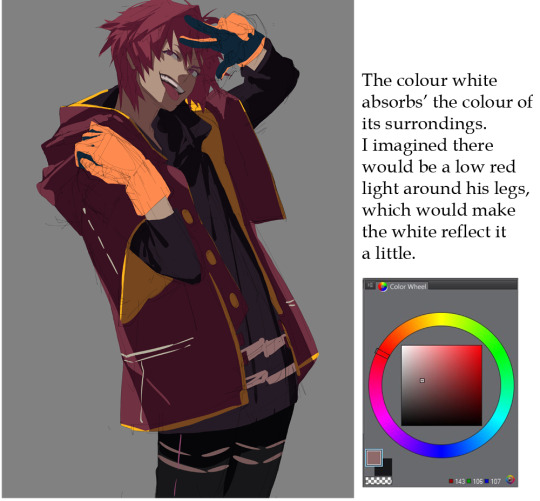
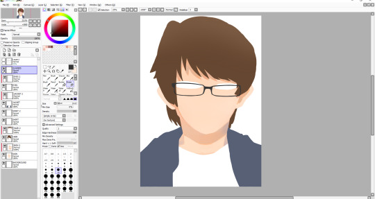
#on the jacket for the shadows i used my lineart brush and then for the highlights i used the smoother brush i use for stuff like jewelry
Text
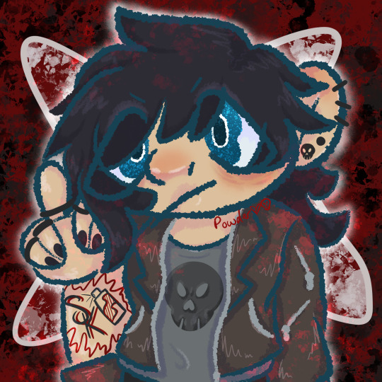
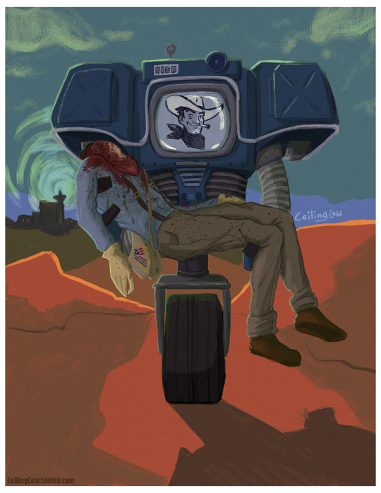
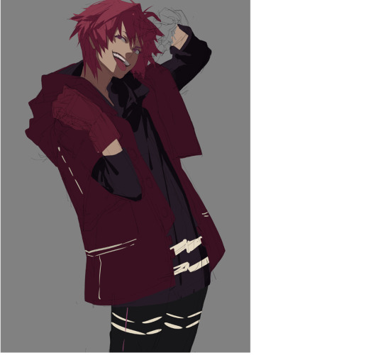
This one took a bit, but next up from MyStreet, Gene
#i struggled some with that tattoo and his hair but i really like how this turned out#i tried differed brushes for the shading on his jacket and i like how it turned out#i think i just want to use the same brush for the shade and highlights on the jacket next time tho#on the jacket for the shadows i used my lineart brush and then for the highlights i used the smoother brush i use for stuff like jewelry#mcyt#mystreet#mystreet gene#mystreet fanart#mcyt fanart#powdery art
13 notes
·
View notes
Note
How do you colour your stuff? (If you don't mind telling👉👈) because your art looks so nice, it looks traditional but also digital at the same time.
Hey, thanks so much for the question! I love traditional art, but for various reasons digital is a lot more accessible to me now, so I try to bring my traditional process to digital as much as possible. I tend to really build up layers in traditional mediums, and digital can very conveniently mimic that.
I'll deconstruct my layers because this is more or less the sequence I go in.
One of the most important things to me was finding digital tools (brushes) that felt like the traditional tools I liked most. When you find one that just clicks, it's a tangible feeling. I'll list my favorite brushes at the bottom of the post. Putting a cut here because it's a long post, but I like sharing information when I can because hey maybe it'll be helpful to somebody!
I always start with a blank canvas that already has a paper-texture overlay applied to it. I tend to sketch in a couple different colors to keep things straight. A holdover from traditionally inked pieces where I'd sketch in non-photo blue pencils. I keep it rough, especially in faces. I do my final layer of pencils or inks over that.

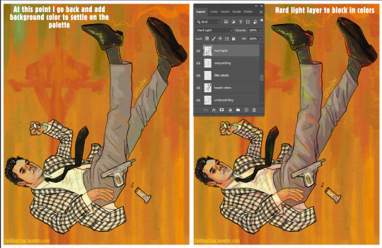
Once I have my lineart, I establish the tone of the piece with a background color or gradient. I do a bit of underpainting where I know I want to build on top of colors other than the background.
I tend to start focusing more on the face here. Throughout working on the piece I'll come back to the underpainting layer and add colors as I see fit.

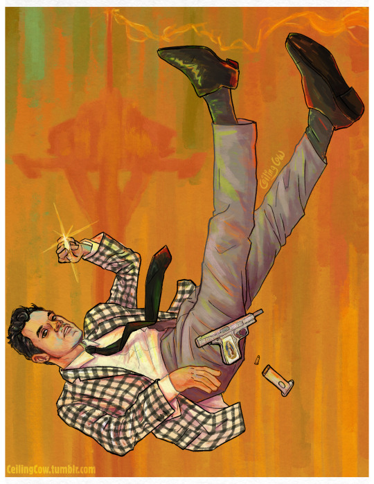
I fill in the base colors next, keeping things messy by using a brush with some texture and flow that varies with pressure. I really like having the background peek through in places and the background color is key to how I mix colors. I never bucket fill areas of color on a piece like this. For Benny's jacket I use two separate layers to keep the checks easier to work with, and layer masks to erase away sections to create a hatched effect. This is one of those places where I love digital art because I can do things more efficiently than what I would've done traditionally.

I do these next steps kind of concurrently, because they both solidify the overall colors of the piece.
I go back and add colors to the background as I work. Above the more opaque paint I've already done on the figure, I start doing "glazing" layers using layer modes in Photoshop. The most important one for me is Hard Light. I use the background colors to add pops of color on this layer and do some shading. I find that doing shadows in Hard Light first makes them a bit more interesting. I used pinks, reds and greens on the Hard Light layer.
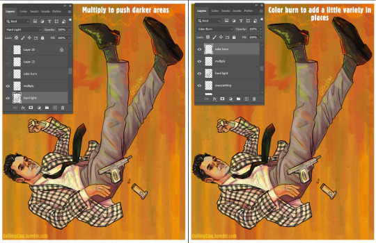
I intensify the shadows in places using a Multiply layer and add a bit more color variety in places on a Color Burn layer using magenta, purple, coral and red.
While I'm using layer modes a lot in this process, I started doing this because it mirrored how I used to work with markers traditionally and build up colors in layers, sometimes using unexpected combinations.
I add a few details over top all the layers and it's done!
Brush talk time!
My absolute favorite sketching pencil is the "Grease Pencil 8B" from Alex Dukal's "Pencil Garden" set. It has a soft-yet-dark, smooth feeling that reminds me of the "Caran d'Ache Sketcher Non-Photo Blue Pencil", which is really just the tops when it comes to traditional sketchers. Seriously I love those pencils. I did the final line art for this with the "German - 45px" brush from the same pencil set, but duplicated the line art layer to make it darker. I do this on many "painterly" pieces because I like how pencil lines and messier paint look together.
Everything else is a Kyle T. Webster brush, which can be found here and downloaded if you've got a subscription with Photoshop. I have a little folder with my favorite of these brushes because there are a lot of brushes. Some I've modified to my likings. The "Oil Background Crusher" is an absolute MVP when it comes to filling in large sections because the color varies based on pen pressure. The "Impressionist" brush is also a huge favorite, and I've done entire pieces before pretty much just with that brush, though I didn't use it for this piece. (Old example, but seriously I've loved this brush for years.)

I've been using a lot of KTW's Gouache brushes lately and most of the painting on the above piece was done with those since they have a messier feel than some of the oil-specific brushes. The recent Victor piece was 100% the KTW Gouache brushes except for the sketch.
Oil paint brushes have a much denser feel and I go for those when I want a more precise feeling. This one was done mostly with the "Impressionist" brush to bring the ghoul skin texture alive, the "Ultimate Oil thicker", "Big Wide Softy" and the "Creamy" brush.
As for color inspiration, I either generate my own palette on Adobe Color or draw inspiration from Impressionist, Post-Impressionist, or Vienna Secession movement paintings, since they tend to have a color palette with the traditional painting feel I'm going for. Right now Toulouse-Lautrec is my painting inspiration.
I hope something in here might've been helpful, though I know it's a bit long. I'm always down to answer questions or talk shop or even chat about art history. =]
#my art#asks#long post#art#digital art#I really like painting... honestly I like it a lot more than drawing#and I've enjoyed that I've gotten to do some messier painting work with Yeehawgust
7 notes
·
View notes
Photo

THE STROKES 11/23/01 11”x17" • Offset Print Signed & Numbered edition of 300 . I’m a few days late… Holy cow…I did this 19 years ago?! I’m trying to scrub my brain & recall where I was at in my life. Well…it was 2001. I was working at #HustlerMagazine & doing #gigposters on the side. I was commissioned by the venue #328performancehall & I think #philaarts . . Back then, a lot of poster artists had to pay to print the posters that they were “commissioned” to do. I was just starting out & didn’t have much money so I only made 11x17 offsets for the print run. This was never a screen print. . I remember that the @thestrokes #ISTHISIT had just come out. All the cool kids hated on the band for whatever reason. They wrote GREAT songs! They were BIG & I remember trying to get tickets to their show in LA but it sold out in a second. So the idea was to draw a hipster dude begging for tickets. I based the guy off a buddy of mine, Kerry. He was a good dude! But he had the iconic “Silverlake Look”. Ironically, the band was from NYC. . Back then I worked at 11x17 on bristol board. I used a @winsor&newton series 7 sable size 2 brush & @drphmartins #Blackstar #indiaink. Size 2 feels like a mop to me nowadays. I currently use a size 0. I wasn’t very confident of my inking back then. So I would use a black @prismacolor #prismacolorpencil to soften up the shadows of the leather jacket & for the cardboard sign. A trick I learned from reading #ANDREWLOOMIS books. PLEASE check him out. They’ve been reprinted & are affordable. You will learn a lot from them!!! . Fast forward 19 years & I’m still doing posters. This piece has been reprinted in numerous magazines & books. I could cringe & be embarrassed about this but I’m actually proud. I’m still doing posters & my work has improved a tiny bit. . . . ALL ORDERS shipping this week! . The NEW #JOKER colorway is up in the shop but no one ever reads this far… . . colorway is up in the shop but no one ever reads this far… . . . #brianewing #inking #posterart #lineart #illustration #design #details #darkartists #rockposters #thestrokes #thestrokesband #thestrokesarchive #juliancasablancas #alberthammondjr #nikolaifraiture #winsornewton (at Nashville, Tennessee) https://www.instagram.com/p/CIBvRJVJP0F/?igshid=70yjuuuiqf8n
#hustlermagazine#gigposters#328performancehall#philaarts#isthisit#blackstar#indiaink#prismacolorpencil#andrewloomis#joker#brianewing#inking#posterart#lineart#illustration#design#details#darkartists#rockposters#thestrokes#thestrokesband#thestrokesarchive#juliancasablancas#alberthammondjr#nikolaifraiture#winsornewton
1 note
·
View note
Text
Basic Colouring Tutorial
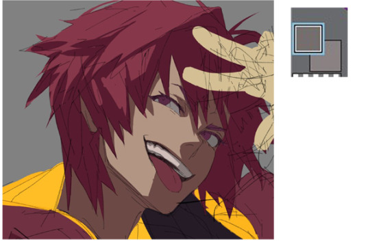
1) Choose a character to sketch
I chose a cool character by my friend daydreamkazooma at twitter. I kinda wanted to give him a flamboyant pose for some reason.

2) Let’s skip line art phase for now and add the base colours
Do not worry too much about what colours to use. Just fill in a general colour and use Hue/Saturation adjustment if you’re not happy.

Try to imagine what the final piece will look like in terms of how the colours will help direct the viewers eyes. In this example, the way the yellow attacks your
eyes immediately brings your view to his jacket.
3) Picking a colour to use for the shading
Now for the shading. Imagine how the object looks in 3D so you can properly show off shapes. Also notice how I flick my pen to create some of the hair shapes.

To choose the colour for shading:
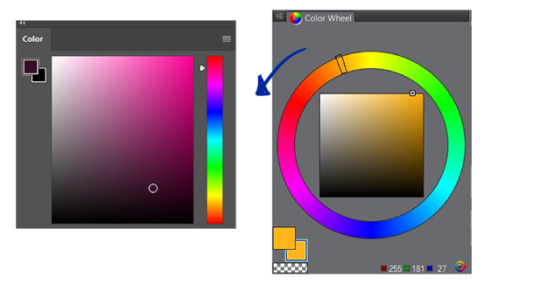
Use the eyedropper tool to select your base colour. (Pic on the top right)
Slide the adjuster on the colour wheel downwards, just a little bit. Then click a colour going towards the lower right on the “colour box” for that perf dark hue. (Pic on the bottom right)
4) Keep going with your shading, always keeping the shapes in mind
e.g.) spiky hair = spiky, triangular shades

The whites of his eyes are so bright its getting creepy, so let’s pick a darker value that’s more pleasant to the eyes and use it for shading the teeth too.
I also changed the colour of his tongue.
5) Follow the folds and shade accordingly
Take note of the type of fabric and the weight of the clothes. This is difficult to explain without going into too much detail, but in general, the thicker/heavier a fabric is, the less folds it has. Your jeans tend to have less folds compared to your cotton shirt.
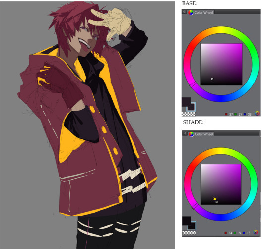
The McDonald’s red and yellow is starting to bother me at this point so I hid the yellows, and used Ctrl + U (Hue/Saturation adjustment window) to find a darker redviolet for his jacket which I think is a good shading colour for red hues.
6) Lighting
Before that, I darkened the (too) bright yellows so it’s not jarring against his jacket.

Add the base colour on top of the shading. You do this by thinking of the LIGHTING instead. I personally do this method more; the other method being: painting with the SHADOWS/SHADING in mind.
Use a bright yellow to light his jacket’s lining.

Also, notice his red gloves are blending in too much against his dark jacket... so what do we do?
7) Contrast
A bright colour of course! Make those gloves pop.
Extra details: The white pattern on his shirt and trousers.
8) Focal point
OK, let’s give him an eye colour that can “compete” with the eye catching yellows in his jacket. We want to bring attention to his face as well.

The viewer’s eyes are now focusing on his intense eyes before his stylish jacket. We successfully changed the focal point back to his face, don’t you think?
9) More shading
Let’s shade the gloves:
Notice how the shade colour I chose goes towards the left,
(towards desaturation)
Unlike the previous shade choices which were towards the right (towards saturation) For example on his hair:
This is to sort of ‘balance’ the tones. Saturated hues are generally hard to handle so be careful with them. If you choose a saturated tone for shading when your base colour is also a bright tone like a saturated orange, it can end up looking like its been coloured in MS Paint, like so:

When I coloured the yellows on his jacket in a previous step, I did this too.
I switched to Photoshop so my colour wheel is now a... colour box.(?)
Towards-the-left on the colour wheel is Downwards on the colour box.
10) Now for the pre-rendering stage.
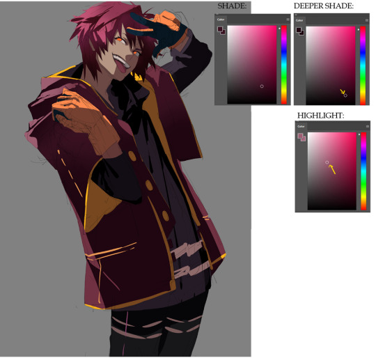
Select the shaded areas using the Magic Wand Tool. It’s OK if it feels messy.

Then, using the same method of choosing your shade colour, (again, choose downwards the “colour box”, towards the saturated hues) choose a shade darker than your Shade colour for a deeper shade colour.
Using a soft round brush with pen pressure turned off, carefully paint on the edges of his hair. Just the edges please, you don’t want to replace your original shading colour with the darker tone.
11) Highlight
Now Invert Selection in Select > Inverse and paint the area near the shadows with the Highlight tone so you make that nice contrast effect.
Highlights tend to go towards the desaturated areas (to the left)

Do the same for the jacket:
And the yellows:
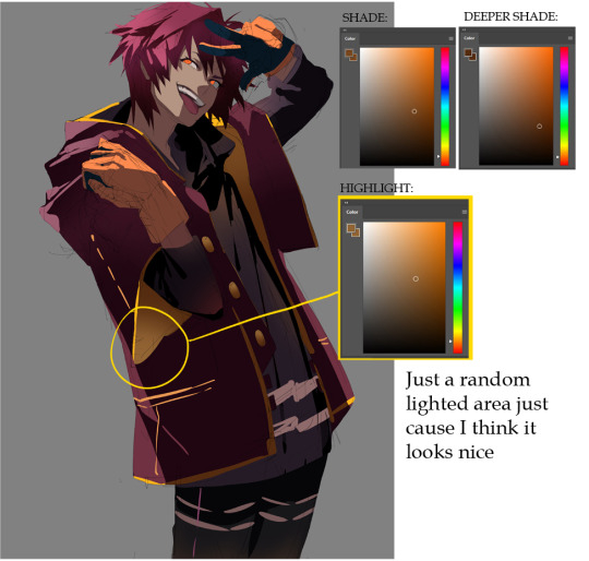
I dabbed this same yellow Highlight colour lightly on his black shirt serving as its
Highlights instead of choosing a lighter tone from the black base.
I find a saturated splash of colour on a black surface much more cool looking.
Do it again for the skin.

I said ‘Highlight’ on that pic on the right, but that’s not really the actual highlight colour. It’s a secondary colour to add hues to the skin so the character looks more alive, kinda like blush-on in makeup. The concept is, skin is translucent so you should tend to show the blood/haemoglobin underneath. For this character’s skin tone, I chose a more orange hue (slightly more saturated orange VS. the base orange) so it goes well with the rest of the colours.
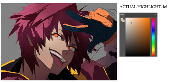
12) Highlights on the face
Now for the real “highlight”. Just lightly dab with the soft round brush the side of the face where the most light hits. Add a little more orange hue if you want, to keep that gradation effect.
13) Finished establishing the colours!
Now just clean it up a little...

14) Lineart
...add lineart on the edges and you have a finished cel-shaded piece! Next step would be rendering it if you want to push further.

15) Rendering
Add textures.
Do the rest of the fucking owl.

=========================================================
Thanks for viewing! Kayl belongs to daydreamkazooma.
This is only a cel-shade tutorial but the tutorial to render the rest of the fucking owl is available in my patreon. Brushes used will also be available!
PATREON TWITTER DEVIANTART INSTAGRAM
3K notes
·
View notes
Note
In your most recent mollymauk art it looks like there is no line art for Molly’s face. How did you achieve that?
Thank you for asking, and I’ll gladly reply that.. I found really helpful starting with a dark background, cause I could picture better a tridimensional face from the side; I had a very sketchy lineart for approssimative face proportions, then I used my fave ink-like brush to draw the shape of Molly’s face. I added basic stuff as eyes, nose and ears using different shades of violet instead of lineart… I did the same (general shape + details with different shades) for hair and horns (I spent a lot trying to figure the horn position…) andd added jewels and corrections on a separate layer. [I suck at tutorials cause I basically don’t follow an order for my layers…and lately I always put a final layer on the top where i try to correct every mistake…filling the gaps i left empty and changing random shadows and so on.] I added the jacket on a different layer and put details on the first silver sketches…and in the end i used a different brush (with lower density) to add some violet shadows on the whole thing…
It took me 1/1.30 hour to draw everything until the jacket part, and then i spent 2 hours on corrections and details + some more hours for more corrections the day after…checking on a drawing some time later is always useful, cause it makes you see mistakes or weird details that you thought right in the first place…

No lineart is usually a great pain for me so that’s why I prefer leaving the coloring at the end, and keeping the strong ink ish lines all around…That allows me to try different poses and prospective, but I should practice more this lineless style cause I really want to learn how to color and shadow everything properly…
But yes, thinking about a 3d version of the thing you want to draw and pretending you’re actually doing a statue with…colors, works a lot…when i’m,, inspired,,, cause if i’m not it comes out like:

#ask#anon#i'm SORRY for the text wall#i'm awful at explaining stuff i haven't even understood by myself#the final proof i'm incredibly messy#all my drawings are 2% drawing and 98% corrections#(also sorry for some english mistakes)#faq#tutorial#art advice
107 notes
·
View notes
Text
Personal Illustration Process
04/06/18
For my final piece, I have pretty much decided that I will be having an illustration in my final piece, the illustration will be of me. There is more context and rough sketches of ideas in the 10-page sketchbook work post below which detail the ideas which I had relating to the illustration. Anyway, I’ll talk briefly about some ideas that I have for my final piece. My main idea now is to draw myself have a cityscape background behind me. The illustration will include me wearing a striped t-shirt, which will be added in Photoshop when I have finished the whole illustration - the stripes will be lines which I will distort so it looks like a striped t-shirt, but also not at the same time because it will look manipulated and unshaded - I think that this will look pretty good when it’s done. The background will be hopefully transparent so that I can export it into Photoshop, but if this doesn’t work, then I will try my best to cut around it using the tool available to me in Photoshop such as the pen tool, it will just come down to my own accuracy. The reason I’m keeping the background plain is so that I can have a cityscape background which I will create in either Photoshop or Illustrator, I say Photoshop as I recently created a scene for an animation there, and found that as long as I don’t use complex shapes such as shapes that involve the line tool to create, then creating a cityscape scene shouldn’t be too tricky - the whole reason for using Photoshop for this at all is because of the effects it offers as opposed to Illustrator.
So I started by sketching out some line art, which I think looks okay, but the face needs some working on. I decided to kind of exaggerate the eyebrows because I think it resembles me more that way. I think the hair looks relatively similar to my own, though probably a bit straighter-looking, but I tried to get the curl on the right hand side, and the hair which you can see at the back of my neck. The glasses may look a bit too big, but the neck and clothes look fairly good in my opinion. For this line art I used a very thin black watercolour brush with brush sensitivity on, as I’m using a Wacom drawing tablet - not really expensive one with a screen, but it does the job.

I started adding some basic colour to the segments which need to be coloured in, in this case being the hair, the visible skin and the jacket - I also thought that I would colour the shirt in white, so that when I export it when it’s finished, it’s not transparent because it wasn’t coloured in. The colours aren’t flashy or anything, but I think that it will still look good when it’s all finished. When colouring, there’s a specific way that I do it. I colour the different parts on their respective layers, and then add another layer above it, and enable something called ‘clipping layer’ or I think that’s what it’s called - basically, it means that whatever I do on this layer, will only happen on whatever I did on the layer below it, so it’s extremely useful for shading different parts of a drawing. This will take effect on the part below.

I began to start shading in places I thought would fit, like on the neck, where a shadow is cast from the head. I also shaded under the hair above my glasses, as the hair would be casting a shadow there too. For the shade I used mixes of orange and grey. Because of the blue jacket thing that I’m wearing here, I tried to reflect the colour from it slightly onto the neck shade, on the right. This was also the point at which I drew the glasses, which took a really long time to get right as I did it freehand with no shape tool or anything. I think that they turned out alright.
Next I shaded the face slightly, so that it didn’t look so flat. I also added a shade on the face to give the impression that there’s a nose - I also added a subtle highlight on the nose too. I drew a facial expression and also a little detail under the mouth to show that the chin is there. After this I decided to start working on the hair. I started by adding shade and lines where I thought my hair kind of parts, and then I added some highlights mainly near the left hand side. I didn’t have any particular idea for a light source in this illustration, though judging from the shadows on the face and neck, I would assume that it’s coming from the front. I also added a small shade under the middle of the glasses - I haven’t yet decided whether I want to have a shadow being cast from the glasses themselves, because it would be frustrating to draw them all over again except this time I’ll need to be even more accurate. I might be able to duplicate the layer and change the colour to the skin shade and have them underneath the glasses.
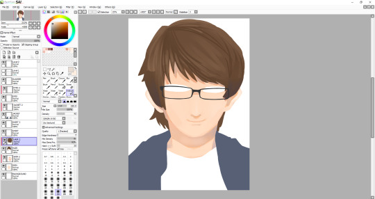
I worked on the hair for a while to try and get it to look kind of smooth, which I think I’ve pulled off for the most part, although I might work on it some more when I’ve done everything else. The hair contains a range of shades. I even used a desaturated purple, as well as some saturated browns and some greys. For the highlights, I tried to smooth them out and they’re just regular browns, with a bit of desaturation to them. After doing the hair, I decided I was unhappy with the eyes once I tried adding pupils, so I changed the shape of them a bit. I also added a more noticeable highlight on the nose as well as add one below the nose. I’m not very good at caricature, so facial features don’t tend to look a whole lot like how they should, so I have to rely on getting the hair right to some degree for now. I added a kind of gradient thing to my jacket, though I may remove it - I still plan on shading the jacket, I just thought it might be a cool touch.
I decided to work on the hair some more, and added some more highlights, most notably on the left side of the hair. One of the more prominent things which I added here is the eyes. I think that they look alright, maybe it bit sad-looking, which wasn’t my intention - maybe I’ll work on them later. The face still needs things adding such as the eyebrows, which I think will be the thing to make it look more like me. The whole illustration still needs line-art around it, so I will add that when all of the colouring is done - though if line art doesn’t work then I’ll leave it as it is now. A problem that has been raised by my tutor, and that is that since my composition is going to be landscape eventually, with the illustration looking like this, the sides of my arms are cut off. I don’t know how I didn’t think of this, but I’m glad that it was pointed out much sooner than later. I suppose I’ll have to draw the arms on, which in theory might actually be quite difficult, since I’m working with quite a few layers, and also I’m not even sure if I’m able to expand the canvas, I’ll have to research this soon, as the deadline is creeping up on me, and I can’t spend too much more time on this illustration.
Luckily, I was able to expand the canvas as much as I wanted so I could draw on the sides of the arms. I decided not to sketch them first, so they may look a bit off, or that could be because I really need to improve on drawing anything from the head down. Alongside this, I drew on details around the eyes, most notably the eyebrows, which I think turned out well. I also changed the eyes slightly, though I still look sad. Also - I made the hair a bit rounder near the top, as I thought that it just looked a bit off before.
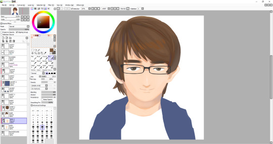
I am almost finished - except not, because now I have to work on the jacket, which was the part I was least looking forward to, so if the drawing doesn’t look as good now, I’ll be blaming it on the jacket. Anyway, to start, I very loosely stuck to my original lineart, though there are some differences between them. I stuck with one of the watercolour brushes that I’d been using throughout this whole illustration, though maybe I should’ve used something else because the texture just doesn’t really look like clothing. I suppose just a different type of brush may have done the trick, though it still comes down to how I handle the shading and where to put it. I usually like to draw things like hair and clothing in segments, like with hair, there’s different parts to, and with clothing, there’s folds, which I need to vastly improve it seems. After I finished with the dark tones, I decided to add highlights I deemed necessary, that or I just added them because it looked empty - though perhaps I shouldn’t have added highlights, and just worked on the darker shades because I’m not particularly pleased with how it turned out. Anyway, that was the end of the illustration, I thought I would add a kind of inner glow in the illustration, as I plan to have this illustration in front of a city. To do this all I had to do was go on each layer and use a large white airbrush. Also, I’m leaving the shirt blank as I still plan on adding some black lines in Photoshop which I will manipulate to look wavy.
Final Illustration

Overall, I think that this illustration turned out well, in particular the head and neck. As I mentioned, I’m not very happy with the jacket, but I think that no matter how many times I redo it right now, I won’t be able to make it look good - it just comes down to me needing much more practice drawing and shading clothes. Looking back at this, I noticed the head looks a bit too big for the body, which wasn’t what I had intended, but I guess after all, the whole thing is just an exaggerated drawing of me.
0 notes
Last Seen Blogs

whoadin
Raquel Mayr

tvoyakroshka
tvoya kroshka

coreys-corner
too weird to live, too strange to die

adventuretree611
Untitled
st-ring
St.Ring