#pantone system
Text

"Don't make me right
It's me to decide
This or that side"
My (unpopular) take on zodiac vibes, part 11 ♒️✨️
#zodiac#astrology#horoscope#aquarius#vibe#pantone color: asphalt#i bet you wonder what's up with asphalt and aquarius#actually nothing is#asphalt is just asphalt and the color suited the overall aesthetic#aquarius are known for being somewhat unpredictable and eccentric#and i think they would appreciate the pun#fuck the system#tamino#cigar#digital collage#mood#aesthetic#Spotify
6 notes
·
View notes
Text
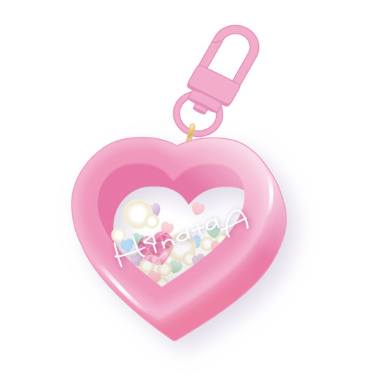
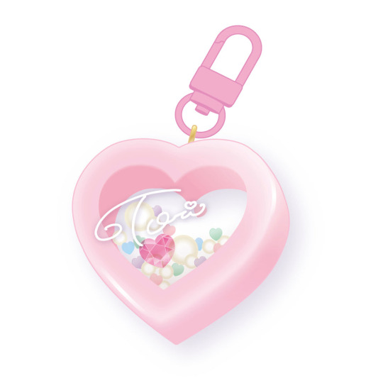
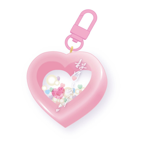
pink boys best 8th anniversary get shaker colors
(in my humble opinion)
1. Hinata
2. Tori
3. Kohaku
4. Shu

see how the only one who chooses to be pink has the best pink? hinata having the brightest one makes sense, and tori’s sweet pink matches with his cute image… kohaku’s is supposed to resemble cherry blossoms, and i see shu’s as a more elegant subdued pink.
if you don’t see the differences between them then i don’t know what to tell you… iykyk 💕
#i’m not sure what color coding system their image colors use so idk if they match#since physical merch is more likely to use pantone but idk#ensemble stars#enstars#hinata aoi#enstars hinata#tori himemiya#enstars tori#kohaku oukawa#enstars kohaku#shu itsuki#enstars shu#enstars merchandise#enstars merch#color theory
13 notes
·
View notes
Text
In case anyone was curious, the Pantone colors for Oreos are apparently PMS 2935 (royal blue), and PMS 298 (light blue).
#pantone#colors#oreos#blue#pantone matching system#graphic design#branding#trade dress#love seeing the color stuff hidden on the flaps of packages#yes i am one of those guys
0 notes
Text
Tchibo: Limited Edition Qbo ICONIC x Pantone
Am Montag, den 15. Juli 2024, geht es los: dann gibt es die die limitierte Qbo ICONIC x Pantone Edition in ausgewählten Filialen und online zum Aktionspreis von 59 Euro statt dem Normalpreis von 119 Euro! Doch was hat es mit dem Qbo-System von Tchibo auf sich? Und warum gilt dieses Verfahren der Kaffeezubereitung als besonders nachhaltig?
Schon vor dem Launch der neuen Qbo ICONIC hat Tchibo für…
#coffeenewstom#Brühdruckverfahren#Caffè Rosa Azul#Coffeenewstom#Kaffeekapsel#Kaffeekapseln#Kambukka#Kapselkaffee#Kapselkaffeemaschine#Kapselmaschine#Kapselrecycling#Kitchen Innovation Award#Kitchen Innovation Award 2024#Nachhaltigkeit#PressBrew#Qbo#Qbo ICONIC x Pantone#Qbo Premium-Kaffee#Qbo Speciality Caffè#Qbo-System#Tchibo#To go Becher#To-go-Becher
0 notes
Text
Choosing Between Spot Color and Process Color: What's the Big Deal?
So, as you venture into the world of print, you’ll encounter two major approaches to bringing color to life on paper. On one hand, there’s spot color—also known as solid color—and on the other, process color, commonly referred to as CMYK. If you’ve ever sent a design off to the printer, chances are these terms have crossed your path.
But do you truly understand the subtle distinctions that…

View On WordPress
0 notes
Text
Pantone del giorno 02/11 - Raspberry Wine
Il Raspberry Wine di Pantone è una tonalità di burgundy media, un elegante mix di rosso e rosa che si presta a molteplici combinazioni classiche. Prende il suo nome dal liquore al lampone, delizioso come la sua nuance. Di romantica ispirazione, questo colore che rientra a pieno titolo nella famiglia dei rossi più utilizzati nel fashion system, è adatto a qualsiasi occasione, soprattutto quelle…

View On WordPress
#02 novembre#adobe#avana#blu notte#canva#colori chiari#fashion#fashion design#fashion moodboard#fashion system#moda#moodboard#pantone#progetti#tabatha moda design#vinaccia
0 notes
Note
thoughts on digital lavender?
it’s a gorgeous color but i *will* say that we predicted a near identical shade three years ago so great minds i guess!
#in my experience i have become kinda anti pantone 🫢#only because we use like 6 different color systems and there are ones that are soooo much better#anon#answered
0 notes
Text
If you needed an excuse to do some spending today, here you go. August 8th is National Dollar Day!
On this day, August 8th, in 1786, the United States Monetary System was established by Congress. For today, Howard discusses if we can print money in our shop while letterpress printing three dollar symbols. The dollars are 8 line pica in size and wood type that was made about 125 years ago. This was printed with Pantone 209 oil base ink using our Washington hand press.
#on this day#money#dollars#museum#sacramento#history#letterpress#printing#art#printmaking#asmr#old sacramento
157 notes
·
View notes
Text
No, Adobe and Pantone don't "think they can own colors and charge you to use them". No, Stuart Semple's "liberated colours" don't solve any problem. No, Adobe isn't going to lock you out of your files if they happen to have any colors in them that are in Pantone's books. That's not how any of this works.
Pantone doesn't own colors. They own the Pantone Matching System, which is a system for designers and the people who turn those designs into end products to all be on the same page about what color something should be. It's essentially a more complex and extensive version of what happens when you pick out a paint swatch and someone mixes up that color for you.
There's nothing new about Pantone charging exorbitant amounts for their products. Pantone's color books—which are essential because knowing what the color will look like in physical form is the whole point—infamously cost hundreds of dollars. They can charge that because Pantone is the color matching standard agreed upon by multiple industries, from print publishing to fashion. Everyone uses it, because everyone else uses it, and because it works.
Yes, that unfortunately means that a lot of people have locked themselves into using something owned by a single corporation, and if they ever decide they want out, it would be massively inconvenient at best. That's a huge problem that isn't limited to this situation (see also: Adobe) and doesn't have a simple solution.
Stuart Semple's "liberated colours" palette, that he's hyping as Pantone colors but free, doesn't address this problem at all. Nor does it solve the immediate problem facing people who actually professionally use Adobe's existing features for incorporating Pantone compatibility into design files.
Because that is the actual issue here: Currently, you can specify your colors in e.g. InDesign as specific Pantone colors, and that information can be used when your file is turned into a physical product to get the exact colors you asked for. This works only because, again, you and the printer are both using Pantone's system, which tells you what the color will look like and tells them how to make it look like that.
Adobe removing those palettes doesn't mean you can't use any Pantone colors. It means you can't automatically specify them as Pantone colors in your file. And that means, when someone produces your designs, they don't have the Pantone system to tell them exactly what physical colors to use. That's it.
Semple's palette doesn't fix this problem, because it's just a palette. It's not part of any larger system that ensures colors are faithfully reproduced in the end products. It's just a set of colors that are similar to some of Pantone's colors. It's no different than using the color picker, or a palette you downloaded somewhere else. It doesn't have any effect on what gets printed, which is the whole reason anyone uses Pantone at all.
I know people love the story of Semple and the other guy and the black paint, and/or the other side of the story where he's actually the villain, but none of that matters except for this context: Semple's whole brand is "liberating" colors from these evil millionaires and corporations who want to control them, etc. I like to think that he has a basic grasp of what Pantone is used for, and if so, he knows his palette doesn't solve the problem. It's just a promotional stunt. It's not inherently a scam or anything; but the idea that he's giving you back something Adobe and Pantone took from you is complete nonsense.
1K notes
·
View notes
Text
Forever

The reporter was so nervous! She could feel how sweatier her hands were getting by the minute and how dry her mouth was. She was going to be the first one in the entire city of Chicago to get an interview with the new Michelin-starred restaurateur in town. She had beaten them all, once again.
When she saw Carmen Berzatto approaching her, she swallowed, hard.
The interview started smoothly, considering her heart was basically beating outside of her chest. She was amazed by how great she could function on autopilot and still remember all the questions she had studied the night before and gone over and over on the way to the restaurant.
He was HOT, she thought in the back of her mind as she tried to remain professional. She had such a crush on Carmy, based on her research, that when she finished booking the interview, she made sure to stop by the salon and get a makeover. Her hair looked like a mane straight out of a L'oreal campaign, and she even wore false eyelashes and her favorite French perfume.
When she confirmed the appointment for the interview and found out that his business partner/CDC wasn't going to be there to join them, she faked disappointment but celebrated on the inside because that meant she could flirt with the sexy chef all she wanted. She didn't care that it was rumored that Carmy Berzatto and his CDC were actually dating. It wasn't confirmed by any of them, so as far as she knew, he was available and she was determined to shamelessly hit on him as soon as she wrapped the interview. They had already swapped phones, so all she had to do now was make sure he knew she was down bad for him, and then wait for him to take the bait.
The golden compound question about how they got the Michelin Star and how he felt about it was mid-questionnaire. She preferred to break the ice by inquiring about him, his personal life, his favorite meals, his funny anecdotes in the kitchen, his trips around the world, and his family, which was a topic she quickly learned he was reluctant to touch so she didn't push it and whenever he stirred the conversation to Sydney she just skillfully changed the subject to avoid her being mentioned or keep her name out of the conversation as much as humanly possible. Sydney Adamu was not a winning chef in her eyes, she was just mere competition at this point, and Carla Redmond was not above treating her like such. She was laser-focused on her prize, to be more precise, on her prize's impossibly blue eyes, not to mention the rest of him.
"So, Carmy, can you tell us, mortals how is it that the Michelin stars happen to those who reach for them?"
"Um... Well, Darla, you make it sound a lot more epic than it actually is, really..."
"Carla, it's Carla, Carmy."
"Oh, sorry, yes, Carla. Well, let me tell you... Um... it's basically a phone call you get. As simple as that, well, scratch that. It's not so simple. I-I- think the logistics in the Michelin headquarters are something along the lines of... Um...so, once each restaurant in consideration has been inspected, the Michelin guide director meets with the um... the worldwide teams for what is called ‘star sessions’, I believe, and that is where the rating of each restaurant is debated. These sessions can last days, often do actually, and um... each restaurant is considered one by one until a unanimous decision is reached. And... the um... The results are then published in a country-specific guide, that's when you get the call."
"Sounds fascinating, Carmy!"
If he had gone over the entire list of colors in the Pantone color system, her answer and gooey eyes would have been the same.
"Before getting to the meat of this interview, the brand new accolade you just got, I'd like to make a quick round-up of all your previous awards: Let's see, you are a James Beard Award winner, right?"
"Um... yes, as it's Sydney, my partner."
"Right, right and you were also the best CDC at the most excellent restaurant in America and at some point not only the CDC of the best restaurant in the world, according to Eater Magazine, but also retained not just one but 3 Michelin Stars in New York? And all of this under the age of 30?"
"Well, yes. It was... Wow! You really did your research, Marla!"
She laughed for a second and then corrected him. Again.
"Carla, it's Carla, Carmy"
"Oh, I'm so sorry! My bad... Um... so, yeah, basically that's it, I was very um... lucky? I guess..."
"You gotta give me more than that, Carmy. I'm sure this must have been really challenging for you, especially at such a young age... Tell me more. How did it feel to get the 3-star call?"
"I… Um… Well, so… The first few seconds I felt like a sort of panic... 'cause I knew I just had to retain them. Is not like I had a choice. I had to retain 'em. Um... And then your brain does this weird thing where it just bypasses any sense of joy because you're just so overwhelmed, so caught up in the turmoil and the pressure, etc... And, um, I don't know... Anyway, I-I had to turn over a really slow table 'cause the, uh, entire United Nations Security Council was coming in, it was just another day in the office for me, I guess."
"So you're telling me you didn't enjoy those first 3 stars? This is like your fourth one, Carmy!"
"No, no, this is my first. Our first star and the only one that matters, actually, Carla."
And just as she was getting excited because he finally got her name right, and was about to dig deeper into his first star, she had to turn around because his face had changed. His eyes sparkled a different shade of blue and his jaw dropped slightly as a smile formed on his face, he looked happy and even hotter. So Carla followed his eyes and could see Sydney making a casual entrance, looking down at her phone, obviously texting. She was completely unaware of the effect her presence was having on the cook Carla was trying to make a move on.
"Syd!" His smile said it all, he didn't need to complete that sentence.
"Oh!" Was all that Carla managed to say. She was not loving it but masked it pretty well.
So the interview continued but with all 4 stars in the spotlight: The Michelin Star, Carmy, Sydney, and Natalie, who Syd made sure to include. Even Richie and the rest of the team made an appearance. After they all had their moment in the sun and thanked her for coming, Carla thanked them for their time and left the premises with a very well-composed tune based on all the instruments of The Bear, but also empty-handed and still very much single and ready to mingle with her nightly schedule fully open. Carmy had not taken the bait, but apparently, he was already taken and he made sure to mention it.
Carla was defeated, but couldn't help but admit that Carmy and Sydney looked perfect together, the chemistry was painfully obvious. As was their mutual love. She felt frustrated, but in spite of herself, she was now rooting for them. They were now her "couple goals". After spending an hour with them, she didn't just want Carmy, even though she knew it was never going to happen, she wanted what Syd and Carmy had.
Her last question for Carmy had been "So is there a memento or some sort of souvenir you got to commemorate this Star forever, seeing as you mentioned that you had already retained 3 before, but this one was the only one that really mattered to you?"
"Yes actually. I-I- um... I got a tattoo, right here, this star is gonna be here forever." He pointed at his heart and looked straight at Sydney. Her eyes smiled in the sweetest way, looking right back at him and Carla felt like such a third wheel that she decided to end the interview right then and there. She didn't even ask Syd if she got a memento or a tattoo too for the same reason.
She could guess she probably did and her intuition wouldn't have failed her. She would have been right on the money on that one. Syd did get a tattoo to commemorate her first Michelin star. It was The Bear logo that Carmy had designed when he first pitched the franchise idea to Michael and it was forever inked in a place south of her back where only her Bear had access to.
#sydcarmy#the bear#carmy berzatto#sydney adamu#carmen berzatto#their michelin star inspired their tattoos#the bear hulu#syd x carmen#carmy x sydney#sydcarmy fic#sydcarmy fanfiction#sydcarmy fanfic#GingerSydcarmyFF#the bear fx
20 notes
·
View notes
Text
Adobe steals your color
When a company breaks a product you rely on — wrecking decades of work — it’s natural to feel fury. Companies know this, so they try to deflect your rage by blaming their suppliers. Sometimes, it’s suppliers who are at fault — but other times, there is plenty of blame to go around.
For example, when Apple deleted all the working VPNs from its Chinese App Store and backdoored its Chinese cloud servers, it blamed the Chinese government. But the Chinese state knew that Apple had locked its devices so that its Chinese customers couldn’t install third-party apps.
That meant that an order to remove working VPNs and apps that used offshore clouds from the App Store would lock Apple customers into Chinese state surveillance. The order to block privacy tools was a completely foreseeable consequence of Apple’s locked-down “ecosystem.”
https://locusmag.com/2021/01/cory-doctorow-neofeudalism-and-the-digital-manor/
In 2013, Adobe started to shift its customers to the cloud, replacing apps like Photoshop and Illustrator with “Software as a Service” (“SaaS”) versions that you would have to pay rent on, every month, month after month, forever. It’s not hard to understand why this was an attractive proposition for Adobe!
Adobe, of course, billed its SaaS system as good for its customers — rather than paying thousands of dollars for its software up front, you could pay a few dollars (anywhere from $10-$50) every month instead. Eventually, of course, you’d end up paying more, assuming these were your professional tools, which you expected to use for the rest of your life.
For people who work in prepress, a key part of their Adobe tools is integration with Pantone. Pantone is a system for specifying color-matching. A Pantone number corresponds to a specific tint that’s either made by mixing the four standard print colors (cyan, magenta, yellow and black, AKA “CMYK”), or by applying a “spot” color. Spot colors are added to print jobs after the normal CMYK passes — if you want a stripe of metallic gold or a blob of hot pink, you specify its Pantone number and the printer loads up a separate ink and runs your media through its printer one more time.
Pantone wants to license this system out, so it needs some kind of copyrightable element. There aren’t many of these in the Pantone system! There’s the trademark, but that’s a very thin barrier. Trademark has a broad “nominative use” exception: it’s not a trademark violation to say, “Pantone 448C corresponds to the hex color #4a412a.”
Perhaps there’s a copyright? Well yes, there’s a “thin” database copyright on the Pantone values and their ink equivalents. Anyone selling a RIP or printer that translates Pantone numbers to inks almost certainly has to license Pantone’s copyright there. And if you wanted to make an image-editing program that conveyed the ink data to a printer, you’d best take a license.
All of this is suddenly relevant because it appears that things have broken down between Adobe and Pantone. Rather than getting Pantone support bundled in with your Adobe apps, you must now pay $21/month for a Pantone plugin.
https://twitter.com/funwithstuff/status/1585850262656143360
Remember, Adobe’s apps have moved to the cloud. Any change that Adobe makes in its central servers ripples out to every Adobe user in the world instantaneously. If Adobe makes a change to its apps that you don’t like, you can’t just run an older version. SaaS vendors like to boast that with cloud-based apps, “you’re always running the latest version!”
The next version of Adobe’s apps will require you to pay that $21/month Pantone fee, or any Pantone-defined colors in your images will render as black. That’s true whether you created the file last week or 20 years ago.
Doubtless, Adobe will blame Pantone for this, and it’s true that Pantone’s greed is the root cause here. But this is an utterly foreseeable result of Adobe’s SaaS strategy. If Adobe’s customers were all running their apps locally, a move like this on Pantone’s part would simply cause every affected customer to run older versions of Adobe apps. Adobe wouldn’t be able to sell any upgrades and Pantone wouldn’t get any license fees.
But because Adobe is in the cloud, its customers don’t have that option. Adobe doesn’t have to have its users’ backs because if it caves to Pantone, users will still have to rent its software every month, and because that is the “latest version,” those users will also have to rent the Pantone plugin every month — forever.
What’s more, while there may not be any licensable copyright in a file that simply says, “Color this pixel with Pantone 448C” (provided the program doesn’t contain ink-mix descriptions), Adobe’s other products — its RIPs and Postscript engines — do depend on licensable elements of Pantone, so the company can’t afford to tell Pantone to go pound sand.
Like the Chinese government coming after Apple because they knew that any change that Apple made to its service would override its customers’ choices, Pantone came after Adobe because they knew that SaaS insulated Adobe from its customers’ wrath.
Adobe customers can’t even switch to its main rival, Figma. Adobe’s just dropped $20b to acquire that company and ensure that its customers can’t punish it for selling out by changing vendors.
Pantone started out as a tech company: a way to reliably specify ink mixes in different prepress houses and print shops. Today, it’s an “IP” company, where “IP” means “any law or policy that allows me to control the conduct of my customers, critics or competitors.”
https://locusmag.com/2020/09/cory-doctorow-ip/
That’s likewise true of Adobe. The move to SaaS is best understood as a means to exert control over Adobe’s customers and competitors. Combined with anti-competitive killer acquisitions that gobble up any rival that manages to escape this control, and you have a hostage situation that other IP companies like Pantone can exploit.
A decade or so ago, Ginger Coons created Open Colour Standard, an attempt to make an interoperable alternative to Pantone. Alas, it seems dormant today:
http://adaptstudio.ca/ocs/
Owning colors is a terrible idea and technically, it’s not possible to do so. Neither UPS Brown nor John Deere Green are “owned” in any meaningful sense, but the companies certainly want you to believe that they are. Inspired by them and Pantone, people with IP brain-worms keep trying to turn colors into property:
https://onezero.medium.com/crypto-copyright-bdf24f48bf99
The law is clear that colors aren’t property, but by combining SaaS, copyright, trademark, and other tech and policies, it is becoming increasingly likely that some corporation will stealing the colors out from under our very eyes.
[Image ID: A Pantone swatchbook; it slowly fades to grey, then to black.]
506 notes
·
View notes
Text
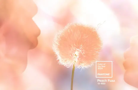
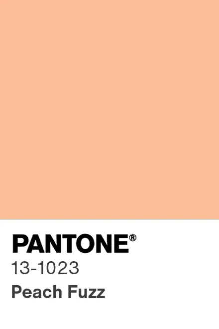
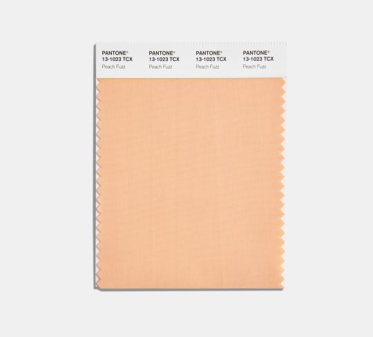
Pantone’s Color of the Year for 2024 'Peach Fuzz'
The gentle, pinkish-orange hue was chosen to reflect a collective desire for respite
A soft, pinkish-orange hue called “Peach Fuzz” is Pantone’s pick for the 2024 color of the year, the company announced last week.
Officially called “Pantone 13-1023 Peach Fuzz,” the color is “velvety,” “gentle” and “subtly sensual,” according to the design and color authority.
Pantone is best known for its color-matching system, created in the 1960s, that numbers and organizes hues with a distinct chip format. The company also runs the Pantone Color Institute, which selects the color of the year and conducts color trend forecasting research.
This year’s choice “echoes our innate yearning for closeness and connection,” says Leatrice Eiseman, executive director of the Pantone Color Institute, in a statement.
“We chose a color radiant with warmth and modern elegance,” she adds. “A shade that resonates with compassion, offers a tactile embrace and effortlessly bridges the youthful with the timeless.”
Peach Fuzz is Pantone’s 25th color of the year. The annual announcements began in 1999 to “engage the design community and color enthusiasts around the world in a conversation around color,” per a statement from Laurie Pressman, the Pantone Color Institute’s vice president.
Every year, a team of color experts examines movies, art, fashion, design, travel destinations, technologies and more to figure out which colors are influencing the world in the current moment. They also use forecasting tools, color psychology research and other sources to predict upcoming trends. From all that research, they narrow down the options to just one color that they feel sets the tone for the year ahead.
Peach Fuzz is less bold than last year’s choice, a bright, pink-red shade called “Viva Magenta.” But the world felt different in 2023, when Pantone “celebrated coming out of the malaise of the last year,” as Eiseman tells CNN’s Leah Dolan. Viva Magenta was intended to evoke verve, power and grace as the world emerged from the pandemic and continued to grapple with social unrest, as NPR’s Rachel Treisman wrote last year.

Heading into 2024, however, Peach Fuzz “arrives at a dark time amid a tumultuous war and a tense election year,” as Angelica Villa writes for ARTnews. The more muted hue is meant to reflect the “need for some quiet, some peace, some respite,” Eiseman tells CNN.
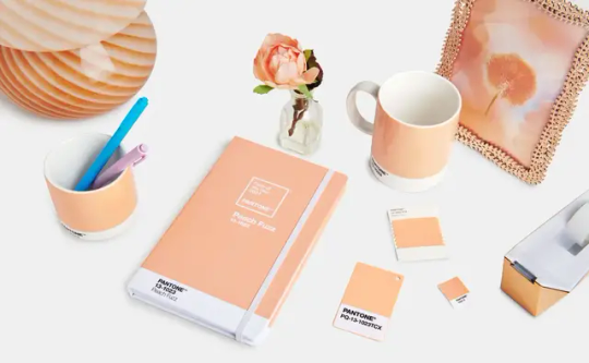
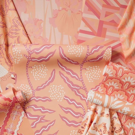
Where will Peach Fuzz show up in 2024? Rugs, wallpaper, fabric, makeup, tea and more—which are all examples of products released in conjunction with Pantone’s announcement. The color is already showing up in fashion, with celebrities like Taylor Swift and the Rock wearing Peach Fuzz to various events, notes USA Today’s Emily DeLetter.
“It feels like another rediscovered neutral that’s meant to seep its way into every surface of our lives,” said Jeremy Allen, the art director for the New York Times Styles Desk, in a conversation with colleagues.
By Sarah Kuta.
#Peach Fuzz#Pantone 13-1023 Peach Fuzz#Pantone’s Color of the Year for 2024 'Peach Fuzz'#Pantone’s 25th color of the year#Pantone Color Institute#color#colorful#style#design#art#artist#art work#art world#art news#pink#pretty in pink
33 notes
·
View notes
Text
really cool posts!
(this is a very incomplete masterlist made by me for whoever is interested. there are a lot of links that lead to more masterlists, so- prepare to browse!)
tumblr lore and very cool posts i guess:
goncharov (1973), apparently (unreality)
the tumblr folk stories
tumblr obsessions alignment chart
humans looking for Someone else
internet is haunted
the legacies people leave behind in you
humans are space orcs
how do you make memes
lighthouses
making toast
the body is round
the rat poem
cool stuff:
just a bunch of useful websites
life hacks (good websites)
in case you’re having a bad night
33 good things to know
learn things for free
for trans afab friends (takes you out of tumblr)
if you love cool socks, artists being paid and to get packidge from the post (takes you out of tumblr)
sew some frogs!
muslim-made modest fashion
pirating is cool i promise (be careful though):
the best beginner’s guide (takes you out of tumblr)
pirating 101 (reddit)
use firefox smile
other search systems (fuck google)
free books
photoshop but online
photoshop never gets hacked. ever. (i can’t guarantee this one, be careful <3)
adobe x pantone bullshit 1
adobe x pantone bullshit 2
for dsmp/mcyt peeps:
every technoblade video (reddit post)
where to read mangoball
for fan artists and writers: put it on your résumé
references for when you wanna draw and need help why is it so hard:
free morpho fats and skin folds this is literal gold
i literally found even better than one morpho: more morphos. and other stuff??!
smithsonian open access! a gigantic bank for free images
same energy (pinterest but cooler)
outfits of older eras holly molly
heads in every angle possible
how to draw hands the way old disney artists did
how to draw wings
how to comics
some brushes (free)
more brushes (still free)
even more (guess what)
these brushes are for making cities fast (wowwie it’s free)
some fonts
color palettes generators
png or jpeg?
references for when you wanna write and need help why is it so hard:
writing deaf/mute/blind characters
writing children!! when you don’t remember how it was
common medical mistakes
some fucking resources
Resources For Describing Emotions
how do i do x on ao3???
how to read like a writer
if any link is missing or deactivated, please tell me! i’ll try to find the missing post again,,,
178 notes
·
View notes
Text
I am a doll collector with BJD and buying parts or making hybrids can be a pain to color match. Just like playline dolls there’s not much consistency between brands. Some resins age differently, too.
The most reliable color matching source would probably be something like Pantone color cards, but those are FREAKING EXPENSIVE and it’s not reasonable to expect everyone to have them.
BJD collecting is an expensive luxury hobby and there are some of us that do need to keep our spending as minimal as possible.
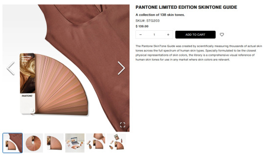
This skintone chips set (https://www.pantone.com/products/fashion-home-interiors/skintone-guide-limited-edition) has an excellent range of skin tones, but seems to be lacking the pasty pale practically white colors a lot of Asian BJD come in and costs as much as a lower-priced BJD.
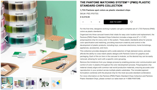
This set (https://www.pantone.com/products/plastics/the-pantone-matching-system-plastic-standard-chips-collection) seems ideal for color matching plastics, which resin is, at first but it’s polypropylene chips which will degrade in a few years, and not all colors of urethane or epoxy resins can be replicated in polypropylene. It’s also NINE THOUSAND FREAKING DOLLARS.
We all know I’m always looking for something functional and accessible and $9k that’s going to discolor and maybe even crumble in a decade is not my idea of accessible.
-
@maleficentmrsofallevil suggested a digital resource (https://redketchup.io/color-picker) which is free and accessible to most collectors that have an internet connection and using HEX codes is consistent across devices, however there are a few problems that we might run into.
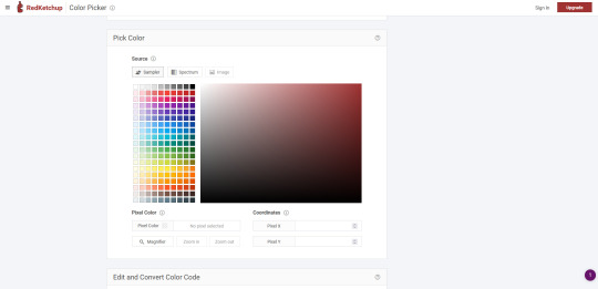
Everyone’s monitors/phone screens and cameras would have to be calibrated exactly the same, and everyone’s lighting when making comparisons would have to be identical for this to be a viable resource. The hex chart being backlit could also skew the way it looks compared to a tangible resin sample.
That’s frustrating. Free and easy for most people to get a hold of is the ideal.
The main benefit of a physical vs digital resource for color matching is that the color sample and the doll are both subjected to the same lighting conditions, monitor settings, and camera settings so even if those factors vary between users, the comparison will still be relatively accurate.
-
A bunch of us sat around discussing different options. International hobby paint brands like Vallejo or Mr. Color, international makeup foundation color cards, etc. etc.
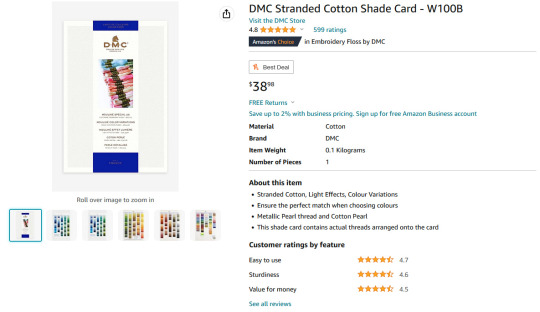
I’ve decided to give DMC embroidery floss color cards a try.
There are two versions.
One has samples of the actual floss in the book and costs about $40.
https://amzn.to/3Oq8G2f
The other has printed color blocks that presumably match the floss colors and costs about $10.
https://amzn.to/3Q2H8Bb
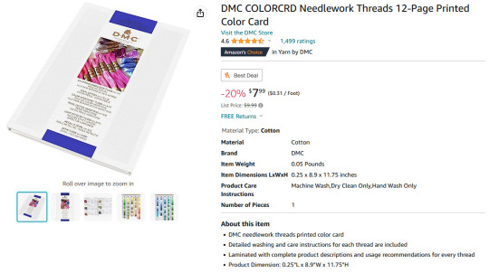
DMC are sticklers for their colors being the same across dye lots. Sometimes they change the numbers on colors and sometimes they discontinue colors all together, so we do still run into the issue of whether everyone’s looking at the same color cards or different versions.
At $10, needing to replace or update the color card every few years isn’t nearly as daunting as a $9k plastic samples set falling apart in your hands once a decade.
(Can you tell I hate polypropylene when used in conjunction with dolls?)
Other variables that will affect the efficacy of using DMC color cards are the conditions under which the color cards are kept like sun exposure, temperature, humidity etc. affecting either the color of the thread samples or the quality of the printed samples.
Another factor is consistency between printed samples.
I have not received these, yet, but my plan is to first compare them to each other to see how well the printed samples match the swatched samples, and then proceed from there.
20 notes
·
View notes
Text
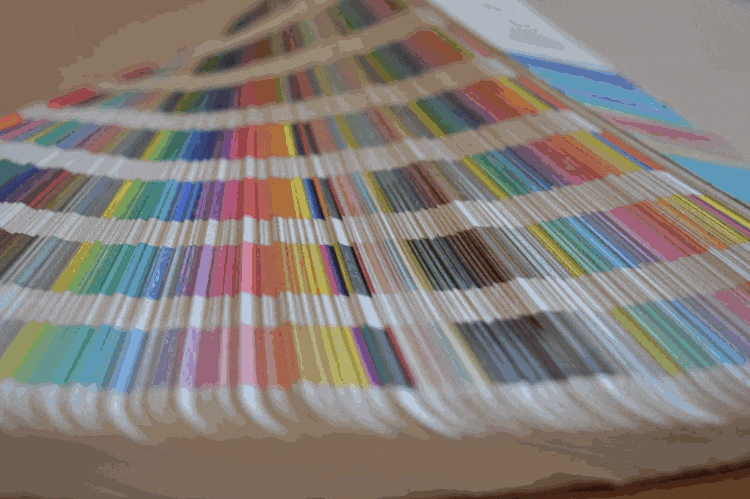
A Comprehensive Guide to Pantone Colors: Understanding and Utilizing Their Significance
Have you ever purchased paint from a local hardware store? You may have noticed the vast selection of color swatches to choose from. Once you’ve decided on a color, you can simply provide the swatch to the salesperson who will then mix the paint for you. This system is both efficient and convenient for both buyers and sellers.
Pantone colors use a similar system. However, the difference is that…

View On WordPress
1 note
·
View note
Text

you guys have no clue how important it is that i now know skeletor's pantone matching system colors are
pms 102/298/266


64 notes
·
View notes
Last Seen Blogs

cleverbakerygiantvoid
🌱Cee-Bee

pokethings
Where Nerd Meets World
philippehenry
Philippe Henry

wssnewsus
Untitled

beachlover69000
Untitled