#played around with opacity and boom
Explore tagged Tumblr posts
Visit Tumblr Blog
Explore Tumblr blogs with no restrictions, modern design and the best experience.
Last Seen Tumblr Blogs


Fun Fact
Celebrities use Tumblr as well.
Text

The guy that made me pick up HSR again. I wanna hate him for it, but this taking nine and a half hours probably proves otherwise.
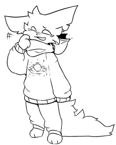
Flat colours under cut, outline only version here

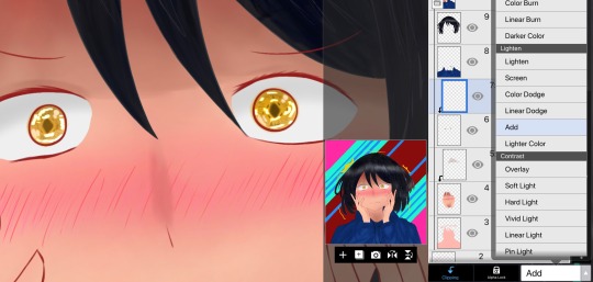
#lunavagans#lunavagans art#honkai star rail#sunday#no i dont have him. cause i only remembered his existence after his banner ended#tried to make his hair just a bit lilac. not sure if its visible#had half a mind to finally learn proper rendering? i dont even know what that really is#but nah#this is good enough#can i just say i LOVE how soft it looks#like the shading colors are so pastel-ish its awesome#guys i think i love shading#i made the color choice really easy for me. just took my usual shading color and chose that plus its tetradic counterparts#played around with opacity and boom#i think sunday looks kind of statuesque. like from the shading#i think i forgot the red undertone from the subsurface thing#but also not sure how i wouldve doen that since the greens already there#hm
15 notes
·
View notes
Note
how does one make graphics (i need to . improve)

Well, the Princess' methods are very simple! She would be glad to teach you.
A bit long graphic tutorial under cut ^_^ (all art by Iinquint on twitter)

First, we import the frame or mask you will use. You can find these by searching "rentry frame".

Then, we will import our picture and erase any excess outside of the frame.

Then we usually add a chibi, You can do this by finding chibi art and erasing the background.

And now we will add any PNGs to the graphic. We chose circle laces for this.

Now we will duplicate the layer of our chibi.

We then use the Stroke Outer filter to find dots that weren't erased, we will go to the top original later and erase where all the exposed dots are.

After that, we delete the layer & reduplicate it. Then we use stroke outer for a white outline, and then a black one. If the chibi or whatever you are using is white or very light already, feel free to reverse the white & black.

Then we add glow outer (usually around 1-2px)

Continue this process for everything

Save it

And then we will import it into a new canvas through 'import picture' & then use the grayscale.

Now, We do not always use a gradient map. But feel free to try out gradients to see if it looks nice on the graphic. Either of the 2 top sites work.

Find a gradient that looks nice. If none fit your vision, feel free to skip it.


Now, import the new image and then add textures. Play around with blending modes & opacity until it looks right.

Boom! You've made your very own graphic.
Now for animated graphics...
(No visuals) If you'd like one where the small chibi moves, move it to be angle -5, save it, and then angle 5 and save it. (Also adjust angles if the 5 looks weird.)
Import the images into ezgif gif maker and turn on "Don't stack frames" and adjust delay time. (I usually use 80ish)
--
Animated graphics 2

Import your graphic into capcut. Add a green background or whatever color is not present on your graphic at all. Add the gif you want on the graphic. Adjust for all the images to go on for equal times so it works.


Ezgif > Mp4 to gif > Remove Background > Select hex code of background > "Replace hex with transparency" > Adjust Fuzz > Optimize

And voila, your graphic is completed! Feel free to adjust in ezgif effects if needed.

#ᛝ a chat with the lady spawn .ᐟ#rentry decor#rentry inspo#rentry resources#rentry#rentry stuff#rentry graphics#rentry banner#rentry coloring#ibis paint colorings#graphic tutorial#rentry tutorial#editblr#pr3typriincess#pr3ttypriincess forsaken#pretty princess forsaken#forsaken roblox#roblox forsaken#roblox#forsaken rentry
464 notes
·
View notes
Text


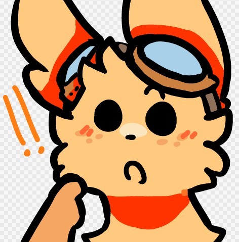
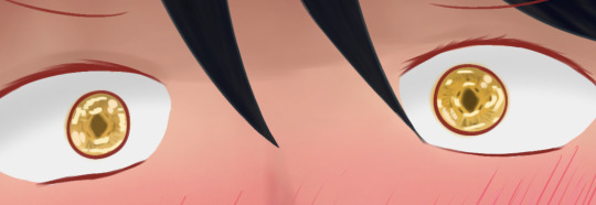
@head---ache
Heres the drawing Ill be using as an exampel
I know you have asked this before but wasn't sure what part of the drawing you were referring to bc i'm dumb I thought u meant wings.
Now I realize I think you were asking about lighting and shading (hopefully u can correct me if i'm wrong)
What also helped was just listening to sad songs like Loveless version of - Running up that hill ,help with the mood hehehe also being sad :)
I like to start with a sketch layer
Wanted the focus to be grave and shadow thus why the wings are in that position almost like protecting it
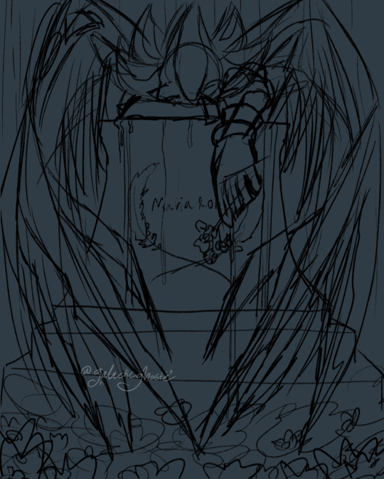
This is gonna be long XD
Then on some separate layers I add rough idea of the type of lighting and colors I want
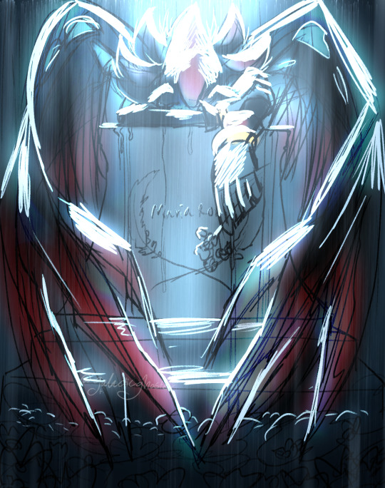
NOW TO GET SERIOUS!!!
Then I add flat colors + all are their own separate layer like for Body, Wings, Grave, Flowers, and background
Then on clipping masks I will add some details to stuff like the Grave textures, name, and other details don't feel like naming them all
Honestly just mess around till happy
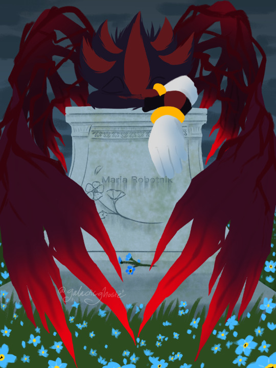
I hate how many layers i made this T.T
More details later...
add multiply layers + color of the sky layer for background grass
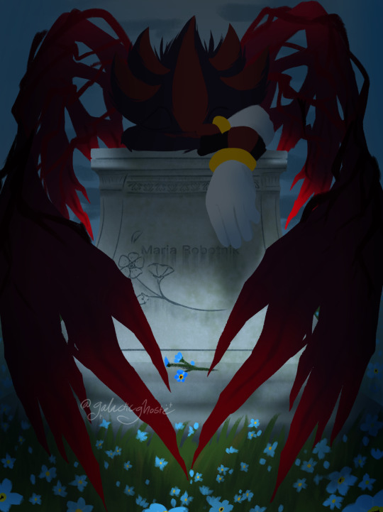
Now lighting ✨
Basically a-lot of add glow + color dodge layers
Play around with opacity
and a normal layer for the sharper parts of the lighting

NOW TO CONTROL THE WEATHER!!!!🌧 ⛈🌧
I was NOT ABOUT TO DRAW EVERY SINGEL LINE OF RAIN
So instead I used a few brushes that give lots of dots and added a motion blur to them the Rain is multiple layers of rain and some are bigger to hopefully make it more dynamic
I draw the rain drops on shadow and the grave by hand tho T.T

Add some more random layers and play around more with light and colors and stuff and till happy
Also Recommend making a color layer that will make your drawing black and white
That way you can see if its the lighting and shading are doing their job to make it more dynamic without being bias of the many colors
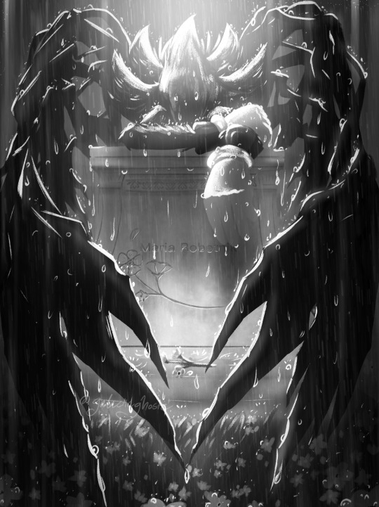
BOOM
DONE!!!
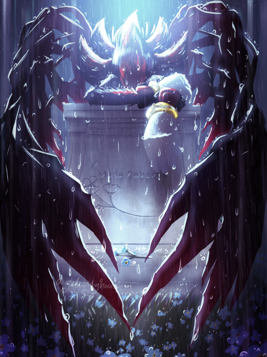
I know i'm not that good at explaining thing or teaching things
Hopefully this is of help to you and anyone else!!! :)
ALSO
I'm still trying to understand lighting myself but these videos are helping me with understanding it!
Would definitely recommend them they are helping me a-lot
youtube
youtube
youtube
Not exactly lighting but this is a cool video too for anyone who wants to play round with fun colors and shapes still trying to understand it myself
youtube
#Youtube#artists on tumblr#art#digital artist#small artist#shadow the hedgehog#sth#sonic the hedgehog#maria robotnik#angel of grief#gghosteArt#sonic x shadow generations spoilers#sonic fandom#art help#art tips#clip studio paint
36 notes
·
View notes
Text
how I made shiny buttons waow
credit to https://www.tumblr.com/kingstorage/765248155234320384?source=share for majority of the help
credit to https://www.tumblr.com/99fish/772133141893775360/hai-everyone-to-the-best-of-my-ability-ive?source=share for the font
ok so first of all there's two ways to do this that I know of ( probably more but I only know these two ) so I'll start with the easier one first
you need these two. a button base and the shiny png


for this one,just recolor the button what ever color you want. there's not really a specific mode to put on ibis paint since they look different with different colors so just play around with it for a little. Then your font,and click add layer from canvas. Boom now onto the shiny part!!!
import the shiny png into ibis paint,and put it to 40% opacity. duplicate the layer,move it behind the original layer,and move it back ten pixels. Repeat this until you reach the end of the button. Then,do the same thing but do not put the layers behind. just duplicate and move forward ten pixels. then,make all the layers a clipping mask and turn them invisible. it should look smth like this

then export the original image without any shiny parts as a TRANSPARENT png,then make the next layer appear and save that,then hide it again and make the layer above it appear,save that,and then keep doing that until you've reached the end of the button. Then go somewhere like ezgif and import your images !!! that's it !!
now the second method.
you basically just need to color the button yourself. the rest is the exact same. here's what you need
button base

three highlight options


shadow

outline

just import these into ibis paint,make a new layer,clip it,and then color it to make the part your desired color. The layers should go something like,base button,highlight,shadow,and then outline. Btw! you can use the highlights on your fonts aswell,just select "hard light"
finished result hawk tuah !

I MIGHT MAKE ANOTHER POST ON HOW TO RESIZE THEM LATER but I'm honestly so flipping tired vro... thank you for reading
18 notes
·
View notes
Note
Teach me the ways of the dragu art
yeah I'll use what I'm currently drawing for this hold on
really long tutorial on how I draw below
step one: sketch

my sketches usually start with a circle for the head and I build from there! generally I just use the circle if I'm familiar with the character and the pose, but it is always good to use more shapes for the rest of the body!
sketches are also a good phase to play around with proportions, the nice part of digital art is that it's really easy to erase or select and stretch/move parts that look funky. play around till it looks right, don't be afraid to use references
step 2: lineart
linearts my worst enemy sometimes, so occasionally I just resort to cleaning up the switch or just making the lineart really sketchy and messy
here though I just follow the sketch to the best of my ability, i don't always do it but I shade in shadows sometimes
also on spots that are like folds or something, I make the lines gradually thinner the farther away from the edge they get. if that makes sense
step 3: color (which is incomplete rn my bad)

I unno what to really say for this one uh
easy trick to coloring everything fast, and if your art program lets you, make a giant square that covers everything behind the lineart, erase or fill any openings in the lineart, select the outside part of the colored square with the wand tool or wtv, and erase/delete. then boom you got a filled color base to go off of, go you!


otherwise if the wand tool doesn't exist, I just draw around the insides of the lineart and fill
step 4: shading
im not planning to shade this drawing so i have to scrounge up old stuff now ouh
shading ! is fun sometimes
i start by picking a bright color that fits nicely with the rest of the art, n choose any spots that would be blocked from the light (i cannot explain this m sorry)

then i put the blending setting on the layer to multiply, set the opacity down until it looks fine

and congrats you've shaded

sometimes i also add a slight blur or like every so slightly softening lines which i do not have an example of right now. i just do this on the ends of the shadows because i think it looks nice
the rest of the art is up to you, color the lines, add a gradient over everything, go crazy.
the best way to get 'better' is practice! doodle whenever ya can, i doodle on homework and notes all the time. find your own little strategies and tidbits to add to your art! just have fun with it in the end!
also when in doubt: add more fluff /j
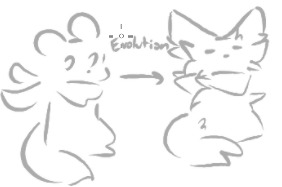
(my old nightcat design compared to the new)
35 notes
·
View notes
Note
transmasc soshun
that's literally the ask
oh anon, they're all trans. just not telling you in what way

such a shame. maybe estrogen or something could've saved them
i saw this like 20 minutes ago and the reason i didnt respond immediately was because i spent the entire time playing around with the opacity of the trans flag layer making it fade in an out imagining the vine boom sound
2 notes
·
View notes
Text
helloooo i wanted to share the way that you too can make wall graffiti digital art like the one i posted because it is genuinely fairly easy and simple ! :]
lets hop right into it!
so first u are going to need the art! my process was to make lineart first and then paint over it but the lineart isn't necessary - I just ended up getting frustrated with the lines and decided to scrap the lineart and go in a different direction than my original plan for the piece LOL
for the painting, find a brush that looks chalky or spray painted. the brush i used is one i made myself, normally used to look like a marker thats running out of ink but I messed with the settings to end up with what I used for this piece. now slap some colours on your canvas!

keep it messy! leave gaps in the colouring for the bg to show through! depending on if youre going for a chalk/chalk paint or spray paint look, you can use different techniques here. keep details to a minimum (or don't! do what feels right!) if u want to achieve more of a typical wall graffiti look!
okay now that you've got your art, time for the wall!
stick a free-to-use photo of a brick wall into your layers under the paint layer (first image):

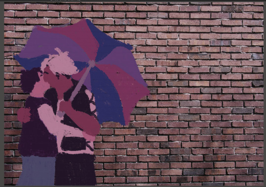
(second image) the wall looked too bright and brown for paint colours i'd chosen, so I put a fill layer of dark purple (colour picked from the painting) and set it to "hard light" and turned the opacity down a bit to get a more cohesive colour.
okay time to get your paint looking more like it's on the wall properly - we're going to go from A to B here:
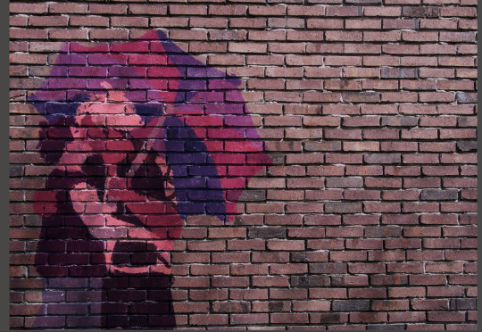
this is where i give the disclaimer "you can do whatever you want but here's what i did" LOL. here's what I ended up with for layers by the end of this part of the process:
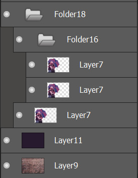
first (bottom) layer7 is my base layer. i set the paint layer to "overlay" at 100% opacity. the second (middle) layer7 is set to "multiply" at around 30% opacity. the third (top) layer7 is set to "screen" at around 20% opacity. do i know what any of these do in proper terms? nope! i learned a little bit of photoshop in grade 11 and 12 and barely remember any of it so I'm just flying by the seat of my pants 🙂👍
base layer alone (just overlay) VS with the added folder 16 (multiply and screen layers) - the difference is barely noticeable but in the second one the colours are a little bolder and more opaque.


screen seems to brighten it a little and multiply seems to darken it. why did i add both? who knows!
for the shadows on the wall, it's pretty easy:
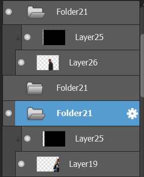
i found free-to-use (and free-to-modify etc) photos of people walking, used "motion blur" in filters on that, added a fill layer of black/dark purple and set it to be a clipping layer over the person walking so they were now a silhouette, and set the motion-blurred person layer (19 and 26) to "multiply". play with the opacity to your heart's content and boom-shaka-laka we've got a shadow (or two) on the wall!


i think it adds a little bit of something extra to it! :]
that's the long and short of what I did to make that piece - if you want to do more stuff like this, mainly I just suggest getting somewhat acquainted with layer filters and then you can have some real fun messing with textures and incorporating photo elements into your digital art!
#this is so disorganized SORR-EE this is a fair representation of my brain lately though LOL#the actual art process is much more chaotic but i tried to organize it a little bit to make sense for yall fdsjkl#dandy.cmd#doodlebug.jpeg#i guess? idk what to tag this with tbh
5 notes
·
View notes
Text
Zirconium Silicate Prices: Trend | Pricing | News | Price | Database

Zirconium Silicate Prices a significant mineral widely utilized in ceramics, refractory materials, and other industrial applications, plays a crucial role in various global industries. Its market dynamics are shaped by factors such as supply, demand, raw material availability, and end-use industry growth. Over the years, the price trends of zirconium silicate have been subject to fluctuations influenced by regional production capabilities, geopolitical events, and changes in global trade policies. This mineral’s importance in manufacturing processes has made its pricing a critical concern for industries relying on cost efficiency and consistency.
The primary driver of zirconium silicate prices is the availability of zircon, its raw material, which is extracted from natural deposits around the world. Australia, South Africa, and Indonesia are among the leading producers of zircon, making these regions pivotal in determining the global market supply. Disruptions in mining operations, export restrictions, or environmental regulations in these key regions can create supply chain bottlenecks, consequently pushing prices upward. Additionally, the demand for zirconium silicate in rapidly expanding industries like ceramics and advanced coatings continues to rise, adding pressure on supply and influencing pricing trends.
Get Real time Prices for Zirconium Silicate : https://www.chemanalyst.com/Pricing-data/zirconium-silicate-1303
Another significant aspect impacting zirconium silicate prices is the production cost, which encompasses mining, processing, and transportation expenses. Energy costs, labor wages, and currency exchange rates in producing regions can directly affect the cost structure of zirconium silicate manufacturers. For instance, a surge in energy prices or stringent labor laws in key mining regions often leads to increased production costs, translating into higher market prices for the end product. Moreover, global transportation and logistics challenges, particularly during times of economic uncertainty or global crises, can amplify the cost burden on suppliers and subsequently reflect in the market pricing.
Technological advancements and innovation in the production process also play a role in shaping zirconium silicate prices. Companies investing in improved extraction and refining technologies often manage to reduce operational costs, which can partially mitigate price volatility. However, these technologies require significant capital investment, which may not be accessible to smaller market players. This creates disparities in production efficiency and pricing strategies across the industry. Moreover, regulatory compliance, especially concerning environmental protection and sustainability, has added layers of complexity and cost to the production of zirconium silicate. Adhering to stringent environmental standards often necessitates additional investments in cleaner technologies, further impacting pricing.
The downstream demand for zirconium silicate is heavily tied to the performance of the ceramics industry, which is a dominant consumer of this material. Tiles, sanitaryware, and other ceramic products rely on zirconium silicate for its unique properties, including opacity, strength, and chemical resistance. Rapid urbanization and construction booms in emerging markets such as India, China, and Southeast Asia have significantly boosted the demand for ceramic products, consequently driving the demand for zirconium silicate. However, fluctuations in construction activity or economic slowdowns in these regions can dampen demand, leading to temporary price corrections.
Another important factor influencing zirconium silicate prices is the competitive landscape of the market. Numerous manufacturers and suppliers vie for market share, often leading to price competition and efforts to optimize cost efficiency. The presence of dominant players in the industry, particularly in Asia-Pacific, has created a highly competitive environment where price wars occasionally emerge. Small and medium-sized enterprises face the challenge of balancing competitive pricing with sustainable profit margins, often impacting the overall market pricing trends.
Geopolitical events and trade policies also contribute to the volatility in zirconium silicate prices. Tariffs, trade restrictions, and diplomatic tensions between major producing and consuming nations can disrupt the smooth flow of raw materials and finished products. For example, import duties or export bans on zircon in key regions could significantly affect the pricing dynamics of zirconium silicate. Similarly, geopolitical tensions can lead to supply chain disruptions, leaving industries dependent on this mineral to grapple with higher costs and limited availability.
Environmental concerns and the shift toward sustainability have also started to influence the zirconium silicate market. With increasing global focus on reducing carbon footprints, industries are exploring alternative materials and greener production methods. While this shift has not yet drastically reduced the demand for zirconium silicate, it has added pressure on manufacturers to adopt eco-friendly practices, which may lead to incremental cost increases in the short term. Over time, the adoption of sustainable technologies could stabilize pricing by ensuring more efficient resource utilization.
The future outlook for zirconium silicate prices remains closely tied to the balance of supply and demand. As industries like ceramics, electronics, and advanced materials continue to expand, the demand for zirconium silicate is expected to rise. However, market participants must remain vigilant about potential disruptions, such as mining restrictions or economic uncertainties, that could create price volatility. Technological advancements and sustainability initiatives are likely to play a pivotal role in determining long-term pricing stability and market growth.
In conclusion, zirconium silicate prices are influenced by a complex interplay of factors including raw material availability, production costs, technological advancements, regulatory compliance, and geopolitical events. As industries evolve and adapt to changing economic and environmental landscapes, the pricing trends of zirconium silicate will continue to reflect these broader shifts. Stakeholders in the market must closely monitor these dynamics to anticipate changes and ensure sustainable operations amidst fluctuating prices.
Get Real time Prices for Zirconium Silicate : https://www.chemanalyst.com/Pricing-data/zirconium-silicate-1303
Contact Us:
ChemAnalyst
GmbH - S-01, 2.floor, Subbelrather Straße,
15a Cologne, 50823, Germany
Call: +49-221-6505-8833
Email: [email protected]
Website: https://www.chemanalyst.com
#Zirconium Silicate#Zirconium Silicate Price#Zirconium Silicate Prices#Zirconium Silicate Pricing#Zirconium Silicate News#Zirconium Silicate Price Monitor
0 notes
Text
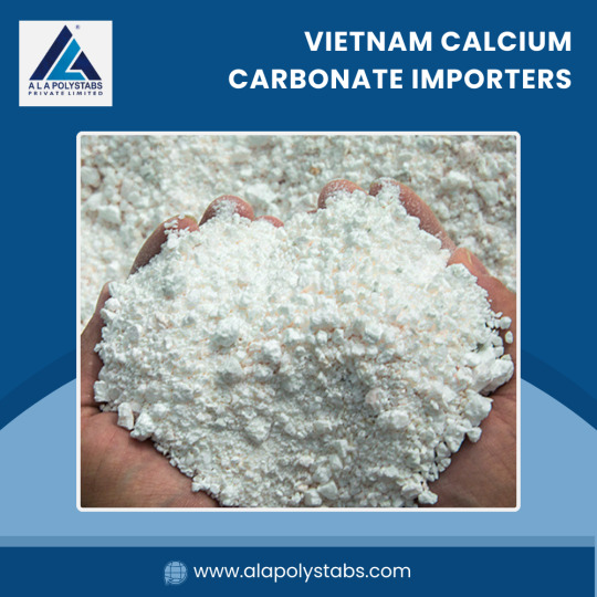
ALA Polystabs: Your Reliable Partner for Egypt Calcium Carbonate Importers
In the vibrant world of industrial minerals, calcium carbonate plays a pivotal role across various sectors, including plastics, paints, paper, and food. ALA Polystabs stands out as a significant player in this market, offering quality products and unparalleled service to calcium carbonate importers. This article explores the relationship between ALA Polystabs and the key markets for calcium carbonate, particularly focusing on Egypt and Vietnam.
Understanding Calcium Carbonate and Its Importance
Calcium carbonate (CaCO₃) is a versatile mineral used in various industries due to its abundance and unique properties. It is primarily extracted from limestone, marble, and chalk. The two most prominent forms are:
Ground Calcium Carbonate (GCC): Fine particles made by grinding limestone or marble. GCC is widely used in plastics, rubber, paints, and paper.
Precipitated Calcium Carbonate (PCC): A synthetic form produced through a chemical process. PCC has a high purity level, making it suitable for specialized applications such as food and pharmaceuticals.
The demand for calcium carbonate continues to grow globally, driven by its diverse applications and the increasing focus on sustainability. ALA Polystabs is committed to meeting this demand with high-quality calcium carbonate products sourced from reputable suppliers.
The Role of ALA Polystabs in the Calcium Carbonate Market
1. Quality Assurance and Compliance
At ALA Polystabs, quality is paramount. The company adheres to stringent quality control measures to ensure that all products meet international standards. This commitment is particularly important for importers in Vietnam Calcium Carbonate Importers, where regulations around industrial materials are becoming increasingly stringent.
2. Comprehensive Product Range
ALA Polystabs offers a wide variety of calcium carbonate products tailored to meet the needs of various industries:
For Plastics and Polymers: ALA Polystabs supplies high-quality GCC that enhances the mechanical properties of plastics while reducing costs.
For Paints and Coatings: The company provides calcium carbonate that improves opacity and brightness, ensuring a superior finish in coatings.
For Paper Production: The use of calcium carbonate in paper helps improve brightness and opacity while being environmentally friendly.
3. Strategic Sourcing
With a keen understanding of global markets, ALA Polystabs strategically sources calcium carbonate from leading manufacturers in Egypt and Vietnam. This enables the company to offer competitive prices while maintaining high quality. By partnering with local producers, ALA Polystabs supports the economies of these countries and ensures a steady supply of products.
4. Tailored Solutions for Importers
ALA Polystabs recognises that each importer has unique requirements. The company works closely with clients to develop tailored solutions that address specific needs, ensuring that they receive the right type and quantity of calcium carbonate. Whether you are an importer in Egypt looking for bulk supplies or a Vietnamese distributor needing customized products, ALA Polystabs is equipped to meet your needs.
Egypt: A Key Market for Calcium Carbonate Importers
Egypt is one of the leading markets for calcium carbonate, driven by its robust industrial sector. The country boasts a rich supply of natural limestone, making it a prominent player in the calcium carbonate market. Importers in Egypt rely on high-quality products to serve various industries, including:
1. Construction
The construction industry in Egypt is booming, driven by government initiatives and infrastructure projects. Calcium carbonate is widely used as a filler in cement and mortar, enhancing strength and durability.
2. Plastics
Egyptian manufacturers are increasingly using calcium carbonate in plastic production to improve strength and reduce costs. ALA Polystabs supplies quality GCC that meets the specific needs of plastic producers in the region.
3. Paint and Coatings
The demand for decorative and industrial paints in Egypt is on the rise. Calcium carbonate is a crucial ingredient in paint formulations, providing opacity and texture. ALA Polystabs offers tailored solutions for paint manufacturers, ensuring they have access to high-quality calcium carbonate.
4. Food and Pharmaceuticals
With increasing health and safety regulations, the demand for food-grade calcium carbonate is rising in Egypt. ALA Polystabs provides PCC that meets food safety standards, making it suitable for various applications in the food and pharmaceutical industries.
Vietnam: An Emerging Market for Calcium Carbonate Importers
Vietnam is rapidly becoming a significant player in the global calcium carbonate market. The country has abundant natural resources and a growing industrial sector. Importers in Vietnam are benefiting from the increasing demand for calcium carbonate across various applications, including:
1. Rubber and Plastics
Vietnam's rubber and plastics industries are expanding, creating a growing demand for calcium carbonate. ALA Polystabs supplies high-quality GCC to these industries, ensuring that manufacturers have access to the best materials.
2. Construction
The construction boom in Vietnam has led to an increased demand for calcium carbonate in cement production and as a filler in construction materials. ALA Polystabs is well-positioned to meet this demand by providing high-quality products tailored to the needs of local manufacturers.
3. Paper and Packaging
The paper and packaging industries in Vietnam are also witnessing growth, driven by rising consumer demand. Calcium carbonate is used to enhance the quality of paper products, and ALA Polystabs offers solutions that meet the specific requirements of this sector.
4. Environmental Considerations
Vietnam is increasingly focusing on sustainable development, and the use of calcium carbonate as a filler can contribute to reducing the environmental impact of various products. ALA Polystabs is committed to supporting environmentally friendly practices by providing high-quality, sustainable calcium carbonate solutions.
ALA Polystabs: Commitment to Sustainability
In today's market, sustainability is more than just a trend; it is a necessity. ALA Polystabs recognises the importance of environmentally responsible practices and is dedicated to minimizing its environmental impact. The company employs sustainable sourcing methods and strives to reduce waste in its production processes.
1. Eco-Friendly Products
ALA Polystabs offers eco-friendly calcium carbonate products that meet the growing demand for sustainable materials. By using calcium carbonate as a filler, manufacturers can reduce their reliance on plastic and other non-biodegradable materials, contributing to a cleaner environment.
2. Collaboration with Local Producers
By partnering with local producers in Egypt and Vietnam, ALA Polystabs supports local economies while reducing transportation emissions. This commitment to local sourcing not only benefits the communities involved but also helps maintain a smaller carbon footprint.
3. Continuous Improvement
ALA Polystabs is continuously seeking ways to improve its sustainability practices. The company invests in research and development to enhance the efficiency of its production processes, ensuring that it remains at the forefront of the industry while minimizing environmental impact.
Conclusion: Partnering with ALA Polystabs for Calcium Carbonate Importers
In the competitive world of industrial minerals, having a reliable partner is crucial for success. ALA Polystabs stands out as a trusted supplier for calcium carbonate importers in Egypt Calcium Carbonate Importers. With a commitment to quality, sustainability, and tailored solutions, ALA Polystabs is well-equipped to meet the diverse needs of its clients.
As the demand for calcium carbonate continues to grow, ALA Polystabs remains dedicated to providing high-quality products that contribute to the success of importers and manufacturers alike. Whether you are looking for GCC or PCC, ALA Polystabs is your go-to partner for all your calcium carbonate needs. Contact ALA Polystabs today to discover how they can support your business in the ever-evolving landscape of calcium carbonate importation.
0 notes
Text
Art Process for Music
*in Mario voice* here we goooooooooo
Okay first things first: sketch out the thumbnail. The prompt for this piece (provided by @zelinkcommunity) was music. So I doodle out some ideas that I thought fit the prompt. I thought Skyward Sword would be cute (plus both Link and Zelda play the harp! I have options!)
I like telling stories with these types of pieces. I have my characters, but what are they doing? How are they interacting with their environment?
Having a prompt (in this case ‘music’) is helpful cause I have decided what my characters are doing: playing music. So now it’s just figuring out how that affects the world around them. And in this case, I thought of kikwis: little forest spirits from Skyward Sword. Forest spirits and music go together in my head.
Additionally: how does the environment help tell the story (have I mentioned how much I love environmental story telling). I decided to make this a modern AU. I wanted it to be like. Early evening. So why would Link and Zelda be walking home in early evening? Maybe Zelda gets late from sports practice. And Link (of course) waits for her to walk home together with a umbrella to share. And that’s why they run into the kikwis.
Now I have my whole story mapped out: Link and Zelda are walking home together after Zelda got held late for practice. It starts raining. They stumble on some lost kikwis, so Link and Zelda decide to lead them back to the park. How best to do this? Link plays the harp to get them to follow. And boom. Thumbnail done.

Next up: value study.
I only started doing these very recently (as in, this is the first piece I’ve actually done one for lol), and it helps me establish the color values I want for the piece. Contrast draws the eye, so I want the characters to have the highest contrast. The environment in the background has more similar values so the characters draw the viewers attention.
This also helps me parse out the background, midground, and foreground of the piece.

After I’m okay with my values, I add a blue multiply layer to help set the mood and give me a sense of the colors I want to use.
I roughly brush in the lighting and how I want it to look. This helps me keep my lighting consistent. It also adds some warm/cool contrast into the piece, which helps draw the eye to where I want the focus to be.

Now the fun part: painting! I start with the background and work my way forward.

Once the background elements are all there, I get to block in my characters.
I had a lot of fun with the modern AU aspect of this:
Zelda has all her volleyball gear from practice.
Fun rain gear!
The kikwis were…an enigma and proved to be uh….quite the challenge (weird blend of a penguin and Bulbasaur but with little human arms???)
I finish off the characters with the shadows and some basic lighting.
I also do a basic lighting pass for some of the objects in the environment (in this case, the fence, light post, and nearby flowers).

Rain effects! I love being outside when it rains.
I like to do several layers of rain lines and tweak the opacity till I’m happy with the overall look.
For the ground, I like to use a grainy airbrush to give it that hazy sheen.
Finally, some rain droplets bouncing off of objects, and some droplets on the foreground vegetation.

And now my favorite part: second lighting pass (aka lighting this bitch).
Anywhere I really want to emphasize more lighting or give a soft glow, I use a soft airbrush set to either overlay or soft light.

And the final touches, like the magic music
(and any little things I might have missed)

And thats it! Hope y’all enjoyed. Thanks for reading 🦎
#art process#newts doodles#i like getting to dump my art brainworms lol 😂#if there’s ever any stuff y’all would want me to go over I’m happy to
57 notes
·
View notes
Text
NEW ART POST!!!
Here, I drew Wanshi(or Banji Idk), member of the Strike Hawks in Punishing: Gray Raven.
Really like how this one turned out!
Yes, this was more practice than serious because if it was serious, the pose would definitely be better.
I used lots of brushes and experimented with a lot of functions. Main brushes I used were watercolor and blurring marker.
However, the sole reason I was even able to reach this result is one function that is severely under-looked…
Blending modes.
You may have noticed this little thing while drawing and glanced over it, but trust me, it’s a game changer!
It’s never explained or anything, so i’ll help you get used to it.
There’s a lot of blending modes, but there is only two you will mainly use, add and multiply.

Now, i can’t exactly explain this, so I’ll have to just show you visually.
Multiply is for shadows and add is for light/glow
Let’s start off with multiply
I’ll just be using my drawing of Nishi as an example.
Alright, you must create another layer on top of the layer you want to blend on. You can clip it for efficiency.
Just choose any color you’d like and fill in the area you want to shade
Turn on blending mode to multiply and you should see that the color has turned darker.
Don’t fret, because you can always adjust the opacity! This mode is best uses for shadows.
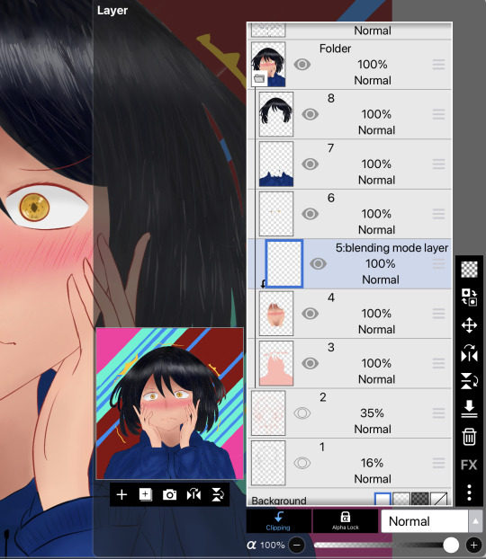


Adding time
Do the same but this time, turn on add for blending mode.
Boom! Easy glow effect! You can use this as your lighting tool for highlights and etc.
Play around with the blending modes more often! It’s really worth it! Hope y’all learned something.
As for the background, just used a crap ton of filters.
P.S, totally didn’t forget to add the mole and had to edit this post.
#pgr wanshi#wanshi#pgr#punishing gray raven#pgr art#pgr fanart#banji pgr#banji#blending modes#anime art
9 notes
·
View notes
Text


some self-indulgent kasumi icons using this gay flag ! (op made their account private but i'll add the flag and its meaning under the cut; op, if you happen to see this and want me to credit you elsewhere or remove this, please lmk!!)
++ important note: this is not meant to be a headcanon!! i just happen to identify with kasumi and i'm a gay guy so i made these for fun :]
btw, these are free to use ^__^ !! credit isn't required but appreciated (and psst, if you want a small tutorial for making icons like these, that'll be under the cut too!)
the flag:
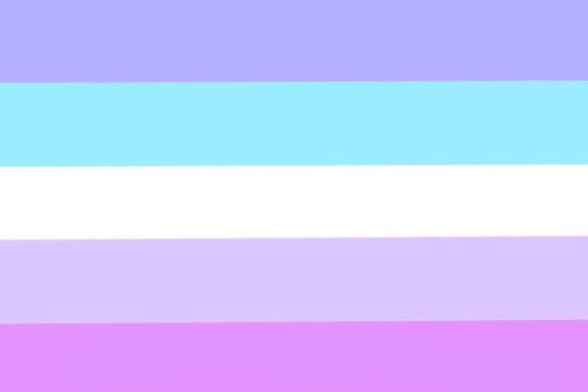
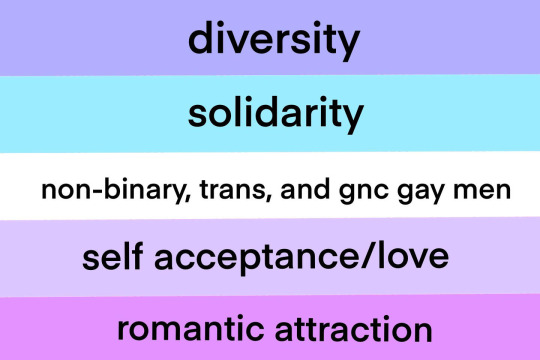
(note that i'm pretty sure the creator meant to only put attraction, not romantic attraction!)
and here's the icon tutorial!
1) using your image editor or art program of choice, make a circle on a square transparent canvas. (these icons were made on photopea, which is free and can be used in your browser! i also used a canvas size of 750x750, but use whatever works best for you. oh, and the circle can be as big as you want it to be, just make sure it still fits on the square haha) 2) duplicate the layer, change the color of the new circle (this is optional and the color doesn't matter, it's just so you can see it easier!), and then resize it to your liking. again, it doesn't matter how large you make it, just make sure it's smaller than the original circle ! and make sure it's centered. 3) you can ignore this step if you only want to add a solid color or a gradient for your border (in which case, simply recolor the first circle), but if you want an image as your border: add the image you want as the main border (whether it's a pride flag or otherwise), drag it under the second circle's layer if it's not already under it, and then set it as a clipping mask. resize and move the image if you need to, and then boom! you now have your border! 4) add the image you want to use for the icon and clip it to the second circle. move and resize the image until you're satisfied with how it looks, and now you have your icon! some other things you can add (completely optional): - layer effects (stroke for an outline, outer glow or inner glow for a soft glow on the outside or inside of the image, drop shadow for a shadow, etc.... these icons use the effects stroke and inner glow! - if the main image clashes with your border, grab a color from the border and draw over the main image using a new layer set as a clipping mask, then play around with layer effects and opacity until it looks good.
#gloomy.txt#i don't have an edit tag . so#resources - graphics#bandori#bang dream#bang dream girls band party#bang dream gbp#kasumi toyama#bandori icons#kasumi toyama icons#pride icons
7 notes
·
View notes
Photo

✧ TEXTURES – A TUTORIAL BY EVANSYHELP.
In this (long and image-heavy) tutorial, I’ll be showing you how I make textures, as requested by a very kind anon. I use Photoshop CC 2019 but you should be able to replicate my methods on most editing software. Please like or reblog this post if you find this helpful!
Index.
Ethically Sourcing Your Images.
Finding The Right Image.
Making Your Texture.
Other Tricks I Use.
Quick Recap.
Making Textures Without Images: Speedrun.
Outro.
Ethically Sourcing Your Images.
I will be explaining a couple quick ways to make textures without any images at the end of the tutorial, but since my personal favourite way involves images and that’s specifically what the anon requested, that’s what the majority of the tutorial will be focused on.
The first step, naturally, is finding an image to use. My personal favourite site is Unsplash, but there are plenty of options out there.
What you need to keep in mind is what kind of license the images have. Unsplash is free for personal and commercial use with no attribution required, which makes it perfect for things like this. There are more sites like this in my free for commercial use masterlist (linked at the end of the post), but unless you’re using them in products you’re selling (like graphic commissions), the commercial aspect isn’t something you need to worry about. Just check the site/photographer’s rules to make sure you’re allowed to edit the images for personal use, and whether attribution (credit) is required.
Another important thing to keep in mind is that these sites typically never allow you to redistribute the images as they are. That means you can’t just go to Unsplash’s texture category, save the images without any changes, and reupload them in a texture pack on Tumblr. That’s stealing. We don’t do that.
Finding The Right Image.
Knowing what kinds of images will make good textures is a learning curve. My first couple texture packs are rough compared to what I make now, because I basically taught myself with no guidance and learned through trial and error. But with practice, I learned what worked and what didn’t.
You want your images to be HQ, either with no ‘subject’ (ie. a person) or with a large background. Higher contrast is better but not super necessary. You should hopefully be able to envision what kind of texture you want to make before you even touch the image.
Making Your Texture.
For the majority of the tutorial, this is the image I’ll be working with. Credits can be found in the link at the end of the post.

Open your canvas. You can make specialised textures, like 100px for icons or 540px for Tumblr graphics, but I personally prefer to make them large for versatility. I’m using 800px in this tutorial. Once you’ve chosen your size, upload your full-size image into the canvas. This is where the fun begins!
Drag the image around into a nice position. Or use Edit > Transform to rotate, flip, and warp the image in different ways. Or use Edit > Free Transform (Ctrl+T) to change the size or the angle more precisely. Or probably some combination of all three! With Free Transform, make sure this aspect ratio anchor is selected so you don’t butcher the quality of the image, unless you’re warping it intentionally:

This is all very individual to each image you use. You might want to flip one, shrink another, put another at a 30 degree angle. Just experiment until you end up with something you think would look awesome as a texture. For the sake of providing a good example, I flipped this image vertically, shrunk it to 80% its original size, and rotated it until it looked like the smoke/cloud was coming from the bottom right corner. This is what we have:
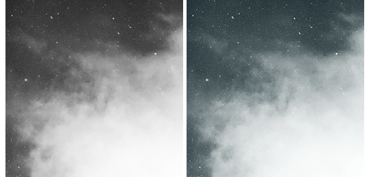
Then we move onto enhancing. Textures work best when there’s a lot of contrast because it’s easier to manipulate the blending modes. So if your image isn’t already high contrast, these adjustment layers (Brightness/Contrast, Levels, and Selective Colour) are your new best friends:

If you don’t see this on your Photoshop, go to Window > Adjustments and it should pop up. Again, just experiment, because different images will require different things. Essentially, you want to make the darks darker and the lights lighter. Something I like to do is add a Selective Colour layer and use the Black slider. Pick out the primary colour of the image, and then Whites, in the drop-down menu, and move the bottom slider (left to lighten, right to darken) until you’re satisfied. Like so:
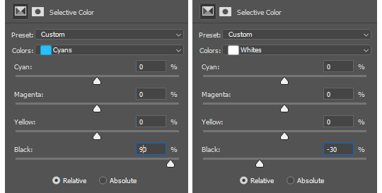
So with those Selective Colour settings and the following Levels settings, here’s the before and after of my image.


Much better contrast! If you want to end here, you can, but I personally prefer grayscale textures a lot of the time because it makes it more versatile. Instead of being forced to make a blue graphic because this image is blue, I can make any colour graphic I want with one simple black and white Gradient layer. Photoshop does have a default Black & White adjustment feature, but I prefer using Gradients.
Pro tip: if your image doesn’t have a pure black, you can keep the darkest parts of your image dark by using the left slider, shown below.


A lot of the time, I’ll also decrease the opacity of that Gradient layer, to somewhere between 80% and 95%, so just a hint of the original colour comes through. This gives it more dimension in my opinion, while still keeping it mostly neutral. Here’s 100% vs. 85%:
You may find that you want to add a little more contrast after. With this texture, I decided to grab another Selective Colour layer, pick ‘Black’ in the drop-down menu, and pull the Black slider up to +40. I also settled on 95% opacity for the Gradient. And here’s the final product!

Other Tricks I Use.
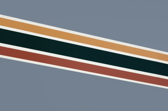
That covers how I make a lot of my easier textures, but here’s a quick run-through of other, slightly more complex tricks. I’ll be working with this image (again, credit at the end of the post):
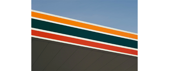
This, of course, is not as obviously texture-worthy as the previous example, but I love textures with strong lines, so here’s how the magic happens! I wanted to get rid of the detail on the bottom half, so I used the Polygonal Lasso tool to select it:

Then I used the eyedropper tool (the 4th symbol under the polygonal lasso in the image above) to select the blue of the sky and, on a new layer, painted that selection completely blue. I decreased the opacity to 90% just so it wasn’t a total block colour, but not enough that you can really see the lines. I repeated this process for the sky, so it looked more consistent with the bottom half.
Then, using the eyedropper tool again and making a new layer for every colour, I went in with a small soft paintbrush and painted out the harsh vertical lines on each segment of the stripes. I didn’t want to make them totally perfect, but I painted over the bulkiest interruptions.
I added a black and white Gradient layer, using the slider tool I showed you before to darken the darks and lighten the lights, and decreased it to 50% so that it wasn’t totally black and white but still more neutral than the original. Here’s the result:
Another fun way to shake things up, which unfortunately will require Photoshop (CS6 should be fine, not sure about earlier versions), is the Filter Gallery. Go to Filter > Filter Gallery, and you’ll find a TON of effects that change your image drastically. Most of the default settings are nightmarish, but you can play around with the settings panel on the right.

Here’s just a few results that are possible with the Filter Gallery, labelled for convenience. You can view the HQ versions in the link at the end of the post.

Quick Recap.
So you don’t have to reread this obnoxiously large tutorial every time you want to reference it in the future:
Choose a HQ image.
Resize, rotate, flip, and/or warp.
Enhance the contrast.
Black and white!
Paint over problem areas!
Filter > Filter Gallery.
Making Textures Without Images: Speedrun.
We’re almost done! There are some tools built directly into Photoshop that can allow you to make textures completely from scratch, and I’ll briefly cover my favourites here.
The first is pattern fill layers. I spent too many years not appreciating the patterns feature in Photoshop, but they’re great. Go to Layer > New Fill Layer > Pattern, click ‘OK’ on the box that pops up, and another box will pop up to let you choose your pattern.
By themselves, they are UGLY. It can take a while to figure out how to use them. But if you change the scale, change the blending mode, and change the opacity, you have thousands of textures at your fingertips. And if you add two or three together? Billions of possibilities. I can do a more in-depth tutorial on patterns if y’all are interested, but here’s two examples I just whipped up in a matter of minutes, using two patterns on each:
The next feature is gradient fill layers, and the gradient tool. Go to Layer > New Fill Layer > Gradient… to select a gradient (or make your own!) and an angle, OR use the gradient tool (featured below) to drag the gradient across your canvas manually. On its own, boom, that’s a gradient texture. Paired with a pattern or put through the Filter Gallery? Even better!


The last is brushes. Brushes can be great for textures because there are so many kinds. You want to make a paint splatter texture? Paint splatter brush sets are everywhere! You want to make a smoky texture? You can get brushes that look like smoke! Smudged? Scratchy? Grunge? Halftone? Light leaks? Torn paper? Brushes have your back.

With all of these features (and things like actions, too!), your saving grace is going to be this little cog wheel shown below, and the list you’ll find under the Reset/Save/Load section. There are SO many more options built directly into Photoshop that you don’t even see right away, because you have to add them manually from this little cog wheel.

And you can download countless more patterns, gradients, and brushes from sites like Brusheezy and DeviantART. A couple tutorials on downloading and installing them can be found in the link at the end of the post, but remember, download these things ethically. If you want to sell products that use a custom brush, it’s your responsibility to find brushes that are free for commercial use. If you don’t want to credit the creator, it’s your responsibility to find resources that don’t require attribution.
Outro.
I think that’s everything, guys! If you found this tutorial helpful or otherwise enjoy my content, please consider supporting me on Ko-fi! I offer exclusive rewards, like custom graphics, to everyone who donates.
Due to Tumblr’s latest rules about links, you can find the credits list, the promised bonus tutorials, other important links, and the full-size HQ versions of the textures made in this tutorial over here.
Thanks for reading!
#rph#allresources#completeresources#itsphotoshop#chaoticresources#photoshop tutorial#photoshop resources#photoshop help#ps resources#ps tutorial#eh#eh: tutorial#tutorial#ps help#texture#*100#*250
371 notes
·
View notes
Note
how do you work ibspaint help
this is a very vague ask so I'll just be making a long (non detailed/descriptive) post abt my favorite/most used features :)!!
mess with every single filter. each one. this is only the draw-radial line filter but there's so much more like the "anime color" one or just the hue/saturation/lightness editing one, just open up a file and fuck around!!!

now, i dont use this particular one a lot anymore but still, mess around with screen tones!!! i used to copy my entire canvas and put it at around 3-5% opacity on dot-l6 but now i dont anymore so idk why im telling you this-

MESS AROUND WiTH THE MATERIALS!!! THIS IS THE MOST USEFUL TOOL ASPECIALLY FOR EDITORS!!! i use so many simple patterns under "geometry patterns-gray"

but oh no! i clicked a pattern and it's not transparent! just click the little "clear white (grayscale)" buddy on the right :)!!


when i have manga panels/any lineart picture i wanna make into lineart only, use the filters > adjust color > extract line drawing and adjust it to my liking!! after that it's free charge to just color it in as you would to a normal lineart :)


brushes!! play with brushes!! just watch an ad and get all the brushes available, everything from stamps to pixel brushes etc is just so useful and fun to use creatively!!

it's a pet peeve of mine to just see pictures slapped onto backrounds without further consideration on edits, even though its so painfully easy to just /not/ do that. just use your backround color/any color and clip it onto your image, slap a cool blending mode (maybe more) and boom you're done the picture looks like matching with the backround :D!!

and uhh that's all i can put in here for now and really all that i have to say, of course it's not very detailed and not a direct tutorial of some sorts bit what can i say, you asked how it works and i provided, so
#that hajime icon is really cute i should use more reply icons jsgsjsgs#the reason i didnt for so long was bc i was afraid of being labeled as a kin blog when really it's just for edits‚ minimal difference but eh#asks#anonymous#not grem edits#tutorials
30 notes
·
View notes
Note
how you make that light effects in ibis paint x? or you use another app?
Nope, all Ibis! I tried to record twice, but the first died and the second was too big, so have screenshots instead. :,)
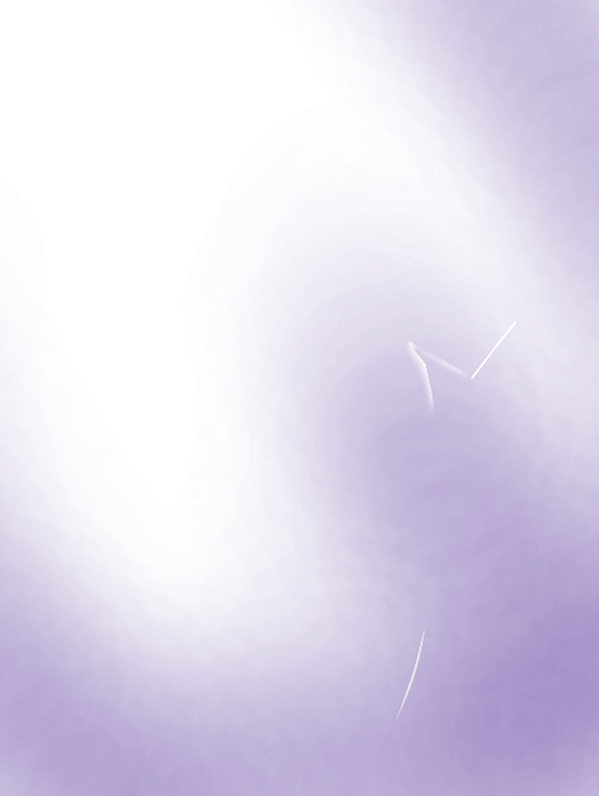
This is what the shading looks like without anything else. There are three layers; a glow layer, the sunbeam layer, and the purple shading (to contradict the green). I have formulated a tutorial of sorts below, and I hope any of this helps!
Here is the basic set up! I made a background that kinda resembles the bg I had on the original piece to kinda help out a bit. The red circle is the object sitting in the beam (i.e. Spinel), and the top layer is those two little dots. Those are the two colors I’m gonna be using (note neither are fully black or white!)

First, the sunbeam. I took my line tool and just made two lines and filled them in. You want to know where the lighting is coming from and slant accordingly, but that’s just a bonus step. Just make sure everything is straight.

Then, bring everything back so you can kinda see what you’re doing. Go to your eraser and select the airbrush. Then, after turning down the opacity, erase the bottom part of the beam and travel up, giving it a fading effect. I like to also run a couple strokes up and down to give that hard edge.
Optional next step: go to Gaussian Blur and blur the lines at the edges. I didn’t do that here, but I did on the poster!
Next, to cut out the sunbeam! It is not going to go through your object, so you’ll want to take straight lines again and just erase part of the beam. I don’t recommend blurring this part as where the edges of the light touch the object, it should be sharp, and picking to blur it the closer you get to the ground has always made it look weird in my experience. Maybe if you’re An Advanced Art Student you can try that? (I mean anyone can don’t let me stop you. This is just my personal experience.)

Next, that glow up in the corner! It’s literally just the airbrush! Make it as strong or as dim as you want, because we can adjust that stuff later! I like to put the glow on top of the object while the beam sits below them, but that is a personal choice that I find is easy to work with. Blends the character into the scene, while also not adding obnoxious visible erase markings on top. Again, personal preference! Do what you want and what feels right!
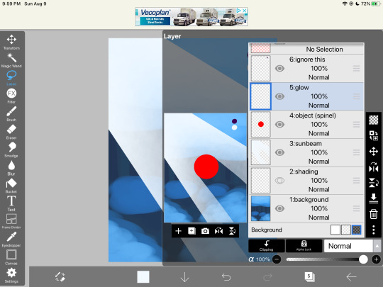

Okay, now turn down the opacity! By dimming the lighting, we can now see behind it better and it creates a softer texture. The dimmer it is, the less it will draw your eye, so find a good balance for the piece you’re working on. I like doing my shading/lighting last for this very reason.
Once you’re satisfied with that, it’s onto the shading. Rule of thumb: NEVER USE PURE BLACK. It can make your scene flat. Be sure to add in tones, even if they’re barely there! For this scene, I used purple, as it’s just the darkest natural color (in my eyes) and goes good with green/blue lighting. Play around with the colors until you like it. Then, most of the shading goes near the bottom of the pic, so as not to contrast the light up above, and goes around the sunbeam. I like to put it on the layer beneath. Add more where you think is necessary, and adjust the opacity!

And you’re done! Make any last-minute adjustments, fix the shadow in the beam, straighten beam lines, completely redo parts if you wanna- doesn’t matter. Mess with it until you’re satisfied, and then boom! You have a lovely beam of light cutting through the foliage!

These rules don’t always work, so do what you want to for the scene/piece you’re working with. If the light is coming from on-screen, the shading becomes more difficult to work with, but the lighting still follows the same basic rules. Feel free to use or ignore any of this.
Hope this helps!
#tutorial#lighting tutorial#drawing tutorial#ibis paint#dimond speaks#asks#answered asks#anon#long post#screenshots
62 notes
·
View notes
Photo
✧・゚: *✧・゚:* AHSOKATONAS PHOTOSHOP TUTORIALS *:・゚✧*:・゚✧
hi hello everyone! it’s been a while, but i’m finally back with a h i g h l y requested tutorial from anons and my mutuals! so before we dive right in, here are a few new rules if you choose to follow this tutorial: if you find this helpful, please give this post a like and/or reblog, i’ll appreciate it a lot! if you use this tutorial for any future edits, please give some form of credit. i’ll accept an @ or a redirect/insp link to this tutorial or a specific edit i made.
if anyone would like a request on another tutorial, feel free to send an ask here! now without further-ado, let’s get to it!
how to create this↴
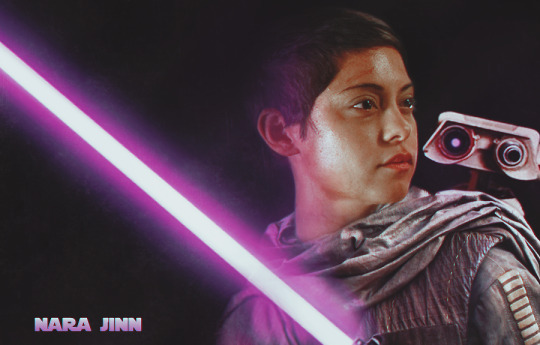
note: this is how i learned how to do this and it’s the easiest way for me. feel free to add/change my steps as you use this tutorial.
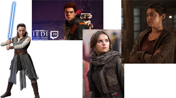
to start off, you want to gather images. for me, this is the hardest and most crucial step because i’m super picky when i want to make my edits look as realistic as possible. on this particular edit, i searched on google for canon star wars character posters, pngs, and screencaps until i found one i liked for the outfit i picture my oc to wear. same goes for my image of rosa salazar, the bd droid, and the lightsaber ( originally blue ).
here are all the images i used for this edit!
now that you have all of your images, open photoshop. i use cc, but if you have any program that allows you to erase, paint, free transform, and add multiple layers, then you can recreate this!
once ps is open, create a blank, black canvas. my crop size is 268x171 and the image size is 900x575 pixels. then, start masking/erasing your photos to make pngs. you can use an eraser for this ( add a layer mask beforehand so you can fix your mistakes!!!! ), but i used my quick selection tool instead bc it’s faster and i’m lazy. here’s a great tutorial for anyone who doesn’t know how to use the quick selection tool!
this is how my image looked like when i kept the parts i wanted for the outfit:

now, the tricky part, adding another head on top of that. luckily, the picture i chose for rosa worked when i flipped the image horizontally, titled the head with free transform, and erased until i could get it as realistic as possible.
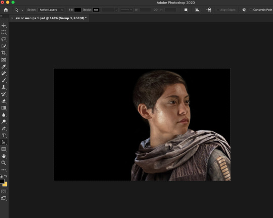
whenever creating a manip such as this, be sure to adjust the different colorings, brightness/contrast, etc. to make things easier, use your “option” key on a layer so it only affects that one layer and not the whole image ( sad to say i only learned that recently but moving on. )
then i added the rest of the images such as the droid and the lightsaber which i colored purple by using selective color and hue/saturation layers.

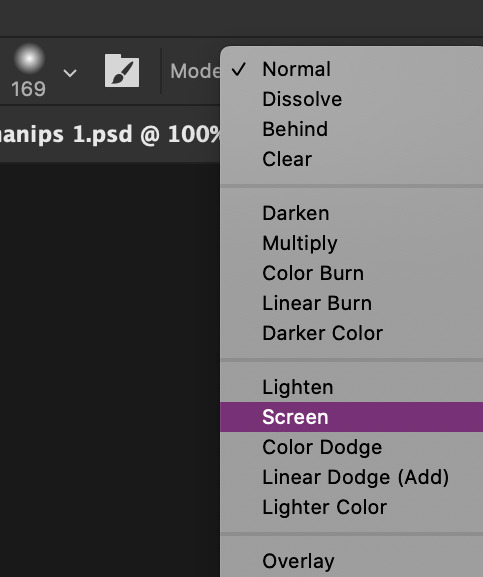
now the fun part, p a i n t i n g. i admit, it can be tricky when you have no idea what to do with it. as long as you play around with it and have fun, it’ll look good in the end! start by creating two new layers. place one underneath all of your layers and one on top.
then i use the paint color and select a purple to use since purple is color i want to focus. after that, i change the paintbrush mode to either screen or overlay ( i used both, depending on what and where i was painting ) and changed the opacity so i can build up the color. when they say less is always more, it’s really true. also i used black too in case i added too much purple to my liking.
you can add multiple layers when painting so you don’t accidentally mess up when using multiple colors. this is what my layers looked like when i was content.

i know some are barely visible but i promise, all of the layers have paint on them.
after this, there isn’t much to do. add on some lighting/distressed overlays to give more texture, add text, any psd you chose, adjust with brightness, saturation, etc. if needed, and boom! you have your very own manip of your oc with a lightsaber!
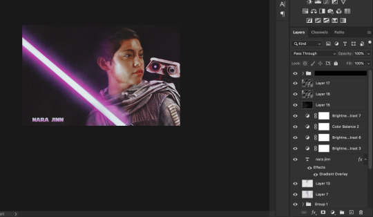
i hope this helped anyone who is struggling with photoshop or just helped someone in general! let me know if any of you have any questions or requests for another tutorial!
#photoshop help#photoshop tips#photoshop tutorial#edit tutorial#manip tutorial#resources#tutorials#ps tutorials#ps help#mine#PLEASE READ THE RULES AT THE VERY TOP!!!!!!
89 notes
·
View notes