#graphic tutorial
Explore tagged Tumblr posts
Visit Tumblr Blog
Explore Tumblr blogs with no restrictions, modern design and the best experience.
Last Seen Tumblr Blogs


Fun Fact
There were a total of 171.5 billion posts on Tumblr in 2019.
Note
hey balu, do you know how to recolor skin / how a coloring psd works for that? like for a character that's pale and not the shade they should be ( cough cough natlan ) asking bc I want to that but idk how
Hiya, anon! I can explain how I personally do it, but here's a huuuuuuge disclaimer: I'm colourblind, so I heavily rely on colour wheel pointers. Throughout this tutorial, you'll see me constantly comparing where the pointer is and trying to use my somewhat limited knowledge of colour theory. I'm sure other creators have other ways to do this that are much simpler and/or more effective; you should look for and check out other tutorials here on Tumblr, YouTube, or Twitter!
Due to the limited previews of images on Tumblr, you can also open the images on new tabs to see more details.
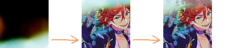
For religious and political reasons, I will not use a Natlan character as an example. Instead, I'll use Candace (also from Genshin Impact) as our muse. Specifically, I will use her character card art image, which can be found on the Genshin Impact fandom wiki. The image quality is not so great, so that's why we'll see some bleeding pixels here and there. Dealing with those is another tutorial altogether. Also, if you meant an absolutely pale character (with littler to no melanin), that would be another tutorial, too. So, I'll be sticking with these examples and explanations here! This can give you a starting point.
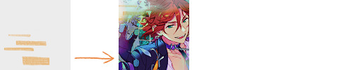
In this tutorial, we will go from this before (left) to this after (right):

Also, I'd like to point out that these steps are for this specific picture/character. Though the same logic can be applied to other characters and images, it's imperative to remember, especially when you're starting your editing adventures, that there is no fool-proof and 100% universal PSD. I'm just explaining the logic behind how a colouring PSD works and some of my mental processes behind it.
Please consider reblogging, liking this post, and/or supporting me on ko-fi if this helped you! That way, I can keep bringing you tutorials like this faster and more effectively. ~
Now, let's begin!

First, we must notice that skin colours (even paler ones) are shade variations of yellows and reds. If we check the hex code colour/colour pointer on the colour wheel, we will see that Candace's skin colour is at the intersection between red and yellow, and is on the lighter/less saturated part.

Here, I am deepening/saturating the blues of her clothes by creating a Hue/Saturation layer, changing from Master > Blues and adjusting the Hue and Saturation values. Colour theory basics: opposing colours on the colour wheels will give a more significant idea of contrast; the bluer colours will appear colder, and the warmer colours will appear hotter and, therefore, more saturated.

In this second step, I am creating a Selective Colour layer, focusing on the Reds. I want this to be highly reddish for now, so I'm lowering the Cyans to the minimum values I can. Notice how the colour wheel pointers went down, meaning we are in a redder, more saturated and more precise zone. The darker the skin, the redder its colours will be in pictures.

Thirdly, I am now creating a Colour Balance layer. Since I want to adjust the warmer colours (e.g., Reds), I am adding more reds, magentas, and yellows.

The exact process I did for Candace's clothes, I'll do for her accessories. Her accessories blended too much with her skin tone (hex code-wise and I imagine that for the normal eye, too). So, to make the yellows on her accessories pop and be more different from her skin, I created yet another Hue/Saturation layer and changed from Master > Yellows, altering the Hues, Saturation and Lightness values.

Now that we have the image's primary colours (blues, reds, yellows) separated, it is time to deepen/saturate the reds. So here, I made another Selective Colour layer, also focusing on the Reds. Notice that now I'm also increasing the Cyan values. Why? Because Cyans make the reds look darker, and I want exactly that. So everything will increase in value.

To further deepen these colours, I created a Curves Layer and tweaked each RGB curve. I made the blues lighter; meanwhile, the greens and reds went darker. Again, colour theory! Notice on the colour wheel that her skin is extremely red and saturated. This is precisely what I want. Why? Well...

... Because now, by using a Selective Colour layer again, I can make her skin magentaish. Pure magentas are rare in pictures, even fantasy/2D characters. Generally, you will find variations of purples, pinks or reds, but magentas are more difficult to find. Therefore, they're easier to work with/edit. Even if the character had magenta colours, we could've isolated them beforehand, too. This step guarantees that my PSD will solely focus on her skin tone, basically.

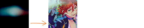
Our final step is to create another Hue/Saturation layer and change the setting from Master > Magentas. We will decrease the Saturation and Lightness values and slide the Hue bar to the right. And now, check the colour wheel: it's a beautiful dark brown! It's popping a lot against the yellows and blues. ~
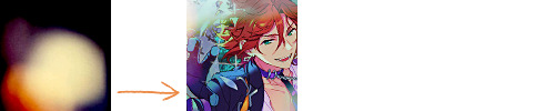
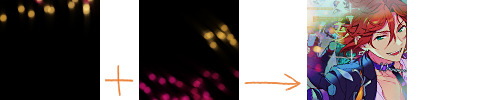
This is where we started vs where we finished!
So there you have it! A speedy but hopefully informative tutorial on how colouring PSD works and how you can quickly love your characters a bit more when doing edits and graphics for them!
Again, please consider reblogging, liking this post, and/or supporting me on ko-fi if this helped you! That way, I can keep bringing you tutorials like this faster and more effectively. ~
If you have any questions, please let me know!
#♡: tutorials! *#gfx tutorial#graphics tutorial#graphic tutorial#gfxs tutorial#resources#rolep#ps tutorial#ps tutorials#photoshop#photoshop tutorial#photoshop resources
51 notes
·
View notes
Note
how does one make graphics (i need to . improve)

Well, the Princess' methods are very simple! She would be glad to teach you.
A bit long graphic tutorial under cut ^_^ (all art by Iinquint on twitter)

First, we import the frame or mask you will use. You can find these by searching "rentry frame".

Then, we will import our picture and erase any excess outside of the frame.

Then we usually add a chibi, You can do this by finding chibi art and erasing the background.

And now we will add any PNGs to the graphic. We chose circle laces for this.

Now we will duplicate the layer of our chibi.

We then use the Stroke Outer filter to find dots that weren't erased, we will go to the top original later and erase where all the exposed dots are.

After that, we delete the layer & reduplicate it. Then we use stroke outer for a white outline, and then a black one. If the chibi or whatever you are using is white or very light already, feel free to reverse the white & black.

Then we add glow outer (usually around 1-2px)

Continue this process for everything

Save it

And then we will import it into a new canvas through 'import picture' & then use the grayscale.

Now, We do not always use a gradient map. But feel free to try out gradients to see if it looks nice on the graphic. Either of the 2 top sites work.

Find a gradient that looks nice. If none fit your vision, feel free to skip it.


Now, import the new image and then add textures. Play around with blending modes & opacity until it looks right.

Boom! You've made your very own graphic.
Now for animated graphics...
(No visuals) If you'd like one where the small chibi moves, move it to be angle -5, save it, and then angle 5 and save it. (Also adjust angles if the 5 looks weird.)
Import the images into ezgif gif maker and turn on "Don't stack frames" and adjust delay time. (I usually use 80ish)
--
Animated graphics 2

Import your graphic into capcut. Add a green background or whatever color is not present on your graphic at all. Add the gif you want on the graphic. Adjust for all the images to go on for equal times so it works.


Ezgif > Mp4 to gif > Remove Background > Select hex code of background > "Replace hex with transparency" > Adjust Fuzz > Optimize

And voila, your graphic is completed! Feel free to adjust in ezgif effects if needed.

#ᛝ a chat with the lady spawn .ᐟ#rentry decor#rentry inspo#rentry resources#rentry#rentry stuff#rentry graphics#rentry banner#rentry coloring#ibis paint colorings#graphic tutorial#rentry tutorial#editblr#pr3typriincess#pr3ttypriincess forsaken#pretty princess forsaken#forsaken roblox#roblox forsaken#roblox#forsaken rentry
378 notes
·
View notes
Text

the ultimate beginner metadata tutorial !! by a dummy :3

HEY PALS AND PEOPLE doing some tips and tutorials ,,,, kinda explaining the metadata that people do in rentry
the site already have a "tutorial" on the "how" window, these on the post are the ones who need further explanation
i will put in topics and try to do my best on this, its a long read!
• the border i will be using for example its by @/suturical on this post
• now, how to understand this and make the magic happen?
GOTCHA!!!
1. Borders: container adjustements
• the least important thing is the container width, you can put as you please but i use it on 400px — 610px, its just my recommendation
• now the padding is important, its basically the distance between the border and the elements of your rentry
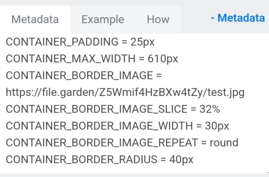
• example: padding on 25px
• example: padding 20px
2. Borders: slice
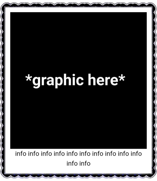
• the image slice is basically how much it will slice your border and repeat it, i recommend using it 20% – 40%, however adjust as you please!
• example: slice 37%
• example: slice 23%
big difference isnt it? and i only changed the slice part, nothing else!
3. Borders: width
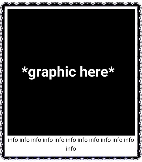
• basically the width of the border, adjust as you please but i also recommend to put on 30px as its the maximum size you can put
• example: width 30px

• example: 15px width

4. Borders: repeat
• this is another thing that dont have much secret and explanation about, there are 4 repeating types for borders, they are:
• stretch: will stretch the original size of the border across the entire container

• round: most used, 'normal', will make your border get around the container
• repeat: will repeat a certain part of the graphic image across the sides

• space: will give space between the repetitions

• onto the next part, text!

2. Text: font applying
• ngl its pretty simple, first catch ANY font of the google fonts site and do like the screenshot above, detail, if you font name has a space between the name (example: playfair display) you MUST put the _ to substitute the space, or it won't work
• but if the font name doesn't have any spaces, write it normally
2. Text: text size
• also really simple, explore the sizes on the rentry, i use it 10px – 25px, adjust to your liking!
2. Text: coloring
• tired of coloring all sentences manually? just do the code from screenshot and input your color! it can be written like i did or the hex code/whatever!
• you can still color things manually even when using this
• final with all these changes:


SO THATS IT! the most important actually :33
hope it isnt confusing, any questions please send an ask!
tagging oomfie @chokingonchairs bc finally got the courage to make this and yu asked for hehe ^___^
THANKS FOR READING!
# giftᧉd from 𐓟bove … ⟡#rentry tutorial#tutorial#rentry#rentry decor#rentry graphics#graphics tips#graphic tutorial#icon pack#icons#random headers#twitter icons#headers#icon#random icons#twitter header pack#twitter headers
631 notes
·
View notes
Text
*✶ please please please
a template by cozysip.
by clicking in the source link you’ll find 02 different dash icon templates made by me from scratch. credit is not needed , but do not claim as your own ! if you enjoy this or you use it, please reblog or like this post . thank you !
#01. PSD TEMPLATES : mine.#template#free template#rp template#psd template#free psd#dash icon#dash icons#dash icons template#icon template#icon psd#psd#rpc#rph#graphic tutorial#free graphics
279 notes
·
View notes
Text
How do i Make Icon masks (Tutorial)
I USE ALIGHT MOTION!! you can actually create icon masks on ibispaint or other app i just use alight motion beacuse thats where im more comfortable in, i havent do icon masks for month so i was curious about making tutorial
#rentry tutorial#❁ 🌊 tutorial ꒱꒱#tutorial#icon masks#icon mask#icon masks tutorial#pfp mask#pfp masks tutorial#graphic tutorial#❁ 🌊 masks ꒱꒱#graphic resources#rentry graphics#rentry
32 notes
·
View notes
Text

𓆩♡𓆪 transparent png tutorial ˖˚
꒰ step one ꒱ ↳ first, find an image or two on a search engine or pinterest/something like it. if doing images from real life (not art), try to use images that don't have noticeable lighting. for example, product images with white backgrounds are best rather than product images in a real life setting with strange lighting.
꒰ step two ꒱ ↳ either copy and paste the image or download and upload the image into remove.bg. use erase/restore as needed.
꒰ step three ꒱ ↳ you're done! pretty simple, huh? good work \(^_^)/

#carrd graphics#rentry graphics#rentry decor#rentry resources#carrd resources#png#transparent png#pngs#transparent#tutorial#rentry tutorial#graphic tutorial#editing tutorial#transparent png tutorial#transparent tutorial
38 notes
·
View notes
Text
Tutorial: ¿Cómo hacer gifs sin PS y no morir en el intento?
¡Holi! Hoy les traemos este tutorial que creemos que les puede ser muy útil si no tienen photoshop (como una brujita de este coven jaja). Eso sí, se usan al menos tres sitios web o apps distintos, así que sobre aviso no hay engaño.
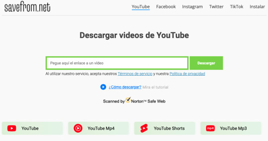
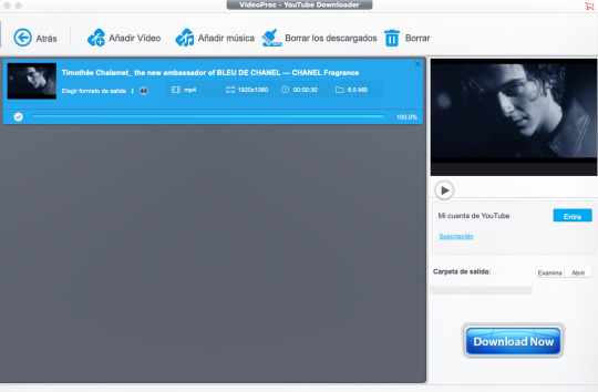
Usaremos un descargador de videos online (el que sea de tu confianza y preferencia), Canva y Photopea. Otra opción que recomiendo es descargar VideoProc Converter, pero no es necesario para este tutorial.
Yo usaré este video de Timothée Chalamet para hacer este gif:
PASO 1. Primero, debes elegir tu video de donde harás el gif. Recomendamos videos de Youtube o Dailymotion de calidad muy buena (mínimo 720p). El consejo es que veas el video entero para que identifiques los segundos que quieres convertir a gif.
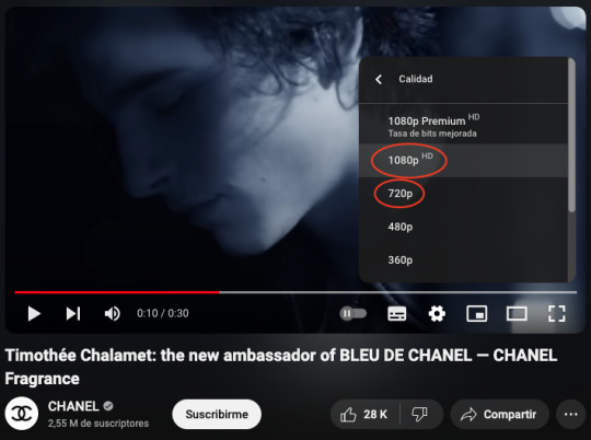
PASO 2. Descarga el video ya sea en línea (una simple búsqueda de "youtube downloader" y listo) o en VideoProc y guárdalo.
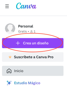
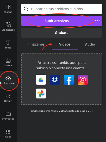
PASO 3. Vamos a Canva (si no tienes cuenta, tendrás que registrarte). Das click en "Crea un diseño" y eliges Video. Una vez que se abra tu proyecto, ve a la pestaña "Archivos subidos" > Videos y sube tu video.
PASO 3.1. En este punto podrás cortar la escena que deseas convertir a gif. Recomendamos no pasarse de los 10 segundos o será demasiado pesado.
También puedes agregarle algún filtro o jugar con los colores y tonalidades. El consejo es que intentes equilibrar el tono en caso de que los colores sean muy cálidos o fríos, o sean tipo Twilight con filtro verde, pero nada más. Esto para no saturarlo y que se vea de baja calidad.
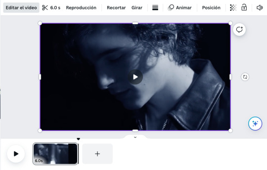
En este caso, lo dejaré en 6 segundos y le quitaré el tono azulado.
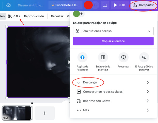
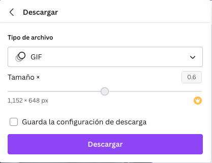
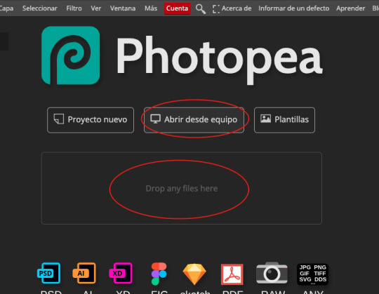
PASO 4. Una vez que tengas tu clip, da click en "Compartir", luego más abajo en "Descargar" y, por último, en tipo de archivo, elige "GIF". Automáticamente, Canva lo guardará con las medidas 1152 x 648 pixeles. Pero a menos que necesites un gif más grande, esa medida es suficiente. Descarga y guarda tu gif.
PASO 5. Ahora vamos a Photopea, que es lo más cerca que existe a Photoshop. Aquí podrás cortar tu gif a la medida y agregar PSD's, colorings, textos, etc.
Mi gif de Tim de 6 segundos tiene 149 capas (por eso les recomendamos mantenerlo lo más corto posible), así que eliminaré las capas que no tengan demasiado movimiento entre una y otra. Puede ser dejar 1 y eliminar 1, cada 2 o cada 3; depende de qué tanto movimiento haya en la escena.
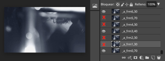
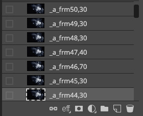
Decidí dejar 1 capa y eliminar 2, quedando así con 50 capas. También agregué un coloring.
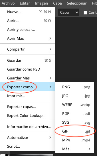
PASO 6. Cuando tengas tu gif como te gusta, das click en Archivo > Exportar como > GIF. Al momento, surgirá una ventana donde podrás jugar con la calidad, la velocidad y el número de repeticiones (por defecto está en repetición infinita y recomiendo dejarlo así). También podrás elegir si quieres que se reproduzca en reversa o tipo boomerang.
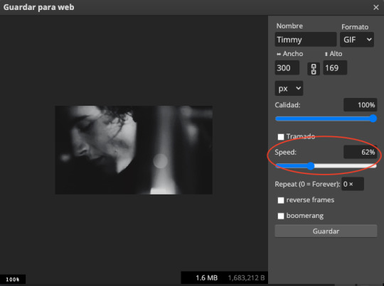
En este caso, bajé la velocidad pues al eliminar un tercio de las capas, el gif se reproducía muy rápido para mi gusto.
¡Listo! Tu gif está terminado ✨.
Pero, Coven, ¿por qué no sólo hiciste el gif directamente en Photopea? Ah, excelente pregunta. Quizá no he encontrado la opción, pero me pareció mucho más complicado sin la línea del tiempo como la que tiene PS. Además, no sé si es igual de eficiente la herramienta de Importar videos a capas, así que preferí tomar el camino largo 😅.
Esperamos que este tutorial les sirva. Intentamos que las instrucciones sean simples y claras, pero si les quedan dudas nuestro inbox está abierto.
72 notes
·
View notes
Note
graagagagaghhhh i need a tutorial how you make these !!,,, EATS EVERYTHJG RAAHH!!!
IF U GUYS EVER WANT A TUTORIAL U CAN TELL ME!!! JUST DM ME AND ILL TRY TO EXPLAIN THE BEST I CAN!!!
#Inbox#inbox open#inbox answered#Tutorial#graphic tutorial#banner tutorial#layout tut#Layout tutorial#Tut#— ⟢ pupdial ! ᘏᘏ#rentry graphics#tbhk#kou minamoto#rentry#requests open#— ⟢ talking !!#toilet bound hanako kun#— ♡ requests ) layouts#silly#— 𝜗𝜚 requests ) graphics#Replying
20 notes
·
View notes
Note
how do you make your graphics?
Hii there! It’s very simple. First step I do is just finding photos, I usually just use Pinterest and sometimes sites with pre cut out photos.
Then I use IbisPaint X to actually edit the pngs ect, I use: the lineout effect aka the stroke one and i’ll sometimes add a blur frame to mines if i feel like it needs / looks good with it. (Depending on the photo it might not show up as much) I normally don’t do this for my pixels, but i’m sure it turns out just as good as my larger favicons. 💝🍀
Then for animation I just move around the photo, so if I want it go to small to big I just make it go like this 👇 if I want it tilted I tilt it ect!
To get it to be a actual GIF i use ez gif! And the gif maker option! I have the speed be around 50 and make sure to select the “don’t stack frames” option!
I hope this helps and i’ll answer further questions too. I’ll also get to requests soon! Some personal stuff has come up and it really has my mood down so i haven’t touched pixel making😭😭💦
#tut#tutorial#carrd grahpics#graphic tutorial#cute#deco#Not sure how to tag this one ngl.#Favicon tutorial#Pixel tutorial#𓈒ㅤׂ 🌈 Mine !
16 notes
·
View notes
Text
I need help with getting screencaps so I'm hoping people on tumblr can help. I know there's a method to extract them from a website like the one linked HERE because many years ago I used to do it, but for the life of me I can't remember how to do it, and I really don't want to go through each picture individually to save it onto my computer so I can make icons
So if anyone can help I would be eternally in your debt
5 notes
·
View notes
Text

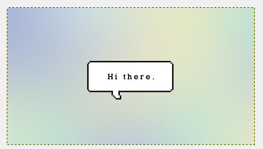
Follow this easy tutorial to find out how to make this cute gradient speech bubble graphic.
Things you need:
GIMP
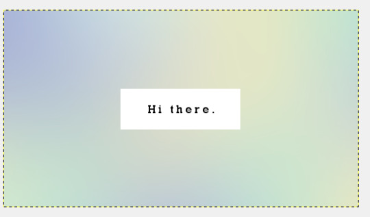
Start a new canvas. I'll make mine 540x by 300px.
2. Use the softest round brush and paint in circles of different colors like this. I'd stick to just 3-4 colors max.
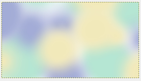
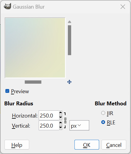
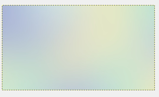
3. Go to Filters > Blur > Gaussian Blur and increase the radius by a lot. I think 250px is good enough for the size of my image. You might to increase/decrease this number depending on your canvas size.
4. Make two new layers: A text layer and a white rectangle (using the rectangle tool and fill it in with white).
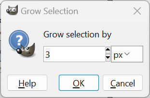
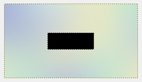
5. Right click on the rectangle layer in the layer tab and pick "Alpha to Selection". Then, go to Select > Grow and pick 3px.
Fill that new selection with black.
Move the black rectangle layer down. Ctrl +Shift + A to deselect.
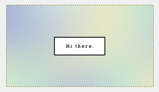
5. Add a layer mask to the black rectangle and zoom in really close. Remove these corners by using the rectangle tool to select a square cut out and filling it with black to erase.
Should look something like this when you're done.
Then, make a new layer on top of the white rectangle and put in a small square like this. Do this for the res tof the corners.
It doesn't have to be super perfect cuz it's not that obvious when zoomed out.
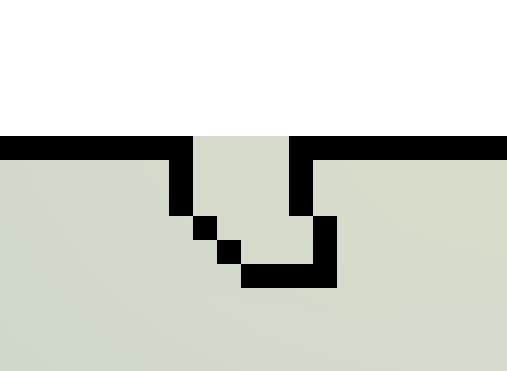
6. Select back the black rectangle layer and mask out around 4 pixels like this.
7. Then, use the rectangle tool to create a jagged shape like this on a new layer. Hold on Ctrl to add in the shapes and Alt to remove any extra bits.
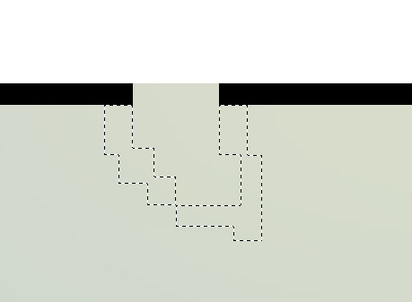
Once you are happy with the blocks and make sure they're all the same pixel width, fill it in with black.
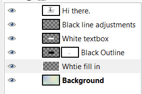
8. Make a new layer below the black outline layer and use a brush to paint in white. Now, my layers tab looks something like this (ignore the typo, LOL):
9. If you want to create a drop shadow, just merge down all the layers and duplicate that. Use the bucket tool to color it to whatever color you want. Then, put that layer below your speech bubble layer. Change the opacity to your liking.
And you're done!
3 notes
·
View notes
Note
haii !! i was wondering on how to put gifs in banners like the one on your profile?? 🎀🧐 I've always wanted to do something like your banner but i just don't know how...😔🎀

HELLO its pretty simple :3 i use capcut for putting the gif into the bg
i let an empty space for the gif on the banner / graphic / whatever
then i go on capcut and put the graphic in front of the gif , using mai banner as example :

after it i just export as a normal video on high quality
now yu go to ezgif on mp4 to gif converter and upload ur video there

do the config. there , but like usually yu dont need to so dont worry

THEN YUR GIF GRAPHIC IS READY !!!!!!
( just realized i used mai old layout pic lol )
# giftᧉd from 𐓟bove … ⟡#rentry tutorial#graphic tutorial#tutorial#rentry#capcut#tumblr graphics#tumblr layouts#icon pack#icons#random headers#twitter icons#headers#icon#random icons#twitter header pack#twitter headers
40 notes
·
View notes
Text
The remove background tool in photopea works fairly well If you´re used to remove.bg then working on photopea I´d recommend just skipping the visit to remove.bg (I should make more tries to see which site works better)
It will add a raster mask so you can touch it up later and it recommends you to use it twice for a better result.
#photopea#editblr#graphic tutorial#i´m putting this in the tags#but the second time i used it it said i could only use it once a day or watch a video#but then i tried again some time later#now‚ to write this post so i could copy/past the message#and it´s letting me remove the bg without problems#but watch the video#i few seconds of your time it’s not asking too much
0 notes
Text
Welcome back to "Icon Making With Killian: An Intro to the 'Lost' Art of LiveJournal Icons"
aka, you didn't think I was one and done, right?
This tutorial was written in Photoshop 2020, but you can probably recreate it in as far back as CS2-ish (since I still use the same sort of techniques I've been using since then, lmao). It also assumes basic understanding of the software, though I've tried to be as clear as possible throughout.
I was possessed with a need to both make an icon of Madara's new event card and then write a tutorial, so let's all be proud that I busted it out before Halloween 💪
I started with the bloomed art of Madara from The Howling Forest★Lupine Halloween event (image from the Halloween 2024 campaign announcement, because the event hasn't started yet).
Since there's a lot of extra text & etc on this, I knew I'd be cropping it pretty close. I started with a blank 100x100 canvas, pasted the original image in, and then resized + rotated it until I liked the composition/crop.

First up, I wanted to get some cobwebs in here (for Halloween!), but didn't want them to overwhelm the whole icon. I used a texture from lookslikerain, set to Lighten, and rotated it a bit before erasing anything covering his face.

Next, I used another texture from lookslikerain and set it to Darken. There's a lot of green in the images for this event and I wanna pull some of that back into the icon, since it most got cropped out.

Time for light textures!!! I used a bunch in this icon~ I started with one from lookslikerain (can you tell I love their resources?), rotated it, and set the layer to Lighten, before deciding that it was too harsh. I used a small, soft brush set to 30% Opacity to erase most of the texture from his face, as well as softening the edges of the light.
The next few light textures are kinda subtle, but overall add to the icon. I'd say sometimes less is more, but I'm a maximalist at heart XD For the next few steps, just assume that the light textures were rotated/resized/moved/etc as I saw fit. I used yet another texture from lookslikerain, set to Lighten, and tucked in the bottom right corner.
This light texture from Sanami276 is also set to Screen. I moved it around to get just a bit of orange in the top left corner- gotta keep those Halloween colors in there!! :D
I wanted some more depth/texture in the upper left corner, so I decided to use part of a texture from Sanami276.
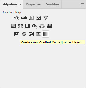
However, it's way to harsh to just throw in there like that...at least not for my purposes. I decided to invert the colors and recolor the black parts orange. My go-to method is with a Gradient Map adjustment layer. The easiest place to find it is in the Adjustments window.
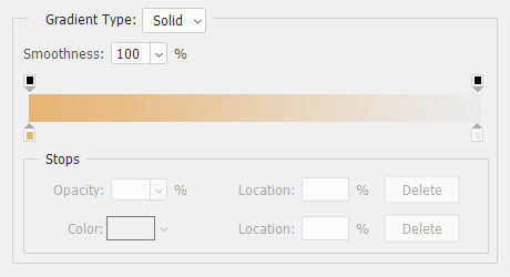
I then used these colors for the gradient itself: #e7b676 at 0% and #ececec at 100%.
And it left the texture looking appropriately orange! I then pasted it into the actual icon, moved it so the rectangles were in the upper left corner, and set the layer to Darken.
Now for more light textures!! I used a couple from ianthinae, set them to Lighten, and went to town. I cut them up, moved them around, rotated them...just about anything to make them fit where I wanted. I love playing with light textures in general, and I find that even when I use similar ones a lot, they can look very different depending on how they're place.
Finally, I used part of a large grunge-y texture that I've unfortunately lost the source to D: I inverted it and set the layer to Multiply, before moving it around a bunch until I found a spot that looked good.
And with that, it's done! You've now got some new skills to make icons with~
If you have any questions, please feel free to ask, and I'll answer as best I can- as long as it's not about making icons in other software D: I only know Photoshop (and Paint Shop Pro, but I don't think anyone uses that anymore). If there are any other icons of mine you're interested in seeing tutorials for - or even just specific techniques! - just lemme know. I love helping :D
Also, I'm happy to share where I get icon resources from. I have a whole post dedicated to that on my DW graphics journal, though tbh that's the best place to talk to me about making graphics in general. But I will absolutely answer asks/replies/etc about icons here on tumblr, don't worry!!!!
#livejournal#icons#tutorials#graphics#icon tutorial#graphic tutorial#photoshop#LJ icons#100x100#100x100 icons#tutorial#reference#halloween#madara mikejima#enstars#ensemble stars
13 notes
·
View notes
Note
How do you make your stamps? :0
Disclaimer: this is an obscenely long explanation, with pictures. Efficiency is stupid
So, for the static ones, I make a 99x56 px file on ibis paint x. Other programs are probably available online but I don't use them.
After that, I either upload an image I want to make into a stamp, or I draw one.
Then, I find a frame I want to use. Ill upload them here but let it be known I stole all of these right from deviantart


Most of them are from Lil-Devil-Melii on deviantart. The rest i have no idea. They're not all 99x56px but you can crop the canvas it's fine
Make sure to erase the edges of the picture , so they're transparent. It's not as cute otherwise
Upload those frames over your image in whatever art program you're using and viola, stamp.
For moving ones, it's a lot harder. Mostly because I refuse to download Photoshop.
There are a couple ways to do this. Some are simple animations, like with flashing text and whatnot. For these, you download the individual animation frames from your art program. Make sure it's transparent.
Then, upload each frame to ezgif.com under the option "GIF maker." You can play around with how fast each frame goes and whatnot but in the end, it'll be a stamp with some rad text that moves. This is easy, and doesn't make me want to shit my pants and cry. If you're new, do this. This is fun. This is good. This does not kill me inside
I made that↓ stamp with this method :)

this next one is how we turn gifs into stamps. This one makes me sad. It involves math and sucks. But we gotta do it. For the vibe
First, grab your gif. I'm using this cow gif because it's awesome

Then, I resize it using ezgif. Literally everything for this will be using ezgif. I am a simple man
At this point you should decide what frame to use. I'm using this one because its the first one I clicked
Figured out what size the inside of the frame is. That's what I resize the gif to, so the edges can be transparent. The inside of this one is 93x50 px, so those are the dimensions I'm making the gif.
Figure it out by putting the frame into ibis paint and realizing the canvas to fit just the inside of the frame, then seeing what the dimensions are. But there could be easier ways

Woah it's so small now
Then, still on ezgif, I go to the "crop" option.
Make sureeee to upload the smaller gif
press the button that says "extend canvas size", and then put the "width" and "height" as the dimensions for your FRAME. This'll put a bit of a transparent border around the gif. For this frame, I did 99px and 56px.
The "left" and "top" boxes show how many pixels the cropping happens from the edges of the canvas. The formula for finding that is
(width of gif / 2) - (difference between gif width and frame width / 2) = left box
For me it's (93 / 2) - (6 / 2) = 43.5
Then you do the same.for the height, which for me ends up being 22 from the top
This is reallyyy touchy and annoying though
Here's my result , with no visible difference

Okay so THEN you go to the "overlay" option, under "effects." And upload your frame. If the cropping was done right, you shouldn't have to move the frame at all and can just download it
Here's my result:

if you don't care about transparency, you can resize your gif to be the same size as the frame, and then put the frame over it. But I'm a slut for transparency
Anyways. I'm sorry if anything was unclear, it's two am. And I hope this was helpful :) these really are fun to make once you get it down
also if anyone has an easier way to make stamps from gifs, please god tell me
#web graphics#old web#neocities#custom#custom blinkies#stamps#page decor#web resources#da stamps#deviantart stamps#blinking gif#How to#tutorial#How to make stamps#Spacehey#deviantart#rentry graphics#old internet#early internet#stamp collecting#ezgif#stamp making#stamp template#Stamp frames#blinkies
6K notes
·
View notes
Text
𓆩♡𓆪 pixels tutorial ˖˚
꒰ step one ꒱ ↳ first, find an image or two on a search engine or pinterest/something like it. if doing images from real life (not art), try to use images that don't have noticeable lighting. for example, product images with white backgrounds are best rather than product images in a real life setting with strange lighting.
꒰ step two ꒱ ↳ either copy and paste the image or download and upload the image into remove.bg. use erase/restore as needed. download or copy this image.
꒰ step three ꒱ ↳ open either photopea or ibispaint x, and create a new canvas. set the size to 25x25 or 50x50 px and open/copy the transparent image into this canvas. shrink the size as needed.
꒰ step three ꒱ ↳ you're done! pretty simple, huh? good work \(^_^)/
#carrd graphics#rentry graphics#rentry decor#rentry resources#carrd resources#transparent#tutorial#rentry tutorial#graphic tutorial#editing tutorial#pixels tutorial#pixel tutorial#transparent png tutorial
14 notes
·
View notes