#practicing coloring + lineart + facial details/expressions
Note
Hi!! Love your artwork and your Charlastor AU with Dawn!!
I was wondering if you think Alastor would make any dawn-themed dad jokes and puns in your AU, and if he does, what would Dawn and Charlie think of them? I can’t really think of any off the top of my head right now, but I know ‘a brand new dawn’ is a phrase he could maybe use!
Again, love your art!!! If you don’t mind answering questions about it, do you have any advice for artists who want to improve their drawing or any practices that have helped you develop your skills? And are there any particular artists that really inspire you?
You’re one of my favorite artists and I don’t know how to explain it but your drawings have so much life in them!! 🌟
sdlksdflkj thank you so much omg!!!
I'm so glad you're enjoying them ;W;
And he would be insufferable with them lmfaoo, especially because I'm sure Charlie would hop in on a few of them and add to the pile as well xD
One more I can think of rn is "Oh, I was wondering where the sun went!" whenever Dawn enters a room, because the implied punchline is "but then it Dawned on me" or something? XD idk I'm not good with puns sadly
Now regarding the art advice!! This one got HELLA long so I'll hide it under a cut for everyone's comfort lmao
I know it sounds shallow and like worthless advice, but a huge huuuuge part of getting better at art is to just... make art! Practice makes perfect - it develops your motor skills, gives you somewhat of a muscle memory for certain basic shapes that are a necessity to have a good feel of for good foundation sketching.
Practice also develops your eye for compositing and for how color theory actually applies in practice, it basically helps you develop a more consistent grasp on art as a whole :D
There are some things I've learned over time that definitely helped speed things up though xD
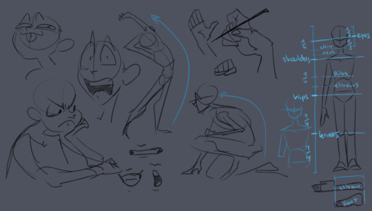
here's some rough sketches I did just to demonstrate what my rougher drawings can look like - also a little diagram (on the right side of the image) of things I keep in mind for the average proportions of a human body!
I tend to sketch very loosely and try to capture the overall vibe and silhouette/rough shapes first before I even think about adding details - there's a certain flow, squish and stretch to everything that's just much easier for me to get a good feel for when I use quick, loose brush strokes and as few lines as possible to convey a concept.
Repeatedly sketching humanoid characters of various shapes, builds and sizes for years genuinely helped enormously in getting not only faster but also more consistent with it!
I'm fairly well practiced with hands and expressions especially at this point since I like to focus on those in my art often, so those come fairly easily to me as well now!
Something I learned along the way about keeping a certain liveliness to my artworks is that sometimes you have to forego anatomical correctness a bit if you want to fully express specific emotions - if you try too hard to keep everything perfectly proportional and realistic, it can make the outcome look stiffer than you might've aimed for - this is something I actually struggle with in my cleaner artworks :'D The ones I do proper lineart for, since a lot of the flow of the original sketch gets lost in the process haha
As for artists/artstyles that inspire me...
There's @/southpauz for example!

Her artstyle is unbelievably expressive and her eye for compositing and her use of shapes is SUBLIME - it inspired me to let loose more with my expressions, exaggerate features a bit more and to push the way I try to vary facial features :D
Then, back when I had that massive Rise of the TMNT phase, the artstyle of it has actually greatly influenced how I draw today!
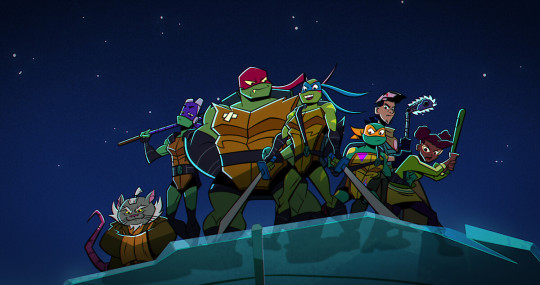
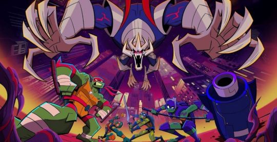
It manages to be detailed and highly recognizable despite its deceivingly simple style - it exaggerates shapes and uses it to communicate personalities, emotions and action super effectively and taught me a lot about utilizing those more efficiently myself :D
And last but not least Ishida Sui - the mangaka behind Tokyo Ghoul (which used to be a highschool obsession of mine)
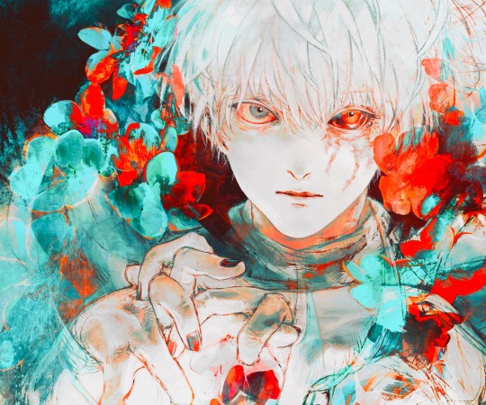
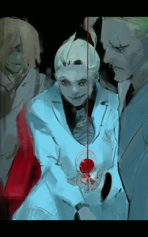
His striking use of colors, textures in abstract, yet symbolically heavy ways and his courage to be rough and expressive rather than looking polished, yet also having such a solid understanding of realism blew me the fuck away as a teen and still does now!!!
His art may have less of an influence on my style today than it used to back then, but I think in my more exagerrated, more horror-esque drawings you can kind of see it still :'D Either way I greatly admire him as both a writer and artist.
-----
I'm genuinely so so flattered that you enjoy what I do enough to give me such high praise, thank you so much for writing me such a wonderful ask <3 I'm glad I got to gush about some of my favorite artists/artstyles for a bit haha
If you have any more specific (digital) art related questions don't hesitate to reach out!! I love giving pointers about a subject I'm so passionate about, we don't gatekeep helpful information in this house!!! <3<3<3
46 notes
·
View notes
Photo
#my art#ozymandias#fgo#practicing coloring + lineart + facial details/expressions#trying to find a style too hhh#kinda like this one tho.
7 notes
·
View notes
Text
I was working on a drawing, and I realized that I don’t think I’ve ever shared the whole process, start to finish before. And this time, I can, because I was texting screenshots to my wife!
So. Here is the finished piece. And the process pics will be under a cut, if anyone is interested. I haven’t done a proper drawing of Avery in over a month- that’s too long to go without drawing them.

So! Process. I usually start with a rough sketch- for this one, I was doing facial expression practice and I came up with one that I liked so much I decided to take it further.

After that, I cleaned it up a bit, did the hair and horns in more detail.

And from there I go in and really neaten everything up. (I used the 6B pencil brush in Procreate for my clean up and the Gelsinki Ink brush for my rough work, in case anyone is curious. Both come with the Procreate program).

Then, I move on to lineart (For this, I use the Technical Pen brush in Procreate, which also comes with the program).

After this, I go in and just do all the flat colors. This is one of my favorite parts- I have a palette pre-saved that I use for Avery, so I just pull from that.

From there I start shading. For this one, I did some simple highlights on the edges and some shadows in the darker parts. I also did kind of an all-over shadow, where I just go nuts with an aibrush and then adjust the opacity of it. I really like how it looks.

After that I start the details! I have a pack of hair brushes and there’s one in there that I LOVE using to add color and texture to the hair- I add a lighter shade and a darker shade in streaks to resemble strands. Then, I blur the whole thing, adjust the opacity, and I add kinda that wavy not-quite-highlight that you get in hair using another brush from that pack to draw and a different one to blend it out. (I also removed the background color, it helped the highlights to pop more and I could see what I was doing a little better.

And then... I had too much fun with the highlights and the background. I used the same hair brush I used for the hair detail to add the thicker strands, a fine tip for the thin ones. I then added an additional layer of highlights and blurred that out to give everything a soft illuminated look (the luminescence brushes are awesome but just a BIT too harsh for this). For the chains, I did a layer behind everything in white, duplicated it, and blurred out the layer on top. And for the chains in front I did the same chain brush in black and then just blurred that out, to keep Avery in focus. I also have a fun thing I like to do with the eyes- when I do that all-over shadow, I go in and erase it just over the irises. I think it really gives the effect that her eyes are glowing from within, or super-bright.

Finally, I brought back the background color, added some more sharper highlights to her jewelry, lips, and teeth. Added in some more little chains on her piercings, and for fun I did a little chain detail at the very back.

And there’s the finished piece from above! This was a lot of fun, took me about 4 hours in total (I think give or take).
Oh, and if anyone is wondering where I get my references- I have the MagicPoser app, and I use that for basic stuff like head angles, figuring out lighting, etc. For everything else I scour Google image searches until I find what it is I’m looking for!
#my art#art#drawing#procreate#Avery is my blorbo#my character#I had never drawn her well and truly PISSED#which is odd because it's one of her like four main emotions#So this was super fun!#I love getting to show off that more feral side of her#look out! they bite!#digital art#DnD#DnD characters#my DnD character#OC
6 notes
·
View notes
Text

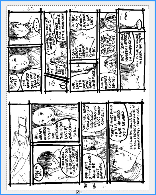
I've been debating whether to show this for a while, but I can no longer resist. Here's a behind-the-scenes screencap of the sketch of Outlander, which is probably the most elaborate sketch I've ever drawn of one subject. Things of note:
The color palette was chosen in advance, got changed a bit during coloring.
Detail sketches are rough but otherwise very close to the final lineart. The pole (handle?) of the scythe is shittier than the other sketches and made me miss the curve tool from MS Paint.
Layers are named, but not by my usual naming convention of "sketchDetail." This is because trying to draw this pose was breaking me mentally. I don't know if there was ever a "sketchB."
Layers are distinguished by their own "pure" color (each value either 255 or 0).
There're a few layers that desaturate the image so that the pure colors wouldn't sear my eyeballs any further than they already had.
Stylization practice doodles on the left side of the screen.
Their facial expression, 😄, is different than the final product because I couldn't get the first idea to look right.
This is a time capsule of my progress because FireAlpaca refused to save this file after a certain point, so I had to continue after saving it as a different file.
"customer service face"
I originally just wanted to show the sketch's face, but now's a great time to talk about my art process since I just posted a year review!
#Yes this is the drawing whose references inspired my infamous 'scythe wielders' post.#IDK why you would reblog this. You can if you want but I won't understand you fully.
1 note
·
View note
Photo

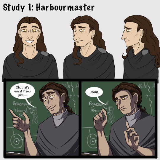


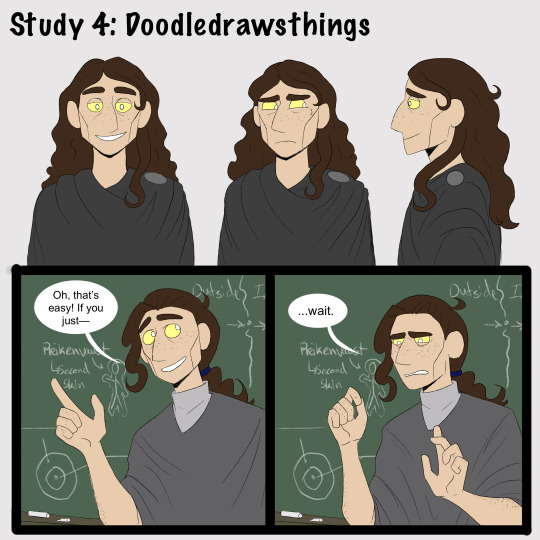

[Brief image description: A series of illustrations of Gerou teaching in front of a blackboard. The illustrations repeat, each in a different art style; at the end is a collection of doodles mixing the art styles and a few notes reflecting on the exercise. Full description and transcript starting at the heading below the cut. End ID.]
Part one of some recent style studies I’ve been doing, featuring Gerou struggling with student teaching!
I wanted to explore how different artists that I like handle stylization and simplification in comics, and when I asked around several people gave me permission to post the results. I recommend checking them out!
1) Harbourmaster is by @waywardmartian.
2) Never Satisfied is by @ohcorny.
3) Broken is by @yubriamakesart.
4) @doodledrawsthings makes a lot of content that is posted to tumblr, most recently a fair amount of A Hat in Time fanart.
Thank you all for the permission to post! ^_^ I'm having a lot of fun with this.
.
Side notes:
I genuinely thought that the Harbourmaster style would be easiest for me, since it contains roughly the same amount of detail as my own style and since I’m like 75% sure that reading it as a younger teen informed a lot of my own style and character designs. Turns out it was actually the hardest! Perhaps because, since there aren’t as many blatantly fundamental differences, I had to pay more careful attention to proportions and specific forms?
.
Never Satisfied was interesting! Alongside the work of Doodledrawsthings it’s definitely the furthest from my own style, and choosing Gerou for this honestly doesn’t do that difference full justice. I looked a lot at Fidelia, Sylas’s mom, and Thierry in trying to figure out how Gerou’s facial features would translate. Part two of my plans is to explore different character designs that might make fuller use of the difference in style, heh. (In other news: Colored lineart looks very neat and studying how it’s handled in NS is the first time I’ve been able to carry it off in a reasonable time frame, hah.)
.
Broken is just... very pretty, y’all. xD I don’t think it really saved me any time or much ease of drawing over my own style, but it’s very nice to look at. And I think the style differences and specific simplifications do lend themselves very well towards creating more consistency than I ever manage in my own art. Noticing the patterned way of drawing ear details was a fun moment for me, I’d never really thought of codifying anything that way before!
.
I did the first drawing in Doodledrawsthings’s style (the 3/4ths view in the turnaround) and thought “Oh goodness this is lovely and quick and feels nice.” It’s very nearly the first time drawing something in a cartoony style has ever come easily for me. But... I struggled much more with every other drawing in that style, ahah. Still, it was comparatively quick and I do love the expressiveness of the stylized eyes. :D This is another style where I think I’ll need to explore a wider range of character designs, though. I think it’s also worth thinking about how character design is fundamentally changed in some ways by the change in style; some of what I would think about designing a character specifically for that style is very different from the details I would normally think about when designing a character.
.
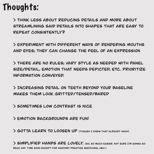
[Detailed image description:
A series of images repeating the same content in different art styles, followed up by a page of sketches and a page with text notes.
The repeated content is a turnaround of the character Gerou as well as a short two-panel comic showing Gerou as a student teacher in front of a blackboard. Gerou is a thin white man with sallow freckled skin, a large hooked nose, long wavy brown hair, and glowing orange-yellow eyes. In the comic, in the first panel he gestures animatedly with a wide smile and says, “Oh, that’s easy! If you just--” then breaks off. In the second panel he holds up a hand as if asking for a pause, and says, “...wait,” with visible consternation.
The sketches feature continued style experimentation with Gerou making a number of expressions and gestures, including: absolutely failing to maintain a good pokerface; looking stressed; various smiles, from tired to nervous to wide and happy; sighing tiredly; sticking out his tongue with arms crossed huffily; arguing with someone; drinking tea; and fighting off a dizzy spell.
The text image is headlined Thoughts and reads as follows:
Think less about reducing details and more about streamlining said details into shapes that are easy to repeat consistently?
Experiment with different ways of rendering mouths and eyes; they can change the feel of an expression
There are no rules; vary style as needed with panel size/detail, emotion that needs depicted, etc. Prioritize information conveyed.
Increasing detail on teeth beyond your baseline makes them look gritted/tensed/bared
Sometimes low contrast is nice
Emotion backgrounds are fun!
Gotta learn to loosen up (though I knew that already hhhh)
Simplified hands are lovely. (So, so much easier. Not sure I’m gonna go back anytime soon except for anatomy practice sketching, heh.)
End image description.]
#I have been hyperfocused on this for a week straight whoops#art#style study#artists on tumblr#style experiment#comics#my art#my stuff#sketches#Gerou#Imperfect Science#image described
35 notes
·
View notes
Text
Lava’s Art Masterpost
Hey, all! Welcome to my art masterpost! I have no idea if this is a thing that is done typically for art, but oh well, I like organizing things, so here we are! What you’ll find here is mostly Dragon Age, with a few non-DA pieces in there, and there’s a range of styles I like to use, depending on my mood. But a lot of what you’ll see will most likely combine lineart with some other form of coloring/shading.
Feel free to browse at your leisure, and I hope anyone who stumbles upon this enjoys what they find! :D And thank you to anyone who sees this and likes, or reblogs, or even just stops by to peruse a bit!
All that said, away we go!
Digital Portraits:
1. Portrait of Nameless Woman, 2020 - This one is just an experiment with a watercolor brush that I did. It’s not anatomically perfect, but I enjoyed playing around with shading.
2. Sketch of Aja Amell, 2020 - This one is basically sketch practice with my Amell~ Not really the most expressive pictures, but it’s a start toward drawing her more expressively. Full disclosure: Aja is one of those OCs of mine that I have had trouble with deciding on a definitive appearance for several pictures, and I really want to work on upping my level of consistency when drawing her.
3. Long-Haired Fenris, 2020 - Exactly what it sounds like; this was for practice drawing Fenris’s features (I love how distinct they are), but with long hair because I am weak for it. This one was a fun piece to shade, and mixing the stylized lineart that I normally use with a greyscale shading spectrum was really enjoyable.
4. Portrait of Ilorin Lavellan, 2016 - This is an oldie. Basically practicing expressions, and it is technically a WIP, but I’m still very happy with how the shading turned out, especially because this is actually (aside from the unfinished hair) one of the more minimal pieces I’ve done in terms of lineart It’s still there, and it still shapes the flow of the picture in some ways, but it also ends up flowing with the shading instead of standing out next to it, which I like. (Both styles are good, though, and I love seeing other artists try both too.)
5. Old Portrait of Aja Amell, 2016 - Much older picture I did of Aja; she... honestly looks very little like the newer one, I think, and that consistency is something I’m still working on, but this one was the first picture of Aja with that particular hairstyle I drew. What I like about this picture is how young she looks; it fits with her image as a fresh and sheltered Circle mage who’s only about 20 years old at the time of DAO.
6. Old Portrait of Trilyn, 2016 - They very first piece of art I posted to tumblr~ It’s not exactly how I envision Trilyn anymore, but it was still very fun to draw, and helped me get a feel for drawing him in the future.
Dynamic Movement Pictures/”Moment’s in Time”:
1. Tabris in Arl’s Estate, 2020 - TW: blood. I am super proud of this one. My ultimate goal is to draw all of my Warden DAO OCs, and I could not believe I’ve never drawn my Tabris, and so here she is. This was, in large part, practicing expressions because I absolutely love art that depicts characters in motion, or capturing some kind of expression.
2. Velyn in the Rain, 2017 - This one was actually based on some art that I saw in a Teen Wolf fic! It was an experiment with a more expressive style (and one of the first pieces I did without lineart left in the finished version) and it was a huge step out of my comfort zone. But overall, I am extremely happy with how it turned out.
3. Jem Nocking an Arrow, 2016 - And here is the lineart version. This was entirely an excuse to draw my DAI baby, Jem, and to do a cool archer pose because archers are my fav, and I love characters in motion.
4. Solas Teaching Trilyn Fade Magic, 2016 - This one was a painterly picture that was also (like the Velyn picture) something which I tried to keep lineart out of. Overall, I am proud of a lot of parts of the pic, but I think I would definitely go back over it and change a few things now if I had the patience.
5. Trilyn Closeup WIP, 2016 - TW: injury, blood, mention of abuse in the author’s note. A lot of early pictures I have are of my OC, Trilyn, and this is one of my absolute favorites. His entire upper body is technically in the picture, but I hadn’t finished rendering it yet, so this was what I posted. And it was an experiment with a cross-hatching style with the pencil tool for some texture, with air brush shading and a blurring tool. It’s a style I had fun playing around with!
6. Trilyn Blood Ritual, 2016 - TW: blood, injury (the slight cut used to supply the ritual with blood). This one was definitely a sort of “captured moment” from a backstory I gave Trilyn, and I think what I was really going for was an atmospheric piece that could fit with any potential fic I wanted to write for Trilyn. And then it ended up being practice for extreme lighting/shading techniques, and drawing the blood and the gross mass of demon ichor (or whatever the heck that is) turned out to be highlights of making the piece for me.
Art + Text:
1. Freedom and Control, 2020 - TW: scars, but very difficult to see. This one was ambitious for me! It started originally just as Solas and my Tal-Vashoth OC, Saara, facing each other, because I love the dynamic I’ve built for them in my head, but then it turned into an attempt at a tarot-esque background, and just sorta grew from there... Overall, I’m happy with how it turned out, especially with how Solas and Saara themselves turned out. The version you can actually see a larger view is here.
2. Marianna and Delia Codex and Art, Pt. 1, 2020 - I love writing my own codex entries, first off, and I love combining art with text to create a (hopefully) seamless work. This work was an attempt to flesh out these OCs of mine with both art (because unique facial structures are hard for me to get down, but so important regardless) and text (because writing~). I think it turned out well overall, but there are elements of the portraits that I might at some point touch up a bit.
3. Marianna and Delia Codex and Art, Pt. 2, 2020 - Part 2, with what I refer to as a “DAI Outfit Change” because I have always loved seeing fans show their own OCs as they look in DAO, DA2, and then finally DAI. So I absolutely wanted to jump on that bandwagon myself. The skin tones are a little off (and I’m sorry about that!) because I was playing with the watercolor brush at that point, and it dilutes the colors I use. Still working to figure that out, but I was very happy with the overall lineart and structures of the faces.
4. Alistair/Aja Amell Picture with a Blurb, 2017 - Ooooold, old, old, old, OLD! I still love the art, and I’m soooo happy with how the interaction between Alistair and Aja turned out (drawing kisses is extremely difficult for me; I always end up creating a distorted weird lip-creature, instead of realistically puckered lips...). I’m not as happy with the blurb that went with it? At that point, I was still very much figuring out my own DAO worldstate, and the characterization for everyone, so, eh. Take it with a grain of salt!
Unfinished Costume Designs:
1. Ancient Elvhen Armor with Dwarven Influence, 2018 - People who do costume design work are amazing and mystical beings, and I wish I could do what they do. This was an attempt at merging the Keeper robes from DAI with a more dwarven armor aesthetic, solely because I created an ancient elvhen character, Ceda, who was taken in by the Cad’halash dwarves mentioned in the Witch Hunt dlc, and I wanted this character to have a mix of the elven style of armor and the dwarven style. I’m overall decently happy with it, but there’s still that persistent level of self-criticism present.
2. Herald of Andraste Outfit WIP, 2016 - This was a very old picture, not one I showed around a lot, but the idea for this was entirely born of my intense interest in how fashion and outfit designs could be used to create a symbolic image for the Herald of Andraste. In general, I love the combination of ceremonial armor with long and flowing cloth, so that was what I went for here. I’m still actually very proud of how this came out, and headcanon something similar for my Herald in my canon DAI worldstate.
Pencil Sketches:
1. Quick Saara Sketch, 2019 - TW: saarebas mouth scars. Exactly what it says; very quick sketch of Saara I did in a small notebook I carry around with me. This was basically a test for myself to see if I could manage to draw Saara with the features and facial structure I envisioned for her without needing to use a lot of references.
2. Mass Effect Character Sketch; Jesse, 2018 - Similar reason for drawing this one as the above Saara sketch! With these characters, I love sometimes the way they can turn out with the specific character creator used for them, and when I draw them, I enjoy trying to create a definitive look for them using what I get from the CC, and my own knowledge of Hooman Faces.
3. Saara Sketch, 2017 - TW: saarebas mouth scars. A more detailed sketch of Saara than the one above, and one I definitely put more time into overall. It’s currently the profile picture I’m using for ao3, and is the definitive go-to reference picture I use whenever imagining Saara in a fic, or for other Saara pics I make. I am extremely proud of this picture, and feel like I should work in graphite more often. It’s such fun, and the texture is so nice to look at.
4. Sketch of Nameless Alamarri Woman, 2017 - This was a sketch I did of what I envisioned some Alamarri tribes to look like; I used artistic depictions of Gaul tribes and hairstyles for inspiration, and have used this as a go-to reference for my version of Alamarri tribes. Nothing super notable about this one, but I really liked the way the shape of her face turned out.
Events and Gifts:
1. Another Scar, 2020 - TW: blood, injuries, gore. The most recent piece of art on the list, and a gift for @cartadwarfwithaheartofgold; featuring sisterly love between Rica and fem!Brosca, which was her requested prompt. This was a tough piece for me because of the difficulty with the lighting I dealt with. For some reason, that one particular element of it gave me so much trouble. Overall, I’m very happy with how it turned out, though, especially the skin tones of the sisters; Brosca I always sort of like as having this greyish, more gaunt look to her, while Rica I like seeing with a darker, richer, and warmer tone to her.
2. A Very Cousland Christmas!, 2019 - This was for a holiday exchange for a server, and I drew a friend’s Cousland (Elissa, the girl on the left) with my Cousland (Gazza, the girl on the right). I love kid-fic, and I love kid-art, and so I decided... baby Cousland art! Drawing kid proportions was the toughest part, I recall, and I thiiiink it turned out well, and I’m still quite proud of it overall. Elissa’s design came entirely from my friend, but I added the holly~
3. Exchange Gift with Dis Brosca and Mabari, 2018 - This was an exchange gift for @fanfoolishness, using her lovely Dis Brosca, and was my first real attempt at backgrounds... I struggled with the coherence of the foreground and background a bit, but I’m still very proud of how it turned out, especially with the colors I had to work with. What I also really enjoyed working with was the lighting and the expression on Dis’s face. Backlit subjects are always fun to play around with!
4. Inktober Picture, “Deep”, 2017 - TW: scars, injury, mentions of abuse in the author’s note/attached dialogue snippets. This was for an Inktober prompt (the only one I’ve ever done, sadly... because I am bad with deadlines...), and again features Trilyn. Trilyn’s backstory has him a former slave in Tevinter, and a lot of the early works I do for him are sort of deep-dives into his life there. It’s all meant to be an exploration of the things he endures, and then those moments when he overcomes it all and takes back his own autonomy and self. This art is definitely provocative, and I can understand if not everyone likes it, but to me, I just wanted to show just what he faces (without glorifying it) before showing the moment of his own triumph.
5. Christmas Holiday Picture with my Brosca and a Friend’s Amell, 2017 - This was a piece of art drawn first by a friend of mine, @nanahuatli~ She drew the Amell, the background, the mistletoe, etc. All I did was add my Brosca to the mix to finish the image. It was a lot of fun to do, 1) because it was fun trying to match her style so that the picture looked cohesive, 2) because I love doing collabs with friends, and 3) because it was just such a fun thing to imagine my surly short Brosca, looking at this weird plant/fungus/thing dangling over some puckering human! It was an absolute joy to do this collab with her!
6. OC Kiss Week Pic of Jem and Saara, 2017 - TW: saarebas mouth scars. A spur-of-the-moment thing meant to demonstrate just what kind of dynamic my OC, Jem, has with my other OC, Saara (both of whom are members of Leliana’s network in DAI). This was a very quick picture (deadlines...) and was mostly just to have fun drawing these two characters interacting, and to see if I could make them look like themselves. I think I did a decent job with it overall, especially with Jem’s kissy-face! (Again... drawing kisses are the bane of my existence, although hands and feet take a close second.)
11 notes
·
View notes
Text
just a little cat design tutorial/exercise by yours truly
as someone who frequently watches animation and art on places like youtube cough warriors cough, I love seeing interesting character designs. we always need more diversity in design, so I was hoping this could be a helpful little guide for people looking to improve and practice how they draw cats.
to start, here’s the most-needed design tip, imo:
if you take away the colors, you should be able to identify the character.
too often characters, especially animals, have same-face syndrome - where every character looks the same apart from their colors/markings. this is fine for beginners, but if you’re looking to take your art to the next level, you should be looking to diversify your designs.
so if you’re interested in some practice, let’s have a go!
1. download/save this base (free! use it as you please with credit):

this base will serve as an average cat reference. smooth fur, not too stocky or slim, no add-ons or anything interesting. just an average cat.
2. open it in your preferred art program (it’s a transparent .png, so it should be usable pretty much anywhere! you can/should size it up on a bigger canvas, the quality won’t matter since you’ll be drawing over it anyway).
3. make a copy of the layer.
4. turn down the opacity of the first layer to about 30%. you want to be able to see it, but not enough that it will distract you from your working layer.
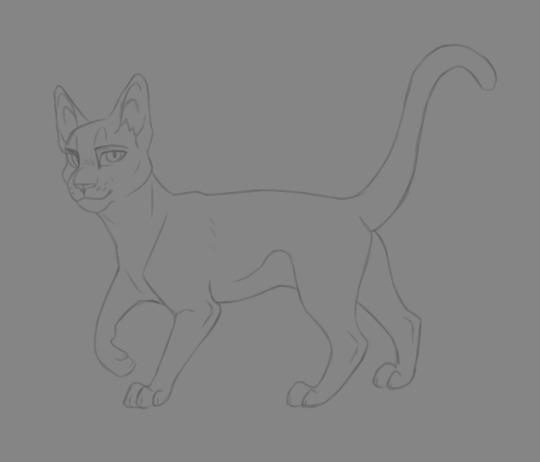
5. switch to the second layer. this is when you’ll start erasing areas where you want your character to have differences from the average cat.

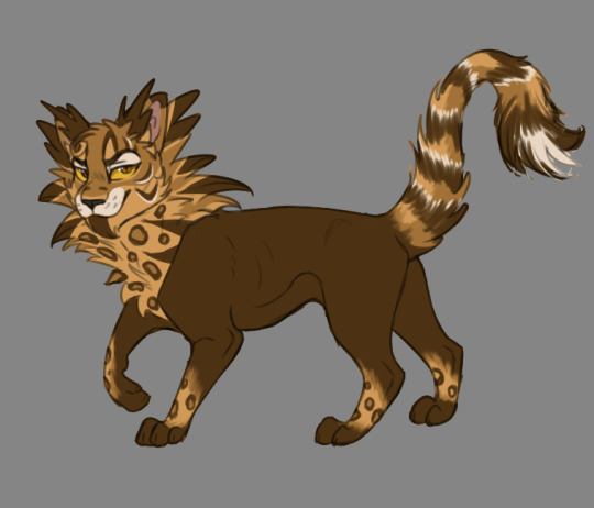
for example, I’m going to use my design for Rum Tum Tugger (from Cats [the musical], who has a very distinct silhouette. I want to use his costume design and actor as a reference for his attributes, so I’m going to make him slimmer in the middle (I love you John Partridge), keep him smooth for the most part, and leave room for some serious tufts around the head and tail. his eye shape is also going to change, and his expression. [see above]
6. alright, now comes the fun part! on a new layer, start drawing everything and building up your character! the bottom layer will serve as a guide for you so you can keep an eye on anatomical changes as you go.
some tips:
- don’t be afraid of big shapes!
- add some flair in the expression!
- try some things, and if you aren’t sure if they look good, save that layer, make it transparent, and try again on a new layer, then compare the two to see which you like more.
- think about your character’s personality as you draw: are they cold? use more smooth and/or angular shapes. are they flamboyant? poof them out more, like good ol’ Tugger here. are they friendly and lovable? try some rounder and fuzzier stuff. associations and shape can take a design to the next level.
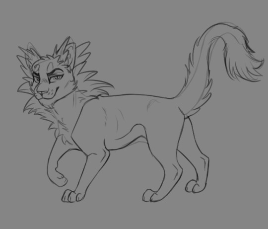
7. delete the bottom layer and make some final touch-ups on your design. you’ll most likely want to draw a new layer over it to make sure everything is smooth. the lineart should be fairly clean and easy to see. (mine here is a little sketchy but that’s ok)

8. now it’s time to add color!
remember some basics:
- don’t oversaturate - if you want, say, gold, tone it down to a more muted gold. same goes for any color. you’ll thank me later.
- pick complementary colors. there’s all kinds of color guides for this with a quick google search.
- never use straight black (except for lineart). always go to a different color as the base and pick a shade that’s a very dark version of it. for example, for a black cat I’d use a dark, desaturated blue that’s almost gray. it looks like black, but brings more life to the design.
- less is more with markings. Tugger may be a bad example, because I wanted to get him similar to the pretty elaborate costume; but you don’t have to put a million bells and whistles on your design to make it interesting and good. simple is often better, as it’s more memorable and easier to look at, as well as easier to draw (especially if you’re animating, oh boy).
- with more complex designs, like Tugger and his spots, it helps to have something that brings out the expression and face. in this case I used white (well, off-white) around his eyes and mouth, so your eye goes straight to it and can pick out his facial details better.
and that’s all folks!
for reference, here’s another design I did using the same method and base:
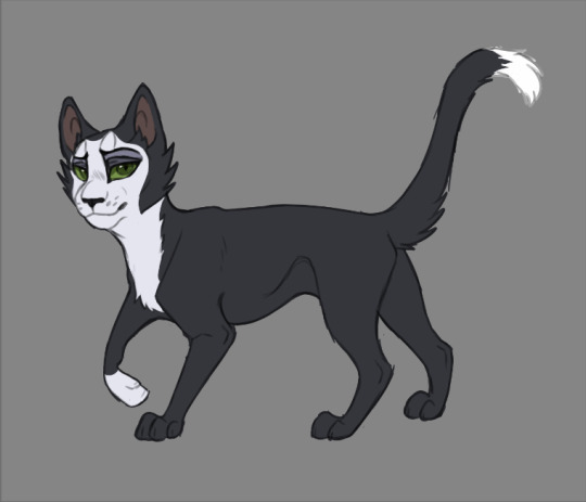
for Mr. Mistoffelees, I slimmed him up a lot more in the middle and legs, gave him some little tufties, and went for shorter, more equidistant triangular ears to pull off his original costume design. I also copied some of the makeup design around his eyes, giving a more pronounced expression. (it really helps that people have already designed the costumes to stand out well at a distance).
don’t be afraid to play around! that’s the fun of it, and no matter how many designs you scrap, you’ll be building your skills just doing it. tracing and re-tracing is the #1 best way to learn art - so long as you don’t present it as your own original work, of course c;
so go ahead and have some fun with it! feel free to tag me in any designs you make, I’d love to see them!
40 notes
·
View notes
Photo
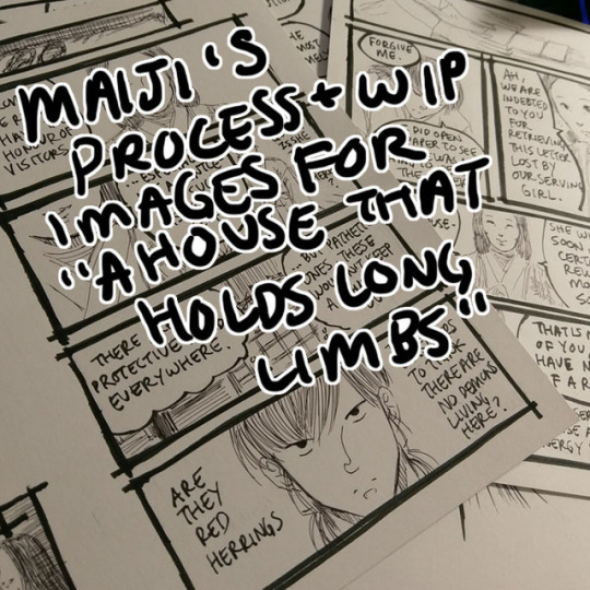
Process and wip images for A House That Holds Long Limbs (Part 3)
Previous process and wip documentation: Part 1 / Part 2
Read the pages for part 3 here (full complete version will be linked from YYH North Bound master post)
In Parts 1 and 2 I went through the transitions between idea, script, thumbnails and final art in quite a bit of detail. This time I’ll share script and thumbnails and point out some of the biggest changes, and then talk about how I scan and clean the final artwork.
Script and thumbnails

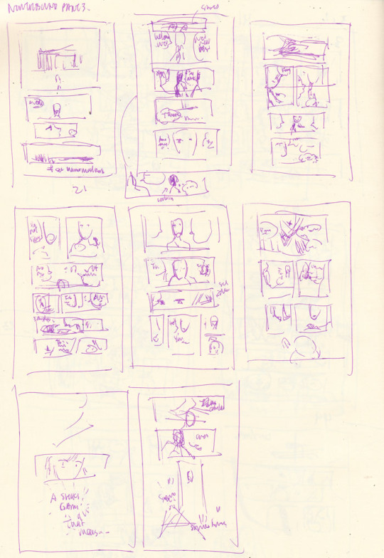
Biggest changes:
Dialogue changes every-freaking-where. Changes in word choice, moving things around to make the dialogue flow better, rewriting to make things flow better up to the umpteenth hour (i.e., right when I’m inking).
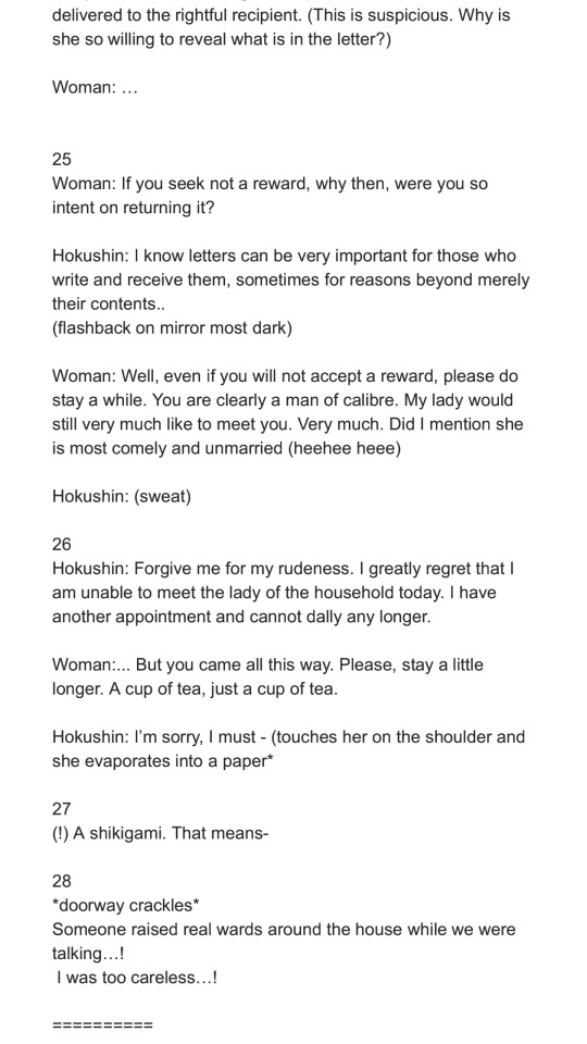
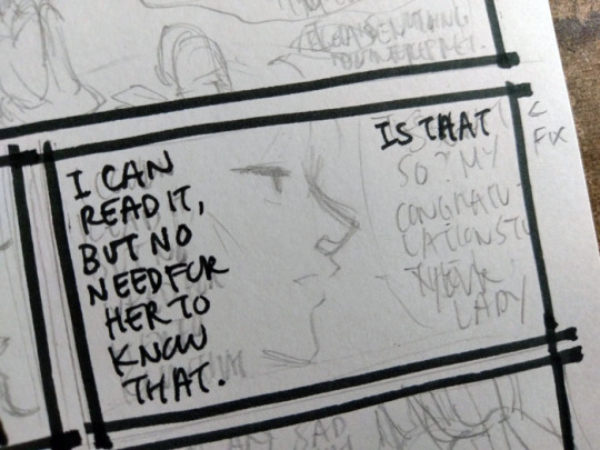
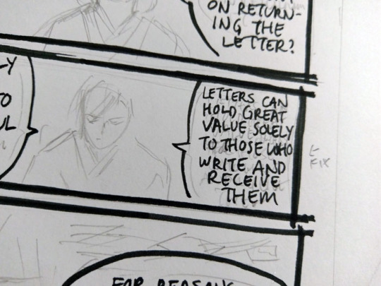
Page 24 “It is enough to know the letter has been delivered” - this thought has been transplanted onto the next page. I was also running out of space on each page for so many wordy words. Looking back now I’d probably like to move Hokushin’s “I can read it, not that she needs to know that” earlier in the sequence of panels, but it’s too late and whatever.
Page 25 split into two pages because 1) the dialogue started growing on the first of the 2 pages and I wanted to give more emphasis to the woman dropping her “tee hee I’m matchmaking” bomb and Hokushin’s “lol get me out of here” expression.
The last page with Raizen did not exist in the script or the thumbnails. I tacked it on at the last second because the previous change increased the page count to 9. I’m drawing 2 pages up on an 11x8.5 sheet of paper (so each page is about 5.5 x 8.5), so this meant I was left facing an empty page. I impulsively threw in a “meanwhile, Raizen’s shenanigans” for fun.
As an aside, this level of dialogue is what I was anticipating the hypothetical “let’s separate Hokushin and Raizen with some random NPC offering a job” scenario to involve (see Part 1 process and wip discussion). You can see why I was so eager to ditch that idea and find something simpler and more efficient.
I feel like "I was (too) careless!" is such a stock (shounen) manga phrase. Therefore I must work in "Seems like I underestimated [...whatever thing they underestimated]" and "Impossible!!" into upcoming parts of the story lol.
Inking
Part way through inking I actually ran out of ink in my new cartridge. I had started the comic with 0.3mm Muji black pen, and it ran out a while back. I switched to 0.4mm (because that’s all they had in stock at the time)... and then actually ran out of the ink part way through on these pages. @atorier lent me a 0.3mm refill so these pages mix both thicknesses in the art. I can’t really tell the difference though... can you?
Part 3 was super fun to illustrate because it’s 90% subtle facial expressions, one of my favourite things to draw. The downside is WAY TOO MANY WORDS BEING SQUEEZED IN EVERYWHERE. I’ve never been very good at managing my speech bubbles - drawing them, positioning them, and fitting words in them. I never give them the time needed for proper planning and I often write rather impatiently, as if I am jotting down a note, instead of carefully lettering each word. They’re simply very sloppy, which results in a lot of mistakes...
It used to be that when I made a mistake in the later stages of the art (mainly, inking) I’d cry and throw everything out because I’m a complete failure, this is all worthless, etc. Nowadays I’m like uhhh... #@^&^#$!!! Oh well. Depending on the mistake I still have moments of I’M A COMPLETE FAILURE, but then I just redo it on the side or add a note to myself to fix it on the computer for the final version. Here you can see a whole bunch of mistakes around lettering and placement of things.
And this is just to make it more legible. It’s still ugly lol. (That’s why I use a font for my webcomic...)
Scanning / editing
Long Limbs is drawn in black and white which makes it a hell of a lot easier to scan/clean/prep final art. I use an old Canoscan LIDE110. I’ve upgraded once or twice but always to another Canoscan (basically whatever the latest version of this series is). It’s a cheap workhorse and lots of other scanners use Canon’s scanning technology so it’s always suited my purposes very well.
For black and white lineart, I scan at 600 dpi black and white. These are my settings as they show up in the default scanner software:

For clarification, the only parts I really pay attention to/change is Color Mode (black and white) and output resoluton to 600 dpi. Most of the other stuff was already calculated or set.
Industry practice is generally 1200 dpi for black and white line art, with 600 being a ���if your computer can’t handle it and is gonna blow up... this is sufficient”. I rarely bother going up to 1200 mainly because I don’t usually have applications where I need it for output (this comic is not intended for print, for instance. And even if I ever do someday print it for whatever reason, it’s not likely to be bigger than a small comic). Scanning in black and white mode also conveniently kills most of the pencil lines I still have left so that post-scan cleanup work is minimized to a degree.
Here’s a shot of the page that was scanned.
Oh god look at all the mistakes that need to be fixed hahaha.
On the computer, I crop the individual pages and save them separately. Then I blow up to 100% and start selecting/deleting unwanted dust/artifacts/dots etc. Sometimes I also just use the eraser for cleaning fine details, but select+delete is faster for large patches.

This is also the opportunity to make corrections. To be honest, there’s not much retouching on these pages because I am lazy and trying to get them out as quickly as possible, so it’s mostly getting rid of artifacts, a few stray lines from ink smearing if I smudged or erased before it was fully dry, cleaning the shapes of a few letters to make them more legible, deleting errors and pasting the fixes over where the errors used to be, and any really stupid mistakes I’ve made - like drawing the fixes to Hokushin’s hitatare in Part 2. For redrawing/adding new parts on the computer, since the art is in black and white mode at such a high dpi, almost any brush will work great and look indistinguishable from the scanned lines when scaled down.
I save a high res TIFF for my archives. Then I convert to greyscale (better for maintaining details when I resize, since black and white can drop things that aren’t 100% black or white), and resize to 72 dpi at 700 pixels wide. 72 dpi has long been the standard for on-screen viewing - nowadays screens can display higher resolutions (e.g., retina) but this looks fine to me so I’ve long stuck with good ol’ 72. I arbitrarily picked the 700 dpi width - it seemed a good balance of “not too small” and “looks big enough to let you see the art nicely” on Tumblr. Below are my settings to resize:
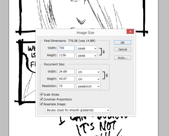
Again, the above I mostly only pay attention to width and resolution. All the other stuff is mostly default or autocalculated. All my pages are different heights, which I don’t really care about since I’m just posting them on tumblr and pixiv. Finally I save as JPG for posting.
Ta da!
#yu yu hakusho#comics#fanart#hokushin#raizen#wip#process#drawings#yyh north bound#art by Maiji/Mary Huang#scanning artwork#cleaning artwork
5 notes
·
View notes
Note
Why have I not discovered you sooner, seriously I love the art style with the bionicles? Any suggestions for a fan trying to draw bionicle?
It’s been a while since I’ve poked my head into the fandom like I used to, but I do have a few art tips that worked well for me. This is somewhat of a rough/vague/basic guide starting from when I was the greenest beginner.
Under a read more because it’s kinda long.
Practice drawing straight lines, curves, circles, and ovals because there will be A LOT of that going on. For circles and ovals, try to make the ends touch (as you can see it takes a few tries lmao but it’s a good warm-up). I usually do these whenever I don’t have time to draw, like on a scrap piece of paper.
Use one single stroke rather than a bunch of small ones. Not only is it a good habit to make your lines nice and clean, but it also makes the drawing process so much faster in the long run.

Use geometrical shapes like cylinders and cubes to block in poses and armor and to visualize proportions and how they interact in space. It’s also a good opportunity to practice some perspective and foreshortening. (this is where those art mannequins come in handy if you want, I personally never used them but I probably should’ve lmao). There’s quite a lot of art books and online tutorials out there that go into much further detail, so I highly recommend reading through some.

USE REFERENCE (such as the actual sets, screenshots, concept art, etc.) This one here is very important for drawing anything in general.
Breaking things down into shapes makes it so much easier to mentally visualize how things would look at a different angle. You can even trace the pics for study purposes to see how things fit together and to get the shapes and proportions down.

Search up pictures and videos of how different mechanisms work, like different types of joints and pistons and hinges (there’s quite a lot of ball joints in particular).
Although what I like the most about the movie designs is that quite a few areas are filled with organics like muscle sinews for the Toa Metru or that brain-looking stuff for the Toa Nuva.

I kinda jumped into drawing biomechs straight away instead of learning to get a grasp on human anatomy first (which in hindsight was a mistake because even now I struggle with humans lmao) but it would be incredibly useful to learn because there’s quite a lot of connections between the structures of biomechs and the human body. Bonkles are just a lot more skewed, and this goes for more than just the movie version I’m using as an example. Posing will also be a lot more easier to deal with.

When it comes to posing, nothing’s better than stick figures amirite guys

Personally I’ve found Kanohi and non-Kanohi faces to be especially difficult to draw because it’s so easy to make them look wonky. Tracing references to study them helps a lot to get the proportions down, and then you can break them down into blocks. Try out different angles, the shapes change drastically sometimes.


But once you’ve gotten Kanohi/faces down, the fun part comes where you can squash and stretch them! Play around a bit and learn how the facial features interact with each other. Making silly expressions in a mirror helps a lot (even without the mirror you’ll probably end up involuntarily making faces anyway). Watching any of the Bionicle movies will give you plenty of examples since you get to see animated expression changes. I use the Piraka as an example here because of their giant teeth. \o/
If squash-and-stretch masks aren’t your thing, then body language and eye expressions will help compensate.


All this stuff may sound daunting, but all it really takes is practice! The earlier you start, the better you will be later, and you’ll save a lot of time and work in the long run. Take inspiration from the works of other Bionicle fanartists and note what you particularly like, such as lineart or color choice or armor design.
Of course, the most important thing is to have fun!

Being able to draw whatever you want is the most empowering thing.
66 notes
·
View notes
Text
COMMISIONS OPEN!
I’ve been thinking about this for a while and decided to start commisioning art so feel free to send me a message! I’ll give you some pointers about what I can do and what I won’t do.
Payment must be before I start the commission via paypall
Refunds would be able only if I can’t complete the commission.
I don’t work with deadlines, anyway I’ll try to finish the commissions as soon as possible.
I don’t make Anthro, Furry, Sonic, Pony, hentai, yaoi/yuri.
Not confident with old people, over weight, extreme musculature, robots or weapons (you can see examples of what I’m confident in my blog/archive).
Slightly sexy nsfw might be possible.
I can’t make backgropunds.
I can do fan art, draw your OC.
If you want more than one character in the piece, each costs separately, for example: you want a full body couple, then it will be $20.
-----------------------------------------------------------------------------------------------------------------------
Prices:
Full body: $10
extra facial expression costs $1 extra

Half body: $7

Headshot: $5

Chibi avatars: $5

Chibi/Sketcky/Lineart /B&N: $2


Special Features $5 extra
Slight Nsfw
complex outfits
Background ( practically cute patterns to make the drawing look better)
Extra details (wings, cat ears/tail, fish tail horns, pets, etc)
----------------------------------------------------------------------------------------------------
MAKE THE REQUEST BY SENDING ME A MESSAGE (private or not) WITH THE FOLLOWING
Commission type:
Sketch portrait/headshot, chibi, halfbody, etc
Character reference:
Full color and Fullbody reference (if that's the case). Any description can be very usefull, and/or all possible references you can show me!
Extra information:
Brief explanation about the personality
#Commissions#commissions open#chichiri's art#i'm up for this sht#i'm gonna love you forever if you ask me anything
6 notes
·
View notes
Last Seen Blogs

kevalpandit-blog
keval pandit

whydoyouwanttobe530
Why Do You Want To Be A Physical Therapist Essay

rootentitydesigns
Root Entity Designs

michael7sworld
Unititled

micahhsblog
Untitled