#products will be the first things displayed in the results and not old photos of malkin painting with watercolors lol
Text
I googled 'evgeni malkin painting' and the results were all paintings OF evgeni malkin rather than him doing the painting...i probably should have seen that one coming
#Journal shit#Everybody is complaining about algorithms and how internet searches cheat nowadays but isnt it fascinating that#Really internet searches have been around for a few decades at this point#And yet instead of making them BETTER we focus on making them profitable and based on popularity#like back in the 90s the educational research project i was on picked their name#to start with A because then in the early online searches that would make our website show up first#and this is a problem companies have (quote) solved (unquote) by making it possible to pay to have certain sites show up first instead#heavy sarcasm on that btw#BUT have we solved actual search difficulties that would help the USER?#no we have not because its not profitable#thus my inability to specify whether painting in this search is a verb or a noun#coupled with googles surity that if i am searching for a word any word i must have a secret wish to buy something so#products will be the first things displayed in the results and not old photos of malkin painting with watercolors lol#its just wild how the internet has developed over the years#not to be too Old Man Yells At Cloud but i do miss wild west html days
6 notes
·
View notes
Text
GGLAM: Krystal
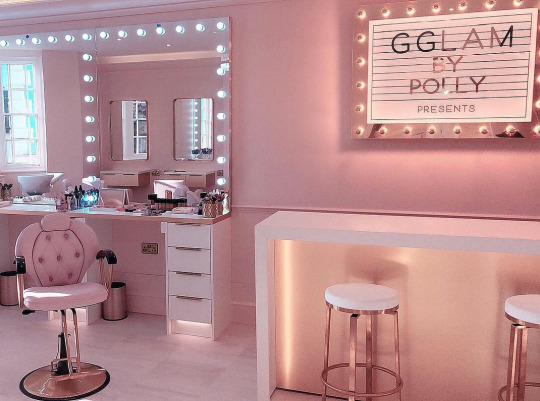
"Hiiiii Krissy! Welcome to GGLAM!"
Kristie had been going to "GGLAM By Polly" for a few weeks. Normally a high end salon wouldn't be her thing. But after "Paula's Cuts" shut down and was replaced by this Barbie-like boutique, her choices were limited. Of course, it also helped the the bubbly and beautiful Polly 'grandmothered' in all of Paula's old clients, offering the old prices for whatever their old styling used to be.
Of course, Polly was always pushing for this or that. Telling her client that she'd look cute with extensions. How she should totally go blonde. That thick and curvy waves with a full body were sooooo in right now. Kristie would always decline the over-enthusiastic bimbo, who to her credit would always drop the subject and do something simple. Kristie did appreciate that her stylist always listened and obeyed her...or maybe the ditz just forgot she offered a total makeover just a few minutes before.

"You're hair is soooo soft and shiny and pretty! Do you trust me?"
Honestly, she did. Polly was exciteable but never did anything Kristie didn't want. So whether it was the stylist's adorable eagerness, the endless happy salon music, or an inner curiosity wearing her down, she relented and consented.
With a squeal of excitement, Polly got to work. Blowing. Teasing. Fluffing. It felt like forever and Kristie almost dozed off as the bubbly beautician tried something new and exciting. When the makeover artist's long acrylic nails tapped on her shoulder, Kristie stared at the mirror in a daze.
"You're such a good girl letting me give your hair a makeover! Do you like it?" Polly asked hopefully.
Kristie nodded. It was...pretty. Sexy almost, but not too over the top. She liked it. Somehow, for some reason, she wished Polly had gone further.

"OMG your face is flawless! You're, like, a literal Barbie!"
Kristie blushed, even if her face didn't show it under all that foundation. Polly's compliments were what convinced her to do more this time. Sure, her hair was kept simple, just washed in a special silicone enriching bath that Polly kept gushing about. But this was the first time Kristie had agreed to pay for the 'Pretty Girl Package'.
The results were stunning. The pink lipstick, the pink top, the little sparkly earrings all made her mind sparkle. She couldn't help but giggle with giddiness alongside her stylist, especially after Polly told her that the package meant she could take all the products home for free.

"Look at you Krissy! Ur, like, a living advertisement for GGLAM! An adorable doll on display!"
As Kristie posed, she processed the words. Her new blonder and curlier hair. Even her somehow curvier form that fit that new dress juuuuuuust right. For a moment she tried to think about it, whether the change was too much. But Polly played that catchy little jingle from the salon as she snapped some photos and Krissy forgot what she was worried about.
There was nothing to worry about! All she had to do was let Polly make her pretty. Wear the cute clothes. Be a GGLAM model. It was soooo easy and soooo nice to let someone doll her up and dress her so sexy. It's like Polly was always saying - Good Girls Love A Makeover!
"Yesssss Krissy! Look at my little blonde angel! You're shining like a diamond...or like, a Krystal!"
Krissy felt amazing. After weeks of makeovers, special supplements, enriching hair treatments she finally went blonde. 'Bimbo blonde' as Polly called it. They left a bit of Krissy's dark roots as a reminder of her old self...but, like, Krissy could barely remember what she looked like before she started working with Polly.
But Krissy didn't worry. Or think. She just did what she was told. Sat obediently in the chair. Gave a smile for the camera. Did a little twirl on command. Polly knew best. Krissy trusted Polly. Krissy would be GGLAM's good girl model.

"Krystal you've been, like, an uh-may-zing client! I've sooooo loved helping you become the super pink girly girl bimbo you told me you were on the inside!"
Krystal just posed and pouted prettily. She, like, didn't 'member telling Polly that she wanted to be a bimbo. Or even looking like such a girly girl before. But, like, Polly must've known. She always knew what was best!
Now Krystal looked her best. She was a bit sad Polly said that after her latest pink makeover her 'Good Girl Package' was done. But quickly happiness took over as her cotton candy pink brain saw her candy pink new hair and yummy new body. As pink and pretty on the outside as she was on the outside, with a hawt new bod to match her mind.

"Hiiiii this is GGLAM by Polly, 'cuz Good Girls Love A Makeover! I'm Krystal...how can I, like, help make you beautiful?"
She stared blankly at the mirror, absent-mindedly brushing her hair and admiring her makeup. Her simple little mind couldn't memorize much beyond that silly short intro line, but luckily Polly had a 'lil repetitive tape that helped drill the greeting into her head. GGLAM's new reception needed to make a good first impression!
After month going to GGLAM, Krystal always made a good first impression. Especially after Polly plumped up her lips even more. It was sooooo worth it quitting her old job. Not only did she, like, get to hang out at the salon allllll day, but Polly gave her comp...complimen...like, free makeovers for working there! It was totes the best deal ever!
She was a total GGLAM girl now. But as she talked the next client...she hoped she wouldn't be the last. Good girls love a makeover...and bimbos need besties...
329 notes
·
View notes
Text
For the Texas Chainsaw Massacre Fanworks Event Day 4- Hobbies
Ship(s): None
Word Count: ~1,000
Warnings: Character death, mourning, implied abuse.
note: Bubba uses he/they/she pronouns.
@texas-chainsaw-fanworks
_______
No responsibilities or chores all day.
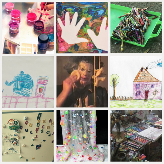
Bubba gets to stay in his corner of Texas Battle Land and do what makes him happy, which currently, is to draw.
A long time ago, an art set with some markers and crayons got left behind at the gas station. It was no use there, so it was brought home, where after some arguing, it was decided Bubba could keep it. The twins were being too mean about it, so they weren’t allowed to have it.
Not that it was anything fancy. The set is mostly basic colors and a couple of the markers were dry when they got them, but the beauty isn’t the part that Bubba likes the most.
Even now that it’s been years and the supplies have been worn down to colorful stubs, the part Bubba really likes is the process.
Something about the wispy sound the paper makes on the table, and the hollow scritchy-scratches of the crayons leaving their marks behind, really helps to calm Bubba.
That’s more important now than ever before, having something to do when things get tense. Really it’s that way more often than not, now that they moved away from their old house.
Coloring reminds Bubba a little of putting on makeup.
As in, it’s not really being pretty that makes them like makeup, as much as it is taking care of themself and expressing the bright colors they feel on the inside. The pretty result is just a bonus.
The precision of holding coloring supplies or makeup brushes is a little hard to master, but that makes it fun and rewarding every single time. Even if his lipstick gets a little crooked, or the lines of his drawing go a bit wobbly.
There are lots of pictures that have been crumpled up and hidden away over the years. Pictures of Bubba with tears on her face with fire and blood and monsters in the background. Monsters that looked a lot more like Drayton than they did the kind of monsters that break into their house.
But that’s not really the fun part. Those are the ones Bubba has to draw because of not being able to speak those feelings out loud. Like a filter for all the yucky emotions he has.
The part Bubba prefers though is drawing flowers and animals and pretty clothes. Anything with lots of bright color, to bring something other than deep coppery red into this life.
Bubba’s most favorite part though is when the finished products get displayed somewhere in the house, be that pinned above the stove or placed into a frame and hung up on a rafter.
There’s an extra special picture that lives right above the supper table on the big stone pillar just to the side.
It wasn’t the first piece of art Bubba drew with the art set, and it wasn’t the best either, but it was the most meaningful.
See, with the family split apart and fighting, it was often that Bubba’s pictures would be one or two of the Sawyer siblings at a time. Whoever was getting along. Maybe whoever had been nice to him that day.
This one though, was of all the Sawyers, including their grandpa and gramma, out in the yard, posed on the front steps of their old house like it was a photo. They’d never gotten a photo like that before Nubbins had to leave forever.
That’s something Bubba is sure of, because the family kept all of Nubbins’ pictures. They’d helped Chop Top look through them one at a time, and found most of them being of random adventures, things they couldn’t piece together without him there.
Bubba knew her brother wasn’t coming back, so she wanted to make a special picture. One where everyone got along again.
There’s tear stains in the corner. Bubba turned them into flowers and hoped nobody noticed.
If they did, they didn’t say anything. Chop Top told him he’d done a good job with the colors. Grandpa didn’t say anything, but Bubba knew that if he could, he would’ve said something nice.
The really funny thing is, Drayton didn’t say anything either. That’s rare.
His eyes got a little red, and his lips curled into a weird shaky frown, but he didn’t say a word. Bubba was scared he didn’t like it and tried to take it back, so he could keep it.
That earned him a smack.
Chop Top patted Bubba’s shoulder and told them they’d draw a new picture together. A better one.
Except they didn’t need to. Because at supper that night, there it was, hanging right above the empty chair, and the lonely table setting that was always provided with a red soda pop.
They were more quiet than usual. Even Chop Top, who hadn’t really been quiet ever since Bubba was allowed to call him by his real name. Not that he could help it, with the head wound and all.
Inside though, Bubba was smiling. Sure, he didn’t have a perfect dark brown crayon to get everyone’s hair the right color, and he didn’t have the exact shade of tan that matched those pants Nubbins always liked to wear, but he felt proud of the picture anyways in the end.
Sometimes special is enough.
At least for the Sawyer boys- who aren’t very good with words, and who don’t always get along, and who definitely mess up a lot- special is the best they’re gonna get.
It’s the heart that counts, and heart is something Bubba Sawyer is just overflowing with.
Today, they’re drawing a picture of Nubbins and them holding hands and skipping down the long driveway they raced as kids. The same one that was stained with Nubbins’ blood after the accident.
Bubba is older now and knows what really happened. That Nubbins didn’t actually just leave. Maybe that’s why she likes to draw him so much.
This specific drawing is for their collection though. Their brothers will understand that.
#tcmfanevent#bubba sawyer#nubbins sawyer#chop top sawyer#drayton sawyer#tcm 2#my writing#my moodboards
62 notes
·
View notes
Text
Divoom Ditoo-Pro Pixel Art Bluetooth Speaker Review
Today, I’ll talk about the Divoom Ditoo-Pro Pixel Art Bluetooth Speaker Review. It is the cutest, most fun, and fullest of features Bluetooth speaker you can get.
Basic Information of Divoom Ditoo Bluetooth Speaker with16X16 LED
BrandDivoomModel NameDitooSpeaker TypeSubwooferConnectivity TechnologyBluetoothSpecial Featurepixel photo display
The Divoom Ditoo is a wireless Bluetooth speaker that looks like an old computer. On the front of the speaker is a 16X16 pixel grid that can be changed to do a number of different things or show unique artwork.
How to use Divoom Ditoo-Pro Pixel Art Bluetooth Speaker
Now, let’s talk about the product. Inside that cute gift bag, we found a nice, clean case with some design stickers and a USB cord. As well as our D2 Pro and the book that tells us how to use it. The first thing I notice about this product is that it looks great. It looks a little bit like a small computer. The front of the device features a screen, some buttons, a lever, and a tiny button located beneath the lever.
If you press the M button, you can navigate through the menus or exit them. The menu method is shown here. If you hold it, it will turn the lights on and off.
We also have a “+” button. Pressing it will increase the loudness while holding it down will increase the brightness.
The brightness slider and the volume controls can be found here, respectively. Next to that is a small button for the sun.
Now you can change the lights by pressing the sun button. As a result, the light’s functionality shifts depending on whether you press or hold the button.
Now, we have the left arrow button over here. When I pair my phone with this gadget, I’ll have more to say about Bluetooth.
Now we have a button that takes away. If you push and hold the “-” button, the volume will decrease and the screen brightness will decrease.
Here is our right arrow button. By pressing it, you can advance to the next track, and by holding it, you can toggle between different visual effects. In any case, that is the key. It will play, pause, answer, or stop a call if you want to do a short pool. And if you do a long pool, a voice memo will be started.
The next button is for your sound source. By pressing it once, you can switch between your device’s various audio inputs, and by pressing it twice, you can end your Bluetooth connection. You can check your battery life by clicking back and seeing how much juice you have left.
On the back, there is a hole for the reset pin, a USB charge port, and a slot for the TF card. And there’s a backport flap on top. To get the app, scan the QR code. Once you sign up for an account and make one, you can connect your Bluetooth to our D2 Pro through your phone’s settings. You’ll be taken to a screen in the app where you can choose the digital art you want on your screen. When you hit the little arrow at the bottom of the screen and apply it, the digital art will appear on your D2 Pro. And you can choose from many different options, such as the following Creation record, Alien 2023 Recommended, and many more.
You can also find more digital art by clicking the “expert” button at the top of the page or the “group” button. And if you want a certain kind of mood, movie, or another thing on there, you can search, say, “mobile,” and different things related to that should come up, and you can click on them. And you can also put that on your page. And here, you can see that it’s going backward on our screen when we go down and click on the bottom left, where it looks like a little compass.
On the D2 Pro, you can do many different things. You can adjust the volume of your notifications and the brightness of your screen in the settings menu, and there’s a help center where you can get in contact with customer care if you have any questions.
And have different features, like being able to shake to change the brightness or showing the time in a 24-hour style. Here, you can make your own small screen that will pop up and here you can see that it also appears on the D2 Pro.
The next thing is motion. You can also make your own animations and show those on the screen. We have a text generator where you can type something. Then, it will show up on the screen. To show you, I’ll say “Hello,” and it should appear on the screen right away.
Here is pixel coloring. If you choose the creative mode, you can pick from these options. You’ll see several sets of 4, 8, and 12; simply color the sets of 4 the same color, the sets of 1 the same color, and the sets of 12 the same color. And a beautiful picture will appear on your screen.
Now we have music that will play through the speaker feature on our D2 Pro if you play different types of stations or add anything you want to it.
I was surprised to learn that the D2 Pro is compatible with music streaming services other than Pandora and Apple Music.
When you press the DJ Mixer button, you’ll be transported to a screen where you can experiment with different drum, bass, and piano sounds. A bell, a drum, and a xylophone.
In addition to the various bass instruments, we also have the saxophone, a flute, and a harmonica. We’re going back to the home screen with our maracas. We have a feature called “voice memo” that lets you record yourself speaking in different sounds, like a baby’s, a robot’s, a woman’s, a man’s, or just your own. We’ll do that by pushing the record button. I’ll just use my regular voice for now to give you an idea, testing, testing. If the sound is too low, you can also turn it up here.
Conclusion:-
I really enjoy listening to music on the Divoom Ditoo. It’s a compact Bluetooth speaker with a unique and appealing appearance. Ditoo offers us a delightful novelty that no other speakers can match because of its pixel display; it also is a terrific gift option.
Also, Read:-How to Connect Speakers to TV with Wire?
How to Connect JBL Bluetooth Speaker to Smart TV with easy steps
Related
JBL Flip 6- Review 202315 June 2023In "Reviews"
Natalie Hall- Net Worth 2023, Bio, and more19 June 2023In "Networth"
Klipsch RP-5000F Review17 June 2023In "Reviews"
0 notes
Text
New "Camera" Has No Lens, Simply Detects Your Location and Generates an AI Picture of It
Susan Sontag's Worst Nightmare
If you haven't heard, Instagram is over — and with it, apparently, is the concept of a camera itself. Meet Paragraphica, a lensless "camera" that uses location data and various AI tools to generate imagery, instead of old-fashioned, uh, photons.
"Paragraphica is a camera that utilizes location data and artificial intelligence to visualize a 'photo' of a specific place and moment," reads the project's webpage. "The camera displays a description of your current location, utilizing the address, weather, time of day, and nearby places."
"When pressing the trigger," it continues, "the camera will create a photographic representation of it using a text-to-image AI."
If Susan Sontag said that regular photographs are a way of imprisoning reality, we can't even begin to imagine what she'd have to say about this thing. Honestly, though, considering how omnipresent cameras — and with those cameras, image-driven social media and algorithm-powered feeds — have been in our lives for the past decade-plus, Paragraphica kind of makes sense as the natural penance.
Introducing – Paragraphica!


A camera that takes photos using location data. It describes the place you are at and then converts it into an AI-generated "photo".
See more here: https://t.co/Oh2BZuhRcf
or try to take your own photo here: https://t.co/w9UFjckiF2 pic.twitter.com/23kR2QGzpa
— Bjørn Karmann (@BjoernKarmann) May 30, 2023
Mole Talk
If you, of course, find yourself asking "but why?" its creator Bjørn Karmann, a designer in the Netherlands, has an answer.
"As AI models are increasingly becoming conscious, it will be hard to imagine how they might see our physical world," he wrote on the project's site. "The camera offers a way of experiencing the world around us, one that is not limited to visual perception alone."
"Paragraphica' provides deeper insight," he adds, "into the essence of a moment through the perspective of other intelligences."
Conscious is a strong — and some might say both misguided and incorrect — word to use for an amalgamation of various generative AI tools, but we digress. Karmann further compares his invention to a star-nosed mole; rather than seeing by way of light, as humans — and our conventional cameras — do, these underground moles "see" by way of snout antennae (hence the antennae-like design seen on the camera's lens.)
By the designer's metaphor, then, Paragraphica offers humans a chance to "see" as an AI program does. But to that end, it could well be argued that Paragraphica, which uses APIs trained on eye-watering amounts of human-generated content, isn't seeing or understanding for itself — instead, it's just spitting a mimicry of human perception right back at us.
Art Project
To his credit, though, Karmann did clarify in a Twitter thread that his creation is simply a "passion art project," further noting that he has "no intention of making a product or challenging photography."
"Rather," he added, "it's questioning the role of AI in a time of creative tension."
More on AI art projects: Google's Top Result for "Johannes Vermeer" Is an AI Knockoff of "Girl With a Pearl Earring"
The post New "Camera" Has No Lens, Simply Detects Your Location and Generates an AI Picture of It appeared first on Futurism.
0 notes
Text
Pop Art
Hello! Welcome to my blog, where I will be covering some of my favorite art forms over the next few weeks, and the wide-reaching impact that they have had both in the art community, but in my life as well. All of these art forms are transformative and unique in regard to the art field, and that is why they interest me so much. Speaking of transformative, let’s begin with an overview of our first subject in this blog: Pop Art.
The Origins of Pop Art
In terms of going against the grain and rejecting traditional art practices, there is no better example than Pop art. This was an art movement that begin in the US and UK during the 1950s, and the entire core of this new art philosophy was to be an alternative to the old standards and traditions of fine art. Which, in conjunction with the actual physical aesthetic, is why this personally attracted me so much. This was an art form that was considered to be a revolt against the dominant approaches to art and culture, and completely shifted the conversation on what art SHOULD be.

The idea of Pop art was overly complicated either, or to “high art”, as it transitioned away from the theories and methods used in other art forms such as Abstract Expressionism and was more straightforward as a result. Being born amidst such a socio-political climate helped shape the ideals of what this new art form could be. Artists turned toward celebrating simple things, such as commonplace objects, and elevating the everyday and otherwise considered mundane, to the level of fine art. Fine art is not known for its commercial uses, or pop culture imagery, and this is where Pop art in turn shines as advertising, comic books and mundane mass-produced objects are constantly being used in Pop art.

Bright Colors and Recognizable Imagery
Another major element of Pop Art that I think really speaks to me is the bright and saturated colors that are often on display. Sometimes art gets this very posh and pretentious vibe, and a major part of that is the drab color tones that are used in many of the most famous pieces in the world. There is nothing wrong with that less vibrant colors, however when it dominates the art world as significantly as it seemed too, the vibrant colors of something like a Andy Warhol piece really sticks out. Pop art in general is often characterized by its vibrant, bright colors. Primary colors red, yellow, and blue were prominent pigments that appeared in many famous works, particularly in Roy Lichtenstein’s body of work. The idea behind this was to play off of how advertisements would often use bright colors to illicit positive feelings for their products.

The element maybe most synonymous with Pop art is all of the recognizable imagery that is included, or the main subject, within the design. Pop art utilizes images and icons from popular media and products. This included commercial items like soup cans, road signs, photos of celebrities, newspapers, and other items popular in the commercial world. Even brand names and logos were incorporated. Many of the times these logos and brands were being used a basis in a more comedic, borderline satirical way, which added a whole new level of commentary on top of the piece. Humor was also a major component of Pop art. The artists had a strong sense of humor, and it often came across in their pieces, as they used their subject matters to make a statement about current events, poke fun at fads, and challenge the status quo. This was especially relevant in the 1950s following WWII as America was going through a massive shift, and commercialism was on the rise.

Another massive inspiration for Pop art, and vice versa was the comic book scene. Comic books found true artistic expression for the first time during the Pop Art movement, which notable artists like Roy Lichtenstein who often emulated this style in his works. A major feature in the pop art comic style was the Ben-Day dots, this was created and used as a way to minimize the ink being used. As the art styles of comic books and pop art become more synonymous over time, these dots became a common element in pop art. Little additions like these I feel like gave Pop Art this identity that was so unusual for any other art form, because it felt as though it was ever evolving.

Another strong element that was in part inspired by the comic book world was visual cues of expression and action, which became a bit of a mainstay in this style, as you’d often see large action texts describing particular actions.

The Artists
Eduardo Paolozzi
Eduardo Palolozzi was a Scottish artist, known for his sculpture and graphic works. He is widely considered to be one of the pioneers of pop art. His art ranges from sculpture to pop art, although he always seems to be able to integrate a lot of similar elements in whichever art form he chooses, which I think is really fascinating.

This famous piece of his is called “Living in a materialist world. Much of his work included colorful collages, poking fun at post-war consumer society. This one utilizes many mass-produced objects and advertising to illustrate that point. To make this he uses mixed media of newspaper and magazines in a surrealist fashion. The bright ads of perfection displayed what materialism meant back in the day, being a shinier looking human with a house full of new gadgets to show to your neighbors.

This one is called “Hollywood Wax Museum” Another major element that was linked with Palolozzi and pop art is how a lot of material gets been visually removed from its known context, isolated, or combined with unrelated material. This encourages people to interpret their own meaning
Richard Hamilton
Richard William Hamilton was an English painter and collage artist. Many of his pieces were full blown installations or exhibits, which adds a whole element of immersion to his art that I truly appreciate. His 1955 exhibition Man and his 1956 collage Just what is it that makes today's homes so different, so appealing?, are considered by critics and historians to be among the earliest works of pop art.

This piece has a particularly fun name, “Just what is it that makes today's homes so different, so appealing?” In this iconic collage by the British artist Richard Hamilton, created in 1956, a midcentury living room is filled to the brim with logos and cut-out images of consumer products. After WWII, many of the factories that had been mobilized to create airplanes, artillery, and other military necessities were repurposed towards the manufacturing of popular culture, luxury items, and household products. This was often parodied in popart work, and specifically Hamilton’s collage.

This next piece was an an installation that was conceived for the legendary exhibition This is Tomorrow held in 1956 at the Whitechapel Art Gallery in London. It was called “Fun House”. Visitors had to squeeze through a narrow corridor past pin-up pictures, hundreds of advertisements, movie posters and spinning color discs, while songs by Elvis Presley and Little Richard alternately blared from a jukebox. The idea behind this was to group together an idealistic location according to the ideals of modern marketing and post-war commercialism.
Andy Warhol
Next up we have probably the most recognizable and influential artist of the bunch, Andy Warhol. He was one of the most prolific and popular artists of his time, using both avant-garde and highly commercial sensibilities. His works explore the relationship between artistic expression, advertising, and celebrity culture that flourished by the 1960s, and span a variety of media, including painting, silkscreening, photography, film, and sculpture.

This piece really showcases the Pop Art tendency to use commercial projects in their art, as this is expectably titled, “Campbell's Soup Cans”. Andy Warhol famously appropriated familiar images from consumer culture and mass media, among them celebrity and tabloid news photographs, comic strips, and, in this work, the widely consumed canned soup made by the Campbell’s Soup Company. When the canvases were originally showed, it was displayed in shelves to mimic products in a grocery aisle. Though Campbell’s Soup Cans resembles the mass-produced, printed advertisements by which Warhol was inspired, its canvases are hand painted.

This next piece may be Andy Warhol’s most popular one of all. It’s a portrait of Marilyn Monroe, simply titled “Marilyn Diptych”. The name of this piece is a referring to diptych, a painting hinged on two panels that can close together like almost like a book. Warhol used a publicity photo for her 1953 film Niagara as the source image. The use of two contrasting canvases for Marilyn Diptych illustrates the contrast between the public life of the star, who at the time was one of the most famous women alive, and her private self. The print is vibrantly colored to reflect her vivacious personality, akin to the majority of Andy Warhol’s colorful gallery.

This piece was another portrait, this time of Queen Elizabeth, and titled “Queen Elizabeth II of the United Kingdom”. Nobody said Andy Warhol was all that creative in his naming schemes. However, he was an obsessive photographer. He not only took photographs of the rich, famous and beautiful, but also documented the myriad aspects of his daily life. This specific portrait of Queen Elizabeth was based on photos of Elizabeth II taken for her Silver Jubilee in 1977. The same basic image of each queen appears in each of her four prints, but they vary in color. Warhol began working in this style in the mid-1970s, fragmenting the image with various overlaid shapes and patches of color.
Roy Lichtenstein
Finally, we have my favorite artist in the grouping, and one of my favorite artists of all time. Roy Lichtenstein was so influential during the 1960s, he became a leading figure in this new art movement. His work defined the premise of pop art through parody. Inspired by the comic strip, Lichtenstein produced bright, graphic works compositions that were often made in a tongue-in-cheek manner.

This piece is titled “Drowning Girl”. The painting has been described as a "masterpiece of melodrama” and is one of the artist's earliest images depicting women in tragic situations, a theme to which he often returned in the mid-1960s. This piece uses the conventions of comic book art, a thought bubble reads: "I Don't Care! I'd Rather Sink". This narrative element highlights the clichéd melodrama, while its graphics — including Ben-Day dots that echo the effect of the printing process — reiterate Lichtenstein's theme of painterly work that imitates mechanized reproduction.

This final piece was titled “Bedroom at Arles”, as opposed to Bedroom in Arles, the original Vincent Van Gogh piece this was emulating. Lichtenstein has updated the original work by van Gogh with contemporary chairs and replaced casual shirts with businessmen's white shirts.
In spite of Lichtenstein’s reputation for parody, this was more of an homage to one of his favorite Van Gogh paintings. He uses the common popart Ben-Day dots on one wall, as well as many other fun patterns throughout the rest of the room.
In Conclusion
Pop art was and still is one of the most influential art forms in the past century, and helped alter this strict view of what could and couldn’t be considered true art. Next, we will be tackling another art form that may be considered even more controversial in the traditional fine art world, and that is “Pixel Art”. Thank you for reading, and I’ll see you back for next week!
1 note
·
View note
Text
SEO strategies to optimize your Shopify site to rank higher and higher Sales

A website with an online presence and optimizing your site to be search engine friendly is crucial to help potential customers find your website. SEO can help you provide a the best experience to users. The higher your site is in the search results page for users to find the more likely they will shop at your shop.
Search Engine Optimization
Nowadays, every business prefers to hire Shopify SEO experts to market their online businesses. Since more than 50% of the traffic on websites is organically generated 20% comes from paid and the remaining from social and other sources.
When optimizing your website for an internet search engine, the keywords play a crucial part. It is therefore crucial to focus on the research you do for keywords.
To optimize your Shopify store for better ranking and higher revenues, below are a few aspects to take into consideration: Create Quality Content
Content is the most important thing So the first thing to do is create high-quality content that includes all relevant information to your viewers. Before that , you should prepare your Google information, as 1000 words are the standard length of content on the Google search result on the first page. It is evident that quality is the most important factor, and not length.
It is possible to optimize your website's URL by using an uncomplicated URL, and avoiding numbers such as dates or years. To rank images you should use Image alt-text within the image area of the search results. Make use of the long-tailed keyword to reach your audience, which will increase the likelihood of getting quality traffic to your site.
Establish Your Brand Identity
To generate organic traffic, your brand's reach should be extended to a large number of people. It is crucial to demonstrate the identity of your business and the services you offer to the market. The most basic and old-fashioned idea is that people will recognize you by the name you have chosen.
Stand Out the Reviews
The fundamental process for a consumer is to look up reviews and ratings prior to buying the product. Reviewers are only trusted if they have both negative and positive reviews.
Display Your Best-Selling Items
When you show the top-selling products, customers are given some insight into the products or services they're seeking and then they are able to find the purchase route.
Portray the Benefits of Your Product
Tell us what is unique about your product or different from the competition? What are the advantages? How beneficial is it for them? What is the reason they should buy it? Give them a reason to buy your product and try to address each concern.
Social Proof
Social proof helps determine whether the group of consumers or customers believe in a brand and buy from it. It is a good idea to use it on every product's page, including reviews. Based on the statistics, 90% of people are influenced by recommendations from a trusted friend and 70% believe recommendations from a stranger.
Illustrate Through Videos & Images
Videos and photos are a great method of communicating with your target audience. With video, you can get your message across to your intended viewers and take up the area where they are drilling the most. It is your sole obligation to get before them.
Emails for Organic Traffic
Emails can help you maintain your customer database healthy. You can send out promotional messages to prove your appreciation to them and provide them with an incentive to come to your site to you for more. In order to do this, you must collect email addresses from other sources of advertisement as a base to boost the organic traffic to your online store.
Send Abandoned Cart Emails
The most irritating problems for customers is to get to the point of purchase and then it disappears without trace. This is known as abandoned carts, and it is recoverable through abandonment emails.
There are a variety of tools on the market that can aid in the automation of abandonment emails and begin to capture the revenue that was lost.
This also assists those who lose their purchase halfway through and let them make a purchase through your online store. Collect Data
Information about your customers is crucial for your company. Therefore, ensure that you get all the data about your customers to ensure that you focus on them to increase repeated sales.
The best part is that the majority of the clients prefer using email to contact companies. The collection of all relevant information will allow for better understanding of your customers and help to move in the proper direction.
Referral Marketing
Every business has moved towards customer-driven goals. Every online company aims to boost their revenue as well as the number of visitors to their site. There are many ways to achieve these goals. Referral marketing is one of them. the picture.
Referral marketing is a great way to increase revenue and improves traffic through the use of Guest Blogs, SEO and Adverts and more. Today, it's often ignored however it is one of the most effective strategies to boost the organic traffic that comes to your store.
Retargeting
As we've discussed in the previous points, retargeting is the online promotion of your brand in order to keep those who have left your site prior to purchasing or converting.
With the information gathered, it's simple to target your visitors and match their behavior patterns and create the marketing messages. If done properly it can increase response rates. Then, making sure to target the right moment in their journey is a crucial aspect that should be kept in your mind.
Enhance Your Customer Experience
Page Speed
Check Your CTAs
Incorporate Chat
Site Design & Architecture
Go For the Mobile Experience
Trust for Brand's Payment Gateways
To sum up
In addition to the points above, Keep all competitors in mind, be inventive and stay in touch with the market. Hire Shopify experts dedicated to examine, measure and adapt to the results of your strategy for linking and content.
0 notes
Text
Meteorite rock

#Meteorite rock skin
Stone meteorites known as chondrites are the most abundant meteorite type. One of the most unique and intriguing surface characteristics of meteorites. Lines can be minute, often thinner than a strand of human hair, and they are Iron and stony-iron meteorites are rich in iron, and will stick toĪ powerful magnet so strongly that it can be difficult to separate them! Stone meteorites also, for the most part, have a high iron content and a good magnetĪs our typical meteorite burns through the atmosphere, its surface may meltĪnd flow in tiny rivulets known as flow lines. Iron and nickel, so the first step in identifying a possible meteorite is the Practically all meteorites contain a significant amount of extraterrestrial Meteorites are divided into three basic groups: irons, stones, and stony-irons. Photo by Geoffrey Notkin, copyright Aerolite Meteorites. The trailing edge is smooth and slightly concave. Its leading edge (pictured) is dome-shaped and heavily thumbprinted. This example displays excellent regmaglypts (thumbprints), as well as a rare natural hole. It is one of the world's oldest-known meteorites and was first discovered by the Spanish in 1576. Iron meteorite - Campo del Cielo: This beautiful 654.9-gram Campo del Cielo iron meteorite was found in Chaco Province, Argentina. Tiny holes, it is probably volcanic rock or slag of earthly origin. If a suspected meteorite looks like a sponge, with lots of
#Meteorite rock skin
The volcanic rock pumice, often used in skin careįor the removal of callouses, contains vesicles which is one of the reasons it is When gas escapes from cooling molten material, it creates small pinprick holes orĬavities in a rock's surface. They do not contain the common earth mineral quartz, and in general do not contain Meteorites tend to look different from the ordinary terrestrial rocks around them. Actual size of area pictured is approximately 10 cm across. Flow lines may be found on the surface of irons, stones, and stony-irons but, like fusion crust, they are fragile and may disappear over time, due to the processes of terrestrial erosion. Iron meteorite with flow lines: This close-up image of the main mass of the Bruno iron meteorite (found near Bruno, Saskatchewan, 1931) shows a delicate and intricate pattern of flow lines, created as the surface of the meteorite literally melted and flowed. Such as runoff (slag) from old smelters, and castoff iron implements that Such as basalt, and many different types of man-made metallic by-products Hematite (many of which will stick to a magnet), dark black rocks Our planet is rich in terrestrial iron oxides such as magnetite and Meteorite, but turns out instead to be a common earth rock isĪffectionately and humorously dubbed a meteor-wrong. Fusion crust is thin and fragile and will weather away over time, so a recently fallen stone will exhibit a dark black crust with no weathering or rust stains. Note the very fresh, rich black fusion crust which is reminiscent of a charcoal briquette. This specimen was picked up immediately after the fall. It is an ordinary chondrite (H5) and an excellent example of a complete fusion crusted stone. Stone meteorite with fusion crust: This 307.1-gram stone meteorite fell as part of a shower on Octoin Mauretania. Than one percent turn out to be genuine visitors from outer space. Hundreds of suspected space rocks sent to us for testing, far less I do spend a significantĪmount of time each year assisting people who think they may haveįound the real thing, but the odds are against it. Living hunting for, and studying, meteorites. So, the chances ofĭiscovering a new example are slim-even for those of us who make their Less common than gold, diamonds, or even emeralds. Meteorites are among the rarest materials that exist on our planet - far Sections of the site is a detailed guide to meteorite identification.Īs a result of that guide we receive, almost daily, inquiries by letterĪnd email from hopeful individuals who think they may have found a rock Of visitors each year, and I try to maintain a fair balance on the siteīetween education, photographs and reports about our expeditions, and One of my happy tasks as a meteorite hunter is running a website that
0 notes
Text
LinkedIn For Students – How to Leverage it While You Are in College

LinkedIn, the social media platform that promotes career development and networking, is generally considered to be the domain of professionals. With connections to form, jobs to apply to, and resumes to update, it could be natural for a college student to think, “Hey, I can keep that for later.” However, as the old Bob Dylan song goes, the times, they are a-changin’.
The increased reliance on online portals of knowledge and education today means new opportunities have sprung up in unexpected places. From using Netflix for learning to pursue virtual internships, students can advance their career aspirations with nothing more than a strong internet connection and a device.
Here’s How to Leverage LinkedIn as a College Student
1. Use a Professional Profile Photo
Unlike Facebook, where a cropped group photo is an adequate image to identify you with, your LinkedIn profile photo must display competence and professionalism.
This means no selfies, no pictures from clubs, restaurants, or your last vacation, and certainly no blank spaces. Taking the extra effort to dress professionally demonstrates to potential employers a sense of reliability and maturity, and makes a great first impression.
2. Update Your Education and Experience
A LinkedIn profile is similar to a CV, in that you can list your educational achievements, work experience, internships, and extracurricular activities. It helps to be descriptive about your accomplishments so that you show up in the search results of potential employers. Further, LinkedIn lets you link with other people who attended your college or university, making networking effortless.
Using keywords specific to your fields of interest and goals is a good way to ensure you show up in the search results of professionals relevant to you.
3. A Succinct but Descriptive Headline
Your LinkedIn profile headline is the first thing LinkedIn users will see on your profile. With 220 characters to work with, it is imperative to have one that is crisp and provides clarity on your vision.
Now, LinkedIn does create a headline for you with the information you give it but the smart move is to write one on your own. Then you can use keywords, and highlight your aspirations to create a compelling vision that would catch the attention of potential employers. According to a poll conducted on LinkedIn, your headline is 46 percent more important to LinkedIn prospects than your experience.
Think of it as setting the tone and generating interest for the rest of your LinkedIn profile.
4. Professional Etiquette While Communicating is a Must
While social media platforms like Facebook and Instagram have no established rules of conduct for communication and favour informal discourse, LinkedIn prizes decorum and professional etiquette during user engagement.
Whether it is making new connections, sending messages to other users, or requesting recommendations, it is important to be polite and respectful. Humour, especially, is best left for other social media.
5. Highlight Soft Skills
The necessity of possessing soft skills like time management, critical thinking, communication, and emotional intelligence cannot be understated. In the workplace of tomorrow, these skills are predicted to be in high demand.
According to Ada Yu, director of product management at LinkedIn, employers actively look for soft skill proficiency on profiles. Including soft skills in the Featured Skills section of your LinkedIn profile is a good bet to boost its visibility.
6. Personalize Your Connection Requests
It helps to make an extra effort while sending out connection requests. A personalized message to contacts you are acquainted with, which mentions how you met, is likely to be responded to favourably. Alternatively, cold connection requests to people you don’t know personally are best paired with a message that states your intent. Take the time to create a message that reflects your professional aspirations and how connecting with this person would help your growth.
7. Share Updates Pertinent to the Streams You Are Interested in
Regular activity on LinkedIn is crucial to maintaining visibility amongst your connections and potential employers. It helps to regularly post informative content that is relevant to the streams you are focused on. This demonstrates your interest in them and your passion towards remaining updated on recent developments.
Be careful not to take it too far and post multiple times a day, however. Posting twice or thrice a week is ideal.
8. Engage With What Your Connections Share
Often the easiest route to a conversation with your connections is by liking, commenting on, or sharing posts that they create. This can be the doorway to a more comprehensive discussion which could lead to opportunities for you. This could potentially lead to being able to meet new people capable of helping you in a professional capacity.
9. Make the Most of LinkedIn Groups
Joining groups on LinkedIn can help you further your knowledge of areas you are interested in, and amplify the connections and opportunities you have. You can start by looking for groups of professionals related to the field you’re interested in. These can be specific to your location or anywhere in the world. Make sure these groups are active on a regular basis, as inactive groups will not help you much.
Next, engage with posts on these groups that interest you – ask questions, post your own content, and join discussions. This will expose you to more details about the fields you are interested in, and bring you in contact with professionals. You could potentially find a new job or internship opportunity by creating a connection.
Conclusion
LinkedIn can be a marvellous tool for college students seeking an extra edge in their professional development. Many students shy away from the platform because they do not believe it is relevant to them, or believe they don’t have a detailed enough profile. In truth, there is a ton of value that LinkedIn can provide for college students such as internship opportunities, networking with professionals, and connecting with school alumni among others.
If you’re interested in knowing more ways to leverage your skills and maximize your innate talents in order to build a career-best suited to you, reach out to our career counselling experts here. For more info visit here at: https://www.mindler.com/career-counselling-for-class-10-11-and-12
0 notes
Text
Do No Harm Fanfic: Tiger
[this is a fanfic of the amazing @peachy-panic ‘s amazing Do No Harm series, which you absolutely must go read right now]
Ok I AM almost done with ONM ch 10, but it is still not finished. What IS finished is this, the inevitable result of my constant Jaime and Sebastian brainrot. I swear this was just meant to be a short drabble but it turned into 2k words of pure fluff. But these boys deserve it!!! Also shoutout to any LA peeps who recognize the mall they go to :)
This is set in the future of DNH, where in my world Jaime has been freed and been living with Sebastian for a few months.
(Actually canon sad backstory context: when Jaime was a kid, he was gifted a giant stuffed white tiger by his family. Soon after, his parents died and he became a ward of the state. At his first group home, his beloved tiger was thrown away bc it was “too big” even tho he begged to keep it. By the time he was taken by WRU, the only remaining thing from his parents was a photo of them in his wallet. The WRU Acquisitions team burned it.)
CWs: box boy universe, pet whump theme
In the morning, Sebastian mentions that he has to run an errand at the mall, and asks if Jaime would like to go with him. A year ago, he would have jumped at any opportunity to be alone, but today he finds himself accepting Sebastian’s offer, not out of mindless compliance, but out of a genuine desire to spend time with him. In the car ride there, he fidgets with excitement at the thought of doing something so perfectly normal again. Sebastian mistakes his excitement for nerves.
“Hey,” he says, from the driver’s seat. “If at any point you feel anxious, or overwhelmed, just let me know, ok? We can head out whenever,” he continues, flashing Jaime a small smile. His eyes are so full of affection, it still surprises Jaime that all of it is for him.
Jaime smiles back, a real, honest smile that he can tell from the way Sebastian’s eyes light up the other man can tell is genuine.
“Thank you, I will. But I’m not too nervous, more just…excited,” he says, suddenly feeling a bit embarrassed.
But Sebastian doesn’t judge at all. “Perfectly understandable! This was my favorite mall growing up, I hope you like it too.”
After they park, they’ve barely entered the large, outdoor shopping plaza when Sebastian stops. He turns to Jaime with childlike glee in his eyes.
“Have you ever ridden a trolley?” he asks.
Jaime shakes his head. It is then that he notices, in the pavement to their left, deep grooves running through the asphalt. He looks back up at Sebastian, who is wearing an excited grin.
“Do you want to?” he asks, right as Jaime hears a cheerful dinging sound, and watches as a two story, old fashioned trolley car comes rolling towards them. The conductor, wearing an old fashioned cap, gives him a wave, and Jaime lets out an exuberant laugh, feeling like a little kid again.
“I’d love to,” he says, and Sebastian beams, gesturing ahead of himself for Jaime to board first.
Jaime grins back, greeting the conductor as he boards and waits for Sebastian. There are plenty of open seats on the first level, but the spiraling staircase to the open air level is beckoning. He turns to Sebastian, a questioning look in his eyes, and the other man smiles and nods up the stairs.
It’s all Jaime can do to stop himself taking them two at a time.
Up above, a few benches are taken by tourist couples and families with children. Jaime and Sebastian slide into an empty one near the front, listening to the conductor ring the bell before they’re off to the other end of the mall.
It’s slow moving, leaving plenty of time for pedestrians to clear the tracks, and children to wave excitedly as they pass. Jaime waves back at each one.
The ride is short, but Jaime carries the leftover bubbly feeling of excitement with him as he follows Sebastian to pick up his repaired laptop. Even the store they go into for the errand is captivating, technological displays and sample products lighting up the store. Jaime contently watches a VR display as Sebastian picks up his computer, then accompanies him back out of the store.
Sebastian takes him to the center of the mall, and doesn’t say anything when Jaime’s jaw drops at the giant fountain display. He checks his watch then mouths “3, 2, 1.” At the end of his countdown, Jaime gasps as jets of water shoot out of the fountain’s center, the spurts weaving around each other as if in a choreographed dance. Sebastian joins him along the edge of the marble railing, though his eyes drift to Jaime’s face more than they do the dancing water.
Afterwards, Sebastian insists on treating them both to an expensive cupcake shop because they’re “in the area.” Jaime compromises to split one between them, and together they decide on a flavor. Sebastian splits it perfectly down the middle, and offers Jaime the one still in the wrapper. Jaime accepts, then grabs a napkin from the front of the shop for Sebastian to hold his piece in.
They eat while they walk back down the mall. Jaime marvels, again, at the easy sensation of swallowing without the feeling of metal against his throat, of being out in public and people looking at him like just another person.
He has not worn the collar for months now, and he never will again. As soon as he was able, Sebastian was the one who told Jaime he could remove it. Even in the safety of Sebastian’s protection, he hadn’t been able to bring himself to take it off himself. So Sebastian did, his cool fingers brushing against the back of Jaime’s neck, sending chills down his spine that were more than just well trained fear. After it was gone, he took his first real breath since he’d woken up in WRU’s training rooms, his neck feeling both naked and complete without the metal adorning it. His next breath caught in a half sob, and Sebastian was there to catch him as he collapsed under the onslaught of all the fear and the pain that the collar had kept contained inside of him.
Now, he walks around a mall, dressed in clothes he picked out himself, with company he has chosen to keep.
He wonders how other people see them, as he finishes his piece of cake and laughs at the smear of chocolate frosting on Sebastian’s nose. Do they think they are friends, spending a day at the mall? Or maybe relatives, on a family trip to a local tourist spot. Or, he thinks, and feels his heart skip a beat, a couple?
Sebastian’s brows furrow in confusion, trying and failing to wipe the spot off his nose with a napkin, and Jaime stops caring about what other people think. He pops a finger in his mouth, then gently swipes it across the spot.
“Thanks,” Sebastian mumbles, his cheeks turning pink, and Jaime smiles and thinks that it’s true that redheads blush easily.
They are almost at the parking lot when they pass by a toy store. Jaime is still looking around idly, still relishing sights that years ago he would have considered mundane, when he sees it. Prominently displayed in the store's window, a giant stuffed white tiger.
He freezes in an instant. His vision blurs, the only thing in focus the image from his childhood that has appeared in front of him. He feels wetness on his eyelashes, and only barely blinks back the tears before they fall. It’s not the same one, he knows it isn’t. The one from his childhood was thrown in the trash when he arrived at his first group home, disappeared like everything else he ever had to remember his family by. But God, it looks exactly the same, and some part of him that he thought he buried with his parents is unfurling in his chest at the sight of it.
He doesn’t register the sound of Sebastian calling his name, too lost in his memories. He doesn’t see Sebastian track his teary gaze to the tiger in the window, doesn’t hear him quietly tell him he’ll be right back.
He’s still staring at it, remembering how his small arms could barely fit around its middle when he first got it, when all of a sudden a worker appears behind it, lifting it up and out of the window. Jaime blinks, the spell broken, even as his heart lurches in nonsensical anguish at the sight of it disappearing (again). He’s watching it go when movement catches his eye and he realizes with a jolt that Sebastian has appeared behind the glass. The redhead gives him a small smile and lifts his hand in a wave. He tilts his head towards where the salesperson walked off, and mouths “Be right out.” Jaime blinks in confusion, his brain only making the connection when he sees Sebastian turn and walk towards the register, wallet in hand. Before he can break out of his stupor and tell him it’s ok, not to spend his money on him, Sebastian is walking back towards the exit, tiger in his arms and triumphant smile on his face. He walks out the door and up to Jaime, who is still rooted to the spot.
“Can you believe it?” he says, holding out the tiger. “He was on sale!”
It’s all Jaime can do to reach out his shaking hands, fingers closing around the plush fur as he slowly pulls it in. He looks down at the memory come to life in his arms, a thousand emotions running through him but the only one he can name an overpowering sensation of gratitude.
“I—” he tries, looking back up into Sebastian’s kind eyes. He’s never told Sebastian about this specific relic of his childhood, doesn’t even know where to start. “I…”
“It’s ok,” Sebastian says softly, “You don’t have to explain.”
Jaime bites his lip, afraid that even after everything, this gift might be the one to make him crumble.
“Want to go home?” Sebastian asks.
Jaime nods, swallowing down the lump in his throat, clutching to the resounding rightness of the word home and Sebastian together. He walks wordlessly behind him, clutching the tiger to his chest, carrying this old piece of home in his arms that has been gifted to him by the new.
He’s still in a dazed state of wonder on the drive home, glancing between the tiger in his lap and the man sitting beside him, wondering how both of them could possibly be real. How Jaime could ever be that lucky. But the fibers beneath his fingers are a concrete sensation, and he doesn’t think it would be possible to imagine someone as intricate as he knows Sebastian to be. He smiles, and clutches the tiger a little tighter.
Back home, Jaime puts the tiger on the air mattress that serves as his bed, safe enough in Sebastian’s apartment to not feel like he needs to be holding on to it at every second. It rests like a protective pet on the foot of the makeshift bed.
When he first arrived, Sebastian offered up his own bed, sheepishly explaining that it was the only one in his cramped apartment. But he must have noticed the fear that stiffened Jaime’s spine, and quickly offered the couch as a second option. The next day, he went out and bought an air mattress, along with brand new sheets and blankets. Jaime couldn’t remember the last time he had anything brand new, and he marveled at the soft, clean blanket as he ran his fingers through it.
That night, he lays on the mattress on Sebastian’s floor, in Sebastian’s small apartment where he already has so little space and yet made room for Jaime anyway. He cuddles his tiger close to his chest, one leg thrown over the body and cheek nestled comfortably against its fur. He thinks of the man sleeping in the room nearby. So much of his life, he hasn’t been able to sleep free from the background noise of other men’s breathing. Now, even in a silent room he has all to himself, he finds himself straining to make out the sounds of Sebastian sleeping. He thinks he can make out a muffled snoring sound, and smiles against the white tiger’s fur. He falls asleep thinking about Sebastian’s bed, and if, maybe, it could fit the both of them.
Or even, he thinks, hugging the tiger that feels like so much more than a child’s toy: the three of them.
[ Bonus: a picture of the actual giant stuffed white tiger I saw in a shop window that inspired this whole thing :) ]

#my writing#whump writing#do no harm#pet whump#bbu#box boy universe#y’all I feel so bad posting this while ONM has been so delayed#but i am working on it#I promise#we’re getting there
36 notes
·
View notes
Photo

POP IN THE SUPERMARKET
Conveyer rock - is it all a hype? Colin Irwin looks at pre-packed pop and talks to the men behind new bands Queen (left) and Merlin
Hype. An ugly, unpleasant word frequently recurring in rock circles.
Up in the boardroom of a vast record company the fat cigar brigade are scratching heads. Binn and Batman have come up with another surefire hit and they want somebody fresh to market it. They ponder a few names and finally decide on one with slight but clear sexual connotations - suggestively camp.
Name settled, they work on the people who will be in this new band. They might be able to find a ready-made group to fit the bill but better to mould their own. There's a singer who has been around for a few years.
He's not great but he knows how to throw himself around a stage, has a hairy chest and can hit the high notes. Give him a new name and he'll do. Somebody knows a lead guitarist who can play a bit and looks good. They can advertise for the others.
They'll work out a sensational stage act, rig them up in some flash gear, buy them the best equipment and arrange a string of appearances in some influential venues. Plunge a few thousand quid in launching them with advertising and posters and "They'll be the biggest thing since sliced bread," chief fat cigar tells his underlings.
Session musicians are employed to record the single and being a Binn and Batman special the radio stations label it "chart bound" and play it twenty five times a day. Seeing the glossy photos in the bop mags the kids gather up their pennies and buy it.
VOILA, stars are born - or manufactured. An extreme form of hype.
There's also a cliché commonly used in the business about people who have been around for many years and finally make it. It's called talent-will-out. An idealist phrase but there is still a popular belief that if a band is truly talented enough it will win through in the end.
Yet even the greatest band in the world need a bit of pushing in the first place. When a record becomes a hit it's not always that easy to distinguish between hype and talent-will-out.
If a record company spends astronomical sums of money promoting a band, is it hype? Or is it a legitimate and necessary weapon in the music business? The argument is that the BBC's ever-tightening playlist and the effects on the industry of the three-day week have made it harder than ever for a new group to make it - talent or no. Without a big money machine behind it there isn't a hope.
The situation is illustrated by two energetic new bands, who both look like breaking.
Big money has been spent on Queen and Merlin, who have had new singles released during the last month.
Queen's record, "Seven Seas Of Rhye," is already moving swiftly up the chart, while Merlin's "Let Me Put My Spell On You," is doing well enough to suggest it might follow suit.
There is no suggestion that either band is a manufactured or manipulated product in the sense of the Monkees. They play the music on their own records entirely themselves and they are both hard at work on the road.
Yet the question arises as to whether they would be doing quite so well without the resources of big companies behind them.
In the case of Queen it's Trident Audio Productions and EMI and for Merlin it's Cookaway Productions and CBS.
The one common factor is that money and backing has been provided because the companies have a solid, unshakeable belief in the artists they are promoting. They are indignant about any suggestion of a put-on or that there has been any attempt to con the public.
Listen to Merlin's producer Roger Greenaway for half-an-hour and there is no doubting his faith in their ability. "They are going to break, I know they are. I'm convinced the record will be a hit."
Nobody's saying exactly how much it has cost to launch either band. "Over a period of months between £5,000 and £10,000" has been spent on marketing Queen by EMI while the figure for Merlin is even vaguer. "A bit, but not a vast amount. Not a fortune by any means."
"Seven Seas Of Rhye" is Queen's second single and was recorded as part of the album "Queen 2" which has just been released. Things started to move for them about a year ago when they recorded their first album for Trident, who have a distribution contract with EMI.
An advance was paid to them to help with the immediate costs of putting them on the road.
Review copies of the album - about 400 of them - were sent out to everyone who might conceivably have any influence on the record buying public, from discos to the national press. Copies were personally distributed to radio and TV producers and extensive advertising space was bought in the trade papers.
The launch for Queen was more concentrated than most artist are entitled to expect.
Trident were completely behind them from the start and found them their American producer Jack Nelson. EMI promotions men Ronnie Fowler and John Bagnall decided they had a product with an exceptional chance of success and they went all out to exploit it to the full.
Says Fowler: "Every record we release we work to a pattern of promotion. When I went round with the album it was normal procedure. It becomes un-normal when people start phoning you - that's when you put more effort into it."
Bagnall adds: "It became obvious after a week or so that it wasn't standard promotion that was necessary. We did a more complete promotion job than usual on Queen because we thought they were going to make it.
"They're all good-looking guys and I did a round of teeny papers and all the girls in the office swooned over them. Brian, the lead guitarist, had made his own guitar and a couple of the nationals picked up on that. It was good, gossipy stuff."
Queen's publicity machine was working from all angles because they were also getting external promotion from Tony Brainsby's promotion office.
He had been involved with them from the time they had been trying to get record producers interested. The intensity of it all paid off when they were invited to do a spot on the Old Grey Whistle Test. Radio Luxembourg latched upon the single "Keep Yourself Alive" and played it regularly.
Their first tour, supporting Mott the Hoople, got the full works. Local press was saturated with releases about this new band which was shortly coming to their town, elaborate displays were arranged at the front of the house on the night of the concert, local disc-jockeys were informed, and window displays were made in about 200 local record shops.
"Trident and EMI committed themselves right from the start to this band, to make sure they had a PA which was better than other bands had and to make sure they had the right clothes. Some of their outfits cost £150 each," said Bagnall. "Spending money on a band isn't hype. It wasn't being flash or extravagant for the sake of building an image. It was making sure that everything else was as good as their music."
Not so far removed from the attitude towards Merlin, although it has been on a smaller scale in this case.
The first Merlin tour, still underway, is rigorous. They are playing ballrooms and colleges all over the country on a lengthy round.
An ambitious project for a new, unknown band, but it has already been successful in that it has launched them as a name people now know. A full-page advertisement was bought in the MM. That's the sort of treatment you might get if you're Bowie, or Ferry, or even Mick Ronson. But Merlin?
They have only been in existence in their present form since last May.
They emerged as a result of discussions between Alan Love and Derek Chick about the possibility of forming a band with definite commercial appeal and a glamorous stage act. The idea reached fruition via a band called Madrigal, who had for some time been working the same circuit as Mud before "Crazy" broke for them.
Madrigal disbanded but reformed with the same drummer and bass player, and Love as singer and Chick as manager. A couple more young musicians were found to join them and Chick started the usual hustling to get them going.
In due course they came to the attention of Cookaway, and Roger Greenaway was hastily summoned to take a look at them. He had already seen Madrigal and when he saw the new model he immediately saw a big future for them.
Greenaway says: "I'd been looking for a group of this type for three years - a young under-20s group who can present a good act. There's a lot more showmanship attached to bands now. I wanted an act with a slightly different approach. I was in New York producing the Drifters and I came back especially to hear them."
He quickly took them into a studio to see how they reacted there and among the tracks they recorded was "Let Me Put My Spell On You" which had been written by Greenaway in collaboration with Tony Macaulay. Like Queen, the best equipment and some fancy costumes were bought for them and the launching process was put into operation.
My own experience of the Merlin project was a couple of weeks ago at Reading Top Rank - a bizarre mixture of precocious boppers, ageing teds, and stern-looking heavies.
Posters and pictures of the group were plastered all over the place and by the time they eventually appeared late in the evening you had been informed quite thoroughly that Merlin had made a record called "Let Me Put My Spell On You."
Greenaway says of Love: "He's got star quality and he's a great charmer. The guitar player Jamie Moses has got a terrific potential too. I've worked with Jimmy Page and John Paul Jones but for me this guy at 18 is a better player than Jimmy Page was at the same age. He's the sort of player guys can follow - like Jet Harris - he had an incredible following with the guys."
He likens the Merlin launch to a military operation. The career of the group has been minutely planned since October. Accepting that it is almost impossible to get airplay for a new band on the BBC they decided the best way to break them was through a solid mass of live dates.
The dates were booked, once again the best equipment, including a light show, was bought for them, and distinctive stage costumes especially designed.
"By the time the tour has ended they will be a really tight band. We are getting support in the regions and you can break a record if you can get regional radio stations and disco plays. I believe this record is a hit and the signs are there. This is a ten-year job as far as I'm concerned."
Not that big money backing is any guarantee of success.
One of the biggest projects of this type was the launching of young Darren Burn as Britain's answer to Donny Osmond. To their eternal credit the record-buying public didn't apparently want an answer to Mr Osmond and the campaign failed.
The pop supermarket is not a new trend. The attractively packaged mass-produced record has been a part of the industry for a long time. The early releases of Love Affair, White Plains and Edison Lighthouse for example spring to mind.
The whole thing is justified for the makers by the fact that they still become hits, thus proving there is a demand for made-to-order records. If the public is willing - or gullible enough - to pay 50p for music created in the boardroom. Well it must be OK.
The Merlin single is blatantly, unashamedly aimed at being a big hit - that seems to have been the one criterion in making it. It has all the ingredients and as the whole thing has been done with concentrated professionalism it will probably be a hit.
Back to Roger Greenaway: "I don't want to present this as a Monkees type of image. It's not a manufactured group in any way - these guys have all been in other bands.
"What Merlin are about is success - reaching people. It's so wrong for opposing people to criticise. If Chinn and Chapman go out to reach a particular market at the thing they do best, and they reach them, then they're doing their job. They've filled a gap.
"When this record happens it'll be called hype but we haven't hyped anybody. Not a vast amount of money has been spent on them. It would be silly to have a tour like this without some sort of advertising. All the money that has been spent on them so far has been towards getting them on the road.
"It's expensive but it's minimal if you think of it as a along term thing."
It may be unfair to associate Queen with the pop supermarket. The group themselves were apprehensive about appearing on Top Of The Pops and the prospect of a hit record.
They have always regarded themselves as an album band and were concerned about being connected with the chart groups. The fact remains that they have been on the receiving end of a giant campaign to create a best-selling single and album.
The first album had sold far better than they had anticipated and there was great excitement around Trident and EMI as the second one was being made. Manager Jack Nelson came in virtually every day to play new tracks as they were completed and many discussions followed on which one should be released as a single.
A special meeting was held between Bagnall, Fowler, marketing manager Paul Watts and a few others to discuss the approach to the release of "Queen 2."
"We talked about the possibility of boxing the album, and other various publicity and posters needed to produce an album we were convinced was going to be one of the biggest of the year. We set a high target for it. 'Seven Seas' isn't a housewives' record so with the daily shows like Edmonds, Blackburn and Hamilton, there's no chance of getting it played, we knew that from the start. But the weekend shows - Rosko, Henry, and D.L.T. - they all flipped over it. I took the records round personally because I felt so strongly about it."
The prime plug, however, is Top Of The Pops. If a record gets exposure on that there is a more than even chance that it will become a hit. He played it to the show's Robin Nash and a couple of days later Nash phoned him and asked him where Queen were. Later he rang back and invited Queen to do a session.
The band weren't too sure whether they wanted to do it but eventually agreed although even then they didn't know until the last minute whether it would be used because they were half expecting a David Bowie film to arrive and take it's place. But in the end Queen were shown and "Seven Seas Of Rhye" moved dramatically from there.
"A lot of people have invested an awful lot of time and money in this band but not as a hype," says Bagnall. "The only truth in the music business is that if a band isn't good, no amount of money will get them to make it."
Greenaway may be right that Merlin are one of the most exciting bands to merge since the Beatles. Fowler might be right that Queen are one of the best since the Who. But big business still remains one of the sadder aspects of the music industry today.
----------
Huge thanks to the anon who brought this to my attention, since I’ve been looking for a copy of this article for ages now!
Credit for the original scans goes to @Chrised90751298 over on twitter, though I stitched it back together into a single image for ease of posting over there. Open the image in a new tab to see the full-size version!
62 notes
·
View notes
Text
Thoughts on the Z Fold 3
The Samsung Galaxy Z Fold 3 is an interesting device. While it is not the first foldable device made by Samsung, and not even the first foldable device on the market in general (though Samsung certainly was the first real company, I'm not really counting the horrible Royole Flexpai) for me personally, this is indeed my first foldable device.
So what is it like? For context, I am a long term Samsung user, having used the S2, S3, Note 4, S7 edge, S9+, and recently the S21 Ultra. Coming from the S21 Ultra the Z Fold 3 isn't that extreme in size, and folded it lies even better in my hand because it is less wide. Typing on the slimmer front screen is certainly something you have to get used to though.
The weight increase of 44 grams from the S21 Ultra's 227 grams to the Fold's 271 grams is noticeable. It isn't the end of the world or tipping the scale into "This is way to heavy" territory, but you will notice it when you handle them one after the other. The Z Fold 3 is, however you hold or handle it, definitely not a small or light device. Considering you have a foldable tablet in your hands, that fact isn't really surprising - it is kind of the point of this whole thing.
So If you want something small and light, you are definitely in the wrong market segment if you are looking at this phone.
The device can be unlocked with the fingerprint reader in the Power button on the right side, which I massively appreciate. I guess they can't yet fit an under display fingerprint reader into this kind of display due to size constraints and I am happy that's the case. I have an under display fingerprint reader on my S21 Ultra and my Galaxy Tab S6 and constantly have to retry with both of them to unlock these devices. These fingerprint readers have not yet gotten to the same level of performance the old ones are capable of, so I am really glad the "old" tech has made it into this device. If you want to unlock your phone with your face, that works perfectly fine, but in a world full of masks today the fingerprint reader is in my opinion the most versatile option, when done this way at least.
For my use cases, this thing is clearly overkill, I'll be really honest. Watching a Youtube video or TV Show is really nice on this device, especially if you want to watch classic shows like Star Trek The Original Series or Knight Rider, because the unfolded screens aspect ratio of 5:4 is really nice for those old 4:3 shows. 16:9 content is fine too, but there is of course quite a bit of screen real estate you are not using in those cases. But since this is more of a productivity device, 5:4 is the perfect aspect ratio in my opinion.
Typing on the unfolded screen is nice, but takes some getting used to. I have been using this phone since I have received it on Friday the 20th of August 2021, which has been 5 weeks now, and I still mistype quite a bit. I don't know why it takes me so long to get used to the split keyboard I use with Microsoft Swiftkey. When typing or swiping on the screen the crease of the folded display is very noticeable. When you watch or read something it quickly becomes absolutely not an issue, I couldn't care less. But you definitely will feel the crease with your fingers or even with the S-Pen.
Coming to the S-Pen, and the Note package available for this device. I like the S-Pen for the Fold 3. I have the smaller one of the two available since Samsung gave me the Galaxy Z Fold 3 Note package for free as a promotion for preordering the phone. The Note package contains a Super Fast Wall Charger supporting up to 25W, and this should have come with the phone itself in my opinion. I understand the environmental concerns these companies cite as the reason they don't put chargers into the box anymore, but for this price I simply cannot accept that this is the case. It just feels cheap when you open up such an expensive device and there is the phone and a cable in the box and nothing else.
I'm sorry but I have to start swearing for the next section of this article. You have been warned.
The Flip Cover that comes in the Note package is a horrible fucking mess and I don't want to meet whoever designed this thing because I would be scared of that person and the drugs they must have taken designing this thing. The cover doesn't stay closed, flops around like a flaccid dick and just feels like cheap crap. I cannot tell you how glad I am they gave that package to me as a free promotion for preordering, because if I bought this package and actually paid 89,90 Euros of my money for this cover I would have been fucking pissed.
Samsung, if anyone of you is reading this, you can do better than this. Much better. It feels like someone decided 5 minutes before production started "Hey we have this new folding phone, and we decided not to make a new Note, so why not combine the Pen with the Fold 3?" and wanked out a design on a napkin during dinner while the kids were screaming at them.
I am not a massive fan of the magnetically attached pens the Galaxy Tab Series and the iPad use, so I appreciate having a place to actually store the pen in, but the front opening part of that cover makes this thing completely useless in my eyes. And I think they kind of knew that, since you can take off the part of the cover the pen stores in - a fact I didn't see anywhere other then one single Youtube video made by the channel HighTechCheck in his video "Best And Worst Cases For Samsung Galaxy Z Fold 3", here is the link, it's a great video in general if you're looking for cases for this phone:
https://www.youtube.com/watch?v=X2TBKlm-R2E&ab_channel=HighTechCheck
There might be other videos showing this feature of the Note Flip Cover of course, but this is the only one I came across while looking for accessory videos for this device.
Continuing on with the S-Pen, I understand that they had to make a new version because people would've poked holes into their screens with the old one - the new one is spring loaded to prevent you from pressing the pen to hard onto the screen - but what I do not like about the new S-Pen (at least the little one, I don't have the bigger one to test this with) is that you can only use it on the inner screen of the Z-Fold 3. That's right, the smaller of the S-Pens available for the Z Fold 3 does not work on the outer display of the phone when it is closed. I do not know why that is. It works perfectly fine on my S21 Ultra screen, but not on the outer screen of the Z Fold 3. I find that very bizarre. The outer screen has Gorilla Glass Victus on it, it certainly isn't a matter of screen protection. And it works on the S21 Ultra, so what the hell?
I'm a tech nerd, so I love the technology behind the foldable screen and the new form factor this results in. But I don't write 20 emails a day on my phone, or write a book on it, or anything like this. I use the big screen on the Z Fold 3 mainly for content consumption, Google Maps occasionally, web browsing, looking a photos, stuff like that. I am not a productivity monster that actually does multi tasking with a device like this. It is a great phone and the continuation of a new era in mobile technology and screen technology, and I'm glad I could be here to support that change because this means cool things might come out in the future with this technology. Could I still do everything I usually do on my S21 Ultra? Yes, yes I could, easily. Don't get me wrong, I'm glad I bought this thing, but for someone like me this is massive overkill, as it probably will be for most people. Most people who buy this thing with their own money might not agree with that I guess. They have to justify the price of 1800 Euro for this thing after all. But I prefer to be honest with myself, and with you.
This is not a sensible device. It is absolutely a fun device and a great look into the future of what will one day be possible with this display tech, not just in the smartphone world but with screens in general. Just like that rollable LG TV this is technology that can be used for so much more than smartphones - it doesn't even have to be foldable. Just being able to put a display around a corner like it is a plastic sheet and having that in a fixed position opens up cool possibilities, once the tech is even better, and most of all, cheaper.
So no, it doesn't make my S21 Ultra look like unusable crap when compared to the Z Fold 3 just because of the foldable aspect. But in my opinion that's not the point of this device. It is to further push along the technology and establish it so it becomes more common place. So it gets better, can be made better, not just because the manufacturer Samsung is continuing to work on it, but because they get feedback from users about the device. The more established and researched a technology becomes, the cheaper it can become, meaning better and new usage forms for this technology in everyday life. Take a screen like that, make it see-through and put it into my car windscreen. It doesn't need to fold for that, but it does have to be durable, and depending on the windscreen, at least bent in some form. Give me overlay graphics on my car window for navigation. Give me glasses not like Google Glass with a small area of a screen but have the glasses BE the screen with this technology in a see through version. Give me a Cyberpunk 2077 style visor. That would really be exciting for me. What this phone and it's display technology represent is what is more interesting and exciting for me than the device itself. But the device itself is still great and I do not regret buying it. If you're into tech and have the necessary funds for it, I can recommend it. Maybe you are even a person that uses this device to its full multi-task capabilities, who knows?
Speaking of which, multi tasking is a breeze with this thing, it's perfectly fine running several apps at once, not just switching between apps but displaying several at the same time since you now have the screen real estate to actually use it. Since I just launched my homepage (this will be the first entry on it, actually) who knows, maybe I will use more multitasking myself in the future when writing stuff on the go, reading and researching in the browser and typing a note on the side perhaps. I doubt it, since for real writing I really don't like to use the touchscreen, but if I have a quick idea on the go and I have time, I could definitely see this being very useful.
Battery life is not an issue either for me, last week I had a day where I watched 6 hours of Star Trek The Original Series on it at around 80% brightness and was around 65% battery when I stopped, which is pretty impressive in my eyes. I have the episodes on my phone, so I wasn't streaming them over the network in case anyone is wondering.
The software has so far given me no troubles, not all apps scale to the screen but they still usually work without issues, and many apps like Youtube for example are adapted to use the foldable aspect of the Z Fold 3 in several ways, like when you half-fold the phone, set it on a table, and have the video on the top and scroll the comments on the bottom. Or multi task by having one app on the top and other on the bottom, stuff like that works really well in most apps I am using, I can't really recall any app right now that had huge issues with the aspect ratio or the foldable nature of this device. Good job Samsung!
The back cameras are on par with the S21 Ultra, so they're in my opinion top, but I'm no expert. What even I notice is the inner camera under the display. No longer is there a hole punch style camera, this one is actually under the display, which drastically decreases the performance of that inner camera. It's usage for video calls I guess, but for a device in that price range I think I would've been fine with a hole-punch style just to get the better image quality. I've made a comparison video on Youtube, comparing the front camera of the S21 Ultra and the Z Fold 3:
https://youtu.be/h5uQ1IQeIvE
The Z Fold 3 is a tech nerds dream come true, and really does whatever you need it to do. Whether you actually need all of that and if it is worth the money is for you to decide. If you already have a tablet you use for media consumption, and if you aren't a huge productivity fan or need one device that does it all and can carry nothing else, then I'd say no, you don't need it. But you might still want it just the same, like me.
Sunday, October 3rd, 2021.
Oliver Weber
2 notes
·
View notes
Text
Guide to Food photography
from culinary nutrition----
by Anna Pelzer
The Best Food Photography Settings Ever
Awesome Cookery Recipes for Your Next Project
Do you want to photograph your recipes but aren’t sure where to begin? Food photography opens the door to so many possibilities, such as Instagramming, writing e-books, product photography and more! It’s also a creative outlet and a fun way to work with color and express your own style. As a food photographer, I’m often asked for tips about how to take great photos. Let’s get started with this introduction to food photography!

Camera
First up, you need a camera! If you are just starting out, you may want to begin with a point-and-shoot because of its low cost and its ease of use. You can learn the basic functions of a point-and-shoot in a few minutes. (Like the name says, you just point and shoot.)
A DSLR is steeper both in price and in learning curve. I won’t get too technical, but DSLR stands for ‘digital single lens reflex’. This means when you take a picture, the camera opens up its shutter, the image reflects on to the camera’s internal mirror, and then on to the sensor. I started out using a point-and-shoot, but switching to a DSLR made a world of difference in clarity and color representation. A DSLR also gives you much more control in different light situations. For me, the price difference was worth it. If you have someone in your life who is really good at finding deals online, this may be a great way to find a used DSLR.

However, whether you are using a point-and-shoot, DSLR, or a phone camera, the basic principles of composition are the same.
Creating Bright Images
Shutter speed, aperture, and ISO are the three elements that affect the brightness of your images. Let’s talk about them in a little more detail.
Shutter Speed
The speed at which the shutter opens can be slowed down to allow more light to hit the sensor in low light situations. I do this on dark, gloomy days or in the fall when it gets dark early. However, with the shutter being open longer, there can be more blur and therefore you might need a tripod. As a rule of thumb, I shoot handheld at 1/125th of a second – you may have a steadier hand than I, but below 1/100th of a second, I use a tripod to avoid camera shake (this results in blurry images).
Aperture

Aperture refers to the width of the opening of your lens. Opening up the aperture lets in more light and also creates a shallow depth of field, resulting in more background blur. This effect allows you to draw the viewer’s eye to where the camera focus is. The lower the number, the wider the aperture. Thus, if you want a sharp focus in one area with a lot of background blur, you may choose a lower number such as 3.2 or 3.5. If you want background objects to be more in focus – a wider depth of field – you may choose a higher number, for example, 11 or 14 (remembering that this won’t let in as much light and you will need to adjust shutter speed or ISO).
ISO
ISO refers to your camera’s sensitivity to light. It is the element I would adjust last, after shutter speed and aperture, because having a high ISO can affect the quality of your image, creating “noise” especially in the darker areas of the photo. I try to keep ISO below 500, but in a dark situation, if I don’t have a tripod and my aperture is already wide open, I will go higher.
Using Light in Food Photography

My preference is to use natural light whenever possible. Professional lights are available however, I would recommend getting familiar with your camera and using natural light before making that investment.
The most important thing is to avoid, as far as lighting goes, indoor kitchen lighting as it casts a yellow glow on your food. If, however, you have food that you want to photograph and it’s 5 pm on a rainy day in November, and you have no choice but to use your indoor lighting, turn your white balance to the Tungsten setting. This will add more blue to your shot and neutralize the yellow.
Another thing to consider is which direction you want the light to come from. Back lighting is the technique I use most. I usually prefer to stand facing my subject on a table with a window on the other side of the table. I find the way the light hits the subject to be the most pleasing to my eye. But try letting the light hit from the front and the side and see what you prefer most! Depending on the weather and the type of dish I am photographing, my preference will sometimes change.
On a dark day, if using back lighting, you may need to bounce some light back at your subject to reduce shadows on your food. You can purchase reflectors designed for this purpose from photography stores. You could also use foam core, poster board, or anything on hand that is white. In a pinch, I have even used napkins and a roll of paper towel!
Composition

If you were to draw two vertical lines and two horizontal lines evenly across your image, dividing it into nine squares, then having the point of focus at one of the intersections adds compositional interest to the photo. This is known as the rule of thirds and is why you may see this on your camera or photo editing software.
One possibility would be to place your main subject near the front and have other blurred out subjects behind, to lead the viewer’s eye through the photo.
Vertical or Horizontal Photos?
Try getting one good shot of each. Vertical works well for Instagram and Pinterest, while horizontal is ideal for blogs, banners and Facebook.
Angles
There are a few common angles you can use to successfully photograph food:
A 45 degree angle shows food as if you were sitting down to eat it. This is one of my favorite angles, as it shows a beautiful texture. There will usually be more focus towards the front of the dish.
Shooting from top down (directly overhead) can show the entire dish in even focus (if everything is the same height), but you lose some of the texture.
A straight on angle can be used to show height if, for example, you are showing a stacked sandwich or a drink.
Styling
A crucial point to food photography is to have your food looking its best. I like to add some raw vegetables or herbs alongside cooked foods to add more freshness to the dish, especially if the meal is brown, such as chili. I soak herbs and greens in cold water for about 30 minutes before using and remove any wilted ones. I add garnishes for color and interest, preferably ones that show something that went into the dish – such as a basil leaf in a pesto.
Plating

If you are making steaks and one is perfectly browned and looks better than the others, put that one in front or on top and make it your camera focus.
In food photography, full bowls are desirable. Even if your normal serving of soup only fills up half the bowl, fill it up for the photo! I stop before it reaches the point of overflowing, although you may want to experiment with drips – many people make that part of their style. It can be helpful to use smaller plates, bowls and other serving pieces in food photography, as large ones can overwhelm the food and make it more difficult to make those full bowls. sauces can soak into the food
When you are setting up your shot, reserve some sauce to add once you figure out your perfect angle. I always take a few shots before adding dressing to a salad because the leaves can start to wilt quickly from the oil and acid.
Best Food Photography Props

Use neutral props that keep the focus on the food. Avoid busy, distracting patterns on plates as the food can become lost in the photo. My favorite dishes are gray or white and matte, so there is no glare shining back at the camera and the food is what stands out.
Another thing I highly recommend using is a wooden background board, which you can purchase from Etsy, My favorite board was made from an old barn door! With wooden boards, I again look for a matte finish to reduce glare, as well as interesting textures.
I prefer to use clean backgrounds so the focus is entirely on my dish. However, you may want to display some of the ingredients around the food to show part of the cooking process. Other options for adding interest include colorful napkins, flowers or unique serving utensils. Check out secondhand shops for some great vintage finds.
Also try using a hand model to show interaction with the food!
5 Suggested Props for Beginners
Wood background board or large cutting board
Monotone plate and bowl
Vintage cutlery (check out thrift shops)
Cloth napkin or a dish towel
Stemless wine glass or Mason jars for smoothies or parfaits
Do not let a lack of props or a hand-me-down camera stop you from creating. You can create amazing art on a plate just by having fresh and colorful food displayed in your own unique style. Remember that good food photography takes time to master and it’s OK if you don’t love your photos right away. Practice as much as you can and enjoy the process!
WE WELCOME COMMENTS ABOUT OUR WEBSITE TO MAKE A COMMENT
on my email control click below on CLICK HERE and choose mailto:[email protected]
tell us what you like about our website or what you don't like, and what you would like to see in the future.
WE HAVE MANY TUTORIALS ON PHOTOGRAPHY
FOR BEGINNERS, INTERMEDIADE, AND ADVANCED PHOTOGRAPHERS.
5 notes
·
View notes
Text
here a New Kitchen area in Your Potential? Get the First Actions to Good results - Planning
A lot of of my consumers have, sadly, initiated the layout of their kitchen area without an understanding of the extent of what is in fact included in the process, in terms of style, spending budget, timeline and other troubles. In these situations, our design and style method with each other, was annoying for the customer and for me. As a end result, this post will clarify the process so that you will have the prospect to grow to be greater knowledgeable before you get started your kitchen undertaking, thus steering clear of uninformed selections or potentially shelling out time and/or cash needlessly.
This article is not about the specific layout characteristics of your kitchen area and how to layout it. There are several great assets obtainable for that. Alternatively, it is about the process of planning your kitchen. It is meant to assist in obtaining a head start off and to expose anybody who is, or might be, embarking on the design of a new or transformed kitchen area, to the first and most critical stage - Preparing.
Developing a kitchen for a new or current property is a large investment decision in time, income and energy and it is at times nerve-racking and challenging. Regrettably, some distributors and Tv set packages will not like to dwell on this element and for that reason mislead the consumer regarding the actual amount of time and effort that is essential. Even however generating a new kitchen area is demanding, most clients say that the benefits are far more than value the effort. I hope that the data presented herein will be a helpful contribution towards getting you nicely on your way to a productive undertaking.
Prior to you get started the method of planning your new kitchen, you will want to set the requirements for the design and style. I advise that you interact a professional kitchen designer that not only types the cabinet format, but designs each and every component of the kitchen and is involved during the entire venture, so that the final consequence will be a cohesive design and style that displays ideal operate and design. The designer will not only assist you generate a beautiful, productive, kitchen but will help save you important time and money and you will the two have entertaining creating your joint generation. I believe in that what follows will get your energy flowing and views racing, in preparing for actually embarking upon your journey. And, it "is" a journey!
THE Kitchen area OF Today
The kitchen area has usually been the most essential room in the residence due to the fact cooking and sharing food has extended been central to loved ones existence. Meals will always be important, but cooking has, in some cases, substantially changed. The grocery industry has targeted on replacements for residence meals and hundreds of restaurants have incorporated "to-go" in their company model. No matter whether we prepare dinner usually or not, kitchens continue to be the foundation of household lifestyle because it is the place we live and gather. It is where most of us commence and stop our days and share the info of our day.
Present-day kitchens provide more roles than ever ahead of: amusement heart, home workplace, cooking and eating area. The electronics for an leisure middle might consist of Television set, tunes and web connection and the place of work region may possibly have a desk, documents, pc and bookshelves.
THE 1st Steps
Establish with your family, who uses your current kitchen area and how, and examine the conveniences you would like to Kitchen Design have in the new version. Make a scrapbook of posts and notes on kitchens and kitchen features that interest you and photos of kitchens you like. Appraise how and when you prepare dinner, in which you provide foods to whom and how frequently you entertain and how you entertain. Stock your dishes, silverware, serving pieces, cookware, linens, and your standard grocery storage demands so that you can be confident that the new design and style accommodates every little thing.
It seems that no matter how considerably time you budget for a reworking task, it typically takes more time than you predicted. For a complete rework, the down time for the duration of design can be at the very least two or a few months and significantly more time, depending on the size and extent of the project. Your family demands to take in in the meantime. So, ahead of construction begins make arrangements to store, warmth and clear up, enough to maintain you likely till the kitchen area is back on-line. Several of my customers who have had the very good fortune to have a bar sink in the household place, have moved in the old refrigerator and microwave near the bar sink and this blend gets to be the interim kitchen area for the duration of design of the new one. The upside to this is that it gives a wonderful rationale for consuming out much more usually!
THE Kitchen area FOOTPRINT
Let's begin with the area you have obtainable for the kitchen area. Whether or not you are planning for a new residence, or transforming in an present one, you are minimal by how a lot place you have accessible in which to generate your dream. If the space is reasonably tiny, you will want to consider whether or not you have the alternative of growing. You might be in a position to accomplish this in your existing house and, in a new house, really typically you still have time to alter the architectural strategy, if needed. In either scenario, if you can eradicate or relocate a wall or walls or insert to the property to generate far more area for the kitchen area, it will increase the function and value of the area drastically.
Of program, if you don't develop an addition to the home, and just eliminate or relocate a wall(s), you then have infringed on a contiguous space and diminished its dimension, so you have to weigh which choice is the best for you. Is it really worth supplying up the other area to improve the dimension of the kitchen area? In my encounter, if you can do with out the adjoining space, it is significantly better to commit that extra area to the kitchen.
When you prepare to eliminate or relocate a wall(s), the key element to determine is, by so doing, will you experience a load-bearing predicament? This occurs when the wall(s) is part of the help technique for the construction of the property. Normally a contractor can figure out this. If the contractor is uncertain, you will need to have a structural engineer examine the structure to make that dedication. If it is non load-bearing, when you are ready to start design, the contractor can proceed to create out the space per the new program. If it is a load-bearing situation, your regional building authority will need that you keep a structural engineer or an architect to design and style a structural answer for taking away or relocating the wall(s).
He or she will post style drawings and calculations of the resolution, to the developing authority for acceptance and permit. Upon obtaining the permit, when you are all set to get started construction, the contractor can then proceed to build-out the framework for every the engineer's or architect's technical specs. This is the procedure in California, based upon the point out building specifications, Title 24. The process in the other states is quite equivalent.
In any situation, when you have manufactured the selection of whether or not to grow or re-configure, you will know the dimensions and form (footprint) of the space that you have offered from a horizontal standpoint - Plan Look at.
VERTICAL Area
You must also contemplate what dimensions and condition the place will be from a vertical standpoint as nicely. If it is achievable to improve the peak of the room by increasing, eliminating or altering an present lower ceiling or soffit, you must critically consider using edge of this choice. The added peak will offer far more cabinet storage from the enhanced peak of wall cabinets and the area will turn out to be a lot more voluminous which is always more visually amazing and cozy. From a design standpoint, the load-bearing troubles will utilize to growing the room top just as it applies to transferring or eliminating walls.
Of course, in working with all of these design and style and development troubles and decisions that want to be manufactured, you will not be alone. Your designer will be the pivotal person who will help you consider the choices you have available. He or she will generate drawings in buy to visually exhibit these choices and will offer you tips on which possibilities are very best and why.
I realize that this all sounds extremely wearisome and problematic. In some sense these two terms are a great description of the design/development method. Even so, what I have outlined over is completed countless numbers of times every day and most of these home owners have survived and, as a end result, now have the new, stunning, functional, kitchen of their goals. You recognize I explained "most"! Critically, the task will be tough and there will be some troubles. This is just the character of design and development and that is why you need to not proceed with no knowledgeable skilled aid all through the process from the extremely starting to the conclude.
Utilizing YOUR Kitchen
Are you an specialist chef, who does it all: cooking, baking, barbecuing, or are you a minimal prepare dinner whose primary purpose is to just get a food on the desk for the family as expeditiously as attainable, or are you somewhere in among? Do you usually cook by oneself or do you frequently have family members and pals help with the cooking? Do you often entertain and all stream into the kitchen although munching on your Brie among sips of chardonnay? Do you bake frequently and want a marble floor for that function? The inquiries can go on and on.
Some customers have massive, prestigious, residences and entertain frequently and/or have massive family members. They may have somebody do the cooking for them. Some of these sorts of assignments could need the full treatment method, such as a butler's pantry or walk-in pantry, two islands, two fridges, two dishwashers, two microwave ovens, a wine cooler, a different beverage cooler, a developed-in espresso machine, sink, prep-sink and bar sink and glass-doorway cupboards to screen the family members heirloom china, and so on.
Business Name: Casablanca Kitchens Inc
Address: 89 Winges Rd, Unit 1 Woodbridge, ON L4L 6B8
Business Phone Number: (416) 994-5854
2 notes
·
View notes
Last Seen Blogs

mishamoisty
.Yeet.

pianomxn
Moved

mcghanwood1979
Untitled

computrik
Computrik's Feed

pi-po-palermo
Pi-Po-Palermo