#ps resource
Text


˙ ˖ ✶ ANAHILATION COLORING PSD #001 — what do you green !!
i make all of my resources for free and always will, but if you’d like to leave a tip my ko-fi is ANAHILATION. enjoy!!
feel free to edit however you like for personal use. please do not redistribute, claim as your own, or sell to others.
credit is not necessary, but always appreciated! a like & reblog if you’re using is the cherry on top. and also feel free to mention me, i’d love to see what you come up with!
my askbox is always open for any questions or suggestions on resources.
i'm now offering commissions! head to my blog for more details.
head to the source link to download on google drive!!
59 notes
·
View notes
Text

⠀⠀⠀⠀ 𝗉𝗇𝗀 𝗉𝖺𝖼𝗄 ⠀⠀♡ 𝐦𝐞𝐧𝐬𝐰𝐞𝐚𝐫 𝒃𝒚 𝒅𝒐𝒍𝒍𝒆𝒄𝒊𝒕𝒕𝒂;
in this png pack you will find #70 pngs of pants, shoes, trousers, coats, accessories and other menswear items (which can be used for any wardrobe, regardless of gender) for all your roleplaying and editing purposes. these were all cropped & edited by yours truly, so please do not copy, redistribute or claim as your own. likes and reblogs are greatly appreciated. enjoy!
download ⠀⠀♡
26 notes
·
View notes
Text
𝐆𝐋𝐈𝐓𝐓𝐄𝐑 *

◟ ⋆ GLITTER STICKERS ! › hola ! this is a collection of glitter stickers png pack taken from various sources & etsy posts . there are 26 PNGS / 100+ STICKERS in total to use in any project . i’ve used these in adding that little final touch to any template and they even make cute simple dash icons . you may edit however you like as there is no coloring ps included . don’t hesitate to contact me if you have any issues . if you have found this useful in anyway , please like and reblog !!
GOOGLE DRIVE HERE .
#RPT#rpc#rph#resource#dailyresource#dailypsd#png#transparent png#ps resource#icons#png pack#Photoshop Resource
413 notes
·
View notes
Photo
♥ > DOWNLOAD <
♥ Please, add to favorites or leave a comment.
♥ Por favor, adicione aos favoritos ou deixe um comentário.
#psd#psds#rpsd#rpsds#psd for icons#psd for edits#psd for photoshop#resources#resource#itsphotoshop#wealps#wealphotoshop#ps resources#ps resource#deviantart#reblogxs
17 notes
·
View notes
Note
how do you do the the multi color pride backgrounds on your icons
hi ! I didn’t make them but searched for resources
- gradients:
pride inspired gradient pack (x)
pride flag gradient (x)
pride flag gradient (x)
pride flag gradient texture (x)
- pride colors
color palette (x)
- textures
I googled ‘pride textures’, ‘pride background’ ...
you can find some that I used under the read more


5 notes
·
View notes
Text
untitled - unknown photographer
#need this on the blog for the resource tag but#CANNOT find the og of this image anywhere at all#pls let me know if anyone has the original creator's name so i can attribute#ps resource
1 note
·
View note
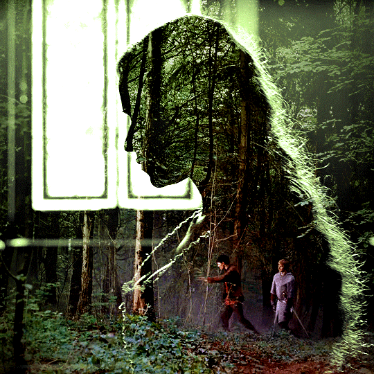
Note
Hi! Can I ask how you did the double exposure gifs for your merlin set? They're beautiful btw!
heyy, thank you!! of course!
it's actually not very hard, the trick is to find the right shots for this. here's how i did it (reference gifset), under the cut.

for this tutorial i will be:
— using photoshop cs5 on windows
— assuming you know how to make gifs using the timeline
— have basic coloring, sharpening, groups, and layer masks knowledge
I. CHOOSING THE RIGHT SHOTS
the ultimate trick to pull this off is to choose the right image. in order to do the double exposure, you need a silhouette shot that has these:
a defined and dark silhouette with a background that is not too busy
enough contrast between the silhouette and the background
the silhouette should take at least 50% of the space
not too much movement
here are a few examples of why they work and why they won't:
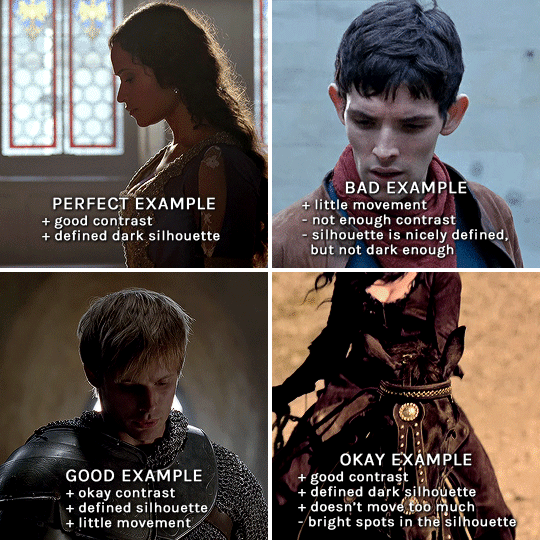
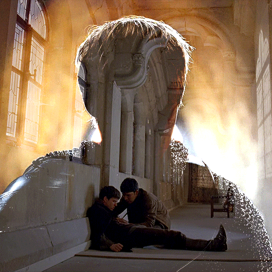
gwen: perfect example since this shot is already quite contrasted with a defined silhouette. there won't be a lot of work needed to make this one work.
merlin: not a great example because even tho there's a somewhat good contrast between him and the background, the silhouette is just too bright, not dark enough.
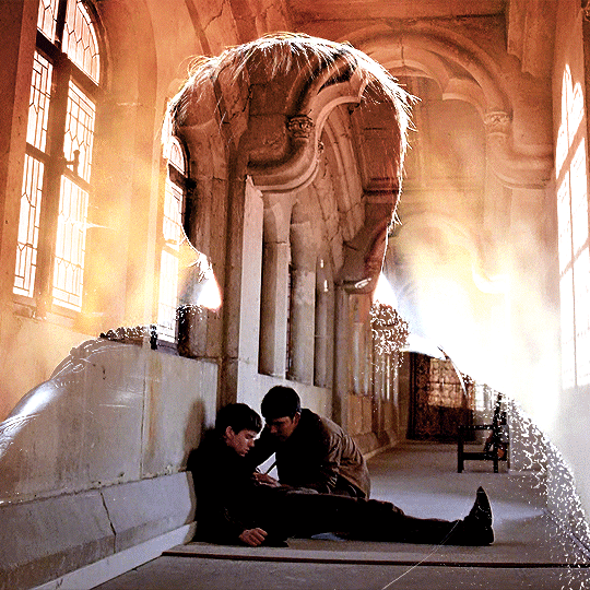
arthur: another good example, even if there are some bright spots on his face and armor. since he's not moving too much, you can definitely brush some black over him to make his silhouette darker (i'll explain/show later)
morgana: this one could work because the contrast is great, but of course her skintone is very bright against the black clothing. that being said, since the movement is not too bad, it could be possible to brush some black over her and move these layers with keyframes (as mentioned for arthur's example). i haven't tried it tho, but i think it would work well enough.
once you have your silhouette shot, you need another gif for the double exposure. what works best, in my opinion, are:
wide, large shots
shots with no to little camera movement (no pan, zoom, etc), but the subjects in the shot can have little movement of course
pretty cinematography/scenery shots
i find these are easier to find and make it work, it's not as "precise" as with silhouette shots. it's mostly just trial and error to see what works best with the silhouettes.
II. PREPPING THE SILHOUETTE
for the effect to work, we want a silhouette that's dark as possible. i'm gonna use the gwen and arthur shots as examples.
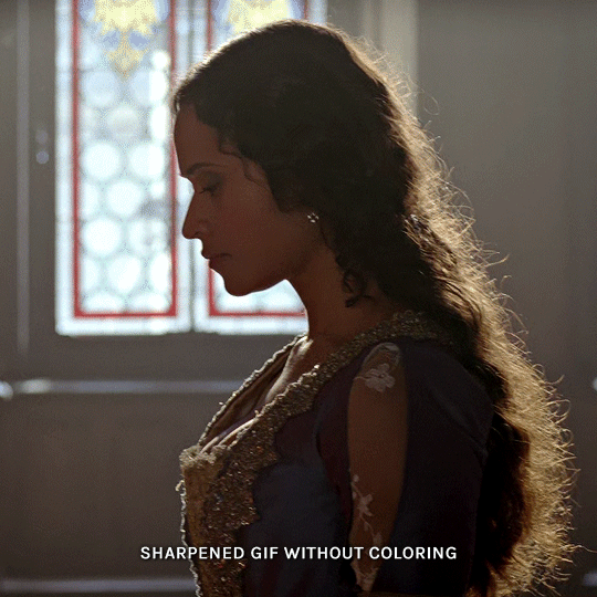
for the gwen gif, i started by sharpening, and then upped the contrast by quite a lot so her silhouette is mostly black, while retaining some nice details. i've used only 3 layers here:

selective color layer: in the blacks tab, playing with the black slider (value: +10)
brightness/contrast layer: added a lot of contrast (+61) and a bit of brightness (+10)
black and white layer: on top, its blending mode set to soft light and at 20% opacity. gives a bit more depth and contrast

then for the arthur example, i've also sharpened it first, and added contrast layers in this order (the skintone looks horrible, but it won't matter soon lol):
levels layer: black slider at 0, grey slider at 0.76, white slider at 104
selective color layer: in the blacks tab, black slider at +10
brightness/contrast layer: brightness at +1-, contrast at +47
black and white layer: on top, its blending mode set to soft light and at 20% opacity. gives a bit more depth and contrast
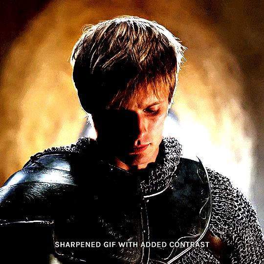
as you can see, half of his face is still quite bright. to correct that, create a new empty layer and put it between the gif and the coloring layers.
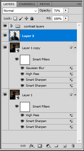
using a really soft brush and the black color, brush some black over his face and body on that new empty layer. you can edit the layer's opacity if you want, i've set mine to 71%. since arthur doesn't move much here, there's no need to keyframe this layer's position. for the morgana example, this is where you'd need to play with keyframes to make it work. here's where i'm at now after this:
you can always edit this layer later if you need, after doing the double exposure blending.
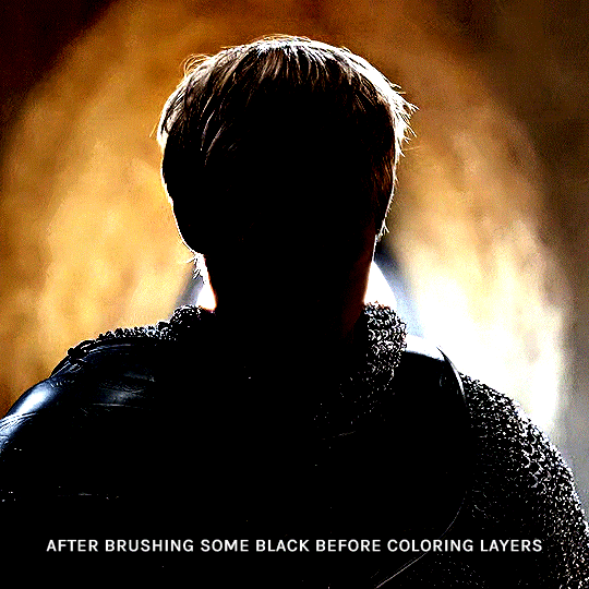
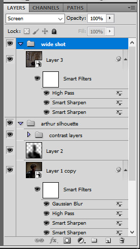
once the silhouette is all ready, you can put all layers in a group and rename it (i've renamed mine silhouette).
III. BLENDING
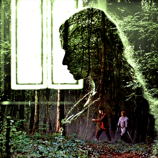
now the fun part! import the wide/scenery shot in photoshop, then resize it to the same height of your silhouette gif. make sure the gif is a smart object layer, and sharpen it. finally, bring this gif onto the silhouette canvas (by right clicking the smart object > duplicate layer). once you have both gifs onto your canvas, put the wide shot gif layer in a group, and set this group's blending option to screen.

you can then position the wide/scenery gif the way you like it in the canvas. this is how it looks for both examples after i've done that:

if the blending mode screen doesn't give you the best result, so you can play around with other blending modes (such as lighten and linear dodge in these particular cases), but generally speaking, screen is the real mvp here haha.
IV. COLORING
now that the double exposure effect is done, we need to color the gifs to bring them together. i went with simple coloring here, simply enhancing the colors that were already there. just make sure that the coloring layers for each gif are in their respective groups. here's how i've colored both examples:
gwen silhouette group: i added a gradient map layer on top of the contrast layers in black to green and set the blending mode to color
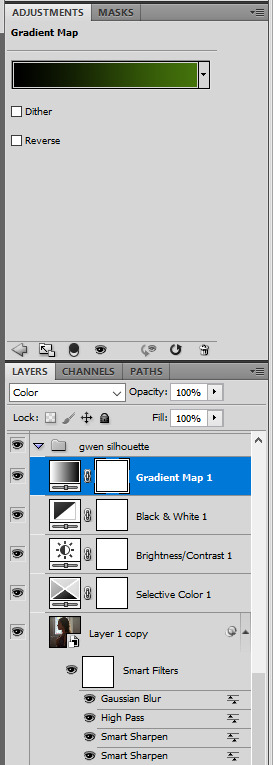
scenery shot group: multiple coloring layers, with a green color fill layer (blending mode set to color), with a layer mask so it only affects the top half of the gif
for the arthur gif, i did something very similar but with warmer colors. i didn't use a gradient map for arthur though:
arthur silhouette group: i made the yellow warmer, closer to orange/red, with a hue/saturation layer, and added more vibrance. didn't feel like it needed a gradient map layer here though.
wide shot group: basic coloring layers to enhance colors from the merlin & daegal shot, and an orange color fill layer set to the color blending mode.
at this point you're pretty much done. just need to add some final touches and typography (if you want).
V. FINAL TOUCHES
a small and completely optional detail, but i wanted to soften the edges of the wide gifs. to do so i've duplicated the smart object gif layer and removed the sharpening filters (right click on smart filter > clear smart filters). put this layer on top of the other smart object layers (but still below the coloring).
then with this same layer still selected, go to filter > blur > gaussian blur... > 10px. this will give you a very blurry gif, but we only want the edges of the canvas to be softer. so add a layer mask to this layer. with a very large and soft brush (mine was at 0% hardness and about 800px size), brush some black onto the layer mask to remove the blur in the middle of the gif.

you can play with this layer's opacity or gaussian blur amount if you want (by double clicking on the gaussian blur smart layer filter). here how both examples look with this gaussian blur layer:
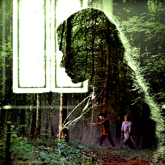

you can also mask some of wide/scenery gifs if you'd prefer, so it shows less outside of the silhouette. just put a layer mask on that whole wide shot group and brush some black or grey on the layer mask. it's what i did for the gwen gif, with a very soft brush and i set the mask density to 72% (i kept the arthur one as is tho):

and that's how i did it! hopefully that was clear enough :)
#alie replies#*ps help#resource#tutorial#allresources#*gfx#usercats#usersmia#userrobin#userfaiths#usertina#usermoonchild#userchibi#uservivaldi#usertreena#userraffa#userriel#userelio#usermadita#usersmblmn
970 notes
·
View notes
Text
˙ ˖ ✶ ANAHILATION COLORING PSD #003 — rocket pop !!
i make all of my resources for free and always will, but if you’d like to leave a tip my ko-fi is ANAHILATION. enjoy!!
feel free to edit however you like for personal use. please do not redistribute, claim as your own, or sell to others.
credit is not necessary, but always appreciated! a like & reblog if you’re using is the cherry on top. and also feel free to mention me, i’d love to see what you come up with!
my askbox is always open for any questions or suggestions on resources.
i'm now offering commissions! head to my blog for more details.
head to the source link to download on google drive!!
14 notes
·
View notes
Text

COLORING + SHARPENING TUTORIAL
someone asked for a coloring tutorial and my sharpening settings, so here it is! there are also a few tips to achieve more HQ gifs. :)
tutorial under the cut!
FOR HIGH-QUALITY GIFS
FILE SIZES
it doesn’t matter what your sharpening settings are if the file you’re using to gif is too low quality, so i tend to look for the best that i can get when downloading stuff.
usually, movies (+2h) look better if they’re 5GB or more, while an episode (40 min/1h) can look good with even 1GB. the minimum definition i try to find is 1080p, but i gif with 2160p (4k) when available. unfortunately, not every computer can handle 4k, but don’t worry, you can gif with 1080p files just fine if they are big enough. contrary to popular belief, size does matter! which means sometimes a bigger 1080p file is better than a smaller 2160p one, for example.
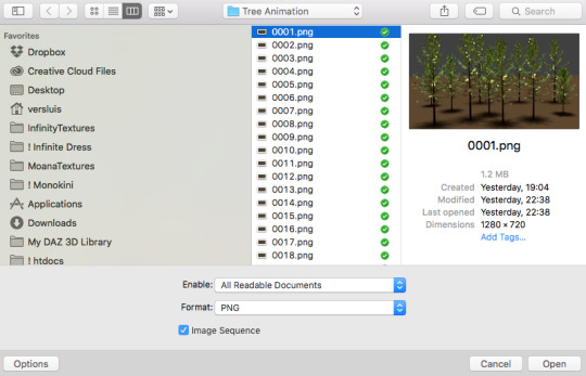
SCREENCAPPING METHOD
this can too influence the quality of your gifs. as a gifmaker, i’ve tried it all: video frames to layers, directly opening video clips, loading files into stack, and i’ve finally settled down with opening screencaps as an image sequence. with bigger files, it doesn’t matter much what technique you use, but i’ve noticed with smaller files you can do wonders if you screencap (either by loading files into stack or opening as an image sequence) instead of using video clips. for example, this gif’s original video file was only 4GB (so smaller than i’ve usually go for), if you can believe it!
here’s a tutorial for setting up and screencapping with MPV, the media player i use to screencap. again, you can keep using video clips for bigger files, but you’ll find this useful when dealing with dire causes. i don't file loads into stack, though, like the video does. i open as an image sequence (open > screencap folder > select any image > click the image sequence button). just select OK for the speed. this will open your screencaps as a video clip (blue bar) in timeline mode (i'm a timeline gifmaker, i don't know about you). you will need this action pack to convert the clip into frames if you're a frames gifmaker. i suggest you convert them into frames even if you're a timeline gifmaker, just convert them into a timeline again at the end. that way you can delete the screencaps right away, otherwise you will delete the screencaps and get a static image as a "gif".
ATTENTION if you’re a Mac Sonoma user, MPV won’t be an option for you unless you downgrade your system. that is, if you have an Intel chip. if you have M1 Max chip (or even a better one), here’s a fix for MPV you can try while keeping that MacOS, because nowadays MPV is skipping frames in its latest build. or you can use MPlayer instead for less hassle. here are two tutorials for setting and using MPlayer. Windows users are fine, you can use MPV without trouble.
FOR EVEN MORE QUALITY
ADD NOISE
here’s a tutorial for adding noise as a way to achieve more HQ gifs if your original material is too low quality.
REDUCE NOISE WITH CAMERA RAW
instead of adding noise, you can reduce it, especially if your gif is very noisy as it is.
the path is filter > camera raw > detail > nose reduction. i do this before sharpening, but only my video file isn't great to begin with. because it’s a smart filter, you can reduce or increase its opacity by clicking the bars next to its name in the layers panel.
TOPAZ AI
i use Topaz Photo AI to increase the quality of my screencaps when i need to. it’s paid software, but there are… ways to find it for free, usually on t0rrent websites. if someone’s interested, i can make a tutorial solely about it in the future.
SHARPENING SETTINGS
here are my sharpening settings (filter > sharpen > smart sharpen). i sharpen things twice: 500% 0.4px + 10% 10px. here's an action for it, for more convenience. here's a tutorial on how to use Photoshop actions. for animated stuff, i use this action pack.

COLORING
here’s the gif i'm gonna use as a base. it’s already sharpened like the way i always do it.

LIGHTNING THE SHOTS
half of the secret of a good coloring is good lightning. i always useCurves (layers > new adjustment layer > curves) and Brightness & Contrast (layers > new adjustment layer > brightness & contrast). the settings depend on the scene you’re giffing, but i always try make my gifs bright and with high contrast to make the colors pop.
CURVES
besides lighting your scene, the Curves adjustment layer has four automatic options that will color-correct it for you. it’s not always perfect and it doesn’t mean you won’t need to do further coloring, but it’s a great start. it’s a lifesaver for most ridiculously yellow scenes. look at the difference! this gif uses the 3rd automatic option (the screenshot below isn't mine btw so that's why the fourth option is the chosen one), from top to bottom. what automatic option you need to choose depends on the gif.

sometimes i like to tweak my Curves layer. not everybody does that, it’s not that necessary and if you’re not careful, it can screw your gif up. to modify your layer by hand, you will need to click and drag points of that straight line in the position you desire. this is the concept behind it:

basically, the lower part of the line handles the shadows, while the upper part handles the highlights of the image. if you pull a highlight point up, the image’s highlights will be brighter. if you pull it down, it will make them darker. same thing for the shadow points. you should play with it to get a grasp of it, that’s what i did when i first started giffing.
BRIGHTNESS & CONTRAST
then i added a bit of brightness and contrast.

CHANNEL MIXER
the scene looked a bit too yellow, so i used the Channel Mixer (layer > new adjustment layer > channel mixer) adjustment layer. here’s a tutorial of how it works. not every scene needs the Channel Mixer layer though, i mostly use it to remove heavy overall tints. in this particular case, the Curves layer got rid of most of the yellow, but i wanted the gif to be just a bit more blue so the Channel Mixer tweaks are very minimal.

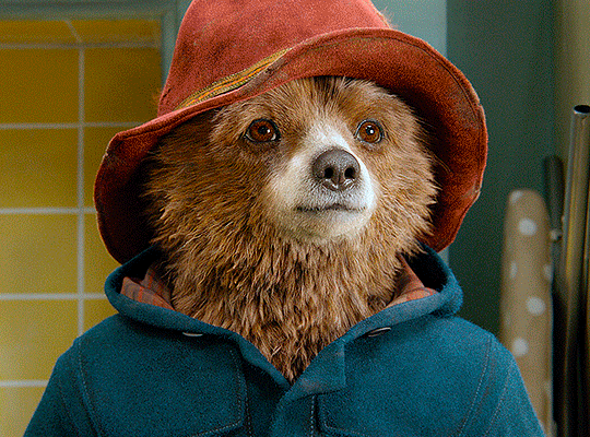
SELECTIVE COLOR
now, this adjustment layer i always use: Selective Color (layer > new adjustment layer > selective color). this is THE adjustment layer to me, alongside the Curves one. this is how it works:

ie, you can separately edit a color this way, giving it tints. for this gif, i wanted to make the colors more vibrant. to achieve that, i edited the selected colors this way:
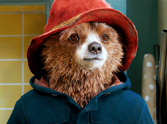
for the reds, i added even more red in them by moving the first slider to the right, making the color more vibrant. for his hat to have a more warm tint, i added yellow to the reds (third slider, moving it to the right). finally, to make the reds stronger, i moved the last slider to the right (more black).
for the yellows, i made them brighter by adding white to them, thus making the tile wall and Paddington more bright as well.
for the cyans and the blues, i just added the maximum (+100) of black that i could.
i wanted for Paddington's nose to be brighter, so i added more white to the whites.
lastly, i added depth to the blacks by increasing their own blackness.
you should always play with the Selective Colors sliders for a bit, before deciding what you want or need. with time, you will automatically know what to change to correct the color grading. it all takes practice!
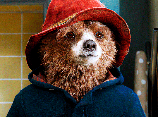
HUE/SATURATION
i don’t know if you noticed, but there are some green spots on the blue wall behind Paddington. to correct that, i added a Hue/Saturation adjustment layer (layer > new adjustment layer > hue/saturation) and made the saturation of the greens 0%, making that unwanted green disappear from the background.

while the green spots on the wall are specific for this gif, i use hue/saturation a lot to tweak, well, hue and saturation. sometimes someone’s skin is too yellow, i made it redder by tweaking the reds and the yellows, or vice-versa. the hue bar follows the rainbow bar, so the maximum settings (+100 and -100) give the selected color to change its hue to something more red or pink (the rainbow extremities). changing hue can give pretty whacky results, like turning someone’s skin tone to green, so you will need to play with it to get the hang of it. you can also tweak the opacity of your hue/saturation layer to further improve your gif’s coloring. i didn’t do it in this case, the opacity is still 100%. the reds and the blues had their saturation increased to make them pop just a bit more, without affecting the other colors.
COLOR BALANCE
the highlights of the gif still had a green tint to it due to the automatic correction of the Curves layer, so i used Color Balance. this is how it works: instead of giving specific colors some tints, you can give them to the shadows, highlights, and mid-tones. if your shadows are too blue, you counterbalance them with the opposite color, yellow. same thing with the cyan-red and magenta-green pairings. in my case, i added a bit of magenta.


B&W GRADIENT MAP
now, if this gif was a dish, it’s time for the salt and pepper. i always add a Gradient Map (layer > new adjustment layer > gradient map) (black to white gradient) with the Soft Light blending mode, thus giving my shadows more depth without messing with the mid-tones and highlights. it also doesn’t “deep fry” (you know those memes?) the gif too much by adding even more contrast. usually, the opacity of the layer is between 30% to 70%, it all depends on the gif. it always does wonders, though!
COLOR FILTER
finally, i like to add Color Filters (layer > new adjustment layer > color filter) to my gifs. it’s very handy when giving different scenes for the same minimalistic set because it makes them kind of match despite having completely different colors. in this gif’s case, i added a “deep blue” filter, opacity 50% density 25. you can change the density and the opacity of the layer for further editing, again, it all depends on the gif.

VIBRANCE
if i feel like it, i add a vibrance layer (layer > new adjustment layer > vibrance) to make the colors pop. this can ruin your coloring sometimes, especially when regarding skin color, so be careful. i didn't do it in this gif because i felt i didn't need it.
TA-DA! 🥳
AN OTHER EXAMPLE
the color grading of the original scene it’s pretty good as it is, to be honest. let’s see a worse scenario, a VERY yellow one:
no channel mixer this time because the automatic curves option dealt with the yellowness, but you can see it made the gif too green. i needed to correct that with the following adjustment layers:
curves (automatic option) (gif 2) >> same curves layer (tweaks) (gif 3) >> brightness & contrast (gif 4) >> hue/saturation (tweaked cyan+blue+green) >> selective color >> color balance (gif 5) >> b&w gradient map >> (sepia) filter >> vibrance (gif 6)
i added a hue/saturation layer to remove the blues & greens before my selective color layer because i thought that was more urgent than tweaking the tint of all colors. color balance (gif 4) was the real hero here, though, by removing the green tint. the selective color layer was meant to make the red pop more than anything else, because the rest looked pretty good, especially her skin tone (despite the green tint). you can notice that tweaking the curves layer (small gif 3) also helped A LOT with the green problem.
tl;dr 😵💫😵💫😵💫
here's a list of my go-to's while coloring and lightning gifs. it's not a rule, just a guide. there are gifs in which i don't use all these adjustment layers, or use them in a different order. it all depends!
1. curves (automatic option + tweaks)
2. brightness & contrast
3. channel mixer
4. selective color
5. hue/saturation
6. color balance
7. b&w gradient map
8. color filter
9. vibrance
i'll suggest that you study each adjustment layer listed for more info, either with other Tumblr tutorials or YouTube ones. the YouTube ones focus on images, but you can translate what they teach to gif making very easily. you can ask me to further explain any adjustment layer, too! i was brief to keep this short (which i kinda failed lol).
feel free to ask me for clarification or something else about gifmaking wise, i always like to help. ❤️
#*#*tutorial#gifmaker tag#resources#resource: tutorials#ps help#uservivaldi#tuserjen#userrin#userelio#useralien#userzaynab#userchibi#userbuckleys#usertj#userbess#tuserlucie#useraljoscha#userdavid#usershreyu#usernolan#userhallie#userisaiah#tusergio#tusergeo#userjesslynn
326 notes
·
View notes
Photo
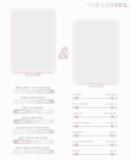
TEMPLATE - THE LOVERS.
was asked by anon a while back to attempt my own ship template and I tried my best with it. it’s not much, but sometimes simple is nice. hope it’ll get people messaging y’all about your ships <3 and since i think everyone loved the card type template, I added it here. as always, fully customizable.
please like/reblog if you use! reblogs are very appreciated.
support me on kofi if you want! it helps a lot.
download.
1K notes
·
View notes
Text
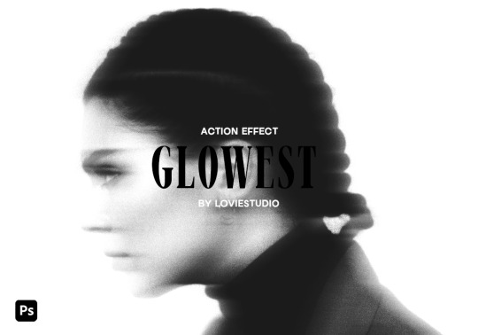
GLOWEST ACTION EFFECT by @loviestudio
This action was made in Photoshop CC, and it will work better on it!
CONTENT
1 Photoshop action file (ATN) with four options of the effect: black and white + coloured - horizontal and vertical.
TERMS
Before/after preview here!
Like and/or reblog to help a creator.
Don’t repost, re-upload or put it on packs and/or google drive. Don’t claim my resources as your own.
Don’t use my resources as a base or copy them.
Credits are not mandatory, although I’d love to see your edits!
My resources are free for personal/non-commercial use only. For commercial use, you must pay for the download. If you paid for the download, you are authorized to use it commercially. Reach out to me for more info or if you have questions about my resources license.
Follow me for more resources! ♡
This is a free resource, but you can buy it with points on DeviantArt to help out a creator or download it for free on Ko-Fi. Thank you!
#dailyresources#allresources#completeresources#dearindies#photoshop resources#rp resources#rph resources#indie rph#rphelp#resources#photoshop action#actions#action#action effect#action: blur#action: effect#free resources#free#ps resources#psd resources#retro effect#retro action
220 notes
·
View notes
Photo

♥ > DOWNLOAD <
♥ Please, add to favorites or leave a comment.
♥ Por favor, adicione aos favoritos ou deixe um comentário.
#psd#psds#rpsd#rpsds#gifs for edits#psd for icons#psd for edits#for edits#ps resources#ps resource#resource#itsphotoshop#psd para edits#reblogxs#wealps#wealphotoshop#deviantart
14 notes
·
View notes
Text
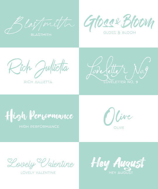
˚꒰ 🏹 FONT PACK #1 : CUPID'S PICKS ♡
below are 10 of my favorite fonts to use for graphics! these in particular are script / handwritten. none of these fonts are mine and credit goes to their rightful creators. feel free to like / reblog if you found this useful♡♡♡
blastmith | gloss & bloom
rich jullietta (free demo) | loveletter no. 9
high performance (free demo) | olive
lovely valentine | hey august
247 notes
·
View notes
Text

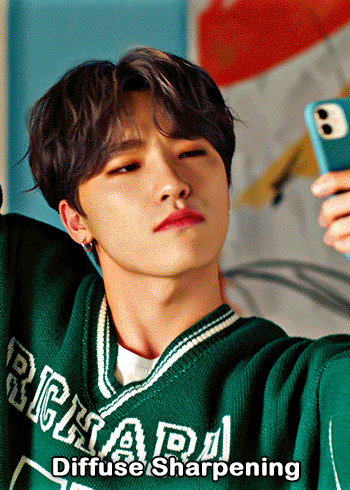
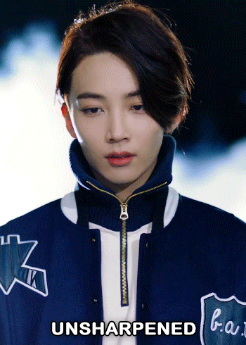
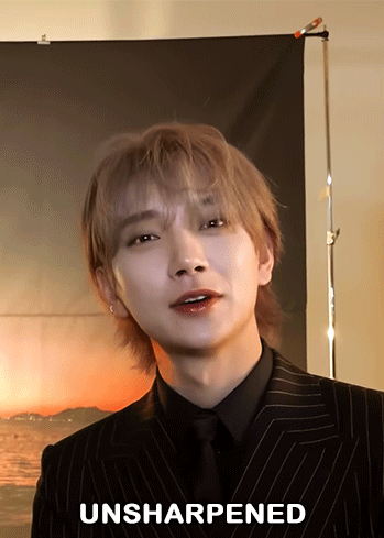
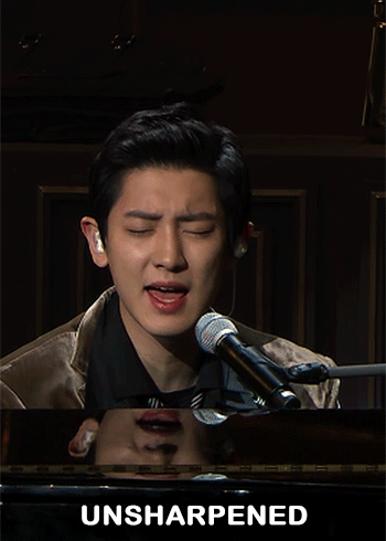
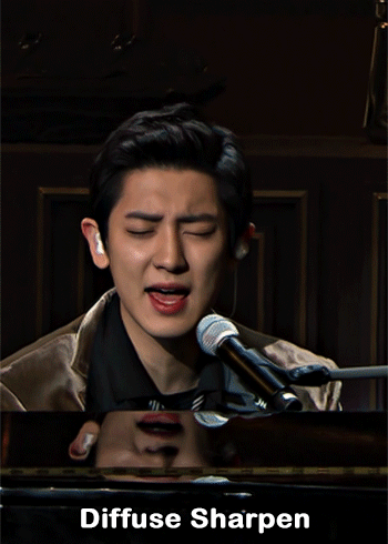
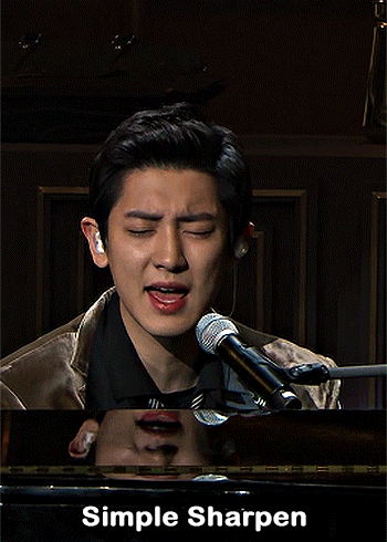
— i've been asked abt sharpening a few times but i thought that i would just share my actual actions i use but with some guidelines because it can really differ between different video sources and no sharpening is always exactly the same

— i've included different examples of video sources that i use for gifs alongside each type of sharpening action because not all actions will work for every gif. while it's always a matter of preference (whether u prefer a softer/more sharpened gif) some sharpenings can whitewash a gif so i added a little question mark as a warning to be mindful of that and make adjustments!
— there are three (technically four) different actions. one is ultra hd sharp and works best on really good quality footage such as master mvs or good film/show footage! the second is a simple sharpening that can be used on all videos and the third is a softer sharpening that utilises the diffuse setting and it has a glowy option w blur as well!
— take a look below at how the sharpenings look on different videos 💙
💌 MASTER/BUGS/BLU-RAY VIDEOS
video source: here (gdrive)
file size: 2gb


💌 4K YOUTUBE VIDEO
video source: here (yt)
file size: 470mb
💌 1080HD OR LESS VIDEO
video source: here (yt)
file size: 77mb


💌 TS FILE
video source: here (k24hrs + dm for password!)
file size: 3.21gb
video specifications: qtgmc 60fps preprocesser + bm3d denoise (2)

💌 GOING SEVENTEEN
because it varies so much it requires an example of its own
video source: here (yt)
file size: 606mb
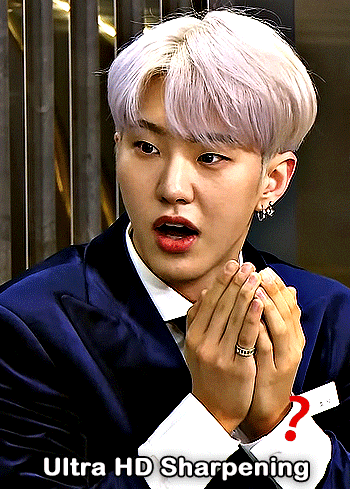


YOU CAN FIND THE SHARPENINGS HERE <3
if you ever need any help or clarification feel free to ask!! no need for credit if you use, but of course please don't claim the actions as your own <3
#allresources#yeahps#photoshop tutorial#gif action#kpop resources#ps help#creations#creations: action#userace#usershreyu#userjoanna#tuserose#useraashna#usernik#useratz#useraurore#usernanda#userkaison#userngocchi
505 notes
·
View notes
Text

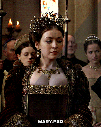
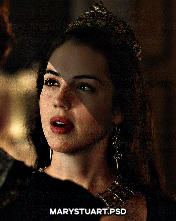

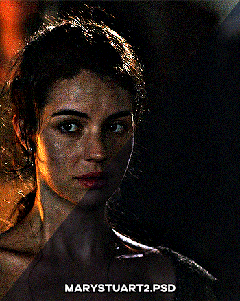
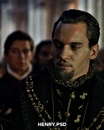
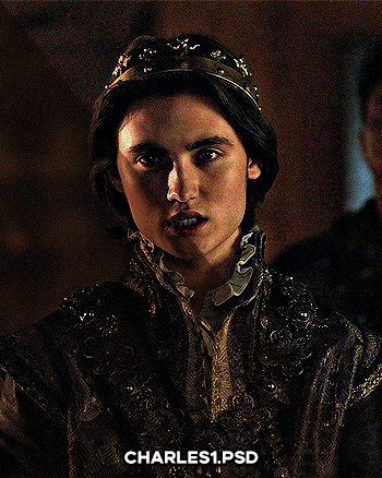
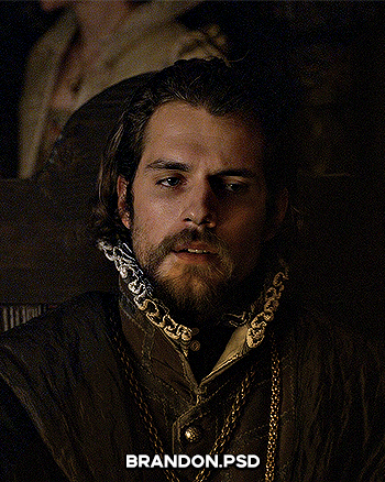

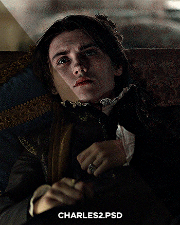
PSD PACK #1 — period dramas
in this folder, there's ten psds created for the shows: reign and the tudors but they should work across any period drama with dark or yellow/green lighting <3 just remember to always adjust the curves (and channel mixer if necessary) to suit the lighting of the scene
a lot of these are pretty basic colourings, and some are pretty similar but these are the ones that i use the most often!
#dailypsd#psdresources#completeresources#allresources#psd pack#psd colouring#photoshop resource#gif psd#01#ps help#useratz#usershreyu#userzil#usershri#usermery#userbloomingwarrior#niniblr#usercats#userfaiths#usermare#userbess
287 notes
·
View notes
Last Seen Blogs
smilingcrittersthingig
Critter AU
sashaaa
Sasha

alexefren
Untitled
animal-lovers-kingdom-blog
Animal lovers