#resource: tutorials
Explore tagged Tumblr posts
Visit Tumblr Blog
Explore Tumblr blogs with no restrictions, modern design and the best experience.
Last Seen Tumblr Blogs


Fun Fact
After the announcement of the deal with Yahoo!, there were 170K signatures of unhappy Tumblr users petitioning to prevent the sale in 2013.
Text

COLORING + SHARPENING TUTORIAL
someone asked for a coloring tutorial and my sharpening settings, so here it is! there are also a few tips to achieve more HQ gifs. :)
tutorial under the cut!
FOR HIGH-QUALITY GIFS
FILE SIZES
it doesn’t matter what your sharpening settings are if the file you’re using to gif is too low quality, so i tend to look for the best that i can get when downloading stuff.
usually, movies (+2h) look better if they’re 5GB or more, while an episode (40 min/1h) can look good with even 1GB. the minimum definition i try to find is 1080p, but i gif with 2160p (4k) when available. unfortunately, not every computer can handle 4k, but don’t worry, you can gif with 1080p files just fine if they are big enough. contrary to popular belief, size does matter! which means sometimes a bigger 1080p file is better than a smaller 2160p one, for example.
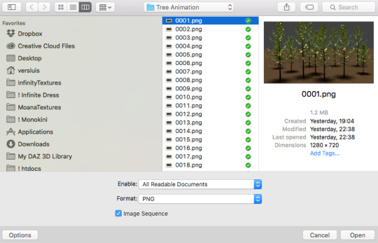
SCREENCAPPING METHOD
this can too influence the quality of your gifs. as a gifmaker, i’ve tried it all: video frames to layers, directly opening video clips, loading files into stack, and i’ve finally settled down with opening screencaps as an image sequence. with bigger files, it doesn’t matter much what technique you use, but i’ve noticed with smaller files you can do wonders if you screencap (either by loading files into stack or opening as an image sequence) instead of using video clips. for example, this gif’s original video file was only 4GB (so smaller than i’ve usually go for), if you can believe it!
here’s a tutorial for setting up and screencapping with MPV, the media player i use to screencap. again, you can keep using video clips for bigger files, but you’ll find this useful when dealing with dire causes. i don't file loads into stack, though, like the video does. i open as an image sequence (open > screencap folder > select any image > click the image sequence button). just select OK for the speed. this will open your screencaps as a video clip (blue bar) in timeline mode (i'm a timeline gifmaker, i don't know about you). you will need this action pack to convert the clip into frames if you're a frames gifmaker. i suggest you convert them into frames even if you're a timeline gifmaker, just convert them into a timeline again at the end. that way you can delete the screencaps right away, otherwise you will delete the screencaps and get a static image as a "gif".
ATTENTION if you’re a Mac Sonoma user, MPV won’t be an option for you unless you downgrade your system. that is, if you have an Intel chip. if you have M1 Max chip (or even a better one), here’s a fix for MPV you can try while keeping that MacOS, because nowadays MPV is skipping frames in its latest build. or you can use MPlayer instead for less hassle. here are two tutorials for setting and using MPlayer. Windows users are fine, you can use MPV without trouble.
FOR EVEN MORE QUALITY
ADD NOISE
here’s a tutorial for adding noise as a way to achieve more HQ gifs if your original material is too low quality.
REDUCE NOISE WITH CAMERA RAW
instead of adding noise, you can reduce it, especially if your gif is very noisy as it is.
the path is filter > camera raw > detail > nose reduction. i do this before sharpening, but only my video file isn't great to begin with. because it’s a smart filter, you can reduce or increase its opacity by clicking the bars next to its name in the layers panel.
TOPAZ AI
i use Topaz Photo AI to increase the quality of my screencaps when i need to. it’s paid software, but there are… ways to find it for free, usually on t0rrent websites. if someone’s interested, i can make a tutorial solely about it in the future.
SHARPENING SETTINGS
here are my sharpening settings (filter > sharpen > smart sharpen). i sharpen things twice: 500% 0.4px + 10% 10px. here's an action for it, for more convenience. here's a tutorial on how to use Photoshop actions. for animated stuff, i use this action pack.

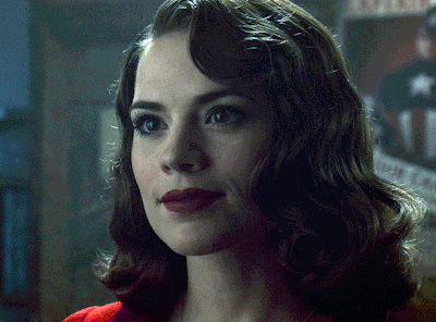
COLORING
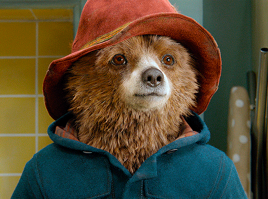
here’s the gif i'm gonna use as a base. it’s already sharpened like the way i always do it.

LIGHTNING THE SHOTS
half of the secret of a good coloring is good lightning. i always useCurves (layers > new adjustment layer > curves) and Brightness & Contrast (layers > new adjustment layer > brightness & contrast). the settings depend on the scene you’re giffing, but i always try make my gifs bright and with high contrast to make the colors pop.
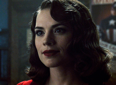
CURVES
besides lighting your scene, the Curves adjustment layer has four automatic options that will color-correct it for you. it’s not always perfect and it doesn’t mean you won’t need to do further coloring, but it’s a great start. it’s a lifesaver for most ridiculously yellow scenes. look at the difference! this gif uses the 3rd automatic option (the screenshot below isn't mine btw so that's why the fourth option is the chosen one), from top to bottom. what automatic option you need to choose depends on the gif.

sometimes i like to tweak my Curves layer. not everybody does that, it’s not that necessary and if you’re not careful, it can screw your gif up. to modify your layer by hand, you will need to click and drag points of that straight line in the position you desire. this is the concept behind it:

basically, the lower part of the line handles the shadows, while the upper part handles the highlights of the image. if you pull a highlight point up, the image’s highlights will be brighter. if you pull it down, it will make them darker. same thing for the shadow points. you should play with it to get a grasp of it, that’s what i did when i first started giffing.
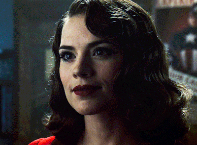
BRIGHTNESS & CONTRAST
then i added a bit of brightness and contrast.

CHANNEL MIXER
the scene looked a bit too yellow, so i used the Channel Mixer (layer > new adjustment layer > channel mixer) adjustment layer. here’s a tutorial of how it works. not every scene needs the Channel Mixer layer though, i mostly use it to remove heavy overall tints. in this particular case, the Curves layer got rid of most of the yellow, but i wanted the gif to be just a bit more blue so the Channel Mixer tweaks are very minimal.

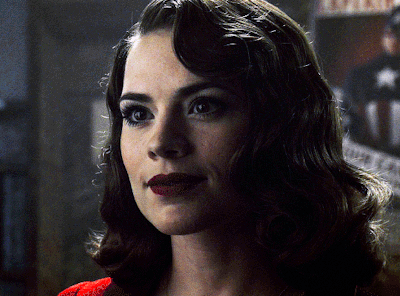
SELECTIVE COLOR
now, this adjustment layer i always use: Selective Color (layer > new adjustment layer > selective color). this is THE adjustment layer to me, alongside the Curves one. this is how it works:

ie, you can separately edit a color this way, giving it tints. for this gif, i wanted to make the colors more vibrant. to achieve that, i edited the selected colors this way:
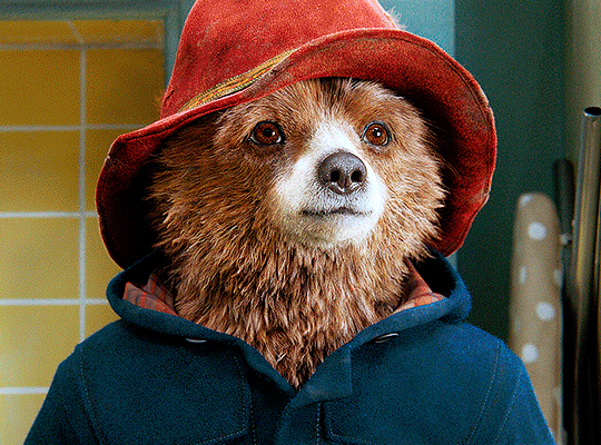
for the reds, i added even more red in them by moving the first slider to the right, making the color more vibrant. for his hat to have a more warm tint, i added yellow to the reds (third slider, moving it to the right). finally, to make the reds stronger, i moved the last slider to the right (more black).
for the yellows, i made them brighter by adding white to them, thus making the tile wall and Paddington more bright as well.
for the cyans and the blues, i just added the maximum (+100) of black that i could.
i wanted for Paddington's nose to be brighter, so i added more white to the whites.
lastly, i added depth to the blacks by increasing their own blackness.
you should always play with the Selective Colors sliders for a bit, before deciding what you want or need. with time, you will automatically know what to change to correct the color grading. it all takes practice!
HUE/SATURATION
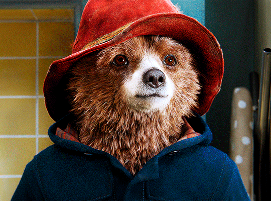
i don’t know if you noticed, but there are some green spots on the blue wall behind Paddington. to correct that, i added a Hue/Saturation adjustment layer (layer > new adjustment layer > hue/saturation) and made the saturation of the greens 0%, making that unwanted green disappear from the background.

while the green spots on the wall are specific for this gif, i use hue/saturation a lot to tweak, well, hue and saturation. sometimes someone’s skin is too yellow, i made it redder by tweaking the reds and the yellows, or vice-versa. the hue bar follows the rainbow bar, so the maximum settings (+100 and -100) give the selected color to change its hue to something more red or pink (the rainbow extremities). changing hue can give pretty whacky results, like turning someone’s skin tone to green, so you will need to play with it to get the hang of it. you can also tweak the opacity of your hue/saturation layer to further improve your gif’s coloring. i didn’t do it in this case, the opacity is still 100%. the reds and the blues had their saturation increased to make them pop just a bit more, without affecting the other colors.
COLOR BALANCE
the highlights of the gif still had a green tint to it due to the automatic correction of the Curves layer, so i used Color Balance. this is how it works: instead of giving specific colors some tints, you can give them to the shadows, highlights, and mid-tones. if your shadows are too blue, you counterbalance them with the opposite color, yellow. same thing with the cyan-red and magenta-green pairings. in my case, i added a bit of magenta.


B&W GRADIENT MAP
now, if this gif was a dish, it’s time for the salt and pepper. i always add a Gradient Map (layer > new adjustment layer > gradient map) (black to white gradient) with the Soft Light blending mode, thus giving my shadows more depth without messing with the mid-tones and highlights. it also doesn’t “deep fry” (you know those memes?) the gif too much by adding even more contrast. usually, the opacity of the layer is between 30% to 70%, it all depends on the gif. it always does wonders, though!
COLOR FILTER
finally, i like to add Color Filters (layer > new adjustment layer > color filter) to my gifs. it’s very handy when giving different scenes for the same minimalistic set because it makes them kind of match despite having completely different colors. in this gif’s case, i added a “deep blue” filter, opacity 50% density 25. you can change the density and the opacity of the layer for further editing, again, it all depends on the gif.

VIBRANCE
if i feel like it, i add a vibrance layer (layer > new adjustment layer > vibrance) to make the colors pop. this can ruin your coloring sometimes, especially when regarding skin color, so be careful. i didn't do it in this gif because i felt i didn't need it.
TA-DA! 🥳
AN OTHER EXAMPLE
the color grading of the original scene it’s pretty good as it is, to be honest. let’s see a worse scenario, a VERY yellow one:
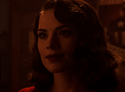
no channel mixer this time because the automatic curves option dealt with the yellowness, but you can see it made the gif too green. i needed to correct that with the following adjustment layers:
curves (automatic option) (gif 2) >> same curves layer (tweaks) (gif 3) >> brightness & contrast (gif 4) >> hue/saturation (tweaked cyan+blue+green) >> selective color >> color balance (gif 5) >> b&w gradient map >> (sepia) filter >> vibrance (gif 6)
i added a hue/saturation layer to remove the blues & greens before my selective color layer because i thought that was more urgent than tweaking the tint of all colors. color balance (gif 4) was the real hero here, though, by removing the green tint. the selective color layer was meant to make the red pop more than anything else, because the rest looked pretty good, especially her skin tone (despite the green tint). you can notice that tweaking the curves layer (small gif 3) also helped A LOT with the green problem.
tl;dr 😵💫😵💫😵💫
here's a list of my go-to's while coloring and lightning gifs. it's not a rule, just a guide. there are gifs in which i don't use all these adjustment layers, or use them in a different order. it all depends!
1. curves (automatic option + tweaks) 2. brightness & contrast 3. channel mixer 4. selective color 5. hue/saturation 6. color balance 7. b&w gradient map 8. color filter 9. vibrance
i'll suggest that you study each adjustment layer listed for more info, either with other Tumblr tutorials or YouTube ones. the YouTube ones focus on images, but you can translate what they teach to gif making very easily. you can ask me to further explain any adjustment layer, too! i was brief to keep this short (which i kinda failed lol).
feel free to ask me for clarification or something else about gifmaking wise, i always like to help. ❤️
#*#*tutorials#gifmaker tag#resources#resource: tutorials#ps help#uservivaldi#tuserjen#userrin#userelio#useralien#userzaynab#userchibi#userbuckleys#usertj#userbess#tuserlucie#useraljoscha#userdavid#usershreyu#usernolan#userhallie#userisaiah#tusergio#tusergeo#userjesslynn
734 notes
·
View notes
Text
I want to tell a story to the artists and would-be artists out there.
When I was 19, I made a large oil painting of the nerd I would eventually marry. I poured all my attention and care into this painting. It's the only art I have from back then that still holds up as a work I'm proud of today.
I entered it into a judged show at the local art center. It got an honorable mention. I went to see the show with my beloved model. One of the judges came up to talk to me, and highlighted that all the judges really liked the painting. It would have placed, except, you see, the feet were incorrect. They were too wide and short, and if I just studied a bit more anatomy-
I called over my future wife, and asked her to take off her shoe. Being already very used to humoring me, she did. The judge looked at her very short, very wide little foot. Exactly as I'd lovingly rendered it. I would never edit her appearance in any way.
The judge looked me in the eye, and to his credit, he really looked like he meant it when he said "Oh I'm so sorry."
Anyways the moral of the story is that all of those anatomy books that teach you proportions are either showing you averages, or a very specific idea of an idealized body. Actual bodies are much more varied than that.
So don't forget to draw from observation, and remember that humans aren't mass produced mannequins. Delight in our variation. Because it's supposed to be there.
122K notes
·
View notes
Text
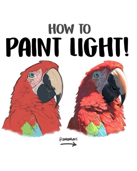
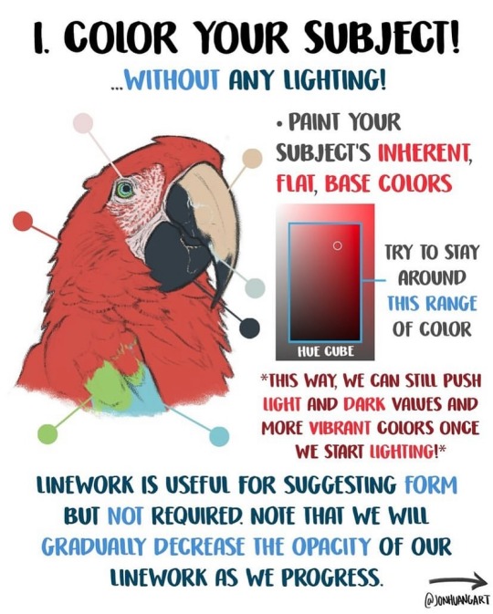
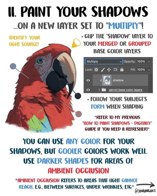
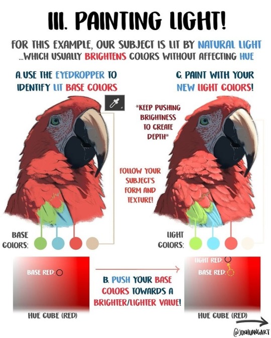
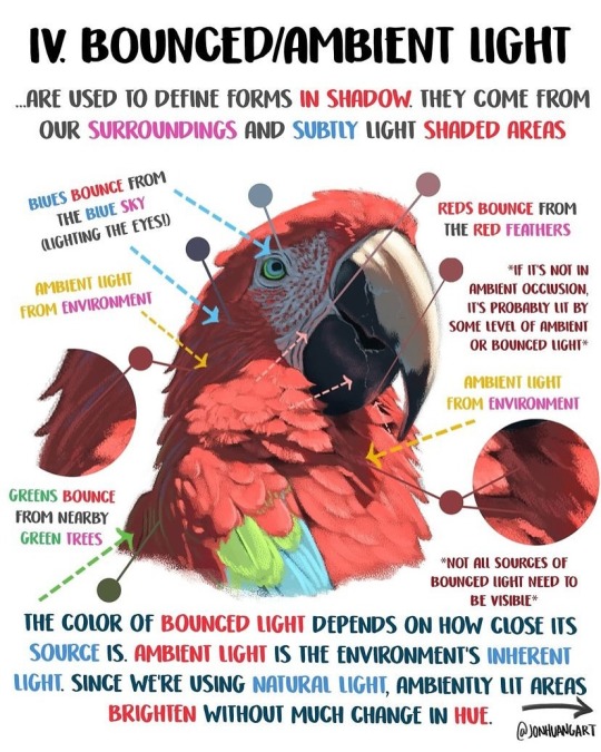
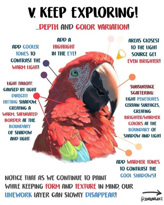
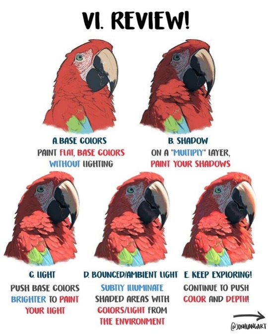
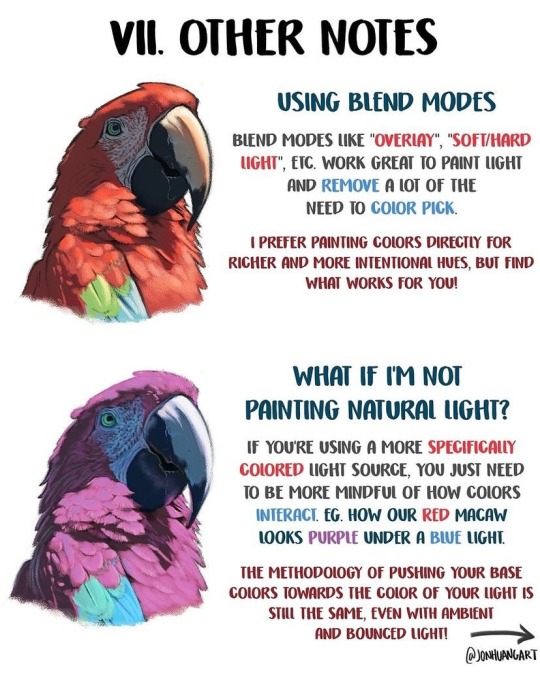
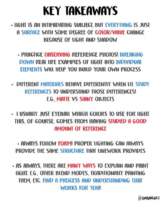
How to Paint Light by jonhuangart
34K notes
·
View notes
Text
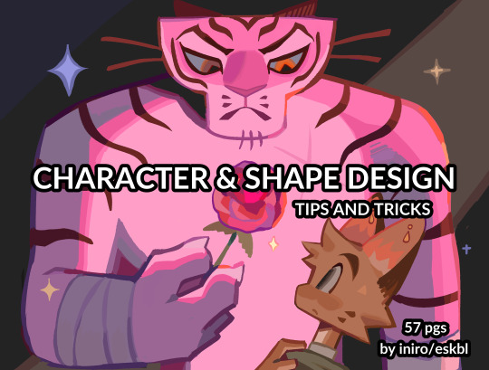

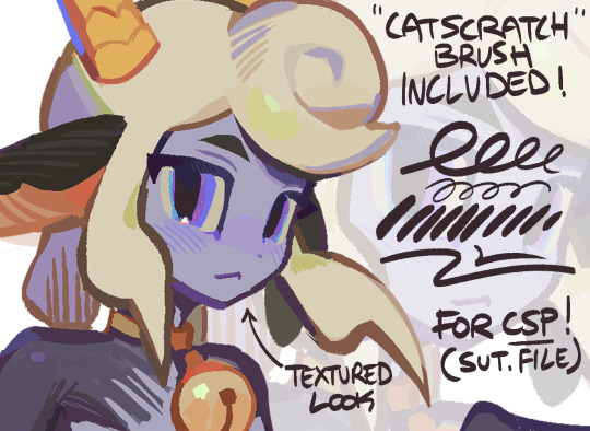
HII my character & shape design tips PDF is now available! ^_^ hope you enjoy !!
BUY HERE or HERE
#character design#art tutorial#art resources#csp brushes#art tips#shape design#myart#i beat the page count of my last pdf woo!
37K notes
·
View notes
Text
for all the artists out there, here are my favorite resources i use to learn!
Files
The Complete Famous Artist Course
Art Books and Resources
Art, Anatomy, and Color Books
PDF Files of Art Books
Morpho and Other Art Books
Mega Folder
Internet Archive
YouTube
My YouTube Playlist of Tutorials
How to Draw Facial Features
Drawing and Art Advice
Drawing Lessons
Art Fundamentals
Anatomy of the Human Body
2D Animation
Perspective Drawing
Websites
Pinterest Board for Poses
Another Pinterest Board for Poses
Pinterest Boards for References
Reference Angle
AdorkaStock
Figurosity
Line of Action
Human Anatomy
Posemaniacs
Animal Photo References
Humanae - Angélica Dass
Fine Art - Jimmy Nelson
The Met Collection
Character Design References
CDR's Twitter Account
iamagco's Twitter Account
taco1704's Twitter Account
takuya_kakikata's Twitter Account
EtheringtonBro's Twitter Account
Drawabox
Color Wheel
Color Palette Cinema
Free Images and Pictures
Free Stock Photos
FILMGRAB
Screen Musings
William Nguyen Light Reference Tool
SketchFab - 3D Skeleton Model
Animation References - sakugabooru
Animation Screen Caps
Animation References - Bodies in Motion
#art#art resources#art books#anatomy#composition#painting#art tips#art help#art tutorial#perspective#color theory#art reference
37K notes
·
View notes
Text
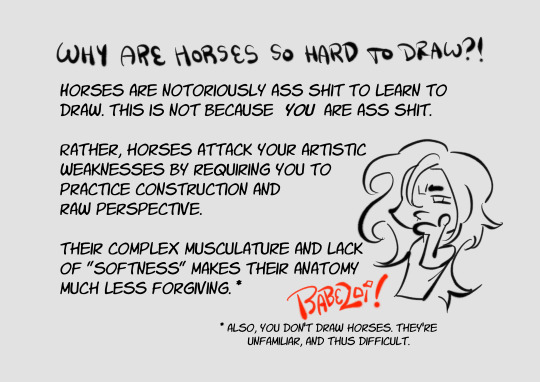
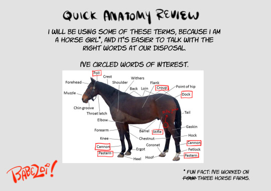
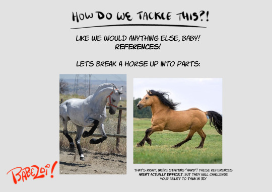
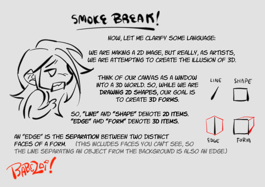
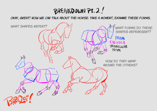
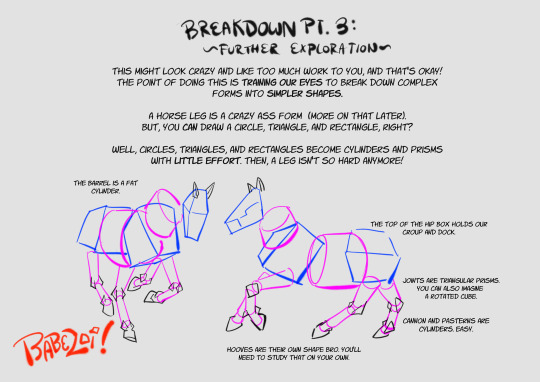
how to draw horses(for the discerning horse girl)
i spent two years working in barns to give you this information. use it wisely
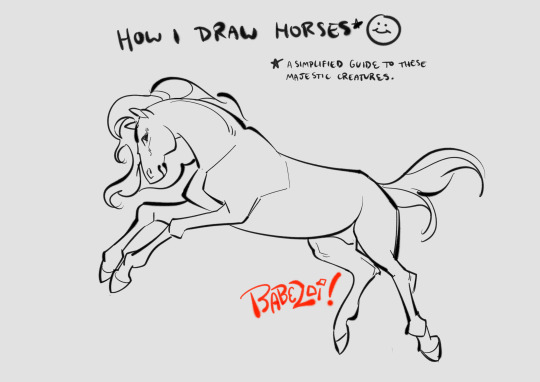
view all 16 parts under the cut!
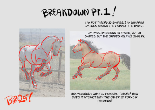
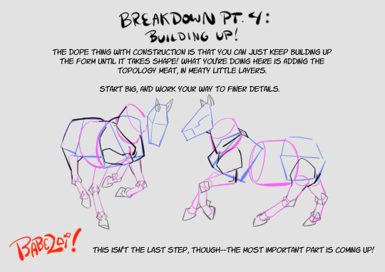
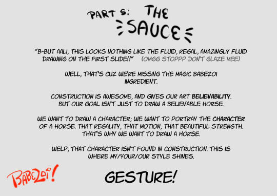
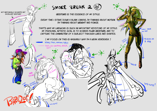
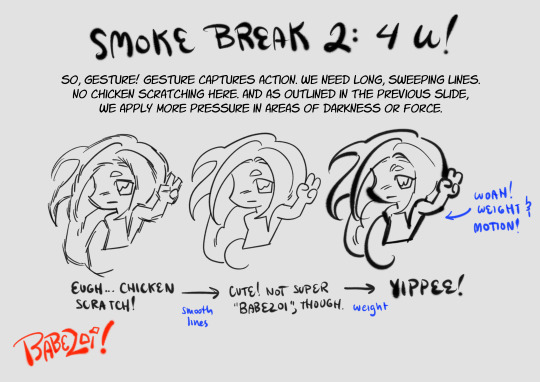
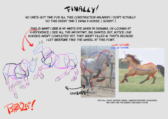
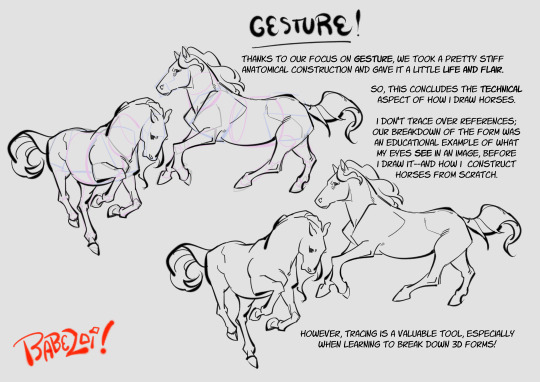
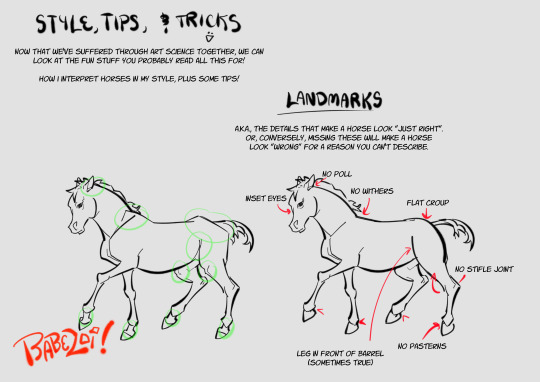
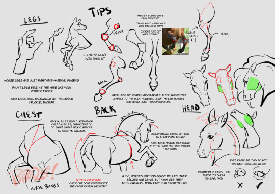
hopefully this guide will inspire you to draw the cowboys you've always dreamed of
#art tutorial#art tips#art resources#horse art#equine art#horses#i love horses so fuckign much#my art#I LOVE HORSES SO MUCHHHHH ILOVE HORSES
12K notes
·
View notes
Text
I made an art/anatomy tutorial about birds! I hope people will find it helpful!


51K notes
·
View notes
Text

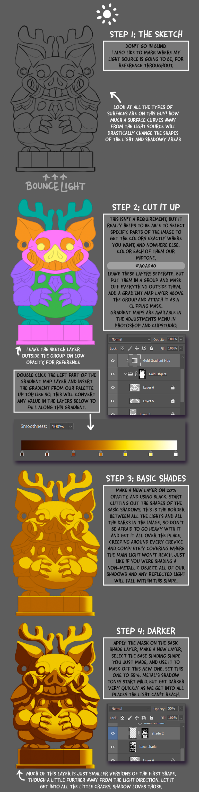
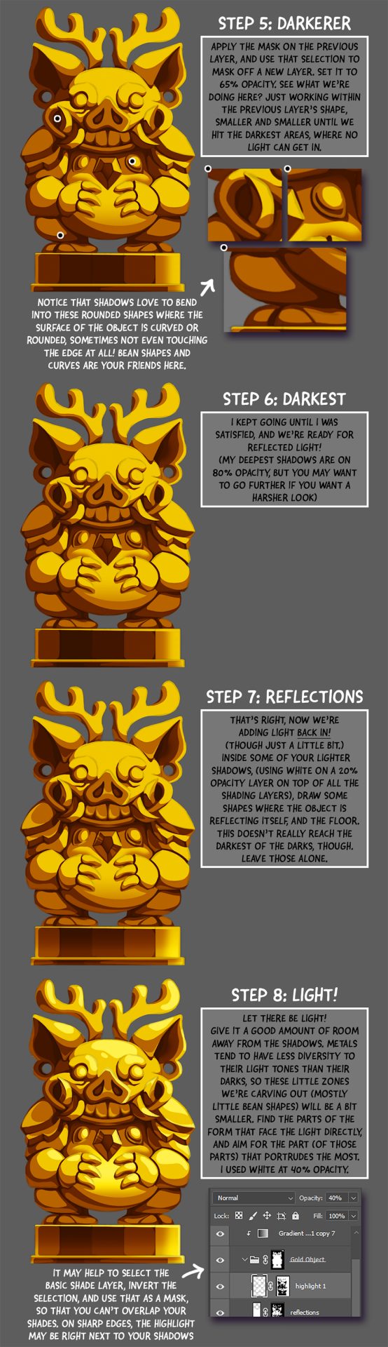
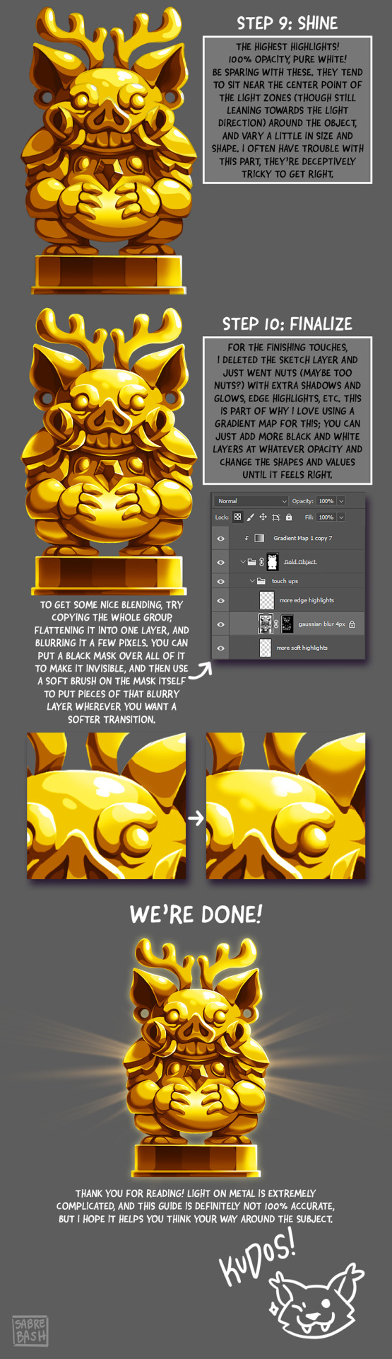
I have to draw a lot of gold and metal for my work, but wasn't happy with any of the metal tutorials i could find around. I prefer really specific instruction, so after some research i put together what i think works as a generalist's guide/tutorial. Not perfectly accurate, but i hope it's helpful!
#tutorial#tutorials#art#painting#artists on tumblr#reference#art reference#useful#art tutorial#art resources#tips#longpost
31K notes
·
View notes
Text
A general cane guide for writers and artists (from a cane user, writer, and artist!)
Disclaimer: Though I have been using a cane for 6 years, I am not a doctor, nor am I by any means an expert. This guide is true to my experience, but there are as many ways to use a cane as there are cane users!
This guide will not include: White canes for blindness, crutches, walkers, or wheelchairs as I have no personal experience with these.
This is meant to be a general guide to get you started and avoid some common mishaps/misconceptions in your writing, but you absolutely should continue to do your own research outside of this guide!
This is NOT a medical resource!!! And never tell a real person you think they're using a cane wrong!
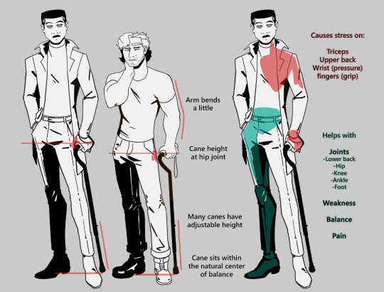
The biggest recurring problem I've seen is using the cane on the wrong side. The cane goes on the opposite side of the pain! If your character has even-sided pain or needs it for balance/weakness, then use the cane in the non-dominant hand to keep the dominant hand free. Some cane users also switch sides to give their arm a rest!
A cane takes about 20% of your weight off the opposite leg. It should fit within your natural gait and become something of an extension of your body. If you need more weight off than 20%, then crutches, a walker, or a wheelchair is needed.
Putting more pressure on the cane, using it on the wrong side, or having it at the wrong height can make it less effective, and can cause long term damage to your body from improper pressure and posture. (Hugh Laurie genuinely hurt his body from years of using a cane wrong on House!)
(some people elect to use a cane wrong for their personal situation despite this, everyone is different!)
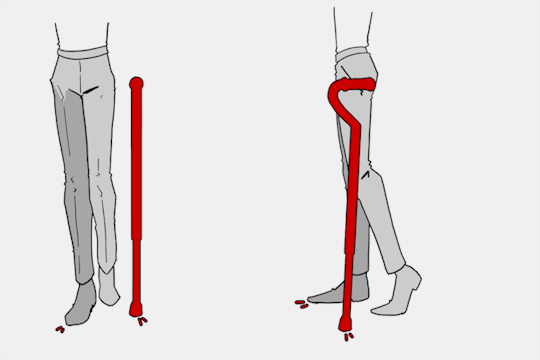
(an animated GIF of a cane matching the natural walking gait. It turns red when pressure is placed on it.)
When going up and down stairs, there is an ideal standard: You want to use the handrail and the cane at the same time, or prioritize the handrail if it's only on one side. When going up stairs you lead with your good leg and follow with the cane and hurt leg together. When going down stairs you lead with the cane and the bad leg and follow with the good leg!
Realistically though, many people don't move out of the way for cane users to access the railing, many stairs don't have railings, and many are wet, rusty, or generally not ideal to grip.
In these cases, if you have a friend nearby, holding on to them is a good idea. Or, take it one step at a time carefully if you're alone.
Now we come to a very common mistake I see... Using fashion canes for medical use!
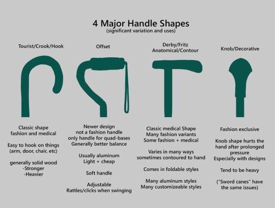
(These are 4 broad shapes, but there is INCREDIBLE variation in cane handles. Research heavily what will be best for your character's specific needs!)
The handle is the contact point for all the weight you're putting on your cane, and that pressure is being put onto your hand, wrist, and shoulder. So the shape is very important for long term use!
Knob handles (and very decorative handles) are not used for medical use for this reason. It adds extra stress to the body and can damage your hand to put constant pressure onto these painful shapes.
The weight of a cane is also incredibly important, as a heavier cane will cause wear on your body much faster. When you're using it all day, it gets heavy fast! If your character struggles with weakness, then they won't want a heavy cane if they can help it!
This is also part of why sword canes aren't usually very viable for medical use (along with them usually being knob handles) is that swords are extra weight!
However, a small knife or perhaps a retractable blade hidden within the base might be viable even for weak characters.
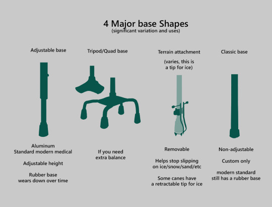
Bases have a lot of variability as well, and the modern standard is generally adjustable bases. Adjustable canes are very handy if your character regularly changes shoe height, for instance (gotta keep the height at your hip!)
Canes help on most terrain with their standard base and structure. But for some terrain, you might want a different base, or to forego the cane entirely! This article covers it pretty well.
Many cane users decorate their canes! Stickers are incredibly common, and painting canes is relatively common as well! You'll also see people replacing the standard wrist strap with a personalized one, or even adding a small charm to the ring the strap connects to. (nothing too large, or it gets annoying as the cane is swinging around everywhere)
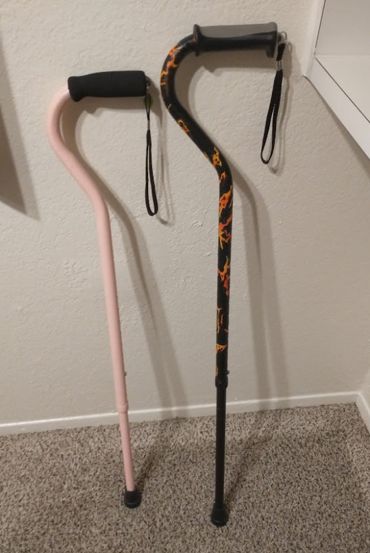
(my canes, for reference)
If your character uses a cane full time, then they might also have multiple canes that look different aesthetically to match their outfits!
When it comes to practical things outside of the cane, you reasonably only have one hand available while it's being used. Many people will hook their cane onto their arm or let it dangle on the strap (if they have one) while using their cane arm, but it's often significantly less convenient than 2 hands. But, if you need 2 hands, then it's either setting the cane down or letting it hang!
For this reason, optimizing one handed use is ideal! Keeping bags/items on the side of your free hand helps keep your items accessible.
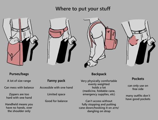
When sitting, the cane either leans against a wall or table, goes under the chair, or hooks onto the back of the chair. (It often falls when hanging off of a chair, in my experience)
When getting up, the user will either use their cane to help them balance/support as they stand, or get up and then grab their cane. This depends on what it's being used for (balance vs pain when walking, for instance!)
That's everything I can think of for now. Thank you for reading my long-but-absolutely-not-comprehensive list of things to keep in mind when writing or drawing a cane user!
Happy disability pride month! Go forth and make more characters use canes!!!
#mobility aid#cane user#writing tips#writing advice#drawing tips#art tutorial#art tips#art reference#art resources#art help#my art#long post
92K notes
·
View notes
Text
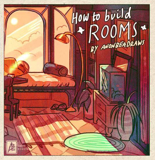
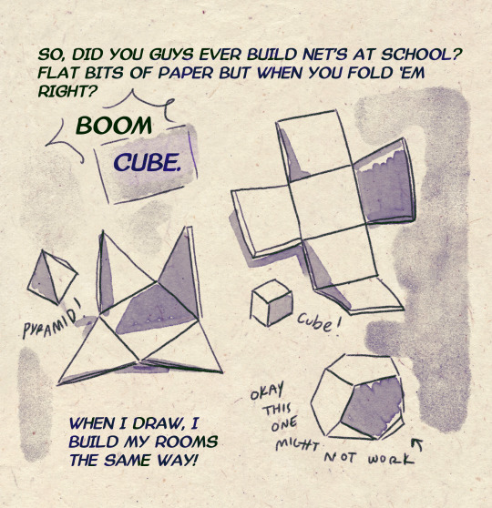
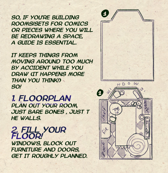
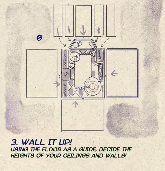
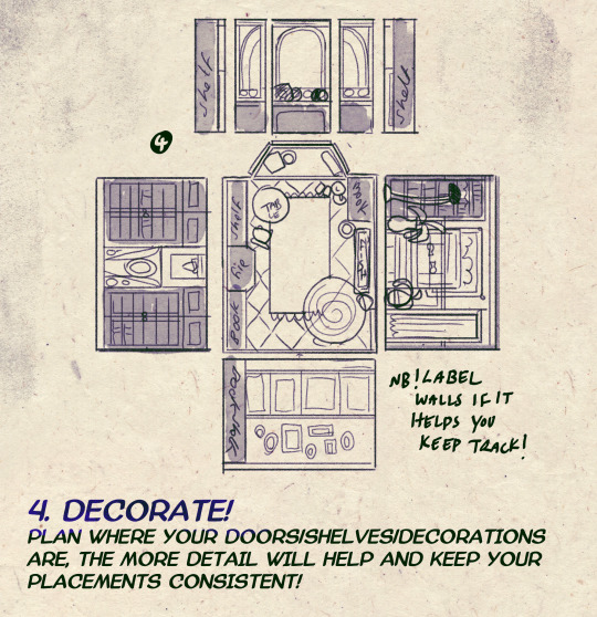
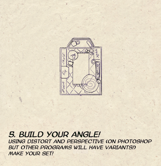
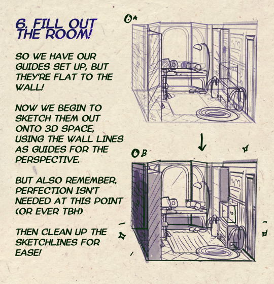

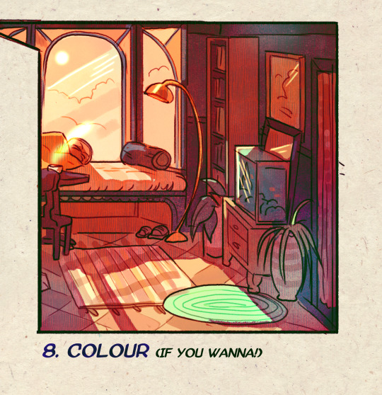
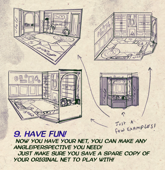
I made a Room Building tutorial! Lemme know if it helps! 🧡
Tip me here| Commission info here!
#anonbeadraws#digital#art tutorial#tutorial#room building#room design#illustration#gif#digital art#digital tutorial#art help#art resource#let me know if it helps!#tried to make it as simple as I could
41K notes
·
View notes
Note
How do you make your stamps? :0
Disclaimer: this is an obscenely long explanation, with pictures. Efficiency is stupid
So, for the static ones, I make a 99x56 px file on ibis paint x. Other programs are probably available online but I don't use them.
After that, I either upload an image I want to make into a stamp, or I draw one.
Then, I find a frame I want to use. Ill upload them here but let it be known I stole all of these right from deviantart


Most of them are from Lil-Devil-Melii on deviantart. The rest i have no idea. They're not all 99x56px but you can crop the canvas it's fine
Make sure to erase the edges of the picture , so they're transparent. It's not as cute otherwise
Upload those frames over your image in whatever art program you're using and viola, stamp.
For moving ones, it's a lot harder. Mostly because I refuse to download Photoshop.
There are a couple ways to do this. Some are simple animations, like with flashing text and whatnot. For these, you download the individual animation frames from your art program. Make sure it's transparent.
Then, upload each frame to ezgif.com under the option "GIF maker." You can play around with how fast each frame goes and whatnot but in the end, it'll be a stamp with some rad text that moves. This is easy, and doesn't make me want to shit my pants and cry. If you're new, do this. This is fun. This is good. This does not kill me inside
I made that↓ stamp with this method :)

this next one is how we turn gifs into stamps. This one makes me sad. It involves math and sucks. But we gotta do it. For the vibe
First, grab your gif. I'm using this cow gif because it's awesome

Then, I resize it using ezgif. Literally everything for this will be using ezgif. I am a simple man
At this point you should decide what frame to use. I'm using this one because its the first one I clicked
Figured out what size the inside of the frame is. That's what I resize the gif to, so the edges can be transparent. The inside of this one is 93x50 px, so those are the dimensions I'm making the gif.
Figure it out by putting the frame into ibis paint and realizing the canvas to fit just the inside of the frame, then seeing what the dimensions are. But there could be easier ways

Woah it's so small now
Then, still on ezgif, I go to the "crop" option.
Make sureeee to upload the smaller gif
press the button that says "extend canvas size", and then put the "width" and "height" as the dimensions for your FRAME. This'll put a bit of a transparent border around the gif. For this frame, I did 99px and 56px.
The "left" and "top" boxes show how many pixels the cropping happens from the edges of the canvas. The formula for finding that is
(width of gif / 2) - (difference between gif width and frame width / 2) = left box
For me it's (93 / 2) - (6 / 2) = 43.5
Then you do the same.for the height, which for me ends up being 22 from the top
This is reallyyy touchy and annoying though
Here's my result , with no visible difference

Okay so THEN you go to the "overlay" option, under "effects." And upload your frame. If the cropping was done right, you shouldn't have to move the frame at all and can just download it
Here's my result:

if you don't care about transparency, you can resize your gif to be the same size as the frame, and then put the frame over it. But I'm a slut for transparency
Anyways. I'm sorry if anything was unclear, it's two am. And I hope this was helpful :) these really are fun to make once you get it down
also if anyone has an easier way to make stamps from gifs, please god tell me
#web graphics#old web#neocities#custom#custom blinkies#stamps#page decor#web resources#da stamps#deviantart stamps#blinking gif#How to#tutorial#How to make stamps#Spacehey#deviantart#rentry graphics#old internet#early internet#stamp collecting#ezgif#stamp making#stamp template#Stamp frames#blinkies
6K notes
·
View notes
Text
Just because it's digital art, doesn’t mean it has to look fake. Now more than ever, it’s so important to show that what we create is made by a human being ♥️
This is a preview of my latest patreon tutorial - find it here!
4K notes
·
View notes
Text
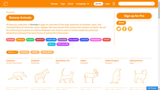
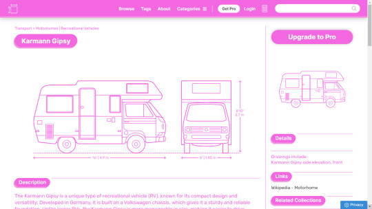
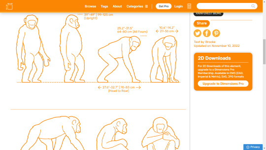
I've found this nifty reference website for artists called www.dimensions.com that has a database of exact measurements for various objects, plants, and animals
They have a premium version with 3D models that I haven't tried yet, but it's definitely very informative if you're trying to get the anatomy and proportions for different species of animals right!
5K notes
·
View notes
Text
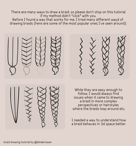
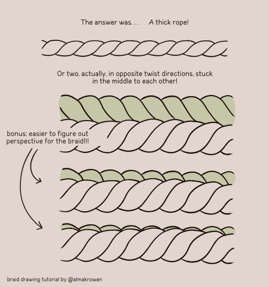
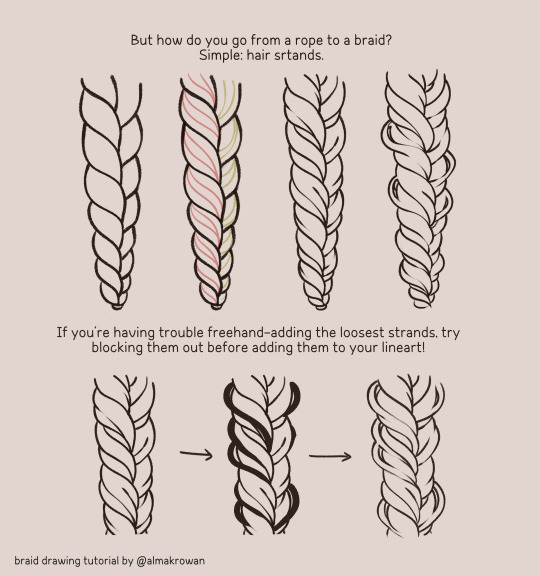
So I posted a silly doodle yesterday on twitter and now people think it was a tutorial. So I got upset and made an actual tutorial so noone says I halfassed the yesterday's one 😡😡😡
Here you go: ~How I draw braids~ 🩷🙏

#almakrowantip#how to draw#tutorial#art tutorial#digital art#art resources#artists on tumblr#I draw non-chibi stuff too!!!#now#this is a TUTORIAL#not like that random yesterday's post#ugh
6K notes
·
View notes
Text
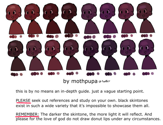
some mid to dark black skin swatches i made for twitter. again this isn’t a tutorial by all means, just a brief visualization and I still highly encourage everyone to do their own research 🫰 i included cool undertones as well since they’re left out often
4K notes
·
View notes
Text
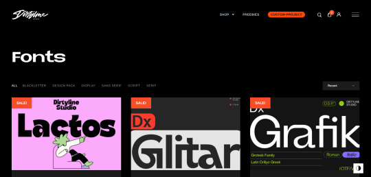
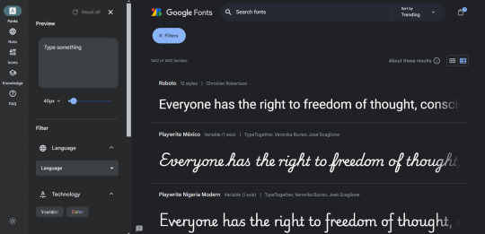
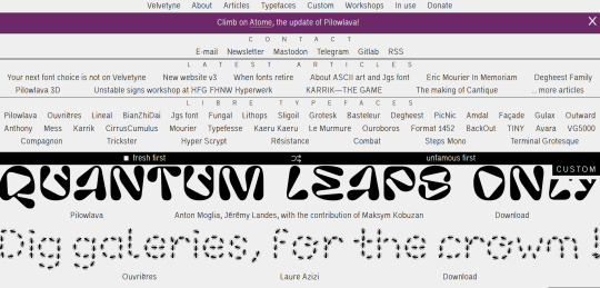
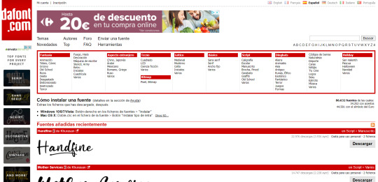
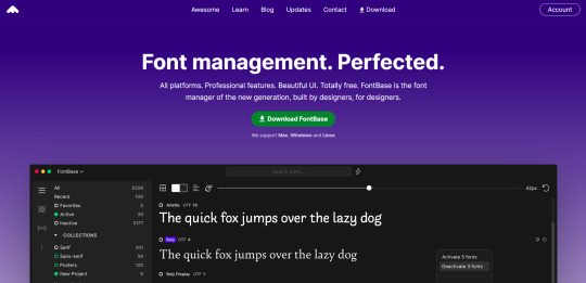
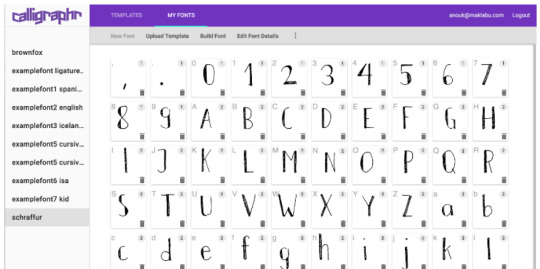
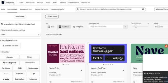
RESOURCES FOR FONTS
KernClub
FREEFACES
FontShare
DirtyLineStudio
FontsGoogle
Velvetyne.FR
Dafont
FONTBA.SE
CALLIGRAPHR (to create your own fonts)
ADOBE FONTS
#reference#tutorial#art#art reference#concept art#illustration#artist#resources#web#websites#design#designer#fonts#font#typography
4K notes
·
View notes