#raster manipulation
Explore tagged Tumblr posts
Visit Tumblr Blog
Explore Tumblr blogs with no restrictions, modern design and the best experience.
Last Seen Tumblr Blogs


Fun Fact
Tumblr has been providing a Korean-language service since 2013.
Text
I started playing with a new Touch Designer video FX processing module called PixaVex developed by Eric Souther (Philosophical Tools on Patreon). I dug up some archival footage of a visit I made some time ago to an early startup robotics lab in NYC called Honeybee Robotics.
PixaVex reminds me a lot of Rutt-Etra FX, but there are great control adjustments as well as in-built oscillators for "x" & "y" control voltage signals. Overall, I think it's a very nice raster manipulation network to explore. Thanks, Eric!
For a few more samples of processing Honeybee footage, visit my Image-Maya.org art blog.
PixaVex - Visit to Robotics Lab
http://www.image-maya.org/2025/06/pixavex-visit-to-robotics-lab.html
#artists on tumblr#glitch#glitch art#video#mg#video art#image processing#markgee85#video artist#PixaVex#Touch Designer#Eric Souther#Philosophical Tools#Patreon#Honeybee Robotics#Rutt-Etra#raster manipulation#Image-Maya
3 notes
·
View notes
Text
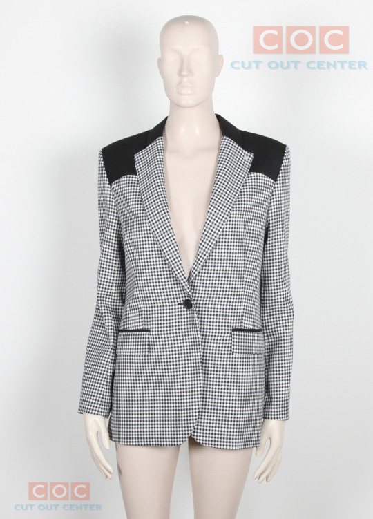
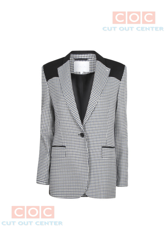
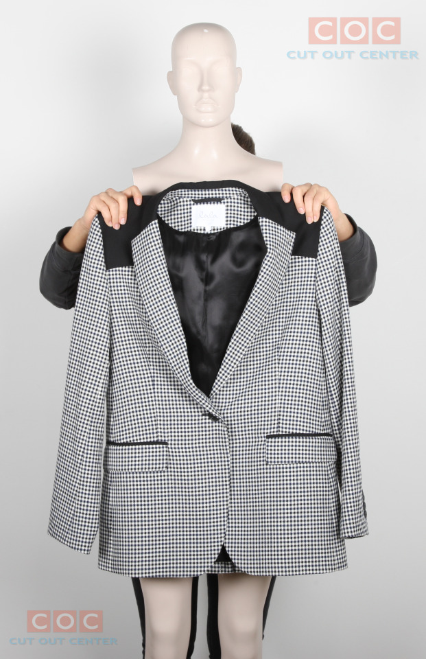
Cut Out Center (COC) designers use neck joint/Ghost mannequin service to remove the doll from the images and combine them to show the garments in their proper sizes and shapes.
Daily 3000 E-Commerce Image Editing Capacity. Dedicated Secure FTP Account. Urgent Delivery Service (1 Hour, 3 Hours, 6 Hours)High-Quality Service Up To 60% Discount 50-100 IMAGES ORDER 10 IMAGES FREE Facility And Many More. Our company's Graphics Design Experts are the best in this market.
Free-Trial Link: https://lnkd.in/gYJkXjh9 W: https://cutoutcenter.com/
#clipping path#shadow creation#color correction#background remove#raster to vector#resize#photo retouching#shoe retouch#background change#recolor#neckjoint#photoretouching#backgroundremoval#clippingpath#photo manipulation#gust mannequin
2 notes
·
View notes
Note
I've been using a mix of Krita and Paint tool SAI. I'd appreciate resources for Krita specifically too. Thank you for answering by the way. ♥️
Of course!
So! Here's my guide to making comics with Krita, down to the details such as layer setup, borders, speech bubbles, and SFX.
preface: it took me at least a year to figure this process out; but once when you've figured out the system & a template, it's smooth sailing. let's use this finished spread from the selfship comic last year to go through the process:

i'm going to assume a certian level of digital program proficiency (knowing what layers are, having a general idea of what vector vs raster graphics are, etc) since otherwise this post would be a book lol.
(if the read more does not work: the static permanent link for the full tutorial is on my website here: https://kradeelav.com/diary/tegalog.cgi?postid=312&1740096282
rest of the post under the cut; this one's going to be a long one as is.
let's start with talking about the layers for a single page of the above comic image.

(ignore the "orbs" and "titania bubble" layers - those were oddities for this specific spread.) Going from the top downwards:
SFX - sound effects. this is an optional layer to have if you don't have a lot of sound effects. you can use either render the sound effects by drawing them out (raster) or vector SFX; whatever you're most comfortable with. more on that below.
frame - this is the comic page borders.
speech bubbles - self explanatory. contains both the text inside the bubble and the bubbles themselves.
ink - main lineart & drawing layer; self explanatory.
tone - the shading layer.
(deleted) ruff/sketch - this is the sketchy thumbnail layer that is imported when i first start working on each spread, and naturally gets deleted when the lineart starts looking good on its own.
so!
there's two types of digital rendering krita can do: raster (most similar to drawing with a pencil or tablet) and vector (computer draws mathematical lines and shapes and text that you can manipulate). a lot of programs fully specialize in one or the other but the killer feature of krita is it can do both on a single page; you just need separate layers depending on the rendering..
that's what this "fx" symbol stands for by the way - these are the vector layers....

... and the symbols circled in purple clue you in that they're raster layers (ink, tone, sketch) where you do the actual drawing. with me so far?
speaking of those:
borders/frame
here's what the borders layer looks like + (the print layout layer above everything in black/yellow). the print layout layer is really only useful if you're physically printing this comic (it's basically bleed/trim if you've heard of those terms, ignore this otherwise).

i really struggled with doing borders in krita until finding this tutorial:
youtube
- since the thing is i make a lot of last minute changes. i need to be able to move and edit borders around easily if a panel's not working for me. so the method above makes it incredibly flexible to just ... up and move one, or to make a gutter wider.
i also really need to be able to see what's behind the borders while i'm drawing it to check anatomy sometimes -- the beautiful thing is you can simply turn the layer style to "multiply" and it's effectively transparent with one click.

like this, voila!
lettering
here's the lettering layer(s) with one bubble's text selected.

fair warning: krita is absolute ass with the text tool. it's the biggest failing but in newer versions i do believe they're slowly working on improvements. thankfully this program can do just enough to letter bubbles.
essentially, i use the same trick as the frames shown in the video above. if you slap a "layer style > stroke" on the whole "bubbles" layer, that's where that 2px black border comes from, and that layer-style-as-a-border "follows" every bubble so it's consistent.
(rule of thumb aesthetics-wise is speech bubble borders should be slightly thinner than frame borders, and on average about as wide as your lineart.)
SFX (sound effects)
technically you can hand-ink all of your SFX if vector art scares you or if you don't intend on doing much, but the vast majority of pros use vector work for efficiency. hentai/erotic work also has a lot of SFX versus other (non-NSFW) genres for the immersion factor with bodily functions.
the spread above didn't need a lot, though.

as you can see it's mostly the inorganic orb clinks and then the big SHING. (i put my for-the-web-kradeelav.com signature on the same layer for laziness).
here's part of my current sfx library below just to show you what i start with for erotic strips; usually i start with some base fonts and start moving the letters around individually.

(a lot of these are redone for every project; there's some in here that are already "outdated" in my eyes.)
miscellaneous
my favorite inking brushes are from this free resource pack. my favorite halftone (shading) brushes are from this (also free). thanks for reading!
26 notes
·
View notes
Note
sorry if you’ve answered something similar before but how do you format things for your website? in the collections you have for poems
i love how it looks. the book kind of format it has
and i want to do similar/the same formatting for my own works but im really struggling…
i've been asked stuff like this a lot and i don't mind explaining it often because i want people to make websites more. i made a tutorial video at some point but it's kind of hard to make a curriculum or tutorial or whatever around this kind of thing because it's really just a self expression thing. i'll try to break down as much of my thought process as makes sense.
i design my pages in photoshop with either double/single page display in mind and then i use html to set them next to each other. most of the choice here comes down to how overwhelming i want my designs to feel. in the case of the lonely leaver page, the entire book was designed to be something that could be a physical book, and so from the getgo i made the pages in that kind of format. i previewed things in acrobat which has a booklet view mode (which singles out the front and back cover around the contents of the file) & allows you to process double page view as well. as for the actual process in photoshop before that point, i typically will open a canvas that is the size of the full 2 page spread (i.e. 8 inches wide for 2 pages which are both 4 inches wide) and i set grid lines for bleed margins and to mark the center of the page so that i can make the composition something that im comfortable with having a gap in the middle from the book folding. with lonely leaver i had to reformat about half the book at some point because i wanted to make it a larger resolution which was annoying but i just keep my guidelines for a print size in mind while im working. often if im a certain amount of time into a project that i feel like i will be spending a lot more time with i'll create a dummy psd file at this point which is devoid of content but which has all of the margins/resolution stuff set up already so i can just open that up and save a different version of it when i'm done.
my actual writing process and my design process is generally extremely intertwined, that's why things tend to be varying degrees stream of conscious in my work i think. i'll for instance, have a thought im stuck on for several days, and then open photoshop without having a poem or comic in mind, but i'll fill the canvas with some kind of color like red or yellow or a photo or whatever, and then open a text box or start drawing. telling a story through composition (i.e. page layout itself) is generally my favorite aspect of art and design because i enjoy how violent and dramatic framing angles can make the content of a piece feel so i'll try to move stuff around as much as possible in order to get my desired effect, often times using place holder shapes in lieu of finished design elements in order to get a rough blocking. as i do this i tend to react to what i'm writing/making as i'm doing it, and i do a lot of selective self editing during this part. for instance, i'll start manipulating rasterized text or cutting around images or whatever. i'll reread and look at whatever im doing for a couple of hours and then when i'm done with a spread or whatever i will save the document as a psd with a combined full spread and then each page separately as pngs or whatever (split at the middle grid line, back to the example, i'll save 2 different 4 inch wide images by changing the canvas size).
when it's time for me to put stuff on my website i then batch convert whatever pngs i exported into webp's because they load faster and take up less space on the server/my computer. you can look at my direct html/css files in your internet browser's explorer mode to see exactly what i do but essentially i just have either 1 or 2 images in a block and then a series of repeating vertical blocks containing images. i don't have an extremely efficient way of uploading pages and i'll typically just copy the same
"<p><img src="01.png"> <p><img src="02.png">"
like, 30 or 40 times or whatever into a html document. i use visual studio code for this stuff because it lets me do a bunch of stuff like having several files open at once & the navigation pane is nice & there's a live server extension that automatically refereshes the html file in my web browser on file save which is really awesome. i have a css page that i made like, 5 years ago, and i usually just link new projects to that because it has a bunch of different settings in it which i'll toggle on or off depending on the needs of whatever page or i'll add new div id's to it. it's kind of messy at this point, but it gets the job done. i use filezilla and something like bluehost or something for webhosting/file management.
i arrange and organize all of my art extremely methodically so usually in my like "<root catch all poetry folder>" inside of my "<root catch all art folder>" there will be a "<name of specific poem book>" folder which just contains the poems named by their actual name e.g. "dedication to saint eulalia 4.png" and then another folder inside of that is called "paginated" where i, using the acrobat document i arrange stuff in as reference, rename copies of my pages which i have placed in that folder to be named things like "01.png" so that i can then manually flip through it sequentially in the windows photo viewer and also just so that i don't have to go through the arduous process of renaming and tracking stuff inside of the root folder i'm containing that project's files in.
i'm 26 now and i made my first website when i was like 18, and my first zine project and i'm tired of feeling feeling around that same time, so i've got like, coming up on a decade of trial and error behind this and this is generally what has worked for me. my website isn't super complicated and mostly just gets the job done but because i try to think about style and presentation up front with whatever projects i'm doing i tend to just make plans based around that as early as it makes sense. to me having a website for art presentation has always been the Primary Method and intended landing zone for my art so it's genuinely always been a consideration in my process to try to plan around how i will put it on my website. i do this because i believe having my own curated space for containing my art allows it to exist in a context which best heightens whatever message i'm trying to convey. if there's an issues with my website right now they are that i'm very bad at mobile browser formatting & i havent updated the main look of the website in something like 4 years barely at all.
anyway, at the end of the day i think really as long as you can identify whatever your intentions are and do some planning/problem solving around that you should probably be able to find your own method which works for you better than mine might but if you do just want to copy my website the tools to do so are within your brain and internet searches and i believe in you. i think the biggest strength of my website is that it shows how easy it is to just put art big as fuck on a webpage and how effective that kind of minimalism can be. i just want my website to be like a museum's walls. and it's not super complicated to get to that level of html knowledge.
11 notes
·
View notes
Note
hi pookie!! i was wondering if you drew on ipad, and if so what app you used? im trying to learn how to draw on mine. i love your art, as always, and you are real as hell for being a john winchester hater. i hope you have an awesome day !!
Hi! Thank you for the ask and the kind words.
I hate John Winchester with my whole being and this show could have never made me feel sympathy for him after what he put his boys through <3
___
I do draw on an ipad most days now. I only got it back in summer last year and I've never had one prior so, it had a bit of a learning curve! But not terrible.
I use Procreate. Its $13 bucks in the app store I think? Worth every penny.
___
The options for resolution and dpi are more than satisfactory if you want to print something.
It has the timelapse feature auto enabled so you can watch back how you drew something (and export it so you can share it with others!)
The default options for brushes / liquify / color manipulation are totally satisfactory.
You can also make animations/gifs.
___
Big complaint:
Procreate has to limit the number of layers you use in each file because of the hardware restraints.
Limited layers are the worst for me because of the way I would usually organize things on a program like ClipStudio. I like to sketch, layer over it to refine, layer over that to refine, etc. Same thing when I 'paint' something. It makes me draw in a different way than on my computer + tablet setup. That isn't inherently bad. Just different.
The limited layers do also suck for animating something. Your layers work as frames, so limits on layers means you have less frames for the animation.
Not a deal breaker, but worth knowing if that's something you want to do with it.
___
Small complaints:
I find some of the selection tools annoying to use. I'm forever accidentally unselecting something or not grabbing enough because I was zoomed in too far.
I also find it infinitely annoying that when you resize something larger than the canvas it automatically cuts off anything past it. I have to undo ALOT because of that, but it is what it is.
Procreate is raster based - you can't have vector layers. If you want to make something that scales perfectly no matter the size, like if you make logos for instance, this isn't going to work well.
___
So yeah! Procreate is good. Not as good/expansive as something like ClipStudio. But:
It doesn't break the bank, doesn't need a full computer setup to use and has most of the features you would ever need to draw.
Anyway, rant over! Hope this helps! And I hope you have a great day as well!
#my stupid little frog brain#someone please kick john winchester's ass#art advice#hello internet friends
15 notes
·
View notes
Note
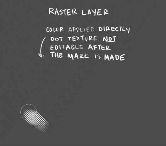
hi i just saw your art for the first time and i am blown away by how beautiful your coloring style is! if you don't mind me asking, how did you get that dithering/halftone effect to look so good? fantastic stuff, keep up the good work! :D
Thank you so much!!! I'll just show my process in clip studio, but the general method is applicable in any program!
What helps to give it a more unique look is to change the blending more of the layer with the halftone, and experiment with textured brushes to apply it. I use a darker base color and turn my halftone layer to glow dodge to bring out highlights:

This works the best with csp tone layers- editing layer information will manipulate the size and density of the halftone (e.g, lowering the opacity = smaller dots). Halftone brushes are useful for adding colored halftones quickly- however, these textures are rasterized and not editable in the same way. Coloring a tone layer takes extra steps but you can draw on them with any brush, and you can adjust the tone size/density/shape at any time!

I personally use both methods depending on the circumstance. Try out different brushes, blending modes, and colors for different effects!
This is just how I've been doing it, not a perfect process by any means... regardless, i hope this helps!!
194 notes
·
View notes
Text
super paper mario is a game about the home PC and the emergence of digital image manipulation and vector art via-raster displays alongside at home gaming
3 notes
·
View notes
Text
hello and welcome to my hasty tutorial! it's on private now but i really should clean this up and post this method public & on clip lol so i'll do that later
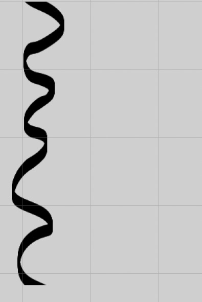
anyway for brush & pattern making it doesn't matter what size your canvas is, just that it is big enough to draw on and is set to greyscale. I made a bigger canvas than my ribbon:
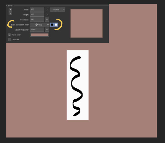
I made a white rectangle where I should draw my repeating object, then drew on that white rectangle in black. This is all on one layer - we'll be separating the lineart it from the background in a bit.
Next, I cut somewhere around the middle:
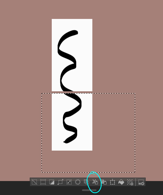
Then, I move.
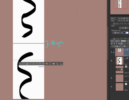
I use the white rectangle part to align, then merge the two.
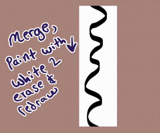
I use white as an eraser & redraw it. You can also make a bigger space between the two and then draw more in between like this:
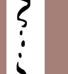
Whatever you do, the upper and lower parts will connect as long as you properly realign the white rectangle you drew them on. :D
Now that we have our shape connected, let's get rid of the background. Go to Edit > Convert Brightness to Opacity & wham, your white background is gone!
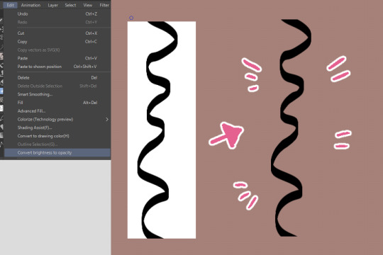
This function was created to get scanned-in lineart done traditionally onto its own separate layer, but can be surprisingly used for other neat tricks like this.
From here you would register the material if you're confident it repeats. If you're not, you can test it like so:
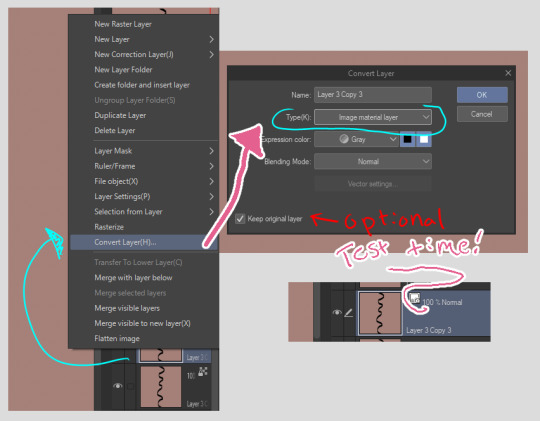
First, right click the layer. Then, convert it into image material layer so it is an object.
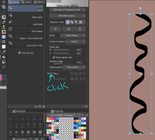
After you made it an object, you can click on the object tool to manipulate it. My icon set is very werid because I've customized my layout and have 40023043204.9 billion brushes I've been playing with, but you'll find it up top somewhere I think. We click on "tiling"...
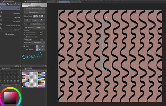
Aww yeah. Success. It works.
You wouldn't register the "image material layer", you'd register the original raster layer you drew it on. If you want to only use vector lines for the whole process, my suggestion is to use the grid tool instead - customize it so it aligns with the top & bottom of your object, then do the same thing we did but with the grid as your actual white box.
This isn't the right size, but the idea would be to make the grid, draw so everything is located within a certain amount of squares in the grid, copy the layer (so you have the original in case something goes wrong) and move the copy around so it re-aligns with the grid.
bonus:
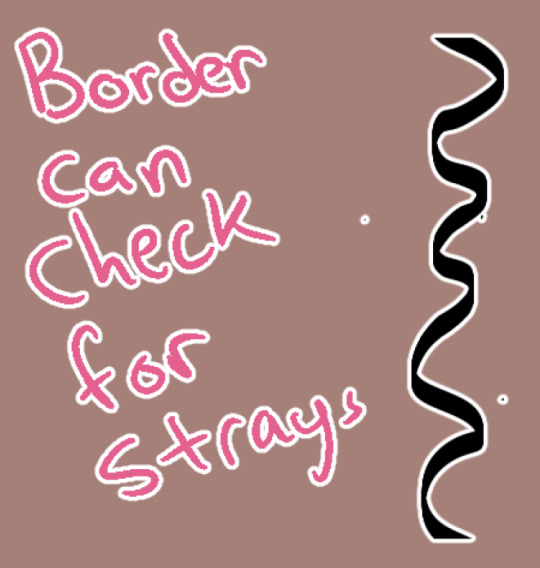
Occasionally I wonder why something isn't repeating. Sometimes it is because there's some stray pixels somewhere that I forgot to erase or left by the brush. You can use the border function to check this & erase them. :D
2 notes
·
View notes
Note
Hey elz! Would you consider doing a tutorial of how you did the frame thing in this post: /post/724195624728379392/and-it-felt-so-nice-so-peaceful-and? It looks so cool!
hi anon! thank you for reaching out. i really appreciate it & you made my day! 💚 ily!!! for length reasons, you'll find the tutorial under the cut!
Resources used:
Photoshop
Vintage flowers pngs -> you can either google vintage/watercolor flower png or here are some DeviantArt packages [x] [x] [x]
Font: Avenir
Workflow
After you have made your gif as you would normally do, it's time for the frame.
First: place the flower
Once you got your flower pngs it's time to place them on your gif. Go on File > Place Embedded... and select the file. This is what will happen.

Now, click on that little tick (✓) on the top right corner, so that your image is actually placed.
Press the shortcut CTRL+T (on Mac: Command+T) to open the transform options - basically it is the same as the photo above. I tend to do it this way, because if I don't like the adjustments, I click on the ⊘ button. If you did that when you placed the image, it would delete the image.
So now, move the image, resize it using the handles on its corners while pressing shift on your keyboard to maintain the proportions.
Once you get a result that satisfies you, click on this button (highlighted in purple)

Now you can wrap the png, and make it "fuller", more natural looking, moving the intersection points of the grid that will pop up

When you're done, confirm.
Now that you placed your png, you can manipulate the colors. Click on the png layer and press CTRL+U (Command+U) and in this case you would adjust the Reds and Yellows.

And you're done!!!!
Second: the border
To make the border use the Rectangle Tool (shortcut: U). On the menu bar on top, set the fill as transparent and the stroke as white

Then drag your mouse and create the rectangle

Then of course, adjust it if needed - by clicking on the rectangle layer, the properties panel will open (if not, go on Window and check Properties).
Now duplicate the layer (CTRL/CMD+J) and make the original rectangle invisible by clicking on the eye next to it.
Right click on the copy and rasterize the layer -> this rasterized layer will be the one you'll work on (you keep the original one as a safe harbor in case you don't like the changes made on the copy).

Now, with the copy selected, pick the Eraser tool (E), reduce the opacity of the layer and zoom in, and erase the parts of the rectangle that goes over the flower. When you're done, set the opacity back to 100%.

Third: add the text
And that is literally it! Super simple and quick to make, and of course you can add as many pngs as you want to create somewhat of a bouquet. The real game changer is the Wrap thing you do to make it more natural, like a real bouquet!!!!
I hope this was helpful and if you have some further questions please please reach out! Love u!!!
E.
#ask#elz:explains#ps tutorials#literally the simplest manip i know - learned it many years ago and it's never old fashioned! it's from the troye sivan flower phase here#on tumblr dot com#*resources
2 notes
·
View notes
Text
Retro Analog Video Noise Effects - applied to processed footage of a UTE Fire Dance. [turn on audio]
More about the processing: I recently came across a FB Reel post by the artist VJ Kuru who does a lot of live performance work processing with his custom Touch Designer networks. In this post he mentions that he was able to create a video glitch network with only 5 TD nodes. (Actually, if you exclude the required video input node and the optional Null output node, he got his glitch effect with only 3 TD nodes- Noise, Displace, and Composite TOPS...)

I was intrigued and so decided I would try to figure this puzzle out -- his Reel showed only the most basic info, but I could see the set of nodes he used, as well as his manipulation of the NOISE TOP's amplitude parameter. So that was my starting point. And after several hours of messing around, I finally found some (rather extreme) settings on the Noise TOP that essentially replicated his shifting wavy bands of raster & chroma distortion effect.
This got me playing around with simulating other sorts of analog tape-like distortions. Over the course of the afternoon, I added vertical roll distortion, tape dropout noise, and static like from dirty VCR playback heads (or a badly tuned TV set). Here is a snapshot of the TD network I ended up with (obviously much larger than a 5 node solution...):

Some examples of my retro analog video processing network based upon found footage of the Golden Butoh (Daidogei) Dance Troupe from Japan can see viewed on my art blog:
Video Distortion FX - retro video
http://www.image-maya.org/2025/05/video-distortion-fx-retro-video.html
Further examples of this network in use (on my art blog):
Video Noise Distortion - retro video - a few more samples
http://www.image-maya.org/2025/05/video-noise-distortion-retro-video-few.html
#artists on tumblr#glitch#glitch art#video#video artist#mg#video art#image processing#markgee85#Touch Designer#digital processing#analog video noise#video distortion#UTE Fire Dance#Golden Butoh#VJ Kuru
3 notes
·
View notes
Text
The Art of Conversion: Transforming Raster Images into Vector Graphics in Illustrator
Vectorization in Illustrator: Common Questions Answered
1. What is vectorization in Adobe Illustrator, and how does it differ from rasterization?
Vectorization in Adobe Illustrator refers to converting raster images (composed of pixels) into vector graphics, which are made up of paths defined by mathematical formulas. This allows for infinite scaling without loss of quality. In contrast, rasterization is the process of converting vector graphics into raster images, resulting in fixed resolution and potential quality loss when scaled.
2. What are the emerging techniques in vectorization that are expected to gain popularity among designers using Illustrator in 2024?
In 2024, emerging vectorization techniques for Adobe Illustrator include AI-powered tools for automatic tracing and simplification, enhanced live shapes for easier manipulation, and improved path-finding algorithms for cleaner designs. Additionally, integration with 3D modeling and augmented reality features is expected to gain traction, allowing designers to create more dynamic and interactive vector graphics.
3. What are the steps to convert a raster image to a vector graphic using the Image Trace feature in Illustrator?
1. Open Adobe Illustrator and import your raster image. 2. Select the image with the Selection Tool. 3. Go to the top menu and click on "Window," then select "Image Trace." 4. In the Image Trace panel, choose a preset or adjust settings. 5. Click "Trace" to convert the image. 6. Once satisfied, click "Expand" to finalize the vector graphic.
4. What are some common challenges faced when vectorizing images in Illustrator, and how can they be overcome?
Common challenges when vectorizing images in Illustrator include loss of detail, complex shapes, and color matching. To overcome these, use the Image Trace tool with appropriate settings, adjust paths manually for precision, and simplify complex areas. Additionally, experimenting with tracing presets and fine-tuning settings can help achieve better results. Always preview changes to ensure desired output.
5. How does the use of layers and paths in Illustrator enhance the process of editing and refining vectorized images?
Layers in Illustrator allow for organized management of different elements, making it easy to isolate and edit specific parts of an image without affecting others. Paths define the shapes and outlines, enabling precise adjustments to curves and lines. Together, they enhance workflow efficiency, enabling quick edits, refinements, and experiments while maintaining the integrity of the overall design.

Visit: VS Website See: VS Portfolio
0 notes
Text

#photo manipulation#ghost mannequin#photo retouching#jewelry retouching#shadow making#post production#raster to vector conversion
0 notes
Text
The Science Behind Visual Perception in 3D Vector Maps

Science Behind Visual Perception in 3D Vector Maps
In an age where data visualization is central to design, planning, and decision-making, 3D vector maps have become powerful tools for spatial understanding. From urban planning to interactive architecture illustration, these maps combine aesthetics with data science to create deeply informative visual experiences. But what makes them so effective? The answer lies in the science of visual perception—how the human brain interprets spatial cues, depth, motion, and color in 3D environments. This blog explores how visual perception principles are embedded in the creation and use of 3D Vector Maps, unlocking a new dimension of insight in modern cartography and design.
Understanding 3D Vector Maps: A Quick Overview
Before diving into the science of visual perception, let’s clarify what 3D vector maps are.
Unlike raster-based maps that rely on pixels, 3D vector maps use geometric shapes—points, lines, and polygons—to represent spatial data. When combined with elevation data and advanced rendering techniques, these maps create realistic yet scalable 3D environments. A 3D Map Illustration of a city, for example, can showcase building heights, terrain contours, roads, and even underground structures, all in one comprehensive layout.
Architects, urban planners, and designers frequently use these maps as part of Architecture Illustration to present development plans, site analyses, and spatial simulations.
The Role of Visual Perception in 3D Map Interpretation
Several scientific principles guide how we perceive 3D visuals, and when used correctly in 3D Map Illustration, they enhance clarity, engagement, and utility.
Let’s explore the major components of this science:
1. Depth Perception and Perspective Cues
Humans perceive depth using monocular cues (like shadows, texture gradients, and perspective) and binocular cues (like stereopsis).
For instance, a map showing a proposed stadium in a city center can use gradient shading and vanishing points to give a sense of scale and positioning.
2. Color Theory and Layer Differentiation
Color is not just aesthetic; it’s functional. In the context of 3D Vector Maps, color helps users distinguish between different types of data—residential zones, commercial areas, vegetation, water bodies, etc.
Designers use warm colors (reds, yellows) to highlight features or areas of urgency, and cool colors (blues, greens) for background or non-critical regions. This contrast guides the viewer’s attention naturally.
Moreover, color gradients help illustrate elevation changes, water depth, or land use intensity. When combined with proper Architecture Illustration techniques, color becomes an intuitive guide through a complex 3D environment.
3. Motion Parallax in Interactive Maps
This movement introduces an important cue called motion parallax—objects closer to the viewer move faster than distant objects, mimicking real-world vision.
This feature helps users understand spatial relationships and navigate virtual environments more intuitively. In architecture, a rotating 3D map illustration can show how a new building casts shadows at different times of the day or how its massing affects nearby structures.
4. Gestalt Principles in Spatial Grouping
Gestalt psychology offers a set of principles explaining how humans perceive visual groups and patterns.
Similarity: Buildings with the same function (like schools or hospitals) are grouped with similar icons or colors.
Proximity: Closely spaced objects are perceived as related.
By leveraging these principles, designers can reduce clutter and help users focus on what's most important in a 3D map interface.
5. Visual Hierarchy and Cognitive Load
Good design organizes information by importance—a concept known as visual hierarchy. In 3D vector maps, this is achieved by manipulating size, brightness, contrast, and placement.
Important landmarks may be rendered larger or in bolder colors, while less critical features fade into the background. This mirrors how the brain naturally filters visual input—what stands out gets attention.
Additionally, minimizing cognitive load (mental effort to understand a visual) is crucial. A clean and intuitive 3D Map Illustration allows users to grasp complex spatial data quickly without feeling overwhelmed.
Neuroscience and Attention in 3D Map Design
Recent neuroscience research supports these design principles. The human brain has specialized regions like the parietal lobe, which processes spatial orientation, and the visual cortex, which interprets patterns, edges, and motion.
Studies using fMRI scans have shown that interactive, well-structured 3D environments activate these areas more effectively than static 2D layouts. This suggests that 3D Vector Maps not only look better—they literally engage the brain more efficiently, leading to better retention and understanding.
This makes them ideal for architecture illustration, where clients or stakeholders need to grasp spatial relationships and design intent in a short time.
Practical Applications: Why This Science Matters
Urban Planning and Zoning
City planners use 3D map illustrations to visualize new developments, evaluate land use, and forecast population density impacts. The visual perception techniques mentioned above ensure these maps are not just accurate but also accessible to non-technical audiences.
Architecture and Construction
An Architecture Illustration showing a building's relationship to surrounding structures, road access, and topography becomes far more persuasive when rendered as a 3D vector map. Stakeholders can “see” the design rather than imagine it.
Tourism and Navigation
Interactive 3D vector maps of tourist destinations provide immersive previews. By simulating real-world depth and texture, they enhance wayfinding and user engagement, critical for digital tourism platforms.
Future Trends: AI and Eye-Tracking in Map Optimization
Emerging technologies like eye-tracking and AI-powered UX optimization are refining how 3D Vector Maps are designed. By tracking where users look and for how long, designers can adjust elements to better align with natural visual patterns.
In the near future, we might see adaptive 3D map illustrations that change based on user behavior, offering personalized layers of information or dynamically adjusting visual hierarchy in real time.
Conclusion
The effectiveness of 3D vector maps lies not just in their technical sophistication but in how well they align with the human brain's natural way of seeing and understanding the world. By grounding design in the science of visual perception—through depth cues, color theory, motion, and cognitive psychology—these maps become powerful tools for storytelling, communication, and decision-making.
Whether you're creating an Architecture Illustration for a new high-rise, a zoning proposal for city planners, or an interactive tourism guide, understanding the visual science behind 3D Map Illustration ensures your message is not just seen—but deeply understood.
0 notes
Text
Poster series: Your Data, Their Power - Final + Feedback
Based on the feedback I received recently, I’ve finalized the full set of posters for my media campaign Your Data, Their Power. The series includes three posters in total: all of them issue-focused awareness posters that explore different aspects of AI surveillance and data privacy.
The first poster, Facial Recognition, shows a blurred human face overlaid with digital tracking points, calling attention to the growing use of biometric data and the ethical concerns behind facial recognition technology.
The second poster, Social Media Tracking, features a person mid-selfie. This composition reflects how our most casual online actions—likes, shares, and scrolls—are constantly being analyzed and used to manipulate user behavior.
The third poster, Digital Footprint, presents a trail of footprints made of fading code, symbolizing how our online actions leave permanent marks that persist long after we’ve logged off.
Visually, all posters share a cohesive style—blending black, white, and pink tones to contrast the harsh digital world with human presence. I used a mix of photography, typography, raster and vector graphics, created and refined.
Thank you to everyone who gave feedback—your insights helped me sharpen both the concept and execution.


0 notes
Text
10 Essential Tools Every Graphic Designer Should Know
Graphic design is a creative field that relies heavily on the right tools to bring ideas to life. Whether you’re a beginner or a professional, mastering essential design software and resources can significantly boost your efficiency and creativity. If you want to learn these tools in-depth, enrolling in a Graphic Designing Course in Dehradun can provide you with hands-on training and expert guidance.
1. Adobe Photoshop
The industry standard for image editing and photo manipulation, Photoshop is crucial for creating digital artwork, retouching photos, and designing graphics.
2. Adobe Illustrator
Ideal for vector graphics, logos, and illustrations, Illustrator offers precision and scalability, essential for professional design work.
3. Adobe InDesign
Used for layout design, InDesign is perfect for creating brochures, magazines, flyers, and multi-page documents.
4. CorelDRAW
A popular alternative to Adobe products, CorelDRAW is favored for vector graphic design and page layout.
5. Sketch
A favorite among UI/UX designers, Sketch provides tools specifically tailored for designing interfaces and prototypes.
6. Canva
A user-friendly, web-based tool ideal for quick graphic creation with templates, perfect for beginners or social media content creators.
7. Figma
A collaborative interface design tool that’s gaining popularity for real-time teamwork and prototyping.
8. Procreate
An intuitive drawing and painting app designed for iPad users, widely used by illustrators and digital artists.
9. GIMP
A free and open-source alternative to Photoshop, GIMP offers powerful image editing capabilities without the cost.
10. Affinity Designer
Known for its speed and affordability, Affinity Designer is a strong contender in vector and raster graphic design.
Why Learn These Tools in a Graphic Designing Course in Dehradun?
While many tools are available, mastering them requires structured learning and practice. A Graphic Designing Course in Dehradun covers these essential software tools and their applications in real-world projects. You’ll gain:
Expert mentorship from experienced faculty
Hands-on assignments to build a professional portfolio
Exposure to industry trends and workflows

Find the Best Graphic Designing Course in Dehradun with AddressGuru
Choosing the right course is critical for your success. AddressGuru is the best platform for searching Graphic Designing Course in Dehradun, offering a curated list of top institutes with detailed course info, reviews, fees, and contact details. This helps you make an informed decision and kickstart your design career confidently.
Conclusion
Graphic design is powered by the right tools, and knowing them can set you apart in the competitive creative industry. Whether you want to design logos, websites, or marketing materials, learning these 10 essential tools through a Graphic Designing Course in Dehradun is a smart move. Trust AddressGuru to guide you in finding the best institute to begin your journey.
0 notes
Text

How to Create a Logo Design in CorelDRAW: Step-by-Step Guide
Creating a standout logo is more than just combining shapes and text, it’s about capturing the identity of a brand in a memorable and scalable design. If you're looking to create professional, vector-based logos, then CorelDRAW is a top-tier choice. This guide walks you through everything from concept to completion in your logo design journey.
Why Use CorelDRAW for Logo Design?
CorelDRAW is a vector graphics editor known for its precision, scalability, and versatility. One of the core strengths of logo design in CorelDRAW is the control it gives you over shapes, colors, and typography. Since it's a vector-based tool, designs can be scaled from a business card to a billboard without losing quality.
Whether you're a beginner or experienced designer, CorelDRAW's tools like the Shape Tool, Bezier Tool, and the Interactive Fill Tool make designing logos more intuitive.
Step-by-Step Process
1. Set Up the Document
Start by creating a new document:
Choose print or web preset
Set DPI to 300 for high resolution
Choose CMYK for print or RGB for digital projects
2. Plan Your Concept
Before designing, brainstorm your brand values and sketch rough ideas:
What does the logo need to express?
Is it abstract, typographic, or a combination?
3. Build with Basic Shapes
Use tools like the Rectangle and Ellipse Tool to form the foundation. Combine shapes using Weld, Trim, and Intersect for creative customization.
4. Add Text and Style It
Use the Text Tool to insert your brand’s name
Select fonts that reflect the personality of the brand
Convert text to curves (Ctrl+Q) to manipulate it as a shape
5. Pick a Color Scheme
Stick with 2–3 brand colors for versatility
Use the Interactive Fill Tool for gradients
Test the design in black and white for clarity
6. Align and Arrange
Use Align and Distribute for precise placement
Snap to grid or use guidelines for structure
7. Apply Effects (Optional)
Keep effects like drop shadows or outlines minimal to maintain readability.
8. Save and Export
Save in .CDR format
Export in PNG (web), EPS/PDF (print), SVG (scalable use)
Pro Tips
Always prioritize simplicity
Check how your logo appears at different sizes
Avoid stock elements for originality
Common Mistakes
Using raster graphics that don’t scale
Overloading with details
Choosing trendy fonts over timeless ones
Conclusion
Designing a logo involves creativity and strategy. With its powerful vector tools and user-friendly interface, CorelDRAW remains a preferred choice among professionals for logo design in CorelDRAW. Follow these steps to create something unique and scalable. Now, go ahead and start crafting a visual identity that truly represents your brand!
#CorelDRAW#Logo design#Logo design tutorial#How to design a logo#CorelDRAW tutorial#CorelDRAW graphic design
0 notes