#responsive cards html css
Explore tagged Tumblr posts
Visit Tumblr Blog
Explore Tumblr blogs with no restrictions, modern design and the best experience.
Last Seen Tumblr Blogs


Fun Fact
Women make up for the other 50% of Tumblr’s audience.
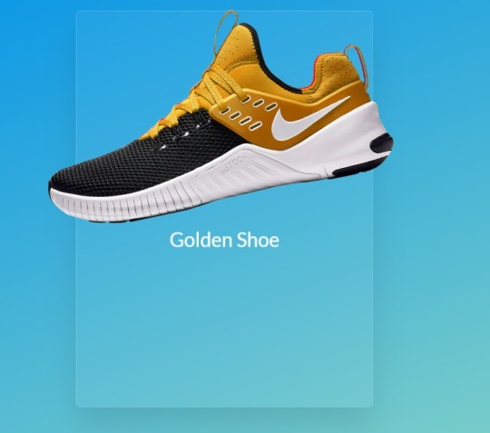
Text

Responsive Cards
#responsive cards html css#responsive web design#html css#divinector#css#html#webdesign#css3#frontenddevelopment#code#profile card
5 notes
·
View notes
Text

Responsive Cards CSS
#css responsive cards#responsive web design#html css#frontend#css#html#css3#frontenddevelopment#webdesign#code#neduzone#learn to code#css cards
6 notes
·
View notes
Text

CSS Responsive Profile Card
#css cards#codenewbies#html css#html5 css3#webdesign#css#css profile card#profile card html css#responsive web design
3 notes
·
View notes
Text
3 Game/Coding Resources!
I wanted to put together a few resources I found for people who might be planning to make games, or might be looking to learn coding!
The first resource is for anyone looking to learn how to code, build a portfolio, and get Certifications:
This is something I've recently been using myself and I can attest that it is an excellent resource!! They have many different paths you can learn, and right now I’m on the Responsive Web Design Certification. You can learn HTML and CSS, in order to create responsive pages. It teaches you through projects, where it breaks down different parts of the coding language and shows you how to use it. Some projects are optional, and some you have to complete in order to earn your certification. Certification projects don’t have instructions, only a rubric of what the project needs to be able to do, but you can learn all those skills in the optional projects! They also have Javascript, Frontend Development, Information Security… the list goes on! The website is run by a really cool non profit. I definitely recommend giving it a try!!
2. The second is for game developers who are looking for background music:
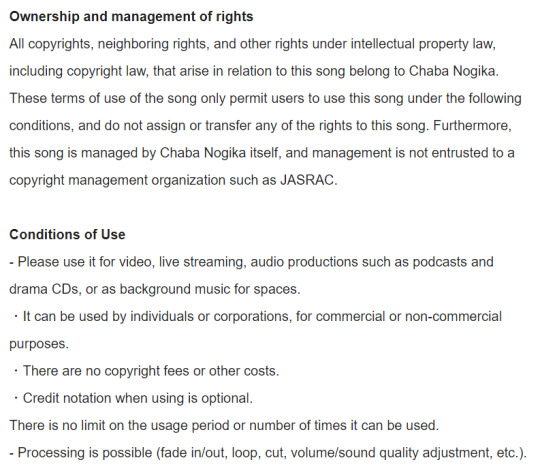
@/茶葉のぎか (Nogika Chaba on twitter) makes some really awesome 8bit-sounding BGM! And a lot of it is free for commercial/non commercial use!!
Make sure to check the description (you can translate to your language) for their policies. Many of their videos are tagged #freeBGM, which if you check their Pixiv Fanbox terms of service (in the desc of each video, please do check it before you use it) states that you are able to use the music in commercial/non commercial works:
2. The third resource is for students:
Whether you're a university student, college, high school, or elementary, Github gives you free Github pro, as well as a curation of free offers! You do need a piece of student ID (proof that you indeed belong to an institution, eg. report card, student card, etc), but it has a host of offers. Microsoft offers free cloud training through this, there are multiple offers for learning a new coding language for free (eg. Codedex free 6-month subscription, which will also give you certificates once completed), you can get free domain names, the list goes on! If you are a student, I highly recommend that you give it a try, since it's 100% free!
#coding resource#game resource#coding#free#background music#if you have any other resources#let me know!!
18 notes
·
View notes
Text
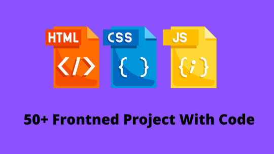
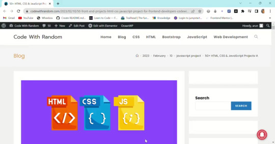
50+HTML, CSS and JavaScript Projects With Source Code
The 50+ HTML, CSS, and Javascript projects list is a boon for beginner developers who wish to make a career in the field of web development. But for that, developers have to go through a lot of learning and project building, and while on the path of skill enhancement, they take a bit of stress because they don’t easily find the topics on which they create their projects. So in the world of web development, we have curated a list of 50+ beginner-friendly HTML, CSS, and JavaScript projects.
Almost 50 of the most significant projects will be covered in this post; these Web Development Projects With Source Code will help you build a strong foundation. You will gain practical experience with the project and be able to develop new, large projects that involve numerous websites as a result of working on this front-end project.
You Get 50+ Web Development Projects with Source Code for total beginners using HTML, CSS, and JavaScript.
We include projects using HTML CSS and Javascript with source code from beginner to intermediate levels covered in this article.
you get all project source code with code explanation. project is very helpful for practicing coding skills and logic building so you definitely need to create some projects that help you to get a dream job and you can add projects to your CV/Resume.
If you want more frontend projects then don’t forget to visit my 100+ HTML, CSS, and JavaScript Projects with the source code, So Must Visit the article👇.
100+ JavaScript Projects With Source Code ( Beginners to Advanced)
1. Social media share icon animation
Project details – Social media icons are used for the identification of specific social media platforms. Each social media platform has different icons. Social media platforms are used to connect people from faraway places and provide a feeling of closeness. Adding animations to icons provides great user interaction.
Browser support: Chrome, Edge, Firefox, Opera, Safari
Responsive: Yes
language: Html, CSS
Project Code Download: Click Here
Project Demo :
3. Card With Hover Effect
Project Details – Cards are small pages that are used to display product information. Cards with a hover effect provide a great user experience, and when the user hovers over the cards, information about the product is displayed to the customer. These cards are generally used on e-commerce websites.
Browser Support: Chrome, Edge, Firefox, Opera, Safari
Responsive: Yes
language: Html, CSS
Project Code Download: Click Here
Project Demo:
read full artical and more intresting projects with source code
3 notes
·
View notes
Note
Hi Dear :) I found your november template and I'm in love with it! I wanted to ask you if it's somehow possible, to have more than one featured project on the right sidebar. Kinda like a responsive card slider or something like that, where you can display more on-going projects. I've tried to follow tutorials but I'm just learning about html/css stuff. Of course it's totally fine if you don't want to. Hope you don't mind me asking. Keep up the great work and have a nice day :)
hi! thanks so much! unfortunately that kind of card slider would be a pretty big customization to the code, and i don't really do those. i have seen some people remove the little stats section that's underneath the project and copy+paste add another project section there, which you could do if you want!
4 notes
·
View notes
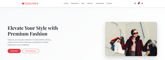
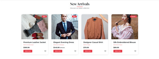
Text
ELEGANCE - Landing Page
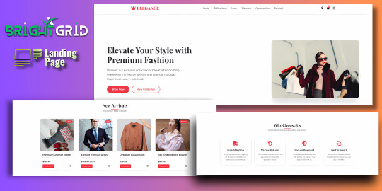
Live Demo | Buy Now
Key Highlights:
Dark/Light Mode Toggle: Enhance user experience with an adaptive color scheme.
Stylish Hero Section: Immediately grabs attention with bold typography and imagery.
Interactive Product Cards: Add-to-cart, wishlist, price tags, and categories.
Conversion-Driven Features: Includes newsletter form, feature highlights, and CTA buttons.
Responsive Layout: Fully optimized for all screen sizes (mobile, tablet, desktop).
WhatsApp Button: Easily reachable for customer inquiries.
Optional Protection Overlay: Disable copy/right-click in preview versions.
Built with clean HTML, CSS, and JS — no external frameworks — making it easy to customize and deploy immediately.
Features:
Responsive design for all screen sizes
Dark and light mode toggle
Animated hero and product sections
Product cards with wishlist and add-to-cart buttons
Newsletter subscription form
WhatsApp contact button
Protection overlay option for preview versions
Clean and organized HTML, CSS, and JS code
Font Awesome icons integrated
Google Fonts (Montserrat & Playfair Display)
Requirements:
Basic HTML/CSS knowledge (for customization)
Any code editor (e.g., VS Code, Sublime Text)
Modern web browser (for testing)
Internet connection (to load external assets like fonts/icons)
Instructions:
Unzip the downloaded folder.
Open index.html in your browser to preview the template.
Use any code editor to customize content, images, and branding.
Upload to your hosting or integrate into your web project.
(Optional) Modify protection overlay or WhatsApp number as needed.
Development Time:
12–14 hours (design + code + responsiveness + animations)
Message to Reviewer:
Hi, This is a responsive HTML landing page for a clothing brand. All assets are externally hosted (Unsplash, Font Awesome, Google Fonts). Let me know if anything else is required. Thanks!
Live Demo | Buy Now
#html#css#htmlcoding#html css#js#landing page#landing page builder#landing page design#landing pages#high fashion#panel#script
1 note
·
View note
Text
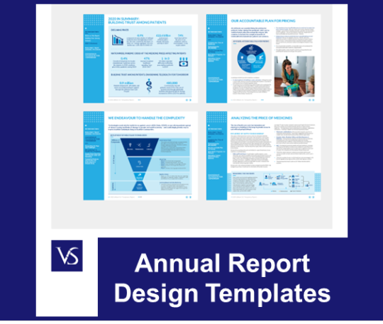
Key Factors for Creating an Effective Annual Report Template: Enhancing Clarity and Engagement
Annual Report Design Templates: Common Questions Answered
1. How to design an annual report template?
To design an annual report template, start with a clear structure: cover page, table of contents, executive summary, financial statements, achievements, and future goals. Use a consistent color scheme and typography that aligns with your brand. Incorporate visuals like charts and graphs for clarity. Ensure ample white space for readability and include contact information at the end.
2. What are the characteristics of a good annual report?
A good annual report is clear, concise, and visually appealing. It includes accurate financial statements, highlights key achievements, and outlines future goals. It should be accessible to various stakeholders, provide insights into company performance, and demonstrate transparency and accountability. Additionally, it often features narratives from leadership and showcases corporate social responsibility efforts.
3. What are the 3 kinds of design templates?
The three kinds of design templates are: 1. **Print Templates**: Used for physical materials like business cards, brochures, and flyers. 2. **Web Templates**: Pre-designed layouts for websites, including HTML and CSS templates. 3. **Presentation Templates**: Designed for slide shows, often used in software like PowerPoint or Google Slides, featuring layouts for text and images.
4. How to structure a report template?
A report template should include the following sections: 1. Title Page (title, author, date) 2. Table of Contents 3. Executive Summary 4. Introduction 5. Methodology 6. Findings/Results 7. Discussion/Analysis 8. Conclusion 9. Recommendations 10. References/Bibliography 11. Appendices (if necessary) Each section should be clearly labeled for easy navigation.
5. How to structure a design report?
A design report typically includes the following sections: 1. **Title Page**: Project title and author information. 2. **Table of Contents**: Organized sections for easy navigation. 3. **Introduction**: Purpose and scope of the project. 4. **Background/Research**: Relevant literature and context. 5. **Design Process**: Methodology and development steps. 6. **Results**: Findings and outcomes. 7. **Conclusion**: Summary and recommendations. 8. **Appendices**: Supporting materials and data.
Visit: VS Website See: VS Portfolio
0 notes
Text
How Web Development Can Help Build Stronger Brand Identity
In the contemporary era of the internet, a pleasing and functional website is the pillar of any business venture. Whether a startup, SME, or multinational, your online presence is the brand and audience outreach identity card. Ambientech Softwares is one of India's top web design companies that provides the best-in-class website design and development solutions to make businesses successful in the competitive cyber market. Placing emphasis on web development solutions in India, Ambientech fuses innovation, creativity, and professionalism to create and develop websites that attract and convert.

Why AmbienTech Software for Website Development?
Ambientech Softwares has developed its reputation as a reliable web development company through the delivery of customized solutions addressing varied business needs. Here's why companies all over India and the world rely on Ambientech for their web development software and design requirements:
1. Holistic Website Design and Development Solutions
Ambientech provides end-to-end website development and design services, from conceptualization to deployment and maintenance. Ambientech's master developers and designers design and develop stunning, user-friendly, and responsive websites that work perfectly on devices. Ambientech guarantees that your website will align with your brand and business objectives, regardless of the complexity of your project.
2. Expertise in Advanced Web Development Software
With the help of the latest web development technologies and tools, Ambientech designs scalable and sturdy websites. They specialize in:
Frontend Development: Using HTML, CSS, JavaScript, and frameworks such as React and Angular to create interactive and dynamic UIs.
Backend Development: Using Node.js, Python, PHP, and database management systems such as MySQL and MongoDB to perform server-side processing efficiently and securely.
CMS Platforms: Personalized solutions on WordPress, Drupal, and Joomla for streamlined content management.
E-commerce Solutions: Creating safe and secure online websites using WooCommerce, Shopify, and Magento.

All this technical ability means your site is not just good to look at but also well-performing and forward-looking.
3. Website Development Services India Customize
Being a leading web development company in India, Ambientech is aware of the Indian market's special requirements. They provide industry-specific solutions for healthcare, real estate, education, finance, and e-commerce. Their client-oriented process includes:
In-depth consultations to realize your vision and needs.
Designing wireframes, mockups, and prototypes for clarity and alignment.
Providing clean, optimized code with rigorous testing to ensure reliability.
This customized strategy renders Ambientech a top-of-mind selection among enterprises looking for localized but internationally competitive web solutions.
4. Identified as one of the Top Web Design Firms
Ambientech's quality- and innovation-focused commitment has made it one of the top web design firms in India. Their design ethos centers around
User-Centric Design: Developing intuitive UI/UX that drives user engagement.
Responsive Design: Making websites run optimally on desktops, tablets, and smartphones.
SEO Optimization: Building websites with SEO best practices to improve search engine visibility, like Google.

Their good looks are matched with functionality, and that is why they are the preferred partner for companies worldwide.
5. Cost-Effective and Timely Delivery
Ambientech Softwares is different on the grounds of the quality of website design and development services offered at affordable rates. Their effective project management enables them to deliver projects within planned timelines without sacrificing quality. They also offer support and maintenance to keep your website updated and secure.
6. Global Presence with a Local Touch
Based in India, the USA, the UK, the UAE, and Australia, Ambientech blends international expertise with local market insights. This enables them to emerge as the perfect solution for Indian businesses wishing to establish a strong web presence or enter international markets.
Industries We Serve
Ambientech's Indian website development solutions are offered across a variety of industries, including:
E-commerce: Creating secure, scalable online stores with payment gateway integration.
Healthcare: Creating HIPAA-compliant websites for clinics and hospitals.
Education: Developing e-learning platforms and institutional websites.
Real Estate: Designing portals with property listings and virtual tours.
Hospitality: Crafting booking platforms and promotional websites for hotels and restaurants.
Why Ambientech Stands Out in Web Development
Innovative Solutions: Using new technologies like Kubernetes, Docker, and cloud infrastructure for websites that scale.
A professional team of developers, designers, and QA testers with over ten years of experience.
Client Satisfaction: A track record of providing expectation-surpassing projects.
Post-Launch Support: Offering regular maintenance and updates to guarantee long-term success.
#WebDevelopmentCompanyindia#WebDevelopmentCompanyNearMe#WeebDevelopmentComany#WebDevelopmentSoftwaresSolutions#FullStackDevelopmentCompany#FullStackDevelopmentIndia#FullStackDeveloperSolutions#JavaScriptSolutions
0 notes
Text
Building My Portfolio Website with Web Development Basics
Designing a portfolio website sounded simple at first just a few pages with some info about me and my work. But once we started diving into the technical side in our VCODE 202 class, I realized there’s much more to it. From learning how websites are structured to actually applying CSS layouts like Flexbox and using Bootstrap’s grid system, the project turned into something both challenging and rewarding.
One of the key concepts we focused on was responsive design. We learned how websites should adjust based on screen sizes — not just look good on desktops, but also function smoothly on phones and tablets. This included using tools like media queries and percentage-based widths to keep layouts flexible.
Another important topic was the Bootstrap framework, which made the design process easier. I used containers, rows, and columns (.container, .row, .col-md-4) to organize my content in a way that looked clean and worked well across devices. Bootstrap also helped me add consistent styling like buttons, spacing, and cards without writing too much custom CSS.
The PDF shared with us for this module explained things like:The difference between main axis and cross axis in Flexbox. How to use justify-content and align-items to align content. When to use flex-direction: row vs. column. The purpose of container, row, and column in Bootstrap layouts
By following those guidelines, I was able to build a site that includes:• A homepage that introduces me. An about page with a short bio. A projects page that uses Bootstrap cards to showcase three of my works with descriptions and images
Throughout the process, I also became more aware of cross-browser compatibility and the importance of validating HTML/CSS via the W3C Validator, which was also mentioned in the PDF.
Even though I had limited web experience before this course, working through the concepts step by step helped me understand how design and development are closely connected. This project gave me not just a live portfolio, but also a better grasp of how the web works behind the scenes.
0 notes
Text

Product Card Responsive
#responsive web design#responsive product card#html css#divinectorweb#css3#html5#frontenddevelopment#responsive card design#css#html#webdesign#css tricks
6 notes
·
View notes
Text

Responsive Cards
#css responsive cards#responsive cards bootstrap#codingflicks#html css#frontend#css#html#css3#frontenddevelopment#webdesign#bootstrap cards#responsive web design
1 note
·
View note
Text

Movie Card UI Design
#movie card ui design#movie card css#css cards#responsive card design html css#html css#codenewbies#frontenddevelopment#css#html5 css3#webdesign#pure css tutorial#basic html css tutorial#responsive web design
2 notes
·
View notes
Text
Beginner's Guide to Responsive Web Design
Websites are the storefronts of the digital world. Everyone wants a sleek, stylish, and easy-to-use web design in Sydney. However, not everyone knows how to make one that works on all devices. That is where responsive web design comes in. It is not just a trend—it is the new normal. If your web design in Sydney is not responsive, you are already behind. But don’t worry, this guide will help you catch up.
What is Responsive Web Design?
Responsive web design means a website adjusts to any screen size. You don’t need to zoom in. You don’t need to scroll side to side. Everything lines up. Everything flows. It feels natural.
So, the goal is simple: Make your web design in Sydney readable and usable, no matter the device. No matter the screen resolution.
Why Should You Care?
People use all kinds of gadgets today. Laptops, tablets, smartphones, smart TVs, and so on. Some websites look perfect on a laptop, but try the same site on your phone. It’s a mess. The text is tiny. Buttons are hard to click. Images get cut off. All this chaos makes your visitors leave in frustration.
Google loves responsive websites and gives them better rankings. This leads to more visitors and better visibility. Thus, a responsive site is not a luxury but a necessity.
The Key Ingredients of Responsive Design
1. Fluid Grids
A fluid grid uses percentages instead of fixed pixels. That way, elements grow or shrink depending on the screen size. For example, imagine a picture might be 50% wide. It stretches on a big screen, while on a small screen, it shrinks. The layout stays balanced. The structure remains intact.
2. Flexible Images
Images are tricky. If not sized properly, they break layouts. So, responsive design always uses flexible images that are easy to scale and adjust. No overflow. No broken sections. Just smooth visuals. You can use CSS to control this. A common trick is to set the image width to 100%. That way, it always fills the space.
3. Media Queries
This is the secret sauce. Media queries are CSS rules. They tell the browser how to style the page based on screen size.
When the screen is 600 pixels wide or smaller, the background turns light blue. You can:
Change fonts
Rearrange sections
Hide or show content
In short, media queries give you control and make your design smart.
Mobile-First Design: Start Small
Design for the smallest screen first. That is mobile-first design. It makes you focus. It helps you prioritise. You start with what really matters. To put it in order:
Build a layout for phones.
Then scale it up for tablets.
Then expand it for desktops.
This approach saves time while reducing clutter. It also ensures a clean and clear user experience.
Tools to Help You Get Started
Bootstrap
This is a popular framework with pre-made grid systems. It includes responsive components, from buttons to forms to navigation bars. You can build fast. You can customise easily.
CSS Flexbox
Flexbox helps you align items in rows or columns. It adapts quickly and is ideal for one-dimensional layouts. Want a row of cards that wraps on small screens? Flexbox does that.
CSS Grid
Grid is perfect for complex layouts. You can place items wherever you want—rows, columns, or overlapping elements. It gives you full control.
Chrome DevTools
Test your design right in your browser.
Open Chrome.
Press F12.
You’ll see the Developer Tools.
Switch to mobile view.
Resize the window.
See how your site responds.
Adjust and fix issues on the spot.
Tips for Better Responsive Web Design in Sydney
Keep Navigation Simple
Big menus do not work well on phones. Use icons or collapsible menus, and keep it clean. More importantly, keep it user-friendly.
Avoid Fixed Widths
Fixed widths can break your layout. Stick to percentages. Embrace fluidity.
Use Viewport Meta Tag
Add this to your HTML:
```html
<meta name="viewport" content="width=device-width, initial-scale=1.0">
```
This tells the browser how to scale the page. Without it, your design might look weird on mobile.
Test on Real Devices
Simulators help, but nothing beats the real thing. Open your site on different phones. Try it on tablets. Check how it looks. Check how it feels.
Optimise Loading Time
Mobile users want speed. Compress your images. Minify your CSS and JavaScript. Use lazy loading. Keep things light.
Real World Example
Let’s take a basic layout. A homepage with a header, a main section, a sidebar, and a footer.
On desktop:
– The header stretches across the top.
– The main section sits on the left.
– The sidebar is on the right.
– The footer is at the bottom.
On mobile:
– The header still sits on top.
– The sidebar moves below the main section.
– Everything stacks vertically.
Same content. Different layout. That’s the beauty of responsive design.
Common Mistakes to Avoid
Even the best designers mess up. Let’s make sure you don’t.
– Don’t forget the viewport meta tag.
– Don’t use large fixed images.
– Don’t hide important content on mobile.
– Don’t ignore load speed.
– Don’t test only on one screen size.
Each screen is a new experience. Each visitor deserves a smooth journey.
Final Thoughts: The Future is Flexible
The internet will keep changing. New devices will appear and new screen sizes will emerge. So, your fully responsive website must be ready. It keeps your site future-proof. To get started with your responsive web design in Sydney - https://www.makemywebsite.com.au/web-design/sydney/ , connect with Make My Website.
Web design is not just about looking pretty. It’s about function. It’s about flow. It’s about flexibility. Responsive design gives your website a fighting chance.
0 notes
Text
Website Developers in Bangalore: Why Businesses Trust Hello Errors to Build Their Digital Identity

In the digital-first world we live in today, your website isn’t just your online business card — it’s your brand’s foundation, marketing engine, and customer conversion powerhouse. For startups, small businesses, and enterprises alike, having a well-developed website can mean the difference between growth and stagnation.
That’s where the role of expert website developers in Bangalore becomes crucial. And among the best in the city stands Hello Errors — a dynamic digital solutions provider committed to building performance-driven, user-centric websites that deliver real results.
Why Bangalore is the Digital Development Capital of India
Bangalore has rightfully earned its nickname — India’s Silicon Valley. With a rich ecosystem of tech startups, software giants, and creative talent, it's become the go-to destination for businesses seeking cutting-edge web development solutions.
When you choose website developers in Bangalore, you’re not just hiring coders. You’re partnering with tech-savvy innovators who understand business, branding, and digital performance. Hello Errors is a shining example of this talent pool, offering comprehensive web development services with a strong focus on usability, speed, and scalability.
What Sets Hello Errors Apart from Other Website Developers in Bangalore?
1. Business-Focused Development
At Hello Errors, website development begins with understanding your business. Before a single line of code is written, the team dives deep into your goals, audience, and brand identity. This ensures that the final product isn’t just technically sound, but also strategically aligned with your objectives.
Unlike cookie-cutter solutions, Hello Errors delivers custom-built websites that reflect your brand's personality, tone, and target market — helping you stand out in a crowded digital space.
2. Full-Stack Expertise
Modern websites require more than just HTML and CSS. They require robust back-end systems, API integrations, mobile responsiveness, and SEO optimization.
Hello Errors brings together full-stack developers, UI/UX designers, and digital strategists to ensure every website is built to perform — from the first click to the final conversion.
Whether it’s a corporate site, landing page, eCommerce platform, or SaaS dashboard, Hello Errors uses the latest technologies and frameworks to deliver scalable, future-ready platforms.
Key Web Development Features Offered by Hello Errors
Here are just a few reasons businesses choose Hello Errors when looking for website developers in Bangalore:
✅ Custom Development: No templates, no shortcuts — just unique, hand-coded websites built from the ground up.
✅ SEO-Ready: Built with Google in mind — optimized meta tags, alt attributes, schema markup, Core Web Vitals, and mobile-first design.
✅ Fast & Secure: Speed-optimized websites that load quickly and are protected by strong encryption and security protocols.
✅ Mobile-Responsive: Designed to look stunning on every screen — mobile, tablet, and desktop.
✅ Conversion-Focused Design: Engaging layouts and CTAs that drive leads, clicks, and sales.
Beyond Web Development: A Complete Digital Partner
While some website developers in Bangalore only focus on building the site, Hello Errors offers end-to-end digital solutions to help businesses thrive online.
🌐 Website Development
From corporate websites to product launches, Hello Errors designs and develops sites that are pixel-perfect and performance-optimized.
📱 App Development
Need an Android or iOS app to complement your website? Hello Errors builds high-performance mobile applications that extend your brand experience across devices.
🚀 SEO & Digital Marketing
What’s a great website if no one finds it? With Hello Errors' SEO services, your site is optimized for organic traffic, keyword rankings, and better ROI.
�� AI/ML Integration
Step into the future with intelligent web experiences — from smart chatbots to recommendation engines and predictive analytics.
🎨 UI/UX Design
Your users deserve the best. With Hello Errors’ UI/UX design services, every interaction is smooth, intuitive, and on-brand.
Common Mistakes Businesses Make (and How Hello Errors Helps Avoid Them)
Many businesses fail to realize the long-term value of proper website development. Some settle for budget freelancers or DIY tools — only to rebuild their websites within months.
Here’s how Hello Errors addresses some of the most common mistakes: MistakeHow Hello Errors HelpsPoor mobile responsivenessAll sites are designed with a mobile-first approachSlow loading speedsOptimized for speed with clean code and caching strategiesLow search visibilityBuilt with on-page SEO best practices from the ground upOutdated designModern, dynamic UIs tailored to your brandNo support post-launchOngoing support, maintenance, and scaling services
This proactive, problem-solving approach is what earns Hello Errors its place among the top website developers in Bangalore.
How to Know You Need a Website Revamp
Not sure if your existing site is holding you back? Here are a few signs:
Your bounce rate is high and engagement is low.
The site isn’t optimized for mobile.
Your rankings are stagnant despite content efforts.
Pages take more than 3 seconds to load.
Your competitors' websites just look... better.
If this sounds familiar, it's time to reach out to a trusted team of website developers in Bangalore like Hello Errors to upgrade your digital presence.
Let’s Build Your Digital Future — Together
Whether you're launching a new business or upgrading your current online presence, the team at Hello Errors is ready to guide you every step of the way.
✅ Transparent communication ✅ Agile development methods ✅ A passion for design and innovation ✅ Timely delivery and long-term support
When you hire Hello Errors, you're not just getting a website — you're getting a full-stack digital partner who understands your brand, audience, and business model.
Get in Touch with Hello Errors Today
Ready to take your website to the next level?
👉 Visit https://helloerrors.in 📧 Contact: [email protected] 💬 Schedule a free consultation today and let’s explore what your ideal website could look like.
Final Thoughts
In a city brimming with tech expertise, choosing the right website developers in Bangalore can make all the difference. With their commitment to quality, innovation, and customer success, Hello Errors is a trusted digital partner that helps businesses shine online.
Don’t wait until your competitors outrank or out-design you. Get started today with Hello Errors — the web development company that builds for growth, not just launch.
#WebsiteDevelopersInBangalore#WebDevelopmentCompany#HelloErrors#BangaloreTech#DigitalSolutions#CustomWebDesign#MobileResponsiveSites#SEOFriendlyWebsites#UIUXDesign#WebDesignBangalore
0 notes
Text
Pixel Themes
Webranker1.com is a comprehensive platform offering a wide array of premium themes and templates designed to enhance your digital presence. While the website does not specifically provide themes tailored for Google Pixel devices, it excels in delivering high-quality themes for various platforms and purposes.
Diverse Theme Categories
The website categorizes its offerings into several key areas:
WordPress Themes: A selection of customizable themes suitable for various industries and personal blogs.
Wix Themes: Professionally designed templates compatible with the Wix platform, catering to different business needs.
Shopify Themes: E-commerce templates optimized for Shopify, aimed at enhancing online store aesthetics and functionality.
Social Media Templates: Creative designs for platforms like Instagram and Facebook to boost social media engagement.
YouTube Thumbnails: Eye-catching thumbnail designs intended to increase video click-through rates.
Gift Cards: Customizable gift card templates for businesses and personal use.
HTML/CSS Themes: Responsive web templates built with HTML and CSS for developers seeking flexible design options.
Magazine and Book Covers: Professionally designed covers suitable for publications and e-books.
Website Banners: Visually appealing banners designed to enhance website headers and promotional sections.
Highlighted Products
Here are some notable products from Webranker1.com:
Care First Wix Theme A clean and professional Wix template ideal for healthcare providers and medical services. Originally priced at $120, now available for $93.
Explore Exclusive Jewellery Wix Theme A sleek and elegant design tailored for jewelry businesses, featuring customizable galleries and product pages. Discounted from $120 to $96.
Best Interior Design HTML/CSS Theme An HTML/CSS template crafted for interior design firms, showcasing portfolios and services effectively.
Dribor WordPress Theme A versatile WordPress theme suitable for corporate websites, offering multiple layout options and customization feature.
Appreciation Cards A set of customizable appreciation card templates, perfect for expressing gratitude in a professional or personal setting. Available for $1.25, reduced from $1.80.
User Experience and Accessibility
Webranker1.com is designed with user convenience in mind, featuring intuitive navigation and detailed product descriptions to assist users in making informed decisions. The platform also offers regular discounts, making premium designs more accessible to a broader audience.
Conclusion
While Webranker1.com does not specialize in Google Pixel themes, it provides an extensive collection of themes and templates for various platforms, ensuring that users can find designs that align with their specific needs. Whether you're building a website, enhancing your social media presence, or designing marketing materials, Webranker1.com offers valuable resources to elevate your digital projects.
0 notes