#responsive mega menu examples
Explore tagged Tumblr posts
Visit Tumblr Blog
Explore Tumblr blogs with no restrictions, modern design and the best experience.
Last Seen Tumblr Blogs


Fun Fact
If you dial 1-866-584-6757, you can leave an audio post for your followers.
Text
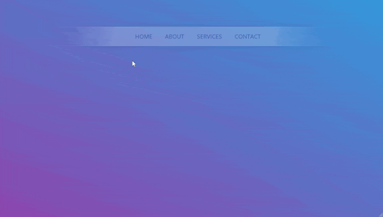
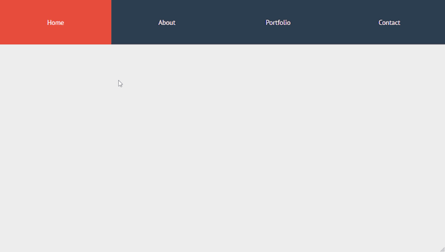
Explore 15+ CSS Horizontal Navigation Menus
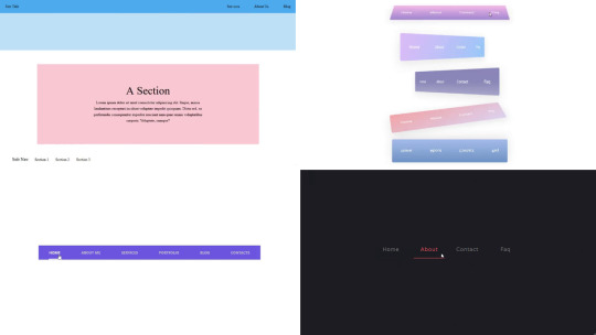
Welcome to CSS Monster, your premier destination for exploring 15+ CSS horizontal menus! In this comprehensive article, we've meticulously curated a collection of free HTML and CSS code examples for horizontal menus, meticulously sourced from respected platforms such as CodePen, GitHub, and other reliable resources. Horizontal menus are a favored choice for displaying navigation options prominently across the top of websites or applications. Our collection goes beyond the conventional, showcasing a diverse array of horizontal menu styles, including dropdown menus, mega menus, and more. This variety ensures that you'll discover the perfect design to elevate your project's navigation. With our latest update in August 2023, we're excited to introduce 2 new items to our collection, reflecting the cutting-edge trends in horizontal menu design. Whether you're a seasoned web developer, a designer seeking inspiration, or someone looking to enhance your website's navigation, these customizable code examples stand as a valuable resource. Dive into our hand-picked selection and witness the stunning diversity of horizontal menu designs that can truly enhance your user experience. Feel free to explore the latest trends, experiment with customization, and seamlessly integrate these code examples into your projects. Our collection is designed to cater to your needs, offering a blend of functionality and aesthetics. Embark on this journey to discover and implement captivating horizontal menu designs, and let your coding endeavors bring a new level of sophistication to your projects. Happy coding! Author seto89 March 4, 2019 Just Get The Demo Link How To Download - Article How To Download - Video Author HTML / CSS PURE CSS MAGIC LINE NAVBAR Compatible browsers: Chrome, Edge (partial), Firefox, Opera, Safari Responsive: yes Dependencies: - Author tris timb February 7, 2019 Just Get The Demo Link How To Download - Article How To Download - Video Author HTML / CSS (SCSS) POSITION STICKY SUBNAV Compatible browsers: Chrome, Edge (partial), Firefox, Opera, Safari Responsive: yes Dependencies: - Author Mehmet Burak Erman June 3, 2018 Just Get The Demo Link How To Download - Article How To Download - Video Author HTML (Pug) / CSS (Stylus) PERSPECTIVE MENUS Compatible browsers: Chrome, Edge (partial), Firefox, Opera, Safari Responsive: yes Dependencies: - Author Stas Melnikov March 5, 2018 Just Get The Demo Link How To Download - Article How To Download - Video Author HTML / CSS HOVER EFFECT FOR HORIZONTAL MENU Compatible browsers: Chrome, Edge (partial), Firefox, Opera, Safari Responsive: yes Dependencies: -
Author Mehmet Burak Erman December 18, 2017 Just Get The Demo Link How To Download - Article How To Download - Video Author HTML / CSS (SCSS) MENU HOVER LINE EFFECT Compatible browsers: Chrome, Edge (partial), Firefox, Opera, Safari Responsive: yes Dependencies: -
Author Charlie Marcotte September 5, 2017 Just Get The Demo Link How To Download - Article How To Download - Video Author HTML (Pug) / CSS (Sass) CSS HORIZONTAL MENU Compatible browsers: Chrome, Edge (partial), Firefox, Opera, Safari Responsive: yes Dependencies: -

Author Artyom June 23, 2017 Just Get The Demo Link How To Download - Article How To Download - Video Author HTML / CSS (SCSS) STRIKETHROUGH HOVER EFFECT FOR MENU Compatible browsers: Chrome, Edge (partial), Firefox, Opera, Safari Responsive: yes Dependencies: -
Author Irvine Potok February 22, 2017 Just Get The Demo Link How To Download - Article How To Download - Video Author HTML / CSS LAVALAMP CSS MENU Compatible browsers: Chrome, Edge (partial), Firefox, Opera, Safari Responsive: yes Dependencies: -
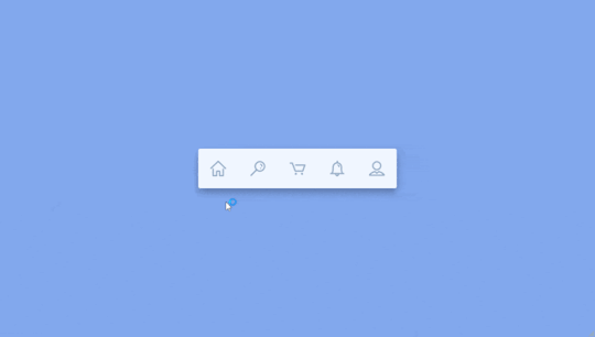
Author Marco Biedermann June 16, 2016 Just Get The Demo Link How To Download - Article How To Download - Video Author HTML / CSS (PostCSS) HORIZONTAL ICON NAVIGATION Compatible browsers: Chrome, Edge (partial), Firefox, Opera, Safari Responsive: yes Dependencies: -

Author Aaron Benjamin April 30, 2015 Just Get The Demo Link How To Download - Article How To Download - Video Author HTML / CSS SLIDE HORIZONTAL MENU Compatible browsers: Chrome, Edge (partial), Firefox, Opera, Safari Responsive: yes Dependencies: -
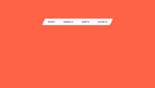
Author Claudio Holanda March 7, 2015 Just Get The Demo Link How To Download - Article How To Download - Video Author HTML / CSS (Less) SKEWED MENU IN HTML AND CSS Compatible browsers: Chrome, Edge (partial), Firefox, Opera, Safari Responsive: yes Dependencies: -
Author Dominik Biedebach January 19, 2015 Just Get The Demo Link How To Download - Article How To Download - Video Author HTML / CSS HORIZONTAL NAVIGATION EFFECTS Compatible browsers: Chrome, Edge (partial), Firefox, Opera, Safari Responsive: yes Dependencies: -
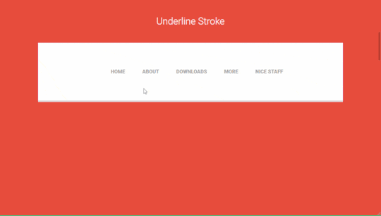
Author Karim Balaa January 6, 2015 Just Get The Demo Link How To Download - Article How To Download - Video Author HTML / CSS SIMPLE MENU NAVIGATION Compatible browsers: Chrome, Edge (partial), Firefox, Opera, Safari Responsive: yes Dependencies: - Author Justin October 8, 2014 Just Get The Demo Link How To Download - Article How To Download - Video Author HTML / CSS ANIMATED UNDERLINE HOVER Compatible browsers: Chrome, Edge (partial), Firefox, Opera, Safari Responsive: yes Dependencies: -

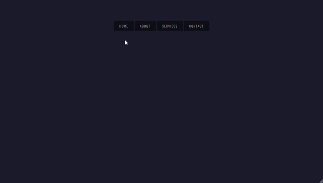
Author Andy Tran September 2, 2014 Just Get The Demo Link How To Download - Article How To Download - Video Author HTML/Haml FLAT HORIZONTAL NAVIGATION Compatible browsers: Chrome, Edge (partial), Firefox, Opera, Safari Responsive: yes Dependencies: -
Author MrPirrera August 23, 2014 Just Get The Demo Link How To Download - Article How To Download - Video Author HTML / CSS TRANSPARENT FADING NAVIGATION BAR Compatible browsers: Chrome, Edge (partial), Firefox, Opera, Safari Responsive: yes Dependencies: -
Author Bogdan Blinnikov April 15, 2014 Just Get The Demo Link How To Download - Article How To Download - Video Author HTML / CSS (Less) RESPONSIVE MENU EFFECT Compatible browsers: Chrome, Edge (partial), Firefox, Opera, Safari Responsive: yes Dependencies: - Author Carl Rosell October 9, 2013 Just Get The Demo Link How To Download - Article How To Download - Video Author HTML / CSS (SCSS) HORIZONTAL MENU Compatible browsers: Chrome, Edge (partial), Firefox, Opera, Safari Responsive: yes Dependencies: -
FAQs
1. What are CSS horizontal menus? CSS horizontal menus are navigation elements displayed horizontally at the top of a website or application. They provide an organized and visually appealing way to present navigation options. 2. Why choose horizontal menus for a website? Horizontal menus are a popular choice as they prominently display navigation options, making it easy for users to access different sections of a website or application. They offer a clean and efficient design. 3. What styles of horizontal menus are included in the collection? Our collection features a diverse range of horizontal menu styles, including dropdown menus, mega menus, and more. This variety ensures that you can find the perfect design to suit your project's needs. 4. How often is the horizontal menu collection updated? We regularly update our collection to stay current with the latest trends in horizontal menu design. The August 2023 update introduces 2 new items, reflecting the cutting-edge developments in this space. 5. Can I customize the CSS horizontal menu code examples? Absolutely! The CSS horizontal menu code examples in our collection are customizable, allowing you to tailor them to match your website's design and aesthetic preferences. 6. Are these horizontal menus suitable for all types of websites? Yes, our collection caters to a variety of needs, making it suitable for different types of websites and applications. Whether you're working on a personal blog or a business website, you'll find relevant designs. 7. How can I integrate these horizontal menu designs into my project? Each horizontal menu design in our collection comes with its HTML and CSS code example, making integration into your projects a straightforward process. Copy and paste the code to enhance your website's navigation.
Conclusion
In conclusion, CSS Monster invites you to explore and implement 15+ CSS horizontal menu designs into your web projects. With diverse styles, including dropdown menus and mega menus, our collection reflects the latest trends in design. Elevate your user experience, streamline navigation, and bring a touch of sophistication to your projects. Happy coding! Read the full article
0 notes
Text
More menu using HTML and CSS

The More menu using HTML and CSS created by Mikael Ainalem. Create a dropdown menu that appears when the user moves the mouse over an element inside a navigation bar See the Pen The more menu by Mikael Ainalem (@ainalem) on CodePen.
#bootstrap mega menu full width#css menu#drop down navigation menu html#how to get more backlinks for my website#html css menu#mega menu bootstrap#mega menu css#menu#menu and submenu in html examples#menu button in html#more menu#More menu html css#responsive html menu#responsive mega menu examples#HTML / CSS
0 notes
Text
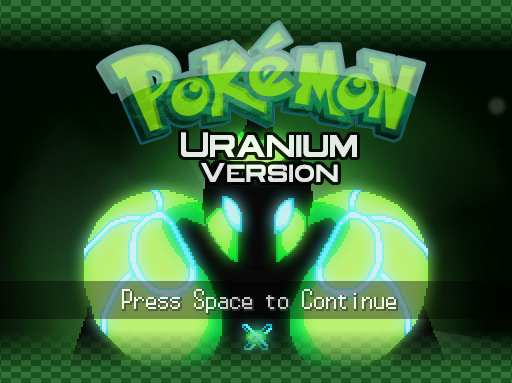
Pokemon Uranium Review
So! I finally completed this game. (have not done post-game yet) I started it ages ago, and then took breaks from it for a very long time. In fact, I almost gave up completely on the game out of irritation. It absolutely has a lot going for it and some awesome strengths, which is why I returned to it and finished it. But it also has some big downsides, and I’ll go into both here.
(Note: expect mild spoilers, especially during plot discussion. I tried to be very spoiler-light though!)
Prelude - DMCA Takedowns
This fan game was in development for quite a long time (about nine years), and is probably best known for having the dubious distinction of being one of the few pokemon fan games targeted specifically and pressured to stop distribution. This is because it suddenly gained a ton of public awareness when it was nominated in the 2016 Game Awards for ‘Best Fan Creation.’ The devs received DMCA takedown notice letters from lawyers soon after. Another pokemon fan game with a large development period has recently met with a similar fate, Pokemon Prism, also in response to a sudden spike in public visibility. Obviously the lesson to take away from all of this is that fan games need to be careful about staying out of the spotlight. The larger and more popular a fan game gets, of course, the harder it is to do that, but hopefully future projects can avoid meeting this unfortunate fate. In the meantime, these “banned” games are still distributed by other players on the down-low.
The discussion of how Nintendo and Game Freak relate to their fan community, the legal details of where fan games fall under, whether or not the owners of the IP “must” legally crack down on fan creations or not when they notice them, and other such details are really matters for another post. For now, let’s just say that I hope in the future, Nintendo alters its stance and learns to relate better to its fans. Fan creations are an expression of creativity and love for the franchise, and the ‘corporate overlords’ would be wise to encourage it, not stifle it, and follow the example of other companies who relate better with their fans and with the creative fan community.
Ok. On with the review.
Introduction
This game takes place in Tandor, an all-new region, and features 150 fakemon, including new evolutions of real pokemon. It boasts some neat modern features like Mega Evolution, and when it first released had fully supported and functional online components, where you could trade and battle with fellow players and even receive Mystery Gifts. The maps and region are very extensive, there is much to explore, and there is a long and very well-developed plot. The game itself is not a ROM hack, but rather, was made with RPG Maker. Your task is to travel the region of Tandor, with your rival tagging along, not merely collecting badges but unravelling a gradually dawning mystery involving strange-looking pokemon and accidents that keep occurring at local nuclear power plants.
UI & Polish
I am not very familiar with the details of hacking pokemon games, but I do believe the main reason the devs chose RPG maker was because it gave them greater control/flexibility over their programming. And that’s quite understandable. But there are a few issues that I think are a result of this. The game itself has a very big lag issue. Even on high-powered machines, pretty heavy lag is very common. However, keep in mind that I played with version 1.0, the first release, for the majority of my gameplay. I believe there are a few patches that help increase performance in that area.
I suspect the reason some of the ‘feel’ of the UI as being a bit ‘off’ is also due, in part, to RPG Maker’s constraints or behavior. The UI is organized a little oddly, the main menu bar scrolling vertically on the top of the screen, the battle screen also scrolling vertically through the four moves. The whole thing feels very squashed at times and not the most efficient use of space, and it’s not easy to see what moves you have or quickly see all the options in the menu. It’s just kind of clunky and awkward to me. Another thing that stuck out for me was the period of time for certain actions. I know this is weird, but when you choose to attack, it almost happens too fast. There’s zero delay when you choose an attack and the battle animations are typically very speedy and with little fanfare. Indeed, the battle animations in general tend to be incredibly simple to the point of barely even being present, not visually appealing, and with very quiet, uninteresting or odd sound-effects. They lack any sort of feeling of ‘punch’ to them. I also notice when you save the game, it seems to occur instantly, when in the pokemon games, it always has a slight delay. Why the heck should this bother me? Isn’t fast saving BETTER? Well yes, haha, in theory, but oddly enough it added to the rushed feel of things. Healing at the pokecenter, too, happens incredibly fast. Normally there is a pretty lengthy delay in pokemon games.
I realize plenty of folks would love faster battle animations and saving and healing and would consider me crazy for noting it! They just want to get on with the playing! But I feel like pokemon is about the adventure, not the destination. You’re supposed to dwell a little. You’re supposed to feel the battles, feel the punch. And the delay for that healing? Well, folks have pointed out that it’s there for a reason, as annoying as it can be to wait sometimes. It’s the price for a free heal. It’s already pretty darn overpowered you get infinite free heals in this game pretty much whenever you want, so they made that teeny little price to pay for doing so. And, honestly, that way, it feels like something is actually being done. But with Uranium, things were so fast, it kind of felt like you weren’t really experiencing things. Is that weird of me to say? I dunno. But it’s the sense I got from it. And to me, that helps to make it feel a bit ‘off.’ It’s a subtle thing, I admit.
That said, there are tons of added features to the game that make for great polish and are very welcome options. There are multiple save slots, which is only a good thing in my mind, and I’m sure using RPG Maker rather than a ROM hack made this a possibility. There are independent volume controls for music and sound effects, which is fantastic when you’re grinding and want to listen to your own music. You can toggle perma-run mode on and off which is super nice. There’s even a Nuzlocke Mode built into the game! If the game didn’t have a ridiculously steep level curve, I would totally use the Nuzlocke Mode, but as the game stands now, I doubt I ever will. But dang, it’s an awesome idea, so props for that! Even the way you get your starter is a unique and cool idea– you take a mini-personality quiz and the professor matches you with a pokemon that best suits your playstyle. Finally, the choice of the player character is super neat because instead of the usual ‘r u a boy or r u a girl’ question, you have three characters to choose from, one of them being nonbinary. (all the characters throughout the game refer to you with gender-neutral pronouns if you make that choice) I thought that was a really nice touch. I ended up choosing them as my player character (at the time just b/c I thought they looked the coolest).
Maps
The locations in this game are top-notch. The towns are awesome; they’re laid out nicely, have good intuitive design, lots of detail, contain tons of interesting NPCs, and have lots of little touches. The tiles are lovely. Many of the towns are memorable and unique, and it really gives a sense of exploration. Also, the place is BIG! There is a ton in the main area and even more to see in East Tandor. You aren’t going to get bored in this respect, and it’s one of the biggest strengths of this game.
Music
Uranium contains a mix of pre-existing pokemon tracks and original music. While I do dislike a few of the original tracks, I love the majority. I admit some of the tracks feel somewhat ‘out of place’ in a pokemon game. It’s not that they’re bad or anything, they just don’t quite feel like they belong in a pokemon game. I realize that’s a very subjective sort of judgment, but there ya go. That said, it’s no big deal. Some of the final parts of the game have truly epic music, and it makes it all worthwhile.
Fakemon
Ok, so. This is a big section to discuss. The game contains a TON (150) of fakemon. I know some folks who play pokemon fan games don’t like fakemon. I, however, am quite happy with them, and in fact prefer them when they’re done well. Of course, doing fakemon well can be a tricky thing. Let’s take a look at how the fakemon fare in this game.
Designs
As professional and polished as the tiles and the locations are in this game, the spritework for the pokemon is a little inconsistent. Some of the sprites look great, while others look as though they could still use some work. This is unfortunate, because I suspect some of the fakemon that were really cool in concept suffered a little in execution. For example, the Frynai evolution line have a cool concept behind them, but I didn’t really care for how the sprites were actually made.
Other fakemon, errr, well, I didn’t really care for in both concept and execution:

There were also fakemon that looked okay but really felt “out of place” to me in the pokemon universe. I know that’s a pretty subjective thing, but I do think that pokemon has developed a pretty distinct style by now. It may be hard to pin down exactly what that style is, but fakemon like Owten (a cat with bird wings pasted onto it) look very cute but don’t really feel like pokemon to me.
Or, take this fish for example:
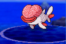
This is a fish with a humanlike brain pasted onto its face, and it just feels wildly out of place to me. Instead of animals with random body parts of other animals pasted onto them, I’m looking for a more cohesive design.
Because I felt very ‘meh’ towards a large number of species in this game, choosing team members was based more on “ok, what actually looks cool to me?” than on anything else. But then, that’s the joy of having such a wide range of species to choose from; odds are, there’s something for everyone. Take a look at my starter, for example:
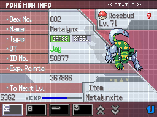
Metalynx here is an example of one of the Uranium fakemon I think is very well-designed. I admit I feel a tad iffy about the random floral pattern on its back (seems to me it’s best to continue the leg/tail stripes throughout the body), but other than that, it’s a cool design and suits Pokemon well. The spritework is very nice, too. You can see the whole design feels way more cohesive and well thought-out than simply pasting random body parts onto an animal.
Names
Another issue I sometimes had with the fakemon were the names. You might think this is nitpicking, but I would argue names are actually very important. Pokemon follow a very clear tradition for their names, relying on portmanteaus, onomatopoeia and puns a lot of the time, or adding specific prefixes or suffixes to words.
The thing is, you can’t blindly follow this structure. You need to exercise a fair bit of judgment. The actual sounds the pokemon name makes is important. In this game, for example, there is a Ground/Dragon named “Terlard.” To be honest, it sort of sounds like a mix between “turd” and “lard,” which obviously isn’t an appealing image. It’s actually supposed to be a cross between “terra” and “lizard.” But, well, I feel like a better-sounding cross could be made rather easily. “Terrazard” sounds far better to me. If that’s too close to Charizard, maybe drop the word “lizard” and go for “snake” or “serpent” as a base word.
Other names sounded okay to me but they really don’t roll off the tongue; ‘Tofurang,’ ‘Fortog,’ ‘Eshouten.’ I feel like pokemon names that are easy and fun to say are the best ones.
But, again, with so many fakemon, of course I was bound to find some I didn’t like as much. There were also fakemon names I thought were really strong! ‘Tancoon,’ for example, is a great pokemon name. ‘Jerbolta’ is actually perfect, and one of my favorite fakemon names, period.
Cries
There are a bunch of fakemon in this game with original cries, which is cool, but the actual cries themselves often felt underwhelming to me. There also seemed to be an odd issue with the volume level, because most of the cries felt really quiet to me. However, creating original cries is no doubt very complex work. I commend anyone for even making any sort of effort at it.
There were also a lot of fakemon that borrowed cries from real pokemon. This is perfectly understandable and plenty of fan games do this; as I said, making original cries for so many pokes has got to be terribly demanding. It did lead to an unfortunate feeling that things were a bit mismatched, with some fakemon having original cries and others having borrowed cries. But overall, that’s a rather minor concern.
Conclusion
I have been pretty harsh in this section about the fakemon of this game. All of that said, I really do appreciate how ambitious it is to make 150 all-new pokemon in a game. That is a TON. I’m sure it’s a remarkable amount of work. I applaud the effort and creativity that went into it, and I certainly don’t claim I can make something better than the Uranium team did. Even if the spritework was occasionally a little wonky, and some of the designs were a miss for me, they’re all far better than my own skills could produce. I also want to reiterate there are fakemon in this game I really liked! So, seriously, even though I consider the fakemon designs and sprites to be one of the biggest weaknesses in this game, if you disagree with me, that’s totally fine. Everyone has their own tastes, and if you love these fakemon, more power to you. :)
Level Curve and Stats Balance
Ok, here we go. This is my biggest gripe of the whole game, and the reason I nearly quit it multiple times. The level curve in this game is poorly done, in my opinion. There is a difference between “challenging” and “ridiculous.” In order to even have a chance at fighting normal, ordinary, run-of-the-mill trainers, I had to grind. For. EVER. Part of why the grinding takes so long is because the wild pokemon levels are so low, they just don’t provide adequate EXP, and the trainers are relatively sparse in this game. So I cannot begin to tell you– actually, you know what? Yes I can. Here:
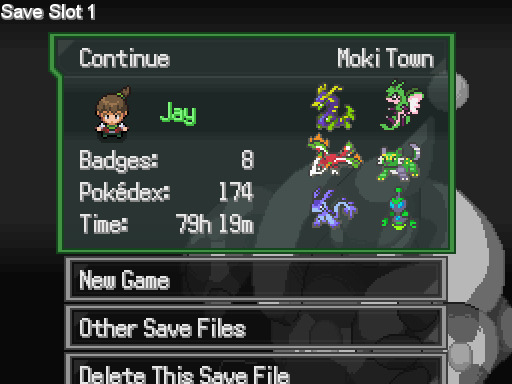
That is how much time I’ve put into completing this game. Almost 80 hours. I can assure you the vast majority of that was spent grinding. (this isn’t a ROM hack so no Gameshark, either)
I get that one of Uranium’s goals was to make a more challenging game for fans, because Pokemon has traditionally been too easy for its older players. That’s a fine goal. But I don’t think they achieve that here. The level curve should be designed so you don’t even need to grind extra levels. Instead, playing this game ended up being a miserble, boring chore the vast majority of the time, because most of it was grinding forever in the grass. I am not a super-competitive, extra-amazing skilled Pokemon player. But I am not utterly atrocious at pokemon, either– I’ve played it and fan games all my life. So I don’t think it was simply that I sucked at the game.
Sure, I could have split the EXP points fewer ways (and just had 1 or 2 overpowered ‘mons) or carefully selected the most OP fakemon I came across (I did not, because I chose based on whether I liked the designs or not). But I think at the end of the day, this game just requires a lot of boring grinding, and that sucks. It really holds it back, because it would be a truly fantastic game if not for this problem.
I suspect another issue is poor stats balance for a lot of the fakemon. This could explain some of the need for so much grinding. Of course, in pokemon, these creatures come in all shapes, sizes, and all ranges of statistics. Some have better stats than others. It’s just a fact. But I suspect the stats balancing in this game still isn’t done very well for a ton of the species. I say this because my team-members tended to drop like flies even when they were at levels equalling my opponents. Yes, I am aware of basic concepts like special and physical defense. I am not saying a pokemon weak in physical defense died at a physical hit and I was shocked at that. I’m talking about pokemon going down regardless. However, I didn’t spend much time researching it, comparing all the numbers, so I can’t confirm that suspicion at the moment. But I suspect there probably were a fair number of fakemon either excessively overpowered or excessively low-tier.
Writing
And here we have what is easily the biggest strength of the game. Oh my goodness, you guys, the writing is so good. This is the reason why, no matter how frustrating and boring the grinding got, I eventually came back. I had to see how the story ended. Traditionally, the plot has been one of the biggest flaws of official Pokemon games. In fact, I’d say the story in official games tends to be pretty lousy, with a couple of rare exceptions. But, guys! Uranium has story! And it’s GOOOOOOD!
Not only is the plot deep and interesting, but the dialogue is excellent as well. I know plot is not a priority for some people when it comes to pokemon games, but to me, it makes an enormous difference. I love a good story, and to me, it seems like a no-brainer that an RPG should have a good plot.
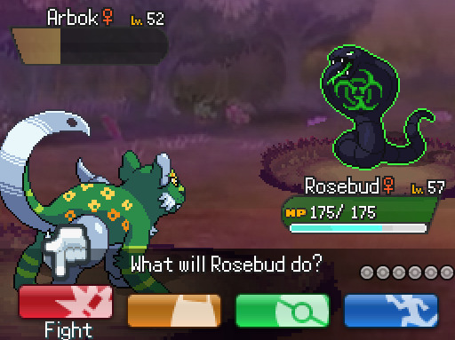
I really don’t want to say too much about the actual story, because of spoilers and such. But in a nutshell, it focuses on a series of accidents at nuclear power plants. The local pokemon end up being exposed to the radiation and they turn vicious and savage. There is a focus on Pokemon Rangers, who act as local law enforcement in addition to environmental protection (well, very much akin to actual park rangers in real life), and it’s well-developed and so well-done. Your estranged father works as the work-obsessed head bossman dude of these Rangers and you eventually help them out as they try to deal with irradiated wild pokemon and solve the mysterious accidents at the power plants. It’s ridiculously spooky and exciting and fun wandering around exploring the old broken-down nuclear power plants and taking on the crazy pokes, which look all glowy and cool and have special nuclear-type moves:
In addition to this great main plot, your rival is perhaps for the first time ever an interesting character. He is so well-written and you see actual growth and change in his character over time– growth and change that is gradual and believeable, and not just the 180 that villians in pokemon tend to do at the last second (I am evil evil evil hahaha oh gosh the way you treat your pokemon has made me realize I was wrong I shall now repent The End). The lad starts off as an annoying kid that reminds you very much of a younger sibling that tags along with you everywhere you go that you just wish you could ditch. By the end of it, by God, you actually LIKE him, and watch him mature and grow, and damnit, I feel actual FONDNESS for him? Is this what actual characterization feels like?!
And there’s even MORE. I’ve hardly scratched the surface. There are side-quests and subplots and everywhere you look, there is rich dialogue from NPCs adding to the depth and complexity of the world. Gyms have folks who are actually interesting, the region has its own legendary pokemon, and there are even ninjas vs. pirates in this game, for pete’s sake.
Despite the relatively dark nature of the subject matter– nuclear meltdowns, irradiated pokemon, my mother having vanished and presumed dead from one of these accidents, my grieving father having abandoned me at a young age to let my elderly aunt care for me, etc. etc.– it was still kept nicely within the realm of Pokemon. It didn’t get too dark or feel out-of-place. And that’s really cool, and a major accomplishment. Even when major character’s lives were in grave jeopardy in a way official Pokemon games wouldn’t dare to do, it felt like it fitted Pokemon games just fine. That’s awesome. Even Pokemon Prism didn’t do this. Prism often felt too adult and grim and gritty to be a real Pokemon game, despite all its strengths.
The very endgame– specifically, the identity of CURIE– was admittedly predictable, and something I had guessed waaaaaay long before it happened. That said, it was still very enjoyable. I also noticed that it is possible to get a “bad ending” in this game (which I kinda got the first time eh heh heh *cough*), which I think is super cool! Admittedly, the foe in the final fight in the game is … well … a bit OP. By about a thousand billion times. (which is why I got the bad ending first :P) But, there was also a certain charm to it, and I think the whole point was the ridiculous hyperbolic stupid OPness of it. It made you feel like you were truly hopeless, which a Pokemon game never does. And that was interesting. Honestly, for a short time, I wondered if it was simply a scripted loss, where a scenario was intentionally designed for it to be literally impossible for the player to win.
There was one little point at the end that was very unsatisfying, when my rival declines to fight me and instead forfeits the Championship to me. It’s not so much the “look, what you just did, saving the world n’ junk, that kinda already proves your worth” bit that bothers me, it’s just … ehh the way it was handled, I guess? It just felt like when I was congratulated for being the Champion, it felt fake. I wasn’t the Champion. I wanted to have my final rival fight, damnit. I was really looking forward to it. I guess that’s my biggest complaint about the storyline. I did love the idea behind the Championship itself, though– not Elite 4 but rather, facing a series of trainers through semifinals and finals etc. Honestly, that way makes a ton of sense and is even more logical than facing an Elite 4. I mean, damn, those Elite 4 would get pretty exhausted fighting challengers all day every day. The fact that there was a huge audience too made so much more sense to me than the solitary, solemn battle the Elite 4 feels like.
Conclusion
I’m glad I played and finally finished this game. It was clearly a labor of love and it’s the best storyline I have ever found in a fan game, period. If you’re willing to put up with some questionable stats balancing and a savage level curve, as well as a bunch of wonky fakemon sprites, then I definitely recommend playing it.
This is a repost on a new blog. The original post was on Mar 6, 2017.
#pokemon#pokemon uranium#pokemon fan games#mycontent#this ended up being quite long aha#sorry bout that#pokemon reviews
13 notes
·
View notes
Text
Leading 10 Premium WordPress Magazine Themes
The thought of offering trending news is actually a main ideas for most new websites floating round the internet. We have now deviated from reading through the usual and serious news-fashion details towards a much more liquid and clean news usage. Attempting to find the shades and humor in whatever related news item we read through, we try to find the amusement of any magazine fashion e-zine in every stylish magazine site. Business gamers of the Magazine websites for example Forbes, TechCrunch, Mashable, Reuters, CNN these have employed the fully responsive and also the water model of a Magazine fashion design site. Following the style, are you currently searching for the ideal WordPress magazine themes for your internet site? We have fantastic selections of the top WordPress themes for news, magazine, posting or evaluation internet sites. So, in case you are either preparation to setup a fresh weblog/internet site or simply are merely rebranding your existing ‘Breaking-news' WordPress website we recommend you keep reading this web site submit. Newspapers The Local newspaper theme by tagDiv is the greatest owner WordPress magazine theme of all the instances, having a large number of around 93,000+ downloads. Greatly in tendency for being employed by news, magazine, and review sites, Newspapers is lighting, quickly, and simply spectacular in just about every creating factor. With free of charge life changes, you can never be apprehensive when you pay money for this theme, since it also provides outstanding support. Several of its characteristics are: Quickly, designed, and well coded. Gives 90+ distinctive total trial designs. The freedom to customize every little thing in the frontend with all the tagDiv Composer page contractor. Drag and Decrease Usefulness. Includes the tagDiv Cloud Collection and also over 1000 design and style templates for content articles and internet pages. Header and Footer Building contractor. Innovative options for inlaid and custom video clips or movie playlists. Makes use of the best Search engine optimisation methods. Incorporation for bbPress Forum, BuddyPress, Mate Click, and WooCommerce. Also, it supports reactive Yahoo and google Ads and Google adsense. Compatible with the WPML plug-in. NewsMag If you want to post content articles or current the newest news, NewsMag could possibly be the most affordable WordPress magazine theme to suit your needs. This is the very best-scored WordPress news theme. Created by tagDiv, the writer of Newspaper, these 2 themes are now the most notable WordPress magazine themes on ThemeForest. With 15,000 downloading, this WordPress theme provides awesome a single-click transfer demos. These sophisticated and brightly simple templates will satisfy your taste instantly. Fantastic layout designs for effective storytelling. You may modify points without having to delve into the codes a major plus for non-technical customers. A smart advertisement process that will help you monetize your site content. Beautiful grid and designs for the creative end-outcome. Also, the theme is powered by the frontend tagDiv Composer page builder. Translation completely ready, E-trade appropriate, and Yoast Search engine optimisation supported. PowerMag The ThemeForest page for PowerMag phone calls it one of the most muscle Magazine/Testimonials Theme. It is a receptive, retina-completely ready, and super-striking theme that makes your site stick out from the audience. A multilingual theme, PowerMag gives 40 elements, a built-in web template method, customized publish varieties and even more. The USP may be the theme's inbuilt Assessment system which comes with a proportion/celebrity position system which can be schema.org suitable. 7 slider combos for maximum artistic mobility Search engine optimisation optimized, RTL assist, unbranded admin solar panel plus much more. Gillion Since they consider it, Gillion will be your one particular-stop multi-idea theme for easily developing weblog/magazine/news/assessment internet site. With 4 header themes and 13 customized widgets, you cant ever be unoriginal or repeating. The lovely theme gives 7 demo layouts and different innovative sliders to pick from. Developed in the Visual composer, your site might be highly custom by using this theme. Endless shades have the fully sensitive design even better. A trending slider will emphasize the most up-to-date content. Strong admin user interface with no html coding essential for personalization. Soledad Soledad is the greatest-offering Blog site and Magazine WordPress theme for the year 2017. This simple fact just about sums within the awesomeness quotient with this gorgeous theme. It really is awesome in so many methods: 900+ Trial homepages and 300+ slider and blog mixtures. 3 sidebar styles, 5 write-up styles, 6 portfolio styles, and 2 super menus variations. WordPress are living customizer with 25+ options for imaginative modification. 9 presented slider types and customized fonts with 700+ yahoo fonts. Search engine marketing designed, WooCommerce appropriate, and specialized customer care. While it started off like a WordPress blog site theme, it's now among the finest WordPress magazine themes currently available with tons of features. SmartMag SmartMag is actually a responsive and retina ready WordPress magazine theme. By having an easily controllable back-finish, it will be possible to seamlessly handle the web site technicalities on this page. Offering a 1-click on demo set up, the theme has special demonstration styles. BbPress online community, interpretation suitable and E-trade completely ready. Search engine marketing works with Schema incorporated evaluation program. Will allow the creation of pages with 11 site-builder widgets and 6 obstruct variations. Special mega food list and numerous article formats. Tana Should you be looking for any theme that is area of interest distinct, Tana could possibly be the smart choice you may ever make. This highly imaginative theme is apt for your personal certain video, vacation, life-style, or design related magazine website. Depicting a ‘state-of-art' designing and format, this theme offers a distinctive idea. These principles are: Newspaper, Blog site, Video, Music, and Trend. 24 distinctive design elements, 5 footer types, and three press sidebar variations The Graphic Composer is now loaded for enhancement. Receptive expert slider, vast and encased layout, WPML preparedness and child theme compatibility. Bimber Bimber is definitely the no. 1 offering viral WordPress magazine theme. It requires under twenty four hours to launch a complete-fledged viral buzz-like internet site. With numerous features similar to a preferred trending collection, yahoo ads and a number of discussing buttons, all you have to do are to pick up your posts and spread it virally. RTS support. Also functions compatibility with caching plug-ins. Search engine optimization optimized and optimized for Yahoo Page speed. completely sensitive, Cross browser compatibility and Social sharing readiness. The most up-to-date update brought in 4 new Demos. WooCommerce, bbPress, and WPML incorporation. Persona quizzes and bogus counters. 15Zine 15 zine is an extremely-present day WordPress magazine theme because it features your latest content with apt appearance style and typography. It provides the pull and decrease tradesman for producing an amazing web site. Even someone who is really a naïve in WordPress can efficaciously deal with it. Endless browse and unlimited publish weight feature for stimulating the website visitors. Potent Ajax Megamenu System. Distinctive Woo Commerce Design and usefulness. WPML, RTL and SEO prepared. Receptive and retina all set. Youngster theme all set. Incorporates a trending menus. More than 13500 downloads. Sahifa Sahifa is probably the best WordPress magazine themes for news, magazine and website websites. This theme is consumer- friendly, custom, fast-launching, and gives a high-quality browsing encounter. This theme has sorted out re-sizing problems as it is receptive for both smartphones and pc just as. Suitable for WPML, bbPress, Friend Push, Woo Trade. Powerful Admin Board. Interpretation Loaded 1-just click demo importer and Pull and Fall Homepage tradesman. Infinite browse wordpress plugin, Built in assessment program, History appearance Advertising. Tacky Sidebars, Pagination Included, Picture Slider and 40+ Shortcodes.
1 note
·
View note
Note
Who does the wallpapers for the PC boxes? They're pretty.
Thank you very much! The wallpapers are from a variety of sources, all of which are listed in the credits under the System menu. Most of the early wallpapers—Forest, City, etc.—were actually designed by Lanette as part of her argument that the system needed a proper GUI. (Needless to say, she won that argument. Among many, many others.) Brigette and a handful of artists the two of them know helped with the rest.
Beyond the basics, every region has their own sets of wallpapers unique to that storage system, as you may have noticed. These come from a variety of sources: the administrator, someone they know, a commissioned artist, a company or government body offering to fund part of the system, or simply donations. (There are ways you can submit your own art to be used in the system. Simply contact your local administrator for details.) Take Unova’s set, for example. Munna was made by Amanita (who is very fond of munna), but Fennel had a hand in Monochrome. The Reshiram, Zekrom, Kyurem, and Zoroark wallpapers were all provided by users, and Musical, Movie, Subway, and PWT were all provided by sponsors. Finally, you have the Team Plasma wallpapers. …I’m not sure how those came about, actually.
Should anyone be curious about which wallpapers were done by the other administrators, though:
- Bebe was responsible for Torchic, Trio (both versions), PikaPika (both versions), Croagunk, and Backyard. She also apparently blatantly stole Space from the Mossdeep Space Center website. (It’s public domain, but she likes calling it stealing.) Outside of the Sinnoh Pack, she did Trio and Spiky Pika for the Kanto/Johto pack as well. Essentially, if it’s cartoonish with thick lines, it’s likely Bebe.
- Cassius did the Yveltal wallpaper, as well as Mega Evolution and, supposedly with the express purpose of making me highly disappointed, Team Flare. (He was not successful, contrary to what he believes.) His assistants provided Xerneas; the others are simply donations.
- In addition to increasingly updated wallpapers for all systems, Lanette also provided the Hoenn Pack with Hoenn Starter Trio. Her sister did Primal Groudon, Primal Kyogre, and Primal Rayquaza. The Contest Spectacular wallpaper was apparently done by a fan, as was, by a separate fan, Super Secret Bases. I’m told that Archie actually did the remaining two, Aqua and Magma, during his time doing community service, but I’m certain Lanette is just pulling my leg. (I’m really not. —LH)
- Molayne insists that he has no artistic talent, but he did suggest that Lanette add in a checkered pattern to her backgrounds on our latest update to make sorting easier. Apparently, he was onto something.
- Celio is very shy about his talents, unfortunately, and to date, he has only designed two wallpapers: Nostalgic (red version and green version), for the Sinnoh Pack.
- As for me, I’ve admittedly only designed one wallpaper myself: Kimono Girl. Its backstory is a bit personal for me, I admit, but suffice to say, it’s based on an old photograph of my mother (used with her permission, of course). It’s an easter egg of the highest caliber, though, so best of luck finding it!
19 notes
·
View notes
Text
Responsive WooCommerce WordPress Theme

EmallShop - Responsive Accessories Wordpress WooCommerce Theme utilizes most recent content and CSS3 to render portable formats and supply numerous highlights, for example, Mega Menu to give dropdown menu item classifications and decent static square, fast view to give the data of the item by means of the popup, Ajax shopping basket. We have numerous highlights to enable your site to wind up more splendid and increasingly exquisite.
Enormous slideshow with wonderful pictures, smooth change is put underneath or above Mega Menu on each landing page. Blog and Testimonial help clients and shop proprietor interface and see each other more by means of posts, remarks, criticism. Additionally, shop proprietors can promote your items over the wolrd. Items Slider modules, for example, New Products Slider, Featured Products Slider, Bestseller Products Slide, Onsale Products Slider, Lastest Products additionally add to enhance execution and tasteful of this site. Set aside your very own opportunity to peruse the demo site and get this extraordinary theme!
1 note
·
View note
Text
Super Churches And Religious Discipleship
Mega church is the popular name for big churches that are swallowing up all around the European world. Since the name suggests, these are not only large churches, but have normal regular attendance from 1k to 30k or more. They are maybe not community churches, but local churches, where persons come from in terms of 50 miles out, as a result of highway travel. Mega888 The sanctuaries of some of these features seat as much as 10,000 at a time. Several game padded stadium sitting with consume slots and stereo telephone outlets to obtain the teaching translated into several languages. The sanctuary is generally only element of an enormous college that features class houses, swimming pools, golf courts, gyms, etc. Usually, they've valet parking and taxi support from the huge parking lots to the refuge and different items of interest. For their size, these mega-churches can offer a wide selection of services for Religious individuals of most types and sizes.
Unfortunately, due to their size, mega-churches are about as close as a professional basketball game. Imaginable, if the sanctuary chairs 10,000, the sixth rank class (for example) might seat 200...Lord, support the teachers! To obtain anything close to personal fellowship, you'd possibly have to be among the 150-200 pastors, but then, you may be therefore locked into the institutional mindset and the break-neck velocity to be able to strategy Christian intimacy. I am aware something of the, having pastored on the team of one of the smaller mega-churches in Upper California. Demanding does not begin to spell it out the experience. After about 4 decades there, the Master moved me to a much better spaced ministry responsibility. Professionally, my experience as a mega-church pastor brings me to believe there is too little chance for affective ministry and a lot of administrative responsibility. The large amounts of people allow it to be similar to herding cattle than hitting individuals with the profound and personal experience of Jesus. Still, this seems to be the tendency in the present day church, therefore, let's see if we are able to take this mega-church point and find a way to infuse intimate discipleship into the process.
Two types of discipleship can however be used well at mega-churches; Mobile Communities and one-on-one. Mobile Organizations, or small organizations, set discipleship duty beyond your church college, in domiciles, wherever close contact and ministry are possible. Most of the mega-churches are becoming small along with finding large, by adding countless little house communities for their enormous menu of weekly services. This isn't new, but positively carries continued attention. Most of us know, inside our modern society, we're maybe not going to get many persons in each other's domiciles for greater than a couple hours weekly, but we must take what we get and let the Sacred soul do the rest. The next technique, one-on-one, is probably the most efficient nevertheless the hardest to perform from the mega-church model. That's because it depends on persons being motivated enough to develop personal associations from the enormous group of guests they worship with each week. I think one-on-one discipleship is really as useful in the mega-church setting as in any...other than the small party, which normally develops relationships.
This calls for a level of determination to discipleship from the top-down. Possibly the largest credit to mega-churches and the largest problem to discipleship is how devoted the whole staff must certanly be to "the huge show." Clearly, when they didn't accomplish that well, they wouldn't be a mega-church. Regrettably, this demands so significantly attention every week that everything nevertheless the "main" Sunday ministries (sermon, music, kids, teens) and the major schedule events, could possibly get overlooked or terminated entirely. Creating personal discipleship a priority in a mega-church needs an all-hands-on-board thinking that the elderly pastor should exemplify and expect of the team (participation is the main job description). Your little teams and one-on-one discipleship possibilities must certanly be endorsed as often and with as much interest as every other significant church function. Every head in every party should collection the hope (by word and example) that personal discipleship should be a goal in everyone's life. If they're maybe not participating, they don't really qualify for leadership in your church. Every bulletin, letter, handout must show the need because of this and a method to participate. Each time some one responds to the meaning to accept or reconcile with Jesus, those hoping using them ought to be taught to inform them, "Listed here is what's next..." Pastor, if you are enthusiastic about taking persons nearer to Jesus, discipleship ought to be stated almost every week in your support in a few way...even in the sermon, along with the fact you are carrying it out, and how they can get involved. Is that way too hard? You never your investment providing, can you?
1 note
·
View note
Text
Middle Child Syndrome: Fatal Frame III

Fatal Frame III: The Tormented sits in a weird place among the entries in the classic horror series. After the novelty of the first game and the refinements of the second, The Tormented starts to retread some very familiar territory. There are more old, abandoned and haunted mansions, more hostile ghosts that need exorcizing, and the same Camera Obscura with which you take pictures to solve puzzles and rid said haunted mansions of the undead. The general idea of the game is identical to its predecessors. If you’ve played through the entire series, you know that there is a familiar sense of core elements and a consistent quality that invites comparisons to the NES line of Mega Man games. As such it’s easy to overlook the game as just another sequel that does more of the same. Done and done.
That would really be selling the game short, though. While not nearly as celebrated as Fatal Frame II: Crimson Butterfly, or as controversial a release as The Maiden of Black Water, The Tormented veers off the beaten path in surprising ways. Sure, you spend the majority of your time doing the exact same things you do in every Fatal Frame game, but the story has a more personal side to it. It also isn’t all haunted house all the time. There are things to do outside of playing paparazzi to the angry spirits of people who met untimely and gruesome ends. There are characters that you can interact with, and loads of quiet time.
I haven’t talked at great length about the story of the other Fatal Frame games for a couple of reasons. First, they are all set up as mysteries. Going into a lot of detail about them would diminish the rewarding sense of discovery you get when you uncover more journal entries or newspaper clippings that allow you to fit the timeline of the story’s events together. Second, the stories being told were never all that satisfying to me. Learning exactly how the ancient ritual that keeps the spirits of hell away got botched for the third or fourth time loses a bit of its luster. There’s nothing wrong with that framework, and you have to expect it to some degree with a series that is self-referential and takes place in some semblance of a timeline. Still, the possibilities to go beyond the failed ritual scenario have been surprisingly unexplored. Fatal Frame III makes a valiant attempt.
In The Tormented, you follow Rei Kurosawa in the aftermath of the loss of her fiance, Yuu Asou. Rei bears the responsibility of Yuu’s death, as she feels it was her inattentive driving that caused the accident he was killed in. Having survived the accident, Rei suffers from tremendous guilt. That is a heavy stage to set and contrasts wildly with the previous setups of “my brother is lost and I think he might be in this creepy mansion” as seen in the original game, and “we were running through the woods and now we’re in some creepy, abandoned village that appeared out of nowhere”. The themes in the series have always leaned very hard into dark and disturbing territory. Who could forget the slightly hinted at taboo relationship between twins Mio and Mayu from Crimson Butterfly, or the horrifically unethical medical experiments performed on mental patients in Mask of the Lunar Eclipse? Where the series had previously begun its games with big, open-ended mysteries, III was the first to begin its story with such a specific focus on the details that ground both the lead into the plot and the character whose the lens the player will be experiencing the plot through.
Rei’s grief and guilt are the emotional frameworks upon which The Tormented is built. That subtitle essentially gives the theme of the game (and the entire series, for that matter) away right off the bat. It’s one thing to have an interesting story framework, though. It’s another to elevate that story through the integration of its themes into something the player can take part in. To that end, Fatal Frame III is comprised of two distinct phases. There’s the dream phase, where Rei (and occasionally other characters) explores The Manor of Sleep and uncovers information about various ghosts she encounters while there. This is also where the player does all of their ghost hunting with the Camera Obscura.
There’s also the waking phase. This phase is set in Rei’s home, which she shares with Miku Hinasaki. Miku is the protagonist of the first Fatal Frame and she works for Rei as an assistant. While awake, the player can develop certain pictures taken while in the dream state in her home’s dark room. Those photos can then be given to Miku to investigate the characters or events revealed in the film. The other main component of waking up is simply to take a breather from the harrowing experiences of investigating the mansion while eluding the tattooed woman hell-bent on tracking Rei down. Having structured quiet time makes the difference between the emotional highs and lows of the game more pronounced and even. The house, taking the role of refuge, completely recontextualizes the nature of the mansion exploration as set forth in the previous entries in the series. Where before the game’s protagonists were forced deeper and deeper into exploration in an effort to find what they were looking for or free themselves, Rei gets to act more like a spelunker. She explores the same horrifying locations and situations as the characters in the other games, but she does so with a rope (somewhat) firmly tied back to reality.
The cyclical nature of sleeping and waking is then twisted over time. The safe haven of Rei’s home, which included having Rei’s health restored and her film replenished, begins to feel less safe over time, especially as night falls. Apparitions tucked away in corners can be seen flickering in and out of existence, the constant rainfall outside acts as somewhat of a psychological barrier to leaving the house. It’s as though Rei’s dreams are forcing their way into her consciousness slowly over the course of the game, which is a more oppressively sinister emotional path to walk for both Rei and the player. What was once a welcomed relief erodes into more uncertainty, cementing the effects of the trauma that Rei undergoes.
The subtlety of Rei’s descent into the trappings of guilt is propped up in some unexpected ways. There are the aforementioned hauntings in Rei’s home introduced over time, but there are more subtle touches that magnify the effects of her emotional deterioration. Elements as omnipresent as the UI seem oddly understated compared to the games it’s sandwiched between. Compare how busy the viewfinder is of a mildly upgraded camera is in Fatal Frame II and a similarly upgraded camera in III.

Fatal Frame II: Crimson Butterfly

Fatal Frame III: The Tormented
The highlighting around the reticle, which indicates the charge of your spirit power, is so subtle that upon picking this game back up again, I completely missed it for the better part of my first fight. I’m not exactly sure why the Camera Obscura has such a minimalist representation when the trend in the rest of the series was to amplify its feedback to 11. It’s not even like it fits in with the rest of the UI features, which saw more shortcut buttons and menu options than previously provided. It certainly seems that breaking immersion wasn’t particularly on the list of worries, so the only options left seem to be that the developers just wanted to give the player more screen real estate with which to frame the ghosts they would be taking pictures of, or they felt that toning down the flashing lights and alarm bells would keep the mood somber, preventing it from clashing horribly with the tone of the narrative. It could be both at the same time. Whether intentional or accidental, Tecmo completely nailed it.
Being the third installment of a series means there were plenty of opportunities to adjust and fine tune features that might have been underdeveloped in previous games. There is still some redundancy in how the player takes pictures, for example, being able to use either the R1 or X buttons, but that’s much better than the three possible buttons used in the previous title. A big improvement was getting rid of having two camera viewfinder control options active at the same time. Fatal Frame and Fatal Frame II allowed for movement of the Camera Obscura’s viewfinder with both the analog stick and directional pad, an odd choice considering the PlayStation 2 had integrated analog control built in from the beginning. The Tormented fixes that, leaving control simply with the left analog stick. By doing this, they freed up the D-pad to be used for swapping film types during combat without forcing the player into a series of menus, which would take them out of the action and ruin the pacing.
Fatal Frame III is full of these small improvements. The system menu options were moved from the Start button to Select, which allowed for the game menu options to be moved from Triangle to Start, which then allowed the Camera Obscura to be raised or lowered with Triangle instead of Circle, putting it much closer to R1, which is used as the shutter button. The map, a huge time saving and confusion busting tool, was moved to the L2 button, which went completely unused in previous entries. One of the best improvements involved implementing an older constraint from the first game that had been “corrected” for the sequel.
Film in Fatal Frame is finite. If the player does a poor job managing their film either in combat or when taking pictures of wandering ghosts or other things of interest, they can either run out completely (admittedly difficult to do as there is more than enough scattered around the mansion), or more worryingly, run low or out of the most rare and powerful film types because their damage capacities weren’t maximized. The team at Tecmo realized that there was a real possibility that players could put themselves into an unwinnable situation, and to make sure that couldn’t happen in the sequel, they introduced a type of film that was infinite. Its capture power was very weak to compensate for having an unending supply, but it was a nice safeguard against both running out of film completely and also against being forced to use more powerful film when it wasn’t really necessary.
Fatal Frame III rides the line between these two extremes. All film types have a limited supply, like in the original game. Two of those types, Type-7 and Type-14, refill to a set amount when Rei wakes up from her dream hours. This accomplishes the goal of heightening the tension of each dream by forcing players to be conscious of how much film they’re using and for what, and also provides an extra dose of relief once players reach the end of a dream segment. There’s an additional benefit to aiding players in mentally pacing the game, as they can form a pretty good idea of about how far into a segment they are based on how much film they’ve consumed, assuming they haven’t gone above and beyond in exploration and searched out every possible film drop possible. The mixing of old and new series ideas demonstrates the importance of looking at the games in a franchise holistically, as there can be great ideas tucked away in entries that can easily get overlooked in the rush to keep things fresh.
Unfortunately, refinements don’t really make for huge selling points, which may be part of the reason why the game is underrepresented when it comes to the series as a whole. It looks the best and typically plays the best of the PS2 games, but not because it made any huge design overhauls. It simply examined what it was that players most often spent their time doing in Fatal Frame and made those features more logical and accessible. It’s as if the Camera Obscura viewfinder’s visual design was a representation of the elegance that this game was going for.
For all that it gets right, Fatal Frame III does, of course, have flaws. Those flaws largely derive from the expectation that players of the game are familiar with the series. Aside from relying upon up the stories of previous games, it also borrows much of its level design from them as well. Revisiting levels familiar to seasoned veterans of a series can be a nice surprise. The Tormented takes this idea to its logical conclusion and basically creates a new game using the locations of the previous two games. The Manor of Sleep, for all intents and purposes, is a combination of Crimson Butterfly’s Lost Village, and Fatal Frame’s Himuro Mansion. There’s really nothing wrong with this in principle, but Tecmo’s reliance on familiar architecture allowed them to slip a little with regard to guiding the player along the right path. Far too often it feels as though players need to rely on past experiences with the games in order to figure out where to go because Fatal Frame III doesn’t really bother to give them adequate clues. This is an intermittent problem. The first quarter of the game is fine, and there’s even one section when controlling Miku where the player has to rely on audio cues to figure out where to go which works extremely well. There are other sections, however, such as Hour VI, where guidance is a little less straightforward. You don’t really take any pictures revealing other locations, there aren’t spirits walking about to point your way, you just have to wander around a bit until you stumble upon the place you’re supposed to be. It’s clunky and does a great disservice to the sections that are well planned out.
The difficulty of the game is another issue that normally wouldn’t be worth mentioning except that it’s tied to the lack of context clues seen in previous games. During Hour VII, Miku ventures into a crawl space beneath the house in order to reach a previously inaccessible area. This area of the map is set up beautifully by way of Rei commenting earlier in the game on her inability to pass through it if the player inspects the opening while in control of her. There’s also a later section where a ghost can be seen hanging out, her body contorted in an off-putting way. When it’s time for Miku to crawl through this space, the player is ready for something. With a set up that good, it’s a shame that the payoff is so weak. What the player finds is an incredibly difficult enemy to fight. While crawling, the game forces you into first-person mode, whether you have the camera raised or not. This limited view makes the ghost, who crawls around on all fours with the frantic pace of cockroach, very difficult to locate quickly. Her attacks are swift, as well. She approaches the player abruptly before pausing ever so slightly and ringing the neck of Miku.

Her spider-like ceiling walk is especially frightening.
It’s obvious there is something wrong with this encounter based on how little damage this ghost does to you upon each attack. If you fail to get a shutter chance on her (and you will), she hangs on to you for a long time. During that time, she drains a minuscule amount of life compared to even the weakest of enemies in other parts of the game. With such little health at risk, it suggests that players are not really meant to engage with this ghost at all, which makes one wonder why they bothered putting her in the game in the first place. After getting strangled weakly for the third or fourth time, I figured I’d just keep on crawling so I could get to my destination, which worked out perfectly. My constant movement made it so the ghost could no longer land hits on me, and she was unable to follow me out of the crawl space.
To say this whole section was a disappointment is an understatement. Because the situation is treacherous, it seems that Tecmo just couldn’t resist putting an enemy here, which would be fine if that enemy had animations that the player could deal with more comfortably. It doesn’t. To compensate for how difficult the timing is for landing shots in her, they simply made her incredibly weak, which takes away all tension from the situation. Players can fail time and time again on this fight without real risk of dying, so the overall scare factor drops to nothing. The animations no longer frighten once seen repeated fifty times. A better option would have probably been to have some clue that a ghost is nearby, but never actually reveal her. Having the player go into a confined space was already enough to ramp up the tension, so much so that actually executing on that tension made for the least scary scenario possible.
Another reason why this particular ghost encounter sticks out is that it occurs roughly halfway through the game. The halfway mark is where the game starts to falter a bit. Where it hits the pavement is in the sheer number of ghost hostile ghost encounters. There are tons. On top of the scripted fights, which must be completed to progress, ghosts can randomly pop up all over the place, even in areas once thought safe. There’s an element of surprise here that serves to undermine whatever sense of security a player might have developed when going through certain areas of the Manor of Sleep, but it becomes overkill almost immediately. Sometimes two ghosts can show up back to back, other times you might fight one, move on, then have the same ghost reappear during a backtrack to a different part of the mansion.
Having repeat ghosts already feels unsatisfying because it eliminates any sense of accomplishment the player had when taking them out the first time. The point of the Camera Obscura is to exorcize spirits, and if it isn’t actually accomplishing that, then the integrity of the narrative completely falls apart. The other major side effect of this is fatigue. The Fatal Frame games are not easy. Exploring takes time, the puzzles, though not mind melting, take a bit of thought or planning to complete. Throwing in fights every other room is daunting, reduces the impact of those encounters, and gives the player incentive to avoid them at all costs. This takes away opportunities to get points to level up the camera and additional abilities, crucial elements of the game that must be done in order to combat the spikes in difficulty. It’s a shame when games appear to actively discourage players from participating in the mechanics that make up the core of the experience, and The Tormented is quite guilty of this in several chapters.
The middle section of the game is also where the training wheels come off with regard to figuring out where to go, not something that makes a great deal of sense considering the amount of backtracking the players are required to put up with. Traveling back and forth between the same rooms dozens of times requires some guidance so that players don’t begin to wander about aimlessly. It’s inevitable that a player is going to run into some blocked doors or impassable spaces, but it doesn’t take hitting too many of these in a row before the adventure starts to fall flat and the feeling of frustration dominates the experience. As a general rule, leading the player on is something Fatal Frame III does really well. There’s a night where Miku’s destinations are signaled by the sound of singing. Locating the sound becomes the game, and it’s an interesting way to provide the player with the solution of where to go without simply jotting down the right room on the map. The uneven application of these unique guidance tricks makes the game feel longer than it is, and horror games are particularly damaged by wearing out their welcome.
Having a bit of a slump in the pacing is an issue, but can certainly be overlooked when viewing the game as a whole. What can’t be ignored is how Tecmo treats its main protagonist, Rei. It shouldn’t be a surprise that the developers responsible for the Dead or Alive series would have some issues regarding representations of women. Sadly, the Fatal Frame series is not free of this problem. With the protagonist of The Tormented being an adult woman, Tecmo was able to overtly sexualize her in a way that feels a lot more familiar to fans of Western horror movies (not to mention sexualization of the main antagonist, who goes bare-breasted throughout the game). Sure, you could read incestuous undertones into the relationship between twins Mayu and Mio from Fatal Frame II, but that served to make the characters more enigmatic and eerie, a reasonable thing to do for a horror game. The fanservice content that did exist was reserved for bonus content and was entirely optional. This is not so with Rei. Even jiggle physics make it into the game, if subtle. Rei’s breasts don’t heave or sway like Mai Shiranui when she runs or quick turns, but there is a distinct butt bounce that is noticeable when she runs. It can be hard to see as it requires the camera being placed close to Rei in an area where she would be moving away from the player’s view, but it’s definitely there, and it’s difficult to justify a reason for its existence. It ended up distracting me quite a lot once I’d noticed it. Maybe that doesn’t say something so flattering about me, but one has to wonder what the intent was with including it, as it seems animated too well to be accidental.
To further Re’s unfortunate portrayal, we get a scene of Rei taking a shower in a half-hearted attempt to convey her difficult time coping. It’s a bit difficult to empathize with her situation, though, when the scene is served with a very generous side of boob. It’s jarring because Rei is just an average woman who’s lost the person she loves most and feels immense guilt about it. She isn’t action star Aya Brea from Parasite Eve running around shooting mutated monsters with a shotgun. Trying to mix in a bit of sex appeal here just doesn’t sit well. The shower trope is repeated later on to more mixed results.
This scene is more Nightmare on Elm Street than Fatal Frame.
This mixed messaging doesn’t hurt the narrative to an irreparable degree, but it certainly does the game no favors, and when your main problem as a game is that you are easily overlooked, it’s this kind of objectification of its characters that makes passing the game by not feel like such a bad thing.
The biggest regret of the game is that its most dramatic moment, the showdown with the Tattooed Woman, has a fatal flaw. That flaw is an instant fail state. One hit deaths feel bad in pretty much every game, but for Fatal Frame, they are especially cheap. The series has these littered throughout, and normally they are easy enough to avoid. Maybe you get caught once, but after that, it’s a good lesson learned. Fatal Frame III decided it would make half of the final boss fight subject to them with a healthy dose of randomness to make the medicine go down. The fight begins normally, with the Tattooed Woman becoming hostile while also becoming vulnerable to your camera. Intermittently, however, she will transform the scene so that it takes on the black and white film grain look that’s been peppered throughout other Hours. During this time, the Woman appears in a random location and you must run from her until things go back to normal. The randomness of her appearance and her ceaseless pursuit of your character make avoiding her challenging, and sometimes, literally impossible. If you get touched, you die. Death at this stage is especially punishing because the player must quit out to the game’s main menu in order to reload their last save. If the last possible save point, the trek back to the boss room isn’t especially far, but it’s enough that the time going back for another try after a death caused without fault from the player really adds up. This is a horrible choice for any boss, let alone the final one.
For this fight alone, it’s hard to blame anyone who honestly hates this game. It’s so bad that it is hard to remember anything else about the game as you fight back the tears of frustration. Of the three games, The Tormented easily feels like the most difficult for me, and poor design decisions like this are a big reason why. It would be one thing if the difficulty had some semblance of fairness to it. Maybe the Tattooed Woman’s moveset could be especially varied or challenging. Maybe she would have a fairly simple moveset but hit very hard in order to punish impatient players with jumpy trigger fingers. Taking control away from players is great for instilling fear, but it’s equally good at instilling rage, which is really all this boss fight accomplishes. What’s amazing is that even upgrading my camera as much as possible and using Type Zero film exclusively, which is the most powerful in the game, I still died numerous times simply because I couldn’t turn around fast enough to avoid some grabby hands.
With all games, you have to weigh the good with the bad. Fatal Frame III’s lows are certainly low due to their feeling of cheapness with regard to eliciting thrills or titillation. Those lows, however, far from sink the game to the level that its reputation seems to have sunk it. Maybe the quick development of these games simply led to oversaturation. Half of the entire series was released in about a three year period, which is remarkable. With that, you’re going to see a lot of corners being cut. The Tormented lacked originality in its locations and ghosts, but it more than made up for those shortcomings through its unique use of those existing assets. From a lore perspective, it’s also crucial, as it expands on the original game’s story and incorporates elements from the second to create a cohesive fictional universe for the fans who really crave that kind of thing. Fatal Frame and Fatal Frame II are more complete games because they have the third game to connect all the dots, even if they didn’t really need to be connected in the first place.
The series would change drastically with its next iteration, moving away from the fixed camera, adopting a whole new control scheme, and abandoning the characters that had established it as one of the premier horror titles. Given that it never made it out of Japan, it’s hard to see those radical departures as being completely successful. The Tormented, then, sits in the kind of limbo that the player strives to make their way out of. It’s the point between staying true to what works and reinventing the wheel. What risks it took were overshadowed by where it played it safe, not unlike what happened to Capcom’s Resident Evil 3. There are far worse fates than good, if not spectacular. If you choose to play Fatal Frame III for yourself, you’ll come across plenty of them.
#fatal frame#fatal frame 2#fatal frame 3#project zero#mask of the lunar eclipse#koei tecmo#playstation 2
16 notes
·
View notes
Text
13+ Top Shopify Themes for Hair Salons in 2022
Are you seeking for Shopify Hair Salon Themes? You are in the correct place! 13+ Best Shopify Hair Salon Themes have been reviewed and manually selected out by our AVADA Commerce team from website, marketplace such as: Themeforest, Shopify Themes or TemplateMonster. Hair Salon Themes have been collected based on the following criteria: number of sales, reviews, ratings and social analytics. The greatest Hair Salon themes collection is ranked and updated in December 2022
1 Unsen theme by The4
Theme Features Main Demo Layout,30+ Impressive Demos,Flash Page loading speed,Unique Sliders,Ultimate small cart,Full of Necessary Pages,Product Page Optimization. Unsen is the next-generation Shopify theme designed by The4 which is developed with powerful modules like Mega Menu, Default home page, Ajax Filter, Sliders, Mini Cart. Unsen theme has been on Top options for Shopify retailers as it owns simple, clean, and versatile design. This theme also is totally optimized for quick loading speed and is fully responsive, so that Shopify users can navigate their store more simpler. With that said, Unsen is expected as a Powerful Shopify theme that assist you with developing your high-converting business, then producing more sales and customer interaction.
2 Jasper theme by Srcn
Theme Elements Include 13 homepage layouts,Support Ajax add to cart,Multiple header and footer styles,Strong admin control panel,Nice and original theme,Unique Import & Export feature,Multiple currency Jasper is a Shopify theme designed by SRCN. This theme features more than 13 layouts and plenty of sophisticated modules such as SEO, Ajax Add to cart, Daily offer, Related Products, Layered Navigation, Quickview, etc. Jasper is a stunning and distinctive theme that adds value to your Shopify store. In addition, Jasper Shopify theme offers a sophisticated control panel system that allows you to manage your store efficiently. Don't hesitate to choose the Jasper Shopify theme, explore it and experience it!
3 Ap Monica theme by Apollotheme
Theme Elements Include eight different homepages, a powerful admin panel, support for the powerful mega menu, a PSD file provided, and ease of setup and customization Monica is a fantastic Shopify that works well for fashion companies, jewelry, apparel, and other types of stores. This theme features over 8 accessible and distinctive homepages to e-commerce sites. It also has a ton of strong modules, including Ajax Search, the Mega Menu, the Blog, the SEO, the Revolution Slider, and the Slideshow. The Monica Shopify theme also offers a versatile and clever control panel. The AP Monica Shopify theme is now available for your online store.
More information: shopify hair store example
Related article: Best facebook store examples

1 note
·
View note
Text
Business from dream.

Collected
Youth empowerment is an attitudinal, structural, and cultural system whereby young humans benefit the capability, authority, and business enterprise to make decisions and put into effect exchange in their very own lives and the lives of other human beings, which includes adolescents and adults. Youngster’s empowerment is frequently addressed as a gateway to intergenerational fairness, civic engagement and democracy building. And these forms of youth empowerment are existing around us. Now I would like to share a story which is another example of youth empowerment.
At the age of their education, they were the entrepreneurs. Doing business in the restaurant. They started very short, later they were owned four restaurants. Not only that, the responsibility of about 60 young people is also on their shoulders. I am talking about the popularity of the coffee shop 'Coffee Time' in Mirpur, the twin brothers Saiful Islam and Mahtab Islam. Besides Tanvir Ahmed as co-entrepreneur.

Collected.
One night in winter, two brothers sat with me in the coffee time. In the story tell them to be their entrepreneurs, dreams are about It is said that the coffee time starts at a range of 35 square fts. At the same time, they have a little kitchen. From there, today's Coffee Time is a big restaurant. The two brothers' hard work and dreams were behind this success. Today, the 'Coffee Time' is very popular for the people of Mirpur people.
When asked about the story of entrepreneurship to the two brothers, they said, 'then we had our last study (both graduated from North South University). Everyone was in the last semester. Many people were busy looking for a job. We used to chat and I thought, there should be something that will be chatting, then the income will also come. What is that job? We started 'coffee time' on that semester. The year was 2014. Four branches of coffee time are now in Mirpur and Uttara in just 4 years.
In connection with the name of coffee time, two brothers said, 'We used to chat. I'll start the business. Then different names came to our head. We liked the names of coffee garage, caffeine or coffee-related names. These names came to mind. Here's the 'Coffee Time'. The name also has a meaning. We actually think at the age of 'student', where good coffee is available at low prices, where a little chat can be given. From that thinking we kept this name.
In the beginning, talking about the inexperience of this business, he mentioned, we did not know how to order the first. (It was originally a pilot project). The plan was, if people like our recipes, then we will grow the coffee shop. Truly people liked! In one and a half month we took coffee time to a bigger extent. Afterwards, to bring some desserts, we brought Brownie, Lava cakes, cupcakes. This way the menu continues to grow. We also added Mexican Foods, various types of barbecue, naan, set mills. And the last addition to the coffee time is Pizza. Italian, Mexican, Chinese, Afghan food is also available in the coffee time.
Why did you come to the head of the entrepreneur?
One thing was always on our head, if the coffee was offered at low prices, then everyone will take it. We've been watching for a long time since we've been chatting with tea stalls, sharing stories, eating food. When we started in 2014, Mirpur did not have a very good restaurant, there was no good coffee shop. Together, this chat, from the story's place, such a plan. The first day of our start was so crowded that we were struggling to cope with the buyers. When we got a lot of orders, we used mic. I would say the order number through the mic. The buyers came. We've just left that mic. The canteen flavors of our coffee shop are still there. Canteen is a flavor always trying to keep in coffee time.
Do not find a job now, give jobs. How is the matter?
The matter is very happy. At first, we saw our coffee house got wet. There are many people coming. At that time, five people under my cover used to work. That means we can run five families. Now, 'Coffee Time' is a family of 60 members.
Why does the restaurant business stay?
Because I liked to chat. From that chat, the student situation came to mind and I saw the restaurant business too much with us. (It's actually they got from the family, their father has been doing a restaurant business in South Africa for a long time). Another topic, here people can chat, it can be communicated. Our contact was good. There are many links, and it can be easily known. That's why I went to the business. We think there is no place for fun of people. Entertainment means now the restaurant is meant to be. See, there are crowds here after the evening. Our love has started here. This coffee time is a place for us to enjoy. The people of Mirpur have now loved the coffee time. The sample of which goes from evening to night nine.
We have a dream of a live kitchen, catering service, and a mega kitchen. Where everything can be found live. The 'live kitchen' is a very big place in the kitchen. Where the cooks will be preparing their favorite item in front of the customer. Everything will be arranged in front of customer. And we will cooperate with customers to cook themselves as well as cook.
Out of it?
The Great Food is a factory where people can get all kinds of food. Chinese, Japanese, Thai Where the Authentic Food There is a desire to start a food factory with these. I think the food delivery system should be more modern. However, there is no intention to launch such a service.
We are going to launch 'Free Home Delivery Service'. This service will be launched in the new year. First, it will start in Mirpur area. Then, wherever we have our branches, we will supply food. We will give free food delivery when ordering 300 taka.
Your suggestions for new entrepreneurs ...
Over the last four years, more than 100 restaurants were developed in Mirpur, after seeing our restaurant business. Not everyone could succeed. Because many people do not know what to do or what should they do in this area or how they manage all. What kind of food is going on in the market and people should take care of what they want to eat. You should give maximum importance to the customer. Must be honest and straightforward in your area or business. You have to provide Good service among your customer at the same time you should treat your customer as your guest. Customers will come again and again. To get into this business, you have to be a chef but in our social context male are terrified about cooking. In general, there is to know about cooking then you will able to manage it easily.
2 notes
·
View notes
Text
10 Excellent Web Navigation Design Examples
web navigation has become an important component in UX because it can either help or hinder your users' engagement with your site. It's similar to the foundation of your house. If a foundation plan fails, your building is at risk of collapsing.
There are no set directions or how-for to's organizing navigation because it varies so much between websites. In Arestos Case Studies, you can learn more about Website Navigation Design.
I'd like to share my thoughts on the concept of navigation in web design. I'll show you a few easy ways to improve the navigation and usability of your website. In addition, there will be some trends and 10 creative navigation menu design examples to help you plan your design.
What exactly is navigation?
The term "navigation" can be interpreted in several ways. In general, it is a focal point of your website that allows your users to find what they are looking for without needless clicks. It is a method of directing users to the most important information on your website.
Which questions should you ask yourself to help you plan a navigation scheme?
What is your intended audience's goal for visiting your website?
What information and functional modules will be available on the website?
How do I organize the information for users in the order of importance?
How will the functional or information modules be organized in the tree-view structure?
Let me introduce 10 website navigation design best practices
1. Atterley: This website attracts user’s attention with its product, which is why the design of the navigation bar is plain.
2. ANGELIA AMI: Push the left menu icon and the main menu moves to the center of the page
3. WE3: The website designed in actable mode. Every time you scroll down the website, new information appears
4. Fairchild: Left sidebar navigation that expands from a menu icon is similar to what you see on mobile sites. The nav is easy to find in the upper left hand corner of the main landing section.
5. Kennedy Center: JFK Center you can use in two types of ways: dragging the pictures or just using horizontal menu down the page.
6. Novotel: You can play with this website. Use navigation to give some tasks to a person who is waiting for you.
7. Adriatic Luxury Hotels: Here you can easily orient scrolling down the site or using a sticky menu to choose what you are looking for.
8. Kalios: Kalios navigation placed top left. After you press the menu icon, you choose the products you want to buy just by hovering over the icon.
9. Okeanelzy: Here you control your moving with arrows. The user can walk around the site like in a house. In every room just scroll down to find the information.
10. Australian Ballet: Type: sticky, responsive, mega drop-down.
Conclusion
There are plenty of navigation types you can implement on your website. There is no single way of creating the perfect site nav. Everything depends on your needs and your customer’s needs. All these examples are just a small drop in the ocean. Hope you’ve found inspiration. Arestos can help you to realize all your most bravest navigation menu design ideas.
0 notes
Text
Best WHMCS Themes

When the WHMCS integration gets done, the step is you need to select the best WHMCS themes for your WordPress website. WHMCS comes with amazing, trendy, and multi-purpose WHMCS themes that allow you to create the trendiest websites.
1. WHMCS One Step Checkout Order Form
This is one of the best Webhosting WordPress WHMCS themes to boost the checkout process of your WHMCS store.
The WHMCS One Step Checkout Order Form has a fully responsive layout, supports multiple businesses, and is fast and UI/UX friendly.
Features of WHMCS One Step Checkout Oder Form theme are :
Allows you to set the country-based payment gateways.
Allows using attractive Payment Gateway icons from WHMCS admin.
Comes with an inbuilt GeoIP Currency Changer.
Also, has a mini cart for mobile devices.
Detailed Order Summary. Let your customers check their order, edit it, stats the product or plan they bought, and displays the promo code used during the checkout process.
Allows your clients to configure their products as per their choice.
Provides detailed information about products, so that your clients can make the right selection.
2. HostX WHMCS Theme
HostX is another all-in-one and the best WHMCS theme that comes with 21+ prebuilt pages. This theme is mostly preferred by web-hosting providers, SSL certificate providers, VPN service providers, Domain service providers, VoIP service providers, and IPTV service providers.
Using the HostX WHMCS theme eliminates the use of WordPress because HostX is the best Webhosting WordPress WHMCS theme has its inbuilt options to manage SEO part. For example:
Page Manager: An easy drag and drop feature to customize your page as per your wants.
SEO Manager: This makes the task of updating Meta tags, OG tags, or any crucial SEO elements easy. All Social Media and SEO activities can be managed in one place.
Top Menu: Allows to create new or edit, enable, disable and delete the existing main menu.
Dynamic Testimonial: This allows selecting particular reviews to display on a specific page.
Live Timer On Offer: This makes creating limited-time offers for clients easy. WHMCS Template Admin page enables to manage offer timers, colors, and much more.
Live Chat: enable Live chat in the client area. Set Live Chat, Tawk Id, Zopim Id, and Custom Id to provide support to your visitors.
That means, you really don’t need WordPress when you have a HostX theme.
Features of HostX web hosting WHMCS theme are:
Comes with an inbuilt WHMCS code
Supports multiple languages
100% responsive
W3C validated
Highly customizable
Optimized for SEO & Speed
Provides Mega Menu
GDPR compliance
Supports RTL
Provides Live Chat option
Provides Live timer on Offer
Helps with Dynamic testimonials
3. ClientX WHMCS Theme
We cannot skip the ClientX WHMCS client area template in the list of best WHMCS themes as is a highly flexible theme. Its features are:
Provides attractive home page
Menu style comes with side and top navigation
Provides unique invoicing WHMCS templates
Supports new dashboard layouts
An Amazing Child Theme For WHMCS: TwentyX WHMCS Theme
The TwentyX WHMCS theme comes with features like:
Highly responsive pages and WHMCS templates. It allows you and your customers to seamlessly navigate the website from any device.
Doesn’t require Licence verification and makes your work hassle-free.
Changes are always saved
Provides flat and modern designs
Works ultra-fast and easy on WHMCS
Supports multi-languages
Don’t wait long and just contact the custom WHMCS development services provider. You can opt for any of these best WHMCS themes of your choice and get started with the work.
Benefits of Best WHMCS Themes
WHMCS themes are user-friendly and highly customizable.
WHMCS theme manages the billing process automatically.
WHMCS themes provide allow you to provide customer support to your clients.
WHMCS themes provide a wide range of integration support.
#whmcs#whmcsthemes#whmcsmodules#whmcstemplate#webhostingtheme#webhostingdesign#webhostingtemplate#wordpress#vps#webhosting#webhostingcompany#cloudhosting#dedicatedserver#server#fastesthosting#fasterhosting#domain#colocationserver#design#ssdhosting#wordpressdeveloper
0 notes
Text
Top Design Practices For Ecommerce Web Developers
After a few initial seconds, no website can keep its visitors if the design doesn't attract them. If you can't make them stay, your website design and development company needs to change something.

Not only good web design keeps the visitors from leaving, but it encourages them to browse and shop in case of an e-commerce website.
Ecommerce web developers should make effortless navigation and attractive design their priority. If you care about a lasting first impression, ensure that the web design and development services can multiply your visitors and improve their overall shopping experience.
Ecommerce has become quite competitive. It becomes all the more necessary to give users value not only through your products but give them a reason to place more orders using your website. Responsive web design and development involves giving website visitors a reason to stay engaged on a particular site.
Let's see how a good design can make eCommerce web developers easy for website visitors to work their way to the product checkout seamlessly.
What are the Best Design Practices for Ecommerce Web Developers?
Multifaceted Navigation
Earlier, shoppers had to browse through mega-menus to find their desired product categories and wad through many sub-categories to the product eventually. Even if these are still a part of web design services, navigation can enhance a shopper's journey.
Ecommerce websites should neatly organize product categories under headers. The most relevant categories should be highlighted. The menu should be adaptable to the mobile screen. When viewing the main page, shoppers should feel comfortable and at ease while browsing the categories and sub-categories.
The product page should have customized navigation with various filters and sorting options to take care of shoppers' priorities and specifications. Top website developers suggest designing mobile-friendly websites by adding more space and creating wardrobe-like menus on the side of the screen.
Show the most important details effortlessly
Responsive web design and development show the most important details on the page itself. If the shoppers have to find them, they are likely to give up and try another website.
Everything should be available to the shoppers at the tip of their fingers, from return policy, refund policy, payment and pickup options, shipping charges, extra payments, etc.
Use Space-Saving Designs
Nowadays, custom web design services use space-saving designs that don't compromise the website's readability. A product summary with different sizes of fonts covering the main pitch will do. With all the essential details, having foldable options can be a pretty fun way to present everything without wasting much space.
Time-saving product options selection
When a web design company goes on creating the UI for a product page, it should save time and add comfort and convenience to the selection process. For example, if the product is a women's dress, it should have standard color swatches. The shopper shouldn't have to go through the tedious selection process of many colors.
Each color option should display a product image as soon as the shopper selects a particular color of his choice.
Closing Words-
Website design and development for an eCommerce store may seem like the most easiest task on the planet. But, the reality is quite different from that.
A simple change in the design and functionality can make and break you. Especially if the shopper is impatient and can find the same product or smoother buying process somewhere else.
Being one of the top website developers, Consagous Technologies aims to help enhance the shoppers' experience with exceptional UI UX design services.
Our design experts can help you figure out the best way to entice and keep the customers on your website and even make a purchase. Reach the most efficient mobile app development company USA.
Original Source:
#custom web design services#Ecommerce web developers#website design and development company#web design and development services#Responsive web design and development
0 notes
Text
15 Ways Web Design Can Improve Your Business.
Advantages of using a HTML Template Website A HTML website template offers many benefits. These templates provide many features and are easy-to-modify. These templates are available for personal or professional use. Some include a Mega Menu and an adaptable Mega Menu. You can modify them to suit your needs. These updates are free from the developers of HTML Website Templates. You can also download them free of charge and decide whether you like them. For a preview, you can even receive a free live preview. HTML is a form languages that allows the browsers to render your web pages as you have intended. HTML 5 does not have the ability to create a different type of template than HTML 4. This is called the HTML head. If you save the template as a favorite, it will be included at the top in the browser. It includes the website title, navigation, as well as the menu. It can also contain links that lead to other hypertext documents. HTML templates are easy-to-edit. These templates are easy to edit using many tools. You can find more information about HTML tag editor on the Internet. Many templates have a prebuilt design that can be modified. If you don't know what to do, you can use a specific website template. Most website templates come with built-in functionality and widgets. These templates are a great investment for any business. Another benefit to HTML site templates is their flexibility. You can easily customize any template with the help of a well-coded HTML code. No matter what industry you work in, an HTML Template will make your life easier and save you money. Website templates also come with support and updates that are free. This will make it much easier for you to maintain your website. With an HTML template you can quickly design and maintain your own website. HTML Website templates can have many benefits. They will make your website more professional. They will include code for images and videos as well as contact forms. They are often open source and will function with all modern web browsers. You'll be able to choose from multiple homepage examples and can customize them according your business niche. Stack is a good choice if a simple and effective HTML template is what you need for your business. To match your business's brand, you can choose from six homepage demos. The HTML Website Template is easily customizable without the need for coding knowledge. This pre-made website is easy to customize to meet your needs. Most templates are fully responsive and compatible with all modern browsers. You can easily replace the placeholder content in an HTML website template to create a unique, eye-catching design that will be different from other designs. An HTML Website Template that is fully customizable offers many benefits. HTML Website templates are a great alternative for any company. It is much cheaper than hiring an expert to design a website. You have full access the code and you can customize them according your requirements. You can make them your own by customizing them. There are many HTML Templates to choose from depending on your business. There are many templates available, both free and paid. You can also purchase HTML Templates from an online marketplace if you don't know much about HTML. There are many HTML Templates on the Market. They can be used for making an online store or a email template. A free HTML template can be used to build an online store. These templates are responsive, and they work on all devices. If you're looking to create an eCommerce site you should think about the benefits of a WordPress website. It is lightweight and SEO-friendly, making it a great choice as a multipurpose site. No matter what kind of business you own, an HTML Website template can help you to get more customers. You will find many templates with thousands options and features to help you make a site that's tailored to your requirements. Good templates will help you optimize the site for search engine optimizing, which is vital for driving visitors to your website. There are many HTML templates available that will help you promote your products and/or services.
0 notes
Text
5 Useful Tips From Experts In Web Design.
Advantages of using a HTML Template Website A HTML website template offers many benefits. These templates provide many features and are easy-to-modify. These templates are available for personal or professional use. Some include a Mega Menu and an adaptable Mega Menu. You can modify them to suit your needs. These updates are free from the developers of HTML Website Templates. You can also download them free of charge and decide whether you like them. For a preview, you can even receive a free live preview. HTML is a form languages that allows the browsers to render your web pages as you have intended. HTML 5 does not have the ability to create a different type of template than HTML 4. This is called the HTML head. If you save the template as a favorite, it will be included at the top in the browser. It includes the website title, navigation, as well as the menu. It can also contain links that lead to other hypertext documents. HTML templates are easy-to-edit. These templates are easy to edit using many tools. You can find more information about HTML tag editor on the Internet. Many templates have a prebuilt design that can be modified. If you don't know what to do, you can use a specific website template. Most website templates come with built-in functionality and widgets. These templates are a great investment for any business. Another benefit to HTML site templates is their flexibility. You can easily customize any template with the help of a well-coded HTML code. No matter what industry you work in, an HTML Template will make your life easier and save you money. Website templates also come with support and updates that are free. This will make it much easier for you to maintain your website. With an HTML template you can quickly design and maintain your own website. HTML Website templates can have many benefits. They will make your website more professional. They will include code for images and videos as well as contact forms. They are often open source and will function with all modern web browsers. You'll be able to choose from multiple homepage examples and can customize them according your business niche. Stack is a good choice if a simple and effective HTML template is what you need for your business. To match your business's brand, you can choose from six homepage demos. The HTML Website Template is easily customizable without the need for coding knowledge. This pre-made website is easy to customize to meet your needs. Most templates are fully responsive and compatible with all modern browsers. You can easily replace the placeholder content in an HTML website template to create a unique, eye-catching design that will be different from other designs. An HTML Website Template that is fully customizable offers many benefits. HTML Website templates are a great alternative for any company. It is much cheaper than hiring an expert to design a website. You have full access the code and you can customize them according your requirements. You can make them your own by customizing them. There are many HTML Templates to choose from depending on your business. There are many templates available, both free and paid. You can also purchase HTML Templates from an online marketplace if you don't know much about HTML. There are many HTML Templates on the Market. They can be used for making an online store or a email template. A free HTML template can be used to build an online store. These templates are responsive, and they work on all devices. If you're looking to create an eCommerce site you should think about the benefits of a WordPress website. It is lightweight and SEO-friendly, making it a great choice as a multipurpose site. No matter what kind of business you own, an HTML Website template can help you to get more customers. You will find many templates with thousands options and features to help you make a site that's tailored to your requirements. Good templates will help you optimize the site for search engine optimizing, which is vital for driving visitors to your website. There are many HTML templates available that will help you promote your products and/or services.
0 notes
Text
5 Facts About Website Building That Will Make You Think Twice.
Advantages of using a HTML Template Website A HTML website template offers many benefits. These templates provide many features and are easy-to-modify. These templates are available for personal or professional use. Some include a Mega Menu and an adaptable Mega Menu. You can modify them to suit your needs. These updates are free from the developers of HTML Website Templates. You can also download them free of charge and decide whether you like them. For a preview, you can even receive a free live preview. HTML is a form languages that allows the browsers to render your web pages as you have intended. HTML 5 does not have the ability to create a different type of template than HTML 4. This is called the HTML head. If you save the template as a favorite, it will be included at the top in the browser. It includes the website title, navigation, as well as the menu. It can also contain links that lead to other hypertext documents. HTML templates are easy-to-edit. These templates are easy to edit using many tools. You can find more information about HTML tag editor on the Internet. Many templates have a prebuilt design that can be modified. If you don't know what to do, you can use a specific website template. Most website templates come with built-in functionality and widgets. These templates are a great investment for any business. Another benefit to HTML site templates is their flexibility. You can easily customize any template with the help of a well-coded HTML code. No matter what industry you work in, an HTML Template will make your life easier and save you money. Website templates also come with support and updates that are free. This will make it much easier for you to maintain your website. With an HTML template you can quickly design and maintain your own website. HTML Website templates can have many benefits. They will make your website more professional. They will include code for images and videos as well as contact forms. They are often open source and will function with all modern web browsers. You'll be able to choose from multiple homepage examples and can customize them according your business niche. Stack is a good choice if a simple and effective HTML template is what you need for your business. To match your business's brand, you can choose from six homepage demos. The HTML Website Template is easily customizable without the need for coding knowledge. This pre-made website is easy to customize to meet your needs. Most templates are fully responsive and compatible with all modern browsers. You can easily replace the placeholder content in an HTML website template to create a unique, eye-catching design that will be different from other designs. An HTML Website Template that is fully customizable offers many benefits. HTML Website templates are a great alternative for any company. It is much cheaper than hiring an expert to design a website. You have full access the code and you can customize them according your requirements. You can make them your own by customizing them. There are many HTML Templates to choose from depending on your business. There are many templates available, both free and paid. You can also purchase HTML Templates from an online marketplace if you don't know much about HTML. There are many HTML Templates on the Market. They can be used for making an online store or a email template. A free HTML template can be used to build an online store. These templates are responsive, and they work on all devices. If you're looking to create an eCommerce site you should think about the benefits of a WordPress website. It is lightweight and SEO-friendly, making it a great choice as a multipurpose site. No matter what kind of business you own, an HTML Website template can help you to get more customers. You will find many templates with thousands options and features to help you make a site that's tailored to your requirements. Good templates will help you optimize the site for search engine optimizing, which is vital for driving visitors to your website. There are many HTML templates available that will help you promote your products and/or services.
0 notes