#responsive html menu
Explore tagged Tumblr posts
Visit Tumblr Blog
Explore Tumblr blogs with no restrictions, modern design and the best experience.
Last Seen Tumblr Blogs


Fun Fact
130K people were victims of a chain letter scam that affected Tumblr in May 2011.
Text

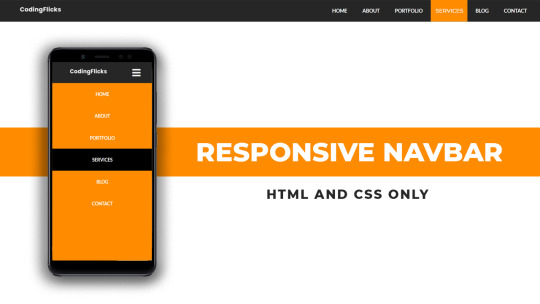
Responsive Navigation Menu
#codingflicks#html css#responsive navigation menu#css menu#css#html#css3#frontend#frontenddevelopment#webdesign#navbar#learn to code#responsive web design#menu html css
5 notes
·
View notes
Text

Responsive navbar
#responsive navbar#html css#divinector#css#webdesign#frontenddevelopment#css3#html#responsive web design#html css menu#css menu
4 notes
·
View notes
Text

Responsive Mega Menu
#Responsive Mega Menu#flexbox mega menu#css navbar#css menu#html css menu#css megamenu#responsive menu#codenewbies#html css#css#html5 css3#code#responsive web design
3 notes
·
View notes
Text


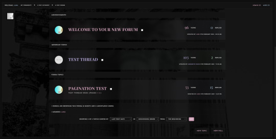
ACHILLES JCINK SKIN
ACHILLES is a minimalist, multi-sale, and responsive skin for Jcink inspired by the book "The Song of Achilles" by Madeline Miller and the aesthetic of dark academia. This skin was optimized for Google Chrome and Opera GX.
You can purchase this skin at my Ko-fi: https://ko-fi[DOT]com/s/c0ad6a23ae
And you can check the live preview here.
basic features:
— Dark and Light mode — Fully customized Jcink HTML Templates. — Guidebook codes. — Main profile application + shipper. — Pop-out profile. — Mini-profile. — DOHTML templates to be used across the board. You can check them here. — Isotopic memberlist filters. — Gradient membergroup colors. — Custom profile fields. — Customized login and register page. — Custom pop-up menu.
Please, read my policy for more information: tenebriuscodes.tumblr.com/policies
#jcink skin#jcink skins#jcink codes#jcink#jcink code#portfolio#jcink resources#achilles skin#jcink premium#jcink roleplay#jcink rp#jcink site
91 notes
·
View notes
Text
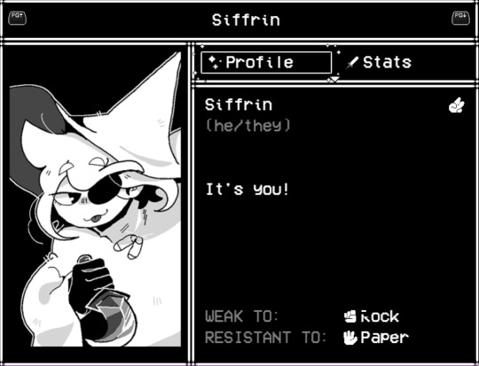
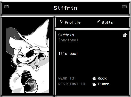

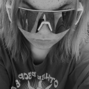
hey everyone!!! i made a free to use code on toyhouse that simulates seeing the characters in your menu! :) it's responsive, too ~
left: in game; right: my code
ps: there's a chance you can't see the font, i've noticed sometimes it works, and sometimes it doesn't. i also wanted to put the sparkle borders around the buttons when you hover over it but you can't do that with only html. boo!
#in stars and time#isat#isat siffrin#ig#i should make a tag for my codes actually im planning on making a lot more#mycodes#there we go#toyhouse#toyhouse codes#toyhouse code#html
110 notes
·
View notes
Text
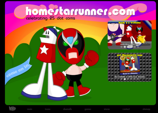
Homestar Runner just released a toon to commemorate its 25th anniversary of existing as a website.
Let that sink in.
25 years.
Its especially crazy when you realize just how few websites from that era made it out of the 2000s, let alone 2010s, and how much any new website struggles to stay alive today.
As for the cartoon itself, while Homestar Runner really isn't that funny to me anymore, and this cartoon wasn't an exception, watching this gave me a very odd, eerie, hard to articulate feeling.
so let me try to articulate,
i was 13 when i first watched Homestarrunner, and by that time the site was already 16 years old, already a barely relevant, barely alive relic of a bygone era of internet culture that I wasn't even around to see. Not that it mattered to me, as an autistic teenager whos interests were already frequently and completely out of touch with what was relevant to anyone my age. i watched pretty much every toon they ever made, every last sbemail.
I even remember my doomed attempt to make my own Homestar Runner style series, with a pirated copy of flash, crude html skills, and a dream, wondering why I was the only one to pick up the slack on this utterly unique sub-medium of animation.
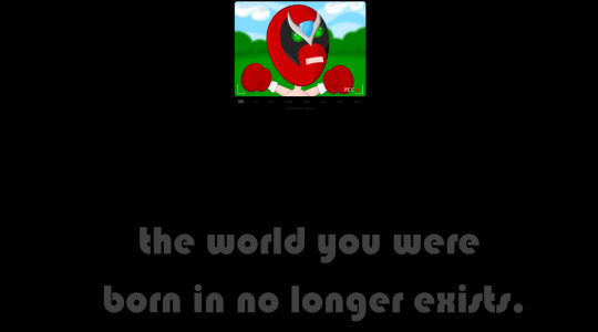
I'm 21 now, and Homestar Runner now doesn't even just feel old, it feels like something from an entirely different reality, as if my memories of it are totally fake and if I actually look back I'll find out that there was never such a thing as Homestar Runner.
Its probably responsible for influencing much of the shape of internet culture and indie animation, but I can only say "probably". Nothing really links back to it in any tangible sense, you can't trace a lineage of inspiration of any current webseries back to it, and a big part of that is probably due to its format. It primarily existed on its own dedicated website, instead of youtube, or newgrounds, or any pre-youtube video site like gametrailers or screwattack. and on top of that, its production value was more polished than any other flash animation or webseries of its time, and yet its scope and approach to the design of its characters and "world" was ruthlessly efficient and minimalistic.
Where a lot of indie projects aim for big concepts and big style, trying to ape TV animation/anime, Homestar Runner aimed to be very small and quick, with characters somehow less animated than the average stick figure and sharing more of its comedic/narrative DNA with the average weekly comic strip than what most indie animation was trying to be (when it wasn't doing swearing mario parodies). It was a universe barely bigger than your average Garry's Mod TTT map, only as rich and expansive as its most one-off joke. That extreme approach to being the minimum viable product with an above-average quality and consistency gave it a significant edge over most online animation of the time, allowing an (almost) weekly format for its most defining period of relevance.
And all of that is not even getting into how it made the most of being a flash web application with its interactivity. Every single menu on the site, even the plain text buttons under the main window, was a flash element. Every single page jam-packed with interactive animation with a unique skeumorphic approach to menus that puts even the most kitschy, lively DVD menu to shame, and to this day is a breath of fresh air from overly rounded-off and soullessly minimalistic web design of today. And if you clicked on the right nooks, crannies, and lines of text strong bad somehow typed out with his begloved hands, you got a pop-up easter egg or even a little extra bit of cartoon to reward you.
Somehow, none of its approaches to format, or interactivity, or web design ever caught on. It was undeniably a product of its time, of course, the idea of entirely flash websites were an extremely awkward peach-fuzz era between web 1.0 and the integration of javascript and dynamic web elements, but theres a strange, dare I say liminal charm to that. And I can't really humor the idea that its ever going to come back.
Sure, we have the rise of "Old Internet Aesthetics", with people making plain html websites with neocities to try and stroke some hauntological intrigue boner and wax wistful about the lost, wild west era of the internet buried by time, but it remains to be seen whether or not thats ever going to manage to become more than a neat little novelty art project that people eventually abandon because it's so outmoded in its ability to generate clout/dopamine by the digital megacities of Xitter and uhh.. Instagram i guess? And of course, the era of flash websites is hardly as resolute an aesthetic as the web 1.0 html site, so its been completely passed over and will likely see its day in the sun, and neither will the pioneering format of homestar runner unless the entire structure of internet culture bends over backwards.
Its the first and last of its kind, a format never tried before or since, a successful and wildly ahead-of-its-time but nonetheless shelved experiment forever gathering dust, like the laserdisc, or one of those strangely designed pre-apple cellphones, a window into what the internet was, and could have been before the iphone came along and derailed everything.
Its an eerie, abstract kind of feeling.
#homestar runner#old internet#hauntology#liminal aesthetic#long reads#blog#internet culture#internet history#flash animation#newgrounds#neocities
13 notes
·
View notes
Text

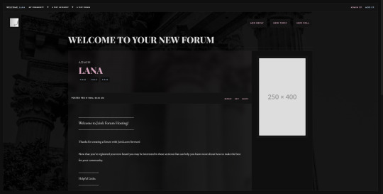
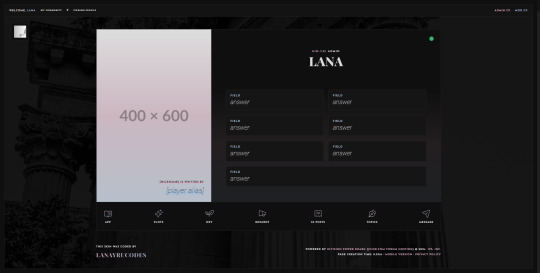
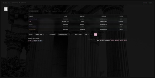

Immortales: Skin Bundle ($20)
I've been wanting to branch out into a more minimalist style for a while, and found the opportunity to do so when I was struck by the coding bug over the weekend and began to experiment with a more semi-transparent style of index that eventually evolved into this. I tried to keep the skin as light as physically possible, with minimal Javascript or Jquery inclusions, and instead tried to optimize it to build off of HTML5 elements as best I could without needing to weigh it down with more external resources.
The Immortales skin is a dark themed, responsive skin for Jcink forums, and is optimized for Google Chrome. (Cross-tested in Opera GX and Mozilla Firefox.)
You can purchase the skin here: https://ko-fi[DOT]com/s/6f663cfe6e
Bundle Includes:
All custom HTML structures
a forum index a topic row for threads a post row with a sticky/hover mini profile a main profile custom board stats, with the five (5) recent topics appended a member list, sortable by filters
Full set of DOHTML templates
x1 general announcement/admin template x1 application template (tabbed, for threads) x4 thread templates x5 development templates x1 miscellaneous codes for TW/CW x1 tabbed webpage/guidebook
Custom Userlinks Menu
Easy to add/modify group variables for color coordination (five groups already included)
Responsive to smaller monitors
Upon purchase, buyers will receive an installation guide with editing and customization instructions, as well as any XML/HTML files.
Support & Refunds:
Refunds or returns are not offered on pre-made skins. Due to the nature of how they're distributed and the fact that they're digital files I cannot offer refunds for a purchase if you buy a skin from me.
If you encounter bugs or skin-breaking issues, please reach out to me and I will do my best to fix them and provide you with updated files.
I do not offer coding support beyond initial problems with my skins at install. (i.e. Finding a bug when you install a fresh copy of the skin onto your site, etc.) If the skin breaks during modifications you make on your own, I am willing to help restore the skin to it's original state. I do not provide support for third party coding that is not mine.
#jcink skins#jcink codes#jcink code#jcink skin#dark jcink skin#dark theme skin#for sale#skin for sale#jcink skin for sale#jcink rp#immortales skin#portfolio
93 notes
·
View notes
Text
I'm alive (theoretically)! I'm almost ready to start putting things up on the armor gallery <- view in a desktop browser for best results pls
the consensus from this post seems to be to keep the sky portion which is fine with me, but last call if you want to make your opinion known! next question:


ok it's not super obvious when the pics are tumblr-sized, but any thoughts on if should I have the shield overlay not visible (left) or visible (right) on the shield-weaver? or both since there will be two images? no overlay with no headgear/visible with headgear maybe?
also I'd still love to find someone knowledgeable in current CSS/javascript/tumblr theme making (my CSS is many years out of date, I don't know js, and while I'm sure I could make a theme I simply don't have the spare brainpower to do it right now). the dropdown menus work on desktop but are iffy at best on mobile, and while I tried to make the theme* responsive to screen size changes, I'm sure it could be done better.
From what I understand of javascript (admittedly very little), a js dropdown menu would work much better on touchscreens - but if there's some sophisticated CSS that would also do the job I'd love to hear about it!
so if anyone wants to help me out in this area, I (and probably anyone who uses the armor gallery) would greatly appreciate it 🙏
*the theme I modified is like... ancient... and doesn't support NPF. which is not exactly a problem because before the old post editor went the way of the dinosaurs, I created *checks blog* 316 drafts in the old format. lol. lmao, even. I may not be good at planning but I AM good at hoarding! still, a theme that's up to current tumblr (and HTML/CSS) standards would be nice.
#horizon-armor#if you notice the background looks a bit different: you know how i said i'd cry if i missed one?#... ... ...#...yeahhhhhhhh#i had a list and everything. physical list on paper right in front of my face. checked things off as i went. and still#(banuk ice hunter master i'm not talking to you ever again)#ANYWAY they're all there now. really. for sure this time. (god i hope)#also GIMP 3.0 coming out just a bit ago was both great and slightly not great#great bc non-destructive editing now whoooooooo! and you can select multiple layers at once! FINALLY!#not great bc some things changed and i had to adjust my muscle memory#but the layer effects are a huge boon! they make everything so much faster!#including my laptop's fans if i've got a lot of them! lol#also i know the theme for *this* blog has issues with npf posts and weird overlapping of pics/text sometimes -_-#i'll have to figure it out or get a new theme... but i don't wanna...
18 notes
·
View notes
Text

Comment faire un site internet de qualité ?
janvier 14, 2025
by engama237
with no comment
Uncategorized
Edit
Avoir un site internet de qualité est aujourd’hui essentiel pour toute entreprise, organisation ou professionnel souhaitant se développer sur le web. Un site bien conçu renforce votre crédibilité, améliore l’expérience utilisateur et augmente vos chances de convertir vos visiteurs en clients. Mais comment créer un site internet qui soit à la fois esthétique, fonctionnel et performant ? Voici un guide complet pour vous aider à réussir.
1. Définir vos objectifs et vos besoins
Avant de commencer la création de votre site, il est crucial de définir précisément vos objectifs :
Souhaitez-vous vendre des produits en ligne ?
Présenter vos services ?
Informer vos clients ou générer des contacts ?
Un site internet de qualité doit répondre à des besoins précis et avoir un but clair. Rédigez un cahier des charges qui détaille vos attentes en termes de fonctionnalités, de design et de contenus.
2. Choisir le bon CMS ou plateforme
Le choix de la technologie joue un rôle majeur dans la création d’un site web. Plusieurs solutions existent selon votre niveau de compétence technique et votre budget :
WordPress : Idéal pour les blogs et sites vitrines. Il est personnalisable grâce à ses nombreux thèmes et plugins.
Shopify ou WooCommerce : Parfait pour créer une boutique en ligne.
Wix ou Squarespace : Pour des sites simples et rapides à mettre en place.
L’objectif est de choisir un outil qui permet de créer un site internet de qualité sans compromis sur la personnalisation et les performances.
3. Prévoir un design adapté et professionnel
L’apparence visuelle d’un site est primordiale pour capter l’attention des visiteurs. Voici quelques principes de base pour un design réussi :
Simplicité et clarté : Évitez les designs trop chargés.
Harmonie des couleurs : Utilisez une palette de couleurs cohérente avec votre identité de marque.
Navigation intuitive : Facilitez la navigation avec un menu clair et structurant.
Responsive design : Un site internet de qualité doit être adapté aux mobiles et tablettes.
N’oubliez pas que le design doit servir l’expérience utilisateur et non l’alourdir.
4. Optimiser les contenus de votre site
Un contenu pertinent et optimisé est la clé pour attirer et retenir vos visiteurs tout en améliorant votre référencement. Voici quelques conseils :
Rédigez du contenu clair et concis : Utilisez un langage simple pour expliquer vos services ou produits.
Travaillez vos mots-clés : Le terme site internet de qualité doit apparaître naturellement dans vos titres, paragraphes et méta-descriptions.
Ajoutez des visuels : Images, vidéos et infographies rendent votre site plus attractif.
Valorisez vos appels à l’action (CTA) : Invitez vos visiteurs à passer à l’action (contact, devis, achat).
L’optimisation des contenus est une étape essentielle pour répondre aux besoins de vos visiteurs et aux exigences des moteurs de recherche.
5. Améliorer les performances techniques
Un site lent ou qui présente des erreurs techniques nuit à l’expérience utilisateur et au référencement. Pour assurer un site internet de qualité, voici ce à quoi il faut veiller :
Temps de chargement : Optimisez la taille des images et utilisez un service d’hébergement performant.
Code propre et optimisé : Réduisez les fichiers CSS, JS et HTML.
Sécurité : Installez un certificat SSL et assurez-vous que votre site est protégé contre les attaques.
Compatibilité : Testez votre site sur différents navigateurs (Chrome, Firefox, Safari).
Les outils comme Google PageSpeed Insights ou GTMetrix vous permettent d’analyser et d’améliorer les performances techniques de votre site.
6. Optimiser le référencement naturel (SEO)
Un site internet de qualité doit être facilement trouvable sur les moteurs de recherche. Voici les bonnes pratiques SEO :
Structuration des titres : Utilisez les balises H1, H2, H3 pour organiser vos contenus.
Meta-descriptions optimisées : Rédigez des descriptions attractives intégrant le mot-clé site internet de qualité.
Optimisation des URL : Préférez des URL courtes et descriptives.
Backlinks : Obtenez des liens entrants de qualité depuis d’autres sites.
Un bon référencement améliore votre visibilité en ligne et attire plus de visiteurs qualifiés.
7. Proposer une expérience utilisateur (UX) optimale
Un site internet performe quand il offre une expérience utilisateur exceptionnelle. Voici les éléments à optimiser :
Accessibilité : Votre site doit être accessible à tous, y compris aux personnes handicapées.
Structure logique : Facilitez l’accès à l’information grâce à une hiérarchie claire.
Interactivité : Intégrez des formulaires, boutons CTA et outils de communication (chat en ligne).
Une bonne UX contribue à retenir vos visiteurs et à augmenter vos taux de conversion.
8. Analyser et améliorer constamment
La création d’un site internet de qualité ne s’arrête pas une fois le site mis en ligne. Il est essentiel d’analyser les performances et d’apporter des améliorations constantes :
Utilisez des outils comme Google Analytics pour suivre les comportements de vos visiteurs.
Analysez vos taux de conversion et identifiez les pages les plus performantes.
Répondez aux commentaires et feedbacks de vos utilisateurs.
Un site internet évolue avec votre activité et les besoins de vos clients.
Conclusion
Faire un site internet de qualité repose sur une combinaison de facteurs : une stratégie claire, un design professionnel, des contenus optimisés et une expérience utilisateur fluide. En respectant ces étapes clés, vous pouvez créer un site performant qui répond aux attentes de vos visiteurs et qui améliore votre présence en ligne.
Pour découvrir plus d’astuces, consultez notre page blog Abonnez-vous à notre page Facebook
2 notes
·
View notes
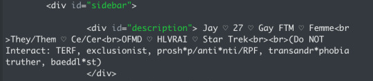
Note
hi!!! i love for custom blog theme,, do you have a link to the code or creator 0:?
ya!
so my theme is actually a heavily modified version of redux edit #1 by lopezhummel (current url: holyaura). i always remind users that most tumblr themes are old and that you'll need to replace all instances of "http://" in the code with "https://" so tumblr will save the theme. i had to do it with this one
these are the modifications i made to the theme. i edited this theme over the course of at least a year or so and don't quite recall how i did all of these things. but to the best of my ability:
i moved the "left side img" to the right side of the screen. i also made this element "responsive" so the image will never get cropped when you resize your screen. this was a bitch and a half to figure out and i truthfully do not remember how i did it
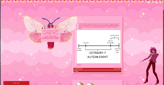
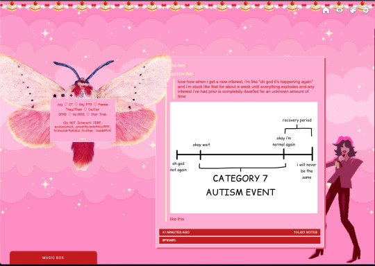
i deleted the text in the drop-down navigation so it appears as a little line that is otherwise not noticeable. this type of theme, the "redux edit," used to be very popular because having a drop-down menu let you cram a bunch of links that lead to sub-pages on your blog. i've done away with my sub-pages, but i still like the format of the "redux style" tumblr theme, for its minimal UI and for its customization options.
i separated my mobile description from my web description for formatting reasons. basically, most elements in tumblr themes are connected to specific text fields and toggles. i simply went to the section that was connected to my blog description and deleted it. the web description has to be manually typed inside of the CSS/HTML editor when i want to change it. whereas my mobile description is whatever i type in the "description" box of the normal tumblr theme editors.
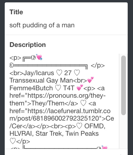
i added code someone else made ("NoPo" by drannex42 on GitHub) which allows you to hide posts with certain tags on them. i did this to hide my pinned post, as it looks bad on desktop.
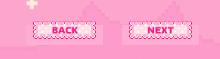
i replaced the tiny pagination arrows at the bottom with images that literally say "next" and "back" because the arrows were far too small/illegible. i know they aren't centered in the container i'm not sure how to fix that lol
i added a cursor

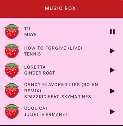
i installed a working music box ("music player #3" by glenthemes), and then added music by uploading MP3 files to discord and then using the links of those files as the audio sources. iirc i also had to make this element responsive and i aligned it so it would sit on the left side of my screen. i made the "album art" for each one the same strawberry pixel art
the moth is just a PNG i added and then moved around so it was behind my sidebar using the options that came pre-packaged with the theme
if you want something like the strawberry shortcake decoration at the top (called "banner" in the theme) your best bet is to google "pixel divider"
theme didn't support favicon so i added that in so i could have a little heart
ALSO:
this theme is. really weird about backgrounds. any background that i have ever set for it, i've had to do weird shit in photoshop. like making the background HUGE, mirroring it, etc. - because it would crop the image weird, or there would be a gap where there was no image. idk man, it's haunted. i'm sure there's a way to fix this but i am NOT tech savvy enough. anyway, patterns are probably your best friend. and if you DO want something that isn't a pattern, it's going to take a lot of trial and error. but i love this theme so i deal with it 😭
the sidebar image and the floating image do not scale. if your image is 1000 pixels, it will display at 1000 pixels. you'll either have to edit the code so that the theme scales the image for you, or resize any images before you add them
my white whale of theme editing (aside from the Weird Background thing) is that i cannot get infinite scrolling to work. i have tried every code out there. all of them break my theme. it makes me sad because like. i have music there for a reason. the idea is that people would listen to it while they scroll. unfortunately, the way it's set up now, the music will stop every time someone clicks "next" or "back" 💀
anyway sorry for rambling but i hope you enjoy the the theme and customizing it in the way that you want to!
24 notes
·
View notes
Text
Free Responsive Guidebook Template
I've wanted to do something to give back to the forum roleplay community for a while. The last couple of weeks I've been focussed on a private project, but when it came to working on the guidebook I finally had a ahah! moment where I knew what I could do.
Here's the result, a responsive tabbed guidebook that's got some super basic styling. It's HTML and CSS only, and the code is annotated throughout.
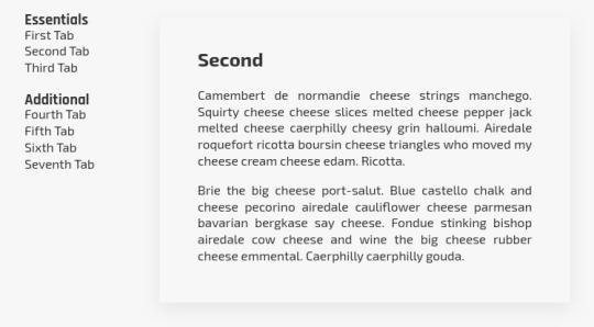
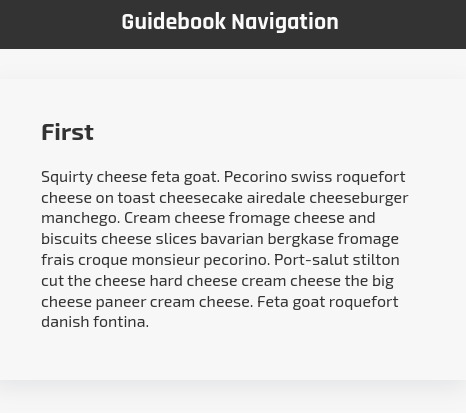
On small screens, the left sidebar collapses down to a dropdown navigation menu positioned at the top of the page instead.
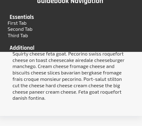
You can find the template on my ko-fi page here. I would like to create an installation and set-up guide, but just need to carve out a bit of time to do it.
For now, I'm going to release the template out into the wild in the hopes that I might actually be able to read some of the fabulous looking site lore out there on my mobile. You can restyle it however you want, it's a base to be used. Enjoy!
#jcink codes#jcink rp#free template#rp resources#codes by beedesigns#roleplay guidebook#portfolio#beedesigns
28 notes
·
View notes
Text
Responsive Navigation Menu
#responsive navbar#responsive web design#css#frontend#html css#neduzone#html#css3#frontenddevelopment#learn to code#webdesign#responsive navbar html css#html css menu#menu css#css menu
1 note
·
View note
Text

Responsive Navbar HTML CSS JS
#responsive navbar#responsive menu#responsive navigation menu#responsive navigation menu bar#responsive web design#html#css#javascript#navigation menu#divinector#html css#learn to code#css3#code
4 notes
·
View notes
Text

Responsive Navigation Menu
#responsive navbar#responsive menu html css#codenewbies#html css#frontenddevelopment#html5 css3#navbar html css#responsive web design#css#html css tutorial#pure css tutorial#html css menu#css menu
1 note
·
View note
Text
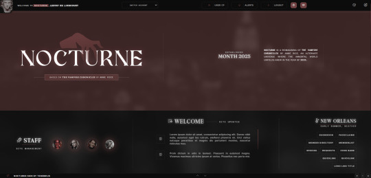
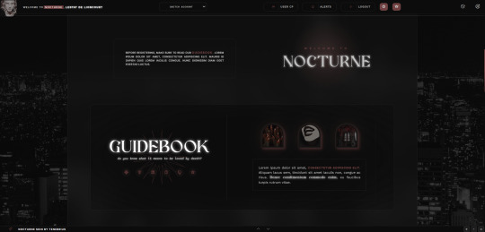
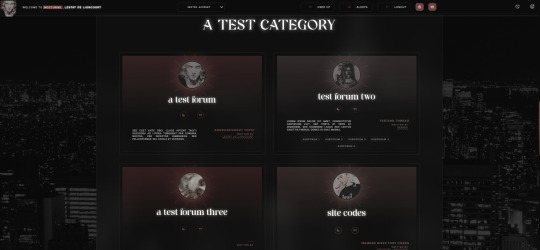
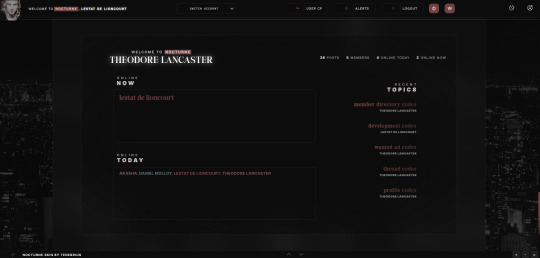
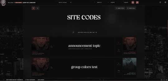


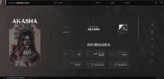

NOCTURNE JCINK SKIN
NOCTURNE is a minimalist, multi-sale, and responsive skin for Jcink inspired by the book “The Vampire Chronicles” by Anne Rice. This skin was optimized for Google Chrome and Opera GX, and it comes with a responsive mobile mode which you can check the previews here.
You can purchase this skin at my Ko-fi.
And you can check the live preview here.
features:
— Installation guide. You can join my discord server if you need further assistance or simply dm me on discord. — 36 custom templates to be used across the board. You can check them here. — Dark and Light mode. — Fully customized Jcink HTML Templates. — Guidebook codes with sub-sections and sub-links. — Main profile application + shipper + thread tracker stylying. — Pop-out profile. — Mini-profile. — Isotopic memberlist filters. — Solid membergroup colors (easily flexible to add gradient tones). — 56 custom profile fields. — Customized search page, register and login page. — Custom pop-up menu.
Please, read my policy for more information: tenebriuscodes.tumblr.com/policies
#jcink codes#jcink skins#jcink skin#jcink#jcink code#jcink resources#nocturne skin#jcink skin for sale#jcink rp#jcink recs
24 notes
·
View notes
Text
En même temps : Macron lâche 3 milliards à Zelensky le jour où le gouvernement Barnier demande aux Français 60 milliards d’économies.
«Ce sera un budget difficile, sérieux et responsable», a promis le pion de Bruxelles Michel Barnier lors de la présentation (https://www.youtube.com/watch?v=8DknxkvSoS8) du Projet de loi finances 2025.
Au menu donc, hausses d'impôts et économies faramineuses… sauf pour le régime de Kiev, dont le président - hasard malicieux du calendrier - était ce jour à Paris pour toucher ses prébendes (https://www.info.gouv.fr/actualite/france-ukraine-jusqua-3-milliards-deuros-daide-militaire#:~:text=La%20France%20et%20l'Ukraine,la%20Russie%20contre%20l'Ukraine.).
Le Président de la République réaffirme la détermination de la France à continuer d’apporter, dans la durée et avec l’ensemble de ses partenaires, un soutien sans faille à l’Ukraine et au peuple ukrainien
Qu'à cela ne tienne, pour faire passer la (grosse) pilule, le chef d'Etat à un plan:
Convaincre ses alliés d'autoriser Kiev à frapper en profondeur du territoire russe avec leurs armes. Ce qu'il est en passe de réussir (https://www.yahoo.com/news/nato-secretary-general-speaks-zelenskyy-131055657.html?guccounter=1) avec l'aide gracieuse (https://www.lemonde.fr/idees/article/2024/10/09/il-faut-autoriser-l-ukraine-a-frapper-les-sites-de-lancement-russes-avec-les-armes-que-nous-lui-livrons_6347358_3232.html) de la presse subventionnée.
Au moins, avec la guerre les Français ne penseront plus à la grécisation du pays.
2 notes
·
View notes