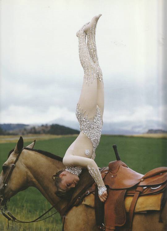
#scan and cut
Text


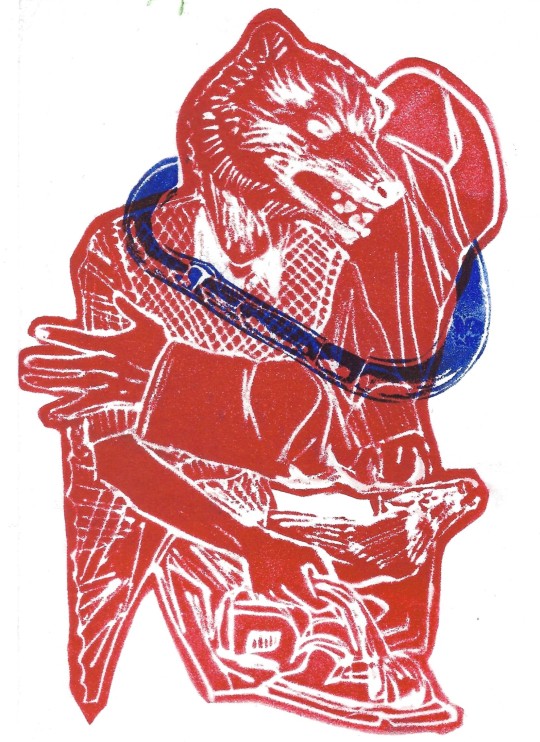
in honor of this amazing post by @robotmango. thank u for ur service, I think of you and your suffering every August since 2016
(i have no idea what you and/or your husband look like, please accept any needed apologies for inaccuracies in gender/race/height/tendency to sarcasm/etc. hope you don't mind that i immortalized your already immortal and correct opinions in what I suppose is technically RPF fan art)
#did i draw the first page of this in 2020 and the rest of it in 2022? maybe#did it then take me 2 more years to finally scan it and post it?#mind ur business what are you a cop?#did my scanner cut off the right side of every page no matter what I tried? yes#did I fix this half-assedly in procreate by literally re-drawing the box borders and faking it? absolutely#did i do literally the minimum of post-scan processing i could get away with before posting? you bet your sweet ass#in conclusion: fuck the sun#summer#fuck summer#i hate summer#all my homies hate summer#august#my art#sketchbook#please don't steal my shit thanks#indie comics#independent comics#comics#comic#comic art#my comics
188 notes
·
View notes
Text


Three pieces of early cut glass of the Brilliant Period (1880-1915)
#my scans#glass#art#cut glass#aesthetic#vintage#antique#1800s#1900s#grandmacore#kitsch#fairycore#dish
150 notes
·
View notes
Text

have i mentioned yet that i love monster trio? cos i fuckin love monster trio
close-ups under the cut! theyre a lil blurry tho haha


#one piece#monster trio#luffy#sanji#zoro#zolusan#zosanlu#i cant pick between zosan/lusan/zolu so im shipping all of them#theyre just too good all together okay u cant separate them!!!#also if these drawings all look different to each other its cos i did this sketch page over like. a few months i think lol#also i accidentally used the wrong brown marker on bottom left zoro and im still mad about it#this was so hard to scan too btw i had to scan it as a document instead of a picture cos it kept cutting the edges off lol 😅
136 notes
·
View notes
Text
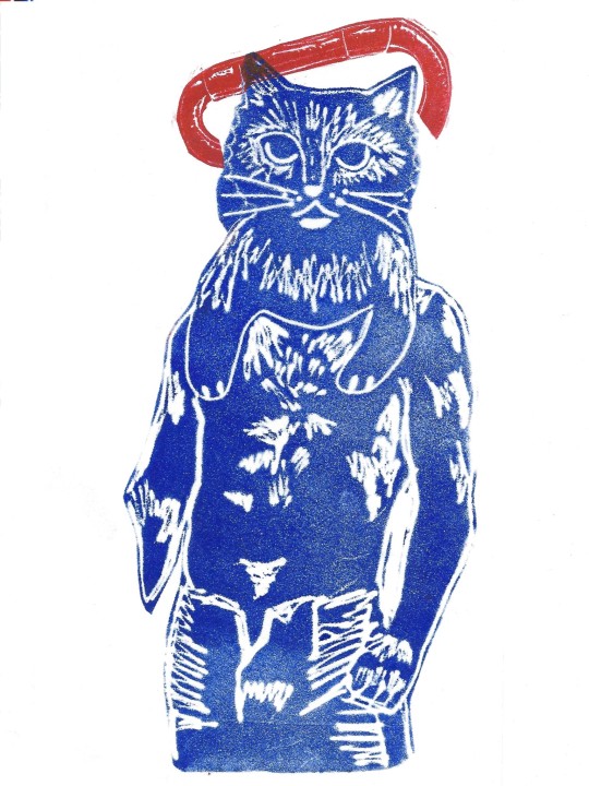

i never posted these butch cat & dog collage foamprints i made in like october
#foam print#printmaking#collage#art#my art#lesbian art#butch lesbian#butch art#putting together uni portfolios so ive been scanning and re scanning and editing and organising and cutting and pasting and scanning again a
251 notes
·
View notes
Note
I love your artwork so much! Your colors are so vibrant and none of the white speckles in the paper ever shows, its so impressive and I really dig it! I was wondering if you use any sort of blending medium? Like baby oil or anything? Either way, I really enjoy looking at your artwork and I'm always excited to see whatever you'll make next
I use a colorless blender (prismacolor, which is wax-based so baby oil probably wouldnt work) but my scanner is also rly bad about picking up white specks in a way photographing the art with my phone isnt, so I usually have to do some digital editing to get rid of them as well.
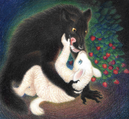

I do this by duplicating the layer, setting the one on top to "darken," and using the mixer brush to blend out the white spots + just use the eyedropper tool to select the color of that area (needs to be a slightly lighter shade of it) and color over the white spots with the brush tool
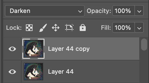
i edited a small bit of the original scan to show what i mean
original:
with the edited layer:
heres how it looks set to normal instead of darken, I used both the mixing brush and regular brush just to demo it

#explanation is under the cut. post got a bit too long#u prob have to click the image for full resolution to rly see what i mean about the white specks showing up#i think its bc the scanner is meant to scan documents. so it picks up the white specks of paper very brightly#how much editing is done varies from piece to piece#ive thought abt listing 'digital art' as one of the mediums in tags for the more heavily edited art#where it looks significantly different than the physical drawing in front of me#but i feel like that might be confusing#art where i set out to do some mix of traditional and digital is tagged this way but im not rly sure where to draw the line tbh#the hunger wasnt edited in a way where it looks significantly different from the original (just a bit darker)#the scan is just dull and light bc my scanner is like that lol#so with editing that one i was mostly just trying to make it look like the physical drawing in front of me#u can tell by the 'layer 44' in the screenshot these take a lot of editing lmao#art help
303 notes
·
View notes
Text
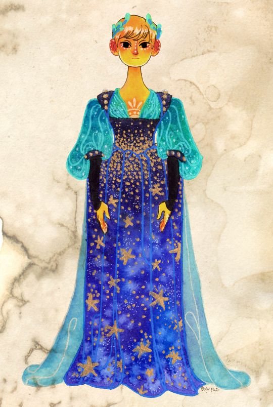
🌙A different moon goddess🌙
You might know her from this piece . This drawing is actually a lot older than the full bg illust, it's from 2019 but I did fix some things digitally to bring the style closer to my current one.
#myart#traditional art#folktale#oc#moon goddess#watercolor#anilinky#character design#pixie cut#blue dress#vintage dress#golden skin#my texture#scanned texture#gold marker#stars#night sky#posca pen#strathmore#white gel pen
329 notes
·
View notes
Text


Western Matsu THE Chara Shop ( 2016 )
#saw merch for kara from this set on mercari and rushed to see if the art was in the okigae paradise art book. and they were. >:)#my scanning program was giving me such a hard time with these for some reason. it kept autocropping and cutting some of the bros out#but i figured it out. pls enjoy the sillies#also not to be that guy but whenever they let kara show his legs i feel akin to a ravenous dog looking at a grade-a steak#i'm not gonna ask ya'll not to judge me. i think i deserve it in this instance.#osomatsu-san#osmt#osomatsu#osomatsu matsuno#karamatsu#karamatsu matsuno#choromatsu#choromatsu matsuno#ichimatsu#ichimatsu matsuno#jyushimatsu#jyushimatsu matsuno#todomatsu#todomatsu matsuno#matsuno bros#official#transparents#my scans#tw weapons
75 notes
·
View notes
Text

collage of that dream that stuck with me
#linoprint#mixed media#collage#composition is kinda shabby but it felt good to make something so it's fine. also not sure why the scan quality is kinda ass#linocut#printmaking#nonfandom#what's a knife really#anyway. whoever reads tags. in the dream i remember distinctly it was about using the knife for cutting up fruit out of love#vs literal murder which is a bit extreme but you get the gist. backstabber#analogue art
463 notes
·
View notes
Text
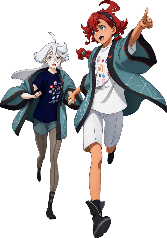
Suletta & Miorine bonus illustration for the Asticassia School Festival Blu-ray
#sulemio#g witch#mobile suit gundam the witch from mercury#suletta mercury#miorine rembran#official art#artist is probably Juri Toida but don't have concrete confirmation#not a scan but just felt like cleaning up and cutting out this one
189 notes
·
View notes
Text
vogue 100: a century of style - robin muir (2016)
408 notes
·
View notes
Text


It's been a year since I've seen my wife </3
#heh heh heh#i always wanted to get one of my drawings as a keychain but for some reason it never occured that i can just.... scan it and cut the bg out#so i finally did it! and i got mulder and scully as well#they actually turned out really good i think if i saw them in am artist ally id stop to peak 🤗#lee know#aunty lee know#skz family#skz art#bystay
70 notes
·
View notes
Photo
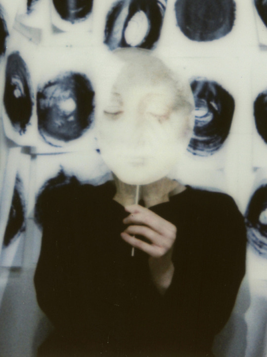
©Philomena Famulok
#Philomena Famulok#personal#analog photography#photographers on tumblr#original photographers#instant camera#Instant Film#fuji instax wide#double exposure#film#filmisnotdead#analog#scan#scanner#fuji instax 90 neo#fuji instax mini color#2023#film photography#da vinci young female head drawing poster cut out#mask
879 notes
·
View notes
Text

An oval brooch that has an enamel plaque painted with a winged Cupid in the style of François Boucher. The gray guilloche enamel border is edged by two bands of rose-cut diamonds. (18th century)
#my scans#angelcore#18th century#cupid#lovecore#aesthetic#gothic jewelry#jewelry design#brooch#enamel#plaque#francois boucher#rose cut diamonds#diamonds#feminine#antique aesthetic#antique#soft#soft coquette#softcore#soft grunge#grunge#grunge goth#pastel goth#fairycore#fairy aesthetic#cottagecore#fairies#angel aesthetic#my%20scans
91 notes
·
View notes
Text

sketches from two weeks ago i think?
#my art#monster high#mh g3#mh#monster high g3#frankie stein#clawdeen wolf#cut off jinafire and lagoona because they dont look great#wanted to scan them before they got too smudged lol
110 notes
·
View notes
Text
My extremely brief review of Sailor Moon Raisonné Art Works 1991~2023 book is as follows: fantastic as something akin to an exhibition catalogue, disappointing as an art book.
Longer version:
Takeuchi is a great artist, Sailor Moon has some extremely memorable illustrations, there hasn't been a new art book in decades... this should have been a slam dunk in terms of meeting fan expectations. Unfortunately I think the portrayal of this as a preserved "art collection" is a bit disingenous given the format of the book, the number of art revisions, and its overall quality are pretty standard for exhibition catalogues rather than actual art books.
In saying this I absolutely love art work catalogues, particularly when they provide context on how the illustrations were originally used. "Raisonné" shines in this regard, it gives revision notes and context to the original uses of all images from Nakayoshi colour pages through to furoku. Loooooove this:
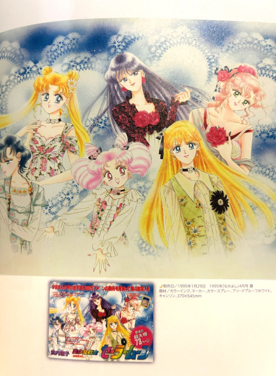
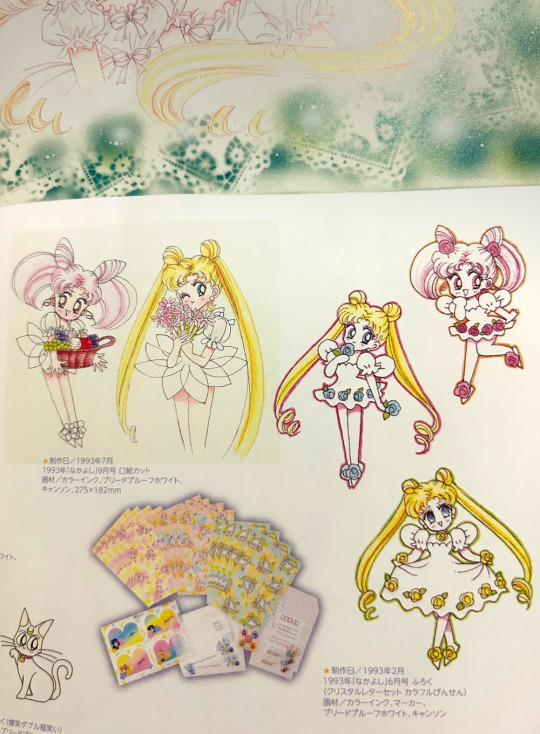
It even features a comprehensive account of furoku and zen'in for the manga, which is another thing I appreciate in these types of publications.
The main problem, as countless people have pointed out, is that the actual art work in this book is extremely tiny. Many of the rarer images fans were excited to see in decent resoluton (like the colour art from Codename wa Sailor V) are a few cms across here, piled up crammed from a couple to a dozen a page.
The character designs presented exquisitely in full in the "Materials Collection" art book are condensed to a handful of pages rendering Takeuchi's chracter notes unreadable and the gorgeous sketches lacklustre at best. Why are they included at all when some designs are barely visible here? The paper quality too is fine for a catalogue but there's just no comparison to the paper and print quality found in the original Sailor Moon art books.
I think it also has some very standard art collection flaws on top of this, including baffling choices when it comes to putting artworks partially across two pages (will never not hate this in any art book, it's particularly egregious here where the cover illustrations from THE BOOK ITSELF are about the third of a page in size and placed across a page spread).
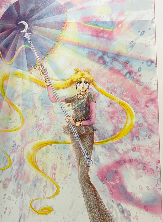
There's already been plenty of dissatisfaction expressed about this book and I'm not here to give it an additional kick around because I do feel it has value as an art work catalogue. I just think there was a definite divide in what Kodansha produced vs. fan expectations and if you purchase the book knowing this then at least you'll be aware of what you're getting.
#personal#photo#my photo#popped the longer version under a cut#so you only have to read my ramblings if you want to#the book got scanned almost immediately after release#because of course it did#but i won't be sharing any scans on here myself#i just wanted to give my thoughts as a consumer
86 notes
·
View notes
Photo
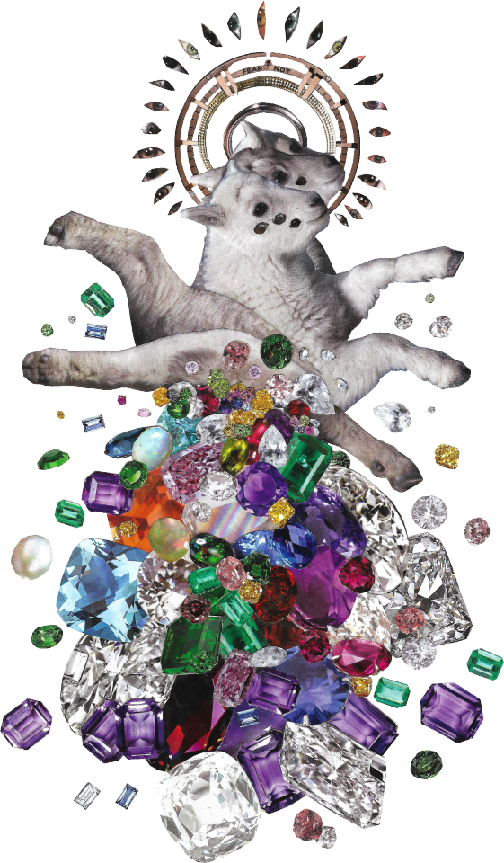
your friend the angel :)
#art#collage#photo collage#surrealism#the collage is made up of images from journals physically cut up and glued together but the fear not is photoshop lol#it originally had the name of a watch company (the halo is the outer edges of a watch)#the cut out gemstones look so pretty i think im gonna use them in some more art#the collages scan so well why cant my drawings scan like this 😩
2K notes
·
View notes
Last Seen Blogs

hell-sanz
Helena

min3495
Shermin Ee

beamtup
BeamtUp

timba619
Untitled

fantastickoalaobservation
sally bollywood season 3 or i die