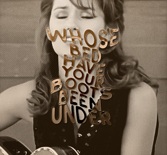
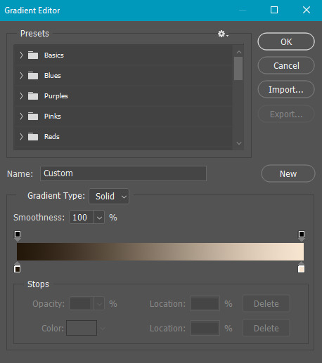
#slaps on a gradient layer
Explore tagged Tumblr posts
Visit Tumblr Blog
Explore Tumblr blogs with no restrictions, modern design and the best experience.
Last Seen Tumblr Blogs


Fun Fact
Tumblr was created by web developers David Karp and Marco Arment.
Text

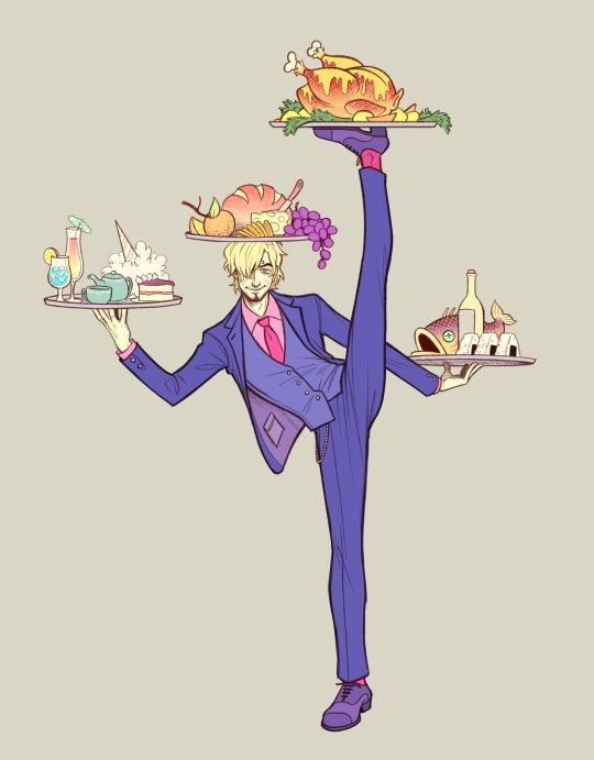
hey! hey, look what I can do!
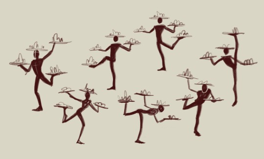
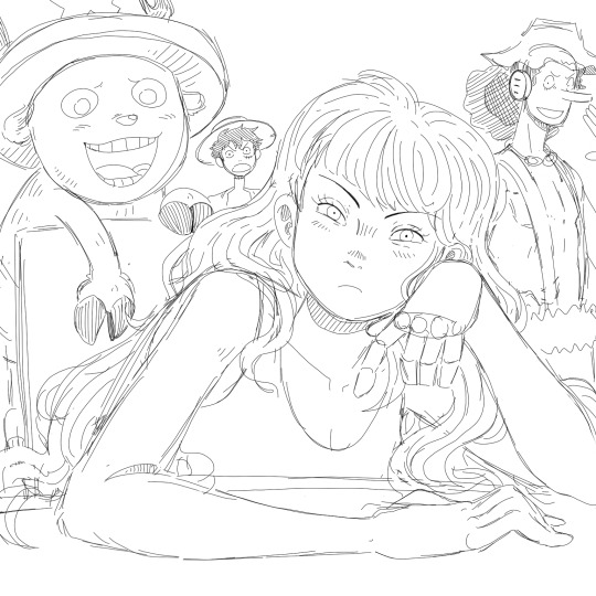
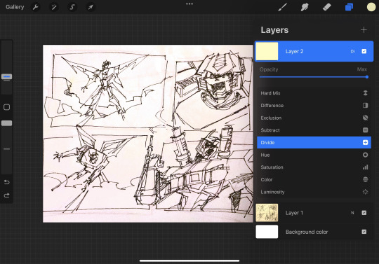
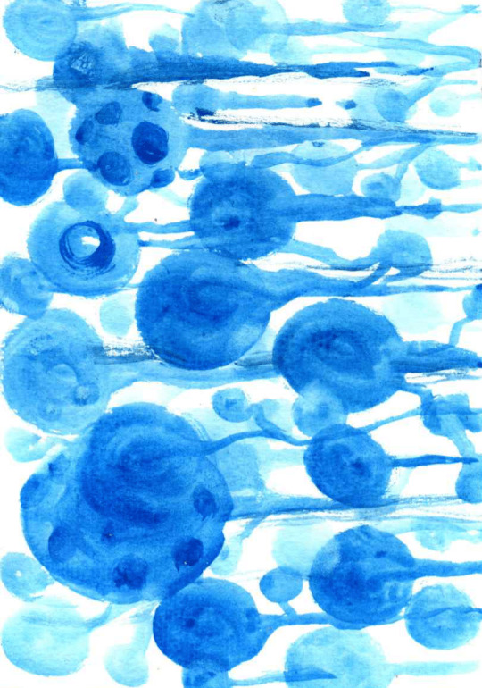
#submas#subway boss emmet#submas emmet#emmet#kudari#my art#imagine being flexible#i can't even touch my toes#i was gonna keep this for kudaugust but it matches 0 of the prompts so here we are#slaps on a gradient layer#butterfly meme: is this a background?
72 notes
·
View notes
Text

I HATE GREYSCALE!!!!
#i lied i loev it sm#its the only efficient way to render to me#just slap a color layer afterwards#some effects#overlays and some gradients#and im good#love value painting#its just so hard with my fingure and my phone brah#this is supposed to be that one christ supported by angels painting but eith curly#might never finish it
2 notes
·
View notes
Text
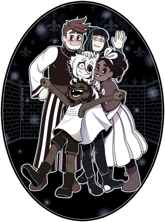

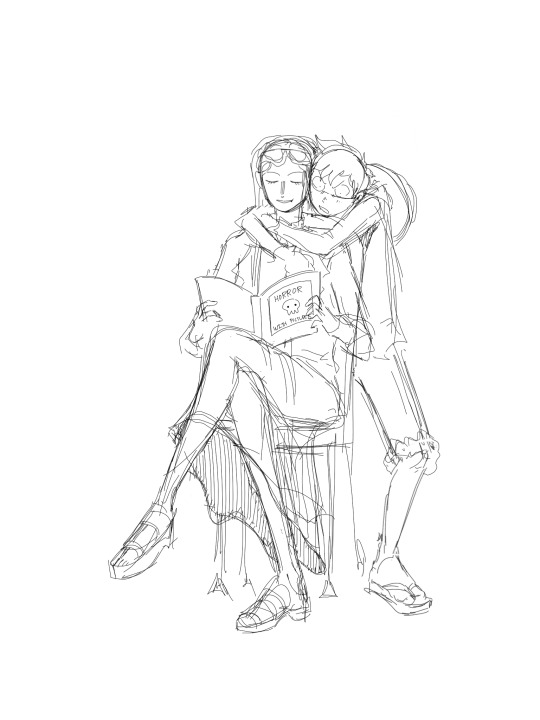
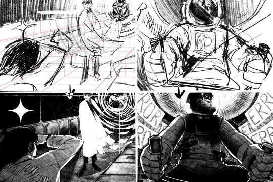
As the flash hits your eye, you feel something crashing into you from all directions. Below you is obvious, Bonbon situated themself to bump into you while the picture was taken. You look to your right, and Mirabelle’s cheek is pressed up to yours. On your left, Isabeau’s sheepishly hugged you to his side. There’s a hand in your hair, too, and it feels like Madame Odile. [...] “We need a souvenir of this trip,” Mirabelle adds. She rushes to the ground to pick up the picture and snort-laughs as she looks at it. “Oh no, Siffrin looks like we’re holding him hostage!” — Curtain Call, Chapter 9, by @openphrase123 (Link in the replies)
2024 October 22nd
Fanfic fanart fanfic fanart!! When I read the "hostage" line, it invoked such a clear image in my head of Siffrin tensed up like a startled prey animal that it got added to my list of things to maybe draw immediately.
Dooon't think about the words 'left' and 'right' in that quote too hard. I know how to read I prommy. :) (I did Not process those words and lost the coin flip in the composition phase...)
Close-up and ramblings about the cans of worms I unleashed upon myself under the cut
Time taken on this was [head in hands] 48 hours and 37 minutes.... That bloated number has two culprits:
1) I got a new tablet! My old one was 10 years old. Its plastic was melting and the electronics had ghosts in 'em, so it needed the sweet release of retirement. However, I had just gotten to the line art phase when the switch happened. Clumsily getting used to the new one during the most precise phase of the process did devastating things to my perfectionism.
2) I made a GRAVE mistake with how I chose to color this. I wanted to keep the grayscale layers for accuracy instead of just slapping a B&W filter over the colored version, so all the colors come from gradient maps, color balance layers, overlay layers, and raster layers clipped to other layers. Listen. I'm used to working with lots of layers. I like keeping things separate so I can edit them more easily. But this is the worst layer system I have ever created. Going from color to B&W requires toggling exactly 20 layers & folders on or off. There are 87 visible layers total. This file lags when you edit it. I've never wanted CSP v1.13 to have layer comps more in my life.
Not helping matters was Isabeau. I said he was the easiest to draw in my last post, but he took that as a challenge, apparently. It's a simple fist-on-hip pose, why was that so hard!?! His face gave me grief too.
Odile's lil' wave got added at the end of the line art phase. I've never added to a sketch that late in the game before, but I felt bad about how little screen area she got, haha. Girl, I tried, but this composition was not kind to you.
Giving Isa, Odile, and Siffrin skin colors felt cursed. Well... "color" is maybe a stretch for Sif. The pallor from being affection-jumpscared isn't helping. In the dev's nose reveal post, they said that Siffrin isn't white but is white-passing, so BOOM albinism headcanon. Like c'mon, they wear a big hat and have most of their skin covered because the sun is a deadly laser when you have little to no melanin and idk if sunblock exists in-universe. Heck, maybe most Islanders have it, their whole religion is about the night sky so maybe they're nocturnal. This makes perfect sense. :)
#in stars and time#in stars and time spoilers#isat#isat siffrin#isat isabeau#isat odile#isat bonnie#isat mirabelle#fan art#2d art
3K notes
·
View notes
Note
i love ur expressions so much!!!!! Is it alr if I ask for u to share ur drawing process, if u don’t mind!! If you’d rather not that’s fine too :333
I can try!
now this does assume I have a consistent drawing process which I don’t, but ill share what I do most often?
So first of course I have an idea
Then I do some sketchies to figure out what exactly I want the pose to be. I dont always do this except when the pose is tricky and/or im just not being lazy that day
Then I go through my sketching and refining process:
I usually do two or three passes and I try and flip it at least once throughout, to help make sure everything’s balancing. For the final lines I’ll usually make them a medium red that I then set to multiply, but if I plan on coloring the lines later i dont do that and just make them black. This is also the stage when I’m scrabbling about for reference images, here are some of the ones I used here:

I usually hunt down references after I do my initial rough sketch, so I already know what im looking for angle and shape-wise in the references. Now for coloring ill fill in the whole area I’m gonna color with a gray then start putting down flats on clipping mask layers (so they dont go outside the lines)
then for quick and dirty shading and highlights I’ll duplicate the flats, flatten them into one layer, then make them darker and bluer and generally futz with it untill ive got a good shadowed color profile down. I’ll repeat the process but making it all lighter for the highlights. Then ill take both those layers, make them masks, and start painting on the shadows and highlights over the original flats.
then the very final step is the Fussing Stage where I make a new layer or two over everything and start fixing mistakes, adding new colors, adding rim lights, messing with levels, color correcting, adding details like flowers, etc. etc.
this can take a very long time or no time at all, depending on how much effort I wanna put in.
Then I slap a background on it which is usually a solid color or a gradient because im a hack and have no idea what i’m doing and ta-daaaaaa, something kinda okay!
And that is one of the many ways I “fake it ‘till you make it” my way through art!
645 notes
·
View notes
Note
How to draw like you no borax
Good question!
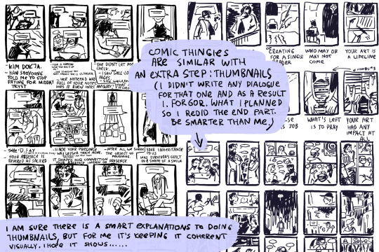
I'd warn against following my process (at least if you want to learn), but I'll be honest and show you, lol. (Heads up: this is just how I do FAN art. When having fun, I generally care less about the fundamentals.)
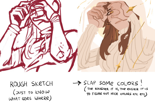
1. I slap down super rough sketches, jotting lines/expressions like bullet points of my idea. Pretty much stick figures with just enough detail to remember who's who later. Not shown here, I also move, resize, and add details to express the intended composition if I'm planning something larger. You may notice a lot of curved lines / haphazard circles.
2. I refine the sketch by drawing it with more intention and build structure with slightly blockier shapes. If I'm really struggling with a pose, this is also where I'll find references or look at myself for bits and pieces to fill in the gaps. (When practicing, I would highly recommend using a reference from the start so all your limbs are an appropriate length and you don't need to say things like "that's passable" right before posting. If you're a perfectionist you'll leave that thought with the rough sketch.)
3. I'll decide around here whether or not to leave the sketch as is or commit to lineart (not likely). I guess I'd say I "shape the lines" here by going over some to add thickness/weight, and by adding basic sort-of-shading to break things up a little. Then I'll just fill in space if the page looks empty. (Usually this is where I incorporate the borax, but I hear baking soda works nicely if you're worried.)

4. Onto coloring. I don't feel confident enough to pretend I know what I'm doing here, lol. I just choose my base colors, imagine the general direction of the light source, then add minor gradients to the light and dark layers so they don't look flat. Then I just add some BS highlights and outline them. I've only recently found the motivation to properly practice coloring and just go with the flow tbh.
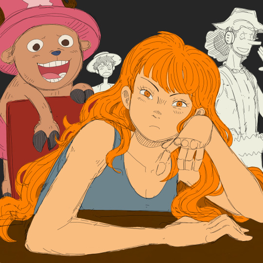

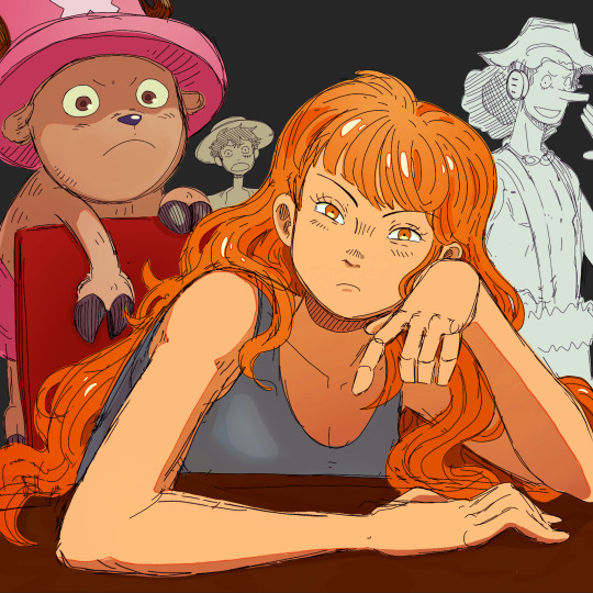
You may notice that Nami's forearm is too long, her hand looks like a pancake and Chopper has no joints! My kind sibling explained to me once that my anatomy is poor, but cohesive enough that nothing stands out too bad, lol. That's why it is important to use references!! And if you're me, practice all parts of anatomy at the same time with full bodies so that even when you're at a loss, your hands aren't that much better than your feet.
All in all, to draw like me, just have a very hedonistic approach to art, ha. Draw what you want, avoid getting burnt out on any single piece (sometimes that happens when you try to perfect drawings one at a time), and follow my personal motto:
Make fun, not masterpieces.
Idk how helpful this was, but there you have it!
492 notes
·
View notes
Note
Can I request the bucciarati gang with a partner who the person who made their clothes and it's a drama queen to the max.
Her saying that if they want to be mafia they have to do it in style and being the fashion police of the bucciarati gang.
Imagine their partner being dramatic because the red fabric she wanted is blood orange (some of them not seeing the difference between the colours 😭)
ooh sure, thank you for requesting and i hope you enjoy <33
Bruno
He tries to be patient, he really does. He loves you, he appreciates your creativity, but when you start dramatically sobbing over a “mismatched thread count,” he just quietly sips his espresso and waits for it to pass.
That said, he’s actually very grateful you care so much. His outfit is functional and stunning? He’s not complaining.
When you throw your arms around and cry, “BRUNO, IT’S BLOOD ORANGE, NOT SCARLET! MY EYES BURN FROM THE INJUSTICE,” he gently pats your back and whispers, “I’ll get the right fabric. Just breathe.”
Honestly, your dramatics entertain him. He thinks it’s charming.
Abbacchio
"It’s a shirt. It’s black. Who cares."
Wrong move. Dead silence. Then a gasp of pure betrayal.
“Who cares??! WHO CARES?? Leone, I spent 12 HOURS layering the undertones of that black to match your aura!”
He pretends to be annoyed, but he secretly loves the attention to detail. And when you call him your “dark prince of tragic tailoring,” he grunts- but his ears turn pink.
Will fight anyone who insults your fashion sense. He gets defensive.
Mista
“Wait wait wait… you’re telling me this red isn’t red?”
“It’s vermillion.”
“What the hell is a vermillion??”
The very reason you carry around color swatches and have threatened to blindfold him if he wears orange and pink together again.
You’ve had full-on meltdowns over his beanie. He once tried to wash it himself and you screamed like someone burned the Mona Lisa.
Despite the chaos, he thinks you’re adorable. He’ll let you fuss over his accessories, as long as you scratch his head while you do it.
Brags about you constantly. “Yeah, my babe made this look. One of a kind. She said it’d bring out my sniper energy or whatever.”
Narancia
Is absolutely terrified of making you mad over clothes. You once cried over a clashing button and he hasn’t recovered.
“WAIT- is this the good red or the ‘forbidden blood orange’ red?!”
“That’s burnt sienna.”
“I DON’T KNOW WHAT THAT MEANS!!”
Always tries to get your approval. “Do I look mafia cool now? Like someone who can kill and serve?”
Loves you dearly and will do literal catwalk spins if you ask him to. He lives for your dramatic praise.
“YOU LOOK LIKE A BULLET WITH A BILLBOARD, NARANCIA!”
“Yesss!! That’s what I wanted!!”
Trish
Your soulmate. Your aesthetic twin flame. Your fashion wife.
You speak in color gradients and emotional fabric choices.
“I’m thinking moody silk that screams ‘I’ve known loss and luxury.’”
“Darling. You read my soul.”
The two of you once cried for an hour because someone suggested brown shoes with a pink velvet suit.
You both agree: if someone wants to join your mafia family, they better be fitted. If not? “Return to sender. No drip, no deal.”
Trish fully supports your dramatics. She even fans you when you swoon over a missing sequin.
Fugo
You give him so much anxiety. He walks into the room wearing a slightly wrinkled jacket and you audibly gasp like he slapped your grandmother.
“Darling, I cannot- WILL NOT- let you represent Passione in that disgraceful crumple. Did you sit on this?”
He tries very hard to follow your rules, but he gets flustered. Especially when you chase him down with a lint roller while screaming, “I’LL DIE IF YOU DON’T MATCH THE THREADING, FUGO!!”
But despite his prickliness, he adores your passion. He thinks your devotion to style is beautiful.
And when you stay up late adjusting his collars and murmuring, “You deserve to look like a star,” it makes him blush so hard he pretends to yawn just to hide it.
Giorno
He’s a man of taste and elegance, so when you met, he deeply respected your devotion to aesthetics.
What he didn’t expect was you absolutely losing your mind over the shade of his jacket trim.
He’ll calmly listen to your critiques, nod thoughtfully, and then say something infuriating like,
“I trust your vision. But if you faint again in the middle of dinner because Mista wore plaid, I’m sending you home in a cab.”
He’s the only one who can talk you down mid-fabric-crisis.
You: “GIORNO THEY SENT CORAL INSTEAD OF ROSEWOOD, I’M GOING TO WALK INTO THE OCEAN.”
Giorno, gently holding your face: “I will personally fly to Paris and get you the rosewood. Please don’t drown yourself over a swatch, amore.”
#jojo's bizarre adventure#giorno giovanna x reader#giorno giovanna#bruno bucciarati x reader#bruno bucciarati#leone abbacchio x reader#leone abbacchio#mista x reader#guido mista#narancia x reader#narancia ghirga#fugo x reader#panacotta fugo#trish una#trish una x reader
122 notes
·
View notes
Note
I'm genuinely so fascinated with your art! it's got an interesting texture if that makes sense.
I remember on Instagram you saying digital touch ups/mixed media but I have such a hard time telling what's digital and what's traditional because it all gels together so well!
if you've ever made a post about your general process that I've missed, I'd love to see it!
anyway thanks for the transformers content, it's feeding my family out four rn
Awh omg thank you so much ! Yes, I've been doing a lot of mixed media lately and I'm glad people think my mixed media art looks seamless ! I'll take you on a journey down my mixed media process ! More below the cut !
I start out traditionally ! I sketched this piece with a colored pencil and went over it with a very thin fine point sharpie (I don't have microns </3) When I'm done I take the picture on my iPad, depending on the room lighting or time of day results vary, but it doesn't really matter how bad the lighting is as long as the lines look crisp.

Then I crank the hell out of the exposure and play around with the photo settings, lighting things up until it looks like this

I don't have exact specific settings for this since it varies depending on how bad the lighting I started with was so I just play around until it looks relatively good. I'm going for bright background with no shadows and crisp lines. Then I pop it into procreate !
First order of business after importing, new layer, color pick the background, fill the layer with the background color, then put the blend mode on divide ! This will get rid of the yellow lighting.
I use Procreate's halftone feature to apply it to my lineart before I color, it just gives it a fun effect.
For coloring, I go on a new layer and put that blend mode on multiply, this lets me color within the lineart, I block out my shapes (usually characters) in one solid color and then as I continue to color I just add layers and clip them together.

Here's a speedpaint for this piece, audio warning for music and flashing warning, especially at the end when I play around with blend modes + gradient maps
The brush I use for drawing over my lineart is Procreate's default gel pen, I slightly adjusted it so that it has a rougher look that blends in with the traditional lineart (the only thing I changed is the jitter amount)

Other brushes I used include; Abbie Nurse's Pan-Dem-Ink's Brushset (Skadouche and Blotto) for my onomatopoeias + blood, paper textures are from one of thedawner's procreate brush packs (I believe volume 3 or it might have been the mixed texture pack, the brushes are just called paper tex 4 and paper tex 5), 1 also use true grit supply's procreate texture bundle a ton for the ink splatter look next to some of the lines as well as the blood (drrty detail 4 + grunge shader - detailed)
For paper textures, I kinda layer them on and play with the opacity to give the piece an almost withered or worn out effect
When I'm done with the piece I slap more halftone on it and play around with the opacity until I'm happy
That's essentially it ! My process is mostly lost of experimenting and playing around until you find that sweet balance
105 notes
·
View notes
Note
You mentioned something called gradient mapping on a recent post, how does that work if you don't mind me asking?

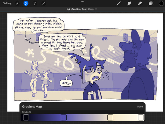
Gradient mapping is a feature in procreate (and i think a few other programs) that translates shades of gray into a number of different color palettes according to value. I only draw in grayscale cuz I’m lazy and it’s easier. I just slap a gradient map onto whatever i drew and call it a day. The only time i color manually is when i do comms and even then i still slap an overlay of a gradient map layer on top to bring the colors together


252 notes
·
View notes
Note
Sorry if this is a question that's already been asked, but what's your typical drawing process like?
an ask about it exists somewhere but honestly. my process is easier than the process of looking for that ask so!!
i don't do much with art to be fair. it's all flat colors, some blushing and a shadow slapped over it. sometimes some gradient maps to make in more fun?

(forgot to add, refs are not just for the pose - i collect character refs and additional things on boards in Vizref, so if need be. i just splitscreen it ^^ very useful, i have those for my fandoms and for commissions. and feels better that reference function inside of procreate)
black and white pencil pictures are even easier. almost one layer "keep at it until it's done" with 6b pencil in procreate.
the ones with watercolors are also easy... honestly the most difficult part about my process is owning watercolor brushes 🥲


Additionally i do have a few timelapses around here, but that's the last one?
youtube
[video ID: a timelapse of an art, it's Lee Hyunsung holding up Yoo Joonghyuk body with a mournful expression on a background of a crumbling wall and a torn portrait. End ID]
so yeah. tldr my process is just very rough sketch - sketch to figure out colors - make the first sketch readable - finish the colors up. :")
#id in alt#orv spoilers#due to the examples i made....#sorry if that is not as exciting as you expected... alas i am a simple person#unless you look at the sketchy lineart like on lhs pic#then i am of questionable priorities. i suppose. ^^
182 notes
·
View notes
Note
Loved the comic above the chapter. It was glorious and this is now my headcanon XD. The art is great too! What's the new programs you got? Had to ask before I dive into this chapter!
-🥸
new program is Affinity Designer, for vector art. My hands are shaky as hell (it's amazing how many weird-ass symptoms ADHD has that you don't hear about until you dig deep) and that makes it a pain in the ass to get my lineart looking as smooth as it does—i'm hoping using vector art for lining will speed up my workflow.
Right now while I'm still getting the hang of it I think it's slowing me down lmao. Got to learn how to deal with entirely new problems from the ones I used to have, like, "why does this damn program keep randomly switching between clicking on the layer I want and clicking on some totally different object group, when i choose a layer in procreate it stays on that damn layer until I tell it otherwise" and "why does drawing a new line sometimes apply the line style I wanted and sometimes apply a line style I used like twenty layers ago for no reason"
But once I've worked out the bugs I'm hopeful it'll speed things up.
Like, this! Look at this. I made a Bill and saved it as an asset. Have a generic Bill.

And now I never need to draw Bill again in my life.* (*this is hyperbole.) I can just slap that asset down, bend some things, rotate some things, and turn it into...

... whatever pose I want.
His body and hat are always the right shape and it's easy to deform them however I want and then instantly un-deform them with one button; his bricks & tie & eye are already applied; his limbs are always the exact same thickness, his feet are always the same shape, it takes one click to put his joints into perfectly smooth swoopy curves at the joints, and even the glow effect is always already applied
and man, I know stuff like an automatic glow is no big deal to people with fancy-pants high-end art software like Adobe Whatever, but I don't have Adobe Whatever, I have Procreate and you have to manually make your glow layers and if you redraw the image you've gotta redo the glow from scratch. Never again!!
You wanna know what I had to actually hand-draw to change the first image into the second image?

That's it.
My two issues are—one—because I'm so new at this, it takes a lot of time twitching around individual nodes and figuring out clever little ways to layer objects to get the right effect that a pro wouldn't have to spend on it, and—two—because vector art is SO precise and smooth, it tends to drain some of the personality and "character" out of the art. Like,

the angry Scalene on the left "looks better" just in terms of having clean consistent lines and pixel-perfect gradients and no sketchy corners—but the one on the right has a better angry face, it's more visually appealing and more intense. There's a lot more rage in those scrawly uneven fists than there is in the smooth flawless fist. I spent a lot of time fussing over her expression on the left and still couldn't get it to look as good as the one I did months earlier with Procreate, because in procreate you can just draw the lines but with vector art you manipulate the curves in strange and esoteric ways.
So I've gotta work to bridge that gap.
and then by god I'll be unstoppable.
#(and then I'll probably get a damn animation program to rig up all the body parts so I'll ONLY have to worry about posing them lmao)#(That's the one thing affinity design can't do)#(I can't just *lock* a couple layers relative to each other so that—for instance—his eyelashes can't escape his eyes.)#(If I wanna perma-lock his eyelashes in place I've gotta use little tricks to *manually* consistently keep them where I want them.)#(but an animation program with rigging could do that!)#(never underestimate how much I'm willing to complicate my work in the name of simplifying it)#🥸 anon#ask#my art
92 notes
·
View notes
Text
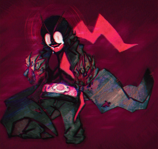
Overwhelming
Unedited version under the cut (my art process is slap tons of gradient maps and layer effects till it starts to be hard on eyes at least a bit <3 )
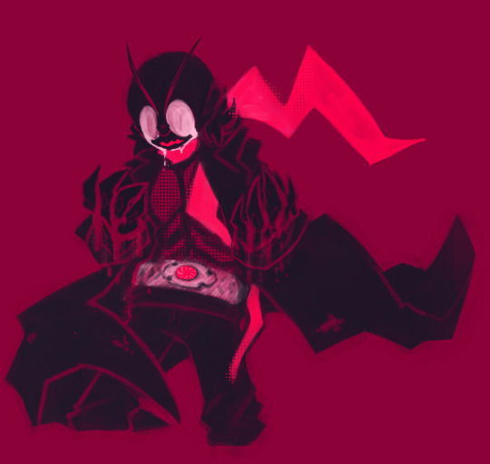
#kamen rider#shin kamen rider#takeshi hongo#watched it yesterday and had to let it out out of the system yea#tw eyestrain#hongo...you are such a nice man;;;#mecha's art
271 notes
·
View notes
Note
Hello, this is not a request it's question because I really want to learn how to make graphics with gifs and idk how to do it 😭😭😭
Like your agar agar cookie layouts, I really like your work and would like to learn how you make it
Thank you for reading this, if you don't want reply it's okay, have a very nice day

Haiii!! It's no problem!! Unfortunately, I'm VERY bad at explaining stuff LOL, so here's the best I can do!! (Also, have a sneak-peak to another post :3)
How to make a gif edit.
How I decorate my edits.
How I make my PSDs.
VERY LONG POST BELOW. MASU LOVES TO HEAR HIMSELF TALK.
Okay so step one is to use photopea. I used to be an avid ibispaintx user until I realized that photopea can make gif edits and suddenly I'm photopea's #1 fan (and hater). Photopea is a website, BTW, here's the link!
First, open up a project. Good job! We're 1/4 of the way there! You can import a PSD if you want (Here's a different tutorial for that), but let's just say you DON'T have a PSD, for the simplicity of this tutorial.

Next, find the animation you want! For this example, we'll be using the Wind Archer sprite below (I took this from the CRK wiki). It can be anything - but preferably nothing too big, because Tumblr for SOME REASON HATES high quality gifs. Siiiigh...

From here, you want to go to FILE > OPEN & PLACE. It'll show a window of all your downloaded items. Click on the animation we just downloaded.


Wam-bam! We're almost there!! Okay, if your image is a WEBP file, it will not animate if you export as a GIF. But! That's okay! Because with trial and error, I found out how to fix this!
On the downloaded layer, double click on the layer. After this, go to SMART OBJECT > CONVERT TO LAYERS...

Now, if your photopea tries to explode and pretend it don't know nobody, that's okay! Just let it load a bit. The file is very. very big. It should turn into a folder! You have nothing else to do from this.

After this, you can do, well, whatever ya need!! Slap a stroke on, put a gradient map on this bad boy, anything else! Once you're finished, go to FILE > EXPORT AS... > GIF. Your photopea might try to explode again, for like, a few minutes. Just give it some time. It's a lot of trial and error!! Don't feel bad if you didn't get it the first time!!
Now, before I talk about my edits, I want to make it clear that you should FIND YOUR OWN STYLE! Don't try to copy off of someone else, or try to replicate another style. Every editor is different!! While I overuse overlays and gradient maps like I won't see tomorrow, you may like a more simple style, or something less over and out there ~ ! That's alright! Don't be afraid to branch out.
Now, as we said - we love to use overlays + gradient maps. I am an artist, so a LOT of what I do correlates to that as well (having an interesting silhouette, making a focal point, color theory, color contrast, composition). It'll be WAY, WAY too much to explain in one single post, so I'd just say to go with the flow! If something looks off, try something else! There's no shame in scrapping an entire project - especially if you're unsatisfied with the result. Do what you need to do!! It's your edits.
For making PSDs, our process is actually pretty simple. We just use a gradient map and adjusts it till it works LOL. We add a few others things too - but that's mostly what I do. If you want to learn how to make your own, my word of advice is to dissect from others. Take inspiration!! If you don't feel like doing that, there's no harm in just using a F2U PSD floating out there. Feel free to look at our Squid Ink post and use that as an example of our PSDs! (If you don't feel like going to go get it, yeah I understand, here it is right here.)
All in all, my biggest tip (besides to have fun), is to edit until you like it. Don't try to compare yourself to big editors - they've had TONS, AND TONS, of experience and editing. Experiment with your style, put yourself out there, edit some new media you've never edited before, find resources to help you out, find tutorials, ETC. It takes time to learn, so make sure to take that time!! You got this, don't feel discouraged by other people's work!!!
That's all from us folks!! Peace out!! ^_^


#໒꒰ྀི ․ ․⸝⸝⸝ ꒱აㅤ﹑﹫ㅤtalks.#໒꒰ྀི 𖦹 ˕ × ꒱ྀིაㅤ﹑﹫ㅤasks.#editblr#edit tutorial#editing#edit blog#psds#photopea tutorial#tutorial
36 notes
·
View notes
Text
gif tutorial
i was asked to make a tutorial for this set i made, so let's get right into it!
first things first, i downloaded the music videos from youtube in 1080p using 4k video downloader. unfortunately, the quality of youtube videos always seems... not great, to put it simply. plus these music videos are from the 90s, so they've been upscaled to 1080p after the fact. all of this works against us, but i've definitely worked with videos of lesser quality than these, so at least there's that!
when i gif, i import video frames to layers rather than screencapping. this comes down to personal preference. after everything has loaded, i group all my layers together and set the frame delay to 0.05. i then cropped my gif to 540x500.
the next step in my process is sharpening. i did play around with my settings a bit given the quality of the footage and the dimensions of the gif. i compared both @hellboys low-quality video gif tutorial to my regular sharpening action and my vivid sharpening action and in this case, i preferred my normal vivid sharpening action. i used this tutorial to create the action for myself, and you can find other sharpening tutorials here. this action converts my frames to video timeline and applies sharpening.
once my gif is sharpened and i'm in timeline, i begin coloring. i wanted to simplify the amount of colors used in these gifs, again because of the video quality -- i knew it wasn't going to have the crispness i would normally like for my gifs. here are my coloring adjustment layers and their settings (not pictured: my first layer is a brightness/contrast layer set to screen) (explanation in alt text):
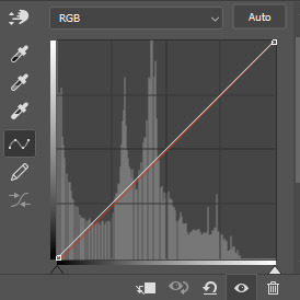

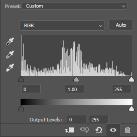
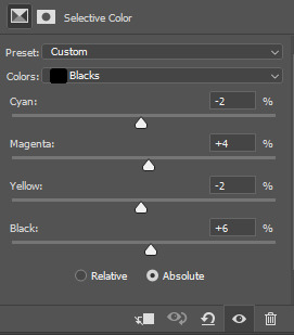
all of these layers and their settings will vary depending on your footage and its coloring (and obviously, feel free to make the gradient map whatever colors you like if you aren't going for this exact look).
pretty basic coloring, especially with just slapping a gradient map on top (my beloved), but at this point, i still didn't like the quality of the gif, so i added a couple textures/overlays.
i put the left one down first and set the blending mode to soft light and the opacity to 8%. depending on what look you're going for, you could increase or decrease the opacity or play around with different blending modes. i like using this texture with lower quality footage because even when it's sized up a bit, it adds some crispness and makes things feel more defined. for the second texture, i set it to overlay and 75% opacity. we love and respect film grain in this house.
now for the typography! sometimes i really enjoy typography and other times it's the bane of my existence for the sole reason of just how many fonts i have installed. anyway, here are the settings i used for this set:
make sure the color of your font is white and then set the blending mode to either difference or exclusion. i can almost never see a difference between the two, but for this set, i used exclusion. below are the blending options (double click on your text layer to bring up this menu or right click and select blending options).
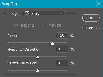
now we have to add the warp effect. with your text tool still selected, click this icon at the top of your screen:

from the dropdown menu, select twist. these were my settings, but feel free to play around with different warp options and their settings. the ones i use most often are flag, fish, and twist.
this last step is completely optional, but it's an effect i use in most of my sets with typography. duplicate your text layer (select the layer and ctrl+j), turn off the layer effects (click the eye icon next to effects), and set the blending mode to normal. right click on the layer and select rasterize type. right click on the layer icon itself and choose select pixels.
at this point, you should see the moving black and white dotted line showing that only your text is selected. then go to edit > stroke. here are the settings i almost exclusively use.
this is what your text should look like now:
using ctrl+T, move the layer off the canvas so you can't see any of the text anymore. you should be left with only your outline. click anywhere on your canvas to de-select the text we just moved. use ctrl+T again as well as your arrow keys to nudge the outline over to the left 2px and up 2px. this is personal preference as far as the positioning, but i almost never move it any other way. you can leave it like this, which i sometimes do, or you can set the blending mode to soft light like i did for a more subtle effect.
and that's it! rinse and repeat for each gif in your set or use a different warp effect on each gif to switch it up! if you have any questions about this tutorial or would like me to make one for anything else, please feel free to ask any time!
#gif tutorial#my tutorials#gifmakerresource#completeresources#dailyresources#chaoticresources#userdavid#coloring tutorial#typography tutorial#tutorial#photoshop tutorial
279 notes
·
View notes
Note
Hi, You make such amazing Amazing gifsets !!! I had a small question about one of your sets 🥹
https://www.tumblr.com/khaotungthanawat/748206993697882112/i-ought-to-stick-to-another-man-a-man-that-surely?source=share
This is so pretty first of all❤️. I wanted to ask, how do we get the effect in the first gif, where the gif actually is like playing on a film reel/screen inside a black bigger gif? Thank you so much for any help 💛💛
hi! thank you so much!!! i don't have the psd for that anymore, but i'll make it again using the same effects. 💞

before i get started, this tutorial makes a couple of assumptions:
you're working in photoshop
you know how to make a gif in photoshop
(as a note, i work in timeline.)
so there are three overlays at play here: the pink lights, the scratches, and the super 8 frame.
i'll start with the lights. the light leaks overlay i used for this effect can be found here on youtube. once i had the overlay gif ready, i placed its layer at the top of all of my other layers and set it to screen. (you can also try lighten for this--it really comes down to what you like best!).
next i added a gradient map adjustment layer with a black to pink gradient. i'm pretty sure i left the blending mode on normal for this, and added a clipping mask to clip it to the light leaks layer.
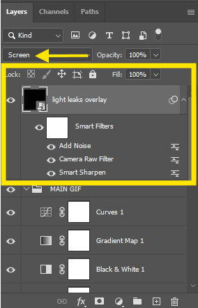
and here's what i have so far:
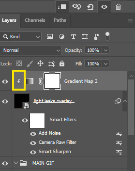
okay! next layer is the scratches. there are lots of these on youtube, but i used this one! similar to the light leak, i set this on top of everything else and set it to screen. i also added another gradient map adjustment layer, this time just a simple black to white gradient, and another clipping mask to keep the bw strictly to that overlay.
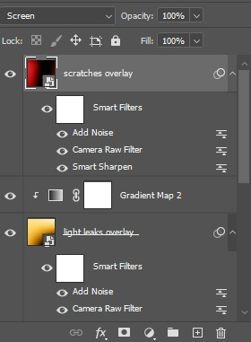
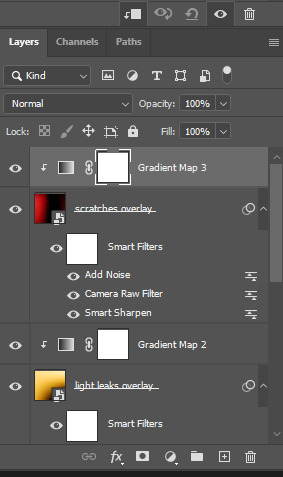
which gives me this:

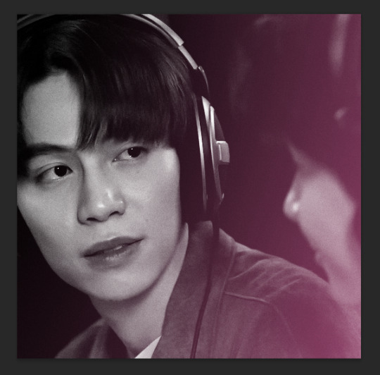
for the black frame, i used the super 8 frame overlay found in this pack (it's free) by neal chopra! once i had this gif ready, i slapped that on top of all of the the other layers. now, since the center of this gif is solid white, if you use screen/lighten, you'll have have a big white box covering your gif.

boo hiss! so what i did instead was set my blending mode to multiply.
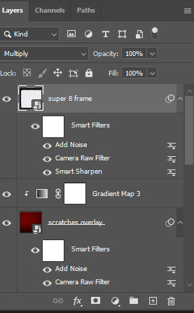
and now i'm here:

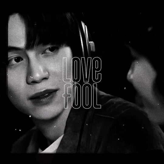
i did some additional tweaking to get adjust placements, added contrast closer to what i wanted, slapped some text on it, and this is my final result:
again, here are the video overlay links:
light leaks
scratches
super 8 frame
i'm not good at tutorials, but i hope this made sense and is helpful to you. feel free to drop an ask if you have more questions. happy giffing!
74 notes
·
View notes
Note
hi !!!! not sure if you respond to asks but your art is soo beautiful and whimsical and awesome, and i was wondering, how do you create the photobash-looking backgrounds? it's so stinkin cool !!
gosh thank you so much!!!!! ahh I'm not sure which drawing you're talking about,,
if you're talking about my kantrio ones then they're actual collages that I put tons of digital editing onto! (posterization, gradient maps, textures, manual touch ups)


If you're talking about this piece,, I just used my own texture and slapped it onto a flat colored bg with a layer mode or two (I can't say which because it's always experimental) then some tinkering with the colors with good ol' gradient map

24 notes
·
View notes
Text
Alright, as desired, here's how how I render silver hair.*
Putting it under a cut cuz it got longer.
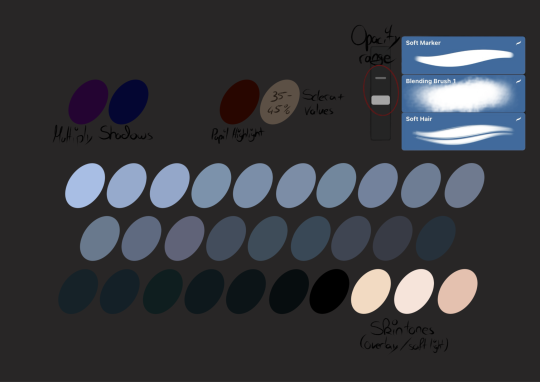
First up, this is my palette. Rough/big shadows with the the saturated blue/purple in multiply blendmode with anything between 10-20% opacity.
As for brushes I use a soft round marker at about 40-75% opacity for getting values onto the page.
The blend brush is used for rough blending and the Soft hair is used to render highlights and dark shadows. For this texture it is important to always go with the direction the hair would flow. Its primary purpose is just to give it texture rather than actual blending.
As for the rendering I use that massive amalgamation of green/blue/purple tones. Rather than blending or smth I just stack values. Aka; I start with a medium dark tone and then just carve out the details from there. It's what works for me.
Generally speaking I use this pallete for everything; if I do skin I simply render it first using the cool tones and once the shadows and all are done I slap an overlay, soft light or colour layer on top of it with one of the actual skin colours. After that I tweak it with colour balance/hues and opacity changes to get something that fits the painting and then tweak it further.
And as a bonus nd cuz I love eyes, I often slap a round "highlight" with that red colour in the middle of the pupil to create some depth and the sclera is usually a yellow or blue (depending on the temperature of the skin and vibe), with anywhere between 35-45% B value. The fact that it looks brighter than the skin is a simple optical illusion.
Anyway, enough text, here's a video (including the finishing touches, aka merging all layers, going into colour balance and applying texture/noise, cuz editing on iPad is painful):
If I'm like 3/4th done I'll use a gradient map to tie it together even more (again, too lazy to blend), change the brightness and all with curves, and then I just do some minor highlights and shadows to enhance the flow of the hair.
Oh also lighter hair colours reflect their surroundings in a way hence why you saw me doing that thing, for lack of better term. Though I had a momentary lapse of judgement (since the part of the hair that lays over skin would have the green and browns of that layer of paint shine thru and reflect rather than the bg), but realised that too eventually 🫡
Anyway, for darker hair I go about it similarly but I keep the values much closer together. Usually below 60 - 50% B value. Using too high values in this case results in greying hair which works for some characters but not all.
*please keep in mind I use a lot of greyscale. I render with values and then just slap colour onto that later, and colour in this case also means I orientate myself on temperature rather than anything else. In my specific case I tend to gravitate towards cool tones. A lot. That's why my pallette is pretty much only cool tones. Also I just use my gut feeling for most shit tbh. Sometimes it works, sometimes I just create more work for myself.
#daemon's art#sure throwing that in there#hope this makes sense and if you have questions just ask#also this took me like 2h to upload despite being shit quality + rather short#and broke tumblr cuz it the bar for uploads won't vanish#so i probably wont be doing that again any time soon#this in fact broke tumblr so hard i had to reinstall it
14 notes
·
View notes