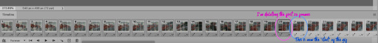
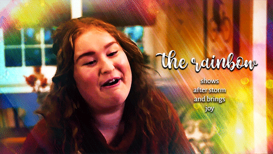
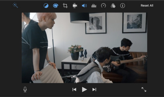
#so i ... did a lot of resizing work on individual frames...
Explore tagged Tumblr posts
Visit Tumblr Blog
Explore Tumblr blogs with no restrictions, modern design and the best experience.
Last Seen Tumblr Blogs


Fun Fact
The average Tumblr user visits about 67 pages every month.
Text


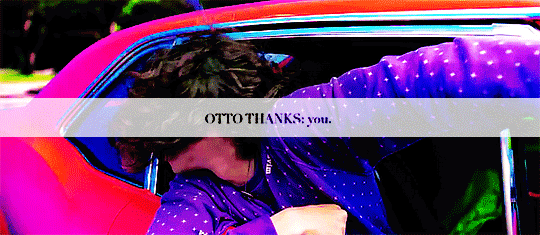
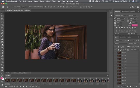
Good Omens s2 e2 | minisode A Companion to Owls
#good omens#good omens 2#good omens 2 spoilers#aziraphale#crowley#job#sitis#bildad the shuhite#(gotta give him his own tag)#s2e2 'the clue'#minisode 'a companion to owls'#goodomensgifs#goodomensedit#idk just a collection of shots i liked/wanted to edit#a *truly unhinged* amount of work went into the last gif and you can barely tell it's moving T_T#but once my brain has An Idea it will not let go#(the actual shot is a slow zoom out but i didn't want it to move#so i ... did a lot of resizing work on individual frames...#if only i could apply that sort of dedication to something that makes me money lol)#gifs#i made this
518 notes
·
View notes
Text
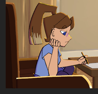
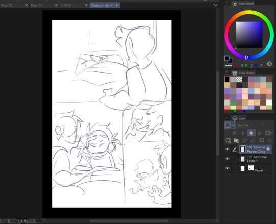
Scene 10 - The Process
I'm finally getting around to documenting the rest of the process for producing scene 10, which admittedly took a lot longer than I initially anticipated. As such, this post will be a longer one, and I will try and be as technical as I can be when it comes to the techniques I used to achieve my end product.
Extra Furniture, TV Animation and Character Lineart

I unfortunately don't have the separate files for each of the specific parts of animation here, but all can be seen in this one clip and I will explain each portion individually with corresponding screenshots.
Character
I began the line art for Em shortly after finishing the furniture turnarounds, as with my previous work on character animation I felt I was stronger suited to adapting the character to the furniture than the other way around. The lines are sharp so as to reflect the style of the original concept art, and overall it was an interesting challenge to get the angles correct for each frame.
TV Animation

Drawing the TV animation was honestly a really nice break from the technicalities of the rest of the scene. Getting to work on something so simple in the midst of a particularly hard scene was so refreshing. I opted to keep the animation simple for several reasons, not least because it would only be in the background of the shot for a matter of seconds, and I needed the focus to remain on Em and the turnaround.
The animation makes use of a lot of gradient colours so as to save me as much time as I could find on shading and other elements.
Extra Furniture

As can be seen above, there is a shelf, potted plant and some books that exist outside the boundaries of the shot. I was adamant that I didn't simply want to cheap out and draw the visible parts in in case my choice of camera angle changed, and so the shelf exists as an extra asset and can be moved in future, should I want a fuller shot.
Colouring the Character
When it came to colouring and shading Em, I chose to use warmer swatches so as to help the character to meld in with the warm light in the room. I additionally went for some cell shading to begin with, as that's what the style initially called for. I did ponder the idea of including the pop art effects over Em here, but for time reasons I decided against it.
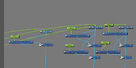
I also rigged the sofa arm as can be seen in this video, so that it moves alongside Em and gives a better idea on the perspective of the character. This video with the basic colouring in my opinion really starts to make the piece come to life, and helps it to seem like less of a mess of assets in one shot. Still to add yet were the papers on the table, a few lighting fixes, the glasses and the movement, but my timeline and node view were already getting quite busy, so I tried to stay organised.
The Finishing Details
I used the same node build as in most of my previous scenes here, mainly because the effect is so nice, but also definitely to save me some time as I was already overdue for this scene.
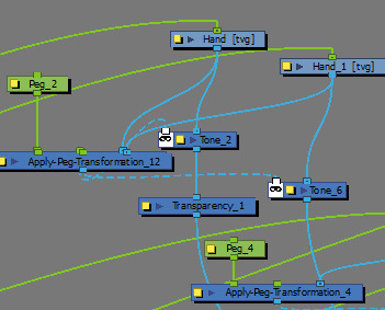
The transparency and tone nodes working over the top of my manually cell shaded character looked great in the end.
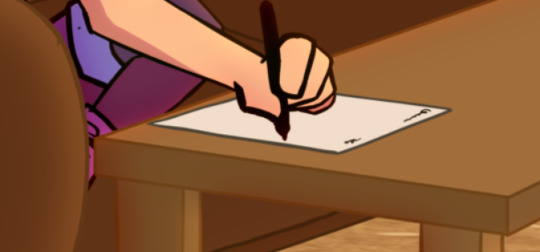
The glasses were a bit of a pain to add seeing as I had forgotten to animate them as I was animating the character, so their movement didn't and still doesn't quite match up to the character's movement, which bugs me a little. However, with the final effect, I am sure it won't be as noticeable. The glasses were done in a diamond style here to fit the character's sharp design.

The paper equally was a pain to add, not so much the rotation and resizing, but more so getting the writing to turn at the same pace. I managed it in the end, but I was quite stressed with the scene as a whole by the end.
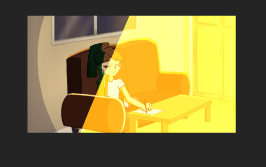
I added a vignette and some extra light beams to add some more dimension to the room, especially as it is actively spinning. I thought it might need to have some more elements to it to retain the illusion.
Here is my finished timeline after all of the movement had been animated, just to give a perspective of the scale of this scene.

I will post the final video seperately to this post, seeing as it is so large.
Thoughts
This scene admittedly was one I wasn't looking forward to from the start, and I quickly began to convince myself I was throwing myself in too deep. However, the more I worked at it and chipped away at little problems, the more it began to come together, and before I knew it I had made a scene that I never thought I'd be capable of so quickly. I do think this scene is one I'll be referring back to for motivation from time to time, to prove to myself that if I can do this, I can do anything. I am really impressed with the quality of this scene.
0 notes
Photo
Alright y’all, today is the day that I’ve finally managed to make a tutorial! I’m going to be showing how I created the effect in my lotr and the witcher sets!
For this tutorial you need to know how to make gifs and have a lot of time on your hands!
this is really long and really image heavy oops
I’m breaking this down into two parts: 1. Setting up and creating your gifs and 2. creating the actual transition part.
1. Guide to this tutorial
We’re going to be working with multiple smart objects and documents at once so I want to create a little keyword guide.
“small” gifs refer to your smaller gifs
“big” gifs refer to your bigger gifs
panel/document/canvas I use somewhat interchangeably here but they refer to the document where you will be placing both your small and big gifs
click on any images that are blurry so that you can view the HQ version!
1.1 Setting yourself up
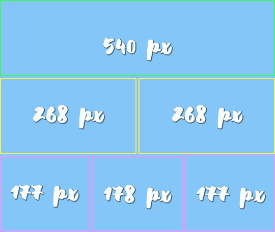
The first thing to do is decide how many gifs you want to do. Standard gif width sizes for tumblr are 540px for one gif, 268px for two gifs and 177/178/177px for 3 gifs. You can do more than this, but make sure that you’re calculating in the gutter between gifs (4 px).
Height is completely up to you, but take into consideration that the upload limit is 10mb!
For my ROTK set, I did 177/178/177 x 150 which gave me a canvas size of 540x458. For my Sam set, I chose a different layout where I had four gifs of 268x150 and 3 gifs of 177/178/177 giving me the same canvas size.
(150 x three rows = 450 + 4 px for gutter x 3 = 458)
Now that you have your sizes, you’ll know how many gifs you want to do depending on how many panels. For my ROTK set I wanted to do five panels so I needed 45 small gifs and five big gifs.
The last thing I do before I start creating the gifs is to set up a new document for each panel with the larger dimension.
File -> New -> this dialog (click on image for HQ)

1.2 Creating your smaller gifs
This is the most time intensive part as you will be creating individual gifs for each panel. You need to make sure that each of these gifs is the exact same amount of frames.��I usually do between 30-40 frames.
Load your screencaps/movie and crop, resize and sharpen it. (shameless plug for my action pack here) and convert to smart object if it’s not already!!
I also like to name my gifs as either side (177 px) or middle (178 px)

If you prefer you can also color your gif now. For color sets I like to color them once I have them all on the same canvas but that’s really just a personal preference there is no right or wrong way.
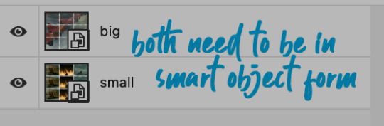
!! YOUR GIFS NEED TO BE IN SMART OBJECT FORMAT FOR THE NEXT STEP !!
We’re now going to drag the gif onto the corresponding panel document (still in smart object form)
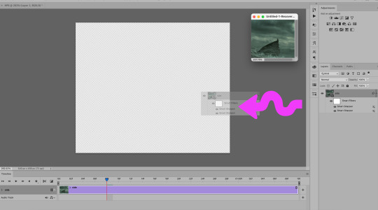
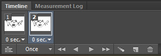
Once the gif is on the document I like to go ahead and create timeline and delete the base layer.
1.3 Aligning your gifs
Move the gif to the part of the canvas you want it be by selecting command + a and then command + v. This allows you to accurately place your gif using these buttons:

Now repeat this process until each of your panels are filled: (for the sake of time I just used 3 gifs that aren’t colored yet hp set coming soon tho ayeee)

If you didn’t color your gifs earlier, color them now and then select each of your gifs and create one smart object by selecting all layers -> right click -> convert to smart object and name this layer “small” or something along those lines
I HIGHLY RECOMMEND SAVING AFTER YOU’VE COLORED AND BEFORE IT’S A SMART OBJECT just in case
1.4 Creating your bigger gifs
Load the screencaps for your bigger gif. Make sure that it is the exact same amount of frames as the smaller gifs.
You’re going to crop it to the size of your documents so 540 x the height you’ve chosen. DO NOT RESIZE IT.
Click on VIEW -> NEW GUIDE LAYOUT
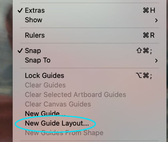
This dialog set is going to pop up - enter in how many rows and how many columns you want as well as the gutter size you’ve decided on (the image has 2 px on it but 4 px is the standard tumblr size)

A layout guide will appear that demarcates where you need to crop.
Remember to change your cropping size if you’re doing 177/178 for the middle column.
Now crop out each section then resize it to the correct size, sharpen it and create a smart object.
Drag this gif to the panel you want and position it in the correct place using command + a and command + v.
Go back to larger gif document and reverse your steps until you have the guide layout.
Crop the next part of the gif and repeat the above steps until your panel now has all of the larger gif on it.

For coloring the larger panel, I like to resize it into the correct size on the original and color it separately and then drag the coloring group onto the panel with the smaller and larger gifs.
Once all of the pieces of the larger gif are in the correct place and your coloring group is there, select the them and create a smart object.
You should now have two smart objects, one of the smaller gifs and one of the larger gif.
2. Fade transition
Now for the transition!
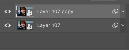
Duplicate your “big” layer so that you have a “big”, a “big copy” and a “small”
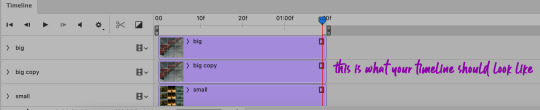
You’re going to drag your “small” layer onto the same line as your “big” layer, creating a video group.

Then drag your “big copy” layer onto the same line but behind your “small” layer.
Your layers panel should look like this:

Click on this button in timeline here, and select cross fade. The amount of seconds you want to choose is up to you.

I did .3 seconds for my ROTK set which created 6 transition layers which I quite liked but it is really up to personal preference here!
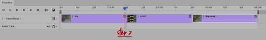
Now drag the cross fade onto both the start and the end of the “small” layer.
I find this is a good time to check my gif and make sure that everything looks the way I want it to and that the fade transition is smooth.
The next few steps are crucial to getting the fade to actually stay in your gif so although it’s waaaay different than how I usually export gifs so stay with me.
Instead of converting back to frames and setting your timing you’re going to go directly to export for web and make sure you have the transparency boxes checked (CLICK ON IMAGE FOR HQ):

note: it might take a long long long time for the save for web dialog box to pop up so don’t worry it’s not you
!!!note 2: as of may 1st due to the new update make sure to uncheck "interlaced"!!!!
Save and then open that gif file you just created. Play it just to make sure that the fade transition is the way that you want it to be.
The key to creating the smooth transition effect is that we will actually be deleting some of the big gif so that the actual “beginning” of the big gif starts after the smaller gifs, even though that’s not the beginning of the actual file.
(this is kinda hard to explain I’m sorry!!!)
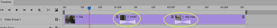
What you’re going to do is delete the first 10-20 frames of the first “big” gif and then delete the frames that you left in the first “big” gif from the back of the second “big” gif.
So for this set I’m deleting the first 20 frames:
and now I need to delete the remaining frames between the “start” of the big gif and the first transition. The easiest way to do this is go find the first transition frame of the second transition - where the small gifs transition back into the big gif. Click through the frames until the you see where they start to fade.
Once you’ve found that frame, count forward the amount of frames you deleted in the beginning. COUNT INCLUDING THE FIRST TRANSITION FRAME.

Now delete the frames that come after your counted ones. The reason I count out 20 instead of 19 (or whatever you number is) is so that I can double check myself. My 20th frame (so frame 63) should be the exact same as frame 1 (the first frame in the whole gif).
This creates the effect that the gif never actually ends!

a colored version:
Make sure that you then flatten your frames to layers and delete your excess layers and set the timing to 0.05!
Finally (I promise) your gif is ready to be exported and uploaded to tumblr!
note: because you deleted a decent amount of frames your gif should be under 10 mb. If you’re struggling with the size limit, either cut down the original amount of frames or cut down the duration of the fade.
(now repeat this process for each of your panels)
I really hope this was somewhat easy to follow and please message me if you have any questions or run in to any problems!
💜 💜 💜 💜 💜 💜 💜
#dailyresources#allresources#usersource#completeresources#tutorials#gif tutorials#mine:resource#ignore the ugly header i can't make them to save my life
1K notes
·
View notes
Text
Wobble Tutorial

Someone asked for a tutorial on how I make my art wobble like in the above gif, so that's what this is! It's not very hard, all you need is a drawing program with layers, preferably Photoshop or another one with animation capabilities, but if you don't have one, you can just export the frames individually as jpgs or pngs and compile them in another program or online gif maker. I'll be using Photoshop in this tutorial because that's the program I use.

Step One: Finish your drawing. I actually did these drawings in SAI, but switching programs mid-tutorial would be confusing, so let's just pretend I did all the steps in Photoshop.


Step Two: Lower the opacity of your first drawing layer, and create a new blank layer on top of it. Re-draw the drawing on this layer using the lower one as a guide, getting fairly close to the original lines without tracing them exactly.


Step Three: Repeat Step Two, lowering the opacity of the second layer and drawing one more version of the artwork on third layer, using the lower layers as a guide. Make sure there's some variation between the lines on every layer.
Step Four: Return all layers to full opacity, and make all but the lowest one invisible. The rest of this tutorial will be specific to Photoshop, but if you need to compile the frames in another program or site just export the three drawings you did as three separate jpgs or pngs. (If you don’t know of any programs or sites that can compile still images into gifs, ezgif.com works well enough.)

Step Five: Open the Timeline window if it isn’t already open, and click Create Frame Animation. On the interface that appears, click the button that looks like the new layer one to create another frame by duplicating the previous one. In this frame, switch the visible layer to your second one. Create one more frame, and make the only visible layer on it your third one. You should have three frames, each displaying a different layer.

Step Six: Since you’ll be creating a looping gif, change the preview from Once to Forever. Then, hit the play arrow to see what it looks like in motion. No delay will probably be too fast, so you’ll also want to change the delay to somewhere between 0.1 and 0.2 seconds for every frame. (You can do this for every frame at once by using Shift or Control to select multiple frames. Holding Shift will let you select a range of frames at once, while holding Control will let you select various individual frames without also selecting every one between them.) Just fiddle with the delay until it looks good.


Step Seven: Once you’re satisfied with the speed of the wobble, to export your animation as a gif, go to File --> Save for Web. There’s a lot of options here, but you probably won’t need to mess with most of them. Just make sure Looping Options are set to Forever, and then click Save. If the gif is larger than 8 MB, you’ll need to resize or compress it if you plan on posting it to Tumblr. You can either fiddle with the options here to decrease the file size, or just use an online optimizer like ezgif.
And ta-da! There’s your wobbly gif. If you want to make more than just the line art of a colored drawing wobble, just repeat the same process with the coloring layers as well, so that there’s three different versions of them. Then, have each frame display a different layer of the coloring along with the line art. Note that the more variation there is between each frame, the more pronounced the wobble will be. Trace the lower layers more closely for a subtler wobble, or more loosely for a more pronounced one.
329 notes
·
View notes
Text

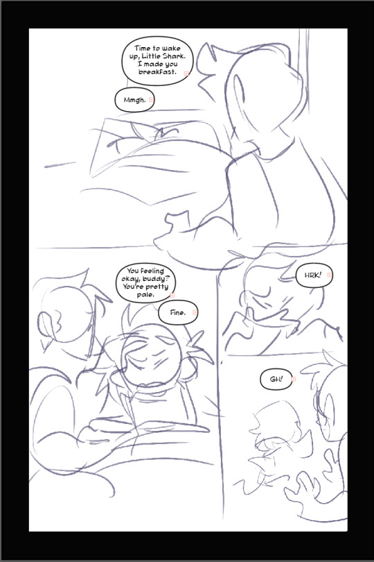
After writing out the entire story of that segment of the comic, it is translated into script form:

Roughly planning all dialogue, composition, and action in the scene. This is how you make sure you have enough space to give all the information that you want and don’t end the scene on an awkward crowded or over-paced page because you didn’t plan ahead. You can deviate from this later!

I begin in Clip Studio with the page border. It’s a transparent black rectangle that I copy/paste from the previous page so it stays consistent. Use this page for reference on page and border sizes.
On a new layer, sketch out a thumbnail for your page. This is honestly more refined than most of mine look, usually just stick figures and border outlines. You can see that I cut out one of the panels from the script while drawing the thumbnail. Save this file as a clip file, then duplicate the file and save it as a PSD.
Pop on over to Adobe Illustrator. This is my template setup. The white artboard on the right is 2100x3150px, and the black bar on the right is 800px wide, with a second artboard that is 800x1280px, which is the maximum image size for Webtoon. The speech bubbles and text in the middle are just reference so I keep the bubble stroke width and character size consistent. (My print text size is 37, stroke size 4, and webtoon is text size 26, stroke size 5. Personally I find the print text size much bigger than necessary but for the sake of consistency I’m keeping it that way)

On a new layer, use File > Place to insert the PSD file onto the big artboard. It will snap into place to fill the entire board. Lock that layer by pressing the box next to the visibility toggle:

Use the oval tool to draw in speech bubbles and adjust the line width with the properties window. Using the text tool, click and drag to create a designated text box for each window, and copy/paste dialogue from the script. (Be sure to make a text box instead of just pasting the text, it’s a pain otherwise). Center the text. and if you have the text selected and hold control, it will let you round off the edges of the text box, making it fit better into the oval shape. Use the “align” window by selecting the text AND the bubble it fits in and press both the second and he second to last buttons in the top row to center the text on the bubble. (Fine tune this if necessary with the arrow keys)

You add the text this early on in the process because if you need to rearrange panels and make more room any where, this is the easiest way to do it. Head on back to Clip Studio and make any necessary changes.

Back in clip, once you’re happy with your layout, use the “create frame” tool to make one big frame around the entire drawing.

set the layer mode on the panel layer to “multiply” so you can see through it.
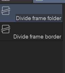
Then take the “cut frame” tool, right next to the create frame tool.

and adjust the size of however thick you’d like your frame borders to be. I work pretty large for my pages, so you probably won’t need them to be as broad as 155.
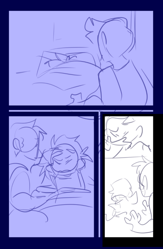
Using this tool, you can cut directly across the big panel you made and cut it up into smaller, even panels. If you hold the shift tool while using it, the lines will be perfectly straight vertically or horizontally. I broke up the first and second half of the page with my first stroke, and with the second, I further broke up the second half. It’s works very intuitively!
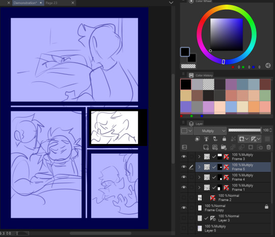
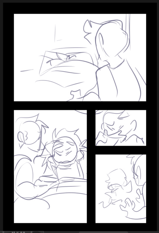
The end result leaves me with four border layers. Select all of them, right click, and press “merge selected layers”. Fill in the white space between the layer borders with black (if you want!) and press edit > convert brightness to opacity to get rid of the white and just leave the black. The end result should look like this:
Killer moves! Now lower the opacity on your sketch and refine it on a new layer.

Save that baby and then overwrite your PSD document with the new sketch. It will automatically update itself in Illustrator.
Check your work one more time in Illustrator, this is your last chance to move things around if you need to. (Looks good to me!)

Lineart in clip on a new layer!
Fill in a new flats layer with a solid color (this ensures you won’t have any white spaces peeking through if you accidentally miss filling them in.
Unfortunately I don’t have separate images for flats/shading because I do them all on the same layer like a hooligan but hey! make it pretty.

Bucket tool is your friend! With “Refer other Layers” selected, and “Area scaling” enabled, you can fill in almost the entire flats section with the bucket tool! Saves a lot of time.
Using Select > Select Color Gamut, You can select all instances of a color on a canvas, and I use this all the time for shading or for quickly adjusting all instances of one color, and if you add “Show border of selected area” to your command bar, you can hide the border of the selection. (You’d have to google how to do that one i have no memory of how)
I shade with the same brush tool I use for lineart because I like the texture and I pick the colors by hand, but do feel free to use a multiply layer for shading!
Once you’re done, crop and export each one of your panels individually for webtoon. You can just save these as pngs!
Overwrite your Photoshop document once again with the full image and head back into Illustrator
That’s lookin REAL FINE fellas gj
Using File > Place again, select all of your cropped webtoon size files and place them on the black bar you made earlier.
Like so! Copy the text and bubbles from the print page and resize them to whatever size you’d like for the webtoon format and arrange them on the strip.
Now to add the tails to the bubbles. Click on one of the speech bubbles you’ve made to set those colors and stroke width as your current settings.
Pen tool
tap once inside the speech bubble

click where you want the tail to end and drag to create your desired curve. (straight tails are valid too!) Press Enter on your keyboard.

Tap the dot at the end of the tail you just placed, and click and drag back inside the bubble to curve your new line going back into the bubble.
Voila! It’s hideous. Click the bubble or the tail, then shift click to select the other half. Do not select the text!

In the pathfinder window, press the four lines in the top right corner to open a sub menu. Select “Make compound shape”
Goshdangit now your text is gone, thanks Em.

Not to be alarmed, the compound shape you made has just been moved to the top of the layer set. Just drag it back down under the text layer.
And you made a text bubble! Nice!

Repeat! And wow! You did it! You illustrated an entire comic page man!
Now to export. Using the artboard tool, you can select the artboards individually.
Select it and hit File > Export as

These are my settings. The image size can be set to whatever you want! I used to work with a much smaller canvas and scale up the webtoon strips as needed, but now I just make them the correct size in the canvas. Save that baby.
Repeat for the webtoon images, but remember, no bigger than 800x1280px. Once you export the first image, grab the top square to transform the artboard and drag it down over the next panel

If you drag from the top and don’t touch the bottom squares, it will make your cuts seamless because both Webtoon and Tapas will stitch your images together seamlessly. (Illustrator will show you how big your artboard is as you scale it so you won’t make it too big!)
And well.. that’s that! You did it! Uploading to Webtoon is super easy

You just need a preview thumbnail, a title, and you can plop all the images onto the site in order!
38 notes
·
View notes
Video
youtube
tree Explains Things 03: Smart Objects and Other Things I Said I'd Talk About in the Last One
In this tutorial I'll be talking about smart objects, variable frame rates, and how to reduce the size of your gif by removing either frames or a section of your animation. (For better quality and a larger video size with more detail, I recommend viewing this on YouTube.)
--
This transcript is about 90% accurate. I'd like to think it's because I'm getting better at making these videos, but it's more likely because most of what I said ended up getting deleted.
Part 1
Imagine you have a vault and you have a bunch of things to put in it. Before you put them in the vault, you take a photo of them. Once you've put them in the vault and shut it, you stick the photo on the outside so that you can always see what's inside it. It doesn't matter what you do to the photo. You can write on it or draw on it or erase parts of it; you can cut it up; you can make copies of it. But no matter what you do to it, the contents of the vault remain untouched. So if one day you go and open your vault, you'll still have all the things that you put in there exactly the way they were when you put them in there.
That's what a smart object is, essentially. When you save your layers into a smart object, you're left with the photo. So, like the photo, you can take the smart object and you can write on it, draw on it, cut it up, erase parts of it, duplicate it. You can treat it as you would treat any layer in Photoshop.
It took me a while to figure out why my file sizes were sometimes really large and sometimes not. That's when I started to figure out what smart objects actually were and did. I've got this gif that I've started working on. I've saved it with the dimensions of 540 x 304 pixels and as you can see there are 51 frames. In Finder, the file is 23.6 MB. I have another copy saved but in this one I've left the original dimensions of 1920 x 1080 pixels. In Finder, this file is 279.1 MB.
If I convert the layers in this file into a smart object and then resize them, the file is 280.2 MB in Finder, versus the 23.6 MB of the other file. This is because, as I said, your smart object retains your layers as they were. Inside the smart object my images are still 1920 x 1080 pixels. It doesn't matter that I've resized them to 540 x 304.
Right click on the smart object and go to Edit Contents. You can see the dimensions of these images are 1920 x 1080 pixels. Fifty-one images with those dimensions are inside this smart object that, when I look at it, is 540 x 304 pixels. That's why the file is so big. And that's really, for me, the only downside to them: if you forget to resize your image you're going to be lugging around ten times the size of a file than you otherwise would.
By the way, that doesn't affect the size of your gif. It only affects the size of your Photoshop file.
[I replay the pertinent section of the video from earlier.]
Once you have the .psb file, all you need to do is go to File, Save As. As you can see, a temporary copy is saved somewhere in the depths of your Library in this folder. Change the destination folder to wherever you want the new file to be saved. Then change the Format to Photoshop. Now you have a .psd file. When you save it, you have a file that's exactly what you had in the original file prior to converting the layers into a smart object.
Part 2A
When you're making larger size gifs that are 540 pixels wide, you'll often have to sacrifice portions of a shot in order to fit the eventual gif size under Tumblr's limits. The largest contributor, obviously, is the individual images themselves. The more frames you have and the larger the frames are, the more data is in the file. Fifty-one frames is too many for a gif of this size. It will definitely be over 5 MB. I usually try to stay under forty frames; that's still pushing it a lot of the time. That's one of the reasons why I crop my images, sometimes quite severely. It's because I don't want to sacrifice part of the shot.
Realistically, thirty to thirty-five frames is probably the best median to aim for when you're making a large gif like this. It gives you a little bit of leeway—it's going to be over 3 MB but probably not that much—especially if you don't want to sacrifice your height. For example, a gif of this size, at 304 pixels high, is going to have a significantly larger file size than if I cropped it down to my usual 250 pixels. Fifty-four pixels actually represents quite a significant amount of data. Obviously, the larger the image, the fewer the frames you want, in order to balance out your file size.
Normally what I do is take from the top or the bottom of the shot, or sometimes both.
I'll delete the first six frames. All you have to do it select them and then click on the bin icon. I still have 45 frames, which is still too many.
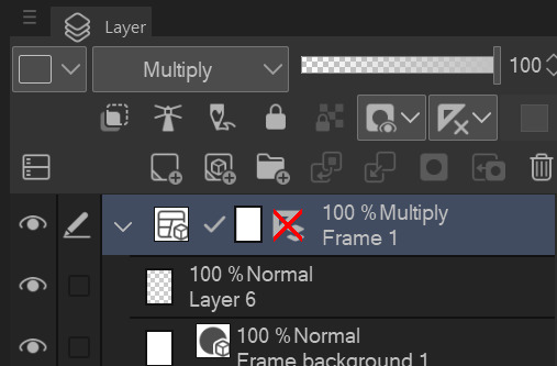
Now I want to turn it into a smart object except I have all these extra layers that I'm not going to be using. They're very simple to delete, the same way you would delete any other layer. Select them and click on the bin. (I said press. IDK why.) Then I scroll down to create my smart object. And finally I delete the layers at the end. So that's how you delete your frames prior to converting your layers into a smart object.
Part 2B
I saved a second copy of this gif with all fifty-one layers in my smart object and now I want to cut some of it to reduce the file size. To do that you'll be using the scissors icon: Split at Playhead (although I think of it as trimming). It allows you to cut your animation into multiple sections that you can then choose to delete.
When you have the playhead where you want it, click the scissors icon. (I said press again!) Now I have two animations — the original file name and the copy. Delete the extraneous part and move the remainder to the beginning of the timeline.
As you can see, if you look at the bottom of the window, this frame starts at 03:18. It goes through 19 and 20, and then at 03:21 it changes to a different frame. I'm going to cut there, which will remove from this frame onwards and retain the previous frame. Select the section to delete and click the bin icon. (I SAID PRESS AGAIN.)
In the previous tutorial, I mentioned that when you convert your frame animation into the video timeline, each layer in the timeline represents the frame plus the frame delay. Photoshop's animation speed is set to 30 fps and I've specified a 0.1 second frame delay, so that means every frame in this gif is visible for three frames in the video. At the bottom of the window you have the running time, which shows as seconds and frames. The 03:18 represents three seconds and eighteen frames into the animation. If I cut this at 03:19 or 03:20, the frame that spans 03:18 - 03:20 would appear in both cut sections, one at the beginning and one at the end, obviously.
The benefit of removing frames this way is that because it's a smart object and, as we know, a smart object is a vault, you will still have all fifty-one layers left in your smart object. So even though you've cut it up, it's all still in there.
Part 3
In this example I want to speed up a section in the middle of this shot. There's a bit in here between when he looks down and then when he looks back up that looks fine on screen but, watching it as a single gif, feels like it goes for too long. I don't want to cut the gif anywhere because it would be too obvious if I cut the middle out of it and it's a reaction shot and I want it in there.
I'm choosing frames 13 to 22 and I'm going to change the frame delay to 0.05 seconds, which is half the frame delay of the other frames.
It doesn't feel like it's dragging anymore, which it did before, in my opinion. His expression looks natural; there are no missing frames, so it doesn't look jerky; it's just that the little bit in the centre of the gif has been sped up so that the pause between him looking down and then looking back up has been shortened.
In different circumstances I might change every second frame or every third frame. It's really a case by case thing. There's no way to predict what you're going to want to do with any individual gif until you get it to this point and start looking at it as a single shot versus a shot in amongst a lot of other shots. There's a lot of difference between a series of shots that happen one after the other in continuity and those individual shots when you break them down and you're just looking at them one at a time.
And that's really all there is to it. It's just a matter of you deciding how you want your gif to look and then adjusting the frame delay accordingly. You just have to experiment and try things out and see what happens.
--
(baaaaa)
If you have any questions or you need something explained in more detail, please come talk to me on Tumblr. Next up, I'll finally be getting to editing.
2 notes
·
View notes
Text
rules: to show appreciation of gifmakers and how much they grow and what they do, post one of your first gifs and one of your most recent gifs, then tag some gifmakers to see how much they’ve grown and improved.
i was tagged by @smilecapsules! thank you so much sarah!
okay i couldnt decide on just two gifs to post, so this is really just gonna be a giant journey through all my gifmaking progress up to this point. for your sake, i have hid it under the read more.
if you want the tl;dr version, it can basically be summed up in that i went from this:
to this:
in just one year!
here is one of the first gifs i ever made:
back in 2016-2017 i used an app called gif toaster on my ipad to make super simple basic gifs from videos that i downloaded from youtube, with another ipad app that is not available anymore. this gif is important bc girl meets world (and specifically rilaya) is what made me want to gif in the first place! i was so inspired by all the beautiful, deep, creative edits made by the gmw fandom and wanted to make cool stuff of my own. i definitely had a phase where i edited the lyrics to girls like girls onto every wlw pairing i ever shipped.
next theres this one:
which is a sample from probably the worst gifset i have ever created. i dont delete anything ever, so if you go far enough back in my tag, its still there. i used to edit gifs frame by frame, with like 4 different apps/websites. that clover? i painstakingly added it in the same spot over and over to each individual frame!
and here’s the last pre-photoshop example i will include:
when i learned how to use overlays on lunapic and had a very prolific text post meme phase, which i mostly put to work on my andi mack sideblog. despite the absolutely awful quality, this gifset has more notes than most of the sets ive posted. descendants 2 was so fun to post about.
i pretty much took a year off from tumblr in 2018, stopped creating stuff for the most part, became disconnected from lots of my old online friends. BUT THEN a bitch came back better than ever and finally took the steps to start learning photoshop in the summer of 2019! here are some samples of things i made when i had just barely learned to use photoshop:
i started off with a gifset of my favorite band, bc ultimately my motiviation for making gifs always has and always will be to preserve the things i love the most. a few things to note here: i think i pretty much only added a brightness layer to this (bc i didnt know how to color yet), i hadnt heard of optimal dimensions so i didnt bother resizing this, and the image is vertically squished, which i didnt know how to fix at the time. i remember that it was a huge accomplishment for me to learn how to add text.
next we have this one:
where i started learning how to use brushes. i was very focused on the umbrella academy when i first started using photoshop, and i was determined to teach myself to add pretty colors to things!
but THIS is where i changed the game:
THIS is where it really started, folks! i had seen enough coloring tutorials to learn how to use selective color layers. and the first thing i did with them was oversaturate my cyans into oblivion. this was the best gif in the set, and everyone’s skin was super yellow toned in all the others.
from there i became more adventurous:
this sally gif marks a point in time where i started getting comfortable with my position as a gifmaker. i started to develop my coloring own style. but funnily enough, at this point, i still didnt know how to sharpen yet! i was still editing in frames instead of timeline, and i couldnt figure out what the people in tutorials were talking about when they mentioned timeline stuff.
in december i posted a hairspray gifset that i would define as the moment i learned and started mastering the vibrant coloring that i still do to this day:
after this i arrived at what i consider to be my current style in terms of coloring and creativity.
[warning, coming next is a massive dump of recent (since march) gifs that im very proud of]
so there you have it! i went from struggling and being very hard on myself for not having edits that i thought were as good as other people’s, to really finding my style and voice as a gifmaker. im so proud of how far ive come and everything im able to make and do now! if you are someone who is just starting out as a gifmaker, my advice to you is to not worry if what youre making isnt perfect! it takes a lot of work and practice to get to the place you wanna be, but definitely enjoy the journey, read lots of tutorials, and always try to keep learning!
im tagging: @ewangmcgregor @dancingwithourshandstied @colewald @asterflor @zu-ko @queenrojpag @stanzier @vangoghs @crayonstoperfume @tmhnks @diegohargreves @timeslord @gabriellabolton
29 notes
·
View notes
Text
The process and completion of the dialogue box.

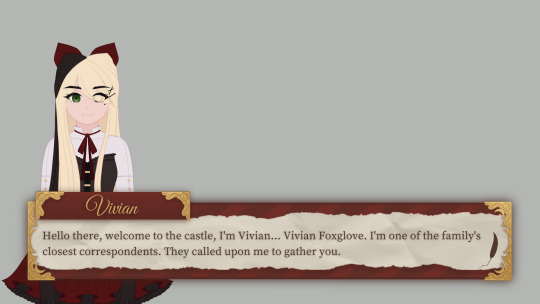
~ Hello there! Tokki here ~ Recently I completed the dialogue box asset, so I thought it'd be interesting to share what the very first prototype looked like! As well as share the concept art with you. The prototype was made in the quest to really jump into the game and then start developing it from there, it was a starting point. We knew we wanted our game to have dialogue and the ability to speak with different characters, so that's where we began. At first, I made a mock-up with it and then I provided Crisp with a blank version so that he could begin coding a dialogue system. It started off as green because that's both Crisp and I's favourite colour. The characters used for the demonstrations are currently my original characters, I'm using them as placeholders until we have official character portraits of our own characters. Tabitha was used at first, however, once a core aesthetic was decided Vivian made for a better placeholder visually. ( Thank you for your initial help though, Tabi! ) From then on, we started to discuss what kind of themes we wanted to have and what setting it would be in. After that, I started to have a lot of ideas in my head about what it would look like visually and decided on a specific, cohesive aesthetic. A victorian-inspired journal/diary. So I started to doodle until I fell in love with the look of something, and that's where the concept art was chosen as something to model off of. Part of my artistic process is working until I love what I've made, if I don't feel anything then it's not right yet. And if I've been working on it for a long time and I still feel nothing, I know it's time for me to change directions and try again. The chain was incorporated as part of an idea I had, where based upon the player's progress/relationship with the character they were speaking to, the chain would gradually weaken until it fell apart. It would have been to give the player a sense of progress, a reward for their work once it fell and a visual metaphor of the storyline. Ultimately, I decided that it was visually disruptive and based on the nature of a dialogue box, it would have just covered up the dialogue text. I think it was a neat idea, but I just didn't care for it and it would have posed a lot of problems. Honestly, though, I do much prefer how it looks without the chain. When I was working on creating the official, polished asset, I ended up adding some nice detailing on the golden frames as I wanted to give it a really unique character/style. If the story ends up in the direction that Crisp and I spoke of, the detailing will be visually representative of some of the story's concepts! At first, the assets did not have any shadows around them but I later added them to make them able to retain visual strength and not have any difficulty with the background art that was to be added in future. It shouldn't blend in, but it also shouldn't stand out. The shadows also helped to make sure everything was visually consistent as the selection boxes I later made also have them. ( Something I heard whilst researching UI was that what makes a good UI, in a way, is that it isn't noticeable at all. It should be so seamless and pleasant to interact with that it's something a player barely notices. ) I later took a ridiculous ( maybe to some ) amount of time deciding on the fonts. I'm very happy with the selection I made! I'm glad I spent so long on it, after all, I believe every single thing matters and adds to the visuals of a game. I believe that the right font can help make a game whilst the wrong one can help break it. ( I'm talking about you, comic sans. ) One font I really loved for the name title didn't have the right licences so unfortunately, I had to remove it and replace it with a different one. I wasn't sure about it at first but after I gave it some time, it grew on me! I really feel it adds to the victorian feel, I wanted to give the player the sense that they've 'been formally invited' to the location the game takes place in. I feel as though the nameplate feels like it honours the
characters that are speaking. Something about that pretty, gold, handwritten calligraphy feels special to me. I've been researching like my life depends on it, trying to learn as much as I can about UI design and UX and in my research, I came across a UI/UX designer that said there should be around 15-26 words per dialogue box because it's far easier on the reader. And it also allows the characters more chance to use different expressions alongside their dialogue. This totally opened my eyes as it was something I hadn't thought of before, and he's right! My prototypes were far too dialogue-heavy, so I resized the box to be smaller and that ended up making it look a lot more visually appealing, too. I was unsure about the character portrait sizes so I took a look at lots of visual novel games to see what they had done and I realised that my characters were scaled far too small. I personally didn't love the sizes that most games chose to go with, I find them to cover up too much of the screen, so I decided to go with my own in between. Not too big and not too small. The last thing I'd like to talk about is the indicator! After staring at our mock-ups intently for far too long, I couldn't help but feel as though something was missing like I could add one last thing to really perfect it. The cherry on top. And then it occurred to me that we're going to use an indicator to indicate that the dialogue is finished and you can click to see the next dialogue. So I played around with it for a bit and then I had the perfect idea! A quill!! What better way to add to the visuals of the dialogue box than to make the indicator a feather quill. I'm ridiculously in love with this detail and think it's the best idea I've had so far, haha. Sorry to write such a long post, but this is the first update I have and a lot ( not a ton but a significant amount ) has happened since the game's inception. My next updates should be a lot shorter, I just wanted to take you through the process and progress of how we've gotten to the place we are now. One thing I'd like to mention though is how important these small things are to me. I really truly believe that every single detail is incredibly important and that's why I take it all equally as seriously as I would with any other aspect of the game. I believe it all adds up eventually. If every single thing shines as an individual, the whole thing can shine together to make something beautiful. Every single thing is part of the game, so every single thing should be treated with care. I want that to show. I want the player to be able to look at this game and see straight away that a lot of love and effort went into it. Thank you for your time reading this, I hope you have a wonderful day and I hope that it was of some interest to you! ~ Tokki 🌸
1 note
·
View note
Text
gif tutorial for anon!
hi everyone! an anon asked me about how i sharpen my gifs and i got a bit carried away in my answer so i decided to just turn it into a tutorial oop.
disclaimer: i’m still a beginner, so some of the stuff i do might be a bit weird! also, two of the “tricks” i use i did not come up with/figure out on my own, i linked to the posts of the original creator’s in the step.
so my settings do vary for each gif, but in this tutorial i just go through all the general steps i use for each gif i make, so hopefully it’s at least a bit helpful to someone!!! there’s a lot of images bc i’m a visual leaner so sorry if you’re not!!!🥺
for this tutorial you will need:
- photoshop + basic photoshop understanding. - a way to download videos. - patience with my ramblings. - i think that’s it?
ok here we go!!! so.
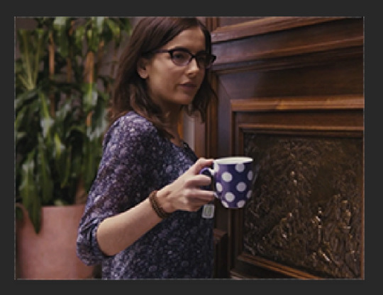
step one: the first thing you do is find the video you want to gif. i’m gonna do this one:

i use clipgrab to download videos of the youtube, which i downloaded for free from right here. i haven’t gotten a virus yet, so it seems safe. it works for youtube videos and instagram videos, but not twitter videos or vlives.
there’s also Y2Mate which is online and does the same thing, but i think for only youtube videos - i also can’t completely vouch for it because i’ve never used it, but i think it should work just fine! you can find it right here.
IMPORTANT - make sure that your video is as high quality as possible. you can either change that on youtube by clicking on the gear in the play bar (right next to cc box). usually videos are automatically set to 720p, which is pretty good, but i like to bump it up to 1080p when there’s the option to! note: clipgrab usually does this automatically for you, i’m not positive about Y2Mate and other online converters.
step two: copy the link into your converter. make sure that the quality is where you want it, then hit “grab this clip” or “convert” or whatever the prompt is and it will download onto your computer. save it wherever you want to that you’ll find it, i usually just save it to my desktop so that it’s right there for me.
step three (optional): i like to crop the video down and do a primary editing on imovie just so it’s easier to manage when making the gifs. this step isn’t necessary, but if you have imovie or another video editing app, i would suggest it!! (you can also slow down the video here if it’s too fast to make a good gif!)
here’s a before and after shot!

for me, i literally just click the “magic wand” or “auto-adjust” tool. but you can already see it makes a big difference!
so now i also use iMovie to crop down to the gifs i think i want to use. it makes things easier to be precise when using photoshop.
step three and a half: export your new mph. once again, make sure the quality and resolution is bumped up to your liking!

step four: so now it is time to use photoshop! open up a new document. you can set it to whatever dimensions you like, i typically prefer 500x281, but it doesn’t actually matter because it will automatically resize to the size of your video lol. anyways, once you have your canvas open, go to file -> import -> video frames to layers.
depending on if you have more than one gif in the movie file, you can either crop it down or just import the whole thing. since i have to gifs in this file, i’m going to crop it.

step five: okay, full credit to this life saving post for the next step!!!! i was stumped on how to edit all layers of a gif at once for quite a bit of time, which is why some of my earlier gifs are a much crustier looking. anyways, op explains it much better than i ever could, so i would suggest just reading their tutorial for this step!!!
step six: so now that you’ve combined all your gif layers into a smart object, it’s time to edit them!! the adjustments i typically mess around with are image -> adjustments. i almost always adjust the brightness/contrast, vibrance, hue/saturation, and selective color. i don’t have specific settings for these (sorry if that’s not helpful!) because it really does depend on each individual gif! sometimes my adjustments are drastically different for gifs from the same video!! i’m perfectly happy to help troubleshoot for specific issues if you need help, but it’s hard for me to give a blanket tutorial for this part :)
also remember to not whitewash poc when adjusting the settings. please don’t do this!!!! it’s also possible to correct whitewash w/photoshop, so just fool around on the settings until the subject’s skin tone is what it should be.
step seven: after adjusting your gif to your liking, now it’s time to actually sharpen. for steps 7 through 10, i use a trick from this amazing post to sharpen! so now that you’ve adjusted all your layers, do control/command click on the layer and choose duplicate layer. this will make a copy of the edited gif.
step eight: on the original layer, go to filter -> sharpen -> smart sharpen. once again, every gif is different so depending on the size and quality of your gif, the sharpen settings will be different. the larger the gif is, the more you can sharpen it, which is why i like to wait until the end to resize it!

step nine: on the copied layer go to filter -> blur -> gaussian blur. again, the amount of blur will depend on your gif. this step just smooths it out. don’t worry if it looks blurry, because it’s supposed to! after this, still on the copied layer, go to filter -> sharpers -> smart sharpen once more.

step ten: cool! now you’re going to lower the opacity of the copied layer! i usually put it at about 30 percent!
step eleven: go to file -> export -> safe for web (legacy). this is were the resizing goes! so for this particular gif, i didn’t have to crop it or anything. so the only think i do to resize it is make it 500x281. this size usually ensures it will be small enough to upload to tumblr, and it is a ratio of most standard sized videos so it works perfectly!!
and voila!
i’m so sorry if that was very long and/or hard to understand!!! please feel free to ask any clarifying questions!!
4 notes
·
View notes
Note
Hi. I need your help. I would like to know how you edit your gifs, please:(
i can’t speak for all the members but i personally use photoshop portable for gifmaking. i’ll put the rest under a cut because this might get quite long:
so first of all, i have the video file that i want to gif from downloaded on my computer and then open photoshop. then follow these steps. i usually click ‘selected range only’ and drag the arrows around the section of the video that i want to make into a gif and only import every 2 layers.
after that, you should have all the layers you want loaded into photoshop and if you click play, you should see that the gif plays. now we move onto resizing and editing the gif. essentially you’ll probably need to crop your image into the shape you want it to be and then resize the gif (using ‘image’ and ‘image size’) for tumblr dimensions. a list of which can be found on a google search.
now, you should convert the gif to a timeline, rather than a frame animation, which you can do by clicking on the little box containing three little squares at the bottom right of the animation window. then right click on one of the layers on the left hand side of your screen and select ‘select similar layers’ - this should highlight all the layers in this section. click ‘filters’ and then ‘convert to smart filters’ which will turn this gif into a smart object, allowing you to add any filters or sharpening effects to all the frames rather than trying to add them to each individual frame.
for sharpening, i usually do a smart sharpen and an unsharp mask so click on ‘filters’, ‘sharpen’, ‘smart sharpen’. my settings for this are usually 0.3 and 500% but people often have different settings so play around and see what looks best for you. then i add an unsharp max and set it to 36%. i then work on the colouring. i have a general colouring that i use on all my gifs which sadly i’m not willing to post here since i use it all the time, but i’ll describe my process. before adding any kind of colouring i try to colour correct the gif. for a show like legacies, a lot of the scenes can be really yellow, or really blue/green and most of the time, they’re dark. so i add a curves layer and click on the middle pointer at the left hand side of the tab which should be ‘set grey point’ or something similar, and i usually use teeth or eyeballs as a generic grey point in a gif. this kind of neutralises the colouring in the scene and makes it a little easier to work with when colouring. after that, i add a ‘levels’ layers and drag the pointers on the far right and the far left (Don’t touch the middle one) to the edges of the black shape that comes up.
now it’s time for the rest of the colouring. i don’t use that many layers, probably 5 or so, which starts with another curves layer to brighten the gif up. generally i don’t rely too much on this layer so i usually just drag the middle pointer up a tad, but play around with this depending on how bright you want your gif to be. the next layer i add is another levels layer so just do this time, what you did before with this layer but again, feel free to play around to achieve the desired effect you want. next up is colour balance. if you find that your gif is still too red, yellow or blue, use colour balance to offset this and neutralise the tones. afterwards i add a brightness and contrast layer. again play around with this depending on what effect you want but try to keep the number you raise the brightness to, and the number you raise the contrast to at a similar number so that the effect is more balanced, but the numbers are up to you. finally i add a vibrance layer which i generally set to 50 but again, depending on how you want your gif to look, you can play around with this number.
i hope this was a little helpful for you. i’ll probably do a full tutorial with screenshots one day if i get the time to work on one since i’ve been asked questions like this before but if you need any help with gif-making, feel free to send me a message and i’d be happy to help you out as much as i can. in the meantime, keep an eye out for a more in-depth tutorial.
3 notes
·
View notes
Note
hello jess! could u share how u make your gifs please?
Sure thing! It’s been a while since I’ve made a tutorial, so please bear with me. In the tutorial below the cut, I’ll show you how I make my GIFs. There’s a million different ways to make GIFs— I know 3 different ways myself— but I’ll show you how I go from a video clip and produce this in less than TEN STEPS!:
Also, TW for length! Please like/reblog this post if you found it helpful! // Buy me a coffee?
What You’ll Need:
Mac
Quicktime
Photoshop CC 2019 (or Photoshop version that allows Video to Frames conversion)
Movie or Video that you want to clip!
This ATN Pack, by yours truly! Please like/reblog this post if using!
Step One: Open Up Everything You’ll Need
Open up that video, movie or clip you want to GIF. Start up Quicktime & while you’re at it, Photoshop too. Did you download that ATN Pack (action pack)? If you did, open it up too (double-click is what I mean by open it up)!
Step Two: Screen-Record
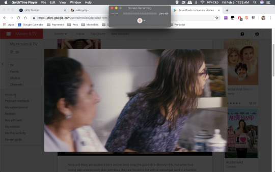
Go to the Quicktime application. In the top bar, open up the ‘File’ drop down and select ‘New Screen Recording’. You’ll get a pop up titled ‘Screen Recording’. Now if you did step one, then you should have the video/movie that you’re gonna record. I’m doing a small clip ‘From Prada to Nada’. Click the red recording button and you’ll get a message. That message says something along the lines of ‘click anywhere to record the entire screen OR click and drag to outline what area you want to record’. I like to click and drag to ONLY record the movie. You can see what that looks like, below.
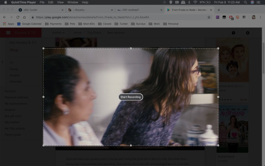
Great. Now start recording! NOTE(S): If you’re doing the whole movie, just set it and forget it; but make sure that the captions/subtitles are off & your laptop is plugged in or fully charged.
Once you’ve recorded whatever it is that you want to GIF, then go to the top bar again and on the righthand side, you’ll notice a small ☐ (stop button). Click it and save your recording!
Step Three: Video Frames To Layers
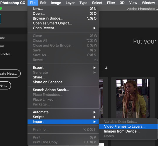
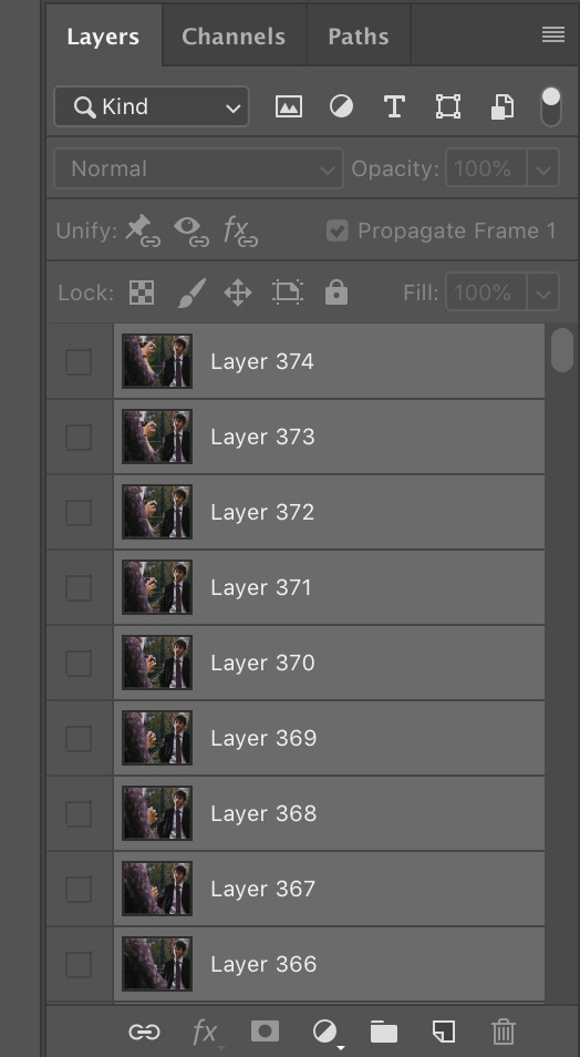
For the sake of keeping this tutorial quick and short, I did a very small clip! Photoshop should be open, so now what you want to do is click File > Import > Video Frames to Layers! Select the screen recording you just saved. After a minute or two (depending on size of recording), you’ll get this pop-up:
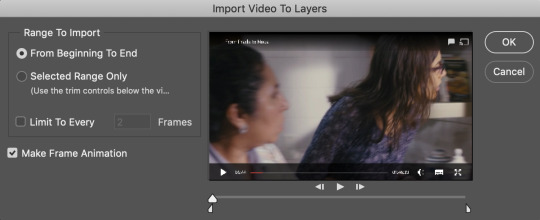
You have a couple of options here, you can choose to convert the entire clip by selecting the ‘From Beginning to End’ option OR convert only a specific scene/part of the video by selecting the ‘Selected Range Only’. For either of these options you have the option of limiting how often a frame actually gets converted— this is the ‘Limit To Every # Frames’ option that you see above. More frames = less of the scene, bigger file (remember Tumblr restricts GIFs to 3mb)! For the most part, I like to do Selected Range Only and I use the trim controls (the 2 funky looking triangles under the video preview) to select the scene I want. AND I check the box to limit frames and I change it from 2 to 7! See my settings below:

Select OK and give it a few seconds/minutes. Why I specifically prefer the video to layers option: it’s quick (usually), easy, and does most of the work for me. After it’s finished doing its thing, your screen should look like this:
NOTE(S): delete any frames and layers you don’t need/don’t want to GIF.
Step Four: Crop/Resize
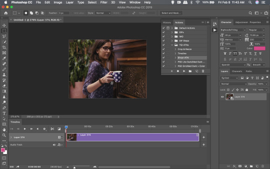
Several options here! on how to crop and or resize. My preference is to make GIFs that are 268px wide and about 150px in height, but the height can vary due to a number of things like the FC being in the background/part of a group. For this step and the ones that follow, be sure to have the actions menu open. If the action menu is not open, go to the top bar, then go to Window > Actions. It’ll open up on the side and if you did step one, then my action pack should be loaded on there!
Option 1: Select All (the entire image) by doing CMD + A.
You should get a dashed and moving outline around the entire image:
Option 2: Select a specific part of the image by using the rectangular marquee tool.
In case you don’t know what that is, it’s that dashed rectangle button that’s on the left panel:
Click it. Be sure that the Style is set to normal. Click and drag on the image to select the specific FC/area you want to GIF. NOTE(S): if your FC moves around a lot in the scene, then you do NOT want to do this option! The outline will not follow your FC. You should get a dashed and moving outline around your selection:
Now, open up the action menu by clicking the sideway triangle/play button that’s to the right of the preview. You should see my ATN Pack in there. Click the ‘>’ that’s next to my ATN Pack. It’ll reveal about 5 individual actions.
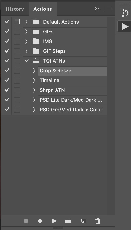
You’re going to select the ‘Crop & Resze’ action just by clicking it. Then press the play button under it. The image/GIF will now be cropped and resized to 268px wide with an auto adjustment on the height! This is what I ended up with:
Step Five: Video Timeline
Alrighty-roo. This step is a must. You’ll be focusing on the layer panel, which looks like this:
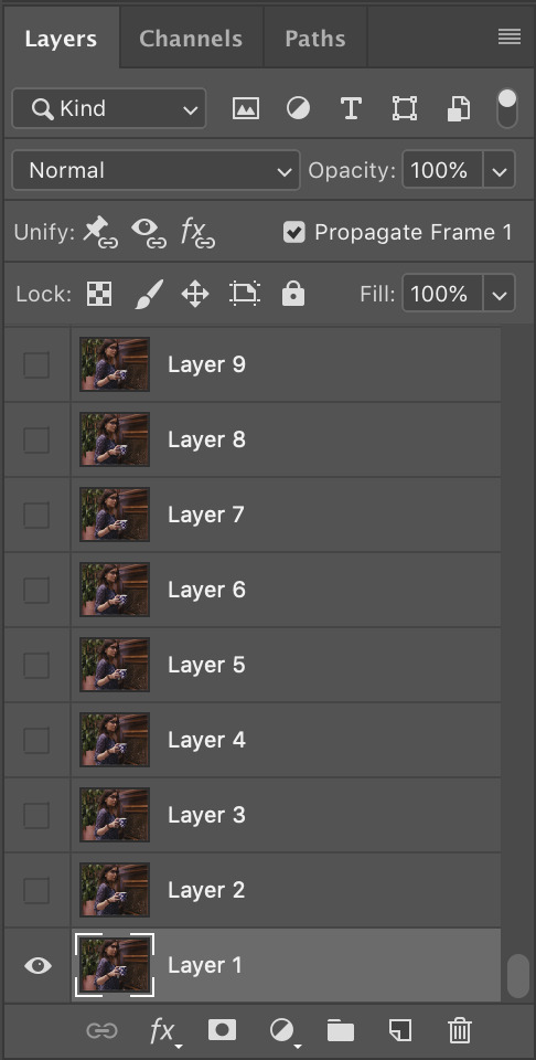
Select ALL LAYERS. Quickest and easiest way is to select Layer 1. Then hold down the SHIFT key and scroll to the top. Click the top layer and everything should be highlighted like so:
Great, now go back to the action menu and click the action that’s labelled ‘Timeline’.
Press the play button. And after it’s done, you should see something like this:
Step Six: Sharpen
Quick step. Back to the Actions menu. Click the action labelled ‘Shrpn ATN’ and press the play button. You’ll notice the Sorry, no preview for this, bc I forgot to screenshot. You’ll pretty much end up with a sharper/less blurry image.
Step Seven: Coloring
You can apply your coloring PSDs now. You’ll note that I included two coloring PSDs in my Pack. They’re pretty simple and, definitely won’t work with everything. For this GIF though? I actually liked the movie’s coloring. Everything I tried either made it look too grainy or whitewashy.
Step Eight: Save For Web
Quick shortcut: Press the CMD + Alt/Option + Shift + S keys at the same time. It’ll open up this window:
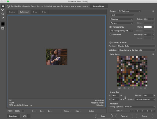
Take a look at my settings on the right. That first drop down has preloaded preset settings. The one you’re looking at on the screen is one I saved on my PS. From that drop down, you’re gonna want to select ‘GIF 128 Dithered’. Then, you have the option of using those preloaded settings or you can copy mine; I’d play around with em to see what works best for you. NOTE(S): The two things you MUST select are the GIF option from the second drop down AND the Forever option from the Looping Options drop down at the bottom.
°˖✧◝(⁰▿⁰)◜✧˖° And voila, you’re done! °˖✧◝(⁰▿⁰)◜✧˖°°˖✧◝(⁰▿⁰)◜✧˖° Found this helpful? please donate! °˖✧◝(⁰▿⁰)◜✧˖°
#tutorial#rph#photoshop tutorial#gif tutorial#dearindies#( anon. )#( answered. )#( inbox. )#( mine. )#( my resources. )#( requests. )#( my tutorials. )
16 notes
·
View notes
Text
Apps I Have On My Phone
I've always wanted to share this, in case anyone found these useful. I get particular apps based off of trial and error with other apps that fall short of what I was looking for. I like apps with great design, or even if it has poor design, with a lot of useful options. I hope you like this list!
Phone: Moto G5 Plus ( Android )
EVIE LAUNCHER
This launcher is simplistic, easy-to-use, and just so GREAT. Just say it like Tony the Tiger already, jeez. My favorite part about it is the search bar to search through the apps. I know other launchers have that feature and more, but I like the fact that Evie doesn't have too many options to choose from, I like the minimalist feel.
ICON PACKS ( I have like four )
I'm thinking about deleting all of them except the recent one I got. It's the only one I actually paid for, and it's really worth my money, sis. Here is the list ( so I can go back when I delete, * AHEM * )
– Pixel Pie Icon Pack
– Pixel Icon Pack
– CandyCons
– Borealis $$
Of course the italicized one is the one that's a keeper. The reason why I had three icon packs was because I wanted circular icons and sometimes one pack didn't have an icon for a particular app but another did one. I could've always used Adapticon for that but it never comes out right for me.
Borealis has squircle icons, more square that circle. The shape is rounded and actually I'm mostly okay with when some of my apps don't have an icon. The design is beautiful and it fits nicely with my moving wallpaper ( back to that later ).
WOLFRAM ALPHA
I actually barely use this app. At all. I've literally paid for this app that I've only used twice. Three times, max. But I have it feeling that it'll be super useful, and I've already skimmed over some of it's incredible features, like seeing a dog color perspective of an image. I'll probably use it when I'm super bored.
UNAPP
It's basically this app to uninstall multiple apps at once. It's really like doing it individually, or the normal way, but a little more convenient. Just try it and you'll see what I mean.
OVERDROP WEATHER
I literally use this to just for the widgets, they're so well-designed. I have the pro version.
MINECRAFT
Because why not? I play PvP modes and stuff, I like hanging out with other players and playing survival mode.
IMAGE SIZE — PHOTO RESIZER
This app is literally a LIFE-saver. I've always trouble finding a good app that let's you change the ratio of how you want to crop, relative to the previous ratio. It's good for cropping an image exactly for a frame, like if your need a 200 x 350 picture or something.
CALCULATOR KEYBOARD
This app is literally to support my laziness. Sometimes when I'm writing and quickly need to calculate something, I just switch keyboard and get my answer fast instead of having to switch apps. It sort of helps with lag.
AMPERE
I have this app because my shxt of a phone is acting up. It's just my battery calibration, I guess ( I don't even know anymore ), and I was like two seconds from factory resetting it but now it works P E R F E C T L Y.
Odd, right? (my phone probably shxtted it's pants )
Green text means it's charging, blue means it's not, and orange ( rare for me ) means it's discharging. It's helpful if your battery sign at the top says it's charging when it's not even plugged in and you need to check.
Here are some screenshots of my home screen.
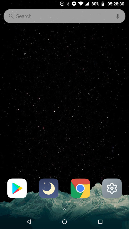


Yes, I have to music players, Spotify and Stellio. The later is for local audio.
The reason I set the time for 24hrs and with the seconds is just because I can. I like the uniqueness, I guess, lol.
#billiejeanisnotmylovershesjustagirlwhothinksthatiamtheonebutthekidisnotmyson
3 notes
·
View notes
Video
youtube
tree Explains Things 01: SnapMotion
In this tutorial I talk about using SnapMotion to create caps from video clips for the purpose of making gifs. (I recommend viewing this on YouTube for better quality and a larger video size.)
Please note that I'm not affiliated with SnapMotion or its creator in any way and there's nothing in it for me if you choose to purchase SnapMotion for yourself. Obviously, I recommend it, but do investigate your options, as there may be something out there that's better suited to you.
(This transcript is approximately 60% accurate to the tutorial and 40% me condensing my waffle into more sensible narration.)
--
SnapMotion is a Mac OS X program available to buy at the App Store. (As far as I'm aware, there are no releases for any other operating system.) It's fairly inexpensive: AUD $7.99 when I bought it two years ago. (In the video I said $12, from memory, but then I looked up the receipt email to confirm and found myself $4.01 wrong.) Considering that I've made thousands and thousands of caps in the couple of years I've been using it, I've definitely gotten my money's worth.
SnapMotion has two modes: what I call photo mode and then batch mode. Photo mode is good for one or two caps, but to extract caps in bulk you'll be using batch mode. (Something I forgot to mention in the video is that dragging your file to the SnapMotion icon will open it in photo mode by default. In order to access batch mode, you have to open the program and select it.)
Selecting Show Batch Mode takes you to the batch mode work space. Here you can drag and drop your clip or click the plus sign to add it. Once you've loaded a clip, select it in order to access the Add Batch Tasks menu.
One of the things that I particularly like about this program is that all the information you need about the file is clearly set out. In particular, it shows you how many frames per second you're working with. This is important because the fps rate determines how many frames you want to extract from a clip.
--
Why? Because math.
All the sources I've worked with have an fps rate of either 24 or 60. That number tells you how many individual images are contained in one second of video. Obviously, there's a considerable difference between 24 and 60, and that affects how many frames you choose to extract.
I've found I get the best results by extracting every other frame from 24 fps sources and every fifth frame from 60 fps sources. So:
24 fps = 2 (or 1/2 ← why does Tumblr do that?? I hate that!) 60 fps = 5 (or 1/5)
(That gives you roughly 12 caps per second for both sources. I say 'roughly' because, as you can see on my screen, the fps rate is rounded to the nearest whole number. 24 fps is actually 23.7 fps, so that missing .03 can have a cumulative effect.)
I find this is the best compromise between having smooth, natural looking motion in your gifs and keeping your file size within Tumblr's constraints. (I'll talk more about that in the next tutorial.)
--
Tools
The green bar is obviously your clip timeline. The cursor defaults to being in the centre for some reason. You have start and end caps (or whatever you call them) that define the start and end points of your extraction. The left and right arrow|bar buttons move your cursor to the start or end cap respectively, and between them is the play button. To the left are the transformation options. I've never used them, so I don't know what they do. (If you decide to experiment, please report back about your results!) To the right of that is the volume icon, which allows you to hear sound from your clip during playback. I don't find it useful, so I don't bother. The tortoise icon allows you to adjust the speed of your playback (left is slower, right is faster in case that’s not obvious). The arrowheads on the far right move your playback cursor to the start and end caps respectively.
Add Batch Tasks
This is where you specify the parameters for the batch.
Mode: there are four options. I primarily use Every X Frames. As this is a 24 fps source, I want to extract every 2 frames, so I use the value 2. When I type my value in and then press tab, the bottom of the panel shows the number of frames that will be generated from my selection. If I process this selection, SnapMotion will create twenty-five images. But because I moved the start and end caps earlier, and I actually want to extract frames from the whole clip, I need to adjust them. When I tab through my X value again, I see an updated number of generated frames.
I always include the Starting and Ending frames because I trim my clips to the exact frames I want (unless I'm being lazy).
Max size: This refers to the width of the image in pixels. (Technically, it refers to the maximum size of the largest dimension, but since video sources are universally landscape oriented, for our purposes this number will always refer to the width.) The default setting is 4,000 pixels and since the source clip is 1920 pixels wide my caps are going to remain 1920 pixels wide. However, if you know what width you want your eventual gif to be and you don't want to go through the extra step of resizing it in Photoshop, you can use this setting to do that for you. For example, if you want your gif to be 540 pixels wide you would enter 540 in this field. When you process this batch, SnapMotion will resize each frame it extracts to a width of 540 pixels with a proportional height. (Yeah, I said width at first and then I had trouble getting out the word height. Talking is hard!)
I don't use this feature simply because sometimes I change my mind, and I would have to rerun the batch if I did. (This isn't a big deal for a single shot like this, but if you're working with a whole scene that contains hundreds of frames, it's a hassle.) I also reuse caps sometimes. As you probably know, if you follow my Longmire gifs, sometimes I do a full scene using small gifs and then I go back and do large versions of some of the Vic shots. (Because I love her so.) And sometimes I make other graphics. In those situations, I want the image at its original size, so that I can resize or crop it the way I want.
Format: I prefer PNG.
Override: this tells the program what to do when a file with the same name already exists in the destination folder. The options are Replace existing files or Use alternative name. They're probably fairly self-explanatory (but just in case, I included a note).
Errors: I don't think I've ever had an error in this program. You can choose to generate a log file with each batch, but I kept getting logs that said "no errors" every time I ran one and it was annoying having to constantly delete them, so I switched to No error handling.
Headline/Credit: I believe this is like watermarking your images. If you want to watermark your gifs (I honestly don't see the point but some people do it), I think it'd be a lot easier to do it in Photoshop (or whatever program you use for image editing).
Export: this is where you specify the destination for your extracted image files. Click Choose to open the menu from here. Alternatively, when you're ready to process a batch, click the red button (aka the "Do the Thing" button according to me when I recorded this), and if there is no destination already specified, it will prompt you for a location.
Once you've clicked the Do the Thing button (yeah, I'm just leaning into it now), SnapMotion will display Task Added. If you look at the top of the window, you'll see a progress bar showing the percentage of completion as it processes.
When the images are fully exported, you'll see All Tasks Done and also an alert if you've selected that in your preferences (which I haven't gotten to yet but it's coming up). If you go to the destination folder, you'll find all the images that have been extracted. That's it!
--
I want to address the syntax for how files are named because I found the options very confusing to begin with. The default syntax made no sense to me and it took me a while to configure something that did. File names are defined in the program preferences, so go to the SnapMotion menu, select Preferences, then select the Batch tab.
Number of concurrent snaps: how many frames should be extracted at the same time. This has an impact on your RAM usage and also impacts how long it takes a batch to run.
Alert users with: this is where you choose whether or not you want a notification outside the program. It's useful if you're running a larger batch in the background and therefore don't see the All Tasks Done message.
Output name format: these are the elements I use:
<movie_name> = the title of your clip file
hyphen
<time_seconds> = the actual second position of the frame within the clip; for example, a frame that was extracted at 14s would be numbered beginning with 14. This parameter converts durations of 1 minute+ into seconds, e.g. 60, 61, etc.
<frame _index> = the running number of the frames extracted in the batch, beginning at 1. The position of this number depends on the total number of frames you're extracting. From 1 to 99 frames, the number will be 01; from 100 to 999 frames, the number will be 001. I've never extracted more than 1,000 frames, but I assume in that situation you'd begin with 0001.
If I were extracting 40 frames from my clip beginning at 14s, then the numerical portion of my file names would start at 1401. If I were extracting 120 frames, then the numerical portion of my file names would start at 14001.
<image_extension> = the file format you've specified
So, my file names are constructed like this:
<movie_name>-<time_seconds><frame _index>.<image_extension>
And the files from the batch I've just run look like this if you separate the elements:
1x05_2206 - 0 01 . png
In this batch, the seconds run from 0 to 3 and there are 34 frames in total. The first number column represents <time_seconds>, while columns two and three combined represent <frame_index>. You can see that the numbers in columns two and three are sequential from 1-34, whereas the numbers in column one aren't. That's because I've extracted multiple frames per second. Caps 1-7 were extracted from the first second of the clip, caps 8-18 from the second, caps 19-31 from the third, and caps 32-34 from the fraction of the fourth second.
This naming system is what works for me, but you should experiment with the options so that you can construct file names that work best for you.
--
The last couple of things:
You can import multiple clips either individually or at the same time.
You can delete a clip by selecting it and clicking the minus button.
--
And that's SnapMotion!
If anything is unclear or I've omitted something that you wanted to know about, please let me know. Thanks for watching and listening (and reading). Next up, I’ll be explaining the process of importing your caps into Photoshop and creating your gif file.
2 notes
·
View notes
Photo


Quilt # 10 - The Twelve Days of Christmas
Size: 90" x 108"
Completed: June 1982
This quilt was inspired by a Hallmark ® Company Christmas card. It became one of the most intricate ones that I worked on, and went through several transitions of size, placement, and arrangement before I settled on the final design. The first consideration was that it was a ‘lateral’ card to be translated into a ‘vertical’ quilt, and did not have borders (see last picture}.
The individual card blocks were colorful and charming; they screamed to be translated into appliqué. In my preliminary sketches I carried out the complete card design, but somewhere during the process I decided that the Pipers and Drummers blocks were too plain: a pipe with ribbons and a military drum. I decided to change them into a block with a human playing the instruments and attempted to match the original artist's concept of design.
It was the borders of this quilt that changed the most often: how big and what scale and what to quilt in them. This quilt was originally sized with the extra border to 'tuck under the pillows', but I felt that wasted too much of the top space. The four repeated corner blocks were changed to two large and two smaller blocks and everything resized again so that the twelve appliquéd blocks would cover the mattress surface. Once that was decided, I drew the block designs full-sized and started cutting appliqué pieces.
I decided at this time that the title of the quilt would be part of the quilting design, and also decided that the lettering would be in 'Olde English' as befitted the carol. Since I knew there would be no way to draw the border designs in once it was put into the quilt frame, I used 'disappearing carbon paper' in red and green to trace the quilting designs onto the long borders. This would later turn out to be a grave mistake. I knew I would be quilting the red and green narrow borders with a plastic template of a cable design, marking them (and removing them) as I went along.
My notes show that one of my original considerations was to quilt a specific border around the edge of each block, such as eggs for the hens and the geese, shoes for the dancing Ladies, and footprints for the Lords A’ Leaping. This was also simplified using a pre-cut plastic stencil of a heart border, marking it in with a blue disappearing ink pen. I decided on fifty-two hearts per block, one for each week of the year. The background quilting would consist of connecting the tips of the hearts to make a quilted diamond background. Everything started to fall into place. It was a lot of work. When I needed a break from this project, I would work on the embroidery of quilt #9.
It was great fun finding appropriate fabrics to duplicate the card designs. There are also embroidered detail such as French Knots and chain stitching for some of the small details that could not translate into appliqué, even in an eighteen-inch square block. Once I completed the appliqués, I assembled the top and began quilting in earnest somewhere in the autumn of 1981.
It was during the quilting that I discovered a major problem: the 'disappearing carbon paper' did NOT disappear! Unlike the blue disappearing pens that I was using to mark the quilting design on the blocks, when I was finished quilting a letter on the borders no amount of dabbing the marks with a wet cotton swab would make the marks go away! A slide taken in April 1982 labeled 'Quilting Disaster' shows the almost completed quilt draped over chairs. I had finally taken to spraying water on the marks and drying the stain with a hair dryer to soften the lines. I was only moderately successful. Knowing that many quilts still bear the markings of their designs, I decided to let them remain. This would also be a mistake on my part.
Soon after its completion, this quilt and several pieces of mine would be packed off to the National Quilting Association (NQA) Show #13 in New Orleans. Perhaps the number '13' should have been a warning. When I arrived at the show (not exactly an event a lot of men would attend) I was met by then-president Alice Skarda who was so enthusiastic about my quilt! She dragged me down several rows of quilts to my Twelve Days of Christmas quilt - which I was surprised DID NOT have any kind of ribbon hanging from it. (Grandmother's Fan-tasy would win a third prize at the same show). Hanging fully open on the quilt stands, I was finally actually able to stand back and see the entire quilt at arms' length for the first time; it looked dirty. The red and green carbon paper ink was carried as far away as the water diluted it, and when it dried, it noticeably discolored the muslin. I was crushed. I had high hopes for this quilt.
Still, Alice was enthusiastic about the quilt and asked about obtaining the designs. I ended up donating the designs to the NQA after the show. While at the show, I bought a bottle of liquid quilt soap.
Once I returned home and my quilts arrived safely, I was faced with the decision of washing the quilt top. With my heart in my mouth I filled the bathtub with warm water and the quilt soap and slowly lowered the quilt (soon to be appraised at $1000) into the tub. I spent several minutes hand agitating the quilt up and down, hoping the cotton fabrics would not run, and hoping that the stains from the carbon paper would truly disappear. After two or three clear rinses, I squeezed as much water from the quilt as I could and carried it outside to dry flat on clean sheets. That was the one and only time this quilt was washed; it dramatically improved the quilt's appearance, too late to win a prize at a national show.
This quilt was appraised for $1000 by a professional appraiser.
Owner: the quilter
Condition: excellent; washed once to remove quilting markings
Please check my archive for more pictures of my quilts, quilting, wall hangings, hoops, and patchwork clothing.
Exhibitions & Prizes:
1982 - NQA #13 - New Orleans, LA
Goshen, CT Fair - First Prize
Bethlehem CT, Fair - First Prize
Mad River Fair (Waterbury, CT) - First Prize and Best of Show
Rita's Quilt 'n' Sew Center (New Mexico) – prizewinner
1983 - NSQG World of Quilts #4
Thames River Quilt Show
First United Methodist Church Show
Westerly, RI Quilt Show
1984 - Connecticut Agricultural Fair - First Prize and Best of Show
Festival of Quilts #3 - Southington, CT
Warwick, NY show
1985 - Ivoryton, CT ‘Quilt Heaven’ show
Magazine Pictures and/or Articles:
QUILT, Winter 1983 p 18-19 “Getting Your Quilt Appraised” includes a B/W picture of The Twelve Days of Christmas, ‘how-to’ article on appraisals. The reprint of this article in Best of Quilt 1984 does not include the picture.
Books the author appears in (1989):
Gallery of American Quilts 1860-1989; Book 2” – published by the American Quilter’s Society. A full-color picture of Quilt #10 appears on page 21.
#Christmas quilt#twelve days of chrstmas#12 days of christmas#quilt#quilts#quilting#hand applique#hand quilting#handmade#applique#needlework#needle art#needle craft#crafts#handicrafts#hand stitched#gay stitcher#gay fiber artist
3 notes
·
View notes
Text
me trying to make a gif part 2 (thrilling finale, buildup ver.)
ok good news and bad news: good news being withheld for Spoilers (not that it’s that hard to guess anyway lol), bad news explained first bc, chronologically, it is first
so yesterday i mentioned in the tags of that post that i had seen that krita has an animation feature so i was gonna try importing the frames into that and then exporting it as a gif. easier said than done, as it turns out
i started by opening the file i made yesterday with 62 layers as the frames and importing that into krita, which worked fine (i didn’t know you could actually open .psd files in clip stuido ((this typo is so fucking stupid it made me laugh so im leaving it)) and krita, so that’s pretty neat, i wonder if it works the other way around too) but i ran into problems when i tried to convert those layers into frames in an animation. because, like, the layout of the program has the layers displayed in one tab, and the animation timeline in another, like so:
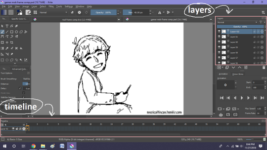
(do u like how im using pictures now, i thought of that yesterday after i published the other post and realized hey, visual reference would probably make my plight a lot easier to understand!! so enjoy these educational diagrams from now on)
so my goal was to get the frames from the layers into the timeline, and i still don’t know if i did it right bc lbr krita is not very intuitive at all,,.,, i mean i watched a video tutorial abt how to animate in krita which was v helpful (it’s the one by jesse j james on yt fuckin SHout out) but it was about animating from scratch, not importing an animation you’ve already done elsewhere
so like, the way krita’s animation thing works, from what i could piece together as i bumbled my way around w/ it, is that each layer in the layers tab is a separate timeline in the,,, timeline tab
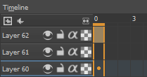
i want them all to be in the same timeline, not separate ones, and there’s no way to combine them in the timeline tab bc doing that just overwrites whatever layer you’re pasting it down onto, and also if you define the number of frames for that timeline (62 for this project) it just puts the single image of that layer for all of the frames instead of just one of them, so you’d have to go through and delete all the other frames you don’t want it to be, which would be such a fuckin pain
so i found a workaround, which is so tedious that it can’t be the right way to do it, but basically i started w/ layer 1 and defined 62 frames & then emptied frames 2-62, like this

(that blue box is the frame, btw, even tho it says 0, which actually kind of annoys me like why doesn’t it start the first frame on 1????)
from there i went up to layer two and selected that in the timeline, but for some reason the frame doesn’t show up automatically?

& i couldnt fuckin figure out how to make it into like, an Official Timeline Layer or whatever tf bc like, u see on layer 1 how theres that little lightbulb-looking icon on the right? that’s for turning on onion skin which only applies when you actually have frames with things drawn on them, so basically layer 2 in the layers tab has a drawing but in the timeline it doesn’t?
i didn’t find out what the actual reason for this is or how you’re /supposed/ to make the frame appear in the timeline, but what i did was right click on layer 2′s timeline & select “create blank frame” which magically made the frame i want appear
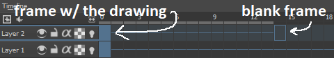
but it’s on top of the layer 1 frame, and i want it to be the frame after. also it’s still in a different timeline. this is the only easy fix in this whole damn process, u can literally just click & drag the frame from layer 2 to layer 1 and put it wherever u want on the timeline

and then u just delete layer 2 and that’s it, frame transferred!! then i just had to do that for 60 more layers and after [unspecified amount of time but it was a fuckin while ok] my timeline looked like this!

(the gaps near the end are held frames, to save me time so i didn’t have to copy a bunch of frames that were exactly the same)
krita is great because as far as i know ur animation can have an unlimited number of frames, at the risk of your own pc’s processing power, which is a definite upside to SOME expensive art programs i know (clip studio, i’m talking abt csp) and u can pick the frame rate too (cough photoshop elements 5.0 even tho u dont technically have an animation feature & it’s a miracle u can even make gifs at all) so once i finally got all the frames situated all nice and in order like on the same timeline, playing it was great! played at the right speed, looped perfectly, it was a dream come true right
well, time to export it as a gif
ha
haha
hoooo oo o
so u got 2 options for exporting ur animation, u can either hit “export,” which lets u save it as different file types, one of which being gif, or you can hit “render,” which gives you gif and video options
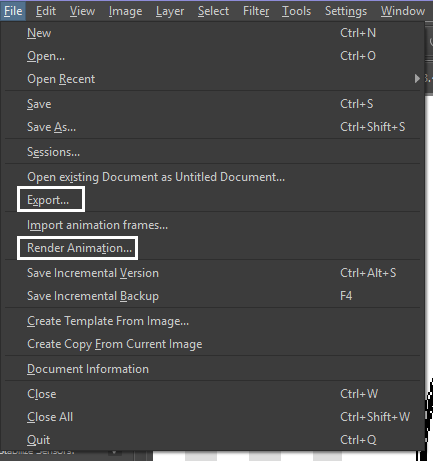
well
i tried export first, bc that seemed like a good idea, but the “””gif””” it made was distinctly not a gif, despite its claim to be one?? this is what i got:

notice: 1. it is not moving, and 2. the black bars to the sides?? those are supposed to be transparent. they’re transparent in the file i made so why didn’t they register as transparent in the export, when gifs have transparency capabilities??

so That was some real live bullshit but i still had the “render” option, right? export was wrong, so rrender must be the correct option to go to that will produce the results i am wanting to see produced in front of me like a silver dinner platter with a correctly functioning gif under the lid, that’s what i want to see and “Render Animation...” is gonna Give me that silver platter righWRONG ok look at this shit rn ok Look
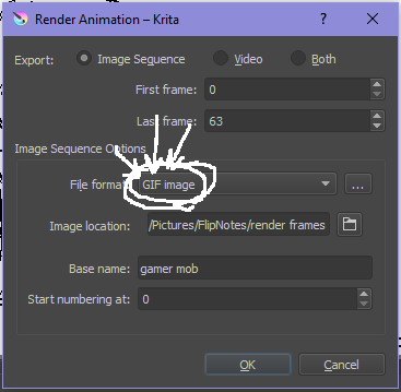
it says GIF it says it RIGHT THERE right??? right?????? then WHY

?????????????
and it also gave me all This bullshit
like did i ask?? did i fucking ask???? i already have all the individual frames why do i need even M o re i mfjgjgk
((rationally ok yea thats v useful for if ur making the animation in krita and want to export the frames to use elsewhere, but like uhhh 1. again, they’re not transparent & 2. i should have the option of saying i don’t want these??? bc *meme voice* i don’t want these)
so in the end i could find NO correct method of exporting animations as a gif in krita bc every ooption that says gif is fuckign LYING to ur face there are NO gifs in krita, aliens made the progam who looked at gifs and went “hmm i thikng this is how a gif works “ and just made jpegs instead but somehow got on the computers good side and got it to lie for them about it being a gif so thats why it says gif on the file still even tho its not a gif illimati confinr
so what is the conclusion to this? well i said there was good news too, and this is the portion where i divulge that sweet nectar (i type dthis 2 seconds ago and @ me what the fuck)
so after wasting a good 2 hours trying to figure out krita i gave up and watched some good old [youtuber name redacted bc what if it shows up in search & ppl see this dumbass post in there but it rhymes with fjackfsepticfeye] to relax into accepting my fate that i’ll never be able to upload my animations to tungle except in poor quality loopless video form, making me into a laughing stock on my own art blog, but THEN i had a stroke of genius, in my Brain
so if u read yesterday’s post u might remember that flipnote studio, the animation program i use on my ds, to animate, has the option to export files as gifs, both animated and sequential (meaning either as one fully animated gif or each individual frame separately), which is super convenient, but as i mentioned yesterday, any time i tried to open the folder with those files on my laptop, it crashed immediately
WELL today i thought “hey, how about instead of opening the folder in the sd card when it’s plugged in, how about i copy that folder from the sd card to my flash drive, and try to open it there, in case it’s the card’s hardware that’s causing the problem, not corrupted files”
so i tried that and it FUCKING WORKED THANK GOD GLORY HALLELUJAH
so now instead of spedning A THOUSAND YEARS trying and failing to force art programs to bend to my will i can just export the animations straight from my ds and drag them onto my computer Just As God Intended oh GOD im so fucking happy
here’s the gif in the end, i’m gonna post it to my art blog too but this is the Green Version bc i animate in green bc of some default settings in flipnote that i got used to, plus it makes me feel like i’m just sketching so nothing really has to be finalized so i’m comfortable while i work, and also it’s just nice ok it’s a Nice Green
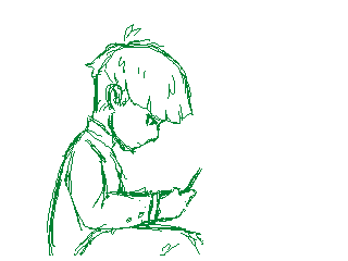
(there’s a few frames at the end that are like the extra scraps from while i was working dw i got rid of those in the final version that i’m posting to my art blog later. also i added my blog url to that one too it’s aaaaaall good)
the only downside to this method is that i can’t change the canvas size to be 540px wide to fit with tumbrl s image dimensions but whatever i can just post them in a text post and fix the html to display it at its original size instead of the resizing bullshit tmurbl pulls constantly ugh. anyway it works great on desktop but it’s inevitably gonna look like shit on mobile no matter what i do *Big Ass Shrug*
anyway thats the end of my success story uhh i can’t make the like comment & subscribe joke again bc i already did that in the last post so like bye i guess thanks 4 watchign & have a great day i’ll see u in my next fvideo
https://www.youtube.com/watch?v=YYob4uDjEKI&t=0s
(^that’s my outro music)
#this started out so boring like a tutorial (but made by someone who doesn't know what the fuck theyre talking abt)#& then things derail Real Quick#that's why this is the ''buildup ver.''#retag later#talkin bout stuff#today posts#rieley's wips#(me: i can't mention this youtuber by name in case my post shows up in search#me: *adds a link to the post rendering that effort for naught*#me: *leaves it anyway bc it's funny*)#pls listen to the outro musi c it's rly good & tunmgmldnr wouldnt let me embed the video & idk how to do it thru html & too lazy to look it#up :(
2 notes
·
View notes
Text
Task 3 - Producing the Animations
Since I have the most experience with Unity I used it as the game engine of my choice for interactive animation. At first, I though that I could directly transfer the AI character files into Unity, I found that unlike Photoshop there is no concise method unless the character is frame by frame or a single image. So, to fix this problem I opened Photoshop files with transparent background and started using CTRL + C and CTRL + V to transfer each individual piece into Photoshop, to retain as much resolution as possible I made pasted images Smart Objects so that I could resize the character and not loose resolution.
At first, I though a normal Psd file would work and I had even imported it into Unity, it is only later that I found out that it needed to be a PSB file. After changing the file type I then imported it. I selected the file in the Assets folder and after making sure the settings were as they were supposed to be, Multiple and having Character Rig selected I went into Sprite Editor > Skinning Editor. From there I used Create Bones to make the main bones of the character, it took me a while to get used to this editor since I either was unable to delete bones which I made by mistake or because I did not understand how to limit the influence of bones I was moving parts during testing that I didn’t want to. It was only after getting use to understanding and what the Bone Influence (adding and removing which bones would influence that part of the character), Auto Weights and Weights Brush that I was able to create a good rig.

From there I went into the Scene tab to see how it would look. I selected the Cute Character (2) object in the list went to Add Component > IK Manager 2D. I then created a Limb Solver, renamed is Arm_R_Solver, dragged the HandR to the Effector tab > clicked on Create Target and then checked the Flip box. I repeated this process for the Left Arm and the Ponytail. I created a limb solver for the right leg and named it Leg_R_Solver, I dragged the FootR into the Effector and then clicked Create Target, I repeated this process for the left leg. I then used the Move tool to pull the effector circles away from the rig, I moved the circles to just above the move tool.
To start the animation I selected the Cute Character (2) object and went to the Animation tab at the bottom and clicked Create Animation, I created a folder for Animations only and named it Skip_anim. I selected the red button in the Animation section and started to move the rig in different positions across the timeline, once I completed the rig I switched the red button off. I would then go to the drop down next to the name of the animation then click Create New Clip to make the next sequence, I did this with every animation of this character. To determine how I would place the character I would use the basic poses sheet that I created that depicted all the poses of each character and their animation states as a guide.

When creating character rigs I still had a lot of trouble, mostly due to how the placed limbs in the psb file would not be placed in that perfect manner that allowed for smoother-looking animation, mostly this was because of my personal idea of what I wanted them to look like. I also found that this could also be due to how the bones themselves were placed in the Skinning Editor so I would also start to get into the habit of constantly reviewing the basic movements with Preview Pose to see if the movement is as smooth as I wanted it, if not I would use Edit Bones to move the pivot into a different position.
Sneaky Character Rigged Animation Demonstration:
https://youtu.be/GSGiOwOf_GU
When it came to certain rigs, namely the Lizard and Sneaky characters, I actually had a bit of issues when it came to them in two areas, namely the rigging and the solvers. When it came to the rig it took me an especially long time to find a way to make the character’s extra features move in the manner I was aiming for, especially for the Sneaky character. The trouble was in rigging the Sneaky Character’s trench coat tails, when animating I wanted to make it so that the tails could flap and move so that I could implement the Principle of Secondary Action. It took a while to not only find the perfect placement of the base bone’s pivot but also to see how many bones would be needed so that when moving the tails it would have a nice and varied movements. The same problem came about when I was creating the tail bones for the Lizard character. I had to experiment quite a bit to find out how many bones where needed to get the best and more fluid movements.
The second issue I came across concerned the rigs solvers of both characters, namely the one for the Lizard Character’s tail and the Sneaky Character’s trench coat tails. Using the normal Limb solvers on these parts made the entirety of the rig warped and even turned it upside down. I did come across the solution, after much experimentation, which was to basically use a different type of Solver. For the entirety of the characters I had been using the Limb Solver, so I tried to use a different Solver, that of the Chain Solver.
I went to the IK Manager > Add Solver > Chain, in the chain solver menu I selected the bone that was the tip of the tail and dragged it to the Effector tab. I then put in the number 6 in the Chain Length, this would be telling the Unity system that this Solver would effect 6 bones in total, the connection was visually confirmed to me when the black circles in the bones I wanted to move turned green. To confirm this I clicked Create Target, once I was able to test that this method did in fact work with no negative repercussions to the rest of the rig I renamed the solver Tail_Solver.
I went into the project which hosted the Sneaky Character and tried to see if implementing the Chain Solver will also work on the trench coat tails. Like the Lizard, I dragged the end bone of the tail into the Effector and made the Chain Length 3, since there were 3 bones only Influencing the right trench coat tail. I clicked Create Target and tested out the new solver, when I saw that it worked I renamed it TrenchR_Solver. I repeated this process for the TrenchL_Solver.

I did come across a very persistent problem, that of updating the psb file in Unity. When I tried to do so, by moving the sprite’s parts in different positions, I always came to the same conclusion, the sprite in the game would be irreversibly messed up and miss different pieces. This led to me deleting the psb file in Unity, updating the original and then putting the original back in Unity. Curiously, I discovered a sort of loophole to this issue. When animating the Lizard character, I discovered that the back leg was in front of the tail, when it should be behind. So, reluctantly I opened the psb file in Unity and moved the layers around until the left leg was behind the tail. It updated in Unity and to my surprise just fixed the issue without messing the sprite, this showed me that moving the layers around is acceptable and will not mess with the rigging or the sprite.
Before I had started the Lizard and Sneaky character animations I came across a little fact, that it is better that the animations of characters are made in the same sport, with only little deviations for specific animations like jumping and such. At this point I had already finished the animations of the Cute and Hot-headed characters, so I was quite ironically amused by this.
So, I started and finished the animation sequences for both the Sneaky and Lizard characters, keeping this in mind. Once I had completed them I went back to the Cute and Hot-Headed Characters animation’s and fixed them so that all the character’s movements would take place at the same point.

Fixing Framework Placement:
https://youtu.be/KqJ-f_-ExOU
Animation Reels of All Characters
https://youtu.be/b0db6IP2mwg - Sneaky Character
https://youtu.be/fZHxMfjRg_c - Lizard Character
https://youtu.be/AIw6jzPvwJA - Hot-Headed Character
https://youtu.be/KxKoHYKhf4g - Cute Character
Since I managed to finish all animations of the different characters before the deadline, I moved on to creating the animations that I wanted to try. These were the spin animations for the cute character and the hot-headed character. I first started off by going into the individual Illustrator files and creating the frame-by-frame animations of the characters. Once complete I transferred each frame into individual PSB files as Smart Objects, this is so that I would be able to transfer the files into Unity with ease, also if I wanted to alter the frames in the future this would be easier.


I first tried to use the Sprite Swap feature but after looking at it I found that it is more focused on allowing a developer to implement the same rig and animations on different sprites that look and act similar to the original with minor differences, like different coloured scarfs or weapons. As such I tried a different method. I hid the rigged Cute character GameObject Sprite, dragged and dropped the first frame of the spin animation and renamed it Cute (FbF).
Selecting the Cute (FbF) GameObject I created an animation project and named it Spin_state.anim. I then selected all the frames and dragged it into the timeline. Hitting the record button I watched the reruns of the animation and placed the keyframes at different points so that the animation would not only last longer but also be fast at certain points, namely the spin itself. Once done, I hid the Cute (FbF) GameObject and revealed the rigged sprite object. I repeated this process with the Hot-Headed characters frame-by-frame animation.
Frame-by-Frame Animation Reels & Process
https://youtu.be/yc8cJ-KdHnA - Hot-Headed Character Frame-by-Frame Process
https://youtu.be/TjpwJdKtPeo - Cute Character Reel
0 notes