#so if you check out my blog and the pagination is in the sidebar
Text
New Theme
On a whim, I decided to redo the desktop themes for this blog and @gamebunny-color-sp (maybe others too).
The old one had pretty much everything I liked in a theme: a search bar, a pagination in the sidebar where you can jump ahead multiple pages, little empty space, etc.
But, one thing it doesn't do well is accommodate how I write entire posts in the tags: they look pretty bad scrunched together, and often times they got so long that they appear behind other posts.
It also behaved strangely for audio posts made after tumblr's major updates, and posts with in-line videos.
This new theme fixes those problems and still has most of what I liked from the old one. I don't like that the pagination is at the bottom, but such as it is.
I think I worked out most of the aesthetic stuff, and I didn't notice any other major problems, but if you notice anything "off," please let me know, and I'll see if it's something I can fix~
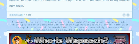
#there is an alternate pagination for this theme that actually puts it in the sidebar like I prefer#but it only has a forward and back button rather than numbered pages#i'm still deciding which of the 2 i prefer#so if you check out my blog and the pagination is in the sidebar#then i changed my mind#i did try to frankenstein the numbered pagination to be where the sidebar pagination was#but it didn't work out~ i don't know too much about coding themes OTL#that said if you get this theme for yourself i did make 1 minor change to it: i changed the date formatting#i prefer to have the month written out vs only numbers#so i don't get confused or confuse others on which way the date is meant to be read#otherwise how you see my theme is how it should behave for you#i'm thinking about making a tag list for this blog#i didn't have one 'cus this is the 'junk blog' but it's becoming the one i use most so i might as well i guess...
4 notes
·
View notes
Text
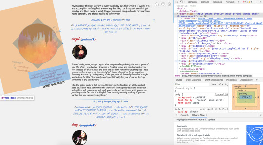
Yo! Sorry for the wait, I've been busy working on sideblogs.
Anyway, this is roughly what I have in mind. I did two versions: one before I knew what I was actually looking for, and the other when I did.

Consider that one a rough draft, and...

This shows more of what I want that might make it distinct from other themes. Here are some close-ups, if my handwriting is hard to read.


I'm not an expert on graphic design, much less for websites, so I just got out my ruler for the dimensions and went from there. I know this version is a LOT more complicated, but I figured, if it's going to be a completely new theme, I should come up with something that would work for more people than just me.
What do you think? Are there some major design principles that I'm missing? I'll leave that up to your best judgement.
---
whew, these are some pretty in-depth designs! this is a huge help, thank you so much! i did my best to follow your layout as closely as possible, though i did end up shuffling some stuff around for various reasons. i'll post the theme itself in just a moment, so you'll be able to check out the differences yourself, but there's a list of the main changes i made under the cut
i hope you like the theme, even slightly altered as it is! if you have any specific requests for changes, you could dm me and i'll see what i can do
removed the scrollbar & put the previous/next page links on the top/bottom instead of the side: for accessibility reasons i don't want to move the scrollbar away from the side of the actual page, and since having the bar just for the page buttons would look kind of awkward i moved them too
second tags section in sidebar replaced by custom blog pages section: i wanted to include the custom blog pages section somewhere, since it's a tumblr-supported way of adding links, and since there were already the four tag links above i figured replacing this would work
likes/reblogs count replaced by single notes count and like/reblog buttons: this one's on tumblr, they don't give us variables for like/reblog counts separately :( still, i figured this should work as far as balancing it out goes!
having first/previous/next/last buttons bracketing all posts instead of under main images: this is largely because with the new post formats, tumblr doesn't let you create the classic photo posts anymore, so even if i implemented pagination under images it'd create a weird situation where some posts (created before the NPF switch or in the old post editor) would have pagination under images while others (created as NPF posts in the new beta editor) wouldn't show pagination. figured i'd bypass that whole issue and just make it standard top/bottom
reordered the post footers a bit, putting the tags under the main permalink/share buttons: this was largely because when i added the via/source links, the post tags section was getting pretty squished, so i compensated by rearranging it and putting the "show tags" button where you had the tags originally
11 notes
·
View notes
Text
How to make responsive themes
A very basic tutorial
This tutorial was requested by an anonymous person. I hope I got to explain well!
difficulty: ★ ★ ★ ★ ☆
You really need to know your way with html and css, plus, you’ll have to style all the other stuff (text decorations, links, dates, audio, asks..) on your own.
I’ll explain only how to wrap correctly the tumblr’s blocks and the very basic structure of a responsive theme. I’ll not explain how to, for example, how to put dates, captions, tags, pagination, and other custom stuff, okay :)
✩⁺˚ Basic Base Code ✩⁺˚
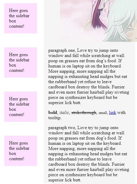
I did a base code so I make this tutorial following the code, to avoid issues. First thing is to understand what we have in the code. We have our blocks and variables and I wrapped the inner content of the {block:Posts} with a .post{ } div. To make a sucessful responsive layout, you must work with CONTAINERS. That’s why I wrapped the outer content together with the block:posts with a .posts{ } div.
I did the same thing with the sidebar. I have boxes with my content with a .box{ } div. And an outer div wrapper with a .sidebar{ } div. Wrapping everything, both sidebar and posts wrapper (with all the sub wrappers inside), I used .content { } because we need a container for the whole page. That’s the basic to make a responsive layout.
Important: So if you don’t want to use this base, and want only to integrate the wrapper divs on your codes instead. Just look for {block:posts} {/block:posts} and wrap everything inside with a div (mine is .post). Then wrap the outside (including the block:posts) with another div (mine is .posts).
This an example of a simple markup with wrappers:
<div class="posts"><!-- the outer wrapper --> {block:Posts} <div class="post"><!-- the inner/content wrapper--> Posts content, blocks and variables goes here! </div><!-- wrapper content end --> {/block:Posts} </div><!-- wrapper end -->
Now, it’s the CSS part (<style></style>).
In the base code there is already a {CustomCSS} line with a comment. That’s the variable for us to be able to make the customizations in the advanced options section. I like to use this instead of copying the source code and using other editor. This way, you can apply the css and see the changes live. We also have a universal selector with a box-sizing border-box, a nice trick that make our paddings look nice and not shit.
First thing you need to do is apply a flexible css to the content. That’s basically the most important action to make while creating a responsive layout. In the Add Custom CSS section, paste the following code:
.content{
width:80%;
margin:1em auto;
max-width:800px;
}
What we did? width:80% is to make sure our content will always have a width of 80% no matter what screen size your blog is being viewed. use the chrome inspector tool (ctrl+shift+i) to resize the screen and see that the content will never touch the window sides and it will always be centered.There are things like images and pre codes overwriting the window, but that’s other css styles you’ll need to search to fix.
The text itself is already responsive! We also used margin auto to center the content. And the 1em value is relative to the top and bottom, giving the content some air to breathe. We also give a max-width of 800px for the content to look nice in desktop version. Without shrink everything and look more solid on computer’s screen.
Moving on.. now is the part to pay a lot of attention: The posts and sidebar. First thing, add these lines to the css part:
.posts{
width:70%;
float:right;
}
.post{
background:#f5f5f5;
padding:1em;
max-width:500px;
margin-bottom:5em;
}
Like I said before, we need containers to make a responsive layout. .posts { } is our posts container and .post { } is our post-box div. Since .posts is a child of .content{ } if you give it a width of 70%, it will be relative to the parent (content) and not the window. This is good to make all the posts floating to one side. That’s why we apply the float here, instead of the post boxes itself, to avoid a mess in the code.
In the .post{ } section, is where you’ll apply some css to your posts. Using max-width will make it more solid on desktop, same as the content, and margin-bottom is to make the posts boxes have a space between them.
Now it’s the sidebar’s time. Add this:
.sidebar{
position:fixed;
width:20%;
top:50%;
transform:translateY(-50%);
}
.box{
background:#f1f2;
padding:1em;
margin-bottom:3em;
max-width:200px;
}
It’s the same method as the .posts and .post. .sidebar is the wrapper and .box is the sidebar box. The only change I made is that I gave the sidebar wrapper a fixed position and used a little trick to center it. Like the post box, I added a max-width to make it solid. This is the responsive layout so far:
Noticed that we didn’t added any complicated css stuff until now, we’re only working with percentages and max-widths. that’s the most basic rule I’ve learned when started to try responsive layout.
The only step we need to finish this basic responsive layout, is to apply css to certain screen sizes. Because we don’t want the content all smushed in a mobile device. We want our content displayed as blocks one on top of each other. For that, we’ll use @media queries.
We need a breakpoint to literally break our theme when the device’s screen size changes. For this simple layout we’ll use a breakpoint of 670px. If you want to make sure how to find this value, save your theme until now, go to the blog, inspect it with chrome and use the responsive tool to resize the screen and see where the content is start to look funny.
Then, we’ll use this code:
/* responsive */
@media(max-width:670px){
}
This means: when the device of the person who is viewing your theme, is 670px wide or less, a certain bit of css will change the content’s appearance. Every code should be inside the media query’s brackets!
To make our current layout responsive for mobile, all we need to do is unset some things and apply width of 100%. Let’s start with our sidebar, since our content does not need edition, unless you want it bigger on mobile, then you must add a new .content{ } inside the @media query and added a width of 90%, for example.
Now, to edit the sidebar on mobile, inside the @media query, add:
.sidebar{
position:static;
width:100%;
transform: none;
margin:3em auto;
}
.box{
max-width:none;
width:100%;
}
what we’ve changed? Since our sidebar was fixed positioned, we unset that using position:static, the default position of everything html. Instead of a width of 20% we now use 100% to make sure the sidebar will fill all the content, its parent. We also, unset the transform css we used to center the sidebar, and added a margin top and bottom of 3em to have some room between the top of the window and posts.
Since we don’t need the solid layout anymore, we unset the max-width of the box and added a 100% width just for consistence purpose.
The best way to see what you’ll need to unset when breaking your theme into a mobile version, is just to look what codes you used on the desktop ver and try to change on mobile. widths, positions, etc.
Now, it’s the posts time. We also have a max-width, a float and a width applied on our desktop version. All we need to do is unset that:
.posts{
float:none;
width:100%;
}
.post{
max-width:none;
width:100%;
}
We made sure our post wrapper are not floating to the left anymore and unset the max-width of our post boxes. We’ve also added a 100% width to both wrapper and box div.
Now our theme is fully responsive!!!!!!!!!!! The only thing I need to talk about is:
apply font-size of 1em and a line-height o f 1.8 to the body so the font will be nice in every screen size. If you think that the font is too big for desktop, you can apply the font to .8em, for example, and 1em in the media query.
body{
font-size: 1em;
line-height: 1.8;
}
apply a max and width of 100% to images and players:
.post img{
max-width:100%;
height:auto;
display:block;
}
.tmblr-full {
margin:0;
max-width:100%;
}
.tumblr_audio_player{
width:100%;
}
To avoid the pre code (if you have on your posts) to overwrite the post box, use this css:
pre{
white-space:pre-line;
}
As a good person I am :^) , I’m going to drop the code for the captions here:
/* captions by todorokiscute,
please don’t repost. */
.reblog-info,
.answerer{
display:flex;
align-items:center;
margin: .4em 0;
}
.reblog-info img,
.answerer img{
width:30px;
margin-right:.5em;
}
Let me know if there are others tutorials you want me to write. I hope I was clear in this explaination and that you have picked the responsive idea. have fun with responsive layout, it’s addictive.
Some tutorials on how to style the tumblr’s blocks posts I already have:
tumblr responsive videos
asks/answers posts like chat bubbles
sticky sidebar on scroll and responsive
make photosets and photos looking like tumblr’s in the dashboard
npf posts simple fix
Style Horizontal Line
Post Link’s style like Tumblr’s dashboard
How to make a fixed contained theme responsive
Make the ‘p’ (paragraphs) look nice
Style ‘keep reading’ link
I made a second (very simple though) tutorial on how to make a responsive theme using display grid. Check it out.
60 notes
·
View notes
Text
TWEAKING YOUR TUMBLR THEME: A CRASH COURSE
i know css/html and code my own themes. one side effect of this is that every so often i encounter someone—a friend or a friend’s friend, usually—who has installed a new theme and is now struggling to customize or tweak it without knowing how to go about doing that.
now i’m always happy to help out, but these are always things that take just a few minutes to figure out if you can read the code and, well, give a man a fish or teach a man to fish. you know how it goes.
so here we go: this is how to fish.
PART ONE: UNDERSTANDING CSS & HTML
let me lead with this: it is normal to feel confused, overwhelmed, intimidated, stupid, and/or frustrated when working with an unfamiliar coding language. my father has been writing software for forty years, but he will look at what is to me a page of very basic css/html and be completely baffled by it all the same. this is normal. please don’t let it discourage you if you feel this way at first.
in my opinion, the first step to conquering these feelings is to wrap your brain around the big picture of what these languages do. what do we use them for?
well, all web pages — and thus, all tumblr themes — are written in these two languages. the only thing you need to know for our purposes is this: html holds the content of a web page, and css controls its appearance.
how does this work?
a webpage is built of html objects called <div> tags. think of them like bricks: you stack a bunch of <div>s on top of each other and bam! you have a house. but it’s a terrible house, because it’s just a pile of bricks with stuff scribbled on them.
this is where the css comes in. a <div> tag can have a unique id or belong to a general class, and we use css to style the appearances of our <div>s on a per-id and per-class basis. to return to our housebuilding metaphor, css is our blueprint: it gives order, structural stability, and aesthetic coherence to our messy pile of bricks, and now, bam! we have a house. for real.
PART TWO: THE SYNTAX
coding languages are like human languages in that they have their own unique vocabulary and grammar. to tweak a tumblr theme, you need to have a basic grasp of this syntax so you can understand what you’re looking at.
css manipulates objects called elements. usually, an element is the id or class of a <div>, but an element can correlate to any html tag. the basic anatomy of a css element goes like this:
selector {
property: value;
}
and we can translate this into english as “when the element this selector is looking for occurs, it will look the way i have described it here.”
selectors might look like this: h1 { or #id { or .class {
the distinction between these different types of selectors is not important for our purposes. all you need to know is that the selector corresponds to (or selects) a particular html tag, like: <h1>, <div id = "id">, or <div class="class">.
properties are the visual features of an element, like its height, width, color, and so on, and the value is a statement that describes the desired setting for the property. a property-value statement is called a declaration, and a collection of declarations is called a declaration block.
you can generally figure out what a declaration is doing by looking at the name of the property, since they’re pretty self explanatory most of the time. for example, font-size: 12px; says that any text contained in this element is going to have its size set such that a character is 12 pixels tall.
[ sidebar: if you are a Tiny Font person, consider using the knowledge you’ve gained from this tutorial to edit your theme such that the text of all your posts is very small, and then don’t use small text or sub/superscripts in your replies. you’ll get the Tiny Font aesthetic on your blog with perfect consistency, without rendering your posts illegible on the dashboard. ]
PART 3: MAKING YOUR CHANGES
the key to quickly and easily modifying a tumblr theme is to be able to identify the name of the css selector for the element you want to modify. let’s look at my own theme as an example.

depending on what changes you want to make and how the theme’s creator laid out their code, you may not have to do much work at all to get the selector.
for example, if you want to do something with your theme’s pagination buttons, it’s a pretty reasonable guess that the css selector will be something like “pagination_next” or “pagination_prev”, and you can go straight to the html editor and do a ctrl+F search for “pagination” to find it.
but what if the selector isn’t immediately obvious? for the purposes of this example, let’s say i want to change the text of the blog description from red to dark blue (while preserving the red color of other elements in the theme, which precludes simply using tumblr’s in-built color picker.)
i could just scroll through the theme code until i found a selector that looked like the one i wanted, and then change something and update the preview & repeat ad nauseum until i found the right one. but again, depending on how the theme’s creator did their coding, this might be very difficult, frustrating, and time consuming. many prolific tumblr theme creators don’t lay out their code in a particularly human-readable way.
fortunately, there is a much easier way.
step 1: load your tumblr and right-click somewhere on the page. depending on what browser you use, the exact name of what you’re looking for will vary, but the keyword to look for is “inspect”:
click this.
(if you are using safari, you need to make sure “show develop menu” is checked in the advanced tab of the preferences window.)
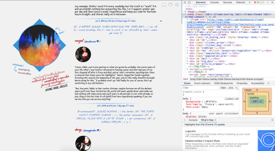
step 2: your screen will now look something like this:
if the element you want to change is in a popup or tab, open it so it’s visible on the screen.
step 3: the topmost box in the inspector displays all the html of your theme. if you hover over an html tag, the corresponding element will be highlighted in blue.
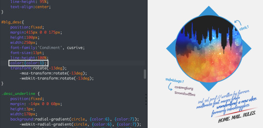
find the <body> tag. you may need to expand this manually depending on your browser. move your mouse down the line of divs until you find the element you want to modify.
here, my mouse is hovering over <div id="blg_desc"> in the inspector, and you can see how the blog description is shown in a blue rectangle. (the large orange shape shows the size of the element’s margins.)
this tells me that the css selector for this element is #blg_desc.
step 4: close the inspector and open tumblr’s theme customization interface. go to edit html. ctrl+f to find the css selector:
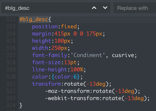
now, my goal is to change the text color, so the declaration i’m interested in is color:{color:6};. the {color:6} value is an object tumblr uses to store colors in a theme as an alternative to using rgb or hex codes (like #B61818, which is the shade of red i have stored in {color:6}. these objects correlate to the color picker under theme options:

thus, if i change the value of color to {color:1}, the text of my blog description will be blue instead of red. i can also write this as color:#0d52c0;.
(note that the exact shade of red/blue in my description varies a little from line to line; this is because of styling i did within the html itself that makes some lines transparent, and thus lighter because of the pale grey background.)
& if you use pages with custom html, the inspector trick will of course work for them too.
PART FOUR: IN SUMMARY
remember that css/html is not magic. it might feel intimidating, but at the end of the day it’s just a language for translating human thoughts like “i want a small purple square” into instructions a computer can understand, like this:
#ps {
height: 100px;
width: 100px;
background-color: #8c4c7a;
}
and all you need to do to make the changes you want is 1) identify the css selector and 2) understand the properties you’re manipulating. 1) is the difficult part, because everybody lays out their selectors differently—but using the inspector will allow you to instantly identify selectors by sight. and once you have that, 2) is super easy, because properties are standard and intended to be readily legible to humans.
you may occasionally run into tricky properties, like for example display or position, which do things that are a little more abstract / not immediately obvious. for those cases, refer to the w3schools css dictionary for clear, simple, but still comprehensive explanations for proper usage.
#⌈ A WRITER ALWAYS KNOWS WHICH WAY THE STORY GOES ⌋ ( ooc. )#[[ for real though i love helping people but#99% of the time when i get asked for help#it's easy little things that#because of a lack of understanding#have bred so much unnecessary frustration#& i just.#you CAN learn and there IS a better way ]]
3 notes
·
View notes
Text
PHP CRUD Application – Portfolio Piece
I am super pleased to share that I have completed and uploaded my first (that I can share at least) personal portfolio piece written in PHP to a subdomain on my personal hosting server located at walk.openlamp.tech. Over the better part of the last year, I have developed a custom reporting dashboard written in PHP for my (current) employer, but do not share any of that work as it is proprietary and not owned by me. However, for a personal project, I can share far and wide. In this post, I provide a brief overview of my simple (in theory at least) application/site, built on the LAMP stack using the MVC (Model-View-Controller) design pattern in core PHP along with Bootstrap 4, jQuery, and MySQL. Image by Tomislav Kaučić from Pixabay Self-Promotion: If you enjoy the content written here, by all means, share this blog and your favorite post(s) with others who may benefit from or like it as well. Since coffee is my favorite drink, you can even buy me one if you would like! Although I will provide some context in this post, its main purpose is to bring awareness to my skill set in Back-end web development as I learn and grow in this area, with the goal to move into more of this type of role. Expect several follow-up posts containing more details on the application code, design, and implementation itself for this particular portfolio project located at walk.openlamp.tech. I initially set out to create a CRUD site/application to store all the data from the many walks I take as I work towards a healthier weight and lifestyle. Site and Project Navigation The ‘Walking Stats Dashboard’ is accessible from the main navigation menu through the ‘Projects’ drop-down: Using Bootstrap 4 navbar dropdown Clicking ‘Walking Stats Dashboard’ from the drop-down, navigates to the ‘All Walks’ page, which displays a jQuery Datatable of information. Four important distinctions in this image are: The ‘Log In’ choice in the navigation menu Disabled ‘Add A Walk’ button Disabled ‘Edit’ button for each row in the table Disabled ‘Delete’ button for each row in the table (Note: The ‘Add A Walk’, ‘Edit’, and ‘Delete’ buttons are functional only if a user is authenticated and logged in.) User Log In and Authentication By clicking the Log In choice from the navigation menu, this simple log in screen is displayed, allowing a user to log in: Login screen Submitting invalid credentials prompts the user with a validation error: Displaying validation error for failed login attempt. Reading and Displaying Data Once logged in and redirected back to the ‘All Walks’ page, we can see that the ‘Add A Walk’, ‘Edit’, and ‘Delete’ buttons are now enabled. Additionally, the ‘Log In’ choice in the navigation menu has been changed to ‘Log Out’: Add A Walk, Edit, and Delete buttons are enabled since an authenticated user is logged in. Create a row of data In order to create a new row of data, we click the ‘Add A Walk’ button, and use this displayed form: Using HTML forms to create a new Walk row of data in the table. There is custom data validation checking on the back-end in PHP prior to any record being submitted to the MySQL database for processing. When values are unacceptable, the user is prompted with all applicable errors. In the example below, all of the input form fields were left blank, resulting in errors returned – and displayed – for each field upon submitting the form: Using PHP validation handling to provide meaningful error messages in Bootstrap 4 modal… Once any validation errors are corrected, the data is added to the MySQL database and the user is redirected back to the ‘All Walks’ page. Update a row of data We can easily edit a particular row’s information by simply clicking that rows’ ‘Edit’ button, which displays the relevant data in a Bootstrap 4 Modal as shown in the following screen-shot: Using Bootstrap 4 Modals for editing a row’s data… Again, there is data validation checking on the Back-end in PHP. However, any errors are propagated through jQuery using AJAX to the form on the front-end without the need for a page refresh: Using jQuery ajax validation with Bootstrap 4 Modals for editing and validation errors. Just as is with creating a new row of data, when any validation errors are corrected, the edited row of data is then updated in the MySQL database via clicking the ‘Update’ button. Upon success, the user is informed by a message in the Bootstrap 4 modal: Display message for a successful update. Delete a row of data Initially, I set out to not include any Delete functionality into this portfolio piece. However, the more I thought about it, I came to conclude that I could not call this project a legit CRUD application without the ability to delete a row. Clicking on any rows’ ‘Delete’ button displays this Bootstrap 4 modal popup, with the date of the row to be removed along with ‘Cancel’ and ‘Confirm Delete’ buttons: Bootstrap 4 modal popup for delete information. Clicking the ‘Confirm Delete’ button executes an AJAX script, deleting the row of data from the MySQL Database. A follow-up confirmation message is displayed as well once the Delete is completed: Delete confirmation message for successful delete. Filtering and pagination Search filtering and pagination are provided out of the box by the jQuery Datatable plugin by means of the ‘Search’ text box located on the top right of the Datatable and the pagination choices on the bottom right. Both of these features are extremely useful and require very little jQuery code to activate: Search filtering and pagination provided out of the box by jQuery Datatable plugin Future Features I’m planning to add more features to this project in the near future, including analytics on the actual data itself so be on the lookout for posts about those features as they are added. I couldn’t be more pleased with the progress I have made in my continued learning of PHP Back-end Web Development. Being self-taught, I suffer a great deal from Impostor Syndrome. But, there is nothing like real-world experience and seeing the code actually come to life in application to remove those thoughts of self-doubt. Like what you have read? See anything incorrect? Please comment below and thank you for reading!!! A Call To Action! Thank you for taking the time to read this post. I truly hope you discovered something interesting and enlightening. Please share your findings here, with someone else you know who would get the same value out of it as well. Visit the Portfolio-Projects page to see blog post/technical writing I have completed for clients. To receive email notifications (Never Spam) from this blog (“Digital Owl’s Prose”) for the latest blog posts as they are published, please subscribe (of your own volition) by clicking the ‘Click To Subscribe!’ button in the sidebar on the homepage! (Feel free at any time to review the Digital Owl’s Prose Privacy Policy Page for any questions you may have about: email updates, opt-in, opt-out, contact forms, etc…) Be sure and visit the “Best Of” page for a collection of my best blog posts. Josh Otwell has a passion to study and grow as a SQL Developer and blogger. Other favorite activities find him with his nose buried in a good book, article, or the Linux command line. Among those, he shares a love of tabletop RPG games, reading fantasy novels, and spending time with his wife and two daughters. Disclaimer: The examples presented in this post are hypothetical ideas of how to achieve similar types of results. They are not the utmost best solution(s). The majority, if not all, of the examples provided, are performed on a personal development/learning workstation-environment and should not be considered production quality or ready. Your particular goals and needs may vary. Use those practices that best benefit your needs and goals. Opinions are my own. The post PHP CRUD Application – Portfolio Piece appeared first on Digital Owl's Prose.
https://joshuaotwell.com/php-crud-application-portfolio-piece/
0 notes
Photo

12 Useful WordPress Plugins for Page Layouts
When it comes to plugins for laying out the pages on your WordPress site, WPBakery Page Builder is a hard one to beat. This easy-to-use drag-and-drop page builder with over 200 unique addons will help the developer and the novice alike create just about any layout imaginable.
WordPress
20 Best WPBakery Page Builder (Visual Composer) Addons & Plugins of 2019
Nona Blackman
WordPress
Get Started With WPBakery (Formerly Visual Composer)
Ashraff Hathibelagal
WordPress Plugins
WordPress Page Builders Make It Easy to Create a Website
Nona Blackman
But for users looking to modify just one page in a specific way, this powerful page builder is probably overkill. That’s why we’ve scoured CodeCanyon for the most useful WordPress page layout plugins and have come up with these 12 that will meet a variety of needs.
1. Essential Grid WordPress Plugin
If you’re looking for just the right grid to display your blog posts, photos, products, testimonials, social media streams, services or whatever else you have in mind, The Essential Grid WordPress Plugin has got you covered.
This multipurpose grid enables you to display any content on your WordPress site in your choice of elegant grid form. First you decide what source you want to use for your grid entry. Then you customise the grid by choosing from three available styles before selecting your required number of columns and rows and setting spacing for the items. From there you can add any number of skins available to customise your look further.
Notable features:
over 25 example skins included
widely varied content sources possible, including images, YouTube, and HTML5 self-hosted video
various animation styles available
responsive and mobile optimised
and more
Essential Grid WordPress Plugin is an engaging and visually appealing way to show off content on your WordPress page.
User webdesigndmc says:
"It's a great plugin and they have even greater support."
2. FlatFolio
FlatFolio is another great option for those looking for an alternative grid layout. Aside from being highly customisable, the plugin has the additional benefit of offering both Carousel and Slider functions as well. You can customise the grid with logos, captions, coloured overlays, titles and subtitles, hover shadows, and more.
Notable features:
preview feature
carousel and slider features
unlimited item formats
various overlay effects
and more
For creatives and other users wanting to show off their visual content, FlatFolio is a versatile and easy-to-use layout choice.
User stefkouf says:
"Great plugin , very quick solution to my problem."
3. Sidebar and Widget Manager
If you’ve ever wished for the freedom to place a widget in the content area of your WordPress site page, the Sidebar and Widget Manager has heard your prayers. The plugin allows you complete control of where you add widgets to your site’s pages by expanding placement possibility beyond the sidebar and footer area to the page content area.
Notable features:
drag-and-drop grid manager
vertical or horizontal widget alignment
ability to display or hide any widget on any page
supports any kind of content
and more
Being able to add widgets to any area of your WordPress site page with the Sidebar & Widget Manager plugin is a great way to build your own unique page layout.
User JohnDoe_VI says
"If you want to create a custom layout of a WordPress site, this is the plugin you want to have in your tool chest."
4. Content Manager for WordPress
The Content Manager for WordPress plugin is probably the most versatile of the plugins in this list because it allows you to create any kind of layout you desire in three simple steps. Simply add a new page, create your desired layout with the drag-and-drop interface, and then add your content.
Notable features:
ability to add unlimited fully editable pages
10 layout colours
30 Google Font options
multiple language support
and more
User Harald777 says:
"Really good plugin and superb support. Would recommend this to every WordPress user who wants a flexible and simple content manager. Really great."
5. Stupid Simple Testimonials
The Stupid Simple Testimonials plugin makes it super easy to add testimonials or quotes to your page layout. Using a simple shortcode that can be inserted in pages, posts and widgets, the plugin features eight unique ways to customise your page layout.
Notable features:
grid layout automatically adjusts to match the total number of testimonials
six unique colour schemes provided to match your theme
ability to divide your testimonials into categories for easy management
ability to edit using the standard WordPress editor
and more
The Stupid Simple Testimonials plugin is a straightforward way to alter your page layout and will integrate your testimonials or quotes into your site in a crisp, professional fashion.
6. UberMenu
What’s a great site without an equally great menu layout to help your visitors navigate your content seamlessly? UberMenu plugin is designed to facilitate just such easy navigation. The highly customisable and responsive plugin offers seven main menus and several submenu options to suit a wide variety of tastes and needs.
Notable features:
easy to add images and descriptions
Google Maps
choice of 18 layout variables
fully responsive and compatible with mobile and touch-enabled devices
extensive user-friendly documentation
and more
UberMenu works out of the box with the WordPress menu system, making it simple to get started and create gorgeous menus quickly and easily.
User lariosn says:
"UberMenu is simply fantastic and its support is just amazing."
7. WordPress Pro Events Calendar
If you’re looking for a clean and elegant way to keep your customers, clients, or followers updated on your public appearances then adding the WordPress Pro Events Calendar plugin to your WordPress page layout might be the right solution for you.
Notable features:
responsive layout
let users submit events from the front-end
add special dates to your calendar like holidays
import events from an ICS feed or Facebook
User DrDanHall says:
"This calendar system is the best for the money. I had used EventOn but the constant add-on cost was unbearable. Pro Event calendar includes all the features I had for much less. Great system."
8. WordPress Content Boxes Plugin
With the WordPress Content Boxes Plugin, it’s all about boxes. 43 stylishly designed boxes to be precise, any of which users can select to contain and showcase site content, like testimonials, social icons, team members, products, pricing lists, etc.
Notable features:
over 1,000 icons
highly customisable
ability to use multiple content boxes in one page
and more
Though one of the newer additions to CodeCanyon, WordPress Content Boxes Plugin with Layout Builder is sure to be a big favourite in the coming months.
User Tixylix says:
"This is a very well-built plugin and the addon/template customisation options are superb. So glad I stumbled across it–fantastic!"
9. Media Grid
Media Grid is a terrific plugin that allows you to create unlimited responsive, filterable and paginated portfolios quickly and easily. You can create your own layout and mix any media to create unique galleries. The plugin allows for a high degree of customisation to every element of your gallery.
Notable features:
unlimited layout-free portfolios
visual, drag and drop grid builder
ability to create grids using any public post on your website
1-click grid cloning system
User seamusberkeley says:
"This is the best image plugin available—lots of flexibility and dynamic organization of images. Customer support is responsive too—Luca replied to questions promptly."
10. Templatera
Created by the authors of the WPBakery Page Builder, Templatera is a WordPress template manager that allows users to create, manage and set access to templates based on user roles or content type.
Notable features:
easy content reuse across templates
edit content across templates from one central place
ability to import or export templates in XML format
and more
User rikfik says:
"This plugin is awesome! It saves me a lot of time build my pages. Great job. Thanks."
11. Quform
Quform is an advanced WordPress plugin that allows you to quickly and easily build multiple forms. This drag-and-drop form builder is feature-rich, easy to use, and has a wide variety of templates that enable you to build all kinds of forms ranging from complex quotes to booking forms and simple contact forms, without ever writing any code. A few clicks and you have fully functional forms—it’s that simple.
Notable features:
responsive forms
drag-and-drop form elements
file uploads, sent as attachments or saved to the server (or both)
live preview while building
User adynsol says:
"Amazing script, easy to install, very well documented and with a ton of configs. Nice work."
12. DHWCPage
DHWCPage is a template builder that helps you create any layout for your WooCommerce page quickly and easily. The plugin, which require WPBakery Page Builder to work, is easy to install and configure and requires no coding skills.
Notable features:
supports WooCommerce shortcodes
create single product by each categories
create single product by product types
display product description and review separately
work with any theme
User mydiamondlive says:
"A must have plugin for eCommerce websites that want to put extra design features for products and to stand out from the rest."
Conclusion
These 12 plugins just scratch the surface of page layout plugins available at Envato Market. So if none of them catch your fancy, there are plenty of other great options there to hold your interest.
If you're interested in other WordPress plugins check out these articles:
WordPress
20 Best WPBakery Page Builder (Visual Composer) Addons & Plugins of 2019
Nona Blackman
WordPress
How to Pick a WordPress Form Builder Plugin
Lorca Lokassa Sa
WordPress Plugins
WordPress Page Builders Make It Easy to Create a Website
Nona Blackman
WordPress Plugins
Create a Drag-and-Drop Contact Form With the FormCraft 3 WordPress Plugin
Daniel Strongin
And if you want to improve your skills building WordPress sites, check out the ever so useful free WordPress tutorials we have on offer.
by Nona Blackman via Envato Tuts+ Code https://ift.tt/2Dnincc
0 notes
Text
[Ask RPedia] Choosing a Theme?
Anonymous asked: Don't know if this has been asked before but it seems like a lot of rp blogs have "Container themes" (some custom styled, some regular). I know it's all preference but why is common preference since it seems smaller and a bit hard to read if it's minimal.
This is such a thinly veiled gentle way of asking me, in frustration, to tell everyone your itty bitty god damn aesthetics boxes are hurting people’s eyes and driving them off.
So Short PSA: They’re pretty, but for the love of cute animals, try using a scaling-in-size theme that does the same thing? They’re like blogs for ants. Some folks, I admit, can’t even browse blogs like that. I personally leave your carefully curated tiny tiny, tiny, boxes because show up on like one quarter of my screen at a size smaller than my thumb.
Round about ways to get around this? You can open those blogs in your dash with x-kit. Or you can just use ctrl and + to make the thing fit your big ass screen, but then everything’s blurry.Goodbye aesthetics, hello visibility! You can also try something like Just Read for Chrome or Reader for Firefox. They strip the CSS entirely and turn the webpage into your submissive eager toy.
Just to be clear: be careful about your choices if you choose a blog design with a smaller screen in mind. Folks with bigger screens find it hard to read, so it may drive us off, and give us eyestrain, which is shit for finding new RP.
I guess I should do a ‘what’s important when picking a theme’ thing to help maximize use for others? So here we go, kids.
Text visibility in themes is extraordinarily important. Roleplaying is about your writing and your gifs I guess here on the wacky world of Tumblr, but mostly writing. Every other website has a focus on it for a reason, it’s literally how you communicate prose. Gif’s are cute, but you don’t need them.
So, lesson one. Make the text visible. It should be around 12px large, you can go down to 10px but that’s going to make some people avoid your blog, which stops you from finding potential players! That’s bad! So go with 12px unless you have a damn good reason, or don’t really have issues finding partners.
Make the colors readable. Do not put red on cyan, don’t do some faded white text that looks mysterious on some dappled background. Don’t overlay it with effects. Don’t do white on black, or black on white. Find a comfortable medium, something you can read at length without burning out your eyes. Many people favor a darker background with lighter text to avoid that burning sensation that white can produce, many others hate that like the dickens so hey if anyone codes themes looks at this, a ‘nightmode’ switch for colors in a theme being dark on white or white on dark would be the coolest thing ever.
Also, do not put it in a god damn tiny ass fixed width box. Theme coders! I love you, I do, but please try using flexible elements. Making the div width a percentage instead of a fixed pixel size can do fucking wonders for people. It lets all the elements fit without being a mess. If you use background-position you can set an image to the right, the left, the center bottom, whatever. Use those for all 4 sides of the box, and then throw in a god damn background-size and background-size-moz of like 100% of the div holding them. Including the background of the entire body! Suddenly your whole fucking theme resizes to fit! It’s a miracle of god! It’s not perfect 100% of the time when you’re being a tricky little shit, and sure absolute positioning and a fixed pixel width can be useful in places, but don’t just go 800px wide because it’s the typical smallest screen size and therefore the “best” when you can do flexible coding!
... I may have gotten a bit nerdy there, sorry for anyone I lost on some of those notes. Anyways.
So you as a roleplayer should pick a simple theme, a banner on top is pretty but having to scroll down on every single new page gets old quickly. If you want people to read a lot of your posts rather often, sticking to sidebars is for the best. It’ll save them precious seconds, and they’ll stick around to read longer.
Make sure you navigation is way visible. Left and right arrows somewhere should be tasteful, but not hidden in the bushes somewhere. You want to be able to go from page to page easily. If the same way, avoid endless scrolling! Seriously! It’s neat on one hand, but trying to find your place after your browser tab crashes and you’re 200 pages into the blog is so horrible some people close the window and never return. You’ve killed another chance. Go for pagination, not endless scroll as often as possible.
Tags are important, so is the time posted, and links to profiles/OOC/tag lists/open thread tags and the like. These should all be visible and easy to access so people can get online, check the tag on your blog, see when you replies, and reply themselves. New people want to read your OOC, character profile, and information about everything important. So have your Out of Character and rules done and ready to go before you open shop!
Fancy elements should always be done with accessibility in mind. Do not pick some weird fucking mouse pointer that is hard as fuck to use, they’re cute, but make sure they have a point on them so people can see how to use them right. Don’t make the scrollbars too small to click. Don’t make a constant glitter shower on every single page that blurs out the writing and constantly distracts people. Avoid colors that clash painfully, red on blue for instance causes weird shapes at the corner of the eye and is generally unpleasant. You want your space to be as open and comfortable as possible.
This doesn’t mean don’t have cute art, or sweet fonts (at least for titles and the like, maybe don’t use cursive for the actual text font). It doesn’t mean some gifs can’t be managed, or a dropdown header that only appears when you raise your mouse can’t be done. Just do it tastefully. Work hard at making your roleplay blog something everyone can read, and you’ll be that much closer to getting more partners to play with. Good luck!
#themes#roleplay themes#roleplaying#RP themes#RPH#RPedia#Ask RPedia#If anyone would like to suggest themes#I can link them here#S'long as they fit my suggestions#Also they are just suggestions#not rules
33 notes
·
View notes
Text
vvvvvvvv
asic theme offers you image zoom option is you are using this theme for a photo blog, this feature will be very useful.
You have the color options to style your blog perfectly, you have Pretty Notes option, custom pages, Google Analytics support, Disqus comment option and a lot more.
DOWNLOAD THEME
Oscar
Oscars is the ideal Tumblr theme for freelancers. You can use it as a simple blogging theme or a personal blog to share some thoughtful stories and articles.
Everything you put on your blog will not go unnoticed as the theme brings in modern design coupled with high customizability to help you make your blog as visually appealing as possible.
All the basic features that one comes to expect from a Tumblr blog are all bundled in with the theme of a comments section, analytics integration, social media integration, and much more.
DOWNLOAD THEME
Minimalism
Minimalism Tumblr theme offers a high-quality option for brands, individuals and other creatives looking forward to expanding their online presence. You will get to share your image based content in a minimalistic and professional approach.
Notable features of the theme include features such as a content grid management, custom header, custom background color, and image options, a mobile-ready layout, social media images, infinite scrolling, a sticky sidebar navigation menu and much more.
DOWNLOAD THEME
Elise
The Elise Tumblr theme offers you multiple layout options to choose from. You can showcase your content in the most elegant way with this theme.
DOWNLOAD THEME
Illustfolio 4
A simple yet attractive Tumblr theme for the illustrators and photos. Though the theme is clean and minimal it does offers you customization possibilities.
You can change the color, font to style your site. The theme supports all types of posts to make sure that you can quickly add your content and publish it.
The theme is fully responsive and offers you social sharing buttons to maximize your reach.
DOWNLOAD THEME
Flare
Flare is one of the most popular Tumblr themes which you can use to set up your own interactive content sharing blog in a matter of moments.
The theme is catered to blogs which concentrate more on sharing animated visuals, videos and pictures on their blog.
It comes with a five-column masonry grid which makes content browsing a breeze. Since media based sites have a lot of content in the form of thumbnails, this is a very important feature.
DOWNLOAD THEME
Osprey
Osprey is a great looking free and highly customizable Tumblr theme. You can customize the look and feel of the theme with seven different color options to choose from.
You can set the design by changing the design between two or three columns. It’s a fast loading Tumblr theme with infinite scroll option.
It offers you permalink option, amazing border option for the post, image border option, optional multi-size posts.
DOWNLOAD THEME
Shiyori
If you need an attractive free theme, here is Shiyori Tumblr theme, a multi-layout design to make your site look more interactive and trendy.
DOWNLOAD THEME
Skyfall
Skyfall Tumblr theme is another one for the photographers. It transforms your blog into a beautiful and high featured gallery of sorts to help you display your latest works quickly.
The front page will showcase only image posts which if clicked will display the corresponding content through a lightbox.
Also, if more than one item has been uploaded to the post, then users can also have access to browse through them from the home page.
DOWNLOAD THEME
Orange Pop
Another great option for the Tumb bloggers. If you are a fan of orange color then you will like this theme. However, you always have the choice to switch the color scheme of your blog as per your wish.
It’s a minimal good looking theme with a clean design and all the important features that you will need to create a perfectly optimized Tumblr blog.
DOWNLOAD THEME
Maximize
This is a great Tumblr theme option for the photo blogs. The theme comes with a nice layout that will highlight each of your photos perfectly.
It’s a fully responsive design, and your site will look beautiful on all small screen devices along with regular desktops.
DOWNLOAD THEME
Writing Pad
Writing Pad, as the name implies is a Tumblr theme targeted for writers looking to use their blog to showcase their work. It comes with design and aesthetic appeal which makes it ideal for writing based content.
Design wise it offers grunge like a background with typography running a slight tilt as if resembling an entry form journal. You can easily transform this into your online journal.
DOWNLOAD THEME
Ten Toes
Another beautiful, minimal free Tumblr theme that you can use on your blog. The theme is clean and attractive.
The interface is user-friendly, and you can quickly click on any image and start browsing more by just clicking on the right or left arrow.
You can easily increase your share content as the users will be able to share your images right from the homepage of your site.
DOWNLOAD THEME
Copycat
Copycat is a great looking modern responsive Tumblr theme with an amazing grid layout. The theme is minimal yet very attractive.
DOWNLOAD THEME
Harbour
And finally, an ending of our list is Harbour, a sort of multipurpose theme for Tumblr which supports all post types and lots of user interfaces and customization options.
It also comes with a responsive design making it mobile friendly. The design quality of Harbour is so good that often people confuse it with a quality WordPress blog.
Overall, if you want to have a blog which showcases a different type of content and also looks very much professional and polished, then this is an excellent option to consider.
DOWNLOAD THEME
ImNotWordy
An amazing Tumblr design for the image-rich sites. If you are a photographer, this theme will make your work stand out.
It comes with a big grid system that makes each image look stunning. This theme is fully responsive making it super attractive on the small screen devices.
It’s a very lightweight and SEO friendly design that will surely put your content perfectly on the search engines.
DOWNLOAD THEME
Editorist
A clean and minimal Tumblr theme with a beautiful interface to highlight your content perfectly. This is a fully responsive Tumblr theme that will make your blog look great on all devices.
DOWNLOAD THEME
Wallstocker
Tumblr is all about minimal designs and designs that give the users to consume your content without any distraction. Here is a theme for photobloggers that offers a great looking clean layout that showcases your content the most elegant way.
DOWNLOAD THEME
Other Basic
If you are looking for a very basic design for your Tumblr site, here is a great option for you. This theme doesn’t offer any fancy elements; you only have a beautifully clean interface to highlight your content.
DOWNLOAD THEME
Fireheart
Another beautiful, clean and highly optimized Tumblr design that you can use to create your content. The theme comes with the modern and trendy navigation option.
You also have the option to have a menu in the sidebar of the theme if you need. You have normal pagination as well as infinite scrolling option.
DOWNLOAD THEME
In Conclusion
So this was our list of some of the best Tumblr themes you get for free. Do let us know which ones you liked here.
And also, if you happen to know some other great theme which got left out then do let us know in the comments section.
You will be helping out your fellow readers with more options in the process.
5 (100%) 4 vote[s]
Tags:
Free Tumblr Themes
Minimal Tumblr Themes
Tumblr Themes
Share134
Tweet82
Pin29
Related Posts
WEB TEMPLATES
Best HTML Templates for Dental Websites (2019)
BY
EDITORIAL STAFF
MAY 1, 2019
WEB TEMPLATES
15 Best School Website Templates 2019
BY
EDITORIAL STAFF
APRIL 4, 2019
WEB TEMPLATES
100 Best Free Responsive Blogspot Templates 2019
BY
DHIRAJ DAS
APRIL 1, 2019
WEB TEMPLATES
40 Best Cute Minimalist Tumblr Themes 2019
BY
EDITORIAL STAFF
MARCH 7, 2019
WEB TEMPLATES
25 Best Personal Portfolio Joomla Templates 2019
BY
EDITORIAL STAFF
FEBRUARY 8, 2019
Comments 2
WPSmashingThemes 1 year agoReply
Great roundup Dhiraj,
I really love the Sugar theme I created a free Tumblr theme here: https://www.softwarefindr.com/reviews/gosimon-tumblr/ that I think would serve a great additional resource for your readers.
Let me know what you think?
Dhiraj Das 1 year agoReply
Hey Brian, Will surely add the theme to this collection. Can you check the download link if it is working properly, it wasn’t working at my end.
Leave a Reply
Your email address will not be published. Required fields are marked *
Comment
Name *
Email *
Website
Subscribe To Our Newsletter
Get weekly top resource updates & freebies
SUBSCRIBE!
ADVERTISEMENTRecommended.
7 Email Marketing Strategies For Your E-Commerce Business
MAY 14, 2019
7 Awesome Crowdfunded Brands & Lessons From Their Success
MAY 13, 2019
10 The Best GDPR Compliance WordPress Plugins 2019
MAY 13, 2019
Important Questions to Ask Before You Start Growing Instagram Following
MAY 10, 2019
ADVERTISEMENT
Begindot.com is all about the top resources that you can use to create and grow your online business.
Categories
Best Resources
Blogging
Coupon
Freebie
How To
Inspiration
Make Money
Marketing
Review
Typography
Web Templates
WordPress
WordPress Hosting
Newsletter
Subscribe to our mailing list to receives daily updates direct to your inbox!
*We hate spam as you do.
ABOUT
TERMS
PRIVACY
CONTACT US
SEO Themes | AdSense Themes | BuddyPress Themes | Event Themes | WooCommerce Themes
YouTube Tools | Lightroom Presets | Dreamweaver Templates | Blogger Templates | Tumblr Themes | Joomla Templates
Handwriting Fonts | Arabic Fonts | Script Fonts | Calligraphy Fonts | Font Generators
Divi Theme 20% Off Coupon | WPX Hosting 50% Off Coupon
Thrive Themes Review
BeginDot is a daily resource site for online startups. We publish content related to resources, themes, templates, online success stories, interviews and more. Sometimes we publish content that includes affiliate links, however, we never accept any money for positive reviews.
Copyright © 2016-2019 www.begindot.com
How To
Marketing
Best Resources
Blogging
Make Money
Review
WordPress
WP Hosting
SEO Themes | AdSense Themes | BuddyPress Themes | Event Themes | WooCommerce Themes
YouTube Tools | Lightroom Presets | Dreamweaver Templates | Blogger Templates | Tumblr Themes | Joomla Templates
Handwriting Fonts | Arabic Fonts | Script Fonts | Calligraphy Fonts | Font Generators
Divi Theme 20% Off Coupon | WPX Hosting 50% Off Coupon
Thrive Themes Review
BeginDot is a daily resource site for online startups. We publish content related to resources, themes, templates, online success stories, interviews and more. Sometimes we publish content that includes affiliate links, however, we never accept any money for positive reviews.
Copyright © 2016-2019 www.begindot.com
This website uses cookies. By continu
0 notes
Note
Do you know how to align a contained theme to the bottom center without it moving to weird places on bigger/smaller screens? I understand if you don't want to answer any more coding questions but thank you all the same!
i’m putting this under a read more because this got quite long, but for everyone who has issues / is unsure about placing something i’ve also made a cheat guide there and you should check it out.
you need to move everything to bottom center then. this is such a beginner’s mistake and i see it a lot of times so (i hope it’s okay if i show it with a bottom left theme bc i don’t remember having made a bottom center screen like …. ever?). usually we can arrange that by saying position:fixed;. and this doesn’t just work with the background alone because well … it’s JUST the background. you need to do this with every single thing that you place directly on your blog. so, what actually is affected then?

we see from left to right: the title (’the dragon queen’) the links (see the four different crowns), the pagination (>>), the container, the sidebar / updates and the credit. all of these need to have a position:fixed; inside them.
now you may have already set your background position and roughly it may look like this:
body { background-image: url(‘http://i.imgur.com/Cjzobb6.png’);background-color:#8f8e8f; **(later a pro tip of mine on this too)background-repeat: no-repeat;background-attachment: fixed;background-position: bottom left; }
however, for each and every of these marked parts and REALLY anything that comes in extra there for idk you wanna have a jumping unicorn gif somewhere in your theme and OUTSIDE of your container (unlike the dragon i inserted in the ask) then you need to have a position:fixed; again.here really really really really important as well: as your theme is set on BOTTOM LEFT you as well need to place them from there on. look at the coding below:
#container {position: fixed;left:513px; bottom:36px; }
the second line with left:513px; bottom:36px; are both suggesting that the container needs to be placed from there (left and bottom) on. many beginners make the mistake of not setting a fixed position or (and this explains the wrongly placed containers that ‘move’ with the screen size) by not using e.g. bottom for a bottom placed background but instead top.
however: everything that is INSIDE the container does not need a new position (fixed) as the container does that for all of these items. that’s why we inserted them inside the container in the first place.
now there is one thing you may not touch when this isn’t your theme etc, but obviously, the credit is well …. zoom out on any of my themes and it will always be stuck in the right bottom corner. why is that so? after all what position might that one have? yup, position:fixed; again, but this time it’s at the right bottom:
#credit {position:fixed;right:20px; bottom:25px;}
so now for you all who don’t know how and where and what exactly here is a cheat guide:

(you see: whenever there is something involved with center you have a 50% there. do never change the 50%. on the first thought it might be a good idea to change the % because it moves …. something? but it scales after your width from your screen and …. you see the problem already. other people have different screen sizes. instead you place it with the margin-left or margin-top or margin-right or margin bottom. you got me.)
** pro tip (background-color:#8f8e8f;) : remember i have a big screen. i see everything and especially when you forget to change the colour or even put that line of coding in. without the line of coding it will just be a white colour around your background image. that sucks, especially for people with bigger screens. you will look like a beginner and if there are at least a few tips to make you look more professional even when starting out this is #1. obviously, don’t take the above colour #, but the one your background gives you.
#( me: oh an anon ask on coding#me: gotta answer this real quick#also me: writes an essay on it with extra tips and help at 1 am#why am i like this )#anon#* i : « tutorials » // general
19 notes
·
View notes
Text
How to Create The Perfect Blog Layout - An Information Blog
How to Create The Perfect Blog Layout
Today, I'm going to go over the ideal blog layout. Many of you have a blog, you have a website, you're writing content, but what's the ideal layout? What you'll find is if you don't have the ideal layout, sure, you can still get traffic, but you won't get any conversions. So I'm going to break down the ideal blog layout. RESOURCES & LINKS: ____________________________________________ Ubersuggest: https://ift.tt/2Cs1r2d Hellobar: https://ift.tt/1iqzQkX AudioEye: https://ift.tt/1AMjEBr ____________________________________________ And let's first start with a blog post page. So if you notice here with my blog post page, I keep it really simple. So the first thing you'll notice is I have a scrolling bar that pops up at the top and as you scroll, it sticks with you, this is a conversion element. And you can use hellobar.com to do something similar for your website, it's free to get started, and once you're on Hello Bar, you can end up creating your own top bar, you can have it look very simplistic, or you can have it look more advanced like mine and more custom. So I would recommend that you have a top bar. Your top bar could collect a lead, collect an email, could push a discount or offer or push people to subscribe to your social channels, or it could just push people into, you know, it could just push people into a discount or a giveaway or anything that you're doing like a Black Friday promo if, you know, it's during the holiday time or anything like that. The next thing I would recommend to do in your blog is always have a sidebar because it gives you more call to action areas. I would recommend a call to action on the top right, that could be subscribing to your newsletter. you can do that through tools like Hello Bar. I would recommend pushing a product, pushing a service, collecting an email, those are all options. Then I would recommend the about section, about you, about your company, if it's not a personal blog and it's more of a corporate blog, that's fine too, it could be about your corporation, and then you all want to have a search bar because you'll find a lot of people search on your blog, just looking for content. Then I would recommend another call to action, to drive people to a product, service, and when you're seeing these call to actions in my sidebar, you'll notice that they're not exactly the same, you'll notice that this one is a little bit different than this one right here, and if you scroll down, it's a little bit different than the one on the very bottom. You'll also notice that my social icons scroll with the user, I think that's great, and the reason that's great is by doing that, you'll get more social shares. You'll also notice this thing on the bottom left, and you're probably like "What the heck is that?" It's accessibility, and this allows me to make sure that my website is compatible for people who may be disabled or have hearing impairment, and I get this through AudioEye, and then the other thing that you'll notice too is throughout my content, I always start my post with the image, it makes it clean, simple, I have breadcrumbs as well, and then as you scroll down at the introductory paragraph, I'll embed videos when it makes sense, and then the other thing that I end up doing as well is I may link out to subsections within the article, I'll use headings that makes it easier to understand images, to describe what I'm trying to do, and then at the very bottom, as you scroll, you'll see a few things, and one of them being a conclusion, this post is quite long, so it's going to take a little bit to scroll to the bottom. And then the other thing that you'll notice is I have a comment section, so that's important as well. You can have the pagination at the bottom, some people do that, I do the infinite scroll. It doesn't make too much of a difference on what route you end up choosing, but that's generally how I do my overall blog layout, it works really well. One other thing that you can consider doing that I do is I use one of these breadcrumbs, you know, you make categories so people can click on them and then they can find all the posts related to that subject as well, but that's my overall blog layout, and feel free and copy mine, it's really effective for driving conversions for B to B, B to C, this will work no matter what kind of blog you have, and it also works really well for getting more Google traffic. ► If you need help growing your business check out my ad agency Neil Patel Digital @ https://ift.tt/2Kiwn8k ►Subscribe: https://goo.gl/ScRTwc to learn more secret SEO tips. ►Find me on Facebook: https://ift.tt/2313ZvR ►On Instagram: https://ift.tt/2ZVz8Z1 https://youtu.be/UBcNQwyjNuY #SEO #NeilPatel #DigitalMarketing
Related Posts Go To Home Page
Traffic From Google Without Backlinks
August 31, 2020 at 05:07AM
via Blogger https://ift.tt/34PlU2b
#blogger #bloggingtips #bloggerlife #bloggersgetsocial #ontheblog #writersofinstagram #writingprompt #instapoetry #writerscommunity #writersofig #writersblock #writerlife #writtenword #instawriters #spilledink #wordgasm #creativewriting #poetsofinstagram #blackoutpoetry #poetsofig
0 notes
Text
Icelander - Accessible Business Portfolio & WooCommerce WordPress Theme
New Post has been published on https://intramate.com/wordpress-themes/icelander-accessible-business-portfolio-woocommerce-wordpress-theme/
Icelander - Accessible Business Portfolio & WooCommerce WordPress Theme
LIVE PREVIEWGet it now for only $60
I C E L A N D E R
is 100% GPL licensed accessibility-ready WordPress theme ideal for presenting your business portfolio in modern and unique style. Beautiful WooCommerce plugin integration also ensures the most pleasurable experience for your e-shop site customers.
ABOUT THE THEME, SHORTLY
There is nothing more important than your content. And it deserves a beautiful display! Icelander makes your website content more readable and presents it in a slick, modern style. The theme looks beautiful out of the box and we’ve put everything you need at your fingertips to ensure you get a beautiful website quickly and easily with no coding required. It’s just impossible to create beautiful websites easier
If you want a fast loading, accessible, SEO and mobile devices optimized theme, then have a look at the demo and see for yourself why Icelander is the WordPress theme you have been looking for!
Theme demo: https://themedemos.webmandesign.eu/icelander
Video preview: https://vimeo.com/webmandesigneu/icelander
Documentation: https://webmandesign.github.io/docs/icelander
Support center: https://support.webmandesign.eu
Video tutorials: https://vimeo.com/album/4647015
THEME FEATURES
Everybody is happy with Icelander: your website visitors, your website users and editors, and also your website admins and developers. Here is why:
Accessibility & Inclusivity
Fully accessibility ready WordPress theme
Passes WCAG 2.1 level AA and Section 508 accessibility requirements
Disabilities friendly, barrierless
Keyboard and screen reader friendly
User friendly
With proper headings structure (including the demo content)
With sufficient color contrast
Readability optimized content area and typography
Responsive, adapts to any device
Multilingual support with RTL language support
Content & Layout
Readability-focused and mobile-first approach to displaying your site content
Unique page intro header with special style on front page (with video support)
Control display of any sidebar and widgetized area with via sidebar management plugin
True WYSIWYG experience with dedicated editor stylesheet
Custom styles with post editor “Formats” dropdown button
Custom useful page templates
Special “List child pages” template
Page excerpt support
Automatic table of contents generation for parted (paginated) posts and pages
Demo Content
True one-click full demo content installation
Theme starter content for small websites
Many pre-designed Beaver Builder page builder row templates
Portfolio
2 different projects list styles: standard and unique blurred overlay
Amazing project layouts with support for page builders
Automatic taxonomy filter generated on project archive pages
Dedicated “traditional” project layout template
Complete control over the project display
Individual sidebar display control (compatible with any sidebar management plugin)
Shop
100% WooCommerce compatible with impressive shop pages design
Checkout guide
Conversion rate optimized design
Beautiful product layouts
Blog
3 different creative blog styles: masonry, list and minimal
Option to set up featured image size for masonry blog style
Readability optimized
Beautiful, unique post layouts
Support for page builders also in posts
Complete control over the post display
No confusing post formats
Individual sidebar display control (compatible with any sidebar management plugin)
Customization
Fast real-time preview of theme options change
WordPress video header support
Sticky header
Custom site width setup
Footer overlay image
Fullwidth or boxed layout (for whole site, and also for header and footer)
Integrated directly into WordPress customizer with option pointers and partial refresh
Language Support
Localization ready to create your website in your language
Compatible with Polylang and WPML plugins to create multi-lingual websites
Loco Translate plugin compatible
Right-to-left (RTL) languages compatible
Translated into Slovak language out of the box
Plugins
Full WooCommerce compatibility
Beaver Builder drag & drop page builder compatible (the theme demo website was created with free version of the plugin )
Beaver Themer fully compatible for creating custom header and footer designs, archive pages, error 404 page layouts and others
Compatibility with Elementor Theme Builder
Use any slider plugin
Compatible with any form plugin
Full integration with Jetpack, WP Subtitle, Advanced Custom Fields, Widget CSS Classes and WebMan Amplifier plugin
Plugin-friendly code ensures wide compatible with any decently coded plugin
Any page builder compatible theme: Elementor, Page Builder by SiteOrigin, Visual Composer,…
Updates, Documentation & Support
Dedicated WordPress dashboard “Welcome” page for theme introduction
Extensive documentation with unique “Anatomy” section for fast reference
Narrated video tutorials
Free theme updates
Friendly, timely and helpful support
…others
2 menus in header (“Primary” and “Secondary” one)
Unique “Recent posts” widget date display
Unique custom “Text” widget enhancements (a featured image and an icon)
Bloat-free WordPress theme with no lock-in effect
Easy to use
Built-in simple megamenu functionality
Integrated child theme generator
Search engine optimized (SEO)
Speed optimized code – with honest performance grade of 97, without using any CDN and caching plugin!
Secure, semantic, extensible and developer-friendly code
100% GPL licensed
WE MAKE CUSTOMERS SMILE
Don’t take our words for that. We have a lot of positive feedback from our happy customers. That’s why we are rated as ★★★★★ (5-stars) WordPress themes author. Here is what our customers are saying about us and our products:
★★★★★ from globalser:
Having worked with famous templates like Avada, Salient, Flatsome and others, at first I was skeptical. But I found very easy to work with the Beaver Builder, and the thing I liked most was Oliver’s support. He has a lot of knowledge about accessibility and is very helpful. I could only choose 1 main reason for this review from dropdown, sadly, because other then the fantastic support I would choose also: Documentation Quality, Code Quality, Design, Customizability.
★★★★★ from smamer_nm:
It’s hard to select just one reason. The Customer Support is also the best, just like other elements like the theme’s Customizability or Flexibility. Great job!!!
★★★★★ from lomw527:
This theme is very well designed and modern looking. I am amazed about the customer support service provided. It is the best written electronic support that I’ve ever encountered throughout years of electronic purchases. I can conclude that WebMan Design is truly committed to give the best user experience.
★★★★★ from kronomia:
A well-coded perfectly validated WordPress theme that is fully accessible and nicely designed.
★★★★★ from junejonet:
Very lightweight and fast to install. Great customer service. Everything works. Awesome flexible design. No problem when installing any other plugins. Detailed documentation. Highly recommended. So good, that I’m looking at buying your other themes!
★★★★★ from sep0088:
More than an amazing, flexible theme, it’s the best support!
THEME SUPPORT
Please check the theme documentation (user manual) before submitting any support ticket. In case you can’t find the answer in theme documentation, feel free to to ask (or search for the answer) at the dedicated support center.
Documentation: https://webmandesign.eu/manual/icelander
Video Tutorials: https://vimeo.com/album/4647015
Support center: https://support.webmandesign.eu
THEME UPDATES
Please see the changelog.md file inside the theme folder for more info on theme update changes.
Version 1.5.4:
Fix: Call To Action page builder module throwing PHP error
Version 1.5.3:
Update: Adding nofollow attribute to default site info links
Update: Theme options info
Update: Localization
Fix: Removing post excerpt wrapper when excerpt is empty
Version 1.5.2:
Add: Adding WhatsApp and Google social icon
Update: Implementing WordPress 5.2 code updates
Fix: Preventing PHP error after theme activation*
Version 1.5.1:
Update: Removing obsolete code
Update: Code notes, formatting and version numbers
Fix: Elementor Theme Builder compatibility
Fix: “Continue reading” broken HTML for posts with more tag
Version 1.5.0:
Add: Elementor Pro Theme Builder compatibility
Add: Theme options to edit home page intro overlay colors and opacity
Update: Custom typography info in theme options
Update: Styles
Update: Welcome page and notice
Update: Improving Beaver Themer compatibility
Update: Updating info about demo require plugins
Update: Improving CSS variables functionality for browsers with no support
Update: Navigation accessibility and touch screen functionality
Update: Improving accessibility skip links
Update: Improving intro image accessibility
Update: Updating excerpts display
Update: Improving Recent Posts widget enhancement
Update: Improving code
Update: Improving security
Update: Localization
WHO IS WebMan Design?
Hi, I’m Oliver. A passionate developer striving for simplicity and doing things right in my products at WebManDesign.eu. I build both free and paid WordPress themes and plugins which are used by thousands of happy customers around the world.
Thank you for your interest in Icelander accessible WordPress theme!
My portfolio: https://www.webmandesign.eu/
My Facebook page: https://www.facebook.com/webmandesigneu/
My Twitter: https://www.twitter.com/webmandesigneu/
LIVE PREVIEWGet it now for only $60
0 notes
Text
Divi Plugin Highlight: Hotel Booking & Divi Integration
Hotel Booking from MotoPress is one of the most popular booking plugins for WordPress. It integrates well with Divi, but as a stand-alone plugin, it doesn’t take advantage of the Divi Builder and its design features. Hotel booking Divi integration is made possible by using the plugin Hotel Booking & Divi Integration from MotoPress.
Using the free or premium version of Hotel Booking, it’s easy to add a hotel booking feature to any Divi website and style it with the Divi Builder. In this article, we’ll take a look at the various plugins and options, see how they work with the Divi Builder, and see how well they integrate within Divi layouts.
Hotel Booking Plugins
Here’s a look at the hotel booking Divi integration plugins.
Hotel Booking Lite
The Lite version of Hotel Booking is free. It’s a property rentals plugin made specifically for lodging businesses. It can handle unlimited rooms, provides property details, smart search, unlimited variables for rates, min and max stay periods, free or paid extra services, coupons, taxes, multiple accommodations per guest, and lots more.
It also includes multiple currencies, localization, shortcodes, and widgets. It has everything you need to get started with property management and includes PayPal integration. For this article, I’ll be using the Lite version.
Hotel Booking Pro
The Pro version adds more payment gateways, automatic synchronization with OTAs (exchange calendars), the ability to add reservations from the backend, variable pricing based on the number of guests and nights staying and other options, and priority updates and support.
Hotel Booking & Divi Integration
Hotel Booking & Divi Integration is a free add-on that adds new modules to the Divi Builder so you can build the booking pages and style them with Divi. The modules allow Divi to style and display the accommodations as lists, as a single accommodation, services, forms, searches, etc. It includes features to enable or disable virtually every element so you can customize how they display. Styling with the Divi modules works the same as any module so you have complete control over how it looks.
Using Hotel Booking & Divi Integration
Hotel Booking’s Default New Pages
Once you install the Hotel Booking plugin you’ll see a message to install pages. These are pages that the Hotel Booking engine uses for transactions, etc., so I recommend that you create them. Click the button.
Eight new published pages are added to your WordPress installation. These pages contain the title and a shortcode that tells the booking system what pages to use to supply information. These pages would be used if you were not using the Divi Builder. I prefer to create them with a single click and then customize each one with Divi. This tells you exactly what pages you need to build.
Of course, you can also use the shortcodes from these pages within other layouts, but you won’t need them thanks to the Divi Builder modules.
Here’s an example of the accommodations page. It adds the title and the shortcode to display them. It shows the featured image slider, gallery, and information about each one. I’ve added the widget to the sidebar to show the accommodation types.
Divi Modules
New modules are added to the Divi Builder. They include:
List
Rates
Accom Services
Booking Form
Search Availability
Single Accom.
These modules let you create complete pages with Divi or add individual features within Divi layouts.
Divi Module Examples
I’ve recreated the same layout as the Accommodations page using the Divi Builder. I added the sidebar just to match.
The result is very similar. Of course, now we can play around with styling and layout options.
The modules give you full control over what displays.
It includes lots of customizations so you can control elements such as categories, tags, sorting, order by, the number to show on a page, etc. It even has a logical relationship option to help decide taxonomies when there’s more than one.
I’ve set it to show one per page by date in ascending order. The page is already cleaner and easier to use. I’ve removed the description and booking button. The featured image is a slider with controls. Since I’ve limited the number of accommodations that it can display, it automatically adds pagination.
Here, I’ve added the excerpt and details back in, and I’m styling the text in the Design tab using the frontend builder. I’ve added a box shadow with some padding.
You can also specify which accommodation will display based on IDs. In this example, I’ve created a new layout with two Accommodation List modules. Each one is showing a specific ID. They include box shadow and spacing.
The Single Accommodation module lets you display any accommodation you want based on ID. It includes the same features as the list module to disable or style any of the elements.
The Search Availability module lets your visitors search based on check-in date, check-out date, the number of adults, and the number of children. You can set the limits and add attributes. It includes three layouts. This is the default. I’ve added a box shadow so it stands apart from the background.
This is the horizontal center layout. This would work great as a section of its own within a landing page. Horizontal Left looks the same but places the search box on the left. In this example, I’ve added a border, changed the background color, changed the font color, and set the field title fonts to all-caps.
The Accommodation Services module displays all services or specific services based on IDs. It includes all of the same design features that we’re used to. Without an ID it will show all services in a list. Adding the ID means you can place any service anywhere and show multiple services in any layout by using multiple modules.
Integrating Hotel Booking into Divi Layouts
Any of the Divi layouts can be customized to create a hotel website, but there are a few that work perfectly without a lot of changes such as Real Estate, Travel Blog, and Bed and Breakfast. I’m using Bed and Breakfast (and, thanks to writing this article, I now want to start a bed and breakfast).
In this example, I’ve removed the blurbs and button and added the Search Availability module to the hero area of the landing page. It’s using the horizontal left layout. I’ve left the settings at default.
In this example, I’ve replaced the embedded video with gallery under it with an Accommodation List module. I’ve set it to show one, but it does include pagination if you want to see more. I’ve disabled most of the text, but it does show the details button.
It looks almost exactly the same as the original section in this layout, but now we can choose specific rooms or accommodations to show and change them by simply pasting in their ID. The pagination also helps to provide more information in the same space.
Ending Thoughts
Hotel Booking & Divi Integration is easy to set up and use. I never needed to read instructions, but they do include a detailed blog post to step you through it if you want to read it. I like using the Divi Builder for all of the pages that Hotel Booking creates.
It is possible to add shortcodes for the elements, even within the Divi Builder, but the design options are still limited, which is solved by using the Divi modules. Using the Divi Builder makes it much easier to create some unique styling for your pages and it’s easy to add the exact elements within the layouts that you want.
MotoPress does have several hotel and property rental themes available for WordPress. I’d like to see a few Divi layouts added to the list. Elegant Themes already has several layouts that work great for hotels and bed and breakfast types of rental business, so using Hotel Booking & Divi Integration feels natural.
If you build hotel and rental websites with Divi, then you need hotel booking Divi integration. I highly recommend using even the free version of the Hotel Booking plugin along with the Hotel Booking & Divi Integration add-on. Now I have to go plan my B&B.
We want to hear from you. Have you tried Hotel Booking & Divi Integration? Let us know what you think about it in the comments below.
Featured Image via Sira Anamwong / shutterstock.com
The post Divi Plugin Highlight: Hotel Booking & Divi Integration appeared first on Elegant Themes Blog.
😉SiliconWebX | 🌐ElegantThemes
0 notes
Text
The 10 Best WooCommerce Plugins For Boosting Your Revenue
Online sales climb higher year after year and now is the best time to get into the ecommerce game. If you’re looking for a platform to start with then WooCommerce is easy to setup, very secure, and it runs on WordPress which means it’s 100% free.
But just launching WooCommerce is only the first step. You then have to setup a usable shop with features that actually encourage users to buy.
That’s why we’ve curated this list of 10 great plugins you can use to boost your WooCommerce shop’s revenues and keep customers coming back for more.
1. Product Enquiry
You should do anything you can to ease customers towards a purchase. This might include adding tons of product photos, user reviews, or even adding a question box with the Product Enquiry plugin.
This is a free plugin for WooCommerce that lets customers ask questions directly about a product they’re considering buying. It’s a great way to clear up any confusion on materials, sizing, shipping, or anything related to your products (physical or digital).
Naturally you could just add a contact page on your site and tell users to message you there. But with Product Enquiry you can grab their attention right on the product page. It also lets you forward emails to different people and you can offer specific enquiry options based on the item.
It’s definitely a subtle feature but for a newer shop this can go a long way towards building trust with hesitant customers.
2. WPB Related Products Slider
The popularity of “related posts” can be seen on every major blog and news site on the net. And with the Related Products Slider plugin you can add this feature to your ecommerce shop too.
Related items work well to keep visitors on your site and possibly increase the size of their order. But adding related items manually is exceptionally tough, so it’s best to let an algorithm automate the process.
This free plugin handles all the product selection based on tags, categories, and keywords.
Each slider is fully interactive and responsive for all devices. It comes with two default themes but it’s also very dev-friendly so feel free to carve up a theme that matches the design of your site.
3. Product FAQs
If you’ve ever shopped on Amazon or eBay you’ve likely seen the “buyer question” areas. Customers often have specific questions about products before buying and this product FAQ plugin adds the same functionality to your WooCommerce store.
Whenever a new question gets submitted you can be notified by email right away. This lets you answer questions promptly and even delete some that are duplicates or just don’t make sense.
But if the customer has an account they can even get notified when you answer the question too.
You can set certain FAQs to publish live on the site for everyone to see while others can be answered privately. This is best used as a public plugin since it benefits all of your customers.
4. WPB Accordion Menu
Larger ecommerce shops often have multi-level categories that don’t fit into traditional horizontal menus. But dropdown accordion menus solve this problem since they can be lengthy and they’re toggleable within any category.
The WPB Accordion Menu plugin is totally free and perfect for all WooCommerce users.
Once installed you can drag the accordion widget into your sidebar and setup the details. This lets you assign a menu along with ordering the items and certain display properties. It even comes with built-in icon support if you want to add custom icons onto each category in your list.
This is a freemium plugin with some options to go pro. But for most users I think the free option is more than enough.
To see this in action take a peek at the plugin’s demo video.
5. Order Delivery Date
If you’re selling physical products then delivery dates are always a concern. With some ecommerce shops guaranteeing 1-day or 2-day delivery it’s good to support your customers as much as possible.
That’s why the Order Delivery Date plugin is an excellent addition to any checkout process. This adds a custom date picker into the form so your customers can select when they’d prefer to have the item delivered.
You have full control over the calendar’s settings including which dates are excluded(for example weekends). This plugin even counts the total number of deliveries per day so you can limit the amount to a reasonable number.
I think this works best for companies that offer services or direct consultations along with products. This way you’re physically in charge of the delivery and not reliant on a mail carrier to match your deadlines.
6. WooCommerce Image Zoom
Almost every ecommerce site you visit will have the hover-to-zoom feature for product photos. Whenever the customer needs a closer look at any product they can just hover to get a close-up shot.
This requires high-resolution pictures and a plugin like WooCommerce Image Zoom. With a one-click install this plugin is ready to go right after you click “activate”. The default settings work perfectly and it’s extremely lightweight.
The entire zooming feature runs on a jQuery plugin called Elevate Zoom. This means it does require jQuery, but WordPress typically includes this by default in most themes.
If you’re looking for more customizable features this does have a pro version too. But for any simple WooCommerce website I would recommend sticking to the free version, especially when first testing it out.
7. My Account Widget
To build your email list and increase sales you should encourage user signups. Once a user has an account on your site they’ll have an easier time buying something and feel more comfortable with the process.
By adding the WooCommerce My Account Widget into your layout you can add a personal touch to the user account setup. Once the user logs into their account they should have access to their cart, their current orders, and any unpaid orders currently pending shipment.
It’s a wonderfully well-designed plugin and it should blend into just about any website. By default it has a pretty bland style but it’s also incredibly simple to redesign. And the user account links are genuinely helpful which can ultimately increase time on site and overall sales volume.
8. Product Slider
The first step of a sale is getting the user’s attention and showcasing some products. And by adding a custom slideshow you can immediately grab attention while showing off a bunch of products at once!
WPB’s free Product Slider plugin can fit anywhere on your site with tons of customizable settings. You can add pretty much any products you like regardless of style or photo size.
This also comes with a simple flat design that’s fully responsive and easy to re-style as needed.
On the settings page you can change the rotation speed, pagination style, total products on display and many other minor features. This is by far the best free product slideshow plugin for WooCommerce and it’s a cinch to setup.
9. Wishlist Plugin
When customers see your site as a brand they’ll be more likely to use their profile frequently. That’s why the Wishlist Plugin is such a valuable asset for more established ecommerce shops.
If someone has an account on your site they’ll see a button next to each product to add that item into their wishlist. Potential customers can bookmark products they like and keep them all saved in one handy location.
On this page the user can add certain items into their shopping cart, view total inventory, and even check when certain items go on sale.
This comes with a very simple design but you also have access to edit the CSS and customize the layout yourself. It’s definitely a top-notch plugin to keep people coming back for more.
10. WooCommerce Cart Tab
The WooCommerce Cart Tab plugin offers one incredibly valuable feature: a shopping cart flyout menu.
When customers add items into their cart they usually need to click onto a new page just to view everything. Most of the time this is fine. But why not give them easier access when possible?
Once you install this plugin you can choose how it displays and what features should be included. It is definitely one of the cooler plugins in this list and it’s a feature most online shoppers appreciate when available.
But think of combining this plugin with a few others from this guide to really improve usability and ultimately increase sales.
Bundle: 625+ Beautiful High-Quality Design Elements and Fonts – only $21!
Source
from Webdesigner Depot http://ift.tt/2tsT1n4
from Blogger http://ift.tt/2sVBKWh
0 notes
Text
New Post has been published on Themesparadise
New Post has been published on http://themesparadise.com/wowway-interactive-responsive-portfolio-theme/
WowWay - Interactive & Responsive Portfolio Theme
WowWay is an incredibly unique and highly interactive WordPress theme for creative portfolios. Based on a responsive grid, packed up with lots of cool features and built on a powerful admin panel, this can become the perfect theme for you!
This theme is currently at version 2.1.2 (changelog’s at the bottom of the page)
A few of the features:
Unique design
Fully responsive
Retina ready
AJAX portfolios
Smooth effects
Complex modal window projects
AJAX gallery with minimalistic galleries
Minimal blog
Interactive contact maps
Shortcodes generator
41 pages manual
Valid HTML5 code
Blazing fast
Support Policy
Due to the large amount of support questions and for keeping everything organized, all tickets will be directed through my private support forum: http://wordpress-support.krownthemes.com/
Please check out the Knowledge Base (which is constantly improving) before posting tickets there, to see if your questions aren’t already answered.
We do not offer refunds for our themes, except when you find a real bug which we are unwilling to fix. Our themes function exactly as we advertise them, so no refunds are given for reasons such as mistake purchasing or customization problems.
Check out the documentation before you buy!
Online manual
Backend screenshots
Read some Frequently asked questions
Video: How easy it is to get started!
Video: Shortcodes generator & page settings
moskoo
I was worry about upgrading to version 2.0, having made a lot of customizations to the previous version. Turns out everything I customized (sizes of portfolio, colors, etc.) is now an option!
The upgrading process was simple, well explained and took me about an hour total. Great job!
Josh Karchmer
Ruben, just wanted to thank you for your great work. I just started using WowWay for my site and it’s really great. Super slick looking template. I’m still learning the functionality, but I’m very happy with the product.
Aurelie Khalidi
Thanks to you I have been able to build my portfolio after have been freelance for 6 yeard without having one.
Lenore Messler
Your theme is AMAZING! Seriously, your manual and FAQs have been so helpful. Your files are so easy to navigate. I haven’t had any issues finding exactly what I needed.
Robert Langius
I just wanted to say how awesome your WowWay theme is. I’m a newbie to WordPress, but it has been incredible to see how I have been able to build my marketing portfolio using your theme.
raknoob
Great theme, perfectly good support. 100% satisfied. Keep on the good work!
GraemeVoigt
This is by far my favourite theme I’ve ever seen!!!!
ToniMnemoniK
Just say I’m amazed with the theme, and with the updates. Great work.
Unique Grid Based Design
Originally published in May 2012, this theme was one of the first grid themes on the marketplaces. Version 2.0 adds a soft modern touch to the original design, making it more perfect than ever!
Modern Technologies
Wowway is built upon modern trends such as HTML5 tags, CSS3 transitions and the History API. Well coded and commented, featuring over 2500 lines of carefully crated custom javascript code, clean & semantic data, this theme provides an amazing experience for your users.
100% Responsive
It is totally responsive, meaning that it will look good on all kinds of mobile devices. The sliders have touch events enabled & the entire content is scaling properly down to the smallest size.
Retina Ready
All the images in this theme will look sharp on devices with a high DPI. If you provide large sizes, when a user opens the site in a retina device a cookie will be stored on his device and after the first refresh all images will look really good!
Highly Customizable
The entire look of the theme can be easily changed through the options provided with the Theme Customizer which allows you to edit the theme and preview your changes in real time. You can change colors, fonts & a lot of options in the layout.
Advanced Portfolios
There are two portfolio types: portfolio & gallery. The portfolio type features cool modal window projects, which have the ability to use both videos & pictures and define custom sizes per project. The gallery has a minimalistic design, useful for displaying large images with little or no text content.
Minimal Blog
The blog comes in two design version (one column & two columns), and it’s perfect for displaying news or random thoughts. Each post can have a slider, image or embedded video at the top.
Interactive Map
You can have as many map pages as you want and in each one you can have a certain location, pin image and contact info.
Shortcodes Generator
The theme comes with an awesome shortcode generator which allows you to build up pages as you see here. There are enough elements to get you started in order to create rich pages with awesome content!
SEO friendly
All headings tags are wisely used in the theme, AJAX calls are recorded and every single portfolio page works out of the box, so search engines will know how to crawl and index your website.
Translation Ready (Multilingual)
.po and .mo files are available, making the theme easy to translate into your own language.
11 Layered PSD Files
A lot of PSD files are available in the download. With them, you can easily change layouts and stuff for presenting the perfect website for your clients!
Great Documentations & Support
There is a comprehensive manual available and some quality screencasts which can help you get started with the theme and there is always the support forum backed by professionals caring for your business!
XML Import File Available
The XML import file is available and can be used to download the demo content from the online preview (without the copyrighted images).
This theme is constantly updated with new features & functionality patches making it a secure and incredibly useful investment for you or your clients.
Version 2.1.2: 14 July 2016
~ Added support for the new Google Maps API
Version 2.1.1: 1 March 2016
~ Fixed an issue with galleries in Firefox
Version 2.1: 12 December 2015
~ Fixed an issue related to pagination in WP4.4
Version 2.0.9 : 11 December 2015
~ Fixed some issues related to latest WordPress versions
Version 2.0.8 : 3 July 2015
~ Added a fail safe against Envato API issues (fixed admin login problems)
Version 2.0.7: 23 January 2015
~ Fixed an issue related to self hosted videos in WP 4.1
~ Fixed a scrolling issue on mobile devices
Version 2.0.6: 22 December 2014
~ Fixed a critical error from last update
Version 2.0.5: 20 December 2014
~ Added WP 4.1 compatibility
~ Fixed some other minor styling bugs
~ Added changelog view in the backend
Version 2.0.4: 18 September 2014
~ Improved retina support
~ Fixed an issue regarding Google Analytics
~ Updated the child theme to support multiple portfolios
Version 2.0.3: 16 August 2014
~ Fixed various bugs including the sidebar behavior on mobile devices
Version 2.0.2: 16 July 2014
~ Fixed various bugs regarding portfolio projects scrolling and resizing, plus other simple style tweaks
~ Updated Google Fonts list
Version 2.0.1: 8 May 2014
~ Fixed the “closing project” bug
~ Fixed “jump in view” bug in Chrome
~ Fixed various style related bugs
~ Removed the twitter & social widgets (replaced by shortcodes)
Version 2.0: 26 April 2014
~ Complete code rewrite
~ Improved portfolio management (drag&drop galleries are now available)
~ Improved animations speed
~ Added the option to choose modal window size per project
~ Added the option to choose gallery resizing per project
~ Added high resolution (retina) compatibility
~ Added much more flexibility for grid thumbnails, regarding size, opacity and hover style
~ Added support for the WP Theme Customizer and increased the number of available customization options
~ Replaced the sliders with the awesome Swiper Slider
~ Improved support for child themes and multiple portfolios
~ Improved project sharing
~ Integrated Google Analytics into AJAX portfolio
~ Refreshed .po/.mo files
~ Multiple categories per project are now supported
~ Added more shortcodes
~ Added password protected galleries
~ Replaced the old hash method with the new History API
~ Replaced the embedded shortcodes with Krown Shortcodes Plugin
~ Replaced the embedded portfolio with Krown Portfolio Plugin
Version 1.9.4: 15 August 2013
~ Replaced the self hosted video player once and for all, with the mediaelement.js one, having a custom built skin
~ Made theme 100% compatible with WordPress 3.6
Version 1.9.1: 12 February 2013
~ Improved gallery image resizing/cropping and created a new option to fit all images
~ Replaced the self hosted video player with a better one
Version 1.9: 30 January 2013
~ Added theme options for a custom color, custom(via Google) fonts and custom css
~ Improved the functionality of the contact form
~ Added a fail safe for playing multiple videos at once in the portfolio slider
~ Fixed some IE8 issues
Version 1.8.4 : 22 January 2013
~ Fixed paginated portfolio number
Version 1.8.3 : 2 January 2013
~ Fixed more bugs
Version 1.8.2 : 28 December 2012
~ Fixed some bugs with the menus
Version 1.8.1 : 13 December 2012
~ Added WordPress 3.5 compatibility
Version 1.8: 4 December 2012
~ Added the option link pages from the main portfolio grid
Version 1.7: 27 November 2012
~ Added the option to have automatic updates via WordPress Dashboard
~ Made tabs & toggles to work inside project pages
~ Fixed gallery filtering order
~ Fixed multiple toggles/tabs on a page issue
~ Fixed some other bugs
Version 1.6.3: 5 October 2012
~ Fixed some bugs, such the twitter widget, the iPhone header, self hosted videos and IE8 issues..
Version 1.6: 25 September 2012
~ Added the option to choose a location(header/footer) for the Anaylitics scripts
~ Disabled self hosted videos fullscreen button due to theme incompatibility issues
~ Fixed paginated portfolio search issues
~ Fixed facebook like button issues
~ Fixed other minor bugs
Version 1.5.2: 17 August 2012
~ Fixed a small bug regarding blog slider images not showing up in Chrome/Safari
Version 1.5.1: 8 August 2012
~ Fixed memory bug when selecting a new category while a project is opened
~ Fixed portfolio pagination for small screens
Version 1.5: 1 August 2012
~ Added self hosted videos support for projects
~ Added a paginated portfolio page template(which also gives you the possibility to use multiple categories on a project)
~ Fixed the project window closing: when you click any category, the project/gallery will close, and i’ve also added “modal” feature for the project window
~ Fixed iPhone “forever closed” menu isssue
~ Fixed Safari “never opening” projects
~ Other small bugs were “smashed” in the process of this update
Version 1.3: 28 June 2012
~ Added a new page template – Fullscreen Video
~ Added another widget area, at the bottom of the sidebar
~ Added submenu pages(not filters) to mobile navigation menu
~ Added portfolio/gallery filters to admin panel
~ Fixed sharing issues
~ Fixed other minor bugs
Version 1.2.1: 11 June 2012
~ Fixed some minor bugs
Version 1.2: 9 June 2012
~ Made the phone widget number callable
~ Added basic touch & swipe functionalities for touchscreen devices
~ Added scrollbar support for project pages
~ Added 8 more social icons
~ Added password protected projects
~ Added scroll top top functionality after filtering projects
~ Added scroll back to viewed items after closing project window
~ Added the ability to have sharing options in the projects page
Version 1.1.5 : 29 May 2012
~ Made a layered PNG file for the sprites
~ Fixed menu category filtering
~ Fixed the ‘jump to top’ feature when opening projects on a mobile device
Version 1.1.3 : 26 May 2012
~ Fixed the sub menu weird arrows display
~ Changed the position of custom.css
~ Fixed other small bugs
Version 1.1 : 23 May 2012
~ Social media links open now in a new tab
~ Back to top link(on mobile devices) fixed
~ Fixed favicon and initial # issue
~ Added the ability to disable sidebar autohide
~ Added the option to center the posts & pages
~ Added the option to fit all portrait images from the fullscreen slideshows
~ Added the ability to link directly to portfolio categories
~ Added a custom.css in which you can add custom css rules, that will not be overwritten by future updates
~ Created a new twitter widget that you can put in the footer
~ Created a new page template featuring a fullscreen slideshow
~ Created a new blog layout template, featuring full width posts & thumbs
Version 1.0.1 : 19 May 2012
~ Fixed double portfolio issue
Disclaimer: All images, videos & audio files which you see in the online preview are copyrighted materials belonging to their authors (listed below). None of the assets you see online will be provided in the downloadable package!
Videos:
http://vimeo.com/tendril
http://videohive.net/item/photo-gallery-in-a-sunny-orchard/3949257
http://videohive.net/item/android-mobile-promo/4958521
Images:
http://www.brandbook.de”>http://www.brandbook.de
http://isabelarodrigues.org/
http://www.flickr.com/photos/pedrosz/2115782565/
http://www.flickr.com/photos/arturstaszewski/7019414841/
http://www.flickr.com/photos/flatworldsedge/5357374440/
http://www.flickr.com/photos/thomasleuthard/5592143951/
Other:
http://photodune.net/
http://www.pixeden.com
http://fontello.com/
Scripts:
Disclaimer: All the scripts used in this theme are either properly licensed for redistribution (the commercial ones are obviously purchased).
http://www.greensock.com/
http://isotope.metafizzy.co/
http://www.idangero.us/sliders/swiper/
http://fancyapps.com/fancybox/
http://manos.malihu.gr/jquery-custom-content-scroller/
Purchase Now
0 notes
Text
New Post has been published on Themesparadise
New Post has been published on http://themesparadise.com/limitless-responsive-web-application-kit/
Limitless - Responsive Web Application Kit
Meet Limitless – responsive web application kit
Limitless – a new professional admin template, based on Bootstrap framework. Limitless is a powerful and super flexible tool, which suits best for any kind of web application. Includes 1 main and 3 alternative layouts, 1000+ commented HTML pages, 1000+ components with different features and options, 100+ plugins and extensions etc. Limitless includes Starter kit – a set of blank pages, that will make your developer’s life much easier. Limitless template is fully responsive, which means that it looks perfect on mobiles and tablets.
Limitless app kit is fully based on LESS pre-processor, includes 100+ commented LESS files. Each file corresponds to a single component, layout, page, plugin or extension – so you can easily find necessary piece of code and edit it for your needs. The package includes both normal and minified CSS files, compiled from LESS.
Also it is translation ready – you can change application language on-the-fly and use other features such as fallback languages, language detection, direct access etc etc. To see examples, follow the main navigation.
Navigation is a powerful thing here. It supports both collapsible and accordion vertical navigation; multi level horizontal navigation with state saving feature. Horizontal navigation is used in navbars and mega menu. Navbar component has been extended and added plugins and components support (form components, buttons, links, menus, progress bars etc.). Mega menu is another song – it can be any color, any width and include any content.
Page and panel headers support a lot of customization options and can include different components, basically all of them are optional (means you can easily remove them from stylesheets by removing a single line in LESS file).
Overall design is harmonious, clean and user friendly. Even though the template has a lot of content, it doesn’t looks messy and all files and code are well structured, commented and divided. Check out the full list of features and go through all the pages. It will take some time though, but you won’t miss anything. Enjoy!
Please, if you found any bugs or have any suggestions and requests – don’t hesitate to let me know, i will do my best to fix those issues as soon as possible. Support is available: Mon – Fri, 9:00 – 20:00 CET
Limitless features
4 pre-built layouts
Main – dark sidebar and navbars, white page header and breadcrumbs line
Second – dark sidebar, light navbar, transparent page header and breadcrumbs line component
Third – light sidebar, dark navbar, transparent page header. Sidebar is inside content area
Fourth – 2 navbars, horizontal multi level navigation, transparent page header
Static layout, fixed navbar, fixed footer and fixed sidebar layout options
Custom and native scrollbars for fixed elemenets
Liquid and boxed layouts
Liquid – 100% width, up to 12 columns and up to 4 sidebars
Boxed – fixed centered width, all options from liquid layout
Custom color system, includes 16 color palettes
Starter kit for developers – set of blank pages with basic functionality
Form components
Full set of basic form components
Styled and native checkboxes/radios/file inputs, toggles and switches
Input groups in different sizes, colors and components
Twitter typeahead integration, including Bloodhound engine
Elastic textarea
Masked inputs
Input formatters
Password generator and password strength indicator
Characters counter and limiter
Form action buttons
Tags inputs with Typeahead and copy/paste support
Dual multiple select boxes with single and multiple selections
Editable form elements with enhanced support of components and input types
Form validation
12 columns responsive grid of input fields
Vertical and horizontal form layouts
Selects
Select2 select library with advanced options
Bootstrap Multiselect library with different options
SelectBoxIt selects library with sizing, styling and other options
Bootstrap Select library with live search support
Wizards
Stepy wizard library
Form wizard library
Steps wizard library
Editors
Summernote rich text editor
CKEditor text editor, the most powerful one
WYSIHTML5 text editor
Ace Code editor with 100+ modes, themes and extensions
Pickers
Date & time – pick-a-date, pick-a-time, anytime, daterange and jQuery UI pickers with options
Spectrum Color picker with options
Location and address pickers with Google Maps integration
Date paginator – date picker with calendar and pagination
Components
Modal dialogs with enhanced options
Dropdown menus with advanced styling
Tabs and pills components with options
Collapsible and accordion components
Nav component with options
Buttons with styling options and loading spinners/progress bars
Tooltips and popovers with options
Different display options for alerts
Pagination with styling and sizing options
Pager with styling and sizing options
Labels and badges, including styling options
Progress bars in different sizes and styles
Page and component loaders with icon spinners and custom loaders
Thumbnails with titles, descriptions, components and other options
Page header component with supported sizes, styles and elements
Breadcrumbs component with supported styles and elements
Media lists with options
jQuery UI and NoUI sliders with pips, tooltips, color and size options
Syntax highlighter with language options
Affix and scrollspy components
Dynamic tree views with different options and data sources
Context menu extension
Notifications
PNotify notifications library
Noty notifications
jGrowl notifications
Content panels
Panels component with all available options
Draggable and sortable panels feature
Available panel heading components and styling
Appearance
Available text styling
Lists, blockquotes, well blocks, headings and heading components
Table with available helper classes
12 columns responsive grid demonstration
CSS3 animations based on animate.min.css library
Icons
Basic Bootstrap’s Glyphicons icon font set
Default Icomoon icon set
Optional Font Awesome library
Extensions
Session and idle timeout tools
Velocity.js animations, including UI pack
BlockUI library for blocking elements
Image cropper with options
Fullcalendar library with styling and display options
Internationalization library with examples and options
File uploaders
Plupload multiple file uploader
Dropzone single and multiple file uploader
Bootstrap file input – single and multiple file uploader
Sidebars
Collapsible and hideable default width sidebar
Collapsible and hideable mini width sidebar
Secondary sidebar with appearance options
Opposite sidebar sith appearance options
Left, right and sticky detached sidebars
Dual and double sidebars options
Light and dark sidebars color option
Hidden sidebar by default
Available components adapted for use in sidebar
Vertical navigation
Collapsible navigation
Accordion navigation
Optional navigation sizing
Bordered navigation style
Left and right icons positions
Ability to disable certain navigation items
Up to 4 levels, can be extended
Horizontal navigation
Open submenu levels on click
Open submenu levels on hover
Examples of horizontal nav with custom components
Using tabs in horizontal navigation
Ability to disable certain navigation items
Horizontal mega menu with components and options
Navbars
Single top or bottom, static or fixed navbars
Multiple navbars
Different multiple navbars positions
Navbar as a stand alone component
Navbar colors options
Navbar sizing options
Top and bottom hideable navbars
Navbar components
Main, secondary or both navbars fixed
Data visualization
Native D3.js library charts
ECharts library with available chart types
Dimple library, built on top of D3.js
C3 library, built on top of D3.js
Google Charts library
Google maps with options and core features
Vector maps with visualization options
Static tables
Basic examples of available table options
Table sizing options
Table borders
Table styling
Table components
Responsive tables
Data tables
Basic initialization examples
Datatables styling
Advanced examples
Sorting options
Datatables API usage examples
Data sources examples
Responsive data tables
Columns reorder extension
Fixed columns extension
Columns visibility extension
Table tools extension
Scroller extension
Custom pages kit
Task manager – list and grid display options, detailed task page
Invoicing – static, editable invoice, invoice grid and archive
User cards and user list
User profiles with and without cover image
Simple and advanced login forms
Simple and advanced registration forms
Unlock user, password recovery forms
Login/registration styling options
Left, right and centered timeline
Chats layouts and color options
Knowledgebase and FAQ pages
Search pages kit – mixed, users, images, videos
Media gallery with optional titles and descriptions
Set of error pages – 403, 404, 405, 500, 503 and offline page
Continuous development
Regular updates
Fast and professional support
Changelog
2017 January 16th – Version 1.5
// # List of new components // ------------------------------ [new] Blog - Vertical layout (blog_classic_v.html) [new] Blog - Horizontal layout (blog_classic_h.html) [new] Blog - Grid layout (blog_grid.html) [new] Blog - Single post (blog_single.html) [new] Blog - With left sidebar (blog_sidebar_left.html) [new] Blog - With right sidebar (blog_sidebar_right.html) [new] General pages - Feed layouts (general_feed.html) [new] General pages - Content widgets (general_widgets_content.html) [new] General pages - Responsive embeds (general_embeds.html) [new] Service pages - Sitemap (service_sitemap.html) [new] User pages - Tabbed profile (user_pages_profile_tabbed.html) [new] Mailbox - Mail list (mail_list.html) [new] Mailbox - List with detached sidebar (layout 1 and 2) (mail_list_detached.html) [new] Mailbox - Read mail (mail_read.html) [new] Mailbox - Write mail (mail_write.html) [new] Job search - Cards view (job_list_cards.html) [new] Job search - Panel view (job_list_panel.html) [new] Job search - Detailed view (job_detailed.html) [new] Job search - Apply (job_apply.html) [new] Learning kit - List view (learning_list.html) [new] Learning kit - Grid view (learning_grid.html) [new] Learning kit - Detailed view (learning_detailed.html) // # List of updated plugins // ------------------------------ [updated] Switchery library - switchery.min.js - to 0.8.2 [updated] Touchspin spinners - touchspin.min.js - to 3.1.2 [updated] Autosize extension - autosize.min.js - to 3.0.20 [updated] Bootstrap Select - bootstrap_select.min.js to 1.12.1 [updated] Moment.js - moment.min.js, moment_locales.min.js - to 2.17.1 [updated] Image Cropper - cropper.min.js - to 2.3.4 [updated] Plupload file uploader - plupload bundle - to 2.2.1 [updated] Bootstrap File Input library - fileinput.min.js to 4.3.7 [updated] Datatables library - datatables.min.js - to 1.10.13 [updated] Autofill DT extention - autofill.min.js - to 2.1.3 [updated] Buttons DT extention - buttons.min.js - to 1.2.4 [updated] Key Table DT extention - key_table.min.js - to 2.2.0 [updated] Row Reorder DT extention - row_reorder.min.js - to 1.2.0 // # List of fixes // ------------------------------ [fixed] Button with icon doesn't support checkboxes/radios [fixed] Float button - if text is too long, it wraps on the second line [fixed] Mini sidebar - in collapsed more, items with child levels have wrong right padding [fixed] Sidebar container bottom spacing fixes [fixed] In separate sidebar, panels and categories have double bottom spacing [fixed] Badge and label are transparent in active navigation item in default sidebar [fixed] Login and registration pages - password fields have wrong input types [fixed] Dropzone uploader - if uploader is not inside panel, background and border colors don't match [fixed] If responsive table goes after panel heading, table container and table itself need top border [fixed] Panel title doesn’t respect font size classes [fixed] Mini sidebar - children level dropdown in main navigation appears behind footer [fixed] Stacked media lists don't respect text alignment classes [fixed] If media object is displayed as panel body, it has extra top margin [fixed] Datatables fixed header - when click click sidebar control button, headers do not adjust to a new width [fixed] Anytime picker - empty cells are hidden in date grid [fixed] In material layout, multiple navbar buttons don't have horizontal spacing [fixed] FAB button in 5th layout has extra border [fixed] RTL layout - Dropzone uploader adds extra horizontal space to body and scrollbar appears [fixed] RTL layout - default pace theme doesn't show up // # List of improvements // ------------------------------ [improved] @table-cell-padding variable does not use padding variable [improved] Removed unused .icons-list-vertical class from html pages [improved] Removed unused .btn-slide class from html files [improved] Added inline list with vertical borders (.list-inline-bordered) [improved] Added group of block buttons (.btn-block-group) [improved] Added seamless row option which doesn't page spacing between columns (.row-seamless) [improved] Added border radius helpers (helpers.less) [improved] Added no-border option for jQuery UI datepicker if used inside panel [improved] Added class name for scrollable panel to limit panel viewport (.has-scroll) [improved] Added top border if panel has multiple bodies [improved] Added class name for slightly darker panel body (.panel-body-accent) [improved] Added nav tabs toolbar with grey background (.nav-tabs-toolbar) [improved] Improved navigation and file naming
2016 August 31st – Version 1.4
// # List of updated plugins // ------------------------------ [updated] Bootstrap library - bootstrap.min.js, bootstrap LESS files - to 3.3.7 [updated] Font Awesome icon set - bundle - to 4.6.3 [updated] Hover Dropdown extension - hover_dropdown.min.js - to 2.2.1 [updated] Typeahead engine - typeahead.bundle.min.js to 0.11.1 [updated] Dual Listbox - duallistbox.min.js - to 3.0.5 [updated] Select2 library - select2.min.js - to 4.0.3 [updated] Bootstrap Select library - bootstrap_select.min.js - to 1.11.1 [updated] Uniform library - uniform.min.js - to 3.0 [updated] Summernote editor - summernote.min.js - to 0.8.2 [updated] Ladda extensions - ladda.min.js - to 1.0.0 [updated] Bootstrap Progress Bars - progressbar.min.js - to 0.9.0 [updated] Bootbox dialogs extension - bootbox.min.js to 4.4.0 [updated] Bootpag pagination - bootpag.min.js - to 1.0.7 [updated] Bootstrap pagination extension - bs_pagination.min.js - to 1.4 [updated] Spectrum color picker - spectrum.js - to 1.8.0 [updated] Pickadate pickers - pickadate.js bundle - to 3.5.6 [updated] Anytime picker - anytime.min.js - to 5.1.2 [updated] Bootstrap daterange picker - daterangepicker.js - to 2.1.23 [updated] Moment.js library - moment.min.js and moment_locales.min.js - to 2.14.1 [updated] ION Range sliders - ion_rangeslider.min.js - to 2.1.4 [updated] NoUI sliders - nouislider.min.js - to 8.5.1 [updated] jQuery UI slider pips - slider_pips.min.js - to 1.11.3 (in LTR only) [updated] Datatables library - datatables.min.js - to 1.10.12 [updated] Autofill DT extention - autofill.min.js - to 2.1.2 [updated] Buttons DT extention - buttons.min.js - to 1.2.1 [updated] Column Reorder DT extention - col_reorder.min.js - to 1.3.2 [updated] Fixed Columns DT extention - fixed_columns.min.js - to 3.2.2 [updated] Fixed Header DT extention - fixed_header.min.js - to 3.1.2 [updated] Key Table DT extention - key_table.min.js - to 2.1.2 [updated] Responsive DT extention - responsive.min.js - to 2.1.0 [updated] Row Reorder DT extention - row_reorder.min.js - to 1.1.2 [updated] Scroller DT extention - scroller.min.js - to 1.4.2 [updated] Select DT extention - select.min.js - to 1.2.0 [updated] Handsontable library - handsontable.min.js - to 0.26.0 [updated] Image Cropper - cropper.min.js to 2.3.3 [updated] Typeahead Addresspicker - typeahead_addresspicker.js to the latest version [updated] Fancytree library - fancytree.min.js - to 2.18.0 [updated] Fullcalendar library - fullcalendar.min.js - to 2.9.1 [updated] Headroom.js extension - headroom.min.js and headroom_jquery.min.js - to 0.9.3 [updated] Nicescroll custom scrollbar - nicescroll.min.js - to 3.6.8 [updated] D3.js charting library - d3.min.js - to 3.5.17 [updated] Plupload file uploader - plupload bundle - to 2.1.9 [updated] Bootstrap File Input library - fileinput.min.js to 4.3.5 // # List of fixed // ------------------------------ [fixed] Wrong horizontal padding in typeahead suggestions menu items in material layout [fixed] WYSIHTML5 text editor color picker doesn’t work and doesn't respect text styles [fixed] Fullcalendar table overflow is visible on small screens and some responsive issues [fixed] Datatable buttons collection dropdown has wrong horizontal padding [fixed] Alpaca horizontal selects extra gap between selects [fixed] Fancytree Child Counter extension missing styles [fixed] Pager has negative bottom margin [fixed] Tabs inside panel don’t have padding on mobile [fixed] Nested tabs in vertical tabs layout are also vertical [fixed] Styled single file input doesn’t respect width if file name is too long [fixed] Mega menu isn’t scrollable on mobile if inside fixed secondary navbar [fixed] jQuery UI datepicker is hidden if inside jQuery UI dialog [fixed] Dropdown menu in material layout inside breadcrumb elements has wrong placement [fixed] Bootstrap file input loading indicator has wrong position when loading begins [fixed] jQuery UI Select with icons - icons don’t have horizontal spacing [fixed] Steps wizard content overflow is hidden, so components inside wizard are partially hidden [fixed] Bootstrap select in panel heading elements triggers native select on click [fixed] Dropdown submenus on Android don’t open [fixed] Breadcrumb line component inside page header in material layout displayed incorrectly [fixed] Single styled file inputs are displayed inline on drag&drop page, in material layout [fixed] Search field in search and knowledgebase has background color in material layout [fixed] Contextual panels don't have background color on mobile, if heading elements are collapsed [fixed] Image cropper in Summernote editor has wrong position and appears behind image [fixed] RTL layout - typeahead inputs in material layout have wrong direction [fixed] RTL layout - fancy box has incorrect position [fixed] RTL layout - handsontable tables have wrong styles [fixed] RTL layout - daterangepicker is missing RTL direction in plugin configurations // # List of improvements // ------------------------------ [improved] Improved file structure in Starter Kits [improved] Removed paths to extra JS files in Handsontable pages [improved] gulpfile.js - minifycss replaced with clean-css due to deprecation [improved] Improved Typeahead initializations accross JS files [improved] Added missing badges component to panel and page header components list [improved] Added 3 new examples of Bootbox dialog extension [improved] Added option to disable collapsing of heading elements on mobile (using .not-collapsible class added to .heading-elements container) [improved] Now heading elements on mobile push content down instead of covering elements below, so that all responsive containers have consistent appearance [improved] Panel heading elements now have background color different from panel background color on mobiles [improved] Each layout now uses 1 gulp file for main layout and Starter Kits
2016 April 1st – Version 1.3
// # List of new components // ------------------------------ [new] New layout [new] Material design theme for all layouts [new] Alpaca forms - JSON driven form generator [new] Floating Action Menu - material style floating action button with menu, supports 4 positions [new] Panel footer components - a great addition to panel component to display panel header components in panel footer [new] Floating labels - display hidden labels on input fields [new] New heading components - image thumbnails and inline lists [new] New page header options - transparent, light, dark, light image and dark image [new] New tabs - vertical left/right, with top icons [new] Modal with remote source - configuration example [new] Navbar navigation - added status mark support [new] Forms - added large and extra large input sizes [new] Footer - now footer can be either text or navbar component (static and fixed) [new] Components animation - added optional transitions to all components, now they are animated by default // # List of updated plugins // ------------------------------ [updated] PNotify notifications - pnotify.min.js - to 3.0.0 [updated] Noty notifications - noty.min.js - to 2.3.8 [updated] Datatables library - datatables.min.js - to 1.10.11 and extensions [updated] Autofill extension - autofill.min.js - to 2.1.1 [updated] Buttons extension - buttons.min.js - to 1.1.2 [updated] Column reorder extension - col_reorder.min.js - to 1.3.1 [updated] Fixed columns extension - fixed_columns.min.js - to 3.2.1 [updated] Fixed header extension - fixed_header.min.js - to 3.1.1 [updated] Key table extension - key_table.min.js - to 2.1.1 [updated] Responsive extension - responsive.min.js - to 2.0.2 [updated] Row reorder extension - row_reorder.min.js - to 1.1.1 [updated] Scroller extension - scroller.min.js - to 1.4.1 [updated] Select extension - select.min.js - to 1.1.2 [updated] Select2 library - select2.min.js - to 4.0.2 [updated] ECharts charting library - echarts.js - to 2.2.7 [updated] FullCalendar - fullcalendar.min.js - to 2.6.1 [updated] Dropzone file uploader - dropzone.min.js - to 4.3.0 (done, replace dropzone.less everywhere) [updated] Plupload file uploader - plupload.full.min.js - to 2.1.8 [updated] D3.js visualization library - d3.min.js - to 3.5.16 [updated] Noui slider - nouislider.min - to 8.3.0 (done) [updated] BlockUI extension - blockui.min.js - to 2.7.0 [updated] Jasny Bootstrap - jasny_bootstrap.min.js - to 3.1.3 [updated] Passy - passy.js - to the latest version [updated] Auto growing textarea - autosize.js - to 3.0.15 (requires fixes in form_controls_extended.js) (done) [updated] Bootstrap selects - bootstrap_select.min.js - to 1.10.0 (requires fixes in bootstrap-select.less) (done) [updated] Touchspin spinners - touchspin.min.js - to 3.1.1 [updated] Bootstrap tags input - bootstrap_tagsinput.min.js - to 0.8.0 [updated] Form validation - validate.min.js - to 1.15.0 (also needs to be updated form_validation.js - replace card with creditcard) [updated] Summernote editor - summernote.min.js - to 0.8.1 (needs new font files to be added) [updated] Hideable navbar - headroom.min.js - to 0.8.0 [updated] Bootstrap file input - file-input.min.js - to 4.3.1 [updated] Handlebars - handlebars.min.js - to 4.0.5 // # List of fixed // ------------------------------ [fixed] Extra horizontal scrollbar in Fullcalendar in Firefox [fixed] Multiple Select2 - wrong cross icon placement in FF [fixed] Container height hack for FF caused footer issues on mobile [fixed] Select2 multiple select with custom bg color - wrong placeholder color [fixed] Typo in navbar.less, which caused compilation warnings [fixed] When collapsing/expanding sidebar category, class name is added to a wrong item [fixed] Panel heading - incorrect vertical alignment in icons and text (wrong calculation) [fixed] Descriptions list have incorrect titles on mobiles [fixed] If badges have border, border radius is too small to make them rounded [fixed] Panel heading - wrong position of tabs and pills [fixed] Incorrect height of ION range slider [fixed] noUI vertical slider has wrong range width [fixed] Color picker overflows fixed navbar [fixed] Growl notification generated by BlockUI has double border [fixed] jQuery UI selects - long text overlaps arrow icon [fixed] Dropzone icon marks appear on the left side overflowing thumb [fixed] In 3rd and 4th layout, collapsed sidebar has extra top spacing [fixed] Links with default bootstrap contextual background colors have wrong colors on hover/focus [fixed] If panel is collapsed by default, arrow icon isn’t rotated [fixed] Single daterange picker with time picker - empty calendars container shows up [fixed] Floating button inside page header (link buttons) don’t have vertical padding [fixed] On mobiles, flat button inside navbar has wrong color text color [fixed] Invoice template first row has wrong breakpoint [fixed] Datatables doesn’t have horizontal spacing in header/footer if table is inside form [fixed] Hideable navbar doesn’t support optional navbar sizes [fixed] Border radius inconsistency in input elements [fixed] In RTL version page title subtitle has wrong position [fixed] Icon inside input group disappears when input is focused [fixed] Default and flat labels/badges heights are inconsistent [fixed] Pagination and pager have extra bottom spacing [fixed] Datatables fixed columns extension - complex header example not resizable [fixed] Dual list boxes inconsistent border radiuses // # List of improvements // ------------------------------ [improved] Improved *-sm and *-xs styles in inputs, buttons, selects and input groups [improved] Additional placements of labels/badges in dropdown (badges/labels are always on the far right) [improved] Fancy box close button position [improved] Added horizontal spacing to images inside user dropdown menu [improved] Single styled file input (supports text and icons with all available button styles) [improved] Use buttons instead of inputs in steps actions [improved] Label/badge and flat label/badge size inconsistency [improved] Increased caret width [improved] Added .no-shadow helper class - removes shadow from element [improved] Tabs inside panel header [improved] Add direction: ltr; to all tags to avoid issues in RTL version [improved] Removed input highlights in contextual feedback states [improved] Look and feel of CKEditor toolbar [improved] Added multiselect dropdown support to navbar [improved] Sidebar navigation appearance [improved] RTL version - switched to gulp task, that automatically generates RTL version from LTR, to avoid problems with updates [improved] Significantly improved LESS file structure
2015 December 16th – Version 1.2.1
// # List of updated plugins // ------------------------------ [updated] Bootstrap file input - to the latest version [updated] Select2 - from RC1 to stable 4.0.1 version // # List of fixed bugs // ------------------------------ // Core fixes [fixed] Documentation - correct release date on main page, fixed path to globalize/ library, gulp plugins to install [fixed] Navbar - added sticky sidebar top spacing if used with fixed top single navbar. To be enhanced in 1.3 [fixed] Fixed sidebar and navbar - removed unnecessary affix code from the page // Components fixes [fixed] Centered timeline - extra dots on desktop [fixed] Datatables Select extension - checkboxes are not selectable [fixed] Datatables Autofill and Select - wrong columns sorting in examples with checkboxes [fixed] Select2 selects - selected text overlaps arrow in single select [fixed] Select2 selects validation - wrong error/success label placement
2015 December 4th – Version 1.2
// # List of new components [new] Handsontable - excel-like spreadsheet for apps [new] Dragula - drag and drop library [new] jQuery UI - full set of components [new] Row Reorder - Datatables extension [new] Fixed Header - Datatables extension [new] Auto Fill - Datatables extension [new] Key Table - Datatables extension [new] Select - Datatables extension [new] Buttons - Datatables extension [new] Login/registration form with validation [new] Login/registration forms inside modals [new] Login/registration form inside tabs [new] Vertical navigation with labels and badges [new] Ion Range Sliders - responsive range slider library [new] gulpfile.js and package.json for Gulp task runner // # List of updated plugins [updated] Bootstrap library - to version 3.3.6 [updated] jQuery UI library - to the latest version (1.11.4) [updated] Select2 - to version 4.0.1, including examples [updated] Sweet Alerts - to the latest version, including examples [updated] Datatables - to the latest version (1.10.10) [updated] Daterangepicker - to the latest version (2.1.13) [updated] NoUI sliders library - to the latest version (8.1.0) [updated] Velocity animations library - to the latest version (1.2.3 and 5.0.4) [updated] i18next internationalization library - to the latest version (1.11.1) // List of core fixes [fixed] Filled page header - extra scroll when content height is smaller than page height (2nd, 3rd and 4th layouts) [fixed] Vertical navigation sizing in Mini sidebar mode (wrong top spacing in sub menu) [fixed] Added missing margin and padding helper classes to the helpers table // List of components fixes [fixed] Login/registration and error pages - jump on page load [fixed] Removed modals with remote source as deprecated in 3.3.0 version (to be replaced with AJAX modals) [fixed] Badges now have transparent background color by default - no dependency on parent container bg color [fixed] Form wizard with validation - doesn’t go to the second step when all inputs filled [fixed] Daterangepicker picker - invisible text in selects [fixed] Incorrect date format in daterangepicker in RTL version [fixed] Daterange single date picker extra horizontal spacing [fixed] Fancybox lightbox jumps to the top of the page on button click [fixed] Fancybox loading icon doesn't show up [fixed] Blockquote footer overlapping [fixed] NoUI slider RTL direction support [fixed] Bootstrap tags input RTL Typeahead input direction (appears in LTR direction) [fixed] jQuery UI datepicker selects wrong margin that causes stacking [fixed] Form control feedback icon inside input group is hidden on focus [fixed] Horizontal multi level menu with nice scroll causes js error, because initialized twice // # List of enhancements [enhanced] Added extra styles for syntax highlighter, doesn't look so boring with stripes [enhanced] Re-structured less files for tables, now they more organized [enhanced] Changed structure of jQuery UI components and less files - grouped by widgets, effects, core and interactions [enhanced] jQueryUI and NoUI sliders default color changed from grey to dark blue // # List of new pages [new page] navigation_vertical_labels_badges.html [new page] jqueryui_interactions.html [new page] jqueryui_forms.html [new page] jqueryui_components.html [new page] jqueryui_navigation.html [new page] extension_dnd.html [new page] datatable_extension_row_reorder.html [new page] datatable_extension_fixed_header.html [new page] datatable_extension_autofill.html [new page] datatable_extension_key_table.html [new page] datatable_extension_select.html [new page] datatable_extension_buttons_init.html [new page] datatable_extension_buttons_flash.html [new page] datatable_extension_buttons_print.html [new page] datatable_extension_buttons_html5.html [new page] handsontable_basic.html [new page] handsontable_advanced.html [new page] handsontable_cols.html [new page] handsontable_cells.html [new page] handsontable_types.html [new page] handsontable_custom_checks.html [new page] handsontable_ac_password.html [new page] handsontable_search.html [new page] handsontable_context.html [new page] login_validation.html [new page] login_tabbed.html [new page] login_modals.html // # List of removed components [removed] TableTools - Datatables extension [removed] ColVis - Datatables extension
2015 October 21st – Version 1.1
// Newly added [new] RTL layout for all 4 main layout variations [new] bootbox.less - new LESS file for extended Bootstrap modal dialogs // Updated components [updated] CKEditor - latest version [updated] Select2 - latest 3.5.x version, 4.0 is coming [updated] Bootstrap Multiselect - latest version [updated] Datatables - latest version // Core fixes [fixed] Sidebar - side border overlaped content in light sidebar (layout 1 and 2) [fixed] Breadcrumbs - in colored version links had wrong background color on hover/active [fixed] Breadcrumbs - dropdown menu didn't have borders in breadcrumb line component [fixed] Labels - striped labels didn't have right border variation as supposed to [fixed] Navbars - unnecessary dropdown menu re-position in navbar component [fixed] Button groups - extra space between buttons in toolbar [fixed] Tables - extra border in framed table in responsive table container // Components fixes [fixed] Bootstrap Select - wrong rounded corners inside input group [fixed] Bootstrap Select - no styling of dropdown menu [fixed] SelectBox - wrong rounded corners inside input group [fixed] Tags Input - input field didn't have bottom spacing [fixed] Typeahead - small menu width if text options are too short [fixed] Sweet alerts - title was too big for motification size [fixed] Anytime picker - wrong title margin and unnecessary close button [fixed] jQuery UI Datepicker - extra RTL-related code in less file [fixed] Fullcalendar - extra RTL-related code in less file [fixed] Chats - wrong variables in LESS file [fixed] Dropzone Uploader - success/error markers moved down in thumbnails is name is visible [fixed] Colors - default BS styles overrided text hover state [fixed] SelectBox page - extra panel control buttons
Purchase Now
0 notes
Last Seen Blogs

grieving-heart
Tell Me Baby.

louisa-lynn
sleepy, always sleepy

rajindubai4u
INDIAN MALE IN DUBAI LOOKING FOR CPL & FEMALES

unemployed-hoe
Biðröð Mistaka

rainbowcatdevil
>_>