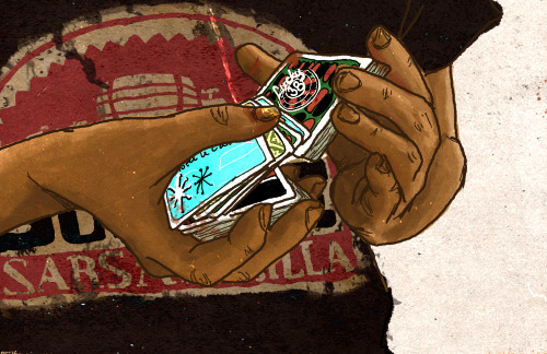
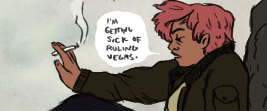
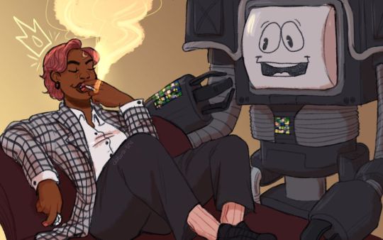
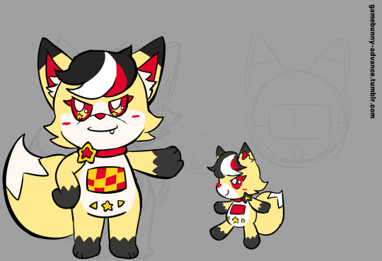
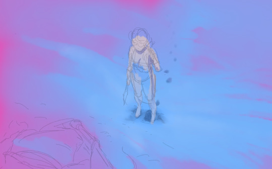
#the first one is a pretty old sketch but colored digitally
Text
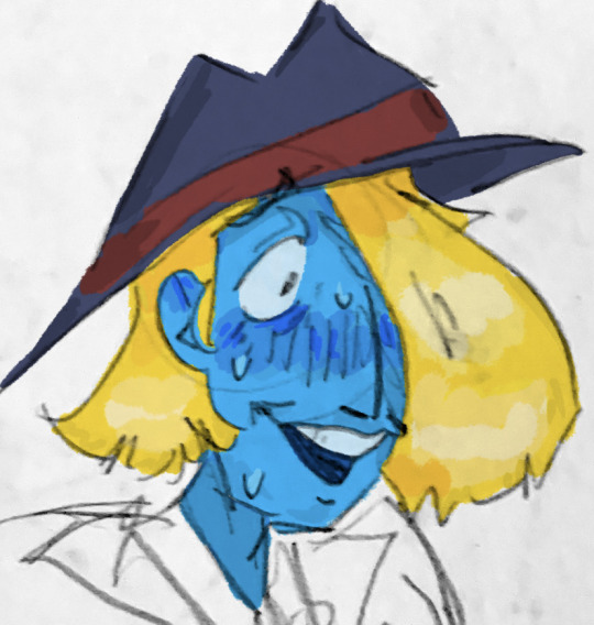

Dandies
#the first one is a pretty old sketch but colored digitally#second one is babysitter dandy I think he’s babysitter dandy in the new timeline#ghost trick#ghost trick spoilers#kamila#dandy#dandy kamila friendship so important
59 notes
·
View notes
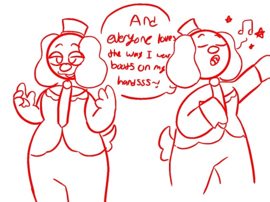
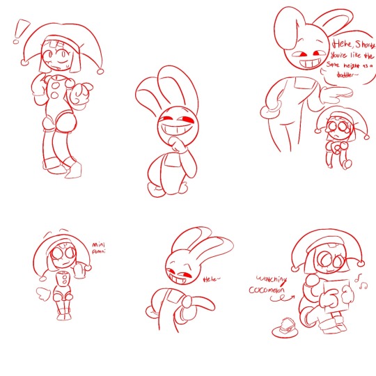
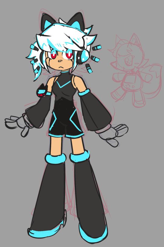
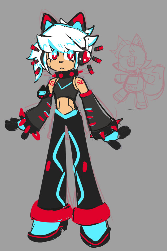
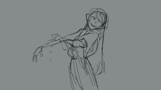
Text
I got really nothing to post and I have INTENSE art block rn… so take these unfinished drawings/doodles I made that I’ll probably never finish.


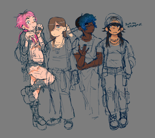
And here’s a lazy ref sheet I made for Azalea.
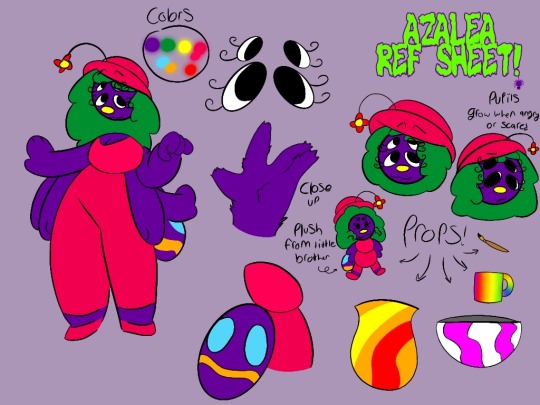
Imma recolor/remove a lot of them props cuz I really don’t like it…
#ive been trying to draw a full drawing for the past 2 weeks#I can only draw a clean sketch and that’s it😭#sometimes I can color them but other than that I can’t finish not ONE drawing#the Barnaby and ahit drawings are pretty old.#not super old tho. like… August.#imma try and make some more ahit au shits soon. I just gotta get rid of my art block first🥲#welcome home#welcome home artist#barnaby b beagle#a hat in time#hat kid#bow kid#the amazing digital circus#tadc pomni#tadc gangle#tadc fanart#welcome home oc#wh fanart#welcome home fanart#ahit fanart
25 notes
·
View notes
Text
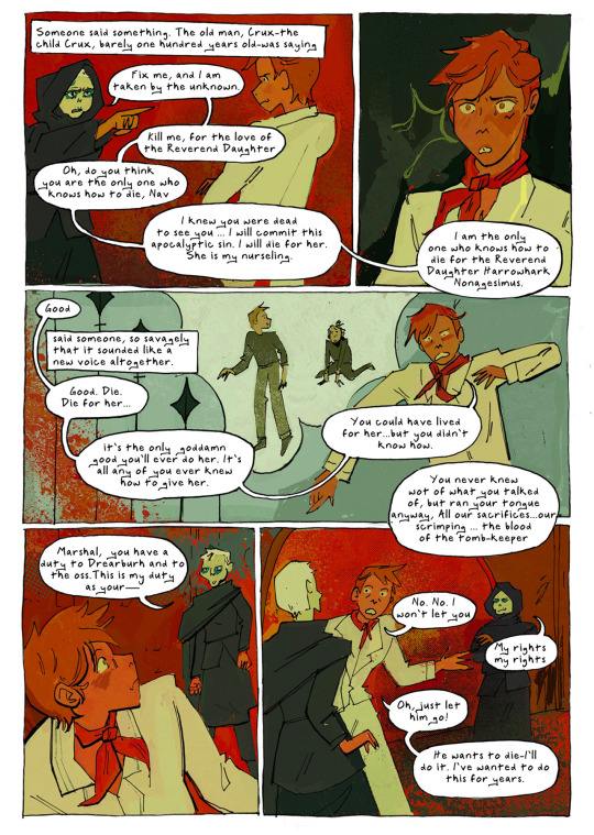
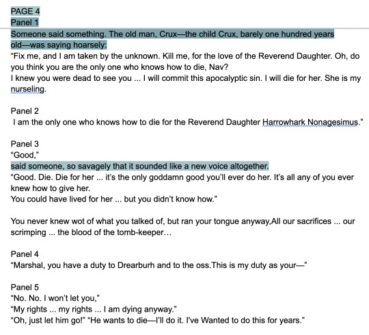
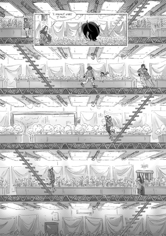
Page (4/14)
I wanted to share my process for my 14 page Nona comic, This got pretty long so the rest is under the cut!
First, I start by making a script, as I'm weeding through Nona I’m drawing immediate reactions. This way I don't have to keep track of action as well as dialogue. This is the most dialogue heavy page of the comic so this one has the most detailed panel break ups.
In this scene Alecto’s inner thoughts are my favorite part so I dedicated a lot of time figuring how to add them naturally. I especially love “The old man, Crux—the child Crux, barely one hundred years old”
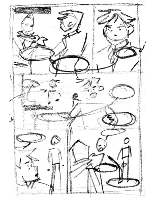
Once I have a rough, and I mean ROUGH thumbnail for the page I move on to creating a digital sketch.
Side note, you’ll notice I go back and forth from traditional to digital back to traditional. Having to fully redraw poses multiple times makes me really think about the action and what I want to include.
Thumbnailing is for figuring out panels. Sketching is for action and dialogue. I tend to show action and emotion over following all the rules of comic making. If you notice i break the 180 rule, but at the end of the day character interactions are more important to me.
I redraw the sketch on comic paper in mechanical pencil. Again I don’t trace the digital work because I want the linework to stay loose. I just focus on lineweight and contrast at this step. The dialogue is written out first then I line everything else with my felt tip pen.
I clean up the comic and replace the handwritten dialogue with a font I made out of my handwriting. This part is tedious but I really don't know how to skip it. My handwriting is too hard to read but I also need to make sure all the dialogue fits naturally, so that means doing it twice.
My coloring process is really chaotic and can't be summed up in screenshots.
Crazy right? I am constantly adjusting, changing, and generally making a mess and then cleaning it up when I color. Often when my colors look off to me it's because I have a contrast problem, so I check it in greyscale.
If you want to know more I can share my brushes and techniques.
And with that I’m done! And then I move on to the next page.
#my art#my process#tlt#the locked tomb#tlt fanart#gtn#gideon the ninth#gideon nav#gideon tlt#gtn fanart#ntn#nona the ninth#ntn fanart#tlt comic#the locked tomb fanart
368 notes
·
View notes
Note
pspspps.. totally not golden groovy woops
ANYWAYS HII!! heard u were open for requests. may i request tammy + qiu with and an artist reader :00
requests of my favorite fandoms are my catnip good gof woa who could this be‽‽ my reqs and my ask box are like always open btw >◡<
extra note/s: I refer to step 1 Qiu as he/him. Uhhh take this as platonic or romantic, I'll add an indicator for romance (𐙚) ^^
more under the cut > o

✧ At 10 years old, QIU's fascinated. How he discovers your interest and skill in arts varies but his reaction doesn't. He's impressed! Whether digital or traditional, Qiu would love to participate especially if you asked him yourself.
For this reason, he carries an extra pen and even those colored ones just in case you get bored or if you're suddenly struck by creativity when you two are playing :3
✧ The first time you show him one of your doodles you made during class, he's compelled to do the same whether or not you actually give him it. And ever since, you two've been exchanging these sketches during class. It's the cutest scene to walk into.
✧ URGH AND THE THINGS HE DOES WHEN YOU TELL HIM ABOUT ART BLOCK DEPENDING ON HOW AND WHAT YOU DRAW
You're into drawing sceneries? Trust that he starts telling you and Tamarack about more "special things" in the forest and/or the town.
Like the sky? There's this clearing a lot further into the forest at your backyards. Stargaze, watch the clouds and the sunset together?
✧ It's also necessary for me to mention that unlike his notes, lazily pressed against eachother and constantly on the run, anything you give him goes to a safe space probably in between a books pages, under the the matress of his bed or inside a drawer/container.
"They broke into my backyard accidentally, 'cause they were on a crazy investigation about a paper airplane. Plus, they got here a day ago and they're already looking out for me. Normally, I'm the one doing that."
"Besides, they're pretty. And they make me pretty. Look! Look how they drew me!"

✧ As for 10-year-old TAMARACK, she's curious. The things you draw, are they based on actual places? Actual people? Oh, you draw based on your imagination? Elaborate.
✧ At some point in the prologue, she says "All the forests in the world are different, and some places don't even have forests. I can show you good spots to find things since you're newer to this forest than me."
And I can't not think of her running up to you to give you all of what she gathered for you to draw like omfg
With all those leaves and tiny branches sticking out of her hair and sweater, she smiles brightly with her hands filled with her treasures. AUGH SHE MAKES ME SO SICK I LOVE HER
✧ Like Qiu, she has her own safe spot designated for only your drawings if you've given her any.
She shows off all of them. Especially if you've drawn her?? It'll be the only thing she talks about during literally any time for the rest of the month and the few months after.
"Out of all the friends I have here, you're the best one. We came to the same exact neighborhood, almost at the same time, and are he same age. You have fun outside and I do too."
"I think you're pretty. How you draw me is pretty! I've never met a kid who was just like me. That's important. That's serious."
✧ Now, 14-year-old QIU's pretty much no different. They're even more impressed when they see just how much you've improved. Nonetheless, they treasure your old drawings just as much as they do they new.
They take the liberty of providing you with both a pen and paper to draw on when you're together, in case you don't bring your sketchbook (if you own one).
On those days where you two just sit in silence in their hideout, their gaze drifts to your side quietly a few times to watch your progress. After a while, they settle with sitting right next to you and watching the stroke of your pen against the paper as the scene forms with each hatch.
✧ As a teen, they've actually been a tad bit farther off the town when they feel like taking a ride on their bike. They've seen many sights and burn the route into their brain for them to tell you about. They'd even be happy as to bring you there themselves.
✧ If you ask them to be your muse, good god you'd need to tell them what to do.
It's almost a funny sight. Qiu, the kid who knew what to do their whole life asks you, "Should I pose? Where do I look? Ah- what's my good side?"
𐙚 They can feel their breath hitch under your scrutiny. Suddenly, they're concious of every single thing about them. Where do their eyes go? Should they move their hands? Is their hair in the way?
They avert their gaze flusteredly, their head ever so slightly moving to the side when they do so.
And good god do their hands clutch the fabric of their pants when you tell them to look at you properly.
✧ Same goes for TAMARACK at 14. She's as intrugued as ever to hear about your work. She admires (you)r style from then till now and has learned to appreciate the time gone into things as simple as this, whether or not you've made it with her in mind. BUT GOD IF YOU TELL HER IT IS, it's always sitting on her desk and she thinks constantly about what you've done for her.
✧ And while she doesn't exactly bring you a pen, she's more than glad to hand you hers when you need it.
✧ Unlike before, she'd now be at your side when you two hung out at her backyard. She'd be sitting across from you, practicing the cello. The hum of her instrument accompanied by the sound of nature and the scratch of your pen against paper gives her a sense of calmness.
This may also be when she realizes she's been your muse! Her fingers trace over where your pen has been and boy appreciate isn't even enough for her to describe how she felt. It was definitely happy, but that wasn't the word either.
𐙚 Her heart pounds alarmingly as she admires your work. It's almost concerning to you that she sits silently with a blank expression as she held your sketchbook in her hands.
But that concern washes off you as soon as a warm smile curls the corners of her lips, tender adoration displayed all over her face.
#🫧 ˎˊ˗ eunoia ✩#our life qiu lin#our life tamarack#our life qiu#our life x reader#our life#our life now and forever#tamarack baumann#tamarack baumann x reader#tamarack x reader#olnf x reader#olnf#olnf qiu#olnf tamarack#qiu autumn lin#qiu lin x reader#qiu lin#gb patch games
145 notes
·
View notes
Text
holy shit this year marks 10 years of this blog and moz!! i can't remember the exact date i started posting here - my archive says i have one post from november 2013 but let's disregard that - but i do remember it was around late 2014/early 2015 :)
^ one of the very first moz art pieces i ever drew, for fallout week 2015!!
memories and art through the years under a read more bc it got long
2014 → baby's first rpg!! i started playing fnv on my cousin's jailbroken xbox late 2013 and finished mid 2014 and i loved every minute of it. i remember waking up at 8am and playing almost nonstop until 2am the next day haha!
i didn't play moz on my first playthrough - but i did start creating a character that would eventually become her: a shorthaired ex-boxer who punched her way through obstacles when diplomacy failed. i remember she spent a lot of time with boone. i liked him then, because he saved my ass more times than i can count. but i digress. this is draft 1 moz essentially
2015 → this is the year that i was doing my thesis so i could graduate but i was so depressed and stressed about it that i distracted myself by replaying fnv on pc, where i played through the dlcs for the first time. i fell in love with the dlcs' oversarching story; particularly ulysses, who i became obssessed with, especially since i couldn't find any content of him at the time. in the game, i played as moz; i had most of her personality and choices down, but her backstory was still up in the air.
fun fact: this was an existing sideblog that i remade to be a fallout blog so i could look for ulysses content, and when i couldn't find any, i made some myself, featuring moz as my main courier six. originally, i didn't ship them, but eventually i ended the year as a courier/ulysses otp shipper.
this was the year i started drawing digitally - my uncle let me borrow a drawing tablet and i used an old copy of photoshop i pirated hehe
2016 → i graduated this year!! and promptly fell deeper into my depression. this was the year that it got so bad that i had to be medicated. through it all, this blog and moz and ulysses and my fandom friends were with me. and for that i am truly grateful :) this was the year i figured out how to lock transparent pixels so that i could color my lineart lol
2017 → i started hammering out moz's backstory this year i think. there's a lot of sketches of her and her family in my files. i experimented with shading and backgrounds here but that experimentation was pretty short-lived
2018 → i started using references seriously!!!! i did a lot of oc on oc kissing this year, featuring mostly moz and many friend ocs haha

2019 → didn't draw much this year. actually this year was a blur and i can't remember much from it except from it being the year of my terrible no good bad copywriting jobs... anyway i did manage to continue my courier/ulysses brainrot and make this piece, which i'm still proud of
2020 → pandemic time. i spent a lot of time asleep at home and i think this was also the year i started doing commissions?? shoutout to anyone who has ever commissioned me - thank you so much, i truly appreciate it!!

2021 → i switched from my old-ass pirated photoshop to clip studio paint and never looked back. also i did a bunch of commissions for my grandmother's surgery, which failed, and i distracted myself from the sadness by drawing my ocs over and over and playing disco elysium

2022 → by this year, i've got moz down pat and have started vaguely developing other ocs instead. but she's still always at the back of my mind

2023 → i bought new brushes from true grit texture supply and immediately found new favorites that i started using for everything. i tentatively started incorporating background elements in some pieces!
2024 → while it's still too early to say where this year will lead me art-wise, i will say that i started experimenting in realistic paint studio (which i bought in 2021, the same time as clip studio paint) a few days ago and i'm liking the results so far. we'll see!

all in all, these last 10 years have been quite a ride, but i'm glad i stuck around and i'm glad you guys stuck around too!! much much love 💖💖💖
#shh peri shhh#god. look at that old art... i took the ones that i still kinda liked but the rest...#well i don't hate them. but they're old and of their time and i wish i could redo them lmao#my art#moz
84 notes
·
View notes
Text
Every single Rainworld artist, new or old, please read!
So while this is on my mind, I just thought I would say something at the moment.
I have seen so many, so many, artists copy or very closely copy a design from another persons since they really like their style and hope that if their style looks like this famous artists then they will get the same attention. This is slightly annoying to me, now drawing other peoples art or practicing design by using someone else's design then somehow in anyway making it super original is perfectly fine by me, it's really good to do that! But when you copy someone's design so closely that is looks like your trying to rip off their designs, that's not ok. another problem i see is people hating their designs cause they are not "detailed" or "pretty" or "different" enough from others.
Now this post is gonna be about how you can make your own character with existing characters WITHOUT using someone else's design and not making the character "look boring" to you and others. Now no character is boring, everyone's different styles are amazing, this is not suppose to be a bad thing, this is just suppose to help other artists think better with making canon characters look original.
Im gonna use Hunter as an example since I was drawing him when i thought of this. So hunter, let's take this step by step:
Step 1: Do NOT look at a canon photo unless it's necessary for like a certain iconic scar or eye color or color or anything else like that, but completely IGNORE that canon design.
Step 2: Break up what the canon character looks like into words.
EX: Hunter is a slugcat with his color being on the red scale. He is being infected with the rot and is NSH's messenger.
Now with this description a thousand different ideas can be made, I mean on the red scale could be red, pink, or all the way to a brown even! Then infected by rot? He could be fully infected by rot or he could be partly or be halfway, maybe he was cured from rot. And NSG's messenger? He could have a weird marking resembling that, or always have a green neuron with him, or have green eyes or green clothing or green markings, really anything! Now wasn't that easy ^w^
Step 3: Sketch/Doodle
Do NOT instantly make a design choice unless you have one in mind right away, start doodling first, either digital or on paper and see how you like the design first, and if you like it then there you go! Now you ofc can change your design later on but it's better to have a main idea instead of posting something right away then regretting it since you don't like it.
EX: For my Rivulet I first had him being a little more like the true rivulet design since the lore for my AU was different then, but when I was finally drawing him I didn't like his design and so I started messing around with it and finally I came up with my water bat design for him.
Step 4: Finally, you have made it this far into the steps, you may now draw it completely, make a ref sheet or don't, join in on character group drawings and yada yada, you have your own design and you like it and that's all that matters!
Step 5: Have fun, you are not limited by the canon design. Design however you like, give them any lore that probably isn't canon if you want to, make them aroace or gay or lesbian, change their gender, mess around, make them siblings with random people that shouldn't be their siblings, mess around with families and personalities, do what YOU want, no what others want or like ^w^
Hope this helped anyone who needed it!
#mistaken#rain world art#rain world#rain world downpour#rw#au#rw slugcat#my au#rainworld#rainworld hunter#rain world hunter#rw hunter#rainworld rivulet#rain world rivulet#rw rivulet#rivulet#hunter#art help#art#charcater design
45 notes
·
View notes
Text

You know, one thing I don't like when I digitally color sketches is that the colors end up looking a little desaturated because of the paper. It doesn't look bad, I guess, but I have to eventually find a way to "fix" it eventually.
Anyway, today marks 6 years since BATIM Chapter 4 was released. Damn. I know I say something similar every time I recognize the passage of time, but it's hard to believe that it's been more than half a decade since this chapter came out. Time passes, I get older, it's crazy!
And I wanted to do something to celebrate. I've never been able to do anything to celebrate this chapter's anniversary since 2019. Which is a shame because "Colossal Wonders" is my favorite chapter in BATIM. Some of my favorite moments from this game are in this chapter.
And every year I try to do something to celebrate the anniversary, but I never manage to do it and it sucks! And as usual, what I really wanted to do this year didn't end up happening. I'll probably do it at some point later, but there was no way I could execute the idea I had in mind in such a short amount of time.
But I still wanted to post something today, so something small will have to do.
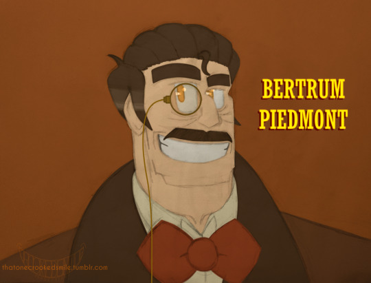
In this case, oh hey! It's Bertie and Lacie!
In recent times I've been going back to old designs of mine of the human cast of the Bendy universe, and since CH4's anniversary was coming up, I thought it would be good to update my designs for both Bertrum and Lacie. It's been so long since I last drew them, so it's about time. I liked the general idea of the last versions of them that I did in the past, so I tried to keep those ideas still, in a way, but at the same time giving them new life. Lacie falls more in this case, tbh. Bert still maintains some of the previous idea, but I had to change a few details. He still looks good, tho.
I originally wanted to put Jack Fain here too, because,by all accounts, Jack Fain only came into existence with the release of CH4 and the remasters of the other chapters. As much as you can put him on CH2's anniversary,he, at the end of the day, was only introduced on April 30, 2018. Problem is, I didn't like the drawing I made of him. I don't know, it wasn't that good in my opinion. And I didn't want to redo the drawing again (this would be my third attempt) and I wouldn't have enough time to redo his part. So today we'll just have Bernie and Lacie. Sorry Jack. Maybe next time, when I show my CH2 cast designs in one place.
Once again, happy anniversary to Chapter 4! This is my favorite chapter of the game to date. It includes some of my favorites from the story, it has several surprises that caught me the first time I saw the chapter, it brought new updates to previous chapters that added things that I still like to this day (and this goes especially for CH2)
And overall, it's a pretty cool chapter me thinks. 👍
That one day we can hear more from Bertrum and Lacie again.🙏 (Especially Lacie. Seriously, don't you guys think it's wild that Lacie is the only one of the human cast of BATIM who hasn't appeared in practically anything since the first game. Like, yeah, she's mentioned in the Handbook, but other than that, she's not mentioned in nothing else after, whether in games or books. I think about this from time to time. Truly one of the Bendy characters of all time)
#bendy and the ink machine#batim#bertrum piedmont#lacie benton#batdr#bendy and the dark revival#crookedsmileart#if you want a fun fact: The first design I made of Bertrum; which was in 2019 in I believe;#I wanted him to be similar to his model that we saw in the game;#at the same time taking a little inspiration from his VA;Joe J. Thomas#I think the design actually worked? but I wasn't happy for a while#so I ended up redesigning him; moving away from the canon accuracy a little; and doing my own thing#and this ended up continuing with subsequent updates#I think this current design is a bit of both ideas; details based on how we saw him in the game; and my own details#and yeah;the monocle has been around since the first design#and yes; the bow tie is kinda weird with that shape#but I think the great Bertrum Piedmont is allowed to wear ties of any type of shape; even they are a bit strange#Lacie's design hasn't changed much in recent years; the main idea has remained the same#The most changes she went through were changes in the color palette#the one I ended up using in the end is what we see above#I think it's what suits her the most (at least; it suits my design of her)
15 notes
·
View notes
Note
What program do you use to make your fanart? Is it on just an average ipad or is there special ones just for art? Your work looks so good! I’m wanting to try digital art but unsure where to start :)
I use the Procreate app for all of my digital art! ✨
It should be available on any iPad 💗 I personally invested for my birthday this past year and I have the 12.9" M2 iPad Pro, but I'll even occasionally use my fiancé's iPad Mini and the Procreate app on there in a pinch since it's so small and portable~
The only real difference is that performance might suffer a bit, the larger an art piece is or how many layers your work has, depending on the iPad. But if you're just starting out, I probably wouldn't find that to be much of an issue!
(More rambling about digital art origins under cut ✨)
There's definitely a learning curve, especially if you're more used to drawing traditionally! It can help to still sketch traditionally (if that's what you're used to) and then upload a photo of your drawing to your tablet to work over digitally (this is personally how I started out and I used to just make little digital doodles by tracing and coloring over my traditional sketches.)
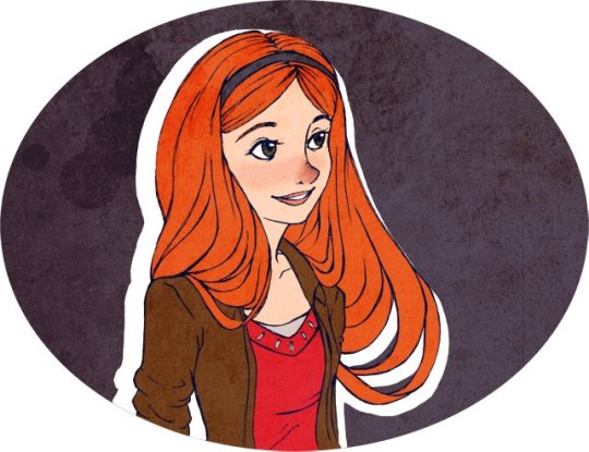
A small doodle from my sketchbook that I traced and colored digitally, from around 2011-2012, I think? Uh, happy Doctor Who day today!
My very first digital art set up was actually a tiny Wacom Bamboo tablet where the drawing space probably wasn't even bigger than my hand, and a super old bootleg version of Photoshop CS2 which was already a version that was 7 years too old for the time (CS5/CS6 was the most updated version by the time I had started on digital art).
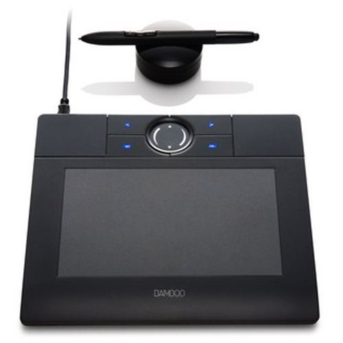
Everyone else in my class had the bigger/fancier/professional-grade Wacom Intuos and I remember my professor taking one look at my baby tablet and just going like "how tf are you drawing on that" lmao.
But still! Experimenting and doing little exercises can get you a long way – I would say to approach it with similar exercises you would do as if you were learning to draw traditionally for the first time.
Shade in circles/nail down basic lighting. Gesture drawings. Random scribbles. Just things that help you get used to the feel of digital art!
Test out different textures you can achieve with one brush, then expand it to see how other different types of brushes can behave and add to the experience.
For proof that even just one brush and not the best/most updated tools can work: these are two of my first more "serious" digital art projects I did in college (with my tiny tablet and mega outdated version of Photoshop) and 99% of the rendering was just done with the "soft airbrush" brush.
But even then, we were taught to create our base sketches traditionally and upload them to the program to work over.
Then one day I decided I wanted to just be able to also do all my sketches digitally and just worked on getting used to sketching straight on my digital program. It was then that besides the all-powerful undo-redo buttons, I started to really make use of the transform/canvas flip/liquify features which I don't think I can live without now lol.
(Caveat: I'm now a little too dependent on those features so I keep a traditional sketchbook to do silly doodles in occasionally to exercise my hand because sketching traditionally without the buffer of those digital tools is pretty difficult for me now lol.)
That was a little long-winded, I'm so sorry hahaha. I hope something in this rambling could be taken as somewhat helpful for starting out on digital art!! 💗
34 notes
·
View notes
Text
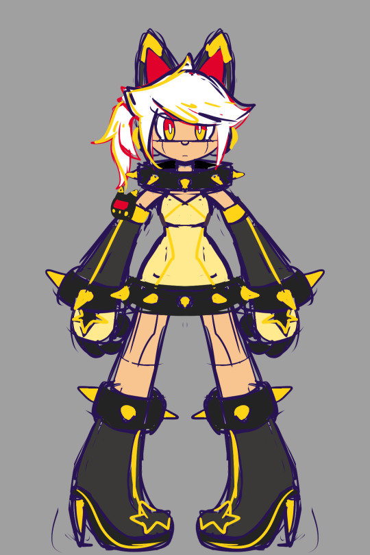

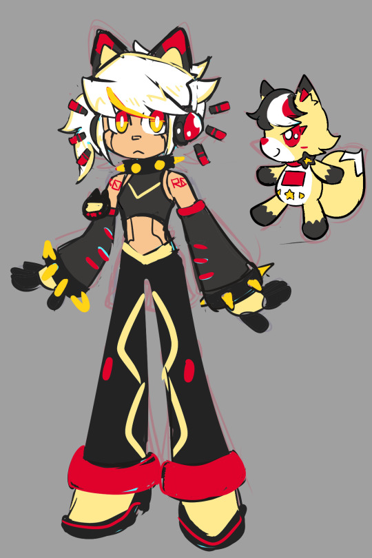

Developing S0-R0 (Sketches)
I just feel like drawing Kun3h0-likes lately, so I decided to work more on developing a "rival" character for her. Right now, I'm whittling away at this design that I'm calling "S0-R0" for the time being.
The 2 pics are the latest drawings, then I have the progress of getting to that point in chronological order. You can see the very first "rival" sketch in the last Misc doodle dump.
When I first went into this project, I didn't have any strong direction for where I wanted the character to go. Since Kun3h0 isn't fully developed as a character either, it was kinda hard to think of a foil to basically nothing. However, I did know that I at least wanted the rival's theme to be "stars" to contrast Kun3h0's hearts. So whatever I did was gonna drift towards sharpness.
The first chronological sketch is almost a straight inverse of Kun3h0's design in terms of palette. I wanted the silhouette of their arms and legs to be roughly similar so that it's more clear that they're supposed to be connected and not (just) that I have a limited amount of body-plans that I default to. I do like the black/green color scheme, but they've got a real "XBox" and "Monster Energy" vibe to them.
The outfit itself was heavily based on these clothes, just to give me a little direction, but the current design really drifted away from this.
(I added spinning bulborb just so the clothes wouldn't stretch out the post too much)
I also borrowed an old idea from my "Digital Idol Kayane" design, where she had some of her elements floating around. I figured since Kun3h0's ears/antenna just kinda "float" that I could apply the same logic to the whiskers. That detail would persist through most iterations of the design, but I eventually dropped them.
But, I was still pretty unhappy with that design, so I made another sketch and started working around it. The first iteration was mostly a palette swap to get away from Monster Energy, so I went with cyan since it's a kinda futuristic color that I thought would go great with the black base. Eventually it evolved into the second iteration where I went back to giving them the pants of the very first rival sketch and working from there. I'm not quite sure where the idea for the spikes came from. I think I just wanted to add some more "sharpness" to really work in the star motif, but then that kinda became the "main" motif beyond the stars.
I thought the black/cyan/red color scheme was really cool, but it kinda works against my established symbology where stars are yellow and moons are blue. In the event that I design a moon-motif character in the GAB universe, it would be odd for them to now not be able to use blue because the star-motif character got to it first. So, I did another palette swap, this time exchanging cyan for yellow and gold.
While I was working on that, I also got the idea to design their mascot to help with the design process. Since Kun3h0 was originally based on GAB, I thought that it might help me come up with ideas to solidify the mascot design first and that would help me design the rival proper. So, I made this little fox fella and have been designing S0-R0 around them since. I made several other palettes for the mascot, but in the end I went with my first design.

Finally, I took another stab at the outfit and landed on this minidress and made the collar comically large. I really liked the idea of this slim body being covered in large, overbearing spikes. I also took out more of the red accenting since I wanted to limit their palette as much as Kun3h0's, which is a neutral + 2 shades of the same color + a pop of one other color for small details.
It's not perfect yet, but I do like this direction. I went with this for some rough characterization: While GAB sought out someone with a strong heart to help them, FOX (name not final) sought someone with physical strength. Unlike Kun3h0 who is more emotional than a robot ought to be, S0-R0 tries to complete tasks as efficiently as possible, which leads to them using physical force to address most of their problems. They're not evil per se, they just don't consider the greater ramifications of their actions if they still ultimately complete their original task.
I haven't drawn it yet, but I think their weapon would be a morning star/flail.
15 notes
·
View notes
Note
how do you get your colors to look so nice and your lineart so red and vibrant? i love it
omg anon thank you!! 😭 im going 2 be honest I am Not Great with color theory... but i like having my sketch pages look cohesive to me...
BUCKLE UP this is going to need a readmore bc i like talking.
I always sketch in neon colors it's a habit i picked up from an old teacher but I'll think of a color usually on a whim and draw with that. and then if i want to draw something else ill pick another color that i think goes well with the page. usually most of my color schemes r analogous (colors right next to each other on the wheel)

yanked this from recent dunmesh post; i kept most of my colors within the pink/red/orange range.
i wouldn't recommend doing everything in monochrome or analogous palettes though because it's sort of a guilty crutch of mine XD.
sometimes when im coloring ill change the layer mode of the sketch. color burn gets you either very very bright or very very deep colors depending on the color of the flats underneath. multiply and linear burn do the same thing but they're a lot tamer and generally always return darker colors. im sure there's some technical bits behind this though. ill either color my lineart afterward to compliment the color of the flats, leave it as is, or mess with layer modes if i feel like it. my favorite trick is color burn + linear burn + some combination of two lineart layers and just fiddling until i get a nice burn effect.
mithrun was done with crimson red on color burn.
coloring... like 999% of this is relative color which is like. kind of the idea that colors look different when placed next to each other. if you eyeball it a bit it's pretty noticeable.

what i used to do a bit ago was i would fill in the area i wanted to color with one big mask of color, make a new layer that has a clipping mask down to the flat layer of color, and then draw my actual flat colors. the color of the mask helped me pick my flat colors bc if I picked a color i think stood out too much next to the mask i could kind of just adjust it until it looked a little more cohesive.

old ish drawing next 2 a canon reference. i ignore local color a lot...mea culpa....but my overall color palette here was a light pink, so the shirt here is actually a desaturated pink? or violet i believe. if you shift sort of that purple color far enough into the gray area of your color wheel it can take on a blueish or even greenish hue. it being next to a lot of warm pinks/fuschias helps.
a neat thing that kind of helps is that if you desaturate or saturate certain colors they can kind of take on a certain hue? not sure if this makes sense. sort of how orange here turns tealish blue the grayer it gets. so if im drawing something that's predominantly orange and i have a blue color i can just take an orange color and desaturate it until i get a color that sort of looks like blue. and that way it kind of looks more harmonious? at least to me XD
shading. i don't apply serious lighting to a lot of my drawings, but a helpful bit is that the shadows tend to be the opposite of whatever color the lighting is? i try to think first about the "mood" or the main color i want to go for in the drawing and then i pick a shadow color opposite of that. so for here, i wanted the lighting to be a coolish magenta so the shadows r lime green. if there's anything off i fiddle around until i get something i like. the shadows on the skin here were too green initially so i shifted them a little more orange.
there's a "band" of color going on between the transition of the shadows to the light. generally this could be for a lot of reasons and i tend to use it differently (core shadow? overexposure? etc etc). but this is a color post so ill try not to go too off track.
but generally digital doesn't "mix" colors the same way traditional colors do if you use RGB (cmyk is a bit better with this but is kind of a pain to get used to), so to make blending a little less muddy, i sometimes add an intermediate color to smooth things out a little. for example, mixing digitally blue n yellow tends to get you gray, but generally, blue + yellow makes green, so if im making a blue->yellow transition ill slap some green color in the middle so it flows a little better.
I do a lot more cel shading nowadays. if you've been on here for a while earlier this year i have another style of coloring but it's not really accurate to how shadows really work so i wouldn't recommend looking at it. it's mostly to add zest and texture to the underlying flat colors.
coloring your lineart does a TON to helping your colors look vibrant, though its like the garnish on a dish to me (same with shadows). i think it's good to try and play with your flat colors and try to make sure those look in order first before adding flourishes. usually ill leave it a dark, saturated color that again matches my overall palette but sometimes i go in and color them by alpha locking my lineart layer and picking a color that matches the flat colors underneath? not sure how to explain it properly.

i used a darkish purple for shuro's ponytail to match the dull red of the flat colors (more relative color! trying to simulate a black/brown while keeping the pink palette there) but a lighter crimson for laios's blond. the light was this super intense like blush pink so i thought it might be cool to add this neon salmon red in the areas of that light to really give off that vibe of a very bright intense rim light.
sometimes you could also tweak with gradient maps or color balance, which adjusts hue based on how light or dark a color is. these r fun to mess with as a final touch but i need to watch using them because they can become crutches real fast XD but those are also just tools to help you. in the end just developing a good sense of how color works and how you want to use it is the best place to start.
LONGASS ramble but yeah. tldr just kind of train ur eye for color and look at what you like best. which is unhelpful and a little sucky but it really is just observation and practice and maybe some personal zest.
happy drawing!
#SORRY THIS IS THE SIZE OF CANADA I YAP A LOT#i like being thorough when explaining myself a lot XD but i think the easiest way to get good with this is just repeat practice n observing#and figuring out how stuff behaves in certain situations and what you like to do and blahblahblah#if you have artists u like that do this well looking at how they use color might be cool#...i feel this entire post is just putting my entire thought process on blast LOLLL.#“eyeball it out” -> study some actual fundamental stuff and or intake new info or art -> apply it back to just eyeballing it out#i dont think i have a natural sense for some basics#but i dont think im naturally one of those people who grind out studies all the time and breakdowns either#i guess i just kind of like knowing the mechanations behind why to do a certain thing or how stuff works and then figuring out#how that translates into what i know nerd emoji#james gurney has a good book on color and light#if you like reading. but its very informative!#quirinahscreams#ask#anon#this is mostly just me talking about how i draw i dont think this is meant to be educational or informative XD um
12 notes
·
View notes
Photo

I drew Zero tonight because while I was going back through old scans and drawings from old file folders, I found a picture of what was the very first attempt I made at digitally coloring something I’d sketched and scanned in.
The scan and digital coloring attempt? This one -

Haha, that was the very first time I tried to use my drawing tablet, I’m pretty sure. It wasn’t even using Photoshop but some...other paint/image editing program that came bundled with the scanner I received at the time.
It was fun to try this out, though. UwU
Got this on the other site too.
50 notes
·
View notes
Text
4/6 Diary: Dead Projects
it's hard to acknowledge why something isn't working when you're in the middle of it, sometimes it's hard to even know why. There's a few plots that have been in my brain for years that I've rewritten and rewritten and rewritten with little success. I think a big part of failed projects is actually over-estimating ones own capabilities, for example I plan out mechanics that I don't have the experience to achieve, or characterization too far from my own experience that its not fun to write. I often plan out stories that require a lot of research and I feel like I can't write until I know everything-therefore most writing doesn't get done and what does is full of holes. It's kind of embarrassing to look back at stuff and just think "I didn't know what I was talking about at all."

Sometimes shit just doesn't work out. In the words of Pretty Boy Detective Club giving up on a dream can be more beautiful than achieving the dream itself.
Probably 90% of everything I try doesn't work out and it's been on my mind lately that that's a good thing. Of course in an ideal world we learn from finished works bc there are things from those you can only learn by sharing with others and by wrapping up a story and by saying goodbye to your characters but there isn't such a thing as an ideal world and everything we do we learn from whether other people see it or not. There is something special you learn from unfinished projects, the types you choose to put down forever, which is you are forced to acknowledge precisely why it could not get done.
These are all images from 2 retired vn/comic projects.


These projects are prisons for some of my best and worst writing, full of ideas with no through-line or real objective, and no real thorough understanding of these characters who I loved just collections of feelings and images and facts I thought were cool.
What is improvement? I'm not a person who looks at my old art and feels like I've gotten better at drawing, and when I look back at old writing I only really get the sense that I've become less cringe but not become a better writer. I think improvement is more esoteric than becoming better at the skills you use to express, maybe it's just knowing yourself better and playing to your strengths, and crystalizing what you want to say (or finding it in the first place). Aesthetics form naturally from writing and drawings that plainly express what they need too and they are drawn like blood from stone from work that is trying its hardest to be clever.
Personally I find these digital pages from 2020(21?) to be better drawings than anything I've done in the last two years in a technical way but it doesn't matter, I couldn't finish it, and I didn't know the characters. It's just portfolio work, it took me months to do five of them. They're just "cool shots" even though I didn't know it at the time.

As I get further into working on Youth Who Was Killed I'm noticing that cutting corners produces better results, there's more emotion in sketches so why finish a drawing, why design a logo which I'm not good at when I can use a font, why color grade the images myself when limiting the palette to one or two or three colors provides an unmuddied result? This is the kind of laziness you would think would harm 'improvement' but I've found that too much brute force is a highway to burn out, and then you're not learning anything at all.


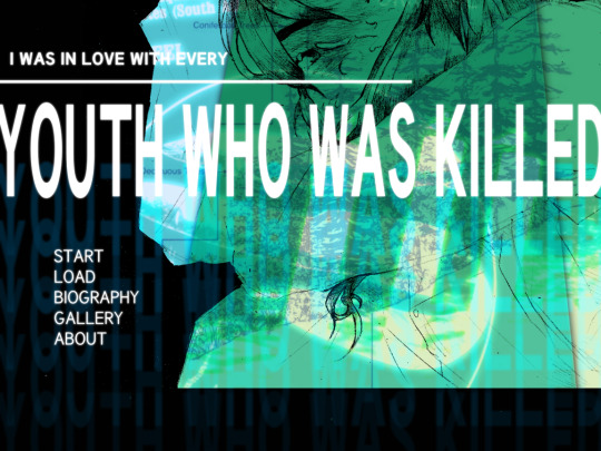
Making art is a war against human nature I think, cavemen definitely weren't built too instinctually develop a five year plan every new years. However it becomes like less of a war when you work with your nature rather than against it. Maybe. I don't know. I really hope I don't make a blog post two years from now about why I couldn't finish YWWK. If that happens blame ren'py.
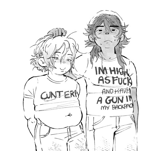
i drew my ocs in funny t shirts for the first time in my life so maybe all that stuff i said about improvement being that you become less cringe is untrue, maybe you get more cringe. thats ok with me i guess.
#meow meow meow#youth who was killed#that feels like kind of a scary tag and maybe i should use the acronym i will decide later
55 notes
·
View notes
Note
What texture/paper/background do you use for your digital drawings? I really like it!
I'm actually using a brush from a trick that I learned from this 4 year old video:
youtube
They show two ways to make a textured canvas on Procreate, but I've only ever followed the first option.
Basically, I grab a regular white canvas of my choice.

Then I take these colors:

The Main Color I just fill the entire canvas with by dragging it out of that little circle at the top right.


Then I find the brush "Soft pastel" amongst my default brushes in the tab "Sketching." and take the Texture Color before lightly brushing all over the canvas with the brush on its largest size. But only once and on a separate layer.


You already get a little bit of a texture going. Then I take the second layer (the textured layer) and change the mode to Multiply. Which makes it darker and makes the texture contrast harder against the plain first layer.

I merge both layers before finding "Hue, Saturation, Brightness" in the Adjustments tab and I play around with only the Saturation bar on the bottom until I get the exact shade of paper that I want.


The difference from before and after I play around with the Saturation bar. (Which stands at default on 50% I'm pretty sure)


And I do that before every drawing that I do on "paper."
It takes less than 5 minutes and really gives my art that textured feeling that I really enjoy. :)


I don't even have to stick to the brown color I showed for sketching and lineart because most (if not all) colors fit. The lineart of the middle one is actually a dark green.
Though for the Snotlout piece I used a different brush to create a different type of texture and I can't remember which one.
For the coloring in the Femcup piece, I only used the default "Round Brush" from the Painting section, but because I didn't press too hard, the texture still came out as if I drew her on actual paper.
For the sketching and lineart, I tend to use the default "Ink Bleed" from the Inking section.

5 notes
·
View notes
Text


Decided to post all the progress pictures I had of this, from sketch to final painting. This is my favorite digital painting I've ever done, lol. Short description of the process below the cut.
Step one: sketch on paper. I usually make sketches for Serious Art on paper first, because I feel like it's easier to play around and get something... loose, with the right feeling.
2. redraw it digitally. This one changed a lot, because I couldn't get the framing right digitally, so I pretty much redid the whole thing.
3. this is where I thought about the lighting. I've been trying to get more intentional about my lighting, because that's what separates good art from great art. So I threw in the shadows while trying to think of what would be the most dramatic, as well as support the themes of the picture.
The rabbit needed to be in the light, and I liked the idea the light coming from behind him, the place he's turning to look at. Like he's looking at all the bright and good things that he has lost... It's behind him, something he can't get back. I also wanted the old-looking / Caravaggio-esque feeling, with harsh shadows.
4:9. These are all just painting in over the sketch. You can see my palette, I color-picked from a screenshot of the beast, but I would also create random similar colors, I wasn't strict about the palette when I needed something slightly different, especially in bloody/wound areas.
I used the built-in gouache brush in clip studio paint. Almost all of the painting is on one layer.
As you can see, I didn't do things the traditional way, where you lay down a midtone and build up darks and lights... I just kinda jump into it.
My least favorite part was the teeth.
10. the final picture. I added details like dust motes in the light, and one of my favorite little tricks, adding a bit of glow around the brightest parts with an airbrush.
If I were going to change anything, it would be the clothing, and the arm holding the rabbit (especially the bicep area) because I feel like you can tell I just phoned it in. There's also something slightly wonky about the mouth, but it would take way too much work to ever fix, so I never will lol.
#amnesia: the bunker#amnesia the bunker#the stalker amnesia#frictional games#amnesia game#augustin lambert
23 notes
·
View notes
Note
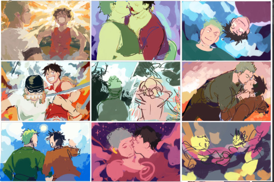
i love your postcard artwork for the zolu playlist SO much!! the colours are so so good and i love the brushwork! i think my favourites are a tie between the one for chikai and the one for simple song <3 also, I was wondering if you could share what brushes you used + how long they took you! looking at your art makes me want to draw again after not doing it for so long
Thank you!! and wow i think this is the first time someone's asked me for my brushes, this is like a digital artist rite of passage!
Answers n screenshots n stuff under cut
(I went a little to ham on this oops)
While we're talking settings I want to give a quick PSA to all digital artists:
CHECK UR ASPECT RATIO!!!:
(MOST IMPORTANT SETTING BY FAR)
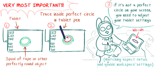
DO NOT DRAW WITH THIS ALL MESSED UP, IT WILL DRIVE YOU CRAZY. It's probably good to check this after every system update (I don't, but, you know...). Windows likes to mess w your shit when it updates.
If you have a really tiny tablet you might need to trace outside a bottle lid or something.
Okay now on to the meat of the post
--
Brush Stuff
--
I use Clip Studio Paint. For my playlist drawings I think I only used these brushes (these are my main 3 in general) (p.s. they're all default brushes! but i've adjusted the settings):
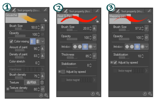
1) Gouache
This is most of what i used for the postcards. I nuked Color Stretch because i hate it (it blends colors together as you're painting, like painting over wet paint. I prefer things to look more crisp)
2) Real G-Pen
Used this as little as possible, to keep the painterly effect. My preferred fine-detail pen, has a nice crunch to it. I've fine-tuned my setting further in the thickness dynamics / brush size dynamics settings because I mostly use this brush for linework and wanted it to handle really, really naturally and precisely
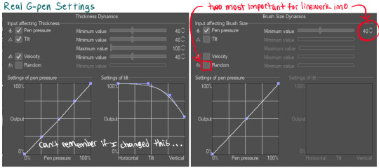
The random box is checked by default, probably to make this brush feel more like handling a real inkdip pen (I don't like that)
3) Mapping Pen
Least used. I generally keep this brush at the 50-70px range. It's unpleasant to use for detail work (the taper is really fiddly at my tablet pressure settings) but good at filling in large areas very opaque very quickly, with a crisp edge (Also, doesn't lag as much as the gouache brush at large-ish sizes). Has enough wiggle room that it can be used to approximately fill tighter spaces at large brush sizes. Used for when I needed to quickly color over an area that wasn't working or quickly fill in background color that didn't need paintbrush texture.
Did not realized the stabilization was set to 10 until just now. I usually turn that waaay down to prevent lag (my laptop isn't very old but it's a sensitive beast)
Other stuff that'll help:
General pen pressure:
(under File -> Pen Pressure Settings)
tweaking how CSPaint handled my pen pressure helped a lot with making lineart look more natural. It's worth messing around with this and trying out different settings for a while to see how they feel.
--
How Long it Takes 2 Draw
--
I don't really keep track of how long art takes me from start to finish, and making the playlist drawings was kinda nonlinear 😅 sorry!
-> I started out sketching really quick composition and color ideas as the songs were playing, limiting myself to just the duration of each song (so like, 5 minutes for this part)
-> i did that again at least 2 more times per song
-> after that, idk. I would work on one pic then get stuck and move to another. Some I could hammer out in like... 5 hours? Some took me upwards of 20 (30?) hours for no real reason (I have "will graham clock" days, where I'll try to draw a face over and over and it'll look really strange, like will graham's clock drawing every time) (this seems to be either a vitamin deficiency or a brainfog inflammation type thing 4 me 😵)
I'll use ur two favorites as specific examples:
-> Chikai was one that went pretty quickly (with the exception of their arms and the clothing folds there giving me trouble). Probably took 4-6 hours?
-> Simple Song had a couple different versions, partially because I initially had the cards all laid out landscape-style, and I decided I actually wanted them all portrait-style & repainted it after it was already done. That aside, the colors /atmosphere on that one gave me trouble and the general composition / perspective had a lot of tweaks (I was trying to figure out if I wanted it to be a kinda flat stylistic perspective or if I wanted it to make more literal sense, trying to figure out what to do with luffy, trying to make him not look Too baby boy sweetie pie). Probably took 7-10 hours...?
In-progress landscape versions:
(varying levels of in-progress)
Misc in-progress of Chikai and Simple Song:
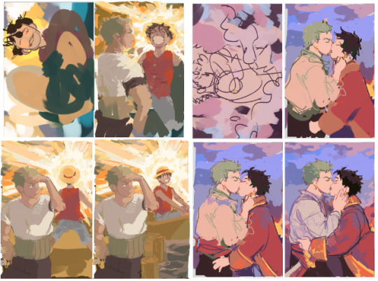
Simple song looks kinda sequential like this lmao. Luffy looks like he's A-posing and floating away to the boat and then sitting down pleasantly in it. Wonderful.
--
Anway -- hope any of that was helpful!
#i draw on my bed because i hate my lower back and hips#every day i pray to god to make my sacroilitis flare up#not art#well...hmmm#some art#long post
9 notes
·
View notes
Photo
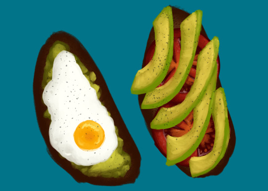
Eggtober 12
Avocado Toast (Featuring Tomato and, of course, Fried Egg.)
Clip Studio Paint, Gouache Brush, Dry Gouache Brush, Airbrush (for the barely visible bread texture) and Freckle Pen (for the pepper.) 20 colors, 1 hour 30 minutes.
Took a little longer on this one because I spent an inordinate amount of time lovingly rendering the tomato that I knew no one was going to get to see in the final product. (Don’t worry, I saved it to another layer since @quezify said last time that he appreciated the peek behind the curtain.)
This was another request by a friend. I must say, I wake up every day excited to choose an egg from the many options I have available and just... have fun putting it down on (digital) paper. I’ve got some yammering about that, but since I’m already going to post a “behind the scenes” under the cut, I’ll shove the musings down there too.
As always, big thanks to the Egg Master Supreme, @quezify for organizing this. It’s wonderful to see so many people getting into art again or branching out and drawing eggs for the first time, all because one zany dude said to Tumblr “You know what? Let’s paint eggs for a month.” And enough of us said “Hell yeah” that I get to see so many different styles and mediums. Loving every moment of it!
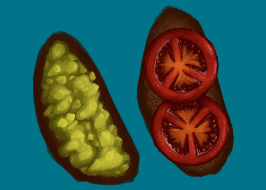
(Art first, because LOOK AT THOSE TOMATOES! I love how they came out, I want to shove them in my mouth! AAAH!)
Now for the rambling musings.
I’m starting to get really comfortable with the gouache brush, a tool which I previously never used, and I’m also getting more comfortable with art in general. My usual process from childhood, when I did much more art, was to slap down pencil work on real life sheets of paper, line it in pen or photograph/scan it and upload it to my computer to line with the pen tool, and then just do everything with pen for bright, solid colors. Most of my other techniques were one off flukes, like the fire I did in my icon’s background.
And my newer process, as an adult who just started learning Clip Studio Paint, was fairly similar. (I just started with CSP recently because it came free with my newest tablet and my old standard, Photoshop Elements [I dunno the version, 7 maybe?], was too old and would resize on my new rig so all the buttons were SO GODDAMN SMALL it was a pain to use.) The only difference is that, as an adult who’s home more often than not, I skipped the paper. Sketch, linework with the pen tool, then color under the line art with pen. Or, for a certain other project, I color under the line art with the watercolor brush.
I’ve always wanted to try gouache because I’ve seen it worked with IRL and it’s got such pretty results! Opaque like acrylics and oils but flows like watercolor. I suppose it never occurred to me to look for it in the toolset. The last time I even used brushes meant to represent real media before CSP was when Corel Painter was a thing and I had it with my very first drawing tablet. And even then I didn’t use it often. I mostly used the watercolors because that was my favored medium IRL. But I quickly started to prefer Photoshop Elements which also came with my first tablet. And slowly I stopped using anything resembling traditional mediums. But I figured, hey, Eggtober is already a time for me to learn some new tricks and get some practice in, watercolor will look too translucent and it has a paper texture to it that I’m not sure I want. Let’s see if this thing has Gouache. And it did. And now it’s my favorite brush. The way it blends naturally, the ease of pressure controls so the opacity is easy to alter stroke by stroke. It feels like laying down real paints. Once I got used to how it behaved it just... clicked.
So yeah, now that I know how to work with it and now that I had the brain explosion necessary to figure out my new process of laying down the darkest colors first and working my way up, it was all too easy to go “Oh. I like laying down these colors. And instead of trying to predict where I’m going to put the avocado, I’m just going to draw the full tomatoes for fun and practice and then figure out the avocado slice placement.” And then I spent roughly 45 minutes just... adding detail to tomatoes. Because it was a genuine joy and I was smiling the whole time and I could just look at those juicy tomatoes forever.
So yeah, I know I say it every time, but I for real owe quezify everything for giving me a reason to pick up a new tool and learn and just have fun with it. Kicking my depression’s ass, my ADHD’s ass, my artblock’s ass, and my (lack of) motivation’s ass, all with the power of “Egg fun, draw egg.”
#Eggtober 2022#Eggtober 12#Fried Egg#Avocado Toast#Tomatoes#my art#I'm just having so much fun with art#For these last 12 days I've fallen into a world where depression doesn't exist and COVID isn't floating around outside#For the last 12 days I've lived in a magical world that's just egg#no bad things#no sadness#just egg#I love Eggtober
60 notes
·
View notes
Last Seen Blogs

ccreblogs4fish
fish fish fish

aluminumcenters
U-Build-IT Aluminum Centers
axolotluv
just a little sleepy

dreadwolftags
the writing.

ohmonvintage
Ohmonvintage