#the pen pressure there is wonky
Text

Felt nostalgic for Sonic stuff so I drew Host and Mike as mobians :3
#My Art#Host#Mike#Host is a bunny and Mike is a rat :3#They'd find each other in every universe#Also if the art looks wonky is because I recently started drawing with an iPad and have no pen pressure#so it's been taking some time to adjust to that and trying to recreate my usual style :P#I'm drawing these during work breaks
33 notes
·
View notes
Note

i have discovered the existence of flaw erruri and i am LOVING her design <3
AGSJHSFYGHFS DUDE!!!! OMG YOU DREW THEM!!!! WAHGJHGHGHG LOVE LOVE LOVE IT<3333333
just cause you're literally the first person in over a year who mentioned (and even drew!!!!) her, i'll throw you a bone
this is her future design wip hehehe >;)c
#ask#wip#my art#other's art#fanart#erruri#flaw#my oc#WAHGHGHG you drew her :'( my lil sweetie<333#i haven't written that name name in so long...i'm neglecting my babies AUGHGH :'D#i have so many old redesigns of her i haven't posted</3 i still love them sm waaa#that wip was done back when my pen was broken btw so that' why it's so thick hhh xD no pen pressure didn't stop my stubborn self<333#her old ref is literally so wonky tho AUGHGHG xd so glad you still liked her despite all of that hh >:'D#muah muah this drawing is going in my special art folder because i'm so flattered and happy and waaa i LOVE it!!!!!!!#stop making your art so munchable paperd or i'll BITE it istg<3333333
11 notes
·
View notes
Text
trying out procreate and noooo my main ink brush, rake brush, and watercolor brush all don’t work on it 😔
#they look really wonky and not how they’re supposed to#but my gouache ones are fine at least#it’s pressure related but nothing in settings seems to change anything#but yeah all 3 of these heavily rely on pressure and how I tilt my pen#I guess I just… import in photoshop at the end if I’m working on something that needs those things#lux.txt
2 notes
·
View notes
Note
Hey, chronically ill journal friend! We should bond over the quality of pens
Oh man, I am absolutely not a pen expert at all but I’d love to hear what other chronically ill folks are using.
My wonky EDS hands love the Papermate Ink Joy range. There’s just no resistance to the ink flowing so I don’t have to apply much pressure.
Also my current favorite fountain pen is my cheapo Lammy Vista pen that lets me use my glitter inks without getting clogged. It works sooo much better than the expensive Benu one my parents gifted me, which sucks because the Benu one is really pretty, it’s just not as good a writer 🥲
329 notes
·
View notes
Text
Tip for Comic Artists+Writers
(If you don't do this already!)
Draw in ballpoint pen. In a notebook.
If you're like me and you struggle to plan your script in a word processor, or you struggle to "storyboard" or even sketch in a digital art program for your comic...
Don't do that part! At least, not yet anyway!
Scribble and sketch and doodle your characters, and their lines of dialogue, wherever you want on a piece of notebook paper, with a ballpoint ink pen. You can try and figure out the comic panel configuration of a page if you want to do that, but otherwise I recommend you don't do any panel-planning yet... in order to not limit yourself to a single page in the story. Draw the first and last scene in the same page, or only draw the witty one lines you had in your head that made you want to make this comic!
The benefit: there's no pressure to get it perfect!
Don't like how you drew the hands? Well scribble it out, or ignore it; it's not the final draft by any means. You're just getting the idea on paper so you can visualize it! It's the best way to practice what emotions you're trying to convey, or the positions of the characters, without worrying about if it's "good" or not. It gives you the freedom to make mistakes, so you aren't paralyzed by the possibility of making those mistakes and the trouble of having to edit them.
You can use a sketchbook or a pencil, but for me, this defeats the purpose of letting myself experiment and make mistakes with the art/dialogue. You get visual representation of what you want to work on (scribbled out hands tells me, "be sure to practice hands and gestures!"; Stricken out dialogue lines tells me, "yep that's not how I want him to say it. Maybe I should practice a few different variations of that line?")
Their faces can look wonky, their word bubbles can be poorly placed, and the dialogue can be absolute "cringe"... and guess what? It doesn't matter because first of all, it's hilarious what you can come up with when you let loose, but second and most importantly, you're getting your ideas down in writing and on paper!!!
--additional note: it gives you so much for you to reference from as well. I recommend letting the notebook be your central spot for experiments, concepts, story ideas, notes, reminders, and important details for your story/comic/graphic novel so it becomes a personal reference guide for you (and maybe somewhat of an encyclopaedia?) :)
I hope this is helpful - it has been for me!
#i had this posted privately but never shared it#but guess what it works SO WELL for me!!#so i'm sharing this for anyone who may benefit from it!#this totally helps me overcome writers/art block#it's just about foolproof!#my post#hope this works for somebody else!#graphic novel#comic tips#writing tips#comic development#comics#art tips#creative#comic writing#story development#comic writer#comic artist#graphic novelist#graphic novel tips
12 notes
·
View notes
Note
hi this is a pretty out-there question but. do u have any advice abt getting over obsessing over drawing consistent faces? i try my best to ignore focusing only on the face but then find myself spending literal hours perfecting only the face :( i want to be able to be free in making comics and having fun drawing like you, but i cant seem to get over this very weird hurdle :,-(
PEN. PRACTICE SKETCHING WITH PEN!!!!! or something else that you cant erase! No pencil sketch beforehand, just straight pen!
(If youre used to pencil, a ballpoint pen will be able to do some pretty faint lines if you apply light enough pressure. It may be most comfortable to start with since it's similar to pencils in that way.)
This will force you to start over completely when you get too caught up redoing details. Historically this has really helped me reel in my perfectionism!!! It can be frustrating but remember thats kind of the point! learning to STRATEGICALLY give up and live with something a little wonky!
Try doing a lot of smaller sketches on the same page so that you can look at each past attempt for reference, too!
AND NO SCRIBBLING OUT THE SKETCHES when you start a new one!!! Sometimes you'll sketch something a few times and then look back at an earlier attempt you initially didn't like, and think "well, that one actually looked the best! I was just too absorbed in this one detail, but everything else looks nice compared to my other attempts now that I have some perspective!" And that's a really refreshing feeling!
I also feel like it makes me better at getting it right the first time, just via developing a muscle memory.
When you're correcting a drawing, you're often doing these little tiny strokes, or if its on paper youre getting caught on the old pencil indentations, etc etc. It's not actually giving you any practice making the bigger strokes in that you'd use for making the initial sketch. Practicing by starting over completely a lot will help build up a muscle memory for that initial sketch, so that it feels easier to do it first try!
LASTLY, if you do this for a while and just find yourself getting more and more fed up, remember to quit and take a deep breath. I've been there! When I first started doing this, I definitely had to be in he right headspace to do it, so always feel free to throw in the towel and try again another day!!!!! Good luck!
366 notes
·
View notes
Text

Tea Party to go
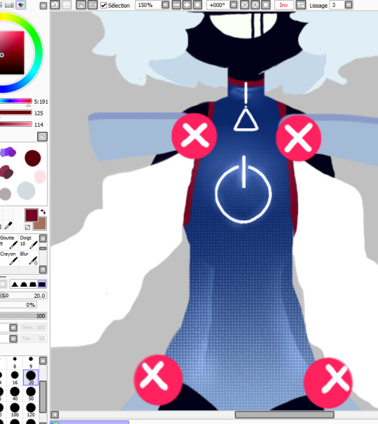
I think I found a way around my pen pressure problem. Still feels wonky and weird though.
26 notes
·
View notes
Text

not-yet-dead-person
silly comic of a conversation in-game i thought was too funny not to make something proper for instead of a doodle ww
(timelapse + wip images (thus silly process commentary in read more if you like artist commentary :3)

i think the sketch looks silly and goofy and funny so i find it important to share with you the mere presence of the faces i drew on it. i drew it on top of the boxes without staying inside its borders because i find my proportions can get wonky if i draw them cropped in a restricted space. and I feel trapped otherwise and i will draw BAD!!! give me spaceeeee to go wild!!!!
the head circles are there for emotional support
very low res speedpaint because truth is the canvas was much bigger than the space where my comic was placed. i didnt account when exporting my timelapse in 720px that that tiny space would look so pixelated ... but it's able to be percieved, so its okay.
(i will now comment on my process and it is not brief sorry)
usually i would try to clean up my sketches and figure out what goes on top before jumping into linework, but since there are multiple panels and drawings i chose to jump into inking right away for the sake of brevity. i just went in with a brush that uses pen pressure and drew what was needed. i added extra line thickness and contrast in areas around the face because it helps direct your eyes there more easily that way.
according to her equipment rei has a chain belt but i only remembered it existed once I was going to color, and i did not like that discovery... I chose to ignore it to maintain my peace. i already have the color palettes for these characters figured out, and i didnt really want to think about a new element at the moment www I tend to overthink those things a lot so i skipped it

the rest is rather straightforward! not that anything else wasn't, but in here i could turn my brain off and sing. linework and sketching require mumbling so i cannot turn my brain off. just block in the characters with a solid color so i can have a mask (something along those lines,) where the color can stay inside. then just color in !!!

Base colors just had slight cell shading on the skin, and for the hair i airbrush a bit of the skincolor in low opacity near the forehead... I'm not sure what it means, but i can look at the faces easier with it somehow. i like the gentle subtlety it adds even if you cant really tell. it makes things look nice.
background was just me blocking in the color of the wall and floor, shade the wall a bit, then slap a noise and free use wood texture on top. work smarter not harder ! yet it took a bit to make it look stylistically fitting with the characters, and even now i think bottom middle panel looks odd. whatever!!!
for the middle panel i thought itd be funny if the background was a solid silly and colorful one to contrast the next panel's sketchy black one. a contrast to how the word widow is seen. on that note my handwritting is not pointy. i gaslighted my hand into thinking that it was indeed pointy in that moment so i could write "not-yet dead person" in letters that didn't seem cute. my hand did not fall for it but it complied anyway
that's basically it! I'm not sure what else i could say that doesn't feel barebones because it really is that straightforward. if you're curious I used clip studio paint for this. only special brush used was for linework (a brush named Lemon Brush), the rest used were just the default. my computer gets the least credit. it was trying to convince me a 20mb file was going to nuke it all the time and hardly let me save multiple times so i do not appreciate it
#re:kinder#fanart#sayaka re:kinder#rei re:kinder#OH I ALREADY RAMBLED IN MY POST WHATEVER SHOULD I TALK ABOUT NOW IN MY TAGS UEEEEEEE😭😭😭#oh yeah do you want to know a fun fact about this drawing#i started it yesterday. i wasnt meant to I DID NOT HAVE PERMISSION...FROM MYSELF... i was meant to be on break#i self imposed a one week break from doing any rekinder related project after the transcript to avoid accidental burn out#NOT THAT I GOT TIRED OF IT AFTER THAT TRANSCRIPT NOT AT ALL#but jumping straight into more hours of creativr work after over 30 hours of it is asking for disaster. it is asking for burn out#yesterday was the last day . 12 hours were left but i was going to die if i didnt draw anything it would have been OVER#(aka my period started recently so i got very gloomy and depressed so i needed to run to my favorite stress relief...drawing rekinder☺️)#(on that note seriously what the fuck please explain the evolutionary advantage to getting horribly depressed every month)#(like hello?!?! rant real quick— i get enough flashbacks everyday i DONT need them to last longer and have me more msierable ?!?!?)#(periods are so dangerous to my mental health for no reason can i get a restriction order on them or some shit what the fuck)#(anyway thats enough of that break of character DONEEEE :3333)#SO YEAH I DIDNT EVEN LAST 7 WHOLE DAYS i even played a new game in between those 6 days youd think itd het my mind of rekinder. WRONNNNGGG#not even another devastating rpg horror gamr could divert my attention for long i hsd to draw rekinder😊#using the newfound power of mt transcript i was decided on drawing rei because i dont draw her enough for how high she is on my fvaorites#i was initially doodling random lines but then i stumbled upon this interactkon and it doesnt really fit into my usual expression sheets#so i thought hey lets do it asife#i thumbnailrd it and from there i was like hey lets do it in comic format isntead of separated messy doodles in tint canvas#and the rest is hisotry .... aka i spent the last two days doing this instead of doing MY HOMEWORK!!!!!#on my defense when i wasnt drawing i was horribly depressed i had no other choice#(seriously fuck off periods WHAT what do you mean i need to be distracted 24/7 to not be struck by crippling meltdowns LEAVE ME ALONE?!?!?)#(they should be banned we as a society should find like a . cure to them it dont do me good to have a whole week where i cant function)#these tags have been more of a weird rant im sorry IVE BEEN FEELING PEEEVEDDD LATELY SO YOU GET. STRANGE DROTTER LORE ????
17 notes
·
View notes
Note
I just wanna pop in out of nowhere to say that I really adore your art style!! I find it honestly super impressive that it took me SO long to decipher whether it was traditional or digital due to how well it's blended!
Oh thank you! :D The credit can't go to me honestly.
I splashed out on some VERY nice brushes from a website called True Grit last year. The ones I use most in my comics here are the KolorMarc set (supposed to imitate marker pens) they have a really nice natural texture and work perfectly with pressure sensitivity.
In case anyone is interested theres a link. They have really good sample packs as well, so you can get some decent brushes for free.
This is for colouring specifically though. My line art is mostly traditional because I find it easier and more fun to draw with pencil. Although I end up fixing up most images digitally cos my drawings are wonky AF lol
11 notes
·
View notes
Note
beginner tips for trying to draw characters similar to the Naruto style? like Kishi?
ps- your blog is incredible. I think about world building questions aaaalllll the time! So glad you made it and continue to post here. It's fascinating. It does not go unappreciated!! 💐💗😁
Thank you so much for the sweet words, dear!! You can always shoot me up some world building questions and I'll try to answer them to the best of my abilities! Your sweet words make my day! ❤
Before we begin, I have a words to say, especially if you're a beginner artist reading this. There is nothing wrong with your art style. Art styles evolve and change, they can be inconsistent and wonky, all of this is normal. We're all hypercritical of our art and its artstyle, however if you're genuinely unhappy with it, there are things you can do! Study your favorite artists and look at how they draw, watch speedpaintings and find what's best for you. The internet is full of resources, if you need help finding anything, you can DM me or send me an ask to give you recommendations!
That being said, let's begin!
How to draw in the Naruto art style, aka like Kishimoto
The artstyle of Naruto changes a lot throughout the series, I'm gonna show some characteristics of the mid to early shippuden style we know and love.
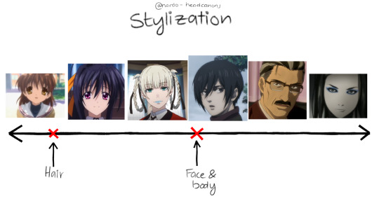
Stylization, like many things, exists on a spectrum. Most anime are between the second and the third image, however there's a broad variety of anime styles. With the Naruto art style, there's this phenomena of the faces being rather realistic, and the hair being very stylized.

The eyes
The eyes of most Naruto characters have the edge sitting higher than where the hypothetical tear duct is. Pupils, if present, are part of the lineart and therefore, pitch black. The irises are very round, almost circular. The eyes themselves do not have many details, as the eyelashes can often be counted on one finger. Compared to the other parts of the face, line weight also plays an important role in how the end results looks. I suggest playing around with your pen pressure settings and/or getting a brush ink pen. (I'm not getting paid) this is the one I use.
The nose
Minimalism is the best way to describe the way noses are drawn in Naruto. If they're drawn from the front view, it's just nostrils. The diversity of nose shapes in Naruto is not very high, unfortunately. Same goes for
The lips
When drawing the lips, you do not need to add many details. Unless the character is wearing lipstick, only the lower lip is drawn, and lips in Naruto all have pretty much the same shape and fullness.
The hair
The hair in Naruto is all heavily styled. Individual strands of hair are combined into thicker "hair bundles". If the hair is short, it can also be drawn in a spiky shape.
The headshape
The general headshape of Naruto characters is almost always the same, across ages and genders. It's characterized by a round forehead and pointy chin, followed by a slender neck.
The eyebrows
(The eye you can see there is in my own drawing style) Naruto eyebrows are thin and very straight. When the character is wearing a headband, more than half of it is covered.

General things
Reference is key. Always use references, even when drawing an OC, until you have built a large mental library of how to draw your character. Find a character from Naruto that has a similar eye shape to your character, and use that. Useful for that are screenshots from the series or reference sheets.
That's all, folks! If you need more help, send me another ask or DM me! ♥♥♥
#naruto#naruto shippuden#naruto fanfiction#naruto oc#naruto fanart#naruto fandom#art tipps#i guess#kinda
28 notes
·
View notes
Note
Hey!! I truly truly love your art. (I especially love your rendition of Frank from IASIP. You capture him so well. And don't even get me started on your Hilson artwork...) Your line art and your coloring is really quite fantastic, and every time your art comes across my dash I'm mega-inspired to draw.
I was wondering about how you think when you draw? What's your process? I really struggle with line art and coloring (especially coloring), and you do line art and coloring masterfully! How do you keep your drawings so dynamic? Would you ever consider doing a speed paint for a future sketch? (no pressure of course).
Thank you so much!! I really admire your style. Keep up the great work :)
first, thank you so much! this was incredibly kind 🫶
For me my process just stems from wanting to capture a face, and everything else comes next. my favorite thing in the world is to draw shoulder up portraits, so I don't pay much mind to their bodies (which makes em look kinda wonky but that's okay)
line art is my favorite part! I spent most of my life drawing traditionally so when I transitioned to digital I wanted my work to resemble pencil and pen. I don't really have a "way" I do line art it just kinda happens LOL! I use brushes that are conducive to playing with texture and line weight and go from there :3
coloring is HELL for me actually, I struggle so much with finding colors that work together. honestly you just have to learn how to be comfortable with your drawing looking weird for a little! I adjust my colors after I finish with sooo many clipping masks to try and make them look cohesive.
I also play around with sliders and after a while you can almost feel? when the colors will work? you just get into the habit and it starts to be like riding a bike.
I'll reblog this post with a couple of speed paints to look at ! sorry if I haven't been very helpful! any proficiency I have in art really just comes from practicing. I know it's soo over used to be like "practice makes perfect" but it really is the best advice I can give!
11 notes
·
View notes
Note
Hi there! This is random, but I really really love the way you do line art! I love how simple, clean, and direct it feels. It has great energy and feels really appealing! I’m trying to improve my own line art right now… I feel like it takes me a long time to choose the “right” lines and end up with clean finish. What to you think has helped you get up to this point with your line art the most? Do you have any suggestions of ways to study and practice? Any favorite artists you look up to for their lines?
I love your work ❤️ thank you
Hello! Thank you for the kind words. I enjoy doing linework a lot, so this is nice to hear :)
These days my line art is more of a "clean drawing" rather than what one usually imagines under traditional line art, which would be opaque lines with varying weight. Right now I like to use a brush that doesn't vary size with pen pressure but varies opacity only. It gives the lines a very soft feeling that I've grown to love.
I browsed through your art, and I was a bit blown away actually, because I think you have a fantastic energy and expression in your drawings, which is something I aspire to have myself. You are very knowledgable about line weight and shapes, so I won't bore you with explaining any of that, haha.
I think good line art comes down to confidence. Obviously, an artist needs a confident hand to avoid shaky lines, to lead them exactly the way they want to, to give them an energy. This sort of mechanical skill is acquired through experience.
But! I've always felt there is a sort of a mental side to this as well, which is best observed during traditional inking. You have to commit to your lines, you have to trust them. You have to sit back and give control to your hand, because with the experience it has, it also has a mind of its own. This sounds pretty out there, but it's about letting go and not overthinking it. I realized this when I looked up to Jim Lee's work as an older teen. There's a lot of videos on YT where you can see his process, which looks utterly effortless. Take this one for example. It's quick, so it's a bit rough, but it does look like his hand is just doing whatever!
I fostered that approach in my art while doing daily drawing from life - straight to inks without sketching. The drawings look wonky a lot of the time, but it gave me confidence where it mattered later. To this day, when I do clean lines in digital too, I adopt this mindset of letting go, which gives the lines more leeway, which also means that if the line doesn't go exactly where it should according to the sketch, I can still trust it. (Although contrary to this, I still put a lot of controlled effort into faces, and this approach comes more easily while drawing bodies and clothes.)
As for suggestions for practice, as I've already mentioned, drawing from life straight to inks (I recommend this over going straight to inks from imagination as that's extremely difficult, at least for me). Have a fast hand, and do long lines even if they come out wobbly. Try to let your hand roleplay Jim Lee here and there - let it do that flick that crosses a line it shouldn't have, let it make a turn with an accidental squiggle, let it pool a bit of ink at the end of the line. Fake it till you make it. At first, I suggest trying this on subjects that aren't your expertise (eg. in my case, draw a bottle instead of a person), so you don't subconsciously compare this to your best work, but make sure you're still having fun :)
Of course, it helps to like doing line art too. I don't know what your relationship to it is, but if it suffers, I suggest busting out the traditional inks with dipping pens, wodden skewers and brushes. It connects me with the process like nothing else.
As for my favorites, I can recommend one of my favorite manga artists - Satoru Noda. Superbly confident and energetic linework. Check out his series Golden Kamuy or Dogsred :)
I hope this will give you a small idea of how I approach my line art. It might be a mess… If you have any more questions as a result of this, or related to anything else, don't hesitate to ask!
19 notes
·
View notes
Text

I got a new iPad for my birthday. As my old iPad was a model from before Apple Pencil was introduced, I was excited to try out Procreate for the first time! Unfortunately… I didn’t get an Apple Pencil as a gift, rather a Logi Crayon, which doesn’t have pen pressure :P Oh well, I know what to ask for next year. I wasn’t planning to move my art making from my Wacom tablet to the iPad anyways. In the meantime, can I offer you this wonky Clodsire?
16 notes
·
View notes
Text
*artists who use nice drawing tablets with fancy pens, or just have decent art material in general, OR at least have a well working device that has pen/finger pressure and decent art apps* :
hi
*me who who has been using the same cheap, wonky amazon fire 7 tablet that's only decent art app is medibang paint mobile for almost over 7 years, and does not have pen pressure at all* :
this is what survival skills are for
#Yeah I've had this thing for forever now I'm surprised it's not broke lol#It's not that I couldn't get a new one I probably could I've just always been afraid to ask#My ass is just paranoid that if I do my parents are gonna take this one and look through it and somehow find out about everything even if I#When I first got this back when I was like 11 I got in trouble with it cause they found out I was staying up till like 4:00 am with it lol#... my search history#I deserved it tho but that's what happens when you give a kid a device who has always been strictly restricted from the internet
4 notes
·
View notes
Text
Hiiii :D hiii hiii...
Please stand by while I finish this semester and figure out why my pen pressure is wonky,,,
2 notes
·
View notes
Note
Honestly as someone who's used a ton of different programs I feel like Sai is the best program I've found for no pressure art, especially since their pen line tool is pretty good and intuitive. I dont feel like CSP is any better unless you wanna use their extra comic tools and assets and the like.
thats just the thing is i dont use assets since they clash and i dont like using stuff thats like. looks Too good? if that makes sense
like for instance i draw all of my comic panels by hand and theyre wonky and look like shit, but its because i find using the ''linework'' tool that gives me perfectly flat lines just makes everything look weird

so i really dont use ad-ons or special tools unless theyre like simple texturing stuff that i can easily just get in SAI as well since i have a shit ton of texture choices for brushes
so maybe it is for the best i stay with SAI. its never failed me and ive never had a complaint.... my one true love
5 notes
·
View notes
Last Seen Blogs

rockalily-blog
Rockalily

jessicasellsthings
Jessica Sells Things

drucifer666
more noise please...

ohnoai
カメラ小娘_オオノアイ
hoierthanthouau
Holier Than Thou AU