#their faces almost have more human-esque proportions?
Explore tagged Tumblr posts
Text
fun fact: one of the things that really sparked me wanting to work on this werewolf thing was this tiktok i saw of someone’s borzoi eating food off the stovetop
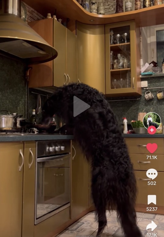
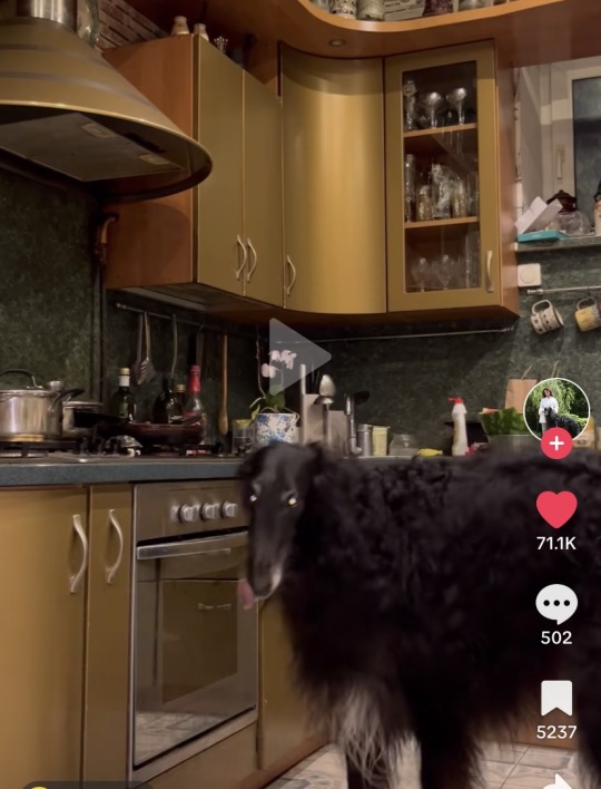
creachure…
#ivy.txt#like obviously my werewolf design isn’t just gonna look like a borzoi#but i like how they’re like. less dog looking than most dogs. if that makes sense#they’re kinda stretched out#their faces almost have more human-esque proportions?#and idk just the hunched over posture….looks very like. Aware if that makes sense. conscious beast.#so! i’m definitely gonna take at least a little inspo
7 notes
·
View notes
Text
Jack Frost Designs Review
Yes it’s finally his time. This is going to include his book designs including previous incarnations in said books. There are more movie concept designs than book so, let’s dig in shall we?
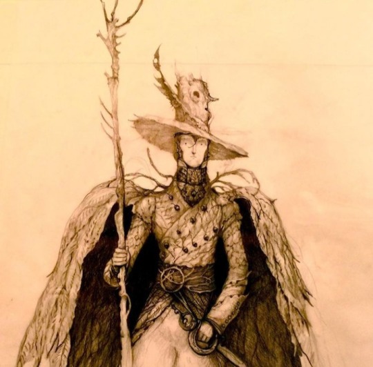
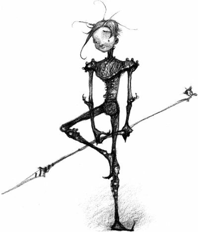
This was in fact the first ever Jack Joyce designed while he came up with The Guardians Of Childhood. He even comes with his own backstory! (Which was cut. Sorry Joyce posts walls of text so it’s a girthy read.)
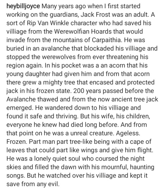
So instead of a young mischievous trickster, we got a much more depressing story of Jack. (Jack by default is sad obviously) but this one... It kind of hits differently and almost reminds me of the story he crafted for Pitch. A dad who tried to defend his family but through tragic events was ripped from them and changed completely. Design wise, he’s a lot more tree than snow. There doesn’t exist a colored version of this so we’ll never know if he sported winter and dull dead leaf colors rather than grassy greens.This Jack has a weird presence to him, I can’t put my finger on it. Rating: 6/10 He’s really neat! Just a little too Autumn feeling rather than a blend of both Autumn and Winter.
Nightlight feels like the baby evolution if Jack was a pokemon and that's what I’m gonna stick with. Below is a more recent version of him colored.
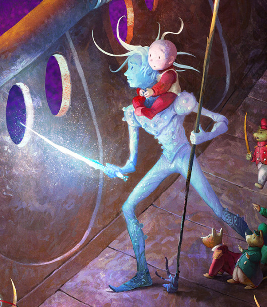
In all honesty that one is easier on the eyes proportion wise because sometimes Joyce has ‘interesting’ anatomy choices but we aint going into that today. It’s interesting how his hair somehow looks shorter and longer than Jack’s at the same time. Could be because the longer strands float seamlessly but star boy hair physics what can ya do. It’s a little hard to tell what is his skin and what is his armor, so that is a casuality in making a character only have one or two colors in their color scheme. I love other artist’s depictions of Nightlight but the canon one feels a little weak color wise. Rating: 5/10 Sorry, get some better LEDs and then come back.
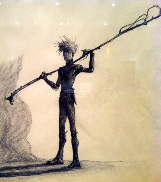
Here we have a book Jack but I can’t entirely recall if this was used in the books or not. I digress. This design looks like him still wearing very Nightlight-esque armor/clothing and slowly growing into his new persona as Jack Frost. The intricacies are hard to make out but we’ll work with it. This one is very interesting to me because he very much looks like an older teen close to young adult. His hair looks very fluffy too. Not many complaints about this one but not much praise either.
Rating: 6/10 Not great but doesn’t stand out that much.

Remember when I said Joyce had ‘interesting’ anatomy decisions? Jack looks like he has half a head here and it bothers me GREATLY. This is the adult Jack design he went with. Supposedly he likes the opera and he sure looks it. This! Exists!! Kind of wish it didn’t. The outfit is nice but it just doesn’t fit Jack as a whole. This just screams to me that it’s someone else with a similar-ish hairstyle.
Rating: 3/10 Guess he’d be the...Phantom Of The Opera. (I’ll go home and so should he.)
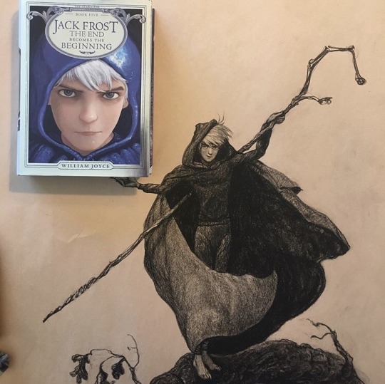
And finally the final Jack. This is the one that almost exactly resembles the Jack we got in the movies(Probably because it was made after the movie but w/e) but just add a cape on him. I can’t really tell if hes got a hoodie and a cape, or just a cloak+hood on top of a sweatshirt. It isn’t too important because my thoughts on this one are obvious. Rating: 10/10 Edna Mode would have a field day with you boy.
MOVIE DESIGN TIME
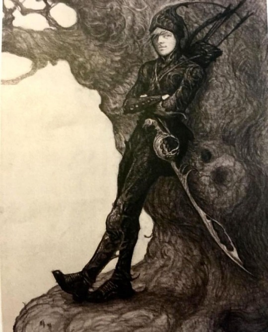
Joyce claims this is a design he drafted when Leonardo DiCaprio was considered to voice Jack and I can kind of see that with how his face is drawn here. This Jack looks a lot more like a warrior and less of that trickster look. I can’t say I’m a fan of the weird antenna his hood has but his sword is really cool looking.
Rating: 4/10 Nice bow and sword but it can’t save your fashion choices.
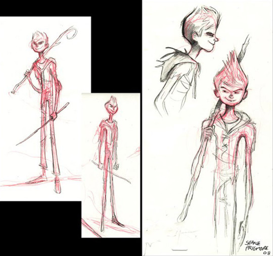
This looks like a lanky 11-13 year old who would put rocks or slugs in my shoes and relish in my disgust. He has the exact look of a snot nose kid and I’m unsure how to feel about it.
His various hairstyles drafted here sort of make him softer looking or just more of a snot nose, no in between. Maybe even an Anime Protagonist.
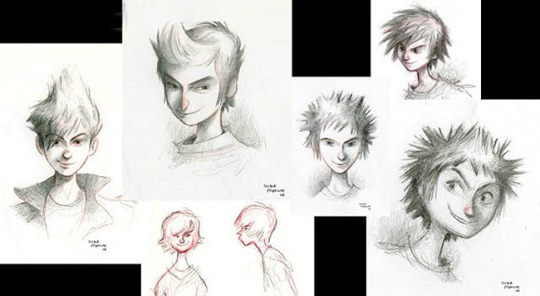
The top right one almost looks like Hiccup from How To Train Your Dragon if you squint. It’ll be a little hard to rate them all as one individual but why not.
Rating: 5/10 I don’t hate them but they aren’t my cup of tea.
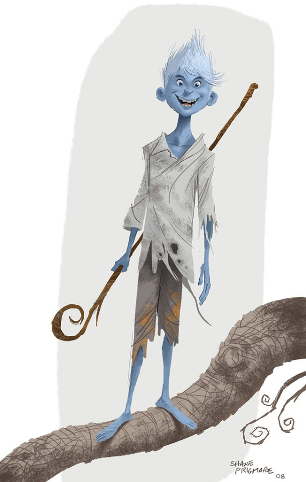
AH- IS THAT A FUCKIN GREMLIN?
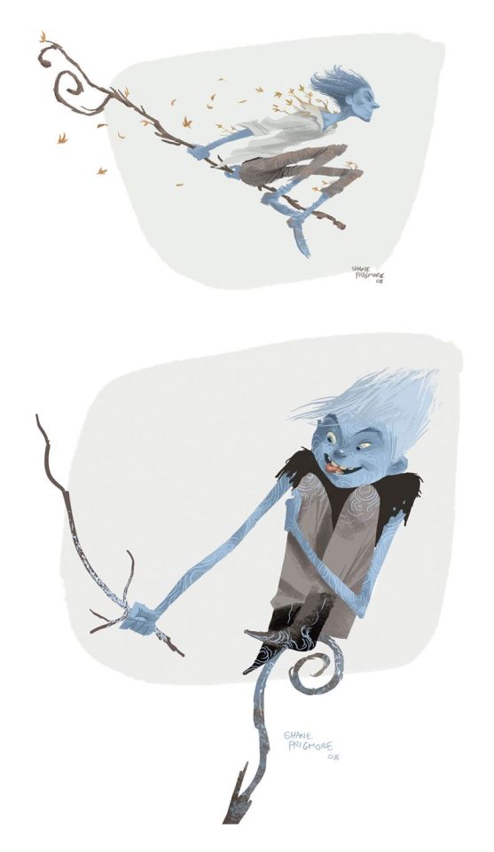
Oh wait no it isn’t he looks like a 10 year old. Whatever don’t feed him after midnight. The staff’s design of not being shaped like a G is an interesting tidbit but the whole design looks like he’s really young or like a troll etc. This Jack looks like he thinks girls have cooties uses outdated slang.
Rating: 4/10 This is me being generous.
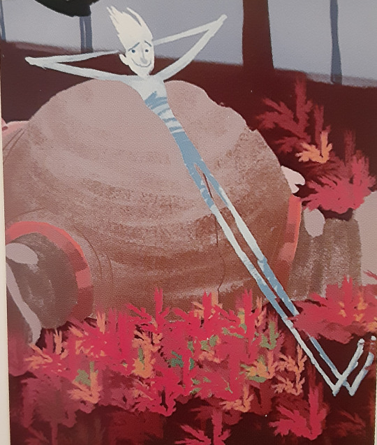
It honestly looks like he hiked his pants up all the way to his chest. A late teen with horrid fashion choices once again. Not many other thoughts here.
Rating: 2/10 Get a sweater on or something.

This is one is very interesting looking to me. His clothes looked a lot more leather based and very human-like. The tatters, tears and frays all make him look like he was a victim of an accident that never changed his clothes. It makes me wonder if this Jack had the same death as the final movie Jack or something else entirely. Either way, this one looks like hes a mid to late teen which really adds to my intrigue.
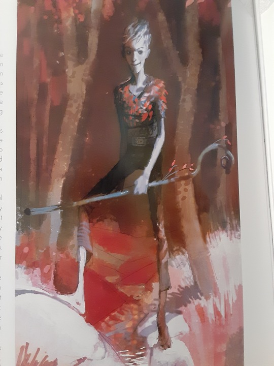
This was another image that greatly resembled the design so I included it here. It almost looks like his skin is blue here which is pretty neat to me at least. He’s also got leaf motifs here, which from the first Jack design Joyce made, we can see a pattern here.
Rating: 8 /10 I was originally weirded out by his head but now its not so bad.
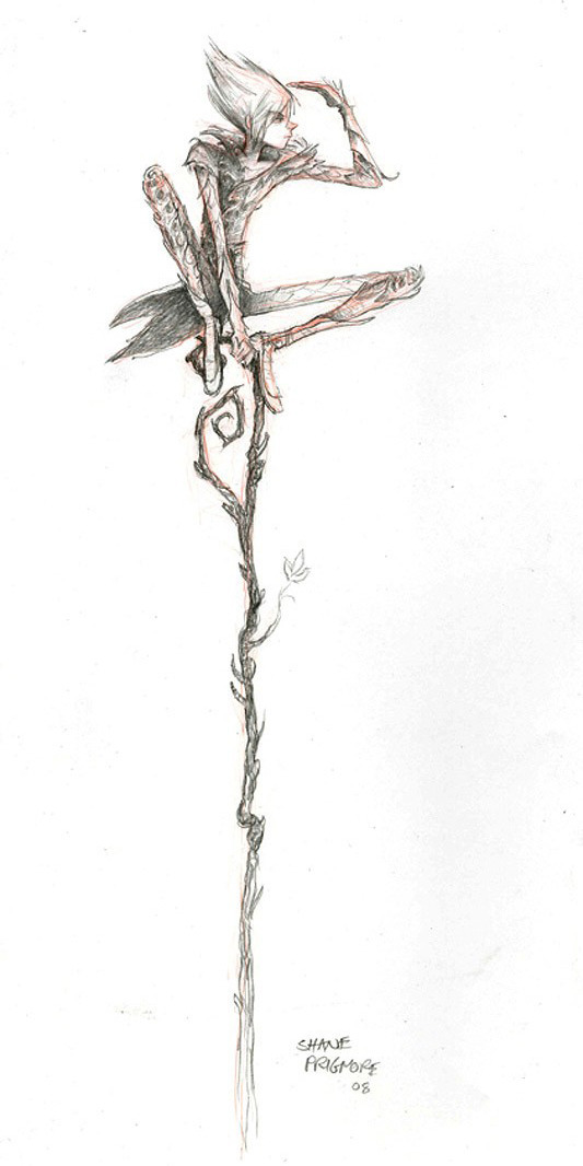
This Jack is definitely dressed more like a nature boy rather than him having human influenced fashion and it’s an appealing touch. The tiny leaf sprouting from his staff is also kind of cute since the designers seemed to want to put leafs somewhere on his designs. His hairstyle is also very cute but it reminds me of Sasuke Uchiha in a sense. (Not a setback for me at least)
Rating: 7/10 13 year old Jack is going thru a phase.
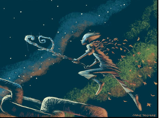
I thought this Jack didn’t show up again in story boards but I was wrong!
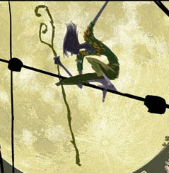
They look a little different from each other but just similar enough to pair together, so bare with me. The first one obviously has looser pants, slightly longer sleeves and got his leaf motif going. This second Jack is a VERY green. It gives the impression that this Jack made his clothes out of plants and natural materials. Again I’m not wholly sure if greens fit his color scheme but they sure went for it for a while. I can’t say I’m a fan of it because it heavily reminds me of Peter Pan.
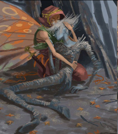
However a very similar looking Jack could be found in this storyboard. It doesn’t look as green as the other storyboards made it out to be and looks more like dead grass. Which is a pretty nice touch.
Rating: 5/10 I don’t hate it but it just doesn’t vibe yknow.
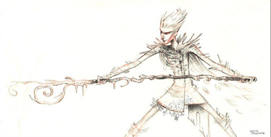
Speaking of a vibe...hoo this certainly has one. This Jack isn’t old but certainly doesn’t look very young, maybe in the 20-30 range, thats just me. He has facial features that remind me of Pitch but resembles the Jack Frost of Santa Clause 3
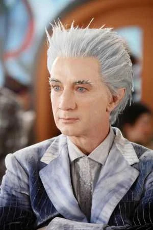
That being said, I wondered if him looking similar to Pitch was in the storyline of them being brothers.(Which was a scrapped thing, who knew.) He’s a bit more menacing in this design but certainly seems like he relishes in his work.
Rating: 4/10 I’d make it a lower score but I gotta give it props
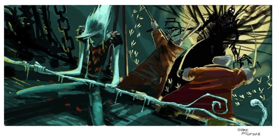
NOW THIS JACK IS KINDA INTERESTING. This one looks like he’s 16 and going through a grunge phase. He’s gonna play Nirvana loudly and not turn it down even if you tell him too. His staff itself has mini icicles hanging off of it and leafs look stuck to his shirt. Did you glue or staple those on Jack? His hair also looks much longer than his other designs and I kind of dig it( Shut up I’m bias.) I’m not wholly sure why else this design has stuck with me but it just has something about it that I just love. I wish there was a full body drawing of it.
(He also kinda has the same hair as the Jack Frost in Runescape but I wont go on about that hoo hoo)

Rating: 9/10 *Bad Boy by Cascada plays in the distance*
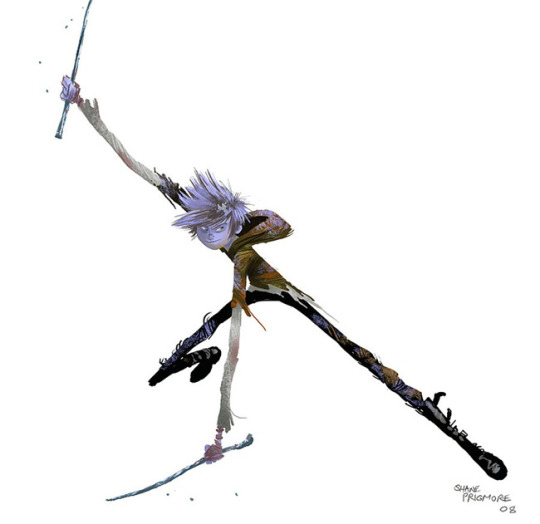
This one definitely feels like middleschooler trying to be in a band. His sticks just resemble drumsticks to me what can I say. I’m a big fan of his shoes and his color scheme screams a hibernating tree in winter. His hair also looks like it’s covered in frost rather than it being wholly white, which is very neat!! He looks like he wants to fight but has slight hesitance. Overall a very balanced Jack.
Rating: 8/10 He’s ready for band practice
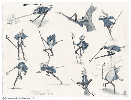
Not many thoughts here, I just found these tiny Jack designs cute. His hoodie being a jacket instead just adds to the charm of this one.

No talk to him he angy.
Rating: 6/10 fun sized boi
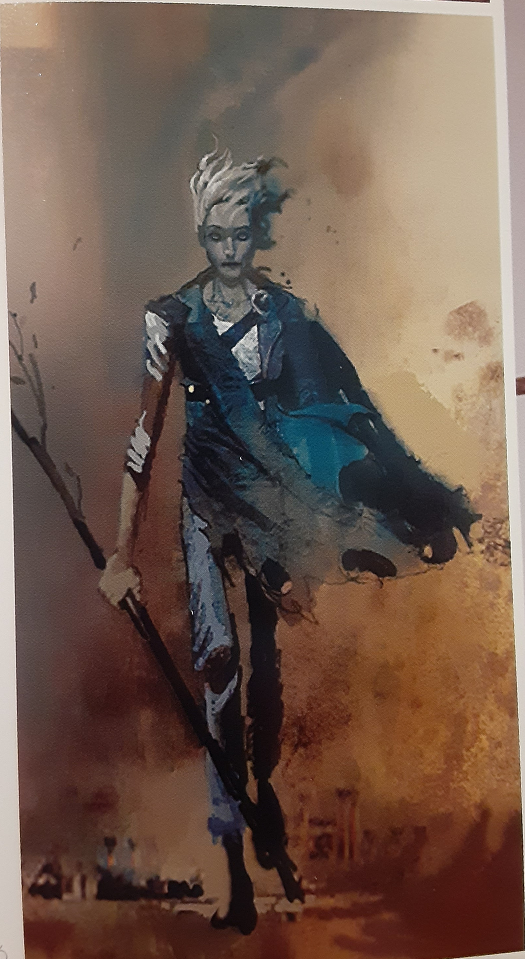
Now this Jack resembles the one earlier that dressed entirely in leather brown colors, however he clearly is different than that one. I’m gonna say it, he looks like a zombie or undead in this design and its pretty fucking gnarly. I don’t know whats going on with his hair but I’m gonna assume it’s just the wind making it look like that. He just has the vibe that he was once human but was turned into something else entirely. It isnt in uncanny territory but borders that. This version of Jack meeting Pitch and the others would have been *very* interesting. Rating: 7/10 Eat a twinkie Jack you’ll feel better.

The final design! I can’t complain much about this one. The way his staff subtly has a G shape and a hexagon(his signature shape) is a wonderful touch. Additionally, the way the frost is gathered mostly where his hand is such an intricate detail. His signature hoodie is iconic at this point so I can’t bad mouth that either.(I can’t anyway because there's no complaints from me here.) Although, I never understood the leather straps that his pants had or their functions. I couldn’t find any colonial outfits that resembled Jack’s pants so its a total mystery to me at least.
And I can’t go on about this design until I mention the snowflake pattern in his eyes
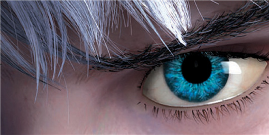
Pure beauty. It’s at a hue of blue that almost looks impossible to have, combined with the electric blue color of the snowflake in his eyes. The amount of detail in this movie amazes me to this day. Rating: One Great Blizzard <3/10
#rise of the guardians#guardians of childhood#jack frost#jack frost rotg#jack frost goc#jackson overland frost#nightlight#nightlight rotg#toothiana#tooth fairy rotg#e. aster bunnymund#nicholas st north#pitch black#pitch black rotg#concept art#artbook#art book#design review#my bullshit#stay tuned for Aster's review
643 notes
·
View notes
Note
Hi, I'm just dropping here, to tell you, that your drawings are amazing!!! I love your style and designs you did for Jimmy and Lizzy 🌸🌺🌸🌺🌸
No pressure, but you said that Lizzy's design isn't final, and I wanted to ask can you show your sketches (if you have them) of other variants? I'm just really interested to see the way you think and develop your designs. It's okay if not, we just love your giant wife design uωu
Have a good day/night!! 🌺🌸🌺
aww thank you :D and just for you sure ;P lemme just go find em
(they're not as polished as the jimmy ones though, I was still intending to come back n do more lol)
To anyone else interested, I might do a whole big explanation thing below

SO, Lizzie.
Admittedly I haven't watched her videos yet, so this is mostly vibes, but I kinda wanted to do a more nonhuman design for her even compared to jimmy, considering she had a whole remembering being the daughter of a deep god/sea monster reversion thing going on, especially as the transformation seems to be triggered by prolonged exposure to land.
Which, considering Jimmy's empire is more marsh/semi aquatic than hers, I think he probably has a more human appearance than her now, though his aquatic features never quite faded in the first place (kinda ironic considering she's the amphibian and hes a fish lol. perhaps he's actually a mudskipper? ;P also means potential full on mer Jimmy)
which leads me to my physical design for Lizz. its not quite so obvious in the other pic, but I like the idea of slightly more axolotl-y proportions: slightly lower hips, longer torso (was not taking any insp from zelda's zora ;P) less defined bone structure and more rounded features in the face, and really framed by her gills. body structure-wise she probably swims more by her tail then classic strokes?
You can also see the other colour palette I tested here (blue axolotl and what-not) until I decided in the end I liked an overall pink scheme, what with the contrast to her hands and such and more natural continuity to her hair colouration.

As for outfit design, I'll be honest in saying my first thought was just 'try and draw a pretty dress,' secondly for a character constantly on the move and frequently swimming.Given more time to think about it, I think I'd like to try some classical greek styles; her empire gives me almost Atlantis-esque vibes, and her skins p toga like.
for now I liked the idea of a a lot of a crown of shells, gauzy, flowing fabric, maybe some tearing to match her skin, and a lot of jewelry for her out of coral, shells, pearls, and other sea themed pretty objects. Considering her main business was initially prismarine, I think I'd also like to try and work that in somehow too? From there it was just testing concepts as design ideas sprung.

So here you go if you made it this far, the Lizzie designs so far, and potentially more in future :P
#actually I have a lot of sketches around#would peeps actually b interested if I posted em? admittedly not empires so much#more generic mcyt#Avi Talks#its 2am I must snzz now tho lol#empires smp#mcyt#Its 2am so sorry if this is poorly written Im falling asleep in my chair#Avi draws#Avi Answers#forgot I had a question tag hol up
21 notes
·
View notes
Text
Things that make Little Nightmares 2 incredibly scary to watch/play, but in more of a “looming sense of dread” way instead of a “direct terror” way. This might contain spoilers! I’m watching through a play through currently that hasn’t finished the game yet so I haven’t seen the end yet :)
- lots of moments where instead of just straight running away from the villain, the goal is to be quiet and hide as you’re almost found.
- The porcelain doll people, who are “alive” and “die” in the game but also... they’re not alive. But they act it.
- Speaking of the doll people, the one who’s head was stuck on a chess piece? awful. (by that i mean very good game design) I kept thinking it was going to move.
- The teacher lady, a mix of the neck which obviously yeah thats terrifying but also her jolt-y movements where she almost turns to get you creates a lot of tension.
- The humanoid monsters coming after you that have human-esque proportions but are always at least slightly off.
- eye imagery everywhere
- the sizing is incredible, the way everything looms over you really gives you the sense of “I’m not supposed to be here at all”
- in general you cant really see your character’s face, or the little character that runs around with you (i dont know who they are.)
- when it goes dead silent but you have to keep making noise and it feels like something is about to get you
- wonderful audio, very gross sounding but also it’s fitting.
#im really loving this game so far!!#a detail i really like is how the character models almost look like they're made of clay?? its very cool#like the teacher lady her neck stretching reminds me of stretching clay#little nightmares#little nightmares 2#horror games#horror game#spoilers#little nightmares spoilers#little nightmares 2 spoilers#little nightmares two spoilers
91 notes
·
View notes
Note
You've talked quite a bit about Shiwan Khan, would be OK with talking about the other villains who show up more than once, Benedict Stark and The Voodoo Master?

The Voodoo Master tends to get overshadowed by Khan by virtue of being less prominent and because, in a lot of ways, Mocquino does feel a bit like a prototype for Khan. Like Gibson was testing the waters of what kind of major supervillain he wanted the Shadow to have, and was gradually figuring details like the hypnotic traps and unique henchmen and mystic background and a fraudulent dark magician figure with Mocquino, before Khan blew it all up to bigger proportions. Twice already we’ve had instances where Mocquino was set to appear in a Shadow adaptation after Khan, and said adaptations got canned before he could show up (and I don’t think it does either character a favor if Mocquino comes after Khan). And of course Mocquino has the problem of being an ethnic supervillain whose identity and name are tied up to grotesque prejudice that twists cultures and beliefs into Hollywood boogeymen, and the novels sadly treat vodou beliefs far less charitably than how the other novels approach tibetan/asian mysticism. It’s definitely a problem, but not without it’s solutions.
Putting that aside, The Voodoo Master trilogy is very fun, the first novel in particular was the number one rated Shadow novel in a fan poll back then. Personally, my favorite is City of Doom because of it’s blend of gothic, urban and industrial settings, great battles even for a Shadow novel, and a spectacular finale, but they all have very strong points. And I do like Mocquino himself as a character. He is historically significant as the first true supervillain of Shadow Magazine (if you don’t count other odd criminals like The Black Master or The Cobra). He is different from Khan personality-wise in the sense that he is more of an old-school supervillain, who likens his conflict with The Shadow to a “game” they play, who likes to boast and brag about his powers and whose goals largely revolve around extortion. He has a vendetta against industrial society (although he himself employs industrial tactics, because he is a hypocrite), and said vendetta being largely just him trying to destroy it so he thinks people will fall in line with his cult more easily. Unlike with Khan, there’s no delusions or aspirations of grandeur and greater purpose here, it always comes down to crime and profit with Mocquino and he barely bothers to pretend otherwise.
He is resourceful and insidious and racks up a bigger body count than Khan on City of Doom alone, and there’s a real creepiness to his zombie minions as they are regular people stripped of all identity and forced into becoming walking meat shields. I think one way to make him work better on his own could be by playing up his ruthlessness and charm, and focus on the mind control/cult leader aspect. Make him the Jim Jones of Shadow villains.
Justice Inc redesigned him to look like Boris Karloff, divorced him of racist trappings, played up his dark magician persona and ballooned up his abilities into outright superpowers, all of which worked quite well as the closest he's ever had to an update And interestingly, there’s some odd Joker-esque aspects to him in his final appearence in Voodoo Trail:
Though almost silent, the explosion was forcible. The tank disgorged a greenish gas that spread like an expanding monster, filling the entire room that the trio had just left.
There was something parched and withery in his face, particularly noticeable when The Shadow saw the Voodoo Master's profile. Mocquino bore the scars of flame, not only on his face, but upon the scrawny arm he extended from his robe. Those burns showed like livid brands: a fitting mark for a supercriminal.
That hissing sound in the zombi cave! It was gas, leaking from underground pipes that led into Manhattan. Filtering through the porous stone, it gathered other chemical elements. Mocquino must have discovered that leakage and noted its effects. He had put the discovery to his own use.
...lips formed a grin so jagged that it was difficult to note where his mouth ended and his scar began.
Mocquino's shrill laugh told that he expected his men to overwhelm The Shadow through force of numbers.
Honestly, “Doctor Mocquino” I think is a better name for him than Voodoo Master. A Rogues Gallery isn’t complete without a major Doctor in there, and divorcing Mocquino of “Voodoo Master” and all that implies could be the better way of making this character work again. Play up the fact that he’s exploiting Caribbean religions and citizens for personal gain and roping them into his crime ring, maybe even have him use similar theatrics as The Shadow to paint himself as this great master of voodoo, but in the end, he’s always just Doctor Mocquino, an evil, rotten shyster who puts his knowledge to use for evil and evil alone.

Responsible for the first and only cliffhanger of Shadow Magazine with the kidnapping of Rutledge Mann, Benedict Stark is easily the single worst scumbag out of all Shadow supervillains. Just this completely horrible, wretched monster who ends up being somewhat dissappointing and frustrating of a villain in my view. Despite having quite a bit going on for him, Stark is not really interesting enough to warrant the 4 novels he gets, and where as Khan and Mocquino usually escape The Shadow thanks to prior planning and last-minute escape and strokes of luck, Stark seems to get away with it only because the narrative says so, not nearly as impressive as the other two despite being far, far worse, which makes it you don’t want The Shadow to match wits with him, so much as you just want The Shadow to kill him as soon as possible. In fact, here’s what Stark gets away with in the first ten pages of The Prince of Evil alone:
He gaslights a man named John Harmon into thinking he was developing amnesia
Gets Harmon to sign away enough money to be bankrupted for life, and no one, not even his wife, believe him when he says he was conned
Causes Harmon to commit suicide.
Then, while Cranston's talking with a friend of Harmon named Jackson who wanted to help him, the two go to Jackson's house to find it completely destroyed, his priceless belongings acid-ruined.
Then, they find Jackson's dog dead, with it's throat slit, and a Bible scattered nearby with the story of the good Samaritan marked, making it clear that this all happened because Jackson tried to help Harmon.
And then, as Cranston tries to stop one of Stark's goons from brutally assaulting a boy who was just paid by Cranston to watch his car, he gets attacked and knocked unconscious.
And THEN, the henchman gives the kid a brain concussion and then hauls him in front of a coming truck, with Cranston just barely saving the kid in time as the henchman escapes.
This is just the first 10 pages. Not even Spider novels usually start with this many atrocities happening all at once. Whatever problems Tinsley has as a Shadow writer, I’ll give him this: He definitely knows how to go from 0 to 100 in ways Gibson never would. The book obviously doesn’t keep this up forever (thank goodness), but The Prince of Evil is really all about building up Stark’s presence as this new ultimate Shadow villain, and I think the build up is quite solid up to a point.
He’s established as possibly the richest man in America. Where as Cranston is a millionaire, Stark is a billionaire, who owns “ailways and steamships, factories and mills all over the United States". Nobody knows what he looks like, nobody’s ever seen a picture of him, and Cranston, who knows everyone and everything, has never once laid eyes on the man. We also know in advance that he uses drugs delivered by chewing gum to turn his thugs into bloodthirsty savages who desire only terror and torture and inflict those at his beck and call, and we get a passage where Clyde Burke ingests one of these gums, experiences it’s effects, and ends up chasing down a mouse and killing it, for no reason other than it was the only living being nearby, much to his horror. And it very nearly develops into something even worse:
He could hear the snoring of a man sleeping inside a cellar apartment. Clyde halted. His fingers tightened on his iron bar. He guessed that the man asleep inside was the building janitor. He fought against a hot impulse that flared anew in his blood.
He wanted to kill that janitor! He wanted to smash at him with the iron bar until the man was battered and dead! Murder seemed so exciting. And so easy! Clyde could picture the terror of his victim as he struck at him. It would be sheer delight to maim the fool before he killed him.
The thing that saved Clyde was the thought of the chewing gum. He knew that the savage whisper that urged him on to murder was not his own brain talking, but the voice of a powerful drug.
Laying the bar on the concrete floor, he ran for the cellar exit. He didn't glance back. He was afraid that if he did, he'd be tempted to pick up the bar and commit a senseless and brutal crime.
The cold bite of the breeze was like a draft of cooling water against his parched lips. He began to get a grip on himself. Once more he was Clyde Burke, a normal human being who would go out of his way to avoid hurting a fly.
Stark has weaponized and mass-produced a drug that creates an army of Mr Hydes at his beck and call, that can turn even one of the kindest and most heroic characters into the series into a sadistic maniac itching to main and murder anything that’s in front of him, and that alone is not just a much more viscerally horrifying kind of mind control than what Khan and Mocquino use, it’s also got a an edge to it more suited for gritty urban drama. It’s an idea I definitely would have liked to see used again even after Stark’s out of the picture.
And then we actually get to see Stark for this first time, and he’s described as a grotesquely deformed baboon man leering at his beautiful secretaries, who deliberately employs the most attractive people to make his own deformities stand out further, and who is cartoonishly vile everytime he opens his mouth. He never really displays exceptional cleverness, compared to other Shadow villains, except for the fact that he keeps suspecting Cranston is The Shadow, and sometimes just seems to get really lucky. Stark tends to get much, much less interesting as the build-up evaporates and he has to stand on his own feet as a character, I barely remember anything he did in the following books. At the time, I thought Stark’s characterization was weak, and I still do.

This text blurb here was used on a promo S&S did for Prince of Evil, and it starts by talking about incredibly well-liked people who are kind and how Stark is the opposite because he's evil. Of course, as we all know, evil and well-liked are not opposites.
Stark may have been a tad more interesting had they went with the angle of him being a horrible monster who's also incredibly popular and beloved and friendly. About 70% of The Shadow’s villains are already middle-aged to elder rich businessmen pretending to be good, so maybe Stark being young and attractive and initially sympathetic-looking, atop being the richest and cruelest of them all, could also help set him apart. Sort of an evil Harry Vincent maybe.
But instead he's so obviously and viscerally awful all the time he shows up, so incapable of restraining himself, that it's impossible to buy him as a deceiver who’s pulled the wool over society’s eyes. At the time, I thought to myself that he was just painfully obvious of a villain and too brutish and stupid for me to buy that he’s supposed to be the richest criminal genius in America.
But then again, nowadays I’m well aware that wealthy and respected figures of society, who are cartoonishly horrible even openly in public, is just what billionaires are like, so maybe Tinsley had a point here.
#replies tag#the shadow#pulp heroes#pulp fiction#shadow magazine#dr mocquino#the voodoo master#benedict stark#the prince of evil
7 notes
·
View notes
Photo

Best of Sundance 2021.
From pandemic-era stories, via portraits of grief, to the serendipitous 1969 trilogy, the Letterboxd crew recaps our favorite films from the first major festival of the year.
Sundance heralds a new season of storytelling, with insights into what’s concerning filmmakers at present, and what artistic innovations may be on the horizon. As with every film festival, there were spooky coincidences and intersecting themes, whether it was a proliferation of pandemic-era stories, or extraordinary portraits of women working through grief (Land, Hive, The World to Come), or the incredible serendipity of the festival’s ‘1969 trilogy’, covering pivotal moments in Black American history: Summer of Soul (...Or When the Revolution Could Not Be Televised), Judas and the Black Messiah and the joyful Street Gang: How We Got to Sesame Street.
The hybrid model of this year’s Sundance meant more film lovers across the United States—a record number of you, in fact—‘attended’ the prestigious indie showcase. Our Festiville team (Gemma Gracewood, Aaron Yap, Ella Kemp, Selome Hailu, Jack Moulton and Dominic Corry) scanned your Letterboxd reviews and compared them with our notes to arrive at these seventeen feature-length documentary and narrative picks from Sundance 2021. There are plenty more we enjoyed, but these are the films we can’t stop thinking about.
Documentary features
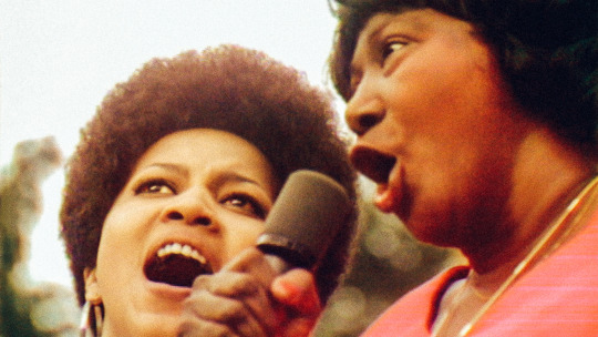
Summer of Soul (...Or, When the Revolution Could Not Be Televised) Directed by Ahmir-Khalib Thompson (AKA Questlove)
One hot summer five decades ago, there was a free concert series at a park in Harlem. It was huge, and it was lovely, and then it was forgotten. The Harlem Cultural Festival of 1969 brought together some of the world’s most beloved Black artists to connect with Black audiences. The star power and the size of the crowds alone should have been enough to immortalize the event à la Woodstock—which happened the same summer, the film emphasizes. But no one cared to buy up the footage until Ahmir-Khalib Thompson, better known as Questlove, came along.
It would have been easy to oversimplify such a rich archive by stringing together the performances, seeking out some talking heads, and calling it a day. But Questlove was both careful and ebullient in his approach. “Summer of Soul is a monumental concert documentary and a fantastic piece of reclaimed archived footage. There is perhaps no one better suited to curate this essential footage than Questlove, whose expertise and passion for the music shines through,” writes Matthew on Letterboxd. The film is inventive with its use of present interviews, bringing in both artists and attendees not just to speak on their experiences, but to react to and relive the footage. The director reaches past the festival itself, providing thorough social context that takes in the moon landing, the assassinations of Black political figures, and more. By overlapping different styles of documentary filmmaking, Questlove’s directorial debut embraces the breadth and simultaneity of Black resilience and joy. A deserving winner of both the Grand Jury and Audience awards (and many of our unofficial Letterboxd awards). —SH
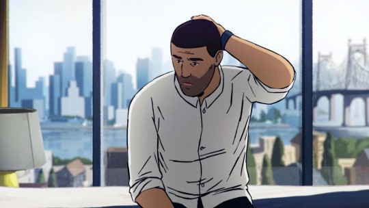
Flee Directed by Jonas Poher Rasmussen
Flee is the type of discovery Sundance is designed for. Danish documentarian Jonas Poher Rasmussen tells the poignant story of his close friend and former classmate (using the pseudonym ‘Amin Nawabi’) and his daring escape from persecution in 1990s Afghanistan. Rasmussen always approaches tender topics with sensitivity and takes further steps to protect his friend’s identity by illustrating the film almost entirely in immersive animation, following in the footsteps of Waltz With Bashir and Tower. It’s a film aware of its subjectivity, allowing the animated scenes to alternate between the playful joy of nostalgia and the mournful pain of an unforgettable memory. However, these are intercepted by dramatic archive footage that oppressively brings the reality home.
“Remarkably singular, yet that is what makes it so universal,” writes Paul. “So many ugly truths about the immigration experience—the impossible choices forced upon people, and the inability to really be able to explain all of it to people in your new life… You can hear the longing in his voice, the fear in his whisper. Some don’t get the easy path.” Winner of the World Cinema (Documentary) Grand Jury Prize and quickly acquired by Neon, Flee is guaranteed to be a film you’ll hear a lot about for the rest of 2021. —JM

Taming the Garden Directed by Salomé Jashi
There’s always a moment at a film festival when fatigue sets in, when the empathy machine overwhelms, and when I hit that moment in 2021, I took the advice of filmmaker and Sundance veteran Jim Cummings, who told us: “If you’re ever stressed or tired, watch a documentary to reset yourself.” Taming the Garden wasn’t initially on my hit-list, but it’s one of those moments when the ‘close your eyes and point at a random title’ trick paid off. Documentary director Salomé Jashi does the Lorax’s work, documenting the impact and grief caused by billionaire former Georgian PM Bidzina Ivanishvili’s obsession with collecting ancient trees for his private arboretum.
“A movie that is strangely both infuriating and relaxing” writes Todd, of the long, locked-off wide shots showing the intense process of removing large, old trees from their village homes. There’s no narration, instead Jashi eavesdrops on locals as they gossip about Ivanishvili, argue about whether the money is worth it, and a feisty, irritated 90-year-old warns of the impending environmental fallout. “What you get out of it is absolutely proportional to what you put into it,” writes David, who recommends this film get the IMAX treatment. It’s arboriculture as ASMR, the timeline cleanse my Sundance needed. The extraordinary images of treasured trees being barged across the sea will become iconic. —GG

The Most Beautiful Boy in the World Directed by Kristian Petri and Kristina Lindström
Where Taming the Garden succeeds through pure observation, The Most Beautiful Boy in the World relies on the complete participation of its title subject, actor Björn Andrésen, who was thrust into the spotlight as a teenager. Cast by Italian director Lucino Visconti in Death in Venice, a 1971 adaptation of Thomas Mann’s novella about obsession and fatal longing, Andrésen spent the 1970s as an object of lust, with a side-gig as a blonde pop star in Japan, inspiring many manga artists along the way.
As we know by now (Alex Winter’s Showbiz Kids is a handy companion to this film), young stardom comes at a price, one that Andrésen was not well-placed to pay even before his fateful audition for Visconti. But he’s still alive, still acting (he’s Dan in Midsommar), and ready to face the mysteries of his past. Like Benjamin Ree’s excellent The Painter and the Thief from last year, this documentary is a constantly unfolding detective story, notable for great archive footage, and a deep kindness towards its reticent yet wide-open subject. —GG
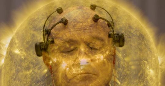
All Light, Everywhere Directed by Theo Anthony
Threading the blind spots between Étienne-Jules Marey’s 19th-century “photographic rifle”, camera-carrying war pigeons and Axon’s body-cam tech, Theo Anthony’s inquisitive, mind-expanding doc about the false promise of the all-seeing eye is absorbing, scary, urgent. It’s the greatest Minority Report origin story you didn’t know you needed.
Augmented by Dan Deacon’s electronic soundscapes and Keaver Brenai’s lullingly robotic narration, All Light, Everywhere proves to be a captivating, intricately balanced experience that Harris describes as “one part Adam Curtis-esque cine-essay”, “one part structural experiment in the vein of Koyaanisqatsi” and “one part accidental character study of two of the most familiar yet strikingly unique evil, conservative capitalists…”. Yes, there’s a tremendous amount to download, but Anthony’s expert weaving, as AC writes, “make its numerous subjects burst with clarity and profundity.” For curious cinephiles, the oldest movie on Letterboxd, Jules Jenssen’s Passage de Vénus (1874), makes a cameo. —AY

The Sparks Brothers Directed by Edgar Wright
Conceived at a Sparks gig in 2017 upon the encouragement of fellow writer-director Phil Lord, Edgar Wright broke his streak of riotous comedies with his first (of many, we hope) rockumentary. While somewhat overstuffed—this is, after all, his longest film by nearly fifteen minutes—The Sparks Brothers speaks only to Wright’s unrestrained passion for his art-pop Gods, exploring all the nooks and crannies of Sparks’ sprawling career, with unprecedented access to brothers and bandmates Ron and Russell Mael.
Nobody else can quite pin them down, so Wright dedicates his time to put every pin in them while he can, building a mythology and breaking it down, while coloring the film with irresistible dives into film history, whimsically animated anecdotes and cheeky captions. “Sparks rules. Edgar Wright rules. There’s no way this wasn’t going to rule”, proclaims Nick, “every Sparks song is its own world, with characters, rules, jokes and layers of narrative irony. What a lovely ode to a creative partnership that was founded on sticking to one’s artistic guns, no matter what may have been fashionable at the time.” —JM
Narrative features
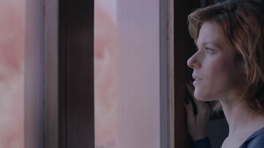
The Pink Cloud Written and directed by Iuli Gerbase
The Pink Cloud is disorienting and full of déjà vu. Brazilian writer-director Iuli Gerbase constructs characters that are damned to have to settle when it comes to human connection. Giovana and Yago’s pleasant one-night stand lasts longer than expected when the titular pink cloud emerges from the sky, full of a mysterious and deadly gas that forces everyone to stay locked where they stand. Sound familiar? Reserve your groans—The Pink Cloud wasn’t churned out to figure out “what it all means” before the pandemic is even over. Gerbase wrote and shot the film prior to the discovery of Covid-19.
It’s “striking in its ability to prophesize a pandemic and a feeling unknown at the time of its conception. What was once science fiction hits so close now,” writes Sam. As uncanny as the quarantine narrative feels, what’s truly harrowing is how well the film predicts and understands interiorities that the pandemic later exacerbated. Above all, Giovana is a woman with unmet needs. She is a good partner, good mother and good person even when she doesn’t want to be. Even those who love her cannot see how their expectations strip her of her personhood, and the film dares to ask what escape there might be when love itself leaves you lonely. —SH
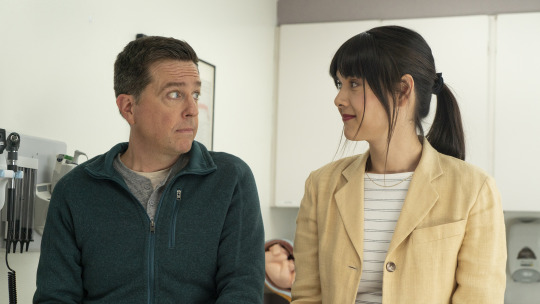
Together Together Written and directed by Nikole Beckwith
Every festival needs at least one indie relationship dramedy, and Together Together filled that role at Sundance 2021 with a healthy degree of subversion. It follows rom-com structure while ostensibly avoiding romance, instead focusing on how cultivating adult friendships can be just hard, if not harder.
Writer-director Nikole Beckwith warmly examines the limits of the platonic, and Patti Harrison and Ed Helms are brilliantly cast as the not-couple: a single soon-to-be father and the surrogate carrying his child. They poke at each other’s boundaries with a subtle desperation to know what makes a friendship appropriate or real. As Jacob writes: “It’s cute and serious, charming without being quirky. It’s a movie that deals with the struggle of being alone in this world, but offers a shimmer of hope that even if you don’t fall in fantastical, romantic, Hollywood love… there are people out there for you.” —SH
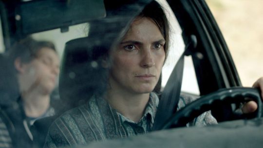
Hive Written and directed by Blerta Basholli
Hive, for some, may fall into the “nothing much happens” slice-of-life genre, but Blerta Basholli’s directorial debut holds an ocean of pain in its small tale, asking us to consider the heavy lifting that women must always do in the aftermath of war. As Liz writes, “Hive is not just a story about grief and trauma in a patriarchy-dominated culture, but of perseverance and the bonds created by the survivors who must begin to consider the future without their husbands.”
Yllka Gashi is an understated hero as Fahrjie, a mother-of-two who sets about organizing work for the women of her village, while awaiting news of her missing husband—one of thousands unaccounted for, years after the Kosovo War has ended. The townsmen have many opinions about how women should and shouldn’t mourn, work, socialize, parent, drive cars and, basically, get on with living, but Fahrjie persists, and Basholli sticks close with an unfussy, tender eye. “It felt like I was a fly on the wall, witnessing something that was actually happening,” writes Arthur. Just as in Robin Wright’s Land and Mona Fastvold’s The World to Come, Hive pays off in the rare, beaming smile of its protagonist. —GG
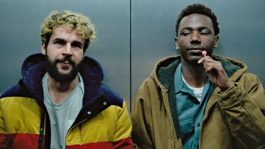
On the Count of Three Directed by Jerrod Carmichael, written by Ari Katcher and Ryan Welch
It starts with an image: two best friends pointing guns at each other’s heads. There’s no anger, there’s no hatred—this is an act of merciful brotherly love. How do you have a bleak, gun-totin’ buddy-comedy in 2021 and be critically embraced without contradicting your gun-control retweets or appearing as though your film is the dying embers of Tarantino-tinged student films?
Comedian Jerrod Carmichael’s acerbic directorial debut On the Count of Three achieves this by calling it out every step of the way. Guns are a tool to give insecure men the illusion of power. They are indeed a tool too terrifying to trust in the hands of untrained citizens. Carmichael also stars, alongside Christopher Abbott, who has never been more hilarious or more tragic, bringing pathos to a cathartic rendition of Papa Roach’s ‘Last Resort’. Above all, Carmichael and Abbott’s shared struggle and bond communicates the millennial malaise: how can you save others if you can’t save yourself? “Here’s what it boils down to: life is fucking hard”, Laura sums up, “and sometimes the most we can hope for is to have a best friend who loves you [and] to be a best friend who loves. It doesn’t make life any easier, but it sure helps.” Sundance 2021 is one for the books when it comes to documentaries, but On the Count of Three stands out in the fiction lineup this year. —JM
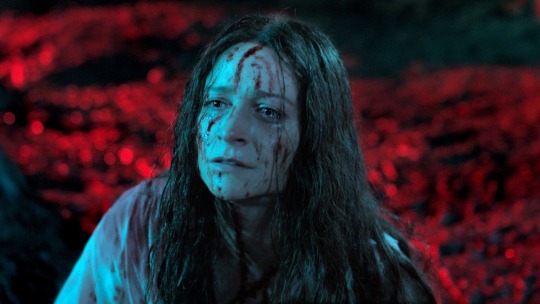
Censor Directed by Prano Bailey-Bond, written by Bailey-Bond and Anthony Fletcher
The first of several upcoming films inspired by the ‘video nasty’ moral panic over gory horror in mid-’80s Britain, Prano Bailey-Bond leans heavily into both the period and the genre in telling the story of a film censor (a phenomenal Niamh Algar—vulnerable and steely at the same time) who begins to suspect a banned movie may hold the key to her sister’s childhood disappearance. Often dreamlike, occasionally phantasmagorical and repeatedly traumatic, even if the worst gore presented (as seen in the impressively authentic fictional horrors being appraised) appears via a screen, providing a welcome degree of separation.
Nevertheless, Censor is definitely not for the faint of heart, but old-school horror aficionados will squeal with delight at the aesthetic commitment. “I’m so ecstatic that horror is in the hands of immensely talented women going absolutely batshit in front of and behind the camera.” writes Erik. (Same here!) “A great ode to the video-nasty era and paying tribute to the great horror auteurs of the ’80s such as Argento, De Palma and Cronenberg while also doing something new with the genre. Loved this!” writes John, effectively encapsulating Censor’s unfettered film-nerd appeal. —DC
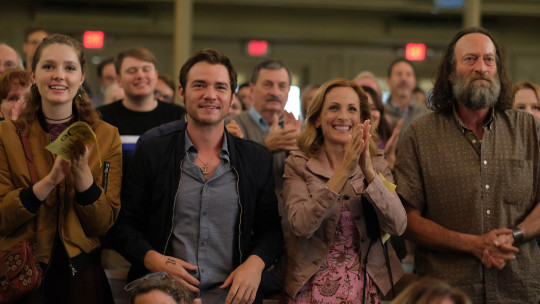
CODA Written and directed by Siân Heder
A film so earnest it shouldn’t work, with a heart so big it should surely not fit the size of the screen, CODA broke records (the first US dramatic film in Sundance history to win all three top prizes; the 25-million-dollar sale to Apple Studios), and won the world over like no other film. “A unique take on something we’ve seen so much,” writes Amanda, nailing the special appeal of Siân Heder’s coming-of-ager and family portrait. Emilia Jones plays Ruby, the only hearing person in her deaf family, at war between the family business and her passion for singing. While Heder is technically remaking the French film La Famille Bélier, the decision to cast brilliant deaf actors—Troy Kotsur, Marlee Matlin and Daniel Durant—makes this feel brand new.
But it’s not just about representation for the sake of it. A sense of authenticity, in humor as much as affection, shines through. With a script that’s 40 per cent ASL, so many of the jokes are visual gags, poking fun at Tinder and rap music, but a lot of the film’s most poignant moments are silent as well. And in Ruby’s own world, too, choir kids will feel seen. “I approve of this very specific alto representation and the brilliant casting of the entire choir,” Laura confirms in her review. Come for the fearless, empathetic family portrait, stay for the High School Musical vibes that actually ring true. —EK
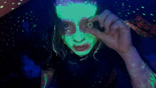
We’re All Going to the World’s Fair Written and directed by Jane Schoenbrun
Perhaps the most singular addition to the recent flurry of Extremely Online cinema—Searching, Spree, Host, et al—Jane Schoenbrun’s feature debut ushers the viewer into a haunted, hypno-drone miasma of delirium-inducing YouTube time-suck, tenebrous creepypasta lore and painfully intimate webcam confessionals. Featuring an extraordinarily unaffected, fearless performance by newcomer Anna Cobb, the film “unpacks the mythology of adolescence in a way that’s so harrowingly familiar and also so otherworldly”, writes Kristen. Not since Kiyoshi Kurosawa’s Pulse has there been such an eerily lonely, and at times strangely beautiful, evocation of the liminal spaces between virtual and real worlds.
For members of the trans community, it’s also a work that translates that experience to screen with uncommon authenticity. “What Schoenbrun has accomplished with the form of We’re All Going to the World’s Fair is akin to catching a wisp of smoke,” writes Willow, “because the images, mood and aesthetic that they have brought to life is one that is understood completely by trans people as one of familiarity, without also plunging into the obvious melodrama, or liberal back-patting that is usually associated with ‘good’ direct representation.” One of the most original, compelling new voices to emerge from Sundance this year. —AY
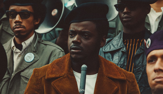
Judas and the Black Messiah Directed by Shaka King, written by King, Will Berson, Kenneth Lucas and Keith Lucas
It was always going to take a visionary, uncompromising filmmaker to bring the story of Fred Hampton, the deputy chairman of the national Black Panther Party, to life. Shaka King casts Daniel Kaluuya as Hampton, and LaKeith Stanfield as William “Wild Bill” O’Neal, the FBI informant whose betrayal leads to Hampton’s assassination. Both actors have never been better, particularly Kaluuya who Fran Hoepfner calls “entrancing, magnetic, fizzling, romantic, riveting, endlessly watchable.”
Judas and the Black Messiah is an electric, involving watch: not just replaying history by following a certain biopic template. Instead, it’s a film with something to say—on power, on fear, on war and on freedom. “Shaka King’s name better reverberate through the halls of every studio after this,” writes Demi. A talent like this, capable of framing such a revolution, doesn’t come around so often. We’d better listen up. —EK

Pleasure Directed by Ninja Thyberg, written by Thyberg and Peter Modestij
A24’s first purchase of 2021. Ironically titled on multiple levels, Pleasure is a brutal film that you endure more than enjoy. But one thing you can’t do is forget it. Ninja Thyberg’s debut feature follows a young Swedish woman (Sofia Kappel) who arrives in Los Angeles with dreams of porn stardom under the name ‘Bella Cherry’. Although Bella is clear-eyed about the business she’s getting into, Thyberg doesn’t shy away from any of the awfulness she faces in order to succeed in an industry rife with exploitation and abuse. Bella does make allies, and the film isn’t suggesting that porn is only stocked with villains, but the ultimate cost is clear, even if it ends on an ever-so-slightly ambiguous note.
Touching as it does on ambition, friendship and betrayal in the sex business, Pleasure is often oddly reminiscent of Paul Verhoeven’s Showgirls. Or rather, the gritty film Showgirls was claiming to be, as opposed to the camp classic it became. There’s nothing campy here. Kappel is raw and fearless in the lead, but never lets the viewer lose touch with her humanity. Emma puts it well: “Kappel gives the hardest, most provocative and transfixing performance I’ve seen all festival.” “My whole body was physically tense during this,” writes Gillian, while Keegan perhaps speaks for most when she says “Great film, never want to see it again.” —DC
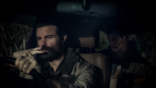
Coming Home in the Dark Directed by James Ashcroft, written by Ashcroft and Eli Kent
A family camping trip amidst some typically stunnin—and casually foreboding— New Zealand scenery is upended by a shocking rug-pull of violence that gives way to sustained terror represented by Daniel Gillies’ disturbingly calm psychopath. The set-up of this thriller initially suggests a spin on the backwoods brutality thriller, but as Coming Home in the Dark progresses and hope dissipates, the motivations reveal themselves to be much more personal in nature, and informed on a thematic level by New Zealand’s colonial crimes against its Indigenous population. It’s a stark and haunting film that remains disorientating and unpredictable throughout, repeatedly daring the viewer to anticipate what will happen next, only to casually stomp on each glimmer of a positive outcome.
It’s so captivatingly bleak that a viewing of it, as Collins Ezeanyim’s eloquent reaction points out, does not lend itself to completing domestic tasks. The film marks an auspicious debut for director and co-writer James Ashcroft. Jacob writes that he “will probably follow James Ashcroft’s career to the gates of Hell after this one”. Justin hits the nail on the head with his description: “Lean and exceptionally brutal road/revenge film … that trades in genre tropes, especially those of Ozploitation and ’70s Italian exploitation, but contextualizes them in the dark history of its country of origin.” —DC
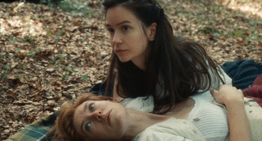
The World to Come Directed by Mona Fastvold, written by Ron Hansen and Jim Shepard
Mona Fastvold has not made the first, nor probably the last, period romance about forbidden lesbian love. But The World to Come focuses on a specific pocket in time, a world contained in Jim Shepard’s short story ‘Love & Hydrogen’ from within the collection giving the film its name. Katherine Waterston and Vanessa Kirby are Abigail and Tallie, farming neighbors, stifled by their husbands, who find brief moments of solace, of astonishment and joy, together. What shines here is the script, a verbose, delicate narration that emanates beauty more than pretence. “So beautifully restrained and yet I felt everything,” Iana writes.
And you can feel the fluidity and elegance in the way the film sounds, too: composer Daniel Blumberg’s clarinet theme converses with the dialogue and tells you when your heart can break, when you must pause, when the end is near. “So much heartache. So much hunger. So much longing. Waves of love and grief and love and grief,” writes Claira, capturing the ebb and flow of emotion that keeps The World to Come in your mind long after the screen has gone silent. —EK
Related content
The 2021 Sundance Film Festival lineup by Letterboxd rating
Letterboxd’s ‘Official’ Top 50 of 2021
Awards Season 2020-2021: our awards-tracker list
Letterboxd’s Festiville HQ: our home for up-to-the-minute festival coverage
#sundance#sundance film festival#sundance 2021#sundance2021#questlove#summer of soul#black woodstock#shaka king#judas and the black messiah#letterboxd top 50#best of sundance 2021#letterboxd
11 notes
·
View notes
Text
A Pair of Very Fine Werewolf Films from the 2000s
Werewolves have been more prolific in cinema than I ever realized. They are, indeed, a bit of a horror movie darling, appearing in a number of movies from the very advent of modern cinema. Perhaps it’s because the challenge of designing a werewolf transformation is just too tantalizing for special effects teams to resist. Perhaps it’s because werewolves can mean so many things in so many contexts.
Whatever the reason, there are a lot of werewolf movies through the decades, and we’ve seen quite a few of them! But we recently watched what are often considered two of the best.
youtube
Dog Soldiers (2002) was the directorial debut of Neil Marshall, who has gone on to make more movies but may be better known for the work he’s done on major TV shows like Game of Thrones, Hannibal and Lost in Space.
For a debut, all I can say is -- wow. This is a very well-made film.
The story is about a group of British soldiers sent to the remote Scottish highlands for a training exercise. Instead of the special ops team they’re supposed to meet, they instead encounter a different type of threat -- a whole pack of werewolves intent on killing them.
There are a couple of things this movie does that are just very very good. For one, it makes a point of humanizing its characters, letting the viewer get to know and care about everyone first before putting them into danger. It’s a big ensemble cast, so taking the time to do that is super important (and something a lot of movies fail to do). It’s also extremely tightly plotted, with pretty much everything having a setup and pay-off, making it very satisfying to watch. Also, Liam Cunningham (of Ser Davos Seaworth fame) is in this movie, and he’s spectacular.
Dog Soldiers does something else interesting -- It’s the first of the werewolf movies we’ve seen where the wolves are 100% the “other.” Most werewolf stories are about the drama and conflict of turning into a wolf yourself. Here, the wolves are monsters, posing a predominantly external threat. It makes the format more of a zombie movie than a werewolf movie, but it’s still quite good (and much better than zombies because the werewolves are cunning and extremely dangerous).
Also the werewolf design is pretty unique. They’re not my favorite werewolves -- they have the problem that most movie werewolves have, of being just too static and lacking in expression -- but they are designed in a genuinely creepy and monstrous way, with exaggerated proportions and well-made heads and faces that are all distinct and have character and personality.
Overall, A+ wonderful film, highly recommended.
youtube
Ginger Snaps (2000) is a Canadian horror movie directed by John Fawcett who you might know as being one of the co-creators of the TV show Orphan Black.
The film is about two sisters, Ginger and Brigitte. Death-obsessed social outcasts, they have a suicide pact and a dream to get out of their boring suburban life. But when Ginger is attacked by a werewolf, she begins to experience some changes that tear a rift into the girls’ relationship...
Ginger Snaps is one of those movies that is frustrating because it was so close to being perfect, but falls short in a way that would have been less disappointing if the film weren’t so good. The first parts of it are excellent, and really ahead-of-its-time for the year 2000: We’ve got two strong female leads, a story centered almost entirely around a family relationship, a story that’s outspokenly about female sexuality. It’s werewolf-as-puberty metaphor, but it’s so much deeper than that.
The werewolf effects are...not my favorite. Right up until the final transformation, though, the makeup is top notch -- slowly converting Ginger into an inhuman creature, one horrifying body change at a time. It’s Cronenberg-esque and deeply human and beautifully acted...
...And then the film kind of falls apart a bit in the third act. It’s not terrible, it just suffers from the problem of allegorical filmmaking where your metaphors start to break down when applied in a literal sense, which can muddle your themes. The pacing is off, and the excellent family drama starts to give way to something that feels a bit more like The Craft. Still good! But not as good.
I guess there’s a sequel and a prequel, which I haven’t seen, but I’m willing to give them a shot.
8 notes
·
View notes
Photo
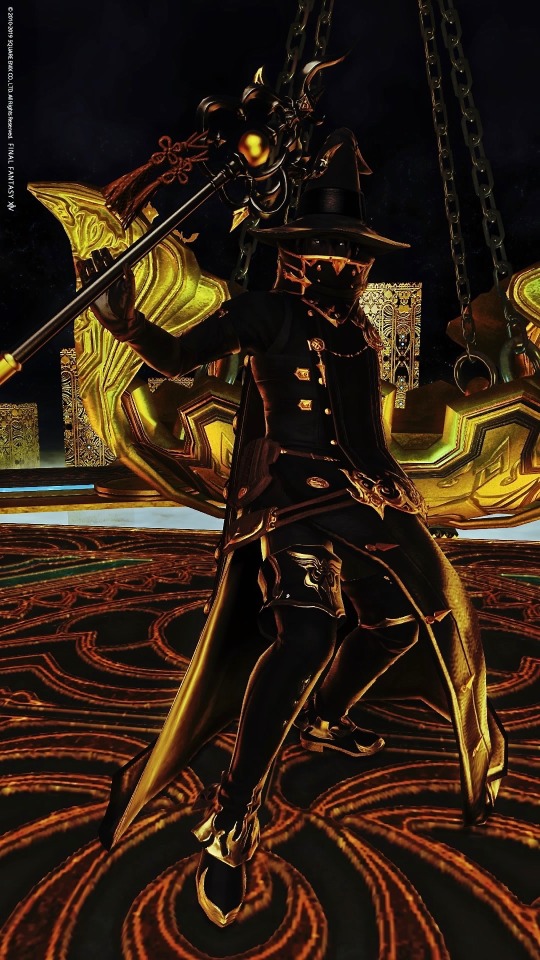
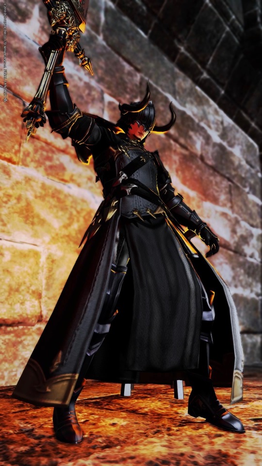
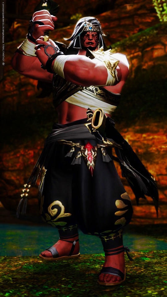

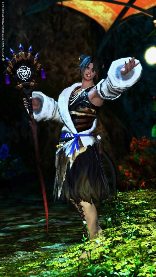
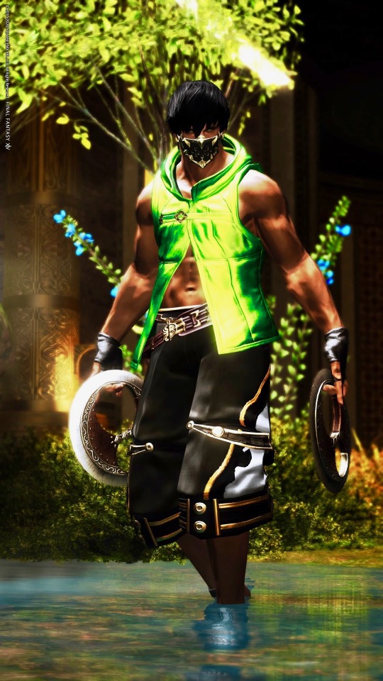
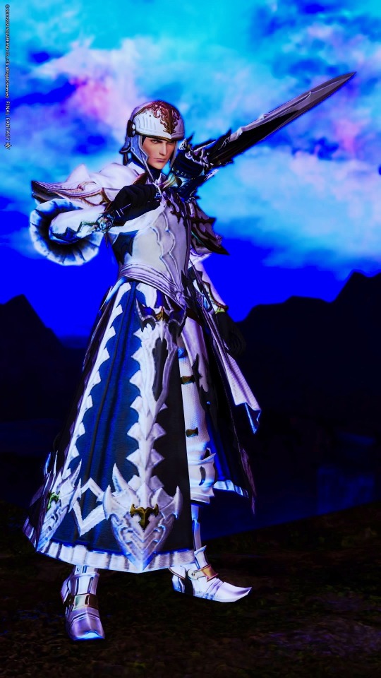
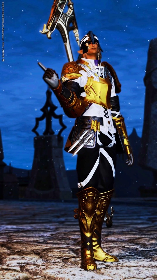
Notes under the cut!
Having made a lady WoL collection, I decided to do a dude one too. As before I have more, but not all are leveled and I have some I’m more attached to than others.
I do want to push for more range honestly--I’m not sure how I wound up with three midlander dudes and a highlander lol. I should really follow through with a male au ra, hrothgar, and lalafell. I did an odd green/brown hair hybrid that I suppose could qualify for brunette, but otherwise my tendencies toward black and blonde hair came through real strong. Mysteriously absent are redheads. I may also want to experiment more with color palettes and cultural influences a bit.
For the guys, there are spots where I played into job expectations and spots where I defied them. I wanted to try designing some characters in ways I hadn’t seen so much in-game, as well as designing characters who would immediately evoke a specific tone! There are also definitely jobs where I deliberately tried to show some traditional masculinity where it’s less expected, which was fun.
Cenric/Black Mage Midlander: People have criticized hyurs before by calling them “too vanilla”, since they’re the human stand-ins. I figure though, they’re hyurs. Hyurs are imaginary and don’t need to follow real world biology. Play with color palettes and features so you get a more definite fantasy look if you want to. With Cenric, I specifically tried to go super dark and de-saturated to evoke a walking silhouette (sort of like drow) and gave him the palest eyes possible with strategic face paint so they’d look like they glow. This was all in the name of making a character who evoked Final Fantasy’s classic black mage, just going in a more adult and extra spooky-goth direction.
Maerec/Dark Knight Midlander: Maerec, I designed specifically to both be a step off of the default midlander from commercials and to embody the Dark Knight questline as best I could. Giving him some edge visually while still feeling reasonably natural was fun to balance! To this end, I knew dark eyes would be important to helping the black hair fit in. Going with a very dark red I figure it almost seems like he could have brown eyes until you look closely. Making him feel very Ishgardian was also fun, with the horned helmet and Fray-esque glamour. I also designed him to both parallel and contrast with Lahabrea given their stories are intertwined. If there’s scattered angel/demon imagery between them that works even more.
Sublime Tiger/Samurai Hellsguard: I know that my natural inclinations go toward bishonens lmao, so figuring out the angle I wanted to work with the SUPER BEEFY male roegadyns was wild! One thing that gave me inspiration at the time was realizing that, with their black noses, Hellsguard roegadyns can 100% evoke big cats--among other animals. I usually prefer designing Sea Wolves for lacking the black noses because my impulse is for it either to be visually unified with the rest of the face/body or go without--so I often feel a bit more limited with what kind of designs I’ll do for Hellsguard. With Sublime Tiger, originally he had both orange and black striped hair (one of the styles available works it) as well as the black face paint evoking tiger stripes. I found the hair more limiting with helms though so made it pure black instead. Deciding what glamour would look good and play well with proportions was also a process--wanted him to feel like he’s from Othard since there is a big Hellsguard population there, so samurai made some sense to me in building that. After experimenting though, I wound up going with a look that took a bit of inspiration from One Thousand And One Nights. I have additional ideas for what I might try going forward though.
J’mor/Red Mage Miqo’te: This was a combination of a lot of ideas! One was wanting to embrace the physicality of red mage as a job, and explore it as a worldly kind of caster who works well with ease of movement and does a lot of darting around the battlefield. Mages in-general are often seen as kind of ivory tower sorts, and by shedding the usual frills I wanted to show that it’s possible to have a caster’s knowledge while being very connected to the world at large. Also give a strong sense of SWASHBUCKLER where the magic kind of slaps you in the face with additional power. I also noticed I hadn’t seen as many black male miqo’te in-general, along with fandom stereotypes about catboys as soft. So I decided to design J’mor with that in mind--playing him as a very shonen kind of hero while the beard brings an extra bit of hardness to his features.
Asah’zi/White Mage Miqo’te: Asah’zi is another case where I wanted to challenge the idea of male miqo’te as soft, and I added to that challenge by making him a white mage when that is often filled by lady characters. I was also interested, lore-wise, in the tension between Keeper of the Moon tribes and Gridania (where white magic has very strong ties). That Keepers of the Moon are also very matriarchal gave added interest for me making a more rough and traditionally masculine-feeling white mage sort, especially since Keepers often build a lot of their lives around hunting through the Twelveswood. I also wanted to bring some sense of druid into white mage as a job, given the nature ties. With Asah’zi, using skydruid skins, claws, a wooden cane, and on all contributed toward the vibe I wanted to build for him. Using emotes that show off his fangs helps bring a bit of cockiness to him too, which is fun. And stealing Thancred’s hair lets him have a bit of a roguish vibe lol.
Amir/Dancer Highlander: Like I said, I tend to go for bishonen-sorts in designs a lot. HOWEVER! I do love this highlander face type specifically a ton, and think guy highlander proportions are well-balanced overall while being beefy. I knew for a while that I had a specific design I liked a lot for male highlander with Amir, and I definitely wanted to do something with him. The choice to make him a dancer specifically came from a conversation I saw just after the job’s release. An IRL male hip hop dancer mentioned feeling a bit bummed out because a lot of the animations felt like they played more to softness/grace and traditional femininity, and he’d been hoping for the option of a little edge with battle dancing because that’s what he does. Some players said he should just play monk, others were kind of mean to him and acted like what he wanted was somehow shitty. I felt for the dude to be honest since he was coming from a place of feeling frustrated by stereotyping, so I decided to look at the animations and see how much they could be integrated into a design that felt more traditionally masculine. I saw a lot of bright greens (especially with the peacock feathers) so I tried to unify that with a green glamour. The mask reminds me of rave aesthetics a bit, and I’ve seen dudes wear shorts similar to the Nezha ones before. I’m a big fan of the idea that fashion can be a way to create what you want tonally, and I tried to explore that in this design.
Navarre/Paladin Midlander: At some point it hit me that I have been avoiding traditional knight-in-shining-armor looks like the plagues in my tanks lol. This made me think a fair bit. What struck me was that if the only thing a glamour has to say for itself is “this is a knight”, that doesn’t feel so interesting to me. If it’s supposed to be a knight in shining armor specifically though, bringing an almost angelic, elemental feeling to the look is something I’m 500% there for. And weirdly, people don’t seem to do this as much. I’m less used to paladins compared to dark knights, warriors, or even gunbreakers--and since paladins are so associated with that holy knight-vibe I figured it made sense to go that direction. While I was looking into glamours, one thing I found was that a lot of them dyed with unchanging patches of black, had edgy red woven in, or otherwise came across as having been designed with dark knight or warrior in-mind. I decided part of what I’d do in this instance was really make a Warrior of Light who immediately screamed “yes I am the Warrior of Light” when you looked at him, and took inspiration from Cecil Harvey from Final Fantasy IV toward that end too. Every piece in this glamour was carefully picked not just for whether it worked as a silhouette, but also how it would dye.
Cesaire/Dragoon Elezen: Cesaire has gone through a lot of design phases. Initially he was a red elezen, because it’s a direction I don’t see used a lot but has a very doable fantasy feel I think is fun. Then he was a champagne/cream color all over as inspired by a particular breed of horses. Now, having put a lot of thought in, he is deep gold with blue eyes. The underlying concept for him was that I wanted to make a golden dragoon who looks like he should be terribly heroic, but then in practice he’s a kind of blood knight WoL who is about as close to Zenos as a Warrior can get without going outright evil. I played into gold and more general adventuring gear for the reason that I think Cesaire has absolutely left Ishgard behind him, and strongly prefers to be someone defined by what they do rather than where they’re from. Given elezens’ wide shoulders I also had to think about what combinations would work for balancing proportions, and I wanted Cesaire to visually hold his own visual niche within my overall Famfrit lineup so a lot was chosen with that in mind.
5 notes
·
View notes
Text
Okay here’s the whole entire text of my original pokemon gen concept under a cut (sorry if that screws you up on mobile)
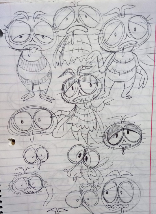
I’ve only ever sketched a tiny number of these (like my fly ideas here), but I can see most of them in my head pretty clearly and might sketch more of them by request someday. I originally set my fan-region in Florida, a place I hated living but still had a lot of interesting characteristics. This changed over once I moved to Oregon, and the thing about Oregon is that it has desert, forest, swamp, coastline and frozen mountaintops that are all pretty vast, ancient and in places relatively untouched compared to the rest of North America. This is not only a perfect setting for some really wild pokemon, but makes a believable choice because our Pacific Northwest is pretty popular in Japan.
The different biomes of this region have "deep" areas where the pokemon change. Some also have "polluted" areas. The region is environmentally themed and heavily deals with human interference on the natural world.
The villains are Team Bio, genetic engineerers lead by a mysterious old woman who narrowly survived the original Mewtwo experiment. Her underlings all use "mutant" pokemon, and she seeks to create a new species of hyper-intelligent, pure-hearted pokemon that will replace humans entirely. Along the way is a strange increase in reports of interstellar pokemon activity... I actually tried hard to minimize how many pokemon in this are just “my kind” of concept, but I think I failed pretty hard. It probably does feel like it leans a little more towards Mortasheen than something Pokemon would actually make, but for basically every pokemon that’s one of my “dream concepts” or “most wanted” I tried to come up with one that I thought would appeal more to somebody else’s taste than mine.
THE STARTERS
Grass Starter: a grass "lumberjack" pterosaur with an axe for a beak. Second stage has more saw-like beak, final stage is a grass/steel quetzalcoatlus (the pterosaur) with a beak and crest forming a chainsaw, no longer flies
Fire type calf whose black cow marks are actually soot. Evolves into cow with craggy black “helmet” and horns of charcoal. Final stage a charcoal-armored minotaur like fire/ground type.
Water Starter is a beady-eyed water shrew with big webbed flipper feet, known to steal shiny objects. Second stage more humanoid, said to dive for treasure. Final stage is water/dark lanky, stripey shrew with a black mask, said to rob boats like a “highwayman” of the river.
Meadows and forest:
Normal type mammal is a spherical porcupine, like a chestnut. Rubs its spines with noxious fruit juices, giving it a multicolored look. Evolved form is a colorful “punk” porcupine.
Early bug is a sticklike inchworm Evolves to cocoon resembling a wooden log on top. Final form is bipedal stick mimic grasshopper, evocative of a cute wooden puppet with a pointed nose.
Basic bird is a hummingbird Evolves to be four-winged and legless, never lands in its whole life. Final hummingbird is a fierce looking hunter that drains energy from grass types like a predator.
Grass type walking bud creature, looks nervous. Evolves to grass/flying orchid-like angelic flower. Alternate evolution is wilted, grey, grass/ghost goth orchid with tattered petals, cute but sad. (evolves this way if it levels up after a battle in which it sustained super-effective damage)
Ground type earthworm sticking out of dirt, cute flower-shaped head. Evolved worm looks like shark sticking out of the dirt, nose looks like its prevo
Electric/dark pikachu-like packrat holding a large coin. Electrically charges its treasure as a booby trap. Actually said to be employed as underlings by the water-type shrew starter.
MISCELLANY:
Bug/poison type grub with fangs. Only encountered in garbage cans. Evolves into a fly pupa Final stage is a gloomy looking, drooling anthropomorphic fly.
Single stage bug/fairy type: a beautiful Maleficent-looking parasitoid wasp. Evolves from any cocoon/pupa pokemon if they're holding a "suspicious egg" item.
Ocean
Water/grass nudibranch with flower on its back. Evolves to a glaucus, each "arm" a colorful flower that absorbs sunlight as it floats.
Water type fish that "sails" on the sea's surface with its fins. Sleepy looking stingray evolution. Final form is water/dragon deep sea fish, combines some traits of anglerfish and viperfish with eyes on stalks. Only evolves from stingray when you're in the sea trench.
Water/flying marlin with huge, dazzling butterfly like fins.
Water type baby dolphin, fuzzy like a seal pup, only evolves if it has fainted more times than the number of its current level. Evolved form is water/dark, shaggy-furred, fierce looking, battle scarred dolphin with legs instead of flippers, a throwback to the doglike ancestors of delphinidae.
Polluted inlet
Water/poison oil slick with two tentacles and beady white eyes, signature ability changes it to water/fire type if it uses a fire move. Evolved form is an oil slick rising into a cartoon octopus with x's for pupils.
Water/steel fish hook with tiny head and eyes, like a barbed metal worm. Water/steel fishing jig, googly eyes and everything.
Barren Island - just a very big rock in the middle of the inlet
Ghost/poison: a greenish "dodo bird" with a face like a biohazard mask, the ghost of a species that went exinct due to sickness.
Sea Trench
Water/fire bristleworm "snake" Water/fire tube worm "dragon"
Water/ghost wailord skeleton draped in pink fuzz and a garden of one-eyed bone worms.
Swamp
Electric/flying bird resembling a lightbulb kiwi. Evolved form resembling a neon light lawn flamingo.
Grass/fairy giant sloth with sleepy face, completely covered in shaggy moss with various flowers and mushrooms. Protector of the swamp, able to control plant life.
Grass/psychic sundew, just a pair of sundew leaves atop a sleepy looking oddish-esque bulb. Evolved sundew is mostly a big circular sundew rosette, but a humanoid flower rotates in the center like a music box to lure prey.
Water/fighting borzoi pup with long legs, acts like a water strider. Evolved form is an elongated, elegant borzoi "ballerina" that dances atop water
Water/ground red leech slightly evocative of a vacuum cleaner. A healer that sucks poison from the body instead of blood. May mysteriously appear in your team after walking through swamp water.
Deep Forest:
Grass/ground banana slug with colorful mold spots, learns spore. Evolves into mold splotched, brown banana peel creature, more like a big squid.
Grass/dark autumn leaf in the shape of a bat, has levitate. Evolved form redder, bigger "vampire cape" leaf-bat.
Psychic/ghost cheshire cat with Meowth-like proportions, bright crescent smile. Evolved form just huge smile and cat eyes hovering in the air, beastly cat body fading into view only for physical attacks or when struck.
Rock type humanoid made of transparent amber with a strange mayfly-like bug sleeping inside. Outer body can "break" at low HP and release faster, more offensive pure bug form.
Rock: incredibly huge, stony looking moose with long white fur draped over its eyes and back. Comes in size variations like Pumpkaboo line and said to never stop growing. A truly titanic one is used as transportation through the deep forest.
Snowy patches
Bug/ice velvet worm that spews a freezing liquid. Silly looking, almost like wiggler from mario.
Ice/flying fluffy white bird resembling a tiny Japanese style snowman. Evolves to resemble western style snowman with clawed bird feet, pointed beak nose. A flightless pure ice mountain dweller.
Electric/ice with levitate: a crystalline "UFO" sky-jellyfish with many colorful lights, core body looks like a cute pikmin-esque "alien" inside. Catch by fishing off of ledges into the sky. Mistaken by locals for alien activity.
Lava Tube Caves
Psychic type bipedal pink salamander with no eyes. Evolves into beautiful milotic-like psychic/dragon blind olm.
Rock/fighting spearhead with feet, eyes are just round holes through blade. Evolves to gain a stick-figure sort of body.
Abandoned town
Normal/bug filthy dog, a shaggy pile of fur with goofy eyes and pink tongue. Little black specks jump about it. Ability changes normal moves to bug moves. Evolved form more obviously a dog but still very shaggy, surrounded by constant cloud of black specks.
Grass/electric "christmas tree" made of holly and lights. Found in a burned down house, glowing eyes peer out from beneath it.
Ghost: has a colorful quilt for a body and a pincushion for a head. Found inside houses.
Garbage dump - accessible through abandoned town, possibly what drove people away (includes piles of toys you may investigate to encounter a banette, mimikyu or klefki)
Water/poison: cartoony fish with blank eyes and humanoid pair of legs. Fish for in toxic green garbage pools. Evolves into ground/poison skeleton fish with four limbs, walking like a lizard.
Steel/bug rusty orange silverfish. Eats junk metal. Evolved form so big it wears a rusty car for protection with just its legs and feelers sticking out.
MICROPOKEMON - enlarged artificially in a laboratory where you can also take your fossils.
Bug/fighting flea - spiny black flea with big jagged white teeth. Create from the "pest sample" an item carried randomly by the normal/bug dog.
Poison/fairy germ - fuzzy multicolored mold ball with eyes, stalked suckers. Retrieve "germ sample" from the dodo ghost.
Water/fairy tardigrade - transparent, cute bug stylized almost like a "gummy bear." Retrieve "dew sample" from moss sloth.
Pseudolegendary:
Rock type baby gargoyle creature. Evolves to winged gargoyle with levitate and a few mossy patches. Final form is an elegant griffon-like rock/dragon with an elaborately carved surface
SPACE ARK DRAGON This location is itself a dragon/fairy legendary pokemon so massive you can enter its body. It exists to collect and preserve species from dying worlds. Most common wild pokemon inside is duosion and sometimes Reuniclus. You can also collect "gene samples" from crystalline pods to replicate the ultrabeasts in the same lab you enlarge the microbes and resurrect fossils.
Bug/dark parasitic alien, a little like weird yellow plant suckered to the ground, red flower-like head with an eye on each petal ala the yokai parasite, gyochu.
Bug/dark parasitic alien, a colorful worm with cute eyes and beautiful mothlike wings, a little like the yokai parasite koshi-no-mushi.
Bug/dark parasitic alien, a pale, red and white striped "lizard" with six spindly limbs and a tubular proboscis, inspired by the yokai parasite kagemushi.
Fairy type alien medic, looks like a cute flatwoods monster with heart motif and nurse coat. Flees from all battles unless you have defeated at least one of each of the parasites.
LEGENDARIES:
Dragon/electric: the ark dragon's smaller offspring, looks like an electronic space whale.
Dragon/steel, menacing, sleek black starship creature. Rival to the ark dragon, a "world reaper" that attempts to destroy planets that it thinks are already dying.
Psychic/fairy little white, fluffy mothman-like being, an observer that casts judgment on suffering worlds to call one of the dragons (version based)
Normal type legendary is the most human-like pokemon we've ever seen, a serene floating figure with long hair and black, almond-shaped eyes. A genetic experiment to supplant humans.
Electric/fighting: a hulking humanoid beast, almost frankensteinian with asymmetrical features, a failed early experiment.
A "glitched and scrambled" two dimensional pokemon. The result of the earliest known experiments in digital pokemon transfer. Actually literally typeless.
POISON FUSIONS created in the garbage dump:
Weezodor - poison/flying - Garbodor/weezing hybrid, like a jellyfish bag with smog tentacles.
Mukking - poison/water - Weezing/muk hybrid, like a koffing with slime appendages.
Garmuk - poison/ground - Muk/garbodor hybrid, like a giant slug made of trash.
MUTANT POKEMON: mutations of classic first-stage pokemon into creatures slightly tougher than even their original final stages.
Mutant Caterpie - bug/dragon - huge, dragonlike Caterpie with more menacing eyespots, clawed limbs.
Mutant Paras - pure grass - giant paras with far more mushrooms of different colors, body pure white with no mouth and white sphere eyes, actually made only of fungus.
Mutant Venonat - bug/dark - same old venonat with a big shaggy monster body
Mutant Zubat - Psychic - somewhat larger than crobat, has actual legs and a pair of clawed arms instead of wings. Much bigger ears.
Mutant Voltorb - electric/steel - a Voltorb even bigger than Electrode, otherwise looks normal besides angrier yellow eyes...until it splits open to reveal sharp teeth.
Mutant Tangela - grass/fairy - more like its scrapped Gen II evolution but perhaps a lot taller, with two very very long arms.
Mutant Geodude - rock/fighting - HUGE spiky arms and hands but head/body are the same as always.
Mutant Shellder - water/steel - it's the spiraly slowbro one!
Mutant Exeggcute - psychic/poison - bigger and more plentiful but "rotten" looking eggs with gloomier eyes and dark purple goo.
Mutant Eevee - normal - bigger than any of the eeveelutions, shaggy and beastly with the "camouflage" ability. Learns strong attacks of every eevee evolution type.
Mutant Doduo - fighting type with only one head
Mutant Luvdisc - the only one based on a non-evolving pokemon. Angry "broken heart" Luvdisc with record offensive stats for the series, but even worse defenses than regular luvdisc.
Mutant Trapinch - dragon/bug - giant turtle-like Trapinch, redder, spiny, second mouth inside jaws.
Mutant Dratini - dragon/fairy - huge long dratini with longer feathery wing ears, identical wings down body.
Mutant Larvitar - dragon/dark - big, armored green reptile, still has larvitar type head with craggier, meaner horn.
Mutant Bagon - dragon - huge, more t-rex proportioned bagon, spiked shell on head.
Mutant Deino - bigger and shaggier with a ring of five long-necked deino heads
Mutant Gible - dragon/fighting - only usually seen as a huge sharky fin sticking out of the ground. When it emerges, its body isn't much bigger than regular gible.
Mutant Goomy - psychic/dragon - giant goomy with gaping mouth, antennae are much longer, green and stripey.
Mutant Jangmo-o - dragon/steel - same old head but more ankylosaur-like big body, entirely a dark iron color with more pitted looking scales.
ENVIRONMENTAL VARIATIONS no mechanical or typing difference, but new color schemes and decorations on existing pokemon, totally an aesthetic change. Have their own shiny forms.
SEA TRENCH FORMS: Entirely pale pink golisopod line with closed eyes transparent red tentacool line with darker red nodules dark maroon inkay line with blue lights red and purple feebas line
CAVE FORMS: White, eyeless venipede line White, eyeless magikarp line
DEEP SWAMP FORMS: crocodile-green Sandile line with lily pad on head black shelled "freshwater" shellder line with green algae growths pure red and purple colored bellsprout line
DEEP FOREST FORMS: braviary with more hawklike colors foongus line with no pokeball pattern...the original foongus? wolf-spider colored joltik line
POLLUTED INLET FORMS: Dewpider line with all black body and limbs, yellow glowing eyes in dirty green water Grey wailmer line draped in red algae, clumps of barnacles (presumably degenerated binacle) Wingull line with grey and black oil-splotched feathers, tin can on head
GARBAGE DUMP FORMS: Bounsweet line with only grey, brown and black colors, dark spoiled looking splotches Black bag trubbish line with green trash, copper colored pipes Rusted looking klink line, rotates only once every few seconds.
----------GYM LEADERS -------------- In this region the gyms are dual type, and bring back past mechanics and gimmicks as their focus.
flying/normal: a blind, wheelchair-bound old man who specializes in dog and bird pokemon. Uses a baton pass team.
Steel/electric: an astronaut commanding his gym by remote feed from the station. Uses Magnezone, Rotom forms and, surprisingly, a random steel or electric ultrabeast.
Poison/bug: a germophobic lady scientist ironically obsessed with pollution pokemon, always wearing a biohazard suit. Has weezing, garbodor, the fly pokemon and Yanmega. Uses Z-moves, but it's random whether she uses a bug or poison one and on which pokemon.
Dark/fire: an elderly biker lady. Has no gym and in fact roams around the region. Surprisingly challenges you to a third-gen style beauty contest with her frightening selection of pokemon.
Grass/fairy: witchy pharmacist and botanist who lives out in the woods, all of her grass types are mushroom based. Unusually has you team up with her in a double battle against a random pokemon of unusual size and strength, like Alola's totem pokemon.
Ground/fighting: an extremely frail little nerdy guy who likes amazingly fearsome pokemon, hates bullies but kind of is one. Makes you face a horde battle with all of his pokemon vs. only one of yours at a time.
Dragon/rock: a boisterous monster movie director who dresses his pokemon in costumes, gym is a cardboard city. Uses a dynamaxed pokemon.
Ghost/psychic: a horror author, Vincent Price like, lives in a mansion and makes visitors face scenes from his books. Instead of a single battle, he has you face a series of singular mega pokemon behind each "scene." THE LABORATORY This location is of course secretly associated with the villain team, but you can free it up from them in the endgame. Here you can make fossil pokemon, micropokemon, regional forms from past generations, ultrabeasts and even mega stones, but all require you to spend one or more “gene crystals.” You’re handed a number of these through the storyline but it would be very challenging to farm more than that (think Gen 7 bottlecaps). Spending more crystals at the lab would allow you to finally alter abilities, natures and IV’s at a whim, and for an exceptional cost you could upgrade the BASE stats of any L100 pokemon permanently. This is a percentage increase applied across the board to all of its stats at once, and stops at either 100 total points beyond their normal limits, or a final base stat total of 530 (equivalent to a fully evolved starter) MISC STUFF:
Your mom this gen asks you if you hope to have an easy, challenging, or very challenging adventure. You can return to her at any time to adjust the difficulty again.
When you beat the game, you can make a custom trainer for online battles using the models of other NPC trainer types, i.e. you can finally be a swimmer/scientist/grunt/etc. You can unlock some popular ones from past generations.
You can select one pokemon as your main partner, which not only has it following you, but involves it a little more in the storyline (special events based on its first typing) and gives it some in-game perks.
A special item attached to any one of your pokemon allows your whole team to “share strength,” meaning that their weaknesses are mitigated for each teammate they share a type with. This allows for type-themed teams to be more viable but wouldn’t completely eliminate their weaknesses, and the effect diminishes proportionately for every pokemon that faints.
You can designate a seventh pokemon to be your “team mascot,” a non-combat role with different effects depending on species/type.
A single team can have either the mascot, a z-move, a dynamax/gigantamax form or a mega, cannot mix these.
Legendary pokemon now suffer a stat nerf for every other legendary pokemon on the same team. A team of six legendaries would actually be somewhat below-average in stats.
631 notes
·
View notes
Photo

I went and unboxed my Tommy Torro, because I was planning to anyway, so why not now that I’m bored and have nothing better to do. I wasn't sure I would love these, because I do love the concept art style and the aesthetics. However, I never liked/owned fabric dolls, not even when I was a child. I didn't believe I would like them any better now, at almost 40-years-old. Lol!
Tommy is super freaking adorable, and the faux-fur on his hat is super soft! The clothes are amazingly well made for what he is (minus the Velcro, I don’t like it). I don't believe I will be purchasing anymore, sadly. I kind of wanted to get the teen Na! Na! Na! boy before today, but I don't like the fabric aspect and can't get past the knit being so obvious, more so on the face. If they made these out of hard plastics, vinyl, or a combo, I would certainly be purchasing all the boys. Even if there was little, to no articulation. I'm definitely not a fabric-doll type of person.
I kind of wish they were all hard plastic, even if they were way tinier or just static figures. I love the dolls, just not the fabric covered bodies/faces. I get they are aimed at much younger children, so they are probably loving these, but again I’ve never been a fan of fabric dolls. I’m not a fan of soft toys in general; like squishies, silicone bodies for 1:6 figures (although I do own one of those), even less fabric dolls. I love hard plastics, and really hate that more modern 1:6 figures are adding more and more soft plastics to the bodies. I am not a fan of soft toys, they degrade a lot more quickly than hard plastic (which I want for my toys/dolls).
I’m kind of tempted to make a custom one out of an existing doll, but I don’t believe these proportions are easy to find on dolls out side of baby/toddler ones, with very human-like-facial-features. These lean more towards cartoony head size and faces, in a good way. Not quite anime-esque faces, but very cartoon-like, overall proportions. Which I really like, because I’m generally not into child-looking dolls. I was thinking maybe customizing the Kuku Harajuku dolls, but those are kind of discontinued, and all girls with very small frame-bodies. These are really cute, but the fabric aspect is a definite “no,” for me.
2 notes
·
View notes
Text
Kingdom Hearts BBS, DDD Blind Thoughts
Spoilers for Kingdom Hearts: Birth by Sleep and earlier titles in the series. Also warning that I have insomnia and these are utter ramblings on the last 24 hours of blindly binging the Kingdom Hearts series as a total newcomer to the series. Haven’t played three yet and just started Dream Drop Distance. With that warning.....
Birth by Sleep was a ton of fun. We ended up needing to grind a little to make Aqua playable, but that ended up forcing me to learn the game mechanics much deeper, and even my friends leveled up their playing of the game! It was really cool to unlock some of the high tier spells like Triple Firaga and Thundaga Shot, although I do wish we had gotten to chance to unlock even more. I should remember how much more fun the game was after some internet research.
It was very satisfying to unlock the true ending so easily. We had only missed 2 of the 12 required Xehanort Reports. The 2 we needed involved grinding the arena for maybe an hour total and then 5 minutes of finding a treasure chest. We were then able to roll smoothly from Aqua’s finish into the final episode.
Aqua’s fight against Braig was laughable easy, but the final fight against Vanitas/Ventus was slightly tougher. The real challenge was fighting Terra/Xehanort but then the REAL challenge was phase 2 of that fight. I got them all on the first try! It was a really enjoyable flex of my gaming skills in front of the friends.
From a story standpoint, Birth By Sleep had my favorite story of any KH game so far, by a huge margin. I liked certain elements of the KH2 ending (Riku and Sora teaming up, Kairi’s keyblade) but BBS has been the only game where I had any sense of purpose or desire to see how it ends. They did a great job of having each of the 3 routes reveal new information even if played out of order (Xehanort taking over Terra, Vanitas having Sora’s face, Aqua taking care of comatose Ventus).
Obviously it helps to have Leonard Nimoy and Mark Hamill join the cast, plus Aqua’s VA absolutely dominates every scene she’s in. Terra’s VA reminds me a lot of Leon’s monotone edgy boy voice acting (David Boreanaz or otherwise). Of course Ventus shares a VA with Roxas, but the twist of Vanitas being Haley Joel Osmont is really great because he sounds so much older. I think it would have been easier to predict that twist if I had recently heard more of HJO’s Sora voice in Dream Drop Distance or KH3.
Aqua is, of course, the great standout character from BBS. From the start, we got attached to her because of her known prevalence in KH3 on top of her cool design, Arrow voice actress, and the fact that we could finally play a girl (plus one with more human proportions than Kairi). It worked out really well how we saved her for last and had to kind of unlock the secrets of her play style by finally mastering the various gameplay systems.
I much prefer the command deck system compared to the gameplay of KH2. To be fair, these are the only two KH games I’ve beaten. I’ve only barely touched KH1 and Chain of Memories. I felt like BBS did a good job of fusing the action gameplay of KH2 with the (potentially) satisfying deck building of CoM.
Re: Coded is a fucking mess. I might actually go back and play it on a DS emulator just to see the gameplay, but god damn the story is a flimsy excuse for a retread. I almost wish we had skipped it entirely, but just watching the opening and ending worked out pretty well. In the end, it’s literally just “Mickey is gonna give Sora the memories of all the other protagonists” which is badass but probably going to be mentioned again before being relevant. I will say that the ending with Riku and Sora being summoned by Yen Sid for the mark of mastery test is fucking badass and elicited quite the reaction from all three of us. The series is finally starting to have that feeling of “the stakes are high and I want to see what happens with these characters”.
This was expressed most fully in the intro to Dream Drop Distance. Step 1: invoke Disney Magic with a silhouette of magician Mickey. Step 2: Orchestral Simple and Clean. Step 3: use entirely new cinematic footage instead of splicing together an AMB. Step 4: show every keyblade wielder standing side by side. Apparently that’s enough to make me actually cry. We all got very excited by this intro, so it was a bit of a let down to start the game and be seemingly replaying KH1 again.
Of course that’s not the whole game, but I’m still not sure what the whole game is. Riku and Sora have to...wake the seven sleeping worlds to earn their mark of mastery? Are they dreaming all of this, or what? Seeing The World Ends With You was cute for like a second before realizing that I know almost nothing about it. Flowmotion is similarly kinda neat at first but quickly becomes annoying, but maybe it will grow on me with time.
Speaking of fun at first but quickly annoying: Dream Eaters. The Pokémon-esque system seems like a time waster that’s perfect for 3DS but maybe not so much for our tourist play through. The Dream Eater designs are cute when they’re on your team, but strike me as a bit annoying when fighting the same ones over and over. Heartless and Nobodies felt more generic, but that made them feel a little less repetitive to fight over and over. I see the same god damn rainbow colored Panda every god damn fight. To be fair, I think each world randomly contains certain types of Dream Eaters every time you visit it.
Speaking of Worlds, I’m not really looking forward to Hunchback of Notre Dame or Pinocchio world, but at least they’re new worlds instead of retreading Halloween Town, Agrabah, Olympus, Neverland for the millionth time. What I am looking forward to is The Grid from Tron Legacy! I don’t think we’ve seen any Disney world that specifically spotlight a sequel to a Disney world we’ve already seen. We revisit Halloween Town, Agrabah, Beast’s Castle, Olympus, Atlantica but only for some minor follow-up fluff. The Tron world in KH2 meant a lot to me having just seen the film. The Lightcycle combat could’ve been a little more true to the original, but the visuals were so faithful plus having Tron’s actual actor was so fucking cool. Sora and gang getting Tron outfits was so cool too. Also would’ve liked to have a disc fight, but the Sark/MCP fight was spot on. Hopefully we can get both of more in DDD!
It’s a perfect excuse to revisit The Grid since Legacy looks so different from the original. Now, The Grid is not a true world in KH2 but instead part of Hollow Bastion’s computer system. I’m curious if The Grid in DDD is a sleeping world or something that exists within another world, or if it is somehow connected to the KH2 Tron world (which would get real weird real quick if that version of the Grid is a copy of the original, but Legacy is supposed to be set in The Grid 30 years later).
Oh, I like that DDD has the command deck system but I don’t like the pets, I don’t like the link system, I don’t like reality shift, and I don’t like flowmotion. It just seems like BBS with all the RPG features crammed into the pet system with a bunch of gimmick infused into the combat system. Admittedly, gimmick is one of the biggest strengths of the KH franchise, but flowmotion just seems silly. Perhaps I’ll like it more when I get used to it and potentially get to customize the moves.
I’m not sure yet how I feel about the drop system, but I do like getting to play as Riku. I think multiple protagonists is a smart way to stretch the assets and tell 2 stories per world. I rather enjoyed the way Aqua, Terra, and Ventus interacted with some of the Disney worlds. Hopefully we get something similar in some of these worlds.
The dive mini game is definitely gimmicky nonsense clearly designed for the 3DS. In general though, all the games in these collections look great and feel great. I suppose that is why Days, Coded, and Back Cover are cutscenes: to keep the average quality of gameplay roughly somewhere in between KH1 and 2 between all the titles. In fact, I think KH1 is easily the worst feeling out of all the ones thus far. I’ve always complained about KH hopping between systems, but now I can’t really complain about that anymore. My complaint still stands about the games being overly complicated. Plus, the games are clearly taking themselves way too seriously, but that’s very clearly part of the charm.
Really, I suppose the games aren’t that complicated if you heavily condense Chain of Memories, cut out Coded, and try not to think too hard about the phone games. Then it just becomes: Sora defeats the heartless, Sora defeats the nobodies, Roxas backstory, Aqua/Terra/Ventus, training/prep montage, then KH3. Oh, and try to forget that somehow the upcoming rhythm game is canon.
#kingdom hearts#kh#kingdom hearts birth by sleep#birth by sleep#dream drop distance#kingdom hearts dream drop distance#kh ddd#kd: ddd#kh bbs#kh2
3 notes
·
View notes
Text
Polypa’s Victory Growth Comm
Commission of Polypa growing hyper-sized anime-esque proportions; I was given leeway for the actual circumstances, so I went with a more fantastical setting this round.
-----
It began with a hunt; victorious, mighty, and Polypa standing high over her prey.
Polypa roared in triumph, as only a troll could, and the other hunters (humans, trolls, carapacians, and other beings) saluted her, shaking weapons and claws and their own fierce mutations. Fangs gnashed, tusks were clanged together, and several of the more excitable trolls headbutted humans who had thought to wear helmets.
Polypa bowed her head, taller than some but shorter than others, her figure well-built and beefy; an ideal weapon to aim at the enemies of clan and oath-kin. Slowly she slid off the massive torso of the devil beast, her head still tilted backwards in a gesture of docility.
And she gazed upwards and kept craning her head back as the enormously muscular and motherly body of Nepeta Leijon, the progenitor of all olivebloods and Huntmaster of the creators, raised her massive paws up.
Leijon was massive; her hips wider than a doorway, her shoulders individually broader across than Polypa’s whole body, her armor distorted by the huge swells of her curvy frame, her large belly suggesting a hint of divine pregnancy. Her hands, as big as Polypa’s whole chest, raised up, claws extending out over the metal hand-blades she wore. Polypa tensed, dreading a frown or criticism from her, the first of their kind…
And Nepeta applauded her, a warm smile on her atavistic snout. Several antannae sprouting from her face like whiskers tweaked as her smile grew. “Good job, everyone! This is going to go in the records!”
They cheered at this. Someone Polypa couldn’t see declared, “All the other reenactment clubs will be so jealous!”
Nepeta, goddess and incidentally president of the Peeled Bones Rennactment Society, smiled indulgently. She took another look at the corpse, and said something that made Polypa stop: “Oh, good job, Polypa! You struck the killing blow!”
The others gathered around, saying things along the lines of ‘good on you!’.
Konyyl Okimaw, Polypa’s childhood friend, rival, occasional mate and professional pain in the neck, gave her a level look Polypa found hard to parse. Was it indignation? Jealousy? Genuine pride?
Konyyl then grinned, and applauded as well. “Congrats, burny girl. You fried that bastard good!”
Polypa glanced down at the beast, the flames from her special claw weapons still blazing upon it, and she preened. “Well, I don’t wanna brag…!”
“You should,” rumbled Li’l Hal, an ironically named war construct from ancient days, towering over the rest with a truly fearsome arsenal still dripping in bloody ichor. Just to be super-extra, he still kept that look even outside the hunts. “Or I’ll take credit for it.”
Nepeta gave him a look. “Don’t tease her!”
Hal winced, in the sense of his many articulated face plates wiggled contritely. “Yeah, ma’am. Sure.” Polypa smirked at him. He made a rude gesture at her, which Nepeta pretended not to have seen. Instead, Nepeta stood forward, extending the godforged green claws (said to have been crafted with some pieces of the green sun used in shaping the new universe they knew), and she sang the song of gratitude to the spirit of the prey. It had been an old song when she made this universe; it sounded older even now, these many eons later.
Then her massive arm blurred, and blood sprayed onto the ground. Her cut avoided getting any on herself, but it did land on the grass. It began to grow faster, swelling upwards with sudden blooms, but in that moment, they were too focused on the ritual of slaughter to notice this.
Nepeta wrenched out the heart of the beast, still dripping blood, and she carefully handled it so that she did not get much on her. The blood of these beasts could have strange effects even on gods, but her magic contained it, aimed those transformation effects on those honored by her. And she offered the heart to Polypa.
“Take it,” the goddess of the hunt said, her expression keen, glowing faintly with her divine olive light as her powers blessed Polypa, priming her for the benefits of her benediction. “You’ve earned it.”
Polypa did not waste time with refusal or meek protests. You didn’t argue with the lion goddess, and anyway she had a habit of just rolling through arguments without ever raising her voice or changing her tone from a sweet, gentle tone. Polypa accepted the heart, bowing her head with awkward grace. Briefly, she wished she could have a quick discussion with her moirail Tegiri on the proper protocol of divine gift receiving; he knew all about that kind of thing and she most absolutely did not!
Nepeta just kept half smiling in a pleasant, amiable way that nicely defused her tension. Polypa awkwardly smiled back. Nepeta patted her shoulder, leaving a bloody clawprint on the furs she wore, and bowed her head low, standing up high until she towered even over Polypa’s amazonian figure. “You may eat.”
Polypa looked down at the heart, which was no longer beating. That possibly would have made it a bit stranger. The black blood still poured, so much of it that it was frankly implausible, maybe it was actually the natural magic of the beast, Polypa mused, still being processed into an organic stuff not so different from blood. Certainly it tingled on her skin, in a surprisingly pleasant way. That was a bit odd; it felt warm, tingling pleasurably. Part of her felt the hints of bloodlust her people were blessed with, the joy of the hunt and the ecstasy of feeling the blood FLOW-
She got a handle on it. Tamping down bloodlust was one of the first things done in the club’s hunt training. She opened her mouth, her jaws working strangely as her mouth fully unhinged, membranes connecting them as they gaped impossibly wide, her lower jaw expanding wide like some kind of anglerfish, and she scooped the heart up into her maw and swallowed it. Her throat squeezed around it, squashing it into a pulpy mass sliding down so sweetly into her belly.
“Is it supposed to tingle like that?” She said, patting her enormously detailed muscle belly with some concern. Her claws scraped against a bulge of gut that wasn’t quite as thick as her abdominal muscles.
The general feeling from the others was along the lines of ‘I dunno’.
And that was then.
----
And this was now.
Months after the hunt, Polypa stretched through her morning exercises, enjoying the weight at her front, and the wonderful flex of all those new splendidly aligned muscles all going up her back.
She was stronger, now. She was… famous, in ways that the hunting reenactment clubs didn’t really think to cater to. And most of all, she was bigger.
She paced through her room, adopting a stride naturally for hips that were much wider now. She didn’t so much walk as sashay, a rolling stride that tended to draw gazes downwards with sheer motion power alone.
At her front, her breasts bounced in all their massive glory, almost bigger than she was, and to feel them moving with each sway, every little bump against her muscular belly… it was a pleasure.
In many ways, she looked every inch like the heroines of the shows she and Tegiri loved so much, that had inspired her to join the hunting club to fight mighty beasts. Wait… no. She was so much bigger than even they were usually drawn!
The thought put a smug grin on her face.
Polypa was a large troll. Larger now, in fact; her doorway had been remodeled several times over the past few months, scaling increasingly upwards just so she could fit through it. Fortunately it hadn’t (yet) gotten to the point that she was in danger of going past the ceiling of her hive; they were built to be as tall as possible, given considerations like the size of some lusii. Even so, she had to walk with her head low, her body lowered so much she felt like she was constantly about to drop into a quadruped stance. And, well. Given the size of her assets now, that would probably be a poor move.
And she was still scraping her ceiling up with her horns. The weight of them, arcing up through her scalp-quills, had almost doubled; they had to be as long as her forearm now, their jagged edges so much more pronounced that not even the armor of worthy prey or warriors would pose a threat.
Distantly, she heard a murmuring, the distinctive sound of many people gathering about as a respectable distance, and she smirked to herself. It was a faint, confident smile, as much self-adoration as anything else. Her public was arriving.
Yes; she didn’t much like hanging out in her hive all day, even before all this, and now that her hive was too cramped for her new stature, and the impact of her body, she had taken to spending a lot of it outside.
And being… admired.
She finished her meal, jaws unhinging as she swallowed her food and edible dish whole, and it made a brief bulge in her throat as she swallowed. She did a few exercises before she went to go on her daily jog, mostly to accommodate her body.
The back muscles were important. They formed a new support structure for her back, flexible and rigid in turns as required by the bouncing hulks at her front, but she felt better working them out first before doing anything intensive. And it felt good working them out, making them stronger. She could FEEL them growing bigger; perhaps it was just her imagination.
Polypa finished her stretches and strode to her doorway, opening it; moonlight poured in, and as she saw the crowd doing its best to huddle around secretively, she tilted her head up, preening. “Hello there,” she said amiably to them. They flushed, almost every one of them a hardened berserker or carapacian brute, and they were still reduced to squirming lumps of shyness in her presence.
It was so cute.
Polypa exited the doorway, and cut a dramatic figure as she left. But it was her breasts that exited first.
And they were gigantic; perhaps there had been some cow-beast in the genetics of the monster that had empowered her, or it was some latent mutation in her olive blood set loose, to make her so mighty. Though Polypa was a juggernaut weighing over fifteen hundred pounds of muscle mass, far more of it was in her breasts; each one was eight hundred pounds heavy, dipping from her throat to almost her knees, the teardrop-shaped masses almost as long as she was tall, and so wide that only their amorphous squishiness let her force them through the doorway. They sloshed heavily, a payload of nearly three thousand gallons of milk making them even heavier, swelling to even bigger sizes.
They bounced hypnotically, the crowd awestruck by her size as she strode out, towering over them even at range. It was hard to appreciate her figure behind her bustline, but Polypa was a curious blend of amazonian and extreme hourglass; her waist impossibly tiny, her hips shockingly enormous. Her butt stuck out like a gelatinous platform, and her shoulders were broad enough that most trolls (most only coming up to her waist, admittedly) could ride comfortably on one. Her muscles stood out, as defined as carved stone, and wearing only small shorts and a tiny beach-top to cup her breasts, it was impossible to not be aware of this.
Polypa strode out, the outer swell of her muscular gut smacking into her breasts and making them bounce up with every step. Her shoulders flexed ,her hips swayed, her butt moved so perfectly; every motion was a delightful frisson, and Polypa restrained herself from a soft moan only with the hunter’s focus that had earned her these benefits in the first place.
She kept going; step after step, moving in just such a way as to make sure everyone’s eyes were on her. She had EARNED this look, earned every magnificent inch she’d piled on. She would make quite sure they saw it all, just as surely as she had always carried her hunting trophies on high whenever it came to call.
She glanced and saw Tegiri sitting atop a hermit’s pole, apparently to catch some brisk morning air before his own run. He glanced at her, with an expression that was somehow totally deadpan. He nodded, just once, as if to say ‘good morning’. There was no real indication or commentary from him over her transformation, besides some vague comments on his part that he could help remodel her home.
She appreciated it. He knew her worth; she didn’t have to blare it with him like she did with others. And that pleased her.
Polypa did some more stretches, and noticed a few people imitating her specific stretches. As she hefted up her own breasts, their immense weight making excellent exercise for her arms, and stirred up her milk stores, she thought it was nice to be… inspiring people like that.
She whistled, and they all looked at her. “Right, then!” she said brightly. “Everyone, after me! It’s a training montage!” She pointed at a few random people in the crowd. “We got a tournament coming up, and if you want to hang out with me, you gotta compete!”
“We what now?” Someone (Joey, she thought vaguely) said in a small voice.
“Ah,” Tegiri said. “First the training montage, in preperation for the tournament arc?”
Polypa smirked. “See. You get it!” The others looked dumbfounded, but now helplessly caught in her wake.
And so off they went when she started to run, the quaking of her breasts causing shockwaves around her, and into the night they went.
5 notes
·
View notes
Text
Omnic Study: Deducing the Original Functions of Well-Known Omnics Based On Their Appearances
Okay people, just, like, bear with me for a hot minute here.
I actively try to stay away from Omnic HCs for numerous reasons; the primary ones being so I can develop my own HCs, and to avoid canonical bias. And it has so far worked! As such, I guess I wanted to put together a bit of an “HC article” about Omnics and their numerous aesthetical appearances, and WHY they were built they way they (possibly) were.
Or, Sumi tries to pull a smort and guess what it was Omnics were initially built to do based on their appearances and other known information.
Please note, this is going off of the assumption that these examples were of Omnics “born” with their current bodies in the examples, and were not later modded or changed as their situations allowed them.
So, let’s begin!
The Uncanny Valley
Uncanny Valley is defined, “In aesthetics, the uncanny valley is a hypothesized relationship between the degree of an object's resemblance to a human being and the emotional response to such an object. ... The uncanny valley hypothesis predicts that an entity appearing almost human will risk eliciting cold, eerie feelings in viewers.”
In short, the more something that isn’t human looks human, the more eerie it is to look at, and the more uncomfortable and even frightened a person may feel looking at it. It is theorized that phobias of mannequins and other human-esque objects and entities stem from the Uncanny Valley. The theory of the Uncanny Valley has a lot to do with the brain’s perception and observation of an object that has a form that, on an instinctive level, the brain is trying to figure out if this object is human, or if it is not human. Neurons start going off as the brain confusedly tries to figure out just what it is looking at, and whether or not it needs to process this entity as “human”, thus a relatable, living creature you could possibly connect with, or “not human”, thus not something you can socialize with and build a relationship with. This confusion of the brain results in the eerie feeling of uncertainty, that “uncanny” feeling.
But! There is a flipside to the Uncanny Valley.
Humans are, naturally (and arguably), social creatures with a need to relate to and empathize with other people (again, arguably, just roll with it people). In the extreme, an object that looks human despite not being human can be extremely unnerving, thus, the extreme of the Uncanny Valley theory. But, if something looks roughly human but has distinguishingly not human features, it turns the uncanny feeling into a sense of curiosity. It’s much easier to react positively to something that is just on the margin of different, but just within the realm of similar, and thus it is easier to interact with.
This is why series such as Transformers have worked out and maintain a loyal following. Because the characters are humanoid, but not human. They are just humanoid enough to relate to, but not so close to looking human that we want nothing to do with them. Humans are naturally attracted to things that look like them, but not so much so that we can’t figure out if it’s another human or not. We like relating to things in this way. This object has two arms, two legs, a head, two eyes, a mouth, etc; but it also has features that scream it is not human. This object has skin, hair, two arms, two legs, two eyes, a mouth, talks, blinks...but it’s not human; and it is making you very uncomfortable.
Stay with me, there is a reason I am explaining all of this!
Okay, so, we now know generally what the Uncanny Valley is without getting too technical, and we have a small example of how and why it is utilized in media. Media creators know we like things like robots and androids and those characters that are humanoid, but not human.
So, onto Omnics and their aesthetical appearances, with image examples to pick apart and theorize what they may have been originally built to do and why!
I repeat - this is all going off the assumption these Omnics have not upgraded themselves or have done too much to change their appearances.
Let’s start off with arguably two of the most popular Omnics - Zenyatta and Mondatta!
The Omnics


Arguably the simplest in design, we know there are a lot more decorative and aesthetically complex Omnics in the Overwatch universe, but we will get to those later. For now, let’s break these boys down.
Zenyatta is a very simple design, made almost frail by his seeming lack of armor. It is not entirely clear if this is just his design overall, or if he ever had more armor to begin with. If at some point he did have more armor, he likely would have looked similar to the Omnics seen in the Alive short, with an example below.

We can see many similarities and even full matches to some plating in the example image and Zenyatta’s image. The breastplates seen in the example image and on Zenyatta are identical, and the areas we can see that seem to be missing armor can easily be filled in with the plates of the Omnic on the left side of the example image. Even the abdominal plate of the Omnic on the left seems like it would fit almost perfectly on Zenyatta’s abdomen where it seems he is missing a similar plate.
(Note that it is somewhat doubtful that Zenyatta would actually look exactly like the Omnics presented in the image if he had full armor, because it seems Omnics in general have regional attributes and trademark appearances based off of what region they may be from. The Omnics above are likely to be European trademark models since they are, in fact, in Europe. But you get the idea.)
Regardless of any armor he may or may not have had, his design is simple. Extremely simple. There does not appear to be any overtly human qualities to him aside from his overall shape and form. He has two legs, two arms, a torso, fingers, a head, and very vague facial features. Two slits in his face downturned at the outer corners serve as a marker for eyes without being actual human eyes, and a differently colored, seemingly locked jaw serves as a marker for a mouth. Curves added to his waist and chest lend more humanlike features and proportions. The only thing about him that may make a human uncomfortable or give him an odd second look is his ability to perpetually hover.

He’s nowhere within the extreme of the Uncanny Valley; he sits right on that very comfortable margin that, when you look at him, he is just familiar enough in shape to be relatable to as one who shares a similar shape, but he is clearly not a human being. His lack of true facial features helps this, and his overall having no skin, hair, eyes, etc also helps the brain determine that he is not human, and thus will not instigate that confusion in the brain.
This makes him of a build that is, very likely, not truly meant to be worth a second glance.
Zenyatta’s build is, as I said, extremely simplistic. This tells me, personally, that he was not built with the purpose of working close with humans. He isn’t decorative enough to warrant attention from one or more people, and he doesn’t possess the features needed to allow humans to identify with him on a level to prompt cooperation. Because he is so simple in design, and his lifestyle suggests he was built to be relatively sturdy, he was likely meant to be a laborer of some sort. He is an Omnic who was built to work “behind the scenes” if you will, with little to no human interactions outside of management.
Aesthetically speaking, he is easily passed over if you were to walk by him while he was working or doing something mundane; moreso if he wasn’t wearing his current attire.
It is, unfortunately, impossible to gauge a more broad idea of what Zenyatta’s original function may have been. Because he is likely missing a massive amount of armor, we lose the idea of how sturdy he is, thus what sort of environments he would be able to work in. His proportions are, like most Omnics, exaggerated, with seeming emphasis placed on his limbs, which may suggest he was meant to be frequently mobile. This is a bit difficult to gauge though considering he hasn’t been seen moving with both feet on the ground.
Many have theorized (myself included recently) that Zenyatta had come from Null Sector, and as such, probably underwent a full downgrade and hardware replacements. If this is the case, we really can’t make any solid guesses to anything unless we see what he looked like pre-downgrade.

(Hmm…)
It is difficult to add much more on what Zenyatta likely was prior to his current self. We lack visuals of him in casual settings, and have mostly audio, screenshots, gifs, and in-game bonus animations to work with, and very little else. Gestures and mannerisms are somewhat lacking, so it’s impossible to gauge a 100% determination of what exactly he could have been in his primary function. His voice lines also mostly determine his current life, rather than many implications of what he used to be or do before the current time. So for now, I can only guage what he was originally built for on his appearance alone.
(Waiting on that lore too, guys…)
Mondatta is in a very similar though distinct boat.
Mondatta is sort of the aesthetic step up from Zenyatta. It has been theorized they are the same make and model, but of a newer and older variety (Mondatta usually depicted as an older model of Zenyatta). But there are also some very distinct oddities to Mondatta that Zenyatta lacks.
Many people have theorized Mondatta was meant to be a focal point of attention as his original function. He is very eye catching and distinct from other Omnics, but then again, just how many Omnics have we seen in the Overwatch franchise? He is also hardly the most aesthetically complex. Like Zenyatta, he is extremely simple in design, with slightly sharper angles and narrower features than Zenyatta, who boasts rounder features and more curves. There are also very subtle yet telling nuances that put him between a simple model and a complex model.
Firstly, his coloring. As far as my research goes, I haven’t seen another Omnic with white armor remotely similar to Mondatta. Most Omnics we have seen are chrome with features in more chrome, copper, black, silver, etc. It is very unlikely he got this armor to replace or upgrade a former armor set. The armor he wears is chipped and stained in some places, suggesting its age and wear. I can also safely assume that Omnic armor of such an obscure color is probably not cheap, and he does not seem like the type to drop so much for frivolous aesthetics. He doesn’t seem to have an obvious reason to adding the white armor to himself at one point in time. Mondatta, while simple in design is obscure for this reason alone.
Another obscurity of Mondatta is his size in comparison to his proportions.

Now, we do not know his or the guards’ heights, but with the average male standing around 6ft (roughly 182cm) tall, we can guess that Mondatta is roughly around 6ft tall, if not taller standing next to his guards, so perhaps 2 or more inches taller than Zenyatta (5ft 8in). We also get to see that his bodily proportions are very close to a tall human’s build. If he is an older model, it is likely that classical proportions went into his design, whereas with Zenyatta, slightly more exaggerated proportions were used. This could also just be a simple result of hardware. Omnics, from what I can see, are very disproportionate because of the ratio of hardware they carry. It’s almost impossible to make an artificial entity with exact human proportions without adding a synthetic skin and padding to fill in narrow or hollow spaces.
Larger Omnics tend to have more exaggerated and wider proportions, yet with Mondatta’s size making him a relatively larger Omnic, he remains in sensible proportion similar to a human, rather than more exaggerated like other larger Omnics. This makes him appear exceptionally tall, though not notably broad. This also makes him sturdy.

He is not thickly built, but there is an implied broadness in his shoulders that, if taken into proportion with the rest of his body (unseen), suggests he is likely bigger and set a bit heavier than Zenyatta, with a larger and slightly more elongated and squared head, which may suggest a stronger and faster processor, or just a lot more hardware to buffer the processors. Though “size doesn’t matter” has become a bit of a running gag for humans, in machines, it usually counts since the hardware size can sometimes imply the power, speed, and efficiency of the software. He likely has a very powerful AI. In a word, he’s smart.
All of this tells me that Mondatta was only slightly like Zenyatta in that he was never meant to work closely with humans. But while Zenyatta was probably never meant to interact with humans at all, Mondatta may be an obscure exception. If he is given the hardware and software to be socially equipped to be dealing with mass crowds and individuals, it could be that he was only meant to work closely with selective humans.
Mondatta’s form is a prime example of “simple yet elegant”, aesthetically subtle and pristine, but not so complex as to be a distraction. His form is one you may expect to see on a well-dressed servant. It could be theorized he is even a custom model some well off individual commissioned to perhaps work as a personal servant. And if in fact he was meant to work closely with one individual in particular, he probably could have been the individual’s assistant - be it for work or in personal assistance, or even health assistance. He would need to be able to, to a degree, argue with and refuse certain orders - ie refusing to finish a project, refusing to take medicine, etc - and try and convince his owner to do something they need to do, but may not want to.
(Confirmed: Mondatta is Ra9)
Both his appearance and his processors imply a sort of interpersonal function, and one that demanded he toe a few lines without actually crossing into areas of insubordination. His function probably demanded he maintain a certain amount of order, and even power, in his former function.
But this also may beg a more functional reason as to why he looks the way he does. Let’s go back to his coloring and his sturdy built again for a moment. As we know, Russia in Overwatch has its own Omnium, and is home to hostile Omnics. Siberia is a common battleground, with Zarya herself being from a Siberian village that got caught in the crossfires. And as we know, a lot of areas in Russia, particularly Siberia, is covered in snow. If at some point Mondatta was built during the Crisis, it would be prudent and even smart to make sure he, as a soldier or otherwise, could blend into his environment during a fight. This could imply he is a Russian made Omnic, and with his simple yet distinct form, could have been anything from a grunt soldier to a higher ranking Omnic officer (if the God AIs even used the militant system).
If his processors are as powerful as they are seemingly implied, this could work well in his favor as a personal servant or a part of the Crisis. As a servant to someone well off, he would probably need to engage with and determine orders and who he can and can’t take those orders from, and thus he would need an AI powerful enough to discriminate, categorize, and even personalize. In a war situation, this would help in strategizing and organizing, even mapping and planning defence and offensive techniques.
Regardless, his aesthetic appearance sits in a margin similar to Zenyatta’s: not too human as to be uncanny, but not so distinctly object-like to not be comfortable interacting with. But he is also touching just this side of a more complex Omnic because of his armor coloring, his overall build, and the implication of powerful processors. He seems, quite simply, like he is built to walk just as well as he talks.
He makes up for his lack of humanoid features with his manner of speech, gestures, and other body language. He gestures frequently during his speech in Alive, and even when he is being escorted off the stage to make his escape, he makes contact with and nods to the crowd as a sign of conscious acknowledgement. This could be a learned behavior, but if it is in fact an ingrained part of his function, it could imply that he is supposed to acknowledge people who are speaking to or regarding him. A sort of “speak only when spoken to” behavior that serving staff would typically be taught. The more he acknowledges, the more he engages, the easier it would be for a human to relax around him and relate to him, and thus make his job easier, and thus increase his efficiency.
But if he did not have these habits and mannerisms ingrained, he had to have the social baseline to learn, and indeed to want to learn them, perhaps even out of necessity. These gestures and little nuances in his everyday body language would be vital in his endeavor to show humans that Omnics are alive and deserve the same treatment as humans. They make him more easy to communicate and cooperate with humans.
(It is somewhat ironic that we can gauge more about Mondatta personality and function-wise from a single short animation, than we can from Zenyatta over years of gameplay)
Now comes a slightly more obscure model that toes the line of Uncanny Valley, and mild anthropomorphism.


Lynx 17 is an example of a VERY obscure Omnic due to one major factor - their adorable headgear.
Lynx is a bit difficult to discern in terms of what their original function was, but with their abilities, we can conclude they were in fact originally intended for computer-based fields; assuming they did not install these functions and software themselves at one point.
Lynx’s possible function is also further obscured by their appearance - or perhaps enhanced by it.
A trademark of Lynx is their ear-like helm extensions. We can safely just assume they function as functional antennae to further enhance their wireless networking and hacking skills. They could also be a means of protection, not unlike an antenna used to project a powerful firewall around their processors. But, looking at the upper left image, we can see they are also used to express emotions.
We also see, in most of the images above, that they have larger optic slits, and in fact, have visible optics. It could be just optical glass inset into their optic slits, but the adding of glass makes a tremendous difference.
Eye contact is something vital to human beings, and it helps for other living things to have eyes they can see and lock with. Gazing into the eyes has been proven to help strengthen relationships of all sorts, and even helps make short term relationships (such as interviews) a much more successful endeavor if you can keep eye contact. This suggest Lynx was, in fact, supposed to work relatively close with humans, probably on a one-on-one basis, or in small groups.
Back to the odd appearance. Lync overall is a sort of subclass example of anthropomorphism, which has been linked vaguely to the Uncanny Valley. Their helm shape, helm antenna, larger optics, and the glass used to make them look like they have more noticeable eyes puts them in a very weird area in terms of human relations. And in fact, this may have only helped them if they were meant to work with humans.
Humans have a much easier time relating to animals than other humans. You ever hear the phrase, “Greet the dog, ignore the owner”? Well, here is your middle ground. People like animals. People like anthropomorphic humanoids. People like anthropomorphic, humanoid robots. And to go further, people who work in more technical and computer-based industries tend to have a much lower tolerance for fellow human beings, and in fact will pick an animal over having a five minute conversation with humans. Animals are just that much more approachable, and they’re easier to get along with, and in fact have been proven to reduce stress in a tense work environment.
This tells me that Lynx likely was built to work in a technical industry, perhaps as tech support or a tech assistant of some sort. But due to the social minefield most humans in this field walk in, it was likely to the benefit of the makers to make Lynx just that more approachable; not by making them look more human, but by making them look less human, and more animal. Again, their antenna features could be entirely utilitary to their function, rather than just an aesthetic; or they could be both. Regardless, the antenna and other, smaller elements have made the idea that Lynx, in function, was supposed to work with humans in an industry where the humans in question would find them more approachable if they looked less human. We can’t go much further due to the rest of their body being covered by a jumpsuit, but from what little we can see, we can conclude Lynx was designed with social preferences in mind.
(On a slightly interesting note, Lynx’s model would make a great companion or minder to humans who have Autism or social defects. Their anthropomorphic design makes them easier to look at, as people with Autism or other social defects do indeed tend to prefer animals over other people and avidly avoid eye contact with other humans. The simple design coupled with the cat-like eyes and “ears” would make it easier for an individual with Autism in question to look them in the eyes more easily, and perhaps enhance and teach the individual in question how to interact with human peers on a much more comfortable level. Lynx’s model would be excellent in teaching subtle body language too because an individual could use their expressive “ears” as a reference, and later pick out the more human-like gestures in Lynx’s model to go along with the more telling droop, prick, and tilt of their “ears”)
Mondatta, Zenyatta, and Lynx 17 are simpler designs, so what about the more complex, thus more Uncanny, Omnics?
Enter, Maximilien…


This Pretentious Asshole™ that I would die for is an example of an Omnic that is much closer to the Uncanny Valley than the previous three Omnics.
Maximilien was first featured in the comic, Masquerade, then later in the campaign, Storm Rising. And looking at him even in the comics, we can all pretty safely conclude that he was meant to work with humans in both one on one, and mass.
Why can we conclude this? Because of his smug face. His head in general actually.
Of this entire list, Max will be only one of two Omnics we will see with a hairlike protrusion on their head. We can’t really say for certain that the “hair” was something he himself added at some point in his life, but it’s doubtful this is the case. We know Maximilien is Akande’s accountant, and that Max has some very high prestige for an Omnic. Storm Rising has shown us that he owns a brewery, and likely various other businesses around the world, and profiles and the comic have shown us that he runs a casino in Monaco. Max knows how to handle money, and this tells me that he is very likely still serving his original function as an accountant.
Accountants are far from the most pleasant people to be around, and working with them can be a chore in and of itself. Handling money is a chore in an of itself. And a lot of people in well-off situations just don’t want to deal with where their money goes and how it is being used, and will likely hire a high end accountant to manage it for them. There is an issue though: accountants tend to be human. Humans tend to make mistakes. They also tend to steal. So, the solution? Make a supercomputer accountant to handle your funds, with zero will or desire to even be greedy or steal from you. Bear in mind, this thought likely came into being before the Crisis and before Omnics started becoming more sentient and self-aware.
This makes Omnic accountants cheaper than their human counterparts, and it makes them a thousand times more efficient since you eliminate human error and bias. It is likely that Omnics like Max have extremely fast and efficient processors; they are living calculators, a sort of sentient supercomputer if you will. They likely have the ability to measure markets, determine stock, bond, and investment pros and cons in less than a few seconds, and can calculate safe and risky investments, as well as determine based on hyper-collected data what you should and should not invest in in the near or distant future. They likely have every up to date accounting manual and guideline in their memory banks, and every accounting and monetary law crammed into massive data banks inside their own processors.
This makes Maximilien and other Omnics like him smart. Frighteningly smart. I would honestly not be shocked if the theory of Max low-key puppeteering Akande to control Talon turned out to be true.


But, back to the aesthetics and why this works in Max’s favor. Max sits a step above the previous three Omnics, and likely many others, and is closer to the Uncanny Valley due to his very distinct and humanlike facial features. In the gifs above and in the beginning, we can see he not only has distinct and lit optics, but optics with shutters - he has eyelids. In fact, if you look closely at the gifs, you can even see he appears to have optic foci - or a pupils - that shift and flicker depending on where he is looking; from Genji’s sword to where Tracer is standing after she clears her throat to get his attention. Like Mondatta, he gestures and makes subtle movements to express in a way that is animated in a human manner and is either an ingrained part of his function, or a learned habit. And although lacking in solid confirmation in the Storm Rising cutscenes, in the comic and presented in the lower right image on the collage, we see Max has a fully articulated jaw that, in my personal theory, only opens when Max is in a state of more volatile or strong emotions.
Max’s humanlike features make him even more familiar to humans than Zenyatta, Mondatta, or Lynx. He’s easier to trust when it comes to business savvy men and women on a social level because he looks just enough like them to be comfortably familiar. Anyone looking for someone to manage their money would want someone who isn’t as likely to steal or make a blaring mistake with where money is spent, gained, or lost.
Now, we can assume Max is likely bleeding clients dry, but bear this in mind: he’s strategic. If anything I said about his processors is true, and if his final cutscene is implicit of his intelligence, then he would legitimately do his damndest to keep his clients happy and not rob them blind. Because if they decide he’s obsolete in managing their money, they will leave, and he loses reputation, money, and resources. Reputation is the lifeblood to any successful high end accountant’s career, and any slip or red mark on their ledger is an absolute death sentence. Max literally cannot afford to screw over accounting clients if he can help it.
He shows a sense of calm and lack of being intimidated by casually adjusting his tie and pin in the third gif of the first set. This expresses confidence. In the cutthroat world of business, no human would trust an accountant with zero confidence in themselves, otherwise, how can they trust them with their money? This could be a learned attribute to his personality, but confidence tends to stem from an inborn seed (meaning, one is not necessarily born confident, but they may be more predisposed to it as they age). Charisma, confidence, wit, charm, and brains are the key factors of a good accountant after all, and the attributes of an accountant someone with a lot of money can trust.
Maximilien does not seem to be loyal to any one person, as we see this loyalty ambiguity when he sold out Akande to be arrested by Overwatch. But we never find out if Akande found out, or even if Akande cared; if anything, perhaps Akande would find the fact endearing. Max seems to have an ingrained loyalty to whoever and whatever is going to benefit him in the long haul. He is “loyal” in the sense that he will remain loyal to X so long as X provides protection and absolute security without compromising his own life. Faced with Overwatch and no escape, Max no longer had any loyalty to Akande, thus sold him out.
This fluidity in loyalty is an absolute necessity in preserving one’s reputation, and thus one’s credibility and ability to perform their given task. It’s nice to feel like your accountant works for you 100%, but if that were the case, your funds would stagnate because your accountant has no resources and no connections, and thus, no means of actually helping your funds grow and increase. Accountants, and accountants like Max, need “friends in high places” as well as “friends in very low, very desperate, very dark places”. Thus, he needs charisma and social prowess, of which he has in spades (hah, puns).
He is a master negotiator if his getting off the hook with Overwatch is anything to go by, and is just enough of a “backstage” type of worker to very easily slide under the shifting leadership roles in Talon without a hitch. This also includes helping Akande remove Vialli from Talon’s head when Akande escapes prison, despite being the reason Akande was put into prison (though again, we do not know if Akande is savvy to this fact). Maximilien functions absolutely seamlessly in his craft, and that is strategy. His appearance gives nothing away of this, but his mannerisms, gestures, how he speaks, and the topics he discusses lend a serious implication to both his function and the benefits he gains by continuing to work by his function, rather than outside of it.
So far, we have seen three Omnics who likely had vastly to mildly different functions to what they do now. Max and others like him, due to how close they work to humans, and thus the benefits they reap, may in fact be more likely to serve their intended function rather than abandon it, while simpler, “disposable” Omnics are more likely to shift their perspectives.
Another Omnic similar in aesthetic class to Max is Luna.

Now, we know next to nothing about Luna, other than the fact she is present on the Paris map in the Cabaret Luna. Luna is a slightly off-the-wall case because of her appearance, and the fact that her gender is made physically very clear.
Most Omnics appear to present as sexless or male by default, usually based off of their bodies or their voices. In Lynx’s case, neutral pronouns are used by their choice. Luna is, as far as I can tell, the only distinctly female Omnic we have seen or had interactions with - second only to Athena/Iris and Orisa. We haven’t really seen any other female-oriented Omnics though, and with female characters of ANY species often being sexually emphasized so we ALL KNOW they ARE female (we get it, please stop with the armor bikinis), it’s very hard to miss if a character is defined - until stated otherwise - as female.
Luna is defined in a relatively subtle manner as female in numerous ways physically, and even audibly by her feminine singing voice. Women in entertainment are, well...they have expectations based on appearances, sadly. And with Omnics being made and installed with the desired hardware and software, even designed with the desired appearances, this criteria becomes moot.
Luna is clearly meant as an entertainer, though whether or not this is of her own choosing, it is difficult to say. There exists little to no information on her other than what her job is and where she is found. But based on her appearance, we can safely conclude she is meant to catch the eye of humans. Her entire physical appearance is meant to catch the eye, likely and primarily the eye of straight men.

She has a curved build with hide hips, an elaborate hairstyle, as well as lit optics set into a coy downturn at the inner corners. Even her facial plate seems to express a coy smile. She even has the implication of breasts on her chest. The cat ears add a sense of mischief and promiscuity, perhaps even some playfulness, and likely a nod to a sort of feline theme.
Though it may just be an attribute of the game itself, there could be implications that she is not a fully sentient Omnic. When spawned in Luna’s cabernet, she appears to be singing, but the whole room is empty. This may suggest she is not - or not yet - self-aware of anything but her function. Whether or not a room is empty, she keeps singing, day or night, until customers come in to watch and enjoy a drink or two. She is not “free” like Mondatta, Zenyatta, Max, and others may be, and in fact may be a very new and very young Omnic who has not yet had a chance to be someone other than her function. But again, this could mean absolutely nothing, and merely be an attribute of the game itself rather than Luna’s lore.
Looking at her arms, legs, feet, face, and collar, we can see light blue lines of biolights. This emphasises her presence, which heightens the desire to gather the attention of as many people as possible in a collective group. Humans are naturally drawn to light and flashing shapes, and this only further emphasises the intentions of her build. Adding in her flashy clothing, humanlike hair, jewelry, and her musical voice, we can safely assume she was built to entertain and catch an audience’s attention, and she is perhaps still serving this function, and may in fact not be self-aware just yet.
TL;DR - I spent a few hours compiling this pile of TRASH BABBLE because I was bored and couldn’t stop thinking about what could be implied by the appearances of some well-known Omnics in Overwatch and I needed to write it all down.
YES, I KNOW I SKIPPED ORISA AND BASTION. But let me explain why: Both Bastion and Orisa have had their primary functions made glaringly obvious as war and battle Omnics, and are in fact relics leftover from the Crisis, and thus, there isn’t really much to unpack about them. But if you want me to do a sort of study on them too in a more current sense rather than a past function and Uncanny Valley sense, let me know!
And that’s all I got. Can I go to bed now?
~Sumi
#overwatch#headcanon#Omnics#tekhartha zenyatta#tekhartha mondatta#mondatta#zenyatta#overwatch theory#theories and lore#maximilien#overwatch maximilien#luna#overwatch luna#overwatch omnic#Sumi is a Stupid Lil Squiddy#Sumi Rambles#so tired
114 notes
·
View notes
Text
Critical Factors of Emergency Department Overcrowding
As an EMT, I wish I could say my job lived up to the expectations people attach to it: fast-paced, life-saving, screeching-sirens, television-esque first responder work. Sometimes it does and I end each call with a rush of adrenaline and a feeling of accomplishment, then clock out feeling satisfied that I did something.
More and more, though, my job description seems to entail a lot of waiting. Last month, I stood against the ER wall with a patient, waiting for a bed, for five hours. I’ve done this several times. But, I'm lucky; I've had coworkers wait in the ER for fourteen hours.
This doesn’t feel like emergency medicine; like adrenaline and accomplishment. This feels disappointing and dangerous.
These long wait times are due to overcrowding, where patient influx exceeds what an emergency department can handle. Dr. Daniel Fatovich, research director and professor of emergency medicine, calls overcrowding the greatest obstacle facing emergency departments today. Current scholars in emergency medicine agree.
Overcrowding has huge negative effects on patients. Long wait times, delayed pain relief, and poor outcomes are just a few, according to Dr. Robert Derlet, UC Davis doctor of emergency medicine. Some emergency departments (EDs) have resorted to closing their doors during high-volume periods. This causes overflow into other facilities, making the issue worse. Illustrated below is one of these most prominent and dangerous effects: prolonged wait times.

Figure 1: Median length of stay in ED before hospital admission.
Reese, Phillip. (2019). From “As ER Wait Times Grow, More Patients Leave Against Medical Advice.”
Overcrowding is not a new phenomenon, having influenced emergency care for years. The late 90s saw the beginning of strong research efforts into overcrowding. Scholarly interest remains high, since the effects of overcrowding affect everyone in healthcare, from patient to provider to administrator. But even with the last thirty years of research, we’re still seeing epidemic levels of ED crowding. Derlet’s worrying observations, if not fourteen-hour wait times, should tell us a solution is long overdue.
When I stood against the wall for five hours, I naturally began to wonder. Anything motionless in healthcare is very unusual, especially in a fast-paced field like emergency medicine. I wondered what was causing this; and I wondered what was changing in overcrowding, since I’d heard of long wait times in EDs for years.
Looking at the literature reveals something interesting: there’s actually been little change in the causes of overcrowding over time. Comparing old and new literature shows that today’s epidemic blooms from the same roots as thirty years ago. These factors, identified time and time again, must be foundational to overcrowding. This is an important observation; by analyzing this lack of change, we can create better solutions to our current crisis.
---
SHORTHANDED, OVERLOADED
Across time, studies describe staff shortages as a leading cause of overcrowding. Staff shortage, as defined by Schull et. al, includes an absolute lack of employees as well as increased workload per staff member. These same authors call staff availability the single most important factor of overcrowding. Old and new research describes staff shortage in similar ways, splitting it into two components: increased employee workload and raw numbers of staff.
High staff workload stems from intense patient visits. In 1999, Lambe et. al’s data showed that “critical visits to EDs increased by 59% from 1990 to 1999 and that urgent visits increased by 36%.” (p. 430) They write that higher amounts of critical visits play into overcrowding. These higher-acuity visits increase staff workload, exacerbate short-handedness, and slow patient flow.
In 2017, di Somma et. al made an eerily similar finding. Complex and labor-intensive patient care, they say, increases the burden on nursing staff and extends wait times. They specifically mention resource imbalances: low staff availability and high patient-provider ratios. This is a direct echo of Lambe et. al eighteen years prior.
This sparks a vicious cycle of mass burnouts. Providers that drop out from stress increase the workload of others, leading to even more staff fatigue. As staff reach capacity, they simply can’t attend to new patients. These factors -- burnout, high workload, and slow patient processing -- come together to cause overcrowding. This pattern happens at all professional levels of healthcare, from my fellow EMTs to nurses and doctors.
Lambe et. al’s study also found that California lost an eighth of its EDs, or 12.3%, from 1990 to 1999. These EDs closed because they couldn’t amass the resources, namely human capital, to care for patients. This 1999 trend is repeating itself in 2021. EDs are forced to close their doors -- temporarily or permanently -- as shorthanded staff fight against waves of critical patients. di Somma et. al comment that, during their study, several EDs closed due to staff shortage. The authors sound distinctly unsurprised. They cite Hsia et. al’s 2015 study, which finds that recruiting and maintaining staff is a major factor in ED closures. In all studies, the closure of one ED redirects patients to others, directly causing overcrowding.
---
COMPLEX CONDITIONS
Staff shortages go hand-in-hand with high patient complexity to cause overcrowding. A “complex patient” is anyone who requires a high level of care. Schull et. al write that patient complexity is critical to overcrowding. They find that a patient’s complexity increases with age, length of stay, and overall health. The authors bluntly state: “...older and sicker patients contribute to overcrowding by virtue of higher acuity and admission rates.” (p. 81) Like staff shortages, this factor shows very little change over time. Studies separated by decades all indicate patient complexity as a cause of overcrowding.
As America’s population ages, patients become more complex, with fragile conditions and longer recovery periods. The poor health of many Americans complicates ED visits, too. For example, diabetes is notorious for complications like poor postoperative outcomes, kidney failure, and heart disease. Almost one in ten Americans have diabetes, according to the American Diabetes Association. With just diabetes, we can easily see how common complex patients are.
Overlapping conditions in unhealthy Americans is common and leads to longer ED stays. From slow-healing wounds in diabetes to the frailty of heart or kidney failure patients, complex patients go to the ED more often and require more care.
When I take a patient to or from the hospital, they usually have established records from frequent visits. Nurses, if I ask for a medical history, rarely waste words. They just point to the laundry list on their computer and let me skim.
Past research noted these trends of increasing age and illness. From twenty years ago, Schull et. al’s study noted these high-complexity patients in overcrowding. Derlet, in 2002, predicted that EDs will see higher numbers of patients with many complex medical problems. He wrote that these high-acuity patients would contribute to overcrowding.
Current studies and trends confirm Derlet’s predictions. di Somma et. al found that complex patients, together with overwhelmed staff, strain ED resources. The 2021 Office of the Assistant Secretary for Planning and Evaluation (ASPE) report also finds a link between overcrowding and complex patients. The report states that resource-intensive patients -- specifically the elderly and chronically ill -- slow patient flow. These modern studies find the same causative factors in overcrowding as others did in 2002.
This trend of high complexity will only get worse. Again using diabetes as an example, the ADA writes that 1.5 million Americans are diagnosed with diabetes every year. Since Schull et. al’s and Derlet’s articles, an additional 28.5 million diabetics have been diagnosed. America’s population is aging rapidly, too, as illustrated in the graph below. Modern trends in overcrowding mirror these increases in age and illness. Whether twenty years ago or now, research shows that patient complexity is foundational in ED overcrowding.
Figure 2: US seniors (> 65 years old) as share of population. Statista. (2017). From https://www.statista.com/statistics/457822/share-of-old-age-population-in-the-total-us-population
---
BED AVAILABILITY
Both staff shortages and patient complexity overlap with bed availability in overcrowding, or the ability for a patient to be seen at all. Past and present literature point to bed availability as a major factor of overcrowding.
Almost every source in past literature places special emphasis on bed availability. Derlet states that filled inpatient beds are a leading cause of ED congestion. Fatovich concurs, finding that American medical beds decreased by 18% from 1994 to 1999.
This factor remains unchanged. The 2021 ASPE report finds that bed availability, proportional to America’s population size, continues to fall at a rate similar to Fatovich’s 1999 finding. The report states, point-blank, that “there are not always sufficient beds” for patient care (p. 5).
The only real change from 1999 is how EDs developed techniques to cope with limited beds. Kim et. al’s 2020 study describes these tactics, including speeding up decision times, rejecting ambulances, and transferring patients to faraway hospitals.
This is deeply worrying. Is the main factor in patient outcomes not quality of care, but if they can be seen at all?
Increases in population with no increase in bed capacity leads to overcrowding. This factor appears in both old and new literature, and its obvious importance means it must be included in a solution. For example, one hospital saw marked decreases in overcrowding after opening more bed spaces, as shared by Fatovich. We may see similar successes by treating this common cause of overcrowding.
---
WHAT DOES THIS ALL MEAN?
The last three decades of scientific study point to the same root causes of overcrowding: staff shortages, patient complexity, and available bed spaces. As these roots persist, overcrowding, too, remains a fixture of American EDs, growing to epidemic proportions.
I was drawn to healthcare by its constant evolution: its innovations, its value of research, its providers who value new information and constantly seek improvement. Overcrowding being so stagnant captured my attention.
Functional emergency rooms are invaluable. To preserve these vital safety nets, we desperately need a solution to overcrowding. Fortunately, literature shows that such foundational causes have remained consistent over time. Creating strong solutions will be much easier, knowing these key foundations of overcrowding.
I joined EMS to do something. I don’t want to be a hero or warrior or what-have-you, but EMS holds a unique, powerful position as the first point of care for emergency patients. There is so much more I can be doing than standing against the wall in an ED. Despite epidemic levels of overcrowding, though, I remain hopeful. The causes of overcrowding are well-characterized over the past decades of research. We know where to start; we only need to implement a solution. (1795 words)
---
BIBLIOGRAPHY
American Diabetes Association. (2015). Statistics About Diabetes. Diabetes.org. https://www.diabetes.org/resources/statistics/statistics-about-diabetes
Derlet, R. W. (2002). Overcrowding in emergency departments: Increased demand and decreased capacity. Annals of Emergency Medicine, 39(4), 430–432. https://doi.org/10.1067/mem.2002.122707
Fatovich, D. (2002). Recent developments: Emergency medicine. British Medical Journal, 324(7343), 958-962. https://www.jstor.org/stable/25228071
Hsia, R. Y., Kellermann, A. L., & Shen, Y.-C. (2015). Factors Associated With Closures of Emergency Departments in the United States. JAMA, 305(19). https://doi.org/10.1001/jama.2011.620
Kim, J., Bae, H.-J., Sohn, C. H., Cho, S.-E., Hwang, J., Kim, W. Y., Kim, N., & Seo, D.-W. (2020). Maximum emergency department overcrowding is correlated with occurrence of unexpected cardiac arrest. Critical Care, 24(1). https://doi.org/10.1186/s13054-020-03019-w
Lambe, S., Washington, D. L., Fink, A., Herbst, K., Liu, H., Fosse, J. S., & Asch, S. M. (2002). Trends in the use and capacity of California’s emergency departments, 1990-1999. Annals of Emergency Medicine, 39(4), 389–396. https://doi.org/10.1067/mem.2002.122433
Office of the Assistant Secretary for Planning and Evaluation. U.S. Department of Health and Human Services. (2021). Trends in the utilization of emergency department services, 2009-2018. U.S. Department of Health and Human Services. https://aspe.hhs.gov/sites/default/files/migrated_legacy_files//199046/ED-report-to-Congress.pdf
Reese P. As ER Wait Times Grow, More Patients Leave Against Medical Advice. Kaiser Health News. Published May 17, 2019. https://khn.org/news/as-er-wait-times-grow-more-patients-leave-against-medical-advice/
Schull, M. J., Slaughter, P. M., & Redelmeier, D. A. (2002). Urban emergency department overcrowding: defining the problem and eliminating misconceptions. Canadian Journal of Emergency Medicine, 4(02), 76–83. https://doi.org/10.1017/s1481803500006163
di Somma, S., Paladino, L., Vaughan, L., Lalle, I., Magrini, L., & Magnanti, M. (2017). Overcrowding in emergency department: an international issue. Internal and Emergency Medicine, 10(2), 171–175. https://doi.org/10.1007/s11739-014-1154-8
U.S. - seniors as a percentage of the population 2050 | Statista. (2017). Statista; Statista. https://www.statista.com/statistics/457822/share-of-old-age-population-in-the-total-us-population/
0 notes
Text
First Attempt at Categorizing Furry Aesthetics
I was inspired by CARI to try to start to categorize "furry aesthetics."
I gave myself the rule that "Furry Aesthetics" should focus mostly on the form and stylization of the anthropormorphization of the character, and be applicable across multiple themes, species, and media.
I'm not sure how this will really go or what form it'll take. There's a lot to consider, look at, and to try and keep from getting too theme-specific. Not to mention, I wouldn't want to re-post anything without permission or credit, so how to actually show these things? Unsure.
I thought I'd start with some big, obvious style choices in anthropomorphic / furry artwork. These names, categories, and descriptions will change... I just wanted to start somewhere. Also obviously much more than just these.
"Beatrix Potter-esque"
Mostly naturalistically shaped animal, with delicate and intricate detail work. Minimal anthropormorphization in form, though generally upright, but more anthropormorphization in wardrobe, environment, and behavior.
"Zootopia-esque"
A sort-of naturalistic animal body but larger eyes and more general stylization and simplification of the animal, tends to have a few completely human features (such as hair or eyebrows). Thinner lower legs with larger, rounder paws.
"Musical / Thundercats-esque"
Very humanoid, but detailed, almost like a human with face and body paint and some mild animal features (such as ears, tail, and fangs.) Plantigrade legs.
"Looney Tunes-esque"
Incredibly humanoid, but generally more stylized and simplified. Large, often oval eyes that are close together and thin, undefined limbs. Big feet and hands/paws. Plantigrade legs.
"Care Bears / Inkblot-esque"
Shorter, closer to animal proportions with a large head, and very round. Simple shapes, round tummies and longer arms than legs. Legs often digitigrade, but squat. Eyes often larger, closer together, and shorter snouts.
I'm running out of energy right now but like...
Kemono-esque
Tezuka-esque
Still-Very-Disney-but-more-human-than-zootopia-esque...?
Vintage-Furry-Esque...? (Kind of like Looney Tunes but closer to human and more detailed?)
0 notes
Photo

Hey there everyone! WHOO! Finally got a reprieve, as I’m done with my drawings for my final project, now I have to continue typing the written parts.
Done largely in part because I love the lore, practice drawing human characters, and to pass the time whenever I need a breather from from college.
While researching for the lore of Dark Souls for my In-progress AU Comic, I noticed how LARGE the mythology of Dark Souls and the deities that reside, along with the fan speculation of which god corresponds with whom and etc. In spite of all this, from what I can tell, outside of Gwyn’s family, there has never been a, for lack of a better term, “compendium piece” of the gods and goddesses of dark souls, so I made my own :D
Because some gods are not represented in imagery, I decided to design how they might look if they ever showed up amongst mortals. I owe a lot to Tumblr, Reddit and the DS fandom as a whole, the amount of theory and lore discussions are always gold, and of course, the lore-lords like @vaatividya and @silver-mont, their vids are always interesting to watch :)
From the Top Row: The Bearers of the Lord Souls
Gravelord Nito: No need for an explanation here xD
Gwyn, Lord of Sunlight: Drawing him was easy, but here I wanted portray a very stern, no-nonsense god king who really, REALLY is someone you don’t want to piss off, and someone who is almost NEVER happy and/or satisfied.
The Witch of Izalith: I’m honestly surprised there’s not much fanart of how her face might look like, so I pitched in. She basically resembles her daughters, but with a more matriarchal vibe, with a stronger jawline and sharper eyes to reflect that. She’s also very tall, towering over Gwyn and just slightly edging out NK in height.
The Furtive Pygmies, featuring Manus and a Pygmy Lord: With the Ringed City revealing that there were SEVERAL pygmies, I had quite some fun with the speculation and possibilities of how the Pygmies as a whole looked like.
Personally? I simply interpret them as humans but more, with more power over the dark soul, but otherwise having different roles in society like regular folk, the Ringed Knights are Warriors, the Lords are the rulers, etc.
I put Manus amongst them, why? Because no way should ONE man be able to have THAT much abyss power just because he’s a human. Since the dark soul is divided amongst humans, I interpret him having a huge chunk of the Dark Soul (as per these two threads), and thus was simply a mighty sorceror who happened to be really, REALLY old, even by Pygmy standards. Plus I always wondered... How does one torture a dead man? The Mad King was described as undying, so according to my own logic, he wasn’t totally “dead” when he was buried. His grave could signify him wanting a modicum of peace, after all, his entire race was basically put in a glorified prison by Gwyn... Sensing the growing madness within him (probably due to sheer isolation), he probably decided to “die” on his own terms in Oolacile... then future idiots proceeded to listen to TOTALLY NOT SUSPICIOUS AT ALL SERPENT and dug up his grave.
The random Pygmy Lord is basically representing one of the first Pygmy Lords.
Second Row: The Children of the Gods
The Nameless King, Firstborn of Gwyn, God of War: In a short period of time, has become my favorite character amongst the gods... There’s so much of a story to tell from him, his relationship with his family, the reasons as to WHY he betrayed the dragons, and thanks to lore threads a-plenty, I interpret him as one of the most honorable and dedicated of the gods. He watches over his warriors of sunlight even if they ARE humans (whom Gwyn HATES) AND he protects Dragons. Despite meI head-canoning him bigger than Gwyn and is in general a wall of muscle and armor, he’s STILL shorter than his sisters.
Gwynevere, Goddess of Fertility: Gwynevere here I interpret as one of the nicer gods, so I made her expression to reflect such. Because Gwyndolin’s illusion of her may be simply him projecting what he remembers most of her and thus potentially exaggerating certain aspects, I toned down a lot the “Aphrodite-esque” glamor, in favor of a more personable look, though still decked out.
Filianore: The daughter we know even less of than Gwynevere, but thanks to a certain reddit thread that discussed how dedicated NK was to her via the floral carvings that is present in Archdragon peak... She must have been someone who NK was VERY close with, so I interpret her as the “Always trying to bring life to the family” kind of sister, though closest to her eldest brother.
Gwyndolin: The Dark Sun himself. Not much else to say here, I just wanted to draw him happy for once... Because WHY FROM? He really, really needs it.
The Daughters of Chaos
Quelana, Mother of Pyromancy: Due to her own title, I interpret her as the Studious Daughter, incredibly dedicated to her craft and always finding out ways to further her pyromancy... Until the Chaos Flame incident happened of course... Then she became wracked with survivor’s guilt...
I also interpret her as being the responsible one looking out to make sure her sisters don’t do anything too brash... Though in hindsight, that would make her suvivor’s guilt worse.
Quelaag: The most well known Chaos Daughter, and whom I interpret as The Aggressive Daughter, hence why she’s the only one of the sisters with a melee weapon. As the most in-your-face daughter I head-canon that she is the one who lowers down her hood the most, especially when she feels like challenging someone. Also VERY protective of her family.
Quelaan, The Fair Lady: Last but not least, I interpret Quelaan as always having been the shyest and nicest of the daughters. Her hood is more drooped down compared to Quelana, to highlight her shyness.
Fun fact, while trying to find her real name, turns out the name Quelaan was the name the community gave to her, and just became established fanon, so I just opted to name her just that.
Third Row: Other Members of the Larger Pantheon
All-Father Lloyd: Gwyn’s uncle, founder of the Way of White. Now there IS speculation that he’s not real, but here I interpret as the real deal, and thus looks like a wimpier, older version of Gwyn, yet still has an aura of authority. I used a bit of Paladin Leeroy for his crown, because I interpret that, when he REALLY needs to get his hands dirty, he too wields a mace, setting an example to all paladin-esque worshipers after him.
His clothes are tattered despite being the godly equivalent of a pontiff, to highlight two things:
One, despite him being a “lord”, his tattered look is to signify he is not “above” the rabble/his followers.
Two, I head-canon him becoming slowly more insane and full of hate toward the undead,as more and more of his family and friends either dies off or leaving home... He eventually disappears for unknown reasons and becomes forgotten.
Fina, Goddess of Love: The most popular candidate for Gwyn’s wife, or at least his first, I wanted to design her with the Embraced Set in mind, just modified to look more queenly rather than armor. Going by the general fanon, I interpret her as the mother of both NK and Gwynevere, but due to unknown circumstances, just up-and-left. Why? I dunno I haven’t thought that deep :(
Also wanted to try out and giving her a different look, skin-tone and facial wise compared to all the other gods and goddesses out there.
Velka, Goddess of Sin: My favorite goddess, her lore and weaponry associated with her is cool, but even with DS3 and all its DLC, I wish we got to know more of her and how she even became the one to hold the title of “goddess of sin” and how she absolves it. She is also, I noticed in fan-art and fanfic, the other most popular candidate for Gwyn’s wife.
Due to the fact that both Gwyndolin and Filianore are associated with illusions and magic, I interpret her as the mother of Filianore and Gwyndolin. She has sharp features and very pale skin, and share’s Filianore’s dark hair.
For her design, I compared aspects of the Statue of Velka from DS3, and both Oswald of Carim and Cromwell the pardoner. I didn’t want her to strictly dress like Oswald and Cromwell, so I incorporated more feathers to her outfit to give her a more “regal” look, as befitting a goddess, and not just pardoner. Funnily enough, with her book of sins and outfit, she also gives the aura of a medieval judge.
Caitha, Goddess of Tears: The third goddess associated with Carim, and one that I intentionally kept her eyes hidden. Mentioned in both 2 and 3, I want to reflect her constant “mourning” nature, and since ‘Gentle Prayer’ is associated with her chime in DS3, I thought her being in a position of prayer would be most appropriate.
Nahr Alma, God of Blood and Murder: Take Titchy Gren, make him more beast-like in proportion, now make him the size of Father Ariandel with the animalistic agility of the Orphan of Kos or Slave Knight Gael, and you have the God of Blood himself. I interpret him as a kind of god that is shunned by the rest, and is mostly treated as an attack dog, and nothing more. REALLY resents the other gods.
#dark souls#dark souls 2#dark souls 3#ds#ds2#ds3#deities#gwyn#lord of sunlight#witch of izalith#gravelord nito#nito#furtive pygmy#pygmies#manus#pygmy lord#the ringed city#gods#godesses#nameless king#gwynevere#gwyndolin#filianore#quelana#quelaag#quelaan#the fair lady#allfather lloyd#lloyd#fina
4K notes
·
View notes