#this is a 2000 pixel width image
Explore tagged Tumblr posts
Visit Tumblr Blog
Explore Tumblr blogs with no restrictions, modern design and the best experience.
Last Seen Tumblr Blogs


Fun Fact
When “GIF” was named word of the year in 2012, Oxford Dictionaries U.S.A. credited Tumblr for pushing the word.
Text

Reference for Zelda's short hairstyles
#Legend of Zelda#Tears of the Kingdom#TotK Master Works#Princess Zelda#Zelda#reference#this is a 2000 pixel width image#for your downloading pleasure
246 notes
·
View notes
Note
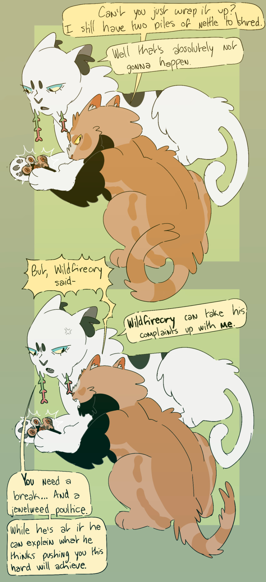
SO I CAN IGNORE THE HURT IM FEEL RIGHT NOW:
What's Song and Weed's relationship like? I imagine Song thinks of Week as a stoner aunt the stoner aunt with a PHD and Homeopathy certification
Weed does her best to make sure that Songpaw wasn't pushing himself too hard. She isn't his mentor, so they don't spend as much time together as him and Wildfirecry, but she always made sure to check on him when she could. You're 100% right about the stoner aunt thing though, If Songpaw was an adult she definately would have introduced him to ditch weed to help with his stress levels.
Thank you! I am honored to be your introduction to clangenblr! My note taking is very underwhelming. I take pretty sparse notes on google docs (sparse because I like to move and fudge things as I go along) and color code them so I can keep track of what season it is. Basically it only gets written down if it's going to be important in the future (births, deaths, scars, name changes, mates, accessories) or if I find it particularly interesting. It looks like this:

I arrived at this process because if I put literally any more effort into note taking the game moves too slowly and I immediately lose interest.
Her name is Magpie. She's still alive, but she didn't think that she would be able to hunt for both herself and Cave, especially since he wouldn't be able to help much as he got older, so she pointed him towards the valley and split.

He's still got all six...
...for now.
Thank you! The text on moons is a font that I made out of my handwriting using calligraphr. The text on ask posts is fully handwritten. It all comes from practice!
1280 pixels is the widest an image can be on tumblr (from my understanding), so I generally limit my canvas to that width to make sure that it doesn't get squished when I upload it. Then I am for each page to be about 2000 pixels, but between 1000 and 3000 seems to result in good image quality no matter what.
That's adorable, I love it!
237 notes
·
View notes
Text
Hey, Here's something I learned for creating my tumblr bio.
So, in current times, I'm a little apprehensive to say anything too searchable in my bio such as that I'm trans. So I didn't want to use the official emoji. But I wanted the flag there for humans to see. I have very limited knowledge of html and css but I got this to work. I embedded the image data it's self into the html code. Usually images are linked, and the address is stated in the html, but that would require uploading the image somewhere and tumblr linking to it even when my not viewing it within my tumblr themed page.
So here's what I did. First I created a file in photoshop that is 8×5 pixels. I painted it with the colors of the trans flag. As tumblr limits how many characters you can put in your bio, the smaller the image the better. As the flag is the same left to right, I reduced it to 1×5 px. Then I saved it as a gif to the desktop.
I'm sure this is easy to do on a Windows or Linux computer too but on a Mac, open the Terminal app. *See alternative option below. type:
cd desktop
Then type: (include the single space at the end after txt)
base64 -i imagename.gif -o imagename.gif.txt
It'll export a file on the desktop with a code in it that looks something like this:
R0lGODlhAQAFAKIAANUtAP+aVv///9NipKMCYgAAAAAAAAAAACH/C05FVFNDQVBFMi4wAwEAAAAh+QQEAAAAACwAAAAAAQAFAAADBAghQwkAOw==
Add the image into the html with a usual:
<img src="#" alt="text" title="text"
Replace the # with this code and the image data:
data:image/png;base64,
Add the inline css to size and position it.
style="image-rendering: pixelated; height: .8em; width: 1.2em; display: inline; position: relative; top: -.15em;">
The final html code looks like this: (remove the $, its there to let you see the code without it rendering the image)
<$img src="data:image/png;base64,R0lGODlhAQAFAKIAAFvO+tewxfWpuPvd4////wAAAAAAAAAAACH/C05FVFNDQVBFMi4wAwEAAAAh+QQEAAAAACwAAAAAAQAFAAADBAhCAgkAOw==" alt="TF" title="TF" style="image-rendering: pixelated; height: .8em; width: 1.2em; display: inline; position: relative; top: -.15em;">
So that's it. It doesn't work in posts, only a tumblr bio or a webpage of your own. Let me know if it works for you and I'll try to help if you run into trouble.
BTW, tumblr only allows up to 2000 characters including spaces in your bio.
Here are some references and additional information that I used to create this.
References:
https://www.thesitewizard.com/html-tutorial/embed-images-with-data-urls.shtml
https://developer.mozilla.org/en-US/docs/Web/CSS/image-rendering
https://www.macworld.com/article/221277/command-line-navigating-files-folders-mac-terminal.html
https://www.w3schools.com/Css/css_positioning.asp
*this next one is a tool that lets you create the image code without the Terminal app.
https://www.coderstool.com/gif-to-base64
hopefully I didn't miss anything, goodluck!
1 note
·
View note
Text
Watermarking and Protecting your Artwork
Tips for everyone to help minimize art theft, including AI training, without greatly sacrificing your images' impact
Objectives of Watermarking
When you place a watermark on your art, it has multiple objectives - they're there to prevent it from being reposted and accredited to someone else, to make it recognizeable as yours with text or symbols, and to prevent major parts of the image from being copied and reused. Here are some tips for making a good watermark, which you can save as a .png to reuse.
Use fonts with serifs or odd shapes and stylings if using text.
Add noise, with color, to your watermark.
Distort the watermark (I like ripple effect to break up the shapes subtly.)
Avoid text and stamps - use handdrawn shapes and letters if possible.
Place it between layers on your artwork if possible.
Use a light blend mode (linear or hard is what I use depending on background colors) and turn down the opacity to make it look nice but still do its job.
The watermark should be visually unobtrusive as possible, while covering major points that would be copied, and BE HARD TO TRACE or select by magic wand or smart selectors. This also helps to keep AI from copying your work.
Compression
Almost more important than watermarking is image compression and resizing. You don't want a full quality image online that anyone can snag and print on T-shirts at the same quality you can offer!
NEVER EVER post an image at 300 DPI or higher to share online. This is the quality required by most printers: without that, it's hard for anyone to make merchandise out of your art. Keep previews at 100 DPI or less. It shouldn't ruin the experience for your viewers and offers an incentive to purchase your work - you can sell higher quality images.
Keep your resolution as low as possible. You don't need more than a 2k image for most usages online - banners, icons, etc. So knock that size under 2000 pixels in height or width.
Flatten and save as a jpeg in medium quality. Typically, you don't need to post any higher quality images online, and you don't want it to include layer data.
Average viewers will NOT notice the difference in these changes without it being pointed out, nor will they think artwork is 'bad' because of it. Don't worry too much about "sacrificing quality."
Glaze it!
Lastly, a technology to combat AI has been developed and is constantly improving. Head over to https://glaze.cs.uchicago.edu/
and use this on your work that you post online for further protection against AI data scraping and training!
#artist#art tips#artist help#art#digital art#digital illustration#digital drawing#digital painting#traditional art
14 notes
·
View notes
Text
Navigating Responsive Design: Best Practices for Website Builders
In today's digital landscape, where users access websites on a myriad of devices with varying screen sizes and resolutions, responsive design has become an essential aspect of modern website development. Mastering responsive design involves understanding the principles and strategies that ensure a seamless user experience across devices. From flexible layouts to optimized images, implementing responsive design techniques can significantly enhance a website's usability and accessibility. Let's delve into some essential strategies for mastering responsive design in website development.

First and foremost, creating a responsive layout is fundamental to accommodating different screen sizes. Instead of fixed-width layouts, developers utilize fluid grids and proportional sizing to ensure that content adapts dynamically to the user's device. By employing relative units such as percentages and viewport width (vw), elements on the webpage can scale proportionally, maintaining consistency and readability across various screen sizes.
Moreover, adopting a mobile-first approach is pivotal in responsive web design. This methodology involves designing for mobile devices initially and then progressively enhancing the layout for larger screens. By prioritizing mobile optimization, developers ensure that the website delivers a smooth experience on smartphones and tablets, which are increasingly prevalent among users.
Another crucial aspect of responsive design is media queries. These CSS rules allow developers to apply different styles based on the characteristics of the device, such as screen width, orientation, and pixel density. Media queries enable targeted adjustments to typography, layout, and images, optimizing the presentation for each device category. By leveraging media queries effectively, developers can create adaptive designs that seamlessly adjust to the user's viewport.
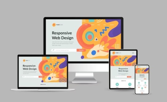
Furthermore, optimizing images is imperative for responsive web design. Large, high-resolution images can significantly impact page load times, especially on mobile devices with limited bandwidth. Techniques such as responsive images, where multiple image sizes are served based on the device's screen size and resolution, help minimize bandwidth usage and improve loading performance. Additionally, using image formats like WebP or JPEG 2000 can further reduce file sizes without compromising visual quality.
In addition to layout and media optimization, ensuring touch-friendly navigation is essential for responsive design. On touchscreen devices, traditional mouse-centric interactions may not translate well, leading to a frustrating user experience. Implementing touch-friendly elements such as larger buttons, ample spacing between links, and swipe gestures enhances usability on mobile devices, making navigation intuitive and effortless for users.
Moreover, performance optimization plays a crucial role in responsive design. As users expect fast-loading websites regardless of their device, developers must prioritize performance optimization techniques such as minification, caching, and asynchronous loading of resources. By reducing unnecessary HTTP requests and optimizing code and assets, developers can significantly improve the website's loading speed and overall performance on all devices.
By harnessing the latest technologies and best practices in responsive design, VerloopWeb guaranties your website adapts seamlessly to varying screen sizes and resolutions, delivering an exceptional user experience across desktops, tablets, and smartphones. With VerloopWeb, you can confidently navigate the ever-changing digital landscape, knowing that your website will always remain accessible, engaging, and visually stunning, regardless of the device used to access it. Partner with us today and elevate your online presence to new heights with our expertise in responsive website design.
#website development#web design#responsive web design#website designers#front-end development#website maintenance#dedicated web designer
2 notes
·
View notes
Photo

Huawei MatePad SE 10.4-inch - Graphite Black 2K Eye Comfort HUAWEI FullView Display1 6 nm Processor | Surround Sound Tuned by Histen 8.0 HUAWEI MatePad SE features a stunning 10.4-inch 2K3 HUAWEI FullView Display1 with 83% screen-to-body ratio, providing wholly immersive viewing experience. With dual symmetrical speaker system tuned by HUAWEI Histen 8.0 technology, HUAWEI MatePad SE can widen surround sound field and enhance human voice, making each call, line in the film, and online class crystal clear. Eye-Soothing Comfort Its 2K screen is specially designed to keep your eyes refreshed and raring to go, passing both TÜV Rheinland Low Blue Light and Flicker Free certifications.4 4096-level brightness adjustment5 changes the display in real time to account for the ambient lighting conditions. From sunny living rooms to dim bedrooms, you'll find that each glance provides the comfort that you deserve. Lightweight and Durable This tablet is surprisingly light at just 440 g,6 and comfortable to grip, thanks to the micro-curved middle frame design. The durable body is built to withstand the occasional mishaps encountered in daily life, like being accidentally dropped or sat on.7 Multi-Window, One-tap Interaction You can swipe to the upper corners to split the screen or bring up a floating window.8 Open more app windows at the same time, and swipe to display a video while replying to a friend's message or plan a trip while searching for a guide. High-Performing Antenna HUAWEI MatePad SE comes with bolstered wireless performance while ensuring its safe usage, thanks to a patented antenna10 design and improved wireless signal capture capabilities, to keep connections and streaming media in sync. Kids Corner, Growth Partner Kids Corner makes tablet browsing safe and fun for children of all ages, and also lets kids have fun trip into nursery rhymes, stories and games in BabyBus. Parents can set time, app and content managements, and enable posture, brightness, and bumpy road alerts to help cultivate healthy digital habits.11 SPECIFICATIONS: SIZE: Height: 24.694 cm Width: 15.67 cm Depth: 0.79 cm Weight: Approx. 0.440 kg (including battery) *Data comes from Huawei Labs. Actual weight of specific product may vary depending on the configuration, manufacturing process, and measurement method. *Product size, product weight, and related specifications are theoretical values only. Actual measurements between individual products may vary. All specifications are subject to the actual product. DISPLAY: Size: 10.4 inches* Screen-to-body Ratio: 83.6%** Resolution: FHD+ 2000 × 1200***, 225 PPI Colour: 16.7 million colours saturation (NTSC): 70.8% (typical value) Type: LCD IPS Touchscreen 4096 levels auto brightness adjustment *The screen is designed with rounded corners. When measured according to the standard rectangle, the diagonal length of the screen is 10.4 inches (the actual visible area is slightly smaller). **Data from Huawei labs. The screen-to-body ratio is calculated by comparing the screen active area to the front panel area of the device. Actual measurements may vary. ***Resolution is calculated based on a standard rectangle. Actual number of effective pixels on the screen with rounded corners is slightly lower. PROCESSOR: Qualcomm® Snapdragon™ 680 CPU: 4 × Cortex-A73 2.4 GHz + 4 × Cortex-A53 1.9 GHz GPU: Adreno 610 OPERATING SYSTEM: HarmonyOS 3 MEMORY: ROM: 32/64 GB* RAM: 3/4 GB* *The available internal storage may be smaller as part of the internal storage is occupied by software. *May vary in different market. Subject to the actual product. CAMERA: Rear camera: 5 MP (f/2.2 aperture, AF) *The photo pixels may vary depending on the shooting mode. Image resolution: Up to 2592 × 1944 pixels *The actual image resolution may vary depending on the shooting mode. Video Resolution: FHD 1080P *The actual video resolution may vary depending on the shooting mode. Rear Camera Capture Mode: Portrait/professional/panorama/watermark/time-lapse photography/smiling face snapshot/voice activation/scheduled photo shooting/Continuous shooting Front camera: 2 MP (f/2.2 aperture, Fixed Focal) *In different photo modes, the number of pixels may be slightly different, please refer to the actual situation. Image resolution: Up to 1600 × 1200 pixels *The actual image resolution may vary depending on the shooting mode. Video Resolution: HD 720p *The actual video resolution may vary depending on the shooting mode. Front Camera Capture Mode: Portrait/watermark/time-lapse photography/smiling face snapshot/Mirror reflection/voice activation/scheduled photo shooting BATTERY: 5100 mAh (typ.) *Typical value. Rated value of battery is 5100 mAh. Actual capacity may vary slightly. The battery is built-in and cannot be removed. CHARGING: 5V/2A charger CONNECTIVITY: WLAN: AGS5-L09: FDD-LTE: B1/B3/B5/B7/B8/B18/B19/B20/B26/B28 TD-LTE: B38/B40/B41 WCDMA: B1/B2/B5/B6/B8/B19 GSM: B2/B3/B5/B8 WIFI/WAPI: 2.4 GHz&5 GHz,802.11a/b/g/n/ac AGS5-W09: WIFI/WAPI: 2.4 GHz&5 GHz/802.11a/b/g/n/ac Bluetooth: Bluetooth 5.0 Bluetooth File Transfer: Supported PC Data Synchronization: Supported OTG: Supported (maximum output 5V/1A during reverse power supply) USB: Type-C, USB 2.0 LOCATION: AGS5-W09: Not Supported AGS5-L09: GPS/AGPS/GLONASS/BeiDou/GALILEO SENSOR: Gravity sensor, Ambient light sensor MICROPHONES: 1 microphone SPEAKERS: 2 speakers AUDIO: HUAWEI Histen: 8.0 Audio File Format: *.mp3, *.mp4, *.3gp,*.ogg, *.amr, *.aac, *.flac, *.wav, *.midi VIDEO: Video File Format: *.mp4, *.3gp IN THE BOX: Tablet (Built-in battery) Charger Type-C Cable Quick Start Guide Warranty Card Eject pin *May vary in different markets. Subject to the actual product.
#PHONE_TABLET#HUAWEI#HUAWEI_TABLET#10.4_INCH#4GB_RAM#64GB_ROM#AGASSI5_L09C#MATEPAD#MATEPAD_SE#TABLET
0 notes
Text

Date: 2/27/24
Time: 9:58
Place taken: Parking lot by CSI soccer field
Image:
Dimensions: 3024x4032
Width: 3024 pixels
Height: 4032 pixels
Camera: Apple iPhone 13
F-stop: f1.6
Exposure Time: ISO 2000
Focal Length: 26 mm
Flash mode: No flash
0 notes
Photo


woohoo process! here’s how i made page 1 (and briefly 2) of this bad boy (x), and basically how i do all my comics. or, at least, all the little square ones
i have a pretty simple process. i make simple things
thank you for reading, if you did!
transcript below bc wacky handwriting:
1. script + thumbs!
i take the little poem scrap i’ve written and i come up with some corresponding visuals in thumbnail form. i like to thumbnail in a sketchbook or on little note paper. this is a 4-panel square comic, so panel width or number per row do not matter as much, unless we break form for effect. as you can see [pictured], i re-did the second panel a few times. rip me
2. panels!
i do a vector/linework layer as a guide for projects over one page, so it’s consistent [note: i use paint tool sai]
grid tips: make a canvas ¼ size of your page and fill it with a colour, and then paste it twice in your page and move them to opposing corners on your page, so you have a little 4-square checkerboard on which to map out your grid!
3. words!
stick them down roughly where they’re going to go, and separate longer phrases for rhythm (and also because of space constraints). i also made the canvas a bit taller in order to accommodate the title and page numbers. [final size is 2000 x 2100 pixels, if anyone wants to know]
4. sketch!
sometimes i sketch! sometimes i don’t. it’s basically the thumbnails again, just for better placement in the actual page.
5. lines!
the final linework! the red lines [in the image] are on a separate layer. i started to shift the words into their final positions so i could draw their speech bubbles.
6. cleanup!
the most gratifying step! note: in order to keep the word and panel layers separate, i coloured the panels white rather than erase them [where they meet the speech bubbles and i want to break the panel]. in the bottom right panel, i decided not to put bubbles, for style :)
same process for page 2! [i like to get all the lines done fully before i get to colours so everything is kept consistent]
7. colours!
for this i was trendy and hip and used only two main hues [pictured: a green-leaning-blue and an orangish-red], and one was quite unsaturated [the blue] while the other was not, for balance (i guess).
8. (optional) overlays!
i was pretty happy with the colours already but overlays are just fun ok [you can barely tell the difference lmfao].
i had one layer with a [very unsaturated blue, at the midpoint between full dark and full light] and one with [the same but orange, because complementary colours], and set them both to 50% opacity and merged them [note: it’s better to merge and Then turn down the opacity]. and then i added another full-opacity [desaturated blue] layer because i am never satisfied.
boom it’s done thank you for reading love you
302 notes
·
View notes
Text
Stop Motion pre production exercise
What are the four most important rules for creating stop motions?
Make sure you have a clear plan and idea for you Stop Motion.
Always have consistent lighting throughout your video.
Take some test shots for your plan and see if it works out.
Always shoot in manual mode it gives you much more control throughout
What equipment will you need?
For Stop Motion you will need...
A camera
a strong tripod
A single or multiple light sources
software to edit your stop motion
What are the standard resolutions for (resolution Width x Height e.g. 6000 x 4000):
• a TV at home>Toshiba Full HD 43inch = 1920 x 1080p
• HD (high Definition TV)>1920 x 1080p, 16:09, 103ppi
• UHD (Ultra High Definition TV)>Samsung 2020 70″ 3,840 x 2,160p, 16:9, 4K
• a Laptop you use>15.6-inch FHD (1920 x 1080)
a top spec iMac>13″, 16:10, 227pp
Iphone 11>1242x2688
The number of Frames Per Second (FPS) can vary, research commonly used FPS for Stop Motion / Animation / Video and consider the effect this has visually.
The most common use of Stop Motion is probably in Social Media, what are the recommended aspect ratios & Resolutions & FPS for the below:
• Instagram> Aspect ratio 1.91:1 4:5 FPS 30
• Vimeo>1:1 FPS - 60 Resolution 2000
• YouTube>Aspect ratio 16.9 FPS - 24 60 Resolution 2560 x 1440
• Facebook>Aspect ratio 9:16 FPS - 30 Resolution - 1280 x 720
What would happen if you had too many pixels (resolution & PPI) when playing your Stop Motion on the above devices?
If you had too many pixels your image quality would become very very poor and appear almost burry like.
What does a TV do if it doesn’t have enough pixels & what is Photoshops equivalent?
If an image has less pixels compared to the tv the image will appear softer. This is because the would be TV stretching the image to fill in empty pixels with similar or the same colours that was already present within the image.
How many pixels (resolution WxH e.g. 6000 x 4000) does your camera have:
My camera the Canon EOS 1300D has the Resolution 4K UHD 2160p; FHD 1080p
What is the resolution (WxH) of the recommended Stop Motion Brief?
1920X1080 as the brief requires you to have 1080p
What is the aspect ratio of the Brief submission?
16:9
1 note
·
View note
Text
3 Fact Of Projector Selection
A projector is an output device that projects an image onto a large surface, such as a white screen or wall. It may be used an alternative to a monitor or television when showing video or images to a large group of people. it come in many shapes and sizes though they are commonly about a foot long and wide and a few inches tall. Ceiling-mounted are typically larger, especially ones that project a long distance (such as 30 feet or more). These qualities are commonly found in classrooms, conference rooms, auditoriums, and places of worship.
Here the 3-fact projector selection:

1.What brightness level do I require?
Brightness with all digital projector is universally measured in ANSI Lumens. Rationally the brightness level for business ranges from 3000 to 5000 ANSI Lumens. Your viewing environment will be a major factor in determining must be. In a standard sized meeting room (i.e. approx. 20 people with lights on), a brightness level of 3000 Lumens or more is recommended. A lower brightness can still be used, however the ambient light in the room may have to be lowered to ensure a clear image. Required brightness levels will vary depending on ambient light and screen size
youtube
2.What Resolution is right for me?
The Projector selection is a most important now a days. Resolution is measured inP pixels and displayed as a (width x height). The higher the better for a sharp and detailed picture. The most common native resolutions for business are: SVGA - 800x600 - Fine for basic PowerPoint presentations. XGA - 1024x768 - A little more detailed so better for smaller text. WXGA - 1280x800 (HD) - HD quality image so great for smaller text graphs etc.. WUXGA - 1920 x 1080 or 1920x1200 (Full HD) - The most detailed picture. Great for Blu-ray movies and very detailed presentations
3.Are there Portable models available?
All projector can be transported easily, though the size and weight will limit the amount of brightness it can produce. While smaller 6 people groups can have a little pocket-sized.
Less than 0.5kg - Pico (limited to less than 1000 lumens brightness good for 2-10 people audience)
Less than 1kg - Mini (usually 1000 to 2000 lumens brightness suitable for around a dozen people audience)
1-2kg - Portable (Range from 2000 to 3000 lumens and can handle a classroom sized audience around 30)
2-3kg - Multipurpose (3000 - 4000 lumens fine for up to 50 people groups)
Conclusion
Before purchasing, whether from us or a competitor, please feel free to contact us to discuss you are thinking of purchasing. We like to ensure you are getting the item that’s right for your needs. Many AV resellers and even some quality only hold some models and therefore attempt to sell what they have in stock. At Just a massive quantity of stock available, we are therefore never pressured to sell one particular model or 'what we have lying around'.
1 note
·
View note
Note
Heya! First off, I adore your art, and the formatting of your update posts! I’m invested in these little guys
Second, what are the dimensions of your canvas for when you draw the longer, cut up comics? I have a clangen blog of my own, and I have a hard time deciding how big each panel has to be to make the and text show up clearer without someone having to click on the images lol
Thank you! :]
Thank you! I struggled with this a lot at the beginning too, so I looked it up and Google told me that the highest quality a tumblr post can be is 1280 x 1920 pixels and I just kinda took their word for it. 1280 is the most important number there, it's the maximum width any of my canvases are and while they all vary in length I usually try to keep them under 8000 pixels long. (Because the bigger the canvas the fewer layers you can use). I draw everything on one canvas (unless it's a multiple part moon) so that I can see the flow of the panels and then when I am chopping them up I just kind of estimate where 2000 pixels would be (usually if you just break the canvas into thirds or fourths it works out pretty well.) And cut it there. Sorry I can't be more specific or accurate, I'm a pretty learn-as-you-go kinda person so there's not a lot of method to my madness. The best advice I can really give you is to just try it several different ways and don't stop changing it until you're happy.
55 notes
·
View notes
Text
As an FYI, Tumblr doesn’t make your inline images blurry randomly or for no reason. It’s a predictable outcome of two conflicting rules fighting each other (because Tumblr is a well designed site).
1. If you try to post an inline image that’s more than 810 pixels tall, Tumblr will resize it so that it’s 810 pixels tall, adjusting the width proportionately. On the face of it this is reasonable; if this rule didn’t exist, assholes could bork your dash by posting an image that’s one pixel wide and a million pixels tall, forcing you to scroll forever.
e.g., if you post an inline image that’s 600 pixels wide and 2000 pixels tall, it will be resized to 243 pixels wide and 810 pixels tall, enforcing a maximum height of 810 pixels while retaining the same relative dimensions.
2. If you post an image that’s at least 300 pixels wide, Tumblr stretches it to be exactly as wide as the main column (currently 540 pixels), adjusting the height proportionately. This rule seems to exist in order to give Tumblr the freedom to tinker with the width of the main column without creating weird gaps at the sides of historical posts; whether this is a reasonable solution to that problem or not is... debateable.
e.g., if you post an inline image that’s 350 pixels wide and 500 pixels tall, it will be stretched to 540 pixels wide and 771 pixels tall, setting the width exactly equal to the main column width while retaining the same relative dimensions.
Now here’s the trick: rule 2 does not take any resizing performed due to rule 1 into account; it decides whether or not to stretch the image based on whether the original width was at least 300 pixels wide.
So let’s take that first example a step further. First, it takes your 600x2000 image and resizes it to 243x810 to achieve a maximum height of 810 pixels. Then, because the original width was at least 300 pixels, it takes the resized 243x810 image and stretches it to 540x1800, an effective “zoom” of over 220% - hence the blurriness.
This rules conflict can lead to some entertainingly stupid results in certain edge cases. For example, suppose that you posted an inline image 350 pixels wide by 10000 pixels tall - a real dash-buster! Tumblr would resize it to 28x810 - but since the original image was at least 300 pixels wide, it would promptly stretch that 28x810 image to 540x15621, resulting in an even more obnoxious image than you started out with, while also rendering its contents almost entirely indecipherable due to the effective 1900% zoom.
Of course, you can avoid all this simply by keeping any inline images that are taller than they are wide under 810 pixels in height and either under 300 pixels or at least 540 pixels in width, which is probably the best way to go unless you enjoy doing math. (With the caveat that it could all break hilarious the next time @staff dinks with how undersize and oversize images are handled, of course, but that would have been true anyway.)
Technology is fun!
2K notes
·
View notes
Text
A Guide to Choosing the Best Projectors
Projectors have come a long way since its first inception, the Zoopraxiscope, which became popular during the 1870s. It was a glass disk with images etched about it that has been operated by spinning it around, with a light shining through it that made the images seem to be moving. This soon gave way to slide projectors then as the need for more interactive projection arose, the overhead projectors were born. This caused it to be possible for presenters and lecturers to annotate while they talked, and was considerably lighter, with clear sheets wherein images could possibly be printed.
Today, however, more and more individuals are opting for the most recent incarnations of projectors, the LCD (Liquid Crystal Display) and DLP (Digital Light Processing) even though the LCD has been around longer compared to the latter. LCDs work by creating a lamp to shine a strong light through a prism which splits the light into component colors and is then beamed through the lens onto the screen for the images to be observed vividly.

The DLP projectors, on another hand, are much more complex since the light is shone through a spinning color wheel onto a chip that's mounted with countless thousands of tiny mirrors. These are deterred or on by electronic impulses depending on what colors are needed at that moment. And as the colors come quickly after another, it seems to blend in a single color with images appearing to be constantly lit when in fact, it's the little parts constantly flickering that make it appear as such.
With so many projectors flooding the marketplace these days, it is easy to become overwhelmed and produce a wrong choice which explains why there are factors that you might want to think about when choosing the best projector for you. First of all, you need to know that projectors are considered for the next features: brightness, resolution, aspect ratio and weight.
Brightness is measured in ANSI lumens. The bigger the lumens, the brighter your projector will be. If you should be considering utilizing it for your property cinema, business presentations or anywhere you will be needing a black room to emphasize image quality, you will need to obtain a projector with a perfection level of fewer than 1000 lumens. For classroom or training presentations, you will be needing a projector with 2000-3000 lumens, particularly if you will be utilizing it in a large venue. Significantly more than 3000 lumens is suitable for churches, concerts, presentations in auditoriums and anywhere where a large screen and very bright lighting is needed.
Resolution on another hand is how many pixels that make up the images. If you prefer sharper and more vivid images, then you'll have to get a projector with high resolution. Ideally, it is better to fit the resolution to the source resolution - as an example, if you're using an XGA laptop, then it is better to employ an XGA projector with it to make certain the very best quality images which are sharp and clean. This same concept applies when it comes to the aspect ratio, that is the ratio of the width of a picture to its height. The best aspect ratio is determined by what application will probably be used, so if it's for classroom presentations or business training, the ideal projector to select is one having an aspect ratio of 4:3. If you should be utilizing a widescreen computer for the presentation, then a projector you employ should have a rate of 16:10 and for home cinemas or DVD showings, you'll need a projector having an aspect ratio of 16:9.
And lastly obviously may be the projector's weight. In the event that you travel around constantly and need to create one with you, then a portable project weighing about 1-2 kg can do just fine. If you should be after a more complex model that you do not have to go or bring with you constantly, something around 2-5 kg will do. Understand that the more complex the projector, the heavier it will be.
1 note
·
View note
Text
Why your screen resolution is more important than you think
what is my screen resolution
Are you wondering whether your computer screen resolution is up to par? Do you find yourself squinting at the screen or struggling to read small text? Fear not! This blog post will guide you through everything you need to know about screen resolutions, including how to change it and why it's so important. So sit back and get ready to optimize your viewing experience with these expert tips on screen resolution!
How to change your screen resolution
Changing your screen resolution is quick and easy, and it can make a huge difference in the quality of your viewing experience. Here's how to get started:
1. Right-click on your desktop background and select "Display settings."
2. In the Settings window that pops up, scroll down to "Resolution" and use the slider bar to adjust it higher or lower.
3. As you move the slider, you'll see a preview of what your new resolution will look like on the right side of the window.
4. Click "Apply" to save your changes.
5. If you're not happy with the new resolution, simply hit "Revert" within ten seconds to go back to your previous setting.
Keep in mind that changing your screen resolution may affect other aspects of display settings such as text size and app scaling, so be sure to double-check those as well before finalizing any changes!
What is the standard screen resolution?
Screen resolution refers to the number of pixels displayed on a screen, usually measured by width x height. The standard screen resolution has evolved over time as technology and devices have advanced.
In the past, 640x480 was considered the standard for computer monitors. As flat-panel displays became more common in the early 2000s, resolutions increased to 1024x768 and then to 1280x1024.
Today, Full HD (1920x1080) is widely accepted as the new standard for desktop monitors and laptops. However, with technologies such as Retina displays and 4K becoming more popular, higher resolutions are also becoming increasingly common.
It's worth noting that different devices may have different standards for their screens. For example, smartphones typically have much higher pixel densities than desktop monitors due to their smaller size.
Ultimately, what constitutes a "standard" screen resolution depends on context – it's important to consider factors like device type and intended use when determining what resolution is appropriate.
Why is my screen resolution important?
what is my screen resolution is important because it determines the clarity and crispness of the images, icons, text and videos that you see on your computer or mobile device. If your screen resolution is low, everything will look blurry and pixelated, making it harder to read and navigate.
Having a high screen resolution not only improves visual aesthetics but also reduces eye strain and fatigue. It can help prevent headaches and other eye-related health issues from prolonged use of electronic devices.
Moreover, different tasks require different resolutions for optimal performance. For instance, if you are a graphic designer or video editor, having a higher resolution allows you to view more details in the content you're working on. On the other hand, if you are gaming or watching videos on your device with a lower quality display then this could ruin your experience.
Understanding why screen resolution matters helps users choose an appropriate setting based on their needs resulting in better productivity without compromising their eyesight health over time.
How to optimize your screen resolution
Optimizing your screen resolution can help improve the overall display quality and decrease eye strain. Here are some tips on how to optimize your screen resolution:
Adjust the resolution: Change the resolution of your device to match the native resolution recommended by the manufacturer. This will ensure that images, icons, and text appear sharp and clear.
Use scaling options: If you have a high-resolution display but prefer larger text or images, consider using scaling options in your operating system's settings.
Choose the right aspect ratio: Different tasks require different aspect ratios; for example, video editing benefits from a wider aspect ratio than web browsing.
Keep refresh rates in mind: Higher refresh rates allow for smoother motion on-screen, but keep in mind that not all devices support high refresh rates.
By optimizing your screen resolution with these tips, you can enhance your viewing experience and reduce eye fatigue while working or streaming content on digital platforms.
Conclusion
Understanding your screen resolution is an important part of optimizing your computer experience. By knowing what your screen resolution is, you can make sure that everything on your monitor looks its best and fits perfectly on the screen.
In this article, we've covered everything you need to know about screen resolution. We discussed how to change it, what the standard resolution is, why it's important and finally how to optimize it for maximum viewing pleasure.
Remember that changing the screen resolution may affect other aspects of your display such as text size or icon spacing. So be cautious when experimenting with different resolutions.
By following our tips and tricks for optimizing your screen resolution, you should now have a better understanding of how to get the most out of your computer's display. With a little experimentation and some careful adjustments, you'll be enjoying crystal clear images in no time!
1 note
·
View note
Text
27 Apr + 2 May | B2: Compiling your collection
SAS
It’s time to think about your merchandise now more as a collection - today and Tuesday you will work on bringing your merchandise together as a whole.

TASK 1: Naming your collection
The name should encompass the overall look and feel of your collection. Think of keywords relating to your project. Consider: what could capture the interest of your target audiences?
Mindmap / list 10+ keywords which relate to your collection.
Use these words as inspiration to create a name to move forward with - write down your chosen name plus a tagline which says a little about your collection.
Explain in 100+ words how the name and tagline are appropriate to your collection’s identity.

TASK 2: Collection graphic
Create a graphic which brings the whole of your merchandise collection together. It is up to you how to present this graphic, but it must meet these requirements:
Photoshop or Illustrator
Size: Width 2000 pixels x Height 2000 pixels
Include your Publication, Tote Bags, T-Shirts and Pin Badges.
You may need to crop images, merge images etc. Look back at your previous research for inspiration.
TASK 3: Write a 200+ word evaluation of your collection graphic, focussing on:
How successful do you believe your collection is?
Explain your design choices.
Did you encounter any obstacles whilst compiling your graphic?
Ask a peer for their feedback - record their name and their comments.
What could you improve if done again?
0 notes
Text
Your Web Design and Images: Why Size Matters
Have you ever sat too close to the movie screen in a theater and everything was blurry and distorted? Have you ever tried to enlarge a picture to make it fit your computer screen? Bad things happen when you try and stretch a picture beyond its limits. You lose focus and resolution.
The resolution of a photo is measured in pixels, which is the smallest bit of information that makes up the photo. If you’ve ever zoomed far, far, in to a photo and seen tiny squares of color, that’s a pixel. There are very specific requirements for the images you use in your web design.
Let’s take a look.
Web Design Header Image/Banner Photos
First of all, the header image or banner photos on your website need to be shot in landscape format, not portrait. (Horizontally instead of vertically.) They must be at least 2000 pixels wide and at least 1000 pixels high. Otherwise, the image may be blurry in website header area. Not the first impression you want to make when someone visits your website.
In addition, when you are taking a photo, make sure the image you are capturing is in the center of the photo and you leave some space on the top, right, bottom and left in case we need to trim the photo.
Website Page Photos
These are photos within a web page, and not a banner at the top. These photos might be of products you sell, staff members, or an image related to what that page is about. Ideally, these images are at least 750 pixels in width and height – the exact specifications will depend on your website design. You want to keep your web pages uniform in appearance, so follow that concept and stick with portrait or landscape images, but not both. Most websites we have designed lately have used landscape images, but there are no set rules.
Blog Post Images
Photos size will depend on your site design. You want to keep your web pages uniform in appearance, so follow that concept. Some clients want a banner image at the top of a blog, while others want photos within the blogs.
Google Business Profile Posts
An image size like 1200 x 900 pixels is preferred but any size works above 400 pixels wide by 300 pixels tall. Try to maintain an aspect ratio of 4:3.
Photo Gallery/Portfolio Images
You’re showcasing your work on your Gallery page or Portfolio page, so you want the images to be of the highest quality. This means they should be the same size as your header image/banner photos. This means they should be at least 2000 pixels wide x 1000 pixels tall, with the same guidelines for how to frame your subject when taking the picture.
How to Tell the Size of an Image on Your Phone or Computer
We’ve talked a lot about why size matters, but not how to tell what size an image is.
On Your Computer
If you’ve ever downloaded images to your computer and saved them, you know that your computer tells you how big the image is. Or maybe you didn’t know. Depending on how you have your Pictures file view set up, you may just need to hover your mouse over an image icon to see the size. Images taken with a digital camera will almost always have larger dimensions than one taken on a smartphone. Each image will have a number x number. The first number is the number of pixels wide, and the second number is the number of pixels high.
You can also right-click a photo and select Properties, and then select the Details tab. You can then look for the Dimensions under the Image section. (If you could use a screenshot image showing this, that might be helpful.)
On Your Smartphone
On your smartphone, for an iPhone, simply tap on a photo to open it. At the bottom, you may see a small letter i, which stands for information, just like it does in your contacts. Tap on that, and scroll down. You will see a number x number. That first number is the number of pixels wide, and the second number is the number of pixels high.
Always Save the Original of Business-Related Photos
You should always save the original of your business-related photos. We understand you may need to clear room on your phone. Consider putting everything in DropBox, or whatever Cloud service you utilize. The reason? Because those original photos are usually large. We can scale down a photo, but we cannot scale it up.
Schedule a Web Design Consultation
If you need a brand-new business website, or need website redesign of your slow and outdated website, we can help. Call 410-420-9390 or use the contact form to schedule a consultation. We work mainly with small businesses in the Baltimore area.
0 notes