#this is also such a nice typeface
Explore tagged Tumblr posts
Visit Tumblr Blog
Explore Tumblr blogs with no restrictions, modern design and the best experience.
Last Seen Tumblr Blogs


Fun Fact
Forty percent of Tumblr users are between the ages of 18 to 25.
Note
📜 ❔📝⛔️
📜 How does your clan’s warrior code differ from other clans?
Ranchclan in particular has a pretty lax warrior code! Especially compared to Valleyclan who can be rather traditional, Ranchclan is much more welcoming of outsiders (doesn’t allow daylight warriors though, you can be an ex-kittypet but your focus has to be on your clan, not your folk), Obviously clerics are allowed to have kits, as are the leader and deputy even if there’s talk about it. I reference a lot of @/bonefalls work and their expanded warrior code, including stuff like Queens Rights.
❔Do you have any suggestions for people looking to start their own clangen blogs?
Include everything in your notes, don’t include everything in your notes. Which doesn’t make much sense, but what I’m saying is like, look at Everything. The relationship tab, cats thoughts, patrol beginnings and events, and you don’t have to write All of it, because a lot of it is probably useless, but when you’re able to string a couple of events relating to a small group, it really works out in your favor for connecting dots and plot lines.
Play 24 moons ahead, and DRAW 24 moons ahead. This may just be a me thing, but having the buffer pages of regular updates on queue, and giving me time to work on 25-48 and 49-72. It also helps with plot writing because you don’t get attached and have big introductions for loners who join the clan only to die from redcough the next moon. This way you can track important plot lines between multiple moons and be able to set the scene for how and when events happen, it’s also great for me making bonusranch content for inbetween because I get interactions from people who inspire them the week of posting ya know.
Speaking of, don’t be afraid to move around small events in the timeline or diverge from clangen as much as you’d like, it’s just the base, and for the most part it doesn’t matter if someone comes out of the closet on moon 23 or 24 if it fits with your pacing better.
Keep your clan small. It’s going to grow rapidly, as clangen is wont to do. Ranchclan in particular has smaller litters for whatever reason, but don’t be afraid to cull kits (sorry), loners, or other clan-joiners to reduce your population and keep only the characters who have plot lines and investments. Otherwise! Save them for mass extinction fodder.
Typefaces, typefaces, typefaces. So many clangen blogs suffer from the fact that some of y’all have ass handwriting or pick really swirly cursive fonts, or write too small! (not to call out anyone specific, many blogs do this and I get the reasons for it!) but making a clean, concise, and legible typeface is going to up your engagement, and makes your panels look cleaner. There are nice handwritten fonts out there, or making your own like ranchclans custom typeface from Calligraphr. Same thing with actually labeling characters in your panels, it’s really useful especially when you’re just starting and introducing characters, and/or when your clan gets large asf and needs reminders. Something I really want to do for Ranchclan sometime is go through and make image ids for the whole thing, captions in the description, and I want to go through with a colorblind filter to make sure that my type doesnt blend in with the background
📝 What do your notes look like?
These are some of my older notes, and like I said previously , a lot of these events get moved around to different moons where less happens. I’ve also started taking more in-depth notes since I started, and events I don’t use but still like, I save for bonusranch content. I sometimes have notes like if someone is injured and it later leaves a scar, I go back and mention where the injury in placed in my notes for future reference.

⛔️How long are you planning on making your comic? For as long as you feel like it, or is there a set end? Also @nimbusclan for asking this question too!!
So I was actually just talking with my partner about it, and I think the goal for Ranchclan is 1000 moons!! I’m not holding myself super strongly to that if I end up losing passion about it, but so far I’m having the time of my life working on Ranchclan and will keep doing it till I’m bored, no set end, just the cats daily lives. I’ll be working on other projects in the meantime, like Dungeonclan (sorry I started Houndclan and did get bored, dogs are less interesting to draw despite their variety), and expanding ranchclans world with Valleyclan and Wanderingclan. Maybe someday I’ll post about my human specific ocs (*cough* dnd characters *cough*)
Thank you so so so much for all the questions!! I really appreciate it my dude 🧡🧡🧡
41 notes
·
View notes
Text
Drove over 2 hours yesterday in a rain storm and horrible traffic, and then two more hours back home, to see Helen Zaltzman, and God, was that ever worth it. She's so great. What an excellent woman. That's what I said to my mother, who came with me to the show, as we left the venue. An excellent woman. My mother agreed.
In a really weird way, this felt like the closest I've come so far to attending, in person, one of those artsy Fringe-y shows from the peak Chocolate Milk Gang era, that I romanticize so much. I've heard stories about Josie Long and Helen Zaltzman doing shows together when they came out of Oxford, where they'd sew live on stage, and other things like that that I believe their people would describe with the word "twee". Twee even by CMG standards, possibly. And I'd love to have seen that kind of thing.
The show I saw last night was in a small intimate venue, with artsy vintage-like decor and chandeliers hanging from the ceiling, and Helen Zaltzman told stories, accompanied by her husband playing very gentle guitar and singing songs, and a screen behind her with a slideshow to illustrate her words, which looked like it had been put together with MS Paint. The stories were sweet and gently funny and emotional and extremely niche. Fucking perfect.
I don't want to be too patronizing toward that stuff, reducing it to being just cute and artsy. It was also intelligently written, carefully put together, captivatingly performed, and genuinely interesting. It was a lot of stuff about etymology, and then at the end there was a genuinely beautiful and emotional piece about a font, and my mother and I have both worked as editors (by which I mean, my mother has built a decades-long impressive career as a very meticulous and well-respected editor, and for a few years in my late 20s I managed to just barely pay my bills by piecing together freelance editing jobs for a tiny fraction of what she charges), so it was cool to sit next to her as we watched that. My mother and I are two of the only people I know who have typeface and linguistics as an area of nerdy interest.
It was just such a nice show, it felt like it was created with so much care and experience and passion, by someone who's learned how to do this so well over many years, and yet it felt very clear that the woman on that stage in Montreal was the same as the Oxford student who sewed on stage at silly gigs in like 2005, or whenever that was. There was so much attention to detail, the soundscape with the music and sound effects, the silly act-outs, the way themes came together. It was so cool. What an excellent woman.
Tonight, I'm going to a local comedy club with a friend of my friend who lives in London, because he's visiting my city, and I've never met him before but he goes to see stand-up shows with my friend in London, and that friend put us in touch so that I can show him the stand-up scene around here. The comedy club we're going to is... I mean, it's one step up from the other comedy club in the city, which John Hastings once described, on the ComCom podcast, as "the Jongleurs of Canada". The one we're going to is the one that didn't get called the Jongleurs of Canada, it's better than that. But it's not a lot better than that. The comedy I'll see tonight is going to be very different from the show I saw last night, and well below the standards of someone used to London comedy. But a friend of mine is on the bill tonight and she's pretty cool, so at least one act will be good. We'll see how the others go.
I went out to a local comedy night last week - not at one of the clubs, just the open spot pub nights that I tend to like better because at least the atmosphere is fun even if most of the comedy's not great (and to be fair, some of the local comedians are good - but a lot of the more interesting/creative ones don't get booked at the clubs), and a guy there was saying how he recently opened for a comedian who was doing: "More of a one-man show that stand-up. There were, like, musical elements. I think he's trying to put all his routines together so he can sell it to theatres and things. It was pretty weird but all right, I guess." So that's the standard of comedy around here; anything that gets too close to a coherent hour is weird and not really stand-up. Alt-comedy is if you bring up a slightly nerdy subject in your set. Literally not one single person in the local scene has ever made a fabric craft on stage.
10 notes
·
View notes
Text
I've been reading House¹ of Leaves lately and it reminded me that Courier is my favorite typeface and I should probably start using the Tumblr version because I think it's be nice for my posts to look cool. You don't agree with me, you should probably ignore this post.²
¹I can't tell if that's purple or blue but the other blue was much too light in my opinion so this one it is and now that I look back at my book it seems kinda purplish too.
²It's really just a kinda bad post and doesn't deserve any likes or reblogs in my opinion. Feel free to throw things at me if you agree.³
³Also yes, I know I'm not doing footnotes right but I thought it would look cooler than having a bunch of parentheses like I usually do so here I am.
#Should I actually do all my posts like this because this actually looks kinda good I think and it works and looks much better than my usual-#million parentheses that I have in most of the things I say as previously stated.#If any of my mutuals see this please I'm begging you tell me how it looks in your oppinion
18 notes
·
View notes
Text
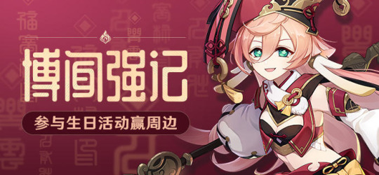
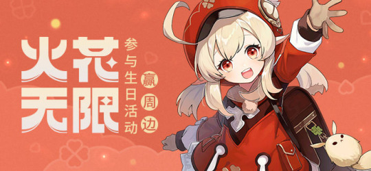
genshin typography stuff. really long
when genshin had birthday web events for characters apparently they'd put an announcement on miyoushe, which from what I gather is chinese hoyolab. the point is the announcement banners actually have interesting typography choices? I wouldn't say graphic design is their passion but at least they put some modicum of thought into it. also they stopped doing customized banners after 2022 for whatever godforsaken reason and im like bruh. bring it back cmon don't be lazy!
edit: oh also if something similar to this is on twitter and in english that's very cool but I actually hate navigating that site. do not appreciate finding things on a page with infinite scroll and a lot more posts
anyways, some interesting things:
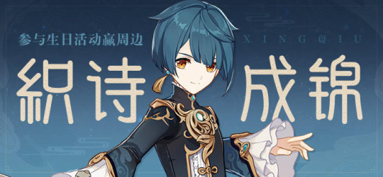

2021 xingqiu and 2022 yanfei have the same font, while 2021 yanfei's is in the typeface of her (and zhongli's) burst. other announcements probably also share fonts (or use the standard hoyo serif font) but I've only noticed these two. edit: pretty sure layla/tighnari/dori all have the same one, and so do kaeya/sucrose
2021 chongyun's text is curved like the bagua symbols which is v cute. bonus points for incorporating his chonghua sword into the 2nd character

gorou's font is so interesting..... it's very calligraphy but more connected and more like actual calligraphy than the other calligraphy fonts they use.... anyways idk I just didn't expect this vibe from him so it's neat. the fish scale background is patternmaxxing so true

sayu's is cute... standard chinese cartoon font, and the paper textures are cool. reminds me a bit of that travel frog game and origami

in the same vein klee's is cute!! I really thought they'd make her font kiddy but it's not super obvious imo? maybe I'm predisposed to liking red because I feel like less is going on in this.
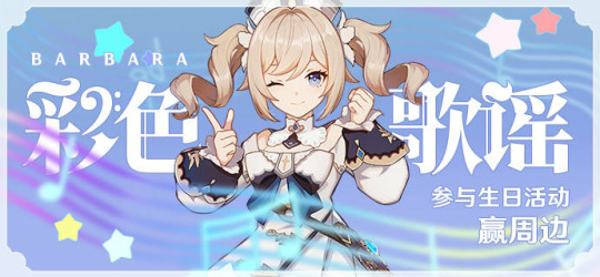
barbara's font being blackletter-y was kinda surprising? it fits though. i adore the clef symbol they added (the border looks like a photo frame? concert ticket? a nice touch)
adding onto 1.0 mond 4* banners, 2021 razor's goes surprisingly hard. ughhhhh the font, color choices, and the way his claymore splits the whole card in two, all of it is so pleasing to my eyes (his 2022 banner is not as good smh)
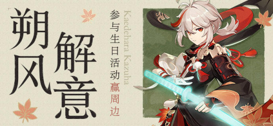
kazuha's is predictably a published book serif font but it fucks SO hard oh my god. I love this one. his 2021 announcement is also ok ig
2022 noelles is also really, really nice no notes. it's just very elegant and has good art (I miss the times when announcement portrait/drip market was a different pose than character splash art). another case where i think the 2021 post is a bit worse
2021 amber's is also pretty nice, looks deceptively simple but has enough going on to be interesting to me (just noticed the baron bunny overlay(?)). taking notes
last one is not a birthday event announcement but the font they chose is so interesting. it is nothing like the usual hoyo serif and I really like it. the gradient is also very nice
also all the text in the banners changes between each art; sometimes it's their skill/burst title, sometimes it's constellation titles, sometimes it's passives, etc. it's interesting.
after writing all this down I think I'm predisposed to liking the ones that integrate the character art into the design well, and everything else (font, background, whatnot) only matters relative to that lol. anyways mainly went through these taking notes
honorable mentions to 2022 jean, 2022 chongyun (composition points), 2022 hu tao (slightly less composition points), 2021 ganyu (because the background is from her story quest cutscene), 2021 ningguang (green backgrounds + ningguang work pretty well tbh), 2021 zhongli for the background, 2022 xingqiu (rainsword mention), 2021 bennett, diluc's just because his emo/goth font and pure black banner is kind of funny
for future reference all of these come from here
and since I've already put way too many links in this post I'll add another. idk where this rug is or if there's a larger post of the art but it's really cute
#teyvat thoughts#debatable. more like unhinged talking#genshin impact#undescribed#i'm still really sad we'll never see twins shenanigans with the characters again. also bc the web events were the one place lu.mine got art
7 notes
·
View notes
Text
KPJMs Let Nothing Slide
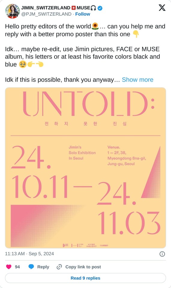
Hooray! An exhibition for Jimin is coming soon to Seoul! It's nice to see Jimin getting a little bit of what Jungkook gets. That said, what the heck is up with that poster?????
The minute the announcement was made, Korean Jimin fans were all over X/Twitter complaining about the poster. There's lots of frustration about how small Jimin's name is. One person likened it to the fine print on an insurance policy. That gave me a laugh.
And can we talk branding? Why make an exhibition announcement that visually has nothing to do with the content? No picture of Jimin, but also no references to the branding of either album. Not the same color story, not the same typeface, truly nothing. What's with the random Art Deco theme? Can we all agree it's just bad? They did it for Jungkook, so why not for Jimin?
Truth be told, I don't like the cover(s) of MUSE, either. It screams cheap to me (only one color ink used for the text and image), but I'll keep that to myself.
Does BigHit call on the janitor to do Jimin's graphic design work?
The good news is, Jimin's talented fandom is already doing the company's work for them. This effort needs its own hashtag, btw.
P.S. Listen to Serendipity and Lie today in honor of their recent 8 and 7 year anniversaries. Both songs are just so amazing.
11 notes
·
View notes
Text
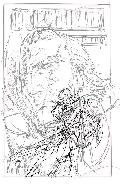
YRMR cover progress for the curious!
before drawing, there were a few things i knew that the cover had to have/show:
critically, had to have vibes of an enemies-to-lovers dynamic in the sense of ... the power tilt? even though that's not "technically" the true nature of their dynamic. gunter's not a nice guy in this fic, even aside from the possession, and i also didn't want anybody to run into this unsuspecting the darker parts to the fic. him more looming/threatening than you'd expect in base game, etc.
wanted to emulate kozaki's style through the whole cover in line qualitty, coloring, and composition. thankfully he gives a few tips over on his twitter. it's both a neat little nod at the source material, and also as a style experiment.
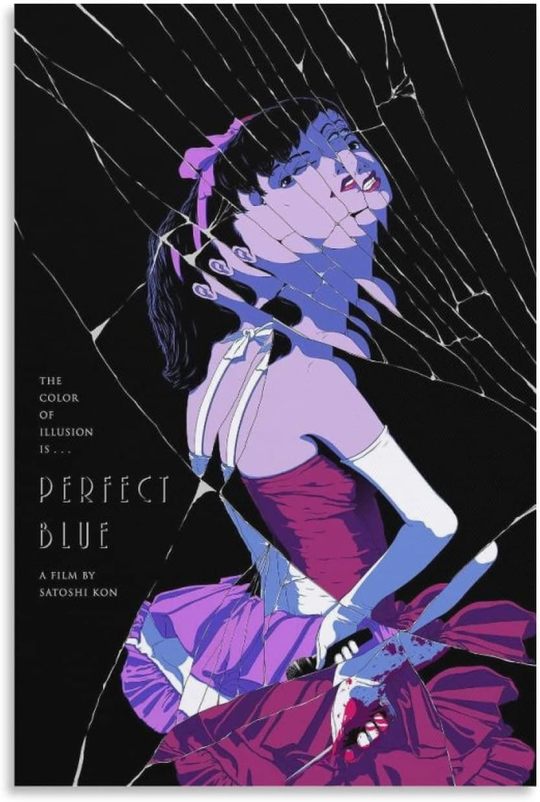
a big theme in this fic is gunter being made of so many masks/shells (there's a perfect blue cover, see below, that specifically made me think this composition could work.)
learning that kozaki hews pretty close to grids + the golden ratio was another big lightbulb moment, here's a drawing yoinked from his twitter where he shows it himself.
after scraping/studying from kozaki's twitter, i made one or two thumbnail doodles below. you can see the solid one had a golden ratio + general line dynamic check squiggled to the side. there's room for the title, the focus is on corrin, it'll work both in a horizontal and vertical crop, looking good so far.

you can see how pretty tightly to the thumbnail i kept, other than moving the vertical text to the top since i didn't have as much room there. i'm a little worried about the different line quality between how big the face is vs corrin but we'll see.
something i also realized i like about the composition is corrin "could" look like she's attacking the viewer, but she also looks like she could be guarding him with her back to him, which.... heh. comes up in some interesting ways in the last third of the fic (possession wise).
bunch of cleaning up.
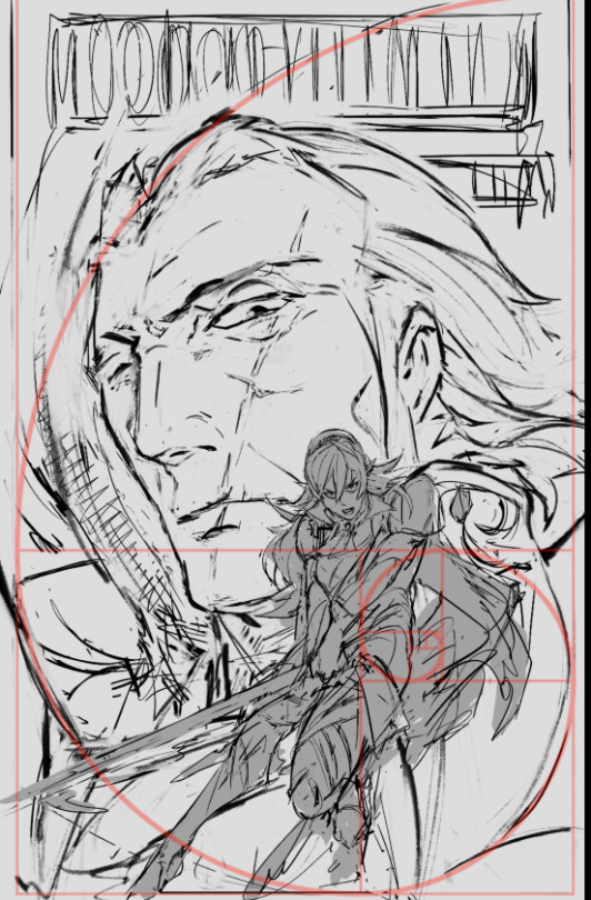

as I suspected since this is 11x17in (much bigger than what i normally draw) i had to grab a different brush for gunter since thin lines were not going to work as they did for corrin. i think kozaki's real genius is how he treats texture with his linework; where he does thin lines, where he puts the thick ones, etc.
corrin's coming along great but there's a spirit to the first face on the left i think i'm missing now, so i'll probably re-insert that. (also decided to at least draw in his face there even though the masks/slices will distort that). i think what also helps is gunter's face is very low contrast and needs to remain low contrast, to help corrin pop out in front.
then i started thinking about typography. a lot of the fonts i had were either way too masculine/bland/modern, or way too feminine/curvy. this title needs a hint of masculinity to nod at FE's general action-adventure RPG roots, but it's also very distinctly the kind of erotica that doesn't easily lend itself to a genre. it's tender horror, it's daddy kink, it's vicious romance, it's ... a lot of things.
here's another thing: when thinking about title typography, another consideration is genre. briefly i considered something like lovecraftian covers; my doujin circle and i had been sharing pictures of old pulp covers. i also noticed a lot of my favorite JP erotic horror doujin have very spiky titles. this title also needs to be scrunched up in a tight space so it's not like we got a sprawl of acreage here either.
what doesn't help is enemies to lovers doesn't really have a visual language in mainstream media.
it's a staple of Ao3 (written) genres, but the closest you'd get otherwise would be romantic horror (kind of says a lot about who makes what huh?). for example, the shape of water (movie) isn't a 1:1, but it's pretty damn close -- unfortunately that poster dodged the question by using an art deco-inspired font typeface that was more about the setting than the genre.
and then i had an epiphany. maybe i was approaching this from the wrong direction: it's the knight/liege romance that's the heartbeat to YRMR.
think more old dragonlance novels. old medieval/fantasy pulp novels; plenty of kinky sex and ass in there, and still close enough to FE. remember everyone and their mamma having a bi ass crush for bad boy raistlin? that's the vibe i want.

this kind of glorious deranged shit. you're not gonna be surprised at possessed grandpa whip kink if you read these on the regular.
after ~*arcane designer magic*~ (I do this for a living) bolton and magiona display were the two fonts that were gonna work just fine together.
god that looks so much better. this looks believable now.

the thin/thick line weight contrast in magiona display is going to accentuate the lineart in a way that might be tricky with other fonts that work better on painted covers. bolton's "squished" vertically enough it doesn't compete with the other one, and makes for a good secondary/tertiary font.
few other things happened.
i shrunk gunter's face because not being able to see his jawline (sex appeal u see) was bothering me from a composition standpoint. it's the same reason frank frazetta didn't censor his glorious asses.
(said seriously, by the way. so many people don't give their lust in art enough credit.)
i also needed more room for the title to show, and the line quality/scale difference between his face was also bugging me. does this mess up the golden ratio composition? sure, temporarily, but his armor's weirdly flexible that we can adapt it pretty easily.
it's about this time i'm also looking through my hydrus network stash of favorite covers for what color palette and contrast to use. kozaki tends to skew purple/cooler hues for nohr characters, and that'd go well with these two.
purple/green hues that play well with light purple and the yellow from those old covers i love so much, low contrast midground, and something that'd contrast well with text above. dark/black background for the gothic vibes, and the text will probably need to be white or some sort of light-warm hue for that "pop".
doing color tests is more of a leap of faith and intuition than an exact science, but damn it is it satisfying when you nail it in one go and go 'holy shit i want to read this. :D

(green/gold for the hint of anankos' mask, also matching the yato and her warmer skin tone. purple flames for him, but the high contrast armor to separate her from his larger shapes. we've got the dragonstone and the yato as flexibility for lighting and emphasizing contrast with her. )
i kind of like how i accidentally made the mask shards reflect(?) a bit of his own face. hell yeah throw it in. this is something that's more likely to work than not. this is something that has that mix of id and horror i've been going after.
here's another version with references to the side and the golden ratio laid on again.


honestly a lot of it at this step is going 'dude you know what would be SO DOPE.... PURPLE FIRE...' 'dude..... fuck yes....' 'what about some sick ass sword effects?' 'YEAH....' and saving a bunch of backups in case of the idea didn't work out.
(am i going so much harder on a literal gilf porn fanfic cover than i need to? hell yeah. gunterfuckers deserve better. :D )
anyway here is when i start questioning everything, so i'll take a break from the colors to tighten up the lineart. now that the composition's settling in much tighter, i'm also thinking about how the two shapes interact with each other and if there's any potential issues with tangent points (where two lines intersect each other in a way that makes an optical illusion.)

that said i love how his jawline "points" at her face, that kind of line you want.
grinding away on corrin's lineart. also double checking that the shapes/colors/forms for her "make sense" both standalone and with the composition too. what's nice is she's at the point where i can just turn off my brain and polish up.

naturally couldn't resist poking at it more and this is when the rest of it clicked after figuring out which bit was anankos' mask, which bit was possessed!gunter vs himself (polished up the armor a bit too. at this point i'm pretty confident that it'll stay "set"; the biggest thing i'm likely to change is the blue silohuette to the dragonstone side for corrin.

here's the last true screenshot before cleaning up the last 2% of the lines. added the pulp cover texture around the border, switched the colors of the text so the cream would stand out more, cleaned up gunter's face and also increased the darkness of corrin's body so it'd contrast more with him behind.
thanks for reading. :D
38 notes
·
View notes
Note
Wait how do you make a font of your handwriting???? I've been wanting to do that for so LONG but i could only ever find weird sketchy websites and apps that didn't work :(
i think i used calligraphr! its been a while since i actually made my font, but the basic steps of it is
》 find a typeface grid where you can write out your alphabet
》 fill in all the letters
》 scan it into a font maker
》 dowload the svg or ttf file
》 i had to look up how to do this but you can upload it to your comp's default fonts! and it should come up in clip studio from there
calligraphr is free to use, there's an option to upgrade but it provides a template and creates the file for you. there's also a Microsoft Font Maker! i havent used it but i found out abt it thru this post that gives you a quick playthru on how to make your font!
for reference, this is how the original font came out thru calligraphr
it's a nice personal touch, and makes it blend into my art more than a serif or sans serif font. it looks like Mine and i didnt need to write it out by hand :>
#ask#surprise! that font was my handwriting the wholw time#ill have to use a new pen for it bc i dont use that brush anymore but. u know.#also. might make more of them now that i have calligraphy brushes dhhdhd
22 notes
·
View notes
Note
now that the lyrics project is complete what was your thought process for all the designs?? 👀 been wanting to ask but wanted to wait till you finished
well well well (i'll do it by song)
Pisara meressä: i wanted an informal vibe, like it's gotta be obvious that it was just written down in a notebook. just to reference the lyric Voit vetää hommat vihkoon but like. literally. so the cursive is just how i would normally write cursive, and the pencil sketch is retained. and the water drop below the P of the title lyric was there from the initial designs
Tuhoaisti: based off the käärijä logo font! it's not bold tho. i wanted to get the sense of destruction across visually. one of the easiest to make imo
Aaveisiin: based off courier. i wanted a vintage vibe with the typeface so i went with this slab serif font. it's all meant to be minimalistic. the window at the bottom is like. where the former lover or smth could look through. and the eyes are for that feeling of being watched. one of my faves
Suuren päivän ilta: i wanted a neon sign vibe, and considering the instrumentals, i wanted smth sleek and sans-serif. so it's somewhat based off this font (the all-caps one). and the doodles are based off the lyrics too. i made it red since it does get mentioned in the song (punasiin käytäviin), tho i also associate red with tuhoaisti and täydellisin. also i ditched my first work of it, and now i use the scrap paper to test color combos
Täydellisin: kinda hard at first, since spi was red and this was also very much red to me. and idk at first what font since i didn't want it to look like spi but i still wanted the neon sign vibes, and also somehow incorporate the seductive vampire imagery. that's when i found the font linked above (i used the cursive one here). i tried to make it glow but ehh... the double lines work i guess?? and the nearest i had to red that was neon was pink
Satama: based off the font kuumaa uses in their pubmats (which u posted recently). because of the modern sound of the instrumental, i wanted smth sans-serif but not as sleek as the spi font. the ship and fence are related to harbors, and the clock is a reference to both the ticking sound throughout the song and the promo videos for it. (it's even set at 1:00! 12 and 1! like in the promo!)
Loppujen lopuks: colors are based off this one poster i made for the song some time ago (it's on IG and the kuumaa fans discord). i wanted to make the text more rounded, and with more lines, but it wouldn't fit in the spaces. the stars are also based on the poster. mostly vibes-based from the instrumental since the lyrics themselves are not very visual imo. another of my faves
Valmiit: based off garamond font, since i wanted a serif font. to match the graduation vibes. same with the colors and the graduation/student caps. the train is mentioned in that very lyric too
Kerran sadassa vuodessa: my literal handwriting. sky blue, but not the light blue of pisara meressä, since it's cloudy. the birds and the heart are based off the lyrics, and the grass is just vibes
Tässä on kaikki: sunny!! i wanted a big font, i played around with some rounded ones but i couldn't get the spacing right. the teal is from the mix of blue and yellow. i thought the double lines make it more fun, as well as the wind. the bus is, well, supposed to represent a tourbus. the song has great roadtrip vibes in general
Luotan tulevaan: i wanted the flowiest script, but that wouldn't fit the page! and in glitter pen yellow gold so it's glowy like an actual streetlamp. and the lyrics are meant to be surrounded by a streetlamp too. tbh i also associate this song with blue (and dusk) but i feel like that's too much blue already (and i wanted to use it for yyl)
Yks yö lainaa: i had some more intricate fonts in mind, but i settled for this one that's similar to the täydellisin one but less cursive. the cleanliness reminds me of some poster fonts and i think that's really nice. dark blue since it's about night, but glitter gold too since i associate it more with this song. the couple is running in the park they sneaked into in the lyrics. it's got the colors of each kuumaa album! probably my fave of them all
overall: my original plan was to do the title of each song in the center, surrounded by lyrics everyone suggested. but i'm bad at layouts. and it felt like too much work, especially with my college stuff alongside everything. i also thought of putting stickers or photos, but that would mean buying more stuff. even if i'm not as fond of those i did for some of my fave songs, i'm alright with how it turned out! tbh i did all this for the 6 month anniversary of pisara meressä
i'm planning to do this too with jo3 after it releases 😉
5 notes
·
View notes
Note
wait ok so as a professional dom does gale have kinks that he won’t engage with, like boundaries? also does he have favourites? or is that like separate between his personal and professional life so he does have fav kinks that he prefers at home obviously but not at work like he sort of treats it all the same. cause as a professional dom he doesn’t get turned on as he works does he?
Omg haha wELL.
Gale’s limits are below, listed in clear typeface. No Daddy kink, no Rape play, no kissing/sex.
John reads that last one a couple of times, sticks another cigarette between his teeth and tries not to frown. It wasn’t that he deeply wanted to, but he’d expected at least kissing. Gale had beautiful lips, soft and sensual and feminine in a way that contrasted with the rest of his masculinity. John thinks it would be nice to kiss them.
But again, this was just research.
so I haven't done a lot of bg development for this au, not like I have with little beasts or Kfak. But I do think like all my AUs Gale grew up with an unstable alcoholic father. So no on the daddy kink. I think he doesn't engage in CNC for a multitude of reasons, but especially within the professional space it crosses too many lines. In personal life he may do cnc play, and would quite enjoy some forms of CNC play, but not rape play. Which ARE two different things I am happy to explain if anyone is curious.
no kissing or sex is because then it becomes a legal issue of prostitution. which is not wrong, but not what Gale does. I think professionally there's a lot of stuff he does that does nothing for him personally.
Of course he gets turned on while working! Not always and not every time and not with every client but he is sexually into domination and he does have people engaging with kink with him. So he does get aroused but he maintains that professional line. (maybe not with john tho....after all he's not paying him :)) )
10 notes
·
View notes
Text


I really wish I could sleep at night and not wake up so often and breathe correctly. Because being so tired all day sucks. I feel a lot better right now but the majority of the day was really tough on me. Not ideal at all.
When I woke up at 9 I just didn't feel very good. I desperately wanted cereal. I literally had it in my dreams. I texted James and they went out to get cereal and orange juice for me. Which was super kind. They are such a good husband. I want for nothing, they always make sure I have everything I need.
While they were at the store I got up and made the bed and got dressed. Long dress and sweater combo continues to be the best outfit. I started with a fleece but it was just a little bit to much. It was soft but to fluffy.
I was waiting on the couch when James got home. I had two bowls of cereal. They were sitting at the island working on some notes and research for their podcast. But would eventually come and lay on the couch with me.
But I was feeling miserably exhausted. Just so tired. I told James I had to go upstairs and lay down. And they decided to join me.
It was nice being held. But all of a sudden there was a crashing sound from downstairs. Sweetp had knocked a pan off the stove, which also got the grate and it was very loud but not a huge deal.
James told me to go back upstairs. And when they came back up to join me they closed the curtains and I was out.
I don't even really remember them leaving at 11. And I slept through 1.
I did feel a little better when I woke up. Not for long but at least for a while I was okay. I tried to have a hotdog for lunch but we still don't have buns and the white bread kept sticking to my teeth and I just hated the entire meal. I had half the hot dog and gave up.
I laid on the couch. I tried doing my makeup. I switched bags. And around 230 I headed out.
I had a $10 voucher for Michaels so I went to buy some felt. I also got dunkaroos. I got back to the car and had my snack and headed to value village.
I completely struck out there though which was super frustrating. I was looking for blankets for making bears. And they only had 2 I would use but they were $9 a piece?! Insane. Plus the line was crazy long and a woman was yelling at the workers. The whole thing stressed me out so I just left.
I went to the goodwill down the street. I found two small pieces I could use but I found out I have 13 sign ups so I will have to go to savers or something tomorrow. We'll see what happens.
I spoke to my dad on the phone while I walked around the store. He told me my brother is doing better. Steve would even text me this evening to tell me he loves me. He did the same thing my whole family does and downplayed the whole thing. I understand no one wants to upset me but I can tell when they are holding back. It was nice to hear from him. And my dad. I saw a picture of my dad today and I'm he was looking good. Everyone needs to be healthy and strong and be here for my baby in the spring. That is the only acceptable option.
When I left the goodwill I could smell the Burger King across the street. I thought that would be nice. Sadly I was wrong. The woman at the register was really nice. But the food didn't make me feel good. I sat inside and ate and tried to eat slowly but I just felt super bad. It was not a good time.
I had thought about going somewhere else to waste more time before the event at the main but instead I just went straight there. Traffic was bad, there were a few accidents, but I got there around 5 in one piece.
I was happy to see James. And I went to find Jesse to discuss the print shop type. One of the volunteers sent an email that the tape I'm using could be damaging to the typeface. And I was super confused about that because it's not true? So me and Jesse went to look at the type tray I keep and it's all fine. I took all the tape off and there was no residue at all. I was pretty upset that someone would say I would do something to hurt the collection . But Jesse and Meagan (who also got the email from the volenteer) both know everything was fine with the type. And I spent most of the next half hour sorting all of the letters and making them all nice. Putting away anything else that I didn't use.
Meril would come in and she joined me in the print shop to gossip and catch up. Apparently she was really mad that someone accused me of doing something to damage the type. She was also included in the email and stuck up for me and it was super validating to know she was on my side. And it was just nice talking to her. Her sister is also pregnant and just found out she has gestational diabetes. Which sucks. I am more and more sure I'm going to test positive for that. Mostly because I am so wildly thirsty. I'm going to try eating more fruits and yogurts and lighter foods. It's hard when it's so cold out, but I think it'll help me feel a little better.
Meril would leave. I would say hello to friends around the museum. I checked out the mural. Which was the entire reason I came. It was really moving. I am very curious how they are going to display it long term in the musuem. I didn't sit in the audience when they had their panel. Instead I sat with James. It was nice just being with them while they worked. We talked a little bit mostly I just enjoyed being in their company.
I stayed there until 730. I was starting to feel a little unwell. And my eyes hurt. I got a package delivered and it was Christmas gifts so I was like let me go home and get these out away before James gets back. So I gave them a kiss and was off.
I got back here at 8. And sorted my gifts. And fed sweetp. And now I am sipping water and planning on getting a shower and getting in bed to wait for James.
Tomorrow I have my workshop in the evening. And so I'll spend the day preparing for that and resting. I think it will be a good day. I just really hope I sleep well tonight. Wish me luck. I love you all. Goodnight!
3 notes
·
View notes
Text
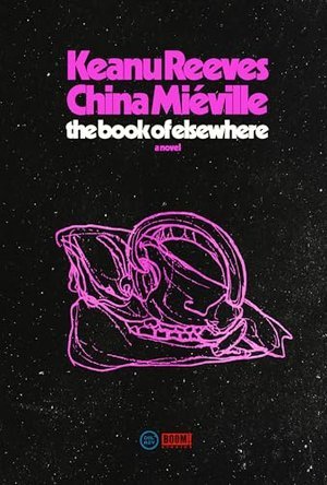
THE BOOK OF ELSEWHERE by Keanu Reeves & China Miéville
RELEASE DATE: July 23, 2024
n which the Angel of Death really wants to take a holiday.
“Memory is a labyrinth.” Or perhaps a matrix. Actor Reeves teams up with speculative fictionist Miéville to produce a tale that definitely falls into the latter’s “weird fiction” subgenre. The chief protagonist is the demi-divine Unute, known as B. He’s not nice: “That man does not kill children anymore, when he can avoid doing so, but still, leave him alone,” warns one of the narrators, whose threads of story are distinguished by different typefaces. B is a killer—early on, he explains to a psychiatrist, “I kill and kill and kill again,” adding that he’d really rather be doing something else. B is also curious about the way things work, which leads him to experiment on unfortunate deer-pigs, the babirusa of Indonesia, to try to suss out what allows him to die but then come back to life, learning that he’s not so much immortal as “infinitely mortal.” B, as one might imagine, isn’t the life of the party—and the reader will be forgiven for being a little grossed out by his experiments, which are infinitely grisly (“A gush of cream- and rust-colored slime sopped out and across the gurney and onto the floor to mix with soapy water”). The structure of the story is both metaphorical (albeit B professes little patience with metaphor), with Unute morphing into Death itself, and rather loose, the plot picking up hints dropped earlier. It’s not always easy to follow, but it’s clear that Reeves and Miéville are having fun with the tale and its often playful, even poetic language (“the huff-huff of horny hard feet on the scuffed corporate carpet, a stepping closer, an incoming, a meeting about to be”).
A well-written if elusive treat for fans of modern mythologizing.
5 notes
·
View notes
Text
ROUND 2 - GREEN GROUP
Propaganda under the cut.
Bookman Old Style: "nicely even, a good serif font so we don't have the I-l mixup, because seriously, sans serif is BULLSHIT. Book Antiqua is a solid second though", "its a nice wide serif font, easier to read than times new roman"
Junicode: "A font that supports way more Unicode characters than your average typeface. It also looks good."
18 notes
·
View notes
Text
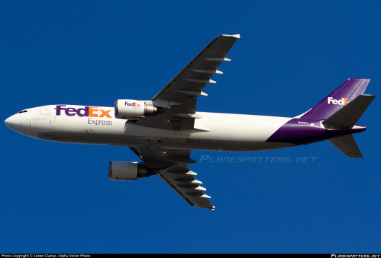
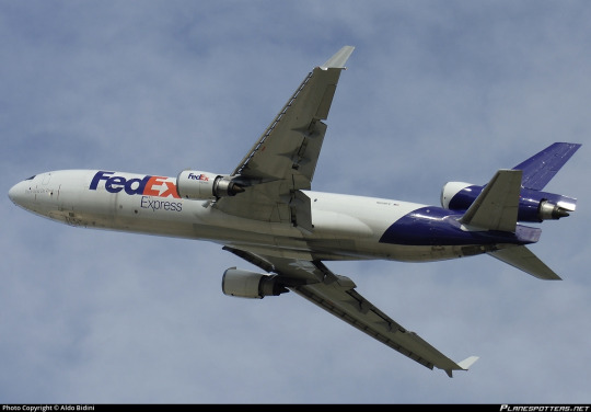
No. 44 - FedEx Express
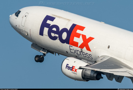
If you have ever sent or received a package, particularly if you live in the United States, you may be familiar with FedEx, and @magic-gps requested that I discuss their airplanes!
FedEx (founded and formerly known as Federal Express) is a massive network for transportation of mail and cargo, and Federal Express Express (okay, no, I can't call it that, FedEx is legally the full name even though we all know what it's really short for) is its airborne branch, making up the largest cargo airline by fleet and freight tonnes conveyed in the entire world. Their largest customer is the US Postal Service, with whom they have an exclusive contract - any USPS air mail is carried by FedEx Express - but they also fly for countless other clients. They cover so much ground (air) that they not only have a dozen hubs but an additional SUPERHUB, located in Memphis. They're what DHL is for Europe but doing bigger numbers, and that's with UPS, Atlas Air, and Kalitta Air to compete with. Although they're based in the US, their website claims that their destinations include every US zip-code, plus "over 220" countries and territories. There are 195 internationally recognized countries at present. I don't think saying they fly everywhere is even really hyperbole at this point.
FedEx's fleet is massive and eclectic. They have the world's largest cargo fleet, with 650 planes (which are named by employees, frequently after their children). Add in FedEx Feeder, a second fleet of small propeller airplanes dry-leased to local carriers for use ferrying small loads to the full-size jets, and there's a total of 699 FedEx liveries in the skies with 88 more on order. They occupy whole swathes of tarmac. They're everywhere. Like snails after the rain.

Oh, and apparently this livery was designed by Lindon Leader (what a name) of Landor Associates, the prolific and highly regarded design firm responsible for hits like the SAS belly stripe livery and misses like JAL's two previous designs. I have higher standards for liveries that are just absolutely everywhere, so let's see if Landor was able to live up to them.
I'm going to be specifically talking about, because I presume this is what the requester meant, the livery FedEx adopted in 1994. The timeline of this is interesting, because the name of the airline stayed Federal Express until 2000, when the entire company rebranded from Federal Express to FedEx and added the redundant 'Express' to the airline's name. I've always thought that was very funny, and while that's charming to me I don't think I should be encouraging things like this. It's just sloppy and a bit weird to say.
Before they adopted the livery they did briefly trial a new logo. From 1991 to 1994 they had this!
Boy do I not like that! It's significant to the history of the company in that it shifted the colorscheme from indigo and burgundy to purple and orange, except that the difference in brightness here is really almost upsetting and the logo itself is...it looks like that. It's very TRON somehow. I don't find the tackiness pleasant. It's just ugly. The typeface they chose is bad. The wriggly X is nice but every other letter looks a unique sort of hideous, with the E in particular looking like a rake made of sponge which has been placed in water and left to soak. Thankfully they moved on quickly, replacing this logo at the same time as their livery.
The fact that there's six years between the visual rebrand and official renaming is interesting. Federal Express was already colloquially known as FedEx before the official renaming, and used it in their branding, but they weren't legally FedEx yet, so for that little span their planes bore both names.

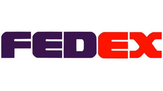
This adolescent period in the life of modern FedEx featured the 'Federal Express' subtitle in this serif mystery font which I haven't seen mentioned at all anywhere. I couldn't find many more pictures with the full 'Federal Express', but there's a scattering of seriffed planes out there, it seems. It looks a lot better with the 'Federal' taken out just by virtue of legibility, and I have to say I'm very keen on the way the subtitle is offset to align with the start of the E. It looks nice and aerodynamic. When the first word is taken out it has the extra benefit of lining 'Express' up with the 'Ex' that stands for it.
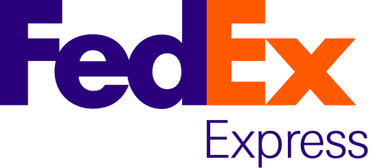
But there it is! The FedEx logo. Adopted in 1994, considered a contender for the best logo ever made, winner of over 40 awards.
I want to disclaim for a moment. I think it's always been somewhat implicit that my opinions are just one manifestation of the infinite variability of human thought and inevitably subjective but I do need to re-stress this now: these are my own hot takes. My opinion is not legally binding. Lindon Leader is an incredibly accomplished designer and I'm not even a designer at all. There is a reason that FedEx's logo is so widely acclaimed. My criticism of it is not an attempt to contest its legacy, and is - again - just my opinion. And it is an opinion colored not only by the fact that I'm an amateur, and by the fact that my tastes are different from other people's, but by the fact that this logo is quite literally older than I am, and tastes have most certainly evolved since then.
I think the FedEx logo is...okay. I certainly do not despise it, but I would stop very short of calling it the best logo ever. I'm going to talk about why I'm so underwhelmed by it, and it's going to sound like I don't like this logo for a bit, but if you power through that you will see that my opinion about it isn't as straightforward as the sum of my opinions about its parts.
The fantastic thing about this particular logo is that it's easily the most-discussed and best-documented bit of branding I've yet covered, so it was a delight to research. I didn't even have to call in my font wizard, for example, because Leader explicitly states what it is in this interview - a proprietary typeface heavily inspired by Univers 67 Bold Condensed and Futura Bold. I actually like Futura (the Cyrillic version is one of my favorite Cyrillic typefaces) but don't love Univers 67 - it reminds me way too much of the handwriting style I was drilled in at school. US schools have truly heinous taste in the penmanship they teach, and much like how Parker cursive inherently reminds me of third grade, Univers 67 feels to me like an adult version of something I've long since outgrown. The design of the letterforms here, with the exaggerated x-height and all the lines (crossbars included) having a uniform thickness of 'very', reminds me of the posters on the walls of elementary school classrooms.

Take a look at this. The green line is hypothetically where the baseline should be, but the E and D descend slightly below it. According to my font wizard this is fairly common as an attempt to some sort of visual trick, but I don't like it. I can make it out from a distance and it significantly bothers me.
Speaking of misaligned, I've always felt like the vertical line on the E was slightly wider than that on the D, but had dismissed this line of thought as an optical illusion - the darker color and the lack of detail at the top, plus the lack of gaps at any point in the E, artificially make the D look narrower than it is. I tried lining them up, and I was right, it's an optical illusion. I still hate it. What isn't an optical illusion is that the middle line on the E is thicker than the second line on the F - again, hate it!
And I just don't like this font! It's like if they fed different fonts to a neutral network and had it invent a weight bolder than bold, like the neural-network generated upperer and lowerer cases. I'm aware of the existence of ultra bold weights, and I'm not talking about those, because those are regular ugly and clearly made by humans. This looks like an algorithm expanded the letters until they were touching.
But the touching bit is intentional. The FedEx logo is hiding a little secret, perhaps the most frequently cited reason for why it's so beloved. Between the E and X, Leader slipped in an inconspicuous arrow.
And I can't pretend this isn't really clever. It's subtle but once you see it you can never unsee it. My problem is that one feature doesn't make something good on its own, particularly when it's something you can easily miss at first. The Sneeze interview linked earlier sort of implies Leader built the font in large part around the idea of the arrow, and I find that a little problematic. Sometimes an idea is so fantastic you just can't let go of it, but when you're designing something you just can't be myopic like that. And, to be clear, I don't think Leader sacrificed the aesthetics of the wordmark to accommodate the arrow. I'm sure he personally thinks this font is beautiful. But when I evaluate it for myself, I can't allow one good feature to overpower my own dislike for the font overall, even if it is legitimately clever.
I do have some nice things to say, though. Well, mostly one nice thing. I love the color scheme. I think the purple and orange shades here are a wonderful choice, an uncommon one but one that manages to be a visually pleasing combination. If either of the shades were less saturated, or the purple were brighter, it would lose its cohesion, but Leader chose the perfect shades to bring out the best in each other. The old red and purple shades were absolutely hideous, but he transformed them into something great.
But at the end of the day my opinion of the logo on a granular scale is irrelevant. And I don't say that because I'm in the minority here or because I'm not allowed to have an opinion or anything else of the like. It doesn't matter because the FedEx logo is older than me and it is FedEx. When I see something purple and orange, I think of FedEx first. Let me use an example by invoking something better left dead.
In 2018 the Overwatch League, an esports league based around the maelstrom of poor decisions which is Blizzard's video 'game' Overwatch, played its first season. A charter member was the Florida Mayhem, a team which was in all honesty sort of a joke (though not exciting enough to live up to their name). I stopped following OWL after the first season, so I'm not sure if any of this has changed, but they finished second-to-last, made some very questionable choices on the management end, and were representing Florida. All of these facts are ontologically comedic. But above all, these were their team colors.
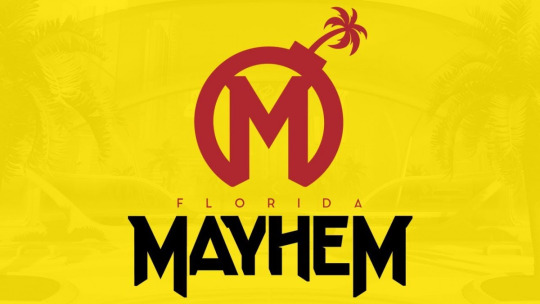

So, this creates the clear issue demonstrated above. Certain brands are so culturally entrenched that even a passing similarity in visual identity makes you immediately look like a pastiche, even if you're otherwise distinct. Mayhem's branding is, in my opinion, way better than McDonalds's, but it was still the right move when they changed to a completely unrecognizable color scheme in 2020. You just see some things and immediately recognize them.
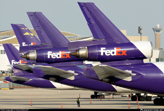
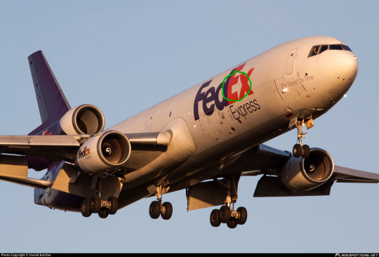
The cultural specter of the FedEx logo is very useful to the FedEx livery. As long as you do not royally mess up - which they have not - a FedEx plane will immediately resemble a FedEx package, even if it doesn't actually look like one, since they're mostly white.
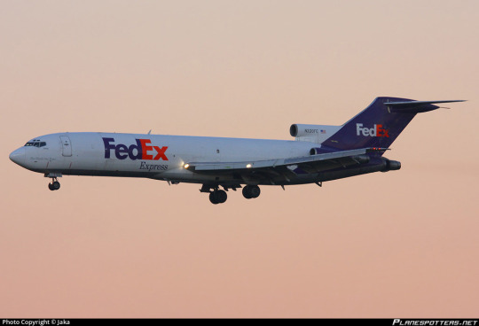
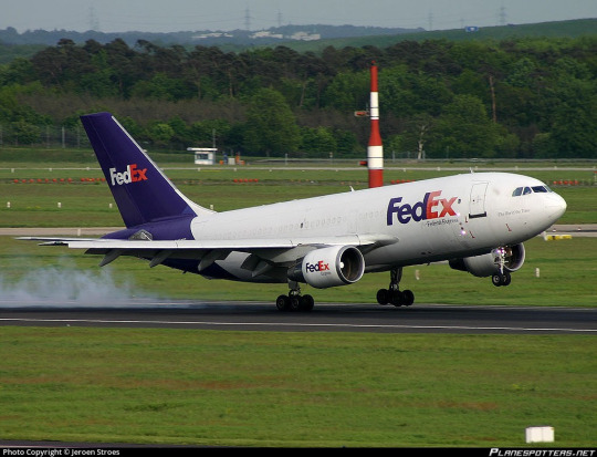
...well, okay, the planes are also mostly white. And I'll be honest, on the 727? This plane isn't half bad. The clean line of the t-tail makes this sort of straight-line-down livery look so much better, and the placement of the wordmark in front of the heavily swept wings keeps the white tube from looking quite so much like a white tube.
But the 727 isn't the only airframe they fly. They're the largest operator of six separate types, most of which are fully retired from passenger service, including the MD-11. Their MD-11s are literally the only trijets you'll see around in the US these days - they only started retiring their DC-10s in 2021, nearly ten years after they flew their last passenger flight. They're pretty unusual among large cargo airlines in that they flew the 747 for just over five years, and not particularly on their own initiative, having acquired a few from a merger with the Flying Tiger Line. So the way the livery looks on the 727 doesn't tell the whole story.
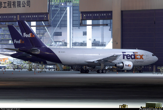
Okay. So that...is a couple of white tubes. That's somewhat unfortunate.
I want to clarify that, while this style of livery has become increasingly popular over time, culminating in its codification as an outright trend in the late 2010s and early 2020s, FedEx adopted this livery in 1994. It is wrong to say that the FedEx livery resembles TAM, Lufthansa, or Icelandair, and more correct to say that all of the above carriers are wearing a style similar to FedEx (though Qantas and MALÉV came first). Despite the fact that I've been known to call these 'Lufthansesque', Lufthansa didn't invent this style and didn't do it best. Still, doing it earlier doesn't excuse it.
FedEx in particular suffers from the rear-heaviness issue. Though they have a larger logo which balances it out better than some (Lufthansa), it's kind of countered by the fact that FedEx exclusively operates planes I'd consider on the long and thin side. It makes the white look all the more dominant on the airframe.
FedEx does take one measure to mitigate this - the undersides are painted grey (in a style I've been calling 'Deltalike' to myself even though Delta absolutely did not do it first) instead of being the same white as the rest of the fuselage with the purple fully wrapping around. Also, they have the line remain straight on the third engine of trijets, instead of committing to one shade or the other, as older trijet liveries frequently did.
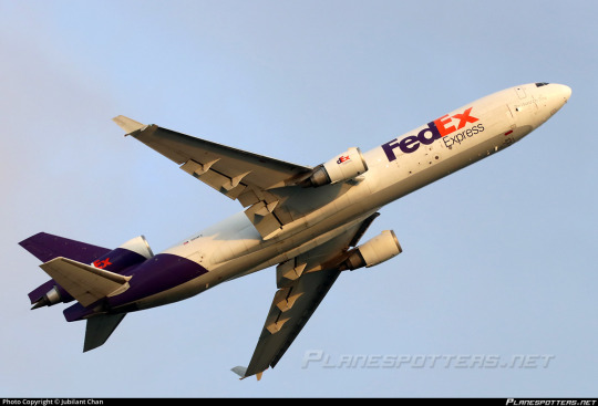

Compared to an ASL Airlines lease which keeps the underside white and the purple as a contiguous loop, this creates a much more streamlined look. But it's not enough to save this.
And I think what bothers me the most is how at odds this is with the thing people say is so brilliant about the logo - the arrow.
Arrows are, as Leader pointed out in his interview, definitely not a new phenomenon in airline liveries. Hell, we even had Arrow Air.

But there's a reason for that. Arrows represent forward movement. They're fundamentally indicative of speed, efficiency, and polish. And airplanes are more or less shaped like arrows, when you think about it.

Something being done very frequently doesn't make it somehow creatively bereft. And it's not like only painting the tail and the big of fuselage directly below it is reinventing the wheel either.
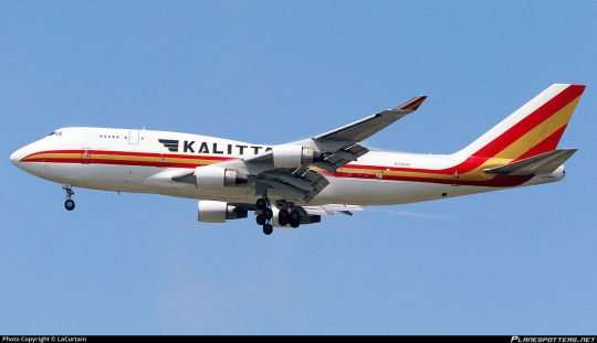
Cheatlines, and hockey sticks especially, were not a particularly new thing when my perennial example of 'boring idea, good execution', Kalitta Air, rolled out in the 1980s. In fact, they were done to death. But Kalitta Air's choice in color and shape, use of proportions, and stylish logo set it apart from every other airline to use this style.

There is a reason arrows are so common. They are speed and precision and kinetic energy. When you refuse to consider making something common your own, you often shoot yourself in the foot. With the logo constructed, with the motto 'the world on time' written on the nose of each plane, absolutely nobody would turn up their nose at FedEx having an arrow motif on its livery.

Ultimately, I'm a bit sad, because the FedEx logo, while I don't like a lot of the choices made in regards to the font, would provide a truly fantastic jumping off point for a livery that would elevate it beyond the point anyone could ever dismiss it as being part of a crowd of very similar designs, the way I have by lumping it in with Lufthansesques. Arrows, being a fundamentally long and tall shape, would also avoid the pitfalls of a livery type which I have already on multiple occasions critiqued for inherently creating a look of rear-heaviness, particularly on longer and thinner airframes, especially when the color used is a dark shade to contrast a white base.
That said, the FedEx livery gets a bit of a free pass where something like Lufthansa doesn't. FedEx's logo is so ubiquitous that unless you actively interfere with or muddle it, any plane bearing it will immediately be recognizable as a FedEx plane the same way a truck or package is. As a branding exercise it is certainly successful. It looks clean, it's by no means exceptionally ugly, it does its job...but it is so rich with potential and so impoverished in execution. Doesn't it just look like this plane isn't taking off, but being pulled by the weight of its purple slice towards the ground?

I'm giving FedEx a D+.
I don't feel good about doing this. I think this is an opinion which is not only contentious but downright unpopular. But as I've mentioned a few times my grades take into account more than just broad aesthetic appeal. Branding and environment factor in, but what also factors in is, as I said in discussing Saudia, wasted potential and a refusal to capitalize on what you have that's clearly good. When I graded Air Astra down for not reaching its potential I meant it as a kind gesture, not even a sort of tough love but an acknowledgment that I like what they have and I know they'll do better.
FedEx, however, is just disappointing. For the frequently cited best logo of all time, this is just unacceptable. This verdict brings me no joy, but the fact that this logo is so beloved doesn't mean I can go easy on it - to the contrary, it had a lot to live up to, and it just didn't.
#tarmac fashion week#grade: d+#era: 1990s#era: 2020s#era: 2010s#era: 2000s#region: north america#region: united states#fedex#kalitta air#cargo carriers#requests#lufthansa line#landor portfolio#skywriting
28 notes
·
View notes
Text
Cornwall's Random Card of the Day #871: Voracious Vermin
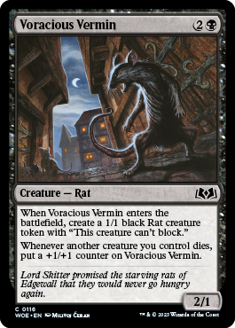
Voracious Vermin is a common from Wilds of Eldraine. Not sure why the typeface looks so ass here. I think they may be ripping these assets straight outta Arena or something.
Back in my day there was a RARE that did this, but without the making a token and only worked for goblins and it was a 1/1. Admittedly only cost {B},(phew, for a second there I thought my } key was broken, disregard). I think that rare was boss as hell and I think this common is, too.
I love the death cycle strategy in Magic, partially cause Lorwyn goblins was what got me into the game, partly cause it has a nice fail state, wherein your creatures are dead, but it's okay, you wanted that to happen. Also there's something satisfying about sending wave after wave of your own men to their deaths, Zap Brannigan style.
6 notes
·
View notes
Text
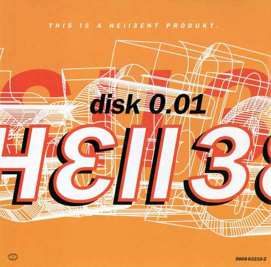
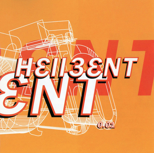

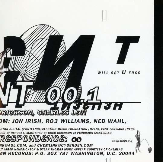

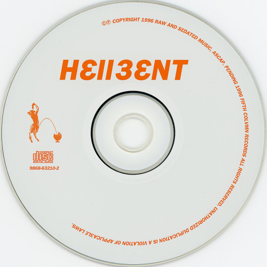
h3llb3nt - 0.01 (CD, 1996, Fifth Colvmn Records). First release from Hellbent (more often stylized h3llb3nt). A stellar collaboration between Bryan Black (haloblack, Motor, Black Asteroid), Eric Powell (16 Volt), Jared Louche (Chemlab), Charles Levi (Thrill Kill Kult) and Jordan Nogood (Nogooddesign).
Love all of h3llb3nt's releases. Their first release sets a great tone for the band with post-coldwave, literal whispers of cyberpunk and the clinical sounds of the digital, balanced nicely with Levi's signature funky basslines.
For 1996, the artwork seems to hint toward the digital precision a la The Designers Republic (95's Wipeout game/compilation) and typeface minimal-but-messy like Tomato (Underworld's '94 LP Dubnobasswithmyhead). Stuff we'd call today probably early Y2K Aesthetic or maybe even a smidge proto-Metalheart. (Nogood's design spans all of h3llb3nt releases but also recognizable in album artwork for haloblack's '94 LP >Tension Filter< and 16 Volt's '96 LP LetDownCrush).
The music is just as excellent. Few artists or releases sound much like this. Highly suggest starting with "Chromed", "3 Murders, 3 Nights" and "Burnout", but the entire album is stellar as a whole.
#my discogs scans#h3llb3nt#Hellbent#0.01#Fifth Colvmn Records#Bryan Black#Eric Powell#Jared Louche#Charles Levi#Nogooddesign#coldwave#industrial#post-industrial#y2k aesthetic#metalheart#highly recommended
15 notes
·
View notes
Note
hello! i first wished to say that your awtdy au is such a cool concept and your art is astounding to look at!!! the way that you draw mk and gk's wings (honestly how you draw them is like candy to the eyes) is something that i will take as a reference for my own drawings, and your headcannons of magolor and bandee's relationship is very cute to look at <33 (also your magolor design is just chef's kiss AJSJAHSJA) and i wanted to ask what font do you use for your comics? it just goes very well with your drawings and it also looks very nice to look at
waaa thank you so much for all the kind words!! auuoohghh oooof wuhghgghhh i'm so touched that you like all these things in particular because they're all things that are specifically important to me, so this just went straight to my heart (and my ego a little bit. lil bit...)
as for the font i use, it's my faaaavourite comicing font, it's called SS Pretzel and you can get it here on the creator's kofi! it's totally free by an indie designer (who also created the infamous Soapy Hands) but tip if you can; creating typefaces is actually extremely hard and unappreciated work!
10 notes
·
View notes