#to practice coloring and stuff i guess
Text

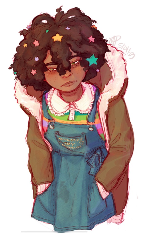
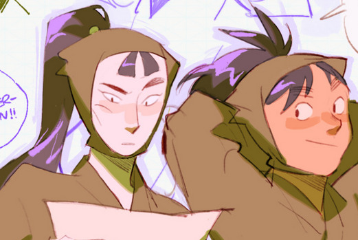
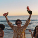
#danny phantom#fanart#digital art#initially this was a sketch that was thrown into the graveyard#with the many other ideas i have for various fandoms#but after watching pewdiepies drawing video I was motivated to at least try to finish it#i still hate it which is why i threw it into the graveyard to begin with#but im happy i completed something#i might drag something else from there as well#to practice coloring and stuff i guess
3K notes
·
View notes
Text
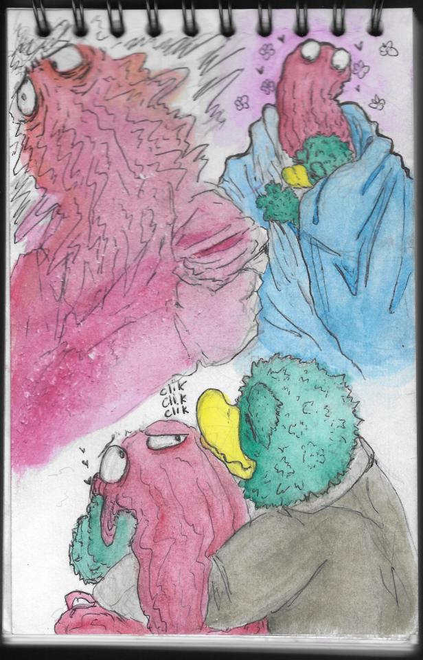
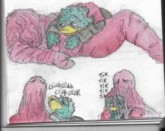
“it’s just a warmup sketch,” i say to myself. “i’m just gonna warm up on shading and coloring. i’m just warming up on anatomy.” my spine crackles from sitting in shrimp stance for 2 hours. “just to warm up.”
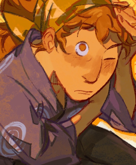
#dairydraws#epithet erased#molly blyndeff#prison of plastic#jelloapocalypse#epithet erased prison of plastic#eepop#digital painting#molly is really fun to practice drawing hair on but i do kinda feel like i’m fighting against the skin tone in her ref whenever i draw her#i don’t even necessarily feel like i favor warmer or more saturated tones in general but idk#something about the color in her ref doesn’t mesh right with my painting style#i should try painting her lit in cooler toned light that might help#i was drawing her crying and then changed my mind#but i forgot to erase the little snot bubble. so i guess molly has a runny nose#the reason i got so carried away is almost definitely because the cafe im in is playing such slow relaxing music#i usually listen to pretty upbeat stuff when i draw#and it motivates me to go fairly fast. but i was just kinda enjoying myself and going with the rhythm of the lowfi beatstrumentals#this is a great cafe. the masala chai here fucking shreds#it’s so cardamom heavy and baby do i love cardamom#you know a tea at a cafe is good if drinking the stuff leftover at the bottom gets a lil grit in ur mouth#molly deserves a warm cup of masala chai frankly
966 notes
·
View notes
Text
don't get me wrong i will try to answer all questions about my art but i kinda don't really like explaining every tiny little aspect of my style piece by piece............ i'm not trying to gatekeep or anything but i personally don't think there *is* anything to gatekeep 😭 my artstyle isn't really a formula or anything, it's just the way i draw. you can study it and ask questions about it if you want but the deep intricacies of how i draw legs or whatever doesn't really seem helpful in my eyes
#DO NOY GET ME WRONG. I AM NOT GOING TO STOP ANSWERING QUESTIONS ABOUT MY ART#NOR AM I MAD OR ANNOYED AT THE PEOPLE WHO ASK ME QUESTIONS#but personally i think explaining every aspect of my style (save for stuff like color etc) would be limiting#because i hardly follow my own “rules” as is#when it comes to taking inspiration from others for me the best way to learn was to 1. stare at the art for hours and 2. trace#i guess this is also advice - but tracing is way more useful than having the style choice explained to you in my eyes#because you literally copy the artist's process to a full extent#like theory vs practice ig#sorry
35 notes
·
View notes
Text
Anxiety and kisses
#pencil sketch with water color and the cheapest ballpoint pen#dhmis#my art#my works#fluffybird#red is smacking his tongue from the roof of his mouth - its really fun that neither of them have lips it lets people get more creative#slowly i gain more confidence on this website with my slow crawl i have here- please enjoy the fear of failure on display with how soaked#the page got with the first drawing and no amount of blotting revived the paper#it is an artistic choice of stress you see- hehe#ive actually really been enjoying watercolor- after really trying to practice with digital its nice to go to something that has no#smoothing or anti alies nonsence that ruins the integrity of the small millimeters of diffrence you can get on a real physical page#or i guess if you have some high end fancy computer with no lag and the best eqitment to record those gestures#but i dont- so i am constantly fighting agenst lag and adjusting my drawing tec to adapt to digital#so heres some authentic stuff finally as a late valintines day gift ehehe
228 notes
·
View notes
Text
Sssh, Kalavinka, they all came back from their very own existential crisis character arc in which they learned valuable lessons and changed for the... better?
My first art Of 2024.
It's a meme art.
I'm so proud of myself 🥹
For those who don't know this is the og tweet calling for this:
#my art stuff#kubera one last god#one last god kubera#kubera#leez haias#ran sairofe#maruna#kalavinka#yes I redrew the bg#why? for practice I guess#and because the colors looked washed off in the og one#also yes#Leez is glaring at the bracelet
18 notes
·
View notes
Text
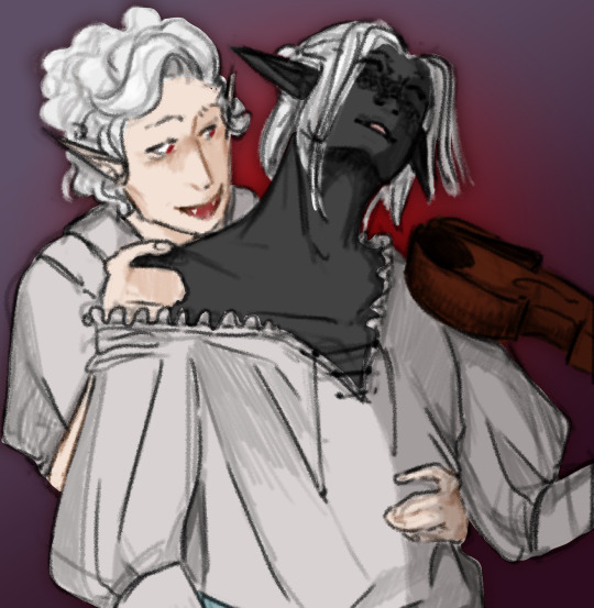
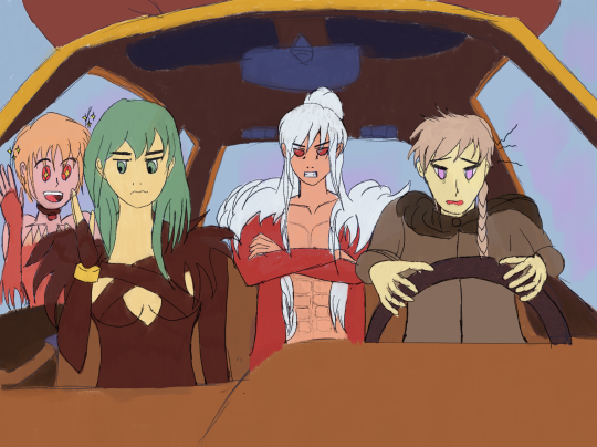
Astarion & Veldren
#martin plays bg3#bg3 spoilers#(maybe ? idk)#astarion#bg3 fanart#sketches#my art#this goes in sketches bc. idk how to classify that one ok.#it's higher effort than the usual sketch but it's not a rendered piece#it's. a colored sketch i guess#hmmmmmmmmmmmmmmmmmmmmmmm vampire <3#sometimes as a bard u gotta b a little dramatic when your vampire bf is about to bite you#fun fact i opened my drawing program with the idea to practice some stuff#and instead i just. drew that.#i had references picked out for practice and all!#i just. saw one of the ones i had and went 'oh thatd be good for these two if i tweak the post just a bit'#pffffff
48 notes
·
View notes
Note
how do you get your colors to look so nice and your lineart so red and vibrant? i love it
omg anon thank you!! 😭 im going 2 be honest I am Not Great with color theory... but i like having my sketch pages look cohesive to me...
BUCKLE UP this is going to need a readmore bc i like talking.
I always sketch in neon colors it's a habit i picked up from an old teacher but I'll think of a color usually on a whim and draw with that. and then if i want to draw something else ill pick another color that i think goes well with the page. usually most of my color schemes r analogous (colors right next to each other on the wheel)

yanked this from recent dunmesh post; i kept most of my colors within the pink/red/orange range.
i wouldn't recommend doing everything in monochrome or analogous palettes though because it's sort of a guilty crutch of mine XD.
sometimes when im coloring ill change the layer mode of the sketch. color burn gets you either very very bright or very very deep colors depending on the color of the flats underneath. multiply and linear burn do the same thing but they're a lot tamer and generally always return darker colors. im sure there's some technical bits behind this though. ill either color my lineart afterward to compliment the color of the flats, leave it as is, or mess with layer modes if i feel like it. my favorite trick is color burn + linear burn + some combination of two lineart layers and just fiddling until i get a nice burn effect.
mithrun was done with crimson red on color burn.
coloring... like 999% of this is relative color which is like. kind of the idea that colors look different when placed next to each other. if you eyeball it a bit it's pretty noticeable.

what i used to do a bit ago was i would fill in the area i wanted to color with one big mask of color, make a new layer that has a clipping mask down to the flat layer of color, and then draw my actual flat colors. the color of the mask helped me pick my flat colors bc if I picked a color i think stood out too much next to the mask i could kind of just adjust it until it looked a little more cohesive.
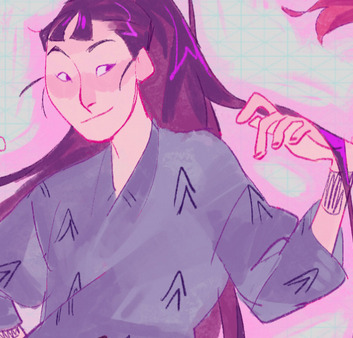

old ish drawing next 2 a canon reference. i ignore local color a lot...mea culpa....but my overall color palette here was a light pink, so the shirt here is actually a desaturated pink? or violet i believe. if you shift sort of that purple color far enough into the gray area of your color wheel it can take on a blueish or even greenish hue. it being next to a lot of warm pinks/fuschias helps.
a neat thing that kind of helps is that if you desaturate or saturate certain colors they can kind of take on a certain hue? not sure if this makes sense. sort of how orange here turns tealish blue the grayer it gets. so if im drawing something that's predominantly orange and i have a blue color i can just take an orange color and desaturate it until i get a color that sort of looks like blue. and that way it kind of looks more harmonious? at least to me XD
shading. i don't apply serious lighting to a lot of my drawings, but a helpful bit is that the shadows tend to be the opposite of whatever color the lighting is? i try to think first about the "mood" or the main color i want to go for in the drawing and then i pick a shadow color opposite of that. so for here, i wanted the lighting to be a coolish magenta so the shadows r lime green. if there's anything off i fiddle around until i get something i like. the shadows on the skin here were too green initially so i shifted them a little more orange.
there's a "band" of color going on between the transition of the shadows to the light. generally this could be for a lot of reasons and i tend to use it differently (core shadow? overexposure? etc etc). but this is a color post so ill try not to go too off track.
but generally digital doesn't "mix" colors the same way traditional colors do if you use RGB (cmyk is a bit better with this but is kind of a pain to get used to), so to make blending a little less muddy, i sometimes add an intermediate color to smooth things out a little. for example, mixing digitally blue n yellow tends to get you gray, but generally, blue + yellow makes green, so if im making a blue->yellow transition ill slap some green color in the middle so it flows a little better.
I do a lot more cel shading nowadays. if you've been on here for a while earlier this year i have another style of coloring but it's not really accurate to how shadows really work so i wouldn't recommend looking at it. it's mostly to add zest and texture to the underlying flat colors.
coloring your lineart does a TON to helping your colors look vibrant, though its like the garnish on a dish to me (same with shadows). i think it's good to try and play with your flat colors and try to make sure those look in order first before adding flourishes. usually ill leave it a dark, saturated color that again matches my overall palette but sometimes i go in and color them by alpha locking my lineart layer and picking a color that matches the flat colors underneath? not sure how to explain it properly.

i used a darkish purple for shuro's ponytail to match the dull red of the flat colors (more relative color! trying to simulate a black/brown while keeping the pink palette there) but a lighter crimson for laios's blond. the light was this super intense like blush pink so i thought it might be cool to add this neon salmon red in the areas of that light to really give off that vibe of a very bright intense rim light.
sometimes you could also tweak with gradient maps or color balance, which adjusts hue based on how light or dark a color is. these r fun to mess with as a final touch but i need to watch using them because they can become crutches real fast XD but those are also just tools to help you. in the end just developing a good sense of how color works and how you want to use it is the best place to start.
LONGASS ramble but yeah. tldr just kind of train ur eye for color and look at what you like best. which is unhelpful and a little sucky but it really is just observation and practice and maybe some personal zest.
happy drawing!
#SORRY THIS IS THE SIZE OF CANADA I YAP A LOT#i like being thorough when explaining myself a lot XD but i think the easiest way to get good with this is just repeat practice n observing#and figuring out how stuff behaves in certain situations and what you like to do and blahblahblah#if you have artists u like that do this well looking at how they use color might be cool#...i feel this entire post is just putting my entire thought process on blast LOLLL.#“eyeball it out” -> study some actual fundamental stuff and or intake new info or art -> apply it back to just eyeballing it out#i dont think i have a natural sense for some basics#but i dont think im naturally one of those people who grind out studies all the time and breakdowns either#i guess i just kind of like knowing the mechanations behind why to do a certain thing or how stuff works and then figuring out#how that translates into what i know nerd emoji#james gurney has a good book on color and light#if you like reading. but its very informative!#quirinahscreams#ask#anon#this is mostly just me talking about how i draw i dont think this is meant to be educational or informative XD um
10 notes
·
View notes
Photo
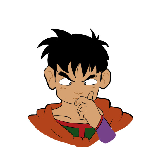

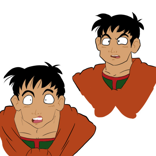
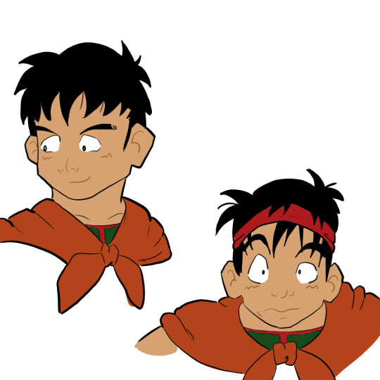
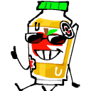
Trying to take making digital art more seriously, but so far all I’ve accomplished is “draw Yamcha a bunch of times” lmao
[Image ID: Eight digital drawings of Yamcha from Dragon Ball with different facial expressions.]
#yamcha#dragon ball#my art#fanart#this started off as me trying to do this practice exercise#where you just re-draw the expressions that a character in a cartoon makes#and this is supposed to make you better at drawing faces and drawing expressions#but i also really need to practice like... literally everything with digital art#so i ended up doing the lineart and flat colors for all of them too#i think i figured out some stuff with line weight while doing this#and i experimented a little with how i drew different features#so i guess i'm learning something!
31 notes
·
View notes
Text
gentle reminder to air-dry your fleece clothing and wash it in cold water if you want it to stay nice and soft <3
(fleece is made out of synthetic fibers that will quite literally deform/melt in the heat of a dryer! and no you can't really see it but it's one of the things that makes it pill and get rough and scratchy.
"no dryer" also goes for most items of clothing with graphics. tbh I don't know the exact reason behind that one, I think it depends on how it was printed on, but both my and friends' experience has proven dryers will fuck graphics up, and manufacturers will tell you the same)
#this announcement brought to you by a sad Synapse after someone else put my brand-new only-once-washed-before#ONCE super-soft hoodie into the dryer#and it is now already beginning to pill ;-;#it's not a massive difference but as someone who tends to be sensitive to these things it is Not Insignificant#I could stand to avoid fleece/sythetics to begin with specifically because of this#but goddamn it is HARD to find super soft and warm clothing that ISN'T that these days#anyway I have some old stuff I don't care about/it was already wrecked by the time I learned that dryers fuck fleece up and those will go in#but anything nice/new enough not to be fucked up stays on the drying rack#worth noting that it's gonna get rougher anyway over time but the process is in my experience notably slower#ugh anyway. this is why I usually wash my nicer stuff on my own but also most of my stuff is darker and this is light green so it went in a#shared load with the rest of the family. guess I'm not doing that again.#(mark on list of disadvantages to being someone who keeps my clothing as long as I can and avoids collecting a bunch:#if I do not have much of a particular color range it is hard to make a practically sized load of said color range)#aaaanyway#synapse talks#laundry#fleece
3 notes
·
View notes
Text
I was just adding random magazine clippings hoping it looks good in the end, it was really fun and I'm happy about how it turned out!!!
#i can't wait to more and get practice and a feel for it i guess#i like it!!!!#my art stuff#i put it in a black and white filter because to ne it looks better but if you guys want a colored version just let me know#i don't know what this pagd was about i was just doing stuff y'know!!!#my handwriting sucks it used to be so good idk what happened :(
4 notes
·
View notes
Text
ive done almost 300 drawings this year if i drew every day for the rest of the year id be able to have average one drawing per day...
#99.txt#i keep my drawing folder seperated per year so its easy to see this sort of thing#i actualy did have one year w over 1 drawing per day average. i think like 2016 ?#i was unemployed and cranking them out. as i am now#but now i have more responsibility than i did then. but still ykno#100tae was brutal but it was good practice...#and then became halfway undone from major life events hitting me like a truck and making me lose focus -_-#but still. i feel like my quality may waver but still continues to get better overall#i made it my art goal to try to color most stuff. which didnt happen#so i guess i will make it my goal next year
4 notes
·
View notes
Text
It's wimblin' time.
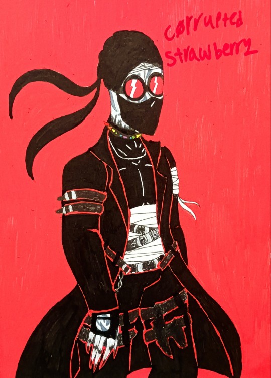
Why the fuck did I decide Hank would be the best character to test paint markers on I've never used them for full pieces like this I've only ever used gold paint markers for backgrounds and accents hhhhhh-
You should totally reblog this that would be so cool guys
#madness combat#madcom#hank j. wimbleton#hank madness combat#hank madcom#paint markers#traditional art#corrupted strawberry's art#He wimble on my ton till he fucking kills me#I also did not have any grey paint marker so I used colored pencils for the lighter parts and a permanent marker for the darker greys.#Anyways hi hello yes it's been a while since I've posted art I'm just not always motivated to post stuff anymore#Haven't been since. uh. the 'dark ages' of my time on the internet. ough.#Unrelated but I think the funniest thing to come out of me being a madcom fan is me being a heavy Hankmos shipper#Not because it's one of many rarepairs in this fandom#But because I named myself after Deimos and practically stole that fuckers entire style and a bit of his personality#And guess what#I'm one of the biggest Hank simps you'll ever fuckin meet I am down BAD for them like goddamn#Shoutout to my boyfriend who is the same way about Ghost from Call of Duty I'm calling him the fuck out lol#But I'm also calling myself out in the process so it's even
14 notes
·
View notes
Text
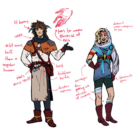
I made myself refs for og Nightwings for... writing purposes mostly
For Erisa I've taken one of the original concepts for character designs. But for Oralech I had to come up with a completely new look... I think it came out pretty ok tho :D
I was inspired by the plague doctor uniform btw, plus some elements that are used in Pyre itself. Clothing in this game is unique, not gonna lie.
#pyre#pyre spoilers#oralech#erisa pyre#my art#original nightwings#i wanted to make oralech more buff tbh but i need more practice with muscled men i guess 😩#also i imagined his clothes to be completely different lol#but it didnt make sense thematically sooo....#the symbol on his clothes is just milithe's but without dots i just thought to add something to tie him to medical stuff more#and ive struggled with colors with this piece for some reason#id draw volfred as well but its funny to think he wears the same thing for years lol#supergiant games
38 notes
·
View notes
Text
i had a good training day at work !!! my first full week (5 days) is next week during..spring break....and i work at six flags...lol....BUT im sure i'll do fine :) i have a new resolve that i didnt have last time i worked so im determined to actually stick with it this time. ive grown as a person and im ready to do a job
#im a caricature artist again !!!!!#they gave me my own stuff this time so i have the week to practice getting my lines better#i really need to work on my line weight. like damn. and my speed i guess#and coloring#a lot of things LOL
7 notes
·
View notes
Text
is anyone gonna talk about the illyrians cause idk i'm a bit put off by the constant talk of how brutal and savage and angry or whatever they are when sarah goes out of her way to describe them as brown people
i'm sorry sarah but poc are capable of being kind and loving AND being cool warriors
#i feel like i'm gonna get some “stop making everything about race” stuff on this#sorry ya'll idk it just irks me#spent my whole life living under my family's colorism#i can practically smell it atp#kidding kidding i can't smell i have a sinus infection#yeah anyways idk if this is like...a bad take....we'll see i guess
2 notes
·
View notes
Text
in general i think it’s good to let people draw whatever out of passion without like. steering them to the fundamentals immediately. but then sometimes i see someone do an entire animation where they have rendered every single frame but like it’s very clear that they do not have a grasp on animation fundamentals at all and im like. oh my god please please do a ball bounce or something before doing that. not because like… it’s bad? but because it’s clear that they put so much time into finishing it and like. ough. i could not imagine spending that much time finishing an animation unless i thought the pencil test looked pretty good. and like i guess if you aren’t that good yet and you want a finished thing go for it..? but i would use that energy. studying the medium. idk animation is just so time consuming and repetitive and every layer of polish multiplies that greatly. so getting the movement working before you finish is. important… also a lot of the time it feels like the artist hasn’t realized that animation is a skill in itself and not just. drawing squared.
#lucky.pdf#also i guess when i see this most of the time the artist Already has a lot of skill when it comes to drawing/rendering#so like. idk. one would think they understand the value of fundamentals#and like IDK doing a bunch of practice stuff isn’t that fun but. also fully lining and coloring an animation that is very meh isn’t either??#like i would never. like. comment any of this on anything i saw like the time was already spent. but
7 notes
·
View notes
Last Seen Blogs

gedanken-erinnerungen
Erinnerungen bleiben.
fuckyeahfakebrows-blog
fuck yeah fake brows!

sohail-626com-blog
Untitled
3proutboy
What This Guy Doin…???