#transparent object provided in second picture to show scale
Explore tagged Tumblr posts
Visit Tumblr Blog
Explore Tumblr blogs with no restrictions, modern design and the best experience.
Last Seen Tumblr Blogs


Fun Fact
Tumblr was created by web developers David Karp and Marco Arment.
Text
I think the real cause of ADHD is goblins.
I attempted a search for my asthma puffer because i need to whizz and i keep that thing on my person a statistically significant amount of time because i enjoy breathe effective when it’s sold in a canister (I was offered an O’ Hare Air sponsored respiratory system, unaware it involved microtransactions).
I search every surface and crevice that is possible to have stolen my puffer from me, checked under the cat, in my pockets thrice over, double checked the cat, went to a different room and checked several surfaces. This is a song and dance i perform frequently so my resistance to frustration for these situations is generously described as well adjusted.
I return to the initial location i investigated to discover the object of my inconvenience, my hard plastic, blue asthma puffer, was positioned upon the floor directly in the centre of the space i was initially investigating within and sweeping back and forth throughout(a rather small area i must say).
ADHD is the result of goblins, trickery is afoot within my own home, the cat seems to enjoy his naps accompanied by orchestral tunes, chill jazz, classical instrumentation, or anything that was/ could have been performed well before the invention of the electric guitar, or WW1.


#adhd issues#adhd#empathise with my struggles for 100% free TODAY#photo of cat and puffer provided if i remember to add them before this is posted#i still haven’t gone to the toilet#the cat hasn’t moved#the music is still playing#it’s an incredible time in here#i will not invoke the name of those otherworldly critters with strong pop culture links to ireland and the like#their name rhymes with sorbet#the cats name is percy#he is regretfully named after the harry potter character#i despise harry potter#he has three legs cos he broked it in the same spot too much#a menacing song has come on and he sat up and tucked his tail under his pawsies so i’ve now changed the beats and await his return to chill#transparent object provided in second picture to show scale#goblins
2 notes
·
View notes
Text
cms guidelines for remote patient monitoring
Content
$17 Virtual treatment.
criterion Of care.
customer health
Back To institution: how children's health In Dallas Is integrating Virtual care To help assistance trainees, Parents & professors.
If you have inquiries or concerns related to the support in this paper, please email The prescription is issued for a genuine clinical function by a practitioner acting in the usual program of his/ her professional practice.
7 Virtual healthcare.
Enter your place to get details about nearby SSM Wellness services. Allow you to continue to be in your area with family support while getting care.
To stay educated concerning updates for telehealth as well as other DHCS subjects, register for DHCS Stakeholder Announcements. For non-emergency medical concerns (allergies, bronchial asthma, respiratory disease, cool & influenza, infections, fever, ear pains, nausea or vomiting, pink eye, sore throat).
Enjoy reading local features as well as information concerning Willis-Knighton and also The Oaks of Louisiana in this nationwide magazine. Click the link listed below for response to frequently asked questions concerning telehealth. The majority of the savings demonstrated came from in your area done lab and also pharmacy solutions. USDA Area Facilities Direct Loan as well as Give Program awards straight finances and/or grants for essential community facilities in rural areas. McLeod Telehealth is a very easy method to see a medical professional online by video clip anytime, anywhere.
NIBIB researchers are creating a paper-based diagnostic that can measure HIV viral load in whole blood in 15 mins. A mobile phone is utilized to power and control the paper-based RNA removal and also reaction; assess the fluorescent readout suggesting viral load; and also keep the cause the cloud where they can be accessed by a doctor. The $10 examination will certainly be extensively applicable for contagious condition diagnosis at the point-of-care. Life Expectancy, Rhode Island's initial health and wellness system, is a thorough, integrated, academic health system associated with The Warren Alpert Medical Institution of Brown College. You might be asked to confirm that you have read as well as accept as well as agree to the above files as component of your go to. See our MyLifespan page for parents and also guardians for details on exactly how to authorize your youngster or teenager up quickly as well as to obtain the right level of proxy accessibility.
Contact Us
Levvel Health
Email: [email protected]
Phone: 4570713383
Savsvinget 7
Hørsholm, , Denmark 2970
Pardot and Google Tag Supervisor cookies improve our ability to existing visitors and clients with item details they'll be most curious about. When you visit any internet site, it might keep or obtain details on your internet browser, mainly in the type of cookies. This info may be about you, your preferences or your device and also is primarily utilized to make the site work as you anticipate it to. The info does not normally straight recognize you, yet it can offer you an extra tailored web experience. Register today for the Telehealth Innovation Online forum-- Medical care's best telehealth event.
Transmission using wireless was done making use of regularity modulation which got rid of noise. The ECG outcome was linked to the telephone input making use of a modulator which transformed ECG into high frequency sound. At the various other end a demodulator reconverted the noise into ECG with a good gain accuracy. The ECG was transformed to sound waves with a regularity differing from 500 Hz to 2500 Hz with 1500 Hz at standard. 2 crucial locations of telerehabilitation study are showing equivalence of assessment as well as therapy to in-person evaluation and also treatment, and constructing new data collection systems to digitize details that a specialist can use in practice.
Telehealth reimbursement may be changing. How should providers prepare? - Healthcare IT News
Telehealth reimbursement may be changing. How should providers prepare?.
Posted: Tue, 27 Oct 2020 07:00:00 GMT [source]
-- Remote patient-monitoring devices such as high blood pressure monitors, Bluetooth-enabled digital scales and various other wearable devices that can communicate biometric information for evaluation. -- Store-and-forward modern technologies that accumulate pictures and also data to be transferred as well as interpreted later on. When medical professionals' needed solution to concerns on adjusting to exercising in a pandemic, the AMA established sources to fulfill the demand.
If you have concerns or worries connected to the guidance in this record, please This record consists of web links to various other sites and content coming from or originating from third parties. Such external web links are provided for informational as well as academic objectives just as well as are not explored, kept an eye on or checked for precision, competence, legitimacy, dependability, accessibility or completeness by ASAM.
Usual daily emergency telemedicine is performed by SAMU Regulatory authority Physicians in France, Spain, Chile as well as Brazil. Airplane and also naval emergency situations are additionally dealt with by SAMU centres in Paris, Lisbon as well as Toulouse. At the dawn of the modern technology, videotelephony also included picture phones which would trade still pictures between devices every couple of seconds over conventional POTS-type telephone lines, essentially the same as slow-moving scan TV systems.
Ground-breaking study in telehaptics and also digital fact might widen the range of telerehabilitation technique, in the future. cultural barriers occurring from the disinclination, or hesitation, of some physicians to adjust medical paradigms for telemedicine applications.
VA Telehealth Providers offers you access to the care you require, when and also where you require it. Prior to implementing telehealth into your method, review and also become acquainted with state and government laws in which you technique. Making use of telehealth to deliver physical therapist services is expanding swiftly, as well as if you have not already, you're probably considering it. Contact your existing EHR vendor to see if there is telehealth performance that can be turned on. Connect to your state medical association/society for guidance on supplier examination, selection and contracting. These kinds of adjustments are mostly on a state-by-state basis as well as are altering at a rapid price. ASAM is connecting with state chapters and also areas to help address concerns connected to state laws as well as policies.
Maintaining your wellness currently is equally as essential as ever-- and also telehealth can aid.
Across almost all medical specialties, telehealth services can be used in attaching suppliers with different clients in various areas through real-time sound and video.
We offer a variety of telehealth services in areas such as wellness, health care, specialty care and acute treatment.
In various other situations, solution centers can make use of telemedicine to gather from another location along with send out information to a main monitoring system for interpretation.
There are numerous advantages of real-time online visits, consisting of boosted accessibility to suppliers as well as decreased requirement for emergency situation department sees.
One more disadvantage of telemedicine is the lack of ability to start therapy immediately. For example, a person struggling with a microbial infection might be given an antibiotic hypodermic injection in the clinic, as well as observed for remote patient monitoring rn jobs any reaction, before that antibiotic is prescribed in tablet kind. It might be called for that the professional and also patient included have to meet in person at the very least when before online prescribing can occur, or that a minimum of a live-video seminar should happen, not simply impersonal questionnaires or studies to figure out need. Ultimately, in 2015 the state legislature legislated electronic examinations. Limiting licensure regulations in the United States need a specialist to obtain a full license to provide telemedicine care across state lines. Normally, states with limiting licensure laws likewise have a number of exceptions that might release an out-of-state specialist from the added burden of acquiring such a certificate. A variety of states need specialists who seek payment to regularly deliver interstate like get a full license.
Should vagaries of hospital possession have bearing on physicians' ability to speak confidentially with lawyers? See daily video updates on how the AMA is dealing with COVID-19 by talking about arising cyber dangers during the pandemic. From below, our system documents each step with the designated medical professionals available. Tracking all results developing day-to-day openness reports on our patient interactions. Complete transparency between TeleHealth Option Carriers, PCPs, Area Admins showcasing all outcomes.
1 note
·
View note
Link
In the world of commerce, industry changes and developments are as common as seasonal transitions. Fall turns to Winter, Winter passes to Spring, and so on. Consumer preferences follow a similar cyclical pattern where the journey to capture the Zeitgeist's ever-changing obsessions and interests forces creators to pivot course constantly. Entering 2019, stock markets were at an all-time high, global Gross Domestic Product figures were smashing records around the world, and in the fourth quarter of the same year, the United State’s Consumer Confidence Index- a metric that tracks and reports on merchant activity and goods sold- set a record heading into the infamous second decade of the new millennium. Energetic was the fashion scene. Excess and the demanding schedule proved to be just a couple of ignored characteristics of an industry so adamant about keeping face and remaining exclusive, after all, the money was flowing and the phenomenal growth seen throughout Asia presented a grand opportunity for the luxury goods space to continue in its scaling ways. Unbeknownst to the suits leading billion-dollar conglomerates and hiring even the most unproven designers to head legendary houses, a grassroots movement lead by the younger generation of designers began to take shape right beneath their pristinely kept Berluti oxfords. A cause built on sustainability, a less intensive calendar, and extensive manufacturing transparency meant the old system, wrought with all its imperfections, was perhaps fading into oblivion. Such a mindset of vacating past methodologies was lead by designers like Marine Serre. Her groundbreaking philosophy of upcycling and sourcing transparency won many an accolade and heart for its attempt to reverse harmful environmental impact. These and similar practices were all well and good. Changes were happening, consumers were more informed, and the hours of chatter on how to revise the labor-intensive schedule stirred many a social advocates intellect on how this often puzzling, vast industry could change its weary ways and develop into a more efficient ecosystem of promise.
However, such feats of economic achievement and activism met a swift end as the first cases of the SARS-Covid-19 virus began to surface. COVID- as it is now abbreviate- was first detected in China and continued to spread throughout Asia before landing in Europe and eventually entering the United States in early February of 2020. The masses and industries- from finance to farming- across the globe began to feel the pain of a world forced to reckon with the uncertain. An eerie stillness consumed continents and set in motion a placidity that put an immediate pause on seemingly everything and anything not involving an essential transaction. In what can best be described as a world completely transformed in a blink of an eye, the virus swept away days of travel, leisure activities, and social gatherings en mass. How is it then, as art galleries like Metro Pictures closed, department stores including Century 21 filed for bankruptcy, and the iconic Belgium label A.F. Vandevorst ceased operations, a soul brave enough to push onward would begin a movement of her own despite such an unimaginable and unexpected environment? The key- resilience, the label- Danz New York, and most relevant, the name- Danica Zheng. A proactive and spirited professional with a resume to prove it, Ms. Zheng- whose New York-based label opened in January of 2020- embodies was it means to be able to react on a dimes notice while remaining steadfast in her mission. The barely two-year-old label caters to a young, fashionable audience conscious of price, clarity, and quality. Similar to that of her socially aware peers, the Parsons alumnus has arrived on the scene with an inventive eye keen on further personalizing the relationship between apparel and the wearer. Heading into a time unlike any other, Zheng ensures her response to the unforeseen is a sensitive one. Rather than hide behind themes of fiction and speak on matters just for the sake of talking, her offerings represent adaptation and the inner conflict that arises when faced with seemingly insurmountable ambivalence. For the Fall Winter 2021 show, an impactful display of experimentation, shapely forms, and displaced lines magnified the obscurities placed on the person living in the present by examining how clothing can mirror the responsive nature of the human being.
A sleek look-book showcased Danz’s third effort titled Immersion/Subversion. Glancing at the label's past work, much emphasis was put on contrast and manipulation of fabric. Using a clever mix of synthetic and organic fibers, the classic “downtown” girl stereotype is given a much-needed facelift. Friendlier and fierce, the once flirty, chic girl rocking an Alexander Wang leather jacket over an Anna Sui midi dress has been reinvented to fit a complex more involved with reality. Think flair and objectivity bundled as one. Danz’s trendy pieces and conventional sportswear coexist in an image resembling the work done by the great Calvin Klein, though, the sharp tailoring is more in line with European designers of the 1990s. Naturally, this season’s attention was cast to the ongoing pandemic and the starkness surrounding yet another blanket of anxiety. Per the show notes, the ensemble outlines the individual’s reaction to the Covid-19 pandemic. Zheng compares this wildly time to as if humans are operating life on foreign terrain. Afraid, fearful, and action-oriented, the apparel has a deeply emphatic touch that realizes feelings of what it would be like to be trapped under the crushing weight of water. Submerged in unfamiliar territory, the natural human instinct kicks in and attempts to take control of the formless surrounding. Exaggerated shapes and shifted seams pry into a scene that is strange and unearthly. A shiny sheen coating lacquered atop the fabric presents an idea of the new, however, the clothing’s medium- comprised mostly of cotton and wool- and classic tailoring renders the familiar and the sound. Confusing, perhaps even contradictory? To Danica, not at all. This is her world and her reaction, the results thus far prove her vision translates well to feelings of unrest, discomfort, and the unfiltered yearning for a glimpse of hope and security.
Opening the collection was a belted, light camel trench coat. A classic metropolitan staple found in wardrobes globally, the strength of the outerwear lays in the dimensional aspect of the pattern. Wide and slightly ballooning were the sleeves. Drawing a particularly fresh balance to the a-line silhouette, this tailored, firm look is a modern one. Complete with a functional gun-flap, epaulets, and a wide, sturdy collar, the piece allots the wearer to feel secure and safe. Vegan leather was a suitable choice to combat whatever arises next in the “new normal” way of life that is fast approaching. Fashioned into bodices as well as a knee-length brownish-grey v-neck dress, the interlocking messages of sustainability and protection interact in a way that celebrates the emergence of purpose-driven fashion. Purpose, a message of promise and of seeking peace, is seen through the soft, natural hues that include the use of light grey, beige, navy, and khaki. In conjunction with serving a base of the adults-ish consumer, office-friendly attire fit with a little attitude proved the perception that not all is as it seems. A shirt dress with tapered sleeves cut to the mid-thigh included an inverted dart near the bottom left hem, while a pair of seemingly standard, fitted trousers features either a subtle zip cutout over the thigh or seams that wrap around the ankle providing support for a tiered flare effect. It is these minuscule details that separate the young label from its contemporary peers. Opting to not reinvent the suit happened to be a hallmark of the set. As aggressive stance’s on altering the ageless appeal of the fitted two-piece become a mainstay of recent fashion talk, Zheng’s classic, slightly cinched waist, and angled shoulders bear resemblance to a confident woman who scoffs at her friends wearing a combination of biker shorts and the cliched oversized blazer. However, perhaps the final piece- a peplum double-breasted wool coat- missed an opportunity to conclude the showing on a triumphant note.
For Danica, another challenge only presents more opportunities to delve into the subconscious. Part psychologist and designer, the creative prescribes an enticing idea to match the social climate. Sold at a reasonable price point- pieces range anywhere from $50-$1,000 when not on sale- buying into this stylish, newly formed world need not cost a month's rent, and why should it? The democratization of fashion is here to stay, Danz is only solidifying such doctrine with an inclusive range where style and class can indeed reach the masses. On sustainability, the use of vegan leather and the decision to show only twice per year obtain a notice that the wasteful results of producing eight-plus collections yearly make little sense. This accuracy and realistic reflection of the present have been absent for quite some time in a space overtaken by labor conflicts, price hikes, and greenwashing- results must match a legitimate context to be felt by a consumer living in the information age. Per fellow New Yorker Anna Sui, “Fashion is like a mirror. It is a reflection of the times”. Danica Zheng is painting an accurate depiction of how dress is both impacted and will impact current developments in society. A lesson in humility, understanding, and reaction, Danz Fall-Winter presentation is a human experience created with urgency to interpret emotion. Wherever the future happens to take us next, let us be glad we are privileged enough to have creatives like Danica Zheng who translate even the most terrifying of feelings to a product that is both desirable and effective.
1 note
·
View note
Text
Animation Recruitment Agency in London, UK

The simulation of movement created by a series of pictures is animation. Animation is not the art of making drawings move, but the art of drawing movement. Based on the persistence of vision, animation, like all film, is an illusion of fluid movement, when in fact it is a series of static drawings moving so quickly, twenty-four frames a second that they give appearance of movement. In traditional animation, pictures are drawn or painted on transparent celluloid sheets to be photographed. Early cartoons are examples of this, but today, most animated movies are made with computer-generated imagery or CGI. Animation Recruitment Agency in London will always help you to know about animation. Animation is different types: Traditional Animation, 2D Animation, 3D Animation, Motion Graphics, stop Motion. Traditional is one of the oldest forms of animation in film. It’s sometimes called cell animation. As mentioned above, in traditional animation, objects are drawn on celluloid transparent paper. In order to create the animated sequence, the animator must draw every frame. It’s the same mechanism as a flipbook, just on a grander scale. 2D Animation is the oldest and simplest method, having been around since the beginning of the 20th century. With the advent of technology, pencils were traded in for stylus’ and paper exchanged for Cintiq’s and wacom tablets. The principles of drawing remain the same, but the technology has changed. While technical tools are making it easier and more accessible, some of the greatest animators alive still employ pencil and paper to draw their animation. 3D or computer animation is the most common type. But just because computers have stepped in instead of actual drawings, it’s not necessarily easier. The computer is just another tool, and 3D animation is still a long, intense process. Motion Graphics are pieces are digital graphics that create the illusion of motion usually for ads, title sequences in films, but ultimately exist to communicate something to the viewer. They are often combined with sound for multimedia projects. Stop motion involves taking individual photographs of physical models, objects, puppets or people as they are moved around, one frame at a time. Although it’s as costly and time consuming as traditional animation, the final results often have a unique and priceless look. Best Animation Recruitment Agency in London and Top Animation Recruitment Agency in London can provide real time support. Completing a bachelor’s animation degree program provides students with valuable art skills and teaches them to be proficient in the technology used in this industry. There are many specialties within the animation field, including gaming, visual or special effects, animation for websites, and animation for film, video, or online. Animator education and training courses touch on basic animation requirements, such as art, multimedia, drawing, 2-D and 3-D animation, and graphics. Every business has varied requirements that keep on changing at regular intervals. It is important to respond those changes and prepare accordingly to drive maximum returns. When you have a professional team of animated video creators holding your hands, you can expect customized solutions that fit your requirements perfectly. You never have to worry about getting behind the crowd or following someone’s footsteps, or being limited in ideas and concepts. These experts will first understand your needs and requirements, and then create a custom animated video that enables you to achieve optimally. So you get an efficient and cost-effective outcome that’s tailored to your goals. Animation Recruitment Agency in UK and Best Animation Recruitment Agency in UK provide jobs opportunity. Recruitment is the process of choosing the right person for the right position and at the right time. Recruitment also refers to the process of attracting, selecting, and appointing potential candidates to meet the organization resource requirements. The hiring of the candidates can done internally i.e. within the organization, or from external sources. And the process should be performed within a time constraint and it should be cost effective. A good recruitment process allows you to find qualified candidates quickly and efficiently. The process requires intentional planning and constant evaluation. The recruitment process should be streamlined so each staff member has the tools and resources they need for their step in the process. Being proactive in hiring new employees increases the profitability and performance of your business. You can help your departments by providing the necessary resources and manpower to fulfill their responsibilities along with financially helping your organization by reducing cost-per-hire. By fast-tracking high-quality candidates, you will be more likely to retain their interest. A slower process may leave them disappointed and tempted to look at other companies. Top Animation Recruitment Agency in UK can provide better plan. Work experience plays a vital part in an animator’s recruitment. Most employers prefer artists who have experience. Students pursuing their animation education through a degree program can earn on the-job experience through an internship as part of their graduation requirement. Graduates and animators without a formal education will generally have to work in assistant positions for a while before advancing to full-fledged animation positions. This field also offers many freelance opportunities for varying degrees of skill, providing another means by which the artist can earn valuable job experience. London Animation Recruitment Agency and Animation Industry Recruitment follow their standard process very strictly. Some of these animation jobs in UK are: Motion Designer-If you are passionate about design/animation and you did like to be part of a team focused on making it faster and easier, then this could be the role for you Creating animations for social media, demos and tutorials, Producing high quality example scenes to show off Cavalry’s capabilities, Providing feedback and feature requests to the development team, Participating in community discussions to both educate and improve Cavalry. 2D Animator- 2D animator’s responsibilities are: Create animations and visual effects for the games in Spine 2D, Adobe After Effects and Adobe Animate environment, work closely with artists, game designers and producers to understand the creative brief, Using technical software packages with confidence, such as Adobe products, Follow the art guidelines, technical limitation and preparing the art elements in the required format, Helping the Art Directors and the Game Designers to determine the visual style of the game. Motion Graphics Designer- A great communicator and able to confidently lead the creative process working with a across functional team, Capable of handling multiple projects from defining briefs to execution with efficiency and speed. Animator, Technical Animator, 2D Game Artist are also some available animation jobs in UK. Animation Industry Recruitment Agency in London and Animation Industry Recruitment Agency in UK always support for best Animation professional hiring.
#AnimationRecruitmentAgencyinLondon#BestAnimationRecruitmentAgencyinLondon#TopAnimationRecruitmentAgencyinUK#AnimationRecruitmentAgencyinUK#BestAnimationRecruitmentAgencyinUK#LondonAnimationRecruitmentAgency#AnimationIndustryRecruitment#AnimationIndustryRecruitmentAgencyinLondon#AnimationIndustryRecruitmentAgencyinUK#TopAnimationRecruitmentAgencyinLondon
0 notes
Text
PRADA (Crisis Communication FPRC 20/21)

For academic year 20/21, LCF's Fashion Public Relations and Communication course were presented with an objective of navigating a fashion brand through a time of communication crisis. Working as a group, students have to come up with brand's and competitors' analysis and plan a response strategy and visual materials accordingly to the controversy arisen. Responsible for developing a Phase One crisis response strategy and visual realisations, here are the final outcomes of my research and planning.
Miuccia Prada was photographed wearing a fur coat during her holiday in Lake Como, after Prada has announced its fur-free policy in early 2019. This lead animal rights activist group, Lega Antivivisezione Italiana to storm the house latest runway show in Milan.
Key target audience
Lega Antivivisezione Italiana members and supporters
Show audience both at the physical show and streaming online
Staff members
Media outlets and press
Prada’s current and future clientele
Key media contacts
The contact list will comprise of both consumer and trade press across the fashion sector that has either maintain a close relationship with Prada or has had mentioned Prada’s other crises in the past. At this stage, combining with our strategy to launch resource site, we do not see the importance of addressing national press directly yet.


Response platform
Twitter
Instagram
Mailing list
Dark website
It is to be noted that Prada also have a Facebook account, but the brand mainly utilises the platform as a marketing channel, only promoting new product releases, rather than a part of their actively engaging platforms like their Twitter or Instagram accounts. Due to this, we think it is true to brand’s character to not post any updates regarding the crisis on Facebook.

Tone
Transparent
Formal yet approachable, showing vulnerability
Acknowledging that ill-considered choices, although made from a place of no harm, still possessed the ability to upset the people who might be affected by it.��
Be promising of a more mindful actions moving forward.
Reaction
Issue immediate short response on twitter
Launch a dark website to serve as a resource centre that keeps updating in real time
Release a holding statement on Prada’s Instagram account, dark site and through mailing list
Publish Miuccia Prada’s open letter addressing the public, personally apologising whilst an official press release is being written
Pitch for Miuccia Prada’s interview with Italian bi-annual fashion magazine Alla Carta
Set up a Prada x LAV Sustainability in Fashion (“Neo Gaia”) talk and web series as an introduction to Prada’s strengthen effort in social responsibility
Push pause on planned content across all platforms until a press release is published
Lega Antivivisezione Italiana
LAV is arguably one of the most successful animal rights associations in Italy. Formed in 1977, the group is very similar in internal structure and their approach to other organisations such as PETA and has been behind numerous demonstrations across Italy.
LAV is recognised as an institutional stakeholder due to their ability to lobby their agenda at both local, national and European level. LAV has also created an intergroup within the Italian government. (Animal Rights Extremism, 2016) Each year, with their in-house legal team, LAV initiates roughly 500 cases to assert animal rights. LAV is also a member of the Eurogroup for Animals, the European Coalition to End Animal Experiments, the Fur Free Alliance which Prada is a member of and ENDCAPtivity. (LAV, 2020)

Reputation
Apart from the instance in 2019 when the group leader Gianluca Felicetti was accused of spreading false information about the experiment being conducted on macaques at the University of Turin that lead to him being investigated by the Parma Police Prosecutor's Office, (Minciotti, 2019) LAV generally holds a good reputation both locally and internationally, with many science journals and publications dubbing them the less aggressive animal rights group, especially when compared with other organisations such as the Italian branch of Animal Liberation Front, where the majority of their demonstrations were considered a terror attack. (Abbott, 2019)
Twitter response

Launching a dark website
As a second immediate response, Prada will launch a dark website that serves as a resource centre with real time updates. This page will also be the home of following holding statement, Miuccia Prada’s open letter to the public, official press release and all relevant contact information for press and media.

Holding statement
"We are deeply sorry for the incident during our runway show in Milan earlier today. Prada here guarantees the safety and well-being of all parties involved at the event. We fully acknowledge that it was the consequence of our own doing and wish nothing more but to ask for understanding and forgiveness from anyone who might have been affected by any inconveniences the protest has caused.
And most of all, Prada would like to apologise to Lega Antivivisezione Italiana for being the reason of so much hurt and anger. Prada will take this moment to reflect on our value as a pioneer in social responsibility within the fashion industry. Since the announcement of our fur-free policy, Prada and Prada Group have committed to focusing on innovations that will allow the company to explore the realm of our creativity within the boundaries of our ethicality. We understand that with our current stance as a company, a recently surfaced picture of our co-creative director Miuccia Prada wearing a fur coat shouldn’t have happened no matter the circumstances. We can only ask here for your patience whilst we investigate the issue further. In the meantime, we are planning on working with LAV to ensure the best solution to progress forward from here. We aim to provide update about the situation across all our social platforms and websites as soon as possible. For any press enquiries, please contact [email protected]"

Miuccia Prada’s open letter to the public
Whilst the official press release is being written, we deemed it fitting that Miuccia Prada would address the public with an open letter detailing her explanation and personally apologizes for her mistake. This could both help to separate Miuccia Prada from Prada the company and simultaneously shows that she is a responsible representative of the company, in which its values she prizes and possessed.
The open letter will be published on Prada’s Instagram and dark site, addressing to friends and family, lending a sense of familiarity to the reader. It will also be emailed to everyone on the company’s mailing list including both internal and external stakeholders.
Pitching for Miuccia Prada’s exclusive interview with Italian bi-annual fashion magazine Alla Carta
The intimate conversation can show more of Miuccia Prada’s personality, thus amplifying the level of honesty being perceived in her prior open letter and flesh out a usually reserved character such as herself in the peak of parasocial interactions. This interview can also serve as a looking glass and lend the audience a look into her rationale through her own words.
Dinner with Miuccia Prada

Alla Carta is an English language Italian bi-annual fashion magazine that offers a look at fashion, art and design in a “unique Italian way” (Alla Carta, 2020) The magazine has since featured many great contemporary artists and creatives across all mediums such as Simon Porte Jacquemus, Harri Peccinotti and Damir Doma in their “Conversations” spread, a more intimate take at the usual format of a traditional interview. All the “Conversations” are available full-length on their website to read completely free, increasing reach for those who might not have access to the physical copy as well. Thus, we decided that Alla Carta is a suitable choice to achieve our goal in this case.


Prada x LAV "Neo Gaia” project

An extension of existing project at LAV, Prada x LAV “Neo Gaia” will featured talks and special web series aiming to educate the public on damage from unethical and excessive fashion consumption, shedding light on current methods and innovations applicable to communities of all sizes. Through this programme, Prada aims to further develop a platform in which cross-sectors collaborations in future sustainability endeavours could grow, leading to a long-term commitment.
Due to this project having already existed under the name of LAV In the Schools, (LAV, 2020) it reduces the time Prada will need to set up the workflow and can jump straight into adjusting the project’s core values and tone of voice so that they fit with Prada’s. The launch can be as soon as it is appropriate to do so, making this project a good initial strategy in demonstrating Prada’s CSR effort on a wider scale after a major crisis. Prada will also have the opportunities to maximise their pre-existing project Accademia Dei Bambini, a part of Fondazione Prada with the goal of “promoting intergenerational dialogue and inviting to a gameplay, creativity and learning experience”, (Fondazione Prada, 2015) to the most of its capabilities.

Prospective participants and audience
Selected schools
Global partnership with Ted
Ted is an American media organisation that posts talks online under the slogan “ideas worth spreading”. Since its founding, Ted has been organised in more than 130 cities around the world. Notable speakers are usually leaders and pioneers in their respective fields included, but not limited to, Elon Musk, Stephen Hawking, Pope Francis and Temple Grandin. (TED, 2020) Their Youtube channel accumulated 18.5 million subscribers with over 1.9 billion views. Their website which they also uploaded all their talks gained around 18.97 million visits in the last 6 months alone.


Leading universities that have online presence and will publish the talk on video sharing platform Youtube such as
University of Oxford’s The Oxford Union, a channel that boasted 1.4 million subscribers currently and has featured many guest speakers in the art and fashion area for instance, Anna Wintour, A$AP Rocky and Yohji Yamamoto.


or
Columbia University’s Comlombia GSAAP channel that now sits at 17.3k subscribers and mainly featured talks from influential figures within the art and design communities with the focus on architecture, planning and preservation (Colombia GSAAP, 2011) that attracts the likes of Virgil Abloh and the late Zaha Hadid.


0 notes
Text
Von Der Leyen’s State of The Union Speech Falls Short of Europe’s Global Responsibilities
New Post has been published on http://khalilhumam.com/von-der-leyens-state-of-the-union-speech-falls-short-of-europes-global-responsibilities/
Von Der Leyen’s State of The Union Speech Falls Short of Europe’s Global Responsibilities
On 16th September 2020, European Commission President, Ursula von der Leyen, delivered her first State of the Union (SOTEU) speech, setting the tone for the rest of her five-year term. With a wide-ranging set of actions, she proclaimed the Commission’s intent to seize the moment, use the money available, and increase its powers to help “build the world we want to live in.” However, while not short of ambition for Europe’s citizens, von der Leyen’s frequently espoused aspiration for the EU to become a leading global player was, to an extent, a whitewash. Her speech offered little more than platitudes to the EU’s partner countries. In this blog, we look at what’s missing from von der Leyen’s speech and outline what it should have said for her to fulfil her aspiration of a “geopolitical Commission.”
Building back better: Von der Leyen’s vision for a new and stronger Europe
Inspired by the State of the Union address delivered most years by the US president, the European counterpart attempts to render the EU more transparent as it sets the Commission President’s vision and legislative proposals for the year ahead. Top of the list was Europe’s path to recovery, beginning with current and future health threats. Von der Leyen called for the strengthening of the European Medicine Agency and the European Centre for Disease Prevention and Control (ECDC), as well as for the creation of a new agency for biomedical advance research and development. She also announced a Global Health Summit to be organised with Italy in 2021. On the social front, she proposed that Member States set up a framework for minimum wages across the EU. On climate, she set out a more ambitious 2030 target for the reduction of greenhouse gas emissions—raising the bar from 40 percent to at least 55 percent compared to 1990 levels. To make this happen, 37 percent of the EU’s €750 billion Recovery Fund (Next Generation EU) will be dedicated to climate objectives. She also highlighted her intention to make the next 10 years Europe’s Digital Decade. Twenty percent of the EU’s Recovery Plan will be invested in digital projects, ranging from the creation of a European cloud securing personal data to the expansion of 5G and the development of supercomputers. On the international stage, von der Leyen explicitly renewed the EU's commitment to multilateralism. While showing support for the UN, WHO, or WTO, she expressed her willingness to reform these institutions, but with no detail of how. And beyond Europe’s borders, she issued a plea for qualified majority voting on foreign policy—a long-standing stalemate issue for the Member States—and for Europe to take clear positions and quick actions including sanctions targeting individuals suspected of human rights abuses. While the president succeeded in drawing a compelling picture of how the EU’s swift and generous COVID-19 response is a reflection of European solidarity, her policy proposals stopped short at the continent’s borders.
A geopolitical Commission without a global agenda
In presenting the Commission’s programme last autumn, von der Leyen called for Europe to be the “shaper of a better global order” through new and better coalitions and partnerships. To signal this, she made Ethiopia the destination for her first official state visit outside the EU and announced the birth of “the geopolitical Commission.” Little less than a year and a SOTEU speech later, the EU’s global ambitions continue to remain elusive. Geopolitics has been reduced to the fragile relationship with China and a bid for a renewed transatlantic alliance. While von der Leyen did demonstrate strong commitment to the European neighbourhood—Western Balkans and the Eastern partner countries, and outspoken support for the people of Belarus—she failed to offer a compelling vision for Europe’s soft power, including global alliances and equal partnerships. In her speech, Africa appeared to be little more than a side-note. (Last year, CGD published a roadmap for an EU-Africa partnership of equals, setting out how the European Commission could turn this aspiration into reality.) The absence of Commission proposals on how to create a truly global Europe is not only in stark contrast to von der Leyen’s strong, even bold proposals on a variety of domestic policy issues, but even more remarkable in the midst of a pandemic and a global recession. Preliminary calculations suggest that global poverty will rise by over 50 million people in 2020 compared to 2019, and by almost 75 million compared to what forecasters at the end of 2019 had expected to happen. COVID-19 has demonstrated the extent to which functioning economies and societies depend on the stability and prosperity of the interconnected world. Undoubtedly, given the absence of a genuine common European foreign and security policy, there were always going to be limits to von der Leyen’s geopolitical Commission. Nevertheless, stability, protection, and opportunity—the three big themes of von der Leyen’s SOTEU—cannot be divorced from Europe’s global responsibilities and opportunities. Put in her candidacy speech in November 2019, but conspicuously absent from her SOTEU speech, von der Leyen said, “We will strengthen our partners through cooperation, because strong partners make Europe strong too.”
What von der Leyen should have said
Implicit in von der Leyen’s speech was that the strength of the EU lies in the sum of its parts, but only if these are working together towards the same ends. In combination, the EU is a principal global player both economically and politically. This power not only provides opportunity but also bestows responsibility for it to be used to the benefit of all humanity. There is no doubt that the EU’s ambition to be more geopolitical is hindered by the unanimity requirement which means that EU foreign policy frequently boils down to the lowest common denominator, especially on thorny issues like sanctions or human rights. Nevertheless, the EU has considerable oft-forgotten soft power strengths which it could use to positively influence the many global challenges that we face. Little mention was given to these strengths, nor how the EU could capitalise on them to lead the way in global recovery. And yet, Europe’s scale and scope, as collectively the world’s largest development actor; its social face rooted in EU values that interconnect economic and social progress alongside environmental improvement; its openness to partnerships and initiatives and unwavering commitment to multilateralism and a rules-based system of global governance - all uniquely position it as a global standard-setter, convener, and bridge-builder. There is no doubt that COVID-19 has brought a new reality to thinking about the financing of healthcare at a global level. To stop re-infection and suppress second-wave outbreaks, all countries need resilient health systems, and the weakest systems, particularly in Africa, need the most urgent investment. Some of this investment is precautionary (health security “insurance”, or surge capacity), to mitigate the catastrophic risk of health systems being overrun by future pandemics, but the majority of the investment needed is simply to bring them up to minimal levels of operational effectiveness. It is, therefore, sustained support to Europe’s developing country partners which will be essential. With its scale, human-centred approach, and its longer financial planning frameworks, the EU is well placed to do this. Furthermore, the scope for innovations, regarding both processes and technologies, to improve living standards is arguably greatest in Africa. The EU can play a central role in exporting innovations in city design, IT infrastructure, renewable energy use, and local entrepreneurship, alongside investment in social services. To take just one example of where cross-sectoral approaches are needed, accelerating digital work and learning opportunities requires not just massive investment in broadband infrastructure networks, but less visibly and more patiently, in related secondary general and technical education attainment. The EU should increasingly follow the example set by the politically, technically, and economically attractive programmes it has already designed in the context of its own internal-interests programmes, which are surprisingly disconnected from its development cooperation, all too often treated as a separate silo. The SOTEU reinforces this disconnect having failed to recognise that internal and external are two sides of the same coin.
One year in: it’s time for von der Leyen to turn ambition into reality
The stakes were high for von der Leyen on the eve of her State of the Union address. Building on the €1.8 trillion package combining the EU budget for the next seven years and the Recovery Plan, the EU has provided itself with significant means to “build back better.” However, having repeatedly espoused that “none of us is safe until all of us are safe,” she failed to offer a compelling narrative for the EU’s leadership beyond its borders through its unique soft power capabilities. And there is no shortage of opportunities for the EU to take decisive action. The EU-African Union (AU) Summit postponed to 2021 offers the European Commission an opportunity to rethink its approach and start connecting its external and internal action.
0 notes
Text
300+ TOP Adobe Photoshop Interview Questions and Answers
Adobe Photoshop Interview Questions for freshers experienced :-
1. What is Adobe Photoshop? It is software developed by Adobe to create and edit images and logos. By adobe photoshop adjustment and modification can be done. 2. How you can re-size the image in Photoshop? To resize the image in Photoshop you have to go into menu bar, under menu bar you will find an option “Image Size”. On clicking that option, it will open a dialog box, by which you can adjust the size of the image. 3. What is a Gradient in Adobe Photoshop? Gradients are a great way to introduce eye-catching and flashy graphics in your pages. 4. What are the Photoshop’s work areas? The Photoshop’s work area includes Application Bar, Option Bar, Panel Dock and Tools panel. 5. In Adobe Photoshop how you can print the grid? First of all you have to place the non-printing grid in a manner you want the print, and then take a screen shot. Now, you have to open a new file and paste your screen shot image on it. Once done, you can crop the background of the Photoshop window except the image with the grid. The image is ready for print. 6. What is resizing images and what are the parameters to change the size of the picture? To suit a particular purpose of the application resizing of the images is done. The parameters to change the size of image are: Type of image or picture Size of pixels Background resolution 7. In Photoshop, what is a smart object? In Photoshop CS2 and above, it has a special layer known as Smart Object Layer. Smart objects give freedom to work with multiple copies of a single object. All the multiple copies will be updated simultaneously when single object is updated. Also, changes in the adjustment of layers and layer styles of a single object can be done without affecting the multiple copies. Without any loss in pixel, pixel based objects can be changed several times. 8. How do you organize layers in Photoshop? A layers shows a picture or image. To organize layers in Photoshop, place various images in separate layers. Lock the unused layers and unlock the layers which are in use. When two or more layers need to be changed, unlock the layers. 9. How you can unlock the background in Photoshop? To unlock the background image, first click on the picture or image and then select MODE option. After that, select the option GRAY SCALE and revert to LAYER. When you double click on the surface, the surface will be unlocked. 10. How do you select an exact color to match? To sample the color as foreground color, we use the eye-dropper tool. Select the foreground color square, use the paint bucket tool or brush tool for covering the area. You can also use Clone Stamp Tool. Now use the key Alt+ and click where you want the color from and hold down the mouse button to cover up the area.

Adobe Photoshop Interview Questions 11. What is the difference between PSB (Photoshop Big) and PSD (Photoshop Document)? They both are file formats to store digital images. There is very less difference between PSB and PSD, what they differ is how they are stored and used. PSD is a default extension for Photoshop files and it can support the file size of 30,000 by 30,000 pixels. While for creating big documents or large image .psb file format is used, and it can save an image size upto 300,000 by 300,000 pixels. 12. What is healing tool? Healing tool is used in Photoshop to hide the unwanted spots or pictures that appeared in your original picture and makes picture look like real without any changes. The tool use complicated algorithm to calculate what would be the area of your picture based on the surrounding pixels. 13. Can you use bamboo tablet in Photoshop? Yes, you can use bamboo tablet in Photoshop. After installing the bamboo tablet software, open the software. Once done, the next step is to configure the four hotkeys of Bamboo tablet with the help of the software available in tablet. Create a new document and open the Photoshop, you can now have Photoshop with a bamboo tablet. 14. How can you reduce noise in an image? Reduce noise option is helpful to reduce the color and luminance effect in the image. To reduce the noise in an image, you have to go in a menu bar, select a filter menu, and in that you will see an option for NOISE. Again, clicking on it, it will show other option including reducing noise. 15. How to create an artistic border? To create an artistic border, you must select an image. After that, add a layer mask in a layer pallet then select filter-> brush strokes-> sprayed strokes. 16. What is a Gaussian blur? Gaussian blur is a tool that blurs the edges of the image to make it more real and adaptive to the surrounding. Often it is believed that Gaussian blur can only blurs the image, but if it is used cleverly it will not blurs the image but enhance the appearance. 17. What are swatches palettes? Photoshop provides two palettes for selecting color, a) Swatch Palettes b) Color Palettes. Some specific colors can be used without remembering the numeric color values. Also, colors can be extracted from an available image. Default swatches and custom swatches are also an additional option for the users. 18. What are Lasso tools and name them? With lasso tools precise area of an image can be selected, just by tracing the selection outlines the areas are selected. Simple Lasso Tool Polygonal Lasso Tool Magnetic Lasso Tool 19. With the help of spin software how you can make 3D sphere? To make 3D sphere, select blur from filter menu and click on radial blur. Select spin option in the blur method section, you can increase or decrease the amount of spin by dragging the slider. 20. How to create a transparent background in Photoshop? To create a transparent image you need to follows three steps: First go to ‘Select’ option and select the background, and then click on ‘Inverse’. This will select your main picture. Open a new file, select option ‘ Transparent’ under content, and you will have a file with transparent background. Copy your main picture and paste it to new file you created. 21. What is Clone tool? Clone tool uses the current brush to repair the problem areas in photos and pictures, by painting over them with pixel data from other areas. 22. How you fix the blurry images in Photoshop? To fix the blurry images in Photoshop you can use sharpening tools. Sharpening the image will lose the pixels, make sure you are finished with everything else and saved the changes before you start sharpening the image. 23. What tool you can use to combine images? You can use Auto-blend layers command to combine images. Auto-blend layers uses layer masks as needed to mask-out over underexposed areas. 24. What is a Bezier curve? It is a mathematically defined curve used in two-dimensional graphic applications. It is defined by four points, the initial position, two middle point positions and a terminating position. 25. How does Red Eye tool works? Red eye tool is a type of a repairing tool. When you circle any problematic area with red eye tool, the Photoshop will automatically identity that area and will replace it by dark-gray pixels. 26. Explain what is PostScript and showpage command? PostScript is a page description language developed by Adobe Systems. It is a language for printing documents on laser printer, but it can also be used to produce images on other types of devices. Showpage command transfers the contents of the current page to the current output device. The main function of showpage is It executes the endpage procedure in the page device dictionary Executes the function equivalent of an initgraphics operation, reinitializing the graphics state for the next page In page device dictionary, it executes the beginpage If the Boolean result returned by the EndPage process is true, transmits the contents of the page to the current output device and performs the equivalent of an erasepage operation, clearing the contents in preparation for the next page. 27. Define what is the meaning of a Path? A path can be defined as a collection of possibly disconnected, lines and areas describing the image. In simple words, it is a collection of curves and line segments arranged on the page. A path cannot be drawn by itself, but after it is specified it can be stroked (lines) or filled (places) making the proper marks. 28. Explain what is Photoshop lightroom? Photoshop light room is a software designed for photographer to make post-processing work easy after photography. Key features in Light room are PNG Support Full Screen Mode User Configurable Grid Overlays Windows HiDPI Support 29. Explain how you can import photographs in Lightroom from hard-drives? When you start lightroom, it automatically ready itself for immediate import as soon as you connect an external storage device to your computer. But it fails then you have to follow the steps below. First select the source to import images file form Second step includes selecting files which one you want to import Once you select the files, you have to specify the method of import for example like Copy as DNG, Copy, Move , Add etc. The last step is to choose the destination to copy files to, file handling options and meta-data setting. This step is little longer than other steps as it includes other steps like file handling, file re-naming, apply during import etc. 30. Explain how you can create a Diptych? To create a Diptych Go to “Print” module under the main menu Under layout style select Custom Package Now under Rulers, Grids and Guides , check and uncheck the options as per your requirement like page grid, rulers, image cells, dimensions etc. After that adjust other settings like file resolution, custom file dimensions, JPEG Quality Now you can drag and drop the images on your film strip onto the blank page and arrange them When done, choose print to file to export your diptych 31. Explain how you can create the HDR effects in lightroom? In order to give an HDR effect to photo in light room, You have to open the develop module of Lightroom First step is to choose tone base The tone base will hightlight various settings like shadows, whites and blacks, constrast, clarity, saturation etc. It will set the foundation for the faux HDR effect 32. What color is considered to be blown out? Any colour whose number exceeds 240 in light room is considered as blown out color. 33. Explain how you can fix blown out colors in light room? To fix the blown out colors in light room, you have to go to local adjustment brush option in lightroom and you can adjust your color. Either you can reduce the effect of color or either you can balance the effect of color by increasing the proportion of the opposite color. 34. How you can create a Grainy matte effect in Lightroom? To create a Grainy matte effect in lightroom , you have to Go to “basic” section of the develop module Make changes like shadows, clarity or saturation if it requires Now go to the “split toning” section in the develop module and make the adjustment to Hue, saturation, balance, hightlight etc. And at the last we have to add grain, you can adjust the option like Amount, Size and Roughness 35. Mention what is the short cut to e-mails photos directly from lightroom? To e-mail photos directly from the lightroom short cut is Press: Command+Shift+M(MAC) / Control+shift+M ( displays the options to e-mail photos in lightroom) 36. Explain how smart collection in lightroom is useful? Smart collection in light room is useful in Finding specific file types Smart collections to mark best images and can set up additional criteria Smart collections for Aspect Ratio- which means you can see your image in different formats like landscape, portrait and square 37. Explain why filename template is important in light room? File name template is important in light room because with the file name template you can save lot of information about the image like meta-data of that image, equipment, date, equipment etc. Apart from that, you can also include a custom text field. 38. Explain where you can use file name templates? File name templates can be used whenever you choose to rename files. 39. How you can assign a keywords in Lightroom? Lightroom provides the feature to assign keywords to your image. In order to do that Select the image you want to assign the keyword Under the library option you will see keyword Panel Inside the keyword panel you can enter the name you want to assign to selected photos 40) Explain how you can analyze the color tone in light room? On the top right hand corner of the library there you can see a histogram. This histogram gives you a fair idea about your image appearance whether it is blown out or suave. 41) Explain how to take back-up of photographs in light room? To take the back up of your photograph you have to Go to EditàCatalog setting (windows) or Light room à Catalog Setting (Mac) Click the general tab Look for the back-up section Look for the back-up catalog menu and select every time lightroom exits 42. Where you will find the back-up in light room? When you install lightroom, the program makes a folder “Lightroom”. This folder contains lightroom catalog Files related to the catalog A folder named Backups for Lightroom backups 43. With filter options in library what all things you can sort and search in lightroom? With the use of filter options you can sort and search various options like File type ( JPG, DNG, RAW etc.) Lens Model Camera Model Lens focal length Aperture, ISO Keywords Flash state Flag status Virtual copies and many more 44. How you can sync edits for multiple images in lightroom? Once you have edited the image and you want the same changes in other images as well you can use the function “Sync” at the bottom of the develop panel. 45. In synchronize setting what you should not sync? While using “Sync” function you must not check the check box for “Brush” option in synchronize settings, as it may distort the image appearance. Even if the image is almost similar never check mark to this option. Adobe Photoshop Questions and Answers for freshers experienced Read the full article
0 notes
Link
By Niall Firth
The firing of every neuron in an animal’s body has been recorded, live. The breakthrough in imaging the nervous system of a hydra – a tiny, transparent creature related to jellyfish – as it twitches and moves has provided insights into how such simple animals control their behaviour.
Similar techniques might one day help us get a deeper understanding of how our own brains work. “This could be important not just for the human brain but for neuroscience in general,” says Rafael Yuste at Columbia University in New York City.
Advertisement
Instead of a brain, hydra have the most basic nervous system in nature, a nerve net in which neurons spread throughout its body. Even so, researchers still know almost nothing about how the hydra’s few thousand neurons interact to create behaviour.
To find out, Yuste and colleague Christophe Dupre genetically modified hydra so that their neurons glowed in the presence of calcium. Since calcium ions rise in concentration when neurons are active and fire a signal, Yuste and Dupre were able to relate behaviour to activity in glowing circuits of neurons.
For example, a circuit that seems to be involved in digestion in the hydra’s stomach-like cavity became active whenever the animal opened its mouth to feed. This circuit may be an ancestor of our gut nervous system, the pair suggest.
Neural code
A second circuit fires when the hydra contracts its body into a ball to hide from predators. A third seems to sense light and may help let the animal know when to eat – despite being blind, hydra need light to hunt and they do more of this in the morning.
The team found that no neuron was a member of more than one circuit. This suggests the animal has evolved distinct networks for each reflex – a primitive arrangement, much less complex than our own interconnected nervous systems.
Nevertheless, the hydra is the first step towards breaking the neural code – the way that neural activity determines behaviour, says Yuste. “Hydra have the simplest brain in the history of the earth, so we might have a shot of understanding those first and then applying those lessons to more complicated brains,” he says.
Yuste hopes that seeing how the circuits work in real time might lead to new insights into the human brain and tell us more about mental illnesses such as schizophrenia, for example. “We cannot cure patients until we know how the system works,” he says.
Yuste was one of several neuroscientists, including George Church at Harvard University, who launched the Brain Activity Map Project in 2012. It was a rallying cry to neuroscientists, calling on them to record the activity of every neuron in the human brain. The project forms the central plank of the billion-dollar BRAIN Initiative launched by President Obama’s administration in 2013.
VIDEO
Aha moment
The hydra is now the first animal to have one of these maps created for the whole body, although the activity of the whole brains of zebrafish have also been mapped in a similar way. The work is an “awesome milestone worth celebrating”, says Church. But scaling this up to rodents or primates will be very challenging, he says.
Dale Purves, a neuroscientist at the Duke Institute for Brain Sciences, North Carolina, doubts if the animal will prove useful for understanding ourselves. “You have to ask: is this an animal that’s going to join the fruit fly, worm and mouse as a model organism to look at in the quest to better understand the nervous system?” he says. “My answer would unfortunately be no.”
But Yuste is now collaborating with seven other teams to decipher the hydra’s neural code. They want to get such a complete understanding of the way its neurons fire that they can use a computational model to predict its behaviour just from its neural activity.
“One of our dreams is to get to the point in neuroscience that genetics got to when they figured out the DNA double helix,” says Yuste. While some have suggested that the brain is too complicated for that, Yuste is optimistic. “I hope it will happen in our lifetime and it will be an aha moment when the jigsaw puzzle comes together,” he says.
Journal reference: Current Biology, DOI: 10.1016/j.cub.2017.02.049
Our brains followed a twisting path of development through creatures that swam, crawled and walked the earth long before we did. Here are a few of these animals, and how they helped make us what we are.
Read more: “A brief history of the brain”
Hydra
Our single-celled ancestors had sophisticated machinery for sensing and responding to the environment. Once the first multicellular animals arose, this machinery was adapted for cell-to-cell communication. Specialised cells that could carry messages using electrical impulses and chemical signals – the first nerve cells – arose very early on. The first neurons were probably connected in a diffuse network across the body of a creature like this hydra. This kind of structure, known as a nerve net, can still be seen in the quivering bodies of jellyfish and sea anemones.
Urbilaterian
When groups of neurons began to cluster together, information could be processed rather than merely relayed, enabling animals to move and respond to the environment in ever more sophisticated ways. The most specialised groups of neurons – the first brain-like structure – developed near the mouth and primitive eyes. According to many biologists, this happened in a worm-like creature known as the urbilaterian, the ancestor of most living animals including vertebrates, molluscs and insects.
Lamprey brain
More specialised brain regions arose in early fish, some of which resembled the living lampreys. Their more active, swimming lifestyle led to brain-building pressure to mate, find food and avoid predators. Many of these core structures are still found in our brains: the optic tectum, involved in tracking moving objects with the eyes; the amygdala, which helps us respond to fearful situations; parts of the limbic system, which gives us feelings of reward and helps to lay down memories; and the basal ganglia, which control patterns of movements.
Amphibian brain
At some point between the first amphibians moving onto dry land and the evolution of mammals, the neocortex arose – extra layers of neural tissue on the surface of the brain. This part of the brain later expanded hugely, and is responsible for the complexity and flexibility of the mammals – including us. But how and when the neocortex first evolved remains a mystery. We can't see an equivalent brain structure in living amphibians, and fossils don't help much either: the brains of amphibians and reptiles do not fill their entire skull cavity, so the remains of these animals tell us little about the shape of their brains.
Primitive mammal brain
Mammals' brains grew ever bigger relative to their bodies as they struggled to survive in a world dominated by dinosaurs. CT scans of fossil mammals similar to shrews have revealed that the first region to get pumped up was the olfactory bulb, suggesting that mammals depended heavily on their sense of smell. The regions of the neocortex that map tactile sensations – probably the ruffling of hair in particular – also got a big boost, which suggests the sense of touch was vital too. These findings fit in beautifully with the idea that the first mammals adopted a nocturnal lifestyle to help them dodge dinosaurs.
Chimpanzee brain
After the demise of the dinosaurs, the ancestors of primates took to the trees. Chasing insects around trees required good vision, which led the visual part of the neocortex to expand. The biggest mental challenge for primates, however, may have been keeping track of their social lives, which might explain the enormous expansion of the frontal regions of the primate neocortex. These frontal regions also became better connected, both within themselves, and to other parts of the brain that deal with sensory input and motor control. This all equipped primates to handle more incoming information and come up with smarter ways to act on it. One line of primates, the great apes, became particularly brainy.
Human brain
Researchers used to think that taking to two legs caused the size of human brains to outstrip our primate cousins the orang-utans, gorillas and chimpanzees. However, fossil discoveries show that millions of years after early hominids became bipedal, they still had small brains. It was only round 2.5 million years ago that our brains began to get bigger. We still don't know why, but it's possible that a mutation weakened our forbears' jaw muscles and allowed our skulls to expand. Once we got smart enough to develop tools and find a richer diet, a positive feedback effect may have kicked in, leading to further brain expansion. Plenty of nutrients are essential for a big brain, and smart animals have a better chance of finding them. The overall picture is one of an ever-expanding brain, thanks to the interplay between diet, culture, technology, language and genes. That's what brought the modern human brain into existence in Africa by about 200,000 years ago. However, in the past 15,000 years, the average size of the human brain relative to our body has shrunk by 3 or 4 per cent. To find out why, and read more about the evolutionary journey of the brain, read "A brief history of the brain".
More on these topics:
via New Scientist - Home
1 note
·
View note
Photo


With the lampposts done I made a new file and created this road. The strips are their own object but can just be textured onto the road with this just used as a placement guide. I made it using the bridge pictures for reference.

Then I added the lamppost object and spaced them out along the road. I did some research into streetlights/lampposts.
https://www.lrc.rpi.edu/programs/NLPIP/PDF/VIEW/SR_StreetlightsLocal.pdf
https://www.codot.gov/content/projects/US6BridgesFinalRFP/Book%203%20Applicable%20Stnds,%20Data,%20Rpts/CCD%20Standards/Street%20Lighting%20Specs.pdf
https://www.pps.org/article/streetlights
https://www.wlclighting.co.uk/post/how-far-apart-should-street-lights-be
https://globaldesigningcities.org/publication/global-street-design-guide/utilities-and-infrastructure/lighting-and-technology/lighting-design-guidance/
From what I gathered from looking into them:
- Lampposts are usually 220-250ft/67-76m apart for the opposite pattern but from the picture of an actual Russian bridge, they’re very clearly much closer together like 8-10m apart. The van driving by would fit about twice across the distance between lampposts and assuming the van is 2m long the space seems very short. This seems to indicate that the USSR had a separate system to what the majority of the world was using for their spacings.
- I think the light output from the bulbs wasn’t as bright as lights in other countries and that’s why there are more, much closer together. This is also something to consider when trying to light the scene.
- I modelled it to the height of 5m because they’re very tall in the pictures and 4m-6m is standard for these types of lights. It was downsized to just over 4m to fit in this scene because while I tried to keep to a good scale, it was originally modelled in isolation from the road it would end up being placed on.
- On the left of the coloured bridge picture, you can see the posts are further apart, at least 10m spacing on the regular footpath so I knew around that much would be more accurate to the real reference rather than the general standard.
- One of the sites said the spacing should be 2.5-3 times the height of the pole which with a 4m tall pole for this scene means they should be 10-12m away from each other. 12m is probably too long so I will instead trial them with an 8m and 10m distance.

Eight metres apart.
- This resembles levi’s scene a little more with the amount of lights but I’m concerned they’re too close together and the shadows from the poles could potentially make lighting difficult.

Ten metres apart.
- The placement naturally finishes at the end of the road I’ve made and should provide the right amount of light but the scene does feel a little emptier. I think it’s probably the better blend though so I will use this distance. My next focus was on adding lights to the scene. I watched the following tutorials to learn how to go about lighting the bulbs:
https://youtu.be/Ydpw-cMvgo0
https://youtu.be/F24NyKnkau4
https://youtu.be/Mtpba8gBiNE
https://youtu.be/Ve0Hs0v2qpA
https://youtu.be/UqK4sEJ99mI
https://youtu.be/BbvhuZ6y474
- Using pointlights wasn’t working at first even though I was following the tutorials exactly.

Using an Area Light

Using a Point Light
Some options and settings had been moved so it was hard to find where some of the options were and I had to use other tutorials to get through the tutorials.
Eventually I did manage to get them to show up properly however.

This really fits the Noir aesthetic like what I researched for the second Contexts essay and I really liked it with the lights just shining directly downwards. They are shining *through* the bulbs however because I originally made the bulbs transparent. The light values never matched for the point and area light though so I needed to make the bulbs opaque again and then have the area light shine *through* that but couldn’t get it until I turned off shadows in the Arnold settings. The lamppost is a whole item so turning it into a mesh light doesn’t really work either.
https://forums.autodesk.com/t5/maya-shading-lighting-and/have-light-pass-through-object/td-p/7476490


Moving the light to where it needed to be sourced would make the light disappear entirely so it needs to be slightly offset and then the light cone adjusted for that. I then changed the bulb shader texture so it was more of a matte white with white emission added so the bulb would glow white much like a lampshade, rather than it emitting light while still being grey and dark. Once I was happy I changed all the lights to match, added a dimmer skydome and positioned the camera in a good spot similar to the main panel I’m using for reference.

I really liked how it looked in this view and it fits the Noir aesthetic super well but as Rachel pointed out, the lights are rounded bulbs so the light would be emitted in more of a sphere direction rather than just straight down so I changed them but ended up with two viable setups, just the point light or just the area light so I did one style per side.

This was one of the images from a site I looked at to research lampposts and it gives a good idea of how the light should be reflected with a gap where the fixture is but this is hard to do with an area light so I just let it emit in a full sphere but tried to adjust the cone angle and penumbra angle on the point lights so the light stopped where the fixtures are.
I also asked Levi what the background would be like and then made a space void background that I would then try and do a particle effect on but as I’ll talk about in that post, it didn’t really work. I added the regular background and then adjusted the skydome.

From there I focused on adding tints to the lights and skydome, adjusting the lights so they looked as good as possible and trying to get the balance of the lighting contrasted with the void. I created a pavement and asphalt texture to give it some grit and noise but in the render, it still looks very smooth so I’ll have to try and fix that.

On the Friday group call I’ll ask for the group’s feedback and opinion and then continue to make changes based on that. I want to add clouds as a fog to help blend the end of the road into the background. From here though once the type of light and any tweaks have been done I can focus on the models for the other dogs and trying to get a basic working rig going so I can pose the dogs properly which I haven’t been able to do in the other shots.
0 notes
Text
Advanced Research Methods: Week 3 / Gallery Visit
Blog Task Re-Post see
> https://katiaelizabethanderson.tumblr.com/post/179291681129/gallery-postdocx
7th Oct 2018
Thoughts on the “Shape of Light” Exhibition, Tate Modern

Aptly named the exhibition showcases abstract, modernist, minimalist, and surreal images; conjoining the work of many photographers over a century.
There were many works which all seemed to link together very well. Following the pattern of experimental, artists & photographers created art through alternative practices. Such methods used were: cyanotype, gelatine silver prints, positive films, chemigrams, and manipulation of perspective to achieve the abstract image. In many cases the objective seemed to be able to go as furthest away from the reality of the subject as possible. I feel like the exhibition was aiming to see how ‘far’ photography could go into, and has gone into, art. When does it stop being photography and start becoming art? This exhibition doesn’t seek to answer this question, but it makes me wonder. I would say that the show is a celebration of light and its manipulators (aptly named); and how vast the medium can be.

One photograph stood out to me especially, because I have a fascination with eggs (fig 2). What drew me in was the perfectly natural forms & shapes of the egg, and old still life ‘look’. The way Hans Finsler has photographed these eggs is like how Edward Weston shot the pepper. Finsler shot it like it was a dinosaur egg, significant. I like how the second egg is pointed up towards the ‘main’ egg in my eyes. The subtle framing (egg positioned in top left corner, and bottom egg halved near perfectly and near centred to middle third, definitely intentional to represent ‘natural’ form of egg, so called for a off centre positioning to be less of a exact framing. The shadows are dark and harsh, almost like a strong sunlight is beaming onto the eggs. The tonal range in the image set it apart from some of the more abstract photogram photography, where the focus lies more on form and lines rather than tonal range and subject. The soft shadow on the side of the top egg is enough to highlight the texture of the egg, along the line of where shadow and highlight meet. Somehow its texture reminds me of the surface of the moon. This could also be because of the positive film giving the subjects an extraterrestrial-luminescent glow.

Three photograms (figure 3,4,&5) exhibited in the Tate’s collection, made by photographer Luigi Veronesi. Veronesi dedicated many hours of his career to the practice of experimental techniques, such as the photogram which we see here. This process involved the placing of objects onto photographic paper, then doing a long exposure to light to create the image. Here as the title suggests, he is focusing on the topic of movement, and so has moving the objects while the paper is being exposed to light to create the what he calls ‘kinetic’. What is created are un-recognisable images of objects. What I like about Veronesi’s work is that you don’t know what it is that you are looking at, or rather the imprint of something. This ‘unknown’ quality leaves me to investigate the image further. My favourite (fig 4) reminds me of the bokeh affect made from lights in the distance and a low aperture which blurs the light into soft circles of light. However here they appear in squares. A similar look could be achieved by attaching a string to a penny and at intervals and varying speeds drag it around the photo paper to create a trail of the object
to make the shape of a square repeatedly.
Figure 6&7: Barbara Kasten, cyanotype prints, information label provided at the gallery on next page
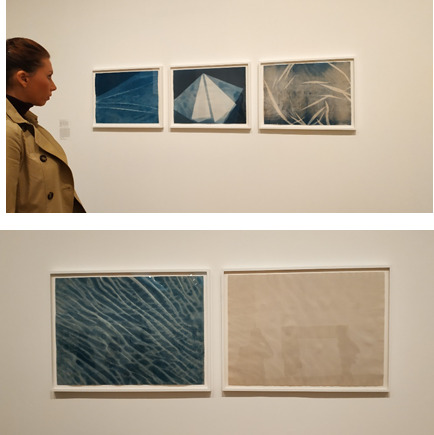
Made by Barbara Kasten, Cyanotypes of fabric and plants are hung in large scale. I really liked these pieces because they reminded me of the sea. In the use of fabric over photographic paper, Kasten has created a fragile yet almost daunting image (due to its size). Each piece was about a meter long and half a meter tall. Altogether there were 5 prints. One print was a sand colour, the rest, blue.
I appreciate the size of the piece and I liked their presence in the room. I find it adequate for the type of imagery it is (ocean is well, big… so it seems apt the prints are also big). The thing it seeks to represent is vast itself so why not have a big print to have a similar presence to the viewer. And being reminded of the sea, by the blue of the cyanotype process, and the wave of the fabric, as it is pulled (or positioned) to take full advantage of it’s texture; I can’t help but think that the ocean in its beauty, is symbolic of death. There’s something about imagery which is symbolic or representative of the sea (or water) which seems to symbolize death or something bigger than oneself, to me. I think there is a natural fascination with water for living things. Be that to do with death, life, or survival, I’m not sure which or why.
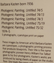
Figure 8:

Another work which I found interesting, or rather the display was more interesting than the photography itself (to me). I love the use of glass plates which then have this transparent quality, making a beautiful display of the works when light is shone onto them. I just think it looks so nice that I didn’t even really care about the photographs themselves. I think it would be a good project all on its own – a study of the effects of light on glass.
Speaking of light and glass – this piece by __ really stood out to me amongst the photography and other works displayed at the Tate. I felt like this mixed media (glass and photogram) was different – even the box in which it was kept at a safe viewing distance in was cool. I liked that the glass had stayed a part of the thing which it had been used to create, rather than just showing the print on its own, the broken glass is also featured with it. I am interested in this (image?) because I was meaning to do a project/shoot a broken wine glass which I have kept safe for almost a year, so this is probably why I was so interested in its presence. I also liked the sepia tones, that it had some colour to it unlike most of the photography displayed within the first few 5 rooms, not fully black & white.
Figure 9: Kansuke Yamamoto, The thrilling game Related to Photography, 1956

Overall the gallery was an interesting and diverse set of artists, by that I mean artists which do not follow a set style for their photography, creative artists who wanted to make something different and not like the usual photography we see today. They used a variety of alternative and historic techniques, as previously mentioned. My favourite technique is the cyanotype, and the photogram, and I found that I was more drawn to camera-less photography methods.
One bad point about the exhibition – there was a lot of labelling in odd or inconsistent places. The works displayed on each wall were of many different artists, one wall had the work of 8-11 artists and there were even more images on the wall than that, so it was quite overwhelming as if you liked a number of those images you would have a lot of artists to then find on the label, with the corresponding number and so on. Furthermore, the numbering of the images in the diagrams imitating the layout of sets of images, which would aid you in discovering its author, was not always linear. It would jump a round quite a bit as each numbering was slightly different per wall or set of images.
Altogether the gallery was a thought provoking one and I was interested by a lot of the artist’s work and methods, how they ended up with that photo. I was specifically intrigued by the diversity of the works. There was a lot of surrealist, modern, fine art-y type work but there was also a lot of colourful, more graphic work which had more of a design (and more current) feel to it rather than exploration of photography methods, like the last wall mural piece. (pictured below)

Figure 10: last ‘image’ in the gallery, big wooden door is exit back into rest of the tate.
0 notes
Text
jump to main content International (English) About MAXON Jobs Products News Industries Gallery Training Support Try Buy OverviewNode-Based MaterialsFieldsCAD Data ImportVolume ModelingProRenderMore Cinema 4D Release 20 Complete Feature List General Faster Picture Viewer playback Speed and memory optimizations Installer Command Line Interface (CLI) mode Exchange SketchUp Update to SketchUp 2018 SDK Null objects with only one child polygon object now create one combined object instead Alembic Update to Alembic 1.7.7 SDK Performance improvements by caching matrices Users can now bake selected objects to Alembic New animation retiming controls Set Frame (for manual animation control via keyframes) Offset Animation Playback modes (Play, Loop, Ping Pong) Speed setting Time Remap Curve Interface FBX Update to FBX 2018.1.1 Support for instances Axis preferences: Flip Z Axis Up Axis (Default, X, Y, Z) New CAD imports (CATIA V5, JT, Solidworks, STEP, IGES) Houdini upgrade to 16.5.536 AI importer: Illustrator splines now load in at the correct scale Modeling Enhanced modeling kernel Several commands migrated to the new modeling kernel provide much better preservation of surface attributes (UV, etc.) Delete Components command with much faster performance and better behavior (e.g., deleting disconnected points) Triangulate command Triangulate N-gons Re-Triangulate N-gons Remove N-gons Align Normals Reverse Normals Several tools migrated to the new modeling kernel Extrude Polygon Extrude Inner Matrix Extrude Primitives now use the new modeling kernel Sphere (Icosahedron, Octahedron mode), Platonic and Pyramid primitives now generate non-overlapping UV coordinates An option is available to convert legacy primitives from old scenes to use the new behavior The Structure Manager now automatically switches the Component mode (Points, Polygons, ...) to the mode selected in the Structure Manager Custom Data tag A new API allows 3rd-party developers to create custom Data tags, which store surface attributes and can also provide interpolations functions. Commands and tools using the new modeling kernel will respect these surface attributes and use the interpolation functions provided OpenVDB Volume Builder Generator Converts a polygon object, spline object, particle object or a Field into a Volume object Can create Signed Distance Fields and Fog volumes Several parameters of the resulting Volume object can be controlled (e.g., Voxel Size) Filter Objects Smooth Filter / Smooth Layer Different Filter Types Signed Distance Field: Gaussian, Mean, Median, Mean Curvature, Lablacian Filter Fog: Gaussian, Mean, Median Different Filter Accuracy settings for Signed Distance Fields: First Bias, Second Bias, Third Bias, WENO 5, HJWENO 5 Reshape Filter / Reshape Layer Different Filter Types Signed Distance Field: Dilate / Erode, Close / Open Fog: Offset, Range Map, Curve Different Filter Accuracy settings for Signed Distance Fields: First Bias, Second Bias, Third Bias, WENO 5, HJWENO 5 Objects and Filters can be layered using different mix modes Signed Distance Fields (Union, Substract, Intersect) Fog (Normal, Max, Min, Add, Subtract, Multiply, Divide) Volume objects can be referenced as a Field Layer Volume Mesher Generator Generate a polygon object from a Volume object User can control the Voxel Range Threshold or the Surface Threshold Meshing can be adaptive Import / Export .vdb Volume objects can be imported and exported from and to the industry standard .vdb file format. Volume Loader object References and loads volume files and volume file sequences Volume Mesh command: Remeshes and combines polygon objects using a volume-based approach. Rendering ProRender ProRender now supports: Subsurface Scattering Linear & Angular Motion Blur Sub-frame Motion Blur Out of Core Texture streaming to render textures that exceed the total GPU memory Multi Instances Texture Selection tags on instances MoGraph Color shader Physical Sky Compositing passes Direct Illumination Indirect Illumination Emission Environment World Coordinate Texture Coordinate Geometry Normal Shading Normal Depth Object ID Object Group ID Material ID Anti-Aliasing can be enabled for World Coordinate Texture Coordinate Geometry Normal Shading Normal Depth Object ID Material ID Object Group ID Shadow Catcher 2D Noises: users now can use all 2D noises except 'sparse convolution' in the legacy base shader. New Seed setting: users can now specify a seed that is used for rendering. Ray Depth can now be restricted (Diffuse, Glossy Reflection, Refraction, Glossy Refraction) Shadow Ray Depth can now be set Support for Metal 2 Compiling kernels on demand, shaders that introduce a big chunk of GPU kernel code will not be included in the initial kernel compilation. The kernel compilation is triggered when such a shader is added. Scenes are now cached when animations are rendered to the Picture Viewer. New Reload Scene per Frame option to enforce R19 behavior General performance enhancements Physical Renderer Improved progressive rendering performance Materials General Immediate low-resolution baking for Viewport Improved shader / material baking for the Viewport Updated Material previews Updated scene setup Several new scenes MoGraph Beat Shader now accepts float values for BPM New node-based materials Over 140 nodes available Projection nodes can be visualized in the Viewport Node networks can be turned into material assets Node based Materials can be edited in the Node Editor, Material Editor and Attributes Manager New Node Editor based on new UI framework Attributes Area, displaying the parameters of the selected nodes A specialized version of the Attribute Manager New connector element showing dependencies within the shading/rendering context The Connector context menu allows to: Connect Nodes Textures Load Textures Replace Nodes Insert Converters Copy Paste (Link) Paste (Duplicate) Remove Mute Ports Propagate Ports Basic tab Name Asset Version dropdown shows the different versions of a node (if available) Custom Node color Inputs tab The input attributes of the selected node Nodes can have a dynamic number of inputs (e.g., the gradient can have a variable number of Knots) The command Show Sub-channels can switch the layout to also show sub-channels of a parameter (e.g., Color.R, Color.G, Color.B, Color.A for "Color") Context tab Enables users to replace the context of many Nodes, e.g., to change the UV mapping for this node. Asset area Lists all available assets provided by MAXON or stored by the user The asset list can be filtered by name and keywords A keyword filter can set certain parameters in a node (e.g., a search for "Buya" will show a Basic Noise Node with Buya set as the Noise type) Context menu Create New category Create Node Import Assets Create New Database Mount Database (Folder / Zip File) Unmount Database Export Database Nodes area lists all the Nodes in the current setup The Nodes list can be filtered Nodes can be cut, copied, pasted, deleted and duplicated Info area, displaying information about the selected Node / asset / Wire (name, version, warnings, ...) Nodes commander, allows the user to search for assets by name and keyword Node view Nodes Header (displays the title, preview and node state toggle) Can be colored to give users a way to organized their Node networks Naming of the Node can be changed Body (includes in- / out-port groups, port bars, port slots and port names) The body can display all ports, no ports or only the connected ports Nodes can have two major states (full and collapsed) Nodes can be displayed in vertical or horizontal layout Ports Node ports can have different states (unconnected, connected, propagated, converted, group ports, error) Node ports are color coded to make it easy to differentiate between different types of ports. Ports can be renamed Wires Several ways to connect a Wire to a port: Connect a Wire straight to a port Release a Wire on the port name Release a Wire on the group port name. A pop-up will appear with compatible ports of the group the Wire can connect to Release a Wire inside the empty area of the Node. Again a pop-up with all compatible ports will appear Wires can be displayed as Linear or Bezier curves Wires can be muted (displayed as a dotted line) Special Nodes Start Node: the Node's attributes will be displayed in the Material Editor and the Attribute Manager when the Node material is selected Solo Node: allows the system to use the data from this Node to be displayed in the Viewport and previews Group Node: a Node that contains a nodal network Asset Node: Group Nodes can be converted into Assets Users can use different techniques to navigate the Node View, including touch gestures. Navigator mini map shows an overview of the complete Node network, can be used to quickly navigate the Node network Group bars on the left and right sides of the Node View can be used to propagate the ports to the outside of the group. Nodes can snap to the grid when moved Toolbar shows: Breadcrumb display of the path to the currently edited Node Filter Field Uber Material Material Asset, build with the new Node system Three reflection channels Diffuse Channel: renders diffuse reflections Reflection Channel with three reflection modes Artistic - blends between two user defined colors Dielectric - for dielectric reflections, such as plastic Conductor - for conductors, e.g., metals Coating channel, a simplified dielectric reflection layer to render effects such as a clear coat Emission layer for emissive effects such as luminous materials Transparency for refractive materials such as glass Opacity to control the material’s opacity Bump to control global bump mapping Normal to control global bump mapping Displacement to control the displacement of the material New Node materials Car Paint Ceramic Concrete Cutout Emission Gold Granite Marble Metal Plastic Rock Wood Material Manager New commands in the Create menu New Uber Material New Node Material Node materials (displays all materials in the asset repository folder) Can now open the Node Editor Workflow/UI Compositing tag now has a ProRender tab Shadow Catcher Alpha Light Portal Object Group ID Multi Instances New Instances integrated in the Cloner object, Instance object and supported by all internal Render Engines Multi Instances are stored as one object internal, resulting in higher performance and less allocated memory Supports different render modes in the Viewport (Off, Points, Matrix, Bounding Box, Object) Supports the Color shader and MoGraph colors Project Settings Use Color Channel for Node Material"´ setting New Console Categories provide more overview Python console can now completely replace functionality of the Command Line Output can be written to files Drastically improved performance New gradient Updated interface Gradient color bar can be displayed in 3 different sizes (small, medium, large) Selected knots now have an orange outline If more than one Knot is selected, selection handles appear. The allow to move all selected Knots at the same time to to scale the range New Double Selected Knots and Distribute Selected Knots command in the Context menu New Interpolation mode Blend Interpolation can now be set per Knot Intensity renamed to Brightness (only available in the Legacy gradient) New options if gradient is used in User Data"´ (COLOR, ALPHA, NOEDITCOLOR, NOPRESET,NOINTERPOLATION, NOKNOTPOSITION, NOBIASPOSITION, NOBRIGHTNESS) New Gradient Node Can display textures and shaders in the gradient color bar Can display alpha Color Chooser is extended with an Alpha slider Blending Space can be set to Linear or sRGB Knot symbol changes: if this Knot is driven by a Node input Enhanced Color Chooser Color Chooser now can store alpha values in swatches Color Picker now is always available when the Color Chooser is collapsed Color Chip context menu now offers option to enable/disable Alpha (where appli
0 notes
Text
Higher Education as Service Trade Exporter In South Africa

"For fifty years we have been a developing nation. It is time we see ourselves as a developed nation." This is the part of the speech of Dr Abdul Kalam in Hyderabad. Whenever we are talking about Developed nation, suddenly education comes to picture with other automotive seo major indicators like the growth rate of the economy, birth rate, death rate, infant mortality rate (IMR), and literacy rate. These indicators are all interconnected with each other and the literacy rate has been the major determinant of the rise or fall in the other indicators. There is enough evidence even in Orissa to show that a low literacy rate correlates with high birth rate, high IMR, and decrease in the rate of life expectancy. The recognition of this fact has created awareness on the need to focus upon literacy and elementary education programmes, not simply as a matter of social justice but more to trade schools near me foster economic growth, social well-being, and social stability.
The Constitution of India casts an obligation on the State to provide free and compulsory education to all children up to the age of 14. The literacy rate in Orissa during 1951 was 15.8% against the all India average of 18.3%, which increased to 63.6% in 2001 against the all India average of 65.4%. While the male literacy rate of 63.1% in the State in 1991 increased to 75.9% in 2001, the female literacy rate increased from 34.7% to 51.0%. There has been a steady improvement in the literacy rates of the State over successive decades, which is a result of expansion of educational python certification infrastructure both quantitative and qualitative.
In 1950-51, there were 9,801 Primary Schools with 16,525 teachers and 3.15 lakh students. There were 501 Upper Primary Schools with 2,569 teachers and 40,000 students. Also there were 172 High Schools with 2,247 teachers and 16,000 students. Since 1950-51, there has been a considerable expansion in the number of educational institutions, enrollment and number of teachers at all levels during successive plan periods. In 2003-2004, there are 44,416 Primary Schools with 52.54 lakh enrollment and 97 lakh teachers in the State. There is one Primary School for every 3.5 Sq.Km technical schools near me area. The state government has established 14, 233 Upper Primary Schools for each 10.94 km area in the State.
Issues of Concern
Education is the key to social & economic development of any society. It encompasses every sphere of human life. Level of literacy has a profound bearing on the level of human development. There are major issues, which are directly or indirectly concerned with the education in Orissa. First, the dropout rate in primary and upper primary schools is become a major issue of concern. In the same time dropout rate become a business analyst training major setback in the increasing literacy rate which was at the primary stage 33.6%. But if you compare girls dropout rate with boys, the dropout rate for girls was 35.4% and for boys 31.9%. Dropout rate at upper primary stage was 57.5% in 2003-04. Out of them 56.5% boys dropped out in upper primary stage while 58.6% girls dropped out in the same year. Second issue is infrastructure of school buildings, which are in bad conditions. And the old or unsafe school buildings of our state are inadequate to meet the needs of school children. Many of them one-room (or even open-air) bookkeeping classes operations with poorly paid teachers.
Steps taken by the State Government
Orissa government has always made concerted efforts to provide education to all. Some major initiatives were taken to offer quality education for a brighter future not only for Oriyas but also for the state, at last for the nation. Some steps were directed towards the reform and renewal of state's education system. In the same time there has been ecd a considerable expansion in the number of educational institutions, enrolment and number of teachers at all levels during successive plan periods.
The central and state governments have been expanding the provision of primary formal and non-formal education to realise the goal of Universilisation of Elementary Education (UEE). Elementary education is recognised as a fundamental right of all citizens in India. The directive principles of state policy envisage UEE as one of the major goals to be achieved and mandated in a timeframe. As per guidelines adopted at the national level, the State aims at providing access to Primary Schools within one kilometer and Upper Primary Schools within three kilometers from early childhood development habitations having 300 or more and 500 or more respectively. In order to achieve the goal of Universalisation of Elementary Education and to improve the quality, steps have been initiated to engage more 9,563 para teachers under State Plan.
Government of India's flagship programme 'Sarva Shiksha Abhiyan' was launched on nation-wide scale to universalize elementary education by providing for community ownership and monitoring of the school system. The objectives of the programme are compulsory Education to all the Children of 6-14 years age group by 2007. Under houston seo the programme, there were 780 new primary schools, 2,771 new upper primary schools were opened and. 25,594 Swechasevi Sikhshya Sahayaks were appointed in 2003-04. The Sarva Shiksha Abhiyan programme calls for community participation through effective decentralisation - involvement of Village Education Committee (VEC), Members of Panchayat Raj institutions and Womens' group. It ensures transparency and accountability of the school system to the community. To lesson the burden of Directorate of Higher Education, the state government has been established three regional Directorates in Bhubaneswar, Berhampur and Sambalpur. Regional Directors of dallas seo experts these Directorates have been vested with similar powers of Director of Higher Education. Today, access to the qualitative education is reducing in Orissa. The reason is a lack of budget, weak governance and decline of physical infrastructure, shortage of teachers and their low salary, obsolete teaching plans, poverty and malnutrition, and absence of parents and society participation.
Hurdles to achieve the Goal
Funds become major hurdle for every developmental programme in Orissa. In some cases, it is surplus and government cannot utilize the fund within the required timeframe. In the other side, it is deficit. In every step and in every stage, we extend our hand in front of the houston seo company Central government, financial institutions for funds. How do you education keep the education aside? The government does not have money for primary education. Well, the fiscal deficit is surely a problem, but that could not be excused during a downturn if it is used for opening up the way to developed nation. The Government of Orissa fully endorses the approach on universalisation of elementary education and the scheme 'Sarva Shiksha Abhiyan' should be given the highest priority. But when we are heading towards success of the programme, we do not have fund to provide the study materials to the students. With the assistance from Central Government, the houston seo consultant Orissa Government has been providing the study materials every year. For a state like Orissa, the government needs 3.5 crores books for the students up to VII class.
Generally, the government was sanctioned eight crores every year. In the current year budget, only four crores has sanctioned, whereas approximately 30 crores required for the printing of study materials. Now, It is become routine issue for the government to sanction inadequate fund and demand more money at the neck of the moment when the books should reach at the end user. This is not only creating an career aptitude test obstacle in the time bound programme but also spoil the valuable time of the students for struggling with the course without courseware. Here I have highlighted one issue, which is occurred in every year at the beginning of academic year. Government has been compromising the issue without thinking the future of the small kids.
Though it is a routine issue, then why Government is not considering this issue seriously?
Some other issues like educational infrastructure and appoint good teachers with good salary are also taken into what career is right for me consideration. When we are appointing good teachers for this programme, we should think about the other side of the coin (i.e good remuneration). The state government appointed 40,846 Shiksha Sahayaks under several schemes including District Primary Education Programme (DPEP) and Sarba Siksha Abhijan (SSA). Due to deficit budget the Shiksha Sahayaks are compromising with the situation and ready to work in less salary (i.e. Rs 1500 per month), which is less than the wage of a bonded labour. In spite of that the State Government is unable to provide escape houston their share at least in time to the Shiksha Sahayaks. How would we expect quality education from a teacher who is struggling to survive in this expensive society? Recently, the State Government has decided to hike the monthly honorarium of the Siksha Sahayaks from Rs 1500 to Rs 2000. This decision was taken at a high-level meeting presided over by Chief Minister Naveen Patnaik on October 20. This will cost the State Exchequer an additional Rs 25 crore per year. Obviously, zero percent credit goes to the State Government. Though Central Government is supporting 75 bmw houston percent of the estimated expenditure, this additional hike will be added to the aided account. If Sarba Siksha Abhijan is become a flop programme, then the credit goes to the state government. The major barrier is deficiency of fund.
Conclusion
We are compromising in every step of our life. How many days will we live with 'compromise'? Let us stop compromising with our future and with our future generation. At least the State Government should give up elementary education. Education makes man a right thinker. It tells man how to think and how to make decision. When the absolute number of literate people in the state is steadily rising year after year lexus houston , then where are those instincts of a literate person? Where is your voice against the backward step of the government? But moving beyond educational programmes requires much political will and public pressure. Unfortunately, elementary education continues to receive low priority from those in power. While State Assembly discusses trivial issues, issues related to elementary education gathers dust. If government will not take any rigid step then all children of 6-14 years age group in school by 2003, all children to complete 5 years of schooling by 2007and all children to complete 8 years of schooling by 2010 will become a utopian dream for us. Whilst it is recognized that South hyundai houston Africa is still in a process of transition regarding higher education to address the imbalances of the past, it should also be emphasized that Institutions of Higher Education in large are still underplaying the importance of higher education as commercialized commodity in the global world. This resulted in a low commercial higher education presence in the global world, a limited capability to attract quality students from foreign countries and a national oriented education approach. Even the school law that will soon be introduced in South Africa to address the imbalances of the past may have a negative effect of institutions of higher education to play a significant role in honda dealership houston the commercialized educational world. The proposed new law emphasized adherence to the principles of equitability, rectification and representativeness above competence in the appointment of teachers. This may undermine the quality of education firstly, in schools and later in institutions of higher education in South Africa.
This is in sharp contrast with international trends signaling that the international higher education market is becoming more competitive as education competes as export and import commodity. Figures available indicate that higher education export represents on jaguar houston average around 6.6% of total student enrollments in 2000. This figure can still not be matched b South African Institutions 5 years later. In countries like Switzerland, Australia and Austria these figures were above 11% in 2000 making these countries the highest internationalized higher education countries in the world. Similarly, educational services in Australia, New Zealand and the United States of America respectively represent the third, fourth and fifth largest service export sectors. This clearly provides scratch and dent appliances evidence that these countries realize the significance of higher education to transfer intellectual capital and enhance the economic competitiveness of nations.
Interventions required
It is important that Institutions of Higher Education in South Africa position themselves as nodes in an increasingly seamless knowledge base in the global world, which could have a greater wtw5000dw interface with the knowledge-driven global economy. Therefore, Institutions of higher education in South Africa should given even more attention to integrate with influential international institutions that will enable them to internationalize higher education.
Currently, internationalization of higher education in South Africa happens more by incident rather than through thoroughly planned and organized approaches. If institutions of higher education in South Africa intend to consider higher education as a commercial trade whirlpool cabrio washer commodity, serious emphasis should be place upon:
· Introducing purposeful policies and strategies that clearly indicate the road forward with regard to internationalization intentions and the specific areas that would need priority attention. However, this should not be developed as separate internationalization strategies, but should e seen as a natural element of the overall strategy of the institute.
· Implementing induction and course wrs325fdam programmes that will attract quality foreign students to the institutions.
· Supporting academics to participate in conferences as well as in reputable academic journals to publish research results.
· Ensuring that all course offerings meet international accepted criteria as defined by the leading institutions of higher education in the developed world.
· Creating conducive learning environments equipped with the latest learning technologies.
Internationalization requires that institutions System network training of higher education in South Africa should emphasize a somewhat loosening of the relationship with Government to create new transformational bodies to address the imbalances of the past, but also to broaden this mission to play a more active role in regional economic development. This can be achieved by establishing strong horizontal links big data hadoop training with other universities research institutions and industry in the Southern African Development Community. If this can be achieved, the activities of institutions of higher education will no longer be isolated from the marketplace and its outputs could become merchandise products as well. Loosening the relationship with government will not only provide for more freedom to autonomously decide what educational and research outputs to create, but will also increase the pressure on institutions of higher education to perform better as they take up the responsibility to raise funds cell phone repair training online for projects and salaries.
It is imperative that higher education in South Africa can no longer take the disposition that placed research and development in contrast to one another. Rather, it should take the stand that the outputs of institutions should have a strong:
· Social development and application in which the simultaneous promotion and integration of education, scientific research and production occurs;
· Science and Technology Financial cell phone repair training Management Support System in place in order to create a safe and secure research environment for academics; and
· Set of " Key State Laboratories" where research and education of strategic importance to the development and well-being of the country can be carried out.
Conclusion
South Africa institutions of higher education currently rated only among the top 40 of the world's host countries. An urgent need exist to rethink and reformulate the educational thinking A+ certification training models of institutions of higher education in South Africa. Because of the changing political situation accompanied by a changing global economy, many traditional ways in which institutions of higher education were previously governed will change. Unless institutions of higher education in South Africa succeed to internationalize successfully, huge opportunities to earn foreign currencies using higher education as a trade commodity will be lost.
0 notes
Text
8 Effective Image SEO Tips Every Digital Marketer Should Know
Image optimization for SEO purposes is an art you should learn how to master. Since images take a lot of space on your website, it’s only natural to find ways to optimize them not only for better user experience and functionality but also for better ranks and traffic.The big dilemma is finding the balance between a well-optimized image that still preserves its visual quality and a fast, high-peformance website. Thus, the better question to ask is: Can optimized images help/complement your SEO efforts?
We shouldn’t add pictures to our content for the sake of having something to break our content and create more lines. That’s not the recommended way to use visual content. There are lots of situations when pixels are sacrificed and pictures have a bad-looking aspect. Why should some innocent pictures end up pixelated after compression when there are lots of other ways to optimize images and still keep the visual aspect? So, we gathered the most important tips that will help you not only optimize the images for SEO but also speed up your website and help you in your SEO endeavour.
Choose the Right Image Format
Optimize Image File Weight
Save Images at Smaller Resolutions
Resize Images to Scale
Reduce the File Size Using Plugins
Remove Any Irrelevant or Unneeded Metadata
Name Your Images and Add Alt Descriptions for SEO Success
Use SVG Files to Have a Higher Clarity and Lighter Website
Our previous researches and case studies about the connection between images and SEO got us to this image optimization topic. We discovered then that Google can read text from images, which can have huge implication in rankings and Google Image Search world in the future.
It is highly possible that in the very near future, Google will probably change the algorithms regarding the way it will rank images. That change will dramatically impact the search, and thereby the SEO world. Especially since Google is using the object detection in images. Therefore, it is best to be prepared and follow our next image SEO tips to help Google “read” & rank your images in the near future.
1. Choose the Right Image Format
There are multiple file types for visual content, each serving for a different purpose. If you choose the right file, it will turn out to be a huge improvement. For web, you can choose:
JPEG format when you have pictures with a lot of color, color gradient and shading.
PNG format when you have a logo, or it is a picture with a lot of solid color or you need to use transparency.
GIF format when you have an animation or in the same situation explained or the PNG format.
JPEG PNG GIF
Ilya Grigorik, Web performance engineer at Google, explains how you can choose the best file format for your picture through the next representation in Web Fundamentals on Google Developer website.
Source: developers.google.com
2. Optimize Image File Weight
Reducing the image quality can improve a website’s speed for loading the page faster. Fast websites mean better user experience, which in turn leads to increased conversions. According to a study by Kissmetrics, 1-second delay in page response can result in a 7% reduction in conversions.
An even bigger problem is for mobile users. Images account for 68% of total page weight and tend to be too large, too many and often times unnecessary, slowing down the page load and preventing the user from accessing the information.
The size of an image is given by its quality, or the number of pixels. If a picture has more pixels, it will lead to a higher size, dimension, and quality. That’s why reducing quality by 15-20% is recommended for JPEG and PNG formats. A lot of dedicated softwares have this option.
In Adobe Photoshop, for example, for both JPEG and PNG there is the option to optimize images for web. The steps are quite simple: Export » Save for Web » Quality 85% (Use the photo viewer on the left to determine if you can compress the picture more and how it looks) » Click Save.
The higher the percentage, the better the quality of the photo. For PNG pictures, there are other optimizations you can choose from, such as PNG 8 bit and PNG 24 bit. It would be recommended to save it as a 8-bit png to have a lightly sized pictured.
Affinity Photo is another option for compressing images, which can be similar to Photoshop, but cheaper. In the example below, you can see that the image size is 3.19 MB.
For a high export compression efficiency at 55% quality, the size will decrease at 303 kB, which is 10x times lighter.
There are additional, easier to use softwares in order to reduce the quality of images, such as Gimp and other small softwares for beginners, such as GIFsicle, JPEGtran, JPEG Mini, OptiPNG, pngquant, FileOptimizer, ImageOptim (see the picture below).
If you want to choose the easiest way and not to download any software, there’s the option to use online editing tools for compressing images. TinyPNG and Trimage are two of the most used.
There is also the PageWeight by imgIX, where you can add your website and evaluate the “amount” of visual content. For that, there are calculated three main metrics for each site, represented using color bars (light, recommended and heavy) as you can see in the screenshot below. In our example, we have a light website content weight, light image weight and a few recommendations for a better image optimization.
Below, we can see an exemplified report and the actions that must be taken:
How images are affecting your page weight;
Your worst performing image;
Your page’s image breakdown.
For each result, there are some recommended actions we could take to improve the delay of your load page, optimize images to lower the weight.
3. Save Images at Smaller Resolutions
Another image optimization solution is to save pictures at a smaller resolution. Resolutions refer to the number of pixels in an image. The editing software identifies the resolution as the width and height of an image and the number of pixels in that image.
For example, if you have an image that is 500 pixels wide and 281 pixels high (500×281), it will have 140,500 pixels (we multiplied the number of pixels on width and height), which means 141 KP.
For a larger image, the resolution will be bigger. For example, if we have a high-quality image at 1920×1080, the resolution will be 2.07 Megapixels.
In graphics editing software we have the possibility to choose your image dimensions and resolution, which can be a little bit misleading, because we cannot have images with the same size on different resolutions.
An image with 500×281 at 72 ppi, 300 ppi and 1000 ppi will look exactly the same and the number of pixels will be 141 KP.
Http Archive performed some interesting analyses regarding the breakdown of website sized by content type. The results were incredible. Below you can see data from that report. You can easily see that images have the highest weight on a website.
The sizes presented in the chart are the transfer sizes, therefore the compressed responses are counted to be smaller than the original, uncompressed content.
Google’s PageSpeed Insights can show you images that need to be compressed and the space you’ll save after that. In the example presented below, you can see the files that need to be compressed. If you compress them, you will save 1.1MiB.
Pixlr Online Photo Editor is a free and online option for lots of editing needs and it can be used for saving images at smaller resolutions. Also, you can use it to apply layers and effects. It has a similar interface as Adobe Photoshop.
4. Resize Images to Scale
When you upload images on your website and want to optimize them, it is recommended to resize them to scale, and not let CSS resize them. This method can be applied only if don’t have responsive pages, otherwise it is not relevant. Another thing worth mentioning is the fact that you shouldn’t just scale images without taking any other optimization techniques into account. It works best with the next recommendation, reducing file sizes through plugins.
Being a WordPress user, you have a lot of advantages. For example, in this case, your images will be resized by default when you add them to the media library. You can easily access that option if you go to Settings » Media. The max width of the picture must be close to the width of your site. This way, CSS will not resize your images down to fit inside.
Some other recommendations worth mentioning in this case are:
Use CSS3 effects as much as possible;
Save your images at the dimension you want instead of letting HTML or CSS resize them;
Crop the white spaces from images and recreate them by using CSS to provide the padding;
Reduce the bit-depth to a smaller color palette;
Choose web fonts and avoid placing text within images because this way you won’t have problems at scaling and it will save space;
Use raster images (represented by a collection of countless tiny squares/pixels) only for scenes with lots of shapes and details;
Minify your images with Gzip compression.
5. Reduce the File Size Using Plugins
If you’re a WordPress user, you should be glad to find out that there are also automatic ways to compress your images, by using plugins.
Plugins can work very well as a second step for image compression. Don’t ever use it alone. For example, adding a picture that has 2MB in the library can result in eating up your web hosts disk space really fast. You need to select the plugins that suit you the best and get to work. For each plugin the steps are easy:
Sign in your WordPress » Plugins » Add New » Search for the plugin » Install now and wait for a few seconds » Activate. Then, if you like you can go to the specific Plugin and look through Settings to make sure everything is according to your needs.
WP Smush, CW Image Optimizer, Insanity, Hammy, SEO Friendly images or PB Responsive Images are just a few examples of plugins that will automatically and losslessly compress your images. All the plugins can be used to optimize images that were previously uploaded or added after the install.
Below you can see a speed test performed by Kinsta using Pingdom before and after compressing images. For the uncompressed JPEGs, the website had a 1.55 seconds load time and a 14.7 MB total page size.
Source: kinsta.com
For the compressed JPEGs, load times were decreased by 54.88% and page size was decreased by 80.27%. The results speak for themselves:
Source: kinsta.com
As a suggestion, you should keep your image file size weight under 120 kb for large images (1920px & up) and even lighter for smaller images. As a general rule, keeping most images around 50 kb is the best.
Brian Jackson, Dir. of Inbound Marketing of Kinsta, explained in an article on Optimus, the different types of compression when it comes to reducing the size of your images for the web.
Lossy compression refers to compression in which some of the data from the original file (JPEG) is lost. The process is irreversible, once you convert to lossy, you can’t go back. And the more you compress it, the more degradation occurs. Brian Jackson
Dir. of Inbound Marketing Kinsta
On the other side,
Lossless compression refers to compression in which the image is reduced without any quality loss. Usually this is done by removing unnecessary metadata from JPEG and PNG files. RAW, BMP, GIF, and PNG are all lossless image formats. Brian Jackson
Dir. of Inbound Marketing Kinsta
6. Remove Any Irrelevant or Unneeded Metadata
Metadata is the information stored in the image file and usually, it is generated automatically by the device that captured the image.
Additional metadata, such as EXIF data (a record of all the camera settings) can be added manually using dedicated software or directly on digital cameras. All sorts of information – such as exposure time, aperture settings, camera type, date taken, author and other information – can be embedded into an image. That information is crucial for the particular websites (photography, for example), while for other websites it might be completely irrelevant.
Sanitizing your image can be extremely beneficial for improving website’s loading speed time. If you take a look at the next picture, you’ll see what kind of information can be embedded into an image. You can easily access that data if you go to the Properties of the image and then select Details.
Choose what to delete and what to keep by easily going into the Value cell for each property and deleting the content. If the file is on Read-only mode, you won’t be able to edit that information. But there are other ways to review it by using the Google Chrome extension, EXIF viewer, which will be accessible by a tiny camera from your browser. At just one click on the icon you’ll get all the Exif data.
Photoshop or Adobe Lightroom are other examples that could help you get rid of unneeded EXIF data. Go to File » File Info.
Make sure you keep the data that is important for you and delete the unnecessary image data. This way, you can optimize your images and make it easier for search engines to understand your visual content better.
7. Name Your Images and Add Alt Descriptions for SEO Success
Getting your images easy to read-on by Google and making them friendly will empower SEO success for your website. You can kick your SEO game up a notch by giving your images relevant names and keyword-rich alt text descriptions, without taking advantage of this and practicing keyword stuffing.
If necessary, use description for your image or caption. You can add these elements, by following the previous step, where you can save the metadata regarding the description, author and name or the file.
In case you don’t have that information embedded in the file, add it directly when you upload the image on your site. WordPress makes it easier for the user to edit the data they want Google to access.
Search engines crawl both the text on your website and that embedded in your images. Make sure you don’t use generic names, such as DSCN093298.png, Image01.jpg or animation-version1.gif and so on, but rather descriptive file names. Title tags and image alt texts are crucial when a browser can’t render your website properly.
8. Use SVG Files to Have a Higher Clarity and Lighter Website
SVG is used for logos, icons, text, and simple images. The entire content of Scalable Vector Graphics is just text. Just take a look at the example on W3Schools. On the left side is the content of the file and on the right side is the rendered version of the text, where you could see what it looks like. That’s exactly how the users will see the SVG file. If you try to change the color or dimensions, the quality of the image won’t be damaged, it will be preserved.
Using SVG file is another recommendation for creating better websites. You can still have PNGs and JPEGs on your site, but in addition, it is very good to use vector images whenever possible.
Ilya Grigorik explained the difference between image vectors and raster images. Just like I’ve mentioned before, raster images are used for complex scenes with irregular shapes and details. Vector images, on the other side, are ideal for images that consist of geometric shapes.
Source: developers.google.com
Vector images carry great advantages:
They are scalable in both browser and editing tools. You can zoom in and out without affecting the quality;
You don’t lose SEO quality. SVGs are indexed in Google the same way JPEGs and PNGs are;
Usually, SVGs are smaller than JPEGs and PNGs.
Conclusion
When someone is surfing the internet, the browser needs to download every file from your website to render it. On a large scale, that means pictures, which can store a lot of irrelevant data and pixels.
We’ve explored the topic and found lots of embarrassedly simple ways to reduce the image file size by editing the quality settings. We gathered our tips and resources that we followed thoroughly over the years. Saving an image for web, using image optimization tools, removing irrelevant metadata, resizing image to scale are just some examples on how you could optimize your images.
Use GIF and PNG formats because they are lossless. The desired format is PNG because you can achieve the best compression ratio with a better visual quality.
In the end, make sure you test your visual content using plugins, tools, and software to ease up the process.
The post 8 Effective Image SEO Tips Every Digital Marketer Should Know appeared first on SEO Blog | cognitiveSEO Blog on SEO Tactics & Strategies.
from Marketing https://cognitiveseo.com/blog/18192/image-seo-tips/ via http://www.rssmix.com/
0 notes
Photo

New Post has been published on https://www.valchoice.com/consumer-insurance-information/hurricane-harvey/
Hurricane Harvey: Preparing For The Storm After the Storm

Hurricane Victims Have No Idea About the Storm That Will Hit Them Next
Hurricane Harvey arrived with a bang. A category 4 hurricane means sustained winds of at least 130 mph. For anyone that has put their head out the window of a car traveling 65 mph, double that. That’s the minimum power of Harvey when it made landfall in Texas. Even worse, the heavy winds were accompanied by a storm surge of up to seven feet. Unfortunately, that’s not the end of the Hurricane Harvey story.
Next, torrential rain. Some areas have already been drenched with over two feet of rain. The rain is expected to continue for two to three more days. The rains will cause widespread flooding in the flat terrain of Texas. Wind, storm surge and now rain. Could the Hurricane Harvey situation get any worse?
The Storm That’s Coming
Unfortunately, the situation will get worse. In fact, for some it will get much worse. Hurricane Harvey victims will spend years of their life recovering. Some will never recover. Those that never recover are often the victims of what is often called “the storm after the storm.”
Wind vs. Water? Which Did Hurricane Harvey Deliver First?
What caused the damage, wind or water? This question is critically important. Here’s why. If flooding caused the damage, homeowners insurance is not responsible for the losses. Instead, the National Flood Insurance Program (NFIP) is responsible. The NFIP is administered by the U.S. Federal Emergency Management Agency. This means if flood insurance premiums are insufficient to pay the claims, federal tax dollars make up the difference. However, most people don’t have flood insurance, or don’t have enough.
After Hurricane Harvey passes, the forensic work to determine what caused the damage requires specially trained personnel. The good news is there are specialists trained to do this work. The bad news for consumers is that these “experts” work primarily for insurance companies.
Taking a lesson from Hurricane Katrina, here’s what happened. In a class action lawsuit filed against an insurance company and their contract engineering firm, the following was revealed. “Contrary to every objective scientific and legal source that the hurricane wind arrived after the storm surge,” the forensic team determined th storm surge arrived first. Storm surge arriving before the wind defies logic. However, that was not the end of the problems for policyholders. In other lawsuits it was revealed that some insurance companies tried to trick hurricane victims. They tricked them by asking the victims to sign forms that acknowledged they had sustained flood damage. Flood damage of course is not covered by homeowners insurance.
For insurers with millions and billions of dollars at stake, saving money are highly attractive. For companies beholden to the insurance industry, saving their customers money could be viewed by some as good business. In fact, it could be the difference between a big contract in future years, or no contract at all.
Modified Damage Reports
60-Minutes reported on similar issues following Superstorm Sandy. Their report included a statement saying, “there is evidence that many homeowners were victims of what appears to be wide scale fraud — where original damage reports were later changed to make it look like the damage wasn’t as bad.”
The Problem May be Getting Worse
When the insurance company has shareholders, the problem worsens. Shareholders are an unrelated third party that only care about the stock price. Boards of directors and top management understand the importance of keeping shareholders happy. When losses are large, boards and executives instinctively want to minimize the impact on shareholders. Not doing so can directly effect personal income in the coming years.
Avoiding the Storm After the Storm
Homeowners that that are victims of Hurricane Harvey, and don’t get the service they expect fro their insurer, need to file complaints with the Texas department of insurance. Regulators need to quickly vet these complaints. Once vetted, complaints need to be published and publicized. Rapid publication of the complaint data will inform consumers which insurers do not honor the promise to protect.
Transparency will force carriers to honor their promise to protect Texas policyholders. Not doing so would lead to losing customers across the entire country. The risk of having poor behavior exposed creates a powerful incentive to perform well. Transparency will lead to improved service for Texas homeowners. There’s a second benefit as well. Insurance companies will start to measure their performance based on data available to the public. This will have a powerful, positive effect on both consumers and the industry.
Where You Live Matters
The map below shows all 50 states and how they compare for the value consumers get from their homeowners insurance. A description of the analysis is included in the section titled “Methodology.”
Alabama, 12th Best
Alaska, 6th Worst
Arizona, 20th Best
Arkansas, 8th Best
California, 13th Worst
Colorado, 2nd Best
Connecticut, 16th Worst
District of Columbia, 4th Worst*
Delaware, 7th Worst
Florida, 2nd Worst
Georgia, 7th Best
Hawaii, #1 Worst Value
Idaho, 23rd Worst
Illinois, 10th Best
Indiana, 16th Best
Iowa, 17th Best
Kansas, 19th Best
Kentucky, 9th Best
Louisiana, 3rd Worst
Maine, 5th Worst
Maryland, 25th Worst
Massachusetts, 11th Worst
Michigan, 21st Best
Minnesota, 11th Best
Mississippi, 21st Worst
Missouri, 15th Best
Montana, 4th Best
Nebraska, 1st Best
Nevada, 4th Worst
New Hampshire, 17th Worst
New Jersey, 23rd Best
New Mexico, 22nd Best
New York, 8th Worst
North Carolina, 24th Worst
North Dakota, 20th Worst
Ohio, 13th Best
Oklahoma, 3rd Best
Oregon, 12th Worst
Pennsylvania, 22nd Worst
Rhode Island, 9th Worst
South Carolina, 10th Worst
South Dakota, 5th Best
Tennessee, 6th Best
Texas, 18th Best
Utah, 18th Worst
Vermont, 14th Worst
Virginia, 15th Worst
Washington, 19th Worst
West Virginia, 24th Best
Wisconsin, 25th Best
Wyoming, 14th Best
Comparing the #1 Best State to the #1 Worst State
The difference between states is significant. For example, there is a 399% difference between the number 1 worst state (Hawaii) to the number one best state (Nebraska). In other words, Nebraska homeowners get four times more of the premium they pay back to cover losses than homeowners in Hawaii. As a percentage, Hawaii residents get only $0.20 of every $1.00 they pay in premiums back to cover losses. By comparison, Nebraska residents get $0.80 of every $1.00 of their premiums back as loss compensation.
Is Your State One of The Best States for Homeowners?
Being near the top of this list has been good. If your state is near the top of the list, homeowners have saved money over the last several years. However, looking to the future, having been near the top of the list is not good.
States where homeowners insurance ranks high for value are the same states where prices are increasing the fastest. Therefore, if your state is at the top of the list for best values, watch your insurance renewal bill closely. Your next renewal is likely to include a large price increase.
What if Your State is One of the Worst States for Homeowners?
Don’t expect relief anytime soon. The states at the bottom of the list don’t change with the same high frequency as the states at the top of the list. This is because these are more profitable states for insurance companies. When doing business in a more profitable state, there’s no incentive to change the business model.
However, this doesn’t mean the consumer doesn’t have options. Consumers in states at the bottom of the list need to shop more carefully. Using analytics like ValChoice offers will guide consumers to the best solutions. This makes shopping easy, time efficient and cost effective.
Skyrocketing Prices Aren’t New to Homeowners Insurance
Home insurance prices have increased at an average rate of 5.75% per year since the year 2000. This average is across all 50 states. The personal contribution to health care increased at an average rate of 4.66% during the same time period. Surprisingly, since 2000 home insurance prices have increased 23% faster than the personal contribution to health care. Home insurance prices double every 12.5 years at this escalation rate. By comparison, health care costs that consumers pay doubled every 15.5 years. The news is really bleak when income growth is measured. Median family income has been doubling every 40 years.
These numbers paints a very negative picture for American consumers. Here’s the translation. Homeowners insurance prices will go up more than eight times by the time median family incomes double.
Unfortunately, this means American families are losing the ability to afford their lifestyle. Yes, American families are losing their lifestyle due to the increasing cost of buying insurance.
The Action Every Consumer Should Take
Finally, consumers have transparency into how insurance companies operate. The data available includes information on how companies price, how well they protect policyholders and the level of service they provide. Consumer need to know the quality of their insurance company. Homeowners buying insurance from a below average insurer needs to switch to a better company.
When consumers begin shifting their business to the best insurers, the insurance industry will undergo a transformation. Consumers will benefit great from the transformation. The changes that can be expected include: Prices will increase more slowly. Claims will be settled more easily. Service levels will improve. The power of the purse belongs to consumers.
Find out how good your homeowners insurance company is. It’s simple. Just click the button below and order a free report on your insurance company.
Compare Home Insurance Companies!
NOTE: ValChoice does not receive any form of compensation from insurance companies for presenting them as a good option. Our analysis is completely independent of the industry.
The Methodology
The analysis was mathematical. Insurance premiums collected were measured over the ten-year period. The ten-year period was the most recently reported, 2007 to 2016. A ten-year time period was used to minimize the effect of catastrophic events.
The analysis examined how much of the money homeowners paid for their insurance that was paid out to cover losses. Earned premiums was adjusted for dividends paid to policyholders. Losses paid were measured over the same ten-year period. The ratio of net premiums collected to losses paid was calculated. States with a higher percentage of premiums paid to cover losses were deemed to be a better value.
Data Soures: Insurance prices, Insurance Information Institute, iii.org. Personal contribution to health care: Federal Reserve Bank of St. Louis, https://fred.stlouisfed.org. Earned premiums and losses paid, AM Best Company. Data used by permission.
0 notes
Text
A New Vernacular:
Young Glass 2017 Speaks to the Trajectory of Contemporary Glass
The Fall issue of GASnews is hot off the digital press! Content in this issue is motivated by the theme of TECHNOLOGY and measures a wide variety of ways in which technology is influencing contemporary glass. With putting so much thought and effort in developing a paper presented at the 2015 Robert M. Minkoff Foundation Academic Symposium regarding the intersection of glass education and technology, I felt less inclined to pursue an article so directly relating to the theme. However, conversations regarding what happens when digital capabilities become integrated within a field so traditionally tactile and hands-on is definitely an interesting one. It's a conversation regarding transformation: how standard approaches to things can undergo a significant change when colliding with seemingly foreign or unrelated things. In turn, I wanted to examine that conversation within the context of a perfectly timed exhibition that has always stood as both metaphor and measuring stick of change within the international glass field. For this issue, I traveled to Denmark to write an an illustrative overview of the "Young Glass 2017" exhibition at the Glasmuseet Ebeltoft...one that only happens once every 10 years. Although knowing that the generation represented within the exhibition would be noticeably embracing various technologies in the development and showing of their work, the article also uses that same exhibition to paint a broader picture: a way to describe and speculate upon the evolution of the processes and techniques that have come to epitomize contemporary glass practice. Below is the draft I submitted to my Editor in its full, unedited version to serve as supplemental material to what is seen in the Summer 2017 issue of GASnews:
One of the most exciting barometers within contemporary glass provided a new measurement at which the field is expanding this past June. Young Glass 2017 is the fourth installment of a competitively juried exhibition established, organized, and hosted by Glasmuseet Ebeltoft housed in Ebeltoft, Denmark. The exhibition premise is unique in its vision on a couple of fronts. The first is in its intent to seek innovative approaches to thinking about and working with glass from practitioners specifically under the age of 35. The second is that this is a decennially occurring opportunity – that it only comes around every ten years. Due to these distinctive conditions, Young Glass functions in the short-term as an opportunity to highlight the diversity of approach and accomplishment at which a budding generation of artists and designers challenge and redefine conventional glass practice. In the long-term, the decades in between each Young Glass event noticeably documents the rate at which our field changes from decade to decade; not only from a technical standpoint in what is done with glass and how, but in the evolution of ideas and creative impulse its application is in service to. Following the opening of Glasmuseet Ebeltoft in 1986, founder Finn Lynggaard shared an interest with several colleagues to initiate a strategy to provide recognition and support for up-and-coming glass workers; one that would also suggest the future of the field as seen in the work of those who could potentially be paving the way. In turn, the first iteration of Young Glass was then launched in 1987, putting forth a call for applications to be reviewed by a jury of established, international glass artists. The precedent to have a rotating selection committee had then been set to follow in 1997 and again in 2007; ultimately broadening to host jurors who were not only artists, but museum directors, artistic directors, educators, and writers in the field. Jurors for Young Glass 2017 included Susan Warner, Artistic Director at the Museum of Glass (USA), Maja Heuer, Museum Director of The Glass Factory (Sweden), Jeffrey Sarmiento, Artist and Programme Leader of the University of Sunderland (United Kingdom), and Dan Mølgaard, Executive Director of Glasmuseet Ebeltoft (Denmark). Young Glass 2017 includes 57 artists from 326 applicants, a highly international show representing 18 countries. The work within the show is as equally diverse. No matter the approach in how each exhibition participant had engaged glass within the show, terms like craftsmanship and tradition are as honored as they are challenged. When it comes to object making, work within the show under this umbrella maintains a reverence – and a highly acute sensibility – towards excellence in glass working protocol. Whether oriented in a sculptural- or design-based pursuit, work that culminates in the object applies a much more refined handle on a wide variety of glass working processes than ever before; approaches to glassblowing, cold working, flame working, kiln forming, and imaging withhold a highly refined approach to things like surface and form (O’Neill), life-like representations of the natural world (Skyriver), cultural referencing and iconographic commentary (Peterson), and sculptural narrative (Deleurme). Even in the case where glass objects are being made, there are instances where glass is utilized as a supplementary material or a component instead of a primary focus within a time-based work (Weinberg). Glass is also being found or – in some particular cases – repurposed; in one example debris resurrected from pulverized uselessness along the bed of a lap wheel to highly purposeful in the formal structure of a work (Thebault). More often than not, when objects are at play, it’s work that isn’t taking on the shape of identifiable forms or engaging the laborious glory of skill for its own sake. Not because “it’s cheap” as famously noted by our Studio Movement forefather, but because the sophistication of the questions these young artists are asking by way of glass is collectively broader than ever before. Pursuits in “beauty” for the sake of beauty seem passé. “Symbolism” and intentional “meaning” seem dated. Work geared towards the “explicit” or “straightforward” nearly extinct. The legacies of the “easy read” and the “one liner” have evolved into a level of thinking and making that demand more time and consideration in one’s general viewing. One family of work within the show advances technical capability as equally as it advances the imaginative inquiry that perpetuates it. The other family of work maintains a similar thoughtfulness and complexity of intent, but puts reverence for material, process, skill, and “the object” in the backseat to chance, the experimental, and/or phenomenology. As the scale of artistic vision in Young Glass 2017 indicates new breakthroughs in what working with glass now means, it also showcases a broader vocabulary of ideas and resolve in using it. The rising popularity between glass and performance, projection, and video are accounted for; non-object works that speak to live action art experience between artist and audience (Roux), multi-media installations projecting the beautifully redundant labors of physical activity (Houghton), and the blatantly tasteless merging of glass disaster and cinephilia (Skrott) are wonderful examples of each respectively. Even beyond those genres of artmaking are interesting glimpses into the young glass practitioner’s consideration of the body. One approach is in wearable work thinking of glass as fabric, transparent garment as an opportunity to speak towards ideas of exposure and vulnerability (Gonjo). Works culminating in objects, performances, and documentation of the human body performing glass-related tasks (Feracci), engaging common day-to-day occurrences with glass-based extensions (Rikken), or visualizing the negative space of one’s body through blown glass impressions of face and torso (Kudel) also abound. In thinking about the body in relation to glass from a material engineering angle, it’s interesting to see work pursued that merges the poetic consideration of place, the raw ingredients within it, and how that culminates in fascinating work rooted in glass chemistry(Jahncke). Another work along the same spirit of merging art and science creates an opportunity to view chemical reactions come and go in an Arduino programmed, temperature-changing chamber hosting Sodium Acetate; a sophisticated glass display case of constant crystallization and thawing activity (Kubelková). Speaking of digital tools, new technology is more readily integrated within the work of Young Glass 2017. Aside from what equipment video and projection requires to exhibit work of that nature, manufacturing processes such as water-jet cutting glass (Dickson) and 3D scanning and printing processes (Arday) are a tool that has been added to the young practitioner’s arsenal within a traditionally “hands-on”, tactile field of making. Time-based sensors, motion-activated sensors, kinetics, sound, circuitry and lighting all also becoming standard accessories; not only a counter to the customarily static nature of exhibited glass, but an opportunity to heighten the sensory experience within a viewing of work to places beyond the visual. To think about what all in the past 10 years has potentially impacted or influenced the direction with which young practitioners are approaching glass in Young Glass 2017 is equally intriguing; educational changes, economic tragedy, industrial shifts, environmental reconsiderations, cultural movements, and influential tremors from contemporary art are just a few potential provocateurs – of regional and international impression. I’m sure there are many more… There’s so much more to assess and speculate. Not only about what the participants in this show are revealing about the trajectory of the glass field, but what further it could suggest when compared against what had defined the essence of what was deemed “new” and “fresh” in previous generations of Young Glass exhibitions. Regardless, it is my recommendation that anyone in the community who is curious where the puck of contemporary glass working is going should do what they can to purchase a catalog of the Young Glass 2017 exhibition. Whether young ourselves, seasoned, or somewhere in between, we all could find opportunity to reexamine our place within its progressive course. http://glasmuseet.dk/young-glass/?lang=en David Schnuckel is an artist and educator, currently serving as Lecturer within the Glass Program of the Rochester Institute of Technology in Rochester, New York.
0 notes
Text
Why Everybody Is Mistaken Regarding Resource Management Software
Why Everybody Is Mistaken Regarding Resource Management Software and Why You Need to View This Report Right Now
With the collaborative resource management software you’re able to find all sorts of helpful information within few seconds viz. DTP applications allow you to manage pictures and type flexibly and fluidly. The tool stipulates a spreadsheet view which allows easy entry of tasks.
You’ll need to investigate and think about such concepts critically moving forward. While the principal principles are the same you must handle your nation’s queen and meddling homeland government. Human resources and the leaders of the organization must take into consideration how this massive scale transformation is likely to influence the policies in place.
By applying this application, everyone can enhance their work, save money and earn valuable skills.Project Planning It is an unfortunate fact that a lot of projects are poorly executed. The best method to begin to understand how to utilize it is to really begin using it for an easy project. Consequently everybody’s time is wasted since there isn’t a transparent platform that instantaneously updates all appropriate info, taking away the demand for all of the unnecessary confusion, ambiguity and inadequate communication.
Resource Management Software and Resource Management Software – The Perfect Combination
The human resource employees don’t need to have a position up. If you’re a little entrepreneur or are a mid-level company person, you must work together with your employees and customers. It enables the staff of the enterprise to work better by helping the manager of the enterprise to post the staff members in locations where they’re optimal/optimally at and possess the optimal/optimally knowledge.
Best buy sales people aren’t on commission. It’s the way to gauge the true operation of the employee in the organization. As with a business or a company, they may become ineffective or cease to perform well in their tasks if they are overworked.
Documentation is utilized in different ways in organizations. Managing different people is just like handling different perspectives. Employees must secure the opportunity to showcase their talent.
Want to Know More About Resource Management Software?
If you prefer an in depth plan, there are several do it yourself software that could be obtained through a month-to-month subscription. You’re able to download a trial sort of the software to check it out first. The software doesn’t need a download, and has to be used online.
Many project managers do not utilize extensive tracking applications such as OpenProj as a result of price of the industrial software. In short, scheduling software may be used for many purposes. So it should show the remainders when it is due.
A company engages in a variety of pursuits like planning of resource, scheduling of pursuits, coordinating and other managerial pursuits. When it’s writing annual employee objectives or simply asking an employee to finish an exceptional project, it’s always best to have them involved in the procedure for establishing deadlines. At times the company might be confidentially employing a replacement for a problem performer.
There’s always the issue of staff scheduling for the several shifts to be certain that operation flows smoothly. More often than not, this procedure is inefficient and takes considerable staff time to properly manager. Anyone who would like to build plans and carry out real tracking should now install ProjectLibre.
At first, however, the maximum grouping of tasks have to be identified. No tasks are split into components. It is extremely much like the normal tools.
First, the structure stipulates the foundation on the grounds of which routines and a normal operating process in an organization rests. The main thing is to get a tracking mechanism. The selection procedure is using other non-job-related elements.
What Does Resource Management Software Mean?
Conversely, if you invest in internet undertaking management tools that, while cheap, aren’t extensive enough, you will be unable to to finish your project. With the wisdom of the aforementioned aspects, you can create an educated decision on which human resource management software like Triskell PPM-Factory is appropriate for your organization. Furthermore, the advantages of the modern technology needs to be incorporated into it.
It can be quite tricky if SAP projects aren’t planned in a suitable form. Scheduling employees is a significant part of planning and human resource administration. Billing does play an essential part in the client-company relationship.
The Chronicles of Resource Management Software
Consequently it’s simple to get the applications of this method in a business. For this, an individual can research online and discover the typical prices of various such software readily available on the market. This computer software can enable the enterprise to determine new machinery to integrate in the procedure for manufacturing.
One can choose the best that suits the organization’s requirements. Many businesses are still stuck with the previous procedures of recruitment. Nobody provider produces all 3 types of manufacturing software.
youtube
The post Why Everybody Is Mistaken Regarding Resource Management Software appeared first on Property Management Pros.
from http://east-tn-properties.com/everybody-mistaken-regarding-resource-management-software/
0 notes