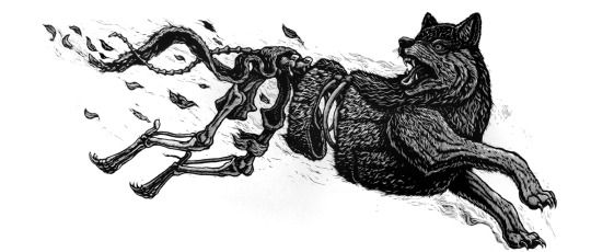
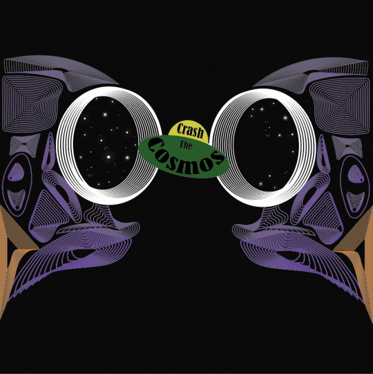
#tried a new technique of drawing black and white and colouring it with layer effects
Explore tagged Tumblr posts
Visit Tumblr Blog
Explore Tumblr blogs with no restrictions, modern design and the best experience.
Last Seen Tumblr Blogs


Fun Fact
The total number of visits Tumblr.com received during January 2021 is 327 million.
Text
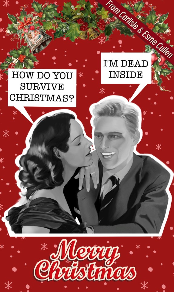
It's time for Carlisle and Esme to make their 1950s photos into funny Christmas cards
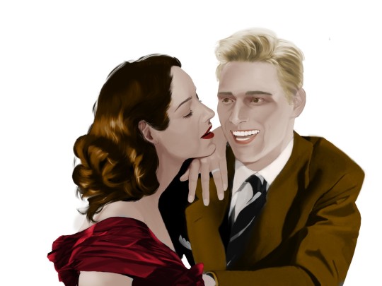
#I know its a little bit early but happy christmas🥂#tried a new technique of drawing black and white and colouring it with layer effects#it surprisingly came with a vintage style that i quite like#twilight#esme cullen#carlisle cullen#carlisle x esme#twilight fanart#my art
125 notes
·
View notes
Text
Kyoto Print ideas from stones:


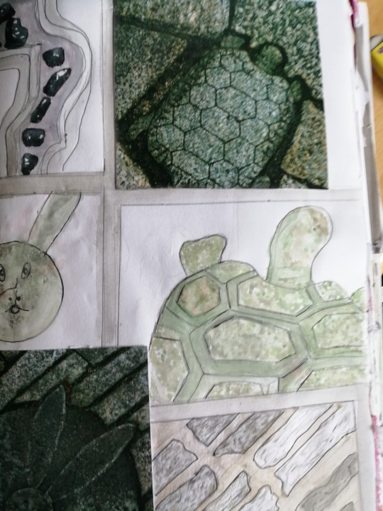


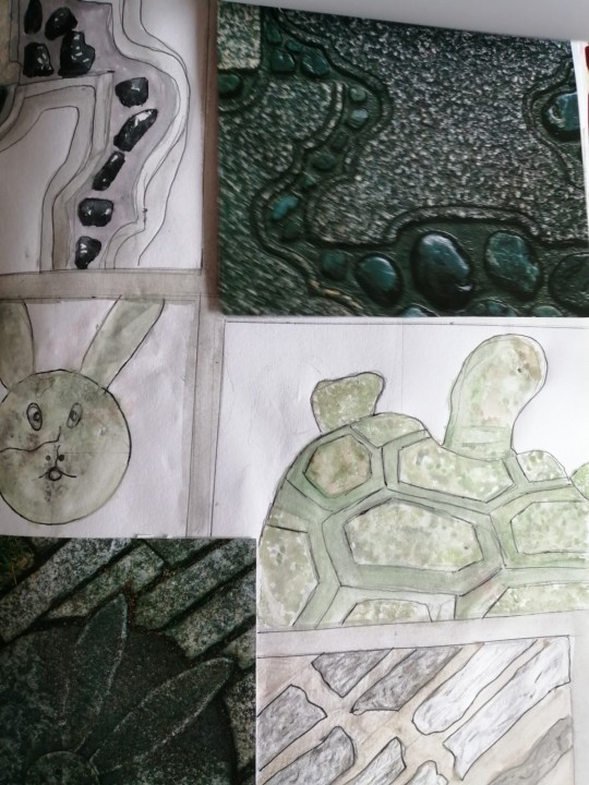
This is my continuation for my Kyoto Garden research page, I had found some stonework prints that I thought would be helpful and I could create some print ideas from these. So, I had started to plan where each drawing was going to be placed, I drew rectangles and squares and created a 1cm border around each one. I then had some room to place my reference photos, but I had created a flip through version of my photos to attach on top of my page as I had a unique idea compared to my usual style of adding half a page to my sketchbook page. I started off to draw an outline of each stonework I wanted to focus on such as the turtle, the rabbit, the rabbit stone background, and a pebble path. For each drawing I had chosen a different media except for the rabbit and turtle illustration. For these I used a mixture of coloured pencils, and watercolour to create the mossed over stonework. It was quite difficult to capture this, so I tried my hardest to create this effect by using a range of greens, greys, browns and even gold. But from this it had character and the effect of mossed stone. I had outlined the details using a fine liner pen. For the pebbled path above the rabbit, I had used my Pro markers and watercolour. I had started with the outside shape with creating depth with various shades of greys to make the stonework look 3D. I used the moss stone recreation for the inside stop in the middle of the pebble path as I wanted to make these realistic as I could. Then I focused on the shiny pebbles inside the path. I had started to colour in the pebbles in a black Pro marker and then I carefully looked at each light reflection of each pebble. Then I used a white gel pen to highlight these light reflections to capture the detail and realism in my illustration this worked quite well for me. For the rabbit stonework background, I decided to trial three different medias to recreate the stones. To start off with the first once at the front I used coloured pencils and pencil shading. I had initially started with lightly shading each stone for a base layer and then I had shaded and added some depth with using a darker tone of the pencils to create the ridged look. I used some green, greys and brown coloured pencils to add some moss to recreate the reference photo. I think I have captured the texture, shadow, and light reflection quite well on these for my first attempt. From my second layer of stones, I had used only pencil shading leaving them in a Monochrome look and these worked quite well but I did prefer when I had added the moss look to them as it created a more sense of realism with aged stones in the gardens. Finally, I had used water colour, but I think the media of watercolour on this piece left colour blocks and did not create the texture of the stone as it looked flat and not bumpy. But at least I had tried it. All these stone works are inspired from Kyoto gardens but I wanted to separate these two elements as I thought the stonework gave me some ideas for prints with the details compared to the soil and flowers from my previous post where I can develop samples with textiles compared to the stonework especially for my collection is inspired by Japan as the stone work would fit more better with the theme of architecture or outdoor theme. From this this page is represented well and I am glad I am trying new media as I can use this knowledge and new technique in my media experimentation in my designs later in my journey in my project.
0 notes
Text
REFINE POSTER 3 [GMS BRIEF]
For my third poster design, I tried a new printing technique and I absolutely loved it. I love trying out new hands-on techniques and I will use this again and hopefully master it!
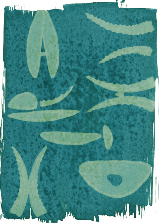
Cyanotype
Cyanotype is a printing process used in photography and creates a cyan-blue print. This process has been most popularly used since its creation in 1842 by engineers and a lot of cyanotype printing can be known as 'blue prints'. It is a process that uses a mix of chemicals to copy drawings or in our case, create images using everyday objects. The process is photo-sensitive and the application of the chemicals to a porous surface, allowed to dry in the dark and then exposed to UV light when ready to create your copied image as a contact print.
In printmaking, plants are typically used in this type of printing however you can use any solid object, pressed onto the sensitized paper usually with a sheet of glass over the top.
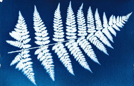
- An example of a cyanotype print using a fern leaf
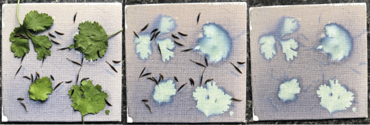
When I started, I tried a Cyanotype on a small piece of canvas with some every day objects and seeds to see if I could create a nice effect using plants and seeds. I loved the effect created however the canvas continued to develop and the image was soon lost.
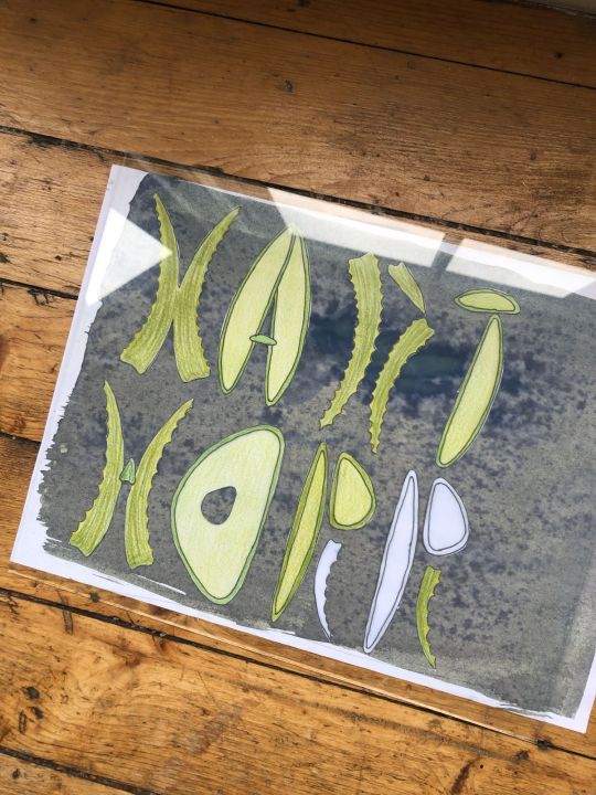
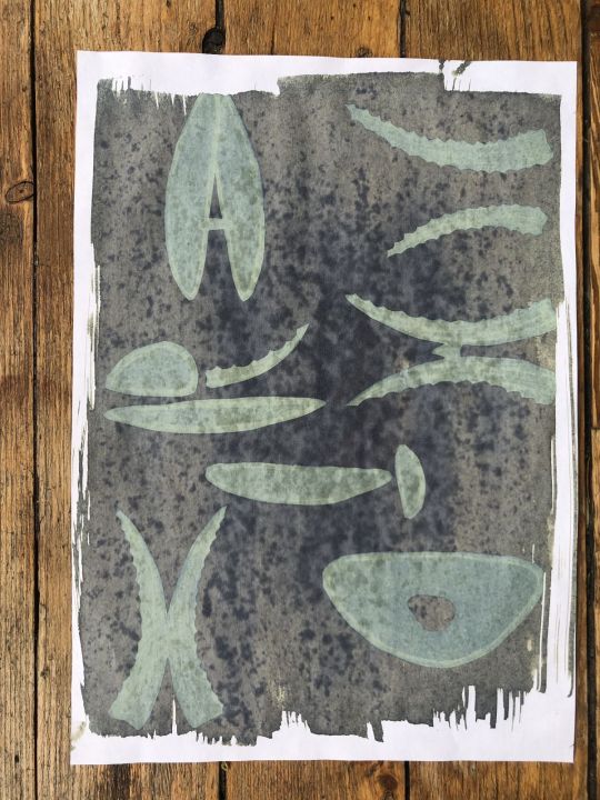
For my cyanotype experiments I used letters I had previously made for this project and placed them on paper I had sensitised with a chemical solution.
I arranged the letters and allowed them sit in sunlight for 30 mins. I had sesnsitised some recycled white paper as I wanted a grainier texture to the image however in the final prints, the recycled nature of the paper caused the ink to gather in spots and not dry fully. At first i wasn’t happy with this however in the end it worked out.
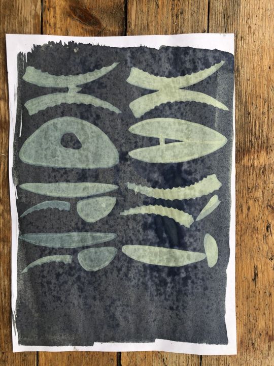
My first print came out okay - too much ink as mentioned but I did enjoy that the pencil strokes had even come through on the image.
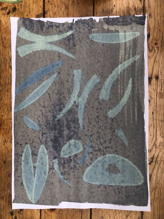
I tried again with another formation, this time arranging my letters at random on the paper.
I used a sheet of glass on each print and left under the window. This time for 40 minutes and this page I sat in the sun for a couple of minutes before I out the letters on.
I liked this version a lot as again, you can really see the different colours coming through from the different pencils in the rendering. The gathered ink on the recycled paper wasn’t great though.
On my third attempt, I changed the letters around again.
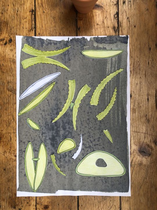
And my print came out like this:
I had added extra shapes but these were not coloured in and you can see this clearly on the print so I didn’t like this as much as the other two. I chose my favourite image and used that for my poster design.
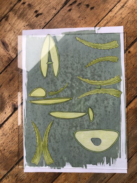
Using photoshop, I tuned the image a little, I wanted to pull through some greens to maintain the aloe feel. I had attempted to tone the prints with tea however this washed away my entire design so definitely something to play with in future.
I am so happy with this design - it has become the front of my final design solution. I then played around with fonts to use to go along with this and the back side of my poster can be seen below, using a typewriter style font to enhance the imperfect print style qualities. I brought some graphic qualities from the front onto the back of the poster to make it more dynamic and brought my font in black.
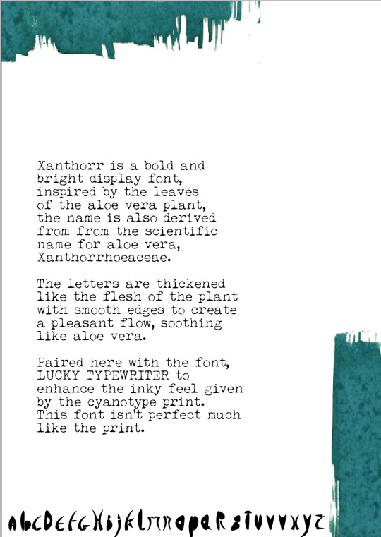
On reflection, I really enjoyed this process and would use it again. I spent a good amount of time looking for fonts that could match up with the design (seen below) and I am happy I settled with this one. If I were to do it again, I would perhaps try layering cyanotype on top of each to see how that would work or I would move the letters about halfway through processing time.
5 notes
·
View notes
Text
WORKSHOP// RELIEF PRINTING
The following prints are the first tries from my induction into the relief workshop. I chose my fearful matchstick from that weeks drawing exercises as part of the new unit two project Assembly. I only had the time of a single day to produce these prints, so some are unsuccessful because I had printing wet on very wet, and so some layers are not as clear as they could be.
Relief Printing- Relief printing is a printmaking method which uses lino or wood as a ‘plate’, and involves gradually removing sections to build up layers of colour, starting with removing sections that must stay white. I am familiar with the process and had created a few on my foundation course. However, I had never had access to such high quality equipment like the big press at Camberwell, so this was a much more satisfying experience. I had to get my head around the process of leaving sections you want to print the next colour and cutting sections you want to remain the last colour again, which can be quite confusing, but overall I love the roughness of the technique and will definitely return to become more proficient at it.

Above- A two colour print- base yellow and black. The shapes are the cleanest and the black best printed in this one because the yellow was completely dry when I added the next later. This is because I created all of the other prints while the yellow was drying! I think this print is successful, however I don’t think it accurately expresses emotion as I wanted it to, and seems too simple.

Above- an unsuccessful experimental addition of blue- it hasn’t printed well because the previous layer was still too wet.

Above: The lino plate itself after printing the last later.

Above: An unsuccessful printing of black over the blue layer which can be seen previously. The blue was still too wet

Above: A more successful print of black over blue, orange and yellow layers. The ink was still wet, but still allowed of some definition. This is one of my favourites.

Above- My favourite print of the session- I think the roughness and mistakes on the print only add to the ‘fire’ effect. This one really displays the fires ferocity and the matchsticks emotion how I wanted it to.

Above- The black in this one looks really muddy, but I think the flame itself looks very effective.

Above- the semi-failure of the black layer on this one has actually given it quite and interesting effect. I think if I edited this one in Photoshop to add a bit more contrast to the black against the orange, that it could actually be quite a successful print.
1 note
·
View note
Text
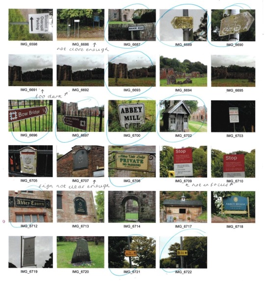
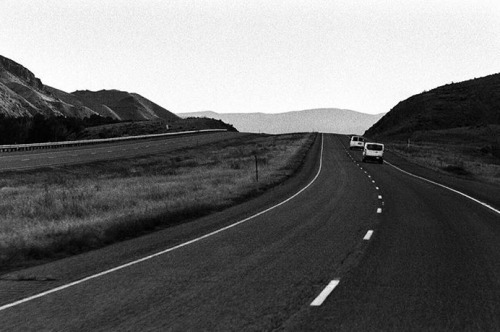
Road Signs
Our first photography workshop was to photograph a range of road signs, but we weren’t told what we would be doing with them. From here, we explored the town, taking images of road signs and buildings which may be of use.
When we returned to the classroom, we were told we would first be producing a topology of signs, and after that we were to produce a ‘landmark’ collage using the images we had collected, influenced by artist Nelson Figuerado, his work can be seen below.
Upon continuing to research Figuerado’s work, I came across a similar artist, Brian Hubble, who’s work can be seen below.
I much preferred his work, due to the lack of colour schemes and more recognisable imagery as oppose to so many layers. From here, I made a contact sheet and chose which images worked best to use in my collage, before opening them up in photoshop, ready to begin making layers.
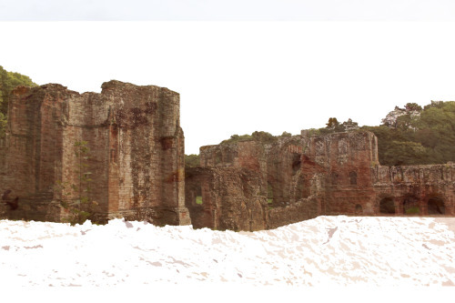
Firstly, I opened an image of the Abbey, which I had taken on my journey around the town. I removed the background and ground beneath, but left the trees behind to add depth. Next, I added a new layer, which was a scan of my homemade paper, to add a worn, decrepit texture to reflect the history behind the building itself.
From here, I created a new layer, and imported all of the images I collected of roadsigns. I tried to keep the lighter coloured road signs in the centre, as I knew this would be the centre of the image when the layers were merged later on. Next, I added a white rectangle layer, and altered the opacity to be much lower, producing a fog over the signpost background. Then, I added this layer into the background of the textured Abbey building, to reflect the clouds in a more abstract way.
I was unsure where to go from here, and as I didn’t find it as effective as I had hoped, I therefore decided to start afresh. I began with the same plan, importing the image of the Abbey as a starting point.
Then, I opened a new document in Photoshop and imported the dark coloured signpost images, as I wanted them to be similarly coloured to the building itself. I then layered and resized them in the correct place on top of the building image, and once I was happy with the placement moved that layer beneath the building layer. I then lowered the opacity of the building to 73%, which allowed me to see the signposts beneath the building, but softly. I then removed any areas of the signpost layer which didn’t fit inside the building itself, using the quick selection tool, which meant the cloud was left clean.
I altered the levels of the signpost layer, and altered the contrast of the building, allowing it to be soft, but still quite bold. I was pleased with this outcome, and felt that although originally I had planned to do the same with the clouds, I felt that leaving them as the original image as oppose to filling them with layers made it look a lot cleaner and professional overall, so left this as finished.
I felt that this was a learning curve for me, as this abstract Photoshop layering isn’t something I have used before. Although I felt my first attempt was a disaster, in the end I was pleased with my more minimalistic, softer result, and therefore if I were to do this again I would try to stay in this region, as I felt it worked best.
Aperture
Aperture is the opening of the lens and the amount of light being let in. The larger the f stop number, the less light is being let in due to a smaller opening of the lens. The smaller the f stop number, the more light is being let in due to the larger lens opening. Using the ‘Av’ option on my Canon 700D, I am able to alter the aperture, whilst the shutterspeed is automatically altered accordingly.Depth of field is the amount of the shot that is in focus, with a large depth of field meaning all or the majority of the shot is in focus, whilst a small depth of field means only part of the image will be in focus, with the rest of the background blurred. Large aperture increases the depth of field, and a smaller aperture gives a larger depth of field. To break it down simply for reference:
Larger f stop number - smaller opening, smaller aperture, larger depth of field (majority in focus).
Smaller f stop number - larger opening, larger aperture, smaller depth of field (background blurred).
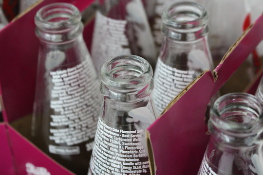
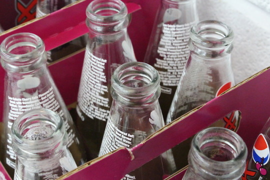
Above, the first image has a large aperture (lower number - 5.6), with a shallow depth of field, blurring the background, with the same again on the three images below.
Below, the first image has a large aperture as described above, blurring the background and surrounding bottles, while the second image has a small aperture (larger number - 16), giving a wider depth of field and allowing everything to be in focus.
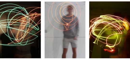
Shutterspeed
Shutterspeed is the amount of time the shutter is open. On my Canon 700D, using the ‘Tv’ option allows me to alter the shutterspeed, with the aperture being automatically set accordingly. The smaller the fraction, the faster the shutterspeed, which will photograph the motion paused/still, with no blur and no movement, meaning splashes of water can be captured sharply. The larger the fraction, or whole number, the more movement and blur is captured; which means drawing with light can be captured perfectly using a slow shutterspeed.
I have included my annotated contact sheet of both my shutterspeed and aperture images below.
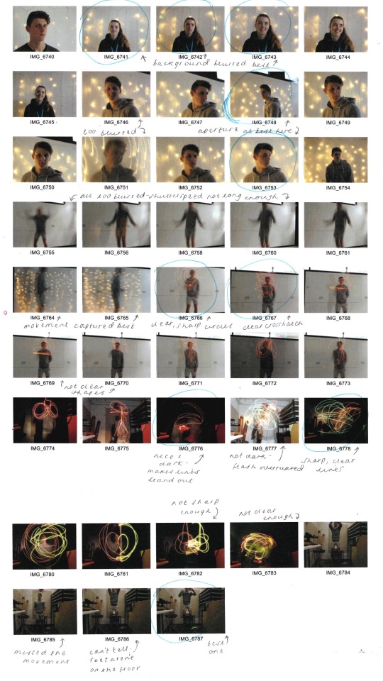
The below image was captured using a very slow shutterspeed at 5″.
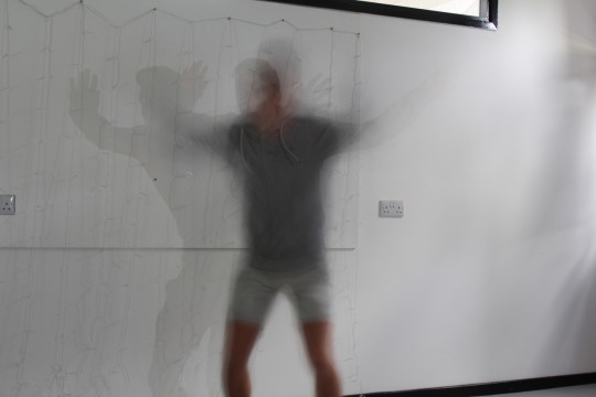
Again, the below images were captured using a very slow shutterspeed at 6″, allowing the light drawing to be photographed both in well lit surroundings and in the dark room.
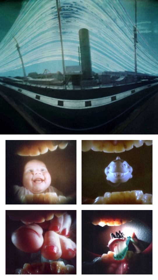
Pinhole Camera - Justin Quinnell - Artist Research
Justin Quinnell is a pin hole photographer, who produces strange and wacky images using the pin hole camera technique. This technique allows him to produce images like the one of SS Great Britain in Bristol, seen directly below; which was done as part of his collection of ‘Solargraphs’, which all use 3-6 month duration exposures, giving the background effect of the swirls of light.
These aren’t my favourite pieces of his work, however, instead I much prefer his collection ‘Mouthpiece’, in which the pinhole images are used by placing the camera in his mouth. Whilst these images, seen below, are weird and something I���ve never seen done before, I think the subjects of these particular images give a warm, nostalgic aura for the viewer, and whilst they are contemporary and strange, I love that they juxtapose with the very traditional and old fashioned method of using the pinhole camera, which I think makes the images all the more effective.
I am very pleased to have been introduced to Quinnell’s work, and his images have inspired to produce pin hole camera images of different varieties, which will be seen in my development.
Pinhole Camera
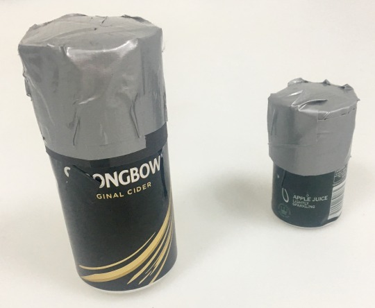
After researching Justin Quinnell, we were then to create and use our own pinhole cameras. These can allow up to 6 month exposure times, catching the lines of the sun moving across the sky.To produce our cameras, we used the instructions linked on Quinnell’s site; which were as follows:
Get an aluminium drink can.
Cut the top off with a can opener and sand the top edge using sanding paper.
Cut an 80mm x 210mm strip of black card, adding cut notches along the long edge and creasing them over.
Cut a circle of card to cover the top of the can.
Turn the can over and tape the card strip tightly around the can.
Fold over the notches and place the circle of card on top, then use duct tape to cover the lid.
The lid is then finished, and can be taken off and placed on the open end of the can.
Then, add a hole using a pin half way up the can. Fold a piece of electrical tape over the hole as a make shift shutter.
Finally, go to the dark room and be in red light. Take the lid off the camera, insert photographic paper, and allow the gap between the two edges of the paper to be where the pinhole is.From here, with the pinhole still covered with tape and the lid back on, we were able to go wherever and use our cameras.
My first pinhole image can be seen both as the developed image and as the inverted image below. This was done indoors and was over exposed.
My second attempt at pinhole photography can be seen below, this time I was much more pleased with the outcome...
When my pinhole image was inverted in Photoshop, the outcome can be seen below. I had my exposure time just right, (12 seconds outside), however the camera was positioned too high up and therefore only caught the top of my subject’s head, but still got the surrounding trees.
I would most definitely love to try the pinhole photography process again in my further development, as I loved the developing process and unpredictability of results.
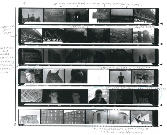
Black and White Film
For our next photography workshop, we were introduced to the world of film photography. In this workshop, we were taught how to use the film camera, explained how to think about our images beforehand due to the limit of film rolls, and then taught how to load the film and develop it in the darkroom.Firstly, I made a Pinterest Board of inspiration, where I realised portraits of wrinkly faces and close ups of architecture were my favourites of people’s outcomes. I also explored the Instagram hashtag ‘film is not dead’ and screenshotted my favourite black and white photographs from other photographers and artists; which I have inserted below.
nickexposed - “The Last Best Place”
cmchappuis
latolome - Dollhouse
In doing so, I also thought about previous images I had taken and whether they would be appropriate locations to take black and white film images. I added monochrome filters to my favourites, with the one pictured below being the best and most effective, therefore I added this to my list of locations; scanned in below.
From here, I visited my locations, shooting at each one. Once I had used all 36, I returned to college to develop my images in the dark bag. First, we had to load the film onto the reel. Once we had loaded the film onto the roll, we then had to place the reel inside the developing tank, ensuring it was properly shut and wouldn’t allow any light in. Then, we were ready to develop the images, using the following process, but in the developing tank as oppose to in the trays.
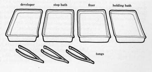
Step 1 - Developer: The developer causes the exposed areas of film to turn black. Areas that weren’t exposed will stay clear, and the areas which were only slightly exposed will turn grey. This takes 12 minutes and the container needs to be constantly turned and moved so that the developer hits all areas of the film equally. Step 2 - Stop Bath: This stops the developing process and only takes about 2 minutes. Again, the tank needs to be constantly moved. Step 3 - Fixer: The fixer makes the image on the film permanent, and takes about 5 minutes. Again, the container needs to be constantly turned and moved. Finally, the paper/film needs to be placed in water for a minute to remove all the chemicals from the paper. The film is then hung up for an hour to dry.Once dry, the film is then split and cut into strips of 6; doing so makes it easier to store and use. Then, the strips of 6 are placed into the holder to make a contact sheet with.To make the contact sheet of images, once in the holder, we then hold the glass case under the enlarger and make sure the light will hit all areas of the case. Next, all the lights are turned off and the photography paper is put beneath the film in the case. The enlarger is run for 0.5 seconds to expose light through the film, and then the contact sheet is put through the developing process explained above. Once done, the contact sheet is complete and can be left to dry before scanning into the computer and used to determine which images will be used to produce prints from.
After making a contact sheet and choosing which images worked best, it was time to make a print using the enlarger and photographic paper. To do so, we inserted the film into the enlarger, and used a test strip beneath the enlarger, covering ¾ of the strip with our hand. We then allowed the enlarger to run for 0.5 seconds, and moved our hand further down the strip, now covering ½ of the strip, and allowing it to run for another 0.5 seconds. This means the first exposed section has now been exposed for a second, whilst the second section has only been exposed for half a second. We continue this process another two times with this strip, and from here we are able to see whether one of those exposure times works perfectly, or whether it needs to be exposed for even less than 0.5 seconds, in which we then try another test strip.
The enlarging tester strip above uses 0.5 secs for each square, left to right.
The second enlarging tester strip above uses 0.2 secs for each square, right to left, then below is the final enlarged print; exposed for 0.6 secs but in hindsight probably needed 0.8/1 seconds exposure.
Below is a tester strip for a second print, using 0.2 secs exposure for each square, left to right.
Below is the final enlarged image, exposed for 1 second, yet in hindsight could’ve been exposed for 1.2 secs.
Portraiture
Portraits can be used to convey a multitude of emotions, and capture compositions, lighting, props and costume. Light can be used in portrait photography in different ways; with artificial light being added, and light being subtracted to produce shadows. Reflectors are used to reflect the main source of light into shadow areas; softening the main lighting source. A reflector can be a flat white board, stretched sheets of white fabric, or even just a white sheet of paper.
For our portrait photography workshop, we were set the task of producing a range of portraits using the following starting points:
Dramatic light - black and white
Two people interacting
Formal portrait
Informal portrait (considering props, costume, lighting and setting)
Fun image
Fun Portrait
I began each photoshoot by annotating a contact sheet of inspiration images on Pinterest, seen under each heading below. Then, once I’d chosen which I felt were more effective, I went on to take my images.
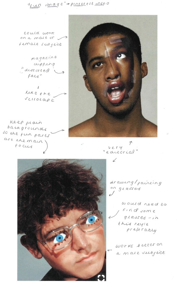
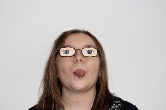
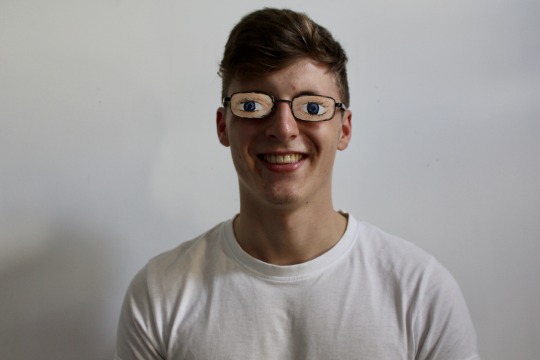
Below is an annotated contact sheet of my fun/creative images, in which I went with painting eyes on a pair of glasses and getting my subject to wear them for the images, both in and out of character.
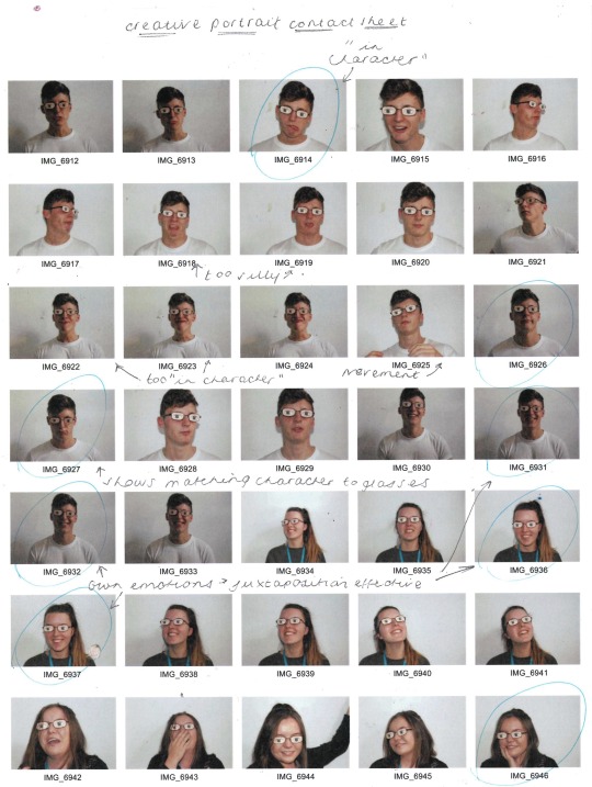
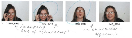
As noticed in my inspiration images, the glasses appeared most effective on my male subject, particularly whilst my subjects were being themselves, as oppose to being in character.
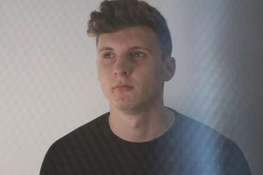
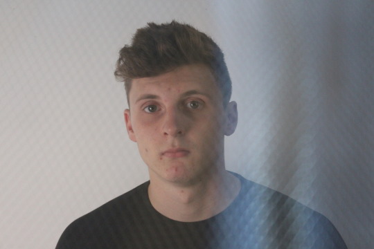
Whilst taking these images, I also experimented with a sheet of wire mesh. I first began using it as a screen, but soon realised that it not only was giving me texture, it was also producing light flares of colour. Whilst these two images weren’t my original intentions, I also felt that these fit under the creative portrait category, and am pleased with their outcome.
Self Portrait
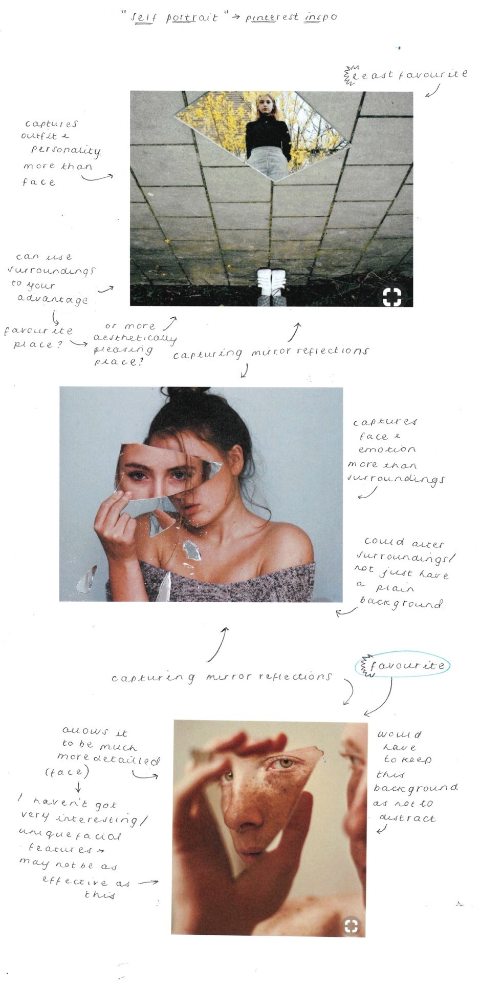
Informal Portrait
Likewise, I began with an annotated inspiration sheet from Pinterest for the informal portraits. Here, I felt that playing with light worked most effectively, and whilst the water and bath images were beautiful, they would require a striking subject.
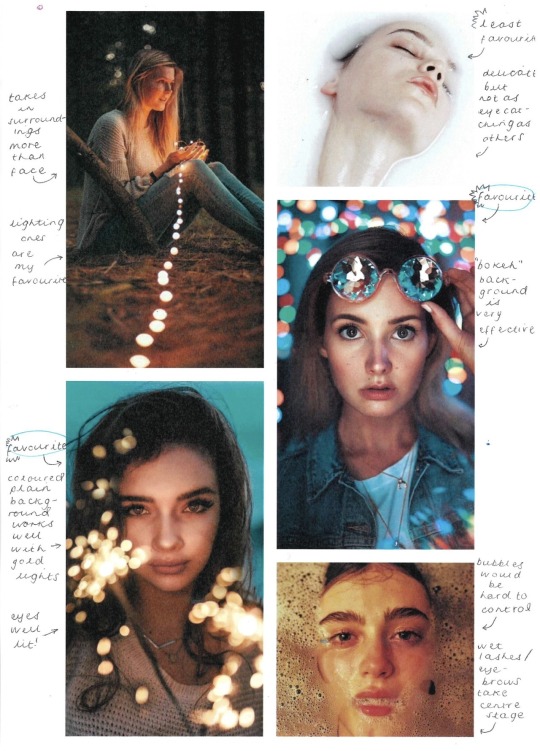
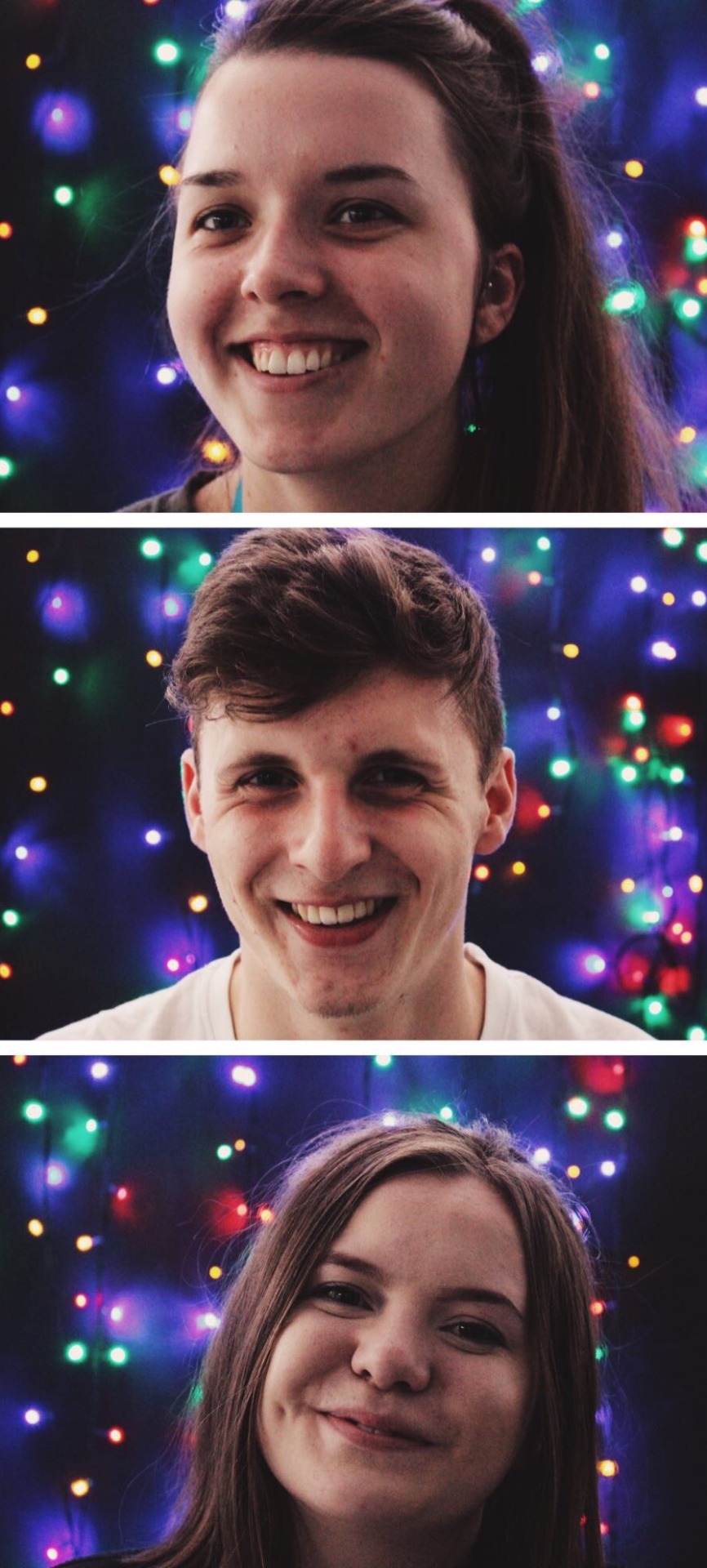
Below are my annotated contact sheets of my informal portraits. I decided to try the bokeh technique, as I felt this was the most effective from my inspiration sheet, however I had never done this before and wasn’t sure how. Andy talked me through it, and whilst I knew the aperture had to be on a low number to allow the background to be blurred, I didn’t realise the subject had to be as close as possible to the camera. Once I had this explained to me, I was then able to take my fairy lights to the photography studio and take my images.
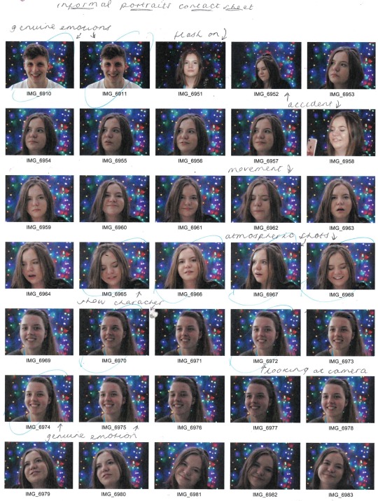
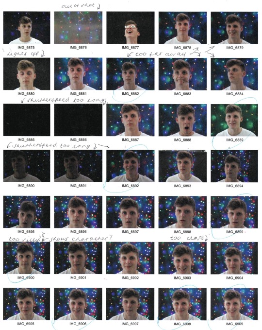
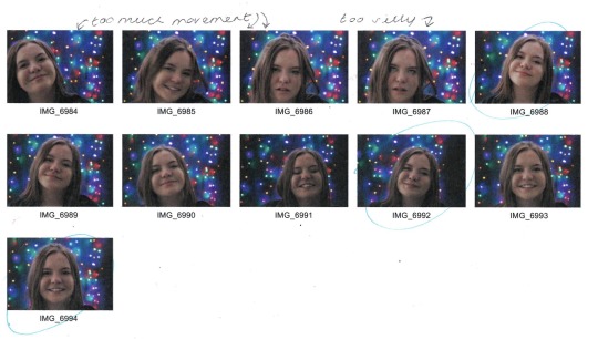
I was very surprised at how effective the images were, and was extremely pleased with my outcome. I chose my best three images to be displayed as a triptych, which all captured people mid laugh, and I felt this raw emotion gave a considerably better portrait image than any of the posed ones.
Black and White Dramatic Portrait
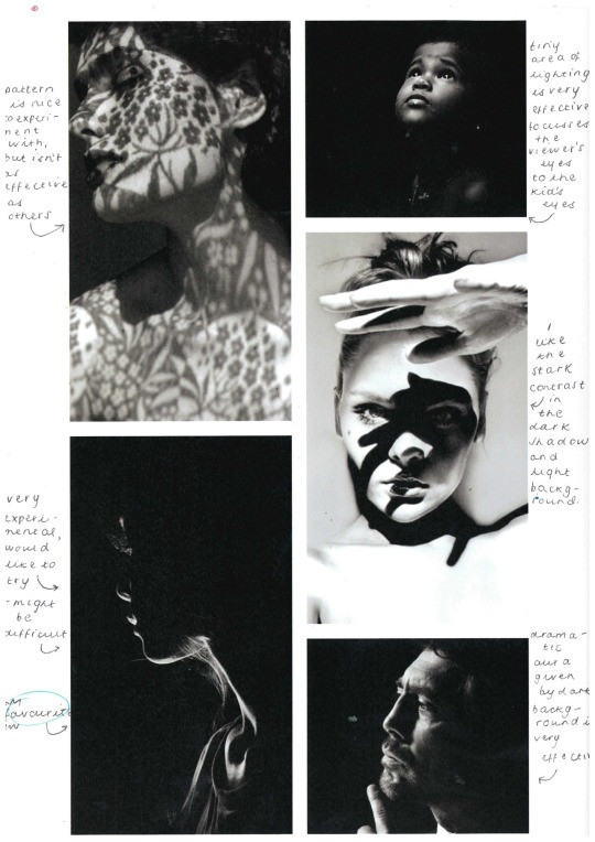
I realised from my annotated inspiration sheet, seen below, that the most effective black and white portraits were those with shockingly stark contrast.
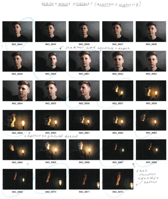
I played with this idea, seen in my contact sheet below, using softboxes to add light to certain areas of the face, and eventually using a filament bulb, which worked considerably better.
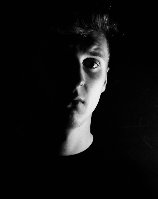
My favourite outcomes from this shoot are seen below, edited to remove the colour and up the contrast. I think these images are extremely effective, and I would like to experiment more with black and white imagery and heavy dramatic lighting in the future.
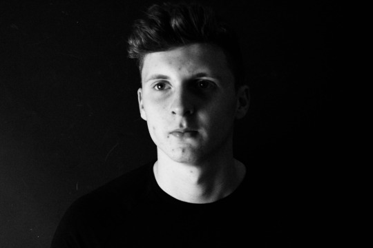
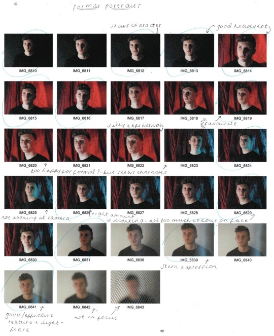
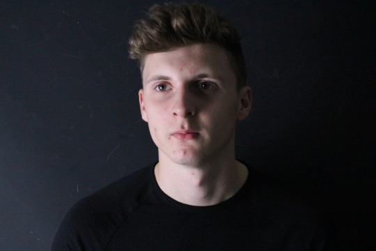
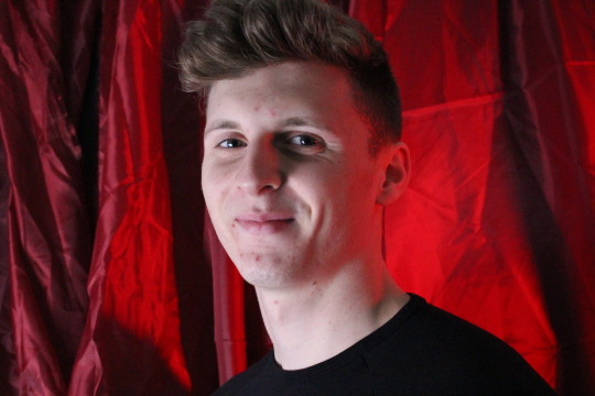
Formal Portrait
I didn’t produce an annotated inspiration sheet for the formal portraits, as I knew that these just had to be plain and simple, with a posed subject, however I knew that I still wanted to play with light and background colours. Below is my annotated contact sheet, where I decided headshots worked best, especially those without any coloured lighting hitting the face. Shadows (produced with the use of a softbox) worked extremely well, and whilst I felt the serious images were effective, I preferred the ones with a smile as I liked the character they portrayed.
Abstract Photography
Our next photography workshop was to explore shape, form, colour and texture in an abstract style. Using a camera, we were to photograph textures and abstract shapes, zooming in to get closeups and macro shots. We were then to edit and alter the images in photoshop, using layer opacity, layer blending, filters, select/cut/erase/duplicate, hue/saturation/threshold, warp/distort/skew.
Some artists that use abstract photography techniques are Kim Keever, Bill Brandt, Russell Tomlin and James R Page.
Kim Keever - Keever ‘paints with water’, producing landscape and abstract images by ‘dispersing paint through the water adding a certain character to the constructed landscape in the tank and a high degree of randomness to the abstract images’. I love Keever’s work as it is beautifully delicate and fluid, and I feel that the colour palette he uses throughout really adds to this delicate and peaceful aura, making it more effective.
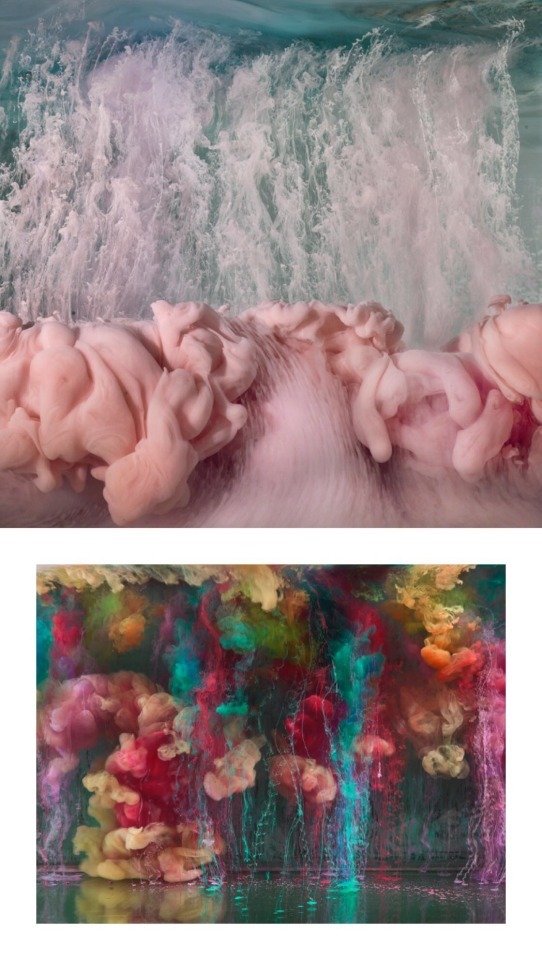
Russell Tomlin - He says his ‘work in photography is driven by the details that emerge from the visual aesthetic I encounter when looking at and into water in its various forms—still water, flowing water, rain or snow, fog and cloud’. While I love the fluidity of his work, I don’t find the colour schemes as effective and calming as Keever’s, but I believe this is due to Tomlin’s editing process as oppose to dispersing actual colours of paint through the water like Keever does.
I will be using the influence of these artists to take my own abstract images and produce my own edited, layered pieces.
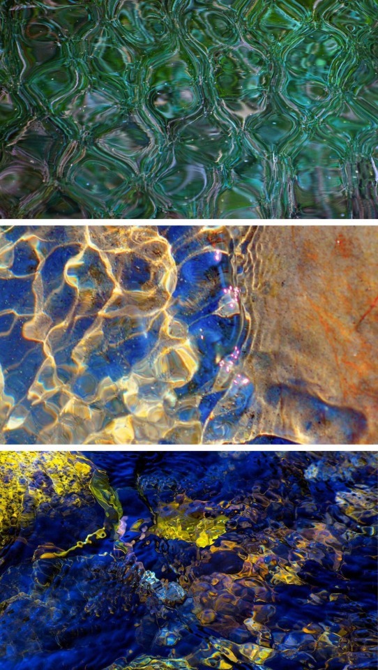
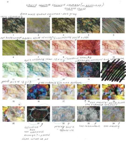
I took 10-20 images, using my knowledge of aperture particularly, then annotated the contact sheet, seen below. The most effective images were those of much closer textures, taken in macro mode.
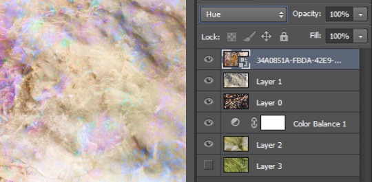
From here, I began to edit and layer the most effective images in Photoshop, the images I produced with their corresponding layers can be seen below.
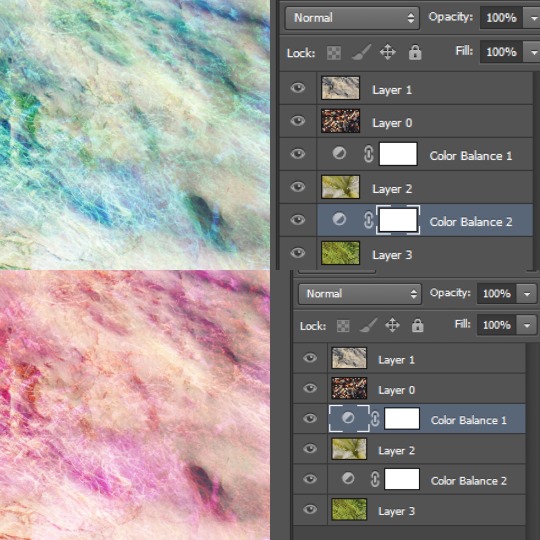
The four edits below are done by changing between using two, three and four layers, as well as altering the blending modes but keeping opacities to 100%.
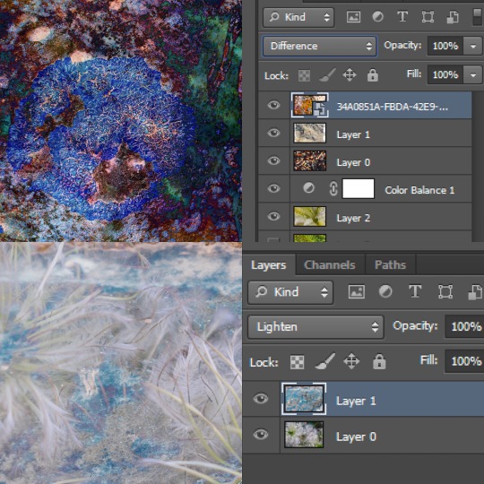
The 4 images below are edited by changing between using two and three layers as well as altering the blending modes but keeping opacities to 100% and keeping layers in the same order.
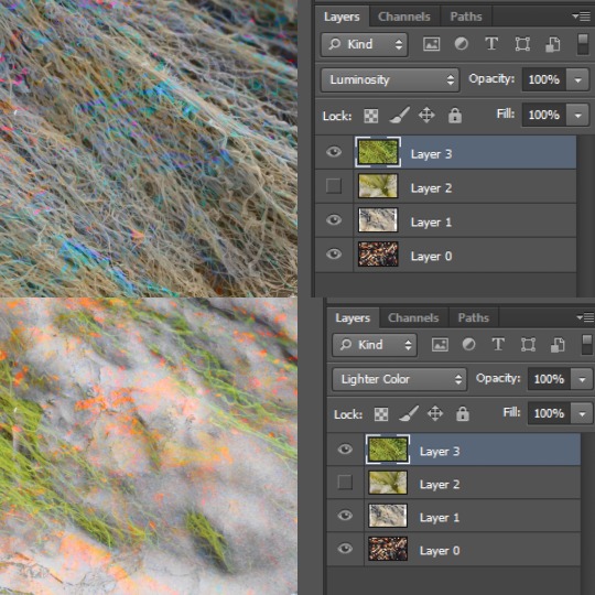
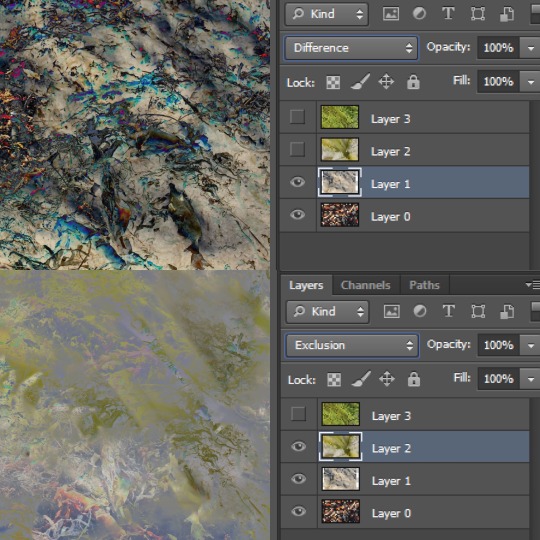
The five images below are done using all four layers and adding two colour balance layers.
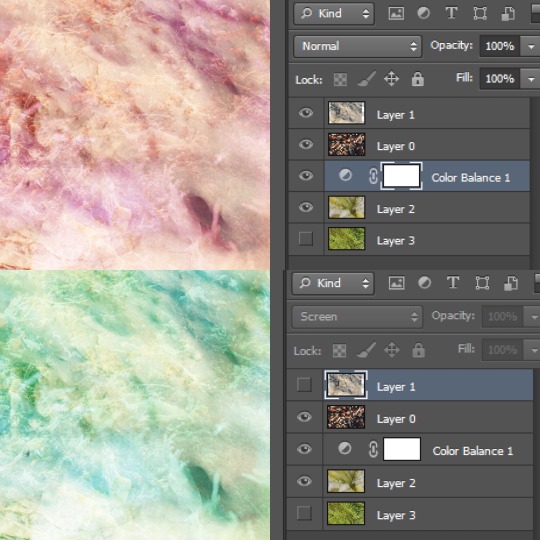
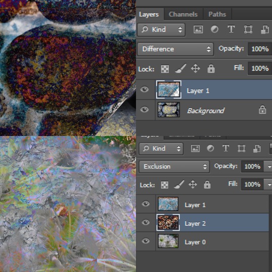
Then, I annotated a contact sheet of the final edits, choosing the edits I felt to be most effective; which in this case were the more delicate, fluid abstract images, reflective of Keever’s work which I previously explored.
I whittled these edits down to the best six, then annotated these below, explaining what layering techniques were most effective and which initial images were included in each process.
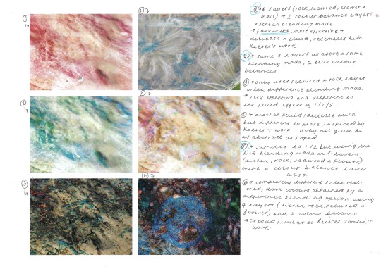
From here, I chose my favourite and most effective abstract image, which again is very similar to Keever’s style, but has a more “electric” addition, from my own experimenting.
1 note
·
View note
Text
Silver Jewelry – By My Best Luxe
Silver Jewelry tends to lose its brilliance and even becomes black over time. The chemical reaction between Silver and Sulphur in the air is the reason behind Silver Jewelry getting tarnished. Most of the silver jewelries and accessories nowadays are plated with a super thin Rhodium layer to protect it and the metal shiny. This thin protective coat, however, makes it easy to blackish silver items.
Perfumes, cosmetics, hair spray, creams, skin oils, and even a few foods can tarnish the metal and make it lose its glossy lustre. Fortunately, it has been possible to remove tarnish, polish and clean silver in economical and straightforward ways.
No matter how carefully kept, they naturally tarnish with time, your silver jewelry, food, and cuts. While silver requires no more maintenance than ordinary household products, such as bed sheets and cooking equipment, it must always be cleaned to restore its original shine. Your most widely used rings, necklaces, and other pieces of jewelry may only need some polishing, but any finely displayed silver or tucked-in jewelry box may need cleaning, especially as the air and light chemical reactions cause silver to tarnish.
Please remember that polishing is abrasive, regardless of how fine your hand is, so cleaning should be kept to a minimum — from two to six times a year.
What is Tarnishing
Tarnish is a thin sheet of corrosion that occurs quickly on your silver jewelry, resulting in a black coating making it unappealing to the eyes. Tarnish is the dulling of silver that occurs due to a chemical reaction with Hydrogen sulphide or Sulphur in the atmosphere. Some people believe that oxidation causes tarnish, however, this isn’t true because silver isn’t reactive to water or oxygen at normal temperature. However, the metal in the alloy, such as copper, has a proclivity for reacting with oxygen.
This is why silver is usually kept in airtight containers; nevertheless, because most jewelry boxes and cabinets are not airtight, the tarnishing process will still occur, albeit at a reduced rate. Your silver jewelry may react with your skin’s alkaline levels, in addition to the air. Perspiration contains Sulphur and amino acids, which can colour your skin and jewelry. This form of yellowing can be avoided by cleaning the jewelry on a regular basis.
Using Aluminium Foil with Baking Soda
This is one of the best products in our arsenal of silver cleaning. If you need to clean up several things or larger things like silver cutlery, candlesticks, or tableware, your aluminium-soda bath is very useful. Top with the shiny side of the bottom of a large bakery pan. To avoid unwanted chemical reactions, use ever-metallic ceramic or glass bakeware. Add the baking soda to fill with water. For each gallon of water, you need 1.5 tablespoon of soda. Bring to a boil, put in the tarnished silver for 15 seconds. Use kitchen tongs to remove the silver. Allow the silverware to cool down on the paper towel.
Using Ketchup Clean-up Tactic
It may sound strange, but ketchup is excellent for removing tarnish from silver. If you only have a couple of silver items to clean, this method comes in handy. Using a paper towel, gently rub the tarnished silverware or jewelry with a few drops of ketchup. If there is old tarnish, apply ketchup directly to these areas and let it sit for 15 minutes. Then, using a microfiber cloth, rub the area and rinse with water. More details can be found on some items, such as fancy candlesticks or silverware. To clean the tarnish, use a soft toothbrush to reach into crevices.
Using Toothpaste
This is a tried-and-true DIY silver cleaning recipe. Make use of non-gel, non-abrasive toothpaste. Squeeze some of it onto a soft cloth or paper handkerchief. To polish and remove tarnish from jewelry or silverware, rub it in circular motions. After 5 minutes, rinse with water to remove the toothpaste. Following this procedure, the silver is as clean and gleaming as new.
Using Window Cleaning Detergent
Window cleaner is effective not only on glass surfaces, but also removes dirt and restores the lustre of sterling silver. Apply a small amount to a cloth and begin scrubbing your jewelry or silverware. Scrub around small details and ornaments with a soft toothbrush. Never use this recipe on antique silver, such as cutlery, candlesticks, jewelry, or silver accessories – antiques are extremely fragile. If you need to clean antique silver, we highly recommend using a specialized product instead.
Mixing White Distilled Vinegar with Baking Soda
This recipe is not suitable for antique silver. Nonetheless, it is an excellent method for restoring the lustre and shine of your sterling silver jewelry and cutlery. Place the silver items in a suitable-sized bowl and cover them with white distilled vinegar. Pour in the baking soda – the approximate proportions are 4 tablespoons baking soda for every cup of vinegar. Allow the silver to dissolve in the mixture for 1 hour. Rinse thoroughly with clean water and pat dry with a soft cotton cloth.
Adding ammonia & water together
This is a simple way to adorn silver cutlery, jewelry, and accessories. Make a solution with 1 part clear ammonia and 2 parts warm water. Soak your silver items for 10 minutes in the liquid. After the timer goes off, remove them from the solution and polish the surface with a soft cloth and a dry cotton cloth. Ammonia should not be used on antique silverware or silver jewelry.
A Mixture of Water & Cornflour
If your silver has lost its lustre, this recipe will assist you in restoring it. Apply a thick paste of water and cornflour to the silver item. Allow the mixture to dry completely before buffing it off with a towel to restore the shine of your jewelry and silverware. If you run out of cornflour, use cream of tartar instead.
Jewelry wise cleaning
Cleaning Silver rings
Because silver retains its lustre best when worn frequently, everyday all-silver rings tend to have a certain level of daily sparkle. However, rings that have been neglected for an extended period of time (or that have not been properly stored) may necessitate extra care.
If soap and water were not enough, a clean toothbrush can be used to scrub any tarnished detail work. The above-mentioned do-it-yourself methods can also be used to clean silver rings.
The best approach for cleaning silver rings will vary depending on the other components in the piece, such as turquoise, pearls, and other jewels or precious metals. Certain cleaning methods may cause some level of damage to them. Baking soda, for example, can scrape fragile metals while vinegar can ruin permeable stones. If the ring is valuable, get professional advice before cleaning it.
Cleaning Silver chains
Silver chains on necklaces and bracelets tarnish easily when exposed to lotions, perfumes, and perspiration, so these delicate objects require extra attention. Fortunately, you can clean chains using the same way as silver flatware.
When sulphur atoms mix with silver, they form silver sulphide, which tarnishes the metal. This cleaning process use aluminium foil to draw the sulphur atoms away from the silver to make the piece gleam. This technique is effective, but it has an awful odour.
FAQs
Does cleaning silver with baking soda damage it?
While baking soda and aluminium foil can remove tarnish from silverware quickly, some dealers warn against using it in ancient silver. This is because this can be too abrasive and ruin the finish (particularly if you’re not sure of the origin and the parts may not be really sterling silver).
Can Coke clean silver?
Silver is a standard metal for jewelry or supplies. You can use Coca-Cola or coke as a simple substitute for sterling or plated silver, if you have no chemical cleaner. Coke acid works to cut the surface of silver through any grime or rust.
About Us –
Living a fulfilled life does not cost you a fortune. Elegance is a choice of lifestyle, it’s not luxury. You need not be making millions to live your life fully.
My Best Luxe is an online one-stop platform where we bring you all the information related to specific luxury lifestyle items. It’s a curated list of everything to do with living a fulfilled life.
Want to understand whats the latest trends in fashion, jewelry, accessories, or lifestyle in general? Stay tuned to our blog for all the updates.
We are a community of market experts who regularly research for trending updates of the market and bring it to our enthusiastic readers.
0 notes
Text
Art Analysis
cogc
task: Complete the assessment on printmaking processes
1. Identify which process of printmaking you see yourself working towards and using your own words, describe this genre. Identify the key characteristics of this process.
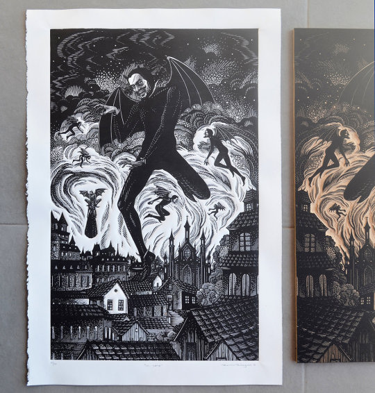
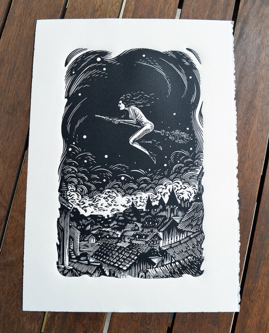
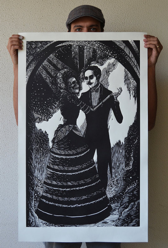
The process of printmaking that I see myself working towards the most is linocut. I haven’t been able to try much of the different techniques so I will be basing this off of the different processes that I have tried as well as from what I have found out from researching, and i have decided that linocut is the process that I see myself working towards. I like this technique as it is very easy to do and you can do any type of design easily, you can also get any level of intensity you want when doing this technique. Linocut also gives bold designs and clean prints. My genre of art is dark, horror and alternative styles. As my personal style is dark and alternative, I like to use this as the genre for my artwork. Usually when doing things such as drawings or paintings, I like to do detailed graphic pieces that have a lot of dark colours and tone/depth. When it comes to linocut, my genre changes a little. When doing linocut I still like to do alternative/dark designs but I try to make them a little more simple but still with the dark graphic ideas. Linocut is a printmaking technique where the artist cuts into a linoleum sheet with a blade to create their design. After the design is cut into the lino sheet, the artist then uses an ink roller to roll printing ink over the lino. The inked lino is then placed on a material and pressure is put over it to help print the design onto the material, this is usually done by using a press. Linocut is very similar to woodcut but due to the different variables of wood and lino, linocut can leave different effects and styles when printing. Lino prints can be created in masses due to the ease of reusing the lino sheet. The sheet used for linocut was created in 1860 by Frederick Walton in order to find a cheaper alternative material. The technique of linocutting was created in the 20th century although was frowned upon by artists due to its ease and lack of needing technical skills. German expressionists such as Erich Heckel and Gabriele Munter are thought of some of the first to come up with using lino for art purposes. Linocut was being used for black&white prints in 1912 in the UK, and russian artists started using it for prints by around 1913. Coloured linocuts were inspired by Claude Flight’s work and was taught in Grosvenor School of Modern Art from 1926-30. Picasso was famous for using linocut and made his first linocut in 1939-60′s, he is also thought of as the artist who started the “reduction linocut” idea - which is where a lino design/sheet is used multiple times in the one piece. Namibian John Ndevasia Muafangejo and Henri Matisse are also famous for their lino prints.
2. Choose 3 pivotal printmakers and their artworks to analyse and evaluate within your chosen genre.
Artist 1 - Ramon Rodrigues
Ramon Rodrigues is a graphic artist and printmaker born in 1982 in Florianópolis, Santa Catarina. He has various degrees in design and also has a studying background of drawing, illustration, anatomy, engraving and printmaking. Rodrigues specialises in dark gothic styled prints, which relate a lot to the same genre and style that I do in my work. From first glance, I can tell that Rodrigues specialises in black and white, there are some prints with colour but most of his work is black and white. This helps add to the horror and gothic genre of his work and works well with the designs of his prints. Another thing I noticed is the scale of his pieces, some are small little prints and others are very large, it’s very impressive to me how he manages to keep such detail and depth in his pieces no matter the scale. The main thing that I noticed when researching his work is just how detailed it is. Rodrigues’ work is filled with lots of tone and depth, all of his pieces have multiple layers of shading and all have little pieces of detail which help bring the piece together. The amount of depth and detail of his work is what really intrigued me and made me amazed at how good his work is. The amount of detail, depth and tone in his pieces make them look almost like a photo/realistic or that they were paintings (and not prints). These are three of my favourite pieces due to how diverse they are yet still all hold the great amounts of detail/depth/tone in them. Pieces like “Os Sete” are filled with objects in the background yet is still as impressive as something like “A Bruxa” which has less subject matter. All have different compositions, subject matter, layers etc yet are all as impressive as the other.
Artist 2 - Mazatl
Gráfica Mazatl is a printmaker based in Mexico City. His work centres around fighting for social, enviromental and political justice and works with groups related to these. The work that he makes is inspired by the work that humans do to “shake off the noose around our necks”. Mazatl creates pieces of printmaking, linocuts, woodcuts and also does murals. Mazatl is also a street/graffiti artist and is very into the punk scene. A lot of his work is also based from and inspired from his culture/heritage. Some of his interests include: anarchism, indigenous resistance and social movements. Although Mazatl’s work isnt as dark and gothic as some of the others on this list, I still think it’s dark and very impressive. The first thing I noticed in his work is the contrast between how much of each colour is used. His work, like the ones below, is predominately centred and filled mostly with one colour with smaller parts of another in it. For example: white with black detail or black with white detail. Another thing I noticed largely when researching his work is the amount of detail and little marks that he uses in his work. Usually, printmaking pieces have a lot of blank space, yet in Mazatl’s work the entire thing is filled with little detail and little lines/engravings. At first look it is clear that his work is filled with detail but the impressive thing is that the longer you look, the more detail and depth you notice, which leaves the viewer interested for longer. I really enjoy all the little and impressive detail/depth used as well as the messages and subject matter that he puts into his work. I also enjoy how a lot of them have the same subject matter which makes the pieces look like a continuing story.
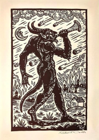
Artist 3 - Slippery Jack
Richard Wells, aka Slippery Jack is a printmaker who specialises in horror and macabre style work. Wells also does work for TV shows, album covers and book illustrations. His work includes things like Doctor who, Dracula (TV) and Green Lung (band), and work for authors such as Arthur Machen and M.R. James. A lot of his work involves traditional mediums such as linocut and drypoint etching. The thing that drew me into his work is the similar subject matter that we have in common, a lot of the work i do is similar to his work and the concepts he does. Although Wells still has the alternative horror genre in his work, some of his work is very modernised looking compared to other artists I’ve listed (e.g. second photo). The thing that drew me into his work is just how much detail and layering there is. Just like Mazatl, you can tell wells’ work is detailed from first observation, but the more you look - the more detail you see. It also impresses me how much depth Wells’ has in his work and how you can tell there’s a foreground, midground and background. My favourite photo of his work is the middle image, this is because each is different yet theyre all as impressive as each other. The right hand photo has so much detail, from the book writing to the book stand. I really enjoy the subject matter and composition of the top middle one as it looks simple but is filled with detail in the animals. The left hand one is one of my favourite due to the creepiness of it, as well as all of the detail and little lines that were used to create it. I think the bottom middle is my favourite as there is so much tone and depth used in it, that you wouldnt think it is a print. The wings, face and outfit are all filled with depth and tone that it looks like it is done by pen or paint or pencil and although it’s simple it is still very creepy and effective. Even though Wells’ work all have the same macabre style, each one is completely different to the others. Wells’ is definitely an artist who is good at his perception in his work (tone, depth, dimension etc).

References: website: https://www.drawcutinkpress.com/south-american-linocut-artists/ publisher: draw cut ink press date: 2020
website: https://www.drawcutinkpress.com/top-linocut-artists-to-follow/ publisher: draw cut ink press date: 2016
website: https://www.ramon-rodrigues.com/sobre-about publisher: ramon rodrigues date: n/a
website: http://www.graficamazatl.com/about publisher: grafica mazatl date: n/a
website: https://www.juxtapoz.com/news/street-art/the-work-of-grafica-mazatl/ publisher: juxtapoz date: n/a
website: https://justseeds.org/artist/mazatl/ publisher: justseeds date: n/a
website: https://vampiresquid.co.uk/artist-richard-wells-on-folk-horror-tv-work-and-his-upcoming-book/ publisher: vampiresquid date: n/a
website: https://www.britannica.com/technology/linocut Uploader: Britannica Date: 2019
website: https://www.thesprucecrafts.com/an-introduction-to-lino-printing-2578530 Uploader: The Spruce Crafts Date: 2019
0 notes
Text
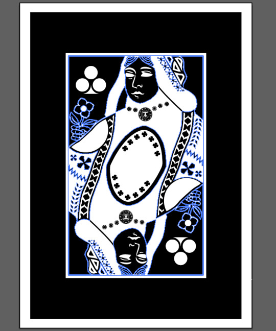
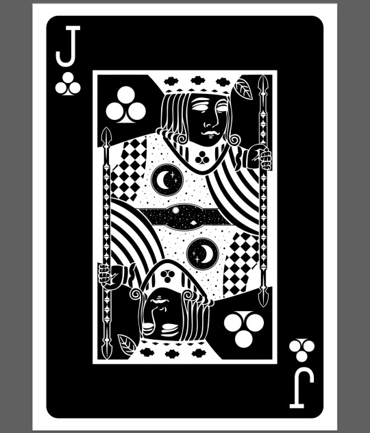
Universaul Face Cards Clubs
Using the playing card templates provided, I was able to go in and create a completely new playing card that is hard to recognise as having anything to do with the original. I was aware that this would be a challenge if I decided to keep too many design elements, which is why I opted to delete a large majority of them and replace them with my own.
To achieve this style for the playing card is easier than it looks. After bringing in the original version of it, I went to Object > Rasterize and pressed OK. This will convert the design from a vector to a pixel image. It’s then as easy as pressing Image Trace at the top of the screen and then going to Edit > Edit Colours > Invert. This process removes all colour and merges everything together. And as you can see below, I have put a sunburst shape in the centre. This was created with the shape tool. I also put the Clubs pip I created in the corners and filled in the eyes.

After removing some details from the image further, it was time to fill the space. I did this by replacing the orbs in the original with the Vitruvian man designs I had done for my Universaul back, which went unused. I also decided I wasn’t going to use the sunburst and instead opted to create a space scene. For an additional bit of detail, I also add a Clubs pip to the King’s face.

I felt the design was looking a little empty but didn’t think that the Vitruvian man was working. This is why I went back to the sunburst idea, but combined it with some geometric lines and shapes. I also made sure the whole image was symmetrical.

After the image for the design was created, I needed to add the value of the card. The standard font for this is usually a slab-serif font.

I used the same process as previously to create this, and added the Clubs pip to the corners. I also filled in the eyes and added the Vitruvian man design that I had failed to be able to add to the King. I did this so it looks like a medallion. I also started deleting all the details that I did not want to use and would be replacing with my own.
In this step, I replaced all cross shapes in the image with my own, and added part of the design back into it. This is the shape in the centre.

It was important to always try and link to the multiverse theme. I did this by replacing parts of the image and adding in stars, as I had done for the King. I did this both on the shoulder and in the centre around the shape I added in previously. There was also a band of shapes coming down from the Queens shoulder, which I made completely black and filled full of the Clubs pip.

Upon looking at the design for a while, I began to like the shape in the centre less. But since I wanted to draw as much attention as I could to the multiverse theme, I decided to design the centre as a sort of “window” to the the universe. I designed the universe by concentrating lots of stars into rings to produce the ring effect. I used the image below for inspiration.


At this point, the design was completed. All I had to do was add the Q and Clubs pip to the corners.

Using the same technique as before, I got to the inverted black and white stage of the design. I added the Clubs pips to the corners but also to on his neck. I think it’s effective to try and add some examples of the suit into the design. The checked area and the thick curved lines were also things that I added.

This part of the card is the first time that the card wasn’t completely symmetrical. In the centre of the card where I have created another “window” to space, there is any unsymmetrical star and planet. I did this because the area was too small to have two of the same things without it looking a bit strange. Even though they are two different things, I tried to make them look as symmetrical to each other as possible in terms of placement. I also added the circle with a moon and two stars in.

The final steps were to add the value of the card as usual, and to fill the white space with some more stars. I think doing this adds another layer of texture and depth to the design.
The last card I created was the Ace. I tried to think of a way to make an Ace symmetrical, and had the idea of splitting the pip in half. With this, I duplicated it and rotated it 180 degrees. The final result is a completely new shape that looks more and more like the Clubs pip the longer you look at it.

0 notes
Text
Skull Design
For my skull design I chose to recreate a picture of a boar skull.

I was using the same technique as I had shown in my leaf shape. I was creating shapes using Blend Tool. Some elements though didn’t look the way I wanted them to when I was drawing one line next to another (already blended) ones so what I did was to create the shapes on the side of the document and then moving them to the right place and adjusting their shape using Direct Selection Tool. I did half of the skull and then I had mirrored it and grouped everything together. I tried making the shapes darker in some places to create more depth in my skull and this is what I ended up with.
I changed the background colour to black and the skull’s colour to white and I much prefer it inverted.
I also decided to add more colour to it to make it look even more interesting. I made new colour layers and changed their blending modes to get different effects. I like all of them equally, I’m very pleased with these outcomes
0 notes
Text
Designing My Final Album Cover
I then tried using the owl skull I drew that was inspired by Patrick Seymour. I previously mentioned that this piece of work is probably my most successful piece from the last 2/3 weeks of work.
Here, I started by placing a black grainy background which I did by creating a square using the ‘rectangle tool’. I then duplicated this to which, I layered it over the top of the original one. I then went into ‘effect’ and ‘effect gallery’, where I chose the ‘grain’ which you can find under ‘texture’. I then played around with the settings as I wanted to still keep the shape being a dark as possible as this would then mean a stronger contrast between the owl skull. I only wanted a slight grain as this would then give a little bit more interest to the whole piece. Once I was happy with the effect, I clicked ‘ok’ but then went the opacity setting at the top of the page. I wanted to decrease the opacity of this textures shape so then the black shape I originally placed can somewhat show through. Doing this would give an overall darker effect, while still showing the grain.
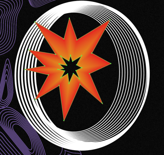
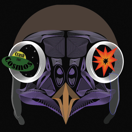
After this, I simply just opened up the file from when I drew this owl skull and copied and pasted it, onto this new page. I positioned this in the centre of the page. I then had the idea to use the eyes to capture the viewers attention as I think this part is the most striking. As the theme is multiverse, I thought of showing stars in the eyes with a spaceship flying into one of the eyes. For the other eye, I felt that I could almost show the impact of the spaceship going through the eyes. To represent this, I had the idea of showing an explosion.
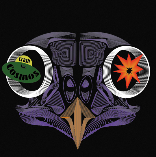
To create the explosion, I knew straight away at how I could produce this. I used the technique that I have recently learnt which is when I used the ‘blend tool’, but this would be a very basic method out of all the other things I created, as I wont do anything special when blending. To get this effect below, I used the ‘pen tool’ to draw the spikey effect for the look of the explosion, where I then copied and pasted this shape and decreased its size. To do this I just held down ‘shift’ and ‘alt’. When drawing the shape, I chose to create a very simply looking explosions I want the viewers to be able to see what it is at first glance. Then, I chose the larger shape to be a red colour and the centre shape to be orange. Next, I selected the ‘blend tool’ and just clicked on the two corners. I double-clicked on the this tool in the settings, where I was playing around with the number of steps as I felt that I didn't really want any of the lines showing. I can’t quite remember what number it ended up being, but it was definitely a higher number than I have been previously choosing. This is the end result of this, to which I think it achieves the look I was hoping for as it is very simple but I felt it needed to be.
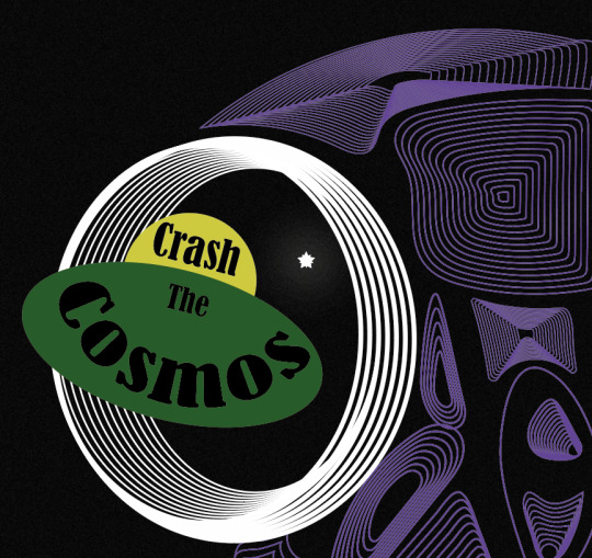
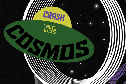
I then created a simple looking spaceship too. I thought to have the band name in this so the type is almost apart of the design. As you can see, I have curved the word ‘cosmos’. I got this idea from one of the scans I did when I was distorting type. I was going to use the actual scan itself but found it could look a bit messy so I just created the same effect but digitally. To do this I went into ‘object’, ‘distort envelop’ and ‘make with warp’. But before I even created this type, I produced the spaceship first. Again, I went very minimal, and used the ‘ellipse tool’ to draw a perfect circle (holding down ‘shift’) for the top part and a circle where I stretched it further out sideways so it created this flying sorcerer effect. My inspiration for drawing it like this, was from old images or drawings from how people used to draw them. I found in old designs, they would be shown in a very simple way. I then show use the two colours, yellow and green. At the time, I thought these colours work so well together and reminded me so much of colours that would have been put together quite often in the past. When it got to creating and positioning the type into the spaceship, I went through all of the past fonts I have used in this project. I saw this font I used when distorting type using the scanner. I felt it looked very attractive. It doesn't scream sci-fi or space, but I was fascinated at how effective it looked. The font is called ‘Bernard MT Condensed’. I felt it gave a sense of professionalism but it wasn't boring nor anywhere near hard to read. I arranged the type do the first word was in the top section of the space ship and the other two words were in the bottom area. I made the word ‘the’ a smaller size than the other words. This is because it is less important and doesn't need to be the first word that catches the viewers attention.
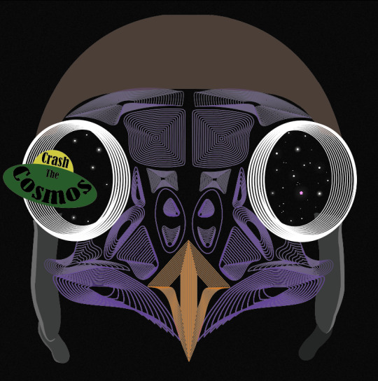
Next, I decided it was time to add the stars which I was going to place in the eyes. I thought adding this element into the design would really help to give the effect to the end result as these objects will show the viewers what their looking at. My inspiration for this was one of the poster designs in my Pinterest board (https://www.pinterest.co.uk/Libbym220/multiverse-ideas/) as the stars easily stood out as the object they the artist was implying them to be.
Below, is the poster I was referring to when creating my own stars. When I looked more closely at how they created them, to me it looked like they have drawn a normal star and then copied and pasted it and slightly rotated it but this new shape has been decreased size. There had then been a glow effect added as well.
This method of how I thought the object was created was exactly what I did to produce my own. Once I had assembled the shapes, I went into ‘effect’, ‘stylize’ and ‘outer glow’. This then brings up a tab, to which I just played around with the settings until I was happy. I started by changing the colour to white as this will then match with the start shade. For the first star, I made the opacity quite high and the blur low. Doing this means the star will be quite bright and the glow won’t be very gradual.

I did generate some more stars which were different to these settings. I copied and pasted all the different ones and arranged them in different places. I also added some very small circles in the design too, as this will then cover more of the negative background space.
As well as this, I added this flying helmet/hat to the owl as I had the idea that this would then relate to the of flying the spaceship. When I was looking for images to use to then trace, I found it very hard to find one where the helmet is from the front as most of the images were from the side. I did eventually find one. I traced the main features of the design where I could have added the goggles as well but felt this wasn't really necessary and could cover some of the owls face.
Here, you can see I have now taken away the explosion from the right hand side. I then added stars to it instead. I did this because I found it didn't really improve the design and almost looked a bit random.
I then wasn't too sure on the hat. I couldn't tell what the problem was so I tried changing the colours so the hat was all one colour. here, I have swapped the bottom section to brown but immediately knew this made it worse. I think its the brown and purple that wasn't working.
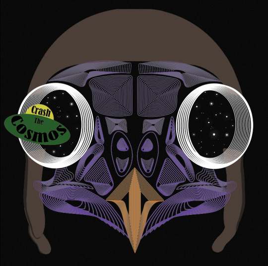
I then tried this silver colour to which I think it looked a lot better.

When looking at the screenshot above, I still thought something wasn't right as it almost seemed a it boring, all of a sudden. I thought that it might have been the black type so I tried to add some more interest to this by changing colours and adding just a stroke. As you can see, I have also changed the font as well. This one is called ‘Aldo The Apache’. This gives me a sense of space a bit more so I thought this could add to the design.
Although when I zoomed back out to look at the whole piece, it still didn't seem right. I decided to change it back to the original font and style, to which I had the idea of moving the composition of the owl. I thought as this owl is the exact same on both of the sides it could look interesting to place half the owl on one side of the and the same on the other side. Doing this, meant that the eyes were right next to one another. I slightly moved the spaceship so it now looks like its come from one of the eyes and going through the other. At this point, I can definitely see my ideas of how to arrange the elements are improving. I felt I was getting to a point where I was getting exited on how the end result was going to turn out.
0 notes
Text
10th December 2020
Experimental drawing/ illustration workshop
In todays lesson we made drawing and stitch pieces. We had to make 4 simple collage + stitch pieces based on 4 quotes from our books, to create disjointed narratives, stitching together different time lines/moments/thoughts. We then photocopied our outcomes creating further compositions which we will develop more at home. At the start of the lesson we looked at 5 artists who inspired our work...
Debbie Smyth
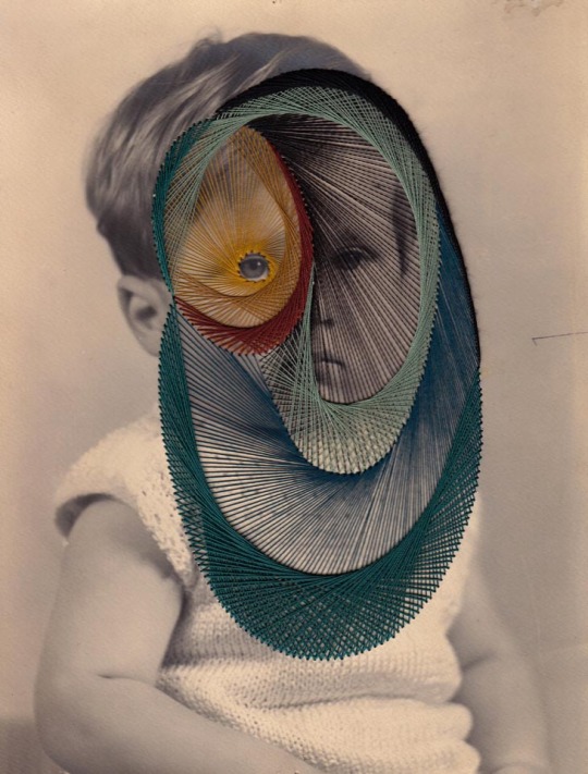
Smyth is a textile artist well known for her detailed and intricate stitched art. She creates these contemporary artworks by stretching thread between plotted nails that result in a beautiful picture. Each image is carefully plotted out before being filled out with thread and Smyth tends to use only black thread which makes for a minimal but effective piece. The sharp angles contrast nicely with the floating ends of the thread that Smyth leaves in sight, creating a sense of movement and free flow, suggesting that she doesn’t mind imperfections within her art. Although the process is rather complex and time consuming, Smyth tries to create a lighthearted feeling of energy and spontaneity with each piece being very thoughtful and considered. The majority of her work is large-scale pieces, drawing the viewer in with an eye-catching and impressive effect. Debbie has worked with many famous brands such as Adidas and Sony which has helped her to create a platform for herself and to boost her career. Her work is versatile and suits any environment that it is put in such as home, work, shops etc, which is why i think her work is so popular. Sewing is not a new skill to Smyth, as she learnt it at a very young age, but it wasn’t until school that she really discovered the potential for textiles and how much you could do with it. Artists that have inspired Smyth throughout her career are Michael Raedecker, Thomas Raschke, Anne Wilson, Laura Thomas, Chiharu Shiota and Hilary Ellis, because of their unusual way of using textiles/thread/line that draws her to them. Her artworks are also inspired by memories from her life. She loves drawing or photographing situations/events and bringing memories back to life in a piece of art and she likes to allow people to admire the overlooked/unappreciated things in life. I love her art as it is beautifully deceiving. At first glance it looks like 2D pieces with the thread stuck down flat to the canvas, however, as you move closer you realise it’s they're 3D pieces, drawing the viewer in, looking almost mesmerising.

Rossana Taormina
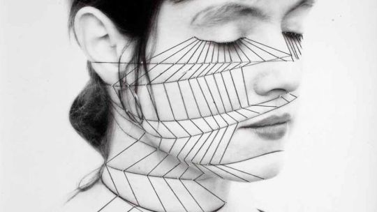
Taorimina is an Italian artist whose work is very similar to Anzeri’s with the concept of stitching onto old photographs from the past. However, unlike Anzeri, Rosanna tends to use photos of multiple people such as family/group pictures. She does stitched geometric shapes on top of the photos using simple coloured thread like white, to keep her art minimal and to fit with the antique theme, as i think bright colours would become overwhelming, and i believe Rossana wants both the original pictures and her additional stitching to be equally appreciated. Her art looks almost otherworldly, with the stitched elements connecting the people together, implying/leading us to assume that they all have a good relationship/bond. Taormina’s contemporary art regenerates and repurposes found photographs, maps, nautical charts, books and fabric, bringing them to life using various techniques, most of which involve textiles and stitching. She was inspired to incorporate stitching into her art as her grandmother was an embroiderer and so she wanted to carry on her legacy, which makes her work unique and has a personal connection to her and her family. For each photograph, she sees imaginary connections and imagines the life that the strangers may have once had, creating her own narratives for them, giving the abandoned and forgotten photos the attention and appreciation they deserve. Rossana once said, “My art is a loving collection of objects, an anthology of remains of forgotten existence. The object becomes a pretext to reactivate memories.” I like her work for its simplicity and antique look, bringing life to old photos, however i feel that her work is rather repetitive and uninteresting, not making it very memorable.

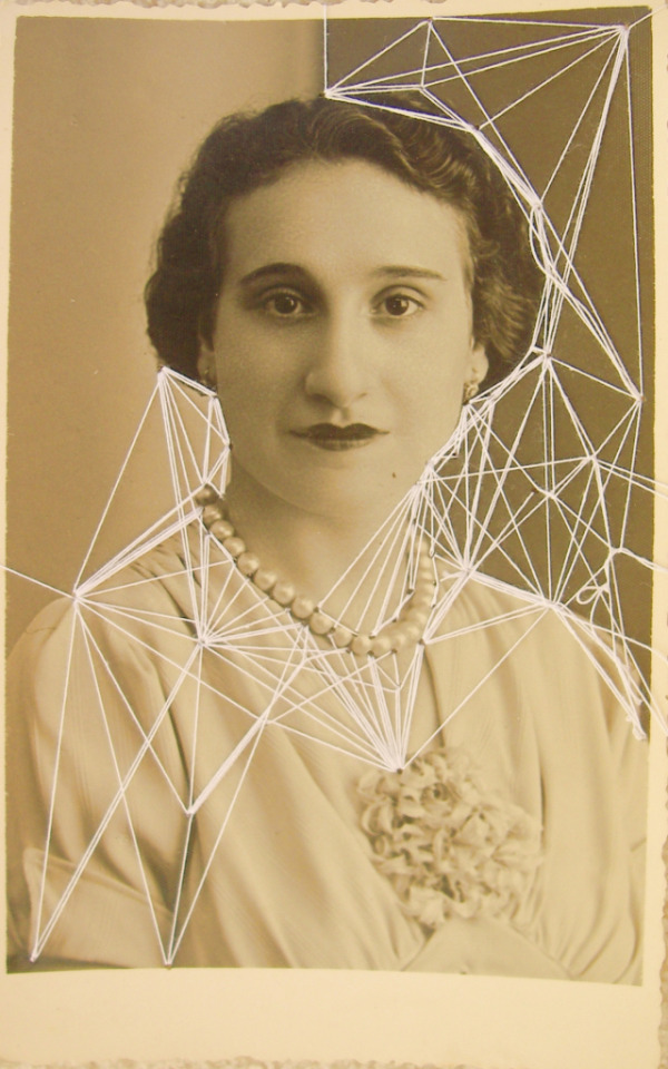

Maurizio Anzeri
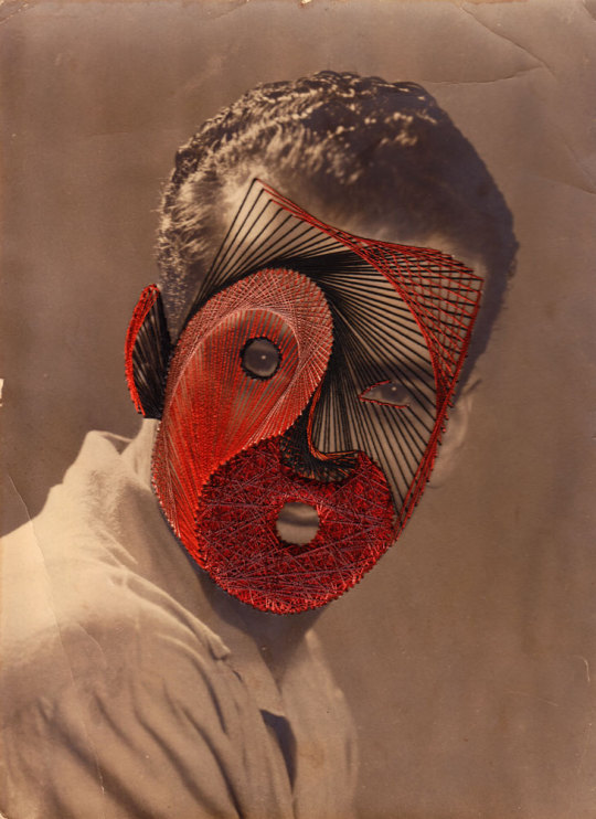
Anzeri is an Italian artist whose works combines stitching with found imagery, usually of people, using the stitching as a way to hide their identity. He uses colourful thread to show their personalities, almost like an aura and sews irregular shapes and odd patterns, making each piece unique. I think the stitching elevates his work, adding texture and emotion, giving the images a whole new meaning. He gets all of his photos from places like flea markets whilst he is travelling, later turning them into beautiful art work. I love the fact that he uses photographs with history behind them, although their story is unknown, it allows the viewer to create their own narrative. The overall vintage and antique look combined with bright thread adds a modern twist to a dated image. These mixed media pieces look almost like portals to different dimensions where the past and future intersect. Anzeri gains his inspiration from places, books, moments, songs, nature etc suggesting that he is easily influenced by things in everyday life. He reveals their thoughts and feelings through colour and shape, capturing their natural beauty and emotions. He usually sews onto their faces, leaving just their eyes as a centre piece to the dense layers of thread, almost like they're watching you with beady eyes, adding a sense of intimidation and eeriness. I love Maurizio’s work for its rawness and contemporary style, inspiring our stitched work in class and encouraging us to experiment with patterns and colour to compliment our collages nicely.

Annegret Soltau
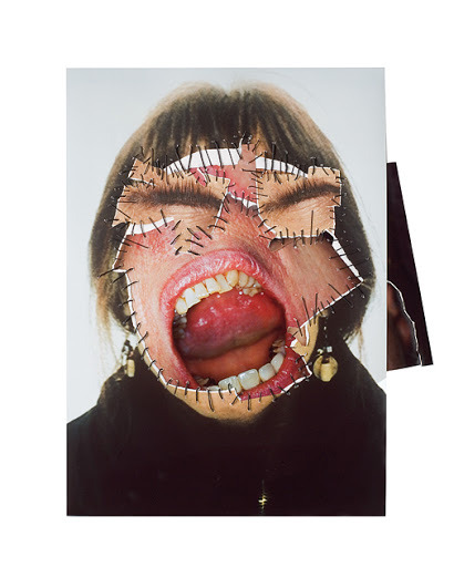
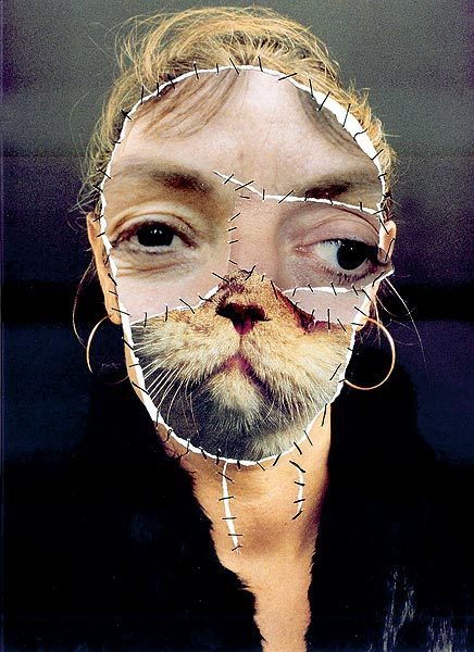
Soltau is a German artist whose work combines random faces with geometric over stitchings and odd cut up pictures of her as she once said,”I am using myself as a model because I can go the farthest with me.” A lot of her art looks unsettling with her self portraits stitched back together in unusual places/shapes consisting of animals and other peoples faces. Soltau almost creates new creatures, playing around with symmetry/asymmetry making for eerie and unnatural pieces. The way she has stitched each piece looks like they've had surgery that has gone wrong and all different facial features have been stitched back together, almost like Frankenstein, which adds to the uncanniness. Her work covers themes of identity, loss and transformation and her geometric over stitchings look like connections/wires wrapping around her face. She is very experimental artist whose harsh tearing and mismatched faces have been influenced by traumatic experiences in her early life. Her work has also been inspired by her own life as well as personal surroundings and society. I find her work very inspiring due to it’s pure honesty and rawness and i love it for its disturbing imagery, shocking the viewer and drawing them in.
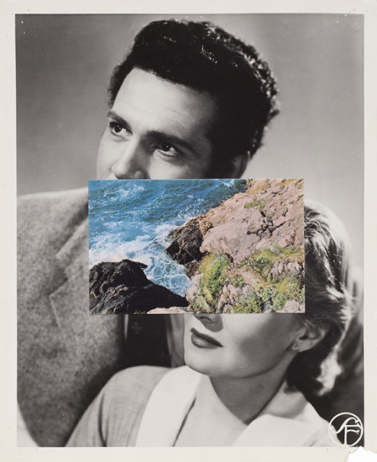
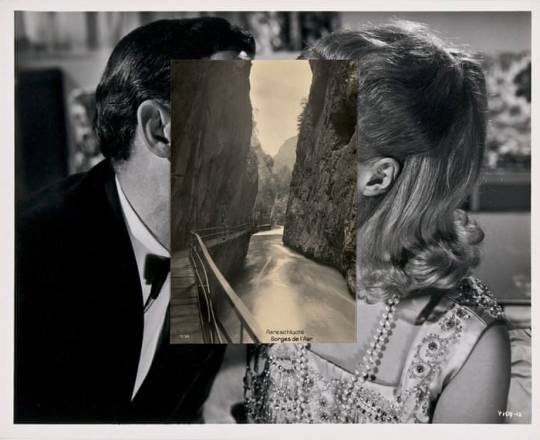
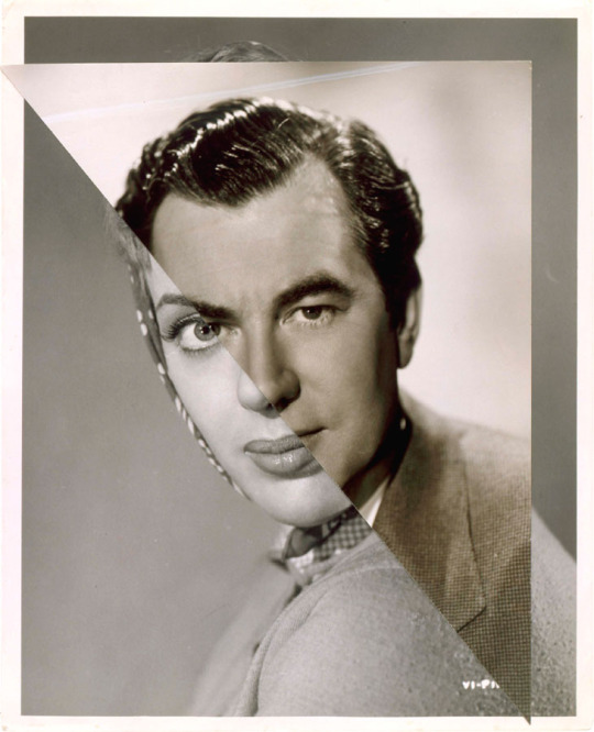
John Stezaker
Stezaker is a British artist whose collages portray passageways through space and time, combining old black and white images of people with places/different people creating an unsettling atmosphere. His work is highly considered and simple but very effective, almost like portals/ wormholes to different worlds. This links in with our theme of multiverse and the idea of there being many different universes, Stezaker managing to capture this beautifully within his art. He gets his images from books, magazines and postcards, the ‘secondhand’ images adding to the overall dated and worn look to his work. He focuses on history and identity, overlapping shots of various famous stars creating a sense of unfamiliarity and uncanniness from something that was originally so normal. Stezaker’s work explores themes of surrealism and is unique to him, each piece creating a new narrative, open to interpretation by the viewer. John also combines images of men and women to add contrast and to reiterate that even though the images are different, they still complement each other nicely, detracting from the piece as a whole, allowing the characters to be admired. He influenced my classwork greatly as i kept my collages straightforward and simple, whereas, i would usually fill the whole page with colourful images, i stuck to a muted colour palette. I personally think his work is very charming and comforting, with a sense of familiarity to it, as he brings life back into old forgotten images. I love how minimal it is, not overcomplicating things, letting the images speak for themselves.
My own stitched pieces:
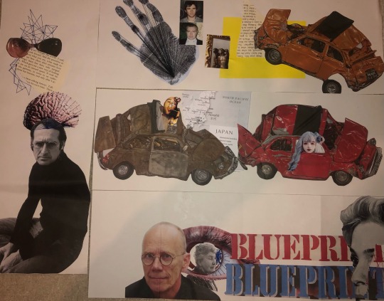


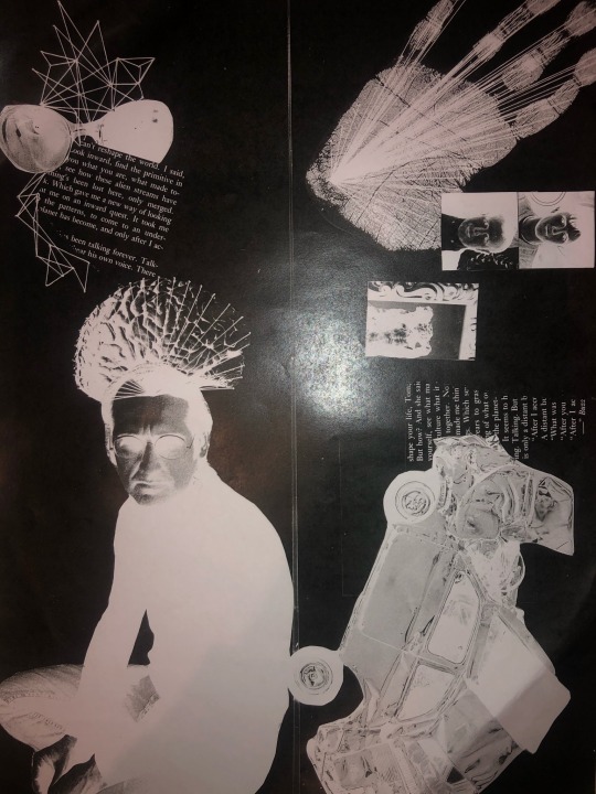
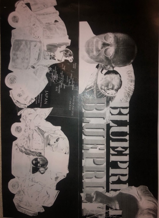

I used magazine cut outs to do collaged pieces based on words from our books. Next i used various coloured thread and sewed geometric/ patterns on the collages to forms connections between the images. Then we used the photocopier to change the colours of the images. My personal favourite is the black and blue because it makes the thread really stand out makes the images look really cool.
0 notes
Text
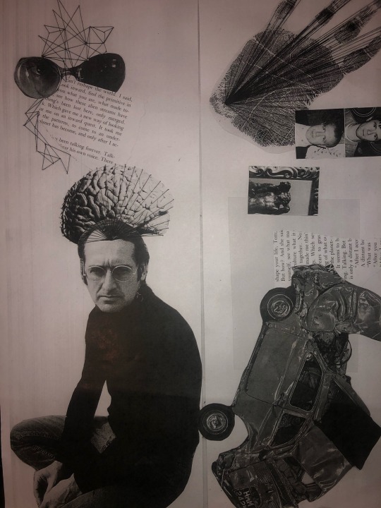
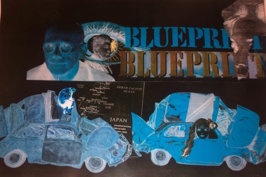
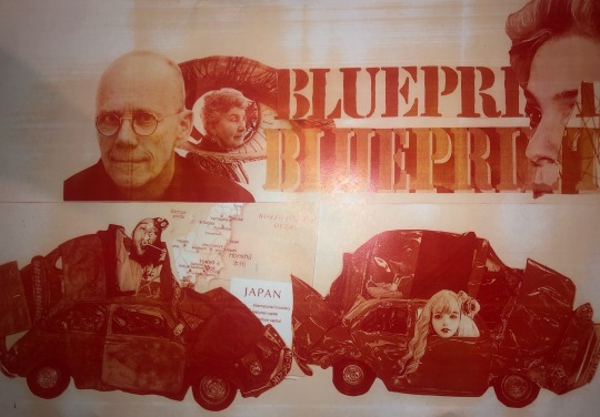
working over our news articles
Today we worked into the pages of our articles creating responses to them based on the context of the page and the article. To inspire my compositions I researched Tom Phillips project “A Humument” as well as Mark Powell, who makes hyper realistic biro portraits on manuscripts and maps, and Lynn Skordal who created a piece which was sewn into a scientific page.
Tom Phillips
“A Humument” is an ongoing project by Tom Phillips where he sets himself the task of buying a cheap second hand book and highlighting words in it which he then illustrates with the means of paint, collage and cutting up the page. By leaving only certain words visible Phillips completely changes the original narrative of the page and turns it into something of his own to manipulate and visually communicate in his own way.
The way he leaves the words blank and connects certain phrases with a small blank line is reminiscent of a speech bubble typically seen in a comic book. This could be purposeful as he as the illustrator tells us blatantly what the pieces are about.
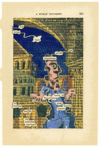
I really enjoy his style of illustration and how the people are quite abstract and disproportionate to how people realistically look. The bubbliness of the person fits with the bubbles that the words are found in and overall the piece has a silly roundness to it making it very cohesive. I also like the way he has made the sky a deep blue and the clothes a light blue as this means that he hasn’t used so many colours that could clash and instead has opted to make the colours work nicely together.
The piece above differs from the one below as even though most of the words are coloured over in the previous piece, they can still be seen, but int eh piece below the collaging element of his work as completely ridded most of the words from the page. This is an interesting choice as it makes the original purpose of the page even more enigmatic to the audience.
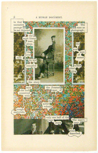
The way he has covered the majority of the words in this piece is with a very scribbly intricate pattern that is very colourful compared to the rest of the piece which consists of black and white photos of men. The use of this photography is a very simple but effective representation of the words which Phillips had picked out and they fit the theme of the page perfectly.
From looking at this work I want to think about how I cover up certain words and whether I decide to do so, and my use of the page as a whole a and whether I should work in black and white or colour or a mix of the 2. I also want to think about the medium I use as I probably won’t use paint like Phillips does and instead opt for pens or pencil so as to not tear through the thin paper I will be working on.
Mark Powell
Mark Powell is a phenomenal artist who creates biro portraits on very old manuscripts and other papers. He commonly leaves areas of the portraits completely blank especially in areas of clothes and therefore the original text of the pieces can be seen which is something I should consider doing in my own work as I really like the way it allows the canvas to become part of the entire drawing. He also uses some very dark areas in the back of his portrait with wavy textures which can be seen extremely clearly in piece below, This makes me think about how I can create texture in the background with whichever medium I choose to use.
He also allows the page he is working on to create the frame for his work. Personally I think this looks very nice and ties the whole piece together as it gets rid of the need for him to draw a border or possibly have to fade the edges around the neck out to the shade of the page. I don’t think this is something I could utilise in these pieces due to the fact my pages don’t have any clear cut borders but it is something I enjoy the look of nonetheless.
Powell creates pieces which tell the story of how a young person who may have used or viewed these pages would age to look and I find that very interesting as in a way all the wrinkles in their faces quite literally tell a story.
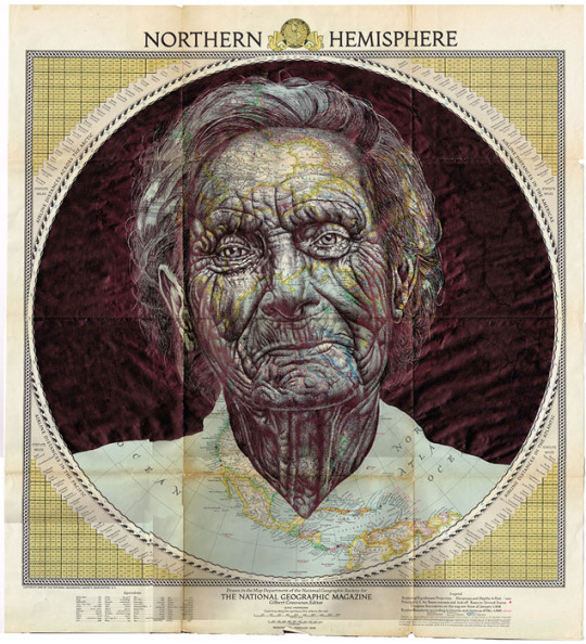
I really like this piece as the map lines work as additional wrinkles in this woman’s face. The map overall adds a lot of texture which works very well for the face of an old person and the blues and greens behind the biro add a lovely colour shining through where the biro is lighter. Blue can evoke a sense of sadness and therefore the blue may be to represent that the person whose portrait has been drawn has had a sad life or an unfortunate end. The way a biro has been used to make a very intricate drawing intrigues me and is something I could use in my own work as I definitely have a biro.
Lynn Skordal
Lynn Skordal is an artist who uses thread along with techniques of collage to create pieces which evoke strong emotions in the viewer. I particularly like the piece below where she has used thread on an old scientific anatomic page to highlight the nerves/ veins of the person and create a rather eerie image. The way that the lines spread across the face and body almost growing over it like the roots of a tree could be to imply that this person is being overwhelmed with some emotion or situation that they can’t deal with.
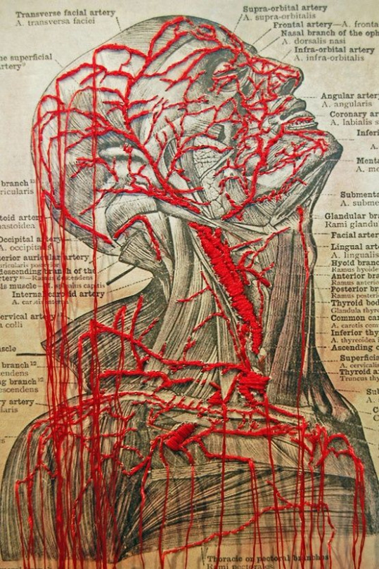
The use of the colour red may be as a link to the body and blood but it could also be because the person is feeling anger very strongly and this is the emotion that is overwhelming them. The colour love can also link to love and therefore they may have just fell in love for the first time and therefore are very taken aback by it, although the imagery implies something much more grotesque than love.
The way that she lets the stray ends of the thread dangle down across the whole image is something I like a lot. This make the red thread look like blood pouring out of this persons body but could definitely fit the themes of anger or love as well as it could be a representation of how they are letting the anger out of them and expressing it, or how they are so in love with someone that they can’t hold it in anymore.
In my own work I intend to use thread in a similar way to this as I think it looks very good and can add lots of interesting textures and a new dimension to a piece which may have been very flat prior to this.
my work
In my own work I created many scratchy textures due to the speed and way in which I applied my medias. For the first piece I tried to cover up the negative space in a dark colour similar to Mark Powell, using the text and page as a base colour for the person which I added. i worked very fast to achieve a scribbly texture. This piece is based on my article about curing blindness hence why I chose to put a big black scribble where the eye would be.
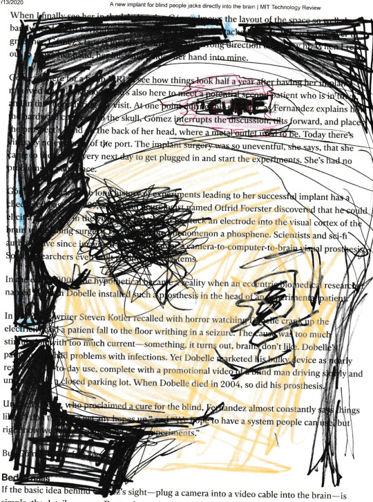
Where the skin would be I coloured in with coloured pencil to show that there is a differentiation between the skin and the white bandage which surrounds the mans head, with a part cut out of it which says cure as they would add an implant to the brain to cure this. The choice to allow the text to show through as the whiteness on the bandage as it contrasts very well with the black background which is something I saw in a lot of Tom Phillips work as the character would stand out on a dark background, but also something I really liked from Daniel Egneus’ work when I drew my train people.
If I was to do this again I would be more careful with the proportions of the face as I don’t think they are very accurate and the person’s face looks very flat because of this. I also may have chosen a darker skin tone as the tone I chose didn’t show up very well. Another amendment I would’ve made is to allow some words to show through in the dark background in a similar way to how Tom Phillips does.
For my second piece I chose to do it based on the robot CIA fly spy. I thought about imagery commonly associated with spies and came up with the idea to do a sketch in biro of a pair of binoculars. I also surrounded the binoculars in a border of rectangle as I felt like the overall page was very empty and I wanted a border in a similar way to Mark Powell.
I did the biro very sketchily and layered it in areas I wanted to have more depth and some shadow. I wish I took more time on this piece to make it realistic in a similar way to Powell but I am happy with the proportions and I think it is obvious what the drawing is of so I was successful in that way. I am also glad I added the rectangles as they made the overall composition make more sense than just a pair of binoculars on a page. I wish I put the effort into making the darker areas extra dark and using the white page behind to show the lighter areas.
In my third and final piece I made it based on the article about brain implants to connect us to social media. To begin with I used fineliners to draw a person whose head is missing at the top. I really like how the eyes look and how i subtly used the orange fineliner to display a skin colour. To then visually represent the brain I used thread in a way inspired by Lynn Skordall.
I made the brain overflow over the entire page as if it is spread out for everyone to see to represent the issues with security in this implant. I wish I had pink thread as that is a colour more fitting for the brain but I didn’t so I made do with red. I really like the way that the thread gives a texture and how it winds all over the page in a very captivating way. If I was to change any elements of this I would’ve made the face using collage, but overall I am extremely happy with how this turned out.
0 notes
Photo

ASSESSMENT 2 FINAL WORK/ STATEMENT
Following up from my Poster in assignment one, i started looking into moods and how they are expressed physically instead of how they feel internally (like in my poster). I was really interested in how a person’s facial expressions change according to their mood or how they're feeling so i started doing research into the face’s different expressions and Scientists believe that humans express 21 different facial expressions.
For my first experiment, i took a first-hand photo series of different facial expressions beyond the regular happy and sad, using an exaggerating face filter which made the differences between the different emotions very distinct, It was very noticeable how the eyes/brows and mouth changed drastically with every mood. I then focused on just the eyebrow and eyes section Its very interesting to see how the eyebrows and eyes develop their own persona and character and can represent different emotions.A person can guess what the mood of each frame is even tho the majority of the face and the body is cut out. i layered opposite moods together to create the compound emotions and creating the mixed emotions theme which links back to my Poster.
Following up i cropped it even more, focusing entirely on the brows and line drawings. I was inspired by the Artist Manny Roberston in how her portraits had a “double face” as if they were wearing a mask and how she made continuous line sketches in her artworks. i tried adapting this technique in one of my experiments where i outlined the face features using one continuous line and repeated the outcome and moved it from the actual face so it gives the layered mask effect.Furthermore, i started looking more into line and how different line combinations or shapes can represent emotions and so i combined elements from my previous experiments by creating different facial expressions using one continuous line, i then layered multiple faces on top of each other and that created the depth which was a metaphor for emotions in how you can see different expressions and faces within when two lined faces are layered on top of each other. Whilst looking into the idea of “masks” i decided to go back to the very original emotion mask which is the classical theatre Comedy/Tragedy in this case Happy/sad Masks.
For my Final work, i chose elements from all my experiments and combined them into an illustration. I simplified the faces by using the theatre masks idea and took two photos of myself looking Happy and Sad and drew them into the theatre mask style using one continuous line that joined all the features. I then gathered a collection and variety of different line designs and combinations and carefully placed them on the face. Through my research, a variety of artists used line to create shadow and depth but in my work, the lines represent emotional depths and range. The line shapes are very different in shapes, line thickness, style and size and here it links back to my original argument in how emotions cant be singular or divided such as just happy or sad so therefore the lines symbolise different moods. It's interesting to see how although both faces have very similar pattern structures, the eyes and mouth shift and separate the two expressions. They are similar but different which creates the “binary” divide.
A problem I faced during making my final work is that when the lines were in black and white, the face outline wasn't visible and was hidden amongst the line patterns. I tried working around with the colours by changing the colour of the line designs into a light grey but the entire photo just lost the focus point. I then changed the design from black and white into colour by inserting a gradient background that goes from dark purple to bright orange( the purple starting from the sad face and getting brighter into the happier face) and then made all the black lines white. The colour gradient brings out the lines and the choice of colours brings out the mood effect.
BIBLIOGRAPHY
New Cadburys 'Eyebrow Dance' Advert (HQ). 2009.
Anne Maizia | Artist Project. Available:http://www.theartistproject.com/gp_artists/anne-maizia/
, Manny Robertson - “Embroidered Metropolis" A series... Available: http://mannyrobertson.tumblr.com/post/50369759399/embroidered-metropolis-a-series [Sep 18, 2017].
(MAIZIAN), A.M., 2016. MAIZIANNE (ANNE MAIZIA): Portraits.
CORRESPONDENT, BY FIONA MACRAE SCIENCE, 2014-03-31T20:20:34+0100, a-last update, Scientists discover that humans have 21 different facial expressions. Available: http://www.dailymail.co.uk/sciencetech/article-2593459/Which-face-happily-disgusted-Scientists-discover-humans-21-different-facial-expressions.html [Sep 18, 2017].
CORRESPONDENT, BY FIONA MACRAE SCIENCE, 2014-03-31T20:20:34+0100, b-last update, Scientists discover that humans have 21 different facial expressions. Available: http://www.dailymail.co.uk/sciencetech/article-2593459/Which-face-happily-disgusted-Scientists-discover-humans-21-different-facial-expressions.html [Sep 18, 2017].
KULKARNI, S.S., REDDY, N.P. and HARIHARAN, S.I., 2009. Facial expression (mood) recognition from facial images using committee neural networks. Biomedical engineering online, 8(1), pp. 16.
MANNY, R., 2013. ArtSlant. https://www.artslant.com/ew/works/show/936987:
https://www.flickr.com/photos/23416307@N04/3969175950/sizes/o/in/set-72157621763684584/
, Zentangles2014-last update. Available: http://www.clipzine.me/u/zine/3226684617270567217/Zentangles [Sep 18, 2017].
MAX MILLY, , Instagram post by MoneyyMakingArt • Oct 23, 2016 at 10:33am UTC. Available: https://www.instagram.com/p/BL5vh6_ANwI/ [Sep 18, 2017]..
Illustration of comedy and tragedy theater masks with a red ribbon. Available: /photo_11169834_illustration-of-comedy-and-tragedy-theater-masks-with-a-red-ribbon.html [Sep 18, 2017].
4 notes
·
View notes
Text
Exercise: Exploring Painting & Drawing
When I began this exercise, I realised I got confused by reading the exercise “An Objective Drawing” and thought I had to choose an object from the list. Therefore I chose an umbrella for this. So even something as simple as the object used is an improvement I could make by choosing an object more interesting.
When I began collecting all my materials for this exercise, I explored my house for things I could use that were not materials I am comfortable with to ensure I am pushing myself out of my comfort zone. When choosing which drawing implements I would use on which papers, I tried to pair them by what wouldn’t usually go together, so the outcomes would be unpredictable, making the exercise quite exciting for me.
Indian Ink on Kitchen Foil

I began by using kitchen foil - I wrapped the foil around a solid piece of card to ensure I would be able to draw on it smoothly. I chose indian ink for this because it has a runny consistency and won’t stick instantly to the surface, making it more difficult to obtain accuracy.
I was not pleased with the outcome even though I was aware of the problems it would come with. When I began drawing with the ink, I didn’t use a brush - I drew directly from the spout of the ink pot. I was happy with the way it was going and I was using the technique of a continuous line, then when getting more ink, there were air bubbles being created resulting in ink blotches and ink running down the page. The final result is too messy for my liking, however, the surface of foil is interesting to me due to it having a shiny, reflective surface giving it a strong character already. I feel like a thicker or dryer medium such as acrylic paint or pen would produce a more effective result.
Oil Paint on Cling Film Wrapped on Recycled Card

I wrapped some cling film found in my kitchen around some recycled card to create a smooth surface to work on, similar to the kitchen foil. I was skeptical about working on cling film due to its waterproof surface and flimsy texture. I chose oil paint for this surface as I have never used oil paints before, and it would be interesting to see how a paint of oily consistency will hold up on a slippery, waterproof surface.
I was surprised by the outcome of this combination; the paint applied so smoothly. I began by stippling the paint on to the surface which was too patchy, so I led into small short brush strokes to blend the paint. I only used 3 colours: Cobalt Blue Hue, Titanium White, and Raw Umber. I was so pleased with this piece as I am very unconfident using paints and wet mediums in general; I painted the umbrella freehand, so to be able to paint and blend at such ease was so satisfying. This has given me the confidence to explore oil paints more in the future.
Water Colour on Tracing Paper

I was very pleased with the outcome of this combination. The painting looked so soft and subtle, with the bolder colour application adding emphasis to the shadows. The shadow under the umbrella was achieved by washing out the watercolour on the paintbrush by dipping it into water, and I slowly allowed the paint-water to spread off the brush onto the surface by applying soft strokes.
Watercolours and tracing paper both have a very washed out and translucent finish, so it could have resulted in the watercolour not showing up enough. However, It was such a beautiful finish because the surface remained translucent, but the paint was still visible. This is a combination I will consider in the future, and I thought about layering up different sheets of tracing paper and painting on them seperately to create depth.
Crayola Washable Supertips on Matt Photo Paper

I did not like this combination as it was simply messy. This may be down to my own way of using the pens, but I did not enjoy using them and was not pleased. I do feel like if I steered away from shading and led more towards solid block colouring the umbrella, it would have produced a more effective outcome. I did like the surface of the matt photo paper - it was very smooth to draw on and the pen dried quickly on it, so there was less chance of smudging. I feel it would have suited a dry medium well.
Dulux Matt Emulsion Paint on Wet/Dry Sandpaper

This was an interesting combination and I went with it because of the thickness of both materials; the thick wall paint would show up well on the thick and dark sandpaper. I began by using a stippling technique with my brush to apply the paint, as the sandpaper had a rough surface so I felt stippling wouldn’t take away from the visibility of the texture. I really enjoyed this process because of how free I allowed myself to be with the paintbrush. For the shadow and the stick of the umbrella, I used longer strokes.
I was so pleased with this piece as it was bold, and the stippling created a rough, imperfect outline on the painting. I feel like this gave it some personality, in a way. The dark background allowed the colours to pop more, and this has made me reconsider my usual decision to settle for lighter and softer backgrounds.
Biro Pens and Crayola Washable Supertips on Iridescent Wedding Card Envelope

This combination was probably the most simple and least experimental one, and it shows in the final outcome. I was pleased with this drawing as I used biro pens to outline shade by crosshatch, then layered the Crayola pens on top to fill in with some colour. This style reminded me of my first exercise in the course where I created a drawing in the style of E.H. Shephard, due to the use of imperfect lines and simplicity and washed out effect of the colour.
Sharpie Pens on 80 Grit Sandpaper

This combination surprised me; I didn’t expect the Sharpie pens to be so bold and blendable on the sandpaper. Due to the extreme roughness of the sandpaper, the pens didn’t show up as solid lines, like they would on regular paper. Instead, the colour spread across the small grains of sand, so layering the colours to blend was so achievable. I only used black, dark green and light green to achieve this. There is a very dark and sinister tone to the image, and the complicated texture of the surface creates an illusion of the way rain looks when it is falling down; it is imperfect and all over the place. I could use this combination to achieve a dark and heavy tone for a future illustration.
Chalk on Brown Paper Bag

This was another less experimental combination as the surface of a brown paper bag is not too different from normal paper. Although, chalk is something I am uncomfortable with using; the powdery-crumbly texture of chalks, soft pastels and charcoal are messy and inconsistent for my liking. However, this exercise is about trying things I am not used to and experimentation, so I went for it. I was happy with the outcome; the colours applied quite smoothly to my surprise. The brown bag had lines on the texture of it, which showed through when the chalk was applied; I liked this effect as it created a layer and showed that the material was something different.
Overall, I was pleased with the outcome of this exercise. I learned to step outside of my comfort zone and that by pushing myself and trying new things (keyword: trying) I can surprise myself. This has encouraged me to use my sketchbook more to explore different possibilities when it comes to materials instead of going with what I know and am comfortable with.
0 notes
Text
Possible image making
illustration style
I like the detail that the illustrated pieces have, I think that space junk can be communicated clearly through all for of these styles. I specifically like the last two styles as I can imagine them on my spreads. The use of lines or pointillism is something I have never tried and it would be interesting trying something new. The use of black and white colour schemes really add depth to the pieces, especially where the circle is black and surrounded by white. Lastly, I find it interesting how the style of the last two is like contained/managed chaos. Despite liking this style, I just don’t think that is will compliment my Ted Talk as much as some colour would, as I think my Ted Talk is a harder, educational read- it would be nice to contrast this with pops of colour. Therefore, I am unsure on whether I will try this style.
clustering of shapes
This is technique I tried quickly on the painting station of the image making workshop. I think that it could be interesting to interpret space junk less literally and more visually through the use of shapes and layer. Moreover, the use of little dots seen in the third image really reinforces the sheer amount of space junk. This technique can be done physically or digitally which leaves me with a lot of freedom. As mentioned in the image making workshop, I could also scan these in and warp them to give them that technological and futuristic look.
I am specifically drawn to the last image where the shapes are random and not perfect-this really reflects the unknown factor of space as well as mimicking junk as they almost have no purpose due to their lack of shape. As well as this, the areas where the shapes overlap at different opacities creates a middle ground colour that joins all the clusters as one cohesive group of imagery. Moreover, I like the variation in shape, I wouldn’t want the imagery on my pages to look the same as this will bore readers instead of engaging them. Overall, I am very excited to try this style in my spreads as I think it has a lot of potential.
digital work
I think that the orbital drawings would be very effective when created digitally. This style of diagram is something I saw a lot within the books I found in the library as well as online. The use of circles is present in this style and I specifically like the use of little circles to add detail. My only worry is that the lines will not look significant enough on the page but I will be able to decide this after my experimentations.
0 notes
Text
Task 4 - Portfolio: Typography
My next project I decided to do was based on Typography. I chose this to show the different styles typography can be in. I decided to do this based on movie genres and chose the movie, Avengers: Infinity War. The 3 different genres I chose were Sci-Fi, Comedy and Horror. To start off, we had to sketch out many different designs for each genre and choose the best one from each. These are my sketches:
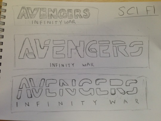
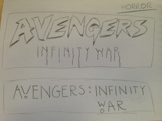

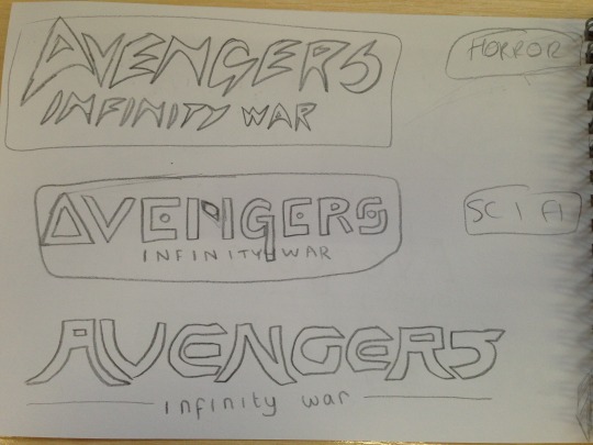
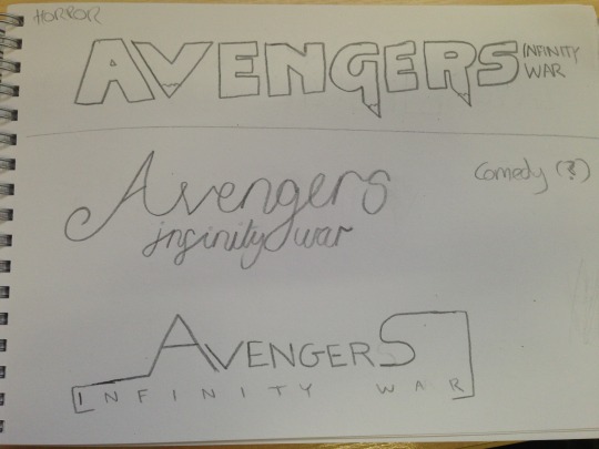
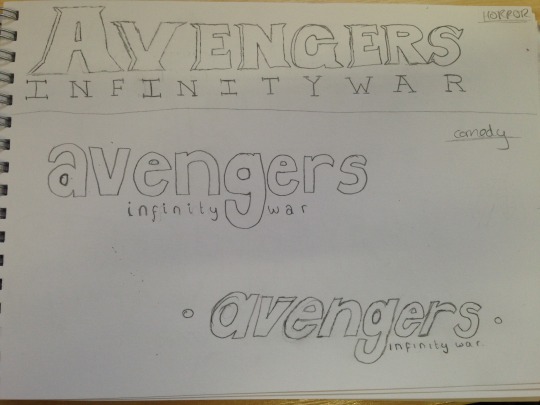


I used visual references for my sketches by looking up movies of the genres on Google. For example, for Sci-Fi, I took inspiration from Tron. For Horror, I looked up films like Scream and The Evil Dead. And I saw that comedy films use a mix of different kinds of typefaces so I sketched out random typefaces. I did 6 sketches for Sci-Fi, 7 sketches for Horror and 6 for Comedy.
For Sci-Fi I decided to choose the third one on the first picture, as I thought I could make it look like a neon logo which is suitable for Sci-Fi because it makes it look futuristic. For Horror, I chose the first logo on the last picture. I think this looks the most like a horror typeface because of the dripping blood. I made the dripping blood look like it dripped into the “Infinity War” text. For comedy, I chose the 3rd logo on the 7th picture, as I felt it looks similar to the Friends logo. I think that this makes it more obvious that it is in a comedy genre.
Sci-Fi Logo
This is the process for my Sci-Fi logo I have vectorized. I did it from scratch instead of tracing over the sketch as I thought it would be easier, the shapes are already in Illustrator and it would look more neat and clean.
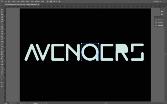
I started by creating the letters from scratch. I did this by using the rounded rectangle tool. I made the R using the same technique and used the direct selection tool to make it into the shape of an R. I created the G using the elliptical marquee tool and removing the fill and then adding the stroke so that it expands from the inner area. I also added another rounded rectangle to add the flick on the G.
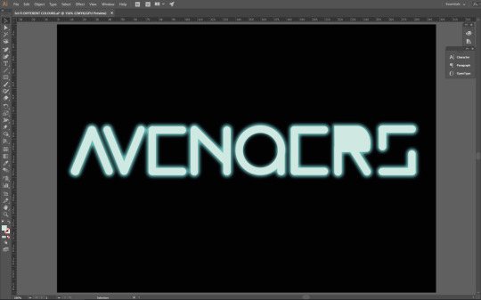
The next step was to add the neon glow. I looked on YouTube for some tutorials on how I can do this. I did it by creating a duplicate layer of the text and putting it under the main layer. From here I selected the text on the duplicate layer and went to Effects>Blur>Gaussian Blur and added a certain amount of blur to it. I made sure the blur was the most vibrant colour and the main text was a lighter version of it, almost white, so that it looks like it is lit up.
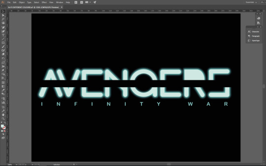
After this I added a black line through the middle to split the text and make it look unique. For this, I just used the rectangle tool and aligned it directly in the middle. From here, I added the “Infinity War” subtitle. I used the main vibrant colour as it looks better and makes it more colourful compared to the main lighter text. I used quite a thin typefaces so the Avengers part is more eye catching as it has the neon glow. The thin text also makes it look more like the Tron logo, like for Tron Legacy.
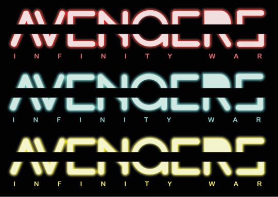
After creating the logo, I duplicated it to test it with different colours. This is what the logo looks like if it was red or yellow.
The final piece has come out the way I had intended it to and I am happy with it. Not much has changed compared to the sketch so it has successfully communicated my intentions. I made sure it didn’t look exactly like the Tron logo as I was just inspired by it, and didn’t want to copy it. The neon glow makes it stand out and gives off the sci-fi vibe I wanted it to. This is also a new skill I have learnt and will remember for if I ever want to add a neon glow to anything else. I wanted to add the neon glow as it would look to simple without it, and it would help to make it look more sci-fi, because it could remind people of light sabers from Star Wars. I added the line through the middle to make it look unique and for some of the letters to be more obvious, like the G looks more like a G with the line through it than without.
Comedy Logo
This is the process for the comedy logo. For this, I used my original sketch and traced over it in Illustrator.
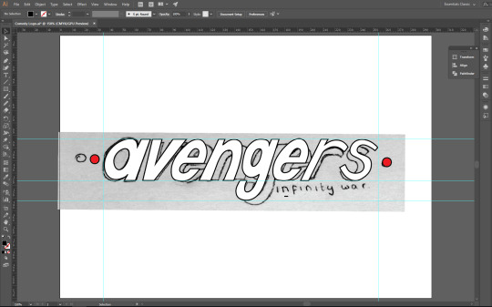
I started by placing my original sketch in a Illustrator document and moving it so that the text is in the centre. After this, I used the pen tool and started drawing over the letters as the writing is italic so it would probably take longer to use shapes for some letters and make it match with the rest of the letters. I used guides to make sure it’s all on one line.
Next, I made the sketch layer invisible and added the Infinity War subtitle and placed it next to the descender of the G, like my sketch. I added red dots on the side by using the elliptical marquee tool.
This is the logo I have made for the comedy genre. I have taken inspiration from comedy films/TV shows like Friends. I added red dots on the side to make it look a little bit like the Friends logo, but not exactly like it. It also makes it look like it is pinned onto something, which makes it look better than just simple typeface. I used thin text for the subtitle for the same reason as my Sci Fi logo, because the main part of the logo is the Avengers part, and I need that to stand out. The logo has come out the way I had intended it to because I just wanted it to be a simple logo as comedy films don’t really have creative or memorable logos like other genres do, so I think it came out well.
I tried adding some colour to the logo to see what it looks like. I added the colours of the Infinity Stones in the movie, but I thought it looks too childish, and the plain white would look better.
Horror Logo
This is the process for my horror logo. For this I used the same technique as my comedy logo, where I open my sketch image up in Illustrator and trace over it using the pen tool.
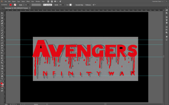
I used the pen tool to draw around the letters and used the direct selection tool to make sure the letters are even and straight. I used the smooth tool so that the edges are smooth and don’t look jagged. I used guides to make sure it is all straight on one line as the original sketch was a little bit bent. I kept it as red so it actually looks like blood. The black background is appropriate as horror films are dark and set in the night, so a brighter background wouldn’t fit.
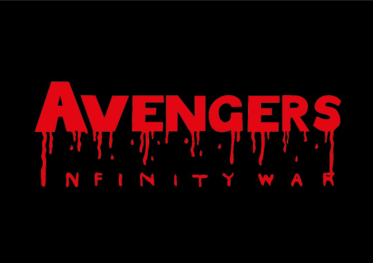
This is the final piece I have created based on my sketch. I have made it look like blood dripping from the logo to form the “Infinity War” part. I decided to make it look like this so that it is clear what genre the logo is, as everyone would see the blood and assume it is for a horror movie. I think that this logo came out well, but there are some issues I have with it. The logo does look how I intended it to, and communicates the genre well, but I think I could’ve done a better job at making the width of some parts of the letters match. I thought the blood dripping to make the subtitle would be a creative way to put it there rather than just typing it out and placing it right under the logo.
1 note
·
View note