#trying to visualize how I can create art using old notes/letters/drawings
Explore tagged Tumblr posts
Visit Tumblr Blog
Explore Tumblr blogs with no restrictions, modern design and the best experience.
Last Seen Tumblr Blogs


Fun Fact
The KCSC sent more than 20K requests to delete posts related to prostitution and porn to Tumblr from January to June 2017.
Text
Amusing Himself to Death, an Akadot.com interview with Kazuya Tsurumaki (director of FLCL and assistant director of Evangelion) from around December 2001. In the article, Tsurumaki explains a few things about Evangelion, his mentality behind FLCL as a whole, and the meaning of the name ‘FLCL’.
Full article text is under the cut, or read the article in its original form [here].
Kazuya Tsurumaki was a relatively little-known animator when Hideki Anno selected him to work as the assistant director on Neon Genesis Evangelion. For the TV series, which became a smash hit in Japan and one of the touchstones of the current surge of interest in anime in the US, Tsuramaki served as the main storyboard artist as well as assistant director, and when Studio Gainax began production on a trio of Evangelion films Tsurumaki got his first directorial assignment.
As he tells the story, Anno came to him after Eva and announced that he was out of ideas and that it was up to Tsurumaki to dream up the next project because, "you are next." Tsurumaki let his imagination run wild, but by the time he had written a script, Anno - despite his declaration that he had no stories left to tell - was already several steps ahead of Tsurumaki and in pre-production for his next series, Kareshi Kanojo no Jijo, leaving Tsurumaki a chance to have complete and unsupervised creative control of his own series FLCL.
FLCL, referred to as "Fooly Cooly" (or "Furikuri" by its American fans), is unlike any anime series to come before it. Wild, maniacally fast-paced physical comedy; exaggerated, exuberant animation alternately pushing towards surrealist- as when mecha exuviate from a bump on young Naota's head - and deconstructionist - as when the animation literally stops and the story is told by a camera bouncing across a page of black and white manga art panels; and obsessively, often irrelevantly, referential to obscure Tokyo-pop bands and anime insider trivia; FLCL was hyperkinetic and disorienting, yet mesmerizing, almost transgressive, and undeniably original. It inspired enthusiastic admiration for Tsurumaki as a creator, even amongst the perhaps 90% of the series' fans who were absolutely baffled by much of it. One is tempted to refer to it as announcing the arrival of full blown post-modernism in animation, or perhaps as the Exploding Plastic Inevitable of the anime industry.
When Tsurumaki visited Baltimore to speak to American fans at the recent Otokon Convention, predictably, many of the questions were along the lines of, "Hi, I really loved FLCL [or Evangelion], but could you please explain this part of it to me?"
Tsurumaki answered all questions genially with a self-deprecating and often mischievous sense of humor. For example:
Why does Haruko hit Naota over the head with her guitar?
Kazuya Tsurumaki: Naota is trying to be a normal adult and she belts him to make him rethink his decision.
Why does Evangelion end violently, and somewhat unhappily?
KT: People are accustomed to sweet, contrived, happy endings. We wanted to broaden the genre, and show people an ugly, unhappy ending.
Why is the character of Shinji portrayed as he is?
KT: Shinji was modeled on director Hideki Anno. Shinji was summoned by his father to ride a robot, Anno was summoned by Gainax to direct an animation. Working on Nadia [Nadia: Secret of the Blue Water, one of Anno and Tsurumaki's earlier projects] he wondered if he still wanted to work like this. He thought that working on Eva could help him to change.
Is there any particular reason why so many Gainax series feature very anxious, unhappy young male protagonists with no parents?
KT: Yes, the directors at Gainax are all basically weak, insecure, bitter, young men. So are many anime fans. Many Japanese families, including my own, have workaholic fathers whose kids never get to see them. That may influence the shows I create.
Could you explain the mecha bursting from Naota's head in FLCL?
KT: I use a giant robot being created from the brain to represent FLCL coming from my brain. The robot ravages the town around him, and the more intensely I worked on FLCL the more I destroyed the peaceful atmosphere of Gainax.
Why doesn't FLCL follow one story?
KT: In the third episode Ninamori was almost a main character, a kid who, like Naota, has to act like an adult. After episode three her problem was solved so we wrote her out. She has many fans in Japan and we got plenty of letters about that decision. For FLCL I wanted to portray the entire history of Gainax, and each episode has symbols of what happened behind the scenes on each of Gainax's shows. Episode one has many elements of Karekano; episode two, a lot of Evangelion references, etc.
Where does the title FLCL come from?
KT: I got the idea from a CD in a music magazine with the title Fooly-Cooly. I like the idea of titles that are shortened long English words. Pokémon for "Pocket-Monsters" for instance, and an old J-pop band called Brilliant Green that was known as "Brilly-Grilly."
Is there any reason why the extra scenes added to Eva for the video release were cut in the first place? Did you think the story would mean something different with them intact?
KT: The scenes that were added to Eva for its video release aren't that important. We added them as an apology for taking so long to get the video out. Maybe they'll help people understand things, because the episodes were done under tough deadlines the first time around.
Can you explain the symbolism of the cross in Evangelion?
KT: There are a lot of giant robot shows in Japan, and we did want our story to have a religious theme to help distinguish us. Because Christianity is an uncommon religion in Japan we thought it would be mysterious. None of the staff who worked on Eva are Christians. There is no actual Christian meaning to the show, we just thought the visual symbols of Christianity look cool. If we had known the show would get distributed in the US and Europe we might have rethought that choice.
After the panel, Mr. Tsurumaki sat down to speak with Akadot.
Do you enjoy confusing people?
KT: I have a twisted sense of humor. I'm an Omanu Jacku, a contrarian. [Writer's note- Omanu Jacku is a folk character a bit like Puck, a mischief maker]
What do you see differently now that you're working as a director rather than only as a visual artist?
KT: As an animator I have only the art; as a director story is really big. I still feel as an animator and I often have trouble putting the needs of the story first.
Did you intend from the start for FLCL to be as bizarre as it wound up?
KT: From the very start I wanted a different flavor. To achieve this I had to re-train the animators to be as stylized as I wanted them to be because I wasn't drawing it. I knew that not everyone would get it. I deliberately selected very obscure J-pop culture and anime sub-culture jokes and references. Because Eva was so somber I always intended to make FLCL outrageous and wacky.
Why the choice to break out of conventional animation and use manga pages? Was it at all a response to how many anime are using computers to achieve smoother and more realistic visuals? Were you trying to go the opposite direction?
KT: I like manga, not only to read, but the visuals. The pen drawings, the frame breakdowns and layouts . . . This is the first time I have used digital animation, and those bouncing manga shots wouldn't have been possible with cel animation. Personally I'm not interested at all in using computers for realistic animation. I'm impressed by it sometimes, but I'm interested in using computers to do what was once impossible, not to do smoother versions of what has already been done. I want to be less realistic.
Has using digital animation techniques changed the way you work, or the way you feel about your work when you see it? Does it still feel like it's yours if a computer did much of it?
KT: Before I got into digital animation I saw other shows that were using it and I felt that there was no feeling, it was empty. As an animator, there's a sense of release when you draw a cel. There's something there. Working on FLCL, though, I learned that computers can do more, and, most of all, that they allow room for trial and error and revising, more freedom to experiment. That is why I now feel that cel art cannot win against computers. For actual animation everything is still drawn on paper. That work hasn't changed. It's the other stuff, the touchups, and coloring. If we didn't use paper, maybe the feeling would change.
Earlier today you said that you were trying to broaden the genre by giving Eva a sad ending. Does the sameness of much of today's anime bore you?
KT: First of all we didn't use a sad ending to annoy fans. When they're upset, that really bothers us. Personally, I think a happy ending is fine, but not if it is achieved too easily. That's no good.
For all the fans that are confused at all, if you had to define in one sentence what FLCL is about, what would you say?
KT: FLCL is the story of boy meets girl. For me it is also about how it's ok to feel stupid. With Evangelion there was this feeling that you had better be smart to understand it, or even just to work on it. With FLCL I want to say that it's okay to feel stupid.
Even though it may be strange to us, do you have in your head a logic behind it? Are you trying to portray a story that follows the logic of dreams, or is it supposed to make sense symbolically?
KT: I'd like you to think of FLCL as imagination being made physical and tangible, just as it is for me when I take whatever is in my head and draw it.
So what are you working on next?
KT: Right now Gainax has told me that they'll support anything I choose to create, but I'm having trouble coming up with any ideas.
Why is that?
KT: Releasing titles for market, I know I have to make something to please fans, but I'm not a mature enough person to accept that fact. If I'm not amusing myself I can't do it. I feel bad that fans have to put up with such behavior from me. I apologize.
#FLCL#Evangelion#archive.org#Kazuya Tsurumaki#also i can upload the text as a PDF if anyone would like it!#things like these articles make me realize the people who say FLCL is too confusing aren't artists. because as an artist this is cathartic-#-to read. i'd kill to be able to make something as high-strung stylized and full of weird references as FLCL.#and with GAINAX too? holy shit#interview#article
23 notes
·
View notes
Note
I am a firm believer that Childe is indeed younger than Keqing and has no form of respect for her regardless.
It’s moreso a form of me establishing that the Keqing is a short adult in her mid to early twenties who has to inevitably deal with the constant neck pain she gets from having to look up at her co-workers just to make eye contact. She curses either herself for it for never growing an inch or curses everyone around her or, well, both. Regardless, she can occassionally be found in her office stomping the floor and feeling like the battle is her against the world LMAO
As a side note, I loved the little headcanons of the boys as children you included! It was a different thing that would’ve never came to mind otherwise. While I’m totally ride or die on the “four men accidentally hire themselves a babysitter and a daily slander machine (she does it out of love)” train, I do appreciate different variations to the idea.
Oh and seeing myself on the anon list makes me feel a bit warm, it feels like I’m being acknowledged as family for crashing this wonderful blog with brainworms lmaooo— on a much serious note, I really appreciate hearing me out whenever I have an idea or two to share.
Sincerely, Keqing harem brainrot anon
(I felt like using a dash was too orthodox, and these are basically my mini love letters to you for being an overwhelming amount of seretonin, so I figured why not give it a little twist)
Minor Spoilers for Character Backgrounds
I wrote some more on this here: Genshin: Royalty AU HCs
---
FUCKING CATCH ME CRYING IN THE CLUB AS I HOLD THIS PRECIOUS ASK IN MY HANDS. I THOUGHT YOU DIED. I WAS SO UPSET. REMEMBER THAT ANON ASK THAT I JUST REPLIED TO WHERE ANON FELT LIKE THEY WERE COMING HOME? THAT. THAT IS HOW I FEEL RN.
Yes. I know anons have lives outside of tumblr. Am I a parent penguin now? Yes. Yes I am. I’m fucking crying, it does feel like I’m seeing my family again.

---
Out of all the “adult” genshin characters, I firmly believe Childe is the youngest. He is just hovering that adult status because of his height. Can I also say how much I love that the “culturally insensitive white boy” idea came from people on twitter getting tired of Chili fanart where Childe calls Zhongli “sensei” even tho the mans Chinese?
Speaking of short people, and because I will never shut up about this, XIAO IS 5′2. Ty for coming to my ted talk. I can literally astral project and visualize Zhongli being Keqing’s boss or co-worker that’s super respectful - but lowkey a bit slow because he keeps forgetting his wallet and Keqing is too nice to leave him without lunch - but when he’s spitting facts about the ancient art of ink blocks she’s cursing him in her mind. Why is this man so tall?? She can feel the neck muscles in her neck crying out in pain that when she finally relaxes and stares forward rather than upward, she get’s a killer cramp and ends up dying on the floor (I HATE THAT FEELING BTW). She’s out here googling ways to grow taller after puberty and chugs milk cartoons like it’s air.
This is why I absolutely love sharing ideas with others. There is so much food to be brought to the table so I always try and encourage others to share their ideas. Plus it let’s me get my over-active brainworms out haha.
I just love the dual personality of younger vs older genshin characters. We got to see a little bit of young Diluc in the manga (pls..I know it’s completed but crumbs. I beg of you) where he was this starry eyed and friendly knight attitude. Actual sweetheart. Your typical childhood boy next door type of vibe that was sweet and polite but was a lot smarter than he looked. He has a pet turtle (or tortoise?) and I find that so cute. I can totally see Diluc being hard working to make his father proud but also slacks hard and watches his turtle awkwardly eat a strawberry most of the time haha. He would both die for his turtle and go to war for it. Honestly, I just love the idea of child Diluc being a bit of a slacker compared to his older self, who is trying to speed run his life.
As for Kaeya, I’m going to say this now. I fully believe in the art of shy and quiet Kaeya when he was a child. It makes sense in terms of the lore since he was basically shoved into an unknown world and all alone. Poor guy probably has a lot of insecurities and is super standoffish to happy and loud children his age. He might come off as rude but he just doesn’t know how to socially interact. As sad as this may sound, he probably mimics other children as his way of expressing emotions. Since he spent most of his time with Diluc, he probably tried to mimic Diluc’s mannerism to try and fit in but Diluc is smart and caught on. It was actually a really wholesome connection of Diluc trying to help Kaeya express himself rather than copying others. Until well, the incident that separated them.
Complete side note since I know we’re talking about a modern au but: I know I’m stretching this super thin and this doesn’t hold up in the lore at all but I really like the idea that Kaeya is secretly the Prince of Khaenri’ah and Khaenri’ah is a code word for the Abyss. This is basically me saying I want the Abyss mages and Kaeya to actually get along but due to moving in with Diluc’s family and the world’s view on monsters. He has to talk and play with them in secret. I think it’s kinda cute haha.
As for Childe, actual angel. Have you seen Teucer? Who is this pure innocent soul and what the FUCK happened to create this Grade A Brat? He got too many vitamin gummies and became a gorilla. I mean, both younger and older Childe would walk an old lady across the street but only older Childe would then try to 1v1 the old lady. I’m actually crippled by the idea that Childe used to be this scrawny kid that decided to bulk up due to deep insecure attitudes towards himself or protection ideas for his younger siblings. Fighting became a need to survive and he hated it at first until he met his Master and found the fun in it because it was his way of having control of a situation. Though of course, while this man has two braincells, he’s still sensible. Childe may be a clown but he’s a good big brother.
Then there’s Zhongli. In my mind, he was basically like Kaeya. Probably came from royalty as well. He didn’t know how to express himself except his boy was actually hollow. A complete husk of a person that was just doing what he was told to absolute perfection. That was until Guizhong, who I completely headcanon as someone older than Zhongli and acts as a sister figure (fucking fight me), grew concerned for this poor child and tried her best to teach him how to have fun. That there was life outside his studies and duties. While it didn’t work out perfectly and Zhongli is still a bit slow on the uptake, he genuinely is thankful to her and her help. I can see him have a little notebook of all her advice and teachings - heck, drawings of human emotions - that he sometimes has to turn to because he’s lost. (why..do i keep making Zhongli’s part so sad).
BUT ASIDE FROM MY BRAINWORMS. “Four men accidently hire themselves a babysister and a daily slander machine” IS SUCH A CONCEPT. I want them all to have the worst habits. Childe LICKS the yogurt peel in front of Keqing slowly because he knows it absolutely disgusts her, Zhongli eat’s his sandwiches vertically, Diluc blends coffee with 5 hours energy and doesn’t tell anyone (so everyone has the worst hangover 3 hours later because they all leech off each other), and Kaeya, for the love of god, cover your tit window. It’s too early to get arrested for public indecency.
---
I’m happy my anon list made you feel fuzzy 💕💕. I’m probably missing a lot of anons on that list because I have the memory of a goldfish so I just listed the ones I could remember. Since you know, you’re some of the few that came back to talk to me which I honestly really appreciate. I know you all have lives outside of this small blog so it does make me really happy seeing you all come back. I’ve mentioned it before but don’t be afraid to chat with me about anything, doesn’t even have to be genshin^^ but I absolutely love the stuff you come up with.
I never thought of an anon list acting like a family acknowledgement (more as a literal list) but I’m fully on board with that. I went back to my older anon asks to see if I missed anyone (and I probably have since the tumblr search tag is garbage) but I hope they are all still around on this blog and wanna drop by to say hi^^
I’m going to go change my anon list to pengu family because holy fuck that’s cute. But with that said,
Welcome back home keqing harem brainrot anon!
#keqing harem brainrot anon#welcome home#the double take i took when i saw that signature#i still love that name#"-these are basically my mini love letters to you for being an overwhelming amount of seretonin -#y-you can't just attack me like this#um wow okay#um let me just bask in what happiness feels like for a hot minute#oh no im gonna cry#...yo no I FEEL SO EMOTIONALLY VUNLERABLE RIGHT NOW WHAT ARE YOU DOING TO ME#this was...really sweet#my serotonin levels have completely peaked for the next year#super duper big mwah#lovely anon#anon ask#i have noodles#im going to go cry in them for a hot second
51 notes
·
View notes
Photo

First thought: Homestuck^2 should've just been called Beyond Canon, and more people should call it that.
The 2 was put on for chuckles; HS trending the day it was announced with it being a sequel spoke enough about how such a thing shant be underestimated, and why Homestuck is ABSOLUTELY more than just our small twitter crowd (and the scrap of us still on tumblr). I say that because remembering the Beyond Canon part slightly reassures me about the fact that this is a fanwork that will do some weird shit, and things I don't agree with, but isn't something that I have to subscribe to enjoying all the way with how I engage with Homestuck.
Homestuck 2 is not the canon continuation. Homestuck 2: Beyond Canon, is an OFFICIAL continuation.
Not having it on such an important stool and as the only content we all are only allowed to digest should come from both people who obsessively dislike it, and people who defensively support it. If a character says they kick babies then I can say, hey that's weird, maybe not great writing, but I can pretend they don't in my content, and i dont have to send threats or call people cishet white men for it! and, it's an absolutely great thing that we were all encouraged to create our own ideas without anyone who's influenced us to do so squinting their eyes when we actually go through with it. Glad I don't have to put this story up to the expectations of being a sequel to a 11 year, worldwide IP that's shooketh the internet landscape since it's merely optional, Death of the Author persists, and ideas aren't just dominated and revolved around the perspective of a 1% in this entire fanbase.
That said.
As an OFFICIAL continuation versus a canon one, HS2 is ok. It certainly has that fanfiction vibe, and a story it wants to tell. I can't really tell what that story is since we have like, 10 sub plots rn though. There's not a real a clear indicator on where the focus of main conflict is that connects all these stories together.
I thought that the prose in replacement of Vriska's battle was jarring, but not teeerribly surprising for the format HS2 is going for. It's more so using drawings to compliment text versus Homestuck's usual of panels being side by side with visual importance, or even itself being the one compliment. It sorta feels weird tho that it brought old fans back in with art just for them to get sneered at when they get a bit upset that there won't be main staples of art known to progress the story forward.
Also people who mock people for “having to read homestuck” knowing there’s language barriers and struggling focus from those who’ve been use to something that was never so dense, are ridiculous.
Personally this could be solved by knowing how old flashes worked, having way more artists on the team, maybe even an art director if not already, and noting that we're not asking for the next Cascade. Rome wasn't built in a day, but Rose Ride sure was, and Homestuck’s animation is absolutely not the same as a 12-24 framed 12 minute cartoon. That, or just snuff the illustrative art as a whole since it's very clear on where the focus is.
I’m sure you’re not here trying to see my opinions on how the outer workings are though, versus plot.
Uuuuh, let's see. Yiffy's still a name I don't care to use until I eventually get tired of any of my art that do not show up in tags. This is fine and not as offensive as people are saying it is. Minors who want to cosplay this character don't have to call themselves this character. Not wanting to be one letter away from accidentally entering a very NSFW space of twitter is fine. Also the lot of people call Tavros, Tavvy.
I hope Kanaya's anger at being cucked is actually seen versus being implied through fan guesses and another character having to say she was.
Roxy needs to be more of an involved character. Where are they during all this?
Jane should have a mention of her relations to HIC being a main/bad influence on her current parallels to Alternian dictatorship.
The PRE-RETCON GROUP should have a fun one-shot update for fans who like them, since they oughta be around if they fell through the ghost hole. Most of them. The sprites that aren't Jasprosesprite should also show up too, since they're around.
Aaaaaand I think we should be extra careful going into the future when it comes to the alien rebellion. It's weird that a lot of the writers are white and toy around with concepts that can be a not so great parallel to racism. Currently not great timing rn! If the characters are going to remain aracial, but with them still doing not much to reference other non-white earth cultures or getting new hair cuts that have different textures (looking at you, Rose), we shant make the species with actual biological benefits a racism commentary. the xeno joke at least had a play on words. If any writer has happened upon this then a, please don't get mad at me again haha, and b, consider having more black writers or directional assistance on your squad. You know who they are.
In the future. I casually want the ghost from the Dream Bubbles to be shown since it's a big elephant in the room to not have a single one of them in the bg despite a load of them appearing from the ghost whole. Don't gotta give them speaking lines, especially the dancestors. I personally don't know if I want that right now.
I also hope in the future that we don't get HS content that is only going to revolve around HS2, if it's optional enough to engage with without being the only option. That's why PQ could ended a bit better for me, and why I hope it's not the main thing that's keeping Hiveswap on the backburner. I don't think it's farfetched to consider that multiple HS content could come from more than just one team; to relieve work load, but to also strengthen the idea that Homestuck can be a various amount of perspectives when it comes to the ideas fans have. The most dedicated fans leading the direction of the story is not just a handful of them. If anything, at least acknowledge the massive ass fan projects going on once in awhile to showcase the different avenues.
"Hey Cro, you sure have bitched about this alot. Do you have anything good to say? Why don't you stop reading if you hate it so much!"
Not every comment needs to be golden, love. Again, some of these decisions I eck at, but ultimately they're just words on a computer that I'm not holding anyone at gun point to do, and I'm curious to see how the story handles itself going forward, since again, it's just a fanwork. Sometimes I wish to not only see where the plot goes, but to see a writer's craft in action.
Good Things:
The Art. Again, please have more artists. It'd help so much, especially since the main one is also double timing for VE. That said, HS2 sticks out to me because of the way the color composition is used. Aside from hair and other tiny things, I haven't seen black used a lot, which makes colors pop. It's really nice to look at. I hope we get more sharper styles of character in the future, since it builds on nostalgia and makes the trolls feel much less like they're from Repiton, but I can deal with it for the most part. I also like that one panel where the omega kids and vriska are talking in the dark room, and based on where they're standing, the text aligns. Tasty as hell.
Meat and Candy still do hold neat logic in the direction the stories go. Candy, while it could be more tasteless in some areas, is chaotic and too much of a good thing. Meat is having something a little more straightforward, though I'm not sure quite yet where it's going. I always found Candy to be the part of the epilogue that actually entertained me the most, from how much of a surreal Robot Chicken skit at 3am it felt. Sometimes the jokes slapped real nice and made me wonder, going in, how is this monkeys paw gonna play out and, hopefully, make people laugh or smirk like they got a good roast at themself?
The slightly episodic feel of each update is what I wanted from the Epilogues, so it's interesting to see that play out when it comes to switching different perspectives.
The bonus updates get points for featuring characters that a lot of us have been wanting to see for ages.
Hopefully this isn't unpopular, but I think the tension of Yiffy's introduction was nicely composed and written (ignoring some of the things I wish for Jane). It leaves you with enough want to see what'll happen next time. You could also say that despite her growling and making a lot of noise, it's not actually bad writing: I see it as the audience being forced to see her in the same perspective that Jane see's her; a dog. Upon no context we're seeing the same thing while knowing things are obviously off, and once we see this character in a new environment where their personality shines, it'll have a bigger impact her own character being humanized. So I like that.
Okay, I think that's all I got. I improv wrote most of this; hopefully I won't be taken out of context since I don’t think that HS2′s writing should ultimately be a judgement of the writers as people, nor treated as if they should hold the same unhealthy work environment that Andrew forced himself to do when writing the og comic. And I'm still like, donating to the patreon and everything, lol.
[runs away]
edit: i was going to put the cw as another positive thing for the comic...but...yeaaaah.
44 notes
·
View notes
Text
Elinor (My Apprentice OC)
pls don’t say Bonjour to me ,-,
However, I hope I did nothing bad if I say that my OC is the apprentice , I only step back a little from the canon(?) I’m sorry ..Just questions are very suitable,_, I'll probably skip some questions >~<Next time I will use this template on real OС, I hope you do not get mad at me
I think the same way to arrange Ask with her, maybe this will also help me develop her as a character.
Finally,after the hundredth attempt to draw my apprentice, since I represent her,I succeeded, now I’m going to the second round of hell - information about her. Honestly, this is a whole hurricane of thoughts in my head,and soon I’ll lose my mind, seriously ,_,
Although what I’m talking about, in my head a mess reigns, reigned and will always reign(yaaaaaaiii)
By the way, so that some have visual representations about Elinor (Yes, maybe I will use different versions of her name( Eleanor, Elenore, Eleonora, Eleonore, Elinor, Elinore, Ellinore, Elynor, etc. XD, not a canon)

So as not to go crazy, I’ll just answer the questions posed by @apprenticealec (thank you very much QwQ)I will also add my items. Just really liked the questions, sorry again!
Let’s begin!
1. What is their occupation in the Arcana World?
In the Arcana world, Elinor’s occupation is to develop her magical skills. In addition, she’s very interested in legends and various nationalities, languages and cultures, for the most part, because in this way she hopes to stumble on something,that will lead to memories of her past.She strives to learn all that is possible.Therefore, when Elinor gets into the palace library, she’s simply cannot be pulled out of there.
Closely related item: Dreams and Desires
Elinor often sees homeless and hungry people, sometimes even very talented, but who do not have anything to somehow light up in society or develop further. Therefore, its goal is to solve this problem as soon as possible. She dreams of creating an academy where children from various sectors of society can study, as well as a charity in favor of those in need.
2. Where are they from?
In fact, Elinor came from a fairly kingdom called Augusay.The power of the kingdom lay, naturally, in the presence of its strong warriors and magicians, who came from some ancient clans, each such clan differed in magical priorities. For example, once on the territory of the kingdom, there was a clan of magicians named Haiko, magicians in this clan were distinguished by both white and black magic. There are legends that once a powerful warrior Haiko Ken was able to defeat a nine-tailed fox - a demon who penetrated into a world in which harmony and good reigned. However, demon's killer cannot remain an ordinary mortal. Ken was cursed, devil left his mark on him, since then demonic blood flowed in warrior’s veins, and sometimes Ken turned into a monster, which he seemed to have killed. Fortunately, Ken met a beautiful sorceress who helped him control the curse. They had children who transmitted both magic from their mother and the demonic curse from their father, thus forming the Haiko clan, a clan in which reigned balance between demonic power and white magic.From such a clan came the mother of Elinor - Aurora,who was the queen of Augusay. At the moment, any mention of the kingdom and its memory were mysteriously destroyed, as if it had never been.
3. Do they have any family members?
Haiko Akane (Elinor’s mother - Queen of Augusay ) - died by demon Lilith when Elinor was 3 years old
Haiko Fuji (Elinor’s grandfather - And also the most strict teacher, whom Elinor hated and loved at the same time when she was child/teenager. Come on he hit her head with his huge damn stick when she was doing something wrong, a terrible old man.) - Oh yes, baby he saw dinosaurs, what are you talking about? (Joke.Yes, he is alive).
Carlisle Victor (Elinor’s father - King of Augusay) - died protecting the Augusay from the (army of demons) army of the Lilith (this is a long story).
Carlisle Anastasia (the illegitimate sister of Victor - Elinor’s aunt) - died of heart failure.
4. Where were they during the plague in Vesuvia?
Even before the plague appeared in Vesuvia, Elinor received a letter from her aunt Anastasia (who owned the magic shop), since Asra and Eleanor managed the shop, Elinor’s aunt lived on the territory of Venterre. In a letter, Anastasia wrote that her health was deteriorating due to severe heart disease, and she would like her niece to visit her. So Elinor spent enough time with her aunt, trying to maintain her condition and always be there so that aunt Anastasia would not be lonely. Before her death, Anastasia, who cared for Ellinore after her 18th birthday (since her memory was completely lost, like all the information and the kingdom of Augusay itself) and claimed that the girl’s parents were middle nobles , who were killed by robbers, wanted to admit that everything was wrong, she hid the girl’s past for her own safety.Perhaps Anastasia had not time or simply didn’t gain strength, but still could not tell Elinor the truth. So aunt only left her property, highlighting a large mysterious box that she had been hiding from her niece all this time.Elinor felt that something was wrong, but she did not have time to figure out how she found out that a plague epidemic had begun in Vesuvia. Naturally, she went there, because she was extremely concerned about the lives of people and friends she knew.
5. Where are they during the main Masquerade? Were they invited royals or just townsfolk who decided to stop in when Nadia opened it to everyone?
Aunt Elinor was known in the narrow circles of high society, despite the fact that she led an extremely unusual way of life for her status.Therefore, Elinor was invited royals to a masquerade. To say that she did something special during the masquerade, no. She was unusual to even be in such a crowd of people, she just wanted to distract herself from everything that had happened earlier, being at that time with Asra and Nadia, who were close enough friends for her.
10. What’s their idea of a perfect day?
Oh yahhhhhhh,in fact, everything is simple, the perfect day for Elinor This is the day when all her friends are nearby, happy, they are having fun as anyone can, well, actually this is all that is needed for happiness and the perfect day for Elinor (almost).
12. What’s one of their favorite memories?
This memory is extremely muddy, with every attempt to penetrate into it, Elinor almost faints. She remembers .. someone’s gentle warm voice, soothing, she remembers that someone sang a gentle cradle, as well as vague features of a woman’s face.
13. What’s one of their least favorite memories?
The moment in the dungeon with Lucio, at that moment she really was very worried and did not know what to do, although she tried not to show it so as not to make Lucio worry or blame himself if she had to sacrifice herself.
14. If they’ve interacted with (insert one of the Main 6 here) what is their opinion of them? If they haven’t interacted, what would their first impressions be?
(If I said anything above that I'm talking about ... oh, it's hard, just imagine that I crossed the MС, or rather an Apprentice with OС ?? :0)
Asra - Master? Master! Master!Maaaster! (agm, I’m sorry). Asra, in secret, her top friend. However, it is worth noting that he is also an authority and an important object for respect for Elinor, for the most part she treat him as an older brother or really as a teacher, although he most likely will not be happy about it.Everything is somehow complicated, he the best friend to whom she trusts even her own life and the at the same time hi’s a teacher to whom she tries too much respect. Like all her friends, Ellie wishes Asra only the very best. Not to say that she is an angel who cannot be offended or angry at anyone, since she really often was offended when Asra went away for a certain time without saying where and for how much, which made her very worried and worried.
Julian - Dear Mr. Ilya, say something bad about yourself and I will crush you with.. MY RASEN... I’m not serious person..Not to say that Elinor was shocked to find out that Julian Devorak was not at all connected with the murder of Lucio, despite his first EPIC appearance in her shop, which scared Elinor so much that she almost fainted and almost every time she met him didn't squeal ..It is not strange that even in the worm Eleanor will find something beautiful, Ilya is far from being a worm, he is a wonderful person who should not think of himself as any kind of monster or garbage, she rather found in him an unfortunate person who lost himself, who is exactly help is needed..
Portia - One Portia's smile and Eleanor’s day made. In her eyes, Portia is a wonderful, strong, cute, cheerful person, while they walked to the castle to Nadia, Elinor asked her a bunch of questions, even the most stupid ones, just to at least listen to her giggle or joke while answering them.When she met Ilya with tears in her eyes, believe me, Elinor inside was already dead, her brain simply could not digest the fact that bitter tears were rolling on the face of this beautiful cutie.In general, Elinor is very happy for Ilya, because she would like to have a sister like Portia. Although, all her friends are her family, which she loves and tries to show care and attention.
Nadia - For Elinor Nadia, authority is no less than Asra and not because of her social status. Elinor sees a patient, strong, kind and wise person in Nadia, to which she cannot but respect. Even the movement of the Nadia’s hands makes Elinor delight, well, this countess is too beautiful...Eleanor is very pleased to discuss with Nadia any important topics related to life, philosophy, art, she is always interested in the Nadia’s opinion. For example, when they argue about something, is it not a gross argument, even rather a reasoning? Oh my God, how she seeks to hear Nadia’s arguments, sometimes her thoughts can sit in Elinor’s mind for the whole day, night, week, month, she will return to this conversation 200 more times, only with other thoughts.
Lucio - please give him a chance ..She likes him the most, but ... what kind of sympathy I'm talking about, Elinor is deeply in love with him.Despite everything, the fact that he is a complete moron, selfish in the opinion of others, in her eyes he is the one who also needs help and support. In general, Elinor does not believe in bad people, for her there are people who make mistakes unknowingly, Lucio is one of those. Her opinion only gained a foothold after she began to pay attention to Lucio, and the more he changed, the more she loved him.She was very touched when he showed his concern, or at least somehow regretted his actions, she believes him, believes that he will never repeat his mistakes ..At the moment they have a very warm relationship, Eleanor really hopes that her other friends will also be able to change their mind about this goat man,and Lucio himself will become more loyal to others.
Muriel - This man deserves the best of this life, his appearance says absolutely nothing about him, so when he saw Elinor was not at all afraid. He is a gentle, kind person, and no matter how he pushes her away from him, no matter how she is annoying, she does not lag, she will do everything to make him feel freer, so that other people also see Muriel as a sweet, good-natured person.
15. Share a song that describes them or just fits their “vibes.”
Nandemonaiya
ROMAJI:
Futari no aida toorisugita kaze wa
Doko kara sabishisa wo hakonde kita no
Naitari shita sono ato no sora wa
Yake ni sukitootteitari shitanda
Itsumo wa togatteta chichi no kotoba ga Kyou wa atatakaku kanjimashita Yasashisa mo egao mo yume no katarikata mo Shiranakute zenbu kimi wo maneta yo
Mou sukoshi dake de ii Ato sukoshi dake de ii Mou sukodhi dake de ii kara Mou sukoshi dake de ii Ato sukoshi dake de ii Mou sukoshi dake kuttsuite iyou ka
Bokura TAIMU FURAIYAA toki wo kakeagaru KURAIMAA Toki no kakurenbo hagurekko wa mou iya nanda Ureshikute naku no wa kanashikute warau no wa Kimi no kokoro ga kimi wo oikoshitanda yo
Hoshi ni made negatte te ni ireta omocha mo Heya no sumikko ni ima korogatteru Kanaetai yume mo kyou de hyakko dekita yo Tatta hitotsu to itsuka koukan koshiyou
Itsumo wa shaberanai ano ko ni kyou wa Houkago «mata ashita» to koe wo kaketa Narenai koto mo tama ni nara ii ne Toku ni anata ga tonari ni itara
Mou sukoshi dake de ii Ato sukoshi dake de ii Mou sukodhi dake de ii kara Mou sukoshi dake de ii Ato sukoshi dake de ii Mou sukoshi dake kuttsuite iyou yo
Bokura TAIMU FURAIYAA kimi wo shitteitanda Boku ga boku no namae wo oboeru yori zutto mae ni
Kimi no inai sekai ni mo nanika no imi wa kitto atte Demo kimi no inai sekai nado natsuyasumi no nai hachigatsu no you Kimi no inai sekai nado warau koto nai SANTA no you Kimi no inai sekai nado
Bokura TAIMU FURAIYAA toki wo kakeagaru KURAIMAA Toki no kakurenbo hagurekko wa mou iya nanda Nande mo nai ya yappari nande mo nai ya Ima kara iku yo
Bokura TAIMU FURAIYAA toki wo kakeagaru KURAIMAA Toki no kakurenbo hagurekko wa mou ii yo Kimi wa hade na KURAIYAA sono namida tomete mitai na Dakedo kimi wa kobanda koboreru mama no namida wo mite wakatta Ureshikute naku no wa kanashikute warau no wa Boku no kokoro ga boku wo oikoshitanda yo
ENGLISH VERSION:
The sorrowful gust of wind that blew right between you and me Where did it find the loneliness it carried on the breeze? Looking up at the sky after shedding a stream of tears I could see for miles of blue, it's never been so clear Speeches that my father gave me would always make me despair Somehow, I feel a warmth and comfort today Your ever kind heart, the way you smile, and even how you find your dreams I knew nothing, so honestly, I've always copied you Now, just a little more Only just a little more Let's stay here a little longer now Now, just a little more Only just a little more Let's stick together just a little bit longer Oh yes, we are time fliers Scaling the walls of time, climber Tired of playing hide and seek with time and always coming just short Crying even when you're happy Smiling even when you're feeling lonely It's because a part of you Has made it here before the rest has I used to wish upon the stars, the toys that I once adored Forgotten now, are rolling 'round the corners of the floor Finally, my dreams have counted up to a hundred today Someday, I'll trade them all for just the very one Girl that I have seen in school, that never have told "hello" After class today, I waved and said, “See you tomorrow” It's not really that bad trying something new every once in a while Especially if I can do it with you by my side
Now, just a little more Only just a little more Let's stay here a little longer now Now, just a little more Only just a little more Let's stick together just a little bit longer Oh yes, we are time fliers, so, and I I knew who you were way before... Way before I even knew my own name There's no clue, but I'm sure, I swear Even if you're not around in this wide world Of course it surely would have some kind of meaning But if when you're not around in this crazy world Would be like the month of August without summer break And if you're not around in this great world Would be like Santa Claus without any glee If you're not around in this wide world Oh yes, we are time fliers Scaling the walls of time, climber Tired of playing hide and seek with time and always coming just short No, never mind that No, never mind what I said now 'Cause I'm on my way to you Oh, we are time fliers Dashing up the steps of time now No more playing hide and seek with you and time And always coming just short You're quite a showy crier Want to stop your tears, see your eyes drier But when I went to wipe your tears dry You refused but I saw them pouring down your face, I knew why Crying even when I'm happy Smiling even when I'm feeling lonely It's because the heart of mine Has made it here before my body
This song, oh yes, the song not only describes Elinor and her feelings, but it seems to me that this is exactly her voice I imagine.. ( Mone Kamishiraishi <3)
youtube
16. What do people assume about them at first glance?
In general, it’s hard for me to answer. Perhaps many people will perceive Elinor as the most ordinary girl, although it all depends on the situation and the person. For some, it may seem very creepy and mysterious. So that..
17. What’s something (personality aspects, body type, hobbies, etc.) that they find attractive in others?
Generosity, tolerance, understanding, loyalty, kindness, good sense of humor.
She doesn’t care about appearance, including body type.
As for the hobby. Hmm, most likely hobbies related to art, playing musical instruments, drawing, poetry and literature.Well, of course, magic-related hobbies
18. Do they have any hobbies?
Sure! Some have already been listed. Elinor also loves to cook, play keyboard musical instruments and sing.
19. Who’s someone that they just can’t stand? (One of the Main 6, another OC, etc.)
Another OC - Hushiba Madara >:0 (Her childhood friend with whom she competed. He often ran into her and did not even think when he said really offensive things in her direction. True, at the moment, Ellie does not remember about Madara absolutely nothing. I’ll actually make an answers about him, because he’s totally an OC)
Another OC - Demon Lilith
#kill my mind#arcana oc#the arcana apprentice#the arcana Elinor OC#my rave#OC art#the arcane game#the arcana lucio#the arcana nadia#the arcana mc#the arcana muriel#the arcane julian#the arcana portia#the arcana asra#bad english#so i'm sorry
12 notes
·
View notes
Text
Best of Marvel: Week of January 1st, 2019
Best of this Week: Thor #1 - Donny Cates, Nic Klein, Matt Wilson and Joe Sabino

What a Thunderous way to begin the New Year! What better way to celebrate than with a glorious new #1 for the new King of Asgard helmed by the ever amazing Donny Cates, Nic Klein and Matt Wilson with awesome letters by Joe Sabino! This book hit so many good notes and lets me breathe knowing that one of Marvel’s most storied characters is continuing to be in good hands, especially after such an epic run by the awesome Jason Aaron.
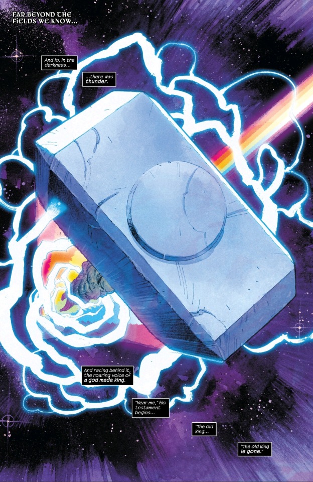
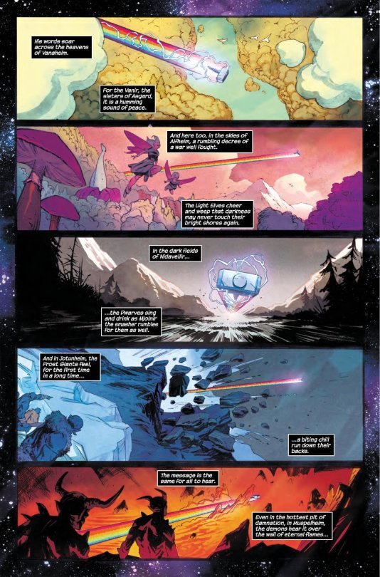
The book begins with an amazing splash page of Mjolnir flying through space and then crossing into each of the Ten Realms as someone narrates Thor’s rise as the new King. It’s a beautiful sequence that alludes to the millennia of war between the realms, culminating in Malekith’s Invasion of them all very recently. Klein and Wilson treat the reader to a variety of landscapes from the bright pinks of Alfheim to the cold blues of Jotunheim. The pair do an amazing job characterizing these locales through visuals alone.
Of course, the reasoning behind the monologue and the throw itself is a show of force. Under Odin, the Realms fought each other as they pleased. Asgard was left in ruins because the All-Father was too stubborn to try and rally his people during Malekith’s Invasions. Under Thor, that would not be the case. As Mjolnir cracks through each Realm, without any of them hearing his words, they know to listen and fear him because of his power. This epic opening climaxes with Mjolnir crashing through the head of some monster the Avengers were fighting before Thor calls it back with a smirk from Asgard.
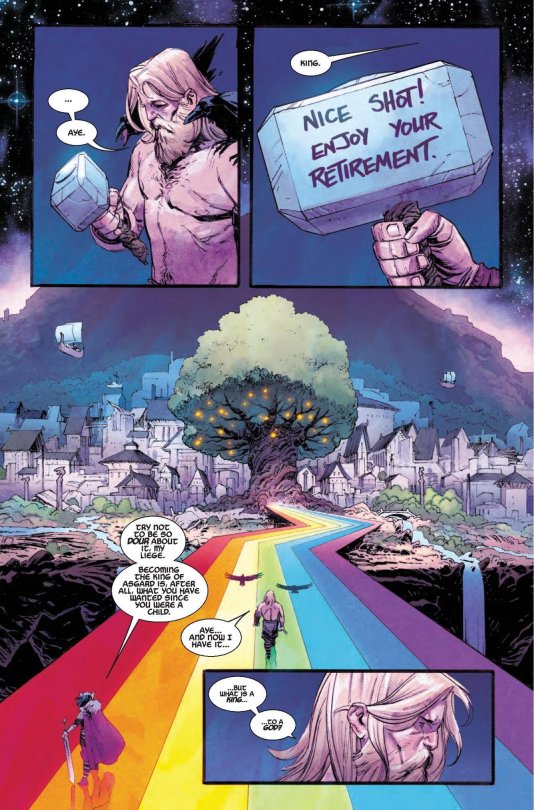
It is at this point that we finally see Thor, months after the War of the Realms. He is gruff, his hair and beard have grown out again and we learn through Tony Stark sharpie-ing a message on Mjolnir that Thor has retired. Sif the All-Seeing reiterates this as she informs the reader that Thor’s smiting days are over and that he must go and be King.
This is...saddening in all honesty. Thor has spent many a lifetime fighting, drinking and avoiding his destiny for so long. He has always wanted to be king, but even as he walks down the Rainbow Bridge back to New Asgard, he looks as if there’s nothing but melancholy about him. The way that Klein frames this panel makes it seem as if there’s a wide divide between Thor and Asgard. The Realm flourishes now that life has been brought to it under Yggdrasil, but Thor is bored.
As he takes a seat on his new throne, we’re shown just how different he is to Odin. Instead of a shimmering palace, Odin’s hall is made of wood and stone because of the World tree with a rune etched just above his seat: Thurisaz, a symbol of defense and destruction (as the book describes) and perfectly fitting of the warrior king. He ushers his court out of his presence and sighs as he prepares to speak to his people and Loki appears from the shadows.
The brothers relationship here is far more confrontational than I would have expected. Granted, I didn’t read the Loki mini-series, so I don’t know if the Trickster did something to draw his brother’s ire. Thor is very terse with the King of Jotunheim and even throws Mjolnir in slight fury after Loki notes that Thor had to grunt when he lifted the hammer, something he’s never done before and a black portent for Thor’s future. Loki didn’t come out with any of his normal witticisms which was unexpected, but Cates does hint that there a potentially big things in store for the brothers through some narration.
Thor had been meant to speak to his people following the restoration of Asgard, but just as he’s about to regale his people of the new era of peace, his nervous butterflies turn to abject horror as a one armed Galactus crashes into Asgard, right on top of the Asgardians. Nic Klein and Matt Wilson spare no expense in making this one of the most epic double page spreads imaginable.
Galactus face of pain and sends a shiver down the spine as one wonders what could possibly have sent him crashing in the way that he did. The debris, people and smoke fly around the edges of the pages as Galactus’ impact and the snow that follows him creates a sense of unease. Klein makes sure that the reader can feel the weight of the crash and Sabino accentuates it with his EXCELLENT “KRAKOOOMM” sound effect. Wilson excellently blends Galactus varying purple tones to the fire just behind his head to create a sense of extreme heat. Klein creates a grand sense of scale as Thor appears miniscule to both Galactus and the incoming threat.
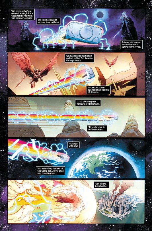
Not knowing what the hell had just occurred, Thor leaps a Galactus with every intention of sending him to Hel herself until the Eater of Worlds pleads with him to stop, warning him of something called “The Great Black Winter.” Part of said Winter had followed Galactus and caused the skies of Asgard to be cursed with rain and The World Tree began to turn black and die. Thor then calls previous Heralds of Galactus to see what is going on. At the table sits Firelord, Cosmic Ghost Rider and others until the Silver Surfer arrives, still black and intangible (See Silver Surfer: Black).
Thor is angry and demands answers which the Surfer is able to provide. We learn that The Great Black Winter was the event that destroyed the Universe before the one we know today and that the Surfer had hidden away powerful planets for Galactus to consume precisely for this occasion. Cates has done an amazing job in building a new lore and power scale for the Silver Surfer in particular as normally he’d have no secrets from his master.
As Thor dons his vestments of war, he thinks back to Sif and Loki’s words of his bygone days as a warrior. It’s a powerful set of panels as Thor seemed ready to enjoy his days of peaceful boredom. He grunts like an older man only snapping his cape on, but that doesn’t stop his kingly heart as when he approaches Galactus, he commands the World Eater to kneel to him. As The Surfer fills Galactus in on his plan, Galactus tells all about what lies in the void of the Great Black Winter; The form of ones own true death. Galactus reveals that he had gazed into it twice. First he saw the void because he couldn’t father the future things that he would see and next… he saw Thor.

The revelation comes as a shock to everyone as Galactus then blasts Thor with an immense amount of energy. Kein and Wilson make sure to shower the pages with bright light, intense lines and posing until revealing Thor: Herald of Thunder, similar to the cover of the book with Thurisaz as the new symbol of his chest.
Donny Cates has a particular style when he writes. He scripts grand moments interlaced with shorter ones that build character. It worked when we got into the psyche of the Silver Surfer as he explored the primordial state of being and Thanos as he watched a future where he had killed all of life. Cates has an affinity for the cosmic characters and it shows as he’s taken the reigns of Thor and reminds us of why he and his lore have been able to capture our imaginations for so long.
Thor has the ability to transverse the Ten Realms, the entire universe if he wishes, but even he suffers the melancholy of duty and boredom. He is a warrior at heart and he needs a great battle to fight in or he loses a part of himself that kept him motivated. With that in mind, Cates is looking to take Thor on a grand adventure in the stars with a buffed powerset that hopefully will expand on his greater strength in the Old King Thor future.
Nic Klein and Matt Wilson make all of this possible however with their amazing art. Klein is easily able to get into the groove of drawing these vast environments, amazingly dynamic poses and heavily expressive faces. Wilson brings it all to life with beautiful and vibrant colors that make you feel as though you’re in there, interacting with the characters. Without them, this wouldn’t feel as epic as it does.
This was a very explosive issue and I’m absolutely excited for the future of this series as I have been with all of Cates’ other work up to this point. It’s definitely a high recommend from me for a promising story and absolutely fantastic art!
#thor#loki#galactus#cosmic marvel#marvel#comic review#donny cates#nic klein#matt wilson#norse mythology
23 notes
·
View notes
Text
Outrun the Sun……Kelly Haigh talks about how it all started and where it’s going.
It was random really….I had posted some cd covers of a 90’s/00’s Canadian indie rock/pop band Ashley Park and tagged author/musician Michael White who played drums on one of the records. From there a few comments came from a Kelly Haigh, a name I remembered as being in the band and she appeared on a few of the bands record covers, too. I then friended her on Facebook and asked if she had any records out under her own name, which she did. One cd (Country Western Star featuring Kelly and Frances the singing dog!) and a book filled with Kelly’s amazing, expressive art that includes a cd (Post Apocalyptic Valentines) both of which I quickly ordered. The music leans heavily toward the country genre, which after hearing some Uncle Tupelo and Gram Parsons records in the early 90’s was a genre I dove into as well. Not having ever met Kelly in person she definitely seems like someone who dances to the beat of her own drum, a unique talent for sure. I then thought she’d be a person to find out more about as being part of Ashley Park and her own solo records that she’d have an interesting story, which she does so I sent her some questions that she graciously answered. Read on dear readers and discover the magic that is Kelly Haigh!

Where were did you grow up? Tell us a little about your childhood.
I grew up with my mom and two little brothers in Winnipeg, Manitoba. We spent summers on my Grandma's farm in Ontario, and so much of my inspiration and love of outdoors has come from those times. My dad was also a truck driver, so sometimes I got to ride with him in his big rig truck where we'd listen to all kinds of great old country music. When I was quite young, he once told me about one of his truck trips where he came upon quite a bad accident. He and his driving partner had gotten out of their truck to set up flares in the dark of night, and he tripped over a man's body. When there was enough light, he went back to check on that man's body, and he saw the man's head had been taken clean off! I asked if he also found the man's head, and my dad said no. On subsequent family road trips, I'd hound my dad to tell me where that accident had been, because I thought if I watched closely enough, I might find that man's head! I recently asked my dad if he thought that man's head had ever been found. He said, 'Don't be ridiculous, it probably smashed to pieces like a pumpkin.' I asked why he let me think I might find it by watching out the car window. He said because it kept me quiet for long enough he could have some peace and quiet. ha! But that was the start of my fascination with death and taxidermy. I couldn't bear to part with my first pet hamster when I was 11. The cold wintery ground prevented me from digging him a grave, so I skinned him. I still have his fuzzy little hide. I nearly became a taxidermist, my dad had an apprenticeship set up for me when I turned 19, but I decided instead to become a hairdresser.
Was your childhood musical? Did you parents/siblings/relatives play any instruments or were they big music fans?
Nobody I knew played any instruments, but we always had alot of records around. My parents were both big music fans. My mom loved Rolling Stones and Diana Ross and the Supremes, and my dad favoured classic country like George Jones, and Dolly Parton. I used to put a yellow tea towel over my head to pretend I had blonde hair, and I'd sing all Dolly's songs, hoping one day I could be a singer, only I was painfully shy. Whenever we were in the car with my mom, we'd all sing along to whatever music was on her car stereo!
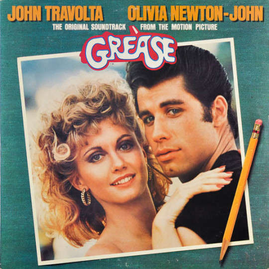
Do you remember the first record you bought with your own money?
If memory serves, the first record I bought with my own money was the soundtrack to Grease. I had been given a record player for Christmas, and it was SO exciting to have a turntable of my own!
At certain point did you ever get into the punk and/or new wave scene?
No. That just wasn't for me!
Prior to Ashley Park had you been in any bands?
No. I taught myself how to play guitar when I was a teenager. I'd sit in my bedroom with my dog and practice playing and singing for hours and hours. But I just never could bring myself to sing or play in front of anyone. I was just too shy.
Please tell us about how you met Terry Miles and became part of Ashley Park?
Terry was my significant other for nearly 15 years. When we first moved in together, he put that band together. I asked if I could be part of his band, and he said no. Then his keyboard player quit the band right before a trip to Austin Texas to play South by Southwest. He said if I could learn to play keyboards, I could be in the band. I had two weeks. He showed me what chords looked like on the keyboard, and told me what chords were in each song. I worked my butt off, and that was the start of my music career! We recorded at home, and I got to sing on some of the songs, and play some keyboards on a few tracks as well.

What was the best part about being in Ashley Park? Did you guys play out often?
The best part of being in Ashley Park was just getting to be part of something musical. I learned so much about recording and writing songs from Terry! Our drummer was Gregory. He's in a band called Sloan now. He was always very encouraging and supportive as well. We didn't play often, but we did get to play a few shows in our hometown of Vancouver, (including opening for the Soft Boys), and as well, we got to tour England! That was challenging, but exciting. We were also on a UK record label called Loose Records, and they sent us some music from some of their other artists including Neko Case. Of course I loved her, and her music led me to discovering and meeting her friend Carolyn Mark, who has become a dear friend of mine, and a huge inspiration to me. And that has led to a whole other life of music now, so many years later...
How did Ashley Park end?
Terry became disenchanted with music. He wanted to make movies, and direct films, which he has, with some good success. He also went on to make podcasts, which are very successful, (including Tanis, Rabbits, and the Black Tapes). He always said we'd record another record, but I knew it was something he likely wouldn't make time for. Ashley Park didn't so much end as just fade away... Though, Terry has the music available online, and he's started to record a bit of music on his own for his podcasts.

Tell us about your solo career. Was Country Western Star your first solo record? How did it come about?
Country Western Star was my first attempt at writing songs and recording. I got to put into action all that I learned from watching Ashley Park songs come into being! I had a rough patch in life, evolution can be painful! So I took my heartbreak and turned it into art! Little songs would come to me each night as I slept, I'd wake up and write them down and record them. I played every instrument on the album. It was huge challenge, but seeing Terry do it, I thought that was just how you created songs! The record was kind of meant to be like a play, little snippets of scenes that hopefully come together to tell a story. Also, it was a bit of a love letter to my dog Frances. My most loyal and loving companion of the past 13 years.
Who is the person(s) behind Darling Music? I’ve got some other fine records on that label.
Terry created and ran Darling Music... He did put out some fine records, including the Solarists, (songs by our friend Cam McLellan, who is SO talented, and a visual artist as well)!
Please tell us about your book that came out a few years ago Post Apocalyptic Valentines (this also included a cd of more of Kelly’s music). How long have you been painting? Who/what are some of your biggest inspirations?
After recording my Country Western Star album, I wanted to record another album. This time, though, I wanted to have some friends who are FAR more talented, play some instruments, and sing with me. It was a really fun thing, and I had a ball making this book and album. I initially wanted to record a set amount of songs, and have a painting and short story to go with each. That was too ambitious, as it turned out, and the project evolved into just including many of my works, and some short stories I did write for this book, which connect to some of the songs. I knew I would have to make something that would stand out, in order to sell some copies. It was becoming clear fewer and fewer people wanted to buy another jewel case copy of a cd.
I've been painting and drawing for pretty much my whole life. I have a pair of paintings I got back after my grandparents passed away. My grandmother had kept these little paintings, darkened skies, owls sitting waiting while their prey, dear little mice, sit unaware of their impending doom. Life is my inspiration. There is so much beauty around us, which sometimes comes packaged with the biggest heartbreaks and ugliness. I always try to paint lovely things with a touch of ugly, and ugly things with a hint of beauty. There is one artist in particular, Ray Caesar, who inspires me the most. His works are beyond incredible, but as a human, he is a kind, and generous man. Generosity of spirit and encouragement. He found me on MySpace (remember that?) hee hee, and sent me the nicest note that made me want to keep painting.
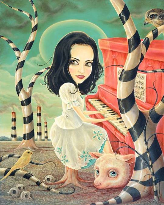
Just one of Kelly’s fabulous pieces of art.
Name some bands/musicians from your neck of the woods who we need to hear?
My bestest pal, an incredible steel guitar/guitar player (and singer) Jimmy Roy, who plays music with me every Sunday night at a local music and dinner club called the Revel Room, also plays with a band called Petunia and the Vipers. Another band, Viper Central, every musician in those bands are so talented. Carolyn Mark is also one you must hear! My own sweetheart, Don Clark has a record up on Bandcamp that is pretty great! Two of most incredible guitar player friends, Paul Rigby and Paul Pigat have recorded together, Pigby... Kitty and the Rooster are pretty fantastic! As well as the Modelos! Also Geoff Berner I got to paint a couple of his album covers (A couple of Carolyn Mark’s as well, so I’m partial to their music as I listened to it so much as I worked on creating the album art) These are some I can think of off the top of my head. I'm sure I'll think of more later, and feel badly for forgetting...
How about a few of your current favorite bands/records (from anywhere)?
I have to be honest, I mostly listen to old time country music, and Elvis Presley. Stuff like that. I don't hear much current music, aside from friends who play locally! I do like to hear a little Camera Obscura sometimes!
What are your top 10 desert island discs?
Here's the funny thing about how music has changed... No longer going to buy copies of albums, but searching out music by artist, I don't know album titles really, for the music I listen to! I mean, a few I do, but the 10 artists' recordings I'd need to have would be as follows,
1 Elvis Presley
2 Buck Owens and the Buckaroos
3 Melvin Endsley
4 Wynn Stewart
5 Dolly Parton with Porter Wagoner
6 Loretta Lynn and Conway Twitty
7 Anita Carter
8 Patsy Cline
9 Marvin Rainwater
10 George Jones and Tammy Wynette
What’s next? Will there be another record soon? Another book, perhaps?
For sure I'd LOVE to get into a studio with Jimmy Roy, and our band, the Murderbirds! We have SO many amazing friends who could play on it with us! We have a lot of songs written, so hopefully soon we can get this going! I think it would have to come in another book for sure! I'm not sure yet what that might look like!
Any closing comments? Final thoughts? Anything you wanted to mention that I forgot to ask?
Final thought... I think people should sing every day, even if it's just in the shower! Nothing brings as much joy, in my opinion, as music. It can bring people together in so many ways. It can build memories, help us feel connected to others, to ideas, to feelings, and to ourselves. <3
www.kellyhaigh.com
www.northern-electric.ca
youtube
2 notes
·
View notes
Text
Research: Project Defuture The Future
Randolph Lamonier
Randolpho Lamonier, is a visual artist from Minas Gerais, born in 1988.
He developed several works, specially photography articulated with other languages. He deals with several daily experiences in the city as a form of work, in which photography leads to multiple forms of symbolic exchange.
His work moves between different media, with a leading role in the practice of textile art, drawing, photography, video and installation. In his research, word and image are always together and tend to talk about micro and macro politics, urbanities, sentimental lies, chronicles, diaries and multiple crossings between memory and fiction.
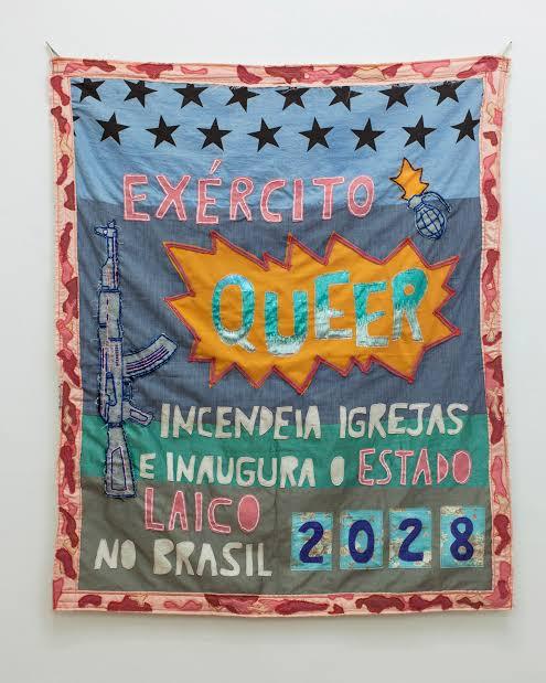
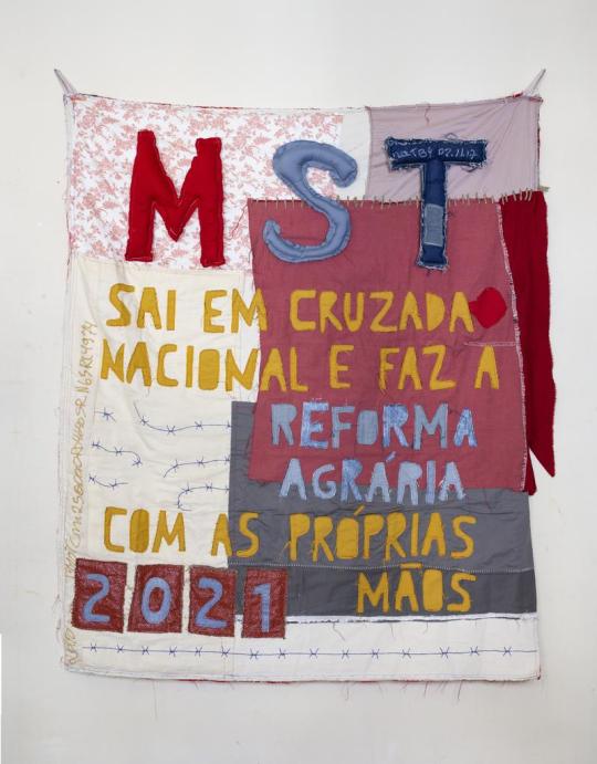
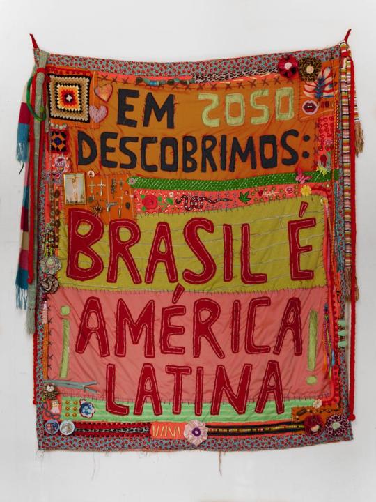
The work done in fabric and embroidery brings sentences like: “ In 2040, we legalized love and other less intense drugs”, and is part of a set of creations in which Lamonier elaborates predictions based on thoughts about the present. “ I always create these works from guidelines that I consider urgent”, explains him.
In the words of the artist himself: “I make flags with what I have. I have never been so foreign. I draw poems, calls for help, war cries, everything is very urgent. The air is contaminated, the floor is covered with debris; sheets, pots, ropes, concrete, broom. Under the rubble the seeds grow in a hurry”.
Perhaps something more interesting than his incredible flags, are the themes he addresses, most of the time making a prediction of the future, about things that could happen in Brazil.
He is indignant with everything rotten that has in Brazil, from the corrupt government, the uncontrollable drug trafficking, the misogynistic society that still exists in Brazil and in several Latin countries, up to the violence itself.
He creates these flags in order to have some kind of hope for Brazil in the future, creating an utopia, where the problems would be thrown away.

David A Smith
Is a British designer who is specialized in lettering.
He started his own company own sign writing company in 1990 and after 13 years sold the business in 2003 to concentrate more on hand crafting lettering and glass gliding. His main techniques include water and oil gliding, acid etching, French embossing, screen printing and sign writing.
His career in sign writing began in 1984, when he left Westlands school in Torquay, age 16 and was apprenticed for 5 years with Gordon Farr & associates. They were a traditional sign writers, who had come up through the ranks and Gordon, had an uncanny ability to paint letters, accurately laid out, without even a sketch. Under their tutelage, David became an accomplished draftsman, and a accurate letter painter.
This gathering of talented sign artists, carvers and muralists experts. David passion for creating elaborate, ornate mirrors&reverse glass signs of distinction.
In 1992 he set up his own business in England dealing every aspect of sign trade from vehicle graphics to 3D installations.
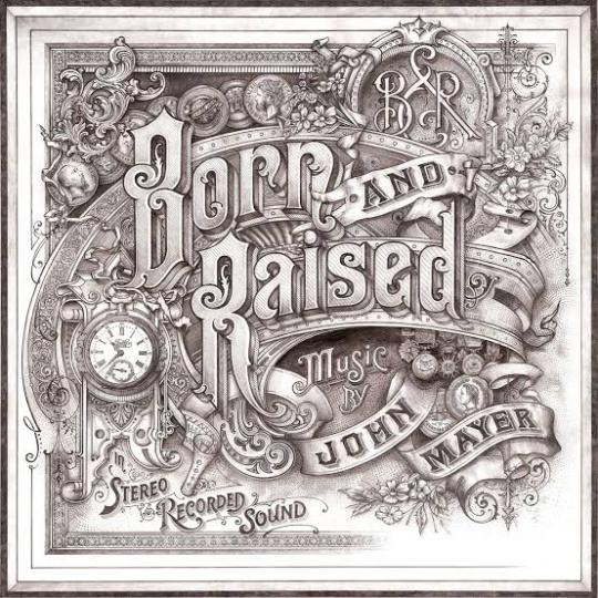
In 2012, Smith was hired by the singer John Mayer to design the album cover, of ‘Born and Raised’. The cover was styled like 1900 trade card.
He has also worked on posters and other merchandise associated with the album and single.
He was also commissioned by Jameson Whiskey to design a st.Patrick’s Jameson Whiskey bottle for the brand.
David sold the business, to concentrate more fully on gilding, painting e acid-etching glass, adding cutting, so that he could fully replicate the Victorian glass work he admire so much.
Thomas Burden
Burden is a senior designer at the design boutique “I Love Dust”.
He likes to produce work that references the pieces of vintage tat and printed material he gets from car boot sales and junk shops. Thomas Burden has created work for book covers, ad campaigns, music videos and magazine editorial to packaging, and even animations.
Thomas Burden was always encouraged to be creative, he was allowed to draw murals on the walls of his house, when he was very young. He had many references to do his drawings, in his grandparents house, full of Alpine memorabilia and indigenous art.
Toys weren’t allowed in Burden’s life as a child, so he was always looking at catalogs full of brightly colored things.
So in his works he tries to transmit that nostalgic journey to his childhood memories.
In each work there is a maximization of colors and textures and his great influences are: the film director Wes Anderson and the artist Mark Ryden.
On his own words: “ I was lucky enough to have a pretty idyllic childhood. I grew up sailing and skiing and traveling, so our house was full of souvenirs that parents collected, along with various bits of old boating junk and pieces of old cars”.
As an 3D illustrator / Art director from UK. He had worked with many different clients such as Nickelodeon, The New Yorker, Apple, McDonalds, Penguin, Bloomingdales and Ford.
His signature style is mainly the toys that he was never allowed as child, combined with fairground / neon signage and anything bright and fun that catches everyone’s eyes. He create works in Cinema 4D, also using the Adobe Illustrator, Photoshop and After effects.


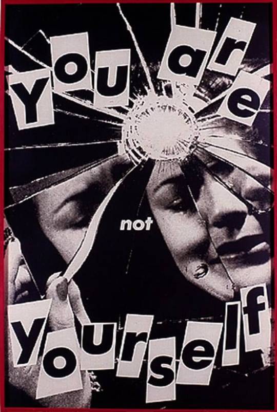
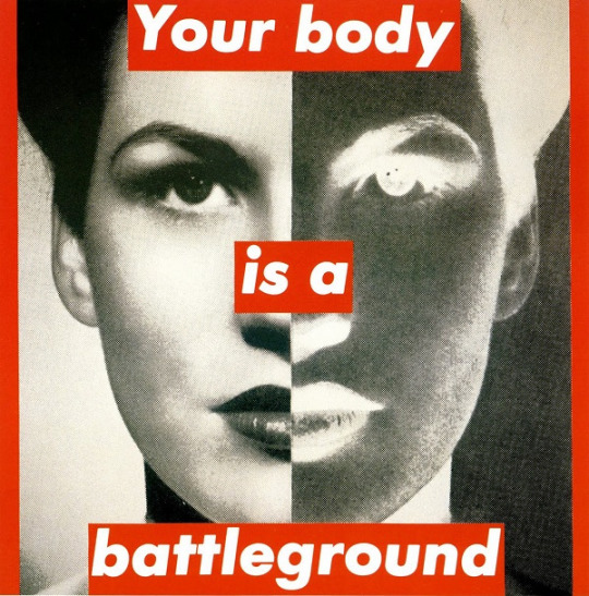
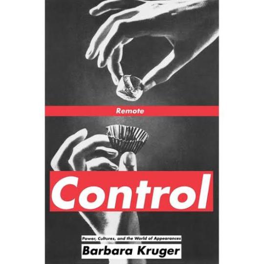
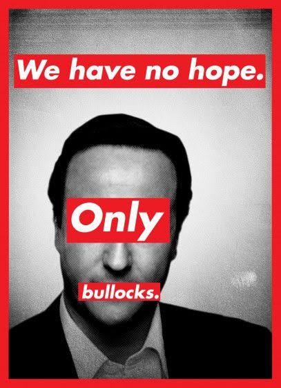
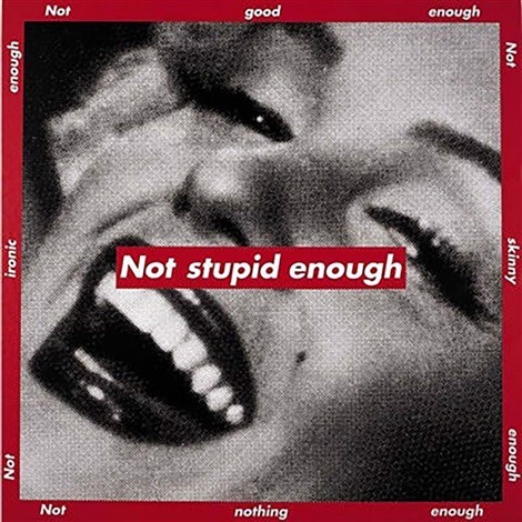
Barbara Kruger
Barbara Kruger is a postmodern artist who was born in 1945 in New Jersey. Having grown up in a middle class family, her first job was as an operator. In 1965 she graduated from The Parson Design School in 1965 and worked as an art director in different magazines. By breaking some barriers of the modern art, Kruger and other women artivists ( art + activism) demonstrated not only against the bonds of patriarchy in society, but also within cultural production. Being an artistic medium an environment built largely by male hegemony, feminist art presents itself as a mean of liberating women. Her works examine stereotypes and the behaviors of consumerism with text layered over mass media images. Rendered with black and white, with a red background, Kruger’s works offer up short phrases such as “Thinking of You” and “I shop therefore I am”. Kruger uses language to broadcast her ideas in a myriad of ways , including through prints, T-shirts, posters, photographs, eletrônico signs and billboards. Despite the work of feminist artists of the twentieth century to change the way women are portrayed in the art world, today this representativeness still confined by a backward ideal. Thus, the work of Barbara Kruger proves to be even more relevant and undoubtedly necessary today.
Mike Perry
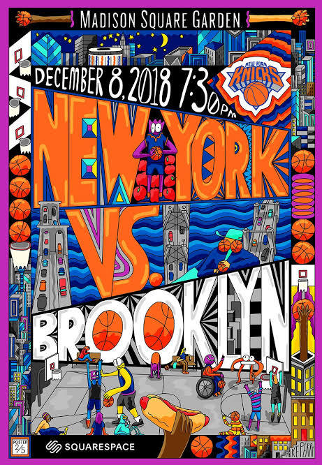
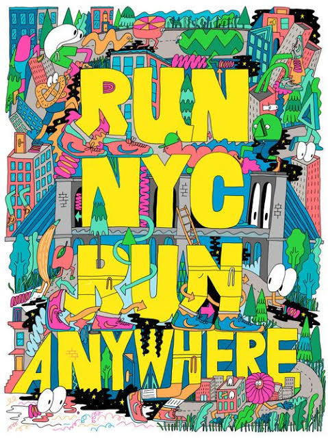
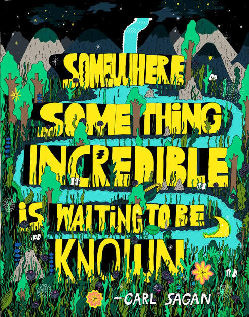
Mike Perry is an artist that makes paintings, animation, sculptures, books, public art installations, monographs, silkscreens and more. Mike Perry was born in Missouri, United States, and grew up in Kansas City. He started drawing at the age of four. He attended to the College of Art in Minneapolis, and earned a degree in graphic design. Mike Perry's style of using extremely vibrant colors, and making totally stylized designs with a lot of personality is something that draws my attention mainly. His letters are always around a totally imaginative space, which can be both a forest and even a city. The creativity in making those compositions for his posters is something very captivating, not necessarily making a poster that matches with the reality, but doing something perhaps lysergic. His works can be considered love notes to the abstract, unknowable future that is all possible in the present. Illustrator Ana Benaroya said that , “Mike Seems like a modern surrealist to me. His works feels like a childhood memory of slipping down a giant water slide during summer. Slippery and wet and innocent but not innocent. His drawings feel like they just fell right out of his brain onto the paper”. I think he is a great influence, especially for this project. Because I'm wanting to go overboard with the lyrics and the drawings, wanting to do something totally experimental, doing something absurd and creative at the same time. And with this nature theme, I want to make posters with extravagant animals and unconventional scenarios. How he uses photoshop and Procreate for most of his work. I would like to use Photoshop again for this job to continue to learn painting techniques.
Filipe Grimaldi
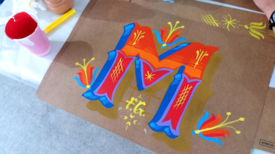
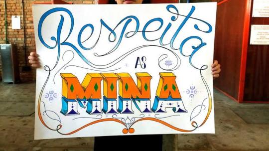
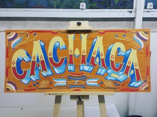
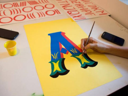
Filipe Grimaldi is a lyricist and designer. He has been working in the graphic design market since 2006 and, in recent years, has been focusing on the study of manual techniques of calligraphy, lettering and letter painting, migrating part of his work to the development of letterings and commercial decorative painting.
He even give practical classes in ateliers of other institutions. His works can be seen on walls, slates and thousands of plaques that circulate around with his characteristic traits.
Filipe Grimaldi works on the primary chromatic contrast, a key element for the graphic construction of the alphabet.
Letters, words and sentences are organically raised, avoiding the precise math of right angles.
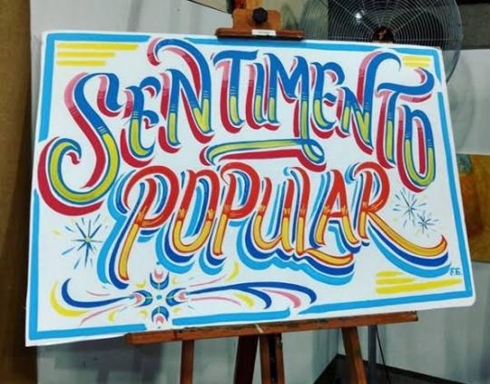
I met Filipe Grimaldi at EBAC in 2019, when he taught a class of typography, teaching how to make a freehand letter. I was impressed, because I saw great perfection and lightness when he drew those letters.
In addition to using several very vibrant colors in his works, even looking like a lettering of an entertainment show.
He even painted on a mural at EBAC, where even I had the opportunity to give a light brushstroke in one of his letters.
For 13 years, Filipe has been specialized in manual techniques of calligraphy, lettering and letter painting. In his own words: “ My authorial research and commercial activities ended up leading me to rescue the calligrapher profession, an almost extinct activity in the development of technology and printing and clipping machines”.
Currently, he teaches typography and calligraphy, for college students, with the goal of encouraging people to try more hand-made letters.
Wayne White
Wayne White is an American artist, typographer, cartoonist and puppeter. A former set and character designer for the television show Pee-Wee’s Playhouse, White produces ironic, often subversive imagery. On Pee Wee’s Playhouse where his work for his set and puppet designs won three Emmys; he also did many voices on the show. He is best known for his word paintings composed of oversized, three dimensional text painted onto cheap landscape paintings he finds at thrift stores and markets. In 2000, he began painting words and phrases, on thrifted lithographs. “When you think about it, you’re surrounded by giant letters and words everywhere”. White said once. “We don’t take for it granted, but the whole American landscape is nothing but a giant letter forms”. One Journalist said his opinion about White’s paintings: “the weirdest landscape painter in America, White uses master painting techniques to create the illusion of words and phrases surreally disappearing into the horizon or jutting out from each lithograph’s place setting.” White’s famous “word art” paintings hang in museums and galleries across America. His paintings features technically proficient and wildly colored phrases that are funny and sarcastic. And critics have praise White’s series for being entryway to the artist mind. Over the past years, White has worked primarily as a fine artist with solo exhibitions of his paintings and sculptures in galleries in New York and Los Angeles. In 2006, he created a giant head sculpture, with a giant lettering next to head. This marks one of White’s other passions, which is sculpting, and he like to exaggerate on the expression, of the characters that he is sculpting.
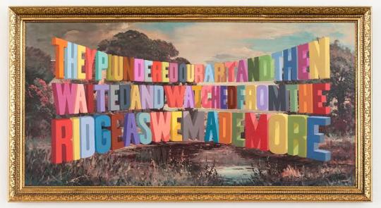
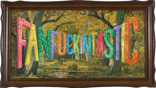
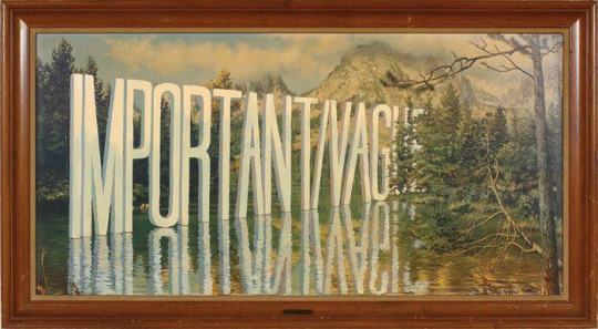
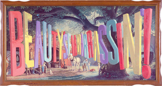
Joshua Noom
Joshua Noom is a famous illustrator who was born in Australia, in 1988. He is very popular in the social networks, specially in Instagram, where his minimalist illustrations and typography have earned him over 60,000 followers. He had created several illustrations for musicians and major brands like, Miller High Life, Sony, and Warner. Today Noom lives at Florida, and he is specialized in detailed and bold illustrations combined with an organic sense of typography. One of his most recent works, was recreating the Bible’s cover, with many other Christian artists. Each artist offers a visual entry point focused on a particular biblical theme or passage, setting a tone of reflection as readers engage with the Bible. I’ve been looking at Joshua works, and I really like the feeling of gritty and inky that he puts in his illustrations. Some of his works feels military inspired and masculine, while other pieces feel soft and feminine, like some vintage postcards that he produces. Something that Josh uses in most of his work, and that connects with my posters, is the use of wild animals and different situations. It can either make a tiger surfing, or even protest posters for the preservation of wildlife. He has a very intense passion for animals, and he enjoys drawing them in very expressive ways. With strong colors, with its minimalist style, and texts with different fonts around it. In a interview Josh even discusses his style “ My inspirations for my style are mostly from music and other art, but one artist that I’ve been diggin’ is Mark Conlan. My style has just kind of developed over the time and I think I will probably keep evolving. After many attempts of trying new things and figuring out what works for me, and what doesn’t for me. I prefer to draw in a more minimalist style, specially using my ink pens. Animals are one of my inspirations, specially here in Florida, we got many different species of birds and reptiles, so like to sit somewhere, and draw any animal that appears, and try to create a composition with different typefaces, to make future posters.

1 note
·
View note
Text
Pop Comics #5: Astonishing X-men #3. Is Clarity Enough?
This article originally appeared on my patreon, which you can subscribe to for as little as one dollar a month. As a patreon subscriber you get to see these and other articles sometimes weeks before everyone else. Subscribe now.
Pop Comics is a series of articles I am doing on the most popular comics according to Comixology’s weekly top 10 list. This week I am writing about Astonishing X-men #3 which is written by Charles Soule, penciled by Ed McGuinness, inked by Mark Morales, colored by Jason Keith and lettered by Clayton Cowles. Astonishing X-men #3 is basically like...a game of Heroclix between The Shadow King and Professor X. The comic starts out with Old Man Logan climbing through an icy astral plane whining about how in an alternate past he killed all the x-men yada yada. There’s a side game where Professor X is trying to get Logan to something or other, without the shadow king knowing.
Meanwhile in, London(you can tell because it says so you see)…
Psylocke, Bishop, and Angel are protecting the X-men in the astral plane from alarmed local authorities. Of course the London police are pretty concerned about the X-men being there--which, I’m thinking of all of the other times the X-men have fought some huge battle or tried to do similar things without the authorities ever really showing up--and so...good on the London police. Eventually the x-men send Angel out to try and calm the situation, but the police shoot him with a razor net or something. Angel starts to wig out but eventually refrains from doing anything; instead he offers to do some kind of hostage swap where an officer goes down to the roof and he goes into their helicopter--which doesn’t seem like a good idea on anyone’s part. And of course, it turns out it’s not. As Logan is taken over by the Shadow King, awakens, and promptly kills the police officer who has came down to talk to aforementioned x-folk. The comic of course ends at this moment.

That’s probably the strongest image from the comic as well. It really captures the distress of the dude, and the sort of dark elf appearance of possessed Logan kind of accentuates the “uh oh-ness” of the moment to a sufficient degree. On the whole, it’s a solid comic to be honest. Everything that happens in it is very clear. You are told very overtly who people are, where they are, and why they are there, so even though I am reading this in issue #3 I know exactly what is happening. In that way it is a very functional workmanlike comic that meets the quota of being a thing that came out this month and appropriately updates the story of your favorite characters. But let’s say you weren’t an X-men fan. And just wanted to read a good comic--I don’t know that it is that. McGuinness figures aren’t that dynamic to look at, and kind of just look like pictures of toys more than they do flamboyant characters locked into an extradimensional fight that defies the laws of reality. I think X-men: Heroclix is an adequate description of how all of the characters look. Which again, is fine. But I mean if you’re an adult, maybe you should be buying those 3A figures instead? Just sayin. I think the main thing that was interesting to me reading this, was the parts with Logan in the astral plane which are meant to take place in a very snowy cold creation of Logan’s imagination.

The story tells us that Logan has made this place for him to traverse because he likes pain. So in theory this is like the worst snow that Logan can imagine. His idea of painful snow. But the depiction of this is very lacking. There’s this blue gradient easing you from the whites to the blues in the sky sometimes into black, which is very soft. And while it denotes coolness, does it really hit as COLD? Add to this, there aren’t very many snowflakes. Logan himself is not even bundled up, just wearing a normal jacket, bare hands, exposed white tank top, some jeans. The choice to keep Logan in this costume undercuts one’s ability to visually apprehend this as a cold place, because dude isn’t even zipping up his jacket. And then there aren’t many physical signs on Logan himself that he is in snow. His hands look frostbitten a little bit on the very first page, but never after that. None of the snow is really sticking to him. And then there’s not much of an attempt to show the scale of him trudging through an endless snowy battle towards a fortress in the distance. As an idea that is very epic and if I just told you it was a snow comic where Logan killed his way through all of his old enemies on the astral plane--I think you’d picture a really rad comic--but there’s nothing like that in this. Compare all of that to Barry Windsor-Smith’s snow in Weapon X:

Which, it’s not fair to compare anyone to Barry Windsor-Smith in comics(though it is worth using his work as a measuring stick to ask for more from artists)--but I think there are some basic principles here that if they had been implemented would have really turned up the volume on Astonishing X-men #3. First of all, note how much snow is flurrying around on the BWS pages. There’s not even space for a colorist to run in here and drop gradients. What is the point? The snow has a physical force in these panels that impacts the figure within it. The environment is impacting what it contains, which creates a much richer sensation as a reader because you have to recognize the impact of this environmental force--wherein the astonishing pages you an just glance over it. Look at how the snow is stuck into Weapon-X’s hair. And look how it freezes to his face. This is the same character! And we are led to believe in Astonishing X-men #3 that that snow is the worst that the same character as BWS has drawn can imagine?? It defies belief.
The great thing about setting something in the astral plane is that the rules of reality don’t have to apply. So everything can be extreme. Everything is the mental dream or nightmare of the image. The most insane unreality. So to set something there, and then to be so boring that you don’t even draw more than a few snowflakes is insane. There are more snowflakes on these two pages in Weapon X than the whole of Astonishing X-men #3. It’s all just lumped into the colorist’s hands, and I know we live in an age where colorists are considered so important--but I don’t think that the best artists in comics are worse than the average colorist--so I don’t get where the trust comes from. The artist should be leading the way not laying back in the cut letting the book live or die based upon the colorist ability to finish up the environments. There are very few colorists who have that level of skill. Like I could see if you were working with Dean White who was going to paint the whole thing for you--but in this case it seems lazy and rushed. Which is crazy--because if you rock it correctly, snow issues should be pretty low on the workload! You can leave so much white! Also--having the word balloons a whiter white than a lot of the snow...doesn’t help visually! These problems with the setting continue into the London parts of the book, which...don’t really evoke London. I mean...I assume the buildings that are drawn there are actually there. But the buildings don’t look any different than NYC, and the London Police and their superiors don’t really have any kind visual signifiers that make you think they are not American. Which is fine. It just means as a reader, that aspect of the book has no weight to it. So what we’re left with in this book is everything is hinging upon how dramatic the writing can pit the stakes between these action figures. My other thing, which is a more general taste thing is “floaty panels”--they are all over here:
I call them floaty panels, where panels are just stacked randomly over each other and then over a bottom image, and then somehow you call it a day, and say “composition”. To me it’s goofy. Like look at the above page. The most background image is Angel starting to freak out, and the panels are basically placed down across his wing. That image is kind of the dramatic underpinning of the whole page--so from a logical point of view it make sense to then visually have that actualized. But all you’ve really done is covered up art and crowded out the most dramatic moment. It’s a taste thing, but I feel that if this page had been on a grid, and the last long rectangular panel was just this unclouded image of Angel about to go nuts--it would have hit harder. Also there’s never any attempt to try and make Angel flying around these helicopters look cool. He literally could still be standing on the building in that first panel and you wouldn’t bat an eye. The bald dude literally looks like he’s just peering out his office door telling people to get to work. But then you look at it, and are like “where would you even show the cool panel of Angel hovering dangerously between these armed helicopters? There’s no space?”
Also...I don’t get it...the net cuts his wing? Perhaps showing this dangerous knived net would have helped? Or just have someone use a gun? Maybe it’s because the story needs a reason for Angel to go crazy, so the net has to cut him? The way that it’s done, it’s the same problem as the Logan stuff in the Astral plane; you are being told by the story that there are stakes, but those stakes aren’t really being shown with any kind of weight. And weightless stakes are not the best thing when you are talking about stories largely about characters that everyone knows can’t really progress beyond their static movie IP stage. But again. This isn’t a bad comic. It’s just very focused on clarity and the mission of conveying a plot. a plot. Without offering much beyond that. Which I think a lot of editors in comics see as a goal to shoot for. Philosophically I think clarity for its own sake is just treading water. Just because you can see something doesn’t mean it’s worth looking at. Rather than clarity, I think value should be a larger goal. How do I create value in you looking at this thing? Because you can have two images of a chair, right? But which one is the one you are drawn to? Is it the one that just looks exactly like a chair? Or is it the one that makes you really examine the chair, and think about your own internal image of the chair to compare? And I mean there are an infinity of things that can spin out of a chair. And that’s just a chair. Surely the astral idea of snow from the perspective of a man like Logan can be more interesting than even a chair. Or we should at least ask for it to be.
43 notes
·
View notes
Text
Beyond Talks - Day 1
Research for, in and through practice.
Speaker 1 -
Rosie Cox & Cathy Campbell - Xero - https://www.xero.com/nz/
Design at Xero - “research won’t give you the answers, but it will point you in the right direction”.
C - Design research lead: Des majoring in Industrial at AUT, worked in research, strategy, Xero product team, in process from the beginning, customer to end product.
R - Designer: studied graphic design - branding, packaging, graphics - worked at a start-up building educational children’s apps.
Research is a part of everything that we do.
Community & social sites, design research, competitor analysis, data analytics…
Curve of uncertainty to confidence in product design, an inkling of an idea to a fully formed idea and product.
Generative: empathy research, customer research, what is the purpose? Is there a problem here? Are we solving the right problem? Absorbing information and a space of understanding.
Evaluative: are we solving the problem in the right way? Sharing paper prototypes, sharing idea, getting critique, usability at the end of it.
Observed people doing tax returns and interacting with Xero software, from doing 6 observations, they came up with insights on where they could alleviate pain or save time through improving the software. Did a design sprint with marketers, engineers and designers - consolidated down to 1 solution, tested with 6 external customers, then iterations and testing - look at data analytics and iterations cont.
Tools: generative - what / why are we finding out? Define assumptions before testing, design question framework to take you through a good conversation (to cross off points, e.g. snowball analogy), mindset of being empathetic - they are the expert, not you. E.g. “Miro” board (whiteboards/post-it notes digital, e.g. digitises real post-it notes with handwritten type, also used to capture feedback from users in different colours) — organise post-it notes, transcripts, finding commonalities in problem spaces, sharing with project team. What are the possibilities? What value will it drive?
Try e.g card sort - see if your ideas are the same, paper prototyping - scribbling away ideas / co-designing, or take them through a clickable prototype - asking unloading questions to open it up.
Usability - e.g. clickable prototype or product in production, online or in person, see interactions / where mouse is moving - feedback to the team.
Researchers are only as valuable as what they can share with their team of people. Understand what you’re working on and share it with other people.
Be comfortable with not knowing, clear about what you don’t know.
Desirability hat, but also viability and technical feasibility. Working with existing technology, many hats in the development process.
Take up research as a way to provide objectivity and rationale to your ideas.
Be curious - ask questions. Ask “why?” - why the customer needs it, why it’s important to the business, what’s the point in doing it. Why is important.
Xero Graduate Program - curious people, know about user testing, ask why, willing to learn, knowing you are part of a team, collaboration. https://www.xero.com/nz/about/careers/graduate/2021-product-design/
Data privacy, how you store information.
Optimal workshop - digital tool: card sorts, tree testing, groupings https://www.optimalworkshop.com
Team structure - “product designers” traditionally UX/UI designers. 1 accounting software, teams split across products, EGM of Design - Directors (1 area), Design Managers, team of Product Designer who work with a POD (product owner, devs, QA’s), Design Researchers (13 in total) - 75/80 people combined across team.
Developers / Engineers love data - watching user videos helps to empathise.
Ethics, legal team comes up with guidelines - do you need to collect that information, is a relevant for this project. The more data you collect, the more you need to get rid of over time. GDPR - rules around data collection.
Security, e.g. X1 (confidential, can’t leave the office) - X5 (anyone can see this)
Usability testing, depends on project and deliverables, UI has a structure around it (visually) at Xero, testing becomes more specific as prototypes change. Trying to test too much is a big pitfall, if you get clear on the top 3 things you want to find out, answer questions, define what it is you are trying to find out. Understand the point where you’re at, have you moved from UX to UI?
Test the concept, solution, value proposition first, before spending time putting detailed UI screens together.
Speaker 2 -
Alastair McCready - Inhouse - alistairmccready.com
Graphic and typeface designer - few Best awards, past AUT student
Craft of the working designer
Fonts - makes them, used to be a screen printer, using the pen tool,
“Letters are signs for sounds” - Eric Gill
Metaphors - saying something without saying it - with fonts, hinting at things or moods.
Typeface designer (makes the type, e.g. luthier guitar analogy) / typographer (someone who uses type, e.g. guitar player)
Colophon Foundry - type foundry (photo)
Commercial and bespoke range of clients.
Typographic memorials - in parks - was influential.
Research and practice
Project 1 - King’s Theatre - in Brooklyn (NY) - water damaged, got restored
Mike Meyer (sign-writer) inspired rail-lettering style but still hand drawn style. Developed it into a system - used on posters since.
Project 2 - James Bond font - Eon Productions
Looking at James Bond as a character, personality - e.g. never see him eating, he’s a solitary guy, often seen in isolation, walked the streets of London trying to get perspective.
Interpol - Guggenheim in NY - style - brutalism / modernism of architecture, bauhaus masters, imagery to pull from. ‘Babbakin’ area.
Uno Goldfinger - Architect
Set designer - Ken Adam
Napier (from here) - was smashed by an Earthquake, art deco street signs, Futura is an art deco typeface.
Typeface for James Bond, inspired by idea that it would need to look OK on a whisky bottle and on the side of a building. It’s a tool which unites elements together, e.g. watch, t-shirt both saying the same thing. Multiple weights, deck weight for subheadings.
Crests - designed to be made small - James Bond’s family crest.
Project 3 - Type as Monument - type as a memorial Trajan column in Rome.
Photographing memorials for war, NZ gave more people in WWI than other countries.
Primary research - taking a wall rubbing of plaques
“It’s about the journey, not the destination.”
Try to enjoy what you’re doing at the time.
Memorial fonts - Memorial / Flagstaff
Put it in a book, which will be published “Memorial As Type”
Scars on the landscape that unite us.
Type is a way of expressing himself, without spelling it out.
Find something that is endless to develop upon, growing research.
SO much work to be done in the type industry.
“I’m not a pilot but I could’ve been a really good pilot” - grew up around planes, his dad flies, used to hang out with the old guys who restore planes. He helped them to restore the graphics and lettering on the sides of the planes, numbers on the side of a Lancaster.
Peter Gilder - “the more reading you do, the better writer you’ll become” - it’s the same with fonts, the more you use type the more you’ll understand it. It’s a matter of caring and reading, his mentor in the UK teaches him stuff he thought he already knew. Be aware and look at other work, processes of why a font was designed for certain purposes.
Software: font lab, robo font (user can build more additions to software), glyphs (main recommendation - doesn’t crash, friendly user interface) - uses it for drawing logos.
Try to be original, but don’t be too hung up on being original. Reference 2 things, but create something new, or add on it, look backwards to see forwards.
Have confidence in your passion, get involved with DINZ, Designworks - working as an intern as he was eager and active, serving beers at a DINZ event, Anzac Tasker was there at the event, he was the only student at DINZ that night.
Passion shows through to people who give you a chance.
Is type as monument national or international - or inherent to a place - a certain tone of voice at a certain memorial - grandure or religion. Find a project where you can narrow your gaze, narrow the scope, focus on NZ heritage, ANZAC memorials, became a NZ project. Theory behind it could be international.
Achievable, local, available project.
Speaker 3 -
Felicia Irene - Culture & Theory - https://www.cultureandtheory.co.nz
Strategy Researcher - operates within a strategy team - picks key insights to deliver strategic work.
New York called, interned for Saatchi & Saatchi NY, 8 weeks, asked her to stay until her visa was up.
Passionate people doing cool work, Walmart account - world’s largest retailer at that time.
She freelanced in New Zealand, but wasn’t learning as quickly as she was in an agency.
Culture & Theory was a team of 4 (4 years ago) now they are a team of 12.
Business / Strategy / Design - started as a Designer, became a Strategist.
Compiles info about products and services for strategy team, from internal team to brand specific comms to consumer research.
Start broad, then find the essential issue - capture the issue or challenge.
Visual research - meaning or emotions.
Strategy - timeline of products or services, where numbers have grown or not. Look at issue or noise around it, e.g. Coca Cola (plastic, sustainability issue), and what are the competitors doing? What are they doing that we don’t? What is effective about it?
Research in supermarkets, whether products are standing out or not.
International landscape - outside the NZ market - find nuggets to inform argument.
Process takes a lot of curiosity, capture a lot.
Find an informed point of view, “why?” Ask the hard questions to the client and yourself, does it make a difference? Bullet-proof your argument.
The world is moving fast. Cultural trends - fall behind without knowledge of cultural trends.
Research - Hypothesise about the future* Brian Collins (strategy)
Ask what the reason is for the topic’s existence? Think of having a future beyond getting your degree. Find one thing you’re most annoyed about and find a solution for it. Or think about an area that you’re most passionate about, passion is contagious - immerse yourself in it.
All Birds, Patagonia, Blunt Umbrellas, Rhino, iPhone, Fjallraven backpacks.
The best designers think strategically, know the problem, find the solution.
“Design is a benevolent agent of change, it comes up with a thesis or an idea or premise about the future. It builds artefacts to make it real.”
Research trends, from the past year, think about what it means going forward.
Strategy and creative phase - seamless workflow
Memes - deliver on emotion or point in time - relatability to people - not a serious form of communication
Freelancing - differences between freelancing and agency: clients / small businesses with specific projects, agency project timelines are really tight, not just deliverables but it’s about the idea - the conceptual part.
Walmart “store of the future” idea at that time.
Do you have focus groups for strategy? Yes, workshops for brand (client and internal team come together) - qualitative research to test out an idea with a consumer to test potential of idea going forward.
Good things are working, bad things need to be tackled or challenged, interesting things are usually emerging.
Noise in sustainability area surrounding brands, where the world’s moving. You can’t decouple sustainability from any products or services.
Start-ups have a bigger appetite for change, but as an agency you can have a voice of change.
Portfolio advice - sometimes the prettiest tangible design work doesn’t resonate, how much passion you have is what counts as a junior and being able to articulate things / presentation. How much you are able to articulate an issue verbally, to sell an idea, convince the client and what you can do to solve it.
Meet people, talk to people, be excited.
AUT Internz program, domestic and international internships - apply to be in the pool, then later in the year apply for the particular company. e.g. Red Antler.
https://internz.aut.ac.nz
Speaker 4 -
Monique Redmond - AUT
How practice generates research
Practicing artist for 25 years, went to art school in the late 80’s went to teaching college and was a teacher for many years.
Photographic, installation and social exchange practice.
Exchange, reciprocity,
Flowers, ceramics and printed matter.
Drive-by photographs from inside the car - of flowers and flowering trees, some will have been photographed over 15 years.
Drive-by as a suburban inhabitant, became a map of her movements across space, a method.
Ceramics, in the 1970’s e.g. Public Share collective - a nod to the quintessential morning tea cup.
Collating recipes - used baking as a way to host in a social art residency. Cultural space of difference, e.g. sultanas not existing in the US.
Magnolia as an object hood in her life. Each year represents 1 flowering “A Floral Gesture” project iterations, distribution in the world - ‘take away magnolia’ printed on a folded publication.
Misprint of a magnolia photo - Index Studio print.
Characteristics of a Risograph print (as a material or process), situates it as a conceptual flower. Generosity as a material for her PHD project.
@afloralgesture - Instagram tag
Akzidenz Grotesk - Marcel Bloodthaers, e.g. Moi Aussi (1964) refused to work along the Fluxus / Dada movement at the time, he challenged it and printed over photographs.
index.org.nz
“I like to think of noticing as a conceptual act.”
The idea of what it means to keep company as a conceptual idea
The exchange event is the research focus.
Driving by is a daily practice, she mutters about flowers she notices.
An interest in publication, e.g. format of a newspaper - Flowering Now - ad in the newspaper about what is flowering in the suburbs - certain type of audience - argument about what she was announcing, she tried to explain contemporary art on the phone to the person at the Herald.
Black paper on the scanner (behind image) reduces the visual noise of the paper.
Everything begins with a story, a context. The research is the telling.
10 minute tea break, memory of having 9 minutes (excluding time to walk up and down the stairs).
Legislation around tea breaks, in 2015 the National govt took away the automatic right to take 2 x 10 min tea breaks in the working day, then the Labour govt re-introduced it.
“Public Share” art collective.
Tea break cups - glazed with colour inside.
Collective Agreement, one of the collective is a Lawyer and Installation artist.
The priority for the research is to locate the question of the idea. The idea of an artwork, an event, an exchange, a noticing.
Notions of care, empathy or love in a practice. Finding commonalities, social good, looking after one another.
Practice AS research - the idea of the document, an active archive. Practice-led research is informed by things we look at, e.g. Anna Miles (BVA)- intellectual neighbourhood or cultural neighbourhood.
Summary thoughts:
Noise around the work - Felicia / quiet research - the things I make are the things I love - Monique / notion of the idea and the uncertainty towards knowing more about a project and confidence emerging - Miro app - usability.com - Xero / scale of project - Alistair - finding the focus and making projects achievable, leave space for post-grad exploration.
0 notes
Text
PENFRIEND The final report
Viliam Fedorko
Proposal
TRANSCRIPT
Oh guys,...
How many of you I spoke personally with? Some of you. This letter might be my first personal contact with most of you.
Thank you for opportunity to propose my workshop idea. Thank you for all the effort you paid to organization yet.
-Theory-
What do you remember?
What do you remember from EASA?
Which of your memories are about your interaction with someone else?
Which of aour memories you shared with someone?
Do you have any memory you didn´t share, but also is not about interaction?
How do you share your memories?
What we remember depends on words, language and ability to express ourselves. We can influence what we remember by way how we express our experience. Typical example is writing notes. Writing notes is not about reading them later. It helps us formulate our toughts, cultivate our intelect and understand, what is worth to remember.
-Writing-
-helps us to remember. It consciously creates portal to possible timetraveling to noted experience from the future.
(picture)
__________________________________________________
Personal motivation
Talking with our past participants, I have noticed they all experienced EASA 100%, they understand it somehow, but explaining it is always limited to a few experiences, often conected with alcohol... and it is not good representation.
By focusing on narrative formulation of our experience, we can remember and understand much more of it!
It might have an effect on understanding EASA more than just its repetitive „Community“ representation.
It might help to pass the message of EASA through subjective narration further.
Writing helps to remember in quantity, but more inmportantly in QUALITY way.
-
-How-
We could just write.
Or we can make it more attractive and We can also comment tourism.
Romantism and tourism has a lot in common. You know that famous picture from Caspar David Friedrich – Wanderer? Tell me this guy is not a tourist...
-intermezzo-
-Thanks to invention of railways, tourism becomes possible. It also opens door to new motives in art, such as countriside or nature sceneries as seen in imresionism
It os on point being romantic when being tourist. Using romantic approaches will give to idea (my workshop) a backstory. Let´s write letters to our beloved ones at home. Attach a landscape scatch you made on planair. Pictures and writing works very well together! You do not know what to write? Practice formulating experiences by writing a diary. You always wanted to do that, you just didn´t have enough motivation to start.
Workshop exercises might be more experimental:
- Send your diary to your grandma instead postcard
- Ask a stranger to write something nice to your brother
- Let´s make a collective diary!
- Send a portrait of your crush to the citizen of Villars
- ...
-SPACE TO FORGET-
You have probably already noticed it is important for me being analog.
Why? Because of romantic approache...
To compare analog with digital communication, in digital we do not have chance to forget something. Everithing is archived. There is no natural/mental filters to divide important memories from not important ones. We can easily forget everything because everything is archived. But nothing is actually forgotten, because everything is archived and easy to find again.
Writing letters helps us to remember. Sending letters helps us to forget. Your mind will be naturally curatored with gems worth to remember.
Yeah, I was also thinking about offering some service to EASA. Something like „write a letter home – day“ campaign. ... What do you think?
-RELIC INTERMEZZO-
Catholic church recognize 3 levels of relics.
-First-class relic is a body part of a saint person (hair)
-Second-class relic is an item frequently used by saint person (like letter I sent)
-Third-class relic is an item which was in touch with 1.st or 2.nd class relic.
(XXX)
-INSPIRATION-
Honestly? Myself...
I am writing a diary for more than 10 zears and it helps me to understand myself and my reality.
In time between EASA Malta and EASA Lithuania I was in pen-mail contact with a friend from Estonia. She didn´t come to Nida so I have decided to write my diary for her.
After two weeks I sent it. I have ritualy lost two weeks of my memories so someone else can have them.
It was catharsic.
-
Yeah, but inspiration comes also from MAIL ART by FLUXUS, or from previous EASA workshops like MEMORABILIA or ON OTHER STORIES.
-MATERIAL-
Papers – a lot! – whatever quality...
Needles, thread, glue,... – we can make our own diaries DIY
Ink, pens, brushes, charcoal...
Postage stamps – to motivate people to actually send their letters
- Possible to pay for them by tokens...
Soooo...
What do you think?
Yeah, sorry for my english. It´s ver intuitive. (Not to mention French)
Let me know! Write me back!
XOXO
Viliam –
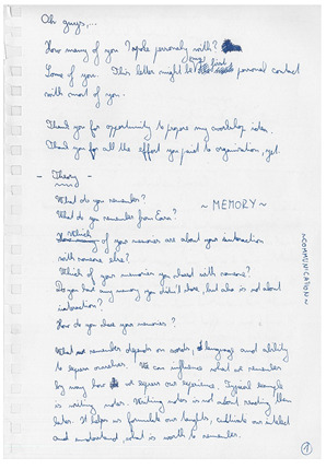
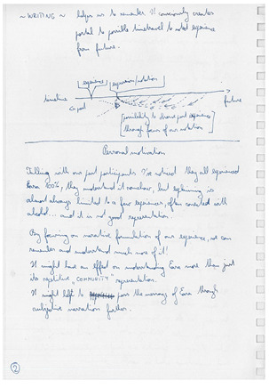
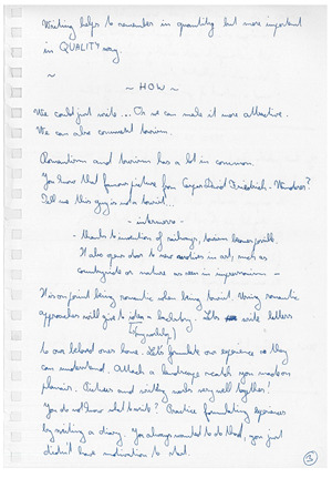
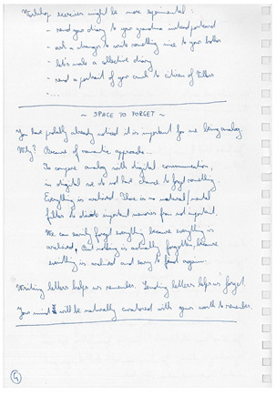
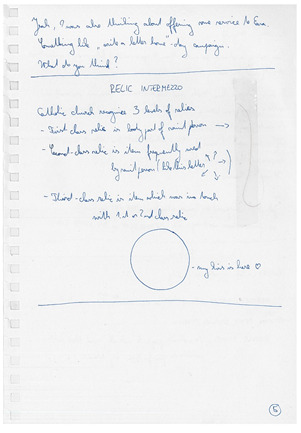
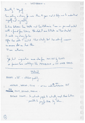
Idea
Proposal says it almost all. Just to add – First time I wanted to make this workshop happen for Denmark, but for a sad reason I didn´t felt confident enough.
It´s paradox, my first tutoring experience was with differrent project in EASA Croatia.
We are learning on mistakes and I taught I´ve learned enough on my Croatian tutoring premiere with Nudge . Unfortulanely or luckily,... there is still place for new mistakes (even some old ones, to be honest), to learn from.
Idea of Nudge was to look for a situations where people are or should be making decisions and try to design environment of that situation in a way, common good is achieved. Penfriend continues with a Nudge, but it is focusing only on one task during whole two weeks of EASA. The task is to motivate people to remember their experiences better through sharing their memories with beloved ones by writting them letters.
Reaction
Quote I have used for promotion on facebook page is from Aubrey de Grey. I have found it on some random motivation picture but I think it is fitting concept perfectly yet keeping enough mystery for future participant, what workshop is about.
It worked well. I have got over average of likes on EASA CH facebook page and a lot of verbal support from friends.
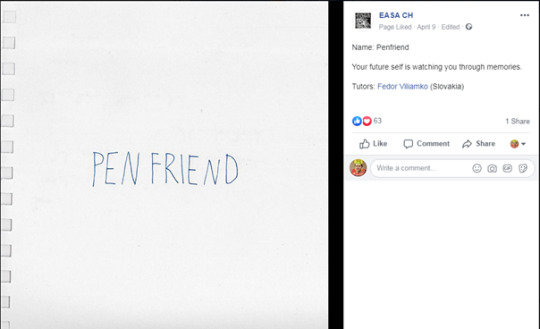
Expectation
Offerring post-office service in a structure of EASA seemed to be an obvious thing to do. I didn´t heard about similar approach from previous EASAs, which was for me even stronger motivation. My dream was to make this warkshop so popular it would find its place as standard format. Especially when it has the potential to earn some small money if selling stamps or postcards by tokens.
Since Penfriend was not so hard topic as Nudge was, I was expecting to find some dedicated participants. Everybody knows that most of the EASA people want to participate on construction workshops, thats why I knew I will get less participants and some of them would be 2nd choicers.
Preparation
Big part of my lagguage was my own material for workshop. Postcards, papers of differrent kinds, pens made of recycled materials and personally curated drawing tools.
Looking back I need to confess, I could have pay more attention to schedule preparation. I have considered idea clear enough to let inspiration fill the gaps on site. I need to note to myself, that participants need to have both: freedom but also concrete guidelines.
Letter for future self – direct continuity
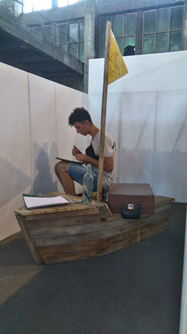

Letter to your future self was a direct continuity between Nudge workshop and Penfriend workshop. In one of our last activity on Nudge workshop we tried to motivate people to remember their EASA experience better by answering quideline questions in a form of letter. All the letters were been collected and kept in safe place for whole year.
To find author of each letter was task which was done during workshop fair. Occasionaly I have asked nearby standing people if they know the person by the name. With this method big part of the letters were been distributed in one of the first day of EASA.
On two photos you can see that one representative lucky guy who wrote a letter to himself in Croatia and recieved it in Switzerland.
Majority of letters of people who were not been present in EASA Switzerland contained their postal address and were been sent via post office. Small part of letters were been written by people I knew I will meet in recent future, some letters contained email address and few letters remained mystery in my personal archive.
Just to add; I have motivated to write letter to your future self again this year. All the letters are save, private and secure.
Presentation
Idea to present the workshop on workshop presentation with that legendary scene from Harry Potter, where he recieves tons of letters seemed clever in my head, but was probably a bit misunderstood in practice. The idea with cardboard envelope (as seen on the photo) worked well and it later became significant visual identity of the workshop.

Photos: Alexandra Kononchenko
Workshop fair start promising. I got support from people with very relatable questions. Yet later empty space emerged in front of my table (as seen on the photo) and it confirmed it presence till the end of EASA. Yes, I have got zero participants even in a second round.
Big shame, ...
Big opportunity maybe. After an evening of objective depression, I have realized I can do whatever I want with a workshop and without compromise.
The state of stability
No big dreams. I have found my comfort in stability and service.
My daily routine was:
1. Suit up: envelope backpack and totebag with poscards, envelopes and writing tools.
2. Send correspondence from previous day
3. Oscilate between most visible places – infopoint and dinner plaza
4. Request random tasks.
5. Approach random EASians
6. When approached, explain concept of workshop and provide person with equipment, if they were been interested.
7. Collect the correspondence.
8. Finish my shift after dinner or evening lecture (depends on the mood)
Photo: demonstration of sending the correspondence
Postal stamps which I was selling for tokens later were been bought by EASA money in nearby post-office. We used stamps with value 1,40CHF for which we used conversion of two tokens (approximately the value of 1,50€).
The post-office lady said, its possible to design and order online your own postal stamps in Switzerland. This idea was very attractive to follow, but we (me and wonderful helping oranizers) found out later, that it was also very difficult to achieve. Whole process was full of unbreakable steps, which made it super difficult in our situation. After a few days of struggling with system we finally ordered our own designed EASA stamps, which actually never arrived ...
Big thanks to all wonderful organizers helping with this impossible task.
Love story of random couple
One of my most frequet clients was this couple writing mails to each other. Ah, it felt so nice to be part of their romance!
Collective diary
A bit parallel project, which was formerely meant to be excercise for the Penfriend participants. From material I have bring with me, in combination with waste paper from EASA IT-lab, I have made two notebooks with a simple rule written on the inside cover of both of them:
- USE IT ONE DAY
- PASS IT TO SOMEONE ELSE
On the photo are the first links in chain.

I have let these diaries live their own life.
It was very pleasable moment to find blue diary in active use a few days later, in a Camp 2!
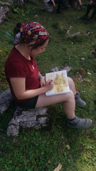
I have seen blue diary again at infopoint in last day of EASA. Last user was probably anxious to continue with a chain outside of EASA. I took my baby back home and I will bring it to next EASA.
I believe that brown diary is living its own live somewhere, or is laying in someone´s bookshelf as a unique memory token.
Transcript: So, EASA is always about fun, good vibes... But sometimes here we feel a little bit tired of all that is happening around. Dear diary, today I went to hide from everything, just for 1-2 hours to think about what actually I want to do and continue working hard
Transcript: It was my first time up in the mountains, I felt like the land wanted to be the sea... Ant the storm started...
The view from up here is so beautiful...
Transcript:
end of easa <3
It´sbeen nice an different.
Climbing the mountains, being in
this weird place and sleeping
in circus.. I will
think of you and your letters.
They spread love and reflection.
Hope you had the best
time, and that I see
you again soon!
Xx
Discoveries
Petronela is still making jokes on me and she uses my mailbox rucksack as a metaphore for useless work.
I believe Penfriend has potential to continue in EASA as a some kind of service, it just need more skilled mediator than me than I was this year.
To compare with a Nudge workshop, I need to say that focusing on one simple task for whole two weeks is much more effective than looking for a new task every other day. Yet to motivate people to do something, you need to be super motivated on a first place, and its hard if you are alone for this task for two weeks, but not impossible.
Sadly, I didn´t record any datas. Approximately 100 letters/postcards were been sent, but I do not know exact number. 100 is a nice number to present. It could be more if we consider size of EASA, but it is not a small number. It makes me feel good to know that I have made this small analog expansion of EASA .
Vision
Since Penfriend worked somehow well as a one-man-show, it make sense to consider future of this concept as some Aloneshop maybe.
GLOBAL
Idea of global impact of Penfriend workshop was to simply spread and share EASA experience with friends or relatives, or in general with those who were not been physically present on this year EASA.
I didn´t got any response yet Fsom what I did, but didn´t ask for any too. I believe the letters arrived safely and make their reciever feel a bit of EASA at that moment, or in any other moment when they read the letter again.
LOCAL
Some abstract toughts about local impact were been presented in proposal, but most of them was open and relying on input and activity of potential participants. Being in this workshop alone, I didn´t focus on local level impact.
EASA
A few letters inbetween easians were been changed. People were been looking for me rarely. Approaching felt sometimes awkward. Anyway, I still believe this concept has potential mostly because of its introverted nature. I think it was also proven how does it connect personal-EASA experience with outside world.
0 notes
Text
Weekly Update 2/1/19
General Studies:
Reading:
This week was filled with many Groundhog’s Day themed activities. The friends learned about the holiday and made predictions. More friends hoped that Phil the Groundhog won’t see his shadow in hopes of an earlier spring. They also were taught key holiday vocabulary words such as burrow and hibernate. Some friends learned that compound words are formed when two smaller words are combined to form a new word, such as ladybug and baseball. The friends enjoyed learning about adjectives. Through a fun interactive matching game, the friends learned how adjectives are used to describe a noun.
Some friends read the poem “Groundhog’s Day” and learned the sight words little, see, more and winter.
I’m a little groundhog
In my hole.
On February 2nd
You will know,
If I see my shadow
It will be,
Six more weeks of winter
For you and me!
Friends who have been learning their r and l bends, began to learn the digraphs, wh, sh, ch, and th. Some examples they came up with are, whale, why, shoe, shop, chocolate, chip, thumb, thick. Many friends are beginning to use these digraphs and blends in their writing as well. The readers also worked on asking their reading partners “why” questions before, during and after reading to engage in active inquiry while reading to aid in deepening comprehension, making connections, and thinking beyond the text.
Some friends were introduced to reader’s theater, practicing the play Chicken Little. The friends learned to follow along to be prepared for their part.
Writing:
This week, the writers continued their handwriting without tears curriculum. They are learning to carefully write their uppercase and lowercase letters in an effort to support theirs writing stamina!
Some friends continued to work on opinion writing. They also began writing book reviews. Our reviewers listened to stories and wrote their opinions. They learned about star ratings and used adjectives to help express their feelings about the books, such as interesting, voting, and funny. They also learned how to write a summary and conclusion.
Math:
Some friends are continuing to practice their subtraction facts. As the weeks progress, the friends are challenged with larger number sentences. We also discussed the importance of paying close attention to the symbols and how the plus sign tells you to add while the minus sign tells you to subtract.
Other friends continued to practice solving word problems where they add to with change unknown, take from with change unknown, put together with addend unknown, and take apart with addend unknown word problems. For example: “Maria has 15 baseballs, 8 of them are old, and some of them are brand new birthday presents. How many brand new baseballs does Maria have?” Students solve these problems using both the counting on strategy and subtraction strategies.
Here are two more examples: Cameron gives some of his apples to his sister. He still has 9 apples left. If he had 15 apples at first, how many apples did he give to his sister?
Toby dropped 12 crayons on the classroom floor. Toby picked up 9 crayons. Marnie picked up the rest. How many crayons did Marnie pick up?
The get to ten strategy has students solving 12 – 3 as 12 – 2 – 1, understanding that decomposing the subtrahend to easily get to the ten yields a simpler, more manageable subtraction problem. It is the way a student can make ten when there is an unknown addend. It is a step away from counting on, where, rather than counting on by ones, students consider how much it takes to get to ten and then add on the rest to the teen number. For many students, the language of get to ten helps them bridge from counting on to a more efficient strategy.
Cultural:
We continued our study of North America and focused on understanding where we live. We reviewed the book Me on the Map, and worked on our project to understand where we live on the map. We looked at our street, city, state, country, continent, and planet.
Ivrit:
This week the 5-7 friends investigated the way a plant is developing from a zerah (seed) to a Tzemach (plant). Some friends worked on a visual dictionary drawing the corresponding pictures to words such as Zera (seed), Nevet (sprout), Shoresh (root), Geza (tree trunk), Anafim (branches), Nitzanim (flower buds), Alim (leaves), and Prachim (flowers), conjugated in plural and singular form. Others, added adjectives describing the nouns by conjugating each adjective to corresponding with the noun’s gender. Everyone enjoyed looking for zraeem in various fruits and vegetables sampling the evidence.
Yahadut:
This week in yahadut the friends learned about Parashat Mishpatim. We spoke about some of the mitzvot in this Parasha and noted that the mitzvot in this Parasha have a logical reasoning behind them. The friends got the chance to look at a short Torah phrase and find hidden words inside the passuk. Some of the friends also worked to find the Hebrew prefixes in the passuk. We are continuing our brachot unit. The this week we focused on the 6 different brachot we say before eating food. We looked at the words of each bracha and practiced sorting different foods into their correct brachah category.
Art Classes January Reflection
Students worked on a number of projects that focused on using a grid to create artwork. Creating art with boxes on graph paper ‘takes the edge off’ realistic drawing, as it’s more like building an image with squares and rectangles, like Legos, Minecraft or 8-bit video game graphics. We discussed this unit as requiring translation, that students were challenged to adapt their curved and diagonal lines to the grid format.
One activity was to copy a simple line drawing of an animal by breaking the image into gridded squares and working to recreate the same image square by square. We labeled the grid with letters and numbers to organize the process, and some students said it was like the game Battleship. The objective was to recreate the lines in each square, piece by piece, rather than trying to draw the whole animal all at once. Students had to observe each square, break the image into parts, and transfer the drawing to a second grid.
For another activity, students got a white paper with a 1”x1” grid, a bunch of black paper 1”x1” squares, and a glue stick. Students experimented with building a picture with the squares. Once they’d settled on a picture, they glued the squares onto the paper. We discussed how details were limited when working in this format, and we considered how the activity would change if the squares were smaller. I explained this is like HDTV, that the smaller pixels allow for a more crisp image.
The culminating project raised the bar. Students went from the 80 squares of the black and white project to over 1,200 squares and full-color on a sheet of graph paper. We talked about making decisions about what they wanted to draw and how the drawings may successfully be adapted as a gridded image. Students will continue these project for a few more classes as they build their pictures with boxes. We worked in pencil to create the image, and students will add color with colored pencils. They are having fun being challenged to translate their ideas into the grid format.
0 notes
Text
The Art of Punk and the Punk Aesthetic.
(Ramones Los Angeles fan club mail-out, USA, 1977. Source: Punk: An Aesthetic (Rizzoli).
... ...
For a musical and social movement that snarled in the face of authority and wasn’t averse to spitting at its friends, punk has received a great many shelf inches in the last 30 years respectfully devoted to histories, reassessments and eyewitness accounts. Today, there is even an academic journal exclusively devoted to the pursuit of punk and post-punk studies, which has just published its second issue. There can’t be much left to say about the music, clothing, media outrage and legendary gigs, but the graphic expression of punk has received less critical attention. Now, within weeks of each other, two thick, illustrated volumes have appeared: Punk: An Aesthetic (Rizzoli) edited by Johan Kugelberg and Jon Savage, and The Art of Punk (Omnibus Press/Voyageur Press) by Russ Bestley and Alex Ogg. Kugelberg and Savage have also curated “Someday all the adults will die!”, an exhibition of punk posters, handbills, record covers and ’zines at the Hayward Gallery in London.
The books are nicely complementary, with fewer overlaps in what they show than one might expect. Both address British and American punk, with the Rizzoli survey leaning towards the US, and the Omnibus volume inclining towards the UK, while also showing a strong awareness of punk scenes in other countries. Anyone nursing a serious interest in this subject will need to buy or consult both titles.
(Anarchy in the U.K. fanzine, UK, 1976. Photo: Ray Stevenson. Design: Jamie Reid. Source: Punk: An Aesthetic)
The editors’ approaches are different, too. Kugelberg and Savage’s book is more of an album, with the images presented in art-book style on a plain white page (no objections here — it’s good to be able to see the work clearly without punk-inspired page layouts intruding). These are smart writers and Savage, author of England’s Dreaming: Anarchy, Sex Pistols, Punk Rock, and Beyond, is a key participant in the era; his punk archive is now stored at Liverpool John Moores University. But neither author is a historian or critic of graphic art, design or visual culture. “The history of the punk aesthetic cannot be told, only shown,” claims Kugelberg, somewhat unpromisingly. Savage made punk collages with the artist Linder Sterling and he has some good observations about punk montage: “In the act of dismembering and reassembling the very images that were supposed to keep you down and ignorant, it was possible to counteract the violence of The Spectacle and to refashion the world around you.” He points to the visual influences of John Heartfield, Martin Sharp’s work at Oz magazine, the feminist artist Penny Slinger, the Beach Books 1960s pamphlets, and Dawn Ades’ Photomontage (1976). I bought Ades’ trail-blazing study when it came out and would love to hear more: which punk image-makers were looking at the book and what did they get from it?
Bestley and Ogg write with a carefulness of phrasing and appearance of academic detachment that only partially masks the same devotion to punk as listeners and fans. Punk graphics was the subject of Bestley’s PhD and he curated the earlier exhibition “Hitsville UK: Punk in the Faraway Towns”; he is course director of the graphic design MA at the London College of Communication. Ogg is author of No More Heroes, a history of British punk, and an editor of the Punk & Post-Punk journal. “It is important to question the notion of a direct association between work by prominent early punk designers and the emergence of a radical new visual language of parody and agitprop,” they write. “To an extent, the techniques adopted by Jamie Reid, for instance, were already widely accepted as the natural languages of anger and protest.” Such a comment can only be addressed to readers who know nothing about the histories of graphic design and graphic protest. As Savage and Kugelberg point out in their exhibition intro, punk’s precursors and putative influences include Dadaist collage, the Situationist International, the mail art movement, the graphics of counter-culture protest, and the 1960s underground press. I say “putative” because none of these connections is explored in depth and definitively established in their book.

(Situationist pamphlet by David Jacobs, USA, 1973. Source: Punk: An Aesthetic)

(Sex Pistols, Pretty Vacant poster, UK, 1977. Design: Jamie Reid. Source: The Art of Punk (Omnibus Press) The buses appear to come from David Jacobs’ design. Reid claims he sent the Situationist group the image in 1973)

(Pretty Disobedient, screenprinted poster by Shepard Fairey, USA, 2001. Signed by Fairey)
It was valuable to revisit so many original pieces in the exhibition after looking at small reproductions in the two books because the show communicates the explosive energy and “messthetic” rawness of punk graphics with persuasive power. This was an art of expediency, making use of collage, cartoon drawings, hand-lettering, rub-down lettering, ransom-note lettering, stencils (Savage and Kugelberg include a fantastic display of used stencils made by Crass), rubber-stamping and black and white Xerox copying, as well as silkscreen and offset litho. Looking at the discordant profusion of examples in the books, I kept trying to single out less familiar pieces that were highly accomplished as “design” from the many pieces that are hugely expressive and exciting, but not original or well resolved when seen in strictly graphic design terms. In the show, savoring scores of examples packed together at full size on the walls, those distinctions seemed irrelevant. These were raucous, vitality-filled transmissions from a turbulent graphic universe totally different in intention and effect from the smooth, orderly, design history-conscious parallel universe of professional design aesthetics, purposes and training. There didn’t necessarily have to be any points of contact or interchange between the two co-existing spheres.
(Flyer promoting a gig by Adam and the Ants, UK, 1977. Design: Adam Ant. Source: The Art of Punk)
(Poster promoting a gig by Crass, UK, 1978. Source: Punk: An Aesthetic)
But the question of the relationship between punk D.I.Y. design in its most basic or amateur forms and the later development of graphic design cannot be avoided for anyone who is both sensitive to punk’s impact and legacy (“the immediate implementation of D.I.Y. grassroots culture among the young” — Kugelberg) and committed to graphic design as a medium. Kugelberg and Savage say that the “anarchic upsurge in graphic creativity . . . revolutionised design,” a clear attempt to assert punk graphics’ significance beyond the punk subculture, yet this claim, too, can only be substantiated by a lot more detailed research. (In my book No More Rules, I connected punk’s anti-design ethos to the late 1980s/early 1990s idea of “deconstruction” in graphic design.)
In the UK, the punk-related designers that had most influence in the early 1980s were a handful of individuals such as Malcolm Garrett, who had been formally educated as graphic designers (in his case at the University of Reading and Manchester Polytechnic), though design’s mainstream was, in fact, slow to learn from and assimilate the lessons and styles of subcultural music design’s new wave. In any case, the graphic sensibility of Garrett’s work for Buzzcocks and Magazine, shown in The Art of Punk, has always seemed closer to “post-punk” graphic design than to what is commonly understood as punk — even allowing for Bestley and Ogg’s precautionary advice that “there is no one standard punk visual language” and that “a notion of a pure or authentic punk style is difficult to justify.”

(The Desperate Bicycles, “Occupied Territory” 7-inch single, Refill, UK, 1978. Source: The Art of Punk)
(Prag Vec, “Existential” 7-inch single, Spec, UK, 1978. Source: The Art of Punk)

(Black Flag, “Jealous Again” 12-inch EP, SST, USA, 1980. Design: Raymond Pettibon. Source: The Art of Punk)
It is no accident, too, that the stencil-based graphic identity of Crass, one of the most highly politicized punk bands, is so well coordinated and trenchant. “Both Gee [Vaucher] and myself trained as graphic artists,” Crass co-founder Penny Rimbaud tells Bestley and Ogg. “Both of us prior to Crass had brought money into the house by doing book design and that sort of stuff. And part of training as a graphic artist wasn’t just learning type[setting], it was also thinking in terms of marketing; a lot of the projects at college were: ‘This is the product, how do you design and market it? How do you create a corporate idea?’ . . . It was a very distinct policy that things should have an instantly recognizable image.”

(Crass, The Feeding of the 5000 LP, Crass, UK, 1978. Design: Gee Vaucher. Source: The Art of Punk)
(Crass, Yes Sir, I Will LP (back), Crass, UK, 1983. Design: Crass. Source: The Art of Punk)
There is an old slogan and rallying cry that insists, “Punk’s not dead.” Bestley and Ogg certainly believe that. Their book ends with examples of more recent punk design, though I find it hard to get excited by most of them in graphic terms. Punk might, as they say, have employed a fairly broad set of graphic conventions, but they remain as consistent and constrictive over time as those found in heavy metal. Kugelberg deduces from punk a more general lesson for today: “Form a band, start a blog, become an artist, a DJ, a guitar player, an editor.” No one can argue with that, though many might see it as a stretch to claim that, in 2012, these possibilities derive from punk’s mid-1970s example — unless, perhaps, one were to view punk prophetically as a form of science fiction. Interestingly, this is just how Savage does regard punk: as a “jump cut” into the future. “[P]eople in Britain see punk in terms of social realism and rock music. It was pure science fiction and it was very informed by J.G. Ballard, and by The Man Who Fell to Earth, among a lot of other things. . . . I think what’s important about punk is the idea that it was for a brief period very futuristic.” That’s another intriguing insight that calls out for more excavation.
(Anti, I Don’t Want to Die in Your War LP, New Underground, USA, 1982 Design: Dan Phillips, Ed Colver, Gary Kail. Source: The Art of Punk)
original from here.
#inspiration#punk#music#rock#rock'n'roll#design#graphics#graphic design#drawing#illustration#art#artist#art of punk#punk graphics#studio#good designer#shop#design studio#design thinking#design history#visual#collage#print design#flyer#editorial#typography#typographic#photographic#type#abstract
4 notes
·
View notes
Text
January 2021 [UK]
So! It was time to get back to the UK. Unfortunately, we had to make a COVID test to get on a plane, and we had to spend our own money (or as Nikita, you could get a note from your family doctor and do it for free). The test was 50€ which is bonkers! I am writing this post in June 2021 and trust me - 50€ is nothing in comparison to 200+€ that you have to pay now. This amount of money is a sum of:
1. COVID 19 test before the arrival to Latvia - 50€
2. COVID 19 test before the arrival to the UK - ~80€
3. Mandatory 2nd and 8th day test that you have to book before the arrival to the country. ~100€
Judging by the situation there is at the moment in the world, it seemed that countries won’t drop these rules anytime soon, so it makes me very sad and depressed knowing that I can’t plan my trip to Latvia as I cannot afford paying that much money. This is absolutely awful. I could suffer this whole year from not being able to attend any events and spending all my time at home, but this is just devastating... it makes me feel like my youth is lost as I don’t understand when will this nightmare end and I start having watery eyes very time I think about it.
Anyway, let’s continue. I don’t want this diary to be sad.
We managed to get on our plane and we arrived to the UK without any problem. Now 10 days of self isolation awaited us.

Even before we got back, I told Nikita, how much I want to play Mafia: Definitive Edition, which he played with Alex back in November. I wasn’t watching their gameplay but I heard some parts which made me very curious. Gosh, that game is absolutely amazing! We played that game together and I must admit, that it’s so beautiful and so well made, I think that it’s one of my favourite games of all times. The story is dramatic and the graphic is so delicious, it’s a piece of art! There is Hangar 13 studio in Bristol and I wish they could hire me... Alas, I suck at 3D art and I doubt that they would need an illustrator there. Maybe I can apply for a managerial position after I graduate 🤔...
Oh, and about that! I applied to MSc Management course at University of Salford so I am a student again! A completely different course from my BA Illustration and Animation degree from Coventry, but that’s what I was aiming for. I hope it will give me more luck when I start applying to jobs after I graduate. Either I become a business lady, who can help marketing team by creating designs or I will become a visual artist, who can multitask and do other additional promoting jobs... Or even manage a team of fellow artists lol. But I am still too far from that goal.
Anyway, getting back to January 2021.
After we finished Mafia: Definitive Edition, Nikita advised we should play GTA V and wow... that game was made in 2013 and its still sooooooo good! I always heard of that game, when I was in school but I never payed attention to it or played it. The only thing that made me disappointed about Mafia is that you can’t interact with the world that much but its different with GTA. GTA devs new exactly what they were doing. The story didn’t have the charm I like, but probably because it takes plays in our time... And I think that modern world kinda lost its Beaty because how fake it is. On the other hand that’s what GTA is trying to show. My favourite character is Michael. He is such a dorky old man. But Franklin and Trevor are cool too!
Another thing worth mentioning is that before applying for the Student Finance, I had to send my ID to prove my identity. They sent it back to Salford too early, so I was worried that I won’t be able to return back in time and they would have to send it back to the Student Finance Office. So I redirected the delivery to the local post office and here is a thing that made me laugh soooo much.
I got this email saying that my local post office received the letter and here is the signature that they left

I was very confused by it, since it didn’t look like a signature. It looked more like a drawing. So I turned it upside down.
It says
COV
19
0 notes
Text
Journal - The Art of Rendering: Duy Phan on Creating Powerful Architectural Visualizations
Byron Cai is the lead editor at Archi Hacks, a platform dedicated to architecture visualization, portfolio, and design tips and tricks for students and professionals.
Duy Phan is the winner of the Ronen Beckerman TMRW 2020 Challenge and his project “Orchard Jenga” was honored to win two out of ten best-commended entries from One Rendering Challenge by Architizer.
I first came across Duy Phan’s work while browsing through the finalist gallery of Architizer’s One Rendering Challenge. His images immediately stood out to me for their bold expression of color and uniquely crafted narratives.
I would describe his style of visualization as ‘hyperrealism’; the prefix “hyper” being defined as above-and-beyond or ‘enhancing reality’. Robin Eley, Nathan Walsh, and Emanuele Dascanio are excellent examples of hyperrealist artists.
The ARM at Hudson Yards; design and visualization by Duy Phan
I think it is important to mention that hyperrealism, even though it is often mistaken as a term to be synonymous with photorealism, is not the same as photorealism. Rather, hyperrealism is the clever synthesis of color, composition and atmosphere with a hint of the avant-garde that ultimately invokes a heightened sense of emotion and mood. Duy Phan’s work does it all, and its exemplified in his winning entry for the Ronen Beckerman TMRW Challenge 2020.
I had a chance to reach out to Duy Phan and ask him about his work, methodology, and any insights he may have about ArchViz.
Byron Cai: How did you initially become interested in the field of architectural visualization? What made you decide to pursue architectural visualization or even architecture to begin with? Did you have a background in traditional art or digital art?
Duy Phan: Things started back in my high-school days when I got too addicted to drawing imaginary comic scenes and my Mom discovered that I designed and drew the little buildings I put in my images so she encouraged me to apply and study architecture. It is not that architectural design bored me, but on the contrast, having to portray and represent my ideas glued me so tight to the chair.
It made me as the question — how do I convince the project viewer to explore my work further by showing powerful images just like all the legendary architects and visual artists do? Genuinely speaking, the more I refined my project images, the more it helped me to realize my path as an ArchViz illustrator in the future.
The ARM at Hudson Yards; design and visualization by Duy Phan
Your renderings often invoke a unique sense of mood. Is photorealism the goal, or are you striving for something more?
I believe Photorealism is more of a tool rather than a goal in order to chase the outcome. Understanding and using physics in visualizing images could help the shot be more convincing, but the most realistic image might not be the most interesting. Since we observe our world with all its lights and materials daily, things become curious if those realities are stretched a bit to promote certain ideas. I have to keep reminding myself about the message I would like to convey in the image to help me collect the ingredients, and photorealism usually plays a main part here.
Urban Farm Temple; design and visualization by Duy Phan
What I find interesting about your work is that each image has its own unique quality. Where do you get your inspiration from? Does it differ from image to image?
I’m really glad that you found my works differ from one to another, as I love to try and bring something fresh to the table each time. Besides following and studying visual images from profound studios, I love to spend a bit of time everyday exploring photography sites such as Flickr and Unsplash, training my eyes to see how all physical elements attach together in a beautiful shot. At the same time, I note interesting moods that are present in some adventurous photographers’ work.
I keep these random inspirational images in a cloud drive, where I can access and note any ideas I have during my free time. Later on, when touching base with a specific image, this resource helps remind me of some concepts, and I explore whether it could fit the project brief and is worth developing further.
The ARM at Hudson Yards; design and visualization by Duy Phan
One thing that stands out immediately are the beautifully selected color palettes for each render. How do you decide which colors to use?
Color in an image is like the alphabet of our language. Letters and words are picked and organized to help us demonstrate our thoughts. In the case of visualization, considering which color to go with sis dictated by what feeling the painters would like their viewer to have. Studying the color palette and how it connects to the narrative of the image concept is key. Collecting reference images by both photographers and other rendering artists can help pre-production go in the right direction.
What is your favorite rendering that you have done so far?
Orchard Jenga is my most memorable image, which happened to be a career guide for me when I was finalizing my thesis project in university recently.
Orchard Jenga image development; design and visualization by Duy Phan
What kind of software do you use? How did your choice of digital mediums change between your school education and the ArchViz industry? Vray or Corona? Something else?
At the moment I mostly use Sketchup, 3ds Max, Corona and Photoshop. I found it was quicker for me to build my concept and preview it quickly in Sketchup, playing around with it by adjusting the Style tab features before moving on to 3ds Max. Corona got me hooked straight away when I first tried it after using Vray for a while. It’s more of personal preference when comparing these two; we can barely distinguish between them when looking at high-end renders by the masters in this industry.
Though I continually learn new techniques in 3D software, the more images I have a chance to work on, the more I lean toward 2D resources to get the result pictured in my head. Hence, the digital mediums might not change, but the proportion of time I spend on each step is changing in my workflow.
Orchard Jenga image development; design and visualization by Duy Phan
You obviously have your own creative approach to an image. Your work-in-progress images can look very different from the final result. Can you describe the process you go through for an image?
In the brainstorming process, if I didn’t model the design myself, I simplify the 3D file and then import it to Sketchup. Personally, I have found the user interface in Sketchup helps me explore and invoke more potential concepts by playing with basic light and shadow, lines weight and fog. With some images, I could go straight to Photoshop from a shot I captured here and matte paint the rest, but usually the next stage is moving to 3ds max for rendering.
From the sketched concept, I replicate the angle similar to what I had in Sketchup using Corona cam, and start with sun, lights and materials. I always keep all the lights separated in Corona Lightmix so that I can quickly find a potential mood by messing around with the light setting. As an example, two versions of the Orchard Jenga both came out of a single rendering, but differ by custom lightmix. I try to balance the time I spend in 3D and 2D; if I can solve a problem using Photoshop, I will not invest too much time in the CPU burning process.
The ARM at Hudson Yards (gallery view); design and visualization by Duy Phan
Can you describe the influence of matte painting and how you use it in the visualization process?
In my case, I think matte painting is more about eye-training rather than hand-training, just like in the old days when painters had to mess up the palette to find out which color is most similar to nature. Attaching and gluing all the pieces together to create a beautiful image is a time consuming process, and requires knowledge about any brush or montage we choose to put in.
Fully relying on 3d software sometimes gets us to forget how reality works and makes us hesitant to pursue the original concept because there is a limitation of technology, or we simply can not find the right 3d model.
The ARM at Hudson Yards (matte painting); design and visualization by Duy Phan
Are there different visual approaches that you use depending on the kind of architecture you are portraying?
Yes there are a few ways to approach a specific image in my case. A good example for this is with a birds-eye view, I would spend more time studying the surrounding context, if not in person then by google map and local images. This sometimes results in capturing good images for a photomontage, or otherwise provides me heaps of information to build the context from scratch, either in 3D or using matte painting.
Then there are interior images, where I spend more time on looking or making the right materials which happen to be exposed within the scenes, again things could be purely done from the render engine but I found it always needs a quite decent of touches when moving onto post-production process.
Interchange Oasis image development; design by Xpace, visualization by Duy Phan
Tatiana Bilbao controversially said that renderings are “dangerous and damaging” in a recent Dezeen article. Do you agree with her reasoning?
I partly agree with Tatiana about holding ideas from further development after seeing a realistic render. As I understand, from a design concept to built reality, it has been and will always be a constantly communicating process, back and forth, between designers and decision makers. Realistic renderings, collages, physical models, technical drawings or any other presentation mediums are considered as a method to convey the message from one mind to another.
Choosing to use any of these mediums is dependent on an architecture studio’s culture of demonstrating their thoughts, and this should be uniquely tailored to that studio’s type of project and their clients. Hence, in Bilbao’s studio, with a very interesting story about an old client and their potential clients, it makes sense that they found a new way to express their process.
From the viewpoint of architects, using renderings is just one of the tools to achieve their goal for a specific client or public community. When a project suits the need of making compelling images that communicate ideas, that is where ArchViz artists can help.
Where do you see the future of ArchViz going?
The more developed technology is, the easier it is to produce renderings for architectural designers. For illustrators, this should be a more positive thing rather than a competitive thing. There are always good, very good and super good images. Those who recognize the differences between them tend to value the manual work and effort put in to portray the unbuilt.
Nonetheless, this raises the bar higher for the industry. Better tools help artists unveil their potential skill set and discover more hidden inspiration in the corners of their imaginations. As a result, we will see more and more stunning work that will define new boundaries.
The post The Art of Rendering: Duy Phan on Creating Powerful Architectural Visualizations appeared first on Journal.
from Journal https://architizer.com/blog/practice/tools/the-art-of-rendering-duy-phan/ Originally published on ARCHITIZER RSS Feed: https://architizer.com/blog
#Journal#architect#architecture#architects#architectural#design#designer#designers#building#buildings
0 notes
Text
Hello and welcome to the first “Keeping warm” Update for the Foundation Art and Design course at WMC.
So, by now you should have started a Blog and Sketchbook. Don’t worry if you haven’t, guidance about how to do this is attached to your offer letter, or email [email protected] if you have any queries.
Every 2 weeks or so we will be sending out one of these updates, this is not compulsory work to do, but we wanted to give you activities and ideas to work on in the run up to the course starting in September, particularly as so many of you are now no longer studying for you’re A levels or Btecs.
So for now I have 2 things for you to try:
Activity 1: 100 Times Over
1- Find or make 100 pieces of paper or card, you can use scrap out of the recycling, post it notes, envelopes, cut up printing paper, old greetings cards, whatever you can get your hands on.
2- Choose an object or a set of objects that interest you. This could be some fruit and vegetables, things from your bed side table, the contents of your bag. Just 2 or 3 objects.
3- Arrange them some where they won’t be disturbed for a few days.
4- Make 100 drawings of these objects! I know this feels like a lot, and you WILL get fed up half way through, but power through, if you get stuck you could try using the words below as a prompt
5- Once you have your drawings put them away for a few days, try activity 2 for a while maybe.
6- Get the drawings out and lay them out so you can see them all.
Consider / try the following and record in your sketchbook or on your blog.
Do they fit in to sets or groups? Can you arrange them in to “families”? What is it that links them together? The size, the colour? The mark making?
What do they look like arranged in a line? In a circle? Can you see relationships forming between them?
Do you have a favourite? A least favourite? Why?
What are the 100 drawings like as an object in themselves? what does it feel like to hold that much work in one hand?
How did you feel about the exercise? At the start and at the end?
How did your drawing change? Did you change how you saw the objects?
Can you make the drawings into something? A book? A collage? another drawing? Could you cut them out? Layer them up?
Activity 2: Exploring shape and colour in tiles
Lubna Chowdhary creates ceramic sculptural objects and site-specific artworks. She is known for her bright installations of vibrantly hand-glazed ceramics tiles. She was a Ceramics Resident at the V and A.
In her video, Lubna Chowdary talks about how she ‘endlessly composes’ with the tiles she makes – moving elements around until a ‘visual energy’ is unlocked. Start this mini project by watching her video on her website!
http://lubnachowdhary.co.uk/about/
Lubna ‘composing’ with her tiles.
Aim: To create a paper tile mural inspired by Lubna’s approach. You could use this an inspiration for a clay piece (a mural or other). You will make a series of tiles and then play with putting them into a mural.
For this exercise you will need:
Plain or coloured paper (what is in your recycled bin)
Pens or paint for colouring the paper or pattern making on paper
Scissors
Glue if you want to stick your work down (photograph it if not)
You can give yourself the boundary of only using the following shapes or you can experiment and use other shapes and/or pattern
circles
squares
triangles
rectangles
If you don’t have access to paper or would like to work further with pattern blocks you can use shapes in word (see below) or follow this link for more complex shapes https://apps.mathlearningcenter.org/pattern-shapes/
Step One:
Cut out a series of square and rectangular tiles that will make up your mural – at least 10. The size is up to you but you may chose to work in a more mathematical way so that the mural fits easily together.
Then cut out another series of shapes (circles, squares, triangle and rectangles) that will form the patterns on your tiles. Cut out different sizes and colours.
The more you have of each shape, the more you will be able to experiment.
Experiment with pattern and colour to create the tiles.
Step Two:
Once you have got your series of tiles, start to explore how they might fit together. You may need to adjust sizes or even make a few more.
‘Compose’ your mural.
Photograph the combinations you play with and post them on your blog.
0 notes
Photo

READING MATERIAL // HEY WHIPPLE, SQUEEZE THIS
*reading and taking notes from ‘Hey Whipple, Squeeze This: The Classic Guide to Creating Great Ads’
Chapter 3: A Clean Sheet of Paper Coming up with an idea—the broad strokes
“Print is to [all of] advertising what figure drawing is to fine art; it provides a creative foundation.”
“SAYING THE RIGHT THING THE RIGHT WAY. Remember, you have two problems to solve: the client’s and yours.”
“Dullness won’t sell your product, but neither will irrelevant brilliance.”

*“dullness is represented on the far left side of the left circle, and irrelevant brilliance, on the far right side of the right.”
“Hit the overlap”
“you often lose the selling idea in the act of trying to express it creatively”.”Your job as a thinker and problem solver is to keep both in mind, to spin the strategy without losing hold of it.” “the two most common rejections of your ideas will be “I don’t get it” and “I’ve seen that before.” In other words, either it’s too weird or too obvious.”
“Find the central human truth about your product.” “write down the truest thing you can say about the brand or the product.”
“We try to find that long-neglected truth in a product and give it a hug.”
“find” this truth, not invent it. The best ideas are old truths brought to light in fresh, new ways.
*”instead focused on one of the central human truths about this category—the use of flowers as a ticket out of the Casa di Canine.” (i.e men get out of the ‘dog house’ by showering their lover with gifts)
“Tell the truth and run.”
“We’re Avis. We’re only number two. So we try harder.” Totally believable. More important, I like a company that would say this about themselves. America loves an underdog.” - - -
Perhaps the biggest underdog of all time was Volkswagen. VW was the king of self-deprecation. The honest voice Doyle Dane Bernbach created for this odd-looking little car turned its weaknesses into strengths.”
“Identify and leverage the central conflicts within your client’s company or category.”
“the best work usually come from a place of conflict.” “When a strategy can be built on top of one of these tensions” “There’s a natural energy at these points of cultural stress, a conflict of ideas or themes that can be a fertile place for ideas of force and substance.” “stir a little bit of talk.”
“thematic tension might be simply “deprivation”; having something taken away from you is a platform leveraged for years by Goodby, Silverstein & Partners in their iconic “Got Milk?” campaign.”
Look for polarities. Where you find them you will also likely find tension. And where you find tension, you will find creative sparks.
“A FEW WORDS ON AUTHENTICITY.”
“mid-1950s, however, this omnipresent voice of authority started to lose its credibility.” - - - “We’ve become a nation of eye-rollers and skeptics. We scarcely believe anything we hear in the media anymore, and marketers can’t make things true simply by saying they’re true.”
“what people look for today, and what they believe in and are persuaded by, is authenticity.”
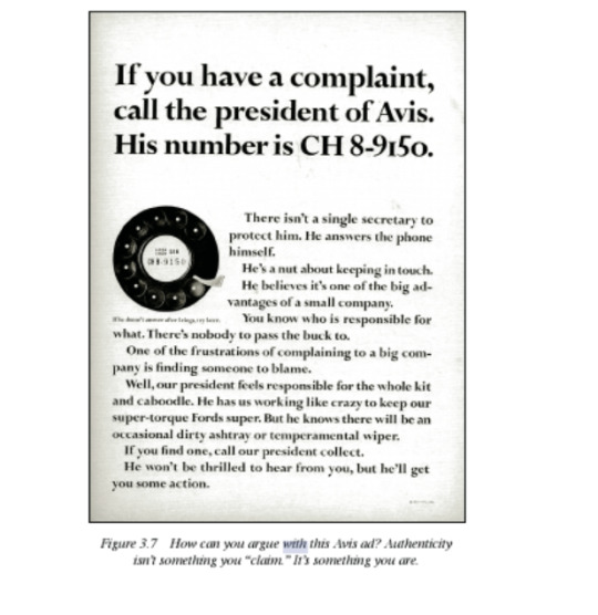
*”How can you argue with this Avis ad?” Authenticity is something “you are”
“Admitting that your commercial is a paid message with an agenda is one way to disarm distrust.”
“This generation knows you’re trying to sell them something and you know they know, so let’s just drop the pretense and make the whole exercise as much fun as possible.”
Underpromising and overdelivering is perhaps another way to disarm distrust. Even self-deprecation can help establish authenticity; VW’s “It’s ugly but it gets you there” is perhaps the most memorable example.
“To effectively ‘hype’ something today, you must find a way to cut through ‘the hype.’ . . . This necessitates telling the truth.”
“the brands that are unwilling to have a real and truthful conversation with consumers will become completely irrelevant and therefore invisible.”
“Don’t rationalize away what you [like about their product]. Find the truth they are exploiting that you are not.”
“Try the competitor’s product”
“Find a weakness in the leader’s strength and attack at that point.”
“Avis Rent A Car was only number two.”“come to them instead of Hertz because “The line at our counter is shorter.”“
“Pose the problem as a question”
“not to simply restate the problem in the terms in which it was brought to you; you’re not likely to discover any new angles. Pose the question again and again, from entirely different perspectives.”
“Ask a better question.”
“Don’t be afraid to ask dumb questions.” “we sometimes find simple answers that have been overlooked.”
“Ask yourself what would make you want to buy the product.”
“Dramatize the benefit”
“don’t mean the features of the product, but the benefit those features provide the user, or what some call “the benefit of the benefit.”
“Avoid style; focus on substance”
“Remember, styles change; typefaces and design and art direction, they all change. Fads come and go. But people are always people.”
“They want to look better, to make more money; they want to feel better, to be healthy. They want security, attention, and achievement. These things about people aren’t likely to change. So focus your efforts on speaking to these basic needs, rather than tinkering with the current visual affectations. Focus first on the substance of what you want to say. Then worry about how to say it.”
“Find a villain”
“overpriced product. “ pain or inconvenience the client’s product spares you.” “If the product’s a toothpaste, the villain can be tooth decay” “A villain can come from another product category altogether” ”an indirect competitor”
“Try some of these “strategy starters” and see if ideas start to form.”
“Do a straight on us vs. them approach.“
“Show life before and after the product.”
“Instead of trying to change how consumers think, change what they do.”
“Is there a compelling story about the heritage behind your brand?”
“Can your brand dispense some smart advice about the whole category?” “Is there a story in the founders of the brand? Or in their original vision?”
“Can you turn a perceived negative attribute of your product into a positive? Can you demonstrate on-camera or online your product’s superiority?”
“Can you move your product out of its current category and reposition it in another?”
“Can your brand be insanely honest about itself, admitting to some shortcomings while winning on the important thing?”
“First, say it straight. Then say it great”.
“simply write out what you want to say.” “This is an ad about . . . ” And then keep writing. Who knows?”
“You can tell when ads are trying too hard. Their intentions are too obvious.” “some that grab your attention with their executional brio, but their lack of relevance is such that after you’ve seen them they leave you kind of empty”
“Great advertising combines density of content with the elegance of form.
“Density of content and elegance of form.”
“Don’t let your concept get in the way of the product”
*don’t be a “visual vampire” - “the concept’s execution is so busy it sucks the life out of their commercial message“
*”usually happens when the product bores you. Which means you haven’t dug deep enough to find the thing about it that’s exciting or interesting. Or maybe you need to reinvent the brief.“
“the interesting part of an ad shouldn’t be a device that points to the sales message; it should be the sales message”
“The product, the product, the product. Stay with the product.” “don’t get seduced by unrelated ideas”
“Put the pill inside the baloney, not next to it.
“Dogs hate pills, right? So what do you do? You wrap the pill in a piece of baloney.“
“Customers hate sales pitches. So you wrap your pitch in an interesting bit, and they’re more likely to bite.”
“You gotta wrap that baby right into the middle of the baloney. The two have to be one. Your interesting device cannot just point to the sales message; it must be the sales message.“
“Emotional purchase drivers connect with customers more deeply than rational ones.” “Okay, this campaign is gonna be . . . thoughtful.” Or it’s gonna be angry, or stark, or . . . well, you decide. What’s right for your client? What’s right for the customer?”
“Finding that emotion is often all you need in order to get the ideas flowing.”
“Deciding which emotion to leverage is something you’ll do early in the process.”
“the answer is always a combination of what your product is and whom you are talking to”
“You can change your mind later, but sometimes making this decision can give you focus” - - -
“Stare at a picture that has the emotion of the ad you want to do.” “ for copywriting. You need to be in the mood.”
“emotion is, it may help to put up some pictures that put you in the mood” “have you ever tried to write an angry letter when you weren’t angry?” “the same can be said for copywriting. You need to be in the mood.”
“Let your subconscious mind do it.” “controlled daydream.” “hear what the ad wants to be“
“Try writing down words from the product’s category.”
“Embrace the suck.” “some kind of dopey device or visual or slogan. It could be a client’s geeky spokesperson, a long-running sale with a goofy name, or just some bad footage.“ “Tackle it directly. When you embrace the suck, good ideas often spill out of the very thing your instincts tell you to avoid.“
“The only way I can get anything written at all is to write really, really crappy first drafts“ “You just let this childlike part of you channel whatever voices and visions come through and onto the page.“ - -”it’s a workbench” “Write. Keep writing. Don’t stop.”
“Allow your partner to come up with terrible ideas.”
“Even if the idea truly and most sincerely blows, just say,”
“That’s interesting,” scribble it down, and move on“
“see if you can take it and shape it and mold it.”
“Then throw it back to him or her with your idea tacked on.“
*”Just because an idea doesn’t work yet, doesn’t mean it might not work eventually.”
*”not to say aloud every stinking thing that comes into your head. It’s counterproductive.”
“Spend some time away from your partner, thinking on your own.” - “gives you both a chance to look at the problem from your own perspective before you bring your ideas“
“Come up with a lot of ideas.”
“in order to get to a great idea, which is usually about the 500th one to come along, you’ll need to resist the temptation to give in to the anxiety and sign off on the first passable idea that shows up”
“Learning to be okay with uncertainty is part of the process of having more insights”
“Quick sketches of your ideas are all you need during the creative process”.
“Just get the concept on paper and keep moving forward. You’ll cover more ground this way.“
“Tack the best ideas on the wall”.
“helps you determine whether there are campaigns forming” "where there are holes that need to be filled”
“Write. Don’t talk.”
“Don’t talk about the concepts you’re working on”
“an idea talked about is never as exciting as the idea itself.”
“The time will come to unveil.”
*The best ad people I know are the silentbut-deadly kind. You never hear them out in the hallways talking about their ideas. They’re working.”
“Write hot. Edit cold” --- “Once you get on a streak, ride it.”
“Nurture a newly hatched idea. Until it grows up, you don’t know what it’s going to be.”
“If it makes you laugh out loud, make it work.”
“Try something naughty. Or provocative”.
*“it often pays to try to be naughty on purpose.” - - -
“Naughty is good. It gets your client talked about”
“Remember, being provocative just because you can isn’t the point.”
“Be sure your provocativeness stems from your product.”
*“We can’t do that, can we?” - “That’s a sign it’s a strong idea.”
Ask yourself - “Will somebody talk about this idea if we do it?”
“If you’re about to spend advertising dollars on a campaign and you can’t imagine that anybody is going to write about it or talk about it, you might want to rethink it. It means you probably missed injecting a truth or social tension into it.”
“Try doing something counterintuitive with a medium.”
“put your poster in exactly the wrong place”
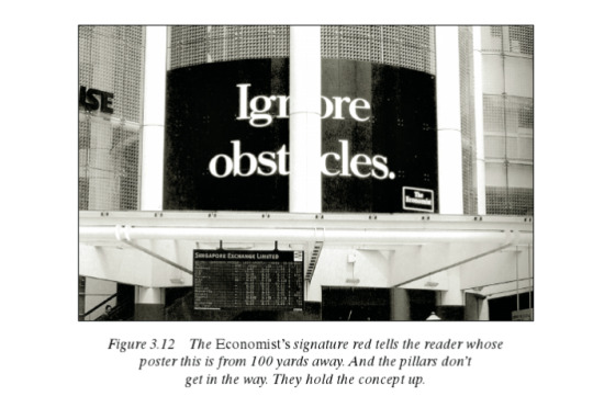
“What if”
“Things get really interesting when you take this kind of thinking into the digital realm” “BK asked Facebook members to delete 10 of their friends to get a free Whopper“ - - - “These stunts tend to create a lot more talk value than what’s traditionally been called advertising.“
“If you have to do an ad, does it have to be a flat page?”
“Try a pop-up, a gatefold, a scratch and sniff, a computer chip” - “there are less expensive tricks you can try. Sequential ads. Scratch-off concepts. Die cuts. Different paper stocks. Acetate film. There’s even magnetized paper now.”
“Try not to look like, or act like, or sound like, or be like an ad.”
“People don’t buy magazines to look at ads. They don’t buy TVs to look at the stinkin’ commercials.” “Can it be an interactive display in Times Square? In Red Square? Can you turn a building into a QR code? Can your TV campaign be a soap opera? Or an opera opera? Can you make it a video game?” *REMEMBER DO SOMETHING PROVOCATIVE
“a picture is worth a thousand words” “John Hegarty says, “I just don’t think people read ads.”” “visuals work fast.”
“As the larger brands become globally marketed, visual solutions will become even more important. They translate, not surprisingly, better than words.”
“If readers don’t get what you’re trying to say from the visual, they won’t get it.“
“The page is turned.” “Coax an interesting visual out of your product.” “Visualize it on its side. Upside down. Make its image rubber. Stretch your product visually” “always keeping in mind you’re trying to coax out of the product a dramatic image with a selling benefit.” “Take your product, change it visually, and by doing so dramatize a customer benefit.“
“Get the visual clichés out of your system right away.” “Every category has its own version of Tired Old Visuals.“
“Learn what iconography is overused in your category, and avoid it.”
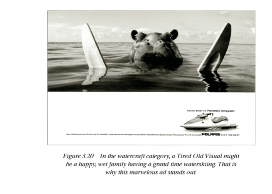
“Show, don’t tell.” “Saying isn’t the same as being.” *”If a client says, “I want people to think our company is cool,” the answer isn’t an ad saying, “We’re cool.” The answer is to be cool. “
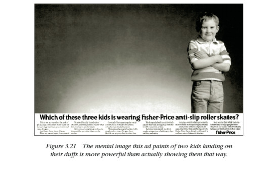
“When everybody else is zigging, you should zag” - “If your product is white sheets, write the headlines in mud. If your product is beautiful, show something ugly.”
“search as far outside the boundaries of convention”
“turn everything on its head. Logos usually go lower right, so put them top left. Product shots are usually small, make them big. Instead of headlines being more prominent than the body copy, do the opposite. It’s perverse, but I’m constantly surprised how many times it works.” - - -
“You are not right if in your ad you stand a man on his head just to get attention. You are right if [it’s done to] show how your product keeps things from falling out of his pockets.“
“Consider the opposite of your product.”
*”What doesn’t the product do? Who doesn’t need the product? When is the product a waste of money?”
“Avoid the formula of saying one thing and showing another.” (“But if you use this sort of setup, make sure the difference between word and picture is breathtaking”)
“Make sure you don’t get stuck always doing the ol’ exaggeration thing” “It’s just a little too easy” “will rarely lead you to a totally unexpected solution” “Just be aware”
“if you’re going to do an exaggeration scenario, make sure you base it on a truth”
“Whenever you can, go for an absolute” “Quietest, fastest, cleanest” “middle ground are boring.”
“Metaphors“
*“can be a quick and powerful way to communicate”
“The trick is doing it well” - - -
“Just picking up an image/symbol and plopping it down next to your client’s logo won’t work. But when you can take an established image, put some spin on it, and use it in some new and unexpected way that relates to your product advantage”
“Symbols lifted right off the rack usually won’t fit your communication needs and typically need some spin put on them.”
“they involve the reader.”
“use images already in the reader’s mind, twist them to the message’s purpose“
“If you leave too much out, you’ll mystify your audience. If you put too much in, you’ll bore them.”
“Don’t set out to be funny. Set out to be interesting.”
“Simplicity is all” “Simple is easier to remember” “Simple breaks through advertising clutter”
“If you can’t reduce your argument to a few crisp words and phrases, there’s something wrong with your argument.”
“Keep paring away until you have the essence of your ad“ - “Inside every fat ad there’s a thinner and better one trying to get out.”
“When you have distilled a good idea into its simplest form, you’re in the neighborhood of “great.””
“Learn to recognise big ideas when you have them”
“Big ideas transcend strategy”
*”Doe’s it really have to land precisely on the target to work?” - *sometimes big ideas wander off strategy, and that's ok.
“After you’ve covered the walls in ideas and you’ve identified concepts you really like, stop.” - “and I mean covered the walls”
References:
Sullivan, L. (2016). Hey, Whipple, Squeeze This: The Classic Guide to Creating Great Ads, 5th Edition. 5th ed. Wiley; 5th edition (16 Feb. 2016).
0 notes