#tyler vigen
Text
On rekindling past internets, and exploring local history and geography
The older you get, the more “past” you have. It’s inevitable. It gets pretty easy to live in your past (well, as long as there’s some good moments), but sometimes it hinders future growth. But self-reflection is also good, as you can see what worked and what didn’t and learn from it. Looking back can also be good for revisiting past interests and seeing which ones are worth giving another go.
I…

View On WordPress
#andy sturdevant#chicago#geography#geography ride#history ride#matt bergstrom#minneapolis#my past#self guided ride#tyler vigen#zines
1 note
·
View note
Text
Recently saw a post demonstrating various cases of spurios correlation to rebuke some weirdo conspiracy bs and that just reminded me of my
absolute favouritest webbedsite on the interwebs.
Allow me to introduce you, if you have not yet met, to the Spurios Correlations website.
Created by Tyler Vigen, this cute little website provides neat graphs and r values for assorted, statistically significant correlations that are, almost certainly, competely spurious. It is an excellent learning tool both to demonstrate the axiom that "correlation does not imply causation" and as a warning against trusting statistical significance as the be-all-and-end-all of scientific evaluation.
The page linked above takes you to the main website where you can see a curated selection of such causations and can also follow links to buy the book if you would like even more curated examples.
There's also a Discover page which lets you find more from the 30,000 spurious correlations collected on the website.
(PS. If you find any especially fun ones pls rb with the example because there are so many brilliant ones on here and I haven't had time to look at them all.)
0 notes

Photo
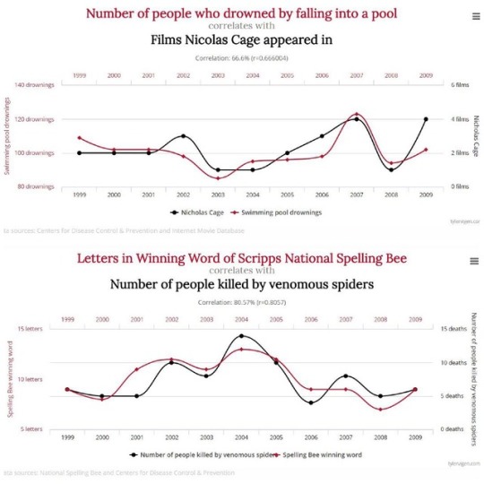
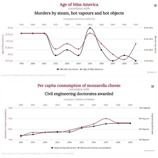
Spurious Correlations by Tyler Vigen.
These charts were made to depict that correlation does not always equal causation, showing that although statistics always arise, they aren't always necessarily useful.
#data#science#physics#chemistry#biology#engineering#math#data science#analytics#big data#meta data#universe#statistics#psychology#correlation#causation#cosmos#learning#education#numbers#miss america#cheese#spiders#murders
9K notes
·
View notes
Photo


August/September Recap:
Wow my life has been crazy these past two months. I got a new job, got married, had my house robbed, recovered a lot of our stuff, and in the past couple of days we found out we're moving to a new apartment in the next couple of weeks! I'm very unsurprised that my reading speed has suffered.
My favorite book in August was Broken Stars, a Chinese science fiction short story anthology (which may seem strange given that I have two five-star reads from August but neither of them is Broken Stars), and my favorite book in September was Red, White & Royal Blue, which was just absolutely adorable. I only read 10 books combined in those two months, which is very slow compared to my standard.
Read in August:
Spurious Correlations by Tyler Vigen: 3.5/5
Neverwhere by Neil Gaiman: 5/5
Small Gods by Terry Pratchett: 5/5
Broken Stars ed. by Ken Liu: 4/5
Beyond the Sunrise by Mary Balogh: 3.5/5
Read in September:
Can’t Escape Love by Alyssa Cole: 2.5/5
Space Opera by Catherynne M. Valente: 4/5
Red, White & Royal Blue by Casey McQuiston: 5/5
Pride, Prejudice, and Other Flavors by Sonali Dev: 4/5
Midnight Riot by Ben Aaronovitch: 4.5/5
11 notes
·
View notes
Text
Daily Create Data
#clmooc #ds106 @ds106dc #tdc3850 #myFest22 A DS106 Story: Click around for the DS Data and info on misinformation
Click Here for Live View with Interactivity
Daily Create
#ds106 @ds106dc #tdc3850 #myFest22 Data is an interesting thing– and so much misinformation arises from the spurious use of it, as this website shows: Tyler Vigen Spurious Correlations
So I added in some spurious data about DS106 Daily Create along with actual links and data– click around to see the facts and data of the DS106…

View On WordPress
0 notes
Text
Why You Should Be Skeptical of the Latest Nutrition Headlines: Part 1
This article is Part 1 of a two-part series about the problems with nutrition research. For more on why you should be skeptical of the latest nutrition headlines, check out Part 2 of this series.
Nutritional epidemiology is basically the board game equivalent of a Ouija board—whatever you want it to say, it will say. – Dr. Peter Attia
Every week, we’re bombarded with splashy headlines in the media about the latest nutrition research. Here’s a sampling from the last few weeks alone:
“Low-carb diets could shorten life, study suggests” (BBC News)
“Eating cheese and butter every day linked to living longer” (Newsweek)
“A New Study Says Any Amount of Drinking Is Bad for You. Here's What Experts Say” (Time)
“Whole grains one of the most important food groups for preventing type 2 diabetes” (Science Daily)
“Low carb diet ‘should be first line of approach to tackle type 2 diabetes’ and prolong lifespan” (iNews)
Within a six-week period, we learned that low-carb diets will make you live longer and shorten your lifespan and that they’re both good and bad for diabetes. We also learned that consuming even small amounts of alcohol, which has long been regarded as health promoting, is now unhealthy.
For decades, we were told to limit dietary fat and cholesterol because they would clog our arteries, give us heart attacks, and send us to an early grave. Yet in 2010, the federal government removed its restriction on total fat from the U.S. Dietary Guidelines, and in 2015, they did the same thing for cholesterol, remarking that it is “not a nutrient of concern for overconsumption.” (1)
If you’re confused by this, or you’ve just stopped listening altogether, you’re not alone. And who could blame you? In a recent, scathing critique of nutrition research in JAMA, Dr. John Ioannidis, a professor at the Stanford School of Medicine, said:
Nutritional research may have adversely affected the public perception of science.
… the emerging picture of nutritional epidemiology is difficult to reconcile with good scientific principles. The field needs radical reform. (2)
In other words, you’re not crazy for doubting the latest media headlines or just throwing up your hands in frustration! In this article, I’m going to explore the reasons why skepticism is an appropriate response when it comes to most nutrition studies. Armed with this information, you’ll be better able to protect yourself and your family from the latest media hype and focus on what really matters when it comes to diet and nutrition.
Why You Can’t Trust Observational Studies as “Proof”
An observational study is one that draws inferences about the effect of an exposure or intervention on subjects where the researcher or investigator has no control over the subject. It’s not an experiment where researchers are directing a specific intervention (like a low-carb diet) and making things happen. Instead, they are just looking at populations of people and making guesses about the effects of a diet or lifestyle variable.
Observational studies are good for generating hypotheses, but they can’t prove that a specific variable causes a specific outcome.
That is the domain of a randomized controlled trial (RCT), which randomly assigns participants to two groups—a treatment group that receives the intervention being studied and a control group that does not—and then observes them for a specific period of time.
We’ve all seen nutrition headlines promising groundbreaking information that will change the way we view our health. But how many news stories are based on studies with faulty methods, uncontrolled biases, and other major problems? Check out this article to find out.
Every scientist knows this, and most journalists should as well. Yet today, it’s not uncommon to see headlines like “Low-carb diet shortens your lifespan” and “Eating processed meat increases your risk of cancer,” which imply that the studies proved a causal relationship when, in fact, all they did is establish a correlation.
Correlation Is Not Causation
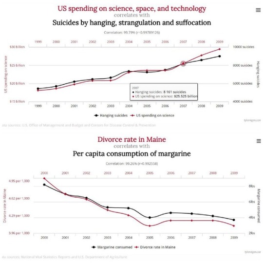
The problem is that two variables that are correlated, or associated together, do not always have a causal relationship. Consider the following examples, from Tyler Vigen’s excellent webpage called Spurious Correlations:
S. spending on space, science, and technology is 99.8 percent correlated with suicides by hanging, strangulation, and suffocation.
Per capita consumption of margarine in the United States and the divorce rate in the state of Maine are correlated at 99.3 percent.
Total revenue generated by arcades is 5 percent correlated with computer science doctorates awarded in the United States.
Those are incredibly strong correlations, but I think it’s fairly obvious that consumption of margarine in the United States has absolutely no impact on the divorce rate in Maine … right?
Another great example of how easy it is to derive spurious correlations—especially when you set out with an agenda—comes from a large study of the most common diagnoses for hospitalization in 10.6 million Canadians. The researchers found that 24 diagnoses were significantly associated with the participants’ astrological signs: (3)
People born under Leo had a 15 percent higher risk of hospitalization due to gastrointestinal hemorrhage compared to other residents of Ontario.
People born under Sagittarius had a 38 percent higher risk of hospitalization for arm fractures compared to people with other signs.
In Dr. Ioannidis’s editorial in JAMA, he notes:
Almost all nutritional variables are correlated with one another; thus, if one variable is causally related to health outcomes, many other variables will also yield significant associations in large enough data sets.
As an example of just how absurd this can become, he notes that, if taken at face value, observational studies have inferred that:
… eating 12 hazelnuts daily (1 oz) would prolong life by 12 years (ie, 1 year per hazelnut), drinking 3 cups of coffee daily would achieve a similar gain of 12 extra years, and eating a single mandarin orange daily (80g) would add 5 years of life. Conversely, consuming 1 egg daily would reduce life expectancy by 6 years, and eating 2 slices of bacon (30g) daily would shorten life by a decade, an effect worse than smoking.
Are these relationships truly causal? Of course not, Ioannidis says. Yet study authors often use causal language when reporting the findings from these studies.
In fact, according to an analysis in 2013, authors of observational studies made medical or nutritional recommendations (suggesting their data showed a causal relationship) in 56 percent of cases. (4) The study authors summed up their findings as follows:
In conclusion, our empirical evaluation shows that linking observational results to recommendations regarding medical practice is currently very common in highly influential journals. Such recommendations frequently represent logical leaps. As such, if they are correct, they may accelerate the translation of research but, if they are wrong, they may cause considerable harm. [emphasis added]
I should note that it’s at least possible to become reasonably confident of a causal association between variables in an observational study using what is known as the Bradford Hill criteria:
Strength of the association
Consistency
Specificity
Temporality
Biological gradient
Plausibility
Coherence
Experiment
Analogy
The more of these criteria that are met, the more likely causation is present.
However, observational nutrition studies rarely satisfy these criteria, which makes the frequent claims of causality even more dubious.
There Are Problems with Data Collection Methods Too
There’s a saying in science: “Data are only as good as the instrument used to collect them.”
Way back in the 13th century, the English philosopher and Franciscan friar Roger Bacon said that scientific data must be: (5)
Independently observable
Measurable
Falsifiable
Valid
Reliable
To use a simple example, if someone is eating an apple right in front of you, you can observe, measure, and either verify or repute that they’re doing that. But if they simply tell you that they ate an apple at some time in the past, you can neither observe, measure, verify, nor refute their story. You just have to take their word for it—and that is not science.
The term “observational nutrition study” is a misnomer because it suggests that researchers are actually observing what participants eat. But of course that’s not true; researchers aren’t standing around in people’s kitchens and going out to restaurants with them.
Instead, they are collecting data on what people eat by giving them questionnaires to fill out. There are different versions of these used in research, from food frequency questionnaires (FFQs), which may ask people to recall what they ate months or even years prior, to 24-hour recall surveys where people are asked what they ate over the past 24 hours.
These “memory-based assessments,” or “M-BMs,” bear little relation to actual calorie or nutrient consumption. Why? Because memory is not a literal, accurate, or even precise reproduction of past events. (6)
In a paper criticizing the validity of M-BMs for data collection, Edward Archer pointed out:
When a person provides a dietary report, the data collected are not actual food or beverage consumption but rather an error-prone and highly edited anecdote regarding memories of food and beverage consumption. (7)
Going back to the apple example above, researchers aren’t watching participants eat an apple. They’re relying on the participants’ reports of eating apples—sometimes several years prior!
We Can’t Rely on Memory When It Comes to Nutrition Research
But just how inaccurate are M-BMs? To find out, Archer analyzed questionnaires from participants in the National Health and Nutrition Examination Survey (NHANES), which is a long-running series of studies on the health and nutritional status of the American public. NHANES has served as the basis of dietary guidelines and public health recommendations.
Archer found that, over the 39-year history (at the time of his study) of NHANES, the self-reported calorie intake on the majority of respondents (67 percent of women and 59 percent of men) was not physiologically plausible, and the average calorie intake levels reported by overweight and obese people (i.e., the majority of Americans) were incompatible with life.
In other words, a bedridden, frail, elderly woman (i.e., a person with the lowest possible calorie requirements) could not survive on the number of calories reported by the average person in the NHANES survey!
And this isn’t just a problem in the United States. The inaccuracy of M-BMs has been replicated consistently over three decades and in multiple countries around the world. (8)
Can you see why this would be a problem?
All macronutrients (protein, fat, and carbohydrate) and micronutrients (vitamins, minerals, and trace minerals) are consumed as calories, so when calories are misreported, all nutrients will also be misreported.
What’s more, certain subgroups are more prone to underreporting, including people who are obese or have a high calorie intake. Obese subjects have been found to underreport up to half of their calorie intake, and in particular, they underreport fat and carbs. (9)
One consequence of this is that the health risks associated with a high fat (or carb) intake would be overestimated. Imagine that someone reports a saturated fat intake of 50 grams, and they have a total cholesterol of 200 mg/dL. But say they underreported their saturated fat intake by 40 percent, and their actual intake was 80 grams. This would overestimate the effect of saturated fat intake on total cholesterol because it assumed that eating 50 grams—rather than 80 grams—led to a total cholesterol of 200 mg/dL.
Where does that leave us? Archer doesn’t pull any punches:
Data collected from M-BM are pseudoscientific and inadmissible in scientific research and the formulation of national dietary guidelines. (10)
… the uncritical faith in the validity and value of M-BM has wasted significant resources and continues the single greatest impediment to actual scientific progress in the fields of obesity and nutrition research. (11)
Most people have no idea that the entire field of observational nutrition research—and all of the media headlines that come out of it—is based on questionnaires about what people eat. Now that you know, will you ever look at nutrition headlines in the same way again?
How the “Healthy-User” Bias Impacts Findings
The “healthy-user” bias refers to the observation that people who engage in a behavior perceived as healthy are more likely to engage in other behaviors that are also perceived as healthy and vice versa.
For example, because red meat has been perceived as “unhealthy” for so many years, on average, people that eat more red meat are more likely to: (12)
Smoke
Be physically inactive
Eat fewer fruits and vegetables
Be less educated
Of course, most researchers are well aware of the influence of confounding factors and the healthy-user bias, and good ones do their best to control for as many of these factors as they can. But even in the best studies, researchers can’t control for all possible confounding factors because our lives are simply too complex. As Norman Breslow, a former biostatistician at the University of Washington, once said:
People think they may have been able to control for things that aren’t inherently controllable.
One of the inevitable results of the healthy-user bias is that many observational studies end up comparing two groups of people that are not at all similar, and this casts doubt on the findings.
For example, early studies suggested that vegetarians live longer than omnivores. However, these studies compared Seventh Day Adventists—a religious group that advocates a vegetarian diet and a healthy lifestyle as part of their belief system—with the general population.
That introduces serious potential for healthy-user bias because the members of the SDA church engage in lifestyle behaviors—like not smoking or drinking alcohol, eating more fresh fruits and vegetables, and getting more exercise—that have been shown to reduce the risk of death from cardiovascular disease and all causes. So, we can’t possibly know whether the reduction in deaths observed in these studies was related to the vegetarian diet or these other causes, and thus the findings are not generalizable to the wider population.
(As a side note, four later studies that compared vegetarians with a more health-conscious population of omnivores found that both groups lived longer than the general population, but there was no difference in lifespan between the vegetarians and healthy omnivores. You can read more about this in my article “Do Vegetarians and Vegans Really Live Longer than Meat Eaters?”)
The healthy-user bias plagues most observational nutrition studies, and yet we hardly ever hear it mentioned when these studies are reported in the media. Now that you know about it, how might you respond differently to some of the headlines I shared at the beginning of the article?
“Low-carb diets could shorten life, study suggests”
“Eating cheese and butter every day linked to living longer”
“Whole grains one of the most important food groups for preventing type 2 diabetes”
Would you ask questions like:
Since fat has been perceived as unhealthy and low-carb diets are high in fat, were the people eating low-carb diets also engaging in other behaviors perceived as unhealthy?
Were the people eating more cheese and butter doing anything else that might have contributed to a longer lifespan?
Were the people who were eating more whole grains exercising more or engaging in other behaviors perceived as healthy (since eating whole grains is perceived as healthy)?
The “Risks” Are Often Pure Chance
In 2015, the International Agency for Research on Cancer (IARC) issued a report suggesting that for every 50 grams of processed meat consumed, the relative risk of cancer was increased by 18 percent compared to those who ate the least processed meat. (13)
How confident can we be of that claim? In epidemiology outside the field of nutrition (and even within the nutrition field until recently), the threshold for confidence in relative risk is between 100 and 300 percent. In other words, we’d need to see an increase or decrease of risk of between 100 and 300 percent for a given intervention before we could be confident that the change observed was due to the intervention and not simply to chance.
According to the late epidemiologist Syd Shapiro, cofounder of the Slone Epidemiology Center, at the higher end of this range, one can be guardedly confident, but “we can hardly ever be confident about estimates of less than 100 percent, and when estimates are much below 100 percent, we are simply out of business.” (14)
Marcia Angell, the former editor of the New England Journal of Medicine, said much the same thing in a 1995 article in Science called “Epidemiology Faces Its Limits”:
As a general rule of thumb, we are looking for a relative risk of three or more [before accepting a paper for publication], particularly if it is biologically implausible or if it’s a brand-new finding.
And Robert Temple, who was the director of drug evaluation at the Food and Drug Administration (FDA) at the time, put it even more bluntly in the same Science article:
My basic rule is if the relative risk isn’t at least three or four, forget it.
Most epidemiologists that were interviewed for the Science article said they would not take seriously a single study reporting a new potential cause of cancer unless the increase in risk was at least three-fold.
This is bad news for observational nutrition studies since the vast majority of relative risks reported fall well below this threshold. Most are well below 100 percent, and many—like the IARC finding on processed meat and cancer—are below 25 percent.
To put this in perspective, the increased relative risk of lung cancer from smoking cigarettes is between 1,000 and 3,000 percent. The increased relative risk of liver cancer from eating grains contaminated with aflatoxin is 600 percent.
It’s also important to consider the difference between absolute and relative risk reduction. Researchers often use relative risk statistics to report the results of nutrition studies. For example, in the IARC report, they said that every 50 grams of processed meat consumed increased the risk of cancer by 18 percent. But when that increase in relative risk is stated in absolute terms, it doesn’t sound quite as impressive. The lifetime absolute risk of colon cancer in vegetarians is 4.5 out of 100; in people eating 50 grams of processed meat every day for a lifetime, the risk is 5.3 out of 100. (15)
All of this suggests that most findings in observational nutrition studies are indistinguishable from chance and are unlikely to be validated by RCTs (which is exactly what has happened in most cases, as I’ll explain shortly). Yet despite this, many of these studies are highly publicized in the media and often reported as if they conclusively discovered a causal relationship.
The current climate in both academia and the media, unfortunately, contributes to this. Null results—when researchers don’t find a positive or negative association—are significantly less likely to be published, and without publication, researchers are out of a job. (16, 17) And the pressure to get clicks and generate advertising revenue in the digital media world leads to splashy headlines that overstate or distort what the study actually found. One study found that 43 percent of front-page stories reporting on medical research are based on research with mostly preliminary findings (i.e., they were observational studies that didn’t prove causality). (18)
“The sin,” Dr. Sander Greenland, an epidemiologist at UCLA, has said, “comes from believing a causal hypothesis is true because your study came up with a positive result.” (19)
Sadly, this is more the rule than the exception today.
I hope this article has given you some reasons to remain skeptical about nutrition research. For more information on this topic, check out Part 2 of this article series—and let me know what you think in the comments below!
The post Why You Should Be Skeptical of the Latest Nutrition Headlines: Part 1 appeared first on Chris Kresser.
Source: http://chriskresser.com
September 27, 2018 at 12:07AM
4 notes
·
View notes
Text
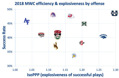
Wyoming: 2019 Arizona Bowl Champions

Levi Williams has strong audition for next season
If the Arizona Bowl was any indication, Wyoming could have itself another quarterback competition looming.
This spring, it was Sean Chambers solidifying the job over Tyler Vander Waal. Vander Waal is almost certainly on his way out of the program after entering the NCAA’s transfer portal a few weeks back, but true freshman Levi Williams could enter the equation at the position given how he looked Tuesday.
Making his first career start, Williams shined against Georgia State. The 6-foot-5, 208-pounder wasn’t terribly efficient — he completed just 42 percent of his passes — but, as Wyoming coach Craig Bohl noted afterward, he looked composed. There was an interception he threw off his back foot late in the first half that you could chalk up to a freshman moment for a guy playing in his third career game, but he delivered big plays in the clutch more often than not.
He had touchdown passes of 18 and 51 yards and also delivered a 62-yard strike to Xazavian Valladay — the Cowboys’ longest pass of the season — to set up another touchdown. All three of his touchdown passes came on third down, helping Wyoming start 9 of 12 on third down and finish 11 of 17 on the money down. His 234 yards passing marked the most for Wyoming all season, and he added 53 more yards and a score on the ground.
Bohl has said in the past he’s never had a player lose his spot atop the depth chart because of an injury, and given how dynamic Chambers is in the running game, it’s hard to see Chambers not back as QB1 whenever his surgically repaired knee returns to full strength.
But should there be a competition heading into next season? Or at least a platoon? You have to think Williams, who accounted for 524 total yards in the three games he played this season, has at least made Bohl and offensive coordinator Brent Vigen start pondering those questions with the way he performed down the stretch.
Xazavian Valladay is an emerging star
Wyoming’s sophomore running back doesn’t like the limelight. Given the chance to talk about himself, he usually opts to thank his offensive line or a Wyoming defense that was really good about getting the ball back to the offense this season to give him more opportunities.
But Valladay better start getting used to all the attention.
Valladay put together another lunch-pail type of performance against GSU that doubled as his best of the season. The first-team all-Mountain West selection was bottled up for much of the first half but exploded as part of the Cowboys’ 218 second-half rushing yards. He finished with 204 yards on the ground and 91 receiving, surpassing the 280 all-purpose yards he had against Nevada earlier this season.
Valladay finished with six 100-yard games in the last seven games of the season. He ran for 1,385 yards on the season. And it’s not just the running game where Valladay can hurt you (211 receiving yards).
He’s quickly emerging as one of more well-rounded backs in the MW and could become a household name next season.
Wyoming takes momentum into the offseason
The excitement of a 6-2 start for Wyoming was dampened some after the Cowboys lost three of four games to end the regular season. Bohl and his players talked at length about wanting to get that bad taste out of their collective mouth in the bowl game, and Wyoming did that Tuesday.
It gives the Cowboys a wave of momentum heading into one of the more promising offseasons of Bohl’s tenure.
Losing Logan Wilson, Cassh Maluia, Alijah Halliburton and Tyler Hall from one of the MW’s top defenses will hurt, but the Cowboys were still a relatively young team this season. Wyoming is losing fewer than 20 seniors in all.
What’s coming back is significant. That includes the Cowboys’ leading rusher (Valladay), leading passer (Chambers), at least two quarterbacks with starting experience, five of their top 8 tacklers and all but two offensive and defensive linemen off their two-deep.
And Wyoming was in every game despite some of that youth. Their five losses came by a combined 28 points.
Wyoming has never won more than eight games in a season in Bohl’s six years at the helm, but there’s enough talent and experience returning that the Cowboys could make a serious run at changing that in 2020.
0 notes
Text
7 Mistakes to Avoid When You’re Reading Research
Thai Massage tutorials and tips.
This article was provided by Mark's Daily Apple, which is the go-to destination to learn how to lead a healthy Primal life in this hectic modern world. I find their posts usually offer some interesting opinions and useful trips and advice
A couple weeks ago I wrote a post about how to read scientific research papers. That covered what to do. Today I’m going to tell you what NOT to do as a consumer of research studies.
The following are bad practices that can cause you to misinterpret research findings, dismiss valid research, or apply scientific findings incorrectly in your own life.
1. Reading Only the Abstract
This is probably the BIGGEST mistake a reader can make. The abstract is, by definition, a summary of the research study. The authors highlight the details they consider most important—or those that just so happen to support their hypotheses.
At best, you miss out on potentially interesting and noteworthy details if you read only the abstract. At worst, you come with a completely distorted impression of the methods and/or results.
Take this paper, for example. The abstract summarizes the findings like this: “Consumption of red and processed meat at an average level of 76 g/d that meets the current UK government recommendation (less than or equal to 90g/day) was associated with an increased risk of colorectal cancer.”
Based on this, you might think:
1. The researchers measured how much meat people were consuming. This is only half right. Respondents filled out a food frequency questionnaire that asked how many times per week they ate meat. The researchers then multiplied that number by a “standard portion size.” Thus, the amount of meat any given person actually consumed might vary considerably from what they are presumed to have eaten.
2. There was an increased risk of colorectal cancers. It says so right there after all. The researchers failed to mention that there was only an increased risk of certain types of colon cancer (and a small one at that—more on this later), not for others, and not for rectal cancer.
3. The risk was the same for everyone. Yet from the discussion: “Interestingly, we found heterogeneity by sex for red and processed meat, red meat, processed meat and alcohol, with the association stronger in men and null in women.” Null—meaning not significant—in women. If you look at the raw data, the effect is not just non-significant, it’s about as close to zero as you can get. To me, this seems like an important detail, one that is certainly abstract-worthy.
Although it’s not the norm for abstracts to blatantly misrepresent the research, it does happen. As I said in my previous post, it’s better to skip the abstract altogether than to read only the abstract.
2. Confusing Correlation and Causation
You’ve surely heard that correlation does not imply causation. When two variables trend together, one doesn’t necessarily cause the other. If people eat more popsicles when they’re wearing shorts, that’s not because eating popsicles makes you put on shorts, or vice versa. They’re both correlated with the temperature outside. Check out Tyler Vigen’s Spurious Correlations blog for more examples of just how ridiculous this can get.
As much as we all know this to be true, the popular media loves to take correlational findings and make causal statements like, “Eating _______ causes cancer!” or “To reduce your risk of _______, do this!” Researchers sometimes use sloppy language to talk about their findings in ways that imply causation too, even when their methods do not support such inferences.
The only way to test causality is through carefully controlled experimentation where researchers manipulate the variable they believe to be causal (the independent variable) and measure differences in the variable they hypothesize will be affected (the dependent variable). Ideally, they also compare the experimental group against a control group, replicate their results using multiple samples and perhaps different methods, and test or control for confounding variables.
As you might imagine, there are many obstacles to conducting this type of research. It’s can be expensive, time consuming, and sometimes unethical, especially with human subjects. You can’t feed a group of humans something you believe to be carcinogenic to see if they develop cancer, for example.
As a reader, it’s extremely important to distinguish between descriptive studies where the researchers measure variables and use statistical tests to see if they are related, and experimental research where they assign participants to different conditions and control the independent variable(s).
Finally, don’t be fooled by language like “X predicted Y.” Scientists can use statistics to make predictions, but that also doesn’t imply causality unless they employed an experimental design.
3. Taking a Single Study, or Even a Handful of Studies, as PROOF of a Phenomenon
When it comes to things as complex as nutrition or human behavior, I’d argue that you can never prove a hypothesis. There are simply too many variables at play, too many potential unknowns. The goal of scientific research is to gain knowledge and increase confidence that a hypothesis is likely true.
I say “likely” because statistical tests can never provide 100 percent proof. Without going deep into a Stats 101 lesson, the way statistical testing actually works is that you set an alternative hypothesis that you believe to be true and a null hypothesis that you believe to be incorrect. Then, you set out to find evidence to support the null hypothesis.
For example, let’s say you want to test whether a certain herb helps improve sleep. You give one experimental group the herb and compare them to a group that doesn’t get the herb. Your null hypothesis is that there is no effect of the herb, so the two groups will sleep the same.
You find that the group that got the herb slept better than the group that didn’t. Statistical tests suggest you can reject the null hypothesis of no difference. In that case, you’re really saying, “If it was true that this herb has no effect, it’s very unlikely that the groups in my study would differ to the degree they did.” You can conclude that it is unlikely—but not impossible—that there is no effect of the herb.
There’s always the chance that you unwittingly sampled a bunch of outliers. There’s also a chance that you somehow influenced the outcome through your study design, or that another unidentified variable actually caused the effect. That’s why replication is so important. The more evidence accumulates, the more confident you can be.
There’s also publication bias to consider. We only have access to data that get published, so we’re working with incomplete information. Analyses across a variety of fields have demonstrated that journals are much more likely to publish positive findings—those that support hypotheses—than negative findings, null findings (findings of no effect), or findings that conflict with data that have been previously published.
Unfortunately, publication bias is a serious problem that academics are still struggling to resolve. There’s no easy answer, and there’s really nothing you can do about it except to maintain an open mind. Never assume any question is fully answered.
4. Confusing Statistical Significance with Importance
This one’s a doozy. As I just explained, statistical tests only tell you whether it is likely that your null hypothesis is false. They don’t tell you whether the findings are important or meaningful or worth caring about whatsoever.
Let’s take that study we talked about in #1. It got a ton of coverage in the press, with many articles stating that we should all eat less red meat to reduce our cancer risk. What do the numbers actually say?
Well, in this study, there were 2,609 new cases of colorectal cancer in the 475,581 respondents during the study period—already a low probability. If you take the time to download the supplementary data, you’ll see that of the 113,662 men who reported eating red or processed mean four or more times per week, 866 were diagnosed. That’s 0.76%. In contrast, 90 of the 19,769 men who reported eating red and processed meat fewer than two times per week were diagnosed. That’s 0.45%.
This difference was enough to be statistically significant. Is it important though? Do you really want to overhaul your diet to possibly take your risk of (certain types of) colorectal cancer from low to slightly lower (only if you’re a man)?
Maybe you do think that’s important. I can’t get too worked up about it, and not just because of the methodological issues with the study.
There are lots of ways to make statistical significance look important, a big one being reporting relative risk instead of absolute risk. Remember, statistical tests are just tools to evaluate numbers. You have to use your powers of logic and reason to interpret those tests and decide what they mean for you.
5. Overgeneralizing
It’s a fallacy to think you can look at one piece of a jigsaw puzzle and believe you understand the whole picture. Any single research study offers just a piece of the puzzle.
Resist the temptation to generalize beyond what has been demonstrated empirically. In particular, don’t assume that research conducted on animals applies perfectly to humans or that research conducted with one population applies to another. It’s a huge problem, for example, when new drugs are tested primarily on men and are then given to women with unknown consequences.
6. Assuming That Published Studies are Right and Anecdotal Data is Wrong
Published studies can be wrong for a number of reasons—author bias, poor design and methodology, statistical error, and chance, to name a few. Studies can also be “right” in the sense that they accurately measure and describe what they set out to describe, but they are inevitably incomplete—the whole puzzle piece thing again.
Moreover, studies very often deal with group-level data—means and standard deviations. They compare the average person in one group to the average person in another group. That still leaves plenty of room for individuals to be different.
It’s a mistake to assume that if someone’s experience differs from what science says it “should” be, that person must be lying or mistaken. At the same time, anecdotal data is even more subject to biases and confounds than other types of data. Anecdotes that run counter to the findings of a scientific study don’t negate the validity of the study.
Consider anecdotal data another piece of the puzzle. Don’t give it more weight than it deserves, but don’t discount it either.
7. Being Overly Critical
As I said in my last post, no study is meant to stand alone. Studies are meant to build on one another so a complete picture emerges—puzzle pieces, have I mentioned that?
When conducting a study, researchers have to make a lot of decisions:
Who or what will their subjects be? If using human participants, what is the population of interest? How will they be sampled?
How will variables of interest be operationalized (defined and assessed)? If the variables aren’t something discrete, like measuring levels of a certain hormone, how will they be measured? For example, if the study focuses on depression, how will depression be evaluated?
What other variables, if any, will they measure and control for statistically? How else will they rule out alternative explanations for any findings?
What statistical tests will they use?
And more. It’s easy as a reader to sit there and go, “Why did they do that? Obviously they should have done this instead!” or, “But their sample only included trained athletes! What about the rest of us?”
There is a difference between recognizing the limitations of a study and dismissing a study because it’s not perfect. Don’t throw the baby out with the bathwater.
That’s my top seven. What would you add? Thanks for reading today, everybody. Have a great week.
(function($) {
$("#dfTn9tB").load("https://ift.tt/35EJWu1" );
})( jQuery );
window.onload=function(){ga('send', {
hitType: 'event',
eventCategory: 'Ad Impression',
eventAction: '95641'
});}
The post 7 Mistakes to Avoid When You’re Reading Research appeared first on Mark's Daily Apple.
I hope that you found the above article interesting. You can find similar content on our blog: https://thaimassagegreenock.co.uk/blog/
Please let me have your feedback below in the comments section.
Let us know what topics we should cover in future.
source https://thaimassagegreenock.co.uk/7-mistakes-to-avoid-when-youre-reading-research/
0 notes
Text
Wyoming looks a little more like a Craig Bohl team each year

The Cowboys might be too young to compete for another division title, but they’re going to be fun and physical as hell.
Bill C’s annual preview series of every FBS team in college football continues. Catch up here!
It’s been a theme of many of my MWC previews thus far: this conference improved rapidly in 2018. San Jose State improved in S&P+ but went 1-11, UNLV improved but fell to 4-8, Air Force improved but remained 5-7, etc.
It was a bad time to have to find yourself, in other words.
After back-to-back eight-win seasons and a 2016 MWC East title, Wyoming and head coach Bohl headed into 2018 with a redshirt freshman at quarterback (Tyler Vander Waal). The Cowboys lost their top two returning running backs (Trey Woods and Kellen Overstreet), most explosive wide receiver (CJ Johnson), and starting right guard (Gavin Rush) to injury before the season.
Then, during the season, both lines got detonated by injuries and shuffling. The OL ended up giving more than 60 percent of its starts to freshmen and sophomores.
Wyoming was a team in flux, even more than expected, and while the defense remained excellent (41st in Def. S&P+ after ranking 36th in 2017), the offense had to figure itself out. By the time it did, the Cowboys had already played five teams that would finish 31st or better in S&P+ — Missouri and Washington State in non-conference play, then Fresno State, Boise State, and Utah State within the MWC. The result: a 2-6 start with four losses by at least 20 points.
And yet, the Cowboys finished bowl eligible. The schedule eased up, and a change at quarterback prompted a change in identity.
With true freshman Sean Chambers behind center, the Cowboys’ offense turned into an old-school meat grinder. Not including sacks, Chambers and running back Nico Evans combined for 44 carries and 233 yards. They averaged 50 and 297 over the next two games (wins, both) as well.
Chambers was lost with injury the next week against Air Force, but Vander Waal led a comeback win. Evans and backup Xazavian Valladay combined for 334 rushing yards in an easy win over New Mexico.
By the end, Wyoming had become the nasty team Bohl dreams of. Chambers returned healthy for spring practice, and he and Vander Waal have been battling for the No. 1 job. (If it seems as if Chambers should be the no-brainer pick, realize that he never really had to throw the ball. He threw only 23 passes in his three full games. So we didn’t get a complete picture.)
You can sort of see whatever you want to in Wyoming. Chambers could be the second coming of Collin Klein — thick (6’3, 215) and durable enough to carry a rushing load and just good enough at passing to punish preoccupied defenses — and the offensive line returns eight players with starting experience. The linebacking corps is scary, every cornerback from a dynamite pass defense returns, and while there are quite a few linemen to replace on defense, the Cowboys got a head start, with all the injuries they had to deal with last year.
Of course, they are still going to be led by either a redshirt freshman or sophomore quarterback. Valladay is the only returning RB who had a carry last season, and while CJ Johnson is back, leading receiver James Price isn’t. The line still has to replace two stalwarts who combined for 86 career starts, and the defensive line really does have a lot to replace.
Wyoming could become scarier and scarier over the next couple of seasons. But the Cowboys are still going to be awfully young this year, and the MWC is still going to be awfully good.
Offense

Even with Vander Waal behind center, Wyoming was a run-heavy team. It’s in both Bohl’s and coordinator Brent Vigen’s DNA. When Wyoming won the division in 2016, it was powered by running back Brian Hill, who carried the ball almost as many times (349) as quarterback Josh Allen threw it (373).
That probably means big things for Valladay. He very much looked like the redshirt freshman he was in 2018, producing only a 34 percent success rate to Evans’ 45 percent. But after gaining just 181 yards on 45 carries in the first 10 games, he exploded for 215 in 26 in the last two.

Troy Babbitt-USA TODAY Sports
Xazavian Valladay
I can’t even pretend to worry about the line. Rush returns, and if Wyoming could rush for all those yards late in 2018 with a ton of freshmen and sophomores up front, it can do so with sophomores and juniors.
I can find concern for the backfield, though. Even if Valladay takes a permanent step forward, he’s going to need some help, and it would likely come from either redshirt freshman Reow Jackson or one of three three-star true freshmen. That’s not a recipe for efficiency.
Without run efficiency, the pass quickly gets dicey. That is true for all of college football, but it’s particularly true for Wyoming. The Cowboys ranked 48th in rushing marginal efficiency but only 122nd in passing marginal efficiency -- 77th on standard downs but 118th on passing downs.
Vander Waal was dramatically up-and-down, even for a freshman. He produced a 145.1 passer rating against Boise State and a 151.9 against Air Force. But he was not only below 100 (horrible by the college formula) on five occasions, he was below 60 on three. Against Wazzu, Utah State, and New Mexico, he was a combined 19-for-56 for 146 yards and two interceptions. That’s as bad as you’ll ever see, and it’s why Chambers got an opportunity.

Brian Losness-USA TODAY Sports
C.J. Johnson
Chambers made the most of his pass opportunities, going 15-for-25 for 266 yards and three scores. Wyoming’s fate may rest on how representative that tiny sample turns out to be.
The receiving corps indeed has to replace Price and tight ends Tyree Mayfield and Austin Fort. If there’s good news, it’s that Price wasn’t particularly efficient as a No. 1 target; his production was replaceable even though he had explosive moments.
The bad news is that none of the returnees were that efficient either. Johnson’s return should assure explosiveness potential — he averaged 17.7 yards per catch as a sophomore in 2017 — but reliability could still be an issue. Seniors Austin Conway and Raghib Ismail Jr. did combine for a 55 percent catch rate (good for Wyoming, anyway), but they averaged a paltry 9.2 yards per catch, and their success rate was actually lower than Price’s despite Price’s far-too-low 46 percent catch rate.
The hopes have to be that Chambers is a standout in fall camp, that a Chambers-Valladay backfield both produces and stays healthy, and that this opens up play-action opportunities to Johnson and company. But a few too many second-and-9s or third-and-7s would wreck this.
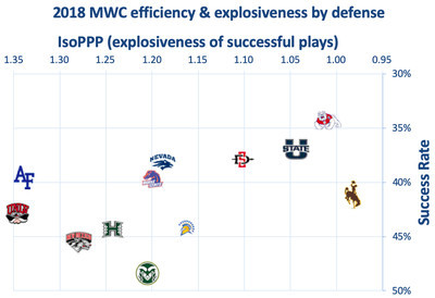
Defense

It took a while for Bohl to replicate the defensive culture he built while winning a billion games at North Dakota State, but once it began to take hold, it evidently locked in. After averaging a Def. S&P+ ranking of 113 in Bohl’s first three seasons, the Cowboys surged to 36th in 2017, then held at 41st last year despite an extended visit from the injury bug.
Leading returning linemen Carl Granderson, Youhanna Ghaifan, and Kevin Prosser missed games, and exciting emerging tackle Javaree Jackson missed half the season.
This hurt the pass rush a ton — the Cowboys ranked only 114th in sack rate, 100th on passing downs — but the combination of line depth and a strong back seven meant that the run defense still had some punch at times. The Cowboys were a decent 58th in Rushing S&P+ and only allowed four-plus yards on 43 percent of non-sack carries (24th).

Jake Roth-USA TODAY Sports
Antonio Hull
The secondary was outstanding. The Cowboys allowed only 1.3 gains per game of 30-plus yards, ninth in FBS, and they ranked ninth in Passing S&P+ despite the total lack of pressure on the quarterback.
There’s good news and bad news in the back. Safety Alijah Halliburton and corners Antonio Hull and Tyler Hall (who also plays a mean nickel) are all back. Halliburton was as good in pass coverage as anyone on the team, and Hull and Hall combined for three INTs and 17 pass breakups. Three-star sophomore C.J. Coldon could be ready for a larger role, too.
The bad news is that safeties Andrew Wingard and Marcus Epps are gone. They were outstanding in both making (nine combined TFLs, 14 run stuffs, and 11 passes defensed) and preventing plays. While coordinator Scottie Hazelton — who left to become Kansas State’s coordinator — played as many guys as possible up front, he deployed basically five guys in the secondary, and maybe the two most important are gone. Sophomore Keyon Blakenbaker could be ready to make plays at nickel, but there are obvious question marks.

Troy Babbitt-USA TODAY Sports
Logan Wilson (30)
So that’s challenge No. 1 for new DC Jake Dickert. But since he served as safeties coach over the last two years, he knows the new starting candidates.
Dickert was the coordinator for some tremendous Minnesota State-Mankato defenses before joining Bohl’s staff in 2016. His Maverick defenses pressured the passer well, but it’s unclear where Wyoming’s pressure will come from. End Garrett Call, the only of the DL regulars to play in all 12 games, did lead the team, but with only 4.5 sacks. The next returnees are senior end Josiah Hall and linebacker Logan Wilson, who had two each.
The run defense could pick up some slack. Wilson was a heat-seeking missile against the run, leading the team with 17 stuffs and nine non-sack TFLs. Fellow senior Cassh Malula isn’t exactly chopped liver either, and three-star sophomore (and Wyoming legacy) Chad Muma appears to be a spring standout.
Despite attrition, Jackson and Raveontae Holt return at tackle. Depth there could be questionable, but that’s a solid starting point.
Special Teams
Cooper Rothe was a one-man special teams unit in 2018. Wyoming got next to nothing from its return game, and neither of two punters, Tim Zaleski nor Dontae Crow, could prevent Wyoming from ranking in the bottom 15 of punt efficiency.
Thanks to Rothe, though, UW ranked 56th in Special Teams S&P+. Opponents started at or behind their 25 after 87 percent of his kickoffs (28th in FBS), and he not only didn’t miss a kick inside of 40 yards, he went 5-for-6 on longer FGs. He was second in FG efficiency and ended up a Groza Award finalist. He’s back, which means the Cowboys will at least break even in special teams.
2019 outlook
2019 Schedule & Projection Factors
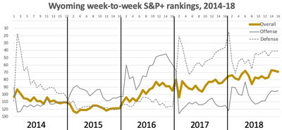
Date Opponent Proj. S&P+ Rk Proj. Margin Win Probability 31-Aug Missouri 16 -19.6 13% 7-Sep at Texas State 102 1.6 54% 14-Sep Idaho NR 19.5 87% 21-Sep at Tulsa 95 -1.2 47% 28-Sep UNLV 100 5.3 62% 12-Oct at San Diego State 54 -12.0 24% 19-Oct New Mexico 115 13.1 78% 26-Oct Nevada 83 -0.2 50% 9-Nov at Boise State 24 -19.7 13% 16-Nov at Utah State 42 -14.7 20% 23-Nov Colorado State 109 10.6 73% 30-Nov at Air Force 90 -3.6 42%
Projected S&P+ Rk 92 Proj. Off. / Def. Rk 107 / 68 Projected wins 5.6 Five-Year S&P+ Rk -7.7 (95) 2- and 5-Year Recruiting Rk 104 2018 TO Margin / Adj. TO Margin* 4 / 4.3 2018 TO Luck/Game -0.1 Returning Production (Off. / Def.) 49% (52%, 46%) 2018 Second-order wins (difference) 6.3 (-0.3)
2019 will be a test of culture. There are key departures at running back and safety and on both lines, and the Cowboys rank 120th in returning production. But if Chambers is ready to shine, and some of the sophomores and juniors who have been in the program for a few years are ready to step up, this might be when the culture Bohl built in Fargo starts to sustain itself in Laramie.
Or, hey, maybe that doesn’t happen until next year. S&P+ projects Wyoming to fall to 92nd thanks to the iffy returning production, and that puts the Pokes on the precipice of projected bowl eligibility for what would be the second straight year. It wouldn’t surprise me if they exceeded those projections, but it’s not a given.

Team preview stats
All 2019 preview data to date.
0 notes
Photo


CO-EDITED BOOK for Kunstverein München
A rock that keeps tigers away. Post Brothers, Hasan Veseli (editors). Roma Publishing. Amsterdam, 2017.
The ninth in the Companion series, this 224-page publication contains the theoretical grounding (around causation, correlation and contingency) for A rock that keeps tigers away - a group exhibition at Kunstverein München.
The publication contains texts (in either German or English) by Claudia Blum, Heinz von Foerster, Sigfried Großmann, Katrine Dybbroe Møller, Timothy Morton, Francesco Pedraglio, Edgar Allen Poe, Steven Shaviro, Julian Sigmund, and Doug Zongker, which wrap an extensive interview with the exhibition's main curator Post Brothers, conducted by the Kunstverein's director Chris Fitzpatrick, and with contributions from the publication's co-editor Hasan Veseli (in English and German). A collection of quotes from comedians, writers, and philosophers, transcriptions from episodes of the television programs, Sesame Street, The Simpsons, and The West Wing, a charting of the development of the 'Chicken or the Egg' debate in popular media, and artistic interventions by Beth Collar, Laura Kaminskaite, Simon Dybbroe Møller, Gianni Motti, Julie Peeters, Tyler Vigen, and Freek Wambacq are also contained in the publication.
Co-edited by Post Brothers and Hasan Veseli. Designed by Julie Peeter.
The exhibition contains work by Beth Collar, Tania Pérez Córdova, Jason Dodge, Laura Kaminskaite, Simon Dybbroe Møller, Francesco Pedraglio, Adrien Tirtiaux, Freek Wambacq, and Herwig Weiser.
Order here
1 note
·
View note
Text
Don't Be Fooled by Data: 4 Data Analysis Pitfalls & How to Avoid Them
Posted by Tom.Capper
Digital marketing is a proudly data-driven field. Yet, as SEOs especially, we often have such incomplete or questionable data to work with, that we end up jumping to the wrong conclusions in our attempts to substantiate our arguments or quantify our issues and opportunities.
In this post, I’m going to outline 4 data analysis pitfalls that are endemic in our industry, and how to avoid them.
1. Jumping to conclusions
Earlier this year, I conducted a ranking factor study around brand awareness, and I posted this caveat:
"...the fact that Domain Authority (or branded search volume, or anything else) is positively correlated with rankings could indicate that any or all of the following is likely:
Links cause sites to rank well
Ranking well causes sites to get links
Some third factor (e.g. reputation or age of site) causes sites to get both links and rankings"
~ Me
However, I want to go into this in a bit more depth and give you a framework for analyzing these yourself, because it still comes up a lot. Take, for example, this recent study by Stone Temple, which you may have seen in the Moz Top 10 or Rand’s tweets, or this excellent article discussing SEMRush’s recent direct traffic findings. To be absolutely clear, I’m not criticizing either of the studies, but I do want to draw attention to how we might interpret them.
Firstly, we do tend to suffer a little confirmation bias — we’re all too eager to call out the cliché “correlation vs. causation” distinction when we see successful sites that are keyword-stuffed, but all too approving when we see studies doing the same with something we think is or was effective, like links.
Secondly, we fail to critically analyze the potential mechanisms. The options aren’t just causation or coincidence.
Before you jump to a conclusion based on a correlation, you’re obliged to consider various possibilities:
Complete coincidence
Reverse causation
Joint causation
Linearity
Broad applicability
If those don’t make any sense, then that’s fair enough — they’re jargon. Let’s go through an example:
Before I warn you not to eat cheese because you may die in your bedsheets, I’m obliged to check that it isn’t any of the following:
Complete coincidence - Is it possible that so many datasets were compared, that some were bound to be similar? Why, that’s exactly what Tyler Vigen did! Yes, this is possible.
Reverse causation - Is it possible that we have this the wrong way around? For example, perhaps your relatives, in mourning for your bedsheet-related death, eat cheese in large quantities to comfort themselves? This seems pretty unlikely, so let’s give it a pass. No, this is very unlikely.
Joint causation - Is it possible that some third factor is behind both of these? Maybe increasing affluence makes you healthier (so you don’t die of things like malnutrition), and also causes you to eat more cheese? This seems very plausible. Yes, this is possible.
Linearity - Are we comparing two linear trends? A linear trend is a steady rate of growth or decline. Any two statistics which are both roughly linear over time will be very well correlated. In the graph above, both our statistics are trending linearly upwards. If the graph was drawn with different scales, they might look completely unrelated, like this, but because they both have a steady rate, they’d still be very well correlated. Yes, this looks likely.
Broad applicability - Is it possible that this relationship only exists in certain niche scenarios, or, at least, not in my niche scenario? Perhaps, for example, cheese does this to some people, and that’s been enough to create this correlation, because there are so few bedsheet-tangling fatalities otherwise? Yes, this seems possible.
So we have 4 “Yes” answers and one “No” answer from those 5 checks.
If your example doesn’t get 5 “No” answers from those 5 checks, it’s a fail, and you don’t get to say that the study has established either a ranking factor or a fatal side effect of cheese consumption.
A similar process should apply to case studies, which are another form of correlation — the correlation between you making a change, and something good (or bad!) happening. For example, ask:
Have I ruled out other factors (e.g. external demand, seasonality, competitors making mistakes)?
Did I increase traffic by doing the thing I tried to do, or did I accidentally improve some other factor at the same time?
Did this work because of the unique circumstance of the particular client/project?
This is particularly challenging for SEOs, because we rarely have data of this quality, but I’d suggest an additional pair of questions to help you navigate this minefield:
If I were Google, would I do this?
If I were Google, could I do this?
Direct traffic as a ranking factor passes the “could” test, but only barely — Google could use data from Chrome, Android, or ISPs, but it’d be sketchy. It doesn’t really pass the “would” test, though — it’d be far easier for Google to use branded search traffic, which would answer the same questions you might try to answer by comparing direct traffic levels (e.g. how popular is this website?).
2. Missing the context
If I told you that my traffic was up 20% week on week today, what would you say? Congratulations?
What if it was up 20% this time last year?
What if I told you it had been up 20% year on year, up until recently?
It’s funny how a little context can completely change this. This is another problem with case studies and their evil inverted twin, traffic drop analyses.
If we really want to understand whether to be surprised at something, positively or negatively, we need to compare it to our expectations, and then figure out what deviation from our expectations is “normal.” If this is starting to sound like statistics, that’s because it is statistics — indeed, I wrote about a statistical approach to measuring change way back in 2015.
If you want to be lazy, though, a good rule of thumb is to zoom out, and add in those previous years. And if someone shows you data that is suspiciously zoomed in, you might want to take it with a pinch of salt.
3. Trusting our tools
Would you make a multi-million dollar business decision based on a number that your competitor could manipulate at will? Well, chances are you do, and the number can be found in Google Analytics. I’ve covered this extensively in other places, but there are some major problems with most analytics platforms around:
How easy they are to manipulate externally
How arbitrarily they group hits into sessions
How vulnerable they are to ad blockers
How they perform under sampling, and how obvious they make this
For example, did you know that the Google Analytics API v3 can heavily sample data whilst telling you that the data is unsampled, above a certain amount of traffic (~500,000 within date range)? Neither did I, until we ran into it whilst building Distilled ODN.
Similar problems exist with many “Search Analytics” tools. My colleague Sam Nemzer has written a bunch about this — did you know that most rank tracking platforms report completely different rankings? Or how about the fact that the keywords grouped by Google (and thus tools like SEMRush and STAT, too) are not equivalent, and don’t necessarily have the volumes quoted?
It’s important to understand the strengths and weaknesses of tools that we use, so that we can at least know when they’re directionally accurate (as in, their insights guide you in the right direction), even if not perfectly accurate. All I can really recommend here is that skilling up in SEO (or any other digital channel) necessarily means understanding the mechanics behind your measurement platforms — which is why all new starts at Distilled end up learning how to do analytics audits.
One of the most common solutions to the root problem is combining multiple data sources, but…
4. Combining data sources
There are numerous platforms out there that will “defeat (not provided)” by bringing together data from two or more of:
Analytics
Search Console
AdWords
Rank tracking
The problems here are that, firstly, these platforms do not have equivalent definitions, and secondly, ironically, (not provided) tends to break them.
Let’s deal with definitions first, with an example — let’s look at a landing page with a channel:
In Search Console, these are reported as clicks, and can be vulnerable to heavy, invisible sampling when multiple dimensions (e.g. keyword and page) or filters are combined.
In Google Analytics, these are reported using last non-direct click, meaning that your organic traffic includes a bunch of direct sessions, time-outs that resumed mid-session, etc. That’s without getting into dark traffic, ad blockers, etc.
In AdWords, most reporting uses last AdWords click, and conversions may be defined differently. In addition, keyword volumes are bundled, as referenced above.
Rank tracking is location specific, and inconsistent, as referenced above.
Fine, though — it may not be precise, but you can at least get to some directionally useful data given these limitations. However, about that “(not provided)”...
Most of your landing pages get traffic from more than one keyword. It’s very likely that some of these keywords convert better than others, particularly if they are branded, meaning that even the most thorough click-through rate model isn’t going to help you. So how do you know which keywords are valuable?
The best answer is to generalize from AdWords data for those keywords, but it’s very unlikely that you have analytics data for all those combinations of keyword and landing page. Essentially, the tools that report on this make the very bold assumption that a given page converts identically for all keywords. Some are more transparent about this than others.
Again, this isn’t to say that those tools aren’t valuable — they just need to be understood carefully. The only way you could reliably fill in these blanks created by “not provided” would be to spend a ton on paid search to get decent volume, conversion rate, and bounce rate estimates for all your keywords, and even then, you’ve not fixed the inconsistent definitions issues.
Bonus peeve: Average rank
I still see this way too often. Three questions:
Do you care more about losing rankings for ten very low volume queries (10 searches a month or less) than for one high volume query (millions plus)? If the answer isn’t “yes, I absolutely care more about the ten low-volume queries”, then this metric isn’t for you, and you should consider a visibility metric based on click through rate estimates.
When you start ranking at 100 for a keyword you didn’t rank for before, does this make you unhappy? If the answer isn’t “yes, I hate ranking for new keywords,” then this metric isn’t for you — because that will lower your average rank. You could of course treat all non-ranking keywords as position 100, as some tools allow, but is a drop of 2 average rank positions really the best way to express that 1/50 of your landing pages have been de-indexed? Again, use a visibility metric, please.
Do you like comparing your performance with your competitors? If the answer isn’t “no, of course not,” then this metric isn’t for you — your competitors may have more or fewer branded keywords or long-tail rankings, and these will skew the comparison. Again, use a visibility metric.
Conclusion
Hopefully, you’ve found this useful. To summarize the main takeaways:
Critically analyse correlations & case studies by seeing if you can explain them as coincidences, as reverse causation, as joint causation, through reference to a third mutually relevant factor, or through niche applicability.
Don’t look at changes in traffic without looking at the context — what would you have forecasted for this period, and with what margin of error?
Remember that the tools we use have limitations, and do your research on how that impacts the numbers they show. “How has this number been produced?” is an important component in “What does this number mean?”
If you end up combining data from multiple tools, remember to work out the relationship between them — treat this information as directional rather than precise.
Let me know what data analysis fallacies bug you, in the comments below.
Sign up for The Moz Top 10, a semimonthly mailer updating you on the top ten hottest pieces of SEO news, tips, and rad links uncovered by the Moz team. Think of it as your exclusive digest of stuff you don't have time to hunt down but want to read!
via Blogger http://ift.tt/2k8uT5x
0 notes
Text
Don't Be Fooled by Data: 4 Data Analysis Pitfalls & How to Avoid Them
Posted by Tom.Capper
Digital marketing is a proudly data-driven field. Yet, as SEOs especially, we often have such incomplete or questionable data to work with, that we end up jumping to the wrong conclusions in our attempts to substantiate our arguments or quantify our issues and opportunities.
In this post, I’m going to outline 4 data analysis pitfalls that are endemic in our industry, and how to avoid them.
1. Jumping to conclusions
Earlier this year, I conducted a ranking factor study around brand awareness, and I posted this caveat:
"...the fact that Domain Authority (or branded search volume, or anything else) is positively correlated with rankings could indicate that any or all of the following is likely:
Links cause sites to rank well
Ranking well causes sites to get links
Some third factor (e.g. reputation or age of site) causes sites to get both links and rankings"
~ Me
However, I want to go into this in a bit more depth and give you a framework for analyzing these yourself, because it still comes up a lot. Take, for example, this recent study by Stone Temple, which you may have seen in the Moz Top 10 or Rand’s tweets, or this excellent article discussing SEMRush’s recent direct traffic findings. To be absolutely clear, I’m not criticizing either of the studies, but I do want to draw attention to how we might interpret them.
Firstly, we do tend to suffer a little confirmation bias — we’re all too eager to call out the cliché “correlation vs. causation” distinction when we see successful sites that are keyword-stuffed, but all too approving when we see studies doing the same with something we think is or was effective, like links.
Secondly, we fail to critically analyze the potential mechanisms. The options aren’t just causation or coincidence.
Before you jump to a conclusion based on a correlation, you’re obliged to consider various possibilities:
Complete coincidence
Reverse causation
Joint causation
Linearity
Broad applicability
If those don’t make any sense, then that’s fair enough — they’re jargon. Let’s go through an example:
Before I warn you not to eat cheese because you may die in your bedsheets, I’m obliged to check that it isn’t any of the following:
Complete coincidence - Is it possible that so many datasets were compared, that some were bound to be similar? Why, that’s exactly what Tyler Vigen did! Yes, this is possible.
Reverse causation - Is it possible that we have this the wrong way around? For example, perhaps your relatives, in mourning for your bedsheet-related death, eat cheese in large quantities to comfort themselves? This seems pretty unlikely, so let’s give it a pass. No, this is very unlikely.
Joint causation - Is it possible that some third factor is behind both of these? Maybe increasing affluence makes you healthier (so you don’t die of things like malnutrition), and also causes you to eat more cheese? This seems very plausible. Yes, this is possible.
Linearity - Are we comparing two linear trends? A linear trend is a steady rate of growth or decline. Any two statistics which are both roughly linear over time will be very well correlated. In the graph above, both our statistics are trending linearly upwards. If the graph was drawn with different scales, they might look completely unrelated, like this, but because they both have a steady rate, they’d still be very well correlated. Yes, this looks likely.
Broad applicability - Is it possible that this relationship only exists in certain niche scenarios, or, at least, not in my niche scenario? Perhaps, for example, cheese does this to some people, and that’s been enough to create this correlation, because there are so few bedsheet-tangling fatalities otherwise? Yes, this seems possible.
So we have 4 “Yes” answers and one “No” answer from those 5 checks.
If your example doesn’t get 5 “No” answers from those 5 checks, it’s a fail, and you don’t get to say that the study has established either a ranking factor or a fatal side effect of cheese consumption.
A similar process should apply to case studies, which are another form of correlation — the correlation between you making a change, and something good (or bad!) happening. For example, ask:
Have I ruled out other factors (e.g. external demand, seasonality, competitors making mistakes)?
Did I increase traffic by doing the thing I tried to do, or did I accidentally improve some other factor at the same time?
Did this work because of the unique circumstance of the particular client/project?
This is particularly challenging for SEOs, because we rarely have data of this quality, but I’d suggest an additional pair of questions to help you navigate this minefield:
If I were Google, would I do this?
If I were Google, could I do this?
Direct traffic as a ranking factor passes the “could” test, but only barely — Google could use data from Chrome, Android, or ISPs, but it’d be sketchy. It doesn’t really pass the “would” test, though — it’d be far easier for Google to use branded search traffic, which would answer the same questions you might try to answer by comparing direct traffic levels (e.g. how popular is this website?).
2. Missing the context
If I told you that my traffic was up 20% week on week today, what would you say? Congratulations?
What if it was up 20% this time last year?
What if I told you it had been up 20% year on year, up until recently?
It’s funny how a little context can completely change this. This is another problem with case studies and their evil inverted twin, traffic drop analyses.
If we really want to understand whether to be surprised at something, positively or negatively, we need to compare it to our expectations, and then figure out what deviation from our expectations is “normal.” If this is starting to sound like statistics, that’s because it is statistics — indeed, I wrote about a statistical approach to measuring change way back in 2015.
If you want to be lazy, though, a good rule of thumb is to zoom out, and add in those previous years. And if someone shows you data that is suspiciously zoomed in, you might want to take it with a pinch of salt.
3. Trusting our tools
Would you make a multi-million dollar business decision based on a number that your competitor could manipulate at will? Well, chances are you do, and the number can be found in Google Analytics. I’ve covered this extensively in other places, but there are some major problems with most analytics platforms around:
How easy they are to manipulate externally
How arbitrarily they group hits into sessions
How vulnerable they are to ad blockers
How they perform under sampling, and how obvious they make this
For example, did you know that the Google Analytics API v3 can heavily sample data whilst telling you that the data is unsampled, above a certain amount of traffic (~500,000 within date range)? Neither did I, until we ran into it whilst building Distilled ODN.
Similar problems exist with many “Search Analytics” tools. My colleague Sam Nemzer has written a bunch about this — did you know that most rank tracking platforms report completely different rankings? Or how about the fact that the keywords grouped by Google (and thus tools like SEMRush and STAT, too) are not equivalent, and don’t necessarily have the volumes quoted?
It’s important to understand the strengths and weaknesses of tools that we use, so that we can at least know when they’re directionally accurate (as in, their insights guide you in the right direction), even if not perfectly accurate. All I can really recommend here is that skilling up in SEO (or any other digital channel) necessarily means understanding the mechanics behind your measurement platforms — which is why all new starts at Distilled end up learning how to do analytics audits.
One of the most common solutions to the root problem is combining multiple data sources, but…
4. Combining data sources
There are numerous platforms out there that will “defeat (not provided)” by bringing together data from two or more of:
Analytics
Search Console
AdWords
Rank tracking
The problems here are that, firstly, these platforms do not have equivalent definitions, and secondly, ironically, (not provided) tends to break them.
Let’s deal with definitions first, with an example — let’s look at a landing page with a channel:
In Search Console, these are reported as clicks, and can be vulnerable to heavy, invisible sampling when multiple dimensions (e.g. keyword and page) or filters are combined.
In Google Analytics, these are reported using last non-direct click, meaning that your organic traffic includes a bunch of direct sessions, time-outs that resumed mid-session, etc. That’s without getting into dark traffic, ad blockers, etc.
In AdWords, most reporting uses last AdWords click, and conversions may be defined differently. In addition, keyword volumes are bundled, as referenced above.
Rank tracking is location specific, and inconsistent, as referenced above.
Fine, though — it may not be precise, but you can at least get to some directionally useful data given these limitations. However, about that “(not provided)”...
Most of your landing pages get traffic from more than one keyword. It’s very likely that some of these keywords convert better than others, particularly if they are branded, meaning that even the most thorough click-through rate model isn’t going to help you. So how do you know which keywords are valuable?
The best answer is to generalize from AdWords data for those keywords, but it’s very unlikely that you have analytics data for all those combinations of keyword and landing page. Essentially, the tools that report on this make the very bold assumption that a given page converts identically for all keywords. Some are more transparent about this than others.
Again, this isn’t to say that those tools aren’t valuable — they just need to be understood carefully. The only way you could reliably fill in these blanks created by “not provided” would be to spend a ton on paid search to get decent volume, conversion rate, and bounce rate estimates for all your keywords, and even then, you’ve not fixed the inconsistent definitions issues.
Bonus peeve: Average rank
I still see this way too often. Three questions:
Do you care more about losing rankings for ten very low volume queries (10 searches a month or less) than for one high volume query (millions plus)? If the answer isn’t “yes, I absolutely care more about the ten low-volume queries”, then this metric isn’t for you, and you should consider a visibility metric based on click through rate estimates.
When you start ranking at 100 for a keyword you didn’t rank for before, does this make you unhappy? If the answer isn’t “yes, I hate ranking for new keywords,” then this metric isn’t for you — because that will lower your average rank. You could of course treat all non-ranking keywords as position 100, as some tools allow, but is a drop of 2 average rank positions really the best way to express that 1/50 of your landing pages have been de-indexed? Again, use a visibility metric, please.
Do you like comparing your performance with your competitors? If the answer isn’t “no, of course not,” then this metric isn’t for you — your competitors may have more or fewer branded keywords or long-tail rankings, and these will skew the comparison. Again, use a visibility metric.
Conclusion
Hopefully, you’ve found this useful. To summarize the main takeaways:
Critically analyse correlations & case studies by seeing if you can explain them as coincidences, as reverse causation, as joint causation, through reference to a third mutually relevant factor, or through niche applicability.
Don’t look at changes in traffic without looking at the context — what would you have forecasted for this period, and with what margin of error?
Remember that the tools we use have limitations, and do your research on how that impacts the numbers they show. “How has this number been produced?” is an important component in “What does this number mean?”
If you end up combining data from multiple tools, remember to work out the relationship between them — treat this information as directional rather than precise.
Let me know what data analysis fallacies bug you, in the comments below.
Sign up for The Moz Top 10, a semimonthly mailer updating you on the top ten hottest pieces of SEO news, tips, and rad links uncovered by the Moz team. Think of it as your exclusive digest of stuff you don't have time to hunt down but want to read!
from http://dentistry01.blogspot.com/2017/12/dont-be-fooled-by-data-4-data-analysis.html
0 notes
Text
Don't Be Fooled by Data: 4 Data Analysis Pitfalls & How to Avoid Them
Posted by Tom.Capper
Digital marketing is a proudly data-driven field. Yet, as SEOs especially, we often have such incomplete or questionable data to work with, that we end up jumping to the wrong conclusions in our attempts to substantiate our arguments or quantify our issues and opportunities.
In this post, I’m going to outline 4 data analysis pitfalls that are endemic in our industry, and how to avoid them.
1. Jumping to conclusions
Earlier this year, I conducted a ranking factor study around brand awareness, and I posted this caveat:
"...the fact that Domain Authority (or branded search volume, or anything else) is positively correlated with rankings could indicate that any or all of the following is likely:
Links cause sites to rank well
Ranking well causes sites to get links
Some third factor (e.g. reputation or age of site) causes sites to get both links and rankings"
~ Me
However, I want to go into this in a bit more depth and give you a framework for analyzing these yourself, because it still comes up a lot. Take, for example, this recent study by Stone Temple, which you may have seen in the Moz Top 10 or Rand’s tweets, or this excellent article discussing SEMRush’s recent direct traffic findings. To be absolutely clear, I’m not criticizing either of the studies, but I do want to draw attention to how we might interpret them.
Firstly, we do tend to suffer a little confirmation bias — we’re all too eager to call out the cliché “correlation vs. causation” distinction when we see successful sites that are keyword-stuffed, but all too approving when we see studies doing the same with something we think is or was effective, like links.
Secondly, we fail to critically analyze the potential mechanisms. The options aren’t just causation or coincidence.
Before you jump to a conclusion based on a correlation, you’re obliged to consider various possibilities:
Complete coincidence
Reverse causation
Joint causation
Linearity
Broad applicability
If those don’t make any sense, then that’s fair enough — they’re jargon. Let’s go through an example:
Before I warn you not to eat cheese because you may die in your bedsheets, I’m obliged to check that it isn’t any of the following:
Complete coincidence - Is it possible that so many datasets were compared, that some were bound to be similar? Why, that’s exactly what Tyler Vigen did! Yes, this is possible.
Reverse causation - Is it possible that we have this the wrong way around? For example, perhaps your relatives, in mourning for your bedsheet-related death, eat cheese in large quantities to comfort themselves? This seems pretty unlikely, so let’s give it a pass. No, this is very unlikely.
Joint causation - Is it possible that some third factor is behind both of these? Maybe increasing affluence makes you healthier (so you don’t die of things like malnutrition), and also causes you to eat more cheese? This seems very plausible. Yes, this is possible.
Linearity - Are we comparing two linear trends? A linear trend is a steady rate of growth or decline. Any two statistics which are both roughly linear over time will be very well correlated. In the graph above, both our statistics are trending linearly upwards. If the graph was drawn with different scales, they might look completely unrelated, like this, but because they both have a steady rate, they’d still be very well correlated. Yes, this looks likely.
Broad applicability - Is it possible that this relationship only exists in certain niche scenarios, or, at least, not in my niche scenario? Perhaps, for example, cheese does this to some people, and that’s been enough to create this correlation, because there are so few bedsheet-tangling fatalities otherwise? Yes, this seems possible.
So we have 4 “Yes” answers and one “No” answer from those 5 checks.
If your example doesn’t get 5 “No” answers from those 5 checks, it’s a fail, and you don’t get to say that the study has established either a ranking factor or a fatal side effect of cheese consumption.
A similar process should apply to case studies, which are another form of correlation — the correlation between you making a change, and something good (or bad!) happening. For example, ask:
Have I ruled out other factors (e.g. external demand, seasonality, competitors making mistakes)?
Did I increase traffic by doing the thing I tried to do, or did I accidentally improve some other factor at the same time?
Did this work because of the unique circumstance of the particular client/project?
This is particularly challenging for SEOs, because we rarely have data of this quality, but I’d suggest an additional pair of questions to help you navigate this minefield:
If I were Google, would I do this?
If I were Google, could I do this?
Direct traffic as a ranking factor passes the “could” test, but only barely — Google could use data from Chrome, Android, or ISPs, but it’d be sketchy. It doesn’t really pass the “would” test, though — it’d be far easier for Google to use branded search traffic, which would answer the same questions you might try to answer by comparing direct traffic levels (e.g. how popular is this website?).
2. Missing the context
If I told you that my traffic was up 20% week on week today, what would you say? Congratulations?
What if it was up 20% this time last year?
What if I told you it had been up 20% year on year, up until recently?
It’s funny how a little context can completely change this. This is another problem with case studies and their evil inverted twin, traffic drop analyses.
If we really want to understand whether to be surprised at something, positively or negatively, we need to compare it to our expectations, and then figure out what deviation from our expectations is “normal.” If this is starting to sound like statistics, that’s because it is statistics — indeed, I wrote about a statistical approach to measuring change way back in 2015.
If you want to be lazy, though, a good rule of thumb is to zoom out, and add in those previous years. And if someone shows you data that is suspiciously zoomed in, you might want to take it with a pinch of salt.
3. Trusting our tools
Would you make a multi-million dollar business decision based on a number that your competitor could manipulate at will? Well, chances are you do, and the number can be found in Google Analytics. I’ve covered this extensively in other places, but there are some major problems with most analytics platforms around:
How easy they are to manipulate externally
How arbitrarily they group hits into sessions
How vulnerable they are to ad blockers
How they perform under sampling, and how obvious they make this
For example, did you know that the Google Analytics API v3 can heavily sample data whilst telling you that the data is unsampled, above a certain amount of traffic (~500,000 within date range)? Neither did I, until we ran into it whilst building Distilled ODN.
Similar problems exist with many “Search Analytics” tools. My colleague Sam Nemzer has written a bunch about this — did you know that most rank tracking platforms report completely different rankings? Or how about the fact that the keywords grouped by Google (and thus tools like SEMRush and STAT, too) are not equivalent, and don’t necessarily have the volumes quoted?
It’s important to understand the strengths and weaknesses of tools that we use, so that we can at least know when they’re directionally accurate (as in, their insights guide you in the right direction), even if not perfectly accurate. All I can really recommend here is that skilling up in SEO (or any other digital channel) necessarily means understanding the mechanics behind your measurement platforms — which is why all new starts at Distilled end up learning how to do analytics audits.
One of the most common solutions to the root problem is combining multiple data sources, but…
4. Combining data sources
There are numerous platforms out there that will “defeat (not provided)” by bringing together data from two or more of:
Analytics
Search Console
AdWords
Rank tracking
The problems here are that, firstly, these platforms do not have equivalent definitions, and secondly, ironically, (not provided) tends to break them.
Let’s deal with definitions first, with an example — let’s look at a landing page with a channel:
In Search Console, these are reported as clicks, and can be vulnerable to heavy, invisible sampling when multiple dimensions (e.g. keyword and page) or filters are combined.
In Google Analytics, these are reported using last non-direct click, meaning that your organic traffic includes a bunch of direct sessions, time-outs that resumed mid-session, etc. That’s without getting into dark traffic, ad blockers, etc.
In AdWords, most reporting uses last AdWords click, and conversions may be defined differently. In addition, keyword volumes are bundled, as referenced above.
Rank tracking is location specific, and inconsistent, as referenced above.
Fine, though — it may not be precise, but you can at least get to some directionally useful data given these limitations. However, about that “(not provided)”...
Most of your landing pages get traffic from more than one keyword. It’s very likely that some of these keywords convert better than others, particularly if they are branded, meaning that even the most thorough click-through rate model isn’t going to help you. So how do you know which keywords are valuable?
The best answer is to generalize from AdWords data for those keywords, but it’s very unlikely that you have analytics data for all those combinations of keyword and landing page. Essentially, the tools that report on this make the very bold assumption that a given page converts identically for all keywords. Some are more transparent about this than others.
Again, this isn’t to say that those tools aren’t valuable — they just need to be understood carefully. The only way you could reliably fill in these blanks created by “not provided” would be to spend a ton on paid search to get decent volume, conversion rate, and bounce rate estimates for all your keywords, and even then, you’ve not fixed the inconsistent definitions issues.
Bonus peeve: Average rank
I still see this way too often. Three questions:
Do you care more about losing rankings for ten very low volume queries (10 searches a month or less) than for one high volume query (millions plus)? If the answer isn’t “yes, I absolutely care more about the ten low-volume queries”, then this metric isn’t for you, and you should consider a visibility metric based on click through rate estimates.
When you start ranking at 100 for a keyword you didn’t rank for before, does this make you unhappy? If the answer isn’t “yes, I hate ranking for new keywords,” then this metric isn’t for you — because that will lower your average rank. You could of course treat all non-ranking keywords as position 100, as some tools allow, but is a drop of 2 average rank positions really the best way to express that 1/50 of your landing pages have been de-indexed? Again, use a visibility metric, please.
Do you like comparing your performance with your competitors? If the answer isn’t “no, of course not,” then this metric isn’t for you — your competitors may have more or fewer branded keywords or long-tail rankings, and these will skew the comparison. Again, use a visibility metric.
Conclusion
Hopefully, you’ve found this useful. To summarize the main takeaways:
Critically analyse correlations & case studies by seeing if you can explain them as coincidences, as reverse causation, as joint causation, through reference to a third mutually relevant factor, or through niche applicability.
Don’t look at changes in traffic without looking at the context — what would you have forecasted for this period, and with what margin of error?
Remember that the tools we use have limitations, and do your research on how that impacts the numbers they show. “How has this number been produced?” is an important component in “What does this number mean?”
If you end up combining data from multiple tools, remember to work out the relationship between them — treat this information as directional rather than precise.
Let me know what data analysis fallacies bug you, in the comments below.
Sign up for The Moz Top 10, a semimonthly mailer updating you on the top ten hottest pieces of SEO news, tips, and rad links uncovered by the Moz team. Think of it as your exclusive digest of stuff you don't have time to hunt down but want to read!
0 notes
Last Seen Blogs

paisleylaw
Paisley Law LLC

sarpasaranlar-blog
Çileklisüt

nerina95
Savage

zymus-hospital
Untitled

hajsblogg
Hajs blogg