#vector i dont draw enough
Text
Doodle page with da boiz
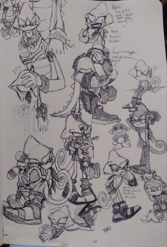
Hugs galore
And a v sus naner
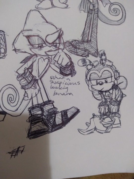
#sonic#espio the chameleon#charmy bee#vector the crocodile#team chaotix#sth#sonic the hedgehog#some more wholesome and silly stuff#cos thats their style#espio is not a hugger lol#but i bet there are exceptions to that#especially#with the circumstances#vector i dont draw enough
133 notes
·
View notes
Text
man the brush engine i use to just draw solid shapes instead of doing sketches and lineart is just making the process so much easier
lineart is the absolute worst for me it frustrates me to no end bc i never seem to be able to get it right. and if you fuck up the lineart thickness unless youre using vector graphics the only thing you can do to fix it is to draw it all over again or have selection artefacts all over it
maybe ill never be able to do thin lineart.. or maybe i just dont practice that aspect of art enough. who knows
#i tried to do lineart over the solid shapes but it still looked wrong unfortunately#i guess im happy that im just managing to draw Something.. in my chronic depressive state thats all i should strive for realistically#i wish krita had the capability of doing brushstrokes that turn into vector objects#the worst part of drawing is the resolution. i currently dont have enough ram to draw as big as itd look pretty#plus it'd bloat the filesize anyways. but if i could export it as an SVG... lossless lineart.. the dream!..
1 note
·
View note
Text
ok guys heres my sonic species headcanons cause I dont see enough of these
sonic - four-toed hedgehog (atelerix albiventris) this is the species he was based off of and also one of the most common hedgehog species. it also has that pink underbelly that sonic has
amy - north african hedgehog (atelerix algirus) these guys have wider but flatter faces, plus i like variety in their species
knuckles - short beaked echidna (tachyglossus aculeatus) if i’m not mistaken this is his canon species but if not i’m saying it now. it’s always bothered me that knuckles doesn’t have a ‘beak’ like echidnas do. theyre also arguably way fluffier in comparison to hedgehogs. such silly guys
shadow - south african hedgehog (atelerix frontalis) these guys have naturally darker pigments which would make sense for shadow, aside from that they look very similar to the four-toed hedgehog
rouge - honduran white bat (ectophylla alba) I can only imagine this is the species rouge was based off of. arguably one of the cutest bat species. super super tiny and they also have sharp teeth for the purpose of cutting leaves to form tents.
big - maine coon (domestic cat) if im not mistaken Big is based off a maine coon (long, pointed ears and distinct large size) big could be fluffier, though. draw big fluffy. i like fluffy big.
espio - panther chameleon (furcifer pardalis) okay okay I know Jackson’s chameleon would make more sense BUT these guys are the species known for varying colors, not to mention have a single ‘horn’ instead of three. these guys are just so cool.
vector - siamese crocodile (crocodylus siamensis) vector is most likely based off an american crocodile but i dont care. i love siamese crocodiles. they’re also pretty small compared to other crocodile species which reminds me of vector’s original design.
chamy - cryptic bumblebee (bombus cryptarum) GRAHH I’m ashamed to admit as someone who really likes entomology that I haven’t studied much about bees. but charmy is definitely a bumblebee and cryptarum definitely seems like one of the closest matches. plus they’re also super fluffy.
OK im sorry autism over.
#but#i might make more if people are interested........#just needed to let my autism demon take over for a bit#anyways ask me about sonic biology headcanons and i will talk your ear off#kotek headcanons#sonic the hedgehog
30 notes
·
View notes
Text

okay so i have an animation project for school and at first i was gonna do a loz:fourswords animation to jack stauber's choice but if felt too ambitious sense i had a lot of different ideas for it :anyway i found myself doodling this storyboard and now am gonna animate bandana waddle dee and kirby making apple pie!!!
anyhow~ just thought itd be a fun idea to log my progress here >:DD
currently i jut have this storyboard and also this youtube playlist of bgm and sfx (if you know where i can find some more good sfx please let me know!!)
so right now ima draw the story board/rough animatic on clip studio paint: cause i fucking hate adobe animate fndajkds the drawing tools are way to limited, the color pickers tricky to work with: and it being vector based i just dont vibe with it: it has so many tools i dont need and not enough that i do
animating in csp can be a bit of drag: tbh my favorite animation program to work in is just flipnote dnkfjad, but i dont think flipnotes colors and aesthetic will fit what I have in mind for this
the animation stuff wont really get tricky til after the animatic is finsihed: im still decideing if i want to do lines or lineless animation: ill need to get over my hatred of excessive layers to make things easier for myself too nskdaf
anyway! im really excited to start working on it >:DDDD
9 notes
·
View notes
Text
Hello! Hola! Bom dia!
Call me Garden. I'm 23, hard of hearing, ace and you can use any pronouns for me.
um vercão de portugês (trabalho de andamento)
Native english speaker, learning BRPT
This blog is for my streamer brainrot. Also a language learning blog.
My main is @teainthedust
-hearing aid guide here
Don't spoil anything I'm watching. I'm serious. No 👀 about anything, you can give context of things I have already seen and behind the scenes things that are non spoiler
How this blog is run and relevant information is under the cut
- Most reblogs are under a queue system. these types of posts will be mostly art and fic.
- Queue is about 4 weeks long rn.
- I will post liveblogs, and reactions from streams and vods when I watch them. if you don't want to see that, please block the tags #garden of reactions <- for vods and #garden of liveblogs <- for live stuff. This will mostly be in english.
- Any tags that I use are on this post, so feel free to click on them and scroll through.
- I do photo editing and vector drawings mostly. Triangles.....
- I natively speak English, and am learning Brazilian Portuguese. I do also know a little Spanish as well.
-I will be speaking Portuguese here it's pratice. Please please please be nice.
-eu vou a falar em português aqui. É a prática. Por favor, eu novo no isso, seja legal comigo.
-my description in my blog will sometimes change. It's just me updating as I learn more and then decide that it's not good enough for me.
-I have a language learning tag - #garden learns a new language, and a Portuguese pratice tag #garden fala português. Expect me to make a fool out of myself when speaking Portuguese here.
-I do not use machine translations for full sentences. Most of what I say is my own attempts. I only use it for checking my work and to look up specific words
-dont expect me to be perfect. But if I get stuff wrong please don't feel bad about telling me! Just be nice about it.
- There is a lot of difficulty in learning a new language with a hearing disability. I had to go to speach therapy as a child for my deaf accent and stutter, I am fully aware that I will probably never have a good accent when speaking, doesnt mean I try though. Some sounds I physically cannot hear.
- I will not tolerate homophobia, racisim or any sort of xenophobia. If I see it you get blocked.
- Ask box is OPEN I am always down to talk. If you have any questions about hearing aids or HOHness please send them my way! And also please please don't worry about me use whatever language you feel most comfortable with in my askbox!
#intro post#garden of queue#garden of liveblogs#garden of posts#garden of answers#garden of art#garden learns a new language#garden fala português
0 notes
Note
please for the love of god talk to me about fonts. please i’m so serious i need to get infodumped at about this
this is mostly technical stuff but then again i am obviously an artist so i might bring up more artsy stuff
also this is going off the top of my head so some aspects may be inaccurate!!! particularly the stuff about pre-digital fonts!!!
while fonts have kinda existed as long as writing, they really started to properly exist around the time of the printing press, in the 1400s. then, in the victorian era, they invented the typewriter. these obviously had plenty of benefits to society as a whole, but i'm kinda gonna just. overlook that. cause it doesnt really matter here.
while the printing press didn't really have 1 font, typewriters did have a standard font, as i'm sure youre aware. in america (and plenty of other countries), this was american typewriter, which you can still use today!
fun fact: there's a good change your favourite font predates digital fonts!!! some examples are times new roman, papyrus and (as i said earlier) american typewriter
in the 80s, paste up, a long tedious process where you would have to cut out and paste everything onto a grid by hand, was rendered obsolete, because of the growing use of home computers. 3 companies (apple, microsoft and adobe) play a giant role in everything because capitalism.
while apple was the most popular at first, you probably already know that microsoft would then dominate the market, offering alongside itself all those wonderful little microsoft office programs i know so well. all of these companies had a big design rivalry, and like most rivalries of that kind, they've definitely died down a bit by now. don't get me wrong, they're still competitors, so they're still gonna have their discrepancies, but microsoft and apple aren't design companies, so they're kinda just. eh.
they also had SO MANY BAD THINGS about them. did you know that arial shouldn't exist? oh and by the way, i HATE arial. its so ugly. its an eyesore. same with helvetica, though i think i prefer arial.
arial was created specifically to imitate the ever-successful helvetica, which is why the two fonts look so similar. you see, apple owned the rights to helvetica and microsoft wanted it for themself, so, they commissioned a very very similar font instead. i believe there was a legal issue over here in europe that never happened in the usa, because if you can create the same product in a different way in the usa, you can get the same patent. the same rule does not apply in the eu. there are differences between helvetica and arial, but they are predominantly in the way they're drawn. i dont have my graphic design program installed right now, so i cant give a good visual demonstration, but i'll try to explain.
basically, in vector graphics, there's always multiple ways to create the same image. for example, if i want to make a circle, i can use 4 rounded vertices or i could use 5 and still get the same image.
anyway, this is what microsoft did for the majority of the letters, with a few exceptions, such as capital G. also i believe the kerning and spacing is slightly different??? btw, kerning is like complicated spacing. it's specifically the space between 2 characters rather than the entire body of text.
then theres the file formats.
it's important to know the difference between bitmap and vector. if you draw, you're probably using bitmap, if you design, you're probably using vector. in adobe terms, photoshop is bitmap while illustrator is vector.
bitmap is typically easier and more standard for general images, for example when a vector image is exported as an image, all the most common image files (png, gif, jpg, hell even webp*) are bitmap.
*i hate webp files a lot.
however, vector can give you a more crisp image in a more lightweight manor. whats more, no matter how large you make your bitmap image, when you zoom in enough, you will eventually start to see the pixels. that isn't the case for vector graphics, because it specifically stores the instructions for how to make an image rather than the actual image itself.
so, when everyone's been using bitmap fonts and then suddenly adobe come out with these amazing new otf files, which use vector over bitmap, everyone wants in. the main issue?
what is always adobe's biggest problem? that's right,
CORPORATE GREED 🎉🎉🎉
adobe paywalled otf files, so what did apple and microsoft do? apple created ttf files, which is basically the same thing as an otf file, and also gave them to microsoft for completely free. this then pressured adobe into releasing otf files to the public, too. funnily enough, while both file formats are commonly used, it's probably more likely that you use TTF files in your everyday life.
while i have more to say (because i ALWAYS have more to say), that's all i can at the moment. as i said, fonts have a very rich history and that's only the tip of the iceberg!!!
0 notes
Text
.
#me this morning: *doing absolutely nothing and trying to scarp together a project i can do*#me in the afternoon: *comes up with a project*#me one hour before work is over: *given this massive project*#me who has no illustration experience: .#people: hey maddie can you design a logo?#me: *manages to design one that doesnt look like shit thanks to sketch*#people: great. now do a fucking t-shirt design#.........That also requires vector images ;0;....................#now dont get me wrong this is a cool project#im just sweating if im able to create something#idk if im a good enough artist#like im being realistic#i can get some stock images though and manipulate that but the deisgn the ceo wants..........#the other day i um. cracked and bought clip studio#and in clip studio they have an option im aware of where you can draw with vector lines#i may use clip studio to attempt to do all of this#ahwe9gadfshadfa my boss is out monday so like. the whole day will be dedicated to me trying to figure this out#our normal graphic designer is out of commission which is why i was handed the logo design and now this#aaaaaaaaa#miscellaneous#yeah now i just have clip studio along with the entire adobe creative suite and i have sketch too because i hate illustrator that much
1 note
·
View note
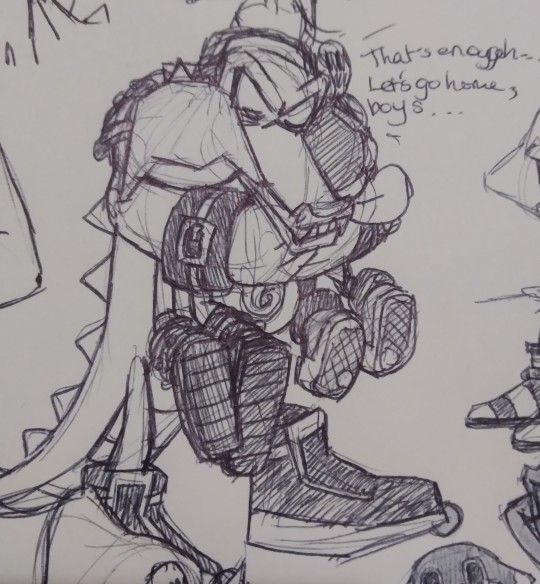
Text

The power has arrived in a dream team
#sonic the hedgehog#team chaotix#vector the crocodile#charmy bee#espio the chameleon#I started this like two months ago but couldnt finish it until now because of school#i really dont draw these boys enough#...probably because vector's difficult to draw tbh
236 notes
·
View notes
Text
more late night thoughts because i cant sleep and i wanna talk abt shadow!
now... look. i'm not gonna meme this and slap a #daddyissues on the guy, but let's unpack his strong preference for female companions (and that wasn't an intentional doctor who joke, @authorleaandres has to stop enabling the crossovers)
maria: self explanatory, but basically the blueprint!
rouge: the person closest to him, whom he trusts the most (debatable but i believe it to be true and y'all know i'm the only correct sonic opinion ever)
amy: the person who literally made him remember his purpose, which enabled him to sacrifice himself for the earth. also, when she hugged him by mistake in SA2 he didn't react negatively, despite showing a distaste for physical contact in canon (especially unannounced or nonconsentually!)
let's compare this to:
sonic: his literal rival. say what you want about sonadow and i'm not denying their mutual unspoken respect and bond, but their arrogance clashes for a reason: they're meant to not get along!
knuckles: they're literally so fuckin tense and bitter with each other, it's amusing but unsurprising given their respective isolations, arrogance, and tendency to rival others and question everyone's actions with distaste
silver: kicKS HIM IN THE FUCKING HEAD! yeah he's somewhat impressed with the guy and mentors him, but onwards they seldom get along unless it's for the greater good (silver doesn't trust him).
okay, these are the biggest ones but i'll do some other brief ones:
infinite: generated his villain arc and kicked him in the head too
vector: mehhh... walks away from him and only half helps him (plus it's up to you!) in his game. if you count sonic x he's kind of a dick to vector too lmao
eggman: respects him more than most of the cast, but also fucks his shit up a lot
black doom: ... skip so i dont make the lamest joke
gerald: ... skip again for the same reasons
mephiles: arguably shadow's best foe because their relationship fucking rules i love it UGH someone remind me to make a post on them
okay okay you get the point, shadow and guys don't seem to work out off the bat... but it feels like i'm skipping some important male characters, right? AM I...? NO.
omega: his other best friend alongside rouge who he cares for so damn much i don't even need to elaborate. aha, omega is a ROBOT.
metal sonic: he has such a sad yet beautiful sense of compassion for the lil fella; him and omega recover his body in heroes, shadow is always looking out for him, and also THE ENTIRETY OF RIVALS 2 OH MY GOD. oh yeah, metal sonic is also a robot!
charmy bee: now it might seem weird to bring him up because shadow doesn't have to be nice to him (just like with vector) but unlike the chill croc, charmy IDOLIZES shadow and is generally considered the most annoying character besides like, omochao. (sorry charmy you irritating thing, i love you but i get why others don't!). just like with amy, shadow could very explicitly tell charmy to fuck off, but he doesn't. why? HE IS A CHILD. the fact he lets charmy stick around and has been present enough in the kid's life to be a role model... i need to draw them 🥺
tails: even though they've worked against each other, shadow seems to admire tails' intelligence and innovation, and has worked with him on occasion. besides boom and x where he beats the shit out of tails, shadow does like the guy. why? he is ALSO A CHILD! however he is a wee bit older which is why shadow sometimes wants to kick him around a bit :") (side note: these are the only two *main canons that give tails a confirmed love interest: cosmo and zooey. old enough to date? old enough to get kicked by shadow!)
notice a trend? yeah. by just taking a handful of characters (arguably the ones closest to shadow in game lore) it's clear that shadow is drawn to the female cast and generally more comfortable with them. robots can be gendered i GUESS, but they're literally non binary y'all idk what to tell you 😭 also children don't count. unless you're holding hands which means you'll catch those hands!
i'm not saying shadow hates men or anything (i mean it would be funny though for the memes) but it's clear that he has issues with authority... male authority. male... fathers who have manipulated and weaponized him... and his only positive formative experience pre big T trauma was a girl... maria... y'all see it right? i dont have to spell it out or make a joke 😎
if you're wondering why i left espio out specifically because they get along really well off the bat, it's because clearly they have mutual unspoken crushes bc they're fruity. i'm literally not biased lmao WHAT no i'm not debunking sonadow and infinadow and whatever other ships y'all have because i'm getting shadpio brainrot... lol no thats not me!
SO TLDR: shadow feels safer with female identifying characters, technically genderless characters, and non binary entities even if they're masc coded bc robot brr. GOT THAT? NO FUCKING TERFS HERE BC EVERYONE IN SONIC IS GAY AND TRANS SO DONT EVEN TRY RUINING THIS
if you made it this far into one of my late night shenanigan posts, then you know me well enough that the bar is on the floor so uh:
youtube
(it's muffled bc he's blasting it on the ARK and this is what the planet hears)
#shadow the hedgehog#sonic analysis#maria robotnik#rouge the bat#amy rose#sonic the hedgehog#knuckles the echidna#silver the hedgehog#infinite the jackal#vector the crocodile#doctor eggman#black doom#gerald robotnik#mephiles the dark#e 123 omega#metal sonic#charmy bee#tails the fox#espio the chameleon#shadpio
57 notes
·
View notes
Text
#showyourprocess
From planning to posting, share your process for making creative content!
To continue supporting content makers, this tag game is meant to show the entire process of making creative content: this can be for any creation.
RULES — When your work is tagged, show the process of its creation from planning to posting, then tag up to 5 people with a specific link to one of their creative works you’d like to see the process of. Use the tag #showyourprocess so we can find yours!
sabrina @lanwangiji, my love, tagged me to share my process of making this typography edit! check out her explanation of her the untamed edit and her edit tag.
1. PLANNING
i once opened lyrics edit requests so i can learn and practice typography. this edit was a request as well. i asked them which lyrics they wanted to have and the colors they’d like. since i got several requests and it was hard to keep tabs on them, i made a trello board so i could organize everything. i’m still using the trello board for every edit idea i have, the board makes my life easier.
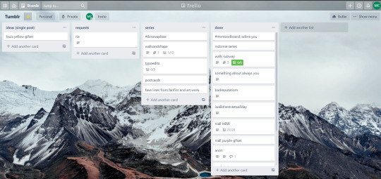

above is what i filled the card in the board with. basically just information of the requests.
1.1 INSPIRATION
once i got the request, my first thought was to find the vibe the song/lyrics exude. “it’s an old curse” screamed witchy vibes to me, so i went to pinterest to find some inspirations. at first i was looking for witchy poster designs and i came across this. i liked how it has smoke-ish graphic and i thought the smoke suited the “old curse” lyrics. and tbh pinterest is a rabbit hole, they gave me suggestions after suggestions, like this and this which became my inspiration for the color palette (i added the gold from those pics) and the sun moon design gave me the idea to incorporate space stuffs too. i somehow landed on this too, and because i wanted to include space theme, i made a simple phases of the moon. ultimately the hero of this edit was the lyrics, i didnt want the graphics took the center stage. i was inspired to make a crystal ball and do this kind of typography but after several trials i couldnt get the the typography right, so i scratched that idea and went with the space theme instead.
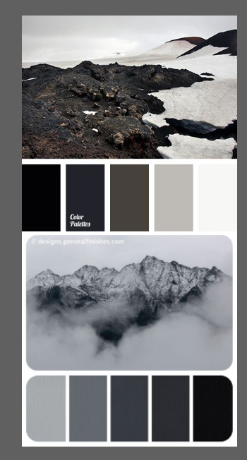
1.2 PICKING COLORS
after i was feeling inspired enough, i went looking for the right colors. i usually just type “color name” and “palette” on pinterest. example “dark grey color palette” and i chose the one i liked best. when the request only asked for 1 color, i always searched for either a complimentary or contrasting color to give it a jushz, to add sprinkles. that’s why i added gold on top of the dark grey.
1.3 FINDING FONTS
this is the hardest part. the fonts play important role to the design. they need to convey the vibes of the lyrics, in this case witchy/magic vibe. i needed to find fonts or font just as magical and a bit whimsical. tho i hoard fonts... i like to use new font for every typography edit lmao sue me.
i highly recommend going to creativemarket free goods site, pixelsurplus font freebies and behance to search for fonts. i always use 100% free fonts, that means i can use it personally as well as commercially. creativemarket gives me desktop license for the fonts, which means i can use it for commercial as well. the reason i do this because i want to open an etsy shop someday, and i want to have the right license when i sell my stuffs. i almost never buy fonts bc they are expensive lmao.
the fonts in used are “Vintage” for the main typograpy (i think i was a freebie from creativemarket) and “Morganite” for the title of the lyrics and the name of artist.
2. CREATING
once i have my materials and ideas, i open my illustrator and hope it doesnt crash every 5 min.
for this kind of typography edits, i use 600x700 px. tbh i dont like using 540px, the suggested tumblr size, as the width bc to me it doesn’t look as good in quality, so i up the px. but more on this sizing later. i utilize the artboards function in illustrator, and i use 2 artboards.
i use illustrator (ai) bc i’m working with vectors. when i work with vectors, the graphics/texts or whatever im making in ai wont become blurry or lose its quality when i enlarge or shrink it. in compare to photoshop, i need to make for example the moon graphic very big, so i wont lose the quality when i reduce and enlarge it again. with vector, i can start small and when i expand it, it’s still as good as when it’s tiny.
2.1 GRADIENTS
i started with the gradients first. i created a rectangle as big as 600x700px and with the “freeform gradient” tool in ai, i played with the colors. below is the color palettes i used
2.2 LYRICS AND GRAPHICS
once the gradients are done, i worked with the lyrics and graphics right away. when i first doing this edits, i made typos a lot lmaooooooo. so i copy and pasted the lyrics on top of my artboard, so i wouldnt have any typos.
i had 3 layers in my ai. one for the inspo pics and the OG lyrics. the rest for the edits themselves. i broke up “It's an old curse/dreamers diving headfirst” into to parts, hence the 2 more layers
i almost always started with the lyrics first then the graphics. but for this edit, i made the smoke first so i can layout where my text would be.
tbh the process of making the lyrics is a trial and error. i tried bunch of different stuffs and i chose whatever the best. but i worked like methodically, i made sure i finished the first part of the lyrics first then i could move on.
i was lucky with this font “vintage”. the font offers me several glyphs like these
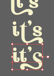
and i chose the one at the bottom. you’re very lucky if you find a font and they have glyphs.
excursion: glyphs vs fonts
glyph is an individual character. It might be a letter, an accented letter, a ligature, a punctuation mark, a dingbat, etc.
A font is a digital file which is used to display a typeface, which contains the entire upper- and lowercase alphabet as well as punctuation, numbers, and other special characters.
after i was finished with all the lyrics i added some graphics to make the edit pretty like small stars or dots. i added the song title and the artist too, sometimes at the bottom sometimes at the top. and i added my watermark put it as small as i could and made it a bit invisible but still can be seen.
2.3 EXPORTING
exporting! this is where i’m going to go deeper with the dimension of my work. in ai, i always choose to save with “export as screens” function. it automatically divides the artboards i have and save them separately. i always save as png, bc the size is smaller than jpg but can maintain the quality.
now the export tab looks like this
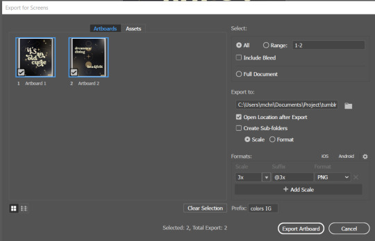
see the formats? i always scale up my edits, 2-3 times the original artboard size. reason is, to maintain the quality. i have tried to save it as original, 600x700 px, but it turned out a bit blurry. bc everything in ai is vector, when i scale up it doesnt lose the quality. BUT once i save it as png, it’s not a vector anymore, and when you zoom in until a certain degree it’ll be pixelated. that’s why i always scale up, to avoid it becoming pixelated when it’s just zoomed 1 or 2 times.
2.4 FINAL TOUCH
i opened my photoshop and also pray it won’t crash. import the png of my edits, add some grains/noise. the reason i use photoshop is, the noise filter is way better than in ai. it’s smoother somehow. and then i export my edits.
(i have a timelapse of how i made one of my edits, it’s not this one, but it’ll give you a better visualization. find it HERE
3. POSTING
now the hardest parts are done, we go to posting!
i uploaded the 2 posters on tumblr as photos then i wrote the captions. for this typography edit, i always chose another lyrics that i like from the same song for the caption. i bolded the lyrics, add link to all of my typography gradient edits.
i always use this link to color my caption. i usually choose 3-4 colors, and i took the colors from my edit. but this was not until recently lmao. before i just took a guess and looked for similar colors that match the edit, but then i thought “why didnt i just use the color in the posters lmao”
ok after i have my html code for the caption, i go to this site to replace the “;” with “ “ so tumblr can read the code.
i’m not one who puts their edits in draft, bc i just cant wait to post it. i have to option here, either i post it immediately when the time is right (i usually post between 4-8) or i schedule it, if im finished before 4.
i put all the necessary tags and click post! i am done finally!
i’m tagging:
@thetriangletattoo for this amazing series
@deludedandlostcause for this impressive gif
@half-lightl for this spectacular edit
@gayndrew for this stunning drawing
@thechampagnelovers for this cool collage
@cloudslou for this incredible edit
@heyangels for this incredible edit
35 notes
·
View notes
Photo


wait im sorry i got really in the zone on some old closed species OCs of mine im pretty sure i literally have 0 followers from my deviantart days and this is truly incomprehensible
they’re names are Klavdii (green hair) and Ivan (pink markings) and i have no idea why i gave them all russian names i think i was just in a russian name phase and they were members of a not very active right now closed species (don’t feel like explaining closed species sorry) called techtites by tenshilove on dA and they were technologically advanced aliens with telepathic abilities and my boy klavdii blinded himself by trying to push his telepathy too hard so he made himself some phoenix wright godot ass glasses (weirdly enough, i hadnt played trials and tribulations yet) which are very impressive in that they allow him to see but also he sees everything like its red alert on the virtual boy (only red vectors) which is….well. anyway i was so active in that community and klavdii was practically my mascot for a bit with how often i drew him jhksfajnjfsds his friend ivan is just a guy tho i dont know where he lost his eye from hes just a business man. they dont have the ability to turn human or anything i just wanted to draw a human design for my lad
the shitty scraggly facial hair is a new development tho on 2016 deviantart we drew hairless twinks and hairless twinks ONLY
#art#ocs#oc art#watercolour#traditional art#sketch#pencil#im sorry im being so irrelevant right now you have to be nice to me i am unmedicated and have too much homework#anyway i could write a dissertation about the adopt and closed species community ofn deviantart from the years 2016-2018#it was just pastel galaxy. pastel galaxy everywhere#everybodys gotta wear an oversized sweater with thigh highs#i didnt actually like pastel colours#or moreso i didnt like pure pastel colour schemes i needed contrast and saturation in there#and i wasnt hiding it or anything i think on numerous occasions i literally said#designed this cute pastel bitch and theyre cute but also i dont really like pastels so here yall go#but man it was funny being a person on there who didnt like pastels
13 notes
·
View notes
Note
my chats don’t work and there’s no ask option. also, i don’t want to come off anon because im a terrible person who is also a coward and can’t bring myshellf to, :(
deep sigh. make it 5 ko-fis then.
okay the thing is we have to draw a line in the sand between trans masc roxy before and after the epilogues. i don’t care about transmasc roxy pre-epilogues. it is literally less than nothing to me. and it’s fine if it’s not nothing to you, because we are different people and we don’t have to like the same things? but to me, it’s the kind of thing you find on a kinnie’s blog and ignore it because they are a single kinnie and who cares.
post-epilogues is a different story.
the epilogues are really the defining factor here - transmasc roxy is something i didnt get before the epilogues in the same vein as transmasc vriska or jade or any other trans woman-coded character being read as transmasc. i still don’t get it, but in the past it was whatever, i dont care. project if you want. i don’t have to see it and i don’t have to have to expose myself to it to get to the parts i care about.
because the epilogues were written in a way where they almost deliberately alienated trans women, by treating jade as a sex pest in both routes to the point where callie-jade’s introduction in homestuck^2 was “thank god she’s not horny”, and also making her textually a woman with a dick wrt “fusing with bec” (canonizing a fan trope that trans women put a lot of work into actively reclaiming from people making futa porn and simmering it down into a gentle trans woman headcanon, thanks v)as well as erasing roxy’s existing trans woman coding for a cis narrative in candy and a transmasc narrative in meat, that erasure of a trans woman with trans coding, adopted by trans women as an icon, is inescapable. and its met with applause, you know?
and if you’re coming into my inbox like “roxy is a canon trans man” (despite, you know, canon being fake post-epilogues. die mad about your noncanon trans man headcanon) then its very easy to tell which side of the coin you fall on, and its the one where the trans woman gets stabbed at the end! but psych, luck doesn’t matter, that trans woman was always going to get stabbed.
it’s especially worth comparing the plot line in eridan’s pesterquest route to meat roxy - maybe i’m surrounding myself with trans women but legit there were more people trying to spin eridan having gender identity issues into a transmasc narrative despite it being pretty clearly recuperation of the march eridan transmisogyny than there were people even acknowledging meat roxy.
people only really care about meat roxy to the extent that they’re representation, very few people actually liked transmasc roxy before the epilogues and again, it’s fine. but meat roxy is like. actually bad enough that it has alienated trans women who identified with roxy since their reveal in the comic from themselves to the extent that i’d need both hands to count the number of people who’ve self-harmed over losing this vector of self-identification.
a server i’m on mostly populated by homestuck kin trans women went from 4 bespoke roxies to none in just a few months, and its effects on trans women are real and as you can see by the notes on that post, it’s brought about hostility towards trans women and like. i am not asking for money as a joke, it is legitimately exhausting to deal with.
if you want to fight me about this send an ask to @thevriscourse because i have a comic to run i don’t want shitty dudes overrunning my art posts
23 notes
·
View notes
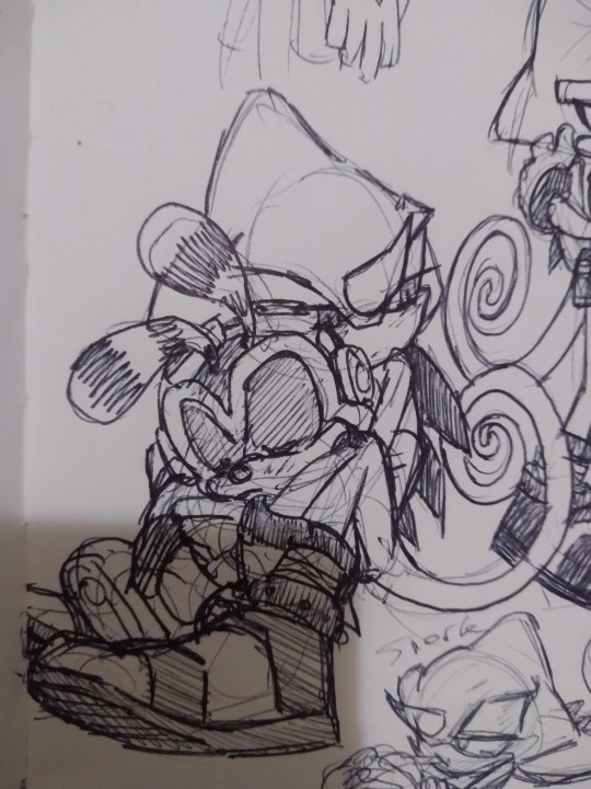
Note
Espio in vectors hoodie makes me weak please do more of that
i want to. the problem is that i dont have enough TIME TO DRAW everything I want. SOBS... IT MAKES ME SO UPSET... i really need to learn how to draw faster!!! if there’s more content dw ill post em heueheh
34 notes
·
View notes
Note
Hey I like your art a ton and I was wondering just how long you have been drawing and working to improve as an artist.
Oh my gosh haha thank you so much for liking my art!
I have been drawing for the longest time, I think ever since kindergarten, well at least the artistic dedication!
I used to draw my when i was in middle school, starting from fourth grade i have been drawing more and more frequently until fifth grade in which I was drawing on a daily base, back then I would also be sitting and making animations on flash, which unfortunately I dont have backups of
but from middle school, up to high school 2012, my art never improved, it was just all the same all the time, I was back then on ritalin and I decided to start my first pony blog, while updating my blog, I couldnt consider yet Tumblr being part of the effective social websites that I go on as nobody was following me and I had no one to intreact with back, tumblr would be the thing i would check once every few days, it was nothing to me but a mere another google plus, until i was sponsored by catfood-mcfly back when he was running the Herpy Derpy blog, and thats where I got recognized and I was determined to continue my activity on tumblr as an ask blog, and I have gotten to become more interactive with people, being inspired by the many of the art I have been seeing from following other people, I would adopt and experiment with what I saw mostly shines through their art, and 2012 was the year I have made the biggest change in my art throughout the months, whitin 6-8 months I have improved by a ton! tumblr was a very resourceful to the evolution of my art! and I also made so many friends and I have as well learned to become a better person! I am a better person of who I used to be in the past, and i am still improving! there are still a lot of things I need to work about myself as a person!
Also stepping out of drawing in flash and starting doing my stuff in sai was revolutionary to my art, flash back then wasnt recognized fully as an animators program by macromedia and neither by adobe, as they saw it an all purpose program for making goptimized ames and ads, only until all browsers and webpages grew out of flash and flash officially was blocked by all browsers since you could have implanted malicious codes into flash files, only then flash recognized as an art and animation tool for creators.
So moving to sai allowed me to build sketches and bodies easily and paint and yadda yadda and it was all great and helped boosting my art upwards
Flash limited my improvement as I wasnt drawing sketches on flash since you couldnt just lower the opacity of the layer you drew the sketch on, you would have to go through several actions to achieve that, but you would be lowering the opacity of your selected drawing and not the layer, I couldnt also paint on flash and flash ever since the stone age had those horrible vector tools that SUCKED DICK unless you do stretching and smoothing and fixing, in my opinion at least, they did improve the vector system a bit BUT IT STILL SUCKS, i prefer bitmap brushes more, which why I prefer Toon Boom harmony as a program for animators.
If you have been back in the days, you could have watched me go through a several phases! like drawing like atryl, raikissu’s shading and coloring styles, florecentmoo’s shading techniques and eye pupil style, and I uhh.. dont remember the rest, but theres have been a lot of artists out there whom I adopted artistic traits like:
theflyingtacoz, kittentoots(drunk fluttershy), w300, Santi, belaboy, dr idiot, inzergue (big impact on my current style), David (the guy who now works on mighty magiswords along with kyle), fungasm, colorlesscupcake (known as caek now), ahappypichu (a pretty powerful current impact on how i paint my art today), uhh, also “pinkie in private” which, to this day, drawing the way the draw the cheek for their characters, and some other artists I that I couldnt come up in my mind but I did adapt a trait or two from.
My current big inspirations are artists who work on OK KO and as fake as it might sound, my own fiance! yes!! they have been an inspiration for me for quite a while even back at 2012, but to how I viewed it, I never really dared to adopt anything from them because I was so out of their league, and my art was still shaping and i already had ideas that I wouldnt think would work if i mixed some of their’s, but now that my art have been developed and has a solid state of how it looks, they inspire me so much!!
Drawing ponies was probably the best practice I have ever had that thanks to that I have pushed so far in the art that I do, ponies are so simplified!! and easy to draw! it allowed me to produce more and that means that it allowed me to experience differently with each time!
It helped me improve with a lot of stuff like gesture, facial and painting and other other minor stuff! drawing ponies was such a booster seat for me!
But unfortunately, from drawing ponies alot you wont learn how to draw humans, which understanding muscle, action line, figure and bones is so crucial for drawing, anything really! understanding how the body works is extremely fundamental and its there for you to know how to manipulate the drawings your making, of any specie, its not there to just teach you how to draw the anatomy of the human body, that will only serve as a plus.
I have learned a lot from ponies but how bodies work and draw clothes lmafo, to this day I cant draw clothes for days
in 2014 I ordered a really good book and I have polished my anatomy and human drawing skills, I yet dont know some stuff because i stopped practicing because of varios reason like relationship, access and physical health.
In the begging of the year I acquired a cintiq and it been nothing but dreadful to me, but im using it because i spent.. so much money on it.. and i have been so concerned about bringing it to my home country as well.. but it has the adventage of a screen so...
its just, I dont have a low enough desktop or high enough chair to draw on it, its always above my shoulder no matter the angle and it puts so much weight on my shoulders, the thing is heavy too so its not something you could lean on your legs while you draw, neither it is portable, it made work much more harder and difficult and I wasnt drawing as frequesnt because my time wasnt so so enjoyable, my 2015 as well become a dreadful year to me and I was feeling guilty and shitty everyday, and it was my fault because it was all my doing and i let myself feel that way, and I had barely the stamina to work on my art ever over the year, I also lost my passion and motivation to draw and basically it dragged also to 2016, I drew a few commissions but I didnt produce much art neither, then I flew over the united states and I didnt have acess to drawing for 4 months as i was away from my equipment, my fiance had the equipment, but that means that I would have to use their computer for all the dedicated hours I use to work on my art and they would have nothing but a mere phone to entertain themselves, also our time togehter was really precious and every minute counted, so we rathered having fun other than doing work work work
2017 came and I still had the sense of drawing lost in me, I would draw whenever i would have a piece of paper available to me since I find fun in that, since im comfortable and cozy and i dont have to concentrate the entirety of my body weight on my hand and arm as i draw, but I would never draw on the cintiq unless its a miracle or if had a crazy comic idea in mind that i had and MUST HAD executed, i almost didnt draw anything in 2017, and neither in this year but the ok ko drawing i have recently created, but I found a new comfortable focus and its doing 3d, I am using my mouse to do everything and i dont have to feel my horrible chair scraping againt my butt like sandpaper, and I dont to feel like my shoulders are about to give up, I did try Tam’s 13hd and it was so much more comfortable and nice to draw on as i could put it on the bed or on my legs, but I cant afford another expensive piece of equipment, especially not in this generation of technology, wacom fucking sucks but no other brand is willing to be their competitive because tablet is not the purchase the average person would make.
Another reason why I have been so held on drawing and using the cintiq, which was probably the most major thing was it’s total, hot flaming shitty garbage diarrhea poopy stank abysmal horrible disgusting nasty dumbass smelly drivers which made every chance i had to draw a miss because i would battle myself from 30 minutes to over a hour fixing my tablet to draw a single thing, and its been like that every time i would turn my cintiq on! the situation was severe and everytime i would find a solution, it would be later suppressed, it was so harsh that i had a few months in which nothing I would do would make the drivers function, i was basically tabletless, so many, and a lot of opportunities for me to create a piece of drawing was flushed in the toilet with the rest, and so it was a deeper burden on my passion, determination and motivation to draw.
But yeah, now im doing 3d and it feels like a fresh hobby to me since I felt that im not going anywhere in and with my art (even though I yet have to learn how to draw bodies better, let alone drawing limbs, feet and CLOTHES!!)
and now the future has yet to be revealed!
1 note
·
View note
Text
i rate 2020, 20 out of 20
i was glad that i had my birthday before the lockdown and i got to see my friends on that day even though the day was a crap because we had a fs defense. but srsly, i thought the virus was very very temporary as in 2 weeks would already ease the problem out. my comeback performance as a stallion member (was supposed to be my last dance as a stallions member) got cancelled and it sucks that it did.
my first greatest flex during the pandemic is my shopee journey. i have been in the shopee world since April, earning something in livestreams. until i became a participant-competitor for a one-week shopee livestream competition. it was a pain in the ass but a hundred of my shopee friends supported me all the way and i am very glad that i met very wonderful people, that until now engage in my posts online. i found a family in shopee and i even cried for them at my last livestream. i retired my shopee hobby on June. didnt believe that i earned a five-digit amount of money there. i spent a lot of audio calls with friends that i havent met personally, strategizing and bashing competitors that played dirty. i didnt sleep for 24 hours just to earn some cash—- that i bought myself my dream pair of shoes. all that hardwork paid off. but my greatest prize was my friends ofcourse. they were all chillin in Luzon meanwhile i am here in Mindanao. i hope someday ill get to meet them because they’re very fun people and we share blessings (we mean money).
my second flex would be my artist career. i started my art life because of a certain shopee friend who gave me a special stylus. i was so happy that i was able to create magical artworks that i never believed i could have done. my shopee friends were the people who cheered and hyped up the start of my journey//artversions account. they provided me the materials, gave comments about price ranges, commended my works, and even became my first customers. i hesitated to accept commissions at first because i am not good enough. but i risked it and invested some money for advertising and other supplies. it worked, thankfully. every week i did not think that people would actually dm me and commission me. i was just glad that people come back again and again letting me draw diffferent faces. i could say my start-up business was successful for the year 2020.
nevertheless, never had the thought that online class was doable/feasible here in the Philippines so i did not prepare my whole self for it. so far i pulled off the first semester and yo boi gon try to hit those kwatros again. i tried my best to still give off that aiverson branding in the online set up just for me to be comfortable with the new routine. its hard to be spontaneous on serious situations but i try my best to still amuse people with who i naturally am. i cried for not being able to be classmates with some selected friends but in the end i just didnt care at all because this is an online set up and being classmates or not doesnt matter anymore. the different tasks given to us gave me doors of opportunities to improve my creativity. i dont call my works magis because my goal was not to make my output look outstanding among everyone’s work,, i just wanted to improve myself and know my extent in terms of creativity. it unexpectedly worked on teachers tho.
another happy thing that 2020 gave me is the chance to be a part of the creatives team of our academic org. i was very happy and excited knowing that i was the only freshie and the only applicant that got in the committee (maybe because i was the only one who applied??) but yea,, they got me in the committee and i proved myself right. they thought i was just all about artsy artsy vector shiz and all that, but nope. i worked hard learning more complex applications just to kick the pubmats some spice of creativity and standards. i surely impressed our head of layouts tho because i became his “assistant” in everything that he did. thankful for the projects he gave me because it was a platform for me to show everyone my skills in graphics and layout.
in conclusion, 2020 was a blast. everything were laid out to me. the Lord really planned everything from the beginning. started from online shopping in shopee then discovering shopee livestreams for me to earn then meeting shopee friends who started and supported my artist journey which gave way to new opportunities such as the creatives team and acads reqs. definitely 2020 was the year that i needed. was actually my pre-debut as a person who just stepped on legality. looking forward to be a very great person in my actual debut year. i admit that i became a better person last 2020 and i will work smarter this 2021 to be a better version of a better self.
i am proud of myself everyday, and i won’t stop reminding my own self that i am enough and i did my best in everything. cheers to 2021!
0 notes
Note
for your gallery image, did you use illustrator? im super into block lineless styles but i have no idea how to do it without using illustrator, which i dont know how to use. its super pretty
actually i just did it in firealpaca with the stabilizer on the pen turned WAAAAAAAY up to make it smooth.
(illustrator is worth learning, but it’s..... kind of a pain in my opinion. yes, vectors are a necessity in the design world, but with enough know how, you can do vectors in photoshop too, or even draw something in photoshop and then convert it to vectors in illustrator if you have to. but if you dont NEED a vector, its a billion times easier to to just fake it with massive canvases and a stabilizer pen lmao)
thank you!
4 notes
·
View notes
Last Seen Blogs
got-7-alb
Got7.Albania
bondypiano-blog
Bondy Piano

heulheul
Live Laugh Lobotomy
heulheul
Live Laugh Lobotomy

shinyinfluencergarden
Untitled