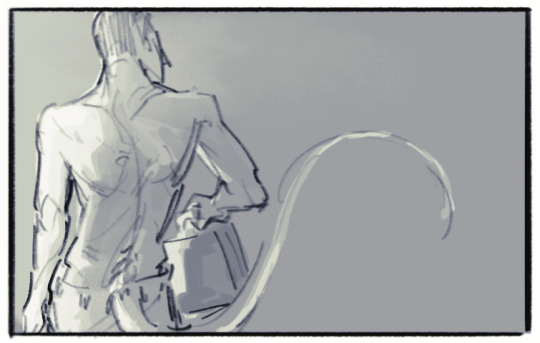
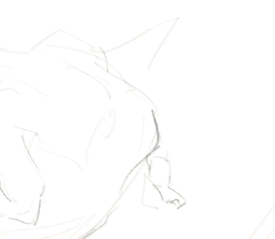
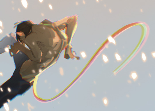
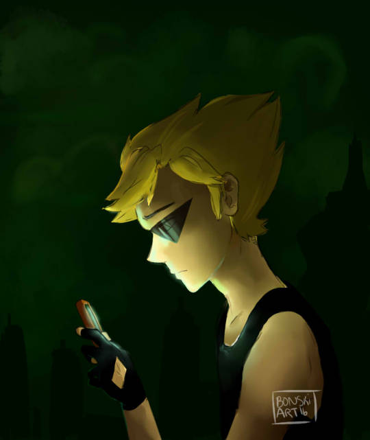
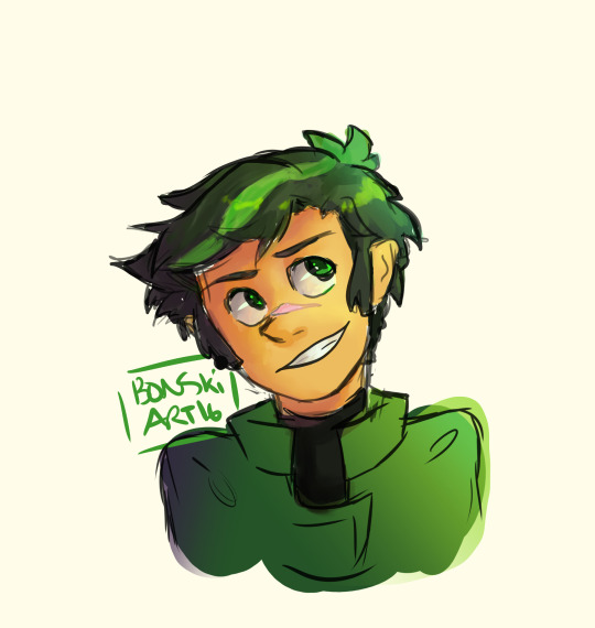
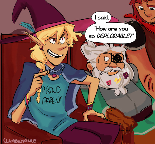
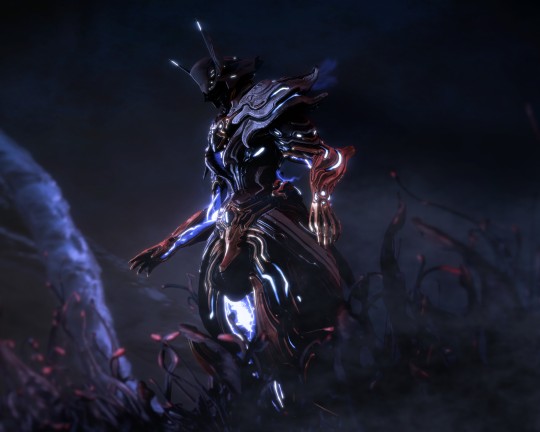
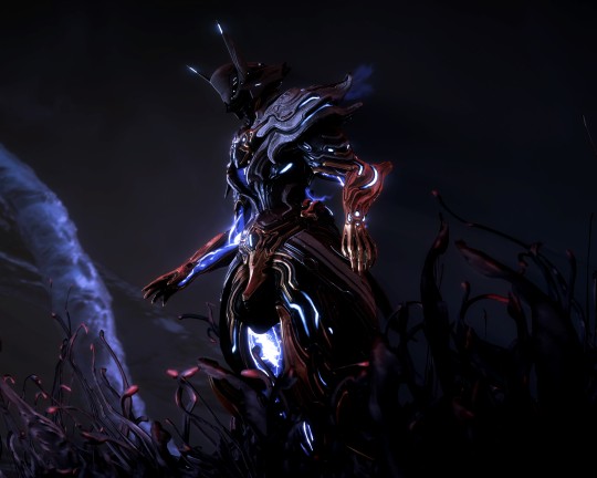
#wanted to do something with really dynamic shapes and poses and such and also see if I could keep these designs as I did so
Text
no, they cannot catch me now
we will escape, somehow, somehow...
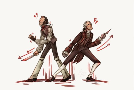
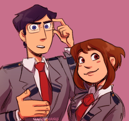
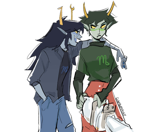
[flintlock fortress is, as always, a collaboration with @dxppercxdxver]
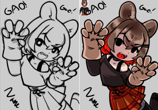
#em draws stuff#flintlock fortress#team fortress 2#on account of how incredibly proud I am of this and because I feel they are particularly on-model I will maintag this Just This One Time#wanted to do something with really dynamic shapes and poses and such and also see if I could keep these designs as I did so#the spatterdashes oughtn't to be so wide around his ankles but I wanted that Silhouette back#also I just wanted a picture of the two of them together Looking Cool#and I think this definitely achieves that!! (as well as paralleling the other drawing I did in this particular style ehehe)#know that I am endlessly torn between 'be subtle and calm' and 'shove my art at every person that I can shove it at'#and the second one of those things has won today. this one's a good one. You See Them. You See Them.#oh yeah and caption lyrics are from 'the bagman's gambit' by the decemberists. extremely them kind of song.
24 notes
·
View notes
Note
I see all your neopet posts and reblogs, so how a neopet review? What is your favorite neopet design and why?


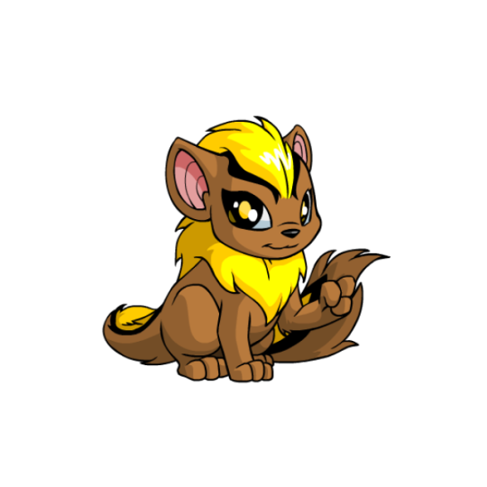

Gotta go with the Xweetok for this one. I've always loved this design ever since it came out—it's like the perfect blend of cute and elegant at the same time.
Xweetoks are vaguely chipmunk-esq with the stripes and general head shape, but the actual body anatomy is more like a fox than any kind of rodent. The end result is something that feels like it could be a real animal, even if it isn't.
And speaking of stripes, the use of color on these guys is also particularly good. They have these really pretty thick black lines running from their heads all the way down to their tails, with color often (though not always) constrained to the stripe and the mane. For example, in the basic colors shown above, brown is used as the base with bright pops of color elsewhere, rather than the entire Neopet being a single color.

In addition to the colors being pretty, the lines also accent the body shape and give it a great sense of movement. This is especially noticeable in their old circle pose, where you get this really nice curved body shape due to them sitting backwards.
It's also worth noting that Xweetoks are one of the only Neopet species to have open eyes that don't have human-like corneas or irises but are also more than just black dots. The deep blacks of their eyes really help to accent the black stripes on their bodies, while the color in the middle helps to pop whatever secondary color is used.

Thankfully, Xweetoks also fared pretty well from customization; the only major change is them now having one paw raised up to hold items (which doesn't look great, but it's not like the fists look good on any Neopet) and slightly different front leg anatomy. Some changes, such as removing the weird thin line above the eye and making the mane thicker, are actually improvements. I do wish it kept the highlight on the mane like it did on the head, but otherwise, Xweetoks look just as good now as they did before if you can get over the fist.
(Also, Xweetoks are one of the only species where female pets look better than males, due to the default pre-customization design being taken as the female design for a change.)
Favorite colours:
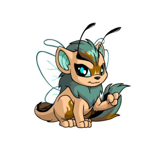
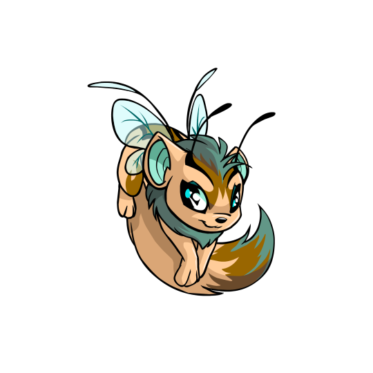
Faerie: Faerie Xwees have always been absolutely gorgeous. The light brown base combined with teal and dark brown is beautiful, and the shape of the brown markings accents the body wonderfully. I also love the style of the wings and how the antennae on the head run directly off the stripes, the shape of which are matched by the first set of wings. Unconverted faerie Xwees are super dynamic, but the converted ones still look quite nice if you want to be able to customize them.

Mutant: What a fantastically sleazy design. Taking what's basically a chipmunk of sorts and making the mutant version a rat is a fantastic concept, complete with buck teeth and a naked tail. The expression is also fantastic (slightly more so in the unconverted art, but the converted still looks pretty good).


Pirate: Unfortunately the UC version of this pet isn't available any more as of the time of writing, but even the converted design is nice, with a nice dull grayish-blue base and some nice red and gold accents that really pop. The old art really went hard though, with the mane basically acting as a beard and the face having a different, tougher expression. I particularly love the ponytail at the back of the mane.
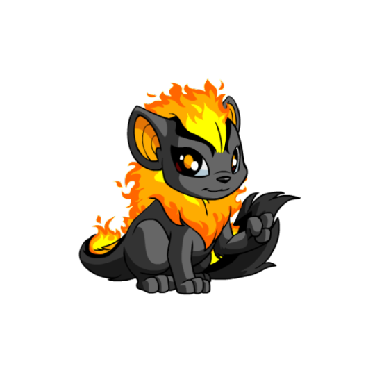
BONUS: I also have to give a shoutout to the fire Xwee, because I have one. :) The fire mane and stripes against the black base works beautiful; definitely one of the all-time best fire pets.
153 notes
·
View notes
Text
I wrote this on twitter but I thought I'd put it here too, since I occasionally get asks on how I draw/any tips I might have. On twitter I also made the caveat that I don't feel I'm qualified to give anyone tips, LOL, but I was drawing today for an assignment and felt like this is worth noting to any beginner artists who have a tendency of clinging onto sketches that they feel like they finally got right! (A.K.A, a habit I still have years later HA!) This isn't so much of a tutorial as expressing my thought process in this discovery of how to draw more dynamic pieces. I found it to be satisfying on my end, seeing it unravel, so hopefully it can help someone who may be struggling with the same thing I am.
MAKING MORE DYNAMIC PIECES, A PERSONAL STUDY!:
I wasn't upset by this drawing, but I could tell there was something stagnant about it so I ended up pushing it and redrawing it a million times to see if I could somehow make it look more dynamic.

Here's one part of the timelapse - I'm clearly adamant on trying to make this pose/composition work but while the sketch itself may look better, the stagnation hasn't changed. Perhaps this works for some people, but anyone seeking a dynamic visual will be able to spot that this simply isn't working as anything more than a semi-decent anatomy study attempting to be applied.
I changed the position of both arms, I tried to play around with the angle of the head, I tried to just the hips forward more so that the spine had increased curvature, but the main issue, really, was that the initial composition lacked the dynamism in general. It prioritised dramaticism over dynamism. Both can exist in the same piece - it did not, in this one.
This was the new sketch I started with. Less rigid base to go off of. Just getting down the general shape I wanted to score - make the spine and tail take a sort of mid-whip path, shoulders hunched, hips cant forwards, as if he's curling in on himself. I think for a dynamic piece, it's more helpful that your initial sketch uses the body as a general marker as opposed to something to do lineart over (granted, I don't really do lineart anyway, my sketch is usually the extent of my "lineart", but since this is just looking at creating a more dynamic composition, I think it still applies!)
Here it's the same principle. For the left image (the legs) I've established where the knee of the right leg goes, and where the hip that precedes the left leg will sit. These are just base anatomical structures that help me figure out 1. Whether or not the mere idea of this composition will work, and 2. where I have to stop once I start drawing. For me, having some sort of limitation for the body helps me stay within range of proportionate anatomy (not that I particularly care for the anatomy to be realistic, just proportionate to the style I'm drawing in)
On the right image is also the same principle. Establishing the movement of the arm, the elbow/arm bend, and the hand. (If you see the full sketch before the two above, I established the hand in that one too - it really is helpful figuring out the placement of the hand ahead of time.) If it looks atrocious afterwards I always have the lasso tool/eraser to save me.
The new attempt brings me to this. While preference in art is subjective, I do think I'd be staying in SOME realm of objectivity when I say this is more dynamic than my initial sketch, LOL. Of course, lighting/rendering choices help push the composition a little more, but this achieves what I couldn't do with that first sketch. I had a general idea, but it's important to know when to let go of something that clearly isn't working.
Would love for anyone to add their own tips or ideas to this post - I'm not particularly known for dynamic pieces so I'm always looking to learn. This was a really valuable study for me so I wanted to share it, but everyone has their own method and what works for me may not work for the next person!
There's a few other asks that asked me for tips on general anatomy, and more specifically legs (oh dear god, I'M going to need to study for that before writing out any sort of resource guide for that, lol) that I hope to get around to doing in the near future. Thank you for your guys' vote of confidence, haha! ❤️
#nc111 tutorials and studies#sketch#art tips#art help#study#I had a lot of fun with this piece so while part of this was definitely to passively respond to my inbox requests#a big part was also just me wanting to talk about my brain expanding as I realised how to Push A Composition#I can't wait to try more things in the future to try and get more dynamic compositions#let me know if this was helpful let me know if it was utterly useless#I'm not a great teacher but I used to tutor my neighbours 7 year old daughter and she found my methods boring but hey she got better
67 notes
·
View notes
Note
I reaaally like the way you draw faces and expressions, so if you want to share your process I'm here for it 👀👀
Yeah! I made a post a while ago talking about face proportions and such here but I can go into depth about how I do expressions!
I start with a really simple sketch which is usually funnier and way more exaggerated than the end product, for example:

Just like with poses, a lot of it is shapes and angles, and as a general rule in art, things that contrast help things feel dynamic! So the eye line contrasts with the mouth line or eyebrow line etc etc. And even the eyes usually differ from each other with one being more squinted or open. It's very cartoony but I like it :)
And the eye mask is a shape that can help you plan where eyes and eyebrows will go. Here's a thread on twitter about it since it explains it better than me. My eyes generally aren't as round and a bit more angular but the eye mask still helps plan how squished or stretched the eye area should be.
Different expressions obviously call for different things. Eyebrows are really helpful for this because just slightly turning them up or down can make totally different vibes. More serious expressions will probably have more wrinkles or tightness in the face, or more tightly knitted eyebrows, while relaxed ones will sit naturally just above the eyes. Also I just default towards the one eyebrow up + smirk combo because it's just too good okay I can see why dreamsworks throws every character into this expression for their posters T-T
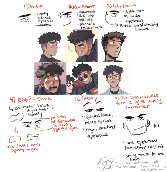
Here is an example timelapse !!!!!!!!!!
So yeah, I'd also study expression sheets like those of Spiderverse (Especially Ami Thompson and Shiyoon Kim who did the sheet below for Gwen in the first movie) bc they are great to study from!!! As you can see the face shape also changes and features like her nose or mouth scrunch up. I usually focus on squishing/stretching the eyes but doing the same for the rest of the face is something I wanna work on too to make expressions more fun :)

275 notes
·
View notes
Note
Just wanted to pop in and say that your art is so cool!! It's so-- SHAPES!! And I especially like how you draw McCoy, he's a favorite of mine and he has such a specific set of facial features that seems so hard to simplify, and yet you manage so well! And there's something I really love about your poses and compositions too, they're so very dynamic and/or evocative even when characters are just standing. Aaa so much to say--
I also saw your last ask, and as someone who was also intimidated by the sheer amount of content there is like you, just know that if you get invested you kinda just forget about it. I got into TNG first and that series alone looked like an enormous task to finish. Before I knew it I finished it and went on to watch DS9, and I already can't wait to see more.
In general my tip is to go with the flow and see it as a hobby rather than something to achieve, because nobody is forcing you to watch EVERYTHING there is. You get there when you'll get there, y'know! It's a show about silly space people, have fun with it! (but with all the fan art you're drawing, I'm sure you already are hehe)
ANYWAY SORRY FOR THE BARRAGE OF TEXT THIS AIN'T EVEN AN ASK BUT UHHH BUH-BYE
THANKS i just. like shapes and points and lines.. i just think they’re neat…… i really like drawing mccoy hes got such a specific posture haha i will definitely be posting. more of him lmao
im on tng s2 right now and i definitely never push myself to watch things i don’t want to watch (except angel (1999) because. i like spike) but i do take my time with watching things so itll be a good while until i’m on the next series.. it did take me uhhh years to finally finish tos but the dam really broke on that in december so. here we are
bones time

#becoming one of those shows where i put an episode or two on while i drink tea or eat dinner or something lmao#always a good time imo#im just so used to shows that get canceled so. change of pace! fun#ask#aless-was-here#honestly big fan of taking time with shows instead of binging them#if any of you ever watch twin peaks pleaase begging you watch it one or two episodes a day its sooo much better when u get to sit and think#or better yet for the 1990 viewing experience u could watch it every thursday night.#not to discuss twin peaks on star trek ask. oops
47 notes
·
View notes
Note
Hello Chronocrump,
I recently stumbled upon your art the other day, and I couldn't stop staring at your gallery.. It makes me realize there is so much thats lacking from my art that I really want to improve on. I felt desperate to contact you, but wasn't sure if it would be rude.
I wanted to try to ask you, how do you approach drawing? Do you structure it first, or start with a gesture drawing? Focus on the form or perspective first? Etc
My other question might seem strange, but I wanted to ask how do you hold your pencil? Ive learned that different pencil grips can drastically change the quality of someone's art.
Thank you for your time. I'm sorry if my message is to long, or you don't want to respond back. I wanted to atleast try, but also let you know that your work has been very inspiring for me to keep trying.
I'm glad to answer your questions, it's seriously no problem. I wanna start by telling you how amazed I was when I checked your profile to see your work. I know you have a huge lack of confidence in it, but your art is genuinely beautiful, and frankly, looking at it, I found it hard to believe that you would be asking me for advice...from my perspective, you're way ahead of me. You're certainly better with color; you might notice I really only post sketches lol. I really don't want to dismiss or downplay your feelings about it, but I have to let you know how I felt looking at it. To me it seems like your brain is telling you your art isn't good enough when it very, very much is.
Anyway, enough gushing from me lol. On to your questions.
Usually when starting a drawing, I very loosely and lightly sketch the overall form of the pose I wanna do. Very rough basic shapes/forms to get everything in its right place before I start really drawing it with confident lines. Even then, all the lines are subject to change; nothing is sacred. To be honest tho, I usually mess up the proportions and have to fix them a bit lol. I try to sketch cleanly and concisely, meaning I try not to draw a lot of lines in a spot that could really be done with just one or two. I'm not super strict on that tho, at the end of the day while I try to draw efficiently, I also want to draw comfortably. So with something like a big circle for example, I'll draw that pretty sketchy. In terms of perspective, I'm trying to get better at it, but when considering how I want to use it in a drawing, it's part of the initial image or idea I have in my head, so I lay it out from the beginning. I do also draw structure lines on the face, just a simple cross to plan where the center of the face will be. Lately I've also tried taking more pictures of myself for pose reference and it works well.
Most of my practice comes from studying my favorite artists and trying to emulate the specific ways they structure their drawings. I should actually be doing dedicated practice sessions with that, but I digress. Recently I've been trying to practice from photos first thing in the morning, tho I'm finding it hard to commit to doing it daily. I just go on pinterest and find cool poses, then draw them, trying to get down the basic shapes and prominent features more than focusing on minute details. I've posted some of these practice sketches on here but there's a few more on my twitter if you wanna see what I'm talking about.
In terms of my pencil grip, I'm not sure...since I was little, I've always had an unusual grip. Looking it up, I guess it's like the "dynamic quadrupod" grip, but with my forefinger farther back. Really the most I try to do is draw less with my wrist and more with my forearm. Some say you should "draw from the shoulder", and that sounds right...I guess it's all about avoiding straining your wrist and getting carpal tunnel lol.
Anyway, I'm flattered that you would ask me for advice. To be honest, it makes me feel like I should have more confidence in my own art. And you should too! I can say that, objectively, your art is very good. I hope my advice was actually helpful and not generic stuff you've heard before lol. Good luck in your art journey.
11 notes
·
View notes
Note
Oh heck, my apologies (for not proofreading and/or being specific)
I was thinking more about like how do you figure out lighting, colour picking and the methods you use to finish up a piece. I was also really curious about your favourite anatomy tips and how you do so many dynamic poses.
Uhh tl;dr
I am fuckin stupid and I'm sorry
Lighting, colour picking, methods for putting the colours down, anatomy tips, and how do you do dynamic posing so well??
I only draw busts and it's making me mad :D
HMM lets see:
I don't color pick unfortunately, it's not a method I use so I can't help u there sadly. As for lighting and shading, I don't really use any tutorials but I just apply the same types of questions to it that I would to any other part of my work while drawing, which are broad question types like :
- where is my light source
- is this piece calling for any unique light source? (universal/generic lighting is just fine to keep using!)
- how MANY light sources do i have, and what are their distances to my figure
- what's the MOOD of the piece, is dramatic lighting necessary
- if im just here to have a bop and do an art what light source do I want to play with for practice
If it was something like a more polished and finished piece I'd definitely be thinking on these questions harder, or multiple revisions and potential references would be pulled up. But normally for references I just refer to my memory of shows that I've seen, since it's a LOT of visual library, and animated or live action, light source is heavily calculated. So you'll get a good display of these ranges you can apply. Lately I've been watching The Bad Batch and I'll always recommend that and clone wars as good examples of environmental lighting, especially given the style of animation they do with how shapely their figures are. It's a good simplified breakdown of the planes of a figure, so paired with their hard lighting choices u get an even exaggerated easier format to look at for guessing light source. (very reminiscent of comics like the more stylized/cartoon you get in art the more u can push and pull these dynamics. or like easier to spot then live action)
SO UHH, im disclaimer: not in any industry and im sure gonna be missing some terminology, but I just nabbed some random images off the google of bad batch to show case a few broad categories of lighting:
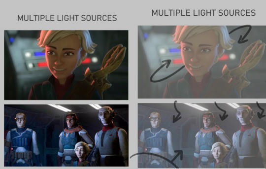
Multiple light sources are ur most common type, and to me the most fun especially when it's like Two light sources. U can often play with the fun lighting types like rim lighting, u often have a warm side and a cold side for contrast/directions sake. The distance of the light determines how sharp or broadly lit something will be, and the size of the light can determine how much of that light hits the figures. So Omega here is surrounded by the lights on their ship, there's likely a very broad top light that's gently lighting the entire area, but the reds and blues of the buttons and screens around her are what's shaping the figure more dramatically. You can see the blue is coming from the top/behind her, where the red is more in front/bottom side to her, since it's the way she's facing and looking at you/the viewer. The second one, still on their ship, features the more broad top down lighting, but the screens in front of them are more important as they're all facing it. both lights in this image are broad wide lighting, so there isn't much of a sharp focus.
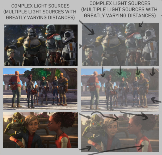
COMPLEX LIGHTING to me usually just means 'there are many light sources of greatly varying distances and brightness' or that there's a lot of figures in the image so it's got a lot more to organize so that the whole image may look readable at the end. You get a lot of environmental lighting for these types, meaning like hey the SUN is one of ur major light sources. it is super fucking bright but it is also FAR away, it's lighting EVERYTHING. and closer to sunset/sunrise u get more direct, highly saturated light from it because of the angle it's often shining- there's a lot to play with for just an outdoor lighting! The three images I picked here are a more morning shot, a mid day shot, and an evening shot. Talking about the angle of the sun especially at the last image with the grookey on Omega's shoulder, which casts a shadow over her and her friend. But her friend is positioned in a way so that she's not entirely over shadowed, because we're here to look at all three figures, and their faces matter in this shot. VS the middle images which is more about the scene/setting as a whole, and the figures are all more or less equally lit/shaded according to just standing in bright daylight.

there's also this fun lighting type, singular light sources can usually add a WIDE RANGE of emotion to the piece, depending where you flash the light. You've probably seen tons of light study gifs or shots where a face is shown with one light passing around their entire face and it highlighting the different planes that illuminate based on where the light is. So the first image, the classic Morticia Addams eye drama light, is focused hard on the figures, and what they're looking at. The second image of crosshair is another type of foreboding emotion, but instead with the eyes in the dark. Singular light sources aren't always for drama or asking you to focus on one specific thing but I feel like end of the day, the sharper and closer the one light source is, the more the artist is usually asking you to focus on the scene for.
There's also some examples here of multiple light sources being used for the same storytelling dramatic effect. There's crosshair's entire front lit up to focus on not just him but by extension the rifle he's holding, with a backlight to catch the edge of his helmet and the barrel, because those are where we want you to look. They're the most important parts of the image, and they wanted to make lighting appropriate for reading that. With the last image there's what's his face (bro i forget my b) looming over him in a common type of dominant lighting. With how the lighting is assigned to this scene his face is shadowed, vs crosshair's who is partially under that shadow.
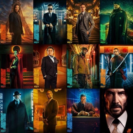
IDK IM RAMBLING NOW i doubt this is the concise easy to read tips anyone's asking for sorrY I am not a teacher. IN SHORT FOR LIGHTING I JUST think about shows I've watched. I won't go into anymore but I think a GREAT example of super well done lighting in all categories of art are the John Wick films. They're both lively, highly direct, and superficially colored to fit the mood of each character and scene. I'll suck these movies dicks i'm obsessed:
Anatomy I always generically recommend people continue loose study/education from skeletal and muscular anatomy cause if you can build a figure from the inside out, the surface is going to be loads easier. And then when I'm too lazy to look up any muscular break down cause I sure don't remember every part at every angle I kind of just fudge it which is super common, like how many of us draw an ear correctly to it's bends and shapes. I sure as hell don't I just like to draw them the way I'm familiar with lining it (unless it's some really polished piece) cause end of the day my ear is still getting interpreted as an ear. So If I can't recall which muscle overlaps the other given a certain angle I just take a guess and usually it's not something blaring if I threw it down confidently enough. Studying not just muscle though, but how all body types sit and tense and move is crucial. Like fat is obviously going to have a much different type of hang and sit on the body, and then there's deciding how much fat to muscle you want on a figure. There's also skin to consider- older skin is looser, scarred skin has a tighter more custom pull to the areas, skin otherwise is just a big elastic band around ur body. So when that becomes overstretched or cut in any irregular way it's going to have a much different look to the muscles and bones it wraps around.
Muscle reference I don't have anything specfic to refer other then using actual anatomy charts. Some 3d modelers have made great reference to body parts with full turn arounds i'd suggest. Since big fantasy muscles can be exaggerated so much (and they should!) it's the only reason why id only Lightly suggest for observing other artists individual drawings of buff characters. cause lotta us are fudging parts and u will end up picking up an incorrect anatomical trait (we literally all do it, just a silly unlearning process once ur hand is so familiar and used to drawing something a certain way)
I think something specifically that's really helped me slowly gain a very diverse understanding of the fat to muscle ratio is getting into sumo wrestling. (NOT TO PUSH MY FAVORITE SPORT BUT I HAVE SOURCES IF U WANNA HEAR ABOUT IT/FIND A SPOT TO WATCH)
In sumo there's no weight division like other forms of wrestling, and because of that you can have a very diverse set of ways to go about your own style of fighting. Entirely setting aside the fighting STYLES, there's broadly the categories of how much fat do you want to put on and the advantages that has against your opponents, vs how much muscle, or where that muscle needs to build on your figure, height and the like also play into it but basically 'what is my body shape, how can i build/ play it to the advantages of how i fight my opponents'
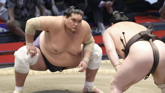
so like terunofuji is a fucking MOUNTAIN of a man, he's the current yokozuna (top banana rank) and his sheer height and weight plays greatly into his fight style. All of them are fucking jacked and watching Sumo has been a great general visual library builder because:
- its a huge sport so it has a lot of coverage and footage on high def cameras
- they're mostly nude and you're getting incredible displays of muscles in slow mo as they collide, fight, and throw each other. s2g you'll have an entirely new appreciation for the human body and just how many ways it can shape itself from watching this sport.
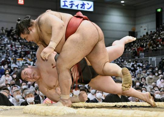
Always a ton of fucking leg muscle but Takayasu is one of my faves i gotta show him.
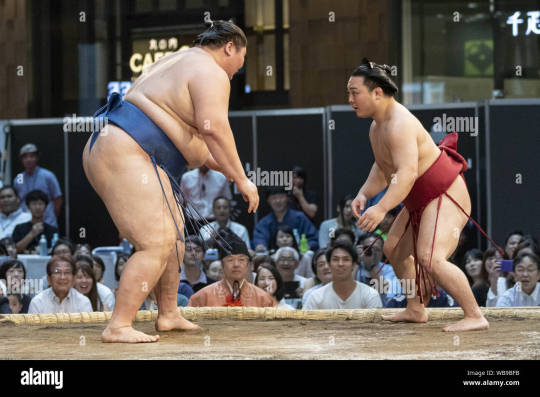
with no weight limitations not only are you seeing all the different levels of weight to fat, but you're getting an excellent display of how fat builds and forms on different people. there is no one way to gain fat, its pretty cool how diverse it can form, where it prefers to store fat, how quickly someone might gain weight vs overtime, genetics, what types of fats you're storing, lots of shit to look up on! this last image is ichinojo vs enho who are like usually one of the biggest and the smallest wrestlers, and both play to their size and shape and have become very high ranked. ANYWAY THIS POST REALLY WENT PLACES HUH
idek if i answered the questions right i think i gave more questions back but i tried to touch a little on my thought process and where ive specifically gone in the art study journey.
For poses I really don't look up anything I just try to think of the figure and do a lot of preliminary sketches. No i don't have the 'picture a perfect apple in my head' noggin i too suffer from looking at a blurry void when i try to think of shit so yes im hitting a brick wall by not utilizing all the model posing references that are probably out there hsuogjdhk
96 notes
·
View notes
Note
hi! this is the bunch-a-questions anon. this wont be an ask ask. thank you for answering! it really gives me so much insight about tools and processes, i really enjoy seeing/reading how different artists have different ways in approaching creation of art. it’s all so interesting to me
and oooh i know what you mean about looking at a lot of different artists! it’s inspiration!! i find those things to be amazing too, it’s so cool. it’s like “this spot is inspired by an artist” “this artist draws this like this, so i wanted to try” “i think the way an artist drew this was neat and i wanted to try an implement it” it reminds me of that one post how we, as people, are a mosiac of other people and i believe it to be the same for how artists are too with their art
i feel inspired by the way you draw….. everything!!! it gets me pumped to try and replicate the way you do some things. like the shapes you create, the colors you choose, the way your lineart seems to be so flowy, how dynamic everything feels and how different each drawing you create is from one another (i saw you reblog that meme of like “why shouldnt i draw characters from the waist up and that is SO me, but it’s shoulders up” because drawing full bodies makes mh drawings feel so stiff, i need to practice more!!), the poses of the characters. just.. every aspect of your art is so, so, so nice!!
the way you draw, in all your styles, it’s definitely one of the ones that is such a good scratch to my brain. it gets me all giddy and happy! i’m not sure if i’ll get into jwri, mostly because my attention span will not let me be able sit and focus on listening before i get distracted and miss context on parts, BUT i still go to your blog almost every day just so i can see your art, no matter what it is, no matter who the characters are because it’s always so so good and i love taking it in. (will eat your art if i could, i am so serious)
this was a long one but yeah! i just wanted to let you know how awesome i see your art is! and how i also think youre a cool person, you seem like such a good peep to hang out it! might be weird to say but if you were a blorbo, you would be one of the most blorbiest blorbos to blorbo ever
hope youre having a good day!!
OH THANK YOU SO MUCH FOR ALL THE KIND WORDS THIS IS SOOOOO

your explanation of taking inspiration from other artists was so poetic and beautiful! truly inspiring in itself
its okay if you can't get into jrwi, i get it! i didn't think i would get into it as well and after binging all the episodes i honestly forgot why i even started listening in the first place. remembered recently tho! it was because i was going a little crazy while making the picrew and needed some actual talking in the background instead of just music. so, if you ever decide to give it a try, or listen to something else equally as lengthy, try to busy your hands with something that doesn't require a lot of thinking! it helps me at least! worked both with jrwi and tma. it's like, doing something monotonous (knitting, sorting files, cleaning the house, etc) can be incredibly boring if i sit in silence and let my mind wonder. alternatively, listening to something long or watching a long movie can be incredibly boring as well because i struggle to pay attention to the same thing for two hours. but combining these is really good, because it keeps both my mind and hands busy, but not overwhelmingly so!
and ough ough ough thank you again for such heartwarming message! im so happy to hear that you feel inspired by my art, and i wish you good luck in your own art journey!!!!!!! remember to have fun and listen to yourself and do things that you find interesting and that you enjoy! don't force yourself to draw stuff you don't like! all art is personal and individual, so don't be afraid to make things "you"! you don't have to do clean line, you don't have to do lines at all, you don't have to do coloring or shading, if you don't like it! and if you do like it or are excited to try, you should go for it! don't be afraid to change and grow but don't force yourself into it!
also don't foget to stretch before drawing its very important!!!!!!!!!!!!
28 notes
·
View notes
Note
mwah your art is good and nice :>
can I ask for some advice? no worries if u don't want to answer.
do you have any tips on how exactly to practice art? everytime I ask for art advice everyone always says "practice" but idk what to practice first! do you have any strategies for learning how to draw something? do you do excercises? and if so how do they work?and are there any beginner mistakes I should look out for and change specifically?
thank you so much!! have a wonderful week :>
thank you so much! im ok w answering! i dont want to speak as if i am an expert on how to draw things in general as i am learning as well and definitely am not completely learned, so i might not be the best person to ask since im not very professional w my art as I do it as a hobby (and I can only speak on mostly digital cartoon matters) but i reallly hope to try and help u out even a lil ! im really happy that you’re eager to draw :] I wish you so much luck muwah muwah
i also hated when ppl told me “just practice” and i dont wanna inflict tht on u EITHER LOL but also thats just what i ended up doing for awhile but i tried to find some things to help ^_^
tips for practice: My number one rule is that practices should be challenging but still fun, I know it can get frustrating trying to redraw a pose over and over trying to get it perfect. And over time it rlly is all about muscle memory, the longer you draw the more your eyes will pick out specific shapes in everyday life and convert them into its own vision of them! or at least its good to look at life that way, try to pin point key shapes and stress less on details in practices. after you look at key points, THEN you can go over what you have and draw in and over it to make it more “complete.” To stop practices from getting too stressful I recommend starting out drawing what you want a little more simple looking than ur desired finished product. This helps eliminate the pressure of everything not looking “perfect” and keeps your art more loose and fun. Doing this a few times is gonna get ur brain to recognize patterns in art and how things look/flow in anatomy and such. dont get stuck in ur own head abt perfecting everything to the point you either 1) give up bc ur not at a level capable of it being 100% “perfect” or 2) focus so much on making it perfect that you end up saying the work looks “wonky” or stale in dynamics, So while I do think studies help, don’t get too lost in them. I always practice with media I enjoy too, whether it’s characters or fashion I enjoy.
Strategies learning to draw something: people get mad abt this one but I think tracing reference photos is great. its been awhile but When I tried learning to draw hands better at first I would trace them then put the traced image to the side of the canvas, then try and replicate what my mind saw as its most important angles and aspects. Same for clothing folds/hair/etc! I think it’s maybe not the best idea to trace the ref and use the tracings as is, because you learn more from tracing it then trying to replicate and simplify what u learned into the style you’re working in. Find what shapes you like from them and don’t over detail it. you may have to go by eye and think “what parts of this ref photo should i simplify to fit my style” and for me, its usually adjusting the length of the torso and then the limbs by associations. i dont recommend feeling like u need a reference for every art you make though, its ok to let ur own head try out its own sometimes too while trying to learn this, see if it remembers any call bad from the past referenced sketches! over time ull remember where everything goes more, these days i rarely kick myself to use refs but im sure they still would help to use, but figure drawing simple blobby figure in a bunch of random poses was a big thing i used to do as well to get better at full body art + overall dynamics (still does this). also paying attention to silhouettes is great
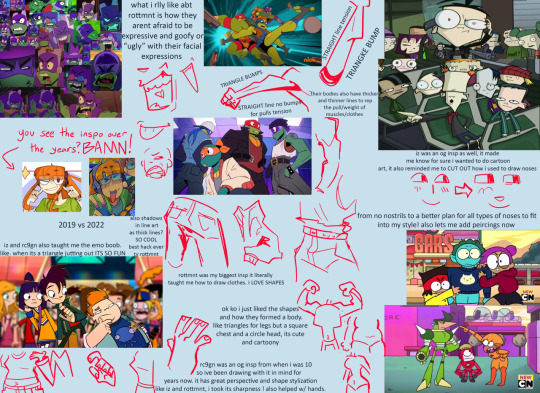
Exercises and how they work: I WANNA HELP U SO BAD BUT to be honest, all the works on my blog ARE exercises! i rarely actually do finished pieces, if u scroll thru my posts ull notice most r sketches. i usually just fill up a page and call it “warm ups” then i get attached to some of them, take a few, and just line them up pleasingly on a smaller page, then color them in (or sometimes fix the lines to be more clean too). im not rlly a person who “exercises” to practice, it more so happens from just me drawing a lot for fun as a hobby! but i really should. i will tell u this has humbled me a lil i need to start practicing too 😭 LOL but a good exercise is to look at what ur inspirations do, and study it. Make a collage and write out what you like most abt their styles/what u want to gain from them. For ref Here’s a page I did awhile ago when someone asked me abt my insps:
i also look at fashion magazines and as well as anime figures and take insps from that sometimes with learning cool poses and compositions to convert into my own things
Beginner mistakes to look out for: its hard for me to pin point “mistakes” beginners make, as sometimes we cant avoid all of them or even notice them, progress comes from growing out of old ways. some mistakes are even the foundation of ur future amazing cool style! but i think some things to look out for could be these, from my own old art experiences
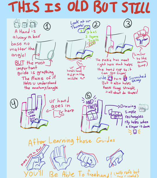
Hands were the first thing I learned bc i liked drawing them. I don’t know if that is the best way to go but I think it is smart to practice sooner than later, here is a lil guide thingggyyy wingyyy from awhle ago
i see beginners shy away from drawing signs of age in people, sometimes adding too much detail on an older person in cartoon art makes it look weird, so i try and hit the key markings on ppls faces of age.
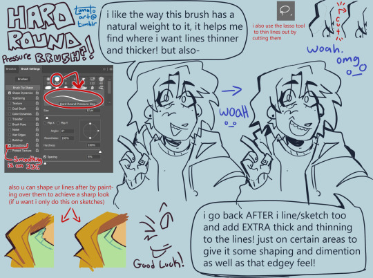
Too thin of lines. sometimes its a stylistic choice to use thin lineart, and it can look amazing ! but sometimes it can flatten an image if ur not familiar with its flow. im not saying use thick line art, but more so to keep in mind the weight of ur strokes, adding depth with a thick thin combo of line art can do SO much for the simplest of pieces. heres a visual from a while back when i talked abt my brush + more abt lines:
but if ur desired style is thin lineart that is cool too! tbh it was just harder for me as a beginner
sometimes artists think they need to do full lineart for everything and then hate how it looks compared to the sketch, do not fear i will introduce u to my bff: painting over a sketch, extractinging the lines, then calling it line art. i only do this sometimes but its a fun exercise-ish thing to do in a pinch. example:
finding what shading fits ur art. sometimes ill see ppl starting out who have a style thats very simple, but they use a very detailed rendering process on it. this is not something id ever police of course, art is each persons own choice! And it CAN work. It can be so cute! but sometimes mixing two very contrasting mediums of art can throw off the “put together” look of it. i use to abuse the airbrush tool thinking it made my simple style look super cool and detailed, but looking back on it now those pieces looked a little off, having such a simple style have somewhat more realistic shading. dont get me wrong the ability i see ppl use rendering like that is so insanely talented! but i found cellshading to be a good match for cartoony art like my own. a tip i learned way too late abt that is rather than shading each layer by color picking a darker color, instead use a clipping mask over the entire art (above line art too as I color my lineart) and lasso tool the areas u want shaded + fill it w a saturated purple then set to multiply + lower opacity. also, sometimes coloring can come out chalky looking when u meant for it to be smooth and transitional, i think this comes from overshading and overlighting pieces without reason. pay attention to where the light source is, and focus on making the shaded and lighter areas nice shapes that cover the necessary areas, then u can add additional shading to the smaller details of what should have a casted shadow/light
its good to spice up ur art now rather than later, focusing making ur art pop more w backgrounds will help ur coloring skills look better too! i dont mean detailed huge backgrounds, a small lil color pallet and design rather than a blank white bg. like this will make u feel better abt it or at least it helped me *sweats* yeah:

beginners tend to draw blank faces like “:)” but I think a good thing to do is try and get silly with expressions early on. It’s okay if the mouth hangs off the face cartoonishly with joy or shock, it’s ok if the eyebrows are super high in surprise.
tracing and pasting it as is (already said this but I’ve seen ppl do it a lot with hair styles and it makes it look alienated from the rest of the style) (final fantasy fans found critically injured) n if need a ref for a pose, using a real humans anatomy as-is doesn’t look quite right on a cartoonyish drawing. Shortening torso and legs usually comes out of this for me!
flip ur canvas i promise u it’ll be less embarrassing over time!
using guidelines for perspective and foreshortening is GREAT. Do it stylistically rather than realistically to add some groove to it...yay. Having silly perspective in art can make it look like a 10 so easily opposed to a normal front facing sketch. Look at cool poses from fashion magazines! Don’t be scared to draw something you don’t feel confident in conveying perfectly, this is why progress redraws exist :)
Drawing the hairline b4 u draw the hair is great, it helps u understand where their hair flows from, where it starts and stops, AND prepares u for drawing bald ppl. Also don’t make the head too big, the skull IS bigger up top, but sometimes I see an alien head affect.
Anatomy is an interesting mistake that beginners make a lot, but it’s one they find harder to notice! When I started out, all my art would be SO wonky, but I didn’t even realize it! It still happens today too! specifically though I see beginners struggle with the arms in this department. My advice is to try and measure them out and make sure they don’t go past the knees, and are the same length as each other when Unfolded. asking for criticism is hard but it helped me realize when i would make something bigger/longer than it should have been in my art, and stuck with me being able to go “oh... i see it LOL”
clothing wrinkles- do not over do it! Too many wrinkles and shading can look unpleasant and wirey- like a plastic table cloth all bunched up which isn’t exactly what ppl wear. pay attention to gravity too
I hope this helped even a lil im sorry tht I’m not very good at explaining or didn’t have much to sayyy! If u have any troubles no guarantee I’ll have the answer, but ur always free to ask!
112 notes
·
View notes
Note
can't do emojis on desktop but tea about fandom bleeding into published fiction
LOL. I don’t feel like I know enough about fiction publishing to have an opinion on how this affects trends or the industry in general, so simply as a woman who likes to read and write: extremely mixed feelings. sometimes it is really funny or even charming to me (when a mostly non-fandomy feeling book drops “he toed off his shoes” i can laugh and move on). however. i feel like many people who write fan fiction see it as fringe in such a way that they don't want to look frankly at how it influences writing style, and that can result in some very bad books. i think the "writing is writing is writing is writing!" school of thought does way more harm than good stylistically and we'd all be doing ourselves a favor to think of fic as a specific genre with specific genre conventions. and consciously or not, a lot of us practice those genre conventions for years, and i do think hopping between fic and original fiction poses some unique challenges. and sometimes this transition is executed poorly in a really obvious way. not just in the language either but also in terms of structure and idea. i think fic is so trope-forward partially because it is typically driven by pleasure-seeking, and partially because it's inherently about riffing. and this practice of RIFFING in particular stands out to me in certain contemporary novels, where it can feel like the author is trying to leapfrog over building an emotional core and instead shape it in reverse, by setting up tropes or dynamics that signify this core exists somewhere, just not on the page. and this can happen in really clear ways (trope-forward romance novels that everyone knows started as fic that include one line like "we've hated each other since we competed in our boarding school spelling bee") and more subtle ways (not to claim random authors i know nothing about are suffering from fan fiction habits but something like mrs s springs to mind. and i didn't even hate that book it just had that weird no-backstory feeling). and the fact that this so often coincides with queer lit and the perception that there's still a lack of stories just makes the whole thing feel sort of tragic.
the flip side of this is that i love fic writers, i love talking to people who find writing so fun they just do it regardless of gain, and i have found a lot of the habits and friendships i've formed through fic extremely helpful to my original fiction. i really love and support fic writers who write and publish original fiction. in a way i think fandom has a fantastic influence on publishing because it's where so many great writers practice and play. but again, ideally that involves being very mindful of the divisions instead of trying to ignore them.
overall if a fandom influence is coming through to me as the reader i'm probably not loving it. i will generally be more forgiving with romance and ya because i think they are fan fiction's closest genre cousins and have a lot of overlapping readership. lit fic i find it more annoying. little rabbit by alyssa songsiridej is another good example. also on a totally different note i think the funniest/weirdest bleed area is rpf and i am genuinely kind of pissed about the graham gore romance novel because i wanted to write that lol. anyway great question.
12 notes
·
View notes
Text
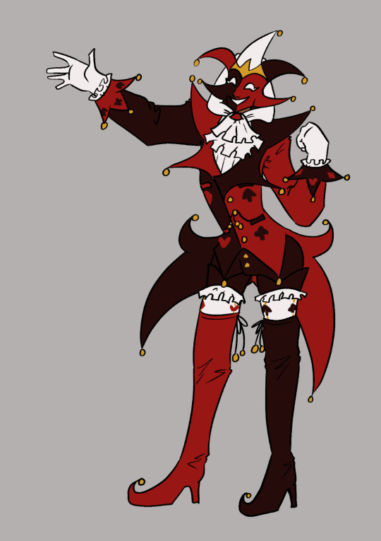
Redesigning Jester
I've been working on trying to pull my story about Kings Court into something coherent and presentable, and as I've been going through that process I've been realising that I need to redesign some of the characters!
The first character I've been reworking is my beloved Jester! Here is their original design:
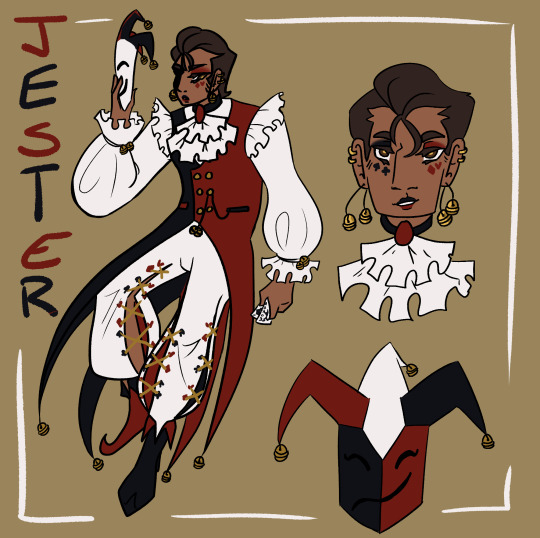
I did really enjoy this design! But as time has gone on there have become certain pain points, and as the story has developed there are things I want to incorporate more strongly into the design. You can see a detailed breakdown of the re-design goals and process below the cut!
The mask - it needs to be a feature, not an afterthought.
As much skin as possible should be hidden, I want to play into the Jester as an anonymous and mysterious entity.
Simplify - the four tail coats are far too unweildy, and the pants proved annoyingly intricate with repeated drawing.
Ensure that the design is fun and exciting to draw in motion! Jester flops around a lot.
Incorporate an additional motif to reflect role in the court.
I began the process by looking for inspiration and reference material, particularly for the mask. I collected a variety of reference images onto a pinterest board to use for inspiration and then got to sketching! Here are some of the initial exploratory sketches.
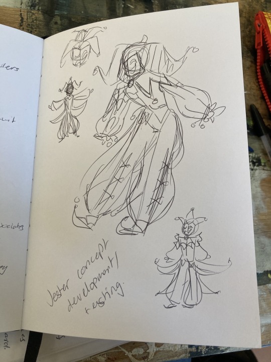
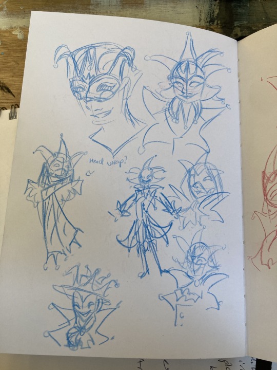

After the sketching process, I started working on some more finalised concepts taking what I had explored in the sketches, exploring the ways to combine shape and colour, and also getting feedback from friends.

I then did a set of concepts all next to each other taking some of the ideas I had liked from these concepts as well as trying to add in some new things.
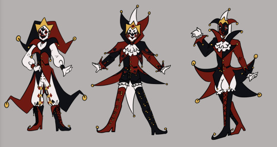
Silhouette was a major consideration throughout these concepts - as well as experimenting with the mask design. The first and second designs proved the most popular, and also worked as my favourites. And so moving forward I decided to combine elements from them both. Namely:
Collar shape from design 1 - it's dynamic, fun, and interesting!
Hood based design from 2 - I like the framing of the hood.
Two pronged vs Three Pronged design from 1 - Easier to draw repeatedly and manipulate in dynamic ways, I think it gives a more dynamic flow to the design as opposed to the triple prong potentially being a bit more static.
Thigh high boots from 2 - my friends like them and I like the way they make the legs look long.
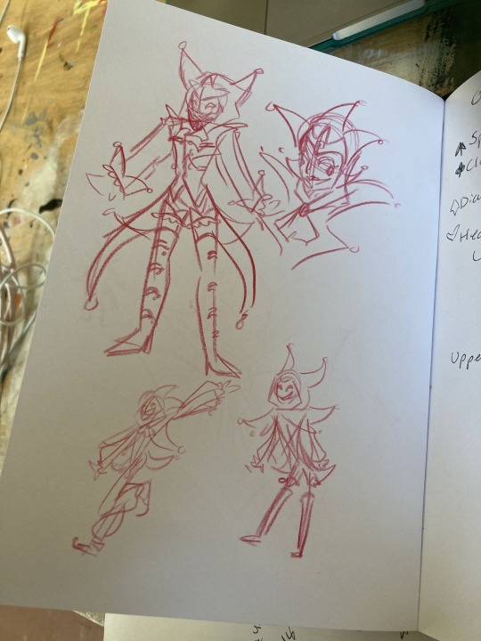
I also knew that I wanted to make sure that the design I came up with fit with the design of another character - Jack, and also play with poses to see it in motion, so for the next tests, I decided to work on them both simultaneously and have some fun drawing them interacting!
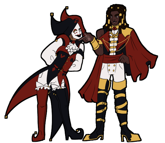
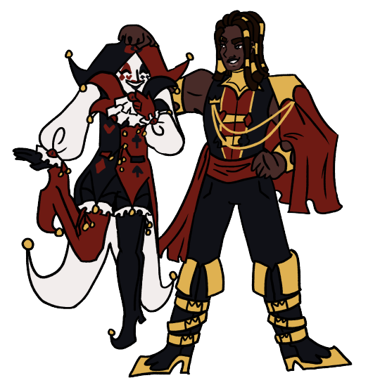
As you can see, I had settles fairly well on the overall shape of the design, but still made some minor tweaks between images - mostly to do with the placement of the colour blocking. I also changed the mask design here from the previous iterations as they felt too cluttered and overpowered, and I also really enjoyed the design from the makeup Jester had in his original design, and realised it could transfer effectively to the mask design! Another thing that changed is I removed the crown motif I had started to develop, and tried to focus more strongly on incorporating an eye motif. This was a change made as I sat and considered the lore and symbolic implications, and I ultimately decided it worked best if Jester had the eyes and Jack had the crowns. King and Queen will likely have both when I get around to redesigning them!
I still have some more playing around to do to settle into the final design before I make a proper reference sheet, as I'm definitley finding drawing the design in context helpful to get a sense of how it operates in practice and streamlining. I'm currently working on a mini PMV project featuring Jester which will hopefully help me solidify the design! But I'm feeling pretty happy with it so far.
I want to do more discussions of my design/redesign process in future as I find it really helpful and interesting to organise my thoughts like this. It's also exciting to see the progression all laid out, I'll probably do a similar thing for Jack soon!
#oc art#art#character design#character design rambles#redesign#pandemonium#jester#a long extended exploration of my process in redesigning my beloved jester#i just wanted to ramble about all the things going through my brain i hope someone finds it interesting#i like reading about peoples processes and considering my own its interesting!!#creative process
10 notes
·
View notes
Text
Guys I’m sorry. A single person asked me to elaborate. I’ve gotta elaborate now. I have permission from an internet stranger. Also, yes, I think I should be locked up and studied for science but exposing my insanity on the internet is the next best thing. @dye-it-rouge-et-noir this one is for you buddy.
This is a follow-up/part 2 post. If you’re seeing this post before part 1, part 1/the context is here = https://www.tumblr.com/archerygun/749484004313579520/alright-i-was-chatting-to-a-friend-about-james?source=share
(Splitting it up into sections because I want to try and contain myself from rambling nonstop for five straight minutes)
DESIGN EXPLANATION/BREAKDOWN
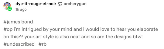
Sean Connery - A friend of mine did most of the design, I added the bottom half, the gun, the colours and a couple of motifs.
I chose Thunderball as the film of focus because my friend mentioned his swimsuit was traumatising, and also because it’s the film with the jetpack in it. Generally focused on circular shapes and tear shapes because y’know… water. He’s orange because of the orange swimsuit that my friend called out lmao.
And the flower on the neck bow is supposed to look like the one from the iconic white dinner suit that I tend to default to drawing Sean Connery Bond in because when he isn’t in dinner suits his dress sense is generally not as fun as I would like.
The gun is based on the one from the James Bond image. You know the one.
I put simultaneously not enough thought and too much thought into this Jesus Christ.
I think he’d have some sort of jetpack power-up or something.
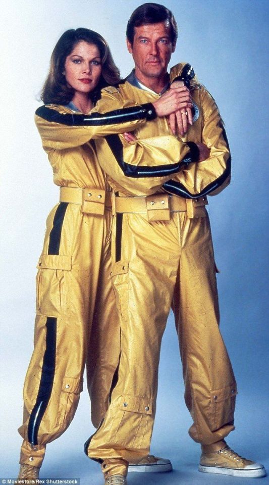
George Lazenby - He only did one film, so that did limit sources of inspiration. Fortunately, OHMSS is my favourite Bond film because everything about it is earnest and completely insane.
I had to include his bowler hat from the intro because it was amazing and not enough Bonds wear hats, so he’d at least look distinctive.
It’s set in an icy location for most of it, so that’s where most of the theming came from, the colour, etc; the diamond motif might have suited Sean Connery better all things considered but too late now. I took some costuming inspiration from his kilt outfit because it was strange and iconic and I think all Bonds should be made to wear it.
He only really has one promo shot with a gun so I had to give the position of tiny gun guy to George Lazenby. He wields it well.
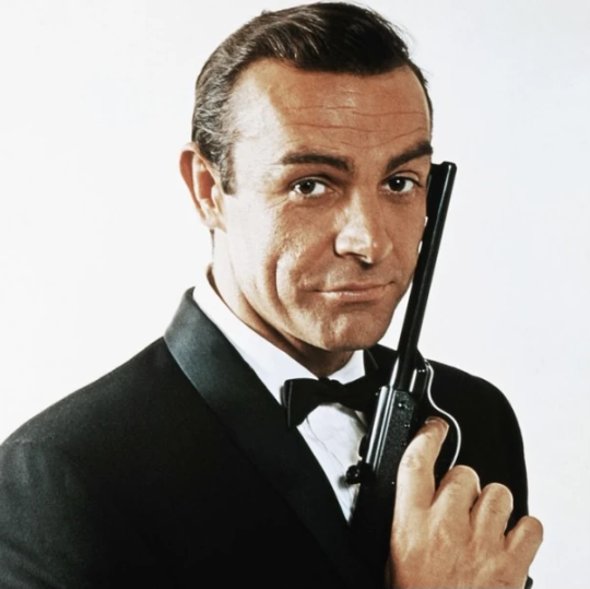
Roger Moore - I kinda just took the fact that he was the first Bond in space and ran with it. Used stars as a motif, etc. Particular inspiration was taken from this outfit:
And partial inspiration from his weird marine navy commander-style getup (for the shawl thing).
It was legitimately way too hard to find a gun that wouldn’t accidentally cross over with a gun from another Bond so I picked the most Seventies gun I could possibly find for inspiration assuming that no other Bonds would ever use something similar. The upper body pose as usual is directly from the reference image.
I felt like if I put all the Bonds in skirts, it’d get a bit repetitive and start looking bad, so I figured if any Bond was going to get trousers it would have to be the one that actually wore flares.
CHARACTER EXPLANATION/BREAKDOWN
Basically just how I’d pitch the three Bonds I’ve done so far if they were a group dynamic instead of solo iterations. Gonna do it in bullet points so it’s more comprehensible. (I don’t have any rhyme, reason or lore for this. It’s literally just me assigning three Bonds distinct personalities).
Sean Connery:
The group leader/group elder/tired old man
He can still be a slut if that’s what you want but minus the creepiness. Mutual engagement in passive flings? No problems with that.
Seen so much shit that he’s sorta nonchalant about everything and believes he’s overqualified for just about anything he’s asked to do.
✨War trauma✨
Suaveness and charm level 100. He’s a crabby old man most of the time but he’s so charming that the group let him get away with it.
He’s desensitised to like, literally everything. He will not hesitate to kill a man in cold blood if the situation demands it.
Pretty much believes that human beings are fundamentally bad, himself included.
Ultimately the one that’s willing to make the hard calls.
George Lazenby:
Like his actor before him he is the least qualified and probably lied to get into the secret service.
Optimistic, perceived as naive, ready to try and fight the narrative to change his fate.
The group child (and the youngest).
Quit the secret service after his new wife was assassinated on their wedding day and only comes back because shit has hit the fan (plot reasons. I don’t have a plot, I’m just speaking as if I’m pitching a TV show).
Doomed By The Narrative™️
Ridiculed or forgotten by everyone except the other Bonds
Sean Connery’s Bond respects him a great deal and secretly envies his more idealistic worldview, but won’t let him make the tough calls because he sees him as too naive and too unstable (willing to risk everything)
Roger Moore’s Bond HAS adopted him.
Roger Moore:
Literally feral
Master of British understatement (“Oh. That’s a bit of a shame.” as the world is literally ending around him)
He’s besties with Sean Connery’s Bond as the other sort of group elder
Despite how manic and wired he appears, he is terrifyingly competent and capable of being very serious
Team leader when Connery’s Bond is out of action
Dad figure. Not just to the other Bonds, but as a default personality. He will go parent mode on anyone he thinks he’s capable of saving.
Although if he doesn’t think you’re saveable he will not hesitate to shoot on sight if he runs out of options.
As far as ideas for the other three, Timothy Dalton is going to look evil and edgy but he’s just an enthusiastic dork and Daniel Craig is a stone cold killer with trust issues draped in bright pink bows. I haven’t seen any Pierce Brosnan movies so far so I might just have to vibe check him based on plot synopsis.
Closing thoughts? I want my brain removed and replaced with a better one. I’m sorry for everything you have witnessed today.
Also, these are based exclusively on the movies and not the books. I’m more digging into what makes each actor and era special and distinct.
If you sat through all that, well done, thank you, please don’t report me to the asylum and enjoy this image of Sean Connery.
#james bond 007#james bond#007#magical girl#pitch#writing idea#concept#sean connery#roger moore#george lazenby#ohmss#on her majesty's secret service#thunderball
10 notes
·
View notes
Note
I really like your style. Was it intentionally designed, or did you just sort of fall into it over time?
I wouldnt say I intentionally designed it, as in I haven't sat down and Engineered a specific style, and instead it was more of me finding what I liked and wanted to incorporate into my style.
You could probably trace my style back to its influences. I used to draw really round shapes (I still do but like they were just ovals and circles...I guess i just like that shape) until I started watching How to Draw Anime tutorials in middleschool T-T (shoutout to Mark Crilley lol)
But when I first joined social media back in 2016, I found all these crazy artists with really unique styles that really influenced me. I was drawn towards artists like star_bite/prince_canary and rawrgyle/grassflu who have very dynamic expressions and character poses :0 (also they ended up working on a Batman and Superman project respectively and how wild is it that my icons from forever ago now work on projects aligned with my current interests!!!) And as you get exposed to different artists you get exposed to the many ways you can Draw things and along with your natural affinities towards certain things (such as me being attracted to Bright and Bold colors and Shaped styles) you kind of naturally build a style.
And part of that is also just having fun Trying things out? Sometimes I wouldnt even try to emulate their style as much as I tried to just...do what they were doing? As in making my ocs and putting them in fun poses, and doing color palette trends and such etc.
I hope that helped! If you're curious I can break down some of my style checkpoints over the years. As you can see there was still some major anime influence in my style back then when I first joined social media around 2015/2016
Around that time, I also discovered the fandom around the Cartoons popular at the time, so I drifted away from anime and drew things like gravity falls/steven universe/otgw etc etc so it got Rounder I guess. I really liked how stylized characters looked and got obsessed with Shape Language and assigning characters distinct Shapes (box vs triangle vs circle etc). I also read a lot of webcomics and stuff like that so those played a part I guess


And then around 2019 I saw more artists drawing anime fanart with really sharp angles, which was completely different but so cool to look at so I tried to incorporate more angles into my art. I still had that very cartoony style but tried to push the Sharpness a tad bit more if you can tell. (I think the name of the artist I liked was jeluto?)


I think around this time I also focused a lot more on color as well and did a lot of paintings then and whenever I did more Painterly stuff I tended to switch Styles into something Less Cartoony T-T

Then by 2020, I revamped my ocs, actually tried to break down and study my own style and how I would draw them, and my style kinda fell into a mix of round vs sharp edges I guess. I tried to give myself Rules which I would follow when stylizing a character to keep it more consistent and intentional.


Then in 2021 some of that Fun Part of stylizing characters into something more Cartoony kind of took a backseat as I focused more on Pose Work and Body Expression instead which I think helped a lot :0

And here's some recent stuff from the past year! Still very cartoony, but less so than 2016 I'd say, and still using really bold colors!! Still love my Soft Vs Hard angles B]
And overall have stronger pose work :) I'm sure my style will evolve as I learn more and experiment more, because one thing I want to focus on is backgrounds and environments :0


60 notes
·
View notes
Note
How do you get such nice shots in captura? I wanna get better at it could you share some tips? Been trying to figure it out but I admit I'm not the most knowledgeable in photography etc.
Well.... It's a bit of a complicated process and it relies very very much on personal preference. Much like with any type of art there are different styles that each individual artist will gravitate toward. I can only show you how I do things, so I'd recommend asking other Captura folks on here about their own styles to see where our processes and preferences differ.
I'll also include some extremely helpful videos at the bottom, they go extremely in depth as to best practices and technical exploits.
Alright, lets get started with the background stuff... the tools!
ReShade: Shader injection, a MUST if you want to take dynamic and customized captura without using a program like Photoshop to do everything in post.
SRWE: Simple Runtime Window Editor.... the god among programs... It's an upscaler, allowing you to increase the resolution of the game beyond the bounds of your monitor. It's how I was able to get 15K panoramas at one point in time.
Any image editing software. Since I rely mainly on compositing to get the lighting I do, I need something to overlay and mesh the images with. I use GIMP cuz it's free, but even Microsoft Paint will work as soon as it add the ability to layer images.
Those are the tools... what about the tactics?
Well, I generally prefer moodier shots with the Warframe being the central focus (though, that's also the side effect of me cropping the image). Just a note! Moody doesn't mean dark, moody is the enigmatic space between dark and light where there is more dark than light... but there's still a good amount of light to be had. Occasionally you can have overexposure in a moody shot even.
Important to note, the overall exposure level of the environment, even is the scene lighting is low, will effect how brightly your Warframe can be lit. Both the Scene Light and Exposure sliders need to be fine-tuned otherwise you won't be able to light your Warframe at all.
Now, for shot composition I prefer low angles with either a cluttered but familiar/recognizable background, or a simple but abstract background. The Subject, be it a Warframe, an enemy, or an NPC, reside in the center with their feet out of shot.
Like so:
Each of these shots also demonstrate well the way I like to pose my subjects: Symmetry and.... not... not symmetry. The official term for this is Contrapposto, which is Italian for Counterpoise. Basically, even though the Wisp is sedentary, her body is still giving off the impression of movement based on how her waist is curving and hips are tilted, forming a loose 'S' shape. There's a handful of animation sets, Khora (Urushu) Noble, Mesa Noble, and Wisp Noble are excellent for this.
Some examples:
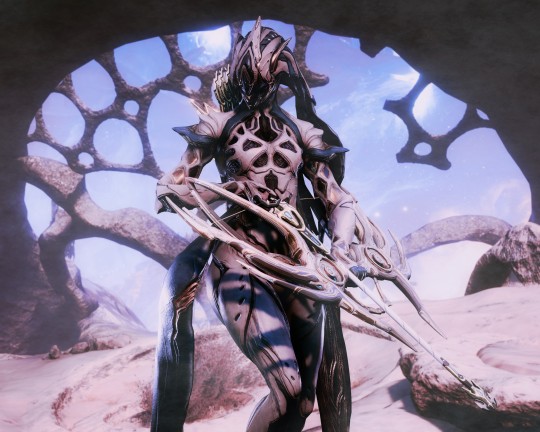
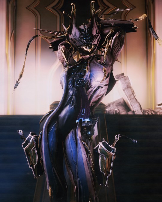
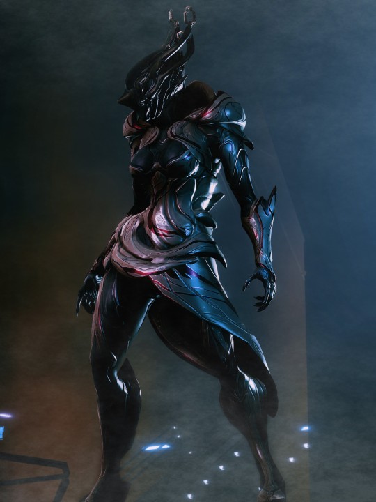
But... what about the lighting?
This is where things get technical.
So, the standard Captura's three-point lighting system is generally inadequate at properly lighting the entire Warframe. This is where compositing enters the picture, in a very literal sense. Each of these shots, shown above, are composites of between two and four separate images, each with different lighting angles. I actually have an example I made for an earlier explanation made already (thank goodness)

Getting the different lighting angles is really simple, just rotate the 3-way lighting without moving the camera. Then you overlay them in some photo editing software and just start going layer by layer, erasing bits of the topmost layer to reveal your desired highlights or shadows from the shot underneath.
Don't feel obligated to do this compositing process though! Sometimes the 3-way lighting works perfectly well for a shot or environment, don't feel obligated to complicate this process.
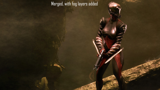
And this segues in nicely to the final part of the shot-making process, post-processing and fog layers.
Now, fog layers are important to the overall appearance and vibe of my Captura. They add texture the image that the game doesn't impart naturally, removing large swathes of solid color from the background and foreground. An added bonus is that the added texture makes the image look somewhat better (imo) when compressed, or when viewed at lower resolutions.
The same image with and without Fog
This shot contains two individual fog layers, one in the foreground, washing out the foliage, giving the general uniformity of it texture and implied depth, it also serves to cover up the manual blurring I did (poorly) around his legs. Then there's the background Fog, which is the deeper blue you see in the sky. It adds a more dynamic air to the generally dour set of greys. And, again, the fog is just something I personally like to add, even if it doesn't serve a practical purpose in a shot. No shade if someone feels the fog ruins the shot, I almost always keep a fog-free version about.
After the fog is added, blended, and blurred slightly, I will apply a few gentle blurring filters to remove any jarring or jagged pixelation from the shot, giving the Frame a somewhat smoother appearance and reducing the file-size dramatically.
That's just how I do it though, it's not a particularly popular style, but it's how I do it and how I love to do it! :3
Remember to ask around, I'm sure there's lotsa Captura Artists out there willing to explain their methods and processes.
Helpful vids!
How to Captura by Vash Cowaii
Hotsampling in Warframe for High Res Shots by PurpleFlurp
good luck, and happy snapping!
#warframe#captura#warframe tag#warframe captura#sorry for writing an essay... sometimes I don't know when to shut up#-_-
13 notes
·
View notes
Text
Progress talk thread
I like to take a lot of backups as I draw so we I can show off my widdle Lilly wips!! I'm drawing again that means I get to talk about drawing again yahoo
Lately when starting a drawing I've been trying to block out very rough thumbnails as seen above! I usually just start drawing like, the head, and trying to then figure out a body under neath and line by line it all ends up pretty similar to my past stuff because it's just not planned out! I don't know where the road is taking me!
So by starting out and trying to throw together the general pose with just a blown up light brush I'm coming up with much more interesting piece! I can figure out the general shape of the entire piece and then start working on top. No making a shoulder then drawing the hand over it and then erasing the shoulder and getting frustrated because it just doesn't look connected right because I didn't plan it out… where does this drawing end? where's the limits?? where am I going?? So my current workflow involves
Make the dimensions of the piece roughly (just throw a coloured rectangle down) -> very roughly block out the shape of the body within it
This also has the benefit of inspiring me to fill in the blanks with a pose I didn't initially expect! The body is reversed from my initial vague idea because seeing the blobs made me go OH IT'D BE COOL IF I DID IT WITH THE BODY FACING THIS DIRECTION ACTUALLY LET'S MAKE THAT WORK!! If you look at the initial you can kinda see it looks more like she's looking down at you with the raised arm being the one facing you.

Anyways after doing my personal Holiday pic the other day, I was like, it would be cool to do a small run of postcards to send to people yahoo!!
I checked the sizes of postcards and none were even close! They all had like an extra inch on of extra space on the bottom whoops! I free style my rectangle sizes when planning an illustration and I guess they're closer to square than the ideal rectangle! Whoops!
So for this one after getting the initial sketch down I thought, hey how close is this to 5x7? AND LO AND BEHOLD IT WAS THE SAME ISSUE!!! So I took filling out the extra space as a challenge. I'm trying to be more dynamic with my art after all!
I spent time adjusting the piece in sai2 using the transform tool with it's perspective skewing on. I wiggled and rotated and pushed n pulled and you get what you see above. A much more dynamic piece filling out the canvas!
The thing that took the most time in this phase was getting the skirt to a shape I found acceptable.
Up next was moving towards making it a finished piece!
Thick lineart is something I've been deciding if I want to stick with or not but honestly it's my natural state! I love thick lineart!! I grew up on manga I wanna see some black lines!!! In the future I wanna go back to colouring lineart as well but for now I believe I need to lean into my natural tendencies for thick lines!
I threw down my lineart to a mostly acceptable state, and brainstormed ways to fill the empty space surrounding Lilly. I found there was just a lot of empty space in the bottom left and I didn't really solve that in the final, but that's ok. It's something I'm trying to be aware of as I actually attempt illustrations. I want to finish pieces right now, I'm not in a place where I can let perfectionism slow me down.
Currently my layers are (face) and (lineart)
I throw down some flat colours, a light layer above and for once I tried a shade layer too! It might of been a multiply layer. It was probably was. Anyways this is what I was happy with before moving forward with refining it. I'm currently going with more focus on like, backlighting/rimlighting because it's easier to make it work with my no context existing in da void illustrations haha.
To refine it, right now, I'm playing around with mainly using one layer. So I slammed together my layers other than the face (I made that mistake with my previous piece and that's how we ended up with the eyebrow incident. I wasn't going to put myself in a place where I had to erase an eyebrow again) and started sculpting!
I think sculpting is the best way to describe it, really. It's a lot of slamming down chunky lines, and since the lineart is on the same layer, I'm constantly pushing colours out and finding the ideal shape of both it and the lineart. It helps me push my shapes even farther and let the colours take priority when they need to. Instead of them being separate things I worry about they're all just one big piece!
I was a bit worried about merging the plaid pattern down as well, but I did my best to get the skirt in a place I wasn't going to adjust much after the merge. That was the biggest priority of the previous step really.
It's a lot of fun! I recommend people try it! Try sculpting your lineart a bit!
I added the necklace accessory after since I knew trying to fit it in earlier would also be a pain in the ass haha. I'm not a one layer purist! I'm just having fun!
The background, I went in with no idea for a bg. So this is what we get. I think it works fine for this piece, it's a vtuber attacking you with big fluffy bear claws with no context other than that they are a bear and they're going to fucking get you. Red fits, Lilly has a very orange/red hued design and it's an aggressive attack so the mood works. I could of even gone harder and made it look a bit more splattery but I wasn't sure if I was going to fill up the bottom left space or not.
Looking back maybe I could fit in her name on a cool blood splatter there but I am not a graphic design major my brain is growing slowly in this department thank you
Also fluffy claw gloves usually have much less defined fingers but I couldn't make mitts look good with my initial plans so I stuck with my initial idea!!! Thank u.
Anyways follow Lilly [Twitch]
15 notes
·
View notes
Note
Ur strength is definitely color and line work. Something I would say needs some work is definitely your full body drawings and poses. Your poses are always static and rigid and (especially when in motion) it takes me a moment to figure out what the character is supposed to be doing. Your anatomy is fine, its the stiffness of the over all pose thats the issue. It makes your pieces lack energy and any real umph. Your beautiful use of color and line usually covers for this but for me (someone who also struggles with this) it pops out like a sore thumb.
To practice, id suggest doing gesture drawings (1 minute sketches of action poses) to really understand how the body moves fluidly and to practice capturing that energy. Id also suggest doing 5-10 minute studies of full body figures in which you specifically observe how the pose affects the distribution of weight. How the torso curves in relation to the pose (your torsos are often very vertical and stiff) and how their muscles, fat, and clothing stretch, bulge, or fold depending on the pose.
Try to keep things loose during these studies and focus on capturing the energy of the pose over perfect anatomy. Focusing on anatomy can often be a distraction and can actually detract from capturing the fluid movement of a pose when you are first learning. You dont want to be thinking about anatomy during a 1 or 5 or 10 minute study if that is not what you are trying to learn.
While doing gesture drawings, its important that you move fast and dont get hung up on details. Get the line of action in there and the general shapes of the figure. Focus more on the movement of the figure over anatomy or details. Feel the rhythm in the pose and do your best to capture it. Id suggest doing 10 or 20 of these at a time. Sites like Line of Action are great for studies like this.
For 5-10 minute studies you want to build on the rhythm you developed during the 1 minute studies. Again, you want to focus on the movement of the pose over the details. Keep shapes simplified and force yourself to think in the abstract. A vibe i get from looking at ur art is that you get focused on the small details while losing sight of the big picture (might be wrong bout this but its something i also struggle with lolol) so during studies its important to keep ur mind on the bigger picture. Focusing in on small details adds to the stiffness of a piece as instead of one singular piece, it’s made of many smaller pieces. Idk if that makes sense lololol. Id do 1 hour of these 5-10 minute studies.
But yea id say this is really the main thing holding you back right now. Once you figure out how to capture the rhythm and energy in a pose id say ur golden lololol good luck! I hope this helps XD
oh gods yeah I need to whip some referencing for poses and specially dynamism, I tend to make things a bit too stiff. I think I cornered myself into making very static poses since I do a lot of character ref oriented work, and showing the design and outfits is a priority over the dynamism, and like, I need to get working on that.
It sucks to realize how I've let social media performance guide a bit on what I draw and I practice. People like their fullbody character designs with a grey background, and I've let a lot of What Isn't That fall apart, and it's bad! I gotta get better!
I need to find a way to maybe get a way to do these practices and still post it, bc even when I've done them, they stay in a folder and never get to see the light of the day. (Also, I saw the other ask and I'm gonna check that one soon! I struggle so much finding good refs for that!)
13 notes
·
View notes
Last Seen Blogs

hatersbehaters4ever
LOST•IN•A•UNIVERSE
iceandfxre
ice and fire.

resus24
Untitled

arcaico90
Senza titolo
resus24
Untitled