#which aesthetic colour are you
Text
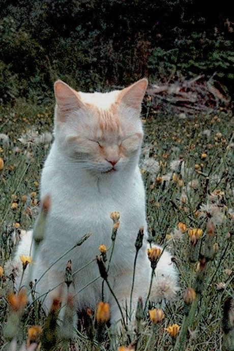
Which Aesthetic™ Colour Are You?
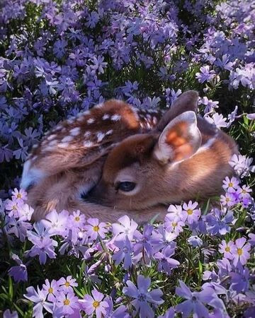
Dusty Rose
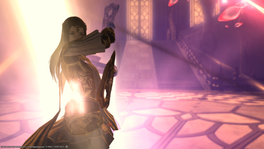
My friend, you are hella aesthetic. Everything about you is thoughtful and intentional, from the way you present yourself to the way you've constructed your space. You'd probably make the most impressive cakes. You have a few close relationships that you've poured yourself into, and you both value the little every-day moments you have together. That said, sometimes you get a bit lost in the details and forget to take a holistic look at your life. Who have you left behind? Are you happy, or do you just look it? Remember to have an honest check-in with yourself sometimes
YES! She absolutely loves that color and it suits her so well~ She often choose her glamours with at least a touch of that shade. And the description… What kind of sorcery is this? xD So true!
Thank you very much @starrysnowdrop for tagging me!🥰💖
I don't know who wants to do take this quiz because I'm kind of late, I think.
>Here is the Link < Just in case 😉
6 notes
·
View notes
Text
the key to understanding hua cheng’s appearance and how he occupies space is that he’s a transmasc goth who’s committed to red and silver as his aesthetic. ok. the layered hair the outfits the boots the chains. he doesn’t shave off his eyebrows and redraw them only because he is a shapeshifter and so his eyebrows grow the way he wants.
#tgcf#hua cheng#my visions n delusions#my hyperfixation demon#anyway footnotes:#the red is because it’s the colour of the eye he was rejected for. the name his mother gave him. the token of his saviour.#and also because they told him he was unlucky well fuck you. fuck you the colour of luck will always remind you of me now#the silver is interesting bc i read about the miao ppl which apparently hua chengs mother was meant to be member of#and only women wear those extensive silver jewellery particularly the neck cuffs#men wear smal pieces but the cultural practice is in women wearing them#so. trans hua cheng is so real so canon#but also he’s literally just a goth ok my entire vision board for him is just#glam rock and goth icons#i had a whole thing detailing his aesthetic in much longer detail but you’ll have to wait for if i ever finish this thing#tbh i might not end up posting a long headcanon piece because i’m really writing this in bits and pieces#turns out a lot of my headcanons are just extensive textual analysis that i internalised? and now i’m writing details turns out it’s a meta
116 notes
·
View notes
Text
Which Aesthetic™ Colour Are You?
Hali Aloke
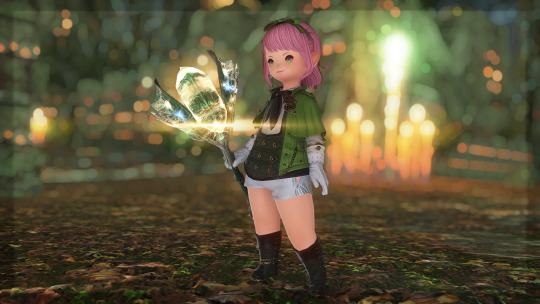
Forest Green 🌲🌳
You're in your own world, spinning fictions and building realities and finding the poetry in ordinary things. The people around you can tell there's something special to you, and you're well-loved by a some very good people. But even to your closest friends, you're a bit of a mystery. This always surprises you to hear, because you don't mean to put walls up-- you just get so caught up in things nobody else sees that you forget to let yourself be seen. You're complicated, and sometimes you get tangled in it. Don't worry, though, it's not off-putting; despite your accidental air of mystery, your warmth can be seen like a campfire through distant trees.
So this is really interesting to me because though the description works perfectly for Hali, I realized that I hardly have any pictures of Hali wearing green, let alone forest green. Luckily I have her standing in a forest wearing green here, so that works, right??
I am wondering if this is a sign to put Hali in more green glams and environments, since I was thinking of making her new custom job have a green aesthetic. Hmmmmm…
- Quiz Here -
Tagged by: @disciple-of-frost Thank you so much for thinking of me!! 🥰
Tagging: @traveler-of-light @reikatsukihana @arinaxiv @sasslett @ainyan @bnuuywol @floweramongstthecold @eorzeanflowers @airis-ray @pinxli @mimble-sparklepudding and anyone else who wants to do this! Just say I tagged you! 💖
23 notes
·
View notes
Text
@remylong :
#newest broken telephone installment#the remy renaissance#or rather standard avvycc dms. broken telephone elements include ccsims designs of my old designs plus prev hp art plus the general sepia#of everything on fire. bonus to the chromatic aberration on hp it feels quite fitting (yknow bc the chorus behind his lines..) idk vibes#this colouring style is actl terribly fun i'm quite !!! about it. i'm also glad that I made reference sheets for them all long ago bc#otherwise i would have gone insane rrying to rmb them from scratch. lately despite the rainbow hp seems to overall be turquoise blue? which#is so fun compared to the more purple/ neutral blues and greys i have in mind for mark...#anyways doing well! getting back slowly into Making things again! having fun etc etc#have been in OC-land lately but nothing i'm ready to share yet haha#so occassional bit of fanart it is. i inexplicably want to draw hands now though i was walking back home#pondering my adamandi era (mad the most insane fanart i've ever made; no recollection of it now) and after enough mulling it over#it would be nice to return to it. don't think i'm as obsessed anymore but it's certainly not lacking in inspiration#ideas are there just havent reached the sweet spot where you get so taken by an idea you're compelled to turn it to reality#and i think itwould be fun. perhaps even gratifying to set wips to rest#so maybe. in the meantime px11 brokentelephone is sustaining my urge to make miscellaneous fanart haha#melliotverse so true. wonder why despite watching taopp i haven't been compelled to draw it but i get the inkling it's just that specific#aesthetic that doesn't do it for me. <blinks> it was very good and i enjoyed it immensely! i think i just surprised myself by being normal#about a musical for once. i think also bc irl i've been more Good Busy the drive to engage in fandom has dissipated somewhat..#so overall i think it's a good thing. just different. but then again this stretch of time is a transitory period for me so changing ought to#to be expected. ah well tldr don't overthink just do what sparks joy be happy? literally so lucky to be spoiled for choice wrt things#i want to do. so much to do and see and learn and time still to get to figure it all out!
17 notes
·
View notes
Note
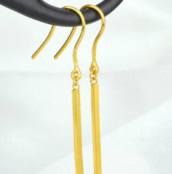
people just consistently have no concept of what goes into the art they see! like I follow a lot of artists whose jewelry is more in line with your description of what goes into your blankets than your earrings in terms of materials and time (I'm talking like painstakingly hand-beaded earrings with antique beads and precious metal findings, backed with hide that they smoked themselves) and they also get people commenting on their prices being too high :(((
yuuup
i mean time-wise it still wouldn't be that much longer. i also hand-bead details on some earrings and stuff it's still not like... a massively time consuming process or anything. blankets take 100+ hours. this choker took me 30 minutes. the necklace only a little longer, despite all the bead connecting going on there


but the materials cost of using. well. high quality materials is what gets you
there's a reason i use metal alloys and glass beads instead of sterling silver and real stone beads, and that reason is "i do not want to pay for sterling silver and real stones that shit is expensive"
(smoking hides also probably takes longer? although i feel like most of that process would be "waiting")
which is again a double sided issue of "undercharging for precious metals/stones/beads" and "overcharging for metal alloy and plastic" that made a clusterfuck baby somewhere in the middle
#gotta thread all those beads onto little bits of metal and then bend the metal into loops at either end#which is fiddly and tedious and slightly makes you want to walk into traffic#but still a whole universe removed from the time fibre arts take#nice prettily coloured glass beads can easily be 5x cheaper than like. actual minerals#babs at the stall next to me buys Actual Minerals because she has customers who believe in the inherent properties of crystals#and she's far too nice to buy pretty beads that look like obsidian or amethyst or whatever but aren't#i on the other hand am here purely for the aesthetic value. black is black#you're not catching me paying 30p-per-bead no SIR
24 notes
·
View notes
Note
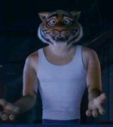
I wonder, with the possibility of having a sing 3 sequel, I wonder if Ryan would even be in it. If he would be added , I'm curious if they would redesign him to be more unique, in Sing 2 he looked like any other tiger character in the movie, considering he has the same models as the tiger background, and considering that the main cast have unique models that differentiate them from the other background characters that are the same animals as them.
I wonder what would his redesign would look like to make him more unique that removes him from the background but also relates to him as a part of the cast.
What do you think his design would be if he was added?
Thanks so much for the ask! And I'm sorry for the rambling that's about to follow this, I just really love this topic. Hope you enjoy though! - <3 Gooseless
--------------------------------------
Ryan does actually have a unique model! His stripe pattern and eye color is completely unique to him, as well as his build being slightly different. Which is why the tiger we see at the auditions is Ryan in my opinion, as legit every other tiger has the same stripes besides that one (who we actually never see audition so might just be there as a represenative).
We only see two other tigers in the movies (that I could find) and while their stripe patterns aren't the same, they are more similar to each other than Ryan. Ryan has a distinct flame shaped stripe on his left cheek. And while the other two's stripes are similar, that's because bengal tigers do have those type stripes on their cheeks.
See below the facial patterns on an actual bengal tiger:
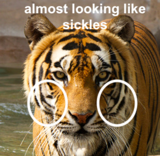
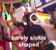
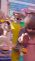
And then the stripes of the two other tigers we see:

And finally, there's my boy Ryan:
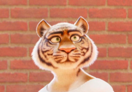
They are distinct from the other stripe patterns we've seen, no longer sickle shaped but flame shaped on the left cheek.
And while it is compressed in the auditions photo. you can see the blobs that would likely look like the other flame branches if he had higher pixelation in this frame (he's tiny and in the background).
And the other two tigers we see, though not in the best pixelation or lighting, seem to have dark colored eyes, while Ryan's are very noticeably green, and likely a shade between olive and sage green judging by how it changes in the various lightings. Even in the auditions, that tiger has a lighter coloured iris.
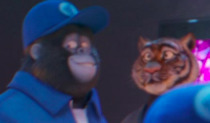
And as for builds, we'll use a handy dandy chart!

As for the other two, we actually see two different builds for them too. While Ryan is an inverted triangle (mesomorph), which is also Johnny's too for reference, the other tigers do seem to be rectangular in build (to be fair they are in loose clothing and that is my perspective of it but this also would align more with actual tigers too). They also differ from endomorphs and ectomorphs as well.

*Sorry photos aren't the best and from weird angles, they literally are barely on screen lol*
------------------
Ok now on to the redesign. The reason Ryan looks more like a background character despite his unique model is his clothing imo. Whenever we see him, he's either in a uniform (the leotard and leggings), or very plain, nondescript clothing (the costume underclothes and the suit).
So, we can fix this by giving him a new outfit! Which is amazing because otherwise we would have to change the entire model and that would take forever lol.
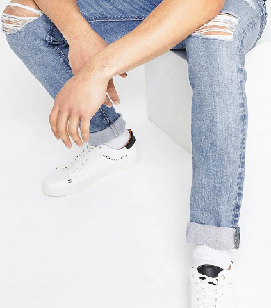
Almost all the teen/younger characters wear jeans in the movies (the exceptions are the eldest two, Nooshy and Ash) and Ryan does seem to be at least close to Johnny's age so he joins the jean club. Now adding cuffed light wash jeans to his outfit.

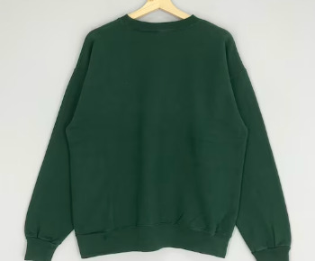
Second, Ryan gives off strong perfectionist vibes. You don't become a principal (or at least high up) dancer at a company like the one we see him in as young as he likely is without an ambitious and perfectionist streak a mile wide. So we're gonna go with something that codes that to the audience (aka yes, somewhat stereotypical clothing for that cliche), a dark green sweatshirt over a white button up. This type of aesthetic is also not used by any of the main cast so far and the dark green accent will highlight his eye color, making it stand out more and further giving him a unique look.

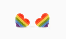
And for accessories, which please let's give these kids jewelry, I typically describe Ryan as having two double lobe earrings, with one being a long simple gold one and another that is either a rainbow heart or a gold stud. I also give him a jade and gold necklace (which is tiger shaped in the continuation fic) and have him wear dark green sneakers for more green accents. You can also add in a brown or black belt if you want so he can tuck in the sweatshirt and shirt, but those don't necessarily have to be showing.


--------------------------------------
So, yeah, that's how I would change Ryan's design to make him fit more in with the rest of the main cast! I really hope we do see more of Ryan, though I am not sold on the idea of a third movie, so I'm pretty sure I'd prefer to see him in shorts lol. But I hope you enjoyed all of this chaos of a character design analysis/comparison of sorts, thanks again for the ask!
#sing 2#sing ryan#ryan my boy#essentially i would just put him in his continuation fic outfit lol#but a character with a darker green colour palette and an academic aesthetic is not part of the troupe now so he'd be very recognizable#also would really contrast johnny's skater style which i love#gives prep and punk vibes which is adorable#if you cant tell i like character design lol#and ramble a lot#also yes i do believe ryan was supposed to be a bigger character in the movie#i mean he has his own model and is the only named dancer and could be a really cool parallel for johnny#but thats a rant for another day
7 notes
·
View notes
Note
i gotta tell you more abt my ocs sometime. smiles widely
Ooo la la...what did i do to deserve such an honour?
#i cant help but admire how much passion and joy and love and devotion each one of your pieces encapsulates#hard to express but you can really feel the movement the joy of each line each colour#how each piece has a rich attention to aesthetics and details and aaaaarghhhh im repeating myself#you never cease to inspire me boss o7#its so intimidating to see a person with all their characters so defined and even organised in a toyhouse for me personally.....#like this great monolith which you can never see the entirety of#so id be greatly honoured to hear about your ocs over a whiteboard if you delight me#tucks hair behind ear#teheee
9 notes
·
View notes
Text
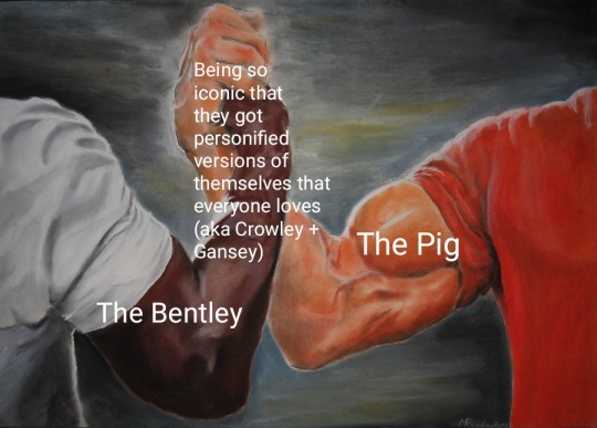
#they're the best characters your honour#i feel so many ways about gansey and the pig#like you could say gansey (narratively speaking) serves as the vehicle for the story; despite the fact that he was supposed to die#and even tho the pig keeps breaking down gansey keeps forcing it to power through#just like how he forces himself to keep going even as his time is running out#i don't remember if this actually happens but the pig eventually runs on magic instead of its engine#which is a parallel to gansey being kept alive with magic (noah and cabeswater's sacrifice)#and as for crowley; I think the bentley embodies everything that he's trying to supress#we see this more clearly when aziraphale is driving it and it willingly lets him change its colour; the music; and the speed#i always found it interesting that whilst crowley keeps trying to convince aziraphale he's not the way he is bc he's a demon#he also uses his demonic aesthetics as something to hide behind; just like how his sunglasses act as a wall between him and everyone else#he lets aziraphale assume he's used a gun before and he leans into the whole “demons lie” rhetoric#and yet the bentley is the most honest version of him we get to see bc it exists without restrictions (aside from the ones crowley imposes)#anyways it's probably not that deep lol#gansey#crowley#good omens#trc#the bentley#the pig
12 notes
·
View notes
Text


the lovely @lovenee tagged me to open pinterest, search my name + core + aesthetic, and make a 9 photo moodboard :3 this was really fun, thank u so much!!!
ill tag @burarahurricane, @grlfriends, @earlymay, @10281, @ashmp3, and @zillua to do this!!! if you want to, ofc 💖
#my name had so much dark academia + cottage core + like white lady witch aesthetic which is. well. not me!!! so finding things#was a little weird cause i had to scroll through all these browns & greys like besties where is the COLOUR#but!!! there were still some nice pictures i found :3#once again thank you for the tag nee!!! <3#tag games
11 notes
·
View notes
Text
Cannot sleep :/
#just pav things#lying awake here with Inigo meta thoughts#specifically the nuances of why he never intervened when Archie and Dism were fighting#He is torn between these two ideas of reality— whether Archie is dead or alive. That is true.#But eventually the latter idea takes more of a foothold; which is just a recipe for mental disarray#It’s a break from the comfortable cycle of self-hatred and destruction. So this new thought has to be counteracted to maintain inertia#So as I understand it he’s now caught on those lingering feelings of abandonment that Archie has left him with. and he is Not Happy.#Because just as he interpreted himself as being a replacement for Dism#He’s interpreting Archie and his little motley crew as a further refusal to move on from the past#And because Inigo acts on impulse (as seen best with the 💥 arm getting blown off) he’s using that momentary anger#to distract himself from the core issue as he lashes out ✨#He’s kind of a hypocrite that one. Stresses the importance of embracing unpleasant memories as a fundamental part of your character#(To the point of berating Idyllia for going the total memory wipe route instead)#but he is ALSO an escapist at heart. Neither of them want their definition of pain so they both have terrible routines to try avoiding it ✌#I’m sorry if this made no sense Dolphin I will probably do a retake with more braincells in the next few days#You know I’ve been analysing the design of this kindergarten in sydney for VCD#It’s called Nubo. Now I’ve always had a fondness for Scandinavian aesthetics but this is PEAK#So I went down a research rabbit hole and I came out of it with a clear concept for what Amonea Montessori School should feel like!#It’s this sort of cross-concept between stereotypical Australian architecture and hygge#Those oak panels and muted colours and glass everywhere#And I can carry through to an overall unique visual identity for Amonea#After all Byrgir should feel similarly detached from Earth in it’s own subtle ways#Tapping more into solarpunk and that overall comforting feeling for Amonea in particular~#I’m so happy :D
3 notes
·
View notes
Text
that reminds me, have you ever seen how weird they got about stimboards on tiktok? fucking wild
#luka 🦐#bf who cares (more than me) aboutt this topic take it away:#first of all stimboards don't make sense in a video format#which is why many people started complaining that stimboards don't even follow their theme#tumblr stimboards are really just gifsets of whatever visual stims a person want to see often linked to a specific aesthetic character etc#this works on tumblr bc you can put it in a 3x3 grid the very middle being a picture of your theme to tie it all together#or just another gif if you didn't have a theme#ofc it doesn't 'fit the theme' you're consuming it in an inferior way#second - people started making ''unsafe'' stimboards (with jumpscares and possibly paranoia-inducing statements)#(or something I've never seen any)#this was only really a problem because people were being disingenuous about it and labeling them as 'safe /srs'#side note: do not fucking misuse tone tags on purpose that defeats the entire point you asshole#which actually did spawn a debate about whether it was okay to misuse tone tags as part of the joke/whatever#it's not. ty for coming to my ted talk#so then for a bit we had people posting 'unsafe' stimboards and labeling them safe and deleting any comments correcting that#it got to the point where people came up with heart colour emoji codes to sneakily say whether it was actually safe or not#even now there's a lot of stimboards on tiktok with a 'not babying' disclaimer#bc I guess someone decided stimboards are babying autistic people (and decided that for every autistic person ever ofc [sarcastic])#anyway the whole thing is bonkers#moral or the story stay away from tiktok#: thank you for that#any typos are *not* being fixed because we are *not* typing all that again
2 notes
·
View notes
Note
Mayu helphelp I wanna revamp my writing blog’s theme @/bamboowrites and I wanna learn 🥺🤲🏻🪤
look at other people's blogs that you admire and mix and match the ideas from there you would find something that you might be satisfied with.
consider if the BFY and DNI are absolutely important for your blog... some people just don't bother to read those things if they are in another link. having it on the pinned post above the masterlist link can help as they end up glancing at it just dont make it too long if you do.
now the theme itself depends on what you are going for but you can go for a. pick a theme like maybe cottagecore, gothic and such and build a mood board from it on Pinterest and from those pictures choose the colours for like the accent? b. would be picking the colors first (maybe a certain shade of color, or maybe a palette you like) and then the pictures. (another idea/way could be like a "3 words" too, like my main account theme @mayulli has a star, royalty, navy theme, but not necessarily galaxy tho. My reblog account @mayullii focused more on a princess fairytale pink.)
Build a pinterest board, everything usually starts from there to be honest lolll

Now for my own... uhhhhhhhhh okay this is mainly for the people who cant pick a theme and wants them all (or at least most)
A lot of people say that sticking to one theme and staying with it is a good idea and to be honest, they are not wrong, and absolutely right it is just that I don't like staying in one theme I guess lol? Example:

Something like this! Or-

Look at all those differences hehehe. Nowhere here do you see green forest themes except for like Diasomnia (twst)? And then I also have the borders of all my writing posts:

I have like probably over 100 fic/original oneshots by now all that uses the borders above which is like alot and gonna be supppperrrr tiring to edit everything if I think about swapping everything. (will cry if I must.) but one thing is very obvious in all the pictures is that all have this pastel, soft dark, neutral tones, and has a mix of flowers, nature/outdoor and vintage themes/vibes.
I tried to make the blog as colorful as possible with the mindset that I will be changing my blog theme often. I just made the blog take all the themes that I personally like and mix and match. The forest green I currently have matched well with all the leaves in the pictures above cause of the leaves of the flowers. With an odd one here and there, but it is not necessarily painful to the eyes.
For me, with all this, I have multiple options of things I like so from like a white background which I can make it look like a canvas where the pop of colors would be from the multiple masterlists, blue where you could call it the outside/sky and the posts are the flowers essentially a garden, dusty tones, most pastel colors but more so the neutral tones like both dark and light academia would be a-okay most of the time. princesses and fairytales also~
Now what would not match with everything here would be neon colors, most bold/bright colors (my heartslabyul dorm masterlist is suffering rn cause of that red), pure black, city street and downtown, sci-fi stuff would stick out like a sore thumb for me but they are themes that I don't care for much so it is fine.
It doesn't have to flower only, to be honest if you want you can go for something jewels which has an array of colors, or maybe fabrics/clothes as like the main theme. really just make a pin board and add everything that you like and pick all the common stuff they have with each other.
Ah! one more thing that probs might help but who knows but like as you saw my twst wonderland masterlists are all different colors. So I use gray as like a divider from the main theme and the dorms. I also did the same for General/multiple characters masterlist and school staff and other characters. The gray is like a refresh for the eyes in a way (like how you sniff coffee when you smell multiple perfumes so that the scent won't mix?) so that the color of my main theme and the masterlist theme won't mix/crash in the eye much.
Genshin is genshin lol but the colours matches well with the colours of the flowers i have so it is fine. my original works masterlist is white as it was part of the white theme that i had once before, but since it is not related to any fandom it is essentially my own empty canvas (lol) so i kept it like that, naruto masterlist is obviously yellow cause... naruto lolll
#i am to be honest#not the best person to ask about themes heheh ^^'#i am bad at explaining but i still hope that this was somewhat useful#but yeah i just mainly scroll throught pintrest and pick a picture that i like#cause in pinterest when you say pick a pink aesthetic picture#scrolling down they would also show you other kinds of pictures similar aesthetic or colour to the picture that you picked#mayu mailbox#now there are those who make everything#by themselves#drawing and or editing#which are also amazing and keeps everything unique#but it really also depends on the person#hope this helps even a little
4 notes
·
View notes
Text
me: *comes into the classroom*
my teacher: oh, is it the 80s again?? *continues to list a couple of subcultures and tells me that my style is too colourful for 80s punk, except for my shirt, which is black*
#for context i have a fresh green mohawk now#also im not 80s punk im 20s punk PLEASE im the new generation#also punks have always been colourful. everyone can do black leggings but how many people do you know with self-painted band logos on them?#im not tryna fit an aesthetic im inspired by 80s punk and turning it into my own#specifically to NOT fit in! which is punk. none of us fit in so were all misfits together#like of course theres a style but its very diy and stuff so theres no one way to it anyway#punk is a style its music its a way of life its an idea its an IDEALOGOY
1 note
·
View note
Text
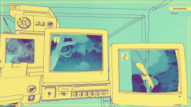
Games for Gaza is a collection of 256 games on itchio, which you can grab for only TEN DOLLARS, with all profits going toward Medical Aid for Palestinians. these are the 10 games I'll probably play myself:
Neurocracy 2049 is a mystery game, in which you solve a murder by sifting through an in-game 'wikipedia' for clues
2. Multiplicity is a short cosmic horror game, with a retro aesthetic and interesting art direction

3. Slasher U is a horror-comedy dating sim with 18+ content and very fun visuals
4. Mysteries Under Lake Ophelia is a fishing sim that looks rather peaceful.... but is it? there might be something unsettling, waiting to be found beneath the water

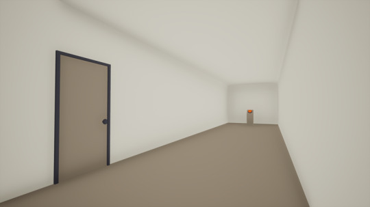
5. The Corridor is a short meta game about the experience of playing games. more specifically, about the experience of walking down a corridor. what does that mean? I don't know.
6. Nuts is an eerie narrative game about.......watching squirrels?! and it doesn't disappoint, there are a large number of squirrels. the world you can walk through looks gorgeous, with stylized surreal colours.
7. Brassica - A Marry Tale is a gay dating sim with a charming art style
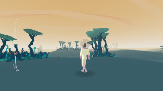
8. Orchids to Dusk is a short wandering game about an astronaut on an alien planet with only a few minutes left to live
9. Extreme MeatPunks Forever is a hybrid visual novel/ brawling sim, following the lives of a handful of gay mech pilots
10. Evolution is a game where you build lifeforms, and help them evolve to perform tasks

and that's just 10 out of 256! there's plenty to appreciate, so check out the bundle yourself
17K notes
·
View notes
Text
Since writing this post as a description of Maven I have...come up with another separate yet linked idea for her past and I can't work out which one I like more because both have such potential
Anyway, Maven being raised by her father has Potential as an idea
#Maven Witchwood#Maven Grimborn#this is the OC au i kept talking about which developed into an origin story I'm really enjoying toying with#also the light fury makes a major appearance - possibly the light fury we see in canon or possibly a separate one#oh and Maven has a change of aesthetic#(I need to colour in her design sheet to show you what I mean)#anyway...#HTTYD#HTTYD Films#HTTYD OC#Fae Rambles Into The Void
1 note
·
View note
Text
kinda annoys me that criticisms of representation in popular media were intended as a means to point out how people of colour, lgbt people, people with disabilities and other marginilised folks were systemically kept out of creative positions of power in the industry which lead to the creation of media that further marginilised them - but those conversations were mutated and co-opted. now, "representation" is mostly used as a shallow metric by which ppl judge the media itself rather than the system and people that made it. it's insane to me that people say "I won't watch succession because there's no lgbt/poc representation" or they'll say, "you have to watch xyz show because it has xyz representation". Representation and it's mere presence (or supposed absence) is not an indicator of quality in any way. moreover, discussing representation so reductively completely ignores creative intention and disregards real issues of systemic inclusion in favour of using aesthetics as a scapegoat. I need people to stop asking, "is this piece of media diverse?" and start asking, "who is telling this story, why is it being told, and who benefits most from telling it this way?". don't do yourself, art, or the fight the disservice of being reductive.
15K notes
·
View notes
Last Seen Blogs

punk-rock-art
control is an illusion
telochvovim
(i dont know myself)

groberts18ahsgov-blog
Gia's Animal Testing Blog
telochvovim
(i dont know myself)
atreuloonynew
Untitled