#with the same full scale original illustrations
Text
while im ranting about rpg stuff
there are some dudes with a really cool rpg monster-design book who have absolutely botched their kickstarter and are scrambling to crawl over the finish line before the campaign time runs out
today it was like "Friday! That means blog post day!" like guys you have been making blog posts every single day desperately trying to scrabble together a few more supporters
i get those emails cause i supported it, it's a really cool project I'd like to see succeed, but man theyve really dropped the ball. one of the guys is an 80k youtuber and they thought that would just be enough i guess?
also theyre asking for 75,000 BIG ONES like guys i have seen fully illustrated book kickstarters before. yours is UNDER 100 PAGES. there are entire original rulebooks and box sets funding for a fraction of that right now. i kindaaaa think theyre trying to squeeze out a bit of pocket money on that baseline funding goal.
honestly yeah theyre reaaally gettin a bit overconfident askin $75k for a glorified 80pg tables book in the indie rpg scene, especially for a book that's already complete?? i fully support trying to earn back your sacrifices and turn a profir on a project you had to make for free before you could sell it, but....
$75k..? 84 pages..? already written and illustrated? in the tabletop homebrew market, the most frugal "build it yourself" audience in all of gaming? ...really?
#my book isnt the greatest comparison cause i didnt have to illustrate it but...#it's the same length and full color professional layout... for free#you understand youre asking $75k for an equivalent product... and both of ours are dwarfed by other full-scale projects out there#asking for <$20k... very often <$10k#with the same full scale original illustrations#idk man i just feel like youre askin comfy corporate costs for a personal passion project#if youre flyin solo you gotta tighten your belt man#again I'd love you to make $75k plus... but is it really a minimum price to ask for? you already made the book.#wouldnt focusing on just breaking even to start be better than setting a profitable minimum and possibly getting NOTHING back?#i kinda feel like maybe it's the artist trying to put a higher “per piece” value on his work.... but...... is this where you wanna do that?#idk man maybe it's a solid plan. “Yeah WoTC my rate is 50k for 10 full page illustrations so youre lookin at like at least 5k for a page.”#national art gallery atelier dudes dont even get that much per piece not a bad hustle
2 notes
·
View notes
Text
i answer your asks vol... 6?
This one made me actually consider how they balance the humours beyond just a simply "they scour it out". Because sometimes a holy beast gets 'sick' and it's not necessarily related to any sort of tissue growth, it's more often a mechanical fault and because the beast is considered to be alive, he is then therefore 'sick'. So how do we deal with this? An enginesmith will make the necessary repairs, but sometimes the sickness is related to environmental conditions. The four humours are arranged on a scale like this:
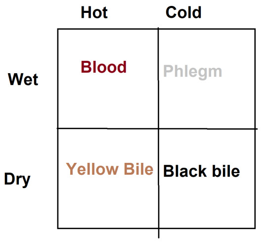
A mechanical fault associated with being too hot and dry could be something like a lack of lubrication on moving machine parts. So this would be considered the reason for a production of yellow bile (excess of yellow bile, btw, was what Pantera was diagnosed with on his last outing). Whether or not the bile is literal or more symbolic depends on the case. Anyway this was the reason Pantera is associated with fire (originally, when I was designing them all) and Leun, diametrically opposite, is associated with phlegm, water, acid, etc.
But anyway, the way to fix these imbalances in hot/cold/wet/dry is to simply reduce whichever one is excessive. In practice, keeping holy beasts maintained even when they're not out on a crusade is a full time job for an army of workers, where the atmospheric conditions need to be as neutral as possible. Too wet and you've got rust, too dry and the metal fatigues, to hot and it might warp and break, too cold and the joints won't fit properly, etc etc. Although the enginesmiths view this through a lens of The Four Humours, it's also just good practice to try to keep things balanced.
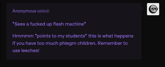
Btw while they do cure an excess of blood by bleeding the holy beast, they don't make leeches big enough :'(
-

There are illustrated representations of dragons that are pretty traditionally dragony (typically a winged serpent with many tails representing the stinging tendrils). These are added to drawings and art as a catch-all symbol for a conscious and targeted Evil. The laity, which is very devout, is unlikely to associate dragons with resistance - dragons cause a lot of damage too, and those stinging barbs will kill you just from the trauma of the impalement before the venom even has a chance to (unless you just get grazed, in which case.. the venom will paralyse you. then kill you)
So active rebellions/civil wars/wars of succession have occurred many times. The subjugated Midaean nation/territory (depending on who you ask) rallies around their beloved Saint Lycaon, a wolf. Flags and signs depicting a wolf devouring a crocodile/a lion/whatever holy beast currently tops the hierarchy of the church would be more likely. Rebellion itself is rarely black and white and as neat as picking a symbol the church hates. It is more likely people would pick a symbol that they love. Outside of Midea, the Mezian empire might not be at its peak but it also has not given its own citizens and laity a reason to take up arms against it.
at the start of the story, at least
-

awesome questions thank you @curious-sootball !
So the nerve cords inside the vertebrae are artificial, but they still perform the same physiological function as a real spinal column. They interface with a knight's dialogue. This produces an incredible amount of heat - this is why the spines are often exposed, even though that might be a point of vulnerability. The spinous processes in particular are very effective heat sinks.
But the tail? In most cases we don't need the tail, really. The spinal column ends at the base of the pelvis. The tail is cropped for most beasts on purpose - we don't need this thing dangling around and becoming entangled, and it has no machinery around it to act as replacement muscles so it couldn't move even if they wanted it to. Krokodilos's tail is the exception and it's just extremely heavy for not much pay off. That's a lot of additional engines we gotta maintain.
So the tail tends to be abandoned. The bones are kept of course but not mounted on the chassis where they're not needed. With no nerve cord running through them they don't run hot either so they won't disperse heat all that well.
Now for replacing bones... they don't. The bones that exist in the chassis are the bare minimum needed to perform the required functions - basic movement. They don't have ribs, they often don't have phalanges. A skull is there to complete the nerve cord - but all you need of that skull is the occipital bone. Nothing more.
If they break a leg, it might be repaired using screw and plate fixation. The bone may deign to knit together (enginesmiths swear that they don't allow tissue growth ever.. but sometimes you need some periosteum. Don't tell the bishops). But if it gets crushed? That's the holy beast done, scrap heap time. The majority of all holy beasts that have ever existed have already broken down and been decommissioned at the start of this story - we only have seven left (eight if you count krokodilos). Krokodilos is an unusual case because he is not dead, so they can't just hold a state funeral and add his heart engine block to the big hall of old hearts in the cathedral. He's sleeping.
But he's the exception. Take Saint Guinefort - dead as a doornail. He had a full funeral, his heart was put in the hall and his body was [redacted] like they do with all dead holy beasts. And then he was [redacted] and now our pal "Sir Victory" with the metal arm uses him as Nosewyse. Circle of life.
I think sidecar motorcycle is a pretty apt way of looking at him lmao. You don't wanna know how many people he's cooked.
-
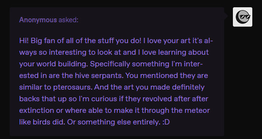
Hey there! So I know I've mentioned they are similar to pterosaurs but they are not related to them at all. In fact they are cetaceans :) Later art I did of them plays up the mammal traits a bit more. Check out these nipples
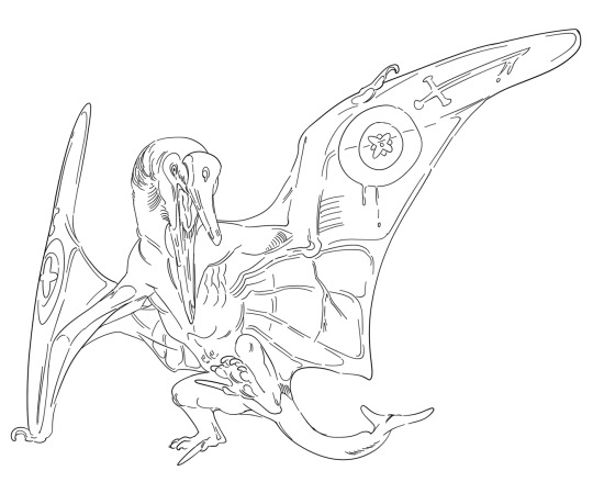
However it is a fact that they are not closely related to modern cetaceans - as in, they did not evolve from modern whales and dolphins, but belong to a side branch that diverged relatively early, around the same time dragons were leaving the water for the skies. That art is quite old too, from before I kind of nailed it all down, so if I drew them now I would remove the more derived traits (i.e the single blowhole, the tail flukes, etc) and tidy it up a little. They diverged from the lineage that would become modern whales before the pelvic limbs were lost. I originally depict them having the crowbar-like claws on their feet to lever skin parasites off the dragon, but i think they are more likely to not use their feet much at all, and are more likely to use their single huge beak-like tooth to do the job instead. They cannot walk on flat surfaces.
-

Only insects and, specifically, winged insects :) I know it would be really cool to have various other giant arthropods but milennia ago, when they crossed into Thera for the first time, insects were the only fliers. And there is no other way to get over the mountain range quickly enough for it not to kill you. The mountain range in which the endless city sits is completely and 100% devoid of life. A journey on foot for a tiny bug would be next to impossible - they are more likely to starve or simply turn around and go back to where the food is.
The winged insects, otoh, can cross the range in a day or less, if the breeze is flowing right. And they would find plants already there in Thera - also solely wind-dispersed species from the previous time the mountains arrived and linked the world with Earth. The insects didn't really come by choice, sometimes the wind just blows the wrong way, but they definitely got lucky.
There are wingless insects in Thera today but only because they lost that trait over time (like ants or larviform female beetles). They have managed to colonise every reasonable habitat, including the sea (though the sea is not very salty) and have developed into a lot of very strange forms which might be unrecognisable to us. But a lot of them just got bigger and smarter.
This time round, in the period of time the story is set (early 1900s on earth), the mountains appeared and new animals crossed over who were not insects. Birds have become invasive in Thera, happily taking advantage of the smaller insect species who are completely unprepared for this new threat. There are also some wind-dispersed spiders hanging out now.
EDIT: oh i forgor the parasites on the flying insects that first colonised thera... yes they would have mites and horsehair worms and things of that nature
153 notes
·
View notes
Text
Idk in my idyllic world the use of ai could improve animation workflow and catapult junior level artists into creative leads roles faster if there's less menial work to be done.
We could have artists still in charge of creative decisions and drawing vis dev while the computer assists with the most labour intensive steps of making shows or movies.
For simpler shows for instance it would be neat I think if you could run your storyboard through a script and have the machine import all relevant assets staged to the best of its abilities instead of manually having to drag props and rigs into your shot and scaling everything before you can even begin to animate (does that tech exist already? Probably).
Like nowadays we already have animation programs where you can set deformer limitations.
youtube
i could imagine a possible future where software includes or does subscription services to ai trained on work by artists who got paid to draw or animate template motions or anatomy references. something like generating smart bones could become an automated feature. i can maybe even foresee tech that can look at a character model or design sheet you've drawn and generate a rig for it. in all these scenarios you would have to correct stuff and tune things to your liking, but it gives a considerable head start to the work.
More dynamic shots could be made on smaller budgets if we gave ai props or backgrounds and said "give me this but rotated a little" instead of drawing the same damn chair from 10 angles as a prop artist, I refuse to believe anyone's passion in life is to make prop turnarounds or clean up inbetweens.
what if you had an ai that was trained on drawings of heads at every angle, animals in every angle, a slew of expressions and mouth shapes, then gave it a character ref drawn from a few angles and bam it makes the vtuber rig for you.
this still leaves space for original art and would still require a skilled creative to make something look it's best, that could be a gig. more animators could potentially begin their own smaller studios if cartoons are way easier to make. if anyone could potentially make their own movie in the future, charge people to do it right! no computer can replace a human knowledgeable in film or drawing to guide it in the right direction. without creative people at a production's core, i think the future of ai film is just a very, very, sophisticated version of goanimate than can also do art theft.
this could become the weird futuristic version of "i wrote this children's book can you illustrate it for me?" but instead your mom's friend wants to commission a show pilot they wrote a screenplay for.
When animation was drawn on cels we had entire painting departments whose job it was to paint each individual frame by literal numbers, and it was tedious!! Now we have the paint bucket tool for digital coloring, and software like Toonboom lets you color in one frame then generate the coloring for the proceeding frames. We still have a colour and painting department, it's just different work now. but now we also have people making full color cartoons from their basements because Flash was released for personal computers with said digital tech along with computer generated motion tweening for animation!!
Junior animator and junior bg painter or prop artist roles will probably face an overhaul where more work can be done with less people. But the utopian outcome would be these junior artists can sooner take up lead or supervisor positions where they get to execute their own ideas instead of someone else's. more shows or movies could be produced with less crew for less money, slashing costs when deciding what to greenlight or to take a risk on new talent. The problem is capitalism would make it suck because it only cares about exploiting workers for those cheapest costs possible and forego the necessary human crew required to make the difference between machine-assisted productions and pure ai generated slop
#my thoughts on ai#as someone with a degree in animation whose worked a bit in several parts of production pipeline
171 notes
·
View notes
Text
A Gift for Jazz Fans: "The Mission"

The annuals that are part of the Marvel UK comics continuity have some great stories in them. Somehow, I hadn't known one of those was "The Mission" by Jamie Delano from the 1986 annual until very recently. I've always wanted to see more of Jazz's inner thoughts and feelings explored, and this story delivered on that and then some. It provides really interesting answers to the question, "Underneath it all, who is Jazz, at his core?" (Plus, it gives Hoist a rare chance to show off his skills without being eclipsed by others.) It provides complex characterization of Jazz and his personality that would be great to see return in newer media.
Head below the cut to read on! I've provided the full story and the illustrations.
The Mission
It was a monochrome world. The onset of the Alaskan winter had clapped the wild land in irons, squeezing the colour from the mountains and the sky. The black-toothed peaks chewed at grey clouds, swollen with snow.
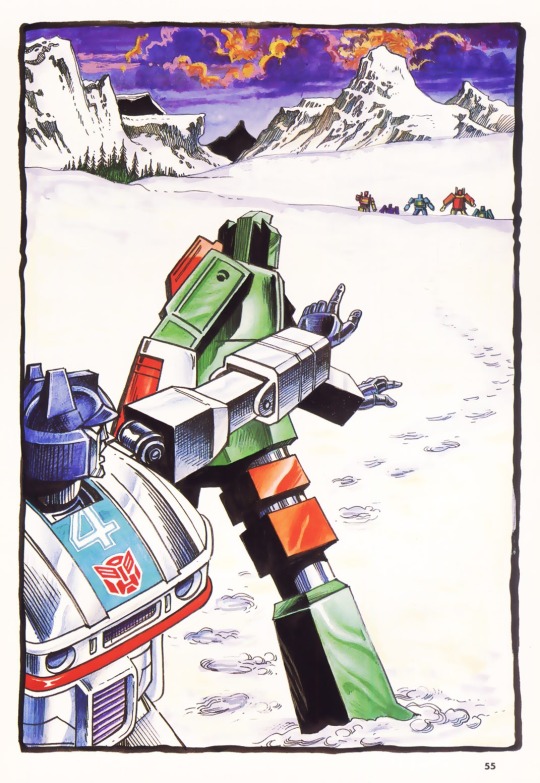
Jazz, the heroic Autobot, was undismayed by the cold. He found the gigantic landscape exhilarating in its scale, its grandeur more a challenge than a threat. Although, in his current mode — disguised as a Porsche — the freezing conditions caused him some minor problems with traction.
He hugged himself closer to the frosted surface of the Alaskan highway and accelerated northwards. The road tested him as it writhed its way across the land. Jazz chased it, with the thrill of perfect control pulsing through him. He slid — broadsiding through the curves — and climbed through the howling gears, arrowing into the straights, cutting through an occasional brief convoy of toiling trucks, like a barracuda through a shoal of jellyfish. The stillness of the massive land invited speed — its silence, noise.
This landscape dwarfed even the Autobots, he thought. How it must oppress and torment the humans who came here! Their design allowed them only marginal resistance to temperature fluctuations. Thankfully, in this, as in most other aspects, Autobots were far superior machinery.
Jazz considered the force which drove him at such speed towards the heart of the Yukon region on the boundary between Canada and Alaska — the perpetual, Earthbound war with the Decepticons. This mission, on which he had embarked with his comrade, Hoist, should have been a straightforward one. A simple observation of the Constructicons, perhaps rounded off with a bit of simple sabotage for good measure. However, something had gone drastically wrong.
Jazz squeezed a few extra revolutions from his motor. He needed to hurry. There were still one hundred miles to cover before he must leave the road, then the same distance again across difficult terrain, to bring him to the origin point of Hoist’s signal. He had not realised that their line of communications had become so extended. It was bad tactics. With enemies as dangerous as the Decepticons, mistakes could be costly.
ACTION AT LAST!
Despite a sense of foreboding, Jazz could not deny that the action was doing him good. He had been idle for too long. For three weeks he had been locked in a freight container. First there was a week, en route from San Francisco to Skagway by sea — a journey which had stressed his balance circuits severely. Then, a further two weeks in a Skagway freight yard, with all systems shut down to conserve fuel. Listening watch only, had been the orders — it had seemed like eternity. When, finally, the brief signal had found his eager antennae and tripped his systems into life, it had not been the one he was expecting. It had been a single brief transmission on the Auto- bots’ Urgent Distress Frequency.
Hoist had done good work as a scout in the past, Jazz had thought as, gunning his powerful motor fiercely, he had cracked out of the steel container as if it were tinfoil; but he lacked flair. He was too methodical for fieldwork. He was a workshop machine, maintainance was his strength. However, with the Decepticons fighting on so many different fronts, the Autobot warriors were spread too thinly. All hands were pressed into service; constant opposition to the enemy was vital. Now Hoist had got himself into trouble. Jazz hoped that his comrade had not tangled with the Constructicons. They would turn him into scrap and use him to make rivets.
Like a snarling bullet, the Porsche ripped into the sub-arctic night. In his riotous wake, snakes of powdered snow writhed, hissing from the road.
SHREWD TACTICS
Until he had stepped into the hole, Hoist had been well satisfied with progress of his mission. It had been no easy task to locate and observe the enemy unit in such haphazard and gargantuan geography as that of the Yukon territory. A city could be lost and never found here. But by shrewd tactics and thoroughly practised techniques he had accomplished his task.
He had tracked the Constructicons and for three days he had waited motionless in the dark, cold, shadows of the mountainside. Only his powerful full-spectrum scanners operated in this time — locked onto the activity of the Constructicons, as constantly they mined and tunnelled their way into the permanently deep-frozen silt of the river plain below.
Whether it was a tactical base they were building, or a mine for some kind of mineral fuel source, Hoist had been unable to ascertain from long range. So, as the Constructicons had now become invisible to his sensory receptors — other than as a clatter of indistinguishable industry beneath the surface of the ice- bound ground — he had deduced that the risk involved in a covert, close-quarters reconnaissance of the target was acceptable.
He had raised his massive bulk to a vertical position. Ice which had lacquered him burst away from his flexing joints in small crystal explosions as the Autobot manoeuvred his frosted form down towards the terraces of the frozen flood-plain.
Conscious of his high sensor profile in this open country, Hoist had kept low, hugging the occasional rocky shoulder with which the mountains nudged the ice-skirted streams towards the river. In this fashion he had approached to within half-a-mile of the enemy’s subterranean work site.
DISASTER!
Then, crossing a low ridge-top with all sensors locked firmly onto the target — alert for the sudden, searing light of a laser — waiting for the rush and metal- tearing fire of a missile — Hoist had stepped forward into nothing. Sudden, split-second, bottomless, unknown, no- thing.
With a gyro-wrenching jolt the drop had stopped short and Hoist was trapped, suspended, held by the shoulders in the impossible grip of the earth frozen hard as granite. His huge legs had flailed at emptiness in wild, futile, energy expenditure and his torso had flexed and strained against the immovable walls of the pit into which he had fallen. Then came realisation that a moment of carelessness had brought potential dis- aster on him and his mission.
He had fallen into some kind of vertical shaft — not a natural feature — and was now wedged with his arms trapped uselessly by his sides. Worst of all, his head and the armoured dome of his shoulders were sticking up above the surface of the ground, like a beacon for the first Constructicon who surfaced for a routine defensive scan. He had decided to risk a brief emergency trans- mission, calculating that even if the enemy intercepted his signal and destroyed him, Jazz would still have the target’s location.
As the frozen hours passed, there was wind. With the wind came snow — swarming out of the darkness liked crazed bees. The Autobot scout waited. He could do nothing else.
ROUGH TERRAIN
After leaving the Alaskan highway and enduring twenty miles of cratered dirt road, until the risk of mechanical damage began to outweigh the benefits of speed, Jazz reluctantly abandoned his Porsche mode and transformed.
There had followed eight hours of slow, zig-zag navigation through a savage landscape. He had climbed boulder-strewn mountain passes and ploughed, stumbling through drifted fields of snow. The wind drove constant flights
of ice needles which scoured him abrasively, periodically clogging his sensory receptors, blinding and disorientating him as he struggled to make his way towards the source of the distress signal.
His sensors determined the location of the Constructicons easily enough. Briefly he considered a lightning, maximum fire-power strike on the concealed installation. But however tempting the prospect of entombing the Constructicons in a crypt of their own manufacture, Jazz's priority had had to be to ascertain the fate of Hoist. He thought he detected traces of Autobot alloys — but the geometry of the image was wrong.
Apprehensively he went to full scanner power and focused. Out on the snow carpet he now distinguished the head and shoulders of his comrade. The Constructicons must have destroyed him and left this wreckage as a warning — or a trap. Fascination and dread drew Jazz down onto his belly and he furrowed forward through the snow, armour grinding on the hard ground beneath. His weaponry was ranged and armed.
As he drew near to the remains of Hoist, he was fine-tuned to a hair trigger of violent reaction, expecting a Constructicon ambush at any second. So, when suddenly his comrade’s head swivelled towards him and spoke, it was unfortunate, but not surprising, that Jazz reacted in the way that he did.
Hoist had remained completely still as the snow hurried down around him, covering his body and the pit. Once more he had shut down all systems except for perception, to minimise the chances of detection by the enemy and to conserve fuel. When, eventually, he sensed movement behind him he knew that it must be Jazz. Gratefully he turned to greet him.
RELEASED
His comrade’s action was spontaneous — and ultimately disastrous. At the sound of Hoist’s voice, Jazz flipped over in a blur of motion. He snapped into an attack position and Hoist saw the Autobot’s photon-rifle lurch as it discharged a concentrated gem of solar power into the Constructicon position.
“Why?” Hoist asked, bewildered. “Why did you do that?”
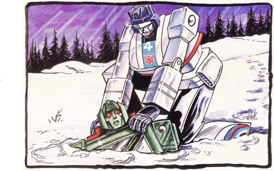
As soon as he had fired, Jazz realised he had responded more like an untested junior warrior on his first mission, than a hardened Autobot commander. He had jeopardised their position in the extreme. He recovered his equilibrium and sprang into action. Straddling the pit, he bent and thrust down his arms to find firm purchase on the smooth, hard armour of the trapped Autobot. Enormous feet chewed into the frozen ground as machinery stressed and levered. Jazz increased power to maximum and, slowly, the dead weight of Hoist began to lift from the pit.
“Trust you to come all this way without mishap and then to fall into a gold-mine at the last minute!”
“Gold-mine?” replied Hoist, as his shoulder armour screamed in friction with the rock-hard earth.
“Do you mean that humans would endure these conditions to dig a useless metal from the ground…”
“They have no logic.”
Jazz would have liked to explain what he had learned of the Klondike gold rushes. How hundreds of thousands of men and women forced their way into the wilderness — enduring misery upon misery, deprivation upon deprivation — in order to win riches and respect. But he knew that Hoist would not understand — and the time was inappropriate.
With an ungainly metallic slithering, the bulk of the freed Autobot tangled him into the snow. Jazz extricated him- self and was about to suggest that they made a hasty strategic withdrawal when he was distracted by a sudden prickle of light from the enemy position. He barely had time to acknowledge this as laser fire, when the world turned red and then disappeared in a flare of purest sterile white.
Clumsily rolling into an operating position, Hoist saw and felt the vicious lines of laser light cutting the air and boiling into the snow around them. Instinctively, he returned fire, his arm launching a covering pattern of heat-seeking missiles which charged, vapour trailing behind them, into the enemy emplacement. He looked for Jazz — and was dismayed to see him stationary and fully exposed to the Constructicon fire. Hoist’s expert eye scanned for damage — and found it. Jazz had been hit in the side of the head.
The armoured steel, still glowing faintly, was puckered around a small, neat puncture. Hoist knew that the Autobot’s sensory and logistical circuits — a complex honeycomb of micro-circuitry — must have been powdered by this hot-shot.
The Constructicons were fanning out, trying to surround them before moving in to finish them off. Hoist had to get both of them into concealment, or a strong defensive position — or they were doomed.
Fortunately, although Jazz's logic circuits had been re-structured by the laser, his motor mechanisms were unimpaired. Bellowing wildly, Hoist bundled him frantically towards the sheltering slopes of the dark mountainside. With fortune and the inaccuracy of the Constructicon marksmen, they might just make it before they were overrun…
CONFUSION
Abruptly, he was aware that he had been moving for a long time.
Who was he? Where was he? Why was he?
What was that thunderous voice that roared in his head? Why was he being pushed, slipping, sliding, crashing and reeling through the jagged black and soft white of this place?
On a ridgetop, he stopped and turned to consider his tormentor, a powerful machine of destruction and violence. He struggled to frame intelligible sounds, but a siren wail that seemed to mimic the wind was all that burst from him. Simultaneously, a splash of fire blossomed beside them, throwing out shoots of rock and ice which rattled and punched at his metallic hide.
He was still listening to the complex percussion of the falling debris, when the violent machine swung a mighty arm and struck him a ringing blow. Surprised and unbalanced, he toppled and fell, limbs scrabbling wildly for grip where there was none. Then he was moving, accelerating downwards in a reckless exhilaration of speed, cleaving up plumes of soft, white powder. He was out of control.
“Move! Move!” Hoist roared in frustration. His damaged comrade stood, vacant, as if engrossed in some strange entertainment. Hoist shoved him again, as he had been shoving him for hour after mountainous hour, mile after ice-bound mile, trying desperately to keep ahead of the pursuing Constructicons.
He watched for a second as Jazz tobogganed down the ice-slope and then, spurred on by the laser fire that pierced and shattered the black rock around him, he too launched himself on the armour-rattling descent.
If Hoist’s navigation was correct they should have cleared the high peaks now and should soon be able to make the tree-line and find forest cover. Fifteen hundred feet below, he came abruptly to rest at the foot of the ice-slope. He shook free the snow that had compacted itself in his scanners and looked for his hapless companion. Locating him, Hoist groaned inwardly — more aberrant behaviour!
The second-in-command of the Autobot Warriors, right-hand of the great Optimus Prime, was sitting atop a large snow-clad boulder — his attention rapt upon six balls of compacted snow, which he manipulated skillfully from hand to hand, managing to keep them all airborne and mobile.
Juggling. In the midst of a potential battle-zone, he was juggling! Still, at least there was nothing wrong with his co-ordination, thought Hoist.
COVER AT LAST
After several miles of difficult descent through a boulder-choked gully, they entered the forest.
Hoist felt marginally more secure as they moved between the trees. They would help screen them from the Constructicon scanners. His damaged companion, Jazz, seemed to be inhabiting a different world. He had lost all awareness of their mission and the danger they were in. He sauntered along, stopping to investigate every feature of their environment in minute detail, as if each held the secrets of the Universe. It was highly tedious and Hoist wasted critical fuel in constantly prodding the Autobot onwards.
Hoist had calculated that their fuel reserves would not take them beyond reach of the enemy. They were going to need transport. A vague plan was forming in his logic centres. He knew that, mathematically, its chances of success were slim; but the only alternative was ultimate destruction at the hands of the Constructicons. They must press on to the south. They needed a river.
Simultaneous with the awareness of a distant crashing and shattering of timber which assailed his senses, Hoist realised that Jazz was no longer with him. Desperately he scanned, trying to locate his comrade’s metal bulk amongst the distracting ghost images thrown back by the trees.
Jazz sat as if sculpted from the landscape. His attention was wholly focused on a stunningly perfect piece of machinery. Four delicately precise limbs supported a powerful, lithe, brown torso. The head, set atop a strong flexible neck, bore strange, spreading antennae with which, for some mysterious purpose, it scraped at the column of one of the tall, static machines.
Suddenly, the entrancing machine froze. Briefly, it cocked its head to one side and then was gone. Disappointed, he turned to find the Violent One shouldering his way through the densely packed columns, like an avalanche.
DEVASTATOR!
Hoist knew from the scale and volume of the fast closing pursuit that the Constructicons must have combined into their awesome composite form — Devastator. Frantically he bullied the unwilling Jazz through the clawing forest. He was urged both by the horrendous tearing of timber, as the gargantuan Decepticon machine levelled all before it in its single-minded desire to annihilate them — and by the fact that he sensed the presence of water ahead.
In seconds they broke from the trees and stood on the rocky banks of a river.

Instantly Hoist was assailed by doubt. A hundred yards upstream the towering, curved, concrete wall of what he recognised to be a hydro-electric dam spanned the river gorge. What should have been a violent torrent was reduced to a sedate surge. Surely the water would not have depth or power enough for his purpose. Nevertheless, with Devastator’s ruthless destruction of the forest rending the mountain air, he knew that defeat could not be contemplated. They were Heroic Autobots — the conflict would continue to the end.
Quickly Hoist selected four tall, thick pine trees. With a series of rapid, powerful movements, he felled and stripped them of branches. Then he manipulated them into the water. It was barely deep enough to float them.
Hoist sensed that the end was near. They would have to stand and fight.
Fifty yards downstream, the mighty form of Devastator ripped, splintering out of the forest. Remorselessly it scanned the river gorge for its enemies. Hoist primed his weaponry and looked for Jazz. In full view, the damaged Autobot was standing, facing the soaring wall of the dam, calmly scanning it from top to bottom and from side to side.
CAUGHT IN THE OPEN
Ugly, he thought to himself. This wall was ugly. It should not be here, obstructing the flow of the water. The water was a part of the big machine that was this planet. The planet was part of the solar system and that was part… The wall was wrong.
Sounds from behind turned him. Two things were happening. The Violent One who harrassed him constantly, was approaching at speed and beyond him a gigantic machine straddled the river, crushing boulders to powder under its enormous weight. This giant was pointing at him.
Then the Violent One cannoned into him, slamming him back into the ugly concrete of the wall. At the same moment, from the pointing arm of the giant machine, a light flared out, like the light of suns. Energy crackled past him and solid heat chewed into the wall, concentrating on a patch which suddenly spurted water and steam in a glittering power-jet.
Then the Violent One was dragging him again. The pulsing light danced from the giant's arm several more times but it did not touch them. The Violent One reached suddenly for his head — and then there was nothing at all.
FINAL CHANCE
There was a chance, one final, desperate chance. Hoist saw it and took it. The ten-thousand degree pulse of solar energy which Devastator had launched at Jazz had punched a hole straight through the dam. Hoist saw cracks, beginning as filaments but rapidly spreading into a web which crumbled from its centre. He knew that he had but scant seconds.
He dragged Jazz to where the tree trunks bobbed and lurched, side by side on the slowly rising river. With the quick, deft skill of an expert mechanic, he shut down Jazz’s systems completely. He just had time to lay the disabled Autobot on the loose raft and throw himself on top — clenching and binding the tree trunks together with his own huge strength — before the dam disintegrated.
A mighty, surging roar of water boiled into the river gorge and plucked up the cumbersome vessel like a feather, spinning and tossing it forward in a wild freedom of escape.
An image, which would remain in Hoist’s memory banks forever, swept by. In panic and alarm, the Constructicons had disassembled from their Devastator mode as the churning wall of water spewed over them. In a split second they were submerged — bowled and scraped along the bottom of the gorge like pebbles — whilst the Autobots’ raft surfed over them on wild wings of water.
The mission was over, thought Hoist. They had failed, but not completely. The war would continue and he and his comrade Jazz, repaired by Ratchet, would fight the Decepticons again.
Two days later, at a back-road gas- station, just south of the Canadian border, a sleepy pump-jockey was surprised to see a towtruck towing a battered Porsche that looked as if it had been in the wars. He was more surprised, as he watched them disappear down the road, to realise that it had no driver. By Jamie Delano.
#Jazz#Hoist#transformers g1#transformers marvel#I adore how Jazz zones out on a boulder and juggles snowballs and also marvels at the beauty of nature#And between this and the snow-bot moment from the Sunbow cartoon I will always associate Jazz with snow#Constructicons#Devastator
26 notes
·
View notes
Text
Yoshitoshi Abe Lain Illustrations - ab# Rebuild An Omnipresence In The Wired

So, for the uninitiated, this is essentially the Serial Experiments Lain art book. Of course, there's more to it as it's also Yoshitoshi Abe's art book, but there's details of the world and concept of Lain, and even stuff in regards to the JP only PlayStation game for the series.
Anyways, what I'm incredibly excited over is the fact that this is not only the limited edition hardcover version, but that it's also the English version. Yeah, this got printed in English once upon a time. I'll explain the history at the end, first some examples of the contents (which are incredibly cool).

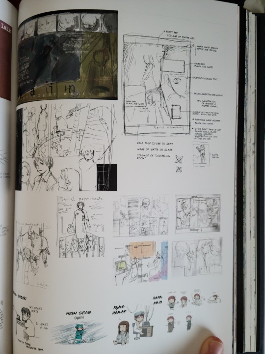
The front/initial pages of the artbook have these really cool translucent pages featuring Lain on them that mesh with a background page behind it and create a really interesting effect when you first open up the book.

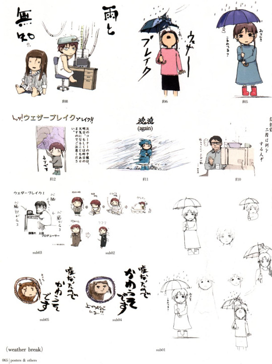
Equally as interesting is that the majority of the color illustrations in the book have their black and white sketches/drafts alongside them. It really gives you an idea of the level of detail and quality of the illustrations throughout.
And of course, it's not just pure illustrations that are in this book, there's more. There's an entire full color comic/short manga in here as well, and is fully translated of course in the English version.

It's not anything that's really out of this world, but it's very interesting and super cool to have in English.
There's really a lot of dialogue/commentary in this art book that makes having the English version that much cooler really. There's an entire page covering technology like the Psyche chip and there's even a short essay/prose towards the middle of the book too.

And of course, to polish it off there's a lot of interesting concept art pieces too. It's really great seeing the how broad the look is into Abe's style and Serial Experiments Lain in general.
Now of course, the backstory. English manga publishing has some very dark days at the start of the 21st century. The amount of independent and small scale publishers was massive, and a great many went out of business before they could be picked up by a larger company. This results in a massive amount of lost manga and other content floating in the abyss that is the industry's early days. Alongside this, in a booming digital market many publishers are hidden in the cracks of the larger companies. Digital Manga represents a very odd middle ground between these two.
Digital Manga used to print books, such as this art book they published in 2006. However, since 2011 they have had to resort to Kickstarter campaigns to publish any physical media, and their most recent campaign seems to have been in 2015. Since then, Digital Manga has coalesced and assimilated with several other online and physical publishers to produce some rather obscure lines of physical and digital media. It's quite an odd story to try and explain because of how many pieces there are to it, but essentially in one way or another, Digital Manga has survived while shedding the vast majority of what it once published, leading to books like this one to be incredibly rare. So you can imagine how excited I was when I found it for under 100CAD, when even the JP versions are selling for closer to 300.
Also, a quick aside. This art book is technically a remaster/re-release of the original Serial Experiments Lain art book. The first, simply titled Serial Experiments Lain - An Omnipresence in the Wired, was release in 1999, while this art book was released in 2005 in Japan and 06 in North America. However, these two books are not the exact same. The layouts of pages are different for one, such as the difference between the two below. And even then, the content of the pages themselves can differ and change between the two. There are pages and illustrations that don't exist in the original that do in the remaster, and vice versa. So diehard fans (like myself) may want to pursue the original as well.
(Left is remaster, Right is original)
So yes, this English hardcover version is painfully uncommon on the internet, let alone at reasonable prices, so I'm incredibly happy to own it. The detail and information in the book is so awe inspiring, and actually owning it seems like a dream still because of how expensive Lain stuff is on the internet.
#serial experiments lain#yoshitoshi abe#lain art#omnipresence in wired#anime#anime and manga#anime art#anime art book#yoshitoshi abe art
172 notes
·
View notes
Text
Todays rip: 25/09/2023
Aquarium in the Ocean
Season 6
Featured on: SiIvaGunner's Highest Quality Rips: Volume FF
Ripped by Zielony Szpieg
youtube
If you ask any avid SiIvaGunner fan to recount the most important parts of Season 5, you'll find two songs to be nigh inevitable to be brought up. There's many concise ways to identify the fifth season by today - it was one of the lightest years on the channel in terms of new lore, it was the season tasked with succeeding the indescribable scale and success of the King for Another Day Tournament and its celebration the year after, it saw the official debut of SiIvaGunner Fusion Records, and it overall was one of the highest-quality years in terms of rips uploaded. Yet two icons remain dominant in the minds of many a SiIvaGunner fan, two songs that caused an absolute uproar during their heyday - Astronaut in the Ocean and Yankin'.
Its hard to really overstate just how much chaos these two songs alone put the channel audience in: I once previously tried to summarize it all in my post on Knowledge of the Depths from the same season. Put simply, Astronaut in the Ocean began to appear frequently in low-effort, unsynced mashups in reference to its origins as a TikTok meme, which gave it a sort of perception as an anti-hero for the fanbase - the joke that, no matter what it was attached to, would never even try to deliver something that sounded conventionally "high quality". If the astronaut was an anti-hero, Yankin' was a full-on villain - the crassness of the song paired with the somewhat hard to listen to vocals and immediately identifiable beat made the song into a source of downright hatred within the comment section, on a level only really previously matched by Season 1's "Bean" (more on that guy at a later date). It was fascinating, for a year without much in the way of proper story progression, to see so much community discourse still happen althesame regarding the state of the channel.
Months later, when Season 6 arrived, the dust had settled´. Astronaut in the Ocean had gotten a sort of cult following for its apathetic, inconsistent use in rips very much unique to it, and Yankin' even had its own takeover, to directly address and cement the meme's status as a villain on the channel. The memes are now a staple of SiIvaGunner despite - or perhaps because of - our ire, and they've been infrequently appearing in rips the same way that Grand Dad, Snow Halation, The Nutshack and so many others oft would back in the early days. And to me, no rip better illustrates that new status quo than Aquarium in the Ocean.
Aquarium in the Ocean follows the style of several rips preceding it as a "mashup medley", most easily comparable to something like Memey Hell from Season 1. While that rip acted as a sort of celebration to Season 1 as a whole, Aquarium in the Ocean feels like it does the same for Season 5's two big jokes as discussed above. Despite featuring both the Season's bringers of hell, they're used in very genuine, serious ways - Astronaut in the Ocean leads the song off and is actually, for once, tuned to the original song's key, and Yankin's vocals play surprisingly softly when paired with different instrumentation. The two are blended together with several other memes from the channel's history, be it old-school like Soulja Boy or more recent ones like Barack Obama vs Mitt Romney's Epic Rap Battle of History - its a sort of scattershot selection of jokes, yet each one is given enough time to sink in as funny whilst matching the Aquarium Park instrumental backing quite nicely.
Really, though, above its quality and sound its the meaning to the rip that I really care about. There's no longer any sort of panic in the comments over the presence of Yankin' - many are even surprised and delighted to hear the track finally sounding *good* in a rip. The two are now just jokes amidst the many others, accepted tools within the arsenal of the SiIva team - and permanent member of the channel's family. I can't say if Aquarium in the Ocean was really the rip to cement that, but something about its assortment of various jokes paired with its somewhat sentimental sound really carries that energy through. Zielony Szpieg, as far as I'm aware, is someone who submitted this rip to the team through email as a fan, and they did an excellent job at both making a good-sounding tune and something surprisingly poignant for the subject matter at hand. I know not how to contact him or if he'll ever see this, but if he does: Ya did good!
#todays siivagunner#season 6#siivagunner#siiva#Zielony Szpieg#sonic#sonic the hedgehog#sonic colors#sonic colours#sonic colours ultimate#sonic colors ultimate#sonic prime#sonic frontiers#sonic superstars#sonic music#astronaut in the ocean#yankin#Youtube#Bandcamp
16 notes
·
View notes
Text
“In six months, you’ll go home, having received a pardon. (…) Those who come with us and on the first day say, ‘I ended up somewhere I shouldn’t have’, we’ll mark a deserter and execute. (…) You have five minutes to decide.”
So said Yevgeny Prigozhin, self-confessed founder of the Russian private military company Wagner, to a group of inmates at Penal Colony 6 in Yoshkar Ola, capital of the region of Mari El, 645 kilometres east of Moscow. After the video from the prison surfaced in September 2022, the same pitch went out to convicts across Russia.
But on February 9, Prigozhin confirmed in a response published on social media to a Russian TV station that Wagner had ceased hiring convicts. “We are fulfilling all obligations towards those currently working for us”, he wrote.
As Bellingcat has previously reported, Wagner originated in Ukraine back in 2014. This private military contractor has risen to newfound prominence following Russia’s full-scale invasion of the country in February 2022, most recently amid the fierce battle for Bakhmut in eastern Ukraine.
Extensive news reporting in recent years has illustrated Wagner’s operations not only in Ukraine but also in Syria, the Central African Republic, Libya, and Madagascar, among other countries. In January, the US Treasury went as far as to label Wagner a “transnational criminal group”.
As analysts from the Carnegie Centre put it in 2019, Wagner’s usefulness lies in the fact that it can do, or claims it can do, what the Russian state and its formal institutions can’t. It is “a vehicle the Kremlin uses to recruit, train, and deploy mercenaries, either to fight wars or to provide security and training to friendly regimes.”
“It is quite clear from the preparatory work that went into building the Wagner Group’s profile ahead of the February 2022 invasion that [Russian President] Putin counted on being able to use the Wagner Group to fill gaps in Russian military units”, said Candace Rondeaux, a Professor of Practice at the School of Politics and Global Studies at Arizona State University, in an interview with Bellingcat. “All the evidence has long pointed to close coordination between the Wagner Group’s leadership and both the GRU and FSB [Russia’s security services]” added Rondeaux, who has researched the Wagner group in depth in a series of reports.
Due to Wagner’s secretive nature, it can be difficult to verify the number of fighters it commands, As of January 2023 estimates by the US and British ministries of defence ran to at least 50,000, convicts or not. The head of Russia Behind Bars, an NGO which protects the rights of prisoners, says that figure is convicts alone. Rondeaux told Bellingcat that she did not find these estimates credible and believes that they are “likely based on the some 30,000 men who are counted as missing or released from prison since the start of the war”.
Whatever the figure, Wagner has grown significantly since its inception. The fact that the group operates openly at all suggests that its usefulness to the state is recognised – although private military contractors are technically illegal under Russian law under Article 359 of the criminal code, in 2018 Russian President Vladimir said that Wagner does not break Russian law.
So Prigozhin’s promises to these prisoners also have a presidential pedigree – Russian presidential Kremlin spokesperson Dmitry Peskov admitted on January 27 that Putin is indeed issuing pardons to convicts who fight for Wagner, noting that one of them received a medal from the president for his “heroism” in Ukraine.
Local media reported Wagner recruiters visiting prisons in every corner of Russia – Tyumen, Chelyabinsk, Kemerovo, the Khanty-Mansi Autonomous Okrug, and many others. RFE/RL’s report from a prison in Primorsky Krai noted that over 100 prisoners are often enlisted in each recruitment trip. Prigozhin has also taken foreign citizens from Russia’s jails; one man from Zambia and one from Tanzania have died while fighting for Wagner in eastern Ukraine. According to news reports, both men were studying in Moscow before being imprisoned for drug offences.
At the Yoshkar Ola prison, Prigozhin noted that Wagner wanted inmates under the age of 50. However, several recruited convicts have well exceeded this limit. Three of them include 59-year-old Sergei Maksimenko, 55-year-old Andrey Berezhnykh, and 55-year-old Igor Kusk.
These three men are notable not just due to their age, but due to the fact that each led violent criminal gangs in the 1990s.
One of the major legitimation strategies for Putin and his enduring political power is his claim of bringing stability to Russia after that tumultuous decade. This plea towards stability helped justify previous military interventions, such as in Chechnya early in Putin’s ascendance, and the country has come full circle – the men who helped create the instability of Russia in the 1990s are fighting, and dying, in Russia’s latest war.
Each of these three former gang leaders tried to fight for a pardon, but instead died in Ukraine. Who were they, and how were their deaths received back home?
3 notes
·
View notes
Text

Laura Wheeler Waring, “Girl with Pomegranate”, ca. 1940, oil on canvas

Winold Reiss, “Langston Hughes”, 1925, Pastel on illustration board

Winold Reiss, “Alain Leroy Locke”, 1925, Pastel on illustration board
The Harlem Renaissance and Transatlantic Modernism at The Metropolitan Museum of Art showcases some of the outstanding work created during this time period. The exhibition also provides some background on the artists, their peers in the art world, and their community.
From the museum-
The Harlem Renaissance emerged in the 1920s as one of the era’s most vibrant modes of artistic expression. The first African American-led movement of international modern art, it evolved over the next two decades into a transformative moment during which Black artists developed radically new modes of self-expression. They portrayed all aspects of the modern city life that took shape during the early decades of the Great Migration, when millions of African Americans left the segregated rural South in search of freedom and opportunity in Harlem and other expanding Black communities nationwide.
This exhibition explores how artists associated with the “New Negro” movement-as the Harlem Renaissance was originally known, after influential writings by the philosopher Alain Locke and others-visualized the modern Black subject. It reveals the extensive connections between these artists and the period’s preeminent writers, performers, and civic leaders. At the same time, it reconstructs cross-cultural affinities and exchanges among the New Negro artists and their modernist peers in Europe and across the Atlantic world, often established during international travel and expatriation.
This complex, multilayered story unfolds through portraits, scenes of city life, and powerful evocations of Black history and cultural philosophy. Highlights include seldom-seen works from historically Black colleges and universities and culturally specific collections. Across its broad sweep, opening with founding ideas and concluding with activist imagery made on the cusp of the civil rights era, it establishes the critical role of the Harlem Renaissance in the history of art as well as the period’s enduring cultural legacy.

Horace Pippin, “Self Portrait”, 1944, Oil on canvas, adhered to cardboard; and “The Artist’s Wife”, 1936, Oil on linen
The caption for the above paintings reads-
Contemporary artist Kerry James Marshall has described Pippin’s self-portrait as a “monumental statement of self-confidence.” In this small painting, tightly cropped at bust length, Pippin gazes confidently at the viewer, his firmly drawn likeness reflecting a well-disciplined hand. Pippin portrayed his wife, Jennie Ora Fetherstone Wade Giles, at three times the scale of his own image, but he unified the two paintings by using a similar palette. Jennie’s blue dress is echoed in the background of his portrait, while the background of her portrait is picked up in the artist’s tie and button-down shirt.
The portraits in the exhibition are not the only standouts. Below are a few more selections.

Suzanna Ogunjami, “Full Blown Magnolia”, 1935, oil on burlap

William H. Johnson, “Flowers”, 1939-40, oil on plywood


Aaron Douglas, “The Creation”, 1935, and "Aspiration", 1936,Oil on masonite
From the museum about artist Aaron Douglas–
A core objective of the Harlem Renaissance was to portray the history and cultural philosophy that gave shape to a specifically African American identity and worldview. The artist Aaron Douglas, whose monumental murals earned him acclaim as the period’s foremost history painter, was also respected for his masterful use of biblical allegory to convey aspirations for freedom, equality, and opportunity.
Douglas first developed his signature silhouette figural compositions-derived in part from Cubism, Egyptian tomb reliefs, and American popular culture-for book and magazine cover illustrations in the late 1920s. He later elaborated this distinctive style in large-scale works for public projects and institutional commissions nationwide as well as at Fisk University in Nashville, where he established the art department and taught for thirty-eight years. Both Douglas and the sculptor Augusta Savage, founder of a Harlem community art school, created art inspired by the work of the author and composer James Weldon Johnson.

Laura Wheeler Waring, “Mother and Daughter”, 1927, Oil on canvas board
About Laura Wheeler Waring’s painting Mother and Daughter from the museum-
Mother and Daughter is perhaps the most direct engagement by a prominent Black artist of this era with the controversial topic of racially mixed families; its very existence was a disruption of the silence on the subject within certain segments of society. Waring experimented with some of the modernist pictorial devices favored by Alain Locke in her portrayal of a Black mother and her white-presenting daughter, rendering them not as specific individuals but as generic types emblematic of the omnipresence of racially mixed families. Flattening their near-identical facial features in profile, Waring established the true subject of the painting via the title and through the work’s most prominent element: the divergent skin tones that point to the subjects’ radically different paths through a social life defined by color lines.

Beauford Delaney, “Dark Rapture (James Baldwin)”, 1941, Oil on masonite
Finally, this portrait of James Baldwin by Beauford Delaney was also a highlight.
From the museum about the work-
Delaney met the writer and civil rights activist James Baldwin in 1940. Finding common ground on multiple fronts-intellectual, social, and artistic-the two gay men began a friendship that would last thirty-eight years. Dark Rapture, the first of Delaney’s several portrayals of Baldwin, presents the author in a thickly painted, expressive tonal study of reds, browns, and blues against a brightly hued landscape. Both introspective and joyous, Dark Rapture stands as a visual manifestation of queer camaraderie, identity, and the search for belonging in the modern world.
This exhibition closes 7/28/24.
#Harlem Renaissance#The Metropolitan Museum of Art#Aaron Douglas#Alain Locke#Art#Art Show#Art Shows#Augusta Savage#Beauford Delaney#Horace Pippin#James Baldwin#James Weldon Johnson#Langston Hughes#Laura Wheeler Waring#New York Art#New York Art Shows#NYC Art Shows#Painting#Suzanna Ogunjami#The Met#William H. Johnson#Winold Reiss
1 note
·
View note
Text
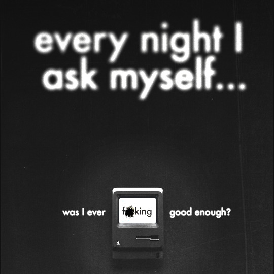

TERM PROJECT NO.5 | WAS I EVER F*CKING GOOD ENOUGH?
Topics of interest
Extreme Close Ups | Relationships, sensual, seductive
Big Book Look | Abstract, asymmetrical, minimal
Monumental Images | Mortality, still, cold
CHOSEN TOPIC -> BIG BOOK LOOK/MONUMENTAL IMAGES??
I'm still conflicted on which theme this actually fits. It fits the requirements of the big book look with its use of scale and typography, but its message is so clear and up front that it could also be categorized as a monumental image. Regardless, I wanted to work with type for this week's illo and make it a huge aspect of my design. That's why I leaned towards those two themes and maybe even combined the two in concept.
Creative Concept
In all honesty, my original idea was completely different from the final result I'm posting now. It would've been an illustration in a style that I have never attempted yet and would be very complicated in execution, and due to the amount of work that was assigned last week, I never got around to really executing my idea. However, that idea will return for the next illustration prompt after the reading break. Anyway, when it came to this concept, I was inspired by one of my failed manifestos from ARTG210: Professional Practice 2, which didn't win the vote for it to be posted online on Instagram. Since this week's theme was scale, I knew I wanted the Macintosh photo to be tiny in comparison to the header text, which would be significantly larger than all the other imagery and text within the composition. I wanted to recreate the feeling when I'm awake past 11 p.m. working on whatever assignment is due the next day; it's tiring yet sort of relaxing.
Description
Despite being bummed out that I didn't get to execute my actual idea for this week's design and having to save it for the next theme, I made sure not to treat this week's design as a throwaway. I decided to go back to Photoshop and create another design, which I'll admit is in my comfort zone, but I always ensure that every weekly exploration looks distinctly unique from one another. This time, I wanted type to have a larger focus and make my narrative as blunt and straight-forward as possible. I tend to use vague and broad phrases for narratives that are way deeper than the actual phrases presented in the final work. Since this one was inspired by both the big book look and monumental images, it was pretty obvious that I had to make this week's narrative as clear as possible.
I feel like every designer or creative will at least suffer from imposter syndrome, and at times it impacts the work we create. It's something that I have to deal with and push through sometimes. I think one of my biggest weaknesses as a designer is that I compare myself way too much with my classmates. They're all so creatively unique in their own little ways, and the work they produce genuinely impresses me. I'm very honoured to be working and being friends with the people in my class, but at the same time, I have never felt this much imposter syndrome in my entire life before. I know I create good work, sometimes even exceptional work. Yet, when people compliment or even applaud my work, I just can't seem to fully determine if it's genuine or not. So, yes. Every night, I do ask if I was ever f*cking good enough! Despite this roadblock I find myself attempting to move past, I still love the work I put in. For the most part, I put in my all for each and every assignment, and sure, some might be better than others, but I'll always appreciate the amount of hard work during the design process that is put in. I think I've come full circle from that failed manifesto from ARTG210; this is my personal manifesto.
Enough of the rationale behind the narrative; when it came to the actual visual aspect of this week's exploration, I mostly used the same principles for the "WHO AM I?" design two weeks ago. However, this time I used different textures and blur effects to experiment more with the tools that Adobe Photoshop offers. I didn't want to overuse the texture; having subtlety there, I think, was a way better decision than it being super apparent and strong, as I wanted to recreate that feeling I have when I'm working on assignments late into the night. I also added some extra outer glow and drop shadows to add more depth, as it was looking very flat without those two effects behind the Macintosh. I adore how the textures turned out in this, especially the field blur effect on the type.
Even though this week's exploration wasn't my intended vision, I loved how it turned out and is so far my second favourite (BASTARD is still my number one!) exploration I've done so far.
KEYWORDS
Desolate
Pessimistic
Melancholy
ROUGH -> PROCREATE
FINAL -> PHOTOSHOP
0 notes
Text
Warfare and Geopolitics are Fuelling Denial-of-Service Attacks
The European Union Agency for Cybersecurity (ENISA)’s new report on the Denial-of-Service (DoS) attacks threat landscape finds 66% of DoS attacks are politically motivated.
The analysis is based on 310 verified Denial-of-Service (DoS) incidents during the reporting period of January 2022 to August 2023. However, this total number only represents the incidents gathered from open sources.
A large-scale study is also included of publicly reported incidents. The study focuses on the motivations of attackers, their goals and the socio-political profiles of targets.
DOS attack threat landscape report 2023
Since the beginning of 2022, DoS attacks have turned into a novel and massive threat using new techniques and are fuelled by warfare motivations.
In the last few years, DoS attacks have become easier, cheaper and more aggressive than ever before. The emergence of new armed conflicts around the world acted as fuel to new waves of DoS attacks where newly formed threat actors pick and choose targets without fear of repercussions.
Objective of report:
To provide a better understanding of this type of threat by analysing the motivations and impact of the DoS attacks and raise awareness at the same time by suggesting prevention and remediation recommendations.
The research performed illustrates that most impacted sectors over the reported period covering January 2022 to August 2023 are associated with government services. These attacks stand as retaliation acts triggered by political decisions.
The report highlights that the last few years, DoS attacks have increased in number especially in the public administration and have become easier and more aggressive than before, largely due to geopolitical reasons. The current DoS threat landscape is greatly influenced by the emergence of the recent armed conflicts around the world and especially by the Russia-Ukraine War that fuelled new waves of DoS attacks where recently introduced threat actors select targets without the fear of repercussions.
The study also illustrates that while no sector is exempted from DoS attacks, the government infrastructure has become a preferred target by threat actors that often manage to be successful by causing downtime.
KEY TAKEAWAYS
- The most affected sector was the government administration sector, accounting for receiving 46% of attacks.
- It is estimated that 66% of the attacks were motivated by political reasons or activist agendas.
- Overall, 50% of the global incidents were found to be related to the Russian-Ukrainian war.
- The study shows that 8% of the attacks caused total disruption in the target.
- The analysis of DoS attacks' motivations and goals is based on the new taxonomy used to classify such attacks based on information publicly available about the attacks the targets for a more systematic analysis approach.
- Warfare is a key gameplayer and organisations would benefit from prevention and remediation strategies.
- Reporting of DoS attacks has not reached the maturity needed to allow for the real extent and impact of such attacks.
A Distributed Denial-of-Service (DDoS) attack DDoS is a subset of DoS attacks. DoS attacks can be distributed which means that they may originate from thousands of sources from all over the world, usually relying on large-scale botnets or proxies.
Further Information
ENISA Threat Landscape for DoS Attacks - 2023
ENISA Threat Landscape - 2023
Read the full article
0 notes
Text
8 Shot Project - Observing A Space
This week, I was tasked with documenting a space.
vimeo
8 Shot Project - Hosted on vimeo
Getting a feel for the environment we were filming in was critical and I wanted to document this same feeling in a visual sense.
We decided on the quay near my accommodation as due to it's close proximity I was familiar with the area and knew what I was looking to portray in the project video.

The building is the focal point of this shot, however we can spot individual elements of the crane transportation block, and the lamppost, which we later put a spotlight on.
The first thing we wanted to put a spotlight on was the presence of the crane, looming over the environment. I thought it would be important to further exemplify this focus when cutting to a new shot on the other side of the building, the crane's movement is still visible, despite the shot being taken later.

Up-close shot of crane operating and spotlight on balcony, we can the get a sense of the buildings scale.

Having this shot being present in movement was important to show the area is regularly populated.
Being able to have an upclose shot of the ground area was important too, as it represents how the quay is regularly full with tourists, cyclists, locals using it as a means to get to accommodation, fountain park etc.

Small discrepancies like abandoned cigarettes was something Sam in our group wanted to put a spotlight on. Pitting a focus on both the recently dropped cigarette along with another two which had fallen through a small crack was something we were hoping would illustrate longevity.

Another shot, this time focusing on the head of the lamppost but the crane still occupies part of the background.

I love the graffiti plastered around the construction areas of the quay, as it gives the place a stronger sense of character. I settled on this centred shot as it presents a government placed lifejacket holder, slowly surrounded and plastered with works and signatures from other creatives. Despite this it still stands in place, and you'd easily be able to visualise how it used to look.

Smaller detailed shot spotlighting one piece, showcasing the variety of artwork populating the area.

Final shot allowing the viewer to catch a glimpse of the environment as a whole, from eye level, whilst now being familiar with its feel and atmosphere.


This was a fun project, as I already enjoyed walking through the quay as it's neighbour, but there were many shots I didn't manage to fit within the 8 shot requirement.
Whilst it wasn't a requirement, if i had to do this project again I would've liked to have captured the sound of the space, being able to highlight the sounds of nature found in ducks and pigeons populating the surroundings, along with passerby chatter.
[Originally Posted As a Draft On The 12th Of November, 2023]
1 note
·
View note
Text
Lesson B4: Lecture + Workshop Notes.
Week 10 Workshop Notes: Principles of Animation
Refer to Vincenzo Logan - The Illusion of Lift
1. Squash and Stretch (i.e Rubber Ball Effect)
Returns to original shape
Narrow
Non mechanical appearance
2. Anticipation
Making the movie, forward and backward
Coming to a stop (i.e. car coming to a halt and people move forward)
Start to Finish
3. Staging
Print Work - the subject taking the centre stage being in the middle of the screen
All attention on object
Keeps us in focus
4. Straight Action and Pose to Pose
Transforming to another shape
Hand render transition/transformation
5. Follow through and Overlapping Action
Brings principles together
Couple of Action together (car example, moving
Moving at different rates (overlapping effect)
i.e. people in the car are moving at different rates as the car comes to a halt.
6. Accelerate to Consistent Speed to Slowing Down
The closer the frames the slower it will be
7. Arc
Effect of gravity on the object/design
Counter gravity (to think about)
8. Secondary Action
One action is supported by another
Interaction of two objects, the after effect of particular movements
Think about how two words are going to interact - come in and out
Makes it dynamic
9. Timing
Easing In and Out
10. Exaggeration
Dynamic - push the limits of the typeface
Large, Small, Bounce, Squashed etc
11. Solid Drawing
12. Appeal
To make the characters, personality, brightness, liveliness
Create an atmosphere with additional elements (example in class, with emojis and claps, laughs etc).
Note for Settings:
1920 x 1080
HD - 25fps
Square Pixels
25
Full
Music - Grab into layers section as opposed to the side panel
Arrow - Audio > Waveform to see sound waves to time waves
Composition > Composition Settings to change timeline if needed
Highlighted is where the video will be rendered, listen back to and edit
Panel at the bottom of screen > Grid > Fifth Option: Proportional Grid
Option > Left Bracket (telling After Effects on this timeline I want to chop on the left)
Text > Open > Source Text (multiple texts on the same layer, to change between wordstrut) >
Manual Textbox sticks to the shape and offers no flexibility, therefore, just click onto the screen to enter the text.
Domino Effect with type - select frame to make change
Scale - S
Opacity - T (aka Transparency)
To have both open, use SHIFT the click letter.
Illustrator - Import As > Composition
Composition > Trim comp to Work Area
Next Exercise: Bouncing Ball (a.k.a flower)
View > Show Layer Control
Right Click on Cursor > Keyframe Assistant > Easy Ease In/Out
Introduction to the Graph Editor to create a smooth transition
Ease in and out
Squash and Stretch
Shift S > Scale
Enter Key Frames - One and after the centre squash keyframe and middle squash - stretch both sides.
Duplicate the Flower > Command D
U - to see underneath
Shift Move to have bump into each other - should see a dotted line in connection with the original image.
To swap object:
Open into panel > Hold Opt/Alt Key > Drag over the layer
0 notes
Text
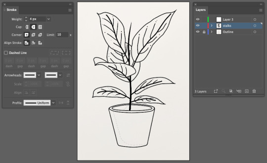
Fundamentals 1: Week 8
26th April
In this week's class we were given a homework task to recreate two drawings of our own choice on Illustrator. The previous post showed the first piece which was a silhouette-style drawing but we then had to choose a second piece that had colour and more specifically some elements of shading. I wanted to challenge myself and make sure I wasn't choosing a drawing that was too simple as the silhouette one was quite easy to do. While I had still had the theme of plants in mind I decided to use this illustration for my second piece.

Already I could see that I'll needed to be really organised with my layers as the pot and some leaves have multiple layers of colour but I was also confident in my abilities to execute this well. Due to the amount of colours layered on top of each other to create the shading on the illustration I realised that I'll also need to use my Pathfinder palette quite frequently. Luckily I got to use that a bit for the previous work. The first thing I need to do is draw the illustration on a piece of paper and map out where the shading outlines are, here's how it turned out:
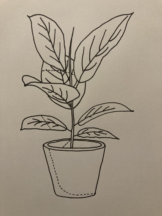
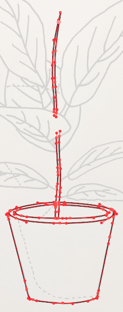
It was a fairly simple drawing to do which was a good start. I mapped out the shading outlines with a dotted line to avoid confusion with the actual outlines of the illustration. By this point I felt like it would've been difficult to draw on the anchor points and handles on top of my drawing as there are so many lines in the drawing which also wasn't on a very large scale, so I decided to skip that step. The next thing I did was take a photo of the the drawing and transfer it on to Illustrator. I set the opacity to a low level where I could see just enough of the referencing drawing to follow as a guide. I decided that I should draw all of the outlines first before getting into the colour. The first/easiest part of the drawing was the pot.

The pot wasn't too complicated as it only involved a few shapes which were easy to draw. The only tricky part of the pot was making sure that each side of the pot was symmetrical. I also realise now that I could've used other tools on Illustrator to make it symmetrical but I think I also enjoy the imperfect side of drawings so I was happy with how it looked. I think I'm pretty much just going in the order of what is the easiest/ simplest part to do firs then going up in levels of complication. The next thing on my list was the stalk in the middle of the plant. This was fairly straight forward but I realised I will have to either have seperate sections of the stalk or have the full shape and make sure that I have it in the background behind the leaf that is seen in front of it. I decided to keep the two halves of it as seperate shapes.
The last major step for the outlines was the do the leaves! This was actually quite fun until I reached the top half where I felt a bit confused on how I would draw the leaf that is underneath the other three leaves. For the meantime (for some reason) I decided to just simply draw the lines and when it comes to adding the colour later on I will be able to close the shape and have a better understanding on how the fill and layering will work.
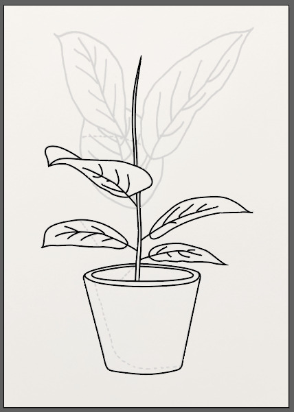
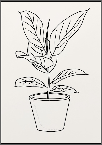
So here's my completed outlined plant! Pretty happy with how it looks and I'm excited to start getting the colour on it. The only lines I didn't do were the shading lines, I think what I'll do is fill the whole shapes and then draw the shade outline while using my pathfinder to cut out the sections that I need. The first thing I did was fill the stalk in black and I also selected the stalk-ish parts of the leaves (lines in the middle) and increased the stroke size to make them look a little bolder than the rest.
The first section to get coloured was the pot, as I felt more comfortable starting with this for some reason. I selected the outline and used the eyedropper tool to get the same colour as the pot from the original photo and quickly realised that the whole area would be this colour. But, this won't be a problem as I can use layering to make sure that the colours for the inside of the pot are simply positioned on top of the colour for the base of the pot.

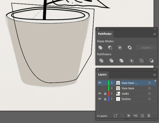
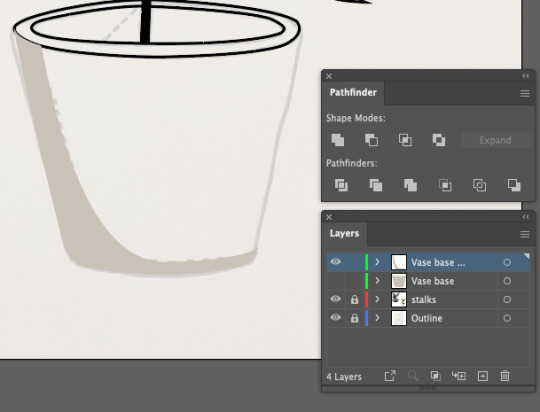
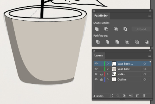
Above are images of how I created the shadow on the pot by using the Pathfinder tool. You can see that my layers palette is growing already because I make sure that each seperate piece on this pot has its own layer (by using copies of the original pot layer), this makes it so much easier to rearrange them in the correct order. The next part was a bit hard to wrap my head around which was the inside and rim of the pot. I had to readjust my shapes that I created in order to get the colour fill into the right places as I was a bit lazy the first time around.
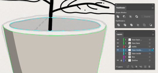
Once I had that sorted out I went and used the eyedropper to get the first two colours on for the rim and for the inside of the pot. I realised that trying to use pathfinder to cut into a shape with all of the different colours/ sections showing was actually a bit confusing so I get rid of the rim colour so I could focus on creating the shadow inside the pot first which you can see below.
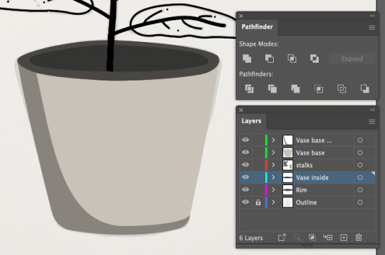
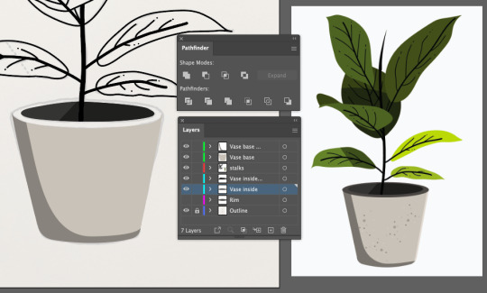
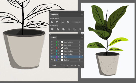
Once the shadow was looking good on the inside I placed the rim colour back on and the pot started to look a lot more like a pot. Was actually really excited about how good this was looking already and that I was feeling confident with the tools that I needed to use in different parts of this whole process.
I did notice that I was actually missing a little highlight on the right side of the pot and felt it was necessary to add in so that I could have the complete look. Below you can see the process of using Pathfinder again to cut out the desired shape and then positioning that layer appropriately so that it shows on top of the pot.
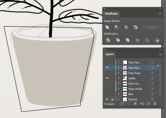
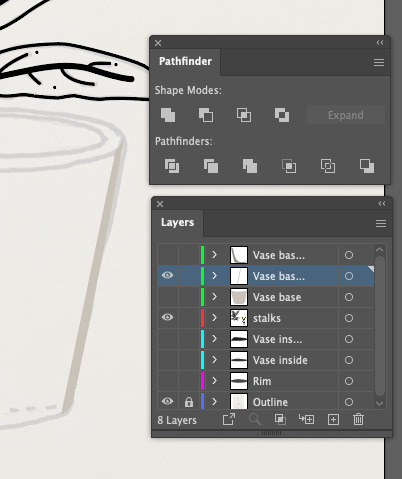
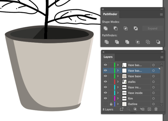
Now that I felt like the pot was done, I moved onto the leaves. The first few were super easy, using the eyedropper to get the right colours and just making sure there was no black stroke after adding the colours. Below you can see that I've reached the leaf that I was not in the mood for, as I needed to add a shade - but to be honest by now I've realised that its not actually that hard.
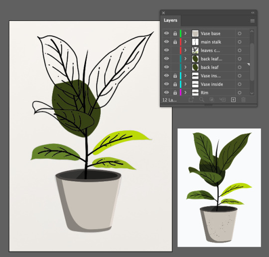
The first thing I did was turn off the leaves outline layer and the stalk layer so that I could just focus on this shape alone (the original hand drawn art is on low capacity in the background for tracing). Below you can see my process as I closed up the shape by just drawing straight lines where I knew the leaf was going to be covered by the leaves in front of it. I used Pathfinder to cut out my shape and added the darker colour in.
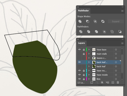
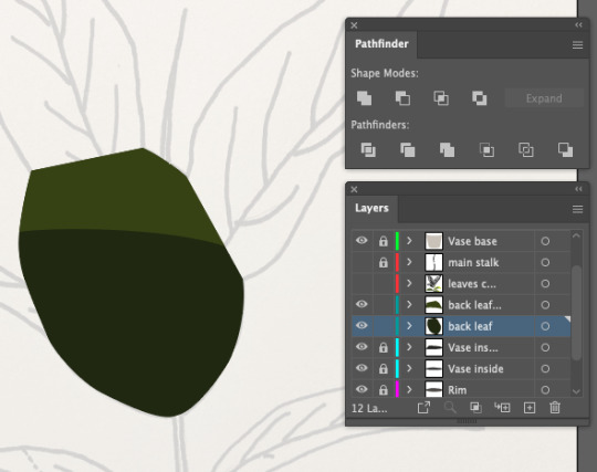
Once i was happy with that I turned the leaves and stalk layers back on and continued filling in the top two leaves with the appropriate colours.
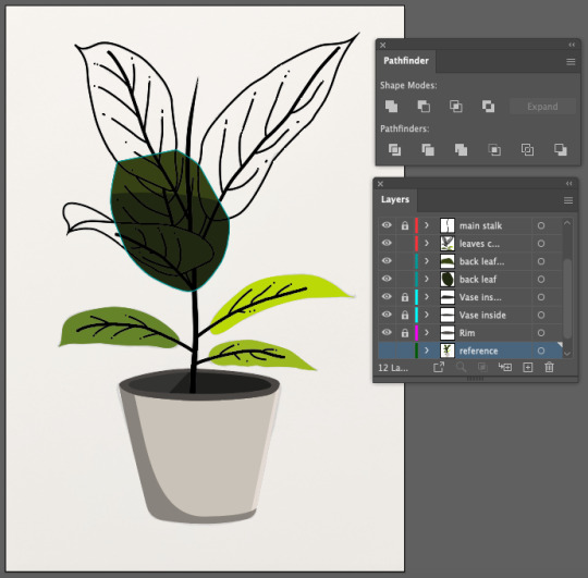
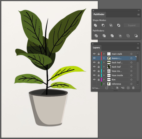
Although it looked finished I zoomed in and checked all the details to make sure everything looked tidy. I then noticed that a few black lines from the background leaf (seen below) were overlapping onto the front leaf. In order to fix this I just used the eraser tool on the selected lines as I felt that because it was such a fine detail that I shouldn't worry too much and just erase the small bumps with a simple tool.
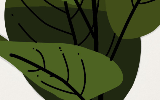
The last thing that I wanted to do was go back to the pot and add the concrete-like texture which I noticed is in the original image. I liked the look of it and felt it would make my illustration look more complete. This process was pretty simple, I used the eyedropper tool again to get the right colours and roughly followed where the dots went and what sizes they were when putting them onto my pot.

So that's it. I've finished! The two images below quickly show that the comparison is almost identical which I'm really proud of. My illustration is on the left with the reference image on the right. Looking at it now I realised that I missed one little piece of shading on one of the bottom leaves BUT I am so happy with how it looks that I'm not entirely bothered by it.
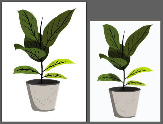
Although I put off this homework task for a bit too long I actually really enjoyed doing it and having the freedom to choose my own images to work on - I think that made me become a lot more invested in the outcome and making sure I understand the processes inside an out in order to do a good job. This task as well as the silhouette task both gave me a lot of confidence in being able to recreate an illustration in Illustrator. Even if it is a simple trace of an outline, I'm glad I can use that skill to fall back on if I need it and hopefully it can encourage me to improve my art skills so that I don't always need to trace images. This task also helped me find the fun in design. I currently see design as homework and lectures and assignments so having this opportunity to create something fun and interesting is encouraging me to try do more of these little illustrations in my own time. It would definitely help me refine my skills as I am about to move into branding in the second semester so I feel that having some confidence in my design skills will make a huge difference. Looking forward to making more fun illustrations in the very near future!
0 notes
Text
Akbash: Dog Breed, Personality Health, Care Full Info
The Akbash dog is a large, significant canine. Size can range from 28 to 34 elevation with weights of 80 to 140 pounds. Obviously, the males are on the larger end of the scale.
These tykes are substantially white with maybe a touch of” biscuit” color, especially on the head. Beast-guarding tykes have been chosen for their white color to match the flock so they aren’t mistaken by the goatherds for bloodsuckers, the utmost of which are dark.
Coats can be short or long but are double carpeted and thus heavy on the slipping side. The fleece may have a surge to it and longer hair is on the tails of the legs and the bottom. Natural cognizance hangs down, however, in some countries they’re cropped.
Despite being white, these tykes aren’t albinos, and they’ve dark colors around the eyes, nose, and mouth. Numerous Akbash tykes are born with double dewclaws on the hind legs, analogous to Great Pyrenees and Briards. While these are big tykes, they’re unexpectedly nimble and quick for their size.
A slight bow in their reverse gives some suggestion of their running speed.
Origin: Turkey
Height: 24 to 33 inches and Bitches 20 to 30 inches
Weight: 120 pounds and bitches 90 pounds
LifeSpan: 10 to12 years
Size: medium
Color: Shades of white, light biscuit, or grey are acceptable
Breed Characteristics Of Akbash
The Akbash Dog’s essential characteristics are those that allow it to succeed as a beast guardian. These tykes have the size, strength, and courage to challenge large bloodsuckers and the speed and dexterity to chase line bloodsuckers.

History Of The Akbash
No one knows the exact origin story of the Akbash canine but nearly everyone agrees to the supposition that this strain was developed by ancient townies of western Turkey, to cover their herds. Some reports suggest that Akbash ancestors date back to 750- 300 B.C.
It’s believed that this large strain was bred about 3000 times agone and the motive behind this picky parentage was to produce a canine that can be easily distinguished from other bloodsuckers.
Some also believe that Akbash is a close kinsman of notorious European white flock tykes like tetra mountain gundog, kuvasz, komondor, and Pyrenean mountain canine.
Over time, this canine strain got indeed more, performing their jobs as flock guardians more directly than its Turkish counterpart.
For illustration, they’ve sharp sight and acute hail which keeps them largely apprehensive of their girding.
Also, their heavy, altitudinous, regal appearance and robust constitution make them a tough contender to wolves and other creatures.
Due to the veritably same reason, Akbash is still used largely, not only by goatherds but also by security officers & deliverance groups as service and backing tykes.
Till the 1960s, this landrace strain was confined to the western regions of Turkey. In 1978, Two Americans David & Judy Nelson introduced Akbash to the rest of the world.
Nelson was so in love with this strain that he ended up importing dozens of Akbash tykes as foundation stock, to America, to increase the number.
Akbashbash was officially added to the guardian canine group by the American department of husbandry. likewise, at the same time, this department began using Akbash in its bloodsucker control program.
In 1998, the United kennel club honored this guardian strain but it’s still to be accepted by the American kennel club.
Appearance
The Akash tyke’s body is muscular, long-lawful, and slightly longer than altitudinous. They’re able of running at great speed and have acute senses of sight and hail they cover color is each over white.
Akbash canine fleece white, rainfall resistant, double, short to medium length fleece is coarse and matting, with veritably little odor.
This canine strain has a head with important jaws. The V-shaped cognizance is set high, with slightly rounded tips, flat to the cranium, and worn as a pendant.
Turkish Akbash tykes may have cropped cognizance It has almond-shaped eyes that are set piecemeal and diagonally. The eyes range in color from light golden brown to veritably dark brown.
The neck is muscular and strong, with a medium length, and bends at the crest. The nails are blunt, slate, brown, or white in color. The pads are generally thick, hard, elastic, and dark. Its tail is long and reaches the hocks.
Temperament
The Akbash Dog is a calm, independent, and steady home companion and guard canine. With his mortal family, children, and other faves, he’s devoted, gentle, and tender. He’s naturally suspicious of nonnatives and can be territorial of other tykes.
Including family faves and children, but remains frosty and suspicious of nonnatives It’s also naturally cautious of other tykes and may reply aggressively to intruding tykes in its own home. Despite its independence, the Akbash Dog responds well to introductory training. The Akbash Dog, when duly mingled and trained, makes an excellent family pet and home guardian.
Personality
The Akbash is a gentle canine who’s veritably defensive of their family. They are independent and like to have their own space from time to time. Firstly bred to cover flocks of beasts, they still have those strong guard instincts moment.
These pups are largely intelligent and, though they do not have explosive energy, are relatively nimble and strong if they smell peril and need to act.
However, they will growl or bark at nonnatives, but they aren’t exorbitantly aggressive towards them If they smell anything amiss. However, you can’t do much better than the Akbash, If you want a watchdog and guardian who’ll warn you of anyone who might approach your door.
This canine needs a strong and harmonious proprietor who can also be sensitive to their requirements when training. They can be fluently trained, but make sure to fraternize them beforehand with other tykes or faves who might live within the house.
Because they’re independent, they generally do not have any separation anxiety from their mortal counterparts. Make sure to give them some space, as they like to be on their own formerly and for a while.
More details:https://animalatoz.com/akbash/
0 notes
Text
dollar-chan's pattern school: picking a pattern and reading the envelope
So I'm trying to get my weird little pattern school idea floating, but I am going to be posting all the tutorials on this blog so that none of that info is secret and only allowed to people who want to learn on another platform. I'm a big fan of providing information for free.
So, in this school idea, the first project is to make something from a commercial pattern, and to choose something that doesn't require specific body measurements. This way, you can focus on learning to read patterns and it doesn't really matter too much if it's a bit smaller or larger than you originally intended. There's a whole lot of flexibility in this project. The important thing is just learning to pick a pattern, get some fabric, cut it out, and assemble it using the pattern markings and pattern instructions. If you already know how to do that, you can proceed to complete that step without even reading this.
Picking a pattern:
There's a lot of ways to make items you would use in a lolita wardrobe. Some ideas:

Basic tote bags (relevant Lolibrary search) are easy to make and are a great first project to make from a pattern. Brands put out tote bags that are relatively easy to simulate by using good fabric choices. Lined tote bags are a very nice project because it teaches the basics of bagging out a lining. You also can pick those fun quilting fabrics that you can't use for main lolita pieces.

Decor and craft items are fun and you can shoehorn them into this with "lifestyle lolita" as your theme.

If you have fabrics or ideas you want to test out, you can try out some combinations on doll-scale before moving on to a full-scale project. This also lets you practice with print scale and that gives you a huge leg up when you start moving into lolita for humans. Note, though, that there's a lot of experienced sewers who make clothes for 18" dolls, so make sure you pick a pattern marked as an easy one.

Aprons (lolibrary search) are a thing you can use in lolita. Gathered aprons have a similar construction to lolita dresses and so they're really good for learning other techniques you'd later apply to other garments. You get experience picking and working with prints on the same scale as you'd be working with future garments. However, since aprons aren't fully fitted garments, if you're off by 3-5 inches, no one will ever know.
Buying your pattern:
If you've never bought a pattern in a store before, they're usually kept in some impossible-to-search cabinets. Somewhere around there should be a big catalog with all the patterns. Look through the book, find one you like, and remember the number of the pattern. Then, you go to the cabinets and look up that pattern. It's super easy, but I've worked in a craft store for long enough to know that it's not universal knowledge.
Reading the envelope:
Most patterns that you buy will be able to make multiple variations of the same pattern, called views. The front of the envelope will have pictures of the views. They're sometimes photos, and sometimes fashion illustrations, but they'll tell you what the pieces should look like finished.

The back of the envelope will have technical illustrations, sometimes of the front and the back of the views, and sometimes just of the back. These are simple line arts designed to show you the construction details. More about different kinds of fashion illustration here.
It will also have the suggested fabrics, and the information about how much fabric to buy for each view. If I want to make the view D bag, I go to the section of the table marked D, and know that it's how much of the fabrics I need. Let's get an easier-to-read envelope over here because I've photographed that one three times and it's still ugly:
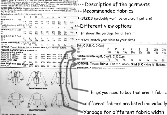
Yes, I've committed to using Comic Sans there.
On some envelopes, there will be a text description of the garment. This will occasionally give you useful information, and as you read more patterns you'll find things like the words "no closures" that just set off a flag. This is a thing that's sort of fallen out of fashion and a lot of patterns don't do this anymore, so don't worry if you can't find it.
Then, there will be suggested fabrics. This will give you a lot of important information, like if the pattern is designed to be made out of light or heavyweight fabrics, if the fabrics should stretch, and if the pattern needs to go in a specific direction. Sometimes, you will see things like "unsuitable for stripes, plaids, or obvious diagonals" and you'll know not to use those patterns.
Then, the fabric needs for each view will be listed. In this case, there are two listings. One is labeled 45" and one is labeled 60". When you pick your fabric, you will look at the bolt end, and it will tell you how wide that fabric is. If your fabric is 45" wide, you'll get the width listed as 45", and if it's 60", you'll get the width for 60". A lot of the time, you'll find fabric that is 44 or 43 or 59 inches, and you can almost always just round up. This number isn't always super obvious on the bold and it might just be "43in" listed in a long line of numbers, but in the USA it's a legal requirement to have this info available to the consumer, so it's there.
Sometimes, there will be different options for "with nap" and "without nap". If your fabric is directional, and looks different when you turn the print upside-down, you need to use a yardage marked "with nap" or "with or without nap".
If your fabric has stripes or plaids in it, or a pattern you want to match, you might want to get some extra fabric, so that you have some wiggle room to place the pieces where you want. Sometimes, the pattern layouts are very cramped and you need extra yardage if you want to deviate from them.
Some patterns need multiple fabrics. For example, you might need a main fabric, a contrast, a lining, interfacing, and trim. Each should be listed separately.
The last part is notions. These are pretty much all the things that aren't fabric that you'll need: buttons, tapes and braids, thread, safety eyes, sometimes something utterly bizarre like "approximately one hundred to three hundred pre-tied 2" ribbon bows". Don't forget about the notions section. Ask me how I know.
There will also be finished dimensions of the project on it. This is useful sometimes, especially with craft projects and bags, because it's hard to judge those things. If you're making a garment, there will also be body measurements somewhere on the envelope. When you're checking what size you should make, go off the body measurement and not the finished garment measurements.
So anyway, now you can go to the fabric store, pick a pattern, and then you can go nuts picking your fabric.
One last note: a)not every fabric store is sorted the way that the pattern envelope lists fabric. Just because the envelope says you can use challis or moire faille doesn't mean the people cutting the fabric have any idea what or where those fabrics are. It's actually not part of their job to know every single fabric that has ever been mentioned on a pattern envelope in the past 60 years so don't get condescending when no one had here of yumissima and b) if you're being rude to the fabric store employees you are getting expelled from pattern school.
And that's lesson 1 part 1, how to know how much fabric you need!
And now you get the great, great open world of which fabric to pick! That's why we're doing a craft project before we do a full garment.
I'm getting the discord up and running but I need to learn how roles work before it's open to all. Special thanks to the people testing it for me. Give me a couple of hours and we'll go public with the link.
As for how the discord is planning on working, each project is listed as a "step," so when you complete your tote bag/apron/perfect replica of kuma kumya but she's neon orange/sewing machine organizer, you get to post it as completed and move onto the next step. I promise to film a video of me throwing confetti at my webcam for the first 15 people to complete a step. Proably. Confetti is messy.
I just want to make sure I can, you know, not fuck everything up before I have a discord with like 40 people on it. Thanks for the patience there. I promise I won't be teasing with without allowing access for too long.
58 notes
·
View notes
Photo
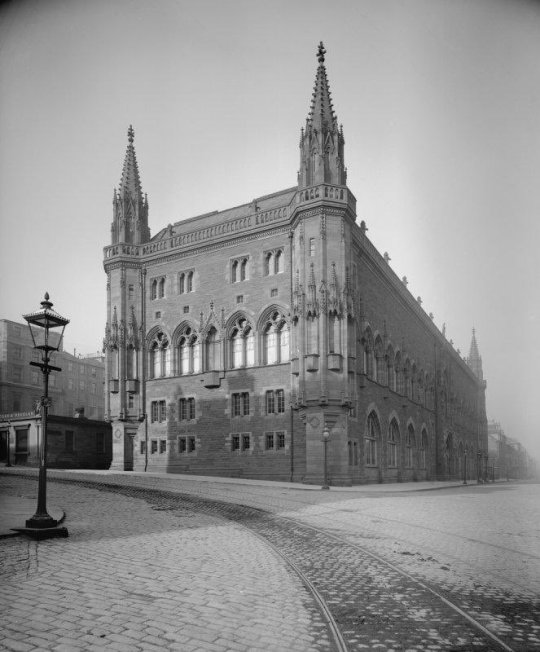
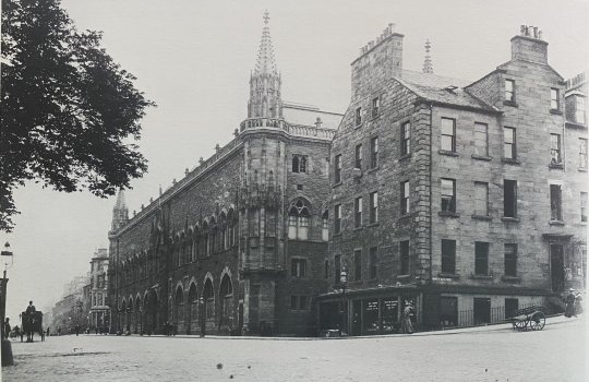
On July 15th 1889 The Scottish National Portrait Gallery opened.
If you remember I featured my own pics of the SNPG A just over a year ago. These pics are from the 19th century, but what makes them different from my own pics?
The Scottish National Portrait Gallery is home to Scotland’s national collection of portraits and currently also houses the National Photography Collection. Its origins can be traced to one enthusiastic collector, the mildly eccentric David, 11th Earl of Buchan. His collection of portraits of famous Scots, assembled in the late eighteenth century, formed the foundation of the national portrait collection in its first conception.
At the end of the nineteenth century, the idea of a National Portrait Gallery for Scotland was championed by many, including the historian Thomas Carlyle. A believer in heroes, Carlyle wrote that ”Historical Portrait Galleries far transcend in worth all other kinds of National Collections of Pictures whatever”. Despite widespread enthusiasm, however, the government of the day was reluctant to commit funds to the project. Instead, it was the philanthropy of a local newspaper owner that allowed the present Gallery to open its doors to the public in 1889.
John Ritchie Findlay, the chief proprietor of The Scotsman, not only paid for the construction and an endowment, but he also masterminded the building that was to house the collection. He employed the architect Sir Robert Rowand Anderson, who had previously won the competition for designing the Edinburgh Medical Schools and who later earned a wide reputation for the restoration of ecclesiastical buildings in Scotland. Rowand Anderson created a modern purpose-designed art gallery to rival the most advanced at the time in Europe and America. At the same time, he wanted his building to be a shrine for Scotland’s heroes. The extensive decoration scheme, both external and internal, was designed with this idea in mind and is now an essential part of the visitor’s experience.
To this day, the Gallery continues to collect works that are portraits of Scots, though not necessarily made by Scots. It aims to add portraits of those missing in the collection, as well as to bring the collection up to date. Since 1982 there has been a policy of commissioning portraits of living Scots by contemporary artists.
To me the murals inside the gallery are a joy to see, created by Edinburgh-based artist William Hole, who specialised in history painting and etching. Around 1895 he volunteered to decorate the chancel of St James’ Church on Inverleith Row with large-scale murals. In 1897 the still unfinished work came to the attention of Findlay, during several years, Hole designed and painted a processional frieze of Scottish worthies and completed a series of large murals that illustrate events in Scottish history.
My favourite painting in the gallery is the grand full length portrait of Mary Queen of Scots.

#Scotland#scottish#edinburgh#New Town#Queen Street#art gallery#history#Scottish National Portrait Gallery.
23 notes
·
View notes
Last Seen Blogs

living-above-the-shoulders
I don't see anything below my shoulders

lcote-blog
Untitled

living-room-interior-design
living room interior design mumbai

livesportsandnews
sport and others🎉🎉

agmenviro
Untitled