#writingaid
Explore tagged Tumblr posts
Visit Tumblr Blog
Explore Tumblr blogs with no restrictions, modern design and the best experience.
Last Seen Tumblr Blogs


Fun Fact
US Tumblr user growth rate is estimated to slow down to 4.1%.
Text
youtube
It's a new month and so it's time for another writing discussion ✒
1 note
·
View note
Text
Just fyi for folks, I'm trying to write as much as I'm able but I do have chronic joint pain in my dominant hand and frequently have to use writingaids to be able to write much at all, especially since I'm only able to write on my phone right now. So, I'm not going to be the speediest author on the planet, but I do try.
1 note
·
View note
Text
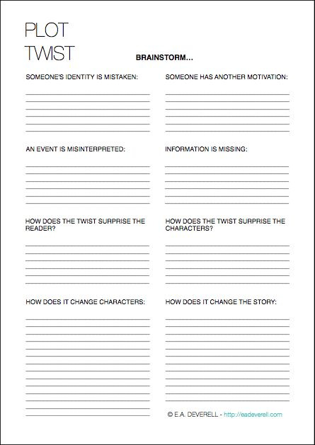
#writing#worksheet#writingworksheet#worksheetforwriting#thisisnotmine#ididnotmakethis#plottwist#writingplottwists#writingaplottwist#worksheetforplottwist#howtowriteaplottwist#writingaid#writinghelp#helpforwriting
1 note
·
View note
Text
A Short Study in Slice-of-Life
(Minor Spoilers)
In my attempt to understand what makes a great slice-of-life story, I look to “The Dutch House” by Terry Patchett. In the beginning of this book I thought it was going to be boring, but it was the little things that held my interest! What makes this an excellent slice-of-life book?
There is something that the main characters want, even if it seems small. Maeve wants to royally mess with their new stepmother and Danny wants to follow in his father’s footsteps. Together, the characters just want the Dutch House back. I learned that if the characters don’t have anything to yearn for then they are not worth reading about.
Their life holds big questions: where did their mom go? How did their dad go from living in poverty to being rich and making the big bucks? Why did he (either male character) marry this woman? It encourages to read on so you can find all of the answers to these questions, as well as to find out how these characters react to them.
They make a simple discovery, but I won’t tell you what it is because I don’t want to be that guy. I will say that they find something out that would have changed quite a bit had they just gone up to the house, rather than hang out a little down the street. It can be something small, as long as there is that little pivotal moment for both your character and your reader to discover.
Conclusion
“The Dutch House” is a great example of slice-of-life done right because we witness their lives as they unfold. The little humps in their journey are questioned and then they are eventually answered. I believe that is the recipe for a lovely simple story.
Concept in Action
For a short story that I am currently working on, I knew that I wanted it to take place in a motel. I grew up staying the night in motels and hotels, and I believe that there is just something special to them that you don’t get from home. That is a great place to start because not only am I writing about something I am very familiar with, but I am also writing about something that has the potential of holding many stories.
In this little motel, my character Chloe has left school behind because she doesn’t know what she wants to do in life anymore.That is a common problem that many people can relate to and my character’s want: a new life’s purpose... or at least a new direction. This could also be her question, what does she want to do for the rest of her life?
Chloe finds a piece of her life that has been missing for years, and she may not even realize her discovery. It is that simple to the character and yet big enough for the reader to feel a jolt.
A question is asked and a revelation is made in the end. In between, we have those little life moments that all come together to create a lovely little slice-of-life story.
#writing#howtowrite#slice-of-life#genre#writers of tumblr#writers on tumblr#writingaid#guideonwriting#writingblr#writing blog
1 note
·
View note
Text
PROMPT #2 You're in a shark cage surrounded by great whites and the door falls off.
PROMPT:
You're in a shark cage surrounded by great whites and the door falls off.
PROMPT WORDS:
Moon boots, a paper bag full of bread crumbs, tap dancing shoes, a very aggressive earthworm, bagpipes, Barbie and Ken dolls, hair scrunchies, a T-rex's leg bone, and a Book: Origami for Dummies.
He watched it drop, slowly disappearing from view into the far depths toward the ocean floor. The door, that suddenly broke off from its hinges, exposing the interior of the cage to the multiple sharks that still swam calmly around him. He had to think fast. Quickly turning to his friend's gear bag, he surveyed it looking for anything that could help. He had to protect himself. And to think his fear of diving was running out of oxygen. This was definitely worse. As he stared at the contents of the bag, he couldn't believe what he saw. A random collection of items that offered him no protection. He would have to improvise. He was good at that, right? He was an engineer after all. He quickly fastened the Ken and Barbie dolls to the T-rex's leg bone with a scrunchie, using the other one to fasten his distraction to the outside of the cage, as far away from himself as possible in the confined space. He then spread the bread crumbs from inside the paper bag around the dolls to make sure that if one of the sharks decided to attack they would focus on that instead of his very meaty very much alive body. With the shark problem possibly resolved temporarily, now was the time to figure out an escape plan. Suddenly, one of the great whites ripped poor Barbie and Ken away, together with the bone and bread crumbs. This was the perfect opportunity to release the very aggressive earthworm, currently enraged, it swam quickly toward the thief that stole its lunch. As the fight between the two predators went on, it provided enough cover for him to read the book "Origami for Dummies" and he gladly applied his recently acquired knowledge to transform the bagpipes into an air balloon that he hurriedly fastened to himself and used to float back to the surface where his friends noticed his panic and helped him up and out of the water. He was finally safe.
(Based on the game Bucket of Doom)
#bucketofdoom#prompt word prompts#writing#creativewriting#creativewriters#improvisando#writingaid#game#practice#writingpractice#escapescenario#idea#thisisbad#fiction#diving#short story#sharks#randomprompt#amateur writer#story#creative#creativity#begginer
2 notes
·
View notes
Video
The next level of details in my character design workbooks quartet. Keep all of your series characters in order over a span of books. Available on Amazon, Etsy, and Storenvy. #characterdesign #characterart #charcterconcept #charactersheet #characterworkbook #inkmagineandcreate #chknyght #characterdevelopement #characterdeveloper #authortools #authorsofinstagram #authorslife #writingaid #writingbook #writingworkbook #writingtips #writingprompts #characterprompts #charcterprofile #seriesdevelopment #indieauthorsunited #indieauthor #indiewriting #writingbook #bookcharacter #bookstagram #bookphotography https://www.instagram.com/p/BqLRG12l30l/?utm_source=ig_tumblr_share&igshid=1t9qy2teh2ddt
#characterdesign#characterart#charcterconcept#charactersheet#characterworkbook#inkmagineandcreate#chknyght#characterdevelopement#characterdeveloper#authortools#authorsofinstagram#authorslife#writingaid#writingbook#writingworkbook#writingtips#writingprompts#characterprompts#charcterprofile#seriesdevelopment#indieauthorsunited#indieauthor#indiewriting#bookcharacter#bookstagram#bookphotography
1 note
·
View note
Text
Buy The Fantastic Flashcards- Index Card Teacher

Flashcards are an effective memory aid for students and help learn new information more quickly and efficiently. These are small, cards which contain useful information or subject matter. If you want to buy flashcards contact Index Card Teacher. https://bit.ly/394yR7l
0 notes
Photo

If you hold your pen too tight or your hands start hurting when writing you need one of these.... I've ignored the pain for 3 years and now have a lump/stump on my finger this things is brilliant. This is the ring finger ultra Ebay item number 172722420179 in the U.K. Just google ring pen ultra complete care sell them that's where I got mine and it's incredible the pen doesn't even lay on my middle finger it only requires my index and thumb so my writing stump won't get bigger it's so comfy to write with.... mine is medium sized I might get a small too. It fits my mildliners, stabillo point 88 my bic four colours and standard biros it's brilliant..... best £14 I ever spent I can imagine this helping a lot. I will review it again after a huge study session as I've had my mepo injection today and I'm pretty exhausted from it.... the side effects can be evil.... #ringpenultra #ringpen #writingaids #ringpen #bic #stabillo #staedtlertriplusfineliner I tried the #stabiloeasystart and don't like the ink though the .88 fineliners fit in the refill hole perfectly (see prior post) this nifty tool though fits all my pens so happy hopefully this will help me write neater and longer.... NOT SPONSORED I PURCHASED IT WITH MY OWN MONEY AFTER ASKING LOTS OF PEOPLE FOR ADVICE.
14 notes
·
View notes
Photo


ECL310, WEEK 2 Post
These two posters were seen in a class that I work in, it is particularly useful when the teacher is doing any writing sessions or wishes for students to correct their own work. I especially like how each one can be used individually or with each other. I believe these two posters are useful in the class as it breaks down the structure of a sentence and a paragraph in a visually friendly way that student can actually relate to. I personally love food and if something can be explained to me using food I’ll definitely remember it better. When I spoke to the teacher who had displayed this, he said that they are appropriate from years 3 up to 8. I can agree with that as last year I was working at a high school with year 7 & 8 students and these 2 posters were used quite frequently and also to the benefit of the students.
0 notes
Text
youtube
It's a new month which means a new writing tips video 📚
#books#writer#bookworm#bookstagram#author#bookdragon#reading#writing#amreading#amwriting#writingtips#writingaid#scene#chapter#what are they#scenevschapter#Youtube
1 note
·
View note
Text
Calligraphy Rulers and Guides: Precision in Every Line
Calligraphy Rulers and Guides Unveiled: Master the Art of Perfect Lines!
Welcome to our guide on calligraphy rulers and guides! If you're passionate about calligraphy and strive for perfection in every stroke, these tools are a must-have in your collection. Calligraphy rulers and guides provide the precision and consistency you need to create beautifully crafted lettering. Let's dive into the world of calligraphy rulers and guides and discover how they can take your artwork to the next level. Key Takeaways: - Calligraphy rulers and guides ensure perfectly straight and parallel guidelines in your projects. - Consistency and precision are achieved by using these tools, resulting in evenly spaced and well-proportioned lettering. - The INKMETHIS Layout Liner is a popular tool for versatility and accuracy in calligraphy projects. - Guidelines are essential for maintaining consistency and achieving a neat and elegant script. - Understanding different calligraphy guidelines, such as x-height and slant lines, is crucial for creating consistent and well-proportioned lettering. Now that we have a glimpse of how calligraphy rulers and guides can enhance your work, let's explore their importance in more detail.
The Importance of Guidelines in Calligraphy
Guidelines are crucial in calligraphy as they help maintain consistency and ensure that the letters are evenly spaced and proportioned. Without guidelines, it can be challenging to achieve neat and elegant script, especially in traditional calligraphy scripts that have specific rules on letter ratios and slants. Guidelines provide a framework for the letters, keeping the height, proportion, and slant consistent throughout the piece. They serve as a reference point for maintaining the correct angle while writing. Whether you are a beginner or an experienced calligrapher, using guidelines is essential to produce high-quality work. Using guidelines in calligraphy helps you create a consistent and professional-looking script. It ensures that each letter is placed correctly and uniformly, resulting in a visually pleasing piece. Guidelines act as a guide for letter heights, proportions, and angles, allowing you to maintain a consistent style throughout your work. With guidelines, you can achieve the desired spacing between letters and words, avoiding overcrowding or uneven gaps. By following these guidelines, you can produce calligraphy that is visually appealing, balanced, and easy to read. The use of guidelines is particularly important for maintaining consistency in traditional calligraphy scripts. These scripts have specific rules and proportions that define their style. Guidelines help you adhere to these rules, ensuring that the calligraphy retains its traditional appearance. In addition to traditional scripts, guidelines are also beneficial for modern calligraphy styles, as they help you maintain a consistent look and feel across different projects. Whether you are working on wedding invitations, certificates, or artistic pieces, guidelines provide a solid foundation for your calligraphy work.
Understanding Calligraphy Guidelines

Calligraphy guidelines are an essential component of creating consistent and well-proportioned lettering. They consist of various lines that determine the height, proportion, and slant of the letters. Let's explore the different components of calligraphy guidelines: X-height space The x-height space refers to the area between the baseline and the waistline. It determines the height of lowercase letters and plays a crucial role in maintaining uniformity throughout the script. Ascender space The ascender space is the area above the waistline and is utilized for letters with ascender loops, such as 'b' and 'h.' This space ensures that the loops are consistent in height and maintain the overall balance of the script. Descender space The descender space is the area below the baseline and is used for letters with descender loops, such as 'g' and 'y.' It allows for uniformity in the length of these loops, creating a harmonious look in the script. Copperplate calligraphy guidelines Copperplate calligraphy, a popular script known for its elegant and flowing style, has specific guidelines for each component. These guidelines ensure that the letters are proportioned correctly, maintaining the unique characteristics of Copperplate calligraphy. Understanding these different lines and their roles is crucial for creating consistent and well-proportioned calligraphy. By following the guidelines, you can achieve precise and balanced lettering that enhances the overall aesthetic of your calligraphy piece.
Drawing Calligraphy Guidelines

When it comes to calligraphy, drawing accurate guidelines is crucial for creating neat and consistent lettering. Whether you're a beginner or an experienced calligrapher, having the right tools and techniques for drawing guidelines can make a significant difference in the quality of your work. Here are some helpful tips and tools for drawing calligraphy guidelines: Tips for Drawing Guidelines - Use a sharp pencil: A sharp pencil will allow you to make precise measurements and create clean, straight lines. - Draw lightly: It's important to draw your guidelines lightly so that you can easily erase them later without damaging your paper or ink. - Measure carefully: Take your time to measure the spacing and proportions of your guidelines accurately. Using a ruler or rolling ruler can help ensure straight lines. - Allow ink to dry: If you're working with ink, make sure it is fully dry before erasing your guidelines to avoid smudging. By following these tips, you can create well-defined and accurate guidelines that will serve as a foundation for your calligraphy work. Tools for Drawing Guidelines Pros Cons Ruler and pencil - Easily accessible and affordable - Can be used on any surface - Ideal for beginners - Manual measurement can be time-consuming - Requires steady hand Rolling ruler - Allows for easy drawing of parallel lines - Provides accurate measurements and angles - May be more expensive than a traditional ruler - Requires practice to get used to Light pad - Helps in tracing guidelines and drafts - Saves time in drawing guidelines directly on paper - Requires additional equipment - Not suitable for all calligraphy styles Each tool has its own advantages and disadvantages, so it's important to choose the one that suits your needs and preferences. Experimenting with different tools can also help you find the one that works best for you.
The Role of Guidelines in Consistency

Consistency is a key aspect of creating a neat and professional-looking calligraphy script. Using guidelines is a fundamental practice that helps you achieve this consistency. Guidelines serve as a reference point for maintaining the correct height, proportion, and slant of your letters. They provide a framework for aligning each character in a uniform manner, ensuring that your script appears balanced and well-executed. By following guidelines, you can avoid the pitfalls of uneven spacing and misshapen letterforms. They act as a visual guide, allowing you to place each stroke with precision and intention. Whether you're working on a traditional calligraphy script or a modern style, utilizing guidelines will help you achieve a consistent and polished result. Using guidelines is especially important for beginners who are still developing their muscle memory and understanding of letterform structures. They provide a helpful framework for practicing and honing your calligraphy skills. With regular use of guidelines, you can gradually improve your consistency and create a more refined and visually appealing script. In addition to maintaining consistency, guidelines also allow for artistic expression and experimentation. Once you have mastered the fundamentals, you can start customizing your guidelines to suit your unique style and creative choices. Breaking traditional rules and exploring different ratios can add a personal touch to your calligraphy and make it stand out. Benefits of Using Guidelines for Consistent Script Ensures uniform spacing and proportion Helps maintain a balanced and polished appearance Aids muscle memory development and skill improvement Allows for artistic expression and customization Summary: Guidelines play a crucial role in achieving consistency in calligraphy. They act as a visual reference for maintaining the correct height, proportion, and slant of your letters. By following guidelines, you can create a neat and professional-looking script with evenly spaced characters. Beginners can benefit from using guidelines to develop their skills, while experienced calligraphers can use them as a framework for artistic expression. Embrace the power of guidelines to elevate your calligraphy and create beautiful works of art.
Customizing Calligraphy Guidelines
When it comes to calligraphy, guidelines serve as a foundation for creating consistent and well-proportioned lettering. While there are standard ratios for calligraphy guidelines, such as the 2:1:2 or 3:2:3 ratio in Copperplate calligraphy, you also have the flexibility to customize the guidelines to suit your creative choices. Breaking traditional rules and experimenting with different ratios can add a unique touch to your calligraphy practice. When customizing calligraphy guidelines, you can try out different ratios such as 1:1:1, 1:2:1, or even unconventional combinations. This allows you to explore new possibilities and create lettering that reflects your personal style. Additionally, using grid sheets or guidesheets with multiple ratio options can help you adapt to different calligraphy scripts and lettering styles. Customizing your calligraphy guidelines not only provides creative freedom but also encourages you to think outside the box and push the boundaries of traditional calligraphy. By breaking the rules, you can create unique and captivating pieces that stand out. Benefits of Customizing Calligraphy Guidelines - Uniqueness: Customizing your guidelines allows you to create calligraphy that is truly one-of-a-kind, showcasing your individuality and creativity. - Exploration: Breaking traditional rules in calligraphy opens up a world of possibilities, encouraging you to experiment with different lettering styles and techniques. - Personalization: Customized guidelines help you tailor your calligraphy to suit specific projects or themes, adding a personal touch to your work. - Creative Expression: By customizing guidelines, you can express your artistic vision and create calligraphy that resonates with your intended audience. Customizable calligraphy guidelines provide the freedom to explore and create unique lettering that reflects your individuality. Breaking traditional rules and experimenting with different ratios allows for artistic expression and personalization in your calligraphy practice. So go ahead, unleash your creativity, and let your calligraphy shine with customized guidelines.
Using Guidelines for Calligraphy Practice

Practicing calligraphy with guidelines is a proven method for improving your lettering skills and achieving consistency in your strokes. Guidelines provide a visual reference for letter placement, height, and proportion, enabling you to create a neat and professional-looking script. By using calligraphy practice sheets with guidelines, you can focus on perfecting your technique while maintaining a consistent script. Calligraphy practice sheets with guidelines are readily available in PDF format, allowing you to start practicing immediately. These practice sheets feature pre-drawn guidelines, saving you time and effort. They provide a structured framework for practicing various letterforms, strokes, and flourishes. Regular practice with guidelines helps develop muscle memory, allowing you to write with more confidence and control. The benefits of using calligraphy practice sheets with guidelines are numerous. They help you refine your lettering skills by providing a clear roadmap for consistent script execution. The guidelines serve as a visual anchor, allowing you to focus on each stroke and achieve uniformity. Additionally, practicing on guidelines can help you identify areas for improvement and make necessary adjustments to enhance your calligraphy technique. Whether you're a beginner or an experienced calligrapher, incorporating guidelines into your practice routine is essential. They offer structure and guidance, enabling you to progress from basic letterforms to more intricate compositions. With regular practice using calligraphy practice sheets with guidelines, you can strengthen your skills, build confidence, and create stunning pieces of calligraphic art. Table: Comparison of Different Calligraphy Practice Sheets Practice Sheet Features Price Beginner's Practice Sheets - Basic letterforms and stroke practice - Step-by-step instructions - Suitable for beginners $5 Intermediate Practice Sheets - Advanced letterforms and flourishes - Drill exercises for improving technique - Varied complexity levels $8 Advanced Practice Sheets - Challenging compositions and layouts - Emphasis on artistic expression - Ideal for experienced calligraphers $12
Erasing Guidelines in Calligraphy
https://www.youtube.com/watch?v=mmaJWx6hVHY When working with calligraphy guidelines, it is crucial to erase them properly to create a clean and finished piece. Before erasing, ensure that the ink has fully dried to avoid smudging. Thicker inks like gouache or Bleedproof White may require more time to dry completely. It is recommended to leave the ink overnight or longer to ensure it is fully dry. Erasers specifically designed for calligraphy can be used to remove the guidelines without damaging the paper or the ink. If you used a light pad for tracing drafts, the guidelines will not need to be erased, as they are only visible when the light pad is turned on. This can be a convenient method for preserving the original guidelines while working on your calligraphy projects. However, if you prefer to have a clean sheet without any visible guidelines, you can use a light touch with an eraser to gently remove them. Remember to be cautious while erasing to avoid smudging or damaging the surrounding areas of your calligraphy. Take your time and erase in small, controlled motions to ensure a clean result. It's always a good idea to practice erasing on a separate piece of paper before working on your final calligraphy piece. Tips for Erasing Calligraphy Guidelines: - Ensure the ink is completely dry before erasing to avoid smudging. - Use an eraser specifically designed for calligraphy to remove the guidelines without damaging the paper or the ink. - If using a light pad for tracing drafts, the guidelines can be preserved without the need for erasing. - Take your time and erase in small, controlled motions to avoid smudging or damaging the surrounding areas. - Practice erasing on a separate piece of paper before working on your final calligraphy piece. By following these tips, you can confidently erase calligraphy guidelines and achieve a clean, professional finish in your calligraphy projects.
Calligraphy Guidelines for Different Scripts
Calligraphy guidelines play a crucial role in creating consistent and well-proportioned lettering across different calligraphy scripts. Each script may have specific guidelines that need to be followed to achieve the desired style and aesthetics. Let's explore the specific guidelines for Copperplate calligraphy and bouncy modern scripts. Copperplate Calligraphy Guidelines Copperplate calligraphy is known for its elegant and flowing script. To create Copperplate letters, specific guidelines need to be followed. These guidelines include: - Baseline: This marks the bottom of the x-height and serves as the starting point for each letter. - Waistline: This marks the top of the x-height and determines the height of the lowercase letters. - Ascender Line: This line indicates the height of letters with ascender loops, such as "h" and "l". - Descender Line: This line determines the height of letters with descender loops, such as "g" and "y". - Slant Line: Copperplate calligraphy has a specific slant angle, typically around 55-60 degrees, which adds to the unique look of the script. Guidelines for Bouncy Modern Scripts Bouncy modern scripts are characterized by their playful and whimsical letterforms, often with exaggerated loops and flourishes. While these scripts allow for more creative freedom, there are still some guidelines to consider: - Baseline: Similar to Copperplate calligraphy, the baseline marks the bottom of the x-height and provides a starting point for each letter. - Waistline: The waistline determines the height of lowercase letters and helps maintain consistency in letter sizing. - Loose Proportions: Unlike traditional scripts, bouncy modern scripts often have varying proportions, allowing for exaggerated loops and flourishes. - Dynamic Baseline: Bouncy modern scripts may feature a dynamic baseline that curves and flows, adding movement and liveliness to the letterforms. Understanding and following the guidelines specific to each calligraphy script is essential for achieving consistent and visually appealing results. Whether you're working with elegant Copperplate or playful bouncy modern scripts, these guidelines will help you create stunning calligraphy pieces. Calligraphy Script Specific Guidelines Copperplate Calligraphy - Baseline - Waistline - Ascender Line - Descender Line - Slant Line Bouncy Modern Scripts - Baseline - Waistline - Loose Proportions - Dynamic Baseline
Tools for Drawing Calligraphy Guidelines
When it comes to drawing calligraphy guidelines, having the right tools can make a significant difference in the accuracy and precision of your work. Two essential tools that can aid in creating perfect calligraphy guidelines are rolling rulers and light pads. Read the full article
0 notes
Text

#writing#writingblr#writingaprotagonist#protagonist#writingtips#howtowriteagoodprotagonist#howtowritethings#writinghelp#writingaid#tipsforwriting
0 notes
Photo

In this busy world, the index card is best for saving your time and money. Index cards are gaining its popularity with time. If you want to purchase index card contact index card teacher. https://bit.ly/38KJBaW
0 notes
Text
youtube
New video is live and it's the last installment of our structure series 🧬
#writer#books#bookworm#bookstagram#author#bookdragon#reading#writing#amreading#amwriting#writingtips#writingaid#writingadvice#story structure#structuringyournovel#Youtube
0 notes
Text
youtube
We're delving deeper into story structure and this time, we're looking at chapters.
#writer#books#bookworm#bookstagram#author#bookdragon#reading#writing#amreading#amwriting#writingaid#writingtips#writingadvice#story structure#structuring your story#chapter structure#chapters#Youtube
0 notes
Text
youtube
New video dat!
We're beginning a writing tips series on How to Structure your novel.
#writer#bookworm#books#author#bookstagram#reading#bookdragon#amreading#writing#amwriting#writingtips#writingaid#writingadvice#story structure#novel structure#Youtube
1 note
·
View note