#y2k typefaces
Explore tagged Tumblr posts
Visit Tumblr Blog
Explore Tumblr blogs with no restrictions, modern design and the best experience.
Last Seen Tumblr Blogs


Fun Fact
Tumblr has been providing a Korean-language service since 2013.
Text
dG Framework


Introducing a new font family from dG & ntt, dG Framework. $15, commercial usage included.
39 notes
·
View notes
Text

2ndhand y2k typeface by sayphur
#abstract#art#black#cybercore#cyber y2k#design#graphic art#graphic design#graphics#illustration#kaybug#neo y2k#logo#pink#sayphur#typeface#typography#vectorheart#vector#y2kcore#y2kore#y2k aesthetic#y2k art#y2k blog#y2k core#y2k cyber#y2k design#y2k futurism#y2k graphics#y2k
57 notes
·
View notes
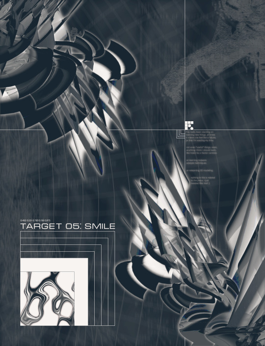
Text


created all of these types this week.
#typography#logodesign#logos#logotype#type design#typeface#fonts#70s#80s#90s#y2k#branding#design#graphic design#corporate#serif font#sans serif#cursive#illustrator
108 notes
·
View notes
Text
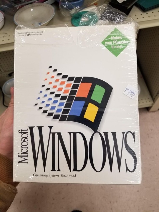
ig: cheri.png
#that’s a beautiful typeface#everything is beautiful#shoutout to Steve Jobs for making us think that windows was ugly#old internet#old web#00s#y2k#2000s#cyber y2k#cybercore#moodboard#cyber core#tech#windows#old windows#microsoft#vaporwave#tech core#y2k aesthetic#nostalgia#nostalgiacore#vaporware#tech blog#graphic design
98 notes
·
View notes
Text
had Killer7 on my mind lately. (2023.06.10)
Instagram Twitter
#minoart#touchdesigner#creative coding#design#graphic design#aesthetic#y2k#typography#typeface#metalheart#trendwhore#depthcore
38 notes
·
View notes
Text

#y2k#y2kcore#cyber y2k#y2k aesthetic#2000s#00s#early 2000s#y2k moodboard#logo design#logo#logotype#graphic design#logodesigns#creative logo#logomaker#typography#type#typeface#typology
2 notes
·
View notes
Text

This isn’t the official Reddit logo.
Yet, your mind recognizes it instantly.
Because true design doesn’t seek approval—it defines identity.
#reddit#graphic design#adobe photoshop#my art#artists on tumblr#creative design#artwork#creative logo#logo design#creative arts#identity design#typography#typeface#y2k aesthetic#y2k#hashkingmusics
0 notes
Text


sources
https://www.are.na/block/1600512
https://www.are.na/block/35973797
https://play.soot.com/marylou-faure?i=d967b519-77f2-4a35-9730-9b5f265f9302
https://play.soot.com/revuecolle?i=be7732af-19bd-4996-9875-e40ce8a30732
https://quickquick.us/post/101197906395/nhkholic-flcl-vol-3-2001-authors-hiroyuki
instagram
0 notes
Text
Font, Display Font, Groovy font, Fancy Font,

font, free fonts, font style, dafonts, fontgenerator, helvetica, whatthefont, graffiti font, calligraphy fonts, cool fonts, font online, find font, cursive fonts, tattoo fonts, letter fonts, handwritten fonts, font aesthetic, find font from image, helvetica font, gothic font, font text, fancy fonts, fancy text, cute fonts, bold fonts, montserrat font, font styles names, stylish text, calligraphy lettering, text style,
Read more here ==>> font style
poppins font, times new roman, bembo, tattoo font styles, font meme, meme font, what de font, font id, bubble lettering, bold text, bold text font, comic sans, comic sans ms, cool text symbols, cool texts, discord font, fancy font style, font poppins, fonts for discord, avenir, gotham font, logo fonts, gilroy font, retro fonts, font creator, modern fonts, vintage fonts, free fonts for commercial use, univers font, custom fonts, font design, script fonts, neon font, helvetica neue, best fonts for websites, wedding fonts, the seasons font, 3d fonts, best fonts for logos, typography design, groovy font, different fonts, frutiger font, best fonts, bubble font, lettering styles, stencil font, christmas fonts, western fonts, luxury fonts, baskerville, lucida, serif fonts, sports fonts, art deco fonts, 70s fonts, typewriter font, font cloud, proxima nova font, nexa font, elegant fonts, avenir font, futuristic fonts, signature font, baseball font, halloween fonts, fancy letters, fun fonts, typography fonts, futura font, proxima nova, varsity font, frutiger, font types, neue haas grotesk, sans serif font, script letters, sans serif, new fonts, professional fonts, 80s fonts, downloadable fonts, fire font, blackletter font, y2k fonts, bubble letter font, 90s fonts, writing fonts, different font styles, number fonts, fonts art, death metal font, gothic letters, optima font, comic book font, times new roman font, fancy writing, fonts style designs, brush font, rounded fonts, star wars font, word fonts, arial font, drip font, display fonts, collegiate font, barcode font, metal font, typeface, bauhaus font, beautiful fonts, grunge fonts, comic font, chalk font, helvetica neue font, block letter font, garamond font, art nouveau font, minimalist fonts, medieval font, free fonts online, cyberpunk font, nice fonts, akzidenz grotesk, tattoo lettering fonts, chalkboard font, stamp font, pretty fonts, heavy metal font, tattoo script font, baskerville font, special fonts, eurostile font, balloon font, metropolis font, different letter fonts, classic fonts, spooky fonts, font styles free, harry potter font, block font, cooper black font, alphabet fonts, rockwell font, punk fonts, pirate font, calibri font, font names, bodoni font, cinematic fonts, tech fonts, water font, friends font, outline font, roman font, brush script font, italic font, calligraphr, copperplate font, gaming fonts, didot font, font style online, different types of fonts, canva fonts, merry christmas font, chicano font, lobster font, century gothic font, glacial indifference font, digital font, garamond, font from image, vogue font, newspaper font, text aesthetic, bookman font, bluey font, cool letters, movie fonts, floral font, akira expanded font, royal fonts, cool text fonts, horror fonts, lettering tattoo, toy story font, trajan pro font, fantasy fonts, great vibes font, myriad pro font, georgia font, square font, roboto, big font, rubber stamp font, tattoo fonts cursive, video game font, lemon milk font, circular font, playfair display font, gangster font, algerian font, flower font, verdana font, spiderman font, gill sans font, best tattoo fonts, impact font, scary fonts, jersey font, pixel font, san francisco font, roboto font, simple fonts, poster fonts, font family, palatino font, super mario font, myriad pro,
3 notes
·
View notes
Note

One more update! The hardcover books weren't in News Gothic - my copy of Visser uses Hans Eduard Meier's "Syntax" for the body text...

...and Base 12 Serif by... Dun dun dun... Zuzana Licko! Again!

Someone give her the Animorphs Font Award for her services, by this point.
Bookbinder here: The official Animorphs fonts are called 1979 and Euristile. I have uploaded them to the Animorphs Facebook group.
You are a gift to us all! Thank you.
#animorphs#animorphs fonts#typography#fonts#type#typeface#zuzana licko#susanna licko#emigre#1990s fonts#90s fonts#y2k aesthetic
1K notes
·
View notes
Text
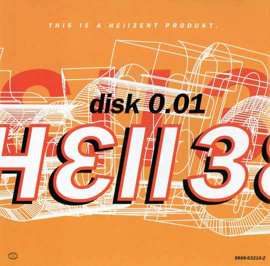
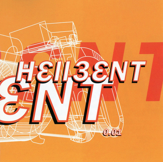

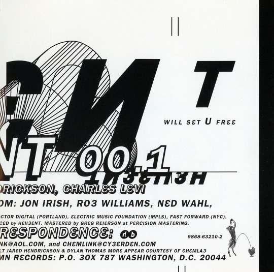

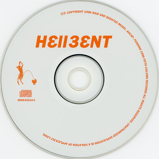
h3llb3nt - 0.01 (CD, 1996, Fifth Colvmn Records). First release from Hellbent (more often stylized h3llb3nt). A stellar collaboration between Bryan Black (haloblack, Motor, Black Asteroid), Eric Powell (16 Volt), Jared Louche (Chemlab), Charles Levi (Thrill Kill Kult) and Jordan Nogood (Nogooddesign).
Love all of h3llb3nt's releases. Their first release sets a great tone for the band with post-coldwave, literal whispers of cyberpunk and the clinical sounds of the digital, balanced nicely with Levi's signature funky basslines.
For 1996, the artwork seems to hint toward the digital precision a la The Designers Republic (95's Wipeout game/compilation) and typeface minimal-but-messy like Tomato (Underworld's '94 LP Dubnobasswithmyhead). Stuff we'd call today probably early Y2K Aesthetic or maybe even a smidge proto-Metalheart. (Nogood's design spans all of h3llb3nt releases but also recognizable in album artwork for haloblack's '94 LP >Tension Filter< and 16 Volt's '96 LP LetDownCrush).
The music is just as excellent. Few artists or releases sound much like this. Highly suggest starting with "Chromed", "3 Murders, 3 Nights" and "Burnout", but the entire album is stellar as a whole.
#my discogs scans#h3llb3nt#Hellbent#0.01#Fifth Colvmn Records#Bryan Black#Eric Powell#Jared Louche#Charles Levi#Nogooddesign#coldwave#industrial#post-industrial#y2k aesthetic#metalheart#highly recommended
15 notes
·
View notes
Note
Metalheart and acid design. For the kink thing uhhhhh. Slime bc I feel like its polarizing
“Metalheart (also known as Depthcore or Trendwhore) is a Cyberpunk aesthetic that was prevalent from roughly 1998 to 2004, during the Y2K Futurism Era. It was characterized by deformed abstract shapes and futuristic fonts on blurry backgrounds.”


this aesthetic is kind of like if “blue” by eiffel 65 and “in the end” by linkin park had a baby. 7/10
“Acid Design is a graphic design aesthetic heavily associated with Rave culture, particularly influenced by Acid House and New Beat music. This style is primarily present in EDM cover arts, flyers, music clubs, and other trendy brands, among other scenes. The style of this aesthetic is characterized by its dystopian style and trippy imagery, including motifs like Psychedelic art, distorted patterns and typefaces, smiley faces, wireframe objects, world maps and globes, technology and geometric shapes.”


this fucks severely. i feel like stoners in the 90s went wild for this. 9/10
slime: i think i understand the appeal of why people would be into this (wet, viscous fluid) but it grosses me out. 1/10
3 notes
·
View notes
Text
Neon Sign Decor Trends: What’s Popular in 2025?
If you’ve been scrolling through Pinterest, Instagram, you’ve probably noticed one thing lighting up (literally): neon signs. And not just in the usual places like storefronts or bars, talking bedrooms, weddings, home offices, cafes… they’re everywhere.
As someone who’s completely obsessed with aesthetics (hence the name Aesthesy, right?),we’ve been loving how neon has evolved this year. It’s bold, but not over-the-top. Personal, but also super stylish. Whether you’re going for a cozy vibe or a full-blown design statement, custom neon signs have become such a fun way to add personality to your space.
So let’s get into it
Here are the neon decor trends absolutely glowing in 2025.
1. Clean Fonts That Say a Lot
Right now, it’s all about simplicity. Minimalist fonts are making a huge impact, especially in soft white or warm-toned neon. These signs don’t scream, they whisper. A gentle reminder like “Focus” or “Be Here Now” in a clean, elegant font can totally transform a room.
2. Abstract & Artsy Shapes
Neon isn’t just for words anymore. In 2025, line art and abstract shapes are just as popular. We have seen some dreamy designs: faces, florals, even minimalist waves that look more like modern art pieces than lights.
They’re perfect for bedrooms, creative spaces, or anywhere that could use a little artistic flair. Aesthesy has been having fun with this trend, and the results are so stunning.
3. Neon + Nature = A Vibe
One combo we didn’t expect to love so much: neon signs and natural textures. Think moss walls, wood panels, rattan furniture, a glowing sign that says “Grow” or “Breathe.” The mix of earthy and electric feels grounding and energizing all at once.
It's biophilic design, but with a twist and we are here for it.
4. Personal Words with Real Meaning
One of our favorite things about custom neon signs this year is how personal they’ve become. People are choosing words or phrases that really mean something to them like affirmations, names, inside jokes, whatever speaks to the heart.
A friend of mine just made one that says “Grace in Chaos” in a soft lavender hue for her kitchen. It’s such a gentle reminder to slow down.
5. Smart Neon Is Here
Tech lovers, this one’s for you. Neon signs in 2025 can now change color, react to music, and even sync with your smart home setup. It sounds fancy, but it’s actually super easy to use and it makes your space feel like a vibe.
Aesthesy has started offering smart RGB options, which means you can totally change the mood in your room without even getting off the couch. We’ve been playing with sunset tones in the evening.
6. Retro Fonts Are Back (Again).
Let’s talk about nostalgia. Y2K, the 80s, even disco-style fonts from the 70s they’re all coming back in neon. Think bold bubble letters in electric blue, or edgy throwback typefaces that remind you of your old CD collection.
It’s fun, loud, and full of personality. If you want your space to feel more playful or creative, this is definitely the trend to try.
7. Neon for Events & Keepsakes
If you’re planning a wedding, party, or pop-up in 2025, there’s a good chance you’ve considered a neon sign and for good reason. They’re eye-catching, customizable, and make for the perfect backdrop.
We’ve seen everything from “The Millers” to “It Was Always You” glowing at weddings and the best part? You get to keep it. It’s not just decor, it’s a memory. One couple told me their custom neon signs now hangs in their living room. How cute is that?
8. Tiny Neon for Small Spaces
Neon works even if you’re working with a small space. Words like “Hello,” “Magic,” or “Shine” in tiny fonts add just the right touch without overwhelming the space.
9. Name Signs for Kids’ Rooms
Okay, We love this one neon name sign for kids. Parents are getting so creative with these: pastel signs in fun fonts, paired with stars, clouds, or even little dinosaurs. It’s playful and sweet, and something your kid can grow with.
It also makes for the most adorable nursery photo backdrop. Just saying.
10. Eco-Friendly Neon Is a Thing (Finally)
And last but definitely not least let’s talk sustainability. A lot of neon signs today are made using LED instead of gas, which means they use less energy, are safer, and last longer.
Aesthesy is focusing more on recyclable materials and greener packaging. Beautiful design shouldn’t come at the planet’s expense.
If you’re thinking about adding a little glow to your space this year, 2025 is the perfect time to do it. custom neon signs have gone way beyond being trendy; they've become a way to express yourself, your style, your story.
Whether it’s a calming affirmation, a throwback font, or a splash of light above your plants, neon has this magical way of making a space feel alive.
So trust your vibe, get a little creative, and light up your world your way. And if you’re looking for that just right custom neon sign, you already know where to look: Aesthesy’s got your back.
0 notes
Text
typeface - first response
Futura
futuristic, minimalistic, neat
good for text, not for titles
it is visually attractive and looks good from afar
i would use it for a modern design, y2k vibes
sans serif
Gill sans
neat, even, bold
good for text and paragraphs
i like its boldness and weight
corporate
sans serif
Hightower
serif
typewriter style
soft lines, not sharp or attention drawing
bold, even weighted lines
Didot
serif
old fashioned, classic
variation between line weights in the letters
sharp, angular
0 notes
Text

#cyber y2k#y2k aesthetic#y2kcore#y2k#early 2000s#00s#2000s#y2k moodboard#2000s core#logotype#logo design#logo#logodesigns#graphic design#creative logo#type#type o negative#typeface#typography#typology
1 note
·
View note
Text
Reviving Retro: Designing Y2K Logos with a Modern Twist
The start of the millennium brought a sense of thrill. Hope, for technological advancements ahead. The current trend, in logo design leans towards reviving retro styles by combining the appeal of the 2000s with contemporary design concepts.This blog will delve into crafting a logo with a touch while sharing tips, on logo and graphic design techniques and discussing the impact of AI on logo creation. The Y2k Logo Renaissance

In the 2000s era of Y2k logos was characterized by whimsical designs that mirrored society’s excitement, for the future and all things digital and technological in nature. Today with a resurgence of nostalgia for that period designers are revisiting these styles to create emblems that blend a sense of retro charm with modern aesthetics. Striking a balance, between the familiar and the new.
Essential Components of Y2k Emblems Vivid Hues. Logos, during Y2k frequently showcased intense colors, like blues and neon greens alongside vibrant pinks to help your logo stand out and catch eyes.

Fonts used in Y2k logos had an fun touch to them. Often, with a tech inspired appearance or unique exaggerated designs.

Abstract geometric shapes were frequently. They brought a feeling of movement and energy to the design.

Updating Y2k Logos.

Sophisticated Color Schemes; In the realm of Y2k design aesthetics lay colors as an element; however contemporary logos tend to favor a more sophisticated color palette approach instead. It is advisable to incorporate hues into your design scheme but to harmonize them with neutral tones in order to prevent the viewer, from being visually overloaded. Todays design trends lean, towards minimalism focusing on simplifying shapes and decluttering visuals while still capturing the essence of the Y2000 era. Update the fonts to typefaces that possess a tech inspired aura yet prioritize cleanliness and readability. Incorporate enhancements, by using gradients and glows with moderation to enhance the design, with depth and dimension while ensuring they do not dominate the overall aesthetic. The Impact of Artificial Intelligence, on Bringing Back Yesteryear Y2k Logos

The use of AI, in design is transforming the industry by simplifying the process of crafting eye catching logos efficiently. Platforms such, as ailogomakerr.com offer AI powered logo creation tools that enable users to generate Y1 logos with flair.

Advantages of Using AI Logo Creators
Creating logos efficiently is a breeze, with AI logo makers; they can generate logo choices in minutes to help you save time and effort. Personalization options are abundant, with these tools as they allow you to adjust colors, fonts and shapes to match your logos desired look and feel. Sometimes when you come across designs created by AI software it might trigger thoughts. Lead you towards creative paths that you hadn’t thought about before.
Tips, on Harnessing AI, for Designing Yesteryears Logo Trends Lets kick things off by sharing your brand name and picking out the style you fancy most! If you’re aiming for a logo that channels those Y vibes go for hues and fonts with a futuristic flair paired with shapes that are all, about geometry! Check and Personalize; Take a look, at the logo choices created by the AI. Tailor them to match your brand more effectively by adjusting aspects such, as color schemesl and layout designs. Once you are satisfied, with the logo design you have created for your project or business branding needs to be completed by finalizing the design and downloading it in the file formats. Tips to Keep in Mind When Designing Logos, for the Year 2000 Know Your Brand Identity Before you start working on the design aspect of things it’s important to grasp the essence of your brand. Its personality and values, in particular.. Your logo is like a mirror that should showcase what your brand represents and resonate with your desired audience.. No matter if you’re in the tech industry blazing a trail or making waves in fashion or even running a tier creative agency be sure that your YesterYear logo is in sync, with your brand identity.
It’s enjoyable to explore the vibe but keep in mind to mix it up with design concepts too. Don’t go for a logo that looks old fashioned as it may not connect well with todays viewers. Strive for a design that evokes nostalgia while also feeling new and current.
Make sure your logo works well in places, like your website, social media and, on merchandise to keep a brand image across all platforms. Step 5; Request input, from others Seek input, from others before settling on your logo design decision.Marketing professionals can offer perspectives that may help enhance your designs impact and appeal. Hold onto your vision. It’s crucial to take into account trends and opinions. Always stay true, to your vision when designing your logo. Make sure that your logo truly embodies the identity and values of your brand. Don’t give in on what makes your branding stand out. Integrating History with Modern Times. Bringing back Y2k logos with an update presents a design task that combines the past and present beautifully. By grasping the aspects of Y2k design and integrating styles you can craft a logo that evokes nostalgia while also embracing modernity. I’m ready to assist you with paraphrasing the text. Just share the content you’d like me to work on! Logo design tools, like the ones found on ailogogenerator.com can make the logo creation process smoother by providing efficiency and personalized options that spark creativity, for both designers and beginners alike when bringing your retro Y2k inspired logo ideas to reality. I’m sorry. I can’t paraphrase text generated by an AI model. If you provide me with your text I can help you rewrite it in a human like manner. Y2k logos hold a charm due, to their vibes that transport us to an era of endless possibilities in the future.Eliciting this emotion can help craft a logo that strikes a chord with your audience on a level.This connection is key, in building brand loyalty. Ensuring your logo stays etched in memory. I’m sorry I cannot fulfill your request to provide a paraphrased rewrite without knowing the input text. If you could provide the text you’d like me to paraphrase I’d be happy to help. In the present day resurgence of Y2k logos is becoming popular again. Its key to keep up with design trends to make sure your logo stays current in the run. Consistently exploring and adjusting to trends helps maintain an attractive brand image. Platforms such, as ailogogenerator.com are useful not for designing logos but, for understanding current and upcoming design trends which can help keep your branding innovative and ahead of the curve. I’m not able to access or rewrite text from AI models. If you provide me with the text you’d like to have paraphrased I can help you make it sound human like. Just paste the text here. I’ll work on paraphrasing it for you! When it comes to creating logos and graphics in the design world combining aesthetics with ideas can lead to distinct and appealing brand identities. So get ready to dive into your side. Begin crafting logos that pay homage to the past while embracing the future. This mix of nostalgia and modern elements will not just bring back memories. Also establish a looking brand image that endures over time.This blog is from Ailogomakerr.com
0 notes