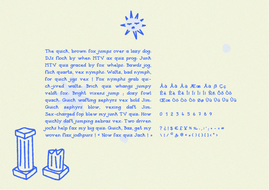
#serif font
Text


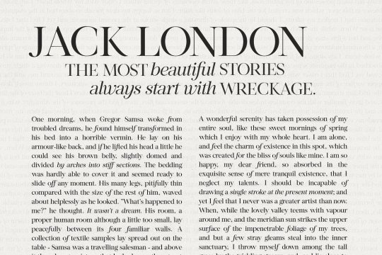
created all of these types this week.
#typography#logodesign#logos#logotype#type design#typeface#fonts#70s#80s#90s#y2k#branding#design#graphic design#corporate#serif font#sans serif#cursive#illustrator
85 notes
·
View notes
Text

Philosykos Serif Font by Harmonais Visual
Download here.
Follow WE AND THE COLOR on:
Facebook I Twitter I Pinterest I YouTube I Instagram I Reddit
28 notes
·
View notes
Photo
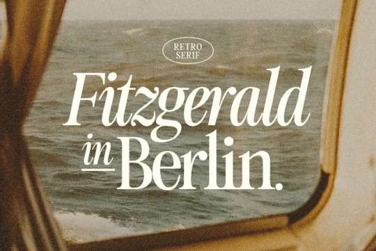
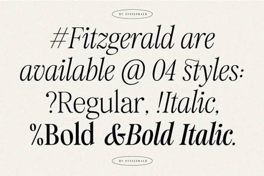
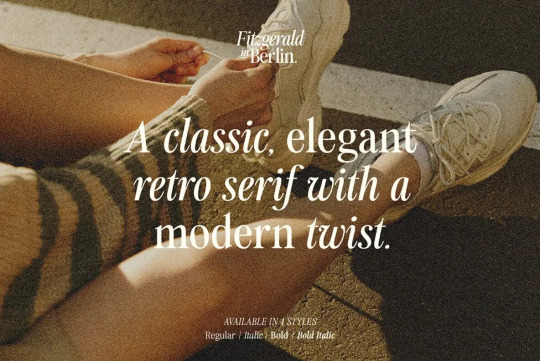

Fitzgerald Retro Serif Typeface - $18
Fitzgerald is a reminder that you can’t go wrong with a classic, elegant serif font. The inherent flexibility of the font lends itself to nostalgic, clean designs that also have a modern twist. In short, Fitzgerald is timeless. Its dignified, old-school modernity is perfect for logos, packaging, editorial, branding, posters, art projects, visual identity, advertising, educational materials, social media, web design, book titles, and more. Fitzgerald—a retro serif for today’s graphic designers.
Fitzgerald is presented by Harmonais Visual, a studio offering a broad range of mockups, fonts, and other digital design resources. The unifying feature of their collection is the way they build elegance and beauty from simplicity.
Purchase Fitgerald Here
#thedsgnblog#design#typography#type#typeface#font#font family#type family#serif typeface#serif#serif font#retro#print design#graphicdesign
201 notes
·
View notes
Photo
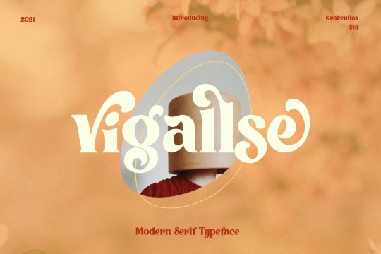


Vigallse font designed by Yahdi Kumala
#modern font#serif#fonts#typography#design#web design#webdesign#vintage#font#serif font#serif fonts#lettering#type#typeface#book cover#book cover design#magazine cover#magazine cover design#brand#branding#brand design#branding design#ttf
127 notes
·
View notes
Text


Andromeda is a handmade font that can be used for branding or illustrations. You can purchase it in my etsy shop
#typeface#typography#lettering#typo#font#graphic design#handmade font#hand drawn font#serif font#illustrative font
11 notes
·
View notes
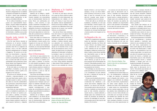
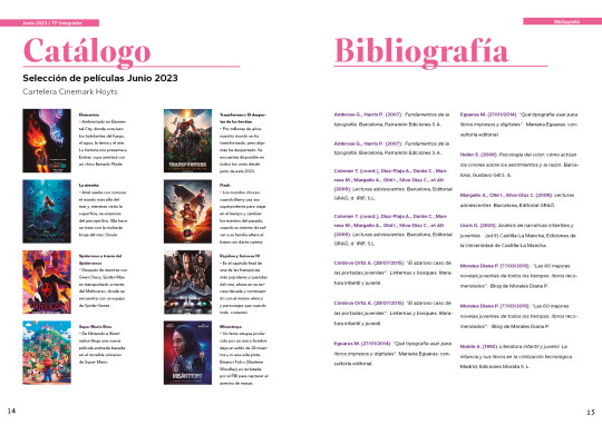
Text
TP Integrador - Computación II | Lic. en Diseño y Comunicación Visual UNLa | 1° cuatrimestre 2023
La consigna consistía en diseñar un cuadernillo/revista de un total de 16 páginas, con el objetivo de ordenar y jerarquizar información en el género gráfico Revista, demostrar pericia en la instrumentación de aplicaciones de maquetación digital, demostrar haber incorporado modos de apropiación de retículas tipográficas, familiarizarse con aspectos funcionales y estilísticos de la tipografía, y experimentar con combinaciones tipográficas en tamaños display y texto.
El objetivo (más personal que de la consigna) fue crear un sistema y estética elegante y chic, intentando ir por colores vivos y llamativos, por lo que para trabajo, opté por una paleta de colores cálida, teniendo como color principal un magenta-rosado y como colores secundarios, y para general mini-sistemas en las dos notas, un naranja (nota personal) y un verde manzana claro (nota en honor a familiar). También, utilicé para los títulos y subtítulos fuentes serif, y para los distintos bloques de texto más extenso opte por distintas sans.


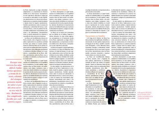


#editorial design#graphic design#magazine#college work#diseño y comunicación visual#UNLa#trabajo practico#university work#college course#julio 2023#warm palette#pink#orange#serif font#serif#sans#sans serif#palo seco#remates
9 notes
·
View notes
Photo
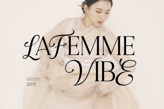
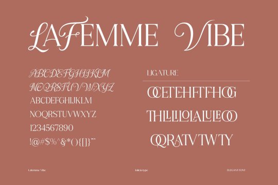


LaFemme Vibe Modern Serif Font
★ ᴅᴏᴡɴʟᴏᴀᴅ • ꜰʀᴇᴇ ꜰᴏɴᴛs ᴏꜰ ᴛʜᴇ week
2 notes
·
View notes
Text

#iphone notes from 2017#used to be happy being unhappy but now it just hurts#art#vent art#journal#visual diary#ed recovery#depressing shit#serif font
4 notes
·
View notes
Text
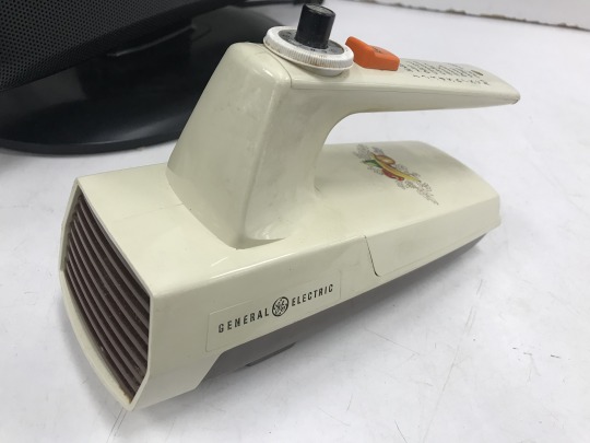
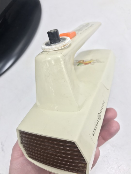
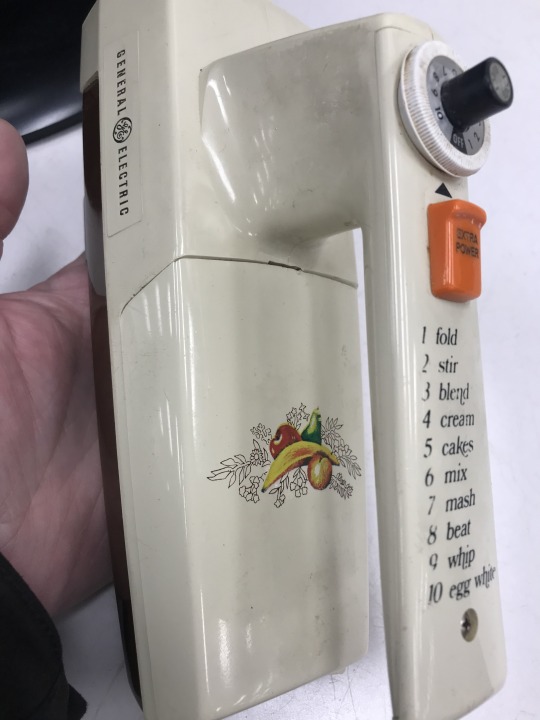
amazing "Harvest" General Electric blender seen at thrift. That LETTERING though. beautiful device.
#1970s#60s#thrift store#kitchen#kitchenware#general electric#70s#vintage#harvest#harvet gold#old school#blender#fruit#serif font
5 notes
·
View notes
Text

Elita-1: "I was hoping you'd say that, makes the job so much mor fun!"
✨️She✨️
#Live-bork: Transformers Earthspark#Secret Legacy Part 1#No id#Chat format#Fancy font#Lucille font#serif font#chat format
8 notes
·
View notes
Text

Super Cool & Modern Style Wedding Invitation
Digital downloads are available
https://www.zazzle.com/z/2grxxzb3?rf=238828267405258083
#wedding invites#wedding invitations#modern#abstract#cool#wedding celebration#stylish#trendy#zazzle made#personalize#customize#unique#colorful#lioness designs#print design#stationery#script font#serif font#art
4 notes
·
View notes
Text
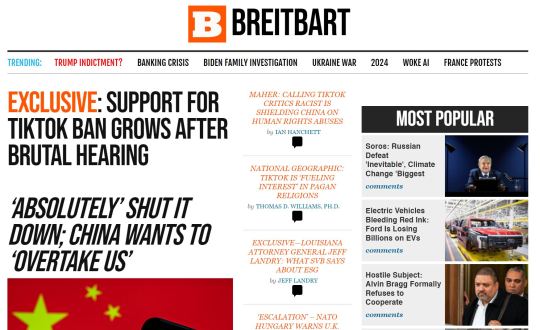

A lot of websites use their design, layout, and typography to emphasize what they are. It amplifies the message, resonates with the reader, and sets unconscious expectations for the kind of discourse you can expect.
You'd never mistake Breitbart for Quillette on a first page-load of either. The design and typography in the first image is tacky, emotional, urgent, shouty -- you know before you've even processed any of the words that it is meant to make you angry or scared.
The second design is staid, it looks like journalism, it has a veneer of modern sensibilities, minimalism, it's high class, or maybe even a luxury good. These are thoughtful people who went to the Correct Schools! These people have friends in San Francisco who really understand modern design.
Don't be fooled, though; underneath all of it the two outlets are pushing essentially the same line. And the cool professional moderate tones of Quillette are perhaps more dangerous, because they're harder for a "reasonable" centrist to dismiss out of hand, to recognize as propaganda right off the jump. After all: it looks like expertise should look! These ideas seem pretty serious!
~~~
Just because a website looks thoughtful and serious, and its layout and typography suggest that you should take it very seriously, you still need to grapple with the substance of the ideas therein, on their merits. It's a hard unconscious bias to recognize, let alone defeat.

2 notes
·
View notes
Photo


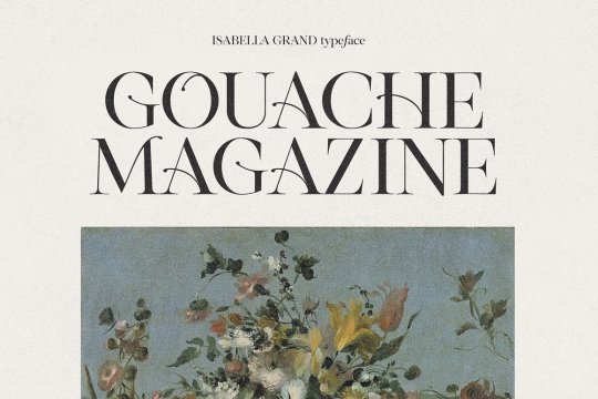
Isabella Grand Typeface by Nicky Laatz
Download here.
Follow WE AND THE COLOR on:
Facebook I Twitter I Pinterest I YouTube I Instagram I Reddit
27 notes
·
View notes
Text
Shany - An Enchantress Handwritten Free Font | Pixelo Freebies Bundle

Shany is the Enchantress among all fonts. The most beautiful handwritten free font made for your graphic design. An invincible bold look in every stroke of this font is tinted with feminine blush.
Create stunning blog banners. Design your cards, invites, and scrapbooks. Also, you can print products like T-shirts, mugs, caps, portraits, etc.
Express your art to the world with Shany and attract your desired audience.
Be a graceful designer❤️
#graphic design#typography#serif font#fonts#calligraphy#freebies#bundle#pixelo#writers#design#art#font style#typeface#editorial design#type#content writing#blogs
7 notes
·
View notes
Photo


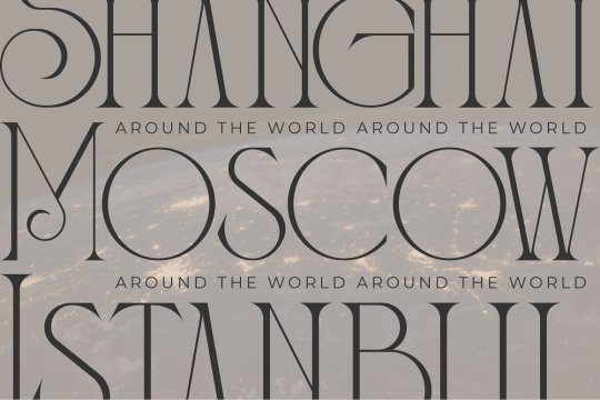


Bagisko font designed by Storytype Studio
#fancy#retro#serif#fonts#typography#design#web design#webdesign#vintage#font#serif font#serif fonts#lettering#type#typeface#book cover#book cover design#magazine cover#magazine cover design#brand#branding#brand design#branding design#ttf#otf#woff
101 notes
·
View notes
Note
So my friend just showed me dis blog, and I wanna try ask something! Is there anything you do to kill time in that area you’re in?

“i like to garden when i’m bored, it’s nice when you get that feeling of taking care of something special!”
#Serif#Serif font#Undertale#Ask#Art#Sorry for the low quality art!#I’m not used to so many asks wow-#That’s cool your friend showed you this blog!
4 notes
·
View notes
Last Seen Blogs

summerwithaniinit
noot

goldandorange
RAAHHHRAHHRHHRRAH

loatheyoulately
Untitled

jeff66000
MY BLOG
disasterhumans
"I don’t want your pockets to get too heavy"