Don't wanna be here? Send us removal request.
Statistics
We looked inside some of the posts by touchwithyoureyes and here's what we found interesting.
Average Info
Notes Per Post
29
Likes Per Post
22
Reblog Per Post
7
Reply Per Post
0
Time Between Posts
5 days
Number of Posts By Type
Photo
12
Text
5
Last Seen Tumblr Blogs


Fun Fact
US Tumblr user growth rate is estimated to slow down to 4.1%.
Photo
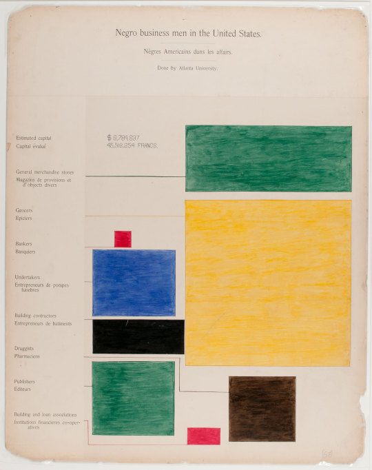
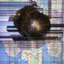
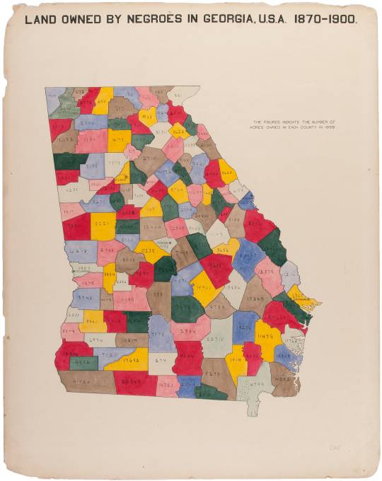
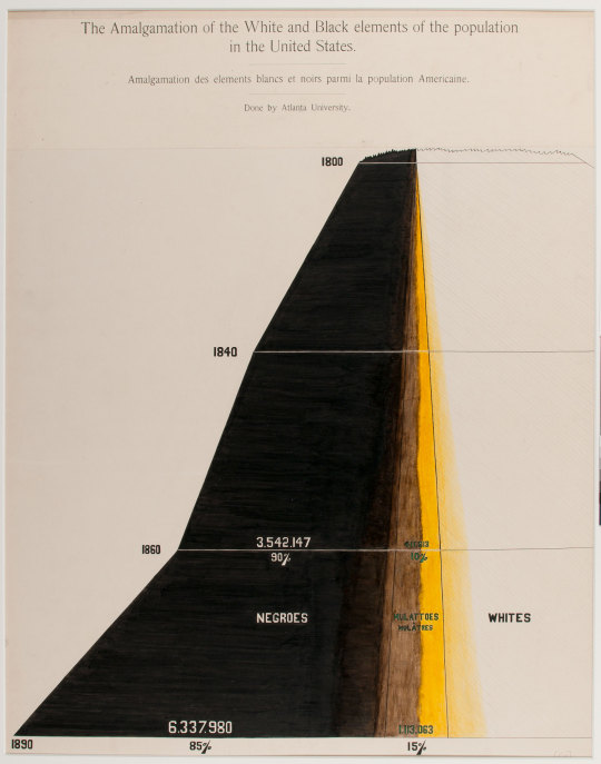
The infographics of W.E.B. DuBois and his team as presented at the 1900 Worlds Fair in Paris are among the most striking and vivacious considering their time. Their bold, vibrant colors and the unique utilization of geometric shape and hard line communicate data of stifled Blacks living in America at the turn of the century, a mere 40 years after slavery had been abolished in the United States. His infographics or “data portraits” as they have also been referred to, were created for the expo entitled “The American Negro” in ink, gouache watercolor, graphite and photographic prints and made this socioeconomic data and information accessible and visually communicated it to a foreign audience. W.E.B. DuBois brought this demographic of Black American businessmen into the international spotlight and utilized visual communication design to accurately portray this demographic of Americans as successful educated businessmen to a broad audience of international fair go-ers and for an audience which may not have even anticipated this data as a reality in the United States upon entering the fair. The exhibition and W.E.B. DuBois’ social commentary through his infographics highlighted racial inequality and injustice in America at the time. The design concepts used in these infographics were extremely ahead of their time and cutting edge during a period where the decorative arts were in their prime and the style of art nouveau was at its peak. As Brittanica writes of the art nouveau we can see that W.E.B. DuBois’ “data portraits” were very modern for their time in contrast to “Art Nouveau [is] characterized by its use of a long, sinuous, organic line” and acceptation of the decorative and organic form.
DuBois can be credited here as one of the fathers of sociology and is one of the first prominent Black figures in the new field which was just in its infancy during this time period.
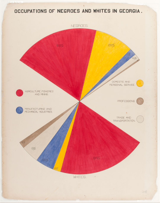
Source: National Postal Museum
Dr. Whitney Battle-Baptiste, Director of the W. E. B. Du Bois Center, discusses W. E. B. Du Bois's data portraits, as displayed in the new exhibit in the Science and Engineering Library: “And the beauty of the infographics for DuBois— they were accessible to all regardless of language, regardless of literacy... you could see these modernist pictures [and] draws you in to find out what is this picture about? The data of everyday life..."

Sources: sixtysixmag.com
2 notes
·
View notes
Photo
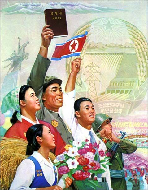
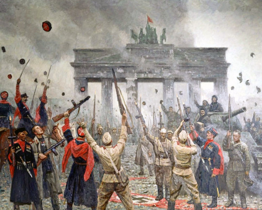
SOCIALIST REALISM AND THE ART OF PROPAGANDA
The artistic style and movement of socialist realism goes hand in hand with propaganda. Above we see a North Korean socialist realist depiction of the glory of the regime and the veneration of the proletariat.
The Tate Modern in London defines the art term, movement and style of socialist realism: “The doctrine was formally proclaimed by Maxim Gorky at the Soviet Writers Congress of 1934, although not precisely defined. In practice, in painting it meant using realist styles to create highly optimistic depictions of Soviet life. Any pessimistic or critical element was banned, and this is the crucial difference from social realism. It was quite simply propaganda art, and has an ironic resemblance to the Fascist realism imposed by Hitler in Germany (see Entartete Kunst – degenerate art). Outside the Soviet Union, socialist artists produced much freer interpretations of the genre as the paintings on this page illustrate.”
Another great article from ArtNews entitled “A Second Life for Socialist Realism: European Museums Revise the History of Socialist Realism” is fantastic further reading on how the style and movement is and was so very important to disseminating and communicating government propaganda visually.
This painting by Marsel Van Oosten captures the exaltation of liberation and extols the virtues of the Soviet army in freeing Berin from the Nazi regime only to later suppress the nation, the eastern bloc an promote communist ideologies which were to take hold in East Germany and East Berlin throughout the next few decades.
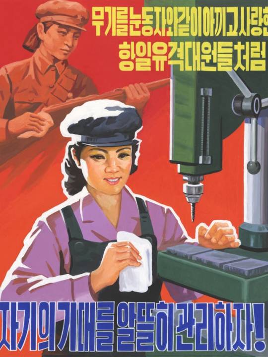
This article in The Independent reviewing a 2015 exhibition in China entitled “Art of the state: Pyongyang propaganda posters to be exhibited in China” features some fantastic North Korean propaganda and socialist realism posters. The posters feature brilliant color and impeccable understanding of graphic design as it pertains to communicating the party line visually.
This below poster reads in Korean: “‘Love our machines like the anti-Japanese guerrillas who loved their weapons like the pupils of their own eyes’ (1990s)”
This below piece of North Korean propaganda is a poster designed to foster anti U.S. sentiment and directs the country to “crush U.S. Imperialism!”

The following poster featuring a railway worker below reads ‘Three revolutions, let’s advance the march of grand construction with Chollima [a mythical winged horse or Pegasus] speed’ (late 2000s)
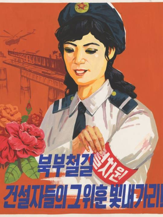
The above poster referenced the building of the new railways and features the worker holding a Kimjongilia flower that represents the dear leader Kim Jong-il.
A personal approach to propaganda:
As my family is Hungarian and was displaced at the hands of the incoming Soviet regime, my great grandfather Ferenc Nagy was forced to resign from the role of prime minister in 1947 for refusal to become a communist leader. This led to a puppet Soviet leader being installed until the “election” at the end of this term. The Budapest Poster Gallery is a gallery in Budapest and a treasure trove of vintage posters and the gallery exhibits and specializes in fine Hungarian vintage posters, propaganda posters and commercial graphic design from between 1890 and 1990. They write of this era of propaganda posters:
“The election in 1949 was the starting point of a new, dictatorial era. In the same year, a new constitution was written, which provided a strong basis for the communist regime. The power of the working class was supposed to be represented by the strong dictatorship of the Hungarian Workers’ Party, and its leader, Mátyás Rákosi. Meanwhile, the country was under the occupation of the Russian red army which took every aspect of the life of Hungarians under its control. These were the darkest years of communism, when the economy went thorugh a disastrous downfall and human rights were trampled. The period of this forceful dictatorship was ended by the revolution of 1956. Although the uprising did not manage to totally strike down the communist leadership, as a result of the extensive international awareness it had raised, the system slowly started to get softer, but only after the terrible initial retaliations following the revolt. ”
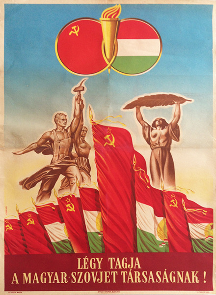
A poster by Istvan Czegledi reads: “Be the member of the Hungarian - Soviet Association!:
The Budapest Poster Gallery writes of the significance of this socialist realist movement and how restrictive it was upon artists, graphic designers and the arts in general and what could be communicated visually and how:
“The themes of painting were also restricted; they were mostly scenes from the workers’ idealized lives. In the 1930s and 1940s, there was a realist tendency present in Hungarian poster art. For example, Tibor Gönczi-Gebhardt designed posters with plastic and monumental forms, and simple political symbols. This tradition gained ground in the 1950s, because it matched the expectations of the new regime. The revolutionary modern poster design of the short democratic period between 1945 and 1949 rapidly vanished. The principles of the rigid and ceremonial soviet poster design became the guidelines for Hungarian artists. This change meant the near exclusivity of socialist realism. Photo-like realistic human figures appeared on the posters, who were mainly idealized typical characters: smiling workers, proud peasants, housewives and children with theatrical gestures, standing straight with their heads up, staring into the distance. They are often marching or working at factories, mines, or wheat fields, laying the foundation of the bright future.
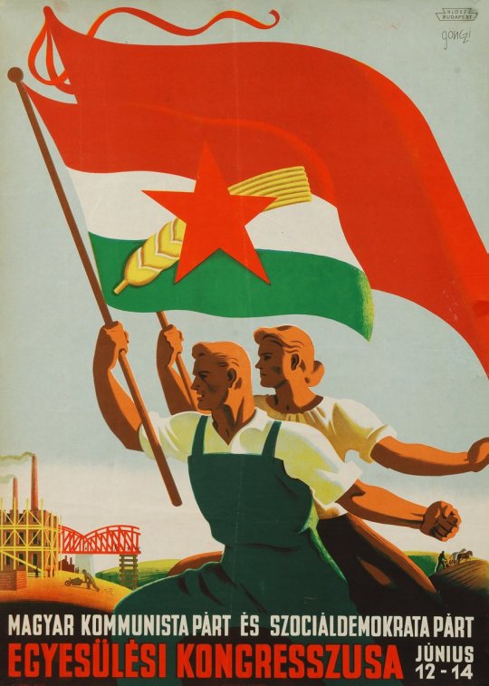
The Magyar Nemzeti Galéria or the Hungarian National Gallery features this visually striking propaganda poster in their collection from 1948 by Gönczi-Gebhardt Tibor advertising the sham “unification congress” of the two parties combining into the Hungarian Socialist (Communist) Party and is reminiscent of the art-deco style:
1 note
·
View note
Photo
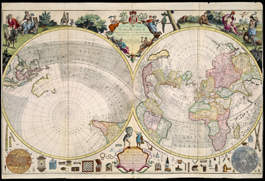
Cartography, or map making, is one of the oldest forms of visual communication in the realm of geography and exploration. Maps have been found as far back as antiquity for example the oldest known map in Japan is a topographical drawing discovered on a stone wall inside a tomb in the city of Kurayoshi, in Tottori Prefecture, dated to the 6th century AD. However, during The Enlightenment mapmaking saw the emergence and development of cartography into a form of art/artistic expression in and of itself with each cartographer or artist’s individual style and characteristics present in the illuminations surrounding the maps or even within the map itself.
I have always had an affinity for maps and [amateur] mapmaking, remembering back to when my brother and I used to draw maps of our “settlements” and chart our explorations in the woods.
Pictured above is the brilliant A New and Correct Map of the World Projected upon the Plane of the Horizon laid down from the Newest Discoveries and most Exact Observations by C. Price c. 1714 | Sold by G Willdey at the Great Toy Shop next the Dog Tavern in Ludgate, London, England where there may [have been] several other Maps of this Size...” as featured in Volume 4 of The History of Cartography Project, University of Wisconsin, Department of Geography:
“The European Enlightenment, the period from ca 1650 to ca 1800 treated in Volume Four, might be called the era of the map. It was characterized by several key themes. As a form of knowledge, “map” proliferated as a metaphor exemplifying the construction of knowledge in general. The concept of the geographical map was dynamic and exciting to contemporaries, embodying as it did the complex and intellectually fruitful discipline of “mathematical cosmography” that integrated the study of the heavens and the earth. The intersections between maps and scientific inquiry reflected that integration in the work of the newly created, state-sponsored scientific institutions to support cartographic endeavors. Government and administrative institutions increasingly relied on maps in order to regulate and control their territories. A burgeoning widespread print and visual culture produced maps in both manuscript and print that adhered to a common aesthetic of layout and design. Calls for a “plain” aesthetic, with decorative and pictorial features concentrated in the map periphery, were part of general Enlightenment print rhetoric. Increasingly, conventional standards of design and presentation also affected topographical and other large scale mapping in manuscript.”
Maps today are still printed despite the rise in the field of Geographical Information Sciences which largely incorporates cartography and mapping as but renderings are primarily created digitally utilizing digital programs for Global Positioning Systems and for digital navigation. The famous company Rand McNally responsible for developing the U.S. Highway number system in 1917 and for launching the first Road Atlas in 1924 still prints and publishes traditional atlases and wall maps (although sadly devoid of vivd ornamentation and expressive artistic elements) despite the larger demand on the market for GPS systems and digital navigation products.

Source: Rand McNally
One of the largest and most remarkable maps in the world was created in the 16th century by Urbano Monte, a gentleman scholar from a wealthy Milanese family whose interests had lately turned to geography. Medium writes “The map is extraordinary for reasons beyond its size. It largely eschewed the Ptolemaic modes of representation that had held sway in mapmaking since the time of the Greeks in favor of contemporary cartographic sources. And, in an unusual choice, Monte used polar azimuthal projection, portraying the spherical Earth with the North Pole at its center — a perspective seldom used in mapmaking until the advent of air travel in the 20th century”
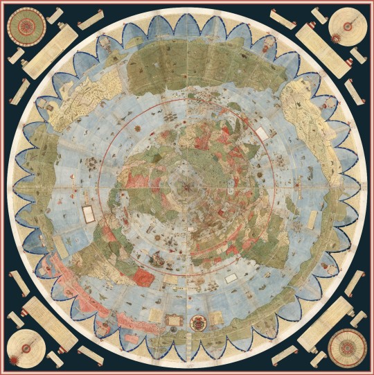
Urbano Monte’s planisphere, digitally stitched together. Source: Rumsey Map Center
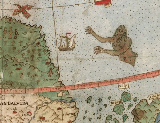
Detail of Tavola XXIII (South America, Venezuela, Guyana) with sea monster
Amed Kabil at Medium continues about these unique and playful embellishments found in maps the during height of cartography during The European Enlightenment:
“Chet Van Duzer theorizes that the monsters that persisted among so many sixteenth century maps could be an attempt by mapmakers to hide their ignorance, or to increase the market value for their works (Wealthy patrons preferred lavish decorations). As maps transitioned from ways of illustrating cosmic principles (as in the medieval mappa mundi) to being reliable instruments of navigation, the sea monsters disappeared.”
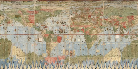
Monte’s Planisphere Georeferenced and Re-projected in Plate Caree or Geographic
1 note
·
View note
Photo

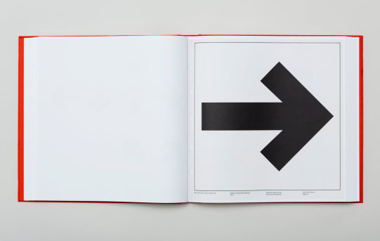
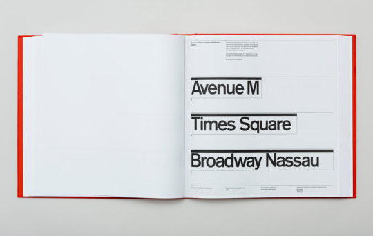
WAYFINDING + VISUAL COMMUNICATION: TRANSIT
The first photo is an archival photo from Pentagram books of the recently reprinted New York City Standards manual as originally designed by Bob Noorda and Massimo Vignelli completed in 1970. Noorda, before working with Vignelli on the New York City Subway, pioneered the way finding system for the Metropolitan Milano or Milan Subway.
Mark Byrnes writes for Bloomberg in his article The Undervalued Simplicity of Bob Noorda's Vision for Milan's Metro “In New York, Noorda and Vignelli created a unified and clear visual language for what had previously been three separately owned and competing subway systems with an impossible mishmash of signage throughout.”
Below is an original page from the standards manual employed by Vignelli and Noorda involving the visual communication and design concepts they utilized in wayfinding systems to solve the “mishmash of signage” problem which befuddled and confused riders.
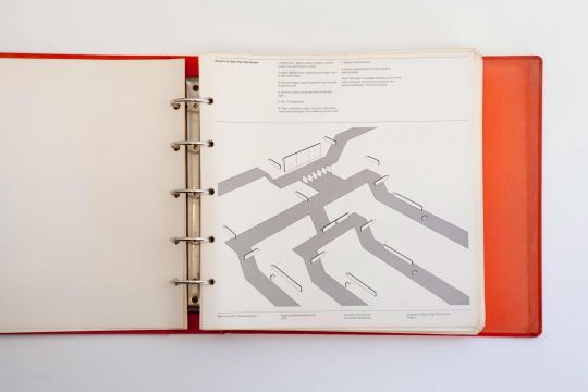
In the MoMA’s permanent design collection is an example of the iconic Massimo Vignelli, Bob Noorda designed New York City Subway Street-Level Signage Designed 1966-1970 (this version 1979) which we New Yorkers know all too well...

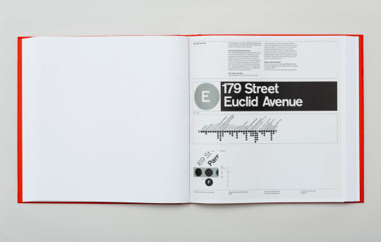
The two diagrams below shows the relationship between platform signage and passengers at San Bablia station and Sesto S. Giovanni station within the Metropolitana di Milano / Milan Metro and the importance of these spacial relationships in effectively communicating wayfinding visually. Byrnes writes:
“Noorda came up with the idea of a color-coordinated band that stretches along the walls inside each station. For Line 1 riders, a red band identifies the station name every 16 feet while a second band provides exit and transfer directions as well as safety signs. The color bands blend in with architectural elements like railings and entrances. Noorda also created a custom “grotesque” font which had an intermediate weight, enlarged counters, and shortened descenders and ascenders in order to be more legible. For their efforts, Noorda, Albini and project engineer Franca Helg were honored with the 1964 Golden Compass Award, Italy’s highest industrial design honor. Line 1 opened that same year.”
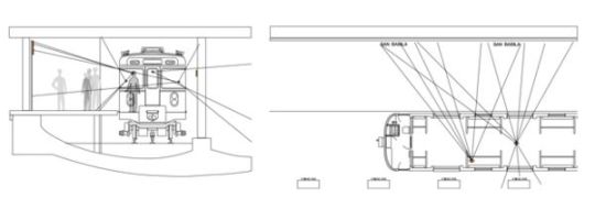
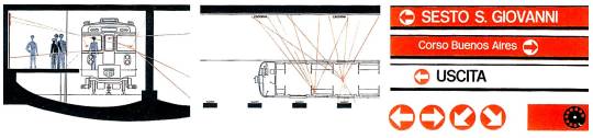
Additional wayfinding as designed by Noorda for a Line 1 station of the Metropolitana di Milano

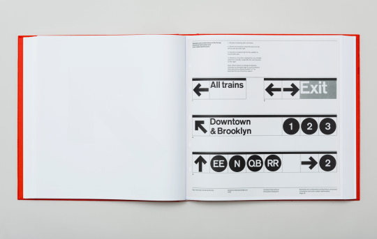
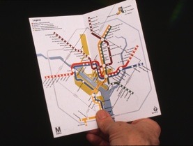
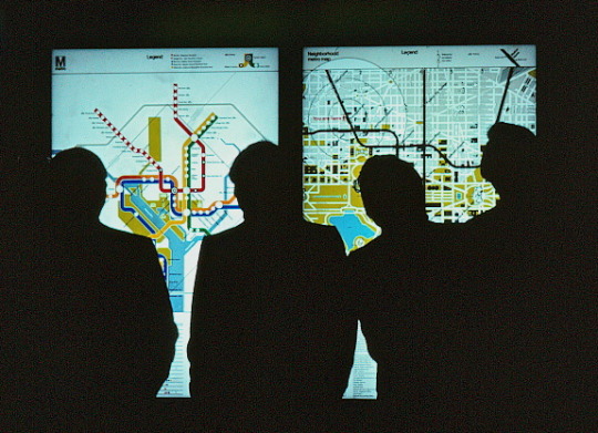
Lastly, we revisit the Washington D.C. metropolitan area in a continuation of design legends Lance Wyman and Bill Cannan who's original D.C. metro map was designed in 1974 by Wyman & Cannan Co. with wayfinding systems put in place also by Massimo Vignelli displaying bold Helvetica text indicating the train’s direction, illuminated in white with a background corresponding to the line’s color. Vignelli also utilized the bold white Helvetica lettering and wayfinding systems on dark brown with colored circles and color bands indicating the train lines present at that station and the names of the stations on that corresponding line.

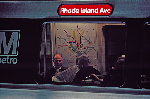
Image Source: Lance Wyman
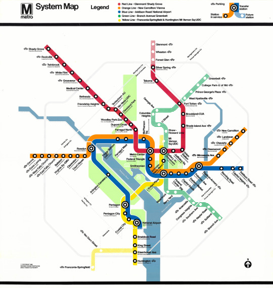
“The System Map is designed using a geometric / diagrammatic style to incorporate Washington’s geographic landscape with all major rivers, parks and landmarks including the Beltway and county borders of Maryland and Virginia. All rail lines are color-coded to tie in with all other way-finding graphics in the system. A Time / Fare panel lists all Metro stations and displays estimated travel times and required fares for each currently operating station in the system. The map was designed on a grid to accommodate the future expansion of the Metro system by adding additional lines.” images and text excerpt from http://www.billcannandesign.com/metro.html
Opening day handout:
#noorda#massimo vignelli#bob noorda#metropolitana milano#mtanyctransit#wayfinding#wmata#wayfinding systems#vignelli#design#visual communication
1 note
·
View note
Photo

This interactive infographic from @npr is a fantastic example of effective visual communication in delivering a complex and evolving data set to a broad audience, here regarding the most recent Coronavirus Daily New Cases and risk assessment for the country overall. This infographic is very easy to read, includes mood colors which reflect severity based human’s reaction to colors / attention paid to color theory (red=bad, orange=alert, yellow=caution and green=good) and divides a large amount of complex data to the reader concisely and clearly. The geometric honeycomb shape of the map is laid out in the shape of the U.S. map with clickable cells opening further more specific dialogue boxes pertaining to that specific state’s data reporting.
Image Source: NPR
0 notes
Photo

In continuing the discussion of the way in which visual communication is involved in science and so very important in communicating abstract scientific concepts and lingo to a wider audience as to make it easily digestible and more understandable we start above with the first ever image of a black hole as published by @nasa as disseminated in the press release. While ground breaking the actual image is nothing spectacular yet these fabulous renderings below diagramming a black hole more in depth and extremely vividly with vibrant color for the masses, students, etc. we see the crispness and clearly defined representation of a black hole rendered for easy readability and communication of scientific understanding of the subject matter involved in the complicated [astro]physics associated with black holes.


Image Sources: NASA
3 notes
·
View notes
Photo
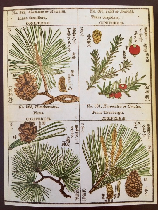
While exploring visual communication design as it pertains to the scientific world, we are led to examine the importance of the mass produced, illustrated image and it’s role in the visual representation of scientific concepts or in communicating abstract scientific ideas pictorially to an audience which may have not been familiar with such foreign species and scientific names or classifications. Before the invention of photography and even after, illustrations and renderings of abstract scientific concepts and ideas have required pictoral representations to accompany and help readers and viewers grasp the scientific language. This led to the ability to scientifically document and classify new undiscovered species of plant and animal life and paved the way for methods of modern taxonomy in the plant and animal kingdom allowing it to be shared and disseminated to others easily.
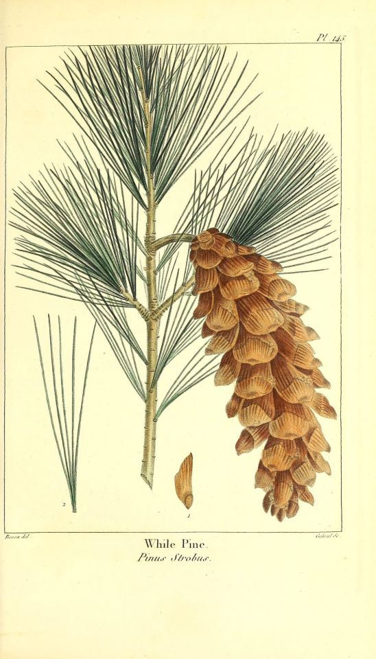
The first image is an exquisite example of French botanical illustration / botanical art at its high point in the early nineteenth century, this fine print is by Pancrace Bessa by Gabriel. It was published in "Traite des Arbres et Arbustes que l'on cultive en france en pleine terre”, a multi volume work documenting trees and shrubs cultivated in France and a showcase for the artistry of P.J. Redoute and Pancrace Bessa. This is plate 145 in the book of a white pine and its pine cone and detail of its needle structure.
The second botanical illustration is a photo I took from a page of a Japanese field guide to coniferous trees (which I discovered while on my lunch break while working for the the New York Botanical Garden in the Bronx. I used to take breaks in the library upstairs to look at books to decompress from the hectic, frenetic energy of the Membership Department and its incessantly ringing telephones)
The LuEsther T. Mertz Library is a fantastic research library with a very helpful staff of lovely librarians located within the campus of the @nybg The library was founded in 1899, is the United States' largest botanical library and was the first library whose collection focused exclusively on botany. It has an extensive database with a plethora of brilliant botanical illustrations which I highly recommend checking out. If you are interested in learning botanical illustration, the NYBG offers terrific Botanical Art & Illustration classes which I also highly recommend.
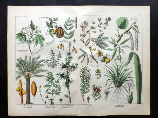
This series of brilliant botanical illustrations is a scan from a spread from the Schubert Wagner botanisches wörterbuch - or the Botanical Dictionary
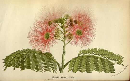
And finally an illustration of the mimosa tree (scientific name of Albizia julibrissin, also known as the Persian silk tree or pink silk tree) and its blossom by the famous illustrator Horto Van Houtteano
0 notes
Photo
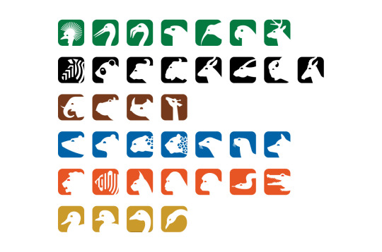
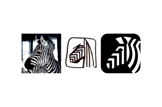
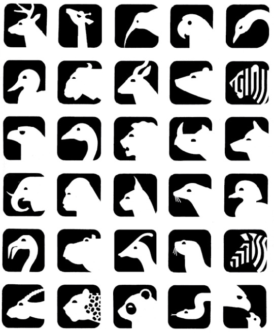
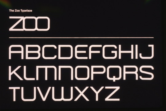
EYES ON DESIGN: ICON, INDEX & SYMBOL
In 1975 the world renowned and iconic design firm Wyman & Cannan designed the award winning logo, font and wayfinding icons for the National Zoo in Washington D.C. This project was commissioned by the National Zoo under Dr. Theodore Reed, Director and was presented with an award by the National Endowment for the Arts. It was published in @smithsonianmag, Print Casebooks, Communication Arts Magazine and featured in the @washingtonpost
As a kid and frequent visitor to the National Zoo, having grown up in D.C. I was always drawn to and absolutely in love with the branding, typeface and design elements present throughout the Zoo and it remains one of my favorite branding and identity projects to date. The sleek lines and bold contrasts allow for high visibility and easily recognizable silhouettes of the animals are international and universal; they require no texts or language and the friendly choices of bold color are inviting to children and their families (and evenmoreso are like candy to adults with an appreciation for design sense and aesthetics!)
Here is a great Bloomberg article for further reading Wayfinding With Lance Wyman
All images courtesy lancewyman.com and billcannandesign.com
1 note
·
View note
Text
instagram
1 note
·
View note
Photo

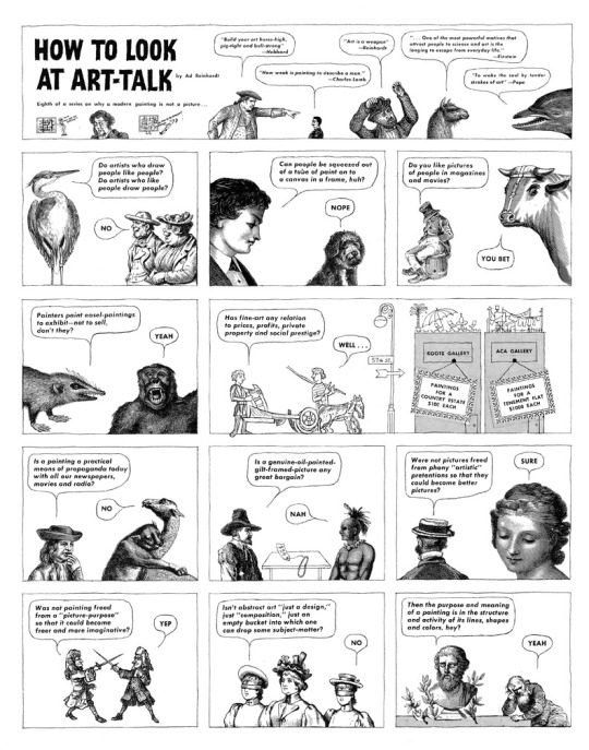
One of the most effective modes of sequential art involved in communicating a visual narrative is the comic. An interesting history of the comic strip dating back to the late 1600s can be found here
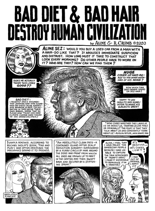
Ad Reinhardt (above) and R. Crumb (below) have been recognized for their work in comics (sometimes regarded as “low art” by the art community) so much so that their comic work has been highlighted and warranted representation on a gallery level by David Zwirner.
Ad Reinhard has utilized the illustration and techniques used in comics to introduce satirically how to view modern art, to critique the art world and to communicate and explain art theory and criticism simply and visually in a form of art comics to normal people who are not of the aforementioned upper echelon of the art world such as art dealers and curators and art critics.
R. Crumb utilizes comics to portray an alternative and risqué side of society and life, revealing a world of fetish and exploring the social underbelly of our society and exploring various subcultures through comics as a form of art.
R. Crumb also utilizes comics as a form of socio-political critique on the current state of affairs and is extremely tactful in his method of comics in communicating disdain and shared frustration visually:
Another famous artist Raymond Pettibon utilizes the comic stye of illustration as well in his graphic novels, artworks and posters. He is most famous for designing flyers for punk shows and concerts from the 70s and 80s and has illustrated and designed many graphic novels (frames of many of which have been reproduced and sold as artworks themselves) with social and political commentary and themes.
As Monica Lombardi, artist manager for Pettibon writes for The Blogazine:
“Raymond Pettibon (born Raymond Ginn in Tucson, Arizona, 1957) is recognized as one of most significant and peculiar US figurative artists, despite his outsider nature, maintained since the 80s, when he first emerged on the international art scene. The “petit bon” (good little one) – as Raymond was called by his father – adopted this nickname as surname during the late 70s when he started playing with his brother Greg Ginn, the founder of the famous punk band Black Flag. At that time, Pettibon started creating ironic and irreverent drawings: ink and gouache on paper that mixed fiction literature and comic-like sketches, creating strong, often ambiguous, associations. The artist’s works, which initially appeared on T-shirts, stickers, skateboards, flyers, cover records and such – among which, the most notable was the distinctive four-bars logo designed for the Black Flag and, later on, the cover of Sonic Youth’s 1990 album “Goo”–, at the beginning spread mainly within underground culture, helping to define the punk aesthetics.”


1 note
·
View note
Photo
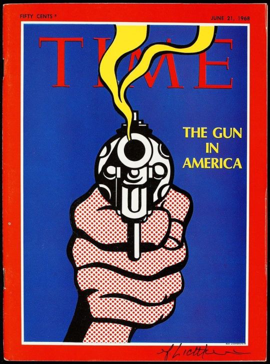
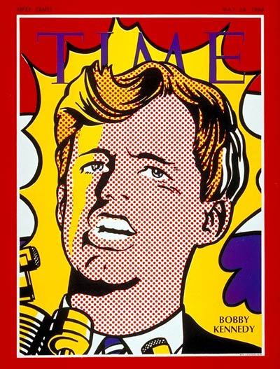
These two fantastic TIME Covers by famed pop artist Roy Lichtenstein capture the fervent anxieties and the trials and tribulations endured throughout the 1960′s. These covers artistically immortalize the difficult memories and issues with which the country struggled during this period of time. The color choices and composition of these cover designs are impeccable as per usual for Lichtenstein and his “pop-propriated” iconic comic-esque aesthetic delivered a softer blow in communicating these issues and difficult-to-digest messages visually to readers and the American people— of which some continue to be glaring issues even to this day.
18 notes
·
View notes
Photo
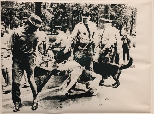
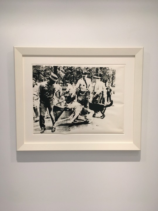
The Charles Moore Life magazine photographs from Birmingham Alabama demonstrations in 1963 reminds me of a silkscreen Andy Warhol painting titled Race Riot executed in 1964 (pictured here) - similar to this edition from the Broad - that I picked up, wrapped and delivered to the office on behalf of a client for consignment to my previous boss, an art dealer.
(A similar work from the same series of these photos by Moore that Warhol ripped off sold for $62,885,000 at Christie's in New York in May 2014)
To me, Warhol’s lack of academic integrity in failing to even cite the photographer is problematic and detestable. I do believe Warhol indeed capitalized off of the struggle and sensationalism of the moment in order to draw attention to himself and his relevance in an egomaniacal chess move. I also believe that Christie’s disgraceful capitalization on this controversial artwork and the [continued] painful struggle which it monetizes and degrades to “Pop Art” status is in bad taste and abhorrent.
“Warhol used a photograph of a police dog attacking an African American man. It was taken by Charles Moore and first published in Life magazine on 17 May 1963. The painting presents the oppression of African American citizens and police brutality. It brings up questions about Warhol’s decision as a white artist to depict Black suffering. Was the image of violence being used to shock or to promote social commentary, attempting to bring news imagery into the rarefied space of the gallery?” - Tate Gallery label, August 2020
The Whitney Museum’s curatorial staff writes about the same series:
“Andy Warhol made very few alterations to the source material for this screenprint—a photograph from Life magazine (in fact, the photographer would later sue the artist for unauthorized use of his work). Warhol simply enlarged and reversed the original image, which was published in a May 1963 photo essay about police dogs attacking civil rights demonstrators in Birmingham, Alabama. Although several of Warhol’s series of the early 1960s touched on current events, the subject of Birmingham Race Riot (and thirteen related silkscreen paintings, made subsequently) is uncommonly political for him. Yet despite the photograph’s disturbing depiction of an African American man besieged by police dogs, Warhol’s deadpan presentation of the appropriated photograph makes the tone of his work ambiguous and difficult to gauge.”
0 notes
Text
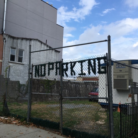
This interesting utilization of [3 dimensional] typography in Brooklyn is reminiscent of the exploration of unique usages of typography in Unit 3 “Text as Image, Image as text” to convey a message in a unique way
0 notes
Photo
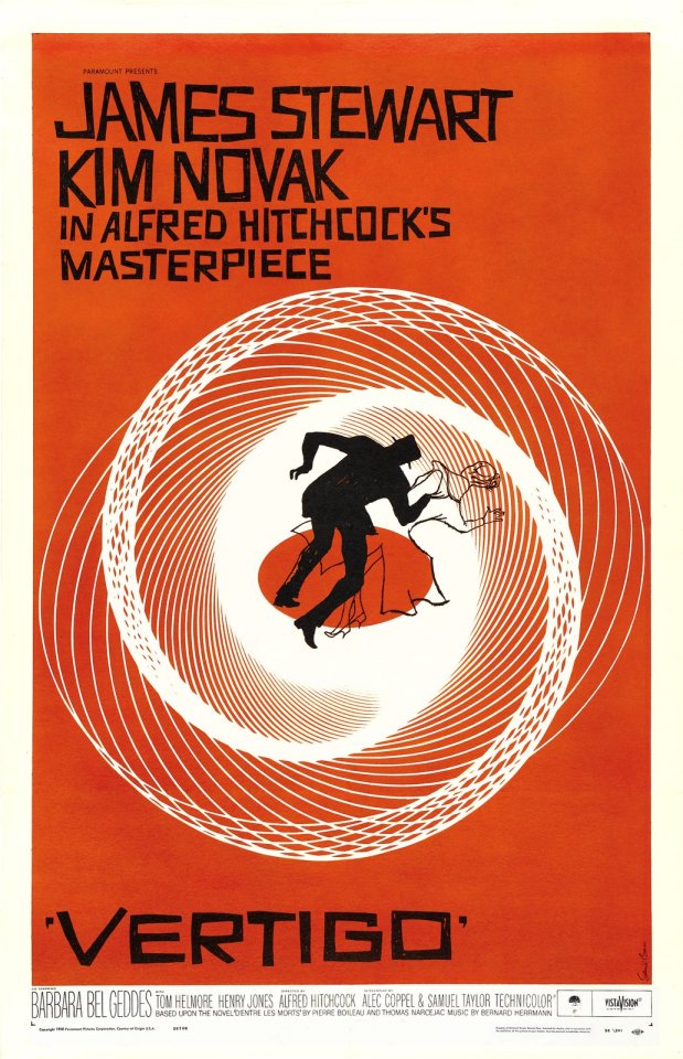
From reading Ehses Representing Macbeth one is drawn to make parallels to the effective use of the design elements of Saul Bass who, utilizing language visually. Here the effect of the condition of vertigo is recreated visually and artistically using a famous scene from Hitchcock’s iconic film.
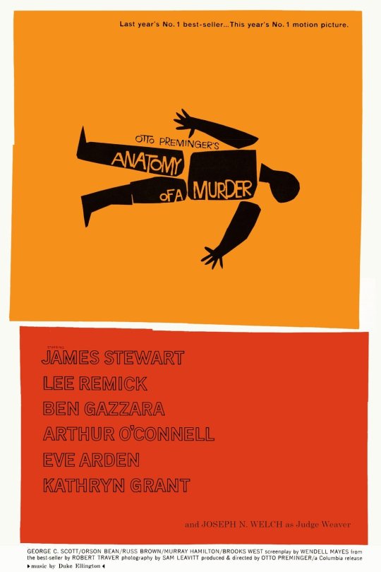
For Anatomy of a Murder, Bass literally utilizes the world anatomy present in the name of the film title cutting up the figure representing a man into pieces as in an anatomy class.
On page 59, Ehses writes “The next step of analysis must be to identify the plot or chosen visual concept that is equivalent to the meaning nucleus of a given graphic image.” The meaning nuclei here are quite apparent such as the title vertigo and the dizzying background and the figure anatomically drawn up for study. As Ehses writes about the theater posters for Macbeth, we can also apply this concept that Bass utilized to the Hitchcock movie posters:
“This graphically encoded statement should be seen as the designer's chosen visual concept that was skillfully and clearly encoded. It should be pointed out that the identified visual concept is not only the result of a literal reading of the perceptible units, but also the result of denotative and connotative reading which, in turn, is influenced by a familiarity with this particular play (in this case a film) and by a certain visual literacy.”
0 notes
Text
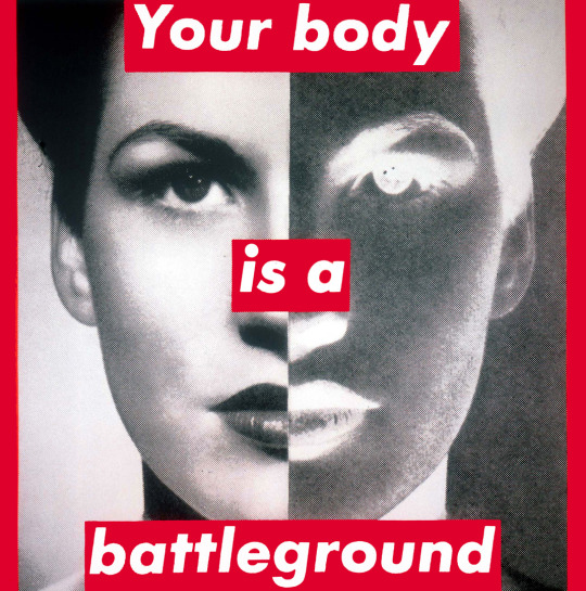

Barbara Kruger is one of the queens of metaphor in art. Many of her works utilize language and how we interpret it juxtaposed with imagery which insights further contemplation on the symantics of the text and language she uses.
0 notes
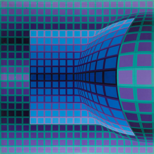
Text
Victor Vasarely known as the grandfather of op art was most active during the 60s and 70s, utilizing oil on canvas as a medium and playing on perception

0 notes
