This is a blog where I will be showcasing my university portfolio for experimental studio practices
Don't wanna be here? Send us removal request.
Statistics
We looked inside some of the posts by yakaashistudio and here's what we found interesting.
Average Info
Notes Per Post
12
Likes Per Post
10
Reblog Per Post
2
Reply Per Post
0
Time Between Posts
5 days
Number of Posts By Type
Text
14
Video
2
Photo
1
Last Seen Tumblr Blogs


Fun Fact
130K people were victims of a chain letter scam that affected Tumblr in May 2011.
Text
EXPERIMENTAL ANIMATION - experimental animation trials
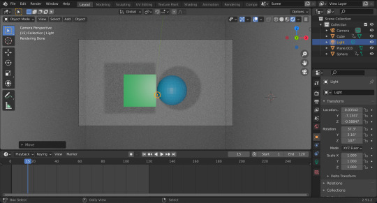
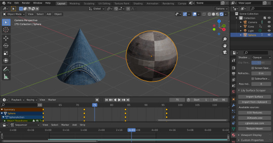
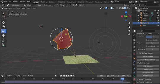
The screenshots below are evidence of the animation trials I have undertaken in this experimental animation project. Links to the fully rendered outputs can be found below the screenshots.
Basic shape movement trials - cube and sphere morph and orbiting cubes

vimeo
vimeo
Complex movement trials (synchronisation to audio) - dancing sphere and cone and pendulum swinging


vimeo

vimeo
Complex movement trials (using element and material physics) - flag blowing in the wind and fabric falling on cube
vimeo
vimeo
0 notes
Text
EXPERIMENTAL ANIMATION - Artist research
The artists I have explored below will inform me in the creation of my experimental animation sequences.
Oskar Fischinger
Fischinger was a German-American abstract animator, filmmaker and painter, notable for creating abstract musical animation many decades before the appearance of computer graphics and music videos.
An Optical Poem (1938) - to create ‘An Optical Poem’ Fischinger manipulated hundreds of paper cutouts hung on invisible wires and shot a frame at a time in close synchronisation with Franz Liszt’s rhapsody. While this animation sequence is simplistic in it’s visuals, Fischinger was a pioneer of the experimental animation genre as there had never been anything like this done before. The way in which the paper circles moved with the rhythm of the music was beyond any real world justification, allowing for the viewer to simply experience the colours and allow their imagination to interpret it. For example, when I was watching ‘An Optical Poem’ I saw the pink, red and cream circles to be teacups dancing on a tea table and the elongated semi circles looked to me like fish swimming, while the actual intention of Oskar was to symbolise a journey through outer space. It is this versatility of experience found in these sequences that I believe is the crux of experimental animation and is embodied by Fischinger.
Jan Švankmajer
Jan Švankmajer is a retired Czech filmmaker and artist whose work spans several media. He is a self labelled surrealist known for his stop-motion animations and features, which have greatly influenced other artists such as Terry Gilliam, the Brothers Quay and many others. Švankmajer has gained reputation over several decades for his distinctive use of stop-motion technique, and his ability to make surreal, nightmarish and yet somehow funny pictures.
FAUST trailer - The trailer for His movie FAUST contains many scenes that vary in environment, pacing, subject matter and media. The trailer appears to seamlessly transitions] the viewer from a sunny field in which human ballerinas are raking the grass, to a dimly lit shack in which a clay stop-motion animated head appears to have its flesh change to form a skull. With a lack of dialogue, the trailer relies heavily on the obscure fast pace visuals that builds intrigue and investment in the narrative
One feature of Švankmajer’s work that I found particularly engaging was the way in which he combined elements of puppeteering, stop motion animation and human acting to create a surreal environment that teeters on the boundary between real and unreal. This combination can be seen in modern artists today such as Jack Stauber.
Jack Stauber
- library (2020)
Stauber’s combination of human actors’ bodies with stylised clay heads makes for unnerving scenes with non cohesive motions. The way in which the clay of the faces appears to twitch and shift during animation while the bodies move smoothly and naturally strikes the viewer by appealing to the uncanny valley (when something appears somewhat human, but not quite human enough to be genuine). This creates a deeply unsettling yet familiar connection to the characters in his videos.
- Cooking with Abigail (2019)
The layering of various images and footage to create realised scenes is something Stauber achieves in a manner like no other. In ‘Cooking with Abigail’ the kitchen scene is comprised of a cartoon-style background illustration, a series of overlaid patterns and occasional superimposed footage of hands, a human actor performing the body motions and his statement clay head. The way in which he is able to make this varying types of footage and images blend together in a sensical way makes his style incredibly unique.
Alice Cohen
Alice Cohen is a Brooklyn based artist and musician. Her animated films often feature beautiful imagery and exquisite patterns moving and overlapping with spontaneous energy. Her lovingly accumulated source material evokes the imagery of lost eras. Silent film actors, Victorian families, plants and animals from some natural paradise, hippies, space-age architecture and medieval castles all co-exist, often in the form of cut-out photocopies from books and magazines, as well as drawings, material, found objects and video footage.
- ‘Swaying Plants’ (2019)
The traditional approach that Cohen takes to her stop-motion animations creates a lively bouncy in her subjects as they move around the screen which compliments the atmosphere that the music creates. The way in which she balances the colours and textures on screen is something I believe should not believe overlooked and must require a lot of trial and error/planning. I am inspired by the diverse variety of textures that exist in her videoscape and would like to create a similar effect in my trial animations.
Adam Beckett
- ‘Kitsch in Synch’ (1975)
Beckett’s animation ‘Kitsch in Synch’ is a high energy abstract animation that combines the pioneering method of Oskar Fischinger with shapes and colours inspired by Henry Matisse. What I find most engaging about Beckett’s animation sequence is the way he is adeptly able to create movement and vive in a way that synchronises with the steadily increasing tempo of the music. This is something I would like to explore in my animations.
Stephen Ong
My favourite experimental animator/artist that I have looked at during this project is Stephen Ong. The illustration based animator crafts playful, mesmerising loops and short films. One of my favourite of Ong’s animations features a series of shots of someone jogging, the way in which the various sections of the screen expand and deflate mimics that of someone’s heavy breathing which brings an organic sense of movement to the piece that connects with the subject matter. Additionally, Ong crafted a looping animation that displayed various emoticons in which the mouth and eyes bounced around their respective frame to form different parts of the individual expressions. The way in which he repurposes each solid to serve different purposes in each emoticon I believe is a cornerstone of experimental animation as it prevents a defined purpose/expectation from being assigned to a subject on screen.
I observed that Ong’s short film ‘Stellar’ was almost a modern day reimagining of Fischinger’s ‘An Optical Poem’ as it tackled the idea of soaring through outer space but with modernised techniques of animating. The use of squash and stretch in the eyeball and other projectiles adds a childish vibrance to the video, increasing my engagement with it as an audience member through its visual appeal.
1 note
·
View note
Text
VIDEO ART - Final video ‘Cocooning Nighttime’
vimeo
The video above is the final product of my video art project. The main source of inspiration for this video was the haiku I wrote expressing the feelings one encounters when stuck in the same room during lockdown.
The video I created features two main locations, the free natural outdoors and the dark manufactured confines of my university accommodation room. Inspired by Christian Marclay’s use of stock footage to create an entirely new piece of media, I frequently cut between and overlaid footage of both locations to create a disorientating clash of light and motion. The reason behind the confusing layering of the diverse scenes was to evoke the tense confusion and restlessness I often felt during lockdown from not being able to go outside. Once the layers were all in place, the image that was created was almost inconceivable. Additionally, I synchronised the cutting of clips with the dripping of the shower. This was inspired by Laura Provost to provide an organic rhythm to video without it feeling too restrained.
My audio mix was inspired by James Richards’ constructed relationship between audio and visual to either enhance or contrast with each other. I paired visuals of spacious outdoor scenes with the dense sounds of the buzzing air vent and heavy door that are common in my room. This direct contradiction between sound and image reinforces the cabin feverish feeling one feels when stuck inside for a long period of time. Additionally, Laura Provost’s use of pulling the viewer in with quiet mild signs to then introduce much louder ones inspired my implementation of the boiling kettle sound to symbolise the rising of overwhelming feelings and panic.
I am happy with the way my final video turned out as I believe I have taken from what I have learnt and been inspired by during this module and applied it to my original idea.
1 note
·
View note
Text
VIDEO ART - Artist research
Stan Brankhage
- Mothlight
Upon first viewing, one experiences a fast paced sequence of split second images of what appear to be scanned textures of things such as leaves, twigs, dirt and moth wings. Brakhage created ‘Mothlight’ by physically sticking these textures onto a strip of translucent camera film and running the film through a projector - the textures are then magnified and played at a rate that is a slideshow projection of the collected materials. I was intrigued by the way Brakhage has used real elements of a moth’s world (materials from nature) and the moth itself to create a journey depicting what a moth would see between birth and death (the flooding light on the screen is akin to a moth coming to light)
- Dante’s Quartet
Once more in this film Brakhage can be seen physically altering the film roll by scratching into and painting over it. The eerily altered imagery is played at a rate of 24 images per second (24fps) additionally the didgeridoo audio that was added connotes to focus and meditation - a sound that can be used to enhance or in this case contradict the mood of the piece of film.
Laura Prouvost
- it, heat, hit (2010)
Prouvost’s whispery narrated film sequences usually evoke feelings of confused cautiousness as they tackle darker more worrying topics underneath a veil of abstract clay formations and footage. The style of her stop motion clay segments are reminiscent of Jack Stauber’s clay characters that play on the uncanny valley.
- Wantee excerpt (2013)
Her soft whispering pulls the viewer in to engage in the visuals, only to startle them with a sudden increase in pace or volume of the footage. Additionally, Prouvost’s combination of lyrics with connoted imagery (e.g. ‘the water was so cold’ + footage of a snowy landscape) allows the viewer to make connections between the sound and image in their minds. The synchronicity between the dripping sounds and clip is flashing up on screen flashing up creates an organic sense of rhythm.
Provost’s unnerving use of stop frame clay animation is similar to the work of Jack Stauber, an independent video artist and musician that has inspired me a lot in both art and music.
Jack Stauber
- library (2020)
Stauber’s combination of human actors’ bodies with stylised clay heads makes for unnerving scenes with non cohesive motions. The way in which the clay of the faces appears to twitch and shift during animation while the bodies move smoothly and naturally strikes the viewer by appealing to the uncanny valley (when something appears somewhat human, but not quite human enough to be genuine). This creates a deeply unsettling yet familiar connection to the characters in his videos.
- Cooking with Abigail (2019)
The layering of various images and footage to create realised scenes is something Stauber achieves in a manner like no other. In ‘Cooking with Abigail’ the kitchen scene is comprised of a cartoon-style background illustration, a series of overlaid patterns and occasional superimposed footage of hands, a human actor performing the body motions and his statement clay head. The way in which he is able to make this varying types of footage and images blend together in a sensical way makes his style incredibly unique.
Roger Beebe
- Strip Mall Trilogy
I was particularly interested in part 2 of the Strip Mall trilogy because of the shift in tone between the photos taken throughout the daytime and the photos taken into the night. The shift in the lighting and colouring of the photos along with the slowing of the rate of photos and tempo of the audio. This gradual change adjusts the viewer into the ambience of the night much like the daytime naturally progresses into night.
The overlapping sounds of bustling footsteps, automated voices and traffic creates an anxious atmosphere in the first part of SMT. The reason behind this, I believe is to recreate the feelings of stress and disorientation one experiences when walking through a crowded strip mall.
Connection to:
James Richards: sound and image > using audio to repurpose or enhance the image or disorientate the viewer by contradicting the visuals.
In my final video experimentation I want to focus on the way in which the audio and visuals will interact as this is something I haven’t considered a lot so far. I am inspired by Richards’ theory surrounding the use of sound and image as the sounds can be paired with specifically contrasting visuals to create a sense of disorientation that borders on surrealism. My take on this will link to my theme of cabin fever by combining footage of spacious outdoor scenes with the dense sounds I have recorded inside my room such as the droning extractor fan and dripping taps.
Christian Marclay
- Video Quartet excerpt #1
Using other media to create something original: Marclay had a team of researchers collect footage of music and instrument performances from all time periods and areas of media and combined them to create an original piece of music and a spectacle. The end result was transformative in nature and proved that you can use other’s footage and media in a way that makes it a new piece of art.
- 48 War Movies (Venice Art Biennale 2019)
Marclay edited 48 war films together and played them all at once, but only showing the outermost boarders of each video, playing the visuals and audio over one another to create a cacophony of movement, dialogue and explosions. The purpose of this undeniably unpleasant experience for the viewer was to use the media’s portrayal of the war to imitate the actual feeling of being at war. I found the way I which it was almost impossible to decipher what the video piece was before the explanation intriguing as it left a lot of room for creative interpretation.
1 note
·
View note
Text
VIDEO ART - Haiku trials


0 notes
Text
VIDEO ART - 10 second video sketches
These are the first 10 video art sketches I have created. I filmed the clips with my phone and edited them together using Adobe Premier pro. My main focuses when creating these video sketches/collages were exploring atypical camera angles and filming styles and editing the clips in a way that removed objectivity from the image; resulting in abstract almost nonsensical sequences.
Up the stairs - https://vimeo.com/520220001
View out of window - https://vimeo.com/520219975
Chair texture - https://vimeo.com/520219939
Magnified clock - https://vimeo.com/520219909
Teeth brushing - https://vimeo.com/520219892
Up the stairs 2 - https://vimeo.com/520219872
Spinning clock - https://vimeo.com/520219858
Chair texture - https://vimeo.com/520219830
Rolling apple - https://vimeo.com/520219810
View out of window 2 - https://vimeo.com/520219798
I feel as though ‘Up the stairs’, ‘Spinning clock’ and ‘Teeth brushing’ are the most successful. In ‘Up the stairs’ the camera work when ascending the stairs paired with the mirroring/overlaying of the clips creates an eery disorientating feeling. In ‘Spinning clock’ the use of varied blending modes confines the spinning globe to the frame of the clock face which I thought implemented the collage element of the task. In ‘ Teeth brushing’ the lighting and contrast of the various clips resulted in an overall aesthetically pleasing view.
1 note
·
View note
Text
CONTEMPORARY DRAWING - My final postcards
The images below show my final 10 chosen strongest postcards. I have digitally refined and redrawn some of them, while others I have not edited very much and rather just placed in cohesive mounting.


I will print these images and send them as copies to my chosen recipients.
While I believe I have been successful in my ambition to stretch my artistic style and process in this project, I feel as though the collection is lacking in coherency as some postcards look as if they do not fit in (the colour capture drawing in the bottom right corner)
3 notes
·
View notes
Text
CONTEMPORARY DRAWING - Sketchbook flip-through
Please see in the video a flip-through of the sketchbook I used for the contemporary drawing section of this term. This features the postcards that the digitally refined final products were based on (see postcards above), the artist research that inspired me and the drawing exercises we completed in studio sessions.
CONTEMPORARY DRAWING - Artist research (transcribed from sketchbook)
Tim Head
Untitled (c.1985) - Head’s satirical take on iconic artwork features a collage of Da Vinci’s ‘Mona Lisa’ with the famous washing machine instructions logo pasted at the bottom of the painting. Simple in it’s execution, I found this collage particularly aesthetically pleasing and metaphorically engaging as it creates a tether between historical and modern art. One could infer the idea that humanity will forever be connected to it’s past or how history repeats itself.
I was inspired by Tim Head’s satirising of famous art to communicate a contemporary message. In response to his work, I reworked Da Vinci’s ‘Virtruvian Man’ with stitching to evoke the message of my chosen journey of drug addiction and rehabilitation. I felt this was successful as it combined the emotionally charged imagery of ‘X’s over the eyes and the word ‘SICK’ with the less emotive scientific drawing of the human anatomy.
Julie Mehretu
Mehretu’s vibrant and dynamic contemporary illustrations are widely renowned due to their striking scale. The way in which she uses evocative brush strokes to capture mood and movement is so pronounced, that it even distorts the viewers perception of the of the shape of the 2D canvas she draws on. I chose Mehretu as a main inspiration for this project as I have noticed my own drawings lack a strong sense of movement and energy. Therefore responding to Mehretu will hopefully aid me in exploring this style of drawing further.
David Hammons
“David Hammons’ ‘Body Prints’ (1968-1979)... used the human body as both a drawing tool and printing plate to explore performative unconventional forms of image making.”
“These early works on paper remain a testament to Hammons’ desire to reinterpret notions of the real; his celebration of the sacredness of objects touched or made by the black body; his biting critique of racial oppression; and his deep commitment to social justice.”
Hammons created his prints by greasing his own of another’s body with substances such as oil or margarine and pressing/rolling them against paper, then sprinkling charcoal and powdered pigment over the surface. The resulting impressions are intimately direct indexes of faces, skin and hair that exist somewhere between spectral portraits ans physical traces.
The intimacy of this documentation of the human body tackles anatomy in a sensitive way that I believe would also be useful when tackling my journey of drug addiction and rehabilitation as not only does the process provide a deeper look at the human form, but also a closer look at the human condition.
Sol LeWitt
Sol LeWitt was an American artist who was involved in the conceptual and minimalist art movements. LeWitt was prolific in a wide range of media including drawing, printmaking, photography, installation and structure making (a term he preferred to sculpting).
My favourite of LeWitt’s work work is his 3D space installations in which a dazzling display of bright colours and bold patterns covered the walls from floor to ceiling. The striking geometric designs played heavily on interior design principles as he achieved a calming sense of balance in the asymmetrical installations. I referred to LeWitt when designing my paper and paint collages to inform myself in creating balance when working with bold colours and shapes.
Roa
Roa is a street artist most well known for his large scale painted murals that tackle topics such as animal cruelty. His pieces are often structured in tandem with the landscape as he uses the architecture of the land to inspire what he paints.
“What separates him from the rest of the field is the way he adds different layers into a piece, giving his viewers multiple perspectives if the biology behind his animal subjects. It’s almost like we have X-ray vision.” - mymodernmet.com
Alongside David Hammons’ use of photo super-imposition, I would like to use Roa’s technique of portraying an ‘X-ray-esque’ viewpoint in my art to capture the internal effects of drug abuse.
Annegret Soltau
‘Self portrait’ (2014) - German artist Annegret Soltau constructs collages using photographs of her own face and body, stitched together with black thread.
I was attracted to Soltau’s work when I noticed she had used physical stitching to combine various photos of herself from different angles and distances to create an abstract collage of facial features. I was interested in the way the stitches were placed into photos of flesh and the slightly unnerving impact this had as it imitated surgical stitching. Keeping Soltau’s approach in mind, I experimented with using physical stitching in my collages photos to play on this slightly gory appearance as I felt it helps communicate the message of my chosen journey.
1 note
·
View note
Text
ARTIST BOOK - My final zine - Bed portal booklet
Please find the interactive flipsnack booklet of my zine: here
Below are photos of each of the pages of my zine in order.


3 notes
·
View notes
Text
ARTIST BOOK - Visual referencing
How to represent your objects through photography:
Once the items have been chosen, in order to stretch your creative presentation of it, look very far out and very closeup. Additionally look beyond the object itself, how it has changed throughout history or the many versions of it.
When presenting your objects in your book, consider how to make the objects stand out on the page - impose them on a background of block colour for example - brings attention to the object.

Mono-printing your images/ converting them to mono print
0 notes
Text
ARTIST BOOK - Flip book animation trial - bed throughout the night
The video below is an animation I created from the sequence photos I will be using in my zine played in a loop that charts the changes that occur in the bed over night. Inspired by Tracey Emin
These are the individual photos that I took of my bed to play in this animation and be featured in my final zine.

1 note
·
View note
Text
ARTIST BOOK - PORTAL QUESTIONNAIRE
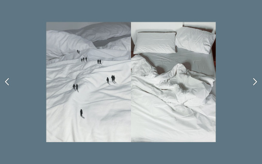
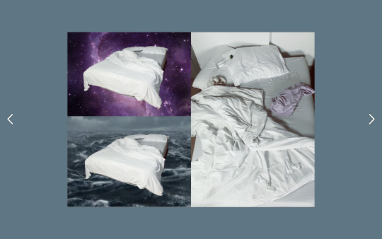
What is your portal? - The portal that I will base my zine/artistic sequence on is my bed. I chose this not only because the appearance of and experience within the bed changes throughout the day/night, but because beds also act as a portal into any dreamscape.
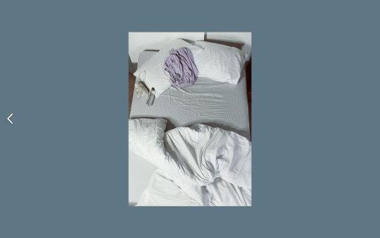
What is on the front cover? - The front cover of my zine will feature either a birds eye view photograph of the bed neatly made in the daytime or a hyper zoomed in photo of the fabric of one of my pillows. (as seen in the trial booklets 1 & 2 below)
Where does it take us to? - The main source of inspiration for this portal was the association between beds and dreaming. The bed portal not only takes you into a small world of duvets and sheets, but into the never ending universe of your own imagination during crucial regenerative hours.
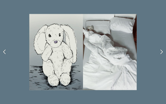
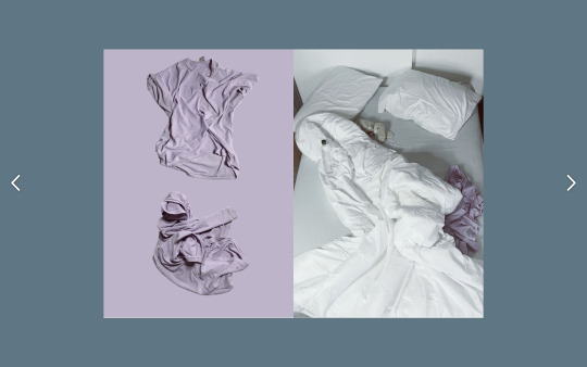
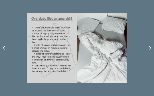
What’s inside? - Physically, my objects of interest (selected in the first session where we explored different forms of cataloguing inspired by Daniel Spoerri) include a rabbit cuddly toy, a white pillow and an oversized pyjama t-shirt. Other objects that can be found inside the bed include a blanket, a pair of socks, a bedsheet, a duvet and pair of earphones. What can be found inside the bed varies over time (harnessing the unusual - sometimes there are plates or sketchbooks left on my bed)
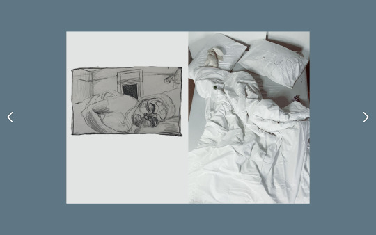
What sequence will your book take? - My original thought was to capture the journey that the bed and the person using the bed undergoes over the period of one night (10pm to 10am). Inspired by Michael Snow’s ‘Cover to Cover I wanted each side of the double page spreads to depict the journey that the user is experiencing (preparing for bed // getting into bed // falling asleep // dreaming // waking up) parallel to the journey that the bed is undergoing (gradually going from neatly made to completely messy by the morning as it is slept in)
How does it end? - The sequence will end with the user getting out of a slept in, unmade bed.
What range of artwork will it include? - I want my zine to have a wide variety of media in it. I will include photographs, collage, written descriptions and some poetic/metaphorical writing as well as featuring the contrast between accurate line drawings of the tangible objects and imaginative illustrations hinting at the dreamscape. I am interested in having a panel that combines photo and sound files of breathing/white noise to recreate the atmosphere of sleep (inspired by fkatwigs’ AVANTGarden)
What format will your book take? - So far I have been content with creating a flipstack render of my book in order to create an interactive online experience flipping through the book. However, since I have decided I would like to include sound in my book, I may have to reconsider this format and instead move it to a video and image playing software such as instagram.
How many pages? - I am aiming to create 10-12 pages of original designed artwork for this book.
What artists/designers are you referencing for ideas/inspiration and how?
- The first artist I took inspiration for my thought process was Fiona Banner. I was inspired by her ability to look so deeply into a seemingly simple subject matter and derive personal and universal meaning from it. The way in which she attached personal experience, political activism and life and personality to a series of fullstops encouraged me to explore every aspect of my bed portal.
- Secondly, Daniel Spoerri’s combination of full realised objects and ambiguous metaphorical descriptions in his desk documentation ‘Topographie Anécdotée* du Hasard’ (An Anecdoted Topography of Chance) clearly showed me that bringing many media types together is the most engaging and effective way to present my portal.
- Michael Snow’s ‘Cover to Cover’ taught me a lot about sequencing and how to construct a visual journey using a series of photographs. A technique of his that I will be showcasing in my book is the opposite sides of my book’s double page spreads showing two coexisting journeys; the journey of the bed throughout the night and the journey of the person sleeping in the bed.
- Most recently, @fkatwigs sound image sequence ‘MEATSPACE’ has made me reconsider whether I want my book to be solely visual and has inspired me to combine visual and audible components for a more immersive experience. Inspired by her atmospheric monologue, I would like to trial combining an image of a sleeping form with slow breathing and white noise to create the atmosphere of a sleeping person in a bed.
How will it be viewed? - It will either be viewed as a PDF converted to an interactive lipstick book or as a sliding image series on instagram/tumblr.
#artist research#artist#book making#my plan#dreamscape#zine making#artist inspiration#graphic design
0 notes
Text
ARTIST BOOK - Creating a book in a digital space - artist research
Zarina Muhammad, Snake
Zarina Muhammad, is a writer, art critic, and artist. She is a co-founder of the white pube, an online art criticism platform that publishes reviews and essays.
Short film Snake - Video essay/monologue mouth video superimposed onto a PNG transparent background. Describes entering the digital space as a physical space - “did you never realise that screens have feelings too?”
She uses her mouth as a portal between the digital and real world
Camile Henrot, GROSSE FATIGUE
A common theme in Camile’s work was her patented ‘internet blue’ that her exhibitions featured
Places images and media on top of each other in an ‘overlapping computer window’ style. This presentation of video can only be achieved through digital video as the windows with videos on them overlap each other with a soundtrack and narration.
January 2017 horoscope - behind the scenes - Zoetrope signifies the cyclical structure of human nature and the affairs of life. The moment when the Zoetrope is no longer perceived as 6 individual objects but forms into one moving image is very significant to Henrot.
Trying to communicate how we should limit our dependency on electricity. Her use of sequence is metaphorically and physically very present in her critique of cyclical of human behaviour and real world animation.
Irma Boom
Irma Boom is a book maker/designer whom larger artists go to to design their art books
Alessandro Ludovico
Post Digital Print - the mutation of publishing - Ludovico tackles the drastic changes that book making and the structure of a book has changed within the shift to digital spaces. Books no longer had spines or hard/soft covers we have a paywall. Instead of libraries we are becoming more accustomed to the website structure - we don't have a centrefold we have a background image.
Real vs electrons: “reader = user.”
Mouse clicking with soon be outdated as touch screens takeover.
Visual Editions
Some of their books are designed to be read on laptop whereas others are optimised for phone screens - artists are encouraged to explore the space that they are using - now that this space has moved online, they have unlocked more features such as animation/moving sound and image content. (useful during scenarios like the pandemic)
Reif Larson - Uses the digital mapping feature to take the reader/user on a physical journey alongside their reading of the passages, another level of immersion
Fkatwigs - AVANTGarden MEATSPACE
Utilised Instagram’s swipe photo feature to create long connected images that reveals a new part of the Zine’s sequence with every swipe. (Continuous feed of content to satiate modern people’s short attention span)
An artist’s guide to Copyright - Eric Schrijver - a guide on what you can/cannot use and how to use it legally.
0 notes
Text
ARTIST BOOK - Creating a Concertina Book
Attaching the entire pages to each other
When hand making the concertina books, attaching the entire backs of folded pages together adds to the security and stability of the book and therefore is the first method.
Card front and back covers
Use a material that is sturdy such as card for the front and back covers of the Concertina books to protect the pages while it is folded up
Attaching tabs to each other
While attaching the entire page face is more secure, tabs folded on the end of the pages can be attached together instead if there are images on both sides of the paper that you want be shown.
My concertina book making trial:
0 notes
Video
tumblr
ARTIST BOOK - Bed portal booklet trial 2 flip through- ‘Preparing to Sleep’
0 notes
Video
tumblr
ARTIST BOOK - Bed portal trial booklet 1 flip through - ‘Sleeping Through the Night’
0 notes
Photo


ARTIST BOOK - Sequences - Response to artist research: Making flip books Taking inspiration from the artists explored above (specifically Michael Snow), I have conducted a photoshoot of my chosen portal (my bed) and the items featured within it to create a journey that details the process of preparing to sleep. (see contact sheet below) After conducting this photo shoot, I selected the most successful photos and prepared two flip books presenting the process of sleeping through the night and the process of preparing for sleep. The final outcomes can be found here: Bed portal flip book 1 - Sleeping Through the Night Bed portal flip book 2 - Preparing for bed (see post above for video flip through of the booklets)
0 notes