#template tutorial
Explore tagged Tumblr posts
Visit Tumblr Blog
Explore Tumblr blogs with no restrictions, modern design and the best experience.
Last Seen Tumblr Blogs


Fun Fact
When “GIF” was named word of the year in 2012, Oxford Dictionaries U.S.A. credited Tumblr for pushing the word.
Note
Awesome edit for gravity falls!!
https://www.tumblr.com/bambigif/769725359108358144/gf-scifi-fantasy?source=share
I want to learn how to add that many gifs into the template you used, would you please make a tutorial?
hi, happy new year and thank you so much! ( ˶ˆᗜˆ˵ )
So here's a tutorial on how to add any gif in a template (I won't be using a gravity falls' gif cause I'm on vacation and I'm doing this in a hurry lol)
I'm doing this in Photoshop CC 2019 but this can be done in any version ⭑.ᐟ also mine is in spanish but I'll translate any option used, let's begin!
step 1: first of all, make you sure to be in timeline mode. once you do, open your template and "create a video timeline"


step 2: get the gif you wanna use ready: apply coloring, sharpening and make sure is also in timeline mode.
step 3: duplicate your gif into the template by right click on the layer and "duplicate layer"

now there are two ways you can do this and I'm going to explain both:
step 4: option a) make sure your gif is above the boxes of the template (or whichever shape you're using), right click and then "create clipping mask"

this will generate your gif being "boxed" on the shape...

and from here you can adjust it how you want!

to add multiple gifs, just repeat the process of duplicating and creating clipping masks, but pay attention that your gifs are all the same amount of frames
step 4: option b) another way to do this is creating a group of the box and your gif (selecting both layers and either ctrl/cmd + g or by clicking the little folder icon)

once you have this, right click on the shape but on its preview, not just the layer, like:

and then "select pixels"

once you have that, now select the group you previously made and creat a clipping mask clicking this icon:

as you can see, it's the same process but more organized:

all you have to do is adjust your gif (again) as you want and that's pretty much it!
the template psd I shared a couple days ago that I personally made for the gf edit already has the clipping masks separated by groups, so all you have to do is make some gifs and duplicate them into the canvas!
I hope I made sense and if you don't understand any of these steps, make sure to contact me! my inbox is always open (๑>◡<๑)
16 notes
·
View notes
Note
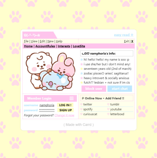
How do you make your stamps? :0
Disclaimer: this is an obscenely long explanation, with pictures. Efficiency is stupid
So, for the static ones, I make a 99x56 px file on ibis paint x. Other programs are probably available online but I don't use them.
After that, I either upload an image I want to make into a stamp, or I draw one.
Then, I find a frame I want to use. Ill upload them here but let it be known I stole all of these right from deviantart


Most of them are from Lil-Devil-Melii on deviantart. The rest i have no idea. They're not all 99x56px but you can crop the canvas it's fine
Make sure to erase the edges of the picture , so they're transparent. It's not as cute otherwise
Upload those frames over your image in whatever art program you're using and viola, stamp.
For moving ones, it's a lot harder. Mostly because I refuse to download Photoshop.
There are a couple ways to do this. Some are simple animations, like with flashing text and whatnot. For these, you download the individual animation frames from your art program. Make sure it's transparent.
Then, upload each frame to ezgif.com under the option "GIF maker." You can play around with how fast each frame goes and whatnot but in the end, it'll be a stamp with some rad text that moves. This is easy, and doesn't make me want to shit my pants and cry. If you're new, do this. This is fun. This is good. This does not kill me inside
I made that↓ stamp with this method :)

this next one is how we turn gifs into stamps. This one makes me sad. It involves math and sucks. But we gotta do it. For the vibe
First, grab your gif. I'm using this cow gif because it's awesome

Then, I resize it using ezgif. Literally everything for this will be using ezgif. I am a simple man
At this point you should decide what frame to use. I'm using this one because its the first one I clicked
Figured out what size the inside of the frame is. That's what I resize the gif to, so the edges can be transparent. The inside of this one is 93x50 px, so those are the dimensions I'm making the gif.
Figure it out by putting the frame into ibis paint and realizing the canvas to fit just the inside of the frame, then seeing what the dimensions are. But there could be easier ways

Woah it's so small now
Then, still on ezgif, I go to the "crop" option.
Make sureeee to upload the smaller gif
press the button that says "extend canvas size", and then put the "width" and "height" as the dimensions for your FRAME. This'll put a bit of a transparent border around the gif. For this frame, I did 99px and 56px.
The "left" and "top" boxes show how many pixels the cropping happens from the edges of the canvas. The formula for finding that is
(width of gif / 2) - (difference between gif width and frame width / 2) = left box
For me it's (93 / 2) - (6 / 2) = 43.5
Then you do the same.for the height, which for me ends up being 22 from the top
This is reallyyy touchy and annoying though
Here's my result , with no visible difference

Okay so THEN you go to the "overlay" option, under "effects." And upload your frame. If the cropping was done right, you shouldn't have to move the frame at all and can just download it
Here's my result:

if you don't care about transparency, you can resize your gif to be the same size as the frame, and then put the frame over it. But I'm a slut for transparency
Anyways. I'm sorry if anything was unclear, it's two am. And I hope this was helpful :) these really are fun to make once you get it down
also if anyone has an easier way to make stamps from gifs, please god tell me
#web graphics#old web#neocities#custom#custom blinkies#stamps#page decor#web resources#da stamps#deviantart stamps#blinking gif#How to#tutorial#How to make stamps#Spacehey#deviantart#rentry graphics#old internet#early internet#stamp collecting#ezgif#stamp making#stamp template#Stamp frames#blinkies
7K notes
·
View notes
Text

— how to recolor gifs ( easy ) tutorial
website used :
https://ezgif.com/instagif

#૮ ´ ཀ `𓏼 ა#rentry#rentry resources#rentry stuff#rentry graphics#rentry decor#rentry inspo#rentry divider#rentry pixels#rentry dividers#rentry frame#rentry icons#rentry mask#rentry template#rentry tutorial#tutorial#nahida#genshin impact
829 notes
·
View notes
Note
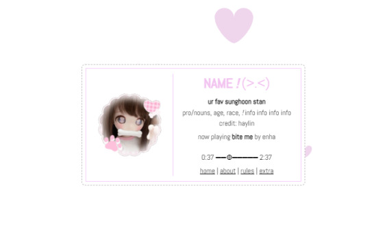
Heyy!! I love your carrds so so much they're so pretty!! Can you please make a f2u non pro discord nitro themed carrd please please please
HELLO HOPE THIS IS GOOD!
non pro freindly discord nitro themed carrd
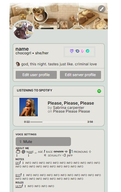
get the carrd here look at it here! here is also the image i used for the nitro badges!
REQS ARE OPEN FOR CARRDS!! only req i have is to be following me to ask for a carrd! and I DO CARRD COMMS!! so if you have a specific carrd you want made message abt my prices and what i take!! use my referral code also to help donate and get some money off on buying pro here / use the code manually HXYLIN !
#carrd commissions#carrd stuff#aesthetic#carrd templates#carrd icons#carrd inspo#carrd moodboard#carrd theme#carrd material#carrd packs#carrd req#discord chat#discord server#discord app#discord mobile#carrd template#request#carrd tutorial#free carrd template#carrd profile#strawberry#cutecore#commission#taking commisions#f2u
2K notes
·
View notes
Text
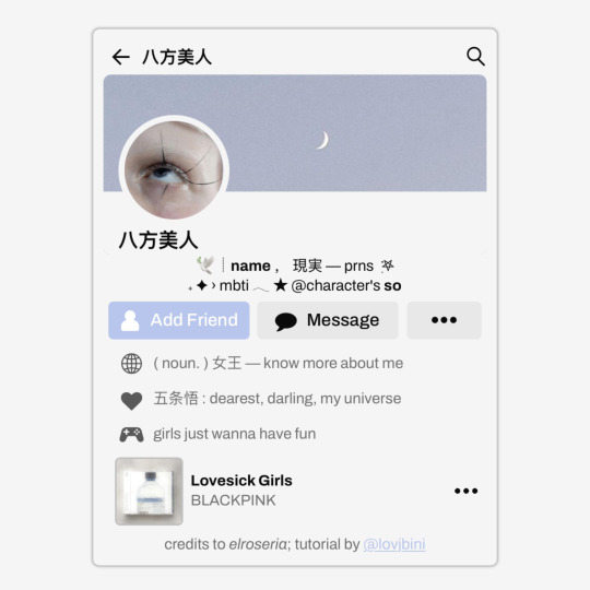
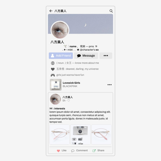
✩ CARRD INSPO by LOVJBINI // © elroseria
like or reblog if you useㅤෆㅤ2024.
✎﹏ please, put “ © elroseria – tutorial by @lovjbini ” in the description if you use our tutorial!
CLICK HERE FOR TUTORIAL
#lovjbini#carrd#carrd.co#carrd co#carrd inspo#carrd tutorial#carrd template#carrd layout#carrd tutorials#carrd templates#carrd layouts#carrd theme#carrd themes#carrd design#carrd designs#carrd stuff#aesthetic#simple#kpop#macbook#pastel colors#pastel aesthetic#kawaii#blue#pastel blue#light blue#facebook
636 notes
·
View notes
Text


jagged, crystalized and pixelated tumblr banner masks!
for the 2 anons that asked!
okay to repost, just dont claim as yours. and free to use (its what they were made for, duh!)
keep in mind gifs dont mesh well with translucent colors if youd like to use these with them :0
#🌫️ i know what you dread | creations#anonymous#carrd resources#rentry resources#rentry#web graphics#rentry tutorial#rentry inspo#rentry gif#rentry decor#rentry graphics#rentry template#image masks#edit resources#editing resources
1K notes
·
View notes
Text

w w w . carrd . co // ⋆ 𐙚 ₊ ˚ 🐇 ⊹ ♡ ˚ .
✿ CARRD INSPO // © misamory
like or reblog if saveㅤ⿻ㅤᐢ..ᐢㅤ♡ㅤ2023.
#⋆ ˚ 。 just an rkive — ★. *#♡✮☁️✧˖°💿⋆。°✩#carrd.co#carrd inspo#carrd template#carrd templates#carrd icons#carrd stuff#carrd material#carrd resources#carrd moodboard#carrd inspiration#carrd#carrd layouts#carrd symbols#carrd help#carrd tutorial#carrd theme#carrd things
2K notes
·
View notes
Text


Lace divider stuff whatever
F2U with like & reblog , I edited pngs from Pinterest to make these. credit is greatly appreciated since this took me a solid 40 minutes
feel free to add to resource rentries, but it has to link back to this post or account.
tagging @smilepilled noticed you enjoy being tagged in things 🤍 unless i mistaked you for someone else
#꒰৯ ̇ ۪ dividers ۪ ྀི#lace dividers#rentry dividers#dividers#rentry icon#rentry tutorial#rentry template#rentry inspo#rentry resources#rentry stuff#rentry pixels#rentry gif#rentry decor#rentry graphics#rentry frame#rentry#carrd resources#f2u with credit#saeriji#template coming soon i promise i js want to post some resources.#postponing the template to be posted next week because i’m busy this week w church.#idk what else to tag#rentry carrd#carrd graphics#carrd inspo#carrd stuff#carrd#carrd decor#carrd dividers#carrd layouts
294 notes
·
View notes
Note
hello! do you happen to have the template for this gifset that you could share? thank you so much!
https://www.tumblr.com/cal-kestis/747385549878345728
hi! just uploaded for you :) get this template free via ko-fi! make sure you get the fonts needed below the cut

ADDITIONAL RESOURCES:
– gifset examples: spotify series – cutout tutorial – fonts: Poppins Bold (Google), Circular Std Black (azfonts.net) – tip: play with your export settings for the cleanest result. exporting gifs with large areas of solid colors can sometimes produce a noticeable pixelated effect (see example below; left). while I normally export using adaptive-diffusion, sometimes selective-diffusion works better. try out different combos until you get something smooth!

150 notes
·
View notes
Text
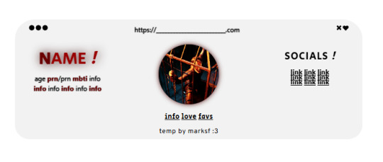
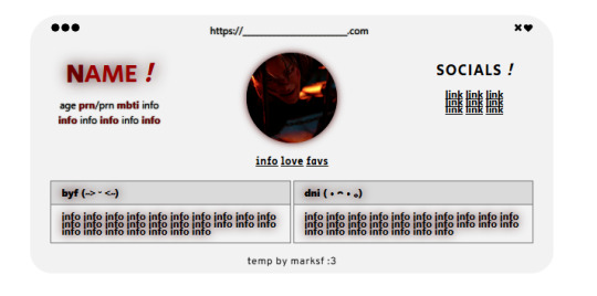
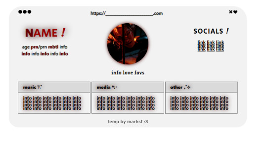
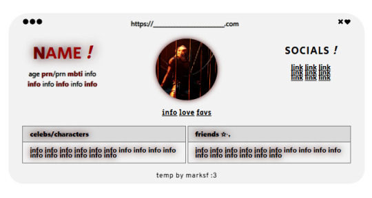
carrd.co template ! ($0+ pay what u want)
non-pro friendly ! preview . buy | refferal code - MARKLEE ♡ kofi
please, do not remove the credit or claim as your own ! you can move the credit but please keep it on the site <3
#marksf#marksf templates#carrd template#carrd#carrd stuff#carrd inspo#carrd resources#carrd commissions#carrd inspiration#carrd templates#template#carrd.co#free carrd template#carrd material#carrd moodboard#carrd layouts#carrd symbols#carrd help#carrd tutorial#carrd theme#carrd things
133 notes
·
View notes
Note
hey mindy mindy its me again (after that chaotic love poem lmaolmao) mwah mwah can u do like a notion guide post ?? like what would be helpful to add and also how you set yours up?? that would be so so helpful ilyily have the best day and sleep tight mwah mwah kiss kiss love xoxo, emily
hey emily! ✧
omg hi again!! (the love poem chaos was iconic btw, never apologize for that) you truly are my biggest fan (and i'm yours <3)
✧・゜: my notion setup: organized chaos but make it cute :・゜✧:・゜✧


so you asked about my notion setup and i'm soo excited to share because i've gone through approximately 500 iterations before finding what actually works for me! and by "works" i mean i've stuck with it for more than 3 weeks which is honestly a personal record.
the thing with notion is that it's so customizable it can be overwhelming?? like, i spent more time watching "perfect aesthetic notion tour" videos than actually using the app for the first month. classic me behavior.
⋆.ೃ࿔:・ getting started (without spiraling) ・:࿔ೃ.⋆
first things first - don't try to set up your entire life system at once! i made this mistake and abandoned notion for 2 months because it felt too overwhelming.
start with ONE area that's currently chaotic in your life. for me it was school assignments because i kept forgetting deadlines until 11pm the night before (and then panicking while eating peanut butter straight from the jar… not recommended).
my biggest tip is to not get caught up in making it pretty right away. i know that's like, counterintuitive coming from me, but functionality first, then we make it cute!
⋆.ೃ࿔:・ my actual setup ・:࿔ೃ.⋆
homepage: i have a super simple homepage with links to my main dashboards (school, blog, personal) and a little daily quote that changes. also a tiny photo of my cat judging me for motivation.
school dashboard: this is my most used section! i have a calendar view of assignments, a database of all my classes with linked notes, and reading tracker. the best part is the assignment database where i can filter by due date and subject.
blog dashboard: where i keep all my post ideas (like this one!), content calendar, and stats tracking. i also have a section for brands i want to work with someday (manifesting!).
personal dashboard: this has my habit tracker, journal prompts, and goals. i also keep recipes here because i was tired of screenshots getting lost in my camera roll.
reading nook: where i track books i've read/want to read with little ratings and notes. sometimes i write embarrassingly emotional reactions to plot twists that no one else will ever see.
⋆.ೃ࿔:・ the actually helpful stuff ・:࿔ೃ.⋆
okay so beyond the basic setup, here are things that have made notion actually useful for me:
templates!! i have templates for everything - blog posts, class notes, weekly planning. it saves so much time not starting from scratch.
linked databases are literally magic. i can have the same information show up in different places filtered different ways. like my assignments appear on my homepage as "due this week" but in my school dashboard i can see everything.
embeds are underrated. i embed my spotify playlists, google calendar, and pinterest boards so everything's in one place.
toggle lists for anything lengthy. they keep things looking clean but you can expand when needed.
color coding that actually means something. i used to just pick pretty colors but now each color has a purpose (red = urgent, blue = school, pink = blog, etc).
⋆.ೃ࿔:・ making it pretty (because we still care) ・:࿔ೃ.⋆
once the functionality is working, THEN we make it cute:
i use a consistent color palette across all pages (mostly soft pinks, lavender, and sage green)
custom icons for each page (there are free packs online or you can use emojis)
cover images that are cohesive (i use pinterest)
font consistency! i stick with the same headings and text styles
little decorative dividers between sections (just search "aesthetic dividers" and you'll find tons)
⋆.ೃ࿔:・ my honest thoughts ・:࿔ೃ.⋆
the truth is my notion isn't instagram-perfect all the time. some sections get messy when life gets busy, and that's fine! the beauty of it is you can always clean it up later.
the pages i actually use daily are pretty simple. it's the ones i rarely visit that look the most aesthetic (because they're not battle-tested with real life, lol).
start simple, find what actually helps you, and then make it pretty enough that you want to use it. that's the real secret!
let me know if you want more specific details about any part of my setup! i could literally talk about this forever (as you can probably tell from this novel of a response).
sending you the most organized vibes! hope this helps!!
xoxo, mindy 🤍
p.s. sleep tight to you too! currently writing this at 1am because i have no concept of proper sleep schedules
#notion setup#notion guide#notion tips#notion organization#notion for students#notion tutorial#notion templates#notion dashboard#notion aesthetic#notion for beginners#notion productivity#notion planning#notion school#notion blog#organization tips#digital planning#productivity system#student organization#notion layout#aesthetic organization#notion for bloggers#digital organization#notion workflow#notion hacks#productivity tips#organization system#digital planner#notion tour#study organization#study tips
53 notes
·
View notes
Text
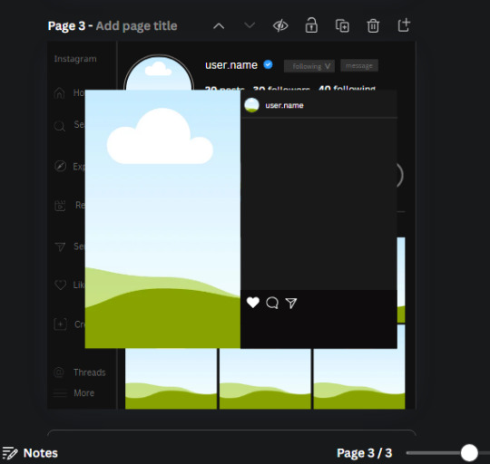
𓈒༷♪˚.✧ How to make a mockup like this for smaus, ocs, etc. (step-by-step tutorial ☆ no Photoshop, easy, free) (requested by @lovebittenbyevans) ✿
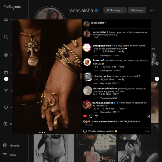
guys this took me two hours to make and you could probably get this done in like, 30 minutes :) I hope this is coherent <3 Please look back this image for comparisons, if my explanation is not well explained, etc.
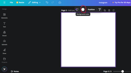
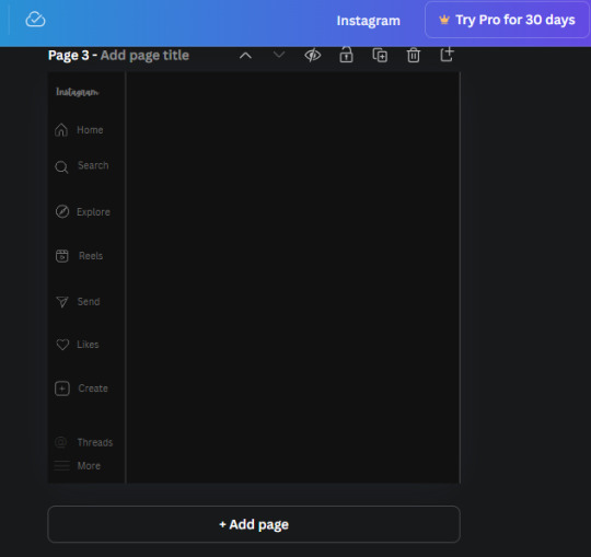
first of all, if you dont already have one, make a free canva acount. once you're signed in, hit the purple "create design" button on the sidebar. A pop-up will appear with different design template options. For this design, we want the dimentions to be 1080 x 1080, so you can either make a custom size or choose the instagram post (square) template by either searching or scrolling through the list.

2. Now you have a blank page. Zoom in with the slider at the bottom of the page if you need to (Mine is currently zoomed in 41%). Click on the page and change the color to an off black (hex code #111111).
3. Now that the color is changed, click the "elements" tab and search "line". Click the shape and it will add it to the page automatically. These line are particularly hard to navigate and hard to get it at the right angle and length so this part might take a little longer than the rest.
4. stretch it from top to button and turn in a 90 angle so its straight on the left side of the page. Change the color of this as well to a grey tone (hex code #2F2F2F).
5. Now we'll add the Instagram logo. Click the "text" tab then click the purple "add text box" button. Write "Instagram" in the box and change the font to "apricots". This is the closest font I could find that resembled the logo font but if you find a better one, feel free to use that instead. Make the font size 19.3 (you can do this manually or do it in the text options). Change the color to grey color (hex code #707070). Add it to the upper left corner of the page like this:
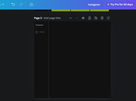
6. now we're adding icons and a menu inside the border we just made. Click the "elements" tab again and search for "instagram home icon" and add the element by sketchify to the page. Click the home icon, an options icon with pop-up above the page. Look for the "Position" button and click it. Scroll to find the advanced options and you can manually type in the width and height at 26.6 and 28.7.
Move it inside the border, under the logo (photo below). Change the color again (the hex code is #707070).
7. Open the text tab and add a text box. Change the font to Canva Sans and write "Home" in the box. Change the font size to 18.1 and align with with the house icon. It will look something like this,
8. Go into the elements tab again and search "instagram search icon". Scroll until you find the one by sketchify and add it to the page.
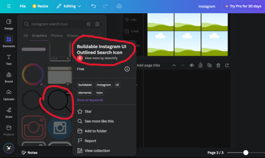
9. Shrink it so the W and H is at 36.6 and 31.3. Move it below the home icon until a purple "67" pop ups and aligns under it. Change it to the same color as the Home text and icon (#707070). Go ahead and Duplicate the the "Home" text box and clicking it and a pop-up will show up then edit the text so it says "Search" and align with the searcch icon we just added.
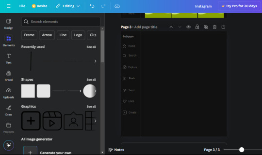
10. You know the drill. We are continuing to search up more icons in the "elements" tab. Search "instagram compass icon" and choose the one by sketchify (are u seeing the pattern?). Add it to the page and change the width and heigth to 33.1. align it under the search icon just like how we did before and change it to the say colors as the other icons.
11. Do the same as before and write "Explore" in a text box and align it with the icon. We're doing the same thing for all of these.
We'll be using the same search prompt for all of these icons so just change the type of icon you're looking for like we've done before hand. Next look for the Instagram reel icon and add the outlined one by sketchify and change the W and H to 31.2 x 30.9. Change the color to the ones we've used before, align it underneath the icons above and add your text ("Reels").
12. The next icon is an outlined, "sent" one. W and H is 31.1 x 27. The text will say "Send". Then an heart outline by sketchify; W and H is 34.2 x 29.1 and the text is "Likes". Next is the "create" outline icon by sketchify, W and H is 36.8.
(p.s if you are struggling to align the icons and text correctly, shoot me a message and I'll send you the X and Y positions ;D)
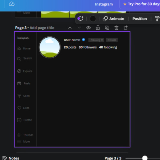
If you followed it through, it should look like this,
13. Now onto step 13, we'll be adding the Threads logo. You don't have to add this but to make it look more like the actual website, I will be adding it. Open the "text" tab and add a text box. Write an "@" symbol in the box and change the font to Nanum Sqaure and the size to 24.9. Add in the bottom corner below all the icons we just added to our page. We need another text box now (Color is still #707070), write "Threads" and align it to the "@" symbol.
14. We're adding another icon now. Search "Instagram menu icon" and find a wireframe menu icon by sketchify. the W and H are 42.5 x 24.6. Add a text box that says "More". It will look like this:
We are a quarter way done now :D
15. Search in the elements tab "circle frame" and look for the one with a little border around it.
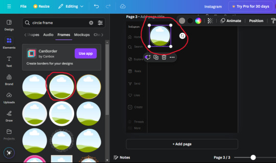
At first, the circle will be green and inside the circle will be white. Change the white to color of the background of the page (hex code #111111) then change the green to a grey color (#8D8986).
16. Add a new text box, change the font to Canva Sans and the size to 22.8 and the color is white. I just wrote "user.name" in the box. the W and H will be 153.3 x 35.7.
Enter the "elements" tab and search for a blue checkmark and find the icon by Victor Aguiar. The W and H is 28.1 by 28.
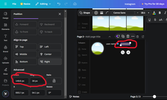
17. Search in the search box for a rectangular shape and add it to the page. Place it next to your username and checkmark icon and make the W and H to 149.6 x 38. Add another and place it next to the other rectangle shape. the W x H is 111.4 x 36.7.
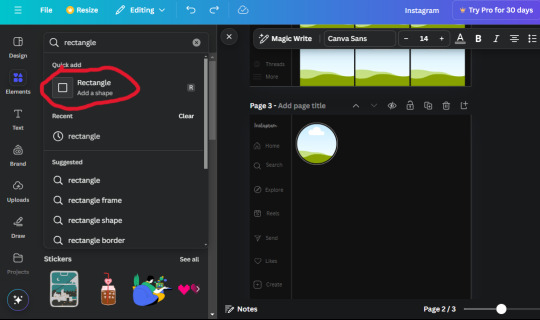
Change the color of both boxes to #2F2F2F. Add a text box and write "following" then change the W and H to 82.6 x 21.8 and fit it inside the first box. Add a second text box and write "message" in it then change the W and H to 77.8 x 21.8. Change both text colors to #7A7A7A

18. Add another text box. Write "<" and turn it upside down and place it beside the "following" text inside the rectangle. Adjust the size as you need to. I also like the round the corners to around 8 so its not so pointy and square.
19. Add 3 new text boxes. Write the amount of posts, the amount of accounts you're following and the amount of followers your have. Write "20 posts", "30 following" "40 followers". Bold the numbers and change the text W and H to 116.4 x 32.7. These are just place holders that I use.
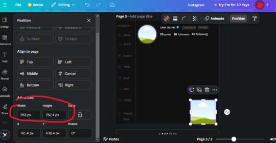
20. Open the "elements" tab again and search "frame". Choose the first one.
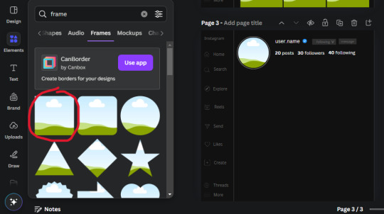
We want the height and width to be 268 x 252.4. Place it at the bottom of the page but we want some space between the frame and the page.
Now we'll duplicate the frame we just placed (the icon between the comment and trash can on the pop up above the frame). Place it next to the previous frame but we want to leave a bit of space between them like this:
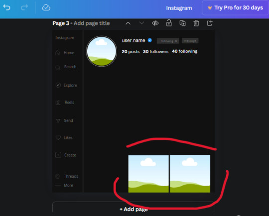
If its a little wonky, don't worry. You can always adjust it so it looks right.
Duplicate the frame again and place it next the second frame you just placed, same distance between. Make sure they're even. Now we have a row.
Select all three frames and duplicate them. Move them above our original frames but leave a little space between them.
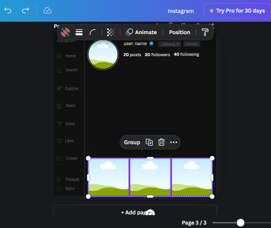
Again, if they're uneven, adjust them as you need to.
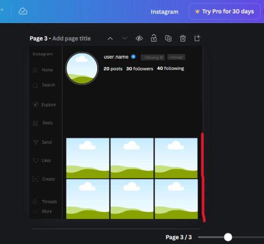
21. Select the line again from the elements tab. Stretch starting from the top frame to the last frame and make the color grey (#2F2F2F).
Because the line is stupid hard to navigate, use something like a text box to mark where you want it to end like this:


Delete the text box and the line with be where we want it.
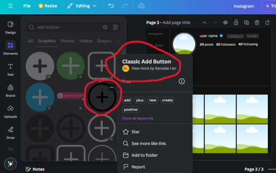
22. On to the highlight reels. Seach for "add button" and find the one by Barudak Lier.
Change the heigh and width to 81.1 and move it above the border.
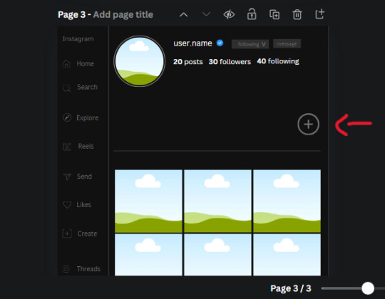
Search for circle frames now and add this one to the page (The same one we used for the pfp), change the width and height to 85.4 and move it next to the add button. Since this is a generic, blank template, I add about 4 of these highlight frames but you can do however many you want. You can change the border color to a gradient or leave it grey.
Add a text box now. The font will be Canva Sans, the size will be 18.1 and the color will be white. Change the text to "Add" and place it under our add button. Make more of these text boxes to place under the circle frames. Depending on which frame its under, write "Highlight 1", "Highlight 2", etc. etc. or you can give them different names and such.
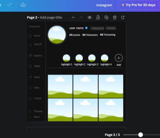
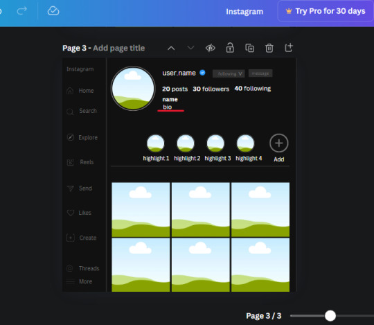
23. Add another text box, write "name" and bold it, change the size to 19.1 and the W and H to 69.2 x 28.8. The font will be Canva Sans and the color will be white. It will go under the amount of posts, followings and followers.
Add another box. The font is Canva Sans, font size to 20.1, the W and H is 40.8 x 31.3 and the color is white as well. This is our "bio". Place it under "name".
Yay!🎉🎉🎉 You're halfway done!
24. Search for a shape in the elements. Look for the rectangle again and add it. Change the width and height to 460 x 760.4 and the color to an off black/grey color (#191919), placing it like this:
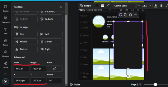
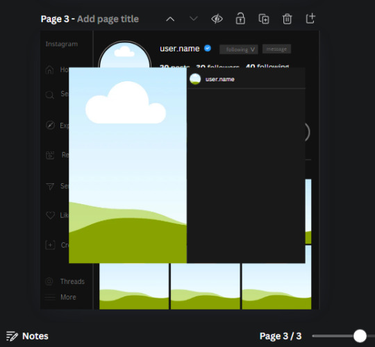
Get the same kind of square frame we used before to make the profile grid and make it the same size as the rectangle we just added. Place right up against the rectangle like it's its other half. Add another line like before and span across the upper half of the black rectangle as a border then add a circle frame inside the border.
Add a text box, "user.name" and align it with the frame. The text is white and the W and H is 111.5 x 25.9
25. Add more circle frame along the inside of the rectangle to resemble the comment section. Make sure the W and H of the frames are 46.1.
Add more text boxes that align with the frames you just made and write "username" again and bold them. Add even more text boxes that align with the usernames and write "comment". These are place holders for when you decide to use this template.
Add another rectangle on the lower part of the rectangle and make the color black. and search for "instagram heart icon", "instagram comment icon" and "instagram send icon". Make sure the lines are thick. Find the heart icon by sketchify, and the the comment and send icon are by Mirazz Creations. Make the lines white and make sure the W and H are the following:
Heart icon: 38.7 x 32.9
Comment icon: 35.2 x 35. 8
Send icon: 35 x 32
Next, look for "instagram bookmark icon" and find the one by Adricreative. Change the color to white and the W and H to 29.7 x 40.2. Move it to the other end of the rectangle.
26. Now add three circles frames and change the W and H to 37.2. Move them below the heart icon and have them overlap each other some. Then, add a text box and write "liked by username and 1000 others". Change the font size to 13.6 and change the font to Canva sans. the color will be white. Align this with the three overlapped frames.
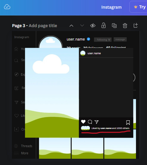
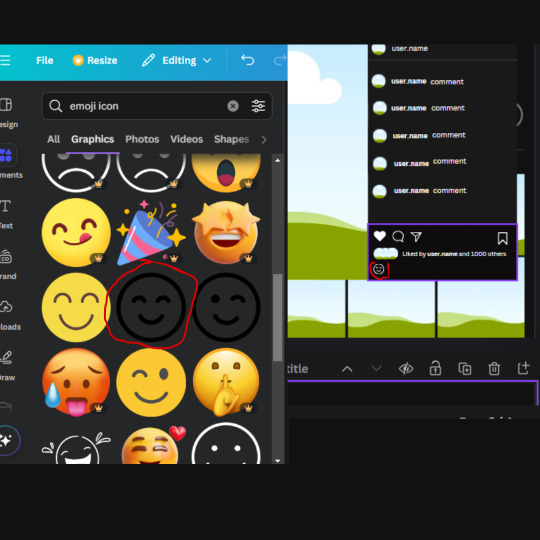
27. Look in the elements tab for an emoji icon and choose the one by Soni Soukell from Noun Project. The W and H will be 32.8 and the color is white.
Now add a another text box and write "Write a comment". The color will be white, the font size will be 14.2 and align with the emoji icon you just placed.
Search for "next arrow button" by Pixeden and make the W and H 42.8 then add it to both sides of the post.
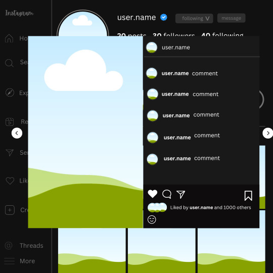
And you're all done with your template! All that is left to do is fill it but before doing that, duplicate the page so you always have an extra blank mockup if you want to use it again.
To fill the frames, upload an image (or use a Canva stock photo), drag and hover it over the frame and it will fill the frame.
Hope this was helpful and you you successfully made one :D <3
#requests#text#smau#template#mockup#moodboard#instagram#instagram moodboard#instagram mockup#graphic design#canva#psd#free tutorial#tutorial#instagram au#social media au#free psd#photoshop#resources#fanfiction resources#graphic design resources#graphic design tutorial#psd tutorial#photoshop tutorial#au#au ideas#mockups#digital design#digital design tutorial
170 notes
·
View notes
Text
Dank farrik 🙈 I tried to make a face by template concepting video à la Eobe and it turned out fun chaos so I have to show it! 😂🙏✨
I picked Crosshair, because he‘s got the most uncommon clone face shape in my opinion and because he got to few friendly attention from my side in the last time (only fun attention, poor kitty Croissant actually not sorry) AND OF COURSE he jinxed it 🖤💀
While drawing I collected my thoughts, fails and drawing frustrations and I drew little funny extras so that it‘s possible to read decipher the notes despite the rush of the timelapse 😀 And I already thought yeah, this is getting a messy thing… 👀
… AND THEN my screen bugged and crashed my brush!! 😱😂 Aaahh sweet chaos! But great, I go for it, let’s look how far I get before my drawing device starts burning or something 🤷🏽♀️
Is making ‚Fun drawing process à la Eobe‘ a thing? 👀 I giggled and definitely had fun like a child playing and hope you have fun with my weird and quite ADHD coded timelapse too! 😂 And also I hope besides fun, it’s maybe a bit inspiring to try out (what was the original intention before I noticed that it’s getting chaotic 😅)
The result is super messy speedy hatched Crosshair! And I kind of like it! It’s hiv vibe 🤷🏽♀️ So have a look:

The finished colored Crosshair get‘s his own posting, grumpy sniper deserves it and a hug 🖤✨I think he wrote the ALT text
Vod, vor entye for giving me the push to do this and sharing @wings-and-beskargam 💙✨🫶 This is the way!
Nix, here it is, have a ☕️ to that dry 🥐✨ @crosshairs-dumb-pimp-gf
Taglist: @eclec-tech @lonewolflupe @bixlasagna @returnofthepineapple @sunshinesdaydream @covert1ntrovert @general-ida-raven @vrycurious @dystopicjumpsuit @chaicilatte @groguandthebadbatch @justanotherdikutsimp @ladylucksrogue @spaceyjessa @morerandombullshit
#procreate timelapse#fun drawing process à la eobe#face drawing#fun drawing#à la eobe#drawing template#star wars#the bad batch#tbb crosshair#clint eastwood#he is it#snarky sniper#crispy croissant#crosscat#tbb#tcw#the clone wars#clones#star wars sniper#sw tbb fanart#star wars fanart#art#drawing tutorial#sketchy#adhd coded#creative chaos#artists on tumblr#my art#eobe
142 notes
·
View notes
Text

⠀⠀⠀⠀⋮ cole's notion.˳˳.⋅˙ᐧ.˳˳.⋅ॱᐧ.˳˳.⋅ઇଓ ⠀⌇ tutorial, to be added. ♡
⋮ HOMEPAGE, a visual diary .ᐟ ⋮ my works, ORIGINAL .ᐟ ⋮ my works, FANFICTION .ᐟ ⋮ TRACKERS, literature, cinematography .ᐟ ⋮ my dreams, ORIGINAL CHARACTERS .ᐟ


⋮ my works, ORIGINAL .ᐟ ⠀⌇ COLORBLIND, a dystopian novel ♡ ⠀⌇ HYROL'S SONG, a fantasy dream ♡ ⠀⌇ FOREVER & ONE DAY, a romantic whisper ♡ ⠀⌇ THE BLOOMING OF HOPE, to be added.


⋮ my works, FANFICTION .ᐟ ⠀⌇ ANIME, a love letter to NARUTO ♡ ⠀⌇ K-POP, a love letter to BTS ♡


#𐔌 . cole's notion .ᐟ ֹ ₊꒱#notion#productive#productivity#notion aesthetic#notion app#notion inspo#notion template#notion ideas#notion tutorial
138 notes
·
View notes
Text
BASIC ACC FREINDLY LIGHT PINK MINIMAL CARRD
Hiii guys, to the comments and everyone i apologize for the inconvenience of the title and everything, the carrd was free at one point but many people kept stealing the carrd and removing creds and giving copies of the carrd and saying they made it. I had sent out posts on here and my discord server letting everyone know if it didn't stop i would start charging for the carrd or just take it away all together and it got progressively worse so i decided to change it to a paid carrd and realized after a couple comments about it on this post that i forgot to change the post and take away the parts where i said free, if you would like the carrd for free there is a tut up on my youtube channel (linked in my pinned post or comms carrd i believe) for it but i won't be giving out copies or temps of it anymore besides the paid one thank you!!
HIIII everyone here's a new carrd! obtain it here look at it here!
REQS ARE OPEN FOR CARRDS!! only req i have is to be following me to ask for a carrd! and I DO CARRD COMMS!! so if you have a specific carrd you want made message abt my prices and what i take!! Donate tips to me so im able to continue making free carrds here! use my referral code also to help donate and get some money off on buying pro here / use the code manually HXYLIN !
#carrd commissions#carrd stuff#aesthetic#carrd templates#carrd icons#carrd inspo#carrd moodboard#carrd theme#carrd material#carrd packs#carrd req#discord chat#discord server#discord app#discord mobile#carrd template#request#carrd tutorial#free carrd template#carrd profile#strawberry#cutecore#commission#taking commisions#f2u#f2ucarrd
1K notes
·
View notes
Text

✩ CARRD INSPO by LOVJBINI // © crdais
like or reblog if you useㅤෆㅤ2024.
✎﹏ please, put “ © crdais – tutorial by @lovjbini ” in the description if you use our tutorial!
CLICK HERE FOR TUTORIAL
#lovjbini#carrd#carrd.co#carrd co#carrd inspo#carrd tutorial#carrd template#carrd layout#carrd tutorials#carrd templates#carrd layouts#carrd theme#carrd themes#carrd design#carrd designs#carrd stuff#aesthetic#simple#website#blue#white#wonyoung#jang wonyoung#ive wonyoung#izone wonyoung#izone#ive#ive moodboard#izone moodboard#wonyoung moodboard
636 notes
·
View notes