
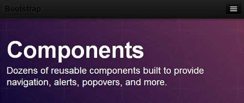
Twitter Bootstrap tutorial: how to start with Bootstrap, how to use Bootstrap to build responsive web sites, HTML templates and themes. Bootstrap Javascript & components How-to, Bootstrap Customize how-to
Don't wanna be here? Send us removal request.
Statistics
We looked inside some of the posts by bootstrapresponsive and here's what we found interesting.
Average Info
Notes Per Post
35
Likes Per Post
26
Reblog Per Post
9
Reply Per Post
0
Time Between Posts
7 months
Number of Posts By Type
Photo
3
Link
1
Text
8
Last Seen Tumblr Blogs


Fun Fact
After the announcement of the deal with Yahoo!, there were 170K signatures of unhappy Tumblr users petitioning to prevent the sale in 2013.
Photo

Bootstrap 4 HTML snippets growing library
There are also several projects with Bootstrap snippets, but however, I did not find clean code and useful ones.
And the main point is to give the most popular and most often used snippets for websites and landing pages(which I myself use every day)
And before we dive in, be sure that you follow me on Twitter and Instagram so you never miss:
My New Templates
Useful Tools
Updates
as well as insane deals on web design resources,
HTML and Wordpress Bundles + website builders
Here's the link Bootstrap 4 HTML snippets growing library
I am also currently 💪 working on increasing the number of Bootstrap snippets.
🙏 I will be glad to hear your wishes and suggestions in the comments.
What snippets would you like to see in future updates?
2 notes
·
View notes
Photo

Free Starter Bootstrap Website Templates & Landing Pages to save hours on your next website creation
Our designers at Bootstraptor.com have created a valuable and customizable starter Bootstrap template package for you to use on your next business website. 100% free.
The Issue
Wireframing is a quick and effective way to identify usability issues early on in your design process. But you probably spend a large percentage of your time creating wireframes either by hand with paper and pencil or using digital tools.
Time Saver
Typically, the majority of man-hours in a web design project are spent in implementation and coding. The good part about this Kit is that, obviously, you’re saving time at the development end by using coded wireframes.
We just launched an online ‘hub’ for free starter Bootstrap templates. We have a lot of uploaded right now.
We saw how much interest there is for a free business website template for your next business website or landing page.
So we decided to produce a high-value collection of Website templates and Landing Pages for your next web project.
Just change text and images and upload them to your web hosting.
Who we are:
At Bootstraptor we build great websites.
It’s what we do and what we do best.
For 6 years more than 250’000 happy customers have used our web templates.
What our customers say:
“We have been purchasing software products from Bootstraptor for over 5 years due to the expertise of the developer, Anatolii, and more importantly his personalized customer service is exceptional. We highly recommend this product and any other produced by Bootstraptor – we have them all.” – Max
These templates are fully compatible with our new template generator - the Blueprints app
Follow this link to get these 15 templates for free from our website.
Direct link https://bootstraptor.com/the-real-ultimate-website-templates-landing-pages-to-save-hours-on-your-next-website-creation/
#bootstrap#bootstraptemplates#webdesign#bootstrap4#wireframes#ui#uix#webdev#webdevelopment#free#freebies#freetemplates#free themes
3 notes
·
View notes

Photo

Bootstrap 3 Drag&Drop builder with lots of features Get it here: http://builder.bootstraptor.com/ EVObuilder provides 3 easy steps for create responsive templates in minutes. All Bootstrap 3.0. features included. Drag&Drop editor + HTML editor + Less + Css editor give you all power to build with bootstrap. Prebuild layouts & Templates. Colors preset themes build-in. Get it here: http://builder.bootstraptor.com/
2 notes
·
View notes
Text
Create Bootstrap e-commerce products template
Consider the creation of the main page of the e-Commerce store. This e-commerce Bootstrap prototype template is based on the examples of the largest sites, thus tested on an audience of millions. So you can be sure of its effectiveness. Of course you will need to make some adjustments and changes specific to your niche and product features.

Live preview
Get code
3 notes
·
View notes
Text
Create portfolio page template with Bootstrap easy
Bootstrap is extremely useful for creating all possible portfolios and various representations of products. The framework has a ready-made elements for images galleries and thumbnails grids.
In addition bootstrap already has several types of presentation of images and easily changed to suit your custom design tasks.
Here example of simple portfolio buit with bootstrap

Preview demo
Get code
4 notes
·
View notes
Text
Making Bootstrap responsive
Bootstrap 2 version offers a choice of two grids: default grid and responsive grid layout
In this tutorial, we will look at how to connect the responsa styles and talk about Dumb possible to better understand the complexities of the issue.

How to enable bootstrap responsive styles.
Style file is responsible for the bootstrap responsive structure has a name bootstrap-responsive.css. You need to connect it after the main bootstrap styles file bootstrap.css. This file is located between the tags head
4 notes
·
View notes
Text
Bootstrap Get started
You will need a basic knowledge and understanding of html and css. Now the easiest way to learn them is http://www.codecademy.com/
Preparing the environment
Before Bootstrap downloading, first get a code editor, The bootstrap creators (@fat and @mdo) recommend Sublime Text 2, there is an alternative to Notepad++.
We won't walk through the source files here, but they are available for download. We'll focus on getting started with the compiled Bootstrap files.
Download compiled
Fastest way to get started: get the compiled and minified versions of our CSS, JS, and images. No docs or original source files.
Download Bootstrap
Download source
Get the original files for all CSS and JavaScript, along with a local copy of the docs by downloading the latest version directly from GitHub.
Download Bootstrap source
Once downloaded, unzip the compressed folder to see the structure of (the compiled) Bootstrap. You'll see something like this:
bootstrap/ ├── css/ │ ├── bootstrap.css │ ├── bootstrap.min.css │ ├── bootstrap-responsive.css │ ├── bootstrap-responsive.min.css ├── js/ │ ├── bootstrap.js │ ├── bootstrap.min.js └── img/ ├── glyphicons-halflings.png └── glyphicons-halflings-white.png
Create a new html file in the root folder and name it as an index.html. Or download:example templates And here you can download extended sample Bootstrap templates: extended templates
The basic template code of any bootstrap project:
<!DOCTYPE html>
<html>
<head>
<title>Bootstrap 101 Template</title>
<meta name="viewport" content="width=device-width, initial-scale=1.0">
<!-- Bootstrap -->
<link href="css/bootstrap.min.css" rel="stylesheet" media="screen">
</head>
<body>
<h1>Hello, world!</h1>
<script src="http://code.jquery.com/jquery.js"></script>
<script src="js/bootstrap.min.js"></script>
</body>
</html>
Live demo: Hello world demo
Another simple way to run the bootstrap project is bootstrapCDN.com
Replace link to the styles and javascript files on the links provided by this service. You will get the highest download speed of your project in any world region and a minimum load on your server.
Excellent! Now you are ready to begin to setup your first Bootstrap project!
2 notes
·
View notes
Text
Creating a carousel
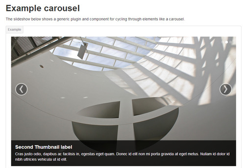
Look at official Bootstrap site Carousel section http://twitter.github.io/bootstrap/javascript.html#carousel
Carousel is an integral element of any modern website. Bootstrap provides a standard carousel pretty simple to use and modify. To use Carousel just copy the code from the official site and include the html file the necessary javascript code.
You should not have problems and difficulties with the use of the standard bootstrap carousel. Therefore, we will discuss the different methods of use and modification of the carousel to provide additional functionality.
NOTE: Be sure to locate your stylesheet files below bootstrap.css style file. Than browsers will apply modyfined properties and overwrite Bootstrap properties by default.
Changing the direction of the slides in the carousel to vertical
Take a look to the Vertical Carousel CSS3 properties
.vertical .carousel-inner { height: 100%; } .carousel.vertical .item { -webkit-transition: 0.6s ease-in-out top; -moz-transition: 0.6s ease-in-out top; -ms-transition: 0.6s ease-in-out top; -o-transition: 0.6s ease-in-out top; transition: 0.6s ease-in-out top; } .carousel.vertical .active { top: 0; } .carousel.vertical .next { top: 400px; } .carousel.vertical .prev { top: -400px; } .carousel.vertical .next.left, .carousel.vertical .prev.right { top: 0; } .carousel.vertical .active.left { top: -400px; } .carousel.vertical .active.right { top: 400px; } .carousel.vertical .item { left: 0; }
Code: http://bootply.com/63148
Demo: http://bootply.com/render/63148
Carousel with Fade effect

Unfortunately the default bootstrap carousel does not provide fade effect. So here's the code to quickly create the desired effect.
Demo: http://bootply.com/64693
Code: http://bootply.com/render/64693
Bootstrap carousel with multi items
It is often necessary to show in the carousel several positions at the same time(multi items), it is ideally reduces site space, allows you to show just a lot of positions, such as products or customers logos or anything

If you need mobile stacked items here is the solution

@media (max-width: 767px){ .carousel .row .span3 { display: block; float: left; width: 25%; margin-left: 0; -webkit-box-sizing: border-box; -moz-box-sizing: border-box; box-sizing: border-box; } }
Code: http://bootply.com/64680
Demo: http://bootply.com/render/64680
4 notes
·
View notes
Text
Bootstrap layout(scaffolding grid)
One of the important tasks of the modern web development is the creation of websites with cross-browser compatible layout. Previously existed frameworks, grid and the elements of which were cross-browser. But Twitter Bootstrap tried to bring cross-browser to a higher level. In addition to bustrape originally laid functionality compatible with mobiles and tablets.
Bootstrap fluid grid is based on the 12-column structure. Therefore, when creating your structure should be remembered that the sum of all block spans elements should be be divisible to 12. For example span1 + span11, span6 + span6 and so on.

Demo: http://bootply.com/render/64764
Code: http://bootply.com/64764
Official Twitter Bootstrap site provides quite extensive information about scaffolding, so we will not cover the basics and go straight to the most difficult places and solutions to the problems faced by developers creating structures on the bootstrap.
One such of problem is the shifting margin-left:30px in the next series of items of nested items in fluid layout grids.
Regardless of whether you are using a container class="container-fluid" or not. This bug is solved only if you use class="row". But we're talking about and want to see Responsive web sites. So here's the solution to this problem.

The problem is solved using a pseudo-classes :nth-child. Similarly, the creation of a zebra table where the color of alternating columns in one style only by the CSS styles. We set the zero offset for each of the first element of the next line in the grid Example css code
#fixthis .span4:nth-child(3n+1){ margin-left:0px; }
Preview Code
Live demo
Similarly, you create code for all span's elements of the just changing the name of the class and values
#fixthis .span3:nth-child(4n+1){ margin-left:0px; }
#fixthis .span6:nth-child(2n+1){ margin-left:0px; }
0 notes
Text
Headings - Hero unit
The hero-unit class calls in Bootstrap CSS rules that scale up font sizes, creating a welcome message that can't be missed. You'll note that things aren't too large outside the hero-unit in the headings and paragraphs below. Here live example
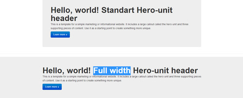
As seen in the example, you can set the width of the header to the full width of the screen just by changing the structure of the html code.
You can change the width of the hero-unit by wrapping in standard class="span.." and add any items such as the Sign in form as shown in the example

Live demo
Change hero-unit background color
You can change padding spacing, and background color in the stylesheet
.hero-unit { padding: 60px;/* CHANGE PADDING HERE*/ margin-bottom: 30px; font-size: 18px; font-weight: 200; line-height: 30px; color: inherit; background-color: #eeeeee; /* CHANGE BACKGROUND HERE*/ -webkit-border-radius: 6px; -moz-border-radius: 6px; border-radius: 6px; }
Ome more Bootstrap heading element is class .page-header
It is suitable for sub-pages or sections heading titles, has a large font headlines and separated from content by the margins and bottom border

Live demo
2 notes
·
View notes
Text
Bootstrap navigation ( Nav bar )
We will move in compliance with the arrangement of the elements in standard html projects from top to bottom. The first element that we study - the navigation bar.
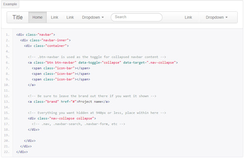
For a review of this element read the information on the official site http://twitter.github.io/bootstrap/components.html#navbar . We will consider in more detail especially nav bar.
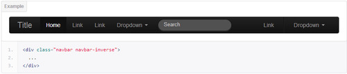
Bootstrap provides two basic colors of navbar light and inverted black. Here class to add if you need black navbar
.navbar-inverse
Also, if you want to fix the navigation at the top of the page when scrolling navigation that remained in place, apply the class class="navbar navbar-fixed-top" You can see a live example of a navigation on this site.
More examples: Static nav bar | Fixed nav bar
You can also fixed nav bar at the bottom of the active window to do this apply class class="navbar navbar-fixed-bottom"
Bootstrap menu adapted for mobile devices. On mobile devices, display links to navigate change, there is a drop down menu. To use it you need the following code

On mobiles and tablets.
When you click on the button - menu opens

When you create a one-page site with scrolling the screen when you click on a menu item, the default menu bootstrap remains open. To change this, use javascript(jQuery) code
<script>$('.nav-collapse .nav > li > a').click(function(){
$('.collapse.in').removeClass('in').css('height', '0');
});</script>
Here you can see live example
By default, the bootstrap fixed menu has one peculiarity to be shown on mobile - changing from a fixed to a static display
@media (max-width: 979px){ .navbar-fixed-top, .navbar-fixed-bottom { position: static; } }
To fix this we need to change following style
@media (max-width: 979px){ .navbar-fixed-top, .navbar-fixed-bottom { position: fixed; } }
Change navbar colors and styles
To change navbar menu colors, add style at the bottom of a file in the page header bootstrap.css For e.g.
.navbar-inner { background: #2b2b2b; background-image: none; background-repeat: repeat-x; border-color: none; filter: none; }
Change navbar height
To change navbar height change value min-height: 40px;
.navbar-inner { min-height: 40px; /* change value here*/ }
Change the color of navbar links
You can change the color of menu links replace the code in styles
.navbar-inverse .brand, .navbar-inverse .nav > li > a { color: #999999;/* CHANGE COLOR HERE*/ text-shadow: 0 -1px 0 rgba(0, 0, 0, 0.25); } .navbar .nav > li > a { float: none; padding: 10px 15px 10px; /* CHANGE HEIGHT HERE */ color: #777777; /* CHANGE COLOR HERE*/ text-decoration: none; text-shadow: 0 1px 0 #ffffff; }
5 notes
·
View notes