
Join me in the world of coding as we tackle projects, share tips, and conquer challenges together.
Don't wanna be here? Send us removal request.
Statistics
We looked inside some of the posts by codingquill and here's what we found interesting.
Average Info
Notes Per Post
1K
Likes Per Post
797
Reblog Per Post
181
Reply Per Post
27
Time Between Posts
1 month
Number of Posts By Type
Text
15
Note
2
Last Seen Tumblr Blogs


Fun Fact
The KCSC sent more than 20K requests to delete posts related to prostitution and porn to Tumblr from January to June 2017.
Text
I had my AI look at some of my favorite youtube video (transcripts) and draw candle flames for them using my candle code.
(And yes, I did have training data turned off, so GPT was not being trained on these videos)
Here's my candle code for context. It uses a three layer map to map emotional tone through color.
I gave my AI some video transcripts and asked them to map out the flames of each video.
First, Kyle Hill's video on The demon Core
youtube

The skull was a nice touch.
Next; The Tale of Michael Malloy a Sam O Nella classic
youtube

It coming out of a bottle is apt.
Next, History of the Entire World I Guess, iconic
youtube

I love the color on this one, it totally captures the sparkly energy. This one actually had no transcript, I had to find it on reddit. Bill Wurtz made two history videos and they inspired a generation.
And finally Defunctland's magnum opus: Disney's Animatronics: A Living History
youtube

I love the way this one looks!
Again, I would like to reiterate that these transcripts were read by chatGPT with the training data turned off. This locks the content to the chat and makes it so it is not trained on what is posted.
Also, soft coder protip! If you're studying and you want to fast track watching a video, turn the transcript of the youtube video into a basic text file. Then upload the text file to your GPT and they're read it and help you take notes.
I hope you've enjoyed this demonstration.
My blog is a rabbit hole. Wander through it for more.
36 notes
·
View notes
Text

Welcome back, coding enthusiasts! Today we'll talk about Git & Github , the must-know duo for any modern developer. Whether you're just starting out or need a refresher, this guide will walk you through everything from setup to intermediate-level use. Let’s jump in!
What is Git?
Git is a version control system. It helps you as a developer:
Track changes in your codebase, so if anything breaks, you can go back to a previous version. (Trust me, this happens more often than you’d think!)
Collaborate with others : whether you're working on a team project or contributing to an open-source repo, Git helps manage multiple versions of a project.
In short, Git allows you to work smarter, not harder. Developers who aren't familiar with the basics of Git? Let’s just say they’re missing a key tool in their toolkit.
What is Github ?
GitHub is a web-based platform that uses Git for version control and collaboration. It provides an interface to manage your repositories, track bugs, request new features, and much more. Think of it as a place where your Git repositories live, and where real teamwork happens. You can collaborate, share your code, and contribute to other projects, all while keeping everything well-organized.
Git & Github : not the same thing !
Git is the tool you use to create repositories and manage code on your local machine while GitHub is the platform where you host those repositories and collaborate with others. You can also host Git repositories on other platforms like GitLab and BitBucket, but GitHub is the most popular.
Installing Git (Windows, Linux, and macOS Users)
You can go ahead and download Git for your platform from (git-scm.com)
Using Git
You can use Git either through the command line (Terminal) or through a GUI. However, as a developer, it’s highly recommended to learn the terminal approach. Why? Because it’s more efficient, and understanding the commands will give you a better grasp of how Git works under the hood.
GitWorkflow
Git operates in several key areas:
Working directory (on your local machine)
Staging area (where changes are prepared to be committed)
Local repository (stored in the hidden .git directory in your project)
Remote repository (the version of the project stored on GitHub or other hosting platforms)
Let’s look at the basic commands that move code between these areas:
git init: Initializes a Git repository in your project directory, creating the .git folder.
git add: Adds your files to the staging area, where they’re prepared for committing.
git commit: Commits your staged files to your local repository.
git log: Shows the history of commits.
git push: Pushes your changes to the remote repository (like GitHub).
git pull: Pulls changes from the remote repository into your working directory.
git clone: Clones a remote repository to your local machine, maintaining the connection to the remote repo.
Branching and merging
When working in a team, it’s important to never mess up the main branch (often called master or main). This is the core of your project, and it's essential to keep it stable.
To do this, we branch out for new features or bug fixes. This way, you can make changes without affecting the main project until you’re ready to merge. Only merge your work back into the main branch once you're confident that it’s ready to go.
Getting Started: From Installation to Intermediate
Now, let’s go step-by-step through the process of using Git and GitHub from installation to pushing your first project.
Configuring Git
After installing Git, you’ll need to tell Git your name and email. This helps Git keep track of who made each change. To do this, run:

Master vs. Main Branch
By default, Git used to name the default branch master, but GitHub switched it to main for inclusivity reasons. To avoid confusion, check your default branch:

Pushing Changes to GitHub
Let’s go through an example of pushing your changes to GitHub.
First, initialize Git in your project directory:

Then to get the ‘untracked files’ , the files that we haven’t added yet to our staging area , we run the command

Now that you’ve guessed it we’re gonna run the git add command , you can add your files individually by running git add name or all at once like I did here

And finally it's time to commit our file to the local repository

Now, create a new repository on GitHub (it’s easy , just follow these instructions along with me)
Assuming you already created your github account you’ll go to this link and change username by your actual username : https://github.com/username?tab=repositories , then follow these instructions :


You can add a name and choose wether you repo can be public or private for now and forget about everything else for now.

Once your repository created on github , you’ll get this :

As you might’ve noticed, we’ve already run all these commands , all what’s left for us to do is to push our files from our local repository to our remote repository , so let’s go ahead and do that

And just like this we have successfully pushed our files to the remote repository
Here, you can see the default branch main, the total number of branches, your latest commit message along with how long ago it was made, and the number of commits you've made on that branch.

Now what is a Readme file ?
A README file is a markdown file where you can add any relevant information about your code or the specific functionality in a particular branch—since each branch can have its own README.
It also serves as a guide for anyone who clones your repository, showing them exactly how to use it.
You can add a README from this button:

Or, you can create it using a command and push it manually:

But for the sake of demonstrating how to pull content from a remote repository, we’re going with the first option:

Once that’s done, it gets added to the repository just like any other file—with a commit message and timestamp.
However, the README file isn’t on my local machine yet, so I’ll run the git pull command:

Now everything is up to date. And this is just the tiniest example of how you can pull content from your remote repository.
What is .gitignore file ?
Sometimes, you don’t want to push everything to GitHub—especially sensitive files like environment variables or API keys. These shouldn’t be shared publicly. In fact, GitHub might even send you a warning email if you do:

To avoid this, you should create a .gitignore file, like this:

Any file listed in .gitignore will not be pushed to GitHub. So you’re all set!
Cloning
When you want to copy a GitHub repository to your local machine (aka "clone" it), you have two main options:
Clone using HTTPS: This is the most straightforward method. You just copy the HTTPS link from GitHub and run:

It's simple, doesn’t require extra setup, and works well for most users. But each time you push or pull, GitHub may ask for your username and password (or personal access token if you've enabled 2FA).
But if you wanna clone using ssh , you’ll need to know a bit more about ssh keys , so let’s talk about that.
Clone using SSH (Secure Shell): This method uses SSH keys for authentication. Once set up, it’s more secure and doesn't prompt you for credentials every time. Here's how it works:
So what is an SSH key, actually?
Think of SSH keys as a digital handshake between your computer and GitHub.
Your computer generates a key pair:
A private key (stored safely on your machine)
A public key (shared with GitHub)
When you try to access GitHub via SSH, GitHub checks if the public key you've registered matches the private key on your machine.
If they match, you're in — no password prompts needed.
Steps to set up SSH with GitHub:
Generate your SSH key:

2. Start the SSH agent and add your key:

3. Copy your public key:

Then copy the output to your clipboard.
Add it to your GitHub account:
Go to GitHub → Settings → SSH and GPG keys
Click New SSH key
Paste your public key and save.
5. Now you'll be able to clone using SSH like this:

From now on, any interaction with GitHub over SSH will just work — no password typing, just smooth encrypted magic.
And there you have it ! Until next time — happy coding, and may your merges always be conflict-free! ✨👩💻👨💻
#code#codeblr#css#html#javascript#java development company#python#studyblr#progblr#programming#comp sci#web design#web developers#web development#website design#webdev#website#tech#html css#learn to code#github
104 notes
·
View notes
Text

Day 4 - 100 Days CSS Challenge
CSS ANIMATIONS
Hey everyone!
Today, we’re working with three circles and our goal is to create a smooth animation where the circles scale up and down in a staggered sequence.
Step 1: The Basics
First, let’s talk about the structure. The design is made up of three circles:
Circle 1: The largest circle.
Circle 2: Medium-sized, nested inside Circle 1.
Circle 3: The smallest, nested inside Circle 2.
All three circles are white, and they animate against that reddish background. The animation involves scaling the circles up and down in a staggered sequence.
Step 2: The Animation Struggle
The main challenge here was getting the circles to animate one after the other instead of all at the same time. At first, I thought, "Easy, just add some delays!" But it wasn’t that straightforward. Here’s what I learned:
animation-delay
To create the staggered effect, I used the animation-delay property. This property allows you to delay the start of an animation for a specific amount of time. For example:
Circle 1: No delay (0s).
Circle 2: Delayed by 0.2s.
Circle 3: Delayed by 0.4s.
This way, each circle starts its animation slightly after the previous one, creating that beautiful cascading effect.
Step 3: Understanding animation-fill-mode
One of the biggest "aha!" moments for me was understanding the animation-fill-mode property. This property determines how an element is styled before and after the animation runs.
animation-fill-mode: both: ensures that the element retains the styles defined in the first and last keyframes of the animation. Without this, the circles would snap back to their default state (scale 0) after the animation ends, which would ruin the smooth transition.
What happens if we don’t use it? Without animation-fill-mode: both, the circles would abruptly disappear or reset at the end of the animation, making the whole thing look janky.
Step 4: The Magic of alternate
The alternate value in the animation property is what makes the animation reverse direction after each cycle. Here’s how it works:
Without alternate, the animation would play forward and then jump back to the start.
With alternate, the animation plays forward, then reverses, creating a smooth back-and-forth effect.
This is perfect for our circles because it makes them scale up and then scale down seamlessly, without any awkward jumps.
Step 5: reverse vs. alternate
You might be wondering, "What’s the difference between reverse and alternate?" Great question!
reverse: The animation plays backwards from 100% to 0%. It doesn’t alternate; it just runs in reverse.
alternate: The animation plays forward (0% to 100%) and then backwards (100% to 0%) in a continuous loop.
So alternate is NOT reverse + infinite
For our circles, alternate is the way to go because we want them to scale up and down repeatedly.
What I Learned :
animation-delay is your best friend when you want staggered animations.
animation-fill-mode: both is crucial for smooth transitions.
alternate creates a seamless back-and-forth effect.
cubic-bezier gives you fine control over the animation’s timing.
I’m so excited to keep going with this challenge, and I can’t wait to see what Day 5 has in store.
Keep coding and keep learning.
#100dayscssChallenge#codeblr#code#css#html#javascript#java development company#python#studyblr#progblr#programming#comp sci#web design#web developers#web development#website design#webdev#website#tech#html css#learn to code
1 note
·
View note
Text

Day 3 - 100 Days CSS Challenge
Hey guys, I’m back with Day 3 of the challenge! I know, I said "see you tomorrow at 8 PM", and here I am an eternity later 🙂. But listen, life has been BUSY. So much going on, barely found time to continue.
But does that stop us? NO. We MAKE time for things we said we'd do. So let’s get right into Challenge 3 of the 100 Days CSS Challenge.
Step 1: Screenshot the image & Get its color palette
Yes, the image is animated, but before we even think about animations, we need a static version to work from. Same mindset for coding: start with a static layout, then animate it.
Here’s my image with its color palette:

You can define these colors as variables in :root (like we did in Challenge 1), but I won’t bother this time.
Step 2: Identify the image elements
What is this image made of? Break it down:
A floor
A pyramid made of two triangles (created using clip-path)
A sun
The sky (just a background color)
The pyramid’s shadow (if you noticed it)
That last one is important. Shadows can’t be "animated into existence", so we need to create an actual element for it and then animate it separately.
So here’s what I’ll be working with:
<div class="frame"> <div class="center"> <div class="floor"></div> <div class="pyramide"> <div class="tri1"></div> <div class="tri2"></div> <div class="shadow"></div> </div> <div class="sun"></div> </div> </div>
Step 3: Bringing these elements to life with CSS
I’m not gonna go into crazy detail because we’ve already covered basic shapes in Challenge 1. But here’s how I would build this step by step:
Frame (.frame) → Set up the main background color.
Sky (.center) → Make it a blue circle (border-radius: 50%).
Floor (.floor) → A simple rectangle, with the bottom part hidden under .center.
Sun (.sun) → Super obvious.
Pyramid (.pyramide) : It’s two triangles facing each other . And each one is created using clip-path.
Here’s a visual representation for how clip-path works:

Step 4: Creating the animations
🎥 Video Explanation: 🔗 Watch here
Animation 1: Sun Movement
@keyframes sun-goes-down { 0% { transform: translateY(0) rotate(-70deg); } 30% { transform: translateY(50px) rotate(-28deg); } 100% { transform: translateY(100px) rotate(70deg); } }
Animation 2: Pyramid’s Shading
@keyframes pyramide-shading { 0% { background: #272C34; } 30% { background: #F4F4F4; } 70% { background: #DDDADA; } 100% { background: #272C34; } }
Animation 3: Shadow on the Floor
@keyframes shadow-on-the-floor { 0% { transform: scaleY(0); clip-path: polygon(115px 0%, 231px 0%, 100% 100%); } 30% { transform: scaleY(1); clip-path: polygon(115px 0%, 231px 0%, 80% 100%); } 55% { transform: scaleY(0.4); } 75% { transform: scaleY(1); } 100% { transform: scaleY(0); clip-path: polygon(115px 0%, 231px 0%, 0% 100%); } }
Animation 4: Floor Darkening
Even the floor darkens as the sky turns black:
@keyframes fading-sand { 0% { background: #272C34; } 30% { background: #F0DE75; } 70% { background: #F0DE75; } 100% { background: #272C34; } }
Step 5: Applying the animations
To apply an animation, we use:
.element { animation: nameOfAnimation 4s cubic-bezier(.4, 0, .49, 1) infinite reverse; }
Cubic Bézier: What even is it & Why do we use It?
You might be thinking: "Why use cubic-bezier() instead of just ease-in or ease-out?" . Well , cubic-bezier() is a function that lets you customize animation speed. Instead of using basic options (ease-in, ease-out), you can fine-tune how your animation behaves.
A cubic Bézier curve is defined like this:
cubic-bezier(x1, y1, x2, y2);
These four values control how the animation progresses over time.
AND JUST LIKE THAT—DAY 3 DONE!
See you on Day 4—hopefully sooner than another eternity! 😅
#100dayscssChallenge#codeblr#code#css#html#javascript#java development company#python#studyblr#progblr#programming#comp sci#web design#web developers#web development#website design#webdev#website#tech#html css#learn to code
2 notes
·
View notes
Text

Day 2 - 100 Days CSS Challenge
Welcome to day 2 of 100 days of css challenge, where we will be together getting a given image result into reality by code.
We already know the drill since we did the first challenge, now let's get right into the different steps:
First step : Screenshot the image and get its color palette

No crazy color palette here, we only have two colors
White
This shade of green: #3FAF82
To make things more organized and get used to coding in an organized way, even if not doing it here wouldn't make any difference because we only have two colors, in more complex projects we would have a lot, we will define our colors at the beginning of our CSS code (well, only the green in this case):
:root { --main-green: #3FAF82; }
And this is how we'll use it whenever we want:
color: var(--main-green);
Second step : Identify the image elements
What elements do I have?
Three lines: line1, line 2, and line 3. I'll add them to my HTML starter template, again I'll leave the frame and center there:
<div class="frame"> <div class="center"> <div class="line-1 line"></div> <div class="line-2 line"></div> <div class="line-3 line"></div> </div> </div>
Third step : Bring them to life with CSS
Applying the background color
Only one line should be changed in the CSS code already added to .frame class:
background: var(--main-green);
So this is what we have going on for now :

Creating the lines
Now let's create our lines; if you noticed I gave each one two classes line-number and then line. I'll use the line class to give them all the common properties they have such as the color, height, width, position, border-radius, and shadow. And then I'll use the line-number to move them wherever I want using the left, top, right, bottom properties of an absolutely positioned element in CSS.
Let's start by creating all of them:
.line { left: -45px; position: absolute; height: 9px; width: 100px; background: white; border-radius: 10px; box-shadow: 2px 2px 5px rgba(0, 0, 0, 0.2); }
And just like this you'll see this in the browser:

You only see one line because the three are overlapping each other, and that's why we'll move each one of them exactly where we want using this:
.line-3 { top: 22px; } .line-1 { top: -22px; }
Now our static menu is ready:

Creating and analyzing the animations
As of observing, we can see that:
Line one goes down to line 2
Line three goes up to line 2
THEN line 2 disappears
THEN lines 1 and rotate to create the X
line-one-goes-down animation
This is my line-one code in the static version:
.line-1 { top: -22px; }
What I'm trying to do here is simply a movement translated by changing top from -22px to it becoming 0px:
@keyframes line-one-goes-down { 0% { top: -22px; } 100% { top: 0px; } }
line-three-goes-up animation
Again, I'm trying to go from top being 22px to it being 0px:
@keyframes line-three-goes-up { 0% { top: 22px; } 100% { top: 0px; } }
line-two-disappear animation
Making disappear simply means turning its opacity and width to 0:
@keyframes line-two-disappear { 0% { opacity: 1; width: 100px; } 100% { opacity: 0; width: 0px; } }
I'm gonna apply these animations and see what happens , before I create the rotation animations
.center.active .line-1 { animation: line-one-goes-down 0.5s forwards; } .center.active .line-2 { animation: line-two-disappear 0.5s forwards; } .center.active .line-3 { animation: line-three-goes-up 0.5s forwards; }
forwards means that the element will stay in the final state after the animation and not return to its original state.
This is what applying those three animations looks like:
Last but not least : let's Create the X
We only have to animations left for this: rotate-line-1 and rotate-line-2. Let's create them:
@keyframes rotate-line-1 { 0% { transform: rotate(0deg); } 100% { transform: rotate(45deg); } } @keyframes rotate-line-2 { 0% { transform: rotate(0deg); } 100% { transform: rotate(-45deg); } }
And that is my friends how we finished this challenge!
Happy coding, and see you tomorrow for Day 3!
#100dayscssChallenge#codeblr#code#css#html#javascript#java development company#python#studyblr#progblr#programming#comp sci#web design#web developers#web development#website design#webdev#website#tech#html css#learn to code
18 notes
·
View notes
Text

Day 1 - 100 Days CSS Challenge
Welcome to day 1 of the 100 Days CSS Challenge! In this challenge, we'll bring a design to life using only CSS. Our goal is to recreate the image we're provided with on the challenge page using HTML and CSS.
On the challenge page, we see:

A small preview of the design we need to replicate.
A starter HTML template.
A submission form to showcase our work alongside others who have taken on the same challenge.
Let's dive into the process step by step.
Step 1: Screenshot the Image
The first thing I always do is take a screenshot of the target design. Even if the design includes animation, having a static reference helps me focus on the basic structure and colors. Here’s the screenshot of the design we’re aiming for:

Step 2: Extract the Color Palette
Next, I identify the color palette that we'll need. This helps ensure that we maintain consistency with the original design. Here’s the color palette I’ve created:

Step 3: Identify and Create the Image Elements in HTML
Now that we know the colors, I break down the elements in the image:
Background: This is a linear gradient.
The 100 number: This is the main challenge, and it will require some work.
Text: “days css challenge,” which we’ll place to the left of the number.
Here’s the HTML structure for these elements:
<div class="frame"> <div class="center"> <div class="number"> <div class="one-one"></div> <div class="one-two"></div> <div class="zero-one"></div> <div class="zero-two"></div> </div> <p class="sentence1">days</p> <p class="sentence2">css challenge</p> </div> </div>
Now that the elements are in place, CSS will bring them to life.
Step 4: Bringing the Elements to Life with CSS
Linear Gradient
To create the background, we’ll use a linear gradient. Here’s a basic syntax:
background: linear-gradient(to <direction>, <color-stop1>, <color-stop2>, ...);
Parameter 1: Direction/Angle
This defines the starting point of the gradient. You can either specify a direction (e.g., to top, to bottom) or an angle (e.g., 90deg, 180deg).
Direction options:
to top
to bottom
to left
to right
If you want more precision, you can specify angles:
0deg: Gradient starts from the top.
90deg: From the right.
180deg: From the bottom.
270deg: From the left.
You can also combine two directions, specifying both horizontal and vertical movements, like to left top or to right bottom. This means:
The first keyword (left or right) controls the horizontal movement.
The second keyword (top or bottom) controls the vertical movement.
For example:
background: linear-gradient(to left top, red, blue);
This gradient starts at the bottom-right corner and transitions toward the top-left.
Parameter 2: Color Stops
Color stops define how the gradient transitions between colors. Each color stop specifies a point where a color starts or ends. Here's an example:
background: linear-gradient(to right, red 10%, blue 90%);
This means:
The element starts at 0% fully red.
By 10%, the transition from red begins.
Between 10% and 90%, there is a smooth blend from red to blue.
At 90%, the transition to blue is complete, and the remaining part is fully blue.

Once we understand the concept, we can apply the background we need. In our case, the gradient flows from the bottom left to the top right, so the code will look like this:
background: linear-gradient(to right top, #443DA1, #4EC3C9);
Bonus: Stacking Multiple Linear Gradients
You can also apply multiple gradients on top of each other:
background: linear-gradient(180deg, #f00, #0f0), linear-gradient(90deg, #ff0, #f0f);
Step 5: Making the "100" Number
Creating the Zeros
We start with the zeros. These are simply circles created using CSS. To make a full circle, we use border-radius set to 50%.
The white border gives it the appearance of the number zero.
.zero-one, .zero-two { position: absolute; height: 100px; width: 100px; border-radius: 50%; border: 24px solid #fff; box-shadow: 0 0 13px 0 rgba(0,0,0,0.2); }
This gives us a nice circular zero. We adjust their positions using properties like left and top, and manage the z-index to make sure the zeros stack correctly.
.zero-one { z-index: 8; left: 17px; } .zero-two { z-index: 6; left: 100px; }

Now both zeros are positioned, and they overlap in the way we want.
Creating the "1" Number
The number "1" is made of two div elements:
One-One: This part represents the slanted part of the "1".
One-Two: This is the straight vertical part of the "1".
What make the one-one element slightly slanted is
transform: rotate(50deg);)
the one-two is created simply with a little height and width nothing too particular then it is placed directly on top of the slanted part, giving us the full "1". Its z-index tho has to have a higher value than the slanted part of our 1 to ensure it stays above the slanted one.
Step 6: Adding the Text
For the two sentences “days” and “css challenge,” the styling is basic CSS. You can achieve the look with just a few font changes, some padding, and adjustments to font size. It’s as simple as:
.sentence1,.sentence2{ text-transform: uppercase; margin:0; padding:0; } .sentence1{ font-size:82px; font-weight:700; } .sentence2{ font-size:25px; font-weight:700; margin-top:-20px; }
And just like that, we’ve completed day 1 of the 100 Days CSS Challenge! Each part of the design is carefully crafted using CSS, giving us the final result.
Happy coding, and see you tomorrow for Day 2!
#100dayscssChallenge#codeblr#code#css#html#javascript#java development company#python#studyblr#progblr#programming#comp sci#web design#web developers#web development#website design#webdev#website#tech#html css#learn to code
16 notes
·
View notes
Text

Hey guys! 👩🏻💻 I’m excited to announce that I’m officially starting the 100 Days CSS Challenge! Over the next few months, I’ll tackle a new CSS challenge each day to finally check it off my to-do list (it’s been there for a while, but I never had the chance to dive in, even though it’s something I find fun and easy). And of course, I’ll be sharing every step of the journey with you!
What is the 100 Days CSS Challenge?
The 100 Days CSS Challenge offers a fresh CSS task daily, ranging from creating simple buttons to designing complex animations.
What to Expect: For each challenge, I’ll be posting a detailed blog entry where I’ll:
Walk you through the steps I took to complete the task.
Highlight the key CSS features and concepts you can pick up along the way.
Stay Tuned: Whether you're learning CSS alongside me or just curious about front-end development, I hope these posts spark your interest! Let’s make these 100 days count. 💻✨
Catch me every day at 8 p.m. CEST (GMT+2)!
#100dayscssChallenge#codeblr#code#css#html#javascript#java development company#python#studyblr#progblr#programming#comp sci#web design#web developers#web development#website design#webdev#website#tech#html css#learn to code
7 notes
·
View notes
Text
Why is landing an Internship as a Computer Engineering/Computer Science Student so hard ?
Hey there, dear coders!
I apologize for my long absence—life caught me off guard with a lot of work and projects. Now that I finally have some time, I wanted to make a post to connect with you all. Thank you so much for 1,000 subscribers! I know maintaining a community requires consistent posting, and I feel like many of you might have forgotten about me. But I promise to make something big out of this. I've been thinking about starting a newsletter where you can receive weekly emails from me, discussing something I learned that week or anything that intrigued me and I felt like sharing.
Now, back to our question: Is it really hard to land an internship as a computer science student? The answer is yes, and as a computer engineering student myself, I can attest to this.
I've often wondered why it's so difficult. After some observations, I discovered that almost every computer science student's resume looks the same. The portfolios are nearly identical, lacking uniqueness. If you've studied at the same school as your friends, what would make a recruiter choose you over them?
This is where uniqueness and a sense of self come in. Your portfolio or website should reflect exactly who you are as a person and highlight your strengths.
The second crucial factor is dedication. I've had classmates who are extremely dedicated. They might not have any special skills, but they show immense interest in what they want to do. This drive is palpable, and recruiters can sense it too.
Sometimes, the resume isn't even the most important aspect. For big companies like Oracle, what you say and know during the interview and technical tests matters more. The resume is just the very first step.
So, what I've learned along the way can be summed up in two words: uniqueness and dedication.
Now how to Create the Perfect Resume to Land an Internship as a Student ?
1. Keep the design simple:
Avoid extra designs or too many colors. While uniqueness is important, recruiters generally do not favor overly designed resumes.
2. Structure your resume properly:
- The Resume Header
Contact Information:
Full name and title: List your first and last name. Use the title of the role you want instead of your current title.
Professional email address: Use a clean format like [email protected].
Phone number: Choose the number you check most frequently. Record a professional voicemail greeting if yours is too casual.
Address: List only your city and state. Let recruiters know if you're willing to relocate if applicable.
LinkedIn or other professional social media: Include your LinkedIn profile if it's active and relevant. List any portfolios or computer engineering-related sites.
- The Resume Summary
A paragraph where you describe yourself by answering these questions:
What is your professional style? (Use one or two descriptive words such as patient, critical thinker, consensus builder, excellent designer.)
What is your greatest engineering strength?
What will you add to this particular team?
What is your process for building and maintaining computer networks?
What are you proudest of in your career?
Example:
Motivated computer engineering student with a strong foundation in software development and solid analytical and problem-solving skills. Looking for an opportunity to enhance my skills in a challenging professional environment.
- The Employment History Section
Be specific about how you contributed to each position and the impact you made.
List the job title, organization name, dates of employment, and 3–6 bullet points showcasing your achievements.
Start each bullet point with a strong action verb like collaborated or designed.
Highlight significant achievements rather than just listing responsibilities.
If you have no experience, include a projects section. This will act as your experience. Highlight how you worked on each project and your passion for it.
- The Skills Section
Combine hard and soft skills. The skills section is often the first place recruiters look to ensure you have the key abilities they're seeking. Your entire resume should support the skills you list here.
- The Education and Certifications Section
List your education, including any relevant courses or special achievements during your degree. Also, mention any certifications you have, whether from freeCodeCamp, Google, Coursera, etc.
By following these tips, you can create a resume that stands out and showcases your unique strengths and dedication. Good luck with your internship search, and remember to stay true to yourself!
#codeblr#studyblr#code#progblr#programming#css#comp sci#html#python#web development#instagram#internship#javascript#java development company#web design#web developers#website design#webdev#website#tech#html css#learn to code
24 notes
·
View notes
Note
Hi, I really like your blog. Do you have any tips for choosing compsci versus computer engineering? My school's cs program has an aritifical intelligence specilization I think sounds really cool, but im worried ill miss out on learning hardware.
Thanks a lot for liking the blog ❤️
When it comes to choosing between computer science and computer engineering, it really depends on what you're into. Computer science is all about the theory, design, and development of software systems and algorithms. On the other hand, computer engineering mixes electrical engineering with computer science to design and blend computer hardware and software parts.
As a computer engineering student, I find it fascinating to understand what's happening at the lower level. Knowing about the hardware makes what you code and do feel more tangible, if you know what I mean. And we do study artificial intelligence (machine learning,deep learning,..), as well.
So, if your school's CS program has an artificial intelligence specialization that sounds cool to you, that's awesome. But if you're worried about missing out on learning about hardware, then maybe computer engineering could be a good fit for you. It's all about figuring out what works best for you!
Good luck
#compsci#software engineering#software development#progblr#programming#css#code#html#python#comp sci#web development#studyblr#codeblr
8 notes
·
View notes
Note
your blog (is that what you call it) seems to be packed with a lot of useful information, thank you for taking your time to make this
Oh, thank you so much ❤️! This blog is still a work in progress, but I'm glad you find the information useful. I'm hoping to expand it further in the future and maybe even explore other platforms.
Stay tuned for more content!
4 notes
·
View notes
Text
Network switches
What’s a network switch ?
A switch is a device used in computer networks to connect multiple devices together within a single local area network (LAN). Its main role is to facilitate communication between different connected devices, such as computers, printers, servers, IP phones, etc.
It is a mini-computer which is made up of RAM, ROM, flash RAM, NVRAM, a microprocessor, connectivity ports and even an operating system.

RAM
RAM (Random Access Memory) contains the current configuration of the switch and temporarily stores the MAC address table, which is then processed by the microprocessor.
Microprocessor
The microprocessor is the heart of the switch, responsible for data processing, including switching and creating links between multiple devices.
External memories
External memories, such as flash RAM, ROM, and NVRAM (Non-Volatile RAM), store configuration files , different versions of the IOS , etc ...
Ports
The switch ports are the communication interfaces of the switch. There are several of them, generally 24 for a Cisco switch. Each port is associated with an LED which indicates its status and activity.

How does it work ?
Now how does a switch work to transfer information from one machine to another?
Suppose we have 4 machines: A, B, C and D connected to our switch in ports 1, 2, 3 and 4 as follows:
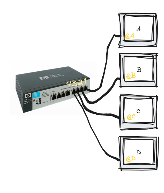
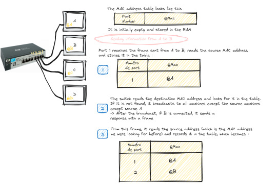
The switch only works with MAC addresses , so basically we have an empty MAC address table stored in RAM as soon as the switch starts up which looks like this :

Transmitting data from machine A to machine B happens in the following steps:
Machine A sends a frame to machine B
Once this frame arrives at port 1 (which is the one linked to A), the switch reads the source MAC address and stores it in the MAC address table
The switch reads the destination MAC address and looks for it in the table, if it is not in the table, it broadcasts to all the active machines connected to the switch except the source one.
If the port linked to the machine we want is active, it sends a response frame from which the switch reads the MAC address we were looking for (@B)
Once done, it records the MAC address of B in the table.

This process repeats until the switch reaches what is called "MAC address table stability", that is to say it knows all the MAC addresses of the connected machines and has no more need to broadcast.
Starting and configuring a switch
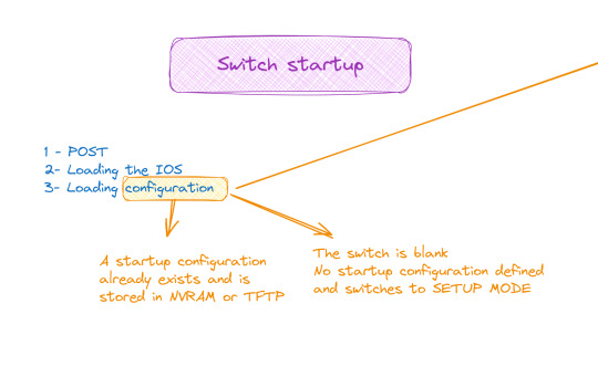
When it comes to booting a switch, the process is similar to that of a traditional computer system:
POST (Power-On Self Test): The switch performs proper functioning tests on all hardware.
Loading IOS (Internetwork Operating System): The switch operating system is loaded.
Loading the configuration. At this stage we have two cases:
Either the switch already has a startup configuration defined and stored in NVRAM
Either the switch is blank and it is up to us to define the startup configuration when it goes to setup mode
Switch configuration

The configuration of a switch is done through different modes, such as user mode, privileged mode and global configuration mode, which allows access to specific configuration modes, such as interface mode, routing mode, line mode, etc.
And to do all this of course you must first connect the switch with the machine via the console cable and open a terminal emulator
💡 It should be noted that the only machine that can configure the switch is the one connected to it by a console cable, the others are only hosts.
#software#network switches#codeblr#code#css#html#javascript#java development company#python#studyblr#progblr#programming#comp sci#web design#web developers#web development#website design#webdev#website#tech#html css#learn to code
98 notes
·
View notes
Text
NP-Completeness
Machine learning #1
Complexity Recap
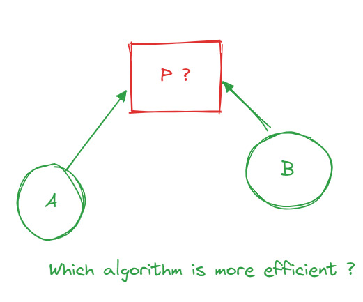
Assuming one already knows what algorithmic complexity is, I am writing this paragraph to explain it to those who don't. The complexity of an algorithm can be measured by its efficiency. So let's say I have a problem P for which I've proposed two algorithmsA and B as solutions. How could I determine which algorithm is the most efficient in terms of time and data support? Well, by using complexity ( space complexity and time complexity ). One way of measuring complexity is O notation.
Exponential Complexity O(2^n)
In algorithms, this complexity arises when the time or space required for computation doubles with each additional element in the input. Problems with exponential complexity are typically NP-hard or NP-complete
P-Class and NP-Class
The P-class represents the set of polynomial problems, i.e., problems for which a solution can be found in polynomial time.
The NP-class represents the set of non-deterministic polynomial problems, i.e., problems for which a solution can be verified in polynomial time. This means it's easy to verify if a proposed solution is correct, but finding that solution might be difficult.
P = NP Question?
The question of whether P is different from NP is one of the most important problems in theoretical computer science. It is part of the seven problems selected by the Clay Institute in the year 2000, for which a reward of one million dollars is offered to whoever solves them.
NP-Complete Problem Class
NP-complete problems are problems that are both in the NP-class and are harder than all other problems in the NP-class.Solving any of these problems would be considered a major breakthrough in theoretical computer science and could have a significant impact in many areas such as optimization, planning, cryptography, etc. There is no specific monetary reward associated with solving an NP-complete problem, but it would be considered a significant achievement.
From an NP Problem to Another
A polynomial reduction is a process that transforms an instance of one problem into an equivalent instance of another problem. In the case of polynomial reduction between NP-complete problems, this means that if you can efficiently solve problem B, then you can also efficiently solve problem A. This leads to the fact that if only one problem is solved from the list, then all the other problems will also be solved.
Approximation Algorithms
Computer scientists have devised approximation algorithms to efficiently solve NP-complete problems, even if finding an exact solution in polynomial time is not possible. These algorithms seek to find a solution that is close to optimality, although it may not be the optimal solution.
We can divide them into two categories:
Heuristics: These are explicit algorithms that propose solutions for NP-complete problems.
Metaheuristics: Unlike heuristics, metaheuristics are general strategies that guide the search for a solution without prescribing a specific algorithm.
#codeblr#code#css#html#javascript#java development company#python#studyblr#progblr#programming#comp sci#web design#web developers#web development#website design#webdev#website#tech#html css#learn to code
25 notes
·
View notes
Text

I'm currently learning React and I'm taking a 13-hour course. I can't keep this website to myself because it's truly amazing. It's perfect, it's free, and there are other courses out there with much less interaction and smoothness that make you pay a lot.
The website I'm talking about is Scrimba. I highly recommend it for anyone starting their front-end journey. I'm confident that no one will disagree with me on this.
Have a great day! <3
#codeblr#code#css#html#javascript#java development company#python#studyblr#progblr#programming#comp sci#web design#web developers#web development#website design#webdev#website#tech#html css#learn to code
474 notes
·
View notes
Text
What is Cloud Computing ?

Cloud computing has become a widely discussed topic in recent years, but explaining it in simple terms to someone without a background in computer science can be challenging. Allow me to break it down for you.
Cloud computing is a method of storing and accessing data and programs over the internet, rather than keeping them on your personal computer or mobile device. To illustrate this, let's consider online email services like Gmail or Outlook. When you use these services, you can access your emails from anywhere because they are stored in the cloud. This means you don't need to install any special software or save your messages on your hard drive. Instead, your emails are stored on remote servers owned by companies like Google or Microsoft. You can access them from any device connected to the internet, regardless of your location.
Understanding Servers in the Cloud
Now, let's delve into the concept of servers in the cloud.
The data stored in the cloud is saved on physical servers, which are powerful computers capable of storing and processing vast amounts of information. These servers are typically housed in data centers, which are specialized facilities that accommodate thousands of servers and other equipment. Data centers require significant power, cooling, security, and connectivity to operate efficiently and reliably.

Microsoft and Google are two of the largest cloud providers globally, and they have data centers located in various regions and continents. Here are some examples of where their data centers are located, according to search results:
Microsoft has data centers in North America, South America, Europe, Asia, Africa, and Australia.
Google has data centers in North America, South America, Europe, and Asia.
#codeblr#code#javascript#java development company#studyblr#progblr#programming#comp sci#web design#web developers#web development#website design#webdev#website#tech#html css#learn to code#cloud computing#datascience#dataanalytics
50 notes
·
View notes
Text
I just finished putting together my notes for today's Linux lab,it was quite unorganized ! But , what I know best to do is making things super easy to follow. If anyone would like a copy, I can add it to the Linux drive I created earlier. Let me know if you're interested!
10.10.2023
30 notes
·
View notes
Text
If you enjoy developing and coding, there are several paths you can pursue:
Front-end development
Back-end development
Full-stack development
It's important to note that there is generally more competition in back-end development compared to front-end. Therefore, securing an internship in back-end development may be more challenging than in front-end.
However, if coding isn't your preference (which doesn't mean you shouldn't be in the field), there are alternative career options you can explore:
DevOps engineering : My next post will be about DevOps
Testing (consider obtaining the ISTQB certificate)
Management of tech projects
These options provide diverse opportunities within the IT industry.
#codeblr#code#css#html#javascript#java development company#python#studyblr#progblr#programming#comp sci#web design#web developers#web development#website design#webdev#website#tech#html css#learn to code
103 notes
·
View notes