
college student - museum enthusiast https://jhanellamae.carrd.co/
Don't wanna be here? Send us removal request.
Statistics
We looked inside some of the posts by csperspectives and here's what we found interesting.
Average Info
Notes Per Post
10
Likes Per Post
10
Reblog Per Post
0
Reply Per Post
0
Time Between Posts
1 month
Number of Posts By Type
Text
7
Last Seen Tumblr Blogs


Fun Fact
The total number of visits Tumblr.com received during January 2021 is 327 million.
Text
Book Review: Concerning the Spiritual in Art by Wassily Kandinsky
[disclaimer: this is a book review i wrote for my modern art class. i did combine multiple versions to create this specific one for my blog. it has the original, edited, and final version all together. the version i turned in for my modern art class is shorter, more condensed, and straight to the point. the original version of the book is in german; however, i read m.t.h sadler's translated version.]
[entry notes: i originally thought that this book will be easy to read, but I WAS COMPLETELY WRONG. and i will explain it in my review down below. this is my academia voice shining through; however, i refuse to let that dictate how i will be posting the entry.]
anyways.. here is my review on concerning the spiritual in art by wassily kandinsky
"there is no 'must' in art, because art is free... nothing is absolute" (32). m.t.h. sadler did a fantastic job translating concerning the spiritual in art by wassily kandinsky. still, this book was challenging, even with the translations, perfect grammar, and punctuation structures. throughout the book, kandinksy always refers back to the spiritual world of art, and he uses color and music as a gateway to have an intensive feeling towards art when the viewers look at it. in addition, using the spiritual world of art impacts the artist's consciousness, allowing them to create their versions of modern art. it is interesting to mention that kandinsky uses "him" and "her" when referring to painting and music; he purposely did that to pay tribute to the artists or to acknowledge that art and music are a class of things that give people life and meaning.
as mentioned earlier, kandinsky consistently refers back to the spiritual world of art; with this, every chapter has something to do with what feel about a particular artwork. he wrote the book to give an in-depth meaning of how the spiritual world affects us through art. he does an outstanding job specifying it in every painting in the book. for instance, kandinsky wrote about raphael's canigiani holy family (1508), mentioning that the various forms in the painting allow different relationships to happen, ultimately deciding the whole composition of the artwork. not only that, but the viewers can also clearly depict the form of the triangular perspective in the paining. in general, this painting provides a lot of languages through form.
[PAUSE: before i continue, i would like to note that this book review is specific to one of the chapters in kandinsky's book. let's get back into it.]
KANDINSKY'S CHAPTER: THE LANGUAGE OF FORM AND COLOUR, leverages him to use form and color as his greatest weapon. the form of the paintings alone is a powerful weapon that can release the inner suggestion of the artist. however, the use of color explodes on the canvas to provide motion and movement- kandinsky's painting: improvisation no. 29 (1912) is full of color that moves across the canvas. kandinsky's chapter provides figures that articulate and translates each color to the next, with ref in the middle of the spectrum; it shows that the motion of red can lean left in an excentric direction or right in a concentric direction.
KANDINSKY'S CHAPTER: THE LANGUAGE OF FORM AND COLOUR, is dense and challenging to understand if read once. there is always a spiritually attached to the element that may strengthen or destroy the painting. there needs to be more understanding of the inner and outer sensations of the artwork with every artist kandinsky identifies. the painting can destroy itself by using specific colors that provide no movement. without looking at the figures, it is completely hard to depict. not only that, another fault kandinsky has in the chapter is the description of the paintings. by providing many different artworks, he does not explicitly write about them well. additionally, with artworks throughout the years, they were taught to follow the instructor's style instead of preceding practice. this is one form of negativity because kandinsky states, "the inner desire for expression- which cannot be determined" (35).
with that being said, if the reader is interested in the general form, color, and theory, just as i am, they would appreciate kandinsky’s book. however, if the viewer is interested in the spiritual world of art, i recommend reading the translator’s introduction and the chapter on the psychological working of colour. this book is arduous to read, but it is eye-opening once you start reading it slower and breaking everything down.
signing off: jhanella mae
#art#music#color#kandinsky#wassily kandinsky#book review#modern art#form#colour#theory#destruction#psychology#hard#difficult#artist
1 note
·
View note
Text
AXIS MUNDI AND COLOSSAL HEADS
written: 2 october 2022 - 10 october 2022
[disclaimer: this specific entry is actually a paper i wrote for my art of latin america class. so it would be a little different from what my previous entries are. i would say this is a well written paper considering the grade i received. my professor made comments that i will take into consideration for the next time i write my paper, anyways.... here is axis mundi and colossal heads.]
the term veracruz usually seems to be in the air when referring to or talking about cultures in mesoamerica. as more things were uncovered, archeologists and possible art historians began categorizing the the specific names and tied them with their material culture. the first "mother culture" or "sister culture" was introduced upon learning. the olmec civilization was referred to as the "mother culture" or "sister culture;" however, as far as the learning process goes, and the anthropological meaning and difference between the two, was the olmec civilization a site that genuinely revolutionized the beginning of mesoamerica cultures? before the maya culture, there were the olmecs. "olmeca" is referred to as the "rubber people," symbolizing people who inhabited the "jungle country of the gulf coast" (coe 58). the olmecs were one of the earliest large settlements out there during their time, and a couple of sites that will be discussed are san lorenzo and la venta. although there is much to talk about with the start of their civilization, the main focus will be material culture and how it resonated with the foundation of the different cultures in mesoamerica. the two main concepts that progressively show throughout the olmec civilization are the axis mundi and the colossal heads with their symbolic meanings.
a type of cosmovision that is important to the culture of mesoamerica is the axis mundi, as known as the center of the world. the axis mundi is the fifth direction of the cosmovision, and it comes in many different shapes and forms. as learned in class, altar 4 from the olmec pre-classic site of la venta is one of the main axis mundis because of its function and symbolic meaning. although not depicted well in the la venta powerpoint, four corncobs surround the person in the middle. the four corncobs represent the four directions; north, south, east, and west, making the person in the middle the essential direction: the center. the person in the center of the altar can be addressed as a royal or high-status member because of the specific ball game helment he is wearing (ellsworth notes from jhanella mae). the figure wearing the ball game helmet signifies that the person is a warrior. mesoamerican cultures commonly associate themselves with the underworld as they believe there are three worlds: the heavens, earth, and the underworld. as the viewers can see, he is emerging from the cave. the cave that he emerges from is the portal to the underworld. in this case, he is coming out of the underworld and onto Earth. the heavens are depicted through the thick sky band on top of the altar. not only that but to the bottom of the altar is a twisted band that symbolizes the sense of motion. the band will always let the viewers know that the world will keep moving.
as archeologists surveyed more of the olmec site, they found well-preserved colossal heads. coe describes the colossal heads as “portraits of mighty rulers, with flat-faced, thick-lipped features,” which may sound unsettling but clearly expressed (coe 68). he also mentions wearing “helmet-like headgear that probably served as protection in both war and in the ceremonial game played with a rubber ball throughout mesoamerica,” which is similar to the la venta altar 4 because of the ball game helmet (coe 69). these large colossal heads were deeply buried throughout san lorenzo’s site and dated back to the early formative period (coe 68-69). the large colossal heads were made from basalt rock which can only be found near a volcano; this means that the olmec people dragged the massive basalt rock more than 50 miles north to get to their site in san lorenzo (coe 68). the colossal heads have different ball game helmets identifying their different rules during their time. their helmet could have anything from a jaguar paw to multi-drilled beads (coe 68-69). although not depicted in coe’s book, some colossal heads have destroyed mouths and noses. they create the colossal heads for the rulers to channel their power; however, once they pass away, they purposely destroy the moth and nose for the power to follow them to the afterlife. a website was posted on the key olmec sites powerpoint to understand and see the different helmets on the colossal heads. not only did the website show where each colossal head was found, but it also showed the size difference between each head.
to consider the olmec site as one of the first cultures in mesoamerica is establishing. although not as significant as la venta altar 4 and the colossal heads, honorable mentions found at the sites of an olmec civilization include a stele that can depict anything about a ruler or monuments scattered throughout the site of la venta, signifying a burial or sacrificial site. nowadays, some people do not agree that altars are not altars; however, we cannot change history. la venta altar 4 will be part of history whether some agree with it. it is a cosmovision that represents the five directions of the universe. there are more statues with symbolic meanings to talk about; however, the olmec colossal heads are one statue that made its mark and significance to civilization that cannot be forgotten.
signing off: jhanella mae
(CITATIONS AFTER THE CUT)
Ellsworth, Kirstin. Lat Am 4, La Venta, September 2022 PowerPoint Presentation. Coe, Michael D. “The Formative Period: Early Civilizations.” Mexico: From the Olmecs to the Aztecs, Thames & Hudson, 2019, pp. 57–102.
#axis mundi#mesoamerica#san lorenzo#la venta#olmec#la venta altar 4#colossal heads#archeologists#pre-classic#veracruz#mother culture#sister culture#maya#maya culture
0 notes
Text
NORTON SIMON MUSEUM EXPERIENCE
written: 1 july, 2022 - 13 august 2022
museum visit: 27 june, 2022
i live in the los angeles county, and it was my first time visiting the norton simon museum located in pasadena, california.
why did it have to take my years to visit a museum that is nearby?
i could have had the opportunity to visit in high school, but i never really found the time and chance to. i do not want this museum visit to be "now that i am an art history major" i will visit. the primary reason for this visit is to get a feel of what it is like walking and being fully immersed in art. with that being said, wanting to work at a museum is something i want to do for the rest of my life (and possibly teach at the end of my career.) getting to choose art being on display or personally picking up the art from another museum is something that will bring me joy.
i will briefly talk about my museum experience before i fully submerge myself in the art. here are a couple of reasons to visit the norton simon museum.
the staff is super friendly, and they will talk to you about art.
they have more van gogh paintings than the getty.
even though they are smaller than other museums, this will give you a chance to become more intimate with the art. it makes them more enjoyable as you walk through and get to know them (the art work) more.
you can take your time to sit down and listen to the mini lectures posted on their website about the artwork. (of course, i took advantage of this.)
people are fully immersed in art. (although, there were some people who took a lot of pictures. i was one of those people because i was trying to capture the immense details of the painting(s).)
although i went on a super hot day, i did peak outside the garden area. (i believe that it is their garden area, fact check me if i am wrong.) they had many sculptures on display; however, i did not get a chance to view the info.
it is a given that you would look at the paintings and read the description that goes along with it (because that is what i did.) however, i started noticing the little details that some people might look over.
let me present the main question.
why did i take a picture of some of the artwork and its fine details?
there are some things that captivated me at first glance, and i needed to talk about it. i found a lot of interesting things that other people should see. i know that some people who have a difficult time traveling or cannot necessarily come to california will not be able to view the art work displayed at the norton simon museum. hopefully, through this entry, it will be a way to read about some of the artwork displayed (as well as my thoughts, opinions, and experiences.)
with that being said, let's take a walk with the paintings.
--------------
i don't want to pull the "as an art history major," but i do not quite wrap my head around this specific artist and era. "as an art history major," i learned about van gogh. however, the question i have is whether or not is an impressionist, expressionist, post-impressionist painter, or what era of art did he fit in.
(google is a great search engine to find out about van gogh's past.) let me just tell you a little bit to start talking about one of his paintings. he was a famous painter during his time, but i am glad to know that he had personal issues and got help, entering an asylum where he continued to paint his surroundings.
while he was a patient in the saint-paul-de-mausole asylum, he painted
the mulberry tree in october of 1889.

my first initial thought about the painting was its brushwork. when you look at the painting as a whole, you are able to depict the tree and its background. (the asylum must have had a beautiful scenery for van gogh to paint something simple but with great intentions of beauty and detail.) the tree is the focal point; with multiple shades of yellow as it corresponds with the field and blue sky. the way you would be able to separate the sections apart is by the brush strokes. van gogh's brush strokes give the painting so much texture. if i had the opportunity to hold the paintings, i would be amazed that i am able to feel the painting's texture. the paint on the canvas is thick, and i would imagine it would take weeks to dry. although, van gogh was able to blend the colors on the canvas while it was still wet, creating the different shades and colors.

i took a close up shot of the painting to focus on the brush strokes. this part of the close up shot is in the middle of the tree, where the tree bark starts creating branches and producing leaves.
as you can see in the painting, van gogh's brush strokes are short and provide texture while his longer strokes blend with the other colors on the canvas. one great example of his long brush stroke is the blending of blue, orange, and black. in this specific part of the painting, i would assume that he painted the yellow leaves first before adding the black tree branch. when you follow the black brush stoke, it follows the orange leaves. he does something similar with the blue. (pointing out the obvious, the background is blue,) but during this (i would assume) he globs a good amount of paint on his brush, and then adds it to the canvas. this is why this section has more prominent blue blending in well with the black and orange.
--------------
IMPRESSIONISM! the norton simon has a variety of impressionist paintings. what a coincidence to talk about impressionism because my last entry was on impressionism.
at least i know this painting was done by impressionist artist.
the view of berneval by camille pissarro

just by looking at it, it is a landscape painting filled with many greens, mini houses, and white clouds. by reading the description of the painting, we can get a feel of where or what berneval actually is. berneval consists of a hotel and many houses throughout the landscape where people will come for food and such. however, there are people who habit the area in chalets. at first glance, i would say the painting is comfortable. it feels familiar and something i would hang in my office (if i had one.)
as i mentioned earlier, this painting feels familiar because of what pissarro saw in his everyday life. i would say this painting emphasizes impressionism because of the short, thin brush strokes that pissarro creates, and the landscape being the main composition of the painting. (click here to see my breakdown of what impressionism is in my last entry.)

now, i just want to talk about his signature on the painting. it is on the bottom right corner, and you can clearly see it with black ink. it doesn't seem like anything special but adding the year this was produced gives the art historian an easier way to find out when this was painted. either way, even if we did not get the year this was produced, art historians would probably connect the pieces together and found out when this was painted.
--------------
oh god, here is the next painting (and artist) i will be talking about.
i really did not want to talk about claude monet, but he has many pieces at the norton simon, and you cannot seem to get rid of him. (technically, not technically, claude monet is one of the founding fathers of impressionism.)
let's propose a question.
why did i choose to talk about this specific painting and not any of his other paintings?
simple. the first thing that attracted me to this painting is the boar located on the left side of the painting.
monet drew the boat beautifully, and he included writing on the boat as well. could this be the boat's name or number? not only that, but the tiny figures in the boat stand out as well. although we cannot see the shadows, we can definitely see what each figure is doing on the boat.
immediately to the right of the boat, we can see a gray colored object. i could assume that this is a fish or maybe a shark the human figures are trying to reel in. unless the gray object is a large net string with ropes on the end to catch the fish.
there is another boat located in the middle of the painting with four figures rowing. this boat also has a tag.
i noticed that both boats start with HOI, but they have different numbers for the endings. let's propose another question.
is there any significant meaning with the tags on the boat?
since i refuse to look anything up for this painting, i am not completely sure if there is any significant meaning with the tags; however, people do name their boats, and i would justify that as the name. unless, monet was trying to do something fancy and wrote whatever he wanted.
i guess we can focus on this painting as a whole. even though it is casted off to the side, the white pigeons are still prominent figures just as the people on the boat. they clearly contrast the gray clouds.
looking at this painting, i immediately think that these people are going sailing or boating before it rains. (although i am not familiar with the history during this time, i would like to come up with a story for this painting.) these people are not far off the shore, but just enough where they know that they will be able to catch fish or any seafood. it is like when you go to the beach, you will see boats far off in the distance (that is what i think monet was trying to capture.)
another interpretation of this could be the leisure time of the people. boating and rowing is a hobby, but as for the men fishing, i would assume that they will sell what they caught at the market.
my review and interpretation for the painting is short, because i feel like i talk about monet too much.
--------------
the next painting i am about to reference is by a women. this is also an impressionist painting that i always learn about. she also has another painting i like as well, but it is not located at the norton simon.
this painting was produced in 1874 and majority of the painters were male. i will give you a great example, and i actually talked about their paintings. claude monet (whom i can never seem to get rid of), camille pissaro, and edgar degas.
BUT. we cannot forget about berthe morisot.
one of her paintings located at the norton simon is....
in the villa at the seaside, painted in 1874.
this painting has three prominent figures, the mom, her child, and another figure ascending the stairs. the description of the painting did mention that these three figures are at the beach. more so, they are in a villa which identifies their middle-class position.
i appreciate the color in the painting. the first color i notice is the beautiful and "clear" ocean. (keeping in mind that this is the year 1874, there is not a lot of pollution; therefore, the ocean is clean and clear.) normally when we think about the ocean color, we would say it is blue. however, morisot did not use a blue color. instead she used a middle blue-green color, and its shades that changes the atmosphere of the painting.
what do i mean by this?
i think that the reason why she uses the middle blue-green color is because of the clouds. (there is a little science? allow me to explain.) the ocean is blue because the ocean would absorb and scatter the red part of the light spectrum. although, we would usually say the ocean is blue because is it the reflection of the sky. in the painting, the clouds cover up most of the painting only leaving a small part of the sky to shine through; that is why i think the ocean is a middle blue-green color.
(i could be wrong because i am not provided with a month, but i think it was painted during the fall or winter.)

here is one thing i did not know about the painting. the description states, "it was during this trip that morisot became engaged to manet's brother.." this fragment sentence led me to look at the painting once more to see the mother's figure's head shaded. the description also states that the women has a veil. (i did not notice this throughout the times i learned about this painting, but i can always learn something new everyday.)

now let's talk about the figure ascending up the stairs. although she is not painted in detail, we can see her holding an umbrella and wearing a long gown. there is only so much i can say about her, but one of my inferences is that she is most likely the mother / grandmother.
--------------
daumier. daumier. daumier. his name sounds very familiar. when i looked him up on google, i immediately know why his name sounds familiar. he is the artist of rue transnonain (one of the first works of art that i learned by him.)
BUT! i am not going to be talking about that artwork. i will be talking about...
saltimbanques resting (top) (1870) and study of saltimbanques resting (bottom) (1865-66).
to me, saltimbanques resting is an example of a family struggling to survive in france. there are a couple of things i noticed in this painting. i would assume that it is three generations, the grandfather, father, and son. another thing i noticed is the feeling of despair that radiates off the painting. i feel sorry, and i wish i can do something to help them.
little history lesson. i think daumier is presenting a message to us. although i am unsure what it is. before i even looked up anything about this painting. i felt like something must be happening during this year. low and behold, it is the franco-prussian war.
this painting makes more sense, and people usually struggle the most. the economy is down, and everything goes into a depressive and distressful state.
now back to the painting. reading the painting from left to right, let's talk a little about the light source and the son.
daumier purposely did not show where the light source is coming from; however, he did show how the light cast through the room and onto the figures. i will only say this much about the light source and slowly incorporate it to the next parts as i talk about the son, father, grandfather, and the painting as a whole.
the son is in a white shirt; however, it is not the whitest nor the cleanest, and this may be because they do not have the sufficient funds.
the mysterious light source is hitting the son't back and hiding his face. we cannot see what his emotions are or how he feels, but his body language is telling me this much. he is looking down at the end of the table, slightly crouching his back so that he focal point is not really on him. there could be numerous reasons why his body is presented that way. the lack of food on the table suggests that his grandfather and father are conversing with him, and his father must be pointing something on the table.
we have to keep in mind that daumier painted this during the 1870s, and men are still the breadwinner of families. the son is there to listen and understand what is happening, and how things should be done.
it is a deep red color that daumier uses for the father. he is in the center, which can mean a couple of things. the first one is his importance to the painting. (still keeping in mind that this is the 1870s,) he could be the sole provider of the family, and he is talking about his plans with his son and father. but due to his expression, i think that he may be telling them some bad news.
i am getting off topic. let's propose an open-ended question.
why did daumier choose to black out half of the father's face.
(i am excited to talk about the next part.) the mysterious light source does it once again. we can only see half of his face, while the other half is completely dark. he looks cery similar to the man in another one of daumier's paintings (rue transnonian). (i can talk about this in another entry.)
(could this possibly be an addition or story sequence that we may or may not know about? and do these two paintings go together?)
i cannot specifically answer the question, because i do not know what daumier was thinking while painting this.
lastly (but not the last thing we will be talking about) is the grandfather. he seems to be the only one that is the "brightest" in the room. what i mean by this is the color of his clothes. it is gray but seems to be the cleanest, and the light source hits him well that we can see him and his facial expressions clearly.
i possibly think that he is the focal point because of the way the light source hits him, the color of his clothing, and how he fits in the painting. the enigmatic light source hits him and completely displays his body. daumier did not do this with the other two figures. however, similar to the father, only half of his face is shown.
i do not want to say this because some people might get the wrong impression, but i think there is a triangle. a better term or phrase for this would be "the golden rule of three."it is not that noticeable like some paintings during the renaissance, but i think it is there.
just to try and prove my point, i will be adding it.
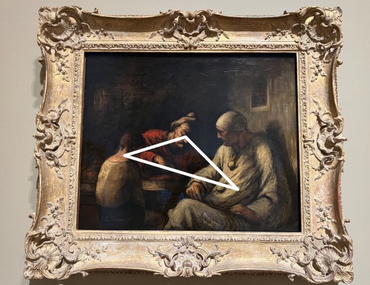
if you think about it, these three figures can represent the holy trinity. the father, the son, and the holy spirit.
why do i think of this to be the holy trinity?
the first obvious answer is the father and the son. they are both clearly shown in the painting. ALTHOUGH, i did mention the grandfather. this is where i start to question about the holy trinity. i mentioned that the grandfather is in gray / white, and usually when i think of the holy spirit, i would think of a literal white spirit.
i also did mention that the grandfather is the brightest one in the room SINCE the unknown light source is clearly shining on him. this could possibly be another reasoning i have towards this painting to be a figure or (hidden meaning) of the holy trinity.
i will let your mind wander now and if you want to debate, that's fine as well.
i described a lot of details in the painting. i am going to cut to the chase with the study of saltimbanques resting.
it is not as detailed as saltimbanques resting; however, i would assume that this was a quick "sketch" of what he actually wanted to paint. the study of painting lacks a lot of details but it does get to the point of the painting across.
--------------
it is out of curiosity why i talk about the next artist. born in illinois, richard hunit (i would say) is an interesting man.
back in the 1950s, he used "direct-metal" sculpting. (this is the first time i have ever heard something like that.) to give a brief definition, it is a manipulation of material rather than carving or casting.
not only did this intrigue me, but he also had lithographs. i've only studied a couple of lithographs during my time, but to see this type of lithograph fascinated me.
when i think of lithographs, i think of the crystal palace in london, england. (i donot know if there is a black and white lithograph of the crystal palace because in my text book it was shown in color.)
in the description, it states how lithographs complimented him as a sculptor.
what peaked my interest is how his lithographs are named "untitled" or "details." however, when it came to details, each detail had a roman numeral. i would suggest that the roman numerals on the "details" would be in a specific order.
richard hunt's lithographs are very unique. i have never seen anything like it before, and i feel like it changes the way of art.
i do not want to get anything wrong, so i will be proposing a question.
lithographs were created in 1965, what would his exact era be?
i will not be pinpointing anything though. however, i do not want to think this fits with abstract expressionism nor pop part. i think it would fit (please note i use the term could loosely) in arte povera. however, the only problem with that is the type of material he used to compose the lithographs.
when you stare at the lithographs, pay attention to all of the fine details. the lines on his lithographs are very sharp and concentrated. before i even read the description of richard hunt, i honestly thought they were mere sketches and drawings.
--------------
let me propose a personal question.
does spanish baroque art come in second place in my life?
i believe in my last entry, i briefly spoke about italian baroque (of course, this is the focus i want to get into.) in a way, spanish baroque does come close; however, i don't find it as attractive as italian baroque.
is it because of the paintings or what?
there is a feeling i got when i started to learn about italian baroque art that made me know "this is the focus and specialty i want to get into."
but nevertheless, i will bring up spanish baroque because the noron simon does have a good amount of spanish baroque paintings on display.
painted in 1633: still life with lemons, oranges, and a rose by francisco de zurbaran
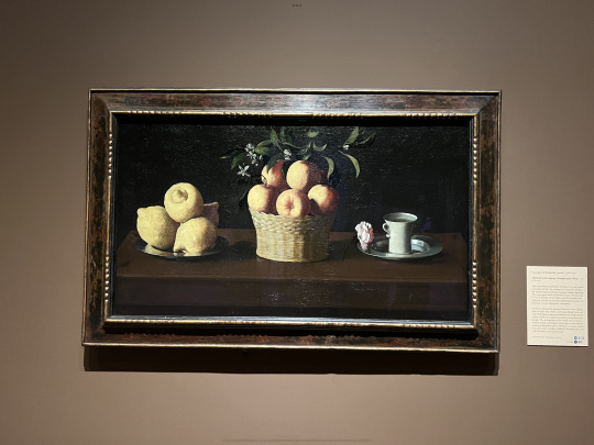
(this painting reminds me of still life with game fowl by juan sánchez cotán.)
everything about this painting screams spanish baroque.
[a little flashback. in my intro to world art class, i met a person who specializes in capturing the spanish baroque art. yes, i did say capturing. instead of painting it, he does it all with a camera. he is currently a professor or for a better term, a faculty member at the school a currently attend.]
anyways, back to the painting.
of course i took close up shots, who would i be without them?
i do want to get into this one detail of the painting: the cracks. i am not sure what the correct terminology, but for better explanation i am talking about the wear and tear of the painting. if you were to zoom into the photo, you can see the cracks which i believe makes it a timeless painting.
back to the bigger picture. in classic spanish baroque, the colors of the lemon, orange, and rose are enhance an bright behind ab black background. saying that makes it sound like i am stereotyping this painting as spanish baroque, but that is not what i am trying to convery (even though this is a spanish baroque painting.)
we have to keep in mind that even though this is a spanish baroque painting, it is right after the renaissance era. the golden rule of three is prevalent in the painting. you have three things to focus on.
(i like to call it the golden rule of three.)
i do want to talk about the orange because i believe they are freshly picked. i believe this because the leaves and branches are present and attached to the orange.
it is interesting to note the title of this painting is with lemons, oranges, and a rose rather than the tea cup.
after quickly skimming through the description of the painting. it did mention that the three objects in this painting do represent the holy trinity, (once again, the golden rule of three.)
the cup is bigger than the rose yet the title of the painting is with lemon, orange, and rose. i do heavily question that.
the whole painting itself feels so realistic.
i don't know what more to say, so i am cutting it short.
--------------
i have never seen a painting like this before. it is a spanish baroque or at least i think it is (fact check me if i am wrong, i still refuse to look anything up.) but i think i am right because artemisia gentileschi (an italian baroque painter) also painted her version of this.
painted in 1655 by bartolomé esteban murillo, the birth of st. john the baptist.

there are so many things happening in the painting. let's take a walk.
on the right corner of the painting, there is a dog. this is pretty much a known thing in art history, but when a dog is painted, it is a sign of loyalty.
i still refuse to google anything about this painting, so from here on, i will be making major inferences.
i will start in the back, where the lady is on the bed being treated by a servant. i am not sure if i am seeing things, but there could be another figure to the servant. it looks like a ghost or a shadow? (i could be wrong or right, although i am not quite sure.) the female on the bed looks very concerning because she could be very sick or on her death bed.
now that we are slowly getting to the focus of the painting, there is something important that i have to bring up. this goes for both spanish and italian baroque. the major contrast between light and dark, also known as chiaroscuro. this technique was used throughout the renaissance and baroque period.
how does chiaroscuro apply to this painting?
chiaroscuro is a well known in baroque style art. (my favorite painter, carravaggio uses this technique, and i praise him for it.) as you can see, the painting clearly depicts st. john being surrounded by the light source while everything else is dark; a very present contrast/
the picture shown above (i did take it at the museum) seems to be bright, but in reality, there are dark parts in the painting.
as i continue to talk a little more about chiaroscuro, i will slowly shift to talk ing about the painting as a whole.
st. john is in the hands of the midwife, and we can clearly see that it is st. john because of the name of the painting, and the yellow halo on his head. he is being cared for by multiple midwives while some of them talk to a male.
i will make a vague but educated guess that this man is from the church, and that he is there because he heard a calling from jesus.
i shall call forth the angels whoa re located on the upper part of the painting. they are there to welcome st. john into the world. they are also another light source that is presented in the painting.
i just want to pay attention to the details of the midwives' clothing. it looks very realistic, and that we are seeing this scene happen.
there could be more things about this painting, but since i refuse to look anything up; i will settle with these thoughts.
--------------
as i finish this entry off, i want to talk about one more painting. it is very detailed, and it has something to tell me.
painted in 1735, interior of st. peters, rome by giovanni paolo pannini
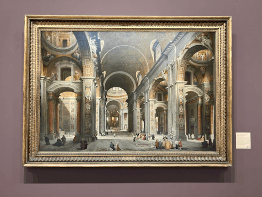
it is actually quite difficult where to start because there is just so much going on in the painting (details and stuff.) although i do not know the main reason why this was painted, i can make inferences and educational guesses.
although there is something i want to talk about first.
there is the one thing i looked up, but i did not google it. instead, i looked it up in my past notes. i learned about this specific piece in the painting when i took intro to world art II. before i get off topic, dead center in the middle is this beautiful bronze (yes, i said bronze) baldacchino.
how did i know what the painting was, or more specifically, where this painting is located?
the magic (or for better term, understanding) of context clues.
although i have never visited st. peter's (i would like to someday), there is also so much information that i can get from the year of the painting, the name of the painting, and the clothes that the figures are wearing.
(if you do not know anything about the painting, it is best to look at the description next to the painting.)
from the description, i gained the information of who the commissioner is (cardinal melchior de polignac of france,) and where he is in the painting.
considering the painting (with the amount of figures it has) it is no surprise that the commissioner (or patron? is that a synonym for commissioner) is painted in the painting. (a lot of patrons like to do this.) not only that, but the description states that the commissioner is in red. there is (i believe) two figures in red; however, my suggestion is the commissioner is surrounded by a cluster of people.
(i have never been inside st. peters, but i have seen numerous photos when i studied it.)
the details in this painting are preciser and intricate. if you were to zoom into the painting (picture provided above) you will see all of the sculptures cared on top of the arches. i am not sure if they are attached or carved into the walls.
(i would suggest that the columns attached to the walls have corinthian style columns.) normally when you see corinthian, they are located outside. however, i think the reason why they are inside is because they are use as a decorative purpose, since they is attached to the walls.
these sculptures remind me of the greek and / or roman era. (although, even to this day; there is always some sort of reference to the greek and roman era.)
they remind me of michelangelo, more precisely the figures that he paints and sculpts. to me, i would say that these figures carved into the walls are renaissance. i just remembered that st. peters is a renaissance architecture piece.
please forgive me as i am not familiar with architecture terms. although, i was briefly taught how to read a (plan?), is that the correct terminology to use? i apologize once more.
as i mentioned earlier, i will be using context clues to talk about the painting.
the renaissance era was during the 15th and 16th century (1400s-1500s.) this painting was produced in 1735, by an italian painter.
(i am thinking about this on the top of my head. i won't say that this painting is baroque because of the nature of the painting. (it just does not fit into the baroque style era, although, who am i to judge? i am still learning.)
[context clues] let's propose a question,
the era that follows after the baroque is rococo, could this be part of the rococo era?
i haven't fully studied the rococo period in depth, but from what i can remember, it was a period of the rich. they spent their money lavishly and did not really care. the artists during this time did not really appreciate nature; while everyone else primarily focused on wealth and being in an artificial world. (this is what i literally remember from the rococo period.)
--------------
although i did not talk about all of the paintings, i talked about the ones that stood out to me the most.
they also had a lot of abstract and expressionism paintings (and a version of the annunciation painting; however, i always seem to study it from a variety of it from different artists.)
anyways if you do have the time and opportunity, go visit the norton simon museum.
signing of: jhanella mae
all photos were taken by me and are located at the norton simon museum in pasadena, california.
#van gogh#monet#impressionism#baroque#spanish baroque#museum#rococo#1400s#1500s#1600s#art history#art#history#abstract#expressionism#lithographs#berthe morisot#camille pissarro#claude monet#norton simon museum#honoré daumier#art exhibit#paintings#paint#color
1 note
·
View note
Text
ARTCURIOUS: stories of the unexpected, slightly off, and strangely wonderful in art history [review #1]
started reading: 19, june 2022 / finished reading: 27, june 2022
started writing: 28, june 2022
finished writing: 29, june 2022
(after reading this book, i will be addressing some topics and points that stood out to me from Jennifer Dasal's book. since her book has 12 chapters, i will be splitting up my review in multiple parts. here is part 1.)
[part 1 - chapter 1]
as an art history major, we all got out start in wanting to learn art. my art journey started very early in my life. i remember i used to collect newspaper and create woven bags, and i would buy duct tape from the dollar store to create wallets, mini purses, and so much more.
i feel like i can relate to her in some ways. when i applied to university, i was a cellular and molecular biology major wanting to go to medical school to become an anesthesiologist. did i actually want to become a doctor? i mean, there was this part of me that needed to become a doctor. but deep down inside of me, i wanted to do history. specifically, art history. (i am getting off topic somehow. maybe one day i will create a blog entry of how and who guided me to pursue art history.) similar to Dasal, she entered university and declared her major as geology with a paleobiology emphasis. however, she took that one art history class and never looked back.
Claude Monet is a very known impressionist artist. it seemed like everyone knew what kind of painter he was, and how he revolutionized impressionism art.
but what steps did he take to get there? or better yet, what rules did he break for impressionism to enter the art world?
as a pure insult and change to the previous era, we had romanticism. where it was full of human emotions, while realism was the complete opposite of romanticism. but the impressionist era felt liberal (in a sense) where they pushed for a new chapter of art.
i will not be diving deep into Claude Monet's background because google is a great search engine. however, i do want to bring up how he started his own style. it took him 2 years for his father to approve of him moving to Paris, but after attending art school, he realized that he did not enjoy the traditional way of art school and learned from a Swiss painter: Charles Gleyre.
after breaking through the art world, he had a difficult time selling and exhibiting his paintings (because people were still focused on romanticism and realism.) so he did what, honestly, i would do. create your own (or rent out) a salon and exhibit your own artwork. this was fantastic for Money and all of the other artists who followed because they showed their artwork and slowly gained attraction. people all over Paris enjoyed the salon des refusés (the salon of the refused) because it was different. it opened many people's eyes, as well as critics and salon-goers viewing this type of work as a joke.
even after this era came to a close, people finally realized the true definition of impressionism and why the refused tradition. they had all of the intentions of capturing light and color without any deep thoughts, and that is what they did to rebel. they truly made a big statement by painting whatever they felt like painting.
i do want to quote on some things in her book.
why haven't i learned about Monet's friend, Eugéne Boudin? because it seemed that Boudin sparked that interested in Monet for him to paint nature and outside.
she also quotes Clueless, a 1995 film with Alicia Silverstone. in this case, Dasal mentions that she "can think of no better way to describe some of Claude Monet's post-1900 paintings." which is interesting. (i will try to rewatch the movie when i have the time, to listen to the scene where they briefly talk about Monet.)
"'do you think she is pretty?' Tai asks.
'no, she's a full-on Monet,' Chef scoffs. 'it's like a painting, see? from far away, it's okay, but up close, it's a big mess.'"
--
i also do want to quote on Dasal's definition of Impressionism art. i think that Dasal defines the Impressionism era well. "first is these artists' commitment to modernity, of finding worthy subject matter in a world that is still so familiar to us today." as well as, "impressionism... about valuing the subject point of view about things that seem like they should be objective: light, color, shadow."
let me break it down:
"first is these artists' commitment to modernity, of finding worth subject matter in a world that is still so familiar to us today."
if it was now, we would probably watch the sunrise or sunset and capture a picture of it, then, post it on social media (probably with the hashtag sunrise or sunset.)
"commitment to modernity" - to me, it seem interesting how Dasal worded this. keeping in mind that this time was 1865-1885, their modern is completely different from out modern. i would assume (and this is a given) their form of entertainment was going out, and the impressionists gave them something to look at and even laugh about because it wasn't accepted just yet. as i am writing this, in a way, i feel like this is stand up comedy because a lot of salon-goers and critics thought the impressionism style as a joke.
as to the second part of this whole sentence, " finding worth subject matter in a world that is still so familiar to us today." subject matter for them is nature, because they devoted their art to their surroundings. comparing the 1860s to 2020, is very different and my definition of nature is not the same as Monet's perspective of nature. nature for them was easy because they can just go outside or look out the window, and they would have it right in front of them. nowadays, (since i live in the city), i would have to drive somewhere just to feel or even be with and enjoying my time with nature.
"impressionism... about valuing the subject point of view about things that seem like they should be objective: light, color, shadow."
there is a small token of appreciation that i would like to point out because impressionism truly is light, color, and shadow. i will be using The Artist's Garden at Giverny by Claude Monet to explain his use of light, color, and shadow.

DISCLAIMER: NOT MY PHOTO, photo was from google.
(p.s.a. i am obsessed with caravaggio's work, and his use of light, and that is why i fell in love with italian baroque art; i am getting off topic."
i am looking at the painting for the first time, and will not be reading any information source on it. i will be giving my own interpretation. in some parts of the painting, there are spots lighter than others, and i think that Monet wants to give us a feel for where the light will hit.
did he paint this during the day? during the afternoon? or when the sun is about to set?
judging by the way he uses color, as well as the shades, i would assume he painted this during the afternoon because the middle of the painting is more vibrant than its surroundings. i would also like to assume that this was painted during the spring season when the flowers are in full bloom. (i could be wrong, but then again, this is my interpretation.) when i first viewed the painting, i saw purple and green. however, as i continued to look at it, i can see light blue butterflies swarming the purple flowers. it makes the painting more exciting. (well, at least i think so.) Monet does use different shades of purple to highlight where the sun is hitting. if this is the case i would assume his light is where the colors are most bright and energetic. not only that, but the bottom right colors are darker than the middle area. my speculation would be that there is a large tree over this area that is not shown in the painting.
(out of context) i suppose that those two figures in the back are on a date. they might be wealthy which allowed them to rent (or have) a boat. their reflections can be seen through the body of water, and it looks like they are enjoying each other's company.
[just a little bit of analysis of Monet's painting so i can get to the point.]
yes, i did talk about light and color; however, i did not mention anything about shadow. if you look closely, there is a walkway path where you can see the shadows of the purple flowers. i believe that Monet did a splendid job on creating the shadows for the flowers.
(which brings me back to my point.) the subject is completely object because Monet uses a few colors but enhances each color to make them pop out and be the focal in the painting.
it is pure, and might i say... gives me a great impression of the artist.
signing off: jhanella mae
#claude monet#monet#art#painting#color#light#shadow#impressionism#oil painting#oil on canvas#paintings
2 notes
·
View notes
Text
HAYAO MIYAZAKI
written: 3 - 4, june 2022
museum tour: 24, may 2022
(i am super excited to be writing about this entry.)
this is one of the last exhibits i entered in, and it was the whole reason why i decided to visit the academy museum of motion pictures. unfortunately, the HAYAO MIYAZAKI exhibit will be closing on june 5. by the time this goes up, or by the time you read this, the exhibit will no longer be featured at the academy museum.
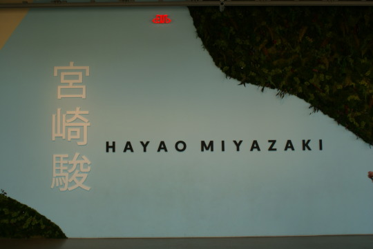
the academy museum of motion pictures did have a rule where you are not allowed to take any photos or videos inside the exhibit whatsoever. most of the photos and footage i attained was from outside the exhibit. now that i realize it, this rule lets you be fully immersed in HAYAO MIYAZAKI's work.
{little history lesson on HAYAO MIYAZAKI. he was born on 5, january 1941 and is a japanese animator, director, producer, screenwriter, author, and manga artist. not only that, but he cofounded Studio Ghibli. he has many awards, and one of them is the academy award for best animated feature for his 2001 anime movie Spirited Away.}
the question is: why did the academy of motion pictures decide to dedicate a whole floor exhibit on HAYAO MIYAZAKI?
on the museum's website, it stated that they wanted to celebrate him as an artist and a filmmaker.
[just want to give a thanks to curator Jessica Niebel and assistant curator J. Raúl Guzman for creating a beautiful exhibit.]
as stated earlier, this is the whole reason why i decided to visit the academy museum of motion pictures. before i entered the exhibit, i merely thought it was going to be his sketches, drawings, and outlines posted on the wall, but it was much more.
i was completely mind-blown, and it reminded me of my childhood.
being fully immersed in his work will deactivate you from any cellular device or camera you have. when you enter in, you enter through a tunnel, and then the first part of the exhibit.
once you are completely in, you see a couple of sketches on the walls and some encased in a glass table. however, the first thing that caught my eye was the three large screen showing different scenes from the different Studio Ghibli movies. when i entered in, it showed PONYO.
PONYO is my favorite Studio Ghibli film ever. was i a little excited to see PONYO on screen? yes.
what blew my mind the most most is seeing the sketches and outlines progress as you view it from left to right. it was basically the step by step process of his work. they were lined up in a way where, when you move onto the next sketch, you would see what is added or removed. (this includes change in facial expressions, flowers blooming, and more.)
when you continue to walk in, you would completely feel like you are a character in one of the movies. they had a small grass area where you can look up and see the sky. and if i can remember, it is inspired by The Wind Rises or Howl's Moving Castle. sadly, i did not have a chance to look up at the sky because there were many kids that surrounded the area.
the part that excited me the most is the big tree. it seemed to be a major staple in the movies and in the exhibit. i think the tree was inspired by Mononoke. the tree will lead you to the end of the exhibit. however, just before you exit, they will be showing scenes from My Neighbor Totoro and Spirited Away.
i wish i went to this exhibit earlier in the year so that i can keep visiting, but great things do have to come to an end. i am very disappointed to say that this exhibit will be closing. it felt like a complete dream.
https://www.tiktok.com/t/ZTdcYgj8U/?k=1
signing off: jhanella mae
all photos and videos taken by me.
#studio ghibli#hayao mizayaki#museum#exhibit#ponyo#my neighbor totoro#the secret world of arrietty#miyazaki#spirited away#totoro
3 notes
·
View notes
Text
INSTALLATION: PEDRO ALMODÓVAR
written: 31, may 2022
museum tour: 24, may 2022
once again, i will be writing about my adventure in the academy museum of motion pictures. this installation is located on level three of the museum.
{little history on Pedro Almodóvar, he is a spanish film director, screenwriter, and former actor. Almodóvar was born on 25, september 1949 and won multiple awards for best film, best picture, best director, and more. he has an installation at the academy museum of motion pictures because of his representation of the human condition throughout his films that makes his work valuable and legendary.}

this was a very interesting installation to enter in and walk through. please be of age when entering into this installation because of the provocative movie clips that are shown. i do have a bone to pick because the excerpt shown in the installation stated, "Almodóvar centers dynamic female characters and stories that express a fuller spectrum of the human condition." however, on the academy website it states, "he centers dynamic female and LGBTQ+ characters and stories that express a fuller spectrum of the human condition."
why not add the "LGBTQ+" in the excerpt in the installation? they had to add it onto the website instead. why primarily focus on the female human conditions rather than focusing on the human conditions as a whole?

you really have to go into the installation to see all of the movie clips that are shown. just by looking at the pictures above, you can see the big screens that feature different movies directed and filmed by Almodóvar. the big screens have a backing that also features more movie clips. some people who entered the installation were intrigued, took a seat, and watched the clips. fortunately, i stayed around to watch a couple of the clips, and there were scenes that really showed the female sides of the human condition. this female side of the human condition that i saw around the exhibit was primarily focused on sex and the pleasure of a woman.
why did it just have to focus on that? why was it in that one movie clip, it showed a man who kidnapped a woman and wanted to pleasure himself right next to her sleeping body?


the next photos shown above and below are the movie posters and their descriptions. each movie poster brings a different impression because of the popping and bring colors they used. i did not know which poster to focus on first because all of the colors were eye-catching. however, i found a small tag next to the poster stating which movie is which, what year it was released, and who the graphic designer was. not only that but due to the blue background, it was a complete contrast of colors so they did not blend or looked dull when looking at it.
(keep in mind the photos in this post are not light edited. the most editing that has been done is cropping and making it as straight as i can.) if you look closely on the photos, you will be able to see how the spotlights hit the posters. i did not want to turn on my flash in the exhibit as it will be distracting for others. so i did the best i could. i do appreciate the white letters on the blue background. the letters does give some ease to my eyes, and tells me more about the posters.
people might ask, "why don't you just look at the movie posters instead looking at the tag?" i am trying to centralize and understand more, and looking at the tag will tell me more about Pedro Almodóvar as what kind of director he is. not only that, but it will tell me more about his graphic designers, and what style they have.


i entered this installation not knowing anything about Pedro Almodóvar. although movie and cinematic references and scenes are not my level of interest, i would like to comment on his work and how it impacted me to try to understand his way on the human condition. i have not seen it all because there is more to the world than what i am looking at right now. as of right now, i am looking at things through a screen without going to places. the human condition will range from the ethnicity and culture you are in, and it is different for everyone. let us keep an open mind and be more understanding when it comes to the "human condition." although this is one that i have not completely wrapped my head around.
this is one installation that i am perfectly fine with viewing once.
signing off: jhanella mae
all photos taken by me and migz.
1 note
·
View note
Text
BACKDROP: AN INVISIBLE ART
written: 25, may 2022
museum tour: 24, may 2022
we are here at the academy museum of motion pictures. although we did not visit all of the exhibits, there are some honorable mentions and interesting exhibits i would like to discuss.
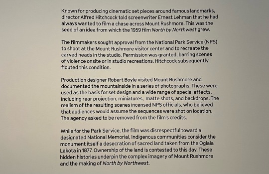
this is the first exhibit i went into. this exhibit is currently ongoing, and i have no idea when it i will be closed. throughout the whole exhibit, it showed Mt. Rushmore as a backdrop for multiple movies throughout movie history. however, this exhibit primarily focuses on the movie North by Northwest.
{little history lesson on Mt. Rushmore. between the times 1927 and 1941, Gutzon Borglum designed and oversaw this whole project with the help of his son, Lincoln Borglum. located in the Black Hills of South Dakota, Mt. Rushmore features four presidents who impacted out nation and history.}
North by Northwest is a 1959 black and white film by Alfred Hitchcock that showcases Mt. Rushmore. the filmmakers gained approval from the National Park Services to canvas Mt. Rushmore and recreated the carved heads in the studio. a video was shown in the exhibit about the production designer, Robert Boyle, talking about his experience canvasing Mt. Rushmore. he spoke about being on rope and cord, going down, and surveying the area to gather all of the details on the four presidents. he, then, went back and recreated Mt. Rushmore for the movie.

although i am not a photography buff, i do appreciate the cinematic and climatic scene of the "Contact Sheet, Eva Mair Saint and Cory Grant During Production." this photography sequence reminds me of "The Horse In Motion," by Eadweard Muybridge because of the scene by scene photography sequence. when zoom closely on Eva Mair Saint, you can see her hair moving "in motion" as you progress to the next image. not only that, Mair Saint also is shown needing help from Grant; however, he leaves her handing on the mountain/ the last photo sequence shows the photo of Grant's facial expression. i think that this is a great photography sequence because it shows how far we came from the first ever photograph sequence. keeping that in mind, the film was created in 1959, while "The Horse In Motion" was captured in 1878. some moments and pictures like these, it is better to see it scene by scene, rather than creating a gif or viewing the actual video. there is more to see, and sometimes we can see things in the photos that others may not see. if this was on a social media platform like instagram, it would have been better to view this scene as a vide, rather than displaying each photo in the scene.
overall, this exhibit was interesting. i have never been to Mt. Rushmore myself, but it makes me want to see it in person. not only that, but i would love to watch North by Northwest to see the Mt. Rushmore backdrop and see how well it blends with the movie.


signing off: jhanella mae
all photos taken by me.
2 notes
·
View notes