
Graphic Design is all about communication. Who else needs to communicate more than anyone else than Non-Profit organizations. This page shows off great designs from Non-Profit organizations, and how they get what they want to say out.
Don't wanna be here? Send us removal request.
Statistics
We looked inside some of the posts by designsforchange-blog-blog and here's what we found interesting.
Average Info
Notes Per Post
91
Likes Per Post
50
Reblog Per Post
41
Reply Per Post
0
Time Between Posts
27 days
Number of Posts By Type
Text
7
Photo
8
Link
2
Last Seen Tumblr Blogs


Fun Fact
In Q3 of 2020, 31% of US users access the Tumblr app daily.
Text
Oxfam: Advertising and Branding
Oxfam has been around since 1942. And yet as a person who tries to keep up with non-profit organizations, I had only experienced Oxfam for the first time last year around holidays. I saw their many of their posters represented all over the mall. It had a picture an awkward goat or alpaca just standing there and the words said “Oxfam Collection”. At first I thought these were high end stuffed animals to buy for a holiday gift. This was marketing scheme for Oxfam America Unwrapped site, where the purpose was to buy sustainable goods for a village who could use them. The whole advertising campaign and idea was amazing and funny. It really caught my attention.


I am not here to talk about Oxfam America’s Unwrapped advertising campaign, but to rather talk about Oxfam International’s logo and branding. This logo shows who Oxfam International is how they go about it.
Oxfam was originally founded in Oxford in 1942 as the Oxford Committee for Famine Relief. It was one of several local committees formed in support of the National Famine Relief Committee. Their mission was to persuade the British government to allow food relief through the Allied blockade for the starving citizens of Axis-occupied Greece. The first overseas Oxfam was founded in Canada in 1963. The organization changed its name to OXFAM in 1965. Since then it has grown. Now Oxfam is an international confederation of 15 organizations working in 98 countries worldwide to find lasting solutions to poverty and injustice.1
With so many branches Oxfam needed to find a way to unify each branch, and to do so they found a way by rebranding themselves. A branding is how some one percieves a company or organization in a recognizable way; which is usually associated with a name, symbol or logo. Oxfam decided to do this with their logo to convey all around the world what their organization does. The logo uses great symbolism and obvious references to do so.
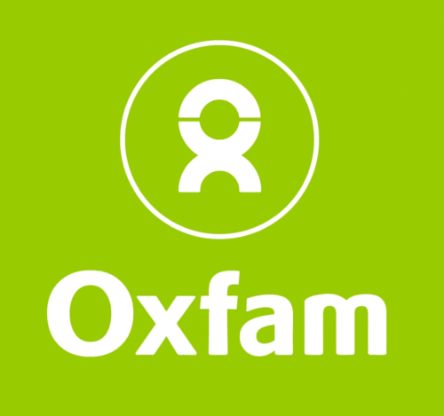
The most obvious reference to the logo is how it is broken into an O and an X together representing the OX of Oxfam. Other imagery also shown is a person’s head or a person who arms spread trying to cause a unification. A ribbon can also be seen, which usually represents a cause of some sort. There is also the circle that represents a wholeness, oneness or even the whole world.
These are all traits that oxfam are trying to convey. How one person can be a unifying force for a cause.
The color green is also being implemented to represent the modern green movement and it also represents a soft approach. There is a sense of boldness and firmness with the strong thickness of the text and line width of the logo.
Oxfam’s advertising and branding can really make anyone not forget who they are. And this is very important for a non profit organization, as being forgotten also makes the cause be forgotten. So check out Oxfam International and their cause. I will guarantee you they will stick in your head for time to come.
#nonprofit#orginization#oxfam#international#famine#relief#injustice#fashion#poverty#America#branding#brand#logo#design#grapicdesign#graphic#advertising#ad#campaign#satire
15 notes
·
View notes
Text
World Vision
So there I was checking out the recent Webby Awards for this year and I came across a website that happen to win the People’s Choice Award for best Media Interaction for a Non-Profit. I felt compelled to check out the link and when I got there I was really pulled into the interaction. At that point I decided to check out the site’s main page and I was in awe of the design. Now the logo I was looking at was not very inspiring, but the layout of the page was very easy to understand. It had a great use of grid and very easy interactive features as well. The wonderful use of complimentary colors that made the design easy to navigate. It all made me want to learn more about this organization.
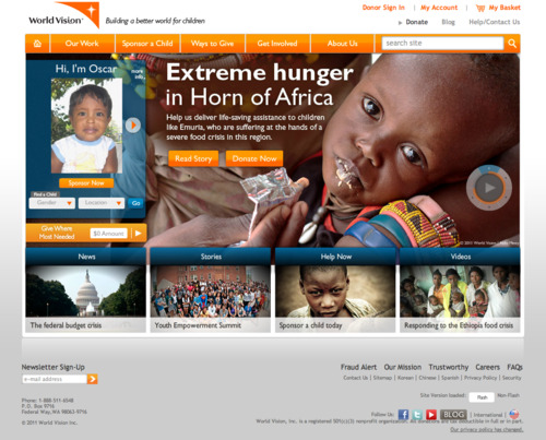
So who is this site I am talking of? I am talking of www.worldvision.org. Who is World Vision? This is an excerpt taken directly from their website explaining exactly who they are:
World Vision is a Christian humanitarian organization dedicated to working with children, families, and their communities worldwide to reach their full potential by tackling the causes of poverty and injustice.
Now back to the design of their site. One thing I will have to say, is that I am not a fan of flash based websites; unless they are done well and done right. This is one of those site that does just that; it is done well and done right. It uses flash to create a good use of interaction, especially when taking a look at their media page, which allows interactive stories. The interactive stories take you on a journey of a life of some in a different world. The videos are there help you illustrate the work that organization is trying to accomplish. But there is a huge issue with this. What about when some one is looking on the website on an iPad or an iPhone? Well that is where I am even more impressed with this website. They offer a non flash version, and it too looks amazing as well. There is even interactive elements using web 2.0 standards allowing for pop ups and switching panels.

Now both versions of the website offer both great use of complimentary colors using blue and orange to offer a consistent theme through out the website. The navigation always in orange so they viewer knows what to look for; as any extra areas of interest are done in the complimentary color of blue. You always know where to look for something.
One of the best way to make any website easy to look at organized is using a good use of grid layout. Nice use of grid layout keeps order and an ease of knowing where to look. The navigation can easily seen by looking across the very top of the page with ordered orange buttons. The articles are easy to see by looking across from one blue headline to another, each in a sequence according to grid.
So check out World Vision’s website either to check out the interactivity or how it uses complimentary colors and grid for design elements. Or you can check them out to help support their efforts to help children, families and communities around the world.
#wordvision#nonprofit#charity#christian#grid#gridstystem#graphicdesign#poverty#aids#hunger#organization#humanitarian#webbyawards#webby#design
5 notes
·
View notes
Text
Studentsfirst.org
In elementary school I was a perfect student. I got all A's and was ahead of everyone else. Then came the transition to Middle School, where I was placed in remedial classes and was set at an average pace for the students around me.
I am not the only person who has become victim to such a case. This is an issue that plagues all of America. It was an episode of 20/20 back in 2006 that made me aware of this situation. The article Stupid In America made me realize that American public schools are living in the past and are plagued with bureaucracy, allowing a lower than expected education.
The website studentsfirst.org is a website that is there to help educate and make a change to our public school system. This site is both a nice powerful message as well as being well designed with use of grid, simple typography and good color harmony.

Usually when I talk about grids, I talk about the grid system used for graphic design. But websites tend to have a different grid system that it uses. This site uses that same grid system here. It makes for a clear layout where you can always find the navigation as well as knowing where to always find the main article. The right side is where you can get other tidbits of information.
The use of type here is very simple use of type, yet paying attention to the details of the spacing of text and how the text is laid out on the page. Most websites just let the text lie on the page and dont pay attention the the space the text leaves behind or takes up. This site pays attention to this element. If the text is messy, no one will want to read the information there.
I really love the color harmony here. The Logo alone tells a lot.
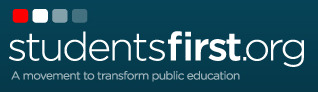
The logo and site are done with a Red White and Blue color theme, emphasizing the use of the American patriotic colors. But they are set equally, which is the mistake of using these colors. Instead two (blue and white) and the other used as an attention grabber. The logo shows this off. Red shows the emphasis/attention grabber, or a good start and then it goes to white and fades to blue (how symbolic of the educational system, and why I love the logo).
Check out some of the good designs of studentsfirst.org. If not for the design elements, like grid design and color harmony, at least check out the website for the information it has to help reform the educational system in America.
#education#educational system#america#studentfirst#nonprofit#website#design#grid#color#harmony#20/20
7 notes
·
View notes
Text
thephilanthropyfactory:

By Adbusters (via hearts of wax)
Beautiful use of typography. Contrast with red white and black. Everything is clustered together so that there is no need to look around for competing elements and it has Macro and Micro aesthetics. (Looks good from far and makes you look close.)
THE HUMAN RACE
4 notes
·
View notes
Text
Doctors Without Borders: Tumblr
I remember when seeing an epsisode of Chuck where Dr. Awesome wanted to get away and do Doctors Without Borders. It was to me what an overly awesome person would do, and ever since then it has alway been a joke to me. But Doctors Without Borders is no joke. They do some real serious things. When I saw their front page of their Tumblr I was amazed.

So a bit more about Doctors Without Boarders (Medecins Sans Frontières), they are an organization of medical humanitarians from all over the world who help those who have been threatened by violence, threat or catastrophe. Doctors Without Borders started in 1971 by doctors and journalists in France and today nearly provides aid to nearly 60 countries. In 1999 Doctors without borders won the Nobel Peace Prize.
So, why does this page work you ask? Well it works because another use of the grid system. The grid system allows for a great flow and organization. Because of this information is easy to read and get to fast. One example is the easy to read side navigation with large text and well laid out links in all-caps.
Also the nuetral colors offer a lot of contrast of imagery which is one of things that makes Doctors Without Borders so intriguing. Their amazing photography from volunteers can really offer an impact. This neutral color also allows for text to pop out in either black or white format.
Now granted what makes this site really work is the Scaffold theme by Mike Harding. A very well laid out theme. Other pages have used this theme, but what is nice is a non-profit went out of the way to use it for their Tumblr. Check out Doctors Without Borders' Tumblr page and their website as well.
2 notes
·
View notes
Text
One.org
I remember seeing the first commercial on TV for One.org. It was very moving and self powering. It made me wake up and made me want to do something. It had a simple idea with a simple message with simple way to the whole commercial.
One.org has always had good design. It's website is no different, offering simplicity in it's message, simplicity in its layout, and simplicity on how to find what you want.
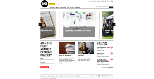
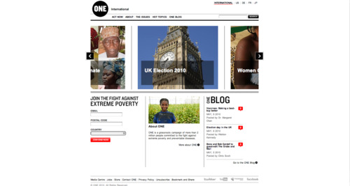
It is no wonder that I am picking another 2010 Webby Award nominee, one.org, which is designed for ending poverty in the world. This program is spearheaded by singer/activist Bono of U2. He even was awarded a TED award for his activities for ending poverty in the world. The best way this organization gets people going is through the extremely well designed website.
WHY IT WORKS:
The website works because it is simple. It is simple because it uses a great grid system as well as good use of minimalist concept of design. All these tie together allowing it to be rightfully a Webby Award nomination
The grid system is something pointed out in the last post about how it can create order how a layout can be viewed. This website does the same. A simple grid allows the user to view exactly what is available to see quickly and easily. Because of this it is very minimal in the way it designed.
When I mention minimal, I speak of Minimalism as a design theory and concept that is also implemented in the design. The idea of minimalism is to allow a little bit to say a lot. The site has very small bits of things to say so that it is EASIER to see what you are looking for. The idea of "less is more" that helps get the point across.
Check out www.one.org to see some of the minimalistic design, good use of grid system. You will find an inspiring site to that will make you want to rid the world of poverty.
2 notes
·
View notes
Photo
uth:
Fields of Peril: Child Labor in US Agriculture
In this 99-page report Human Rights Watch found that child farmworkers risked their safety, health, and education on commercial farms across the United States. For the report, Human Rights Watch interviewed 59 children under age 18 who had worked as farmworkers in 14 states in various regions of the United States.

1 note
·
View note
Photo
stainlessplanet:
Visual flow of development aid.

7 notes
·
View notes
Link
GIVE BLOOD…

To learn more about blood donation opportunities, visit www.redcrossblood.org/ or call 1-800-GIVE-LIFE (1-800-448-3543).
Every minute of every day, someone needs blood. That blood can only come from a volunteer donor, a person like you who makes the choice to donate....
3 notes
·
View notes
Photo
defaced:
“Consequences, ” spotted in the Euston tube station, London
(reader submission)

21 notes
·
View notes
Link
1 note
·
View note
Photo
stainlessplanet:
US military-backed medical trials in Thailand have revealed the first evidence of a possible vaccine against HIV, where tests have allegedly cut infection rates by a third.

4 notes
·
View notes
Photo
stainlessplanet:
I just cannot understand the health care system in the US!

6 notes
·
View notes
Photo
stainlessplanet:
En Eaux Troubles (Bad water kills more children than war)
(via afrosapiens)

8 notes
·
View notes
Text
www.loveletterstothefuture.com
It is no surprise that the design that stood out to me this week is a website that has been nominated for a Webby Award under the green websites catagory. The website I am talking of is www.letterstothefuture.com. It has simplicity and with well done design and very unique idea.

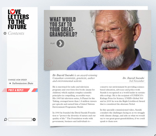
Letterstothefuture.com's unique website designed to spread the awareness of climate change in the world is well designed site. It intends opening people's eyes by allowing people to "send a letter" to the future about the climate today. They then take the top 100 letters and seal them away in a time capsule for the future. This is a very interactive approach to allow readers and participants to be aware of climate change. And even more amazing if the people of the future really do listen to our concerns as we face troubles today.
Why This Design Works:
The first thing that makes this site work is the interactivity element. It creates an environment for people to be able to interact with each other. By posting own concerns allows some one to be heard in this sea of billions of people. In turn some one visiting can learn about the concerns of climate change.
Simplicity is something very obvious about the design. It has very simple gradient texture in the background that adds a feel of paper. The are simple boxes to click on and the text is in every window is simple making it easy to read. What can be expressed can be as simple as 140 characters or 200 characters if you post an image or video. No need to over-think, just place your concerns.
The design has great use of the grid system allowing for great organization and keeps the site simplicity and easy to read. Being able to find easily what you want is made easy with use of simple grid design. The grid is implemented both the layout off each page and a grid is implemented with what is written.
Typography could not be any simpler. Helvetica tends to make typography easy but they did it very well here. The simple use of all caps makes the uniformity and easy to read. The all caps allow for the text to be easy to read and with Helvetica it allows for letters to line up easily. Also like mentioned before, the grid element allows for the typography to be just flow easily.
It is no wonder why www.loveletterstothefuture.com has been nominated for a Webby Award. The use of simple design using grid system and typography help with how fantastic the design is. And it's unique approach to allowing people to be aware of climate change. Check out the site and place your concerns there as well. The future is ready to listen.
3 notes
·
View notes
Photo
fuckyeahvisualdata:
The Afghan Conflict – Possible Scenarios Visualized on Datavisualization.ch

2 notes
·
View notes
Photo
kelliestarr:
emiliakokaine:
lorettayoungsilks:teatime-with-nikki:ewwgrosstori:erikaleahey:tinybirds:wearestatic:soullessparasite:feelthestingx:yoursecretsout: sfatheart:boazpriestly: (via gloomandbloom)
It is time for you to stop all of your sobbin’ whining.

0 notes