
Alexandria is not just a city. This is a collection of my class projects at St Edward's University
Don't wanna be here? Send us removal request.
Statistics
We looked inside some of the posts by dizzytel-blog and here's what we found interesting.
Average Info
Notes Per Post
9
Likes Per Post
5
Reblog Per Post
4
Reply Per Post
0
Time Between Posts
24 days
Number of Posts By Type
Text
14
Photo
2
Video
1
Last Seen Tumblr Blogs


Fun Fact
BuzzFeed published a report claiming that Tumblr was utilized as a distribution channel for Russian agents to influence American voting habits during the 2016 presidential election in Feb 2018.
Text
Identity Project
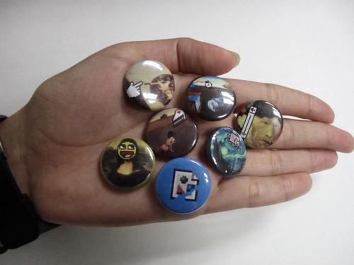
For the identity series project, I chose the digital revolution era of graphic design. I wanted to keep my system as simple as possible so that no one would miss out on getting a particular button, so it is arranged by day of the week. Additionally, there is a members-only button.
The choice of imagery is not random. I chose to combine now-widely recognizable 8-bit images (most from the era of the then-new GUI) with widely recognizable classical art pieces to show how art & design were changed forever. Each of the buttons plays off of the action going on in the art piece, showing the functionality of the GUI. The broken page button is members only, an computer joke implying that only those who posess a membership can see the button.
Poster Link
0 notes
Text
Activity Booklet
We were assigned this project to assert our knowledge of the formal elements of typography. Ideally this project should demonstrate a command of hierarchy and organization.
At the time of making this, I was inspired by the SXSW booklets and wanted to make something spiral bound. Though this is not the final prototype (and is missing the cover), ultimately, my book reflects my lack of knowledge of typography at the time and penchant for decorating things in a monochromatic scheme to suit my own tastes. I plan to remake this project for practice and hopefully then it will better suit its audience!
0 notes
Text
Site Redesign
Site Redesign
We were asked to redesign a website for a local Austin business, bringing them into the era of HTML5. I choose to make a website for the local Austin TexMex Restaraunt, Curra's Grill.
To define my goals for this project, I thought about what wasn't working on the old site and sought to find solutions in my redesign. The old site suffered from a lack of following its own organization, so all of my designwork was content driven, delivering content in the place expected by the user in as friendly typography as possible.
To create a Tex Mex identity that was not over-the-top, I used warm colors and subtle patterns that still suggest a homey feel. The typography choices were very intentional, serving as a throwback to the typography choices on the Curra's Menu, to give it a sense of cohesion. As it is pictured my website is obviously suffering from some major code messups, and this summer I plan to reconstruct it by using my code and labeling in a more systematic fashion.
#ali_diaz-tello#class_of_2014#spring#spring_2013#website#interactive#site_redesign#interaction_design#2013
0 notes
Text
Field Guide
We were asked to make a field guide of objects in Austin that would give the reader insight into a subject they had little knowledge of, and I chose to make a guide to Ethnic Grocery
My overall purpose was to create familiarity in an unknown field, so I achieved this by speaking to both storeowners and shoppers to get a good feel of what each establishment was about. It was interesting to see what the owner percieved as their most valuable asset and what shoppers actually went to the store for.
0 notes
Text
Concept Map
This is a concept map explaining the concept of the Spread of Illness. It is essentially a visual web of ideas detailing all the factors that went into one of the deadliest pandemics in history, the Spanish Flu.
My overarching goal with this assignment was to show that many factors are interrelated in the spread of an illness. I achieved this by creating a composition that seemed to go everywhere in a way similar to the spread of a virus. The path of my chart also changes depending on which route you take, and some paths lead to the same place, showing this interrelated nature.
0 notes
Text
Locating Place: Book
This is my project for Graphic Design 3, in which we were to explore the East Cesar Chavez neighborhood of Austin, Texas and create a book unique to the area.
The area is currently experiencing heavy immigration of well to-do hipster kids, and the ensuing clash of visual language is something that may not exist in say, ten years. My goal was to showcase the changes going on right now, and assess the visual languages from the perspective of color psychology. Ultimately the project morphed into a primer in Color Theory, using images from the neighborhood as examples to extend the learning.
0 notes
Text
Site Redesign (GDES HIST)


I partnered up with Lillian Pesoli to redesign a website using a similar visual language to that of a classical piece from graphic design history. We chose to recreate the Apple Website in the format of the type specimen book for the typeface Bodoni.
The motivation for this project was to recreate something modern in a classical format to see if it was still effective. I thought it would be interesting to use Apple, given Steve Jobs's interest in classical calligraphy and typography.
0 notes
Text
Locating Place: Interactive
My interactive project for Graphic Design 3 took a satirical look at the intentions behind the recent gentrification of the East Cesar Chavez neighborhood in Austin, Texas. Using imagery that would appeal to the target subject of the game, the goal would be to cause a sense of introspection in the game player. I would like to revisit this project this summer and take a new crack at it given what I've learned in Interactive Design. Click the screenshot to play the game!

0 notes
Text
Visual Effects, Shapes and Gestalt


research:
The top post is my study on transparency and color for the gdes class. This was my analysis/presentation from that date:
I found it easiest to study transparency by creating an illustration that employed it. From studying my group’s images, I realized that one of the most common reasons we alter transparency is to imply a sense of depth. A phrase I’d associate with this project is that “everything is dynamic”, as the role a visual effect plays in a composition can change depending on the context.
My illustration shows the different ways transparency adds depth. You know which plane an object is in based on its opacity. The darkest part of the sky implies a pane glass window that has been doubled up on itself, making the color darker and duller. We can tell where the sunlight is relative to the clouds b/c the opacity of the individual clouds and the light. (Obvs in reality the sun wouldn’t be translucent like this, buuuut for illustrative purposes it’s easier to portray light diffusion this way). The stained glass decal appears closer than most of the objects because the panes of glass behind it make it more opaque. The lace, which is closest to us, has the highest opacity, and despite lacking color implies that it is the foremost object.
0 notes
Text
Timeline
My timeline for History of Graphic Design was intended to be a place to compile my notes, along with personal observations about each era in Graphic Design. Before taking this class, I had zero knowledge about its history, so organizing the history by color and alluding to those colors throughout the different sections of the composition really helped with reviewing.
0 notes
Text
Symbol Design for a Cause

I made this logotype to give a voice to the Women's Rights movement, particularly those who are pro-choice. It is primarily for bumper stickers or T Shirts for people who are into wearing their politics. The shocking imagery draws attention to (what in my opinion, are) very important flaws in the Pro-Life argument. It does so in a satirical fashion, by making the pro-choice person sarcastically state that they voted. In retrospect it is ridiculously shocking imagery, but it is nothing compared to the shock photos of mangled fetuses that fundamentalists force upon passerby at their protests.
0 notes
Photo

Critical Assesment: My word for this project was "kitsch". I mostly went with the definition that means "garish design", and went about achieving this by imitating As Seen On TV Ads, which are traditionally kitschy in the extreme. Though I feel my poster definitely conveys my word, it is not something I would want to show anybody. I remade this in the time since, but cannot find the file currently.
#ali_diaz-tello#class_of_2014#spring_2012#gdes_ii#spring#2012#type_design#poster#photography#gdes_2#kitchen_of_meaning
0 notes
Video
tumblr
Critical Assessment: My weather report follows the LATCH system by transitioning from Location to Time to Category. I achieved smooth transitions by creating bars/ribbons that come out, giving the video a futuristic feel. I wanted to create something that felt very straightforward but visually interesting and choreographed, and I achieved this by sticking with linear motion. Some of the lows of the week are too light at points and the alignment is off in many places. Fun fact: My city names are based on the birthplaces of the 4 most recent actors to portray The Doctor on the British TV show Doctor Who
#ali_diaz-tello#advance_typography#weather_report#Illustration#interactive#illustration#spring_2012#spring#2012#motion
4 notes
·
View notes
Photo


Critical Assesment: For our unit in Instruction Design, I chose to explain how to fold a fitted bedsheet. I achieved this by creating the design for a bedsheet that would teach children how to do the chore by having them match up colored stars. I created a package design that detailed the process with pictures to clear up any confusion, and strove to make the package aesthetically pleasing so that a child might enjoy it and want to hold on to it.
Update:I would like to reapproach this project and simplify it, better following a stricter grid system.
#ali_diaz-tello#class_of_2014#gdes_2#gdes_ii#illustration#instructional_design#interactive#type_design#spring_2012#2012#spring
1 note
·
View note
Text
Process Book
Lookin Sharp Process Book
Not wanting to undercut (ha!) the typeface with too much decoration, I made a simple book to show the construction of the final Lookin' Sharp composition.
#ali_diaz-tello#class_of_2014#Fall#fall_2011#image_methodology#type_design#photography#book#poster#document#material_studies
1 note
·
View note
Text
Material Studies

This is my typeface that explores meaning through form. It was incredibly hard (and painful!) to use razors as a medium. There were a handful challenges, such as keeping them all within the same cap-height, but overall the razor's natural curves lent nicely to the nuances of the letterforms, particularly the serifs.
#material_studies#fall_2011#fall#2011#photography#type_design#poster#image_methodology#class_of_2014#ali_diaz-tello
1 note
·
View note
Text
Personal Geography

Click the photo or here to see my personal geography website! Best opened in Chrome, this interactive map features the mile long walk (or bike ride) I took 2 times a day my Sophomore year.
#2011#fall#fall_2011#gdes_1#interactive#interactive_map#personal_geography#class_of_2014#ali_diaz-tello#gdes_i
2 notes
·
View notes