˗ˏˋ the burren shelters fae & lore of mystic tales & dragon wars ´ˎ˗ ・ꕥ・ aisling & lukemultifandom blog! was ironpines.
Last active 60 minutes ago
Don't wanna be here? Send us removal request.
Statistics
We looked inside some of the posts by dragynkeep and here's what we found interesting.
Average Info
Notes Per Post
42K
Likes Per Post
26K
Reblog Per Post
16K
Reply Per Post
126
Time Between Posts
3 days
Number of Posts By Type
Text
16
Note
1
Last Seen Tumblr Blogs


Fun Fact
Tumblr Inc. is funded by 13 investors.
Text
Right girlies, I'm coming to you guys for a final decision:
7 notes
·
View notes
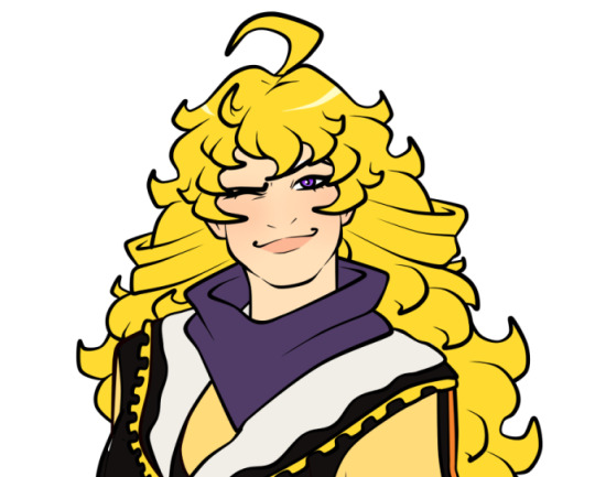
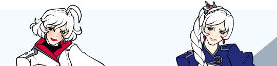
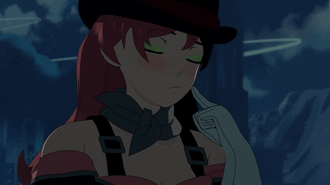
Text
With Weiss done, here's a sneak peek of Blake uwu
12 notes
·
View notes
Text
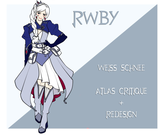
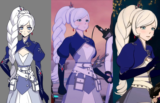
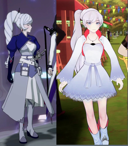
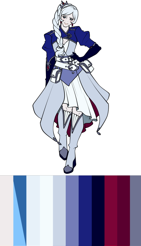
RWBY Design Review - Weiss Schnee (Atlas)
Overview
Actually comng out with Weiss, and straight off the bat we're gonna be struggling tonight. After Ruby's pretty alright design, the rest of her team really dropped the ball and Weiss is one that I know is gonna be more negative than the previous one.
Pros
I have to give something to Weiss' design so it's not all bad, and there's a few things I at least like the idea of here.
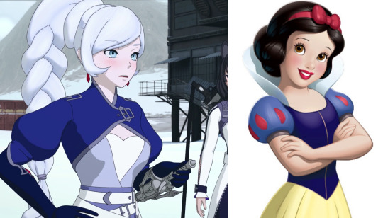
I appreicate the attempt to mimic Snow White's sleeves as a way to allude back to Weiss' allusion, even if I actually don't like how the bulbous sleeves are modelled and feed into her gloves.
On top of that, I do also like her long gloves and the detailing, as well as most of the show design with the wavy style shoecaps.
A final thing was that, while her colour palette is more a con since it's way too many blues and very little white, which is - you know- Weiss' colour, it is still a pretty nice colour palette. Blue is my favourite colour so Weiss does get away with this more than others would.
I will also say that I like the idea of Weiss' bangs being more smooth and preticious compared to the choppy bangs she had before, mostly because loads of characters already have the choppy bangs and it helps to differentiate Weiss from the others.
And that's it for this design.
Cons
Now there is just so much about Weiss' design that I straight up do not like that I gotta do this in designated paragraphs to avoid my thoughts jumping all over the place.
Hair
First up is Weiss' hair.
I won't even blame the modeller solely for this because even in Ein Lee's art, where others at least looked cute at least, Weiss' braid is still not all that great.
This braid is just so obnoxiously thick and top heavy with the addition of the bun that it's on top of. Weiss' hair is clearly thin and her previous ponytail showed that with how thin and flowy it was, but this braid somehow manages to double the volume. If it was way thinner and the bun bit taken off, it wouldn't look half as bad!
I am also just a short haired Weiss truther. Given the storytelling behind her braid that the creators pointed out, Weiss' position of her ponytail correlated with the position in her life under her father. What better way to show her complete freedom from his control than cutting off that control through her hair.
It's a far more drastic and compelling for her character than Blake randomly looking at her hair and deciding a haircut was in order, and I'm somehow who actually likes the idea of Blake having shorter hair to distinguish her hair silhouette from Yang.
It also doesn't help that her braid is just modelled terribly. I try to be understanding for the modellers and such because this time in RWBY was just so bad for crunching and underpaying them, but I will still criticise this work because it's not good.
They tried to improve it between Volume 7 and 8, and they did a good job in mimicing how Ein Lee drew the braid, but it's still a bad looking braid.
Outfit
Going past of the braid itself, the outfit itself is so cluttered and clunky throughout the entire outfit. Weiss is exposing her chest and knees for no reason in the tundra, repeating the same issues as I had with Ruby but even worse, because at least Ruby covered most of her body with something. Weiss didn't even do that!
There's also the four different layers of different shades of blue and white. The navy bolero, the periwinkle dress and the white dress with a darker blue sash. Nevermind Weiss having 3 belts around her waist.
The longer skirt, the shorter dress underneath that needs to flash her legs in the arctic, and the constricting bolero collar and sleeves have taken away from Weiss' established silhouette. She no longer has the wider sleeves, shorter dress and popped collar that would've been suitable for her style of fighting.
Now she looks bogged down and constricted, which coincidedly matches how the writers wanted Ein Lee to design Weiss to be a spellcaster wizard type, which... is not her fighting style and is a problem in all of Weiss' fights because now she mostly stands around and waves her sword around like a fancy wand and spams her summons.
There's also the issue of this outfit being in the wrong style for the position that Weiss is in at this point of the story. The embezzeled jewels and details, the almost princess style of clothing with the jewelled crown, is completely off when compared to Weiss who, at this point, has completely cut off her rich family and is making a name for herself.
This style with the constricting clothing and fancy detailing would've fitted much better for Weiss at the start, who was the ideal heiress to the SDC. Both the clothing and the smoothed out hair could then moved out of this neat and tidy image the further Weiss distanced herself from the Schnee family and name.
Right now, this just looks like the story going backwards on what it's trying to say.
Colour
Now, while I think the colour palette overall is nice 'cause I love blue, it's an issue on this character who's meant to represent white.
Don't get me wrong, putting these characters in mostly their colour is not the right way to go because then it's just boring. Weiss works with white, black, red and an icy shade of blue as an accent. Blue isn't Weiss' colour because A. that doesn't go for any of character, and b. the outfit she wore while trapped at home under her father was a majority of blue.
Nevermind the issue of her associated colour being on the bottom most layer, overpowered by the different shades of blue, the inside of the dress is a dark, desaturated red.
Because the closed collar of her bolero means that Weiss can't have the signature red collar that pops against all the cold colours of her palette, including her pale skin that ends up grey in the Atlas lighting.
But most of the time, you can't even see the red underside of the dress because the white dress covers it, so it's completely unnecessary and just drags the eye down to the bottom of her design whenever she moves.
Similar to Ruby, Weiss' concept at least shows how the bright white and colours of blue compared to the washed out palette of the show, but Weiss does not need four different shades of blue, nevermind that her black gloves and soles are not even black.
They're dark navy. I don't know what it is with some characters in this show and using a darker shade of a colour rather than just using black. It would also add Blake's colour since both Weiss and Blake have consistently used each others colours in their designs and have important relationships with each other in the show.
At least they should but whatever-
I did also draw the dress a bit too short so the underside of the upper dress is showing when it doesn't in the show, but regardless it does highlight just how bad the eye is dragged down to Weiss' legs when you want to be draw to the character's face and whatever body parts they use for fighting.
In Weiss' case you want to pay attention to her arms, but the black dark navy gloves blend more in with the navy blue bolero compared to the warm red contrasting her mostly cool colour palette.

These colour palettes really highlight how grey Weiss is. Grey girl energy, give us nothing Weisssss-
I have to say that, again, if Weiss was blue or if you have a blue themed character, then Atlas lighting at least does well for them. Even Weiss and other white themed characters wouldn't do that bad, but if you're a human with a human complexion, every scene if gonna make you look like an extra of Corpse Bride.
Redesign
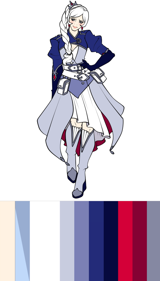
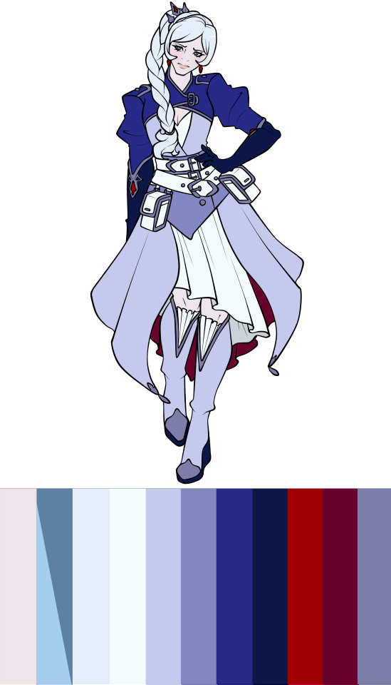
I will be absolutely honest with you all, my girls and gays, I tried with the first redesign to try and see if you could at least make the outfit less ugly, but the answer is no. The style and the colour palette just were not helping me.
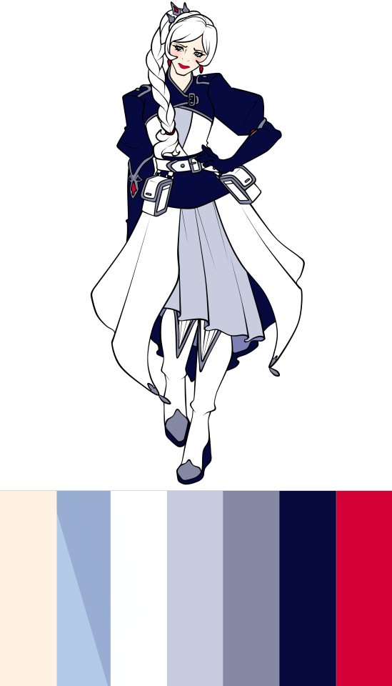
Using the black dark navy to make the bolero and sash stand out with her white dress, and using the lighter shade of grey blue for the dress underneath. The red underpart of the upper dress was also changed so the dress and shoes stood out from the long skirt, but that also means that what little red Weiss wore was now even less with just the jewels and earrings.
I did change her lips to a red lipstick to add to the Snow White aesthetic. I like that.
But other than that, I just do not like this design and no amount of jiggling around will make me like it.
Onto the actual full redesign.
Short haired Weiss SUPREMACY-
So one of the most drastic changes I made was changing Weiss' hairstyle. She now has a wavy, more choppy bob and a cute little ahoge. I totally didn't stare at Furina's hairstyle from Genshin while drawing Weiss, absolutely not-
That wasn't the only thing I shortened either. Both her jacket dress and the dress underneath are shortened to show more of Weiss' legs from both the front and the back, while keeping the bell shape silhouette. On top of that, she now has her wide sleeves and her popped collar back, meaning that the pop of red in Weiss' design is back and frames her face nicely, keeping the viewer's eyes on the face.
I also ditched the dark navy and made the black of her design actually black, providing more contrast between the jacket and her dress, while also illuminating the white on the upper layer where the colour belongs.
I did keep the style of her shoes, but rather than the frilly fabric of her canon shoes, I changed it to inlaid fur for additional coziness. I did add the details of Weiss' canon gloves onto the shoes for a little extra.
While I took away the Snow White-esque sleeves for the wider sleeves, I did add some other bits for Weiss' allusion; including the red lips and the red apple shaped button on her jacket pocket. It's a shame that Weiss doesn't have black hair like Snow White is described as having, but her white hair also fits for her colours and differentiates her from Blake.
And I forgot to add this to Ruby's design, but I did keep the idea of the friendship bracelets that Ruby was meant to buy for her team back in Volume 6. So each member of the team now has them with Weiss' hanging out of her jacket pocket.
So honestly, I do really like this redesign for Weiss.
Conclusion
Overall, Weiss' design is a severe drop from Ruby's and is easily one of the worst designs out of the team, maybe even the Atlas cast in my opinion.
She managed to lose more of her signatures shapes and styles from her Mistral one, which was already a worser continuation of Weiss' Beacon outfit. The colour palette now completely overpowers the white, it's so clunky and cluttered with unnecessary fabrics and looks like it just bogs Weiss down.
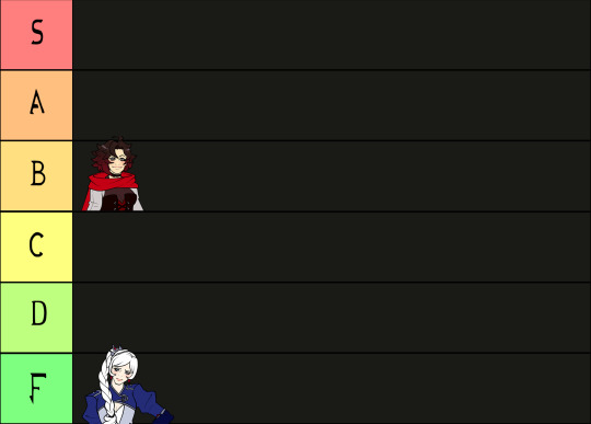
And it was made even worse in the show through the modelling, especially her braid. Just a terrible outfit, I have to put it at the bottom with an F.
Thanks for sticking around! Next one will be Blake's Atlas design, which is only ever so slightly better than Weiss'.
Until next time!
21 notes
·
View notes
Text
Having fun with Weiss' designs (kill me)
#rwby#rwde#weiss schnee#luke.txt#the full redesign was fun but uh#the recolour section is not gonna be fun#her design is just#so bad
20 notes
·
View notes
Text
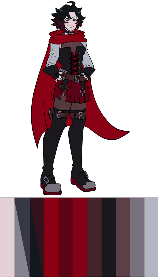
RWBY Design Review - Ruby Rose (Atlas)
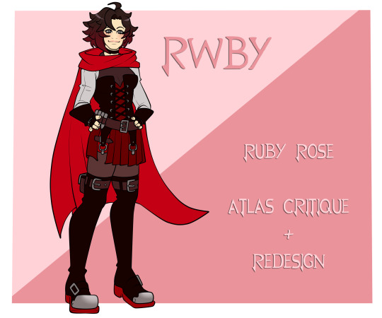
Overview
So, it's been a while since I've done any design reviews, and ahve to thank @thatguythatdrawsalot for inspiring me to fully jump back in with my favourite media to pick at; RWBY.
Go and look at his posts, he's done the mistral/atlas outfits for Team RWBY and the Atlas outfit for Neo, it's great with screenshots from the RWBY Archive that I do not have.
Since the Atlas outfits won the poll, we'll be starting this off with the titular character and leader of the team; Ruby Rose.
Pros
Starting off with the positives, Ruby's design is probably one of the better ones to come out of the Atlas group, even if I'll get into the less than stellar competition in future posts.
From the sources like the archive, the designers slimmed down Ruby's silouette and made her sleeker and more mature, with her puffy skirts and more childish clothing replaced with a pleated skirt and slimmed down sleeves, which I think has done it's job in making Ruby appear older and more mature, especially when you compare her to her look in Beacon.
First things first, I like the change to her hairstyle. The spiky, wild look suits Ruby and even resembles Taiyang's hair, giving her something to relate back to her father. I honestly like this hairstyle for Ruby more than her old hairstyle, even though she had the previous look for far longer.
Similar to that, the design primarily keeps to Ruby's style, keeping all the trademark aspects of her look; the corset, the skirt, and most importantly her cape. Some of the additional details add to it like her cute choker and her usual bullet belt.
The designers didn't venture too far from Ruby's old look while adapting it to suit her position in the story at this point, the story wants Ruby to be in the leadership position fully with everyone looking to her on what to do while in Atlas, and that she finally has achieved her goal of becoming a licensed Huntress.
So they want Ruby to reflect the maturity they expect the viewer to see her as. Regardless of how well the writing did that, I'm only here for the visual side of it, and honestly they did alright.
Plus, Ruby's colour palette doesn't venture away from her established colours and she still represents the colour red well. It's hard to move from that since she has the massive cape that travels all throughout her, establishing red while the rest of her colour palette is neutral shades like black/white, silver or various shades of red itself.
Plus, the placements of the colours themselves work well. The red of Ruby's dress is segmented by the black of her corset and the grey of her shirt, similar to the red soles of her shoes being accented by the black. The uses of black, white and marroon is so her outline isn't lost in the massive mass of red behind her in her cape, which is used to signify the red riding hood.
Last small points are that I do like the homage to Pyrrha in the style of Ruby's corset. Irregardless of how well they did the friendship and following grief over Pyrrha's death for Ruby (AKA not at all), this is a good way of integrating this bit of storytelling into the story outside of just saying "Ruby is sad and still misses Pyrrha), similar to how all of Team JNR wear red after Pyrrha's death.
I also like Ruby's choker and how it, intentionally or not, mirrors Cinder's. I like when the hero and villain mirror each other in designs, even if Ruby's relationship with Cinder is pretty poor in the story itself.
Cons
The biggest issues I have with this design are primarily the somewhat cluttered look with all the unnecessary accessories, and the actual suitability of the design in the setting Ruby's in.
The entire time Ruby's in this outfit is when she's basically in Remnant's North Pole. Not even just in the city or Academy where it's heated up, but out in the tundra where both the characters and the story show that people will die very quickly when exposed to the elements.
Ruby herself even reacts to the cold! She shivers and says its freezing, and it's not surprising because the best idea the creators had was to put her in a pleated miniskirt and thigh highs with the thinnest looking tights imaginable. She doesn't look layered up, and it doesn't matter that the story had it that "Aura protects you from the elements", because that's lazy! Just put the girls in proper clothing!
You're not gonna waste Aura staving off hypothermia if you just put a jacket on. Even just layering up would've made it not so egregious when the show is trying to make you worried about the cold while simultaneously having all the girls run around with their breasts, thighs and stomachs out.
The other point is the cluttered look in parts of Ruby's design and that is mainly because of how many belts Ruby has. It's nowhere as egregious as her belt boots from Mistral, but there's just so many and all I can think about is... why?
She has the belts on her gloves, which aren't as bad since they can be used to keep the gloves secured to her wrists, and then there's the typical belt around the waist for her pouches and such. But then there's the belt buckles hanging off her corset, a belt across the slit in her skirt, two belts on her thigh highs.
Not only that, but the grey shirt is suddenly interrupted by a dull maroonish vest, which feeds into the dress and corset, and the thigh highs...
Ruby's look does not suit thigh highs. Not only has she never worn anything like that, making this change a drastic one, but they just look bland. Most of the shoes in Atlas feel like they just made the outline of the foot and slapped on heels, and Ruby's are the same.
She's always worn boots. Fur trimmed boots would've been cute with some thicker leggings to keep the look similar throughout all her outfits, and then red laces or something would've introduced red to the lower half of her body. 'Cause right now, you have a large amount of red on the upper half, but suddenly it stops at the hips and then suddenly appears on the bottom of her feet.
On top of that, while her colour palette has always stayed consistent and true to her colour, there are just so many different shades of colours on Ruby that do not need to be there.
This colour palette was picked directly from her concept art, and you can see just how many different shades of red/maroon she has on her. Add onto how the black is just a very dark red, and it's all muddying together.
Ruby does not need a different shade of red for her cape compared to her dress, and she absolutely does not need the shorts underneath to be a different shade either!
Add onto the desaturated maroon for her belts, then the way her tights being colours making them look super thin, this palette can be slimmed down. It's great for keeping to her signature colour, but does not need to be this many.
Nevermind that the show itself completely washes out Ruby's colours and somehow copies the same issue that she had in Mistral, her shirt matching the colour of her skin.
Ein Lee always colours both Ruby and Yang with a slight tan, and with this design, the skin colour works great. The yellow undertone of her skin contrasts with the cool grey of her shirt, but the show made Ruby's skin a shade of grey itself so now it all blends together again!
These are palettes taken from the most common look in each volume, starting with 7 and ending with 9. Both Volume 7 and Volume 8 have Ruby's skin as a desaturated, greyish tone, which now matches with the sleeves of her shirt.
And with Volume 9, there was either the dusky tone in the example, or Ruby was stuck in a gross yellow overtone that didn't help her either. The only positive was that now she wasn't so deathly pale, even if she didn't have the nice contrast of her yellow undertoned skin with her mostly dark and cool colour palette.
One little thing as well, while not really a con, is that I don't understand why everyone changed their hair besides Yang in the story. They tried to give some reason behind Weiss and Blake, but Ruby's feels like they changed her hair because everyone else was rather than giving a reason.
But that's really minor and not much of an issue since I like the new hairstyle.
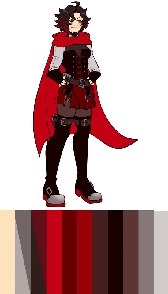
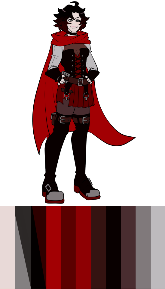
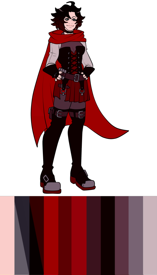
Redesign
With the redesign, I know in my prior post before the voting that I would only try to see what can be done with the design first by tweaking the colour palette as a challenge.
While that's still true, I wanted to add a little addition to that; I wanted to see if I could make the design better while still keeping most of the outfit there, meaning I can't just change the colour palette or completely redo the entire look for the first section.
With this, all I really did was remove a few of the most unnecessary belts, like the one on the skirt, as well as closing up the skirt itself. I also made the boots much shorter while adding the red bands to separate them from the black leggings, keeping more red on the bottom half of Ruby's design.
I did also keep the leg belt. I know I complain about the swarm of belts, but I do actually like leg belts that have pouches. It's from my Naruto phase.
As for the colour palette, I drastically slimmed it down. The grey shirt, while I do like, I changed back to black and lengthened up to the neck so it looks like some kind of sweater Ruby's wearing under the dress and corset.
It's very reminiscent of her Beacon look, though I think I would've changed the shirt back to either a silver or something lighter just so the corset and gloves don't get so lost amongst all the black. There were just no good maroon shades for the leather parts either, but the attempt is fine.
Just fine.

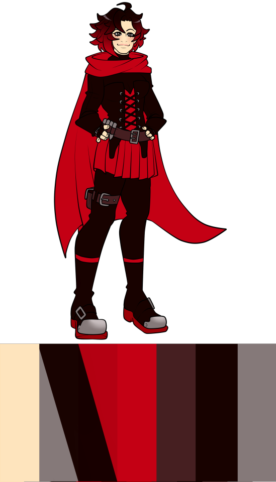
Now for Ruby's full redesign. One thing I wanted to do was avoid just using my other designs that I've done for AZRE, since I wanted to make these designs for canon RWBY and try to keep as much of the other design as I can.
So I've kept the corset, dress idea and the shirt style while either changing others like the boots to her more casual boots, or adding more like the frilled collar to match Penny's. The colour palette has also been slimmed down while adding both Weiss and Yang's colours in the form of the white shirt or pale yellow detailing.
I also missed Ruby's cross imagry so I took inspiration from her Mistral concept arts and put cross details across her longer skirt. The contrasts were also made more apparent with darker blacks and brighter reds/white, while her skin tone is a little darker to more contrast with her shirt.
Another point is that, while Ruby to me isn't someone overly fussed with makeup, I really wanted to give her some black lipstick and such to sell more gothic appeal to her design. I think she looks really cute with it.
One final thing but I had her keep the tattered cape from Mistral. I know she just replaces it in canon, but I also liked the idea that Ruby's cape, something so similar to Summer Rose and to Ruby as a character, is something she can't just replace easily and later feeds into her issues in V9.
So yeah, it's an improvement for me, but you guys are also valid in what you think as well.
Conclusion
Overall, Ruby's design is the best out of the four, but it's not as impressive given the competition.
She keeps a lot of her previous traits while adapting to her progression, but the complete lack of suitability to the environment, too muddied of a colour palette, and the same crowded issues in the upper part of her design does still bring this design down for me.
However, I do like parts of her design and the implied storytelling in them, as well as acknowledging that her design keeps not only to Ruby's style, but to her signature colour. So, I give Ruby's Atlas design a B.
Thanks for sticking around! Next one will be Weiss' Atlas design, which will be a lot more negative from me than Ruby's. Honestly, we started off with the best and it's only going downhill from here.
Until next time!
20 notes
·
View notes
Text
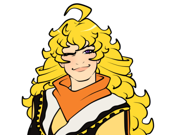
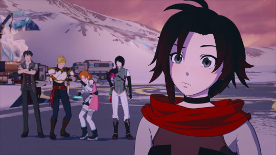
Looks like it's the Atlas outfits up first, so here's a preview of Ruby for the first design post coming soon!
11 notes
·
View notes
Text
RWBY Design Critiques
Shoutout to @thatguythatdrawsalot for inspiring me to pick this back up, I love their thoughts on the RWBY designs and their own personal touches on them.
So, I've been thinking of gettin back into my design critiques after stopping a few years ago, and this time going a bit more into them. So I was thinking of with doing each design in this format:
Pros/Cons: Self explanitory, I talk about the good and bad parts of the design and why in regards of the character/general design tips.
Redesign through colour palette: The segment where I see if we can improve the design through redistributing the colour palette, meaning I can't change the colour palette itself and have to use what is given to me.
Complete Redesign: The segment where I have the freedom to redo the look to how I would like it. People can agree or disagree with my choices here, the more the merrier.
Design Rating: It might be in the form of a tier list since I enjoy those, or just a standard A* - F grade. We'll see.
Poll for next character: The bottom of each review will have a poll for the next character design to be done. Asks can be sent in for characters to be added to the next poll with the limit of 4, and any character not chosen will remain on the poll until they're done.
So that's it, here's the first poll for Team RWBY, and let's see which arc outfits get chosen first!
Whichever one is picked, we'll go through the team chronologically. Any other characters that you might want done, just send an ask and the first ones after Team RWBY will be added to the poll!
5 notes
·
View notes
Text
I love your design series coming back, makes me wanna do mine again so much 😌
Neo - Atlas Design Critique.
No redesign as I said prior- allergies- but I did make this Neo sketch a bit ago before the sick mess I became and I had enough energy to color and type up a critique. Will I ever make a Neo Redesign? Yes it’s on the list with a Blake Atlas Redesign too. Along with a Blake & Yang Mistral Redesign as the prior redesigns I did for them make me wanna die, those drawings are so bad, please focus your attention on the critique rather than the redesigns for them until I FIX it.
RWBY Archives


Alright! Let’s see what they wanted to do for the fan favorite of the time- well current time; Neo! I mean people demanded for her return so certainly CRWBY must’ve made her look stunning which they did for the wrong target audience… the people who enjoy fanservice and if it wasn’t it certainly came across as it.
All the archives have to say about Neo is the importance of Roman’s hat and scarf which I like on her, since Neo is mute she can’t exactly say what her motives are so a clear display on what she’s doing all this crime for is great! A good “Show Don’t Tell” example right here.
Next thing you know they talk about an impossible to see keychain. We’re gonna mention a cute little keychain that nobody can see rather than get an explanation as to why Neo would go to the North Pole with lack of warm clothing?
And why not just put the keychain on her waist or pouch so we can see if it was worth a mention at all???
Hair
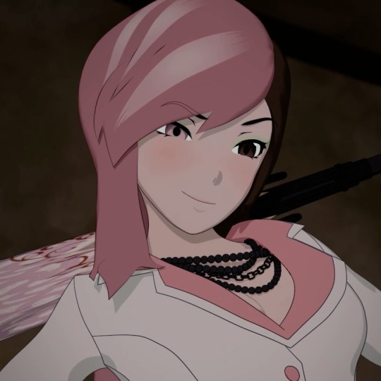

The model is bad. Especially the hair as it’s so bulbous you can’t exactly see the keychain- come to think of it! Why not also change Neo’s hairstyle if you wanted the keychain on the back??? Though I suppose whatever hair they decided for Neo still wouldn't be pleasant to look at as both versions of Neo’s old and new hair don’t look good. They even messed up her white hair streaks. The giant hair that acts like a really wide cape much like Yang’s golden hair, does this thing where it seems to get in the way of what I can see when she does her acrobatics.
Primary Color - Pink, Brown, White!

Okay I know she’s more so defined as pink!
Honestly the color placement is something I didn't mind when I was tweaking the outfit around. I think it’s just a good amount of all three colors coming together minus the hair- my recoloring would’ve robbed Neo of her signature color to make her be more like Roman which is too much. The white ‘coat’ does at least make me see Neo’s limbs when in combat as again the hair in the way can’t make me see much of her in her dark brown ‘coat’.
Positives?

This applies to Weiss’ Atlas look but she does look great in the Ever After. A weirdly explicit version of the Mad Hatter is whacky and something I could mind less since she’s now not in a freezing environment. CRWBY did very well to make Neo’s design make sense in this world and took the opportunity with it just like how they did with Jaune and what they didn’t do with Weiss.
Conclusion

This outfit is still bad!!! I know many like Neo! I do too! Her semblance is cool and she had an interesting enough story of her avenging her crime boss but the outfit just sucks! The designer didn’t care much about Neo’s outfit besides Roman’s hat and scarf which is important, don’t get me wrong… but so is making her be competent. She is gonna go cold so FAST I’m not even kidding. The giant hair isn’t gonna protect her either.
This is just a design to appease fans of the fan favorite character in a fan service outfit, I got no other impression other than that. They just wanted to make Neo popular, no matter what, and I hate it for it.
But of course it’s just my opinion. If you love this design or hate the design, please share your opinion. I’d love to hear it!
Tier List so Far

Since I didn’t add a redesign, I still wanted to put a section of SOMETHING! So why not make a tier of outfits I’ve properly critiqued so far? Oh man I really need to start talking about good outfits than bad ones-
20 notes
·
View notes
Text


they didn’t even spell “Greenstein” correctly
this also happened today


this helped a total of zero people, as usual
665 notes
·
View notes
Text
HYPED HYPED THERE'S A SOUTH AMERICAN ANIME IN THE WORKS MADE AND FOR SOUTH AMERICANS Its so rare to see southam animation let alone one that has mythos!!!!!!! HYPED It looks like it is made from a studio based in Peru name Ninakami. The anime takes a lot of inspiration from the indigenous Quechua influences and other Andean and regional cultures. It even uses the indigenous language in its tittle! 🔥"APUKUNAPA KUTIMUYNIN- El Regreso de los Dioses/ Return of the Gods "🔥
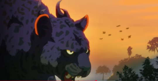
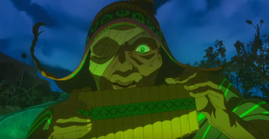
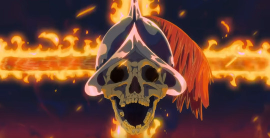
You can watch the trailer here!
21K notes
·
View notes
Text
goyim: fuck musk! this is exactly like the holocaust! punch a nazi!
jews: do you care about Jewish people and the global surge of antisemitism tho
goyim:

705 notes
·
View notes
Text


First Post!
I deleted my old tumblr because... man idk why it was covid-times and the prefrontal cortex was not in the room with us!! Anyways, I was reminded by my lovely friend @repecca that tumblr exists, and that some of my work has been going around on here, so I decided to post some of my work up officially! Starting off with my most notable (?) work to date, here's my LOTR: The Middle Kingdom Project. Now, it's been over a year since I posted this, and at the time I was... really searchingfor myself artistically, and I decided to go all in on something that I'd been ruminating on for a long time.
So, hello, again. I'm Leia. I do visual development/BG design, and I'm also a writer of things. I love fantasy and transformative work. It's nice to meet you.
18K notes
·
View notes
Text

Here's a snippet of the Healing Scara comic I worked on today during my Picarto stream! If you want to see more, I stream on Saturdays at picarto.tv/drawlypsy.
If you want to see Part One, go HERE
Thank you again for being patient as I work on this comic. I'll have the full piece up on my Patreon! (along with other NSFW works)
182 notes
·
View notes
Text
don't ask a woman her age, a man his salary or the irish government what the 1963 commission report on their very own final solution for the "itinerant problem" is or how many jews / roma live in ireland
#racism#luke.txt#no fr my hindu friend came back from ireland and never wants to go back again#cause the way the white irish ppl treated her was appalling#nvm my own experiences but god settled irish ppl need to hold their people and country up to standar
915 notes
·
View notes
Note
So I heard about your “Penny in the Ever After” AU and feel like you should know that in my revamp/reimagining/overhaul Penny is the one who falls into the Ever After and becomes the Rusted Knight instead of Jaune. Curious to hear your thoughts on that.
I want to kiss you on the mouth, mwah-
Penny is such a fountain of potential, even if we keep the stupid plot of her being turned into a human, but canon just did that so they could kill her off completely without people thinking they'll bring her back because they did it before.
Which just brings to question why they brought her back in the first place but we'll ignore that.
Now back to your idea, I love it. I love the idea that Penny, after something as traumatic as the Fall of Atlas, would be in such an emotional state that the Ever After would alter her into this protector that she was. Penny was already the Protector of Mantle, and she'd failed multiple times that resulted in people dying.
Now in the Ever After, she's projecting that desire to not fail again onto these people, but in the completely opposite way in that now she's smothering them. They can't do anything that they would normally do because Penny is so determined not to fail again that she can't see what she's doing right in front of her.
And I'm sorry but it's way more interesting than Jaune getting another volume for his pain after being shoved into the role of killing Penny for no reason at all. I'm tired Grandpa.
8 notes
·
View notes
Text
April 25, 2025 JVP at George Washington University posts statement in support of terror attack in Kashmir:

419 notes
·
View notes
Text
I do love seeing all the antisemites scream about pine trees in Israel whenever there's some sort of ecological issue or disaster going on or they want to use them as "proof" that Israel is a white European colonial project. Why? Because I've never seen them say what pine trees are the culprit. It's always some allusion to pine trees being non-native to the region and that they were planted to make the country "more European" or something like that. The articles are written in English for a Western audience that has pines in their backyard and are likely associated with the winter months in their culture. The implication here is "how could your Winter Xmas Pine Tree survive in the desert?!" which leads to the colonial assumptions and so on and so forth.
This entire schtick plays upon the general populace not understanding anything about ecology, range distributions, species, and other biological concepts. Most people see the term "pine tree" and assume it's the same pine trees they've seen their entire lives. The concept of different species all being colloquially referred to as "pine tree" is not a common conception.
So if you're reading any of those articles or posts that scream about colonialization because of "pine trees" then you need to stop and ask "what species?" Because the JNF has planted 3 particular pines - The Aleppo pine (Pinus halepensis), the Turkish Pine (Pinus brutia), and the Canary Pine (Pinus canariensis).
All three species are endemic to the Mediterranean region and are subtropical species. Meaning, all three have distributions that include Israel in their native range and have a biological history of being there. At one point or another many of them were cut down for some use (from what I understand, primarily for ship construction during the Ottoman Empire). In fact, the Aleppo was almost wiped out from its Middle Eastern distribution until it was brought back (and the three species are all closely related and adapted for the climate in the region).
Now, I've seen variations of the land shouldn't have been greened, they cut down native forests, they drained swamps, etc, etc... as criticisms. I even had the "they shouldn't have drained and greened the swamps" as an argument, barring the fact that the swamps only existed because the native forest was cut down for use by the Ottoman's and as such caused environmental degradation and change.
And the thing is, there's valid criticism for planting so much pine. It's a very dry tree species that catches fire easily. Especially when it becomes sick and/or damaged. There's also concern that it's planted in parts of Israel that are not suitable for said tree species. But at no point are they a foreign invasive species. They are native to the region.
However, what stands out the most to me is that never do one of these articles, blog posts, rants, or antisemitic screeds mention Eucalyptus.
That's right.
Eucalyptus, a genus (or Tribe) primarily endemic to Australia, was brought in to drain swamp, wetlands, and marshlands and make them habitable. And not just one! But multiple species were introduced for this purpose (Eucalyptus camaldulensis, Eucalyptus gomphocephala, and Eucalyptus torelliana).
Not a single writing has ever mentioned these trees, and that should be a big warning flag that what you're about to read is mired in half truths, falsities, and lies of omission besides outright ignorance. Solely focusing on pine trees is to elicit the response I mentioned above in Western audiences who only associate "pine tree" with their winter time and climate. It's a malicious technique to manipulate the reader and come to a false conclusion and assumption that will stoke their outrage at the "colonial" behavior of planting "colonial non-native" trees.
792 notes
·
View notes