
Hello I am Hima, welcome to my visual diary, the place where I capture the spirit of visual storytelling. Through my investigations into Visual designs, typograhy and user interfaces, I will share my thoughts on design imagery, whether they come from online research or self-taken photographs. Together, let's take off on this thrilling journey into the world of visual creativity!"Art is what you make others see, not what you see yourself"
Don't wanna be here? Send us removal request.
Statistics
We looked inside some of the posts by himacp and here's what we found interesting.
Average Info
Notes Per Post
7
Likes Per Post
7
Reblog Per Post
0
Reply Per Post
0
Time Between Posts
2 days
Number of Posts By Type
Text
17
Last Seen Tumblr Blogs


Fun Fact
After the announcement of the deal with Yahoo!, there were 170K signatures of unhappy Tumblr users petitioning to prevent the sale in 2013.
Text

Hi welcome to my Visual Diary
I captured this moment to keep as a memory as we reached the end of our first academic term. These past few months have been great for learning and unforgettable experiences. From the nervous excitement of the first day to the deep connections formed with classmates, it's been a rollercoaster of emotions. This picture encapsulates the mix of nostalgia and hope as we prepare to say goodbye to this semester.
I am grateful for every moment, every challenge, and every mastery that made this term an incredible journey. Here's to the memories made and the ones yet to come.
📚✨ #EndOfTerm #Memories #NewBeginnings
14/12/23
0 notes
Text

Visual Hierarchy
While I was studying about Visual Hierarchy I saw this in googe Si I thought I woud share it in my Visual Dairy. Visual Hierarchy determines how viewers’ attention is directed and can be used to emphasize certain aspects of the design while deemphasizing others.
In this picture so easily they have conveyed Visual Hierarachy. The vital part is understanding how to create effective visuals. By understanding where and when to use hierarchy, Making use of these designers can create visuals that not only engage their audiences but also convey the necessary information.
10/12/23
0 notes
Text


Gumbo illustrations
While doing research for my movie poster, I came across these elegant typefaces on Pinterest that say a lot of different things in single alphabet. This was quite fascinating and eye-catching, in my opinion.
These Gumbo illustrations are like a flavorful mix of visual spices in a pot! They're vibrant, colorful, and rich in detail, just like the diverse ingredients in a gumbo dish. Each illustration tells a unique story through bold strokes, lively characters, and vivid colors, creating a feast for the eyes. They capture the essence of culture, emotions, and narratives, stirring up a delightful and captivating visual experience that leaves a lasting impression.
It is quite impressive that the complete message may be conveyed with just one alphabet.
07/12/23
0 notes
Text


Double Exposure
While doing research for my movie poster, I noticed in these images how they brought the character, typography, and illusion effect together. While reading about it, I understood it was called double expouse.
Double exposure techniques can be incredibly powerful in conveying multiple layers of meaning or storytelling within a single image. It's impressive how the combination of character portrayal, typography, and illusion effects can come together to communicate the essence of a movie poster
03/12/23
1 note
·
View note
Text

This picture I captured when I visted the Grand Canyon last week I felt its is indeed a breathtaking place! Its beauty is awe-inspiring, especially when you capture elements like the play of light, water reflections, and the serene environment that seems to embrace the night.
And it's interesting how you connected this experience to Dublin being an IT hub, often referred to as the gateway of Europe. Just like the Grand Canyon is a gateway to a magnificent natural world, Dublin serves as a technological gateway for Europe, housing a vibrant tech community.
Nature's wonders and human achievements often mirror each other in unexpected ways in this picture, don't they?
01/12/23
0 notes
Text


Visual languages and systems play a crucial role in the design and functionality of a food delivery websites because delivery websites aim to create an engaging, user-friendly interface, simplifying the process of ordering food online while ensuring an enjoyable experience for users from start to finish.
Applying the concepts we studied in the visual communication course and offering comments on how they were put to use in the application was incredibly beneficial. I was able to fully understand the usefulness of these design components in practical situations through these real-world implementations.
As a part of research I was able to find what are the Typefaces and the colour theory they use in food delivery websiites.
Typography
Primary Typeface: Simpleand legible sans-serif font for its logo and headers.
Secondary Typeface: For body text and smaller elements, complementary sans-serif font that's easy to read on digital screens, such as Arial, Roboto, or Open Sans
Colour Theory
1.Orange: These colours can convey warmth, friendliness, and optimism. They're often used for highlighting comfort foods or creating a welcoming vibe.
2.Green: Often associated with freshness, health, and organic produce. It's commonly used for highlighting healthy.
3.Red: Known to stimulate appetite and create a sense of urgency. It's frequently used for highlighting discounts, offers, or enticing food options.
Most of the food delivery webistes do follow above mentioned typography and colour theory to keep their deisgn simple.
28/11/23
0 notes
Text

Logo Design of Costa Coffee: A logo featuring three intersecting coffee beans is not only visually appealing but also representative of the brand's core focus on coffee. Additionally, the typography that emphasizes the word "Costa" contributes to the logo's clarity and brand recognition.
The placement of "since 1971" in proper symmetry adds a sense of heritage and establishment to the brand, highlighting its long-standing presence and expertise in the coffee industry.
Simplicity and elegance are crucial elements in successful logo design. This logo manages to convey the essence of the brand in a clean, simple, and memorable manner while remaining visually appealing, it tends to resonate well with customers.
It sounds like Costa Coffee has achieved a well-balanced and impactful logo design that effectively represents its identity and history.
Sourse: Pinterest
22/11/23
0 notes
Text

This picture was taken from pin interest it shows how colour and shapes can make beautiful picture
By skillfully using the triangular shape as a foundational element, artists and designers have created this bird with a unique and eye-catching appearance. The geometric precision of the triangle lends elegance, grace, and a sense of symmetry to the bird's form, resulting in a beautiful visual representation.
Color Contrast: Birds display a wide array of colors, and contrasting colors can be seen between different parts of the bird. A bird with a brightly colored body and a contrasting color on its wings or tail feathers creates a striking visual contrast.
The combination of geometric shapes and the bold use of different colors with brighter contrast resulted in a visually striking and unique depiction of a bird, allowing for artistic interpretation and creativity.
22/11/23
0 notes
Text
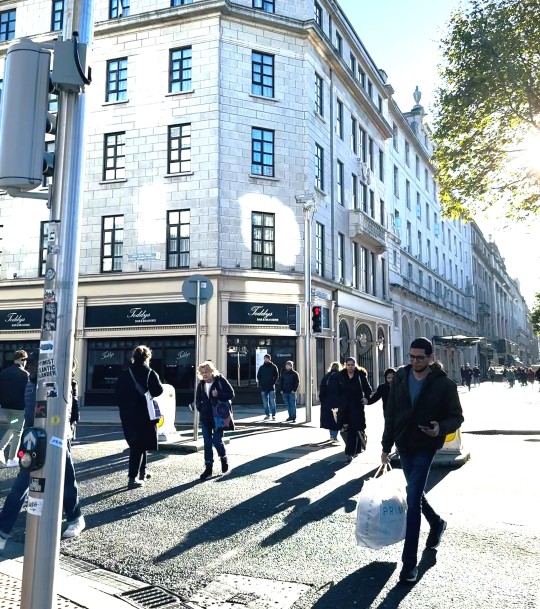
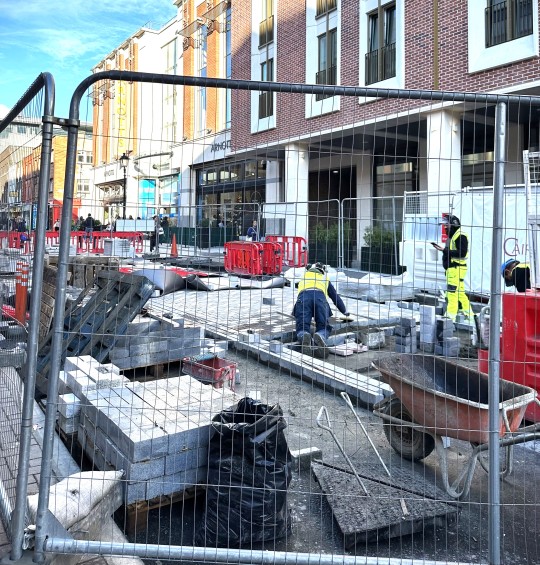


Image 1: Danger
This picture was captured one sunny morning on O'Connell Street Road. A potentially dangerous and illegal action is crossing the street when the traffic signal is red. Such an instance is described in this picture: On occasions when a red signal is in effect, people are attempting to cross the street. It is crucial to wait for the green "walk" signal to guarantee a safe crossing because doing so puts both vehicles and pedestrians in danger. In this picture, there are a few pedestrians who are glancing anxiously at the traffic lights and rushing towards the other side, perhaps hoping for a sudden change, even though the signals are visible. While we can see a man holding his phone and texting while crossing where he is risking his life in danger and others are hesitating whether to cross the road or just to wait till the signal turns green, a few impatient decide to take a chance and step out onto the road. The impatience we often experience, especially when waiting for something as simple as a traffic signal, can sometimes lead to risky behavior. Despite knowing the potential dangers, some individuals might choose to take that risk due to impatience or the need to save time. This is what is purely convened in the image.
Image 2 : Safety
This picture was captured one afternoon in Henry Street Dublin. Safety measures are of paramount importance in construction to protect the well-being of workers, site visitors, and the general public. Here's a description of some key safety measures that are included in this picture for construction: Construction workers are wearing the appropriate PPE, including hard hats, safety goggles, high visibility clothing, steel-toed boots, and gloves to protect themselves from potential hazards. To protect the public, they have fenced with steel wires so that no one can enter the zone unknowingly which describes that they are aware of potential hazards. Heavy operating materials have been kept on one side, and the construction worker is making sure he is taking just one cement brick to construct, which shows that safe lifting and handling of heavy materials has been taught to workers to prevent strains and injuries. Site security has been maintained to ensure that unauthorized access is restricted, and security measures are implemented to protect equipment and materials from theft or vandalism. Finally, the picture shows that by following these safety measures and regulations, construction sites significantly reduce the risk of accidents and create a safer working environment for everyone involved.
Image 3: Joy
This photo was taken on November 12, 2023, at Northwood Apartment Santry Park, during the apartment's Diwali celebration. To highlight the happiness on the two children's faces, I have blurred the background in the picture where we can see a few parents and kids enjoying some tasty treats and the festival with their families. The image captures the delight with which two children embrace and give each other a warm, tender hug. Their face painting also shows that they are interested in artistic things, and both kids have a lot of patience to sit for face painting and get it done so elegantly. This picture has captured the child's genuine happiness and joy that shines from their heart. Both of their innocent smiles look like it has filled the room, resonating with pure wonder and innocence like a melody. Their smile in the pic is contagious and has the power to make us smile too, and their eyes sparkle with trust and curiosity. When we look at the picture we feel a deep connection with the children, a connection that exceeds words, all worries, and tension. Looking at their smile it warms our hearts and gives us a deep sense of happiness and love. It serves as a reminder of the pure, unadulterated joy that can be found in a child's embrace.
Image 4: Anger
This picture was taken one pleasant evening near Griffith college. This image was chosen because it captures the anger that many of us feel when we see someone using their phone to obstruct pedestrians. It also angers me when people are sometimes so preoccupied that they fail to notice that there are elderly passengers in need of assistance or pregnant women who might also need assistance. I'm attempting to capture the general public's anger in this image, which we come across on a daily basis whenever we use walkways or public transportation.
Nowadays mobile phones have become part of everyone’s life. Near the bus stop these students are busily involved in their phone and they are blocking the pedestrians, as there is no place on footpath in the picture, we can see a man stepping down and walking. This makes them really angry as they are not aware of what is going in their surroundings. Being angry when people use phones near a bus stop is quite understandable. The concern often lies in how it affects their awareness of their surroundings, especially in a potentially busy and hazardous area. While phones are undoubtedly a valuable tool for communication and information, it's essential to strike a balance between using them and being aware of one's surroundings, especially in public spaces like bus stops.
20/11/23
0 notes
Text

"Happy faces have this wonderful ability to brighten up our days"
The purpose of a happy face for kids is to communicate positive emotions in a way that's easily recognizable and relatable, especially to younger audiences. It's a universal symbol that can brighten someone's day and encourage a cheerful atmosphere.
Absolutely! When there's a significant contrast in colors between the clothing of a baby and a boy in a picture, the background blur enhances the overall vibrancy and visual appeal of the image.
For instance, if the baby is dressed in light or pastel colors while the boy is wearing brighter or contrasting hues, it can create a lively and colorful composition. The contrast between the colors can draw attention to the subjects and make the scene more visually interesting.
19/11/23
3 notes
·
View notes
Text

This picture was taken from my window one evening.
As you look at it, you can tell how calm the surrounding is, the road, the sky, and the shadow light falling on the bench.
That sounds like a beautiful and serene scene! Capturing the calmness of an evening through a window can create a sense of tranquility and peace. The interplay of light and shadow, especially with the light falling on a bench, can add a touch of ambiance and depth to the photo.
The contrast between the illuminated areas and the darker shadows often adds an artistic element to the image, creating a mood that reflects the peacefulness of the night. The picture sounds like a wonderful moment frozen in time, capturing the serenity of that night and the beauty of the surroundings.
18/11/23
#Northwood Avenue, Santry Dublin
1 note
·
View note
Text

This picture was clicked on one evening when I had been to shopping to Grafton Street, Dublin.
Her expression in picture shows how deeply she is involved in the music act.
This picture captures the essence of music's profound impact on one's emotions and understanding. Music possesses a unique power to convey complex feelings and experiences, often transcending words and language.
#Grafton Street, Dublin City - Ireland.
15/11/23
0 notes
Text
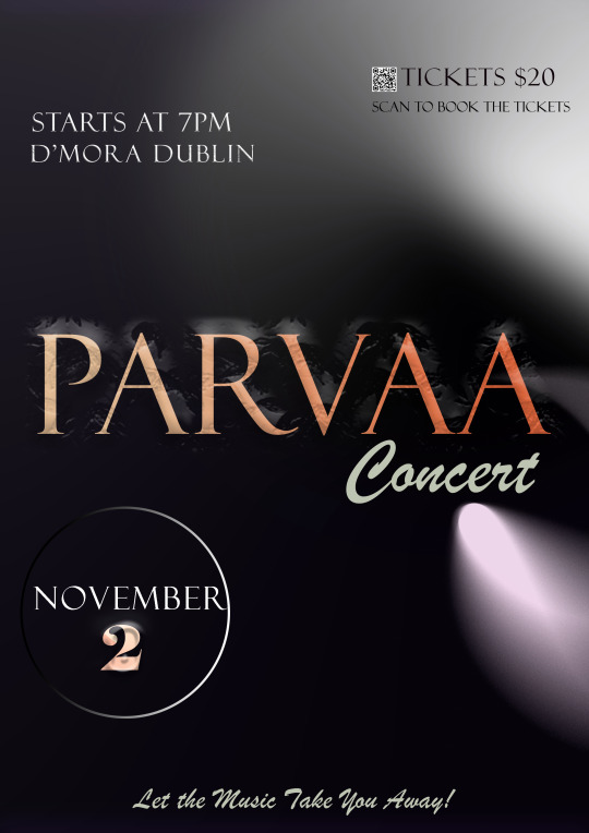
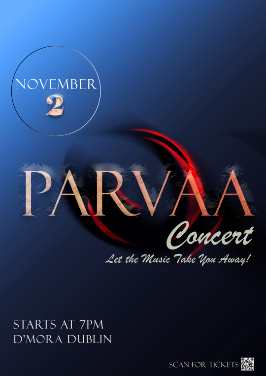

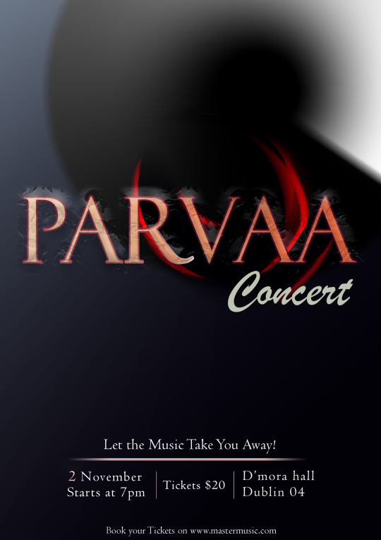
Hi this is my visual dairy,
The music act I have focused on was Jazz and the name of the musical act was “Parvaa” which means “The new beginning”. The name of the musical act I have emphasized more and then placed the rest of the information I choose to give below so that the audience won’t be confused where and what to focus. Once they see the act and their next focus will be below to see the date, venue and ticket price details.
Just above all these details I have given the critics quote with the fading underline which again portrays music will take you to a different zone.
I showed all 3 iteractions to my fellow classmates and teacher so they all suggested to change text placements and font style so after taking peer input and the teacher input, I came to the final decision of the below poster.
10/11/23
0 notes
Text


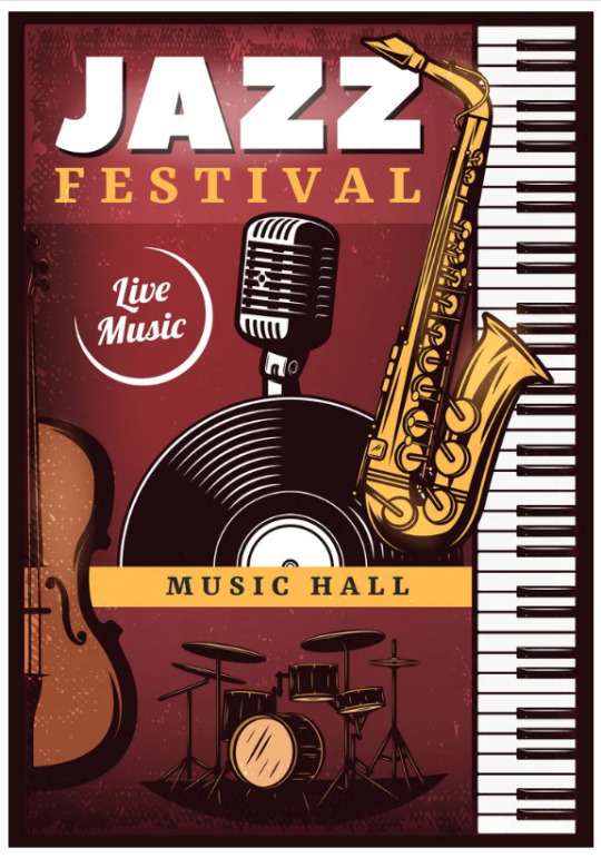
Hi Hima here,
Once the music poster assignment was give I started doing the research on web. When I thought about musical acts, I am a person who likes more traditional based music and I felt choosing Jazz would be the best choice. Jazz is a music genre that originated in the African-American communities in the late 19th and early 20th centuries, it has been recognized as a major form of musical expression in traditional and popular music.
Here are the few Jazz music posters where I extracted few ideas from the above posters.
08/11/23
1 note
·
View note
Text
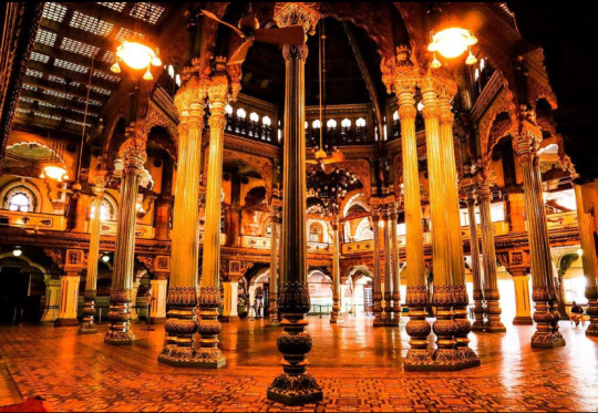
The beauty of the palace is mesmerizing. The architecture is designed with a focus on symmetry and balance, creating a sense of harmony and visual appeal.
The interiors of palaces are often adorned with opulent materials, including marble, precious metals, intricate woodwork, and detailed frescoes. Lavish furnishings, chandeliers, and tapestries contribute to their beauty.
As you can see, the photo has been captured from below to show the height and symmetry of the pillar, as well as its elegance and variety of colors.
Source: Instagram page
06/11/23
0 notes
Text

Hi welcome to my Visual Dairy
This picure was taken in the restaurant. The picture speaks alot about the colour contrast.The sight of this orange and blue juice is not just a treat for the eyes, it's a visual representation of the balance between vitality and calm, warmth and coolness.
The orange colour exudes warmth and energy, reminiscent of the first light of dawn kissing the horizon.
The blue colour adds a sense of tranquility and depth to the composition. It's as if you're gazing up at the vast expanse of the ocean or the heavens, finding relaxation in boundless beauty.
31/10/23
0 notes
Text

This picture was clicked during the festival of Krishna Janmashtami which is one of the popular festival in India where most of the small kids dress up like lord krishna and perfrom Krishna's childhood acts. Here this picture is communicating how innocently the kid is inviting someone who is infront of him to give him company. The colour contrast also so elegant ,the pot, kid's peacock crown and the background is totally giving an amazing look to the photography.
26/10/23
1 note
·
View note