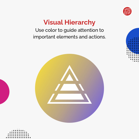
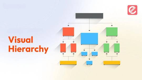
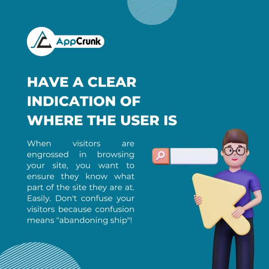
#Visual Hierarchy
Explore tagged Tumblr posts
Visit Tumblr Blog
Explore Tumblr blogs with no restrictions, modern design and the best experience.
Last Seen Tumblr Blogs


Fun Fact
Tumblr was the first site to host the blog for President Barack Obama in 2011.
Text
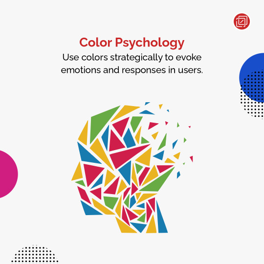
🌈 Unlocking the Power of Color: Mastering Visual Hierarchy in UI Design! 🎨
From vibrant call-to-action buttons that demand attention to subtle color accents that provide seamless navigation, learn to wield colors like a pro designer! 💪
3 notes
·
View notes
Text
How to Design a Seamless Mobile Experience
UI/UX Best Practices

In today’s mobile-first world, a smooth and intuitive mobile user experience isn’t just nice to have—it’s essential. Whether you’re building an app or a responsive mobile site, the way users interact with your design can make or break their perception of your brand.
For more articles please visit: https://pixelizes.com
In this blog, we’ll walk through UI/UX best practices to help you design seamless mobile experiences that keep users engaged and coming back for more.
1. Understand User Behavior on Mobile
Design starts with empathy. Mobile users:
Are often on the go
Prefer quick access to information
Use thumbs for navigation
Expect fast loading and fluid interactions
By designing with these behaviors in mind, you’re already creating a more intuitive experience. Learn more about mobile usage patterns.
2. Prioritize Content with a Mobile-First Mindset
Start your design process with the smallest screen in mind. Focus on:
Core content and functionality
Clean, minimal layouts
One task per screen (to avoid overwhelming users)
Once the mobile experience works beautifully, scaling up for larger devices becomes easier.
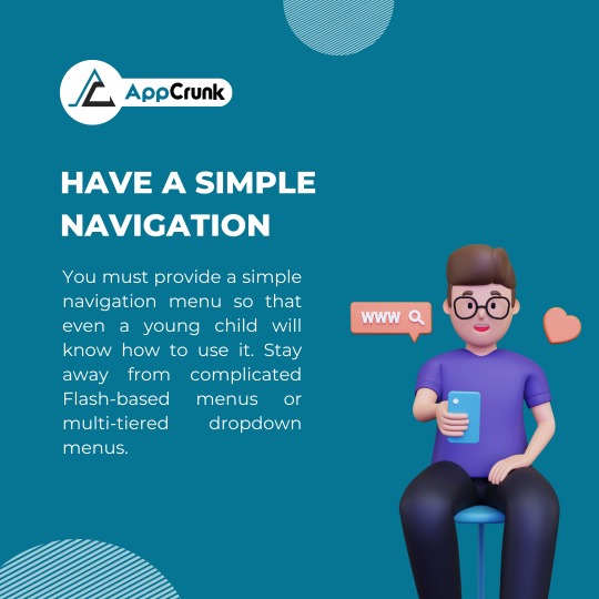
3. Simplify Navigation
Clear and consistent navigation is crucial. Follow these tips:
Use bottom navigation bars for thumb-friendly access
Keep menu items to a minimum (ideally 4–5)
Make icons recognizable (home, back, search, etc.)
Use sticky headers or floating buttons for important actions
4. Optimize Performance and Speed
Slow apps or sites = frustrated users. Improve speed by:
Compressing images and media
Minimizing API calls
Lazy-loading content below the fold
Avoiding heavy animations unless necessary
Fast experiences feel more responsive and reduce bounce rates. Check Google Page Speed Insights to assess your performance.
5. Make Touch Interactions Effortless
Ensure that every tap and swipe feels natural:
Use tap targets of at least 48x48dp
Leave space between buttons to prevent accidental taps
Support common gestures (swipe, pinch, scroll)
Provide instant feedback (e.g., button highlights, animations)
6. Follow Visual Hierarchy and Readability
Small screens mean you need to be crystal clear:
Use bold headings and ample spacing
Stick to 1–2 fonts with clear contrast
Break up content with cards or sections
Make sure all text is legible without zooming
Explore typography best practices for mobile .
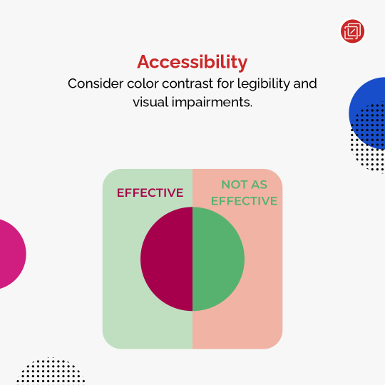
7. Design for Accessibility
Make your mobile design inclusive:
Use sufficient color contrast
Enable screen reader support
Avoid relying on color alone for information
Ensure controls can be accessed with one hand
Accessible design benefits everyone—not just users with disabilities.
8. Test, Iterate, Repeat
No design is perfect out of the gate. Use tools like:
Figma prototypes for early testing
Maze or UserTesting for usability studies
Hotjar or Google Analytics for real user behavior
Use real feedback to refine your mobile UX over time.
Final Thoughts
Designing a seamless mobile experience takes thoughtful planning, user-centered thinking, and a dedication to simplicity. By following these UI/UX best practices, you’ll create mobile interfaces that not only look great but work beautifully—turning casual users into loyal fans.
Want more tips on UI/UX, web design, or mobile optimization? Stay tuned for our upcoming posts, or get in touch to learn how we can help design your next digital product.
#Mobile UX#Mobile-first design#UI/UX best practices#Mobile app design#Responsive design#User behavior on mobile#Navigation design#Mobile performance optimization#Touch interactions#Visual hierarchy#Mobile accessibility#UX testing#Mobile design tips#User experience design#Mobile optimization#Design for accessibility#Digital product design#User-centered design#Mobile usability.
0 notes
Text
Torc Redesigned Email Template


Torc. What is it?
It is basically a platform that helps companies and developers/engineers to thrive in these new times of work, as mentioned in their "About" section.
And how do they do it? For that, they primarily focus on building a positive and collaborative approach:
By using artificial intelligence,
Making it secure, and
Focusing on culture.
Well, coming on to the redesign, some days back I joined an online community and received this welcome email.
And I thought, in this age of creative emailer templates from different internet companies, a letter like this from an evolving new-age company did not appeal to me.
But for some reason, I am also thinking that this company is not Zomato or Swiggy so that might have chosen something generic.
So I thought I would keep this THING to myself and do my own THING.
REDESIGN this emailer.
What I found to be problematic, the whole format seemed to lack visual design elements. Let me break this:
The welcome line in blue colour is not likeable in the first place. Also the "Welcome" written with tags might interest the developers but it does not look good actually.
The logo placement on the greenish blue background was incorrect as the symbol colour scheme at one point merged with it.
There is a chance of winning a monthly bonus of 250$ that seems to be not communicated well.
Numbering with totally irrelevant buttons is not something that makes the categorizing process look useless.
The CTO's photo and title also look a bit out of place.
My contribution to the emailer:
I started by changing the header by using the colours of the palette to create a vibrant backdrop.
I picked the centre alignment for the text as it is a letter. Welcome letters and invitations look good when they are centrally aligned as it sets a visual balance even for a layman.
I highlighted the important text phrases and especially the amount as per the brand's colour scheme as it lay in the centre to keep the visual hierarchy in check.
I didn't touch the referral code amounts as it is my experience that a little happens when sharing something similar.
I tried adding 3D icons to add contemporary elements.
I am very fond of professional headshots on LinkedIn, hence, I placed the CTO's image accordingly.
Resources: Image: LinkedIn Icons: 3dicons - Open-source 3D icon library by Vijay Verma Typeface: Inter Software: Figma
I invite everybody to shed some light of wisdom on this post.
#torc#emailer redesign#typography#visual hierarchy#developer community#redesign#invite mail#graphic design#dechnsign#theharssharora
0 notes
Text
Effective Visual Communication Strategies for Social Media Marketing: Impactful Graphics
In today’s digital landscape, social media has evolved into a pivotal marketing tool for businesses, irrespective of their size. Research indicates that posts featuring compelling visuals receive 94% more views than those devoid of them. This statistic underscores the undeniable importance of effective graphic design in social media marketing. In this article, we shall explore detailed strategies…
#Advertisements#Art and Design Tips#Business#Design Theory#digital art#Digital Design Essentials#Graphic Design Basics#Marketing#Social media ads#Stock#Strategy#Templates#Visual Hierarchy
1 note
·
View note
Text
Tips For Designing Eye-Catching Banners, Posters, And Stands
Street banners, poster stands, and similar projects that would grab the audience’s attention must be done professionally. Additionally, when considering the particularity of communicative content, the objective should be to make your message as conspicuous and reusable as possible. But how can you create something noticeable in a world teeming with images? Creativity alone isn’t enough; designs…
#Advertising#attention-grabbing#audience targeting#branding#Creativity#design banners#design tips#Graphic Design#Marketing#message clarity#poster designs#promotional#visual hierarchy#visually appealing
0 notes
Text
Unlocking Facebook Insights: Use Data to Design Winning Visuals
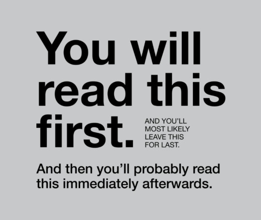
In the ever-scrolling world of Facebook, where attention spans are fleeting, grabbing your audience’s eye is crucial. That’s where visual hierarchy comes in. It’s the art of arranging elements on your Facebook posts to guide the viewer’s gaze and prioritize information.
Here at Deco Design, we’ll explain the visual hierarchy and show you how to use it with Facebook Insights to craft resonated posts.
Why Visual Hierarchy Matters on Facebook
Think of your Facebook post as a visual conversation starter. You want to lead viewers through your message clearly and concisely. Visual hierarchy helps you achieve this by:
Directing attention: First, use eye-catching elements like bold fonts, contrasting colors, and strategic placement to guide viewers to the most important information.
Improving readability: You create a visually pleasing and easy-to-understand post by organizing elements logically. This encourages engagement and reduces confusion.
Boosting brand recognition: Cohesive visuals that align with your brand identity strengthen your presence and make your posts memorable.
Optimizing Visual Hierarchy for Facebook
Now, let’s translate theory into practice:
Hero Image/Video: This is the star of your post — the element that grabs attention first. Use high-quality visuals that are relevant to your message.
Headlines & Text: Keep headlines concise and use clear, easy-to-read fonts. Experiment with different sizes and weights to create contrast.
Call to Action (CTA): Make your CTA button stand out. Use contrasting colors and strong verbs to encourage clicks.
White Space: Don’t overcrowd your post. Utilize white space to separate elements and create a sense of balance.

Facebook Insights is a goldmine of data that can help you understand your audience and optimize your visual strategy. Here’s how:
Track what resonates: Identify which types of visuals (images, videos, etc.) generate the most engagement (likes, comments, shares).
Analyze click-through rates (CTR): See which CTAs with specific colors or designs get the most clicks.
A/B test different layouts: Test variations of your visuals (e.g., headline placement, image size) to see which performs better.
By analyzing Facebook Insights, you can refine your visual hierarchy over time, ensuring your posts are tailored for maximum audience impact.
Bonus Tip: Anchor Text Magic
When promoting your Facebook content on other platforms, leverage anchor text. These are the clickable words that link back to your Facebook post. Use clear, keyword-rich anchor text that entices viewers to click and learn more.
Conclusion
Visual hierarchy is a powerful tool for creating compelling Facebook insights. By understanding its principles and using data-driven insights, you can craft content that captivates your audience, boosts engagement, and drives results.
0 notes
Text
Introduction to Web Design Concepts for Beginners
For beginners in web design, it’s essential to grasp some foundational concepts that will set the stage for creating effective and visually appealing websites. Here are some key concepts to get started: Responsive Design Websites should be designed to provide an optimal viewing experience across a wide range of devices, from desktop computers to mobile phones and tablets. Responsive design…
View On WordPress
0 notes
Text
Learn how Visual Hierarchy transforms the way we design and communicate. Elevate your skills and create compelling visuals that resonate with your audience.
0 notes
Text

Visual Hierarchy
While I was studying about Visual Hierarchy I saw this in googe Si I thought I woud share it in my Visual Dairy. Visual Hierarchy determines how viewers’ attention is directed and can be used to emphasize certain aspects of the design while deemphasizing others.
In this picture so easily they have conveyed Visual Hierarachy. The vital part is understanding how to create effective visuals. By understanding where and when to use hierarchy, Making use of these designers can create visuals that not only engage their audiences but also convey the necessary information.
10/12/23
0 notes
Text

UI/UX Principles
UI/UX Principles are fundamental guidelines governing both User Interface (UI) and User Experience (UX) design. They dictate how visual elements and interactive features should be designed to optimize user satisfaction!
#https://www.techaheadcorp.com/blog/best-ux-design-practices/#ux design#user experience#design best practices#ui/ux principles#mobile app design#web design guidelines#user-centric design#interaction design#usability tips#human-centered design#responsive design#user interface design#ux research#prototyping#wireframing#accessibility in design#visual hierarchy#information architecture#design thinking#mobile app usability
0 notes
Text
Dark Mode vs. Light Mode
Which is Better for User Experience?

The debate between dark mode vs light mode in UI/UX design has gained significant traction. Major platforms like Apple, Google, and Microsoft now offer both, but which one truly enhances user experience? While dark mode offers reduced glare and a modern aesthetic, light mode remains popular for its readability and familiarity. In this article, we explore the pros and cons of dark mode and light mode, and their impact on UX design.
For more UI/UX design insights, visit Pixelizes.com
What is Dark Mode?
Dark mode features light text on a dark background. It’s widely adopted by developers, gamers, and users who prefer low-light environments.
Pros of Dark Mode
Reduces eye strain during nighttime browsing by minimizing screen glare and blue light.
Improves battery efficiency on OLED/AMOLED devices.
Modern UI appeal, perfect for sleek, tech-forward interfaces.
Ideal for light-sensitive users.
Learn more about psychology in UX design and how dark mode can emotionally influence perception.
Cons of Dark Mode
Reduced readability in bright settings.
Harder to scan long-form text or dense content.
Not universally accessible—some users report eye strain from light-on-dark formats.
What is Light Mode?
Light mode—dark text on a white background—is the traditional layout in digital design. It resembles printed content and offers strong visual hierarchy.
Pros of Light Mode
Superior readability, especially for articles and documents.
Works in all lighting conditions without adjustment.
Familiar experience aligned with decades of visual habits.
See how UI design trends have evolved from skeuomorphism to modern layouts.
Cons of Light Mode
Causes more eye strain in dark environments.
Increased battery usage on OLED screens compared to dark mode.
Which Mode is Better for UX?
It depends on your audience and use case:
For reading and productivity apps → Light mode is optimal.
For entertainment, nighttime use, and modern aesthetics → Dark mode prevails.
For battery-sensitive mobile apps → Dark mode has an edge on OLED screens.
Read how AI and machine learning are shaping adaptive UX, including automated dark/light transitions.
Best UX Practice: Let Users Choose!
The best user experience is customizable. Many apps now include:
Dark/light mode toggles
Auto-detection of system preferences
Time-based switching (light during the day, dark at night)
Explore more UX design best practices that prioritize user control and accessibility.
Conclusion
There’s no one-size-fits-all answer in the dark mode vs light mode UI debate. The key lies in offering users control, ensuring contrast and readability, and maintaining design consistency across themes.
Ready to build better, more accessible experiences? Explore more at Pixelizes.com and get inspired by smart, human-centered design.
#Dark Mode#Light Mode#UI Design#UX Design#Dark vs Light Mode#Accessibility in UX#Visual Hierarchy#Eye Strain#OLED Battery Efficiency#Adaptive UX#Night Mode UI#Design Preferences#Customizable UI#Contrast in Design#Readability#UX Best Practices#Human-Centered Design#UX Trends#Modern UI#Design Psychology#Light Sensitivity#Mobile UX#User Control#System Theme Detection#User Experience Optimization
1 note
·
View note
Text
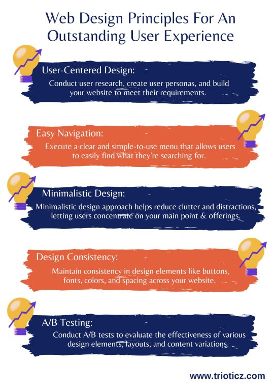
In today’s digital age, a web page is often the initial point of interaction between a business and its customers. To know which layout, and design suite to your website, consult a reputed Website Development Company in Coimbatore or a Web Development Company in Chennai and know the best for your business.
#A/B Testing#Accessibility for Everyone#Attractive Imagery and Visuals#Design Consistency#Easy Navigation#Minimalistic Design#Quick Loading Times#Responsive Design#User-Centered Design#Visual Hierarchy#Web Design#Web Design Company#Web Design Principles#Web Development
0 notes
Text
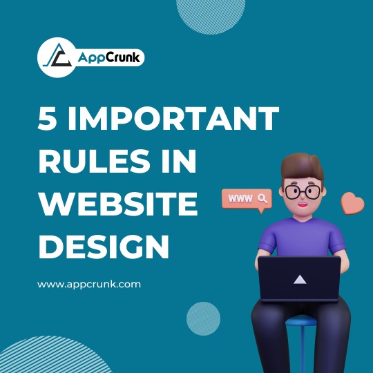
5 Important Rules In Website Design
More Info: www.appcrunk.com
#websitedesign#userexperience#responsivedesign#mobilefriendly#visual hierarchy#call to action#SimplicityInDesign#NavigationDesign#accessibility matters#ContentOrganization#LoadingSpeed#color theory#mobileoptimization#TypographyRules#WhitespaceMatters#ConsistencyInDesign#usability testing#interactive design#imageoptimizationonamazon#CrossBrowserCompatibility#InformationArchitecture#seo best practices#userinterfacedesign#web accessibility#websiteperformance#design principles#userfriendlydesign#AestheticWebDesign
1 note
·
View note
Text


women. you understand
#hierarchies and the laying of hands#the hands that blind the hands that possess the hands that restrain the hands that caress#DO YOU KNOW WHAT I MEAN????#berridraw#anyway this is just an experiment with soft rendering#that and I was plagued by this visual display of their relationship(s)
48 notes
·
View notes
Text
re: elf servants
I think generally there are servants in royal/noble households simply for practical reasons and they generally fall into 2 categories: specialised servants (think, stewards and messengers and scribes, masters of horses or kennels, that kind of thing) and servants who help with the upkeep of the household (cleaning, repairs, cooking and also the apprentices and assistants of specialised servants)
specialised servants are probably quite prestigious roles and fields of industry in their own right, and they are considered full members of a household, and probably are closely linked to the person they serve - it's as much a political and social statement to be Finwe's chief scribe as it is an economic one
but the second category are more associated with the house than the family living in it - for example, Finwe's palace in Tirion would function both as a home and a diplomatic and administrative centre, it would be impossible for him to rule and keep up with chores himself. But Fingolfin's personal home would probably not have any full-time servants - when there more people than usual to feed or house then professionals might be hired, but for the most part I imagine the day to day is done by the family (made possible by the fact elves sleep and eat less than humans)
IRL domestic service (at least in the 18th century) often functioned as a kind of prep stage for adult life (for women in particular, but gender is probably not as big a factor for elves) and I could definitely see this in Valinor - domestic servants being 80% elves between 50-100 who haven't chosen an apprenticeship or similar in another field who are earning extra money to set up their own households, getting experience outside of the family, meeting others in their own ae cohort, learning independence etc. It's a job that comes with the offer of room and board + the wages a king/prince/lord can provide. Not glamorous, but not terrible.
The other 20% is made up of professional servants - experienced elves who are genuinely like the work and are contracted workers as much as a builder or gardener might be. Some of them might be independent and others part of businesses set up by other elves who are really into cooking/cleaning etc.
In Beleriand the situation (for the exiles at least) is probably very different, though I think there would be attempts to adapt the system - but there aren't as many households that need servants and there aren't as many young elves.
#i confess i very much enjoy making ocs who are bg characters and servants are perfect for this#made my own post because i could not fit this in the tags LMAO#also the amount of labour needed to run a pre industrial household is HUGE#but elves generally get around this by having a population that is 90% adult and having magic#and having the time for anyone to become vastly skilled in their field in a lifetime#so things like food and clothing production is almost always communal and in the hands of elves who are REALLY into that specific area#the magic being relevant here because elf magic preserves - elven clothes won't wear out elf food doesn't go off etc#(or at least not as easily as human food/clothes)#i prefer to write elf societies that only visually mirror human ones - to an outsider it looks like a hierarchy of lord and servants#but the dynamic is very different#but that is just my preference#silm meta#not really a meta i just need to be able to find this post on my blog lol#long post#this is one of my fave topics hence the rambling
127 notes
·
View notes
Text
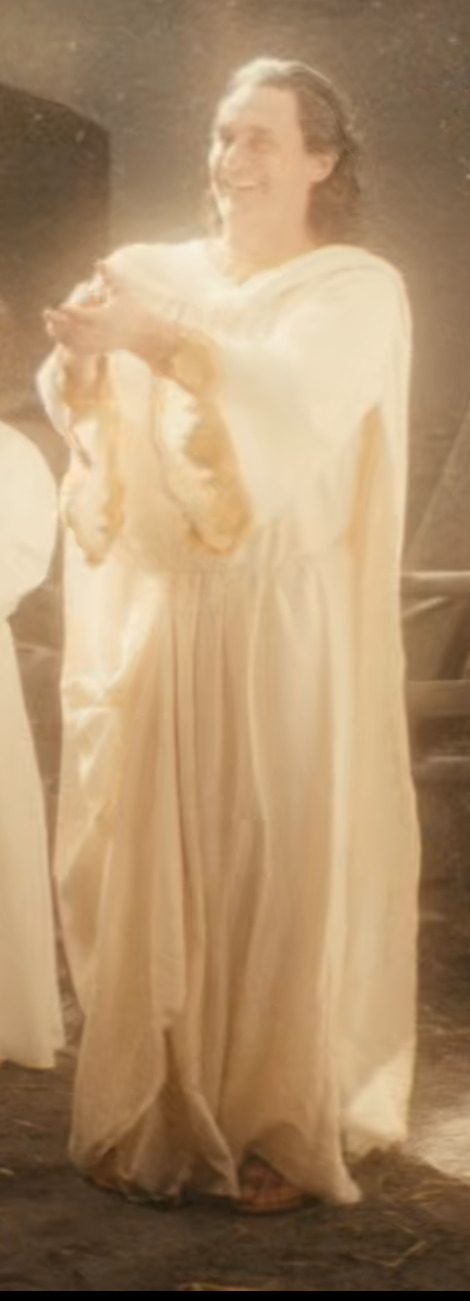
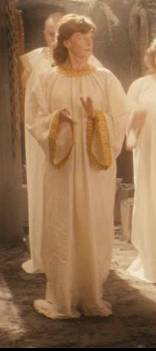
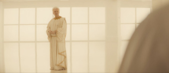
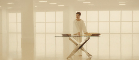
i know ive had like 16 apoplexies in the last 4 hours but im really raking through the weeds on this one: let's talk ✨angel costumes✨ im going to leave the modern ones alone for a moment, perhaps ill take a look at them later on, but for the moment im essentially going to focus on the job minisode.
so let's go in order of what we would understand is the heaven hierarchy. first up we have lord farquaad gabriel:
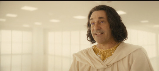
key points:
heavy gold collar embellishment
slight gold cuffs
superhero cape
accentuated waistline
purple eyes as per
biggest and Baddest angel around, michael:
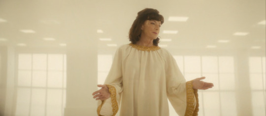
key points:
heavy gold collar embellishment
heavier gold cuffs
more noticeable gold makeup accents
my bamf-y bOY:
key points:
(im presuming it might be down to lighting but his costume is noticeably duller on earth, which kinda fits with how his general daily outfit elevates in s1 when he discorporated, but fundamentally retains the same features)
heavy gold collar embellishments
gathered sleeves with heavy gold cuffs
accentuated waistline
snazzy little gather of material on the waist, also embellished in gold
the light of my life, muriel:
key points:
simple gold collar embellishment but embellishment nonetheless
similarly small gold detail on cuffs
some gold makeup accents (i think eyeshadow?)
and these other angels (im going to call them the Sycophant Squad bc why not) in the background:
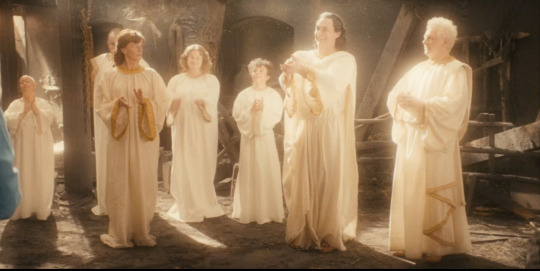
key points:
similar to muriel; small gold embellishments on collars and cuffs, possibly even less than muriel's, but otherwise unadorned as far as we can tell
(also special shout out that the representation in this show is unparalleled, mad behaviour i love it sm).
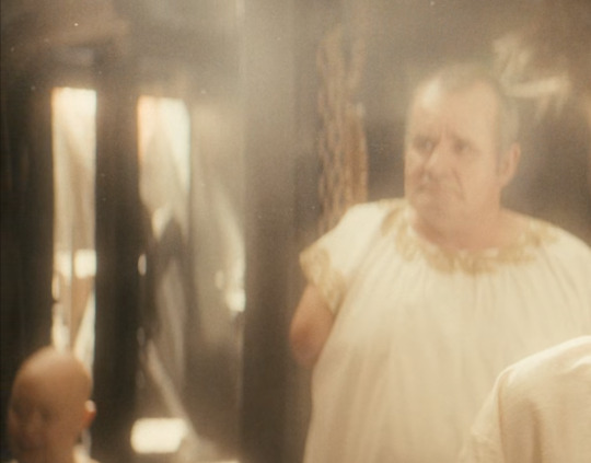
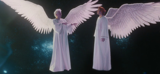
so we could attribute aziraphale's costume to him not only being of relatively high rank (when you take into account that there are 10 million angels milling around somewhere) in the GO!angels hierarchy, and to boot he's one of the main characters. but... his angelwear is almost so ornate that it looks like he actually genuinely belongs in the archangel cohort?
ive remarked on it a couple of times but god still seems to be present in heaven in the job narrative compared to 'modern day': The Lighting Change Is Everything. and when you take into account that his costume before the Beginning used to look like this:
the impression i get is that between this point and job, he may have had a promotion? now i get that neil has said before that fashion changes in heaven, but the general themes (however individualistic the costumes are depending on the character) seem to follow the same trend: the more embellishment and detail in their design, the higher the rank.
the above picture of aziraphale and AWCW may well be because it's simply long before job and the fashion was simpler (ie had more important things to do), so i won't double down on it, but i do feel there might be a little something-something there.
in any case, we know that muriel is below the rank of a throne or dominion. neil has said that the angel hierarchy in good omens runs like this, but nothing that explicitly says about thrones or dominions; but from christian angelology (which he said he and terry based their hierarchy iirc, he said in another ask somewhere), they are in the show at least high ranking below seraphim and cherubim, presumably below capital-A-Archangels, and presumably higher than aziraphale, a principality.
neil also alludes in the ask that muriel is one of the lower tiers/choirs; so in this, we have our scales - muriel's dress being the lowest tier, and gabriel's being the highest tier. when we look at aziraphale's dress, it is ornate, and it is Fancy; is this representative of the midpoint in angel attire (ie a principality, more or less), or could it be indicative of a higher rank at the time?
idk where im going with this in particular, but it just seems very strange to me that there would be a two-step system to how the angels dress - that everyone from presumably principality rank and above gets lovely gold things and fancy dress patterns, and then small gold detail but otherwise plain gowns if below a principality. again, might just be that aziraphale is a Main Character, but it's fun to speculate right?✨
#i just want to soak up every last visual cue in this show im OBSESSED#and am avoiding real life work this is way more fun#good omens#flashback meta#aziraphale meta#s2 meta#costume meta#angel hierarchy spec
35 notes
·
View notes