
Don't wanna be here? Send us removal request.
Statistics
We looked inside some of the posts by learnerworld and here's what we found interesting.
Average Info
Notes Per Post
38
Likes Per Post
25
Reblog Per Post
10
Reply Per Post
3
Time Between Posts
2 months
Number of Posts By Type
Text
15
Note
1
Video
1
Last Seen Tumblr Blogs


Fun Fact
69% of Tumblr users are millennials.
Text
Memory Optimization in Pandas: Why category Sometimes Uses MORE Memory!
Have you ever tried converting a Pandas column to category dtype, expecting less memory usage only to find it increased instead? 🤯 Let’s break it down! Using dtype={'column': 'category'} should reduce memory usage because: ✅ It stores unique values separately and uses integer codes to reference them. ✅ It works best for columns with many repeated values (e.g., product categories, country names). Hidden Insight 🔎 : If your dataset has many unique values, category dtype adds overhead instead of saving space. Here's why: ❌ Every unique value needs its own entry in the category mapping. ❌ If your column had short text values (e.g., 'NY', 'CA'), the original object type was already optimized. ❌ category needs extra storage for mapping each value to an integer index. You can run a quick test to see memory usage differences as given in the code.
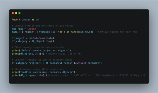
In short; If the column has repeated values, category saves space. If the column has mostly unique values, category uses more memory than object. Use category only when: 👉 The column has a limited number of unique values (e.g., department, product type). 👉 You plan to group, filter, or analyze categories frequently. 👉 The column was using object dtype and taking up too much space. ⚡ What Are Your Thoughts? Have you noticed 'category' data type using more memory in your projects? Share your experience!
0 notes
Text
Code Smarter, Not Harder: Top AI Assistants in 2025
If you work in tech, you already know the drill: there’s always something new to catch up on — a library, a tool, a syntax update, or a surprise function you suddenly need to implement. It feels like a never-ending race, isn’t it?
The pressure to “keep up” is real. But here’s the shift: AI assistants are now helping us learn faster, grow more confidently, and adapt without burning out.
Let’s admit it — as humans, we have limits. Memory fades. Context-switching drains us. And no, we don’t have to be a walking storage device who remembers every syntax rule or function signature.
Instead, we need to act smart. Let these polite, efficient AI assistants help us code smarter — and think clearer. Many of these are free to start with, and you can always upgrade later if needed.
In this article, we’ll explore today’s top AI coding assistants, compare their unique strengths, and help you decide which tools are best suited for your workflow.
Why AI Coding Assistants Matter
AI coding assistants can now suggest, refactor, and even debug code in real time — transforming how developers write software
These tools:
· Boost productivity by reducing repetitive coding tasks.
· Improve code quality with intelligent suggestions.
· Enhance collaboration by integrating with development environments.
· Reduce errors by detecting vulnerabilities and optimizing code.
Top AI Coding Assistants in 2025
1. GitHub Copilot
Best for: General-purpose coding, multi-language support.
Key Features: Code completion, function suggestions, debugging, documentation generation.
USP: Most widely adopted AI coding assistant, integrated into VS Code & JetBrains.
Limitations: May occasionally generate incorrect or outdated code.
Data Privacy: Copilot for Business does not use code for training; personal usage may contribute.
Recently, GitHub Copilot Agent was also released — an upgrade over the original Copilot, offering more autonomous task execution, chat-based interactions, and deeper IDE integration for navigating code, running commands, and making decisions with minimal prompts.
2. Amazon CodeWhisperer
Best for: AWS-based development.
Key Features: Code completion, security vulnerability detection, AWS SDK integration.
USP: An assistant optimized for cloud-native applications.
Limitations: Less effective outside AWS ecosystem.
Data Privacy: Does not use customer code for training.
3. ChatGPT (Not specifically a Coding assistant but quite popular among learners for coding help)
Best for: Learning, debugging, code explanations.
Key Features: Conversational programming, multi-language support, code generation.
USP: Great for prototyping and explaining complex concepts.
Limitations: Not IDE-integrated, lacks real-time coding assistance.
Data Privacy: OpenAI may use interactions for training unless opted out.
Other Tools:
DeepCode (now part of Snyk Code) is widely used for security-focused static analysis. While I haven’t used it hands-on yet, developers praise its ability to catch subtle vulnerabilities early in the dev cycle.
Sourcery is gaining traction among Python developers for its ability to auto-refactor and improve code readability. It integrates with VSCode and PyCharm, and early user reviews highlight its value in maintaining clean codebases.
Cursor AI is positioned as a “Copilot alternative with deep file awareness.” While I’ve only explored it as such, it appears to focus heavily on project-wide understanding and autonomous generation.
Tabnine and Windsurf (formerly CodiumAI) have made strong cases for privacy-conscious and team-based AI development, respectively.
Where caution is still needed:
· Code quality and correctness: Code quality and correctness: AI can be confidently wrong. Sometimes, I get code that looks perfect, but fails because it uses a function that does not even exist. You need to review and test the code (It will help you there too!)
· Security blind spots: Most tools aren’t security-aware by default. They might generate code that works, but doesn’t sanitize inputs or handle edge cases.
· Enterprise concerns: Teams are still wary of using AI-generated code from tools trained on public repositories. Licensing, IP ownership, and data privacy are legitimate considerations.
Final Thoughts
AI coding assistants are revolutionizing software development, making coding faster, smarter, and more efficient. Whether you're a seasoned developer or just starting out, leveraging these tools can enhance your workflow and boost productivity.
The future is not AI versus developers — it’s developers with AI, building better software together. The question now is how to adopt them responsibly, not whether to use them at all.
Have you explored any AI coding assistants yet? Which one do you use, and what’s your experience with it?
If you haven’t tried one, have you heard about them? What’s holding you back — trust, accuracy, privacy, or just not the right time? Drop your thoughts in the comments!
1 note
·
View note
Text
Performance measures for classifiers: F1-Score
In continuation of my previous posts on various , here, I’ve explained the concept of single score measure namely; ‘F -score’.
In my previous posts, I had discussed four fundamental numbers, namely, true positive, true negative, false positive and false negative and eight basic ratios, namely, sensitivity(or recall or true positive rate) & specificity (or true negative rate), false positive rate (or type-I error) & false negative rates (or type-II error), positive predicted value (or precision) & negative predicted value, and false discovery rate (or q-value) & false omission rate.
I had also discussed about accuracy paradox, relationship between various basic ratios and their trade-off to evaluate performance of a classifier with examples.
I’ll be using the same confusion matrix for reference.
Precision & Recall: First let’s briefly revisit the understanding of ‘Precision (PPV) & Recall (sensitivity)’. [You may refer https://learnerworld.tumblr.com/post/153292870245/enjoystatisticswithmeppvnpv & https://learnerworld.tumblr.com/post/152722455780/enjoystatisticswithmesensitivityspecificity for detailed understanding of these ratios]
Precision can be interpreted as ‘proportion of positive identifications was actually correct’.
Precision = TP/((TP+FP) )
If FP = 0, then Precision = 1
Recall can be interpreted as ‘proportion of actual positives was identified correctly’.
Recall = TP/((TP+FN) )
If FN = 0, then Recall = 1
Trade-Off: For evaluating the model performance, we must observe both precision and recall. It’s quite easy to understand that there is a trade-off between the two.
If we try to maximize recall (i.e., reducing false negatives); the classifiers boundary will minimize precision (i.e., increasing false positives) and vice-versa.
Therefore, we need a measure that relies on both precision and recall. One such measure is ‘F-Score’.
F1-Score: This is a weighted average of the precision and recall. F-measure is calculated as harmonic mean of precision and recall. [Harmonic mean is used in place of arithmetic mean as arithmetic mean is more sensitive to outliers*.
F1-Score = (2*Precision*Recall)/((Precision +Recall) )
The F-Measure will always be nearer to the smaller value of Precision or Recall. For problems where both precision and recall are important, one can select a model which maximizes this F-1 score. For other problems, a trade-off is needed, and a decision has to be made whether to maximize precision, or recall.
F1 score is a special case of the general Fβ measure (for non-negative real values of β):
Fβ = ((1+ β^2 )*Precision*Recall)/((β^2*Precision +Recall) )
Two other commonly used F measures are the F2 measure and the F0.5 measure.
As the F-measures do not take the true negatives into account, and that measures such as the Matthews correlation coefficient, Informedness or Cohen’s kappa may be preferable to assess the performance of a binary classifier.
References:
*https://www.quora.com/When-is-it-most-appropriate-to-take-the-arithmetic-mean-vs-geometric-mean-vs-harmonic-mean
Sasaki, Y. (2007). “The truth of the F-measure” (PDF). Van Rijsbergen, C. J. (1979). Information Retrieval (2nd ed.). Butterworth-Heinemann. Powers, David M W (2011). “Evaluation: From Precision, Recall and F-Measure to ROC, Informedness, Markedness & Correlation” (PDF). Journal of Machine Learning Technologies. 2 (1): 37–63. Beitzel., Steven M. (2006). On Understanding and Classifying Web Queries (Ph.D. thesis). IIT. CiteSeerX 10.1.1.127.634. X. Li; Y.-Y. Wang; A. Acero (July 2008). Learning query intent from regularized click graphs (PDF). Proceedings of the 31st SIGIR Conference. See, e.g., the evaluation of the [1]. Hand, David. “A note on using the F-measure for evaluating record linkage algorithms - Dimensions”. app.dimensions.ai. Retrieved 2018-12-08.
0 notes
Text
🧠Imagine you're at an all-you-can-eat buffet 🍽️. Instead of filling your plate with everything at once, you take one item at a time, savoring it, and going back for more only when you're ready.
📌This is exactly how generators work in Python—they serve you data on-demand, making them super efficient and memory-friendly.
A generator is like a "lazy chef" in your code. Instead of preparing an entire feast (dataset) in one go, it cooks and serves one dish (data item) at a time, only when you ask for it. This is done using the yield keyword in Python.
E.g.,
def lazy_numbers():
for i in range(1, 4):
yield i # Produces one number at a time
gen = lazy_numbers()
print(next(gen)) # 1
print(next(gen)) # 2
print(next(gen)) # 3
🔍Notice how the generator "pauses" after each yield and resumes from where it left off.
Why Use Generators ❓
1️⃣ Memory Efficiency:
Instead of loading the entire dataset into memory (like a list), a generator produces data on-the-fly. E.g., Processing a 1GB file line by line without consuming 1GB of memory.
2️⃣ Faster Execution:
Generators produce data as needed, so you save time by not creating unnecessary items upfront.
3️⃣ Simpler Code:
They reduce boilerplate and make code cleaner when dealing with streams of data.
4️⃣ Infinite Data Streams:
You can generate an infinite sequence without worrying about memory constraints.
E.g., Scenarios like generating IDs, timestamps, or test data.
🚀Why Python Outshines Other Languages ❓
👉Ease of Use: Python's yield keyword is intuitive and concise. Languages like Java require more boilerplate code to achieve similar behavior.
👉Versatility: Generators integrate seamlessly with Python's rich ecosystem (e.g., itertools, comprehension-like syntax).
👉Community: Python’s focus on readability and simplicity makes generators accessible even to beginners.
Generators are your secret weapon for writing clean, efficient, and scalable code.
Have you used generators before? What’s your favorite use case? Let’s chat in the comments! 😊
0 notes
Text
What Is a Dynamically Typed Language?
When learning Python, you might hear the term “dynamically typed language” frequently. But what does it mean? Let’s break it down.
Typing refers to type-checking—the process of verifying whether the data types in your code are compatible with the operations being performed.
1️⃣ Strongly vs. Weakly Typed Languages
Strongly-Typed Languages (e.g., Python): These languages don’t allow type-coercion (implicit type conversion). For example:
pythonCopy code"1" + 2 # TypeError: cannot concatenate 'str' and 'int'
Weakly-Typed Languages (e.g., JavaScript): These languages allow type-coercion:
javascriptCopy code"1" + 2 // Outputs: "12"
2️⃣ Static vs. Dynamic Typing
Type-checking can occur at two stages:
Static Typing (e.g., Java, C++): Data types are checked before the program runs. You must declare the type of variables explicitly:
javaCopy codeintx=10;
Dynamic Typing (e.g., Python): Data types are checked during program execution. Variable types are inferred automatically:
pythonCopy codex = 10 # No need to declare 'x' as an integer.
Python: A Dynamically Typed Language
Since Python is an interpreted language, it executes code line by line. Type-checking happens on the fly, allowing you to write flexible and concise code.
Example: pythonCopy codex = "Hello"x = 10 # No error—Python allows 'x' to change types.
This flexibility makes Python beginner-friendly but also increases the risk of runtime errors if types are misused.
Key Takeaway
Dynamic typing simplifies coding by removing the need for explicit type declarations. However, it also requires careful testing to ensure type-related bugs don’t creep in.
Python learners, embrace dynamic typing—it’s one of the reasons Python is so versatile and fun to use!
2 notes
·
View notes
Text
Exploring Python's Core Data Structures: A Beginner’s Guide
Have you ever thought of data structures as something complicated and full of code? Well, not really! Let's break down the basic Python data structures with easy-to-understand examples and show how they can make your coding more efficient.
1. Lists: The Handy Shopping Cart
Think of a List as your shopping cart. You can put any item in it, remove things, and even change the order of items whenever you like. It's like an ever-changing basket of goods.
· Key Features:
Ordered (items stay in the order you add them)
Mutable (you can change, add, or remove elements)
· Practical Example: Want to keep track of groceries you're buying? A list is perfect for that.
· Time Complexity:
Adding an item at the end: O(1) (fast)
Removing or adding an item somewhere in the middle: O(n) (slower for large lists)
Use Case: Great for when you need to store items that change over time, like a to-do list, shopping cart, or a collection of names.
2. Tuples: The Fixed Book Collection
A Tuple is like your favorite book collection at home. Once you've selected the books, you don’t change them. It's an immutable collection—you can't add new books or take one out, but you can still read them anytime.
· Key Features:
Ordered (like a list, but can't be changed after creation)
Immutable (no changes after they're created)
· Practical Example: Perfect for holding things you don't want to change, like your birthdate or the fixed coordinates of a city (latitude, longitude).
· Time Complexity:
Accessing any element: O(1) (very fast)
No time complexity for modification (because you can’t modify them!)
Use Case: Use tuples when you need a fixed collection of data. Example: geographic coordinates, dates, and other fixed sets of information.
3. Sets: The Unique Collection of Friends
A Set is like your group of friends at a party. You don’t allow duplicates—each friend is unique! Sets automatically ignore any repeated names you try to add.
· Key Features:
Unordered (don’t care about the order of items)
Mutable (you can add or remove items, but no duplicates are allowed)
· Practical Example: If you want to keep track of unique visitors to your website, a set is perfect because it automatically removes duplicate entries.
· Time Complexity:
Adding and removing items: O(1) (very fast)
Checking if an item is in the set: O(1)
Use Case: Sets are ideal for situations where you only care about unique items, like when you're checking for unique words in a text, or distinct entries in a survey.
4. Dictionaries: The Address Book
A Dictionary is like an address book. You store someone's name (the key) and their phone number (the value). You can find a person's phone number very quickly by looking them up by name.
· Key Features:
Unordered (no specific order of keys and values)
Mutable (you can add, remove, or change values)
· Practical Example: Perfect for when you need to store data in pairs, like a contact list where each name is associated with a phone number.
· Time Complexity:
Accessing a value by key: O(1) (fast)
Inserting or removing a key-value pair: O(1) (fast)
Use Case: Dictionaries are great for storing mappings of one thing to another, like a contact list, employee ID _ name mapping, or any key-value pairing.
5. Strings: The Immutable Text
A String is like a sentence. Once written, you can read it and use it, but you can't change the individual letters directly. Instead, if you need to change something, you must create a new string.
· Key Features:
Ordered (the letters have a defined position)
Immutable (you can't change individual characters once created)
· Practical Example: Used for storing text, like a user’s name or a sentence from a book.
· Time Complexity:
Accessing a character by index: O(1)
Modifying a string (creates a new string): O(n) (since a new string must be created)
Use Case: Strings are used to store and manipulate textual data, like messages, names, or descriptions.
Python's core data structures (Lists, Tuples, Sets, Dictionaries, and Strings) are easy to work with, highly efficient, and help you solve real-world problems. Whether you need a flexible, changeable list of items or a fixed, immutable tuple, Python has got you covered.
What’s Next?
Stay tuned! Next, we’ll dive into Arrays—another powerful container type. We’ll also explore advanced data structures and lesser-known but powerful functions from Python’s collections module to make your code even more efficient.
Feel free to comment or share your favorite Python data structure! What’s your use case? 📝
0 notes
Text

Thank you @just-for-me-yanno and everyone who got me to 10 reblogs!
When I started learning R, I created some simple functions for data-cleaning tasks that I planned to use frequently. I use to copy and paste those functions in my scripts (r files) to clean various data sets. 🤷🏻♀️
Then I realized there might be a better way to do the job. Copy-pasting every time is annoying!
Soon I found there was a simple & elegant solution to this😎
Do you want to learn what’s that?
📌You can save your function(s) in separate R script(s) and source the script when needed.
You can follow these steps
👉 Write your function(s) [e.g., func1] in a new script myfunc.R [𝐈𝐧 𝐭𝐡𝐢𝐬 𝐬𝐜𝐫𝐢𝐩𝐭, 𝐲𝐨𝐮 𝐨𝐧𝐥𝐲 𝐤𝐞𝐞𝐩 𝐲𝐨𝐮𝐫 𝐟𝐮𝐧𝐜𝐭𝐢𝐨𝐧(𝐬)]
👉In other R files, where you intend to use this function, you can simply source it using the 𝐬𝐨𝐮𝐫𝐜𝐞() function.
👉 Try running this code 𝐬𝐨𝐮𝐫𝐜𝐞(𝐦𝐲𝐟𝐮𝐧𝐜.𝐑)
👉 you’ll see the function(s) is loaded to your global environment.
💡 Modularizing your code makes it easier to read & debug. Start practicing it now.
9 notes
·
View notes
Text
To show changes/patters over time, we might want to create animated charts (like those moving bar chart, I bet you’ve seen at least once & got fascinated about 😎)
gganimate package extends the grammar of graphics as implemented by ggplot2 to include the description of animation. It does this by providing a range of new grammar classes that can be added to the plot object in order to customize how it should change with time.

1 note
·
View note
Text
When I started learning R, I created some simple functions for data-cleaning tasks that I planned to use frequently. I use to copy and paste those functions in my scripts (r files) to clean various data sets. 🤷🏻♀️
Then I realized there might be a better way to do the job. Copy-pasting every time is annoying!
Soon I found there was a simple & elegant solution to this😎
Do you want to learn what’s that?
📌You can save your function(s) in separate R script(s) and source the script when needed.
You can follow these steps
👉 Write your function(s) [e.g., func1] in a new script myfunc.R [𝐈𝐧 𝐭𝐡𝐢𝐬 𝐬𝐜𝐫𝐢𝐩𝐭, 𝐲𝐨𝐮 𝐨𝐧𝐥𝐲 𝐤𝐞𝐞𝐩 𝐲𝐨𝐮𝐫 𝐟𝐮𝐧𝐜𝐭𝐢𝐨𝐧(𝐬)]
👉In other R files, where you intend to use this function, you can simply source it using the 𝐬𝐨𝐮𝐫𝐜𝐞() function.
👉 Try running this code 𝐬𝐨𝐮𝐫𝐜𝐞(𝐦𝐲𝐟𝐮𝐧𝐜.𝐑)
👉 you’ll see the function(s) is loaded to your global environment.
💡 Modularizing your code makes it easier to read & debug. Start practicing it now.
9 notes
·
View notes
Note
Hi Nisha, Pls let me know if you would be interested in a corporate training workshop to be delivered in Delhi in person? Thanks
Hello,
Please reach out to me at [email protected] for further discussion.
Thanks
1 note
·
View note
Text
Data Visualization & Storytelling Part_5: Chart design principles
What are some rules while designing my #chart❓ Wait, do we have some rules about how we set axes limits, how do we name axes & the chart, what colors do we choose, do we need legends, should we add text or not, font/font size/theme/other aesthetics ⁉
If yes, where I can read about those❓ I haven’t heard about any of those.
⚡When it comes to designing a chart (after selecting an appropriate chart & creating a base chart _ Refer to my previous posts on the same), we need to carefully choose the above-mentioned features in order to
👉 Avoid junk & reduce cognitive load
👉 Help Color blind people read it effectively without losing any information
👉 Avoid lying with the chart intentionally or unknowingly
👉 Highlight the message that we want to convey
👉 Fit the available space that we have for the chart (maybe on a newspaper/magazine/dashboard or slide deck for example) without distorting the information
[Yes sometimes, simply resizing your chart can distort information and mislead the readers]
👉 Make it an effective chart for the TARGET reader
👉 Make it look pleasant yet easy to read
[It would not be a useful chart if your reader is scratching his/her head trying to read a pretty-looking chart]
But how do we achieve this, the answer is not as straight forward as a mathematical formula/theorem for all use cases.
Curious to know more about it? Stay tuned. I’ll post about those in my next post.
0 notes
Text
Data Visualization & Storytelling Part_4: How to read a chart?
In continuation to my previous post on #datavizualization
📌When it comes to reading a chart, it’s not only the actual chart but also the other supporting elements such as titles, subtitles, legends, scales, sources, etc. that makes a chart complete.
✍It’s critical to read them carefully to grasp what the chart is about, what is being measured, and how it’s being measured. Alberto Cario, in his book, suggests that to read a chart well, you must focus on:
The features that surround the content and support it —>the chart’s scaffolding—and
on the content itself —> how the data is represented or encoded. The scaffolding consists of features of the chart.
⚡If you struggle to read a chart or think of a suitable chart, you must spend some time developing graph literacy. Basically, you need to learn about visual encoding of the charts.
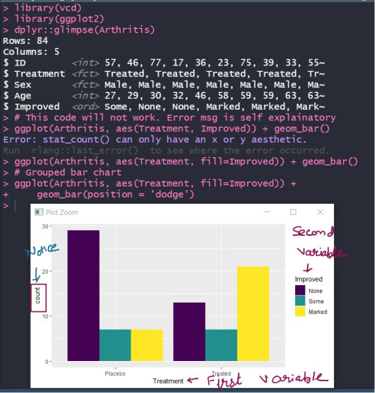
✍🏻For example, many times after getting some clarity on first step (selecting appropriate charts), learners are aware that they need to create stacked/grouped bar charts while plotting the distribution of two categorical variables.
When I ask them to write ggplot2 (I hope you’re familiar. If not, still you’ll get the context) code for the same, they put one variable on x-axis & other on y-axis. 🤦🏻♀
And of course, it will not work! (🛑 Pause reading & think WHY)
I hope you got it. It's not about the code but your understanding of chart elements 😃 .
👉 In a bar chart, the height/length of the rectangular bars basically represents counts/proportions/percentages.
👉 So one of the axes (usually the y-axis) has to have the counts, while the other axis will represent one of the categorical variables.
👉 As you’re planning to plot 2 categorical variables, you’ll either stack or group the categories of that second variable. Refer Image below 👇
Don’t forget to check the comment section for an awesome book to help you.
5 notes
·
View notes
Text
Data Visualization & Storytelling Part_3: How to create a chart (in R or other tools)
📌In my previous posts, I had talked about how you should study data visualization & how to start selecting basic charts.
Creating a chart depends on the tool you’re using. 😎 In my onion, R provides a great ecosystem for creating & designing amazing charts (be it static or animated, or interactive charts).
If you’re interested to learn about how to create a beautiful chart using r, I am sharing some of the awesome resources that I follow 📜
We don’t need to remember every single function/argument that we might need while customizing a chart. R graph gallery and plotly e-book are the sources, you can rely on when the need arises.
Needless to say, StackOverflow & R community can come to the rescue when stuck in a bug.
👇 Some of my favorite resources are in the comments.
1 note
·
View note
Text
Data Visualization & Storytelling Part_2: Selecting an appropriate visual
📌In my previous post, I had talked about the topics that should be studied/taught to master data visualization & then later storytelling with data.
📌 When it comes to data visualization, it is crucial to know what can be a suitable chart for a give objective.
⚡If you’re the one who struggles to select the right chart for your data, this post will be useful for you 🚶🏻♀️.
🛑 WAIT ! it’s not about the RIGHT chart but the APPROPRIATE chart or the chart that suits your need.
Sometimes, even technically correct charts are misleading or useless 💡
🤷🏻♀️ Not sure how? Don’t worry we will discuss the same in coming posts.
📜 Selecting the appropriate chart depends on mainly these factors:
👉 Exploratory or Explanatory Space:
If you want to plot your data to explore it to find hidden insights, relationship between variables, outliers etc., then you’re in exploratory space
If you want to use charts/graphs to explain the insights, make a point, show some interesting pattern to someone (your boss/colleague/or may be your friends), then you’re in explanatory space.
👉 Number of variables & data type:
Selection of chart depends on how many variables do you want to plot and how are you measuring those. Are those variables categorical or numerical?
👉 Objective: What’s the purpose of creating a graph? Do you want to plot data to find association between those or to look at the pattern over time? Are you interested in analyzing the extreme points or how the relationship between two variables is affected by a new variable?
You need to have a clear objective in your mind to be able to select the appropriate chart.
🖊 In many situations, there is more than one graph/chart which can be plotted however, you need to choose the one which is easily interpretable rather than one that looks fancy.
My video will help you select a #chart for your data & objective.
youtube
📜In my upcoming posts, I'll be discussing more on this topic. Stay Tuned
0 notes
Text
Data Visualization & Storytelling Part_1: How to master data visualization & storytelling?
✍Data visualization/storytelling is one of the most important yet underrated skills in analytics/ data science domain. When it comes to learning data visualizations, often learners focus too much on the tool.
🤦🏻♀️And most of the courses out there in the market also focuses on ‘how to create charts using XYZ tool?’ part and maybe ‘designing the chart to make it pretty [😯 beautiful charts are not always useful though!]’ However, I personally believe that while learning/teaching data visualization, one must focus on the following 👇:
👉WHEN to create which chart?
👉HOW to create a particular chart?
👉How to INTERPRET a chart?
👉What are some chart DESIGN PRINCIPLES?
👉How to BEAUTIFY a chart?
👉How to AVOID MISLEADING CHARTS?
👉How to tell a COMPELLING DATA STORY?
In my trainings, I try to give emphasis on these points while keeping in mind the time limit 🕓 to complete the specific TOC.
📜In my upcoming posts, I'll be talking about all these. Stay Tuned
9 notes
·
View notes
Video

Don't get fooled by misleading charts presented to you anymore! 📊 📈 Charts are everywhere, newspapers, social media, magazines, presentations, blogs. And maybe you're getting deceived by lies, hidden information, too much information, biases, prejudices. 🤥 🤦🏻♀️ Educate yourself and learn if the chart is misleading. If you create charts/dashboards, learn how not to create misleading ones. In my recent talk at WIDS Silicon Valley, I had summarised many points to help you get better at avoiding chart lies. The talk is useful irrespective of the charting tool used (Excel, R, Python, PowerBI, Tableau, D3, whatever) 👉🏻 The talk is now available on YouTube. Share it with those who might be interested. #datascience #dataviz #chart #analytics
0 notes
Text


🕓 R Tips to save your time & effort 😎 ✍ If you want to get the messy output of your models in a clean tibble format, you might want to look at the broom package in R. Also, if you need 📜 Presentation-Ready Data Summary and Analytic Result Tables; gtsummary package can help you. See some examples 👇
0 notes