littlespacesquid
Little Space Squid
You can call me Squid. 23 | she/her.This here is my blog to share my art.Traditional and digital!
29 posts
Last active 60 minutes ago
Don't wanna be here? Send us removal request.
Last Seen Blogs

acepunks
@mobydyke now
leafkingofbirds
all birds bow before leaf
musclebeasttbd
Musclebeasttbd
yesjsrn19
Drone Nich!
makeusdo
JPOP stuff (mostly)
Text
reminder to submit your art to tumblr radar it's like a free blaze + they will usually accept it
40K notes
·
View notes
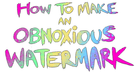
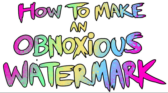
Text
...that your audience won't hate.
This is a method I started using when NFTs were on the rise - thieves would have to put actual work into getting rid of the mark - and one that I am now grateful for with the arrival of AI. Why? Because anyone who tries to train an AI on my work will end up with random, disruptive color blobs.
I can't say for sure it'll stop theft entirely, but it WILL make your images annoying for databases to incorporate, and add an extra layer of inconvenience for thieves. So as far as I'm concerned, that's a win/win.
I'll be showing the steps in CSP, but it should all be pretty easy to replicate in Photoshop.
Now: let's use the above image as our new signature file. I set mine to be 2500 x 1000 pixels when I'm just starting out.
Note that your text should not have a lot of anti-aliasing, so using a paint brush to start isn't going to work well with this method. Just use the standard G-Pen if you're doing this by hand, or, just use the text tool and whichever font you prefer.
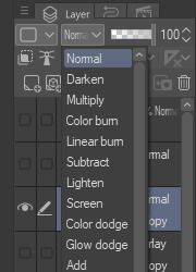
Once that's done, take your magic wand tool, and select all the black. Here are the magic wand settings I'm using to make the selections:

All selected?
Good.
Now, find a brush with a scattering/tone scraping effect. I use one like this.
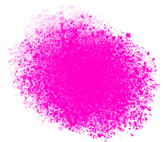
You can theoretically use any colors you want for this next part, but I'd recommend pastels as they tend to blend better.
Either way, let's add some color to the text.
Once that's finished,
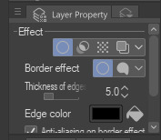
You're going to want to go to Layer Property, and Border Effect

You'll be given an option of choosing color and thickness. Choose black, and go for at least a 5 in thickness. Adjust per your own preferences.
Now create a layer beneath your sig layer, and merge the sig down onto the blank layer.
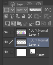
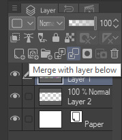
This effectively 'locks in' the border effect, which is exactly what we want.
Hooray, you've finished your watermark!
Now let's place that bad boy into your finished piece.
You'll get the best mileage out of a mark if you can place it over a spot that isn't black of white, since you'll get better blending options that way. My preference is for Overlay.

From here, I'll adjust the opacity to around 20-25, depending on the image.
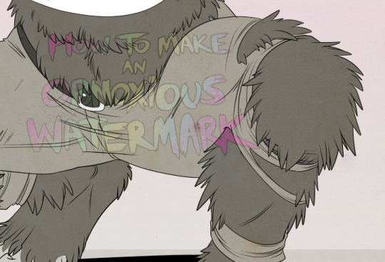
If you don't have a spot to use overlay, however, there's a couple other options. For white, there's Linear Burn, which imho doesn't look as good, but it still works in a pinch.
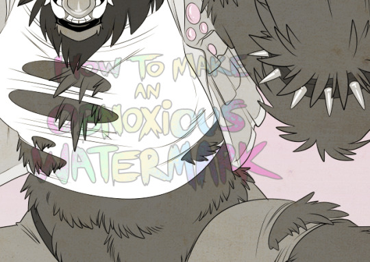
And for lots of black, you have Linear Light
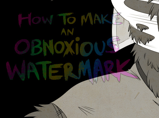
Either way, you're in business!
EDIT since this has escaped my usual circles, and folks aren't as familiar with my personal usage:
An example of one of my own finished pieces, with watermark, so you can see what I mean about 'relatively unobtrusive'-- I try to at least use them as framing devices, or let them work with the image somehow (or, at the very least, not actively against it).
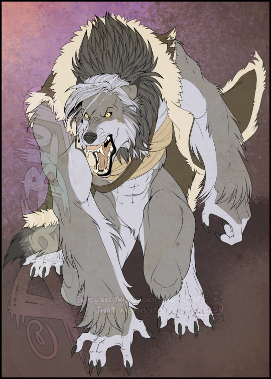
I know it's a bummer for some people to "ruin" their work with watermarks, which is part of the reason I developed this mark in particular. Its disruption is about as minimal as I can make it while still letting it serve its intended purpose.
There's other methods, too, of course! But this is the one I use, and the one I can speak on. Hope it helps some of you!
52K notes
·
View notes
Text
Doodle Brows the Clown
I have been repeating Doodle Brows to the tune of Stylo by Gorillaz for the last 10mins.
#art#artists on tumblr#artist#digital art#little space squid#lss#digital artist#drawing#clown oc#clown art#clownblr
3 notes
·
View notes
Text
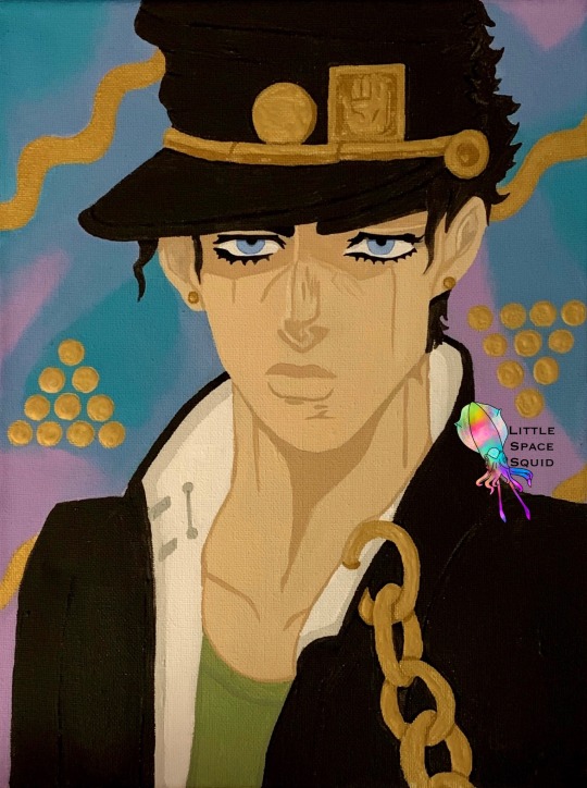
Jotaro Kujo - Winter 2021
I felt that the foil piece my cousin asked for wasn’t enough. So I had asked him for another favorite character of his. He told me Jotaro and I began. The background is inspired by Star Platinum to give a pop of color to the piece as well.
#art#fanart#traditional art#artists on tumblr#artist#little space squid#anime#lss#jotaro kujo#jotaro cujoh#Jotaro#jjba#jojos bizarre adventure#jojo#stardust crusaders#acrylpainting#acrylic canvas#manga
8 notes
·
View notes
Text
Joshua Graham- Winter 2021
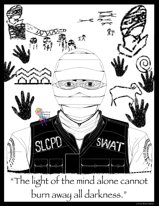
This here is the line-art for a foil piece paired with the quote of the character that one of my cousins asked me for for Christmas this past 2021 holiday. So here we have Joshua Graham from Fallout: New Vegas.
#art#fanart#drawing#artists on tumblr#digital art#artist#little space squid#video games#video game#fallout#fallout nv#fallout new vegas#joshua graham#lineart#foil art#lss
18 notes
·
View notes
Text
Art Improvement
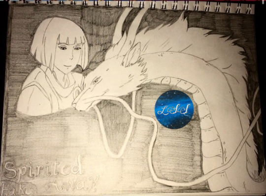

2014 2021
I was looking back at old art and realized I’d ended up using the same photo reference recently as I worked on one of my favorite fanart pieces.
Once I found my art from 2014 I was shocked to see how much my art has improved. I knew my art had improved over the years but to have an a piece to be able to more accurately compare my current art to truly put it into perspective. Granted, one was on a sketch book and one was on a cardboard box/tape that I painted matte white acrylic over, but still.
Side note: sorry for the old art tag sticker on the art, I haven’t added my new one to my phone yet so I was working with what I had.
#art improvement#fanart#fanart improvement#spirited away#haku spirited away#spirited away haku#art#pencil#drawing#traditional art#studio ghibli
10 notes
·
View notes
Text
inktober is trending once again this year so just a heads up for anyone unaware: please do NOT support Jake Parker (creator of inktober) and do not use the official inktober prompt list!
Jake Parker plagiarised the work of black artist Alphonso Dunn without any sort of credit whatsoever
you can still do a drawing challenge, just don’t use the official inktober prompts! also avoid using the name inktober too as it is still associated with him
drawtober, goretober, OCtober, etc are all totally fine, just please don’t support inktober
please reblog to help spread the word!
(and please do NOT send hate to artists participating in inktober - they most likely have no idea about this, so please just politely inform them if they’re unaware, ty!)
5K notes
·
View notes
Text
Art Style
Y’all, let me tell you the realization I’ve just had at 11:16pm this adequate July 19th of 2020. I have spent the last like 8 years thinking that I didn’t have an art style and then it hit me my art style is the kind of semi realism I do. It just hit me that whenever I go to draw, especially when working with human shaped subjects, I always end up drawing them in this kind of style and have the last 6 years of my life.
In summary: It took me 6 years to realize my own art style. If I’m not trying to replicate a specific style, my style is, at base level, semi realism.
2 notes
·
View notes
Text
Kass for Christmas

My cousin’s favorite character from Breath of the Wild is Kass, I drew his name this year so to add to the gifts that I’ll be sending his way, I decided to paint a semi-realistic Kass for him.
#kass#legend of zelda#breath of the wild#botw#botw fanart#Kass fanart#loz#loz breath of the wild#loz botw#artists on tumblr#art#artist#little space squid#traditional art#watercolor
11 notes
·
View notes
Text

Welcome to art version of the League of Villains Band au fanfic I’ve been fleshing out since January.
#dabi#dabi fanart#mha dabi#bnha dabi#anime#manga#fanart#artists on tumblr#art#procreate#digital art#band au#LOV#league of villains#drawing
1 note
·
View note
Text

Lineart for a Sugawara foil print!
#artists on tumblr#art#digital art#artist#little space squid#anime#haikyuu#haikyuu!!#haikyū!!#sugawara#sugawara koshi#sugawara fanart#procreate#fanart#manga#anime / manga
5 notes
·
View notes
Text

A fennec fox for your troubles.
#art#artists on tumblr#digital art#artist#little space squid#fox#fennec#fennec fox#i once again drew an animal rather than doing my class work
2 notes
·
View notes
Text

Posted this on twitter already but uhhh here we go again
153K notes
·
View notes
Text

So in light of the fact that my college classes started today, I drew a duck rather than cleaning my room for the filming I have to do to show I have the testing software. Please enjoy my good luck duck (Seeing a drake is supposed to be good luck).
#duck#drake#drake duck#wood drake#art#artist#artists on tumblr#digital art#digital artist#digital painting#i will ultimately regret drawing this rather than doing what i need to for my classes#good luck duck#good luck drake#good luck#lss#little space squid
13 notes
·
View notes
Text
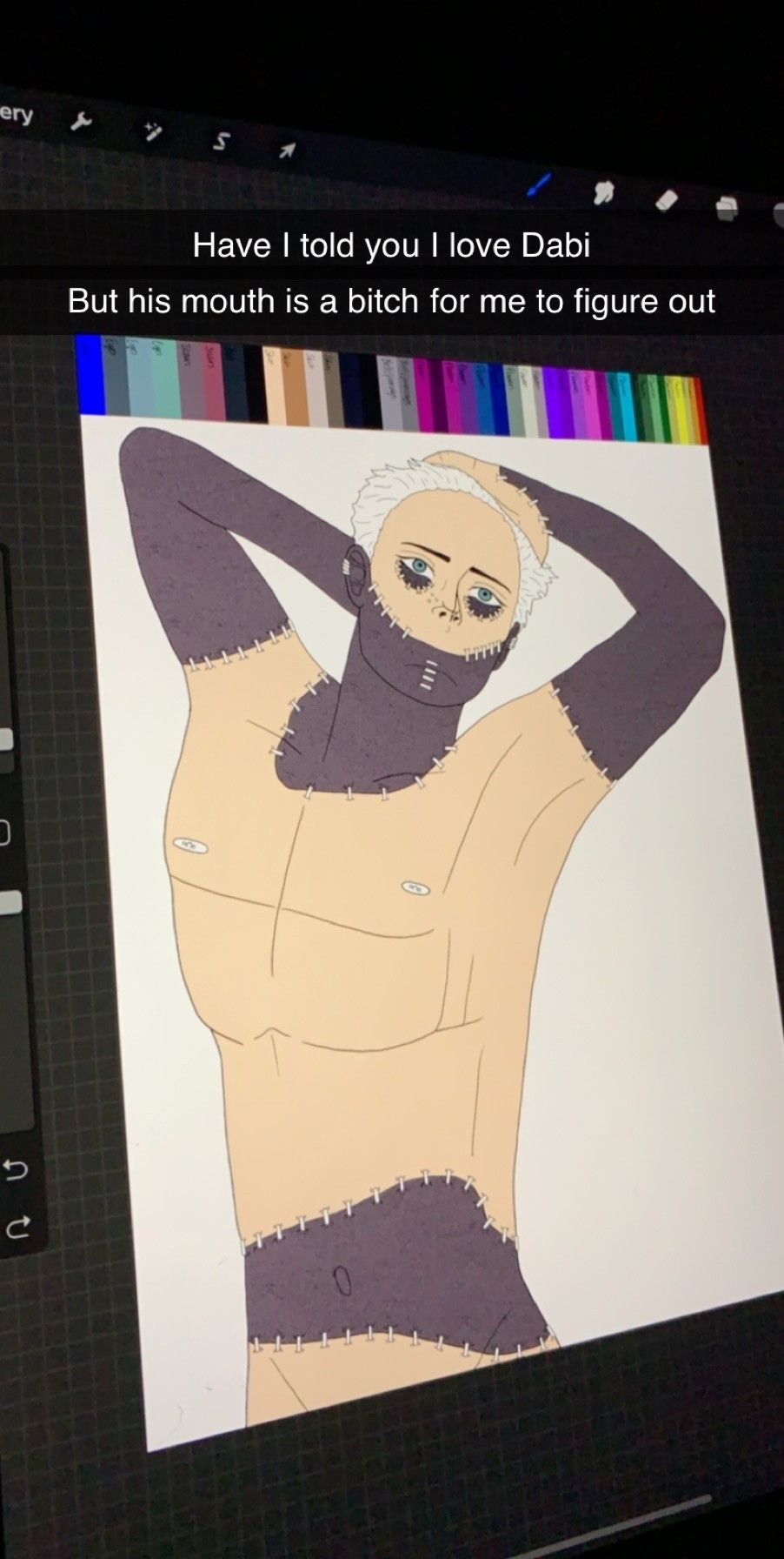
Have some Dabi.
#dabi#bnha dabi#mha dabi#boku no hero academia#my hero academia#art#lss#little space squid#digital art#artists on tumblr#digital artist#anime#manga
6 notes
·
View notes
Text
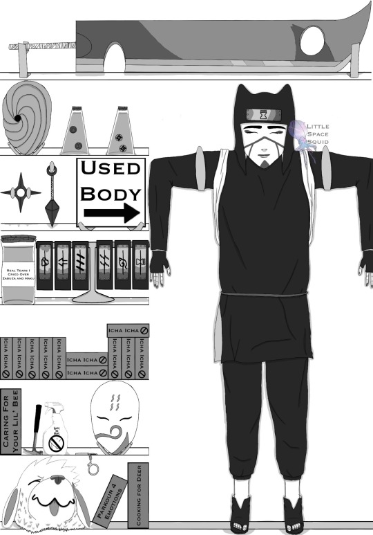
Just gonna leave this here.
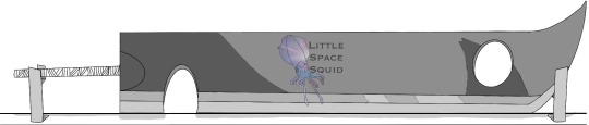
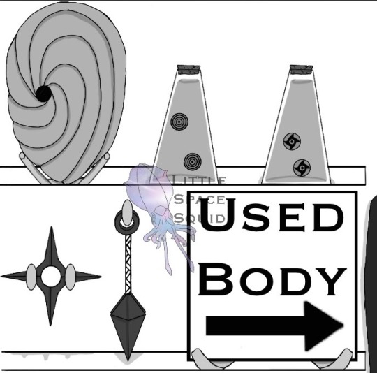

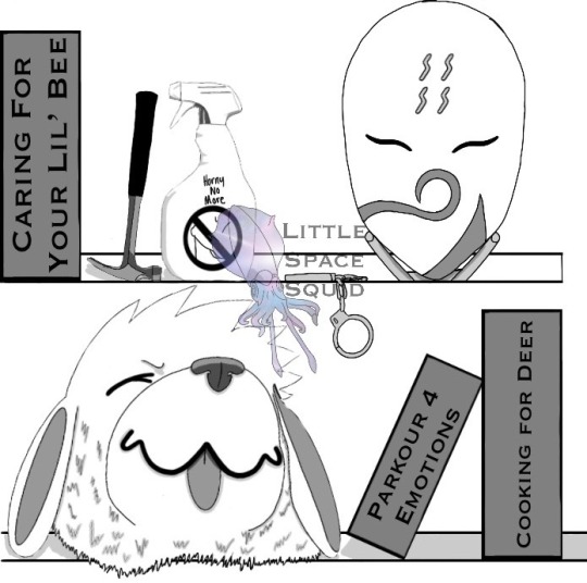
I had a lot of fun with this one by using the bottom two shelves to reference the six other drawings I’ve done of Shadow’s prompts plus the bonus of drawing Haku’s mask. (Three references per shelf)


And let’s not forget the usual of sending my best friend various stages of the process.
Kankuro: I'm donating my body to science
Gaara: Okay but don't come crying to me when they donate you to Goodwill
387 notes
·
View notes
Text
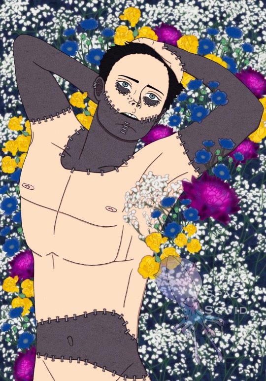

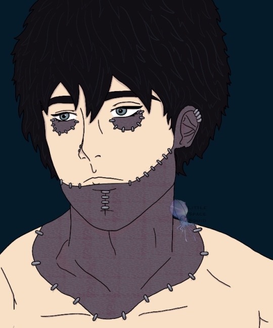
So I drew Dabi.
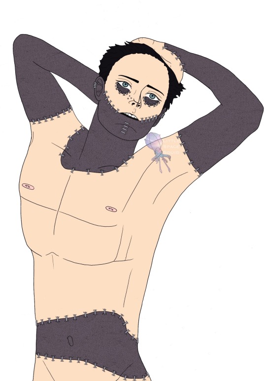

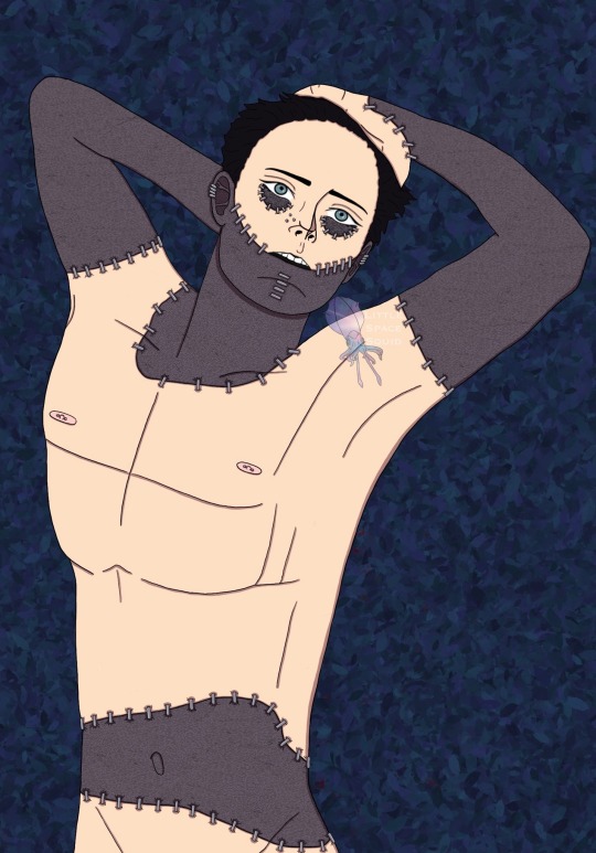


This here is the coloring process I went through. I also wanted to draw focus to his chest being shown because we know that that boy is lean enough and most likely sick enough from his quirk running him ragged with the intense blue flames that his ribs are on the verge of or are showing.
I also want to note that most of the flowers have specific meanings behind them. The Queen Anne’s Lace means haven or sanctuary, which I believe the League became for Dabi. The Anemone means fading hope and a feeling of being forsaken, which I believe falls in line with Dabi’s thoughts on a hero centric society. The Yellow Carnation mean rejection and disdain which again, I believe falls in line with his ideology from Stain about a hero centric society. The Dahlia means standing strong in one’s sacred values, which I believe can represent Dabi’s desire to eliminate the hero centric society.


As I often do, here is my commentary I send to my best friend as I work on my art.
#dabi#bnha dabi#mha dabi#fanart#bnha#mha#boku no hero academia#my hero academia#anime#anime art#toya todoroki#artists on tumblr#digital art#little space squid#my art#i love him#dabi art#dabi is a todoroki#dabi my hero academia#dabi boku no hero academia
15 notes
·
View notes