minhanoor
Minha Noor Sultan
Hi! This is where I curate my EO work
12 posts
Don't wanna be here? Send us removal request.
Last Seen Blogs

minty-mumbles
Current Status: Queered Into Oblivion 💚🤍🩵🧡

la-souveraine
La Souveraine


star-mail
Liamm :]

heavybodymodification
Heavy Body Mods
Text
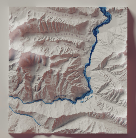
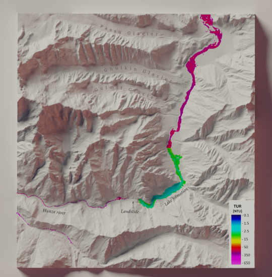
My latest visualization of a Landslide effect on Hunza river. Find out more details here: https://www.behance.net/gallery/145729241/Attabad-Lake
6 notes
·
View notes
Text
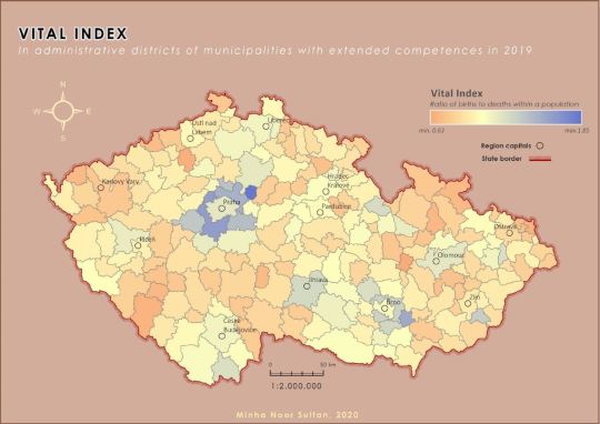

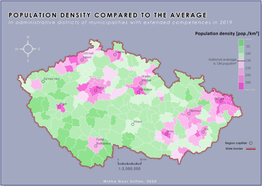
During one of my semester works I created a series of maps on social indicators in Czech Republic, using graduated symbology technique in ArcGIS Pro. Choropleth maps are a commonly used method for representing statistical data on geographic areas through use of variety in color codes and values. The choice of color ramps used for each phenomena play an important role in the end visualization.
For high resolution images, please contact.
2 notes
·
View notes
Text


Traditional remote sensing image understanding systems make use of inductive learning techniques such as the unsupervised clustering algorithms for classification. A recent introduction of deductive knowledge-based image pre-classification in remote sensing literature has paved way for more accurate and efficient hybrid multi-stage image understanding systems by replicating the pre-attentive phase of human vision and cognition. The product of this pre-classification is semantic categorization of pixels which fills in the information gap in existing remote sensing routines.
A while ago I wrote a seminar paper where I evaluated SIAM (Satellite Image Automatic Mapper), an Image Pre-classification tool. I explored the possibility of using SIAM products for standalone qualitative change detection, comparing it to a rule based supervised learning algorithm and its employment in thematic accuracy assessment. The study area was Karachi, Pakistan
#remote sensing#gis mapping#earth observation#analysis#technology#innovation#academia#gis#karachi#satellite
1 note
·
View note
Photo
Eye-tracking Analysis on webmaps is a hectic process. The standard eye-tracking environment doesn’t fulfil the needs of usability analysis for interactive maps. A solution to the problem is converting the screen coordinates to real world coordinates. Find more information about the tool ET2Spatial created as a part of my Masters Thesis.
1 note
·
View note
Photo
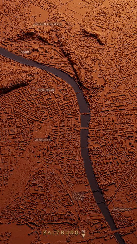
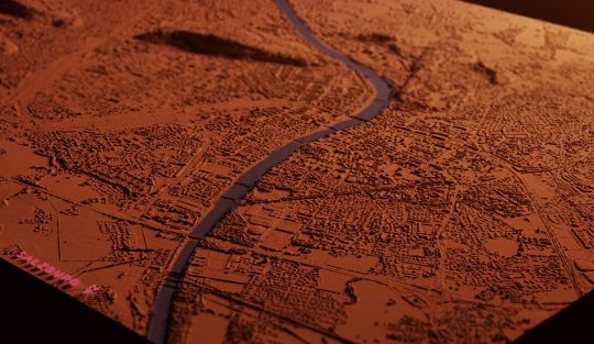
I read Daniel Huffman's well crafted tutorial on how to do relief shading with DEM in Blender, which gave me insight on how to prepare elevation data for feeding into a non-GIS software. Instead of a DEM I wondered how well would a DSM/Lidar fare in Blender's environment. It definitely took some trials, errors and youtube tutorials on my end, but I'm very happy with the result, and more so in learning this technique to enhance my ideas in cartography.
I used 1m DSM provided by Land Salzburg. To find out about my process in more detail: https://bit.ly/3mxUbtp
0 notes
Photo

Continuing my series on visualization of different thematic concepts for Pakistan. Something I like about visualizing more than one variable on a map is that it leaves more to human interpretation to unravel interesting trends and insightful information.
Pakistan has the 5th largest population in the world yet only 36% of it is urbanized.
1 note
·
View note
Photo
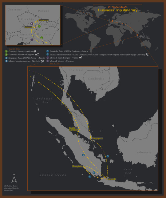
I was recently given a story prompt that had details about a trip to South East Asia. This prompt had to be spatially visualized. My approach for mapping the information relied on a traditional approach of using a legend to describe every travel path.
1 note
·
View note
Photo
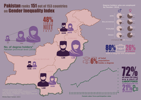
In 2018, a report was published by McKinsey Global Institute (MGI) which stated that if Pakistan could improve its gender parity, it could add more than $30bn to its GDP.
There are many things that contribute to the subject of Gender Inequality. One of them being the Labor Force participation and Employment rates.
As I analyzed the data published by PBS I was astounded to see how much the gender gap increases when moving from tertiary education to rate of employment. I created a small infographic on my observations.
The reasons contributing to the significantly low employment rate or Labor force participation rate of women compared to men in Pakistan are a different debate, but it does not negate the fact that the inequality inhibits the economic and social progress of the country.
#data#datavisualization#gis#cartography#gender inequality#disparity#infographics#Pakistan#labor#women#gender pay gap
2 notes
·
View notes
Photo

I recently stumbled upon the dataset containing Suicide Bombing attacks in Pakistan. From a moral and emotional perspective, it is always difficult to explore such sensitive topics. However, I also believe it is important to study past events to improve the future. I did a basic level geovisualization and infographic of the suicide bombing events in the country.
3 notes
·
View notes
Text
Map Poster
Cartography is an interesting blend of accurate spatial data visualization considering user needs and being mindful of aesthetics to make the product visually appealing. Simplified city maps can often be used as posters, not just for their informative aspect but decorative one as well.
I recently have been seeing a lot of Poster Maps for world’s famous Metropolitan areas. I decided to make one for the twin cities of Islamabad and Rawalpindi in Pakistan. The two cities merge into one another in a non-homogenous way and make for an interesting case to represent. Making a poster map challenged more of my graphic design abilities than cartographic or GIS ones, but I definitely enjoyed making it.

2 notes
·
View notes
Text
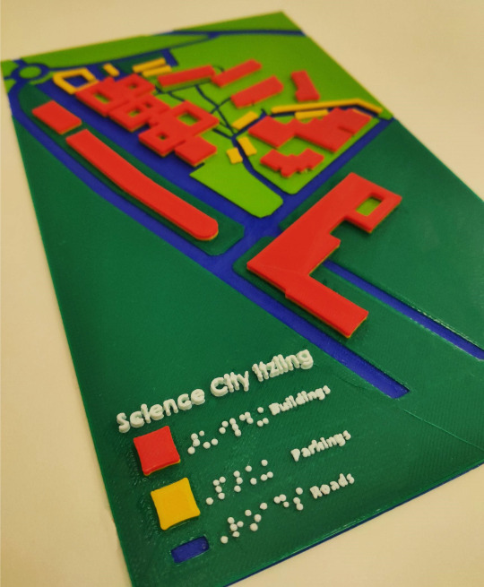
Inclusive Cartography
One field I recently came across and became interested to explore is Inclusive Cartography. A highly useful application of #3dprinting in #mapping where the purpose goes beyond visualization is tactile graphics. Tactile maps are designed for people with visual impairments or blindness and rely on tactile elevations for touch perception and bright contrasting colors for easier interpretation.

4 notes
·
View notes