nikitricky
NikiTricky's blog of projects
Hello! I make stuff sometimes and post them here. I’m more active at @nikitricky3
17 posts
Don't wanna be here? Send us removal request.
Last Seen Blogs

eenkleinleven
ivo van hove sued for emotional damages

jeongw-o
hiatus
wowsnowwhitewell
wowsnowwhitewell

sleepyslushie
SLEEPYSLUSHIE!

ebrynnnn92
The Questionable.
Text
Hello! I've made @nikitricky3 my main blog (I'll continue posting big projects here, but otherwise I'm more active there) so If you want to see more of me, you can find me there! Sadly, i can't make it my primary blog so this post will have to do.
Tagging mutuals: @y--e-t-i, @otesunki, @chibits42, @eintheology, @vodam46, @mazegirl168, @llinksrechts, @662607015, @marocato, @bgeevee2005, @clownpalette, @phoenixdiedaweekago, @schondy, @caliconiko, @mondecitronne, @oscar-the-octopus, @parasite-2
5 notes
·
View notes
Text
youtube
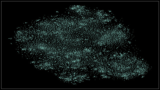
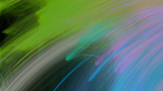
Ever wondered what the datasets used to train AI look like? This video is a subset of ImageNet-1k (18k images) with some other metrics.
Read more on how I made it and see some extra visualizations.
Okay! I'll split this up by the elements in the video, but first I need to add some context about
The dataset
ImageNet-1k (aka ILSVRC 2012) is an image classification dataset - you have a set number of classes (in this case 1000) and each class has a set of images. This is the most popular version of ImageNet, which usually has 21000 classes.
ImageNet was made using nouns from WordNet, searched online. From 2010 to 2017 yearly competitions were held to determine the best image classification model. It has greatly benefitted computer vision, developing model architectures that you've likely used unknowingly. See the accuracy progression here.
ResNet
Residual Network (or ResNet) is an architecture for image recognition made in 2015, trying to fix "vanishing/exploding gradients" (read the paper here). It managed to achieve an accuracy of 96.43% (that's 96 thousand times better than randomly guessing!), winning first place back in 2015. I'll be using a smaller version of this model (ResNet-50), boasting an accuracy of 95%.
The scatter plot
If you look at the video long enough, you'll realize that similar images (eg. dogs, types of food) will be closer together than unrelated ones. This is achieved using two things: image embeddings and dimensionality reduction.
Image embeddings
In short, image embeddings are points in an n-dimensional space (read this post for more info on higher dimensions), in this case, made from chopping off the last layer from ResNet-50, producing a point in 1024-dimensional space.
The benefit of doing all of that than just comparing pixels between two images is that the model (specifically made for classification) only looks for features that would make the classification easier (preserving semantic information). For instance - you have 3 images of dogs, two of them are the same breed, but the first one looks more similar to the other one (eg. matching background). If you compare the pixels, the first and third images would be closer, but if you use embeddings the first and second ones would be closer because of the matching breeds.
Dimensionality reduction
Now we have all these image embeddings that are grouped by semantic (meaning) similarity and we want to visualize them. But how? You can't possibly display a 1024-dimensional scatter plot to someone and for them to understand it. That's where dimensionality reduction comes into play. In this case, we're reducing 1024 dimensions to 2 using an algorithm called t-SNE. Now the scatter plot will be something we mere mortals can comprehend.
Extra visualizations
Here's the scatter plot in HD:
This idea actually comes from an older project where I did this on a smaller dataset (about 8k images). The results were quite promising! You can see how each of the 8 classes is neatly separated, plus how differences in the subject's angle, surroundings, and color.

Find the full-resolution image here
Similar images
I just compared every point to every other point (in the 2d space, It would be too computationally expensive otherwise) and got the 6 closest points to that. You can see when the model incorrectly classifies something if the related images are not similar to the one presented (eg. there's an image of a payphone but all of the similar images are bridges).
Pixel rarity
This one was pretty simple, I used a script to count the occurrences of pixel colors. Again, this idea comes from an older project, where I counted the entirety of the dataset, so I just used that.
Extra visualization
Here are all the colors that appeared in the image, sorted by popularity, left to right, up to down

Some final stuff
MP means Megapixel (one million pixels) - a 1000x1000 image is one megapixel big (it has one million pixels)
That's all, thanks for reading. Feel free to ask questions and I'll try my best to respond to them.
3 notes
·
View notes
Text
Heya! I've been working for some time on a playlist with interesting youtube videos. It's mostly video essays between 20 minutes - 8 hours. All have been watched thoroughly by me, so you get the cream of the crop. You can check it out here:
https://www.youtube.com/playlist?list=PL1a-7NfM-EtuCYMmpeagSAIn1Pdu7ZRuG
I also made an accompanying spreadsheet where I've tried to tag as much as possible. You can find it here.
If you have a suggestion, feel free to interact with this post or send me a message!
PS: I'm not including Veritasium on purpose
21 notes
·
View notes
Note
Wow! You're Bulgarian just like me as well?
Yeah! It's always a surprise when i see fellow Bulgarians on the net.
4 notes
·
View notes
Note
are you a programmer? /curious
Yeah! My hobby is programming. It has been 5 years since my first Scratch project. Time flies by, huh
3 notes
·
View notes
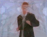
Text
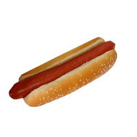
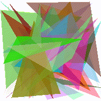
These are 50 triangles "learning" themselves to mimic this image of a hot dog.
If you clicked "Read more", then I assume you'd be interested to hear more about this. I'll try my best, sorry if it ends up a bit rambly. Here is how I did that.
Points in multiple dimensions and function optimization
This section roughly describes some stuff you need to know before all the other stuff.
Multiple dimensions - Wikipedia roughly defines dimensionality as "The minimum number of coordinates needed to specify any point within it", meaning that for a 2-dimensional space, you need 2 numbers to specify the coordinates (x and y), but in a 3-dimensional space you need 3 numbers (x, y, and z). There are an infinite amount of dimensions (yes, even one million dimensional space exists)
Function optimization - Optimization functions try and optimize the inputs of a function to get a given output (usually the minimum, maximum, or some specific value).
How to train your triangles
Representing triangles as points - First, we need to convert our triangles to points. Here are the values that I use. (every value is normalized between 0 and 1)
• 4 values for color (r, g, b, a)
• 6 values for the position of each point on the triangle (x, y pair multiplied by 3 vertices)
Each triangle needs 10 values, so for 10 triangles we'd need 100 values, so any image containing 10 triangles can be represented as a point in 100-dimensional space
Preparing for the optimization function - Now that we can create images using points in space, we need to tell the optimization function what to optimize. In this case - minimize the difference between 2 images (the source and the triangles). I'll be using RMSE
Training - We finally have all the things to start training. Optimization functions are a very interesting and hard field of CS (its most prominent use is in neural networks), so instead of writing my own, I'll use something from people who actually know what they're doing. I'm writing all of this code in Python, using ZOOpt. The function that ZOOpt is trying to optimize goes like so:
• Generate an image from triangles using the input
• Compare that image to the image we're trying to get
• Return the difference
That's it! We restrict how long it takes by setting a limit on how many times can the optimizer call the function and run.
Thanks for reading. Sorry if it's a bit bad, writing isn't my forte. This was inspired by this.
You can find my (bad) code here:
https://gist.github.com/NikiTricky2/6f6e8c7c28bd5393c1c605879e2de5ff
Here is one more image for you getting so far
122 notes
·
View notes
Text
The last one got banned for some reason, trying this again
6 notes
·
View notes
Text
Hello! This is a sideblog for smaller posts and reblogs.
2 notes
·
View notes
Text
This is a playlist with 10,000 tracks where every track is related to the previous track using the Spotify API.
If you see a 404 page you can visit the playlist at this url.
2 notes
·
View notes
Text
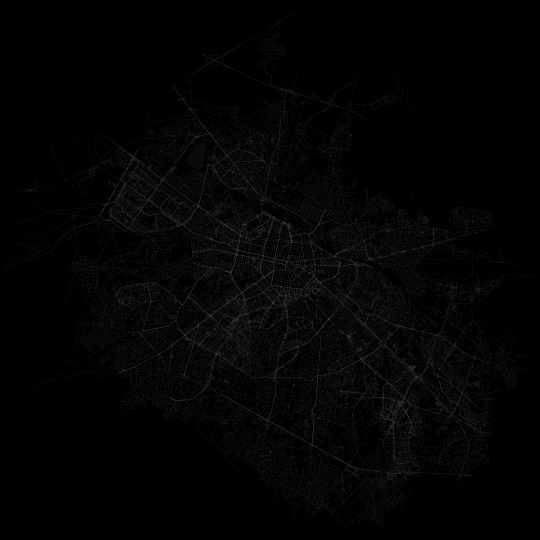
Every street/walkable path/bicycle path in Sofia, Bulgaria
Full res version at
11 notes
·
View notes
Text
I was messing around in blender and got this. For those curious about the process, I precomputed the balls and projected an image onto the final result.
17 notes
·
View notes
Text
This sorta looks like a Voronoi diagram
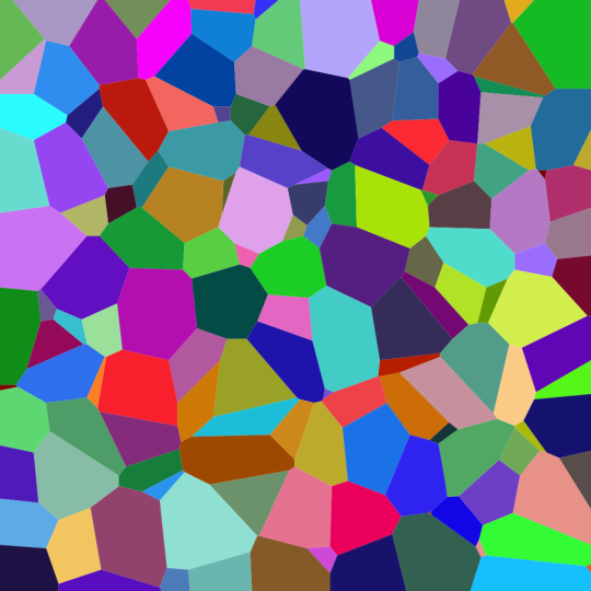

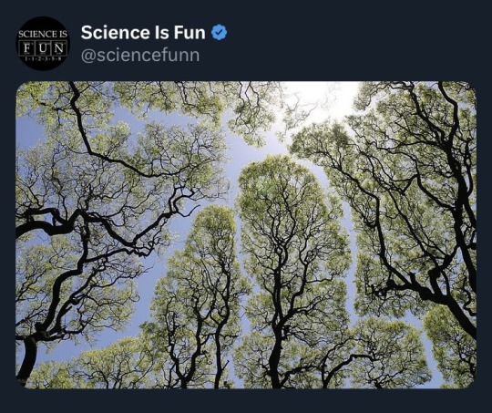
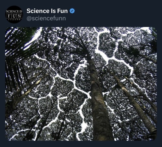
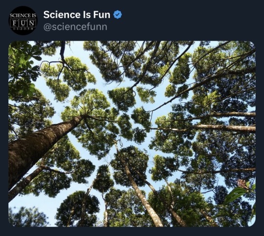
Follow @scienceisdope for more science.
1K notes
·
View notes
Text
Woah. This is 3D-render levels of perfectness
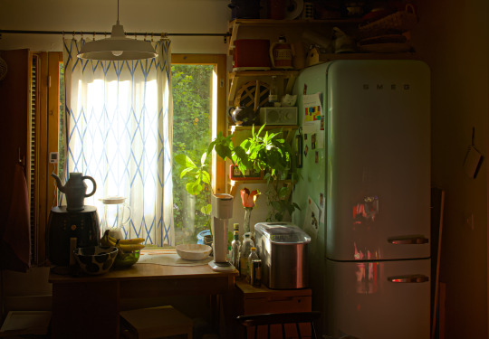
My friend's cozy little kitchen in Finland.
9th of July, 2023
29K notes
·
View notes
Video
For anyone wondering if this is fake, here is a version with no color
undefined
youtube
(Tumblr doesn't allow videos on reblogs)
These circles are stationary
72K notes
·
View notes
Text
How to draw a cardioid
Step 1: Draw x, equally spaced, points in a circle. You can find the angle by dividing 360 by x (in this case 360/30 = 12°). Assign a number to each point (starting from 0)

Step 2: For each point, draw a line to point №(point number*2). If you reach a number that is too high (for example 15, 15*2=30), then just subtract the number of points (30-30=0). This is a simplified version of the modulo operator.
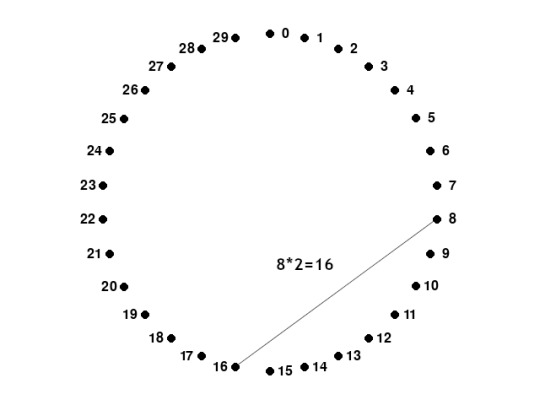
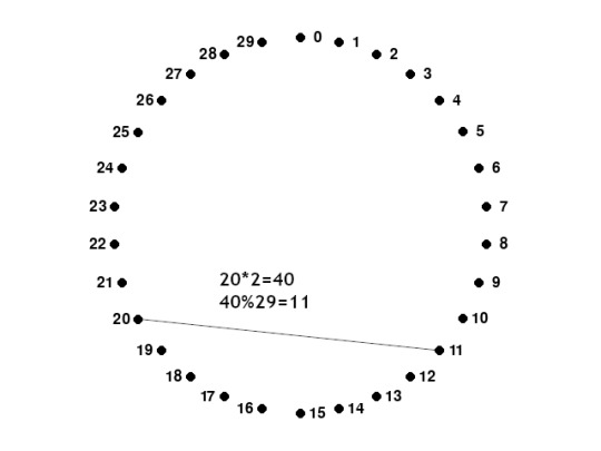
You're done! The cardioid is the bean shape on the top. You can get more detail with more points

For anyone wondering, these animations were made in Pygame and recorded using pygame_screen_recorder.
7 notes
·
View notes
Text
I saw an opportunity to make a graph and I made one. Here is the same graph with a couple of different colorings:

White and black versions of the graph. The algorithm spaced out the nodes, so it looks a little sparse, but if you open the image somewhere where you can zoom, it's very interesting exploring the little communities.
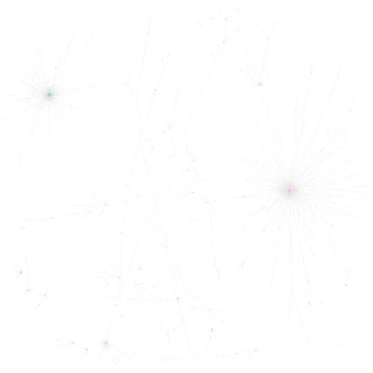
Based on the modularity class
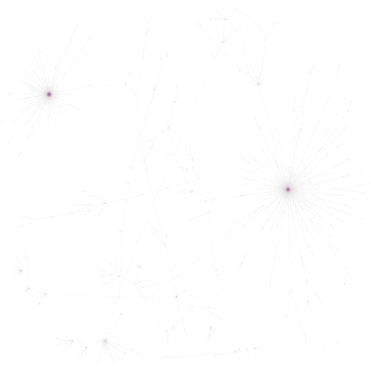
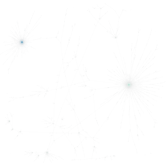
(left to right) PageRank and Harmonic Closeness Centrality (darker is a higher value)
And for anyone that wants to see a full SVG can check here:
Hey, could you do me a favor?
Could you just RB this?
The little RB statistics chart is so pleasant and stimmy to look at and I want to see what it looks like when it gets really REALLY huge because it makes me think of some deep sea lifeform
69K notes
·
View notes
Text
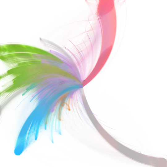
1.3 million pages from the English Wikipedia (a line means that one page links to another)
Close-ups
Hello, World! This is my first Tumblr post, I hope you enjoy it.
For anyone wondering what the colors are, they're computed using an algorithm (Modularity), and the top 8 classes are colored. Here is what I think they each represent:
Purple - Law
Light green - Lawsuits
Blue - Open Source Software
Brown - Pop culture
Orange - Languages
Pink - Medicine/Health
Dark green - Pop culture (again)
Beige - Numbers
17 notes
·
View notes