
Statistics
We looked inside some of the posts by soeverard-blog and here's what we found interesting.
Average Info
Notes Per Post
27
Likes Per Post
12
Reblog Per Post
15
Reply Per Post
0
Time Between Posts
3 days
Number of Posts By Type
Text
17
Last Seen Tumblr Blogs


Fun Fact
Mobile Tumblr US users spend an average of 4.04 minutes per session on the app.
Text
7th week at Ironhack BCN
This was a tought week, no doubt about it. We were knee-high in our last individual project at Ironhack BCN, and everyone was feeling the pressure.
What was the brief?

What did I do?

Although I was relieved this week was over to be honest (it was a lot of work). Two things are beginning to dawn on me: 1) we're almost ready for the real-world; 2) the bootcamp is very almost over. These two realisations make me both excited and sad. It's been a whirlwind, the intensity of the course alongside the world in Coronavirus madness, feels slightly surreal these last couple of months... Let's see how the next week goes.
0 notes
Text
Some thoughts on The Case Study Factory
There are many case studies everyday, using the same structure and not standing out. This leads to:
- Lack of context: case studies starting with an unexplained 'user need'
- Too much focus on process: why are we utilising that method? Focus on insights is better
- Disconnected steps: insights from one step are rarely applied to the next
- Underwhelming solution: after a process with a lot of detail, the end solution is unpolished and not insight driven
Hiring managers don't have time, they don't read the whole case study and they need to be able to scan the case study quickly. With this in mind, how can once stand out?
1. Define your area of focus
Focus on the steps of the process which interest you most
Use language that will appeal to the company you want to attract
Promote you strongest skills
2. Align the story with the medium
Portfolio: focus on your process and output, since you are trying to sell your skills as a designer
Medium: insights that other designers can apply to their own work
Dibbble/behance: most exciting UI
LinkedIn: business impact of the project
3. Set up the context of the project
School or real-world?
What was the brief?
Team, individual?
Technical contrainsts or KPIs?
4. Focus on insights rather than process
Highlight what you learnt working on each step
Make sure the insights are interesting & easy to read
Talk about things that didn't go well
Teach readers something they didn't already know
5. Design the case study reading experience
Use scannable headlines
Use short sentences & paragraphs
Write the story to someone who is hearing about the project for the first time
Replace text with visuals
6. Obsess over case study visuals
Only show deliverables you're proud of
Re-create your deliverables
Use large images & visuals
Include prototypes & motion
7. Make it personal
Show why you care
Speak in your terms
State your opinions
The bottomline?
The case study should focus less on the project and more on the skills & personality of the designer. Forget about ticking boxes, more importantantly it should be a platform for the designer to have his say on the project.
0 notes
Text
UX Strategy Blueprint
Having read this article my Jim Kalback. I'm sharing some key elements he mentions. Quotes in italics.
What is strategy?
Strategy is about uncovering the key challenges in a situation and devising a way of coordinating effort to overcome them for a desired outcome.
Elements of UX Strategy
Based on Strategy Safari & Playing to Win, here are the elements included in the UX Strategy Blueprint.
Challenges.
Strategy implies a need for change, a desire to move from point 1 to point B. What are the challenges? Coherency, usability issues, deteriorating image... etc.
Aspirations.
The experience you ultimately want to deliver. Be ambitious. Should inspire teammates.
Focus areas.
Strategy is about trade-offs. Focus on what matters most, as the priority (not that the others are ignored). Primary focus for these five topics?:
USERS – Who will use your solution? If you have personas, list the ones that are most relevant to the success of this strategy.
REGIONS – What are the countries, languages, and cultures that are in play?
SERVICES – What products, services, platforms, and technologies are included in the strategy? Scope out the ones that aren’t.
USE CASES – Indicate the key scenarios of use at a high level. For instance, in ecommerce settings will you focus on finding products, the purchase process, or both?
AREAS OF UX – What areas of UX will make the most difference? Highlight aspects such as information architecture, interaction design, visual design, content strategy or branding, as well as attributes of usability such as control, learnability, or discoverability, among others.
Guiding principles.
In UX strategy: approaches taken to overcome challenges & solve problems. e.g. specific activity (mobile first, for example). Be as specific as possible - mantra for design team to execute consistently towards same goal.
Activities.
UX activities needed to implement strategy & achieve aspirations? User research, concept dev, sketching, screen design, prototyping, testing. Like an inventory for types of activities required.
Measurements.
Metrics to track progress / success. E.g. measure aspects of user experience (e.g. satisfaction) before & after work begins. Should support business goals - find metrics that show positive impact UX has on business. Be specific, e.g. 'increase sales by 5% by streamlining checkout'
How to use UX Strategy
Begin with challenges & aspirations; afterwhich the box that suits you.
Situations to use UX Strategy Blueprint:
BRIEFINGS. Bring a print-out of it to briefings. The Blueprint serves as a great checklist of questions to ask. Your notes will also be concise and captured in a single overview.
WORKSHOPS. Hang a poster-size version of the Blueprint in kick-off meetings or strategy sessions. Use sticky notes to fill it out as a team. This guides the discussion and keeps the exercise focused, as well as builds consensus.
REFERENCE. Post the completed Blueprint in the office for ready reference. This keeps your strategy in sight at all times.
Once all elements agreed on, consolidate strategy. About two pages long. UX Strategy Blueprint helps see all the moving parts in an overview.
1 note
·
View note
Text
Remote Contextual Inquiry: A Technique to Improve Enterprise Software
Notes from an article by Lynn Rampol (quotes in italic)
Enterprise software? Large-scale software deployments to large number of end users
- Software customisations: 1) change text, layout, behabiour of delivered features; 2) remove features; 3) build own functionality
- System configurations: customers amend how software performs dependent on setup
- User roles: different users have different fuctionality dependent on their system-defined roles
- User preference: personalise interface attributes
- Default data: pre-populated forms set up for end users dependent on their roles
- Domain knowledge: people using it often have deep knowledge / experience in their field
- Training: in-person product training, web-based / email instruction, FAQs or cheat sheets
People to be tested: business analyst & end user
Business analyst, things to ask:
Customizations that have been made and the reasons for making the changes
Known issues with using the software (possibly from internal Customer Support records)
Rough statistical information about the number of users and descriptions of user types
Domain expertise of users and typical duration of employment
The business process that the software supports
The tasks performed with the software, frequency of task performance, and variables, such as calendar-driven tasks (e.g., quarterly or annual tasks) and event-driven tasks (e.g., approvals or sales orders)
Corporate standards, such as monitor resolution settings and supported browsers
Information about training methods and materials provided to users
Plans for software upgrades
Access to end users for further research
Software end users, things to ask:
Information about their goals and the tasks performed to accomplish those goals
Measurement of task performance data, including task completion time and the number of mouse clicks to perform a task
Feedback on layout, content, and behavior in the user interface
Personalization or individual-level customizations made to the software
Background on the type and effectiveness of the training they received
Remote contextural Inquiry
Captures the computer screen of a person working with their version of the software on their own computer.
- Record the session (Camtasia?)
- Completes typical tasks & talks aloud while doing it
Why? 1) observe and record the actual software being used; 2) gather information of real-life tasks relevant to that end user; and 3) probe and discuss the end user’s interaction with her system.
Tips
As the first step in any UCD effort, you need to understand the target markets for your product so that you can obtain representative data from appropriate market segments.
This technique applies to software that is already deployed to a customer base. In enterprise software markets, that may mean collecting data on software that is one or more versions old. The pros and cons of this technique must be weighed against a more traditional usability method.
Some customers may deal with highly sensitive information and may not want you to make video recordings of their interactions. As is typical in our field, you must always ask and receive permission to record audio or video with your participants.
It must be clear to the customer where the recorded information will go, how you plan to use it, and any next steps.
It is helpful for researchers to understand the functionality of the product that they are viewing so that users do not have to explain the basics.
This technique is not a full contextual inquiry. The UE professional will not be seeing the person’s desk area or other external influences using this method. However, supplemental documentation could be gathered to further understand the environment. For example, a researcher could request that the user take a few pictures of her work area, desk, and surroundings.
---
Note (not from the article):
Process is broken into 3 parts
1. Identifying users
At least 6 people, for different user groups (2 of each). Consider budget.
2. Scheduling and conducting visits
People may be reluctant about time needed - communicate clearly the benefits, expectations (ie observations). Prepare consent forms, scripts & recording equipment prior. 2 visits a day (allow time to write notes and understand what’s been learnt)
3. Analysing data
Spreadsheet, card sort or programs (NVIVO / Dedoose / Reframer). Create personas / scenarios to communicate the findings. Service map / service blueprint may be required
1 note
·
View note
Text
Ironhack 5th week: site redesign project
This week we were tasked with redesigning a site for a small business, putting some information architecture, branding, and responsive layout techniques (inc. HTML & CSS) into practice.
I was in a group with Lidia Ruiz Olmedo & Elisabetta Lanzafame and we worked like a dream. All of us had different approaches, insights and experience which made for a beautiful cocktail - we collaborated smoothly, supported one another’s needs and in the end finished with something all of us were very happy with. All in a week’s work.
This project was somewhat different from the others, with less user research and more emphasis on information architecture, responsive design (inc. coding) & branding. This meant that the project’s process was notably different from previous projects. This both was a refreshing and challenging change of rhythm.
What I found most testing was the coding. I’m not particularly familiar with coding and have never had to do a great deal of it, despite always having had an interest. This week gave me the opportunity to dive further into HTML & CSS languages. There was friction and frustration in getting my head around it, but at the end of the day I feel I learnt a lot from having done it.
Reviewing the end result, I think we did a great job and I’m so lucky to have had my teammates I did. The final design is the fruit of a beautiful collaboration of three hardworking girls.
See here for specifics of the project.
4 notes
·
View notes
Text
Choosing colours in UI design
In this article by Erik D. Kennedy, he talks about his approach to choosing colours in UI. I’d like to highlight a couple things here.
He argues:
The fundamental skill of coloring interface designs is being able to modify one base color into many different variations.
In summary, he is suggesting sticking to using variations of one colour, going lighter or darker with the following rule:
Darker color variations are made by lowering brightness and increasing saturation. Brighter color variations are made by increasing brightness and lowering saturation.
This applies for distinguishing states of hierarchy of information.
1 note
·
View note
Text
Choosing a colour scheme: thoughts
When choosing colour schemes for an interface, many designers have many different approaches and I think it’s interesting to gauge how you choose colours by comparing to other strategies. In this article by Neale Van Fleet, he goes through his strategy which I’ve given some thoughts on here.
General Strategies
Limit your number of colours
Maintain consistency throughout the interface by using a few well-chosen colours. Less is more.
Understand each colour’s job
This plays on the last point. Choose few colours with a reason behind each - what’s its job? A few examples of how to assign colours:
- Activity status
- Primary vs secondary information
- Alerting errors
Break the rules when needed
Although the above is a good principle to stick by where possible, occasionally it’ll be best to break this. With good reason, that’s valid.
Selecting Our Base Colours
Start with a set of base colours: key brand (normally denotes interactivity), content & background colours. Further colours can be chosen with these primary choices in mind.
Getting inspiration
Looking at existing colour schemes, this could be from other creative projects or equally from real life examples.
Other colours
With the base colours in hand, more colours will also be required: warning alert (normally bright to draw attention), disabled (similar to key colour but desaturated), secondary/tertiary content (between primary content & background colour), alternative background (allow for better proximity of elements / grouping).
Here is the example given of all those colours describes in one scheme.

This is a really useful article, if anyone is feeling stuck on colour picking, this is a nice breakdown of what’s important to consider in an interface.
2 notes
·
View notes
Text
Interaction Design Patterns (iOS vs Android)
The fundamental difference either Apple or Google would say between the two design patterns is a matter of their philosophies:
iOS: human design
Android: material design
Due to the way the systems are set up there are several things to bear in mind when designing for either one, or both.

Navigation
- iOS usually puts navigation at the bottom, and Android at the top.
- Android has a global nav bar at the bottom, meaning back button not required
- Swipe left to right. Android = between tabs. iOS = back.
Styling
- iOS titles tend to be centred, Android titles left aligned
Action buttons
- iOS tend to put action buttons in top title bar, Android often have floating action buttons
Further navigation
- Hamburger tends to be android, tabbed menu on iOS
With all this in mind, what’s the deal? Although it’s helpful to bear these two sides in mind, it’s also worth reminding oneself that the priority is to be human orientated rather that iOS or Android orientated.

There are many apps that have the same design across the two platforms. If you are designing an app for specifically one platform, perhaps it’s worth leaning on their UI patterns, but if you’re planning on having the design across the two then its totally OK to take valuable elements from both the patterns to suits needs. ----
I am about to start a project to design a travel booking app to be launched on both iOS and Android.
Sofia is my primary user persona:

She’s an android user. Here are a couple things I should have in mind during the design process:
- Android’s preference to floating action buttons
- Top nav more common than bottom nav
- Back button not required
- Styling tends to be left aligned
- Roboto is the standard typeface
Hope you enjoyed this piece!
3 notes
·
View notes
Text
Iterative UI design
Having watched Apple’s video on iterative UI design, I thought I’d highlight a couple of things.
Good design is not easy. I normally don’t like phrases like this, it feels like designers being self-indulgent. However, in this case, I’d like to underline what I think Ryan Olshavsky means by that. In order to get something complex look simple it comes from looking at many different approaches and decided what are the few but necessary elements required to get the job done.
Business goals drive results. This is key. Why is the business investing in this design? They want to see results. How can we get people to understand what we’re doing as designers? By aligning those results to our design. We are, at the end of the day, two sides of the same story who ideally would be supporting one another.
1 note
·
View note
Text
Helping people on Glovo split bills fast & without awkwardness
Split the Bill: feature design for Glovo (UX project)

This was a project done with Ironhack’s UX/UI bootcamp course in Barcelona, with Victoria Micheva.
What’s this all about?
Who’s Glovo? Glovo is a Spanish courier service that provides purchases and delivering through its mobile app.
What was the brief? Adding a ‘split the bill’ feature to Glovo’s existing app as seamlessly as possible.

Our story begins with research.
How do people really split their bills?
To get an idea how people pay generally for their goods when others are involved (whether that be online or in-person), we did 2 initial interviews.
From there, we wanted to see what others were doing already with some benchmarking. We used Jakob Nielsen’s heuristics to evaluate how successfully people were tackling split bill features. Monzo, Uber and Verse were key players in this evaluation — all of which has very smooth split bill functionalities but with varying approaches to user flow and flexibility.
With an idea of the market place (what was already out there) and a survey, we conducted a further 8 interviews that were more focussed. Through affinity diagramming, we found some common themes when it came to what was important to people when splitting bills:
Convenience & time saving is key
Awkwardly asking for repayments is the worst
People hate maths — avoid counting who owes what
Splitting bills can be a vibe killer
---
What did we want to achieve?
With research under our belts we decided to get really clear about what we were doing, why and for whom.
To settle on a problem statement we used How Might We cards, to diverge on the possible opportunities and better understand our priorities. From here, we decided on the following problem statement:
How might we help people on Glovo split bills fast and without awkwardness?
So, who would this be for?
We were very clear on the fact there would be two sides to the feature of splitting a bill: one person using the app (initiating the split bill) and the other(s) accepting their money request. To have specifics in mind we developed two user personas as fictional figures to have in-mind as a representative of the user: traits, behaviours & patterns of a bigger body of people
So, with that in mind, I first introduce you to our primary user persona: Diego.
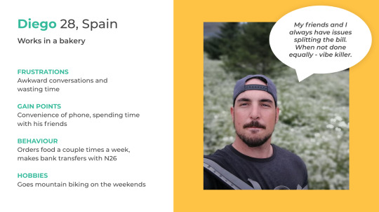
Diego is based in Barcelona, he’s 28 and orders food a couple of times a week. When paying, he needs convenience and things to happen quickly to he can focus on what’s important: spending time with his friends.
And, our secondary user persona: Helena.

Let’s jump into their shoes
I’d like you to imagine the following scenario:
Diego has his cousin, Helena, at his house. They have a lot to talk about and are looking for something quick and easy for dinner. Pizza from Glovo is the go-to.
Diego gets to paying the bill and they decide to split it. Both hate wasting time and awkward conversations about money but luckily Glovo has a new feature which puts their minds at rest.
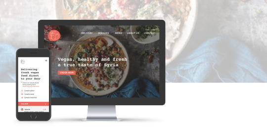
Try the final version
Without further ado, I’d like you imagine you’re Diego in the scenario and you’re on his phone with this prototype. I invite you to try different ways of splitting the bill and explore the flexibility Diego has.
And now, for the other side of the story see here for Helena’s phone.
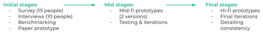
Now, how did we get from A to B?
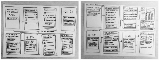
You’ve seen our final design, how did we get there? There were 3 overarching stages in the process, which you can see here:
With research, a defined problem and a persona in mind, we began thinking out how the user flow could materialise which is what you see noted here:
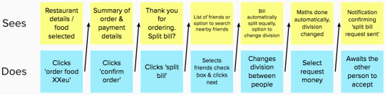
At the start of the process we began developing the feature with the split bill option appearing after the initial payment was made (so there would be no delay in the orders). With this user flow, we began sketching. These quickly developed into a paper prototype allowing us to get user feedback as soon as possible.
What we quickly realised was that we needed to amend the user flow so that the split bill option was before the initial payment, why?
One of the main points from our research was avoid awkward conversations about money at all costs. If people repay one another post initial payment, reminders between friends and awkward conversations will still be had (we would not be reaching our goal)
Glovo is not a bank, and shouldn’t worry about money people after an order has been made if not to do with the order itself
How would people pay after order been made if Glovo if not going to act as an intermediate? You can see where the complications arose
So we had a rethink with one question in mind: how can we allow for split bill to happen before initial payment made without delaying the order?
Solution?
The person initiating the payment authorises his card for the full order’s payment but with a delayed charge of 15 minutes, why?
Glovo has authorised payment as an assurance to process the order immediately
The user’s friends have 15 minutes to pay their share otherwise the order will be processed as normal
That way there a three-fold positive outcome: 1) avoid awkward conversations between friends about money (they pay or they don’t in those 15 minutes, that’s it); 2) Glovo gets their order, only varying who might be covering it; 3) there is no delay in processing the order.
Once the user flow was set, it was just a matter of making it as clear as possible for Diego and Helena to find useful. These changes were made based on user feedback on design iteration. Here are a few key changes made:


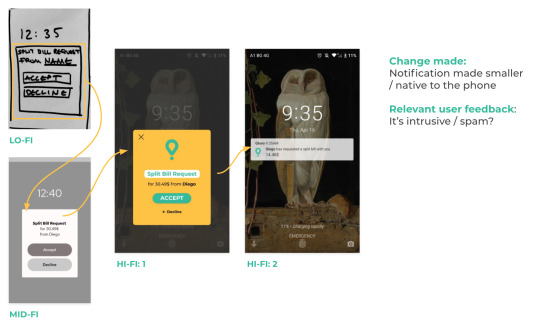
Once we were at the point of high-fidelity, we wanted to make the experience as sleek and enjoyable as possible. To do this we did a couple of things:
Careful consideration of matching the visual design to the Glovo brand
Add illustrations to aid engagement and understanding
Consider how animation might play a part in the feature (using Principle)
See here again the final prototypes of Diego and Helena.
---
Next steps
If we were to move forward with this, what would that look like?
Explore how the interface of multiple users in the split bill would be
Review Glovo’s payment methods (during research this kept on coming up, although we were focussed on the split bill pathway, we would have liked to review Glovo’s payment options more broadly)
Further testing on both sides of the user (Helena & Diego) and iterate the design further
Key learnings
Even with a well-defined brief, good research is essential to ensure the experience is user-centred
Benchmarking is insightful for interface specifics
Listen to user feedback even if you don’t like it
Trust the process — follow each step, make a plan, include a break ;)
---
Thank you for reading! If you have any feedback or comment don’t hesitate to contact me on LinkedIn or at [email protected].
1 note
·
View note
Text
Learning to See, by Oliver Reichenstein
If you’re looking for a good read about what distinguishes ‘the designer’ from the ‘non-designer’, see Learning to See, by Oliver Reichenstein.
What does he mean by ‘seeing’? He argues that ‘seeing is not a passive act’. We all see differently based on experience, profession or current mental/physical state.
Designers see design, non-designers feel design.
He underlines the fact that our job as a designer is to ‘create what others can’t see but only feel’, this doesn’t mean that the designer is superior to the non-designer, merely that we have the job to improve the everyday experiences of everyone through taking care of the seemingly tedious details of a product in order to make that experience as seamless as possible. The designer sees more than how something visually looks, they can see the functionality behind it, the design decisions made and why, and the attention to detail. While the non-designer can sense if something works well and feels good, the process of how the product arrived at being a ‘good design’ is behind the scenes and only visible to those with a trained eye.
The perception of everyone is different, neither better nor worse. As the doctor sees/understand more in an X-ray scan than I ever would, the designer can see/understand how/why something works on top of how it looks or feels.
1 note
·
View note
Text
Apps I like
Monzo

Intuitive design with clear navigation, the app uses real world language and has a personality/tone of voice that the user can relate to. The user has the ability to customise their needs (budgeting, saving, different places to put money for different things, etc.). The design is clear, minimalist, with a hint of play - no faffing, to the point. I’m a fan.
Tinder

Amazingly simple concept based on sex and quick dopamine releases to the brain through gamification. Is it incredibly superficial? Yes. However, it’s addictive, people spend hours on it, and on occasion it finds people the love of their life (or, at least a night). I’m not a fan of the app morally speaking, however as a design the effectiveness of simplicity in concept is something of a beauty.
Uber

The user flow is very straight forward, the user has the info they only need on a screen at any one time. Within minimal time from when the user enters the app to when they get their final goal (order a cab) with small room for error. The visibility of system status is super clear, one always knows exactly whats going on. As an app it’s great. As an organisation, questionable (however, that’s not what I’m writing about here!).
1 note
·
View note
Text
Second week at Ironhack Barcelona: UX/UI bootcamp
During our second week at the Ironhack UX/UI bootcamp, we had our first individual project.
How did I enjoy this week? I’m exhausted, but in the end happy with the result. It was not a smooth ride, but it made me appreciate that we’re in school for a reason: to learn.
Here, mistakes are allowed (and, to some extent, encouraged). I made a pretty enormous error in the design process that meant a couple almost sleepless nights, but now I understand what I did wrong and (hopefully) not to repeat the same mistake in the future.
I want to highlight again the great classmates we have - incredibly supportive, generous with their time and fun. I’m very grateful to be with this motley crew.
On to the third week, with the second team project..!
1 note
·
View note
Text
Project Crits: A Reflection
Midway through our second week project, we had a group critique today to review the work we had done up to this point, feedback from the group and suggestions of how to move forward.
How did it go? Terribly. I went in to it thinking I was in good stead: three days into the project and a mid-fidelity prototype good to go. I thought they’d say, ‘yep, looks like your on the right track, keep testing and iterating’. I left having to go back to the drawing board: no prototype, no user flow, no idea (!!).
What are my thoughts on it? Well, it was hardly enjoyable but it was definitely something I learnt from (the medicine had a bitter taste, but I guess the patient needed it). It’s a known fact that in UX it is unwise to go too fast, one needs to validate what they’re doing and why at every stage. It’s not a straight line from A to B, and there is a lot of shimmying in between. What had I done? Exactly that. I’d gone a hundred miles an hour without reflecting on whether I was meeting the brief. I’d bitten off more than I could chew with an overly complicated topic for a one week project and fundamentally not met the brief.
The crit, although painful, made me realise that I was too confident in the design process - I needed to slow down, consider the brief and reflect my decisions more.
1 note
·
View note
Text
First week at Ironhack Barcelona: UX/UI bootcamp
To give you some context, due to the Coronavirus quarantine the course had to be made remote. I had bargained on the full Ironhack bootcamp on-campus experience, because of this my expectations of this week before starting were low.
With that said, the support of Ironhack, with our teacher (Nevan) and teacher assistant (Hel·lena) has been outstanding. They have supported us whenever / however possible with the utmost flexibility and understanding, it is quite clear their priority is the students’ experience. Starting on Monday, I was sure I would do this week and then postpone to a later cohort. Finishing this week, I’ve decided to stay in this cohort despite the fact it’s remote. That, I believe, says it all.
Here is a picture of our class:

In terms of the learning experience, everyone tells you this course is hard work and not for the faint-hearted - I agree. It’s a course for people that want to learn as much as possible in two months. Some late nights, a lot of screen time (even more with the remote learning) and a rewarding sense of having started the journey into UX design. It’s not a course for people that are lukewarm, it’s a course for the keen.
To give you a summary of the first week:
The first day was an introduction to the school, expectations of the course, our classmates and our first project.
The bulk of the week was filled with classes (such as: design process, heuristics, user interviewing, rapid prototyping, usability testing, and more…), activities to solidify our learnings from the classes and project workshop time.
This all then came together on Friday when we had the final presentations of the week’s projects.
And finally, an briefing on Week 2’s project and an introduction to the career services.
I consider myself very lucky to be in the position to take this course and even more so as my classmates are great. All in all? Happy :)
7 notes
·
View notes
Text
Ironhack BCN: First day
Today was my first day at the Ironhack Barcelona UX/UI Bootcamp course.
So far, so good. As you can imagine with any ‘first day at school’, there were introductions to the school, our classmates and the course structure. This was then followed by a couple of quick classes and exercises to give us a taste of what’s to come.
With the COVID-19 situation as it is, we are doing the course remotely rather than on campus (as initially planned). I was (and still am a bit) apprehensive as to what to expect. We’re only a day in, however I am not finding the remote environment too far removed from what I’d expect in the classroom and I think the guys at Ironhack have approached this (impossible) situation well and with a good attitude.
Let’s see what the future holds...
1 note
·
View note
Text
Saskia here!
Here’s a spiel on who I am ;)
With a degree in Visual Communications from Arts University Bournemouth, I have several years’ experience working on a variety of graphics and communications-based projects. I’ve tackled a wide range of creative problems, from branding organisations in East Africa to activism campaigns in the UK. I have been focused on finding the best tools to execute content-driven creative and provide holistic visual solutions for my clients across disciplines.
It is the nature of any creative to reflect and evaluate. Taking a look at the industry and world I find myself in, I ask myself, where next? I truly believe design thinking can solve real-world challenges at scale, which brings me to UX and product design. Technology has become prominent in daily life; hailing a cab, ordering food, talking to a doctor. If we have the user as the priority at every stage in the design process, understand how they behave and what they need, we can solve problems bigger than ourselves as good design meets functionality. How can we find the sweet spot between business goals, technical constraints and user satisfaction? The answer will never be the same twice, and this is the area that now captures my focus.
1 note
·
View note