#*mine:tutorial
Explore tagged Tumblr posts
Visit Tumblr Blog
Explore Tumblr blogs with no restrictions, modern design and the best experience.
Last Seen Tumblr Blogs


Fun Fact
Tumblr was attacked by a cross-site scripting worm deployed by the Internet troll group GNAA on Dec 3, 2012.
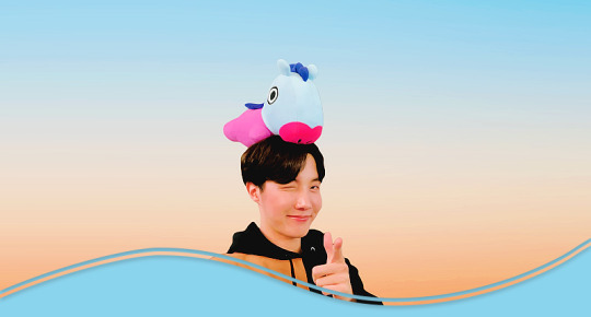
Photo
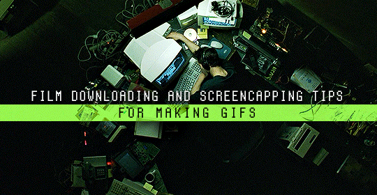
Finding high quality film/tv rips, saving the large files, and screencapping them are half the battle for gifmakers when setting out to make a gifset. Here’s a little guide on this process, including my advice on
Where to download stuff
Where to store your movies/shows
Screencapping programs
Making gifs as HQ as possible, including tips for picking out what to download when you have multiple options (not all 1080p rips of the same movie or tv episode are the same quality and I explain why)
Why screencaps of 4k movies can look weird and washed out and how to fix that
and more
✨ You can find my gifmaking 101 tutorial here and the rest of my tutorials here.
Where can I download movies and shows?
First off, I prefer direct downloading rather than torrenting stuff because it’s faster and with torrenting, there’s more of a risk. Other people downloading the same torrent can see your IP address. This means movie studios can find out you’re downloading their content and can send you a warning letter. The download speed also varies depending on how many other people are seeding it. I would only do it if it’s your only option and you have a VPN or something.
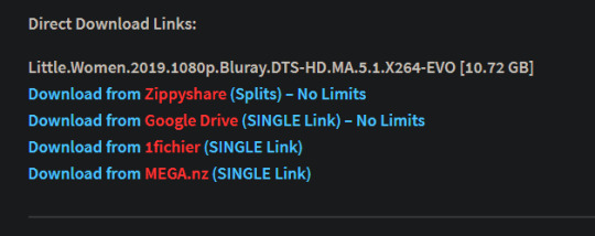
This is THE best guide for pirating I’ve ever seen. I use it for finding sites for books, music, you name it. The part of the guide you’d want to look at is where it says Direct Downloads Link (DDL) sites. My favorite place is Snahp. These ddl sites will have links to their movie/tv rips that are typically hosted on one of these two sites: google drive or mega.nz. You can download stuff from both of those sites for free, but with mega, they have a 5GB file download limit unless you have a premium account. I personally pay the $5 a month membership for mega because it’s worth it imo. You can buy a subscription through the mega app found on the iphone app store (so you’re billed through apple and it’s less scary than giving a random site your credit card info lmao) and as for androids I think mega has an app on there too.
So basically, if you go to http://snahp.it, they’ll have rips for different movies and shows.
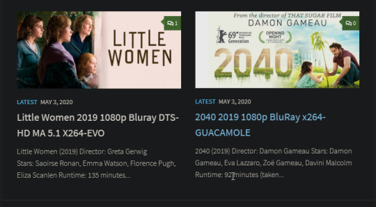
You click on the movie title and it’ll take you to a page where they have links for the video which they have uploaded on a variety of sites (including mega).
How do I make my gifs as HQ as possible?
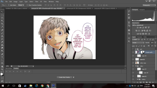
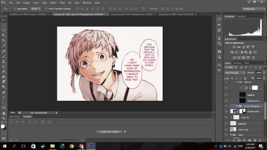
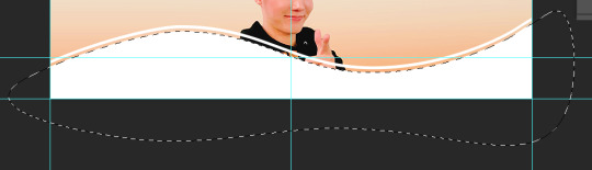
It’s best to gif things that are 1080p. And usually the higher the file size, the better. A really important thing to note is that not all 1080p bluray rips are the same. The piracy groups that rip these files take uncompressed .mkv rips from discs that are anywhere from 10gb to like 50gb, and then run that through video converters to compress the file down so that they’re 2-8gb. Sometimes when that happens, the video quality goes down a LOT. The same goes for TV episodes. One rip could be 800mb, the other could be 3gb and both could claim to be “1080p” but the quality would be NOTICEABLY different. Your best bet is to always pick the rip with the highest file size.
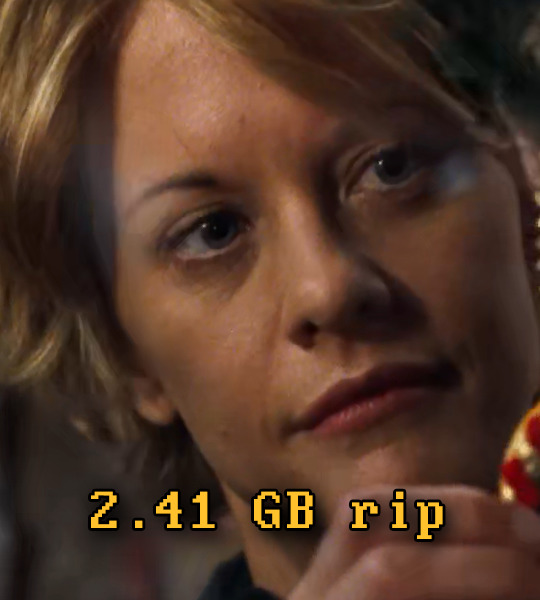
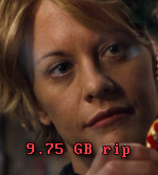
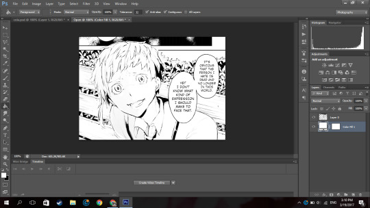
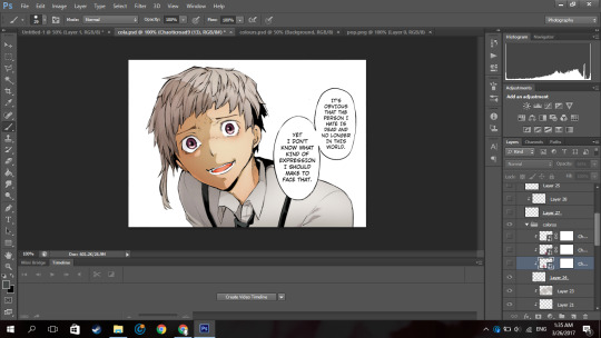
I’ll show you an example with this scene from You’ve Got Mail.

I downloaded 2 different 1080p rip versions of the film. Both claim to be 1080p, but one is 2.41 GB and the other is 9.75 GB. After taking screencaps, it’s obvious that there’s a BIG difference in quality.
(these pictures are best viewed on desktop tumblr)
When it comes to Blu-ray rips, download remux versions of films and shows if possible. Remux means .mkv files that are uncompressed and straight from a Blu-Ray disc. Giffing remux rips cuts down on the possibility of seeing pixel-y effects a LOT in my experience. It’ll take a bit longer to download than typical 1080p rips but it’s worth it imo.
For TV episodes, if you can’t find a Blu-Ray rip, uploads with the word AMZN in it are usually the highest quality and your best bet (unless you see another upload that’s higher in file size - again: always try to pick the highest file size). 'AMZN’ means they’re from a person that ripped the episode from Amazon Prime Video.
Also, even better than 1080p is 4k (2160p). I only really recommend this though if you know you’re going to gif something up close and crop it a lot - like if it’s a big 540x540px close-up gif of a person. You’ll REALLY see the difference if it’s a 1080p vs 4k rip in that situation. I usually don’t bother with giffing 4k files unless it’s the case above because my laptop lags when taking 4k screencaps and it takes longer to load them into photoshop (4k screencaps are usually about 60mb each!)
⭐️ Another thing that’s important is making sure that when you actually make your gifs, you set them to the correct speed (.05 for movies and most shows, and .04 sometimes for reality tv and live broadcasts). Here’s my gif speed guide. Having the right gif speed is really important for making a gifset HQ. You don’t want it to look too slow or too fast.
What’s your favorite video player to take screenshots with?
MPV player, hands down. And I’ve tried a TON of programs over the years. I’ve tried KMPlayer and found that it added duplicate frames (and even missing frames) which is horrible, and I’ve tried GomPlayer which is.....I’m just gonna say it, I’m not the biggest fan of it. It’s a little overly complicated in my opinion and it has ads. If you like these programs, more power to you! Use whatever you’re comfortable using. I just like MPV the most because it doesn’t have ads, it’s simple, you can take sequential screencaps with a keyboard shortcut, and it can play 4k movies.
Screencaps I take of 4k 2160p movies look so dull and washed out, like the colors aren’t right. Why is that?
That’s because your computer can’t handle HDR 4k video files. It probably can handle SDR 4k video files, but unfortunately, 99% of 4k rips out there are HDR.

[picture source]
Now, HDR displays just fine on computers that have 4k-HDR capabilities, but most older computers don’t have this ability. Having said that, MPV - the video player I mentioned above can take a 4K-HDR video and fix the colors/lighting in real time so it displays correctly AND take screenshots of it with the fixed colors. If you have an older version of MPV, make sure you download the newest update for this. In my general gifmaking tutorial, there’s a portion on how to install this program on macs. I also just made a video tutorial on how to install it on pcs here!
High quality TV and Movie rips can take up a LOT of space on my computer. Where do you store your files?
I store them on external hard drives. External hard drives are like flash drives but they have a MUCH higher storage capacity. You just plug them into your computer via a usb cord when you need access to the files and it’s that easy. I have two of these Seagate 4TB hard drives in different colors so I can easily pick out whichever one I need. I have silver for my movies (because it makes me think of “silver screen” lmao and it’s easier for me to remember) and then I just have a blue for shows. Now, external hard drives of this size can be $$$$ but it’s worth it imo. Look out for when they’re on sale.
What’s the size limit for gifs now?
It’s 10mb! It used to be 3mb and then last year Tumblr upped it to 5mb. Some gifs initially had distortion because of Tumblr’s switch from the .gif to .gifv format, but they’ve fixed the problem AND increased the upload limit to 10mb. Just make sure not to add any lossy to a gif.
Lossy is basically a grain you can add to a gif to lower the file size down. Gifmakers (including myself) used to use this as a trick to get the file size down under 3mb. However, since the .gifv update on Tumblr, any gifs with Lossy added will look distorted like it’s a gif made on a phone app or something.
_________________________________
That’s it for this guide! Again, feel free to check out my other tutorials on photoshop, how to center subtitles, download hq movie trailers, and more ✌️
UPDATE 6/23/20 ⚠️
I’ve gotten an ask about this problem 3 times since I’ve uploaded this tutorial, so I thought I’d add this in. If you are experiencing duplicate and/or missing frames in mpv, it is a glitch with the latest version of mpv. download an older version like 0.29.0. this happened to me on my mac and downloading an older version fixed the problem.
3K notes
·
View notes
Text

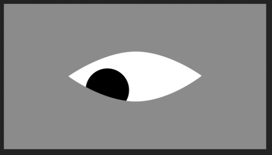
tutorial: animating eyes in after effects
requested by anon, based on this graphic
under the cut because it’s quite long :’)
open a new composition on after effects. you can set the dimensions to anything, but i’m using 540 x 300px for this tutorial. the duration i set to 5 seconds, but we’ll probably have to cut it down after we finish animating it.
1. select the pen tool (G) and draw the basic eye shape. this is going to be the whites of the eye, so set the fill to white.
you can set the stroke to any color if you want a border around your eye, too.
to help with drawing the eye shape, i recommend turning on the proportion grid.
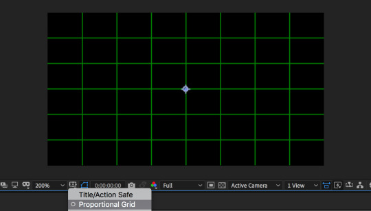
to draw the eye, i
(1) start with the left corner and set an anchor point (click), (2) go to the top-middle, click and hold shift while dragging the handle to the right to fill 2 boxes, (3) go to the right corner and click, (4) go to the bottom-middle and hold shift while dragging the handle to the left to fill 2 boxes.
hopefully that wasn’t too confusing??

this is the basic shape, so you can adjust it however you want depending on what you think looks best! i’ll be keeping it this way here.
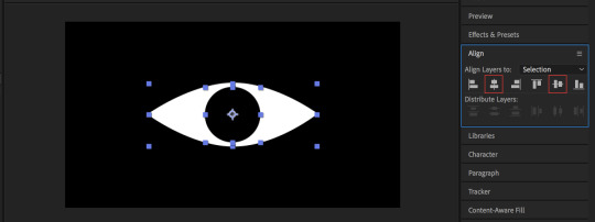
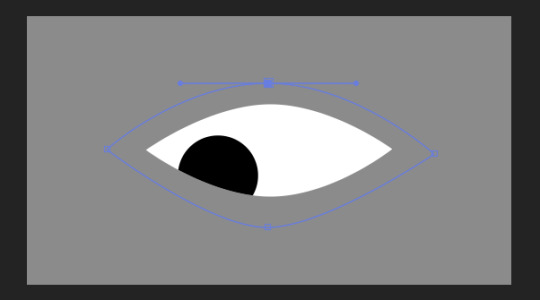
2. draw the pupil of the eye, all you need is the ellipse tool. at the toolbar on the top, you can either click and hold the rectangle tool to get to the ellipse, or you can press Q three times.
be sure to press shift while you draw the shape so that it’s a perfect circle!
you can set the fill to anything, i’m making it black in this tutorial.
center the the pupil to the white of the eye by selecting both of them, going to the align panel to the right, and selecting these two buttons:
i turned off the proportional grid here, too, bc you don’t really need it anymore.
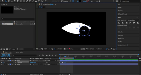
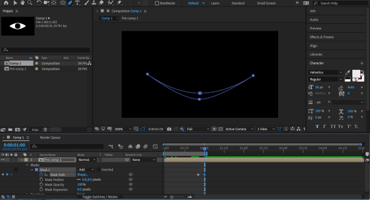
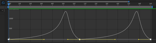
3. animating: moving the pupil
here, you can make the eye do whatever you want but i’ll just be going over the basic animation!
- select the pupil layer and press P to bring up position.
- click on the stopwatch to bring up a keyframe.
this is the starting position of your pupil. you can place the pupil anywhere, but i’m placing it at the center.

- move a couple of frames forward (here i moved 5 frames forward) with the current time indicator and copy and paste the first key frame. this is so that the eye will stay at the center for a few before moving on.
- move a couple of frames forward and move the pupil anywhere. i’m making it go to the right.
i want the eye movement to be a bit jerky, so i’ll be copy and pasting this keyframe a couple of frames forward before moving the pupil to another place (here, i’m going to the left).
- repeat the last 2 steps until you’re satisfied. i’m only moving the eye three times here (center --> right --> left).

i also cut the composition time here to 1 second long. move the time indicator to 1 second and hit N to cut your work area down.
so far, your animation might look a bit like this:

which is honestly a bit boring.
so, i changed the path of the pupil a bit. right now, the path is all straight lines. instead, i’m going to be curving the paths.
- select the anchor point to get to the handles and drag the handles to create curves. play around with them until you’re satisfied!

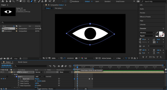
now, your animation might look like this:

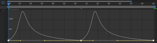
getting better! last thing i did was add easy ease to the keyframes. it just makes it flow a bit better.
select all your keyframes and either hit F9, or right click > keyframe assistant > easy ease. it’ll turn your keyframes from diamonds to hourglass shapes.
now it looks like this:

and that’s the basic animation!
one more thing: it’s not noticeable on the gif above bc the bg is the same color as the pupil, but the pupil is actually spilling over the eye right now. (i actually made this mistake on my gfx, too, haha!)
changing the bg color to gray so that you can see:
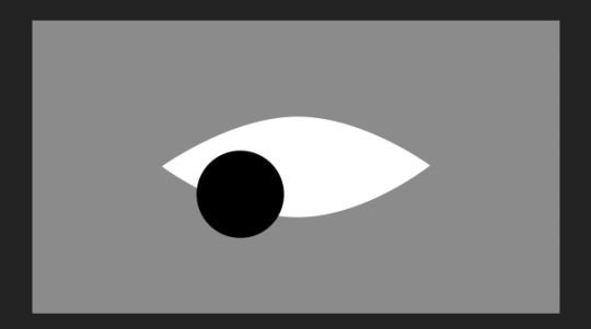
all you have to do is set a track matte.
- duplicate the white and move it on top of the pupil. (cmd/ctrl + D)
- set the track matte of the pupil to alpha matte. you might have to toggle switches/mode at the bottom.
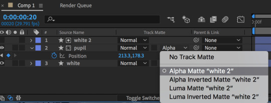
and it should be fixed now!
4. animating: opening/closing the eye
- select all of your layers and pre compose them. (right click > pre compose). your eye should be all in one layer now.
closing the eye:
- select the pen tool and your precomposed layer. draw a rough eye shape around the eye. no need to be exact.
- move to just a few frames before the end of the composition. press alt/option + M to create a keyframe for mask path. move to the end of your comp and drag the first top point of your mask downwards to close the eye.
(i changed the bg color back to black so you can see better :’))
i also added easy ease to the keyframes afterwards.
opening the eye:
- just copy and paste the last two keyframes and put them in the beginning, but be sure to reverse the order. that’s it!
if you’ve been following this tutorial pretty closely, there’ll be timing issues in your animation. here’s how it looks for me right now:

imo, it’s too fast right now.
5. fixing the timing
- first, i extended the time for the work area to 1 second and 15 frames instead of just 1 second.
- double click the precomp layer to bring up all the separate layers from step 1-3.
- because the eye opens after 5 frames, i’m shifting all of the pupil keyframes to the 5th frame of the comp.
- go back to the main composition where the only layer is your precomp. i’m going to be bringing the last two keyframes (the ones where the eye is closing) a bit before the end. (here i chose 5 frames before the end)
- i still felt like the eye opens and closes too fast, so i extended the work area time to 1 second and 25 seconds.
and finished!! here’s the final product:

if u have any clarifying questions, pls feel free to shoot me an ask! i’ll be happy to help :-)
#after effects#tutorial#after effects tutorial#photoshop#photoshop tutorial#mine#mine:tutorial#i hope this makes sense !!#i'm pretty sure you can do this in photoshop as well#tho i'm not sure how it would look bc i never tried it before#pls excuse the awful header at the top :')
212 notes
·
View notes
Text

Hi guys!
An anon asked me to show how I make my gifs, so I made this quick tutorial. Keep in mind that I change my ways often.
This tutorial assumes you know the basics of photoshop. That’s why I will not be covering how to make a gif.
I will cover:
what I use for specific things
how to manipulate colors using the selective color tool
my filter settings
general tips and knowledge
I will be using:
photoshop CC
KMplayer (only to capture the frames, not shown here)
I’ll show you how to get from this:

To this:

Let’s get started!
First and foremost, resizing is very important. You should always choose the bilinear option for the softest, cleanest effect. I use 268x140 dimensions.

Now onto the coloring.
I always start with curves. It lightens the gif and you can also use it for dark scenes. Don’t worry, it won’t be as bright in the end. This is only for now.

Next we have our most powerful tool, selective color. We’ll use 3 layers of it this time.
Note: Usually it takes a lot more layers to achieve the desired effect. This time the scene was very easy to manipulate. You should try to look for scenes like this, because you’ll color faster and without problems!
First comes black. I always set it at +100 to make it pop.

After black come neutrals. This will make our gif paler and softer. It’s great for pastel colorings. Don’t push it too much though - it will lose too much color. Play only with the slider for black!

Now we’ll move onto the actual colors.
So here’s the thing - I like my colorings to be pastel, but I usually want to make the red (or magenta) bright and visible. To achieve that, I set the cyan of it to -100 (in a few layers for more intensity, once will only make it brighter). The rest is just to turn it into the shade that I want.

Note: For pastels you’ll want to push back the black - this rule applies to all colors, not only red.
Next is yellow. I don’t like it to be very intense, so I just play with it. Nothing special here.

Green - a very important part in my colorings. I don’t really like green to be, well, green in my gifs. I prefer blue, so we’ll turn it into that. I think this is one of the crucial ones in my works.

To go from green to blue (which will first be more turquoise) you need to set cyan to the max. The rest is optional depending on the anime, but usually magenta will be either to the max or very close. Yellow changes a lot (at least for me). Play with the colors and see what you like, but keep in mind that if you want it to be really blue in the end, try to make it as blue as possible.
Now that we’re done with that, we can manipulate cyan.

You do what you like, play with things. This is basically going to determine how blue or cyan your gif is going to be, so it’s all up to you.
The same goes for blue.

Always remember to change both cyan and blue, as they are not the same and both are important to achieve the exact shade of blue you want! You can even turn it into purple by settings cyan to the lowest, but here we won’t be doing that.
Magenta is the same as red. Just having fun with it.

This is how it looks after the first layer of selective color:

Time for more layers. I basically made the red pop even more and manipulated cyan and blue to achieve what I wanted. I also pushed the black to the max once more. Nothing extraordinary, so I won’t be spamming with more images.
Another great tool is hue&saturation. I make small changes with it when I can’t get the right thing with selective color, like making yellow more pink-ish. Here are the settings used.
Red:

The hue changes the tone, but if you push it too far back or forward, it’ll get very pixelated and look unnatural, so don’t do that. Slight push is what we’re going for.
If you’re going for a very pale coloring, you should push saturation far back. Lightness is for lightening the color.
Yellows:

I like my yellow to be more pink, so I pretty much always do this.
Cyans:

Making the trees even more blue and less turquoise.
Blues:

Still annoying the trees.
Okay, we’re almost done! Time for gradients. I don’t use many, usually only black and white.

I always set it on soft light. The opacity is 28%.
Brightness&Contrast is a tool for making your gif lighter or darker, and contrast will make it more lively. I use almost at the end to avoid using too many layers, as it will make the gif grainy or create spots that will look ugly in the end, although sometimes you can’t help it, so don’t get discouraged.

Vibrance is also great. It will make your gif more pastel/pale and it will also improve the quality.

Unless you’re going for a very pale gif, you don’t really want to push vibrance back a lot and then leave saturation untouched. Instead, if you still want some color left, push saturation as well!
Note: don’t use too many vibrance layers! It might also create the hideous spots.
Alright, that’s it for the fun part! This is the order of layers:

Convert the layers to smart object and use surface blur. It will make the gif smoother and cleaner.

These settings are optional, sometimes I use 5&5, sometimes 3&3. It’s up to you really. Like everything else, lol.
Now the cool thing - sharpening.

This is also really your choice, but don’t oversharpen. It will look too sharp and will take away quality.
Lastly, we’re going to save our new thingy.

Use only these settings (no dither can be changes to pattern if you want to), otherwise it’ll mess up the colors.

Remember to set quality here to bilinear as well! And loop it!!!
Anyway, this is it. We’re done, finally.
I hope this helped someone, let me know. If you have any questions, feel free to ask.
24 notes
·
View notes
Photo

blinking animation after effects tutorial: a tutorial on how to do a very simple blinking animation in after effects. this tutorial assumes that u know some of the basics of after effects and the pen tool.
disclaimer: this is the way i did it in some of my edits. im not claiming this is the correct/easiest/best way. it may not work for your editing style. this is a very simple animation so it will look best on flat vector type gfx and when its viewed from a distance. 01: open your gfx in after effects- if you have hair strands that are over the eyes make sure the hair is on a seperate layer (i made the illustration in ps and just saved the hair/bg layer as a seperate pngs).
02: select the pen tool and create a layer for the eyelid (closed). make sure there are anchor points on the inner and outer corners of the eye. adjust the fill color of the shape so that it matches the color used for the skin.

03: hit the stopwatch on ur layer under contents > shape 1 > path 1 > path

04: move the time indicator forward a bit and then drag the path on the outer corner of the eye up and towards the inner corner so that u have a nice curve for the opened eyelid. u can play it once to see if u like the result and if not adjust it.

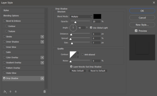
05: optional: add a bit of depth with a drop shadow. keep the distance low. u may have to add a mask to prevent the shadow from peeking out at the top.
(no shadow)
(shadow)
something you may have to do depending on the edit: add a fade in/out animation to the shadow so that its only there when the eyelid moves over the actual eyeball to prevent a line from appearing at the top of the eye when its opened. 06: repeat on the other eye. add keyframes/easy ease to ur liking- done!
#mine:tutorial#photoshop#photoshop tutorial#after effects tutorial#idk any tags#lmk if something is unclear etc!
93 notes
·
View notes
Photo
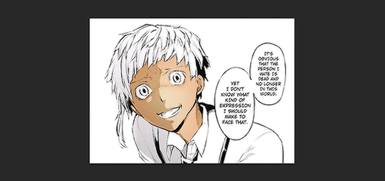
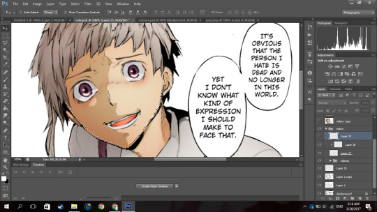
So because I have no life and because I offered to help an anon, I’m making this manga colouring tutorial.
Now first off I’d like to apologise because I personally suck at explaining things. I really do and I’m sorry if this confuses you.
I used Photoshop CS6 (its pretty easy to get it off the internet and I can’t remember where I got mine google is your best friend. But you can see if this masterlist by itsphotoshop still has working links) But, I’m sure other versions of photoshop like CS5 and CC can do this as well.
If this actually helped you please give it a little, like/reblog!
Now on with the tutorial!
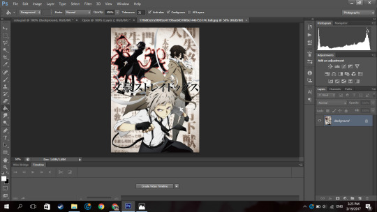
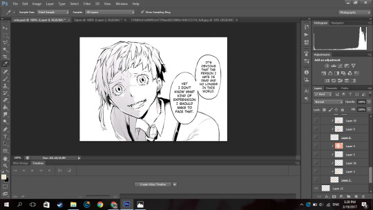
Ok so I’m going to use a mangacap from bungou stray dogs and I’m gonna be colouring something I coloured before (here), my depressed home boy Atsushi
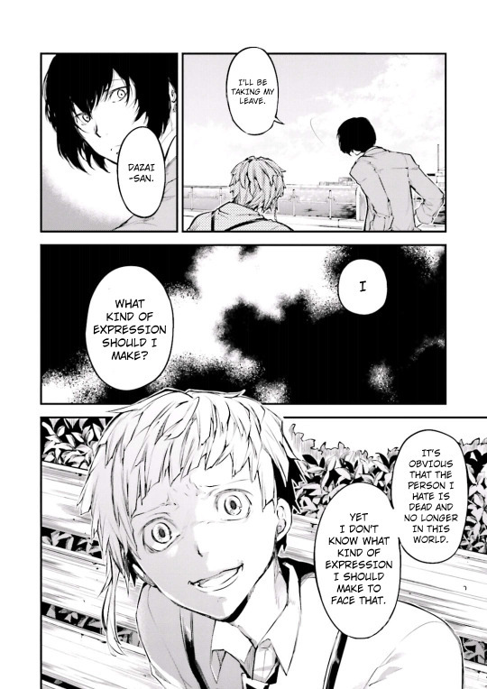
(scan courtesy dazaiscans)
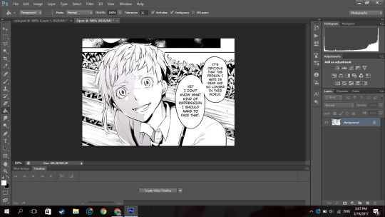
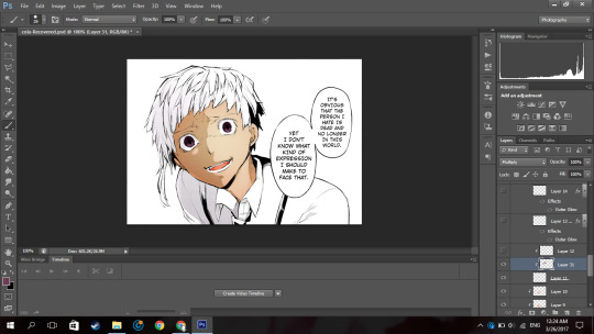
When you open it in photoshop please ensure that your image mode is RGB and not Index (this is common with scans from mangastream). To change it go to Image>Mode>RGB
Crop out the area you’re gonna colour. And resize to desired size (I chose 540px) because I wanted to upload it to tumblr)
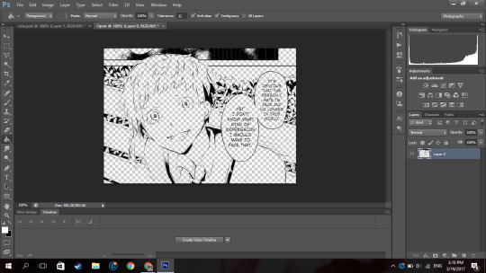
Now we’re gonna clean it. I have no idea how other people clean theirs, this is just how I do it.
First double click on your background layer and click ok on the box that comes up so it will not be locked.
Now click channels

And then click the dotted circle at the bottom. After, click delete on your keyboard.
The image will show up something click this:
Now go to Layer(on the topbar)>New Fill Layer>Solid Colour and you set the colour to pure white). Move that layer below your mangacap.
Now it’ll look like that. Then I merged those layers together.
Because I don’t want the background with the bus andbench and the panel above Atsushi, I’m going to create a new blank layer (so if I make any mistakes I can fix it), take the polygon lasso tool

(if you dont see it right click on the area where you see the normal lasso tool/magnetic lasso tool and then click polygon lasso tool)
and then I select the areas around Atsushi.
Then on the new layer I created, I use the paint bucket tool and fill in the selected area with the colour i wanted which is white.
now it looks like that.
Then on a new layer, I take a black solid brush and I change the size to something small (like around 2-3px) and I just fill in the black areas which look at little weird. For example, I thought Atsushi’s pupils looked a little weird so I filled them in.
So now it’s time to colour. Now go google a random animecap/coloured pic (preferably official art) of your character. Then open it in photoshop.
I used this pic so yeah.
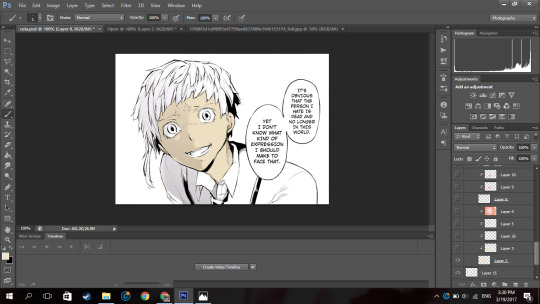
Now using the colour picker tool, pick their skin colour. Ok now go back to your mangacap, create a new layer, and select all the areas where your character’s skin is with the polygon lasso tool.
Then use a solid brush (basically one of the first default brushes from photoshop you see here), adjust the size to suit, then colour in with the characters skin colour. Set the layer to multiply.
Now, create a new layer and clip it to the layer you coloured their skin on. (clip a layer by right clicking on the layer and click clip layer and the layer will clip onto the layer below it). Set the layer to multiply
Then you select the areas where you see a shadow on the character’s skin.
If there is none, what you can do is google some lighting references and choose shadows on faces that are at a similar angles as your character (does that make sense??). Or you can just not put it in.
Now using the same colour you used to colour the skin. Colour the selected areas.

If you decide that other areas need a deeper shadow, you can create another layer, set it to multiply, clip it to the layer below, select the areas you want to be darker and just fill in the selection. I did this for the frown lines on Atsushi’s face.
Now because Atsushi looks as if hes about to cry, using a pink colour (like the one below),

I make a new layer, set it to multiply I clip it to the skin layer and using a soft brush I brush over under his eyes and a horizontally across his nose.
Now to get some soft shadows (?) around his face and like the areas of skin below his hair, using the same pinky colour, and a huge soft brush (i used 288px) brush the area around his face but not directly near like this:
(the gif is shitty and rushed im sorry)
Using a soft brush eraser you can just fix it up from the inside of his face. I’m sorry if that sentence made no sense.
Now on a new layer (set to multiply), using the same colour I used for the soft shading, I select the area where inside his mouth is supposed to be and using a hard brush I fill that in. And then you know the drill, I create a layer, clip it to the layer before, set it to multiply and just put in where I think the shadow would be.
And then going in with a soft brush on another clipped layer and just put in some soft shadows around.

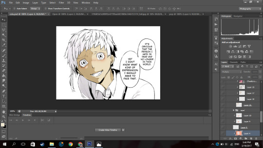
Now I’m going into his eyes. Now I do practically the same thing I do for his skin here: I pick the colour of the eye from the art with the colour picker tool, make a new layer, set it to multiply, colour it in.
Now it, really depends on how I feel to do the shadow on the eye.
Sometimes I do something like this where I shade the top half of the eye, like in the image above.
Or I simply outline the eye and the edges alone are made darker. Like this:

In this case I chose to go with the latter because I felt like it.
NOW. Normally eyes have that ‘shine’ to them right. I normally don’t do the eye like this, I just put a normal circle kinda by the pupil like this or follow whatever highlight the mangaka drew like this:

But since I thought Atsushi’s eyes looked bland like this, I highlighted it more. Now this is optional, I thought it looked better this way because following the highlight it originally had was bland for me so I did it. You by no means have to do it, it just depends on your preference.
So on a new layer, on the eye I selected a kind of a crescent shaped like so:
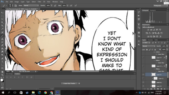
Up close and personal with my depressed son. Then using the colour white, I colour it in with a hard brush.

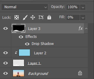
So now at the bottom of the last panel on the right, you’d see a button that says “fx,”

Click that and click outerglow. And a tiny window will show up. Now choose a colour a little lighter that your eye but make sure its around the same tone(?) (a warm colour or a cool colour; red under tones, blue undertones, etc.). In my case I chose a pinky colour.
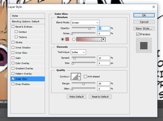
As you can see I set the blend mode to screen now this part is a must, but the opacity and the spread and size are all up to you, again its all based on your preference.
Now your eye will look something like this:
Now just duplicate that layer and move it to the next eye and rotate it by clicking ‘ctrl+T’ if necessary
now boom you got your eye. I put it in a group so it’ll be a little organised.
Now onto his hair oh the pain.
Now you know what to do, make a new layer, set it to multiply, pick the hair colour off your reference image, select the areas with the hair (this includes eyebrows and lashes if they’re there), colour it in.

I hid the layer where I put the redness of his eye and only realised just now so I unhid the layer sorry.
Now Atsushi’s hair on his head has a lot of layers (?) so I had to select the areas where I saw the shadows going (?) (I’m sorry if that doesn’t make sense). If your character has shadows in their hair to go along with by all means follow it but in my case his hair sort of didn’t.
So as you can see, I selected the areas where I deemed fit to have harsh shadows, I really did not put much but you can tell I did something. It all depends on where you want to put it though, I’m no expert in shadow theory so I probably suck at it but eh.
Now if you notice there’s kind of a shadow over his hair and it’s cast over his face to. So I just followed what I saw, and on a new clipped layer I selected the area and using the same colour I used for his hair and just did a shadow for that area like so:
Now normally I put soft shadows and you can see I used a pinky shade for that when I did the skin and his mouth, but since the colour didn’t look like it had any pink undertones (did I say that right), It kind of looked weird with a pink shading. So for the soft shading I used a greyish colour:

and I just did the normal thing where I brushed around the hair with a soft brush.

NOW this part I’m about to do is completely not necessary, I barely do it but I did it in this colouring so yeah.
Using the texture above, I clip it to the hair, set it to screen, change the opacity to 50% and the fill to 28%.
Its bare noticeable but it gave his hair a slight purplish look so I liked it.
Now this part is something I barely do as well but I did it here so I’ll show you how.
Using this texture, I set it the opacity to 22%. I then select where I want the line of the highlight to be (you know how anime characters especially have this line of shine across their hair). Like this:
And then add that to a layer mask by clicking the button next to the “fx,” button. (I did it before I’m sorry I didn’t take a screenshot before I added the layer mask I’m really sorry).
Then you set the layer to soft light and boom.

You have a highlight looking thing.
Now for the shirt I basically did what I did for the skin, hair and other areas: make a new layer, set it to multiply, pick the hair colour off your reference image, select the areas needed, colour it in.
Now advice, I don’t know if you want to do it or not but, I personally think that if your character has a white shirt do not leave it pure white. Colour it with an off white colour like a light grey. Like this:

It makes it easier for me at least to put in the shadows and stuff as you have a layer to clip it to and its easier to just use the same colour and click multiply.
Then again this all depends on your preference.

For the soft shadows I used the same colour I used for his hair soft shadow.
As you can see, he has a tie and suspenders which are both black.
Now again advice and it’s my opinion I am by no means an expert but I think one should never use a pure black colour to colour it in unless it’s what you’re stylistically going for it. I’ve seen a lot of artists on tumblr say this and they use a somewhat dark blush-ish grey colour and I 100% agree with it.
However again, everyone has their own preferences.
Now the colour I typically use for black areas leans more to the gray side rather than the blue.

Now again what I’m about to do is not what I normally do but I did it in this colouring so I will show you but it is not necessary you do it.
Using the same texture I used for his hair, I clip it to the various black pieces of clothing he has, moving it around until I think it looks nice and changed the opacity as I saw fit. I did not change the blending mode from normal to soft light but you can if you want to.
To do each part individually, Using a layer mask and a pure black soft brush, I removed the parts affecting the other parts. And I unlinked the layer mask to the original layer (double click the chain link that’s between in the layer and the layer mask) so I can move it if I wanted to without moving the layer mask.
For example his suspender which appears to be at your left, I place the texture over that, moved it around, changed the opacity as I saw fit, removed the parts affecting his tie and other suspender. And was left with this:

Now just do that for the other parts.

Now I forgot to colour his teeth and white of his eye and only realised now so I just used the off white colour and coloured it in real quick (I put in the harsh shadows as well)

Now by all means you can leave it like this but I like to put in highlights to the skin but you can leave it like this. I have not put highlights to the skin before in some of my other colourings like this one of haiba alisa from haikyuu.
Now what you’re gonna do on a new layer set to normal is select a fine line around areas like, the perimeter of the lower half of the face, frown lines (if you want), the outer perimeter of the ear, the bridge of the nose, a little circle by the lip (if you want) and if the character has sweat or water on their face, select the outline.
It’ll be something like this. Now with a hard white brush fill in selected area.
BOOM NOW YOUR PRACTICALLY FINISHED CLAP THE STRUGGLE IS OVER.
Now you don’t have to do this part it’s your personal preference. I have a photoshop plugin Topaz Clean 3 which is really easy to get off google so if you want you can go get it. Now I copy every layer and merge it. Now using Topaz clean with these settings:

I apply it to the layer and set the layer to 50% opacity (i literally wrote 50% free the 1st time im trash)
Now to add a little more oomph to my colouring because I can.
I used the same texture I used on his hair, set it to screen, I added a layer mask and erased the areas it affected besides the text so they text looked coloured.
Then you apply your psd. Now the psd I’m using is psd 01 from this psd pack but its really heavily modified and I removed a lot of the layers. Then I used 2 textures
with blending mode soft light and opacity 37%
and
with blending mode screen, opacity 51% and a black and white gradient layer clipped to it.
and boom you’re done!

And that is the end result! I hope you enjoyed and that it wasn’t too confusing!
#itsphotoshop#yeahps#tutorial#photoshop tutorial#*mine:tutorial#*mine#photoshop#manga colouring#manga coloring
326 notes
·
View notes
Photo
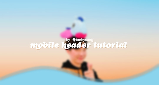
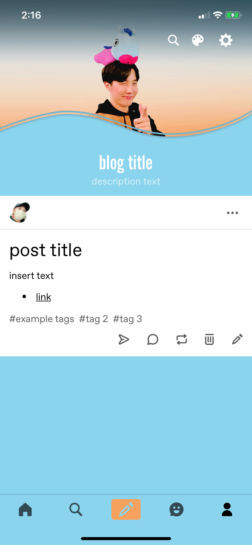
mobile header tutorial
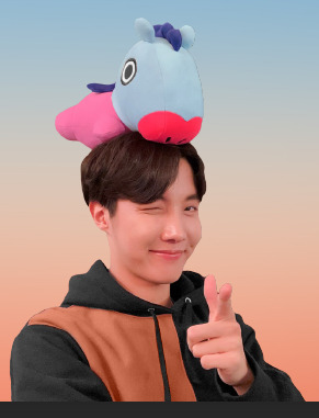
hello! I’m here to share how to create a header similar to these that i’ve done in the past. here are the tools i’m using:
photoshop cc 2018 (from @birdysources)
some picture of hoseok probably from either twitter or weverse i don’t remember lol
i included pictures and tried to make it VERY beginner friendly, but please, send me an ask or dm if i’m unclear at any point. it’s 2:38 am as i’m making this tutorial and i just downed my cold brew so i’m sorry if it’s messy
1: open your picture in photoshop (here’s the picture of hobi if u wanna follow along)
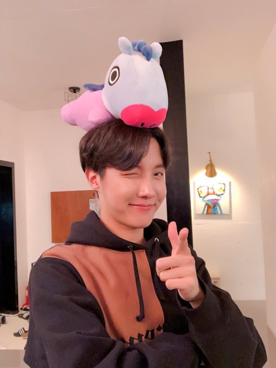
2: find the quick selection tool
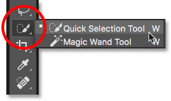
you’ll find it in the left sidebar, fourth from the top. i���ll often use this and the tool above it (polygonal lasso tool) depending on the photo. the quick selection tool is faster but more tedious, in my opinion, but hoseok was easy enough to cut out just using the quick select. use both! whatever u are comfortable with.
here are my settings for the tool:
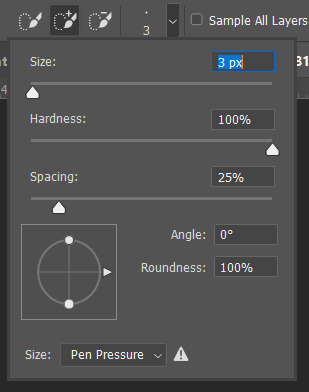
i almost always keep it at 3px. unless the image is huge, then i’ll go up to 5px, but never really above that.
3: trace over your subject(s) (aka hobi) by dragging the tool along the edges, until you’re happy with the accuracy:
4: find Select and Mask (directly above the image):
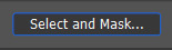
and here are the settings i’m using:
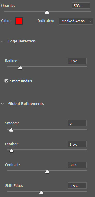
then press ‘Ok’ !
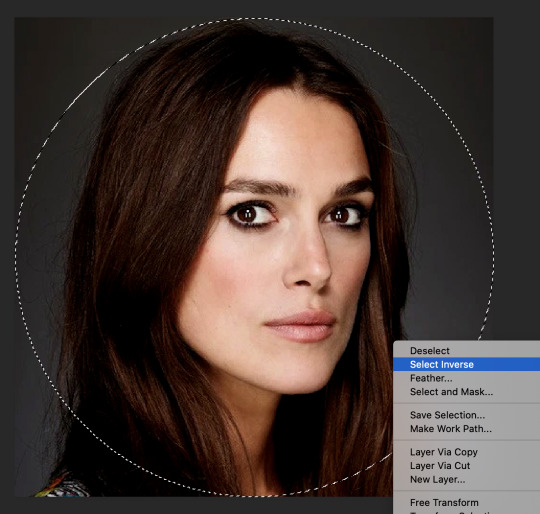
5: Select Inverse (right click inside subject)
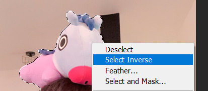
now we’re going to press ‘backspace’ on your keyboard, and the background will be gone~
make sure your file isn’t locked! it should be labeled ‘Layer 0′ and not ‘Background’ (if it’s locked, just double click it and press ‘Ok’ on the window that pops up)
after pressing backspace to delete the background, it should look like this:

then deselect it all. now is the time to look closer at your newly made render and see if there’s any cleaning up to do. i’m good to go, so i’m gonna continue on with making my header.
tip: drag the subject (hobi) with the move tool (very top tool on your left sidebar) to the center so he’s in the very middle. it should click to the center (you’ll see the pink line)

it’s not necessary for the tutorial but if you plan on saving this render as a .png and dispersing the renders you make-- it’s just cleaner looking to have them centered!
6: File > New

i always use 800 x 430 for mobile headers. for gifs, i size it down to 650 x 349.
7: resize and drag hobi into the new canvas (Image > Image Resize)

for single subjects like this i usually resize them to ~300 to ~400. whatever you think looks best tbh
now drag the file from its place up top:
then the file from where it’s labeled ‘Layer 0′

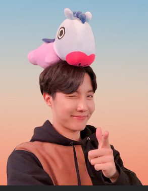
8: now hobi is inside the canvas where the actual header is going to be made~ you can get rid of the render, or save it as a .png, whatever u plan on doing w it
i’m gonna center my hobi for the header i plan on making! from this point it’s just gonna be coloring, sharpening, etc. if you’re interested in using any textures like flowers or bring in other renders of objects, DeviantArt is a great place to search for texture packs. @beapanda on DeviantArt makes beautiful resources (kpop and non kpop related) be sure to credit them or whoever u save ur textures from!
for this header i’m not going to be using any outside resources, i just want my hobi to be the focus~
for the background, i’m gonna use a gradient from this site (this pack is 200 images. phew)
i’m using no. 200 from that pack.
9: optional- i’m gonna make some extra layers and start coloring hobi using clipping masks.
make a new layer > right click the new layer and find ‘create clippink mask’ > set the layer to either color, overlay, or multiply (whatever you think looks best and does what u are trying to achieve)
here i’ve just make layers to color things like his hair, his hoodie, and baby mang
here’s with vs without:
and when you’re done, go ahead and right click your primary layer (subject layer) and click ‘merge clipping mask’.
10: coloring~
find a psd you like or being to color the header yourself. for this header i’m gonna be using a homemade psd. i’m not gonna go into detail bc there are sooo many places to find psds on tumblr and deviantart. just like you brought hobi into the header canvas, drag your psd there, and that’s how u apply a psd.
when u are happy with the coloring, right click the bottom layer and flatten the image.
11: topaz clean + unmask sharpen
topaz clean is an addition u have to manually add to your photoshop program. u can google how to do it, but if anyone’s struggling i can show u how i did if i remember (but i’m pretty sure i do)
topaz settings:
unsharp mask settings (go to filter > sharpen > unsharp mask):
honestly, topaz is completely unnecessary, but i like the way it looks so i’m gonna go with it anyway. sharpening the header alone will still give you a great outcome
12: final step, header border time~
over on my film/tv blog @gusdapperton i’ve made a header template pack (click here if u just wanna use my premade borders) but for this tutorial i’m gonna show u how i actually made those (minus the cloud one, i was just fucking around lol) (it’s so simple)
>>> if u DO just save one of the borders i made in that pack, resize it so the width is at 800 and drag it to your header canvas. set the layer to ‘screen’ and bang there u go!
BUT with that method u can’t change the color from white. so if u want a border with any other color, keep following the tutorial >>>
go to view > rulers and select that to show the rulers (duh)
click from inside the ruler (light grey) and drag out your guides. here are where i’m placing mine:
they should ‘snap’ right into place, but if they don’t, make sure u go to view > snap and that’ll fix it. u will know what i mean once u try it lol
select the curvature pen tool (right click the pen tool to show more tool options):
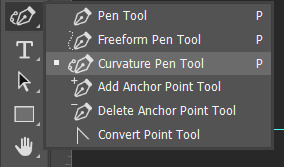
and begin to place your dots. thanks to the guides, these dots will also snap into place
here are mine:

(i eyeballed the two in the middle, it doesn’t need to look perfect tbh)
this next step is sorta stupid but i haven’t found a better way to do it yet lol
to close the shape just make sure to closely follow the direction of the dot you last placed, then go around to make your way back to the first... it looks silly but like this:
just play around with the shape and the tool... u will get the hang of it lol
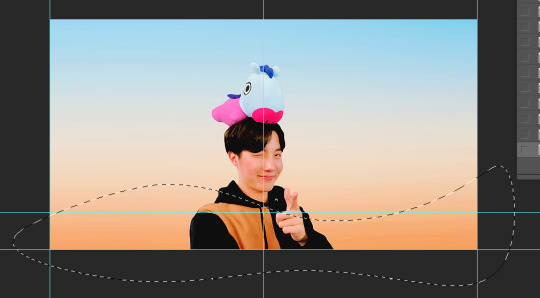
now look up ^ and press Selection

then ‘Ok’ in the next window. then boom~ there’s your selection for the border we’re about to make.
make a new layer then select the rectangular marquee tool (second from the top on the left sidebar) and either drag with your mouse or use the arrow keys to move the selection we just made. here is where i’m placing mine:
then select your paint bucket tool (if you can’t find it, right click the gradient tool and it’ll be one of the sub tools, like i showed u with the pen tool)
make a new layer, then fill it in (i’m using white)
you can stop there, but to make that line like i did in my border template pack, press the down arrow on your keyboard and go down 5-10 pixels, press backspace, go down the same amount of pixels, and re-fill that area.
now unselect. there’s the border~
now go to view > clear guides to get rid of those. u don’t need em anymore :) i’m also going to move the border we’ve just made down to the bottom of the canvas since we don’t need that big gap there.
>>> tip, don’t fill in the white directly on the layer if you wanna change the color. create a new layer on top of the border layer, right click > create clipping mask > fill the layer with the color u want for the background. example:
it saves the integrity of the shape. if you color fill right over the white, look closely and you’ll see it looks sort of pixelated and not as clean or smooth. it’s subtle but noticeable enough to me where it bothers me.
since this color i chose is kinda vibrant and clashes, i’m gonna help it out some. go back to the quick select tool and select everything inside your border layer. make a new layer, fill the layer with black (any color will do, it doesn’t matter) and set the fill to 0%. double click that new layer, and a new screen will pop up. go to drop shadow, find the settings you like, and boom. here’s what i did and what it’ll look like:
now u are finished~ i didn’t do this but u can skip sharpening the header earlier in the tutorial and reflatten the image again to sharpen it at this point instead but, yknow, i didn’t do that lol
here’s the final product (save by going to file > export > save for web)
preview of how it looks on mobile:
background: 8bd4ed
the end~ please send me an ask or dm if you haven any further questions, i will try my hardest to help <3
#photoshop tutorial#header tutorial#allresources#completeresources#mine:tutorial#i probably fucked up somewhere but it's bed time so i will find out in the morning hehe
149 notes
·
View notes
Text
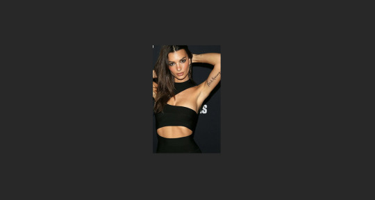
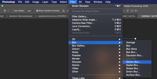
↪ 𝐌𝐎𝐓𝐈𝐎𝐍 𝐁𝐋𝐔𝐑 / 𝐓𝐎𝐏𝐀𝐙 𝐓𝐔𝐓𝐎𝐑𝐈𝐀𝐋 .

BY REQUEST , here is a step by step tutorial of how i make my graphics by using both motion blur and topaz clean . examples of the graphics can be found here and here . this tutorial was made using photoshop 2020 , however every photoshop program i have ever used can translate easily . with that being said , the tutorial is below the read more . happy photoshopping , friends 💕
to start , create ur canvas . it depends on the dimensions of the graphic ur going to make but for the sake of this tutorial , my image is 220 x 350 . u’ll have a pretty , blank canvas like so :

now this step is important . make sure u open and place ur image into ur canvas . don’t copy and paste it in . the image can’t be a smart image or the filters won’t work right and u’ll get a bunch of error messages . for the purpose of this tutorial , i’m using a picture of emrata . get ur image positioned the way u want and then report back here when it’s situated to ur liking .
the first step to editing ur image from here is lvcifer’s gif sharpening action . now i realize this isn’t a gif , but trust me , it looks stunning on pictures . u can find a link to her action here . so after u have ur action installed , go ahead and apply it to ur image .

u can see the image is already sharper . and on the right , u can see that the action was successful as u can see the various filters that have been applied to ur layer . next is topaz . the link that i found for topaz clean has been deleted and i don’t feel comfortable posting a new download link myself . so either go the website and sign urself up for a free trial or find another source to download topaz clean . i’m sorry that i can’t provide it for u myself but i’m not about to risk my shit by providing downloads for purchased apps . it’s super popular , though , so finding a link shouldn’t be hard .
the topaz layer that i add is located here . u can apply topaz actions in just the same way u apply normal actions , so go ahead and punch that button !

ur almost done ! home stretch ! next u’ll want to duplicate ur base image by right clicking on the layer and selecting duplicate image :
now click on ur duplicated image . once it’s selected , go to the top bar and select filter > blur > motion blur . here’s a visual of that pathway :
once u click on motion blur , here are the values that i use :
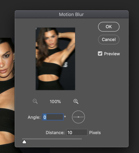
now after u apply this filter , things might look a bit wonky . that is why we want to lower the opacity on that image significantly so it gives us this airbrush - like glow that we’re going after . go ahead and lower the opacity to that duplicated layer to 30% .

and that’s it ! all there is to it ! it’s a super simple method to get a really cool looking image . here is a link to my finished product after i applied a psd .
please let me know if u need any further assistance with this tutorial ; i’d be more than happy to help !
20 notes
·
View notes
Photo
Hi anon, I tried to answer this the best I could! It’s image heavy so it’s all under the cut and I really hope it helps :)
So first I pick the image I want to use, for this I’m going to be using a picture of Keira I got off google
1. open and crop your image to 500x500 px. If you’re going to make the background different this is now, and do your coloring etc (I’m not going to do any for this tutorial but lets pretend I did lmao)
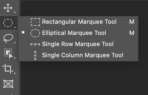
2. select the elliptical marquee tool
and then on the top bar, select fixed size in the dropdown menu for style and set the size to 499x499 (or if you want to make it smaller a smaller size)

3. now click on your image and an elliptical selection will show up and just move it so that it is placed how you want on your image (don’t worry if it’s not centered we will do this later) and then right click and click select inverse (or shift + command + i for mac)
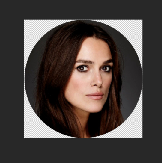
4. now delete! and make sure your background is set to transparent!
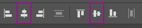
now before deselecting I center the image, and I do this by hitting command + a and then select the move tool (v) and now on the top bar you’ll see this:

What you want to do is click on align vertical centers and align horizontal centers to make sure that your icon is centered :)
5. resize the image to 500x500 (if you need to) and apply an action if you feel like it! I like to use this action for my icons
so this is now what it looks like:
6. upload to tumblr and it will show up like this :)

anyways I hope this was clear and since it probably wasn’t as I suck at explaining things please feel free to message me if you have more questions! :)
18 notes
·
View notes
Text
COLORING + SHARPENING GIF TUTORIAL
From this:

To this:

If you haven’t seen my tutorial on how I make gifs, please find it here and then come back after reading that post. In this tutorial I will show you how I color gifs and sharpen them as well.
COLORING
So this is the gif we are starting with:

Before we can do any kind of alterations to the gif we want to make sure the ADJUSTMENTS window is up. It can be found on the top underneath WINDOW.

Now all our adjustment options should be to the right of the gif and we can start.

The first thing I notice is that it’s too dark and I want to brighten it up, so I want to add either a CURVE layer or a LEVELS layer. I usually like to start with curves.

You can play around with it and see what looks nice but this is where I would put it first.

This gif now looks like this:

It certainly brightened it up but we are no where near finished. For the rest I’m just going to show you how to access each adjustment and what I would do to make the gif look better.
VIBRANCE is next. I like my gifs very vibrant.


Gif now looks like this:

I added a couple more CURVES and VIBRANCE layers for a while until I got to this:

And this is where SELECTIVE COLOR layers come in!! My favorite part.

I will just show you the all of my settings that I used for the SELECTIVE COLOR layer (sometimes I use multiple selective color layers).


And now the gif looks much prettier, like this:

I usually like to add a COLOR BALANCE layer at the end to just make sure everything looks right. Unless the situation is dire, like in bad lighting or very blue scenes, I usually use the COLOR BALANCE sparingly.

This are my settings:

And the gif now looks like this:

Subtle change but it’s noticeable to me. I’m happy with how this gif looks so now we are done coloring!
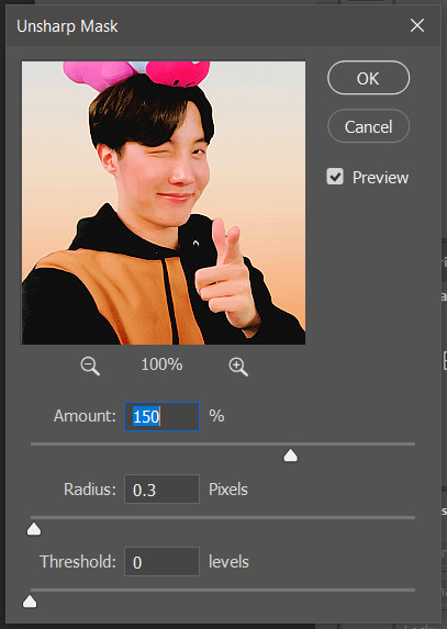
SHARPENING
Sharpening a gif is tricky because you want it to look crisp without it looking grainy. Before you even begin to sharpen at all, you need to make sure that your gif is the right dimensions. Always always always sharpen your gif last so it looks the best. If you are unsure about gif dimensions, please see my previous post of gif making.
Before you can sharpen the gif, however, you need it to be a smart object. Select all the layers in your gif, excluding the adjustment layers.

Then, you want to go to the top bar and hit FILTER and then hit the COVERT FOR SMART FILTERS button. Now you’re gif still plays, but at this point is it treated like one layer so you cannot change any of the frames so this is why you always sharpen last. Now to actually sharpen,

At the top bar you want to go FILTER > SHARPEN > SMART SHARPEN.... This will allow you to sharpen the gif while also getting rid of noise, which is the grainy-ness that sometimes comes with sharpening a gif. These are my settings, but I change them around based on the gif:

Finally, your finished gif looks like this:

It’s colorful, it’s sharpened, and it looks great! The only other advice I have it play around with things, try things and see what they can do to your gif. I learned a majority of what I know about photoshop and making gifs through experimentation so don’t be afraid!
As always, my ask box is always open for questions or concerns!
#psd tutorial#gif tutorial#photoshop tutorial#coloring tutorial#sharpening tutorial#mine#mine:tutorial
573 notes
·
View notes
Video
tumblr
GIF TUTORIAL: PHOTOSHOP CC (video and pictures)
Please like or reblog this post if you found this useful, or consider perhaps buying me a coffee! ♡♡
–
I didn’t include the part before this but I just open the original movie in VLC and screen record the section I want, then save the clip and open it up in quicktime and then that’s where the video starts.
If you upload the original movie to quicktime it’s just a pain to trim it properly hence the VLC step.
I tried to go slowly to make sure y’all can see what I’m actually doing, but for additional help:
step-by-step (with screenshots) below the cut
file > open

right click on ‘video group’ in the bottom right corner, then ‘convert to smart object’
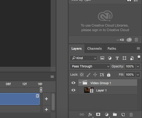
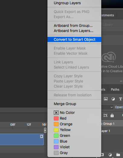
image > canvas size
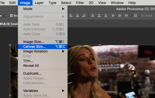
i do 268 pixels by 150 pixels (but do whatever size you’d like!) > ok

cmd+t
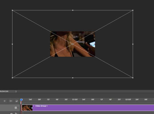
hold down the shift key while you drag the corner to size/move your gif into the visible window (holding down shift stops it from distorting)
click on ‘place’ once you have it where you want it

open your psd (if using one) and drag it over the top of the image
make sure you’re clicked on ‘video group 1′ and color the image the way you want it (i usually just go to image > adjustments > levels and change it to either ‘darker’ or ‘lighter’ in the drop down menu) > ok
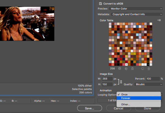
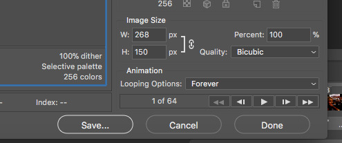
next go to file > export > save for web (legacy)

make sure you click on ‘forever’ in the looping options, then save
next you’re gonna go to open, and then open your gif
you’ll see all of the frames in the timeline at the bottom

click on this icon with the four bars
then ‘select all frames’

click on the little down arrow in the bottom corner of any of the frames (they’re all selected so they should all follow suit)
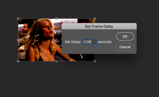
then click ‘other...’
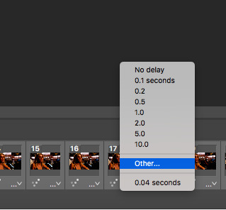
choose your frame delay (for gifs under 40 frames, i generally set the frame delay to 0.07 / 40-60 frames i set it to 0.06 / 60+ frames i set it to 0.05) > ok
then back to file > export > save for web (legacy)

make sure ‘forever’ is still selected in the looping options, then hit ‘save’
all done!

49 notes
·
View notes
Photo


wanted to see if there was any visible difference between the different qtgmc modes for gif making with avisynth.
my steps:
60fps H264 .ts file clipped into smaller .ts files (no file conversion or re-encoding, thus no quality loss... hopefully. I’m not an expert)
avisynth’s video folder > x264losslesswebm.bat (command prompt showed a bunch of errors but put the file thru anyway so I’m not exploring these errors. normalwebm.bat should work too)
deblinear, no extra sharpening
lighting/coloring psd and 0.03 frame delay applied to all gifs
conclusions:
to the naked eye these gifs look the damn same lmao
fast/slow doesn’t affect the flow of the gif
between 30 fast and 60 fast, there is no visible difference in the pixels of the frames. no difference in the frames of 30 slow compared to 60 slow either
HOWEVER... the pixels of fast are slightly less defined than the pixels of slow (see yonghee’s mole; 1000% zoom)
60 slow took So Fucking Long so i’m probably sticking to 30 slow
note: qtgmc 60 fast/slow duplicated every frame despite this being a 60fps video, so I limited to every 2nd frame when converting video frames to layers in photoshop
#avisynth#qtgmc#gif making#mine:tutorial#ref#idk how to tag this if at all lmao#this is as much for myself as it is for everyone#so if you wanna reference it you can reblog it!#thinking of trying vapoursynth so maybe i'll compare its output too#sice
10 notes
·
View notes
Photo

if anyone’s interested, i just made a twitter gifmaking guide on twitter 🌸
#i would've put @kylos on this lil graphic thing but ps crashed before i could change it lmao#it's my twitter handle so w/e#photoshop tutorials#mine:tutorial#*
145 notes
·
View notes
Note
/post/625088637142515712/get-to-know-me-favorite-anime-2-mob-psycho could you tell me how did you do that first gif "your life is your own" ? how can i make the same gif with a different quote?
sure! it’s a simple animation that uses adobe after effects. a small tutorial is under the cut.
final product:

first, open your composition, select the text tool, and type in whatever you want.
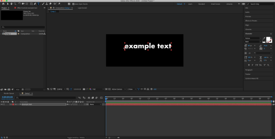
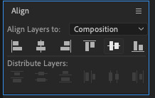
make sure you go to the align panel on the right. select ‘composition’ where it says ‘align layers to’ click ‘align horizontally’ and ‘align vertically’ to center the text
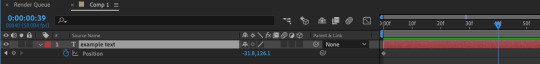
now, press ‘P’ on your keyboard to bring up position.

click on the stopwatch next to ‘position’ to create a keyframe. it will bring a blue diamond on your timeline, that’s your keyframe.

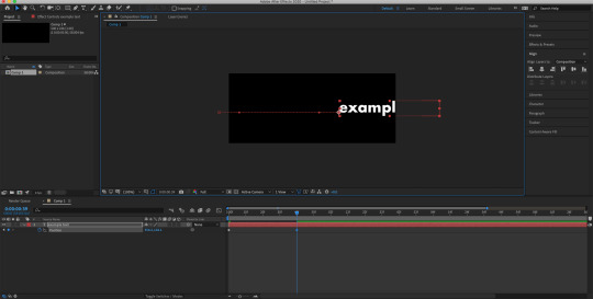
now, move your text to where ever you want it. i’m moving it to the left. to do that, you can drag the text on your composition and move it to the left. make sure that you’re pressing ‘shift’ down so that it doesn’t move up or down.
you can also click and drag the number on the left (next to the ‘position’) to move it the text either to the right or the left. (the number on the right moves the text up and down.)

next, i’m going to move my timeline indicator to around 1 sec, 6 frames. (which i didn’t do in the picture below lmao)
this time, i’m going to move my text to the right. a keyframe should automatically be added once you move the position of your text.
now, i’m going to select the first keyframe and copy it. i’m moving my timeline indicator forward to around 2 secs, 13 frames (which i didn’t do in the picture either lmao) and pasting that keyframe there.

and you just finished the basic animation for your text!
however, your animation is going to look a little like this, which is kinda boring.

to fix this, you’re gonna have to put some easy ease on your keyframes.
so, select all of your keyframes, right click, go to keyframe assistant, and click easy ease. or just hit f9 lol.

so now, your text should look like this.

you can also play around with the graph editor to get something a bit fancier, so for example,
this graph
brings this animation

and this graph
brings this animation

but i’m just going to use the regular easy ease for this tutorial (which is what i used in the mp100 edit, too)
now you have your animation!
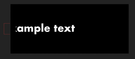
the last thing that i did to the text was add a track matte, so that your text will only show up on the area that you defined.
so, select your rectangle tool and draw a rectangle to the place where you want your text to only show up (?? does that make sense ??)

a new shape layer will be above your text layer. make sure to properly align it, too
click the ‘toggle switches / modes’ to bring up the track matte option

now click the box that currently says ‘none’ and change it to ‘alpha matte’
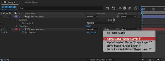
this will make it so that your text will only show up in the area that your rectangle is in.
and you’re finished! go to file > export > add to render queue to export your animation
final product:
please let me know if you have any questions or need clarification, anon!
#idk if my explanations make any sense hshjshsj#tutorial#after effects#mine#mine:tutorial#answered#Anonymous
24 notes
·
View notes
Text
i made a brief tutorial for my lovely wife as she enters the world of photoshop and gif icons ! this tutorial details how i make gifs from scratch and is very photo heavy. not an official tutorial but if anyone else finds it useful, i’m happy! See below the cut!

STEP ONE: Download your video from YouTube or other sites. STEP TWO: Open Photoshop. (I’m using CC 2017). File >> Import >> Video Frames to Layers.

When this screen pops up, click the “Select Range Only” dial and make sure the “Limit to Every 2 Frames” box is checked. Use the sliders to select the portion of the video you want to gif and then press OK.
STEP THREE: If your actions panel is not already showing, go to Window >> Actions or press ALT + F9. You’ll see a little play button appear on the right column. Click it.

STEP FOUR: In the Actions panel, there are a few buttons on the bottom. The folder icon (circled in blue) creates a new folder that you can house all of your actions. The page with the folded corner icon (circled in red) allows you to create a new action. Create a folder for your actions, name it whatever you like and then click the new action button.

I like to name my actions something I’ll remember. This action I’ll be creating is for 80x80 px gif icons, the set is the folder I created. The Function Key allows you to create a shortcut for your action. I didn’t take a screenshot of it, but I made this one F3. (You can even color code your actions.) Press “Record” once you’re ready.

STEP FIVE: Photoshop will immediately begin the recording. You can tell by the recording button on the Actions panel now being illuminated red.

Now, Photoshop is taking note and documenting all of the clicks your mouse makes.
STEP SIX: The first thing I do with my gifs is crop them to the correct size.

Select the cropping tool from the toolbar on the left-hand side.

Make sure your settings in the highlighted square above are 1 x 1 (Square Ratio). Select the area for your gif and then press OK.
STEP SEVEN: Next up, it’s time to resize ! On the Menu Bar at the top, select Image >> Image Size. (Or press ALT + CTRL + I on your keyboard.)

These are my settings. Press OK.
STEP EIGHT: If the Animation/Timeline window isn’t showing on the bottom, go to Window >> Animation (or Timeline). Click the menu button on the right-hand corner and “Select All Frames.”


STEP NINE: With all of your animation frames selected, click the little down arrow on any of the frames.


Set the frame rate to something that looks natural on the preview. Anything between .07 and 0.12 usually works well for me. The less frames in your gif, the longer you want the delay to be so it doesn’t look like it’s moving too quickly. Once you’re finished, press OK.
STEP TEN: You are now ready to stop recording your action. Go back to the Actions panel and press the “Stop” button.

Your action is now ready to be used for future creations !! It’s super easy and honestly saves so much time when you’re working on repetitive actions in photoshop. You can use actions for just about anything !
A fun little tip that’s useful. Those little blank squares to the left of each step in the action? You can click them and sort of create a pause in the action where it will require your input before it moves along to the next step. When making gif icons, I normally place a pause on the “Crop” step and sometimes on the “Set current animation rate” step.

STEP ELEVEN: You’re pretty much done! All that’s left to do now is apply your sharpening technique of choice (I use another action) and throw on a psd over it. And you’re done ! Go to File >> Export >> Save for Web and Devices (or press ALT + SHIFT + CTRL + S on your keyboard.) Earlier versions of Photoshop might have Save for Web right on the File menu.
Here is my final gif after applying a sharpening action and psd.

That’s all that there is to it! Next time all you have to do is import your video and press your shortcut for your action and watch as the magic happens! I hope you found this useful and good luck ! I can’t wait to see what you create!
104 notes
·
View notes
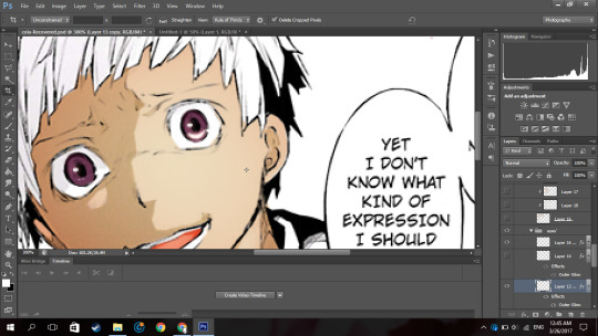
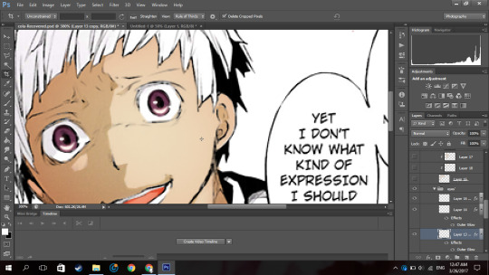
Note
hello ! may i ask how u did the first photo here? where chrollo’s face is split into half? ik this is old but it looked really beautiful :) thank u !
oh yeah its been years lol but its super super simple, pics under cut hehe
01: select the layer u wanna cut in half and double click to add a simple stroke
02: use the lasso tool or pen tool to select where u want the split to be and how u want it to look. go as crazy as u want tbh i just kept it really simple to demonstrate. something like this:

03: keep the layer selected and go to layer > new > layer via cut

04: u will now have two halfs of one image, just move one layer a bit to the right and he other one a bit to the left and u r done!

#Anonymous#hope this helps#also man i never knew u could have links like that in asks lol#gfx ask#mine:tutorial
5 notes
·
View notes
Photo

Help DamDaDi’s Official MV Reach 1 Million Views!
Once the MV reaches 1 million views, Woollim will release the choreography version ~ So here are some tips on how to make your YouTube views count!
Open Youtube in your browser and search for the video (it doesn’t count if you watch it embedded on another site or if you click a link, which is why I haven’t included either in this post)
Watch the MV from start to finish, with the volume up over 50%
Once you have watched it, close the tab and clear your browsing history (you don’t have to clear the full thing, just recent history)
Open a new tab again and repeat steps 1-3
It’s honestly that simple! Let’s all do our best and see if we can hit this target soon :)
66 notes
·
View notes